
Analysis of Covariance, Adjusted Means, Covariate Control, Residual Diagnostics and Effect Size
ANCOVA: Analysis of Covariance Formula, Assumptions, SPSS, Python, R and Excel Guide
ANCOVA, or Analysis of Covariance, compares group means after adjusting for one or more continuous covariates. It combines ANOVA-style group comparison with regression-style covariate control. In this guide, G3 final grade is the dependent variable, school is the group factor, and G2 prior grade is the covariate. You will learn ANCOVA formula, adjusted means, ANCOVA assumptions, ANCOVA vs ANOVA, Python chart interpretation, R validation, SPSS output, Excel workflow, APA wording, common mistakes, downloadable resources and FAQ schema.
Quick Answer: ANCOVA Result
The worked ANCOVA example asks whether G3 final grade differs by school after adjusting for G2 prior grade. This is different from ordinary ANOVA. ANOVA compares raw group means, while ANCOVA compares adjusted group means after removing the predictable effect of a covariate.
The Python adjusted-means chart shows GP with an adjusted G3 mean of 11.999 and MS with an adjusted G3 mean of 11.732. The raw means were farther apart, but the adjustment for G2 made the school difference much smaller. The school-effect F curve shows an observed F value of 5.99, which is above the critical F value of 3.86, so the adjusted school effect is statistically meaningful in that output.
Final interpretation: After controlling for G2, the adjusted school means become close, but the school-effect F statistic still exceeds the critical value in the Python output. This means the post should report the school comparison from the adjusted means and ANCOVA table, not from the larger raw mean difference.
Important reporting point: A complete ANCOVA report should include the covariate effect, adjusted means, F statistic, degrees of freedom, p value, effect size, homogeneity of regression slopes check, residual normality, variance check and outlier/influence review. The adjusted means are the main group means for ANCOVA.
Table of Contents
- What Is ANCOVA?
- ANCOVA Formula
- Diagnostic Null and Alternative Hypothesis
- Dataset and ANCOVA Variables Used
- Python Chart-by-Chart Interpretation
- R Chart-by-Chart Validation
- SPSS Output Interpretation
- SPSS, R, Python and Excel Workflows
- Code Blocks for ANCOVA
- APA Reporting Wording
- Common Mistakes
- When to Use ANCOVA
- Downloads and Resources
- Related Guides
- FAQs
What Is ANCOVA?
ANCOVA stands for Analysis of Covariance. It is used when you want to compare group means while statistically controlling for a continuous variable that is related to the outcome. The controlled variable is called a covariate.
In this guide, school is the group factor, G3 is the final grade outcome, and G2 is the covariate. The goal is to compare the G3 means of school groups after placing the groups on the same G2 level. This produces adjusted means, also called estimated marginal means.
The key difference between ANCOVA vs ANOVA is adjustment. ANOVA tests whether raw group means differ. ANCOVA tests whether group means differ after removing variation explained by the covariate. If the covariate is strongly related to the dependent variable, ANCOVA gives a cleaner comparison than a raw mean comparison.
Simple definition: ANCOVA compares group means after controlling for a numeric covariate. In this example, it compares school groups on G3 after adjusting for G2.
ANCOVA is connected to many assumption and diagnostic topics, including Descriptive Statistics, Variance, Standard Error, Confidence Interval, P Value, Effect Size, Null and Alternative Hypothesis, and Parametric vs Nonparametric Tests.
ANCOVA Formula
A one-way ANCOVA model with one covariate can be written as:
In this formula, Yij is the dependent variable value, μ is the grand mean, τi is the group effect, β is the covariate slope, Xij is the covariate value, X̄ is the covariate mean, and εij is the residual error.
Adjusted Mean Formula
The adjusted mean estimates what each group mean would be if all groups had the same average covariate value. This is the core idea behind ANCOVA. It changes the comparison from raw means to covariate-controlled means.
ANCOVA F Statistic
The ANCOVA F statistic tests whether adjusted group differences are large compared with adjusted residual error. If the F statistic is large and the p value is below .05, the adjusted group effect is statistically significant.
| Formula Part | Meaning | Example in This Guide | Interpretation |
|---|---|---|---|
| Y | Dependent variable | G3 final grade | This is the outcome whose adjusted mean is compared. |
| τi | Group effect | school | This tests whether schools differ after adjustment. |
| X | Covariate | G2 prior grade | This is controlled before comparing school means. |
| β | Covariate slope | G2 predicting G3 | This shows how strongly G2 is related to G3. |
| Adjusted mean | Covariate-controlled group mean | School mean at common G2 | This is the mean that should be reported for ANCOVA. |
| F | Adjusted group test | School effect F statistic | This tests whether adjusted school means differ. |
Formula interpretation: The covariate term removes variation in G3 that is predictable from G2. The remaining school effect tests whether school explains additional variation after that adjustment. This is why ANCOVA is different from a simple one-way ANOVA.
Diagnostic Null and Alternative Hypothesis for ANCOVA
ANCOVA has a main group hypothesis, a covariate hypothesis and an assumption-check hypothesis for homogeneous regression slopes. These should be separated clearly in reporting.
| Tested Part | Null Hypothesis | Alternative Hypothesis | Interpretation |
|---|---|---|---|
| Adjusted school effect | H0: adjusted μGP = adjusted μMS | Adjusted school means are different. | This is the main ANCOVA group comparison. |
| Covariate effect | H0: βG2 = 0 | G2 significantly predicts G3. | This tests whether the covariate is useful. |
| Homogeneity of regression slopes | H0: school × G2 interaction = 0 | The G2 slope differs by school. | If significant, ordinary ANCOVA is not appropriate. |
Decision rule: If the adjusted school effect has p < .05, reject the group null hypothesis and report a significant adjusted school difference. If the school × G2 interaction is significant, do not report a simple ANCOVA as the final model; interpret the interaction or use a model with separate slopes.
Dataset and ANCOVA Variables Used
The worked example uses the student performance dataset. The dependent variable is G3 final grade. The grouping factor is school. The covariate is G2 prior grade. Studytime is used in supporting context charts, but the core ANCOVA model compares school groups after controlling G2.
| Variable | Role | Why It Matters for ANCOVA | Where It Appears in Output |
|---|---|---|---|
| G3 | Dependent variable | The final grade outcome being compared. | Adjusted means, fitted values, residuals and F test. |
| school | Fixed factor | The group variable whose adjusted means are compared. | Adjusted school means and school effect table. |
| G2 | Covariate | Controls prior achievement before comparing G3. | Adjusted regression lines and covariate effect row. |
| studytime | Context variable | Helps describe performance patterns by study behavior. | Mean G3 by studytime within school chart. |
| Residuals | Model errors | Used to check model assumptions. | Residuals vs fitted, residual histogram and Q-Q plot. |
Before final reporting, ANCOVA assumptions should be checked using residual plots, Q-Q plots, variance checks and influence diagnostics. Useful supporting guides include Shapiro-Wilk Test, Jarque-Bera Test, Anderson-Darling Test, Q-Q Plot Normality Check, P-P Plot Normality Check, Skewness and Kurtosis Normality Check, Studentized Residuals, Cook’s Distance, and Mahalanobis Distance.
Python Chart-by-Chart Interpretation
The Python charts below show the ANCOVA workflow for school and G2. They explain the adjusted regression, adjusted means, residual behavior, F statistic, raw-versus-adjusted comparison, covariate distribution and studytime context.
Python Chart 1: G2 vs G3 by School Adjusted Regression
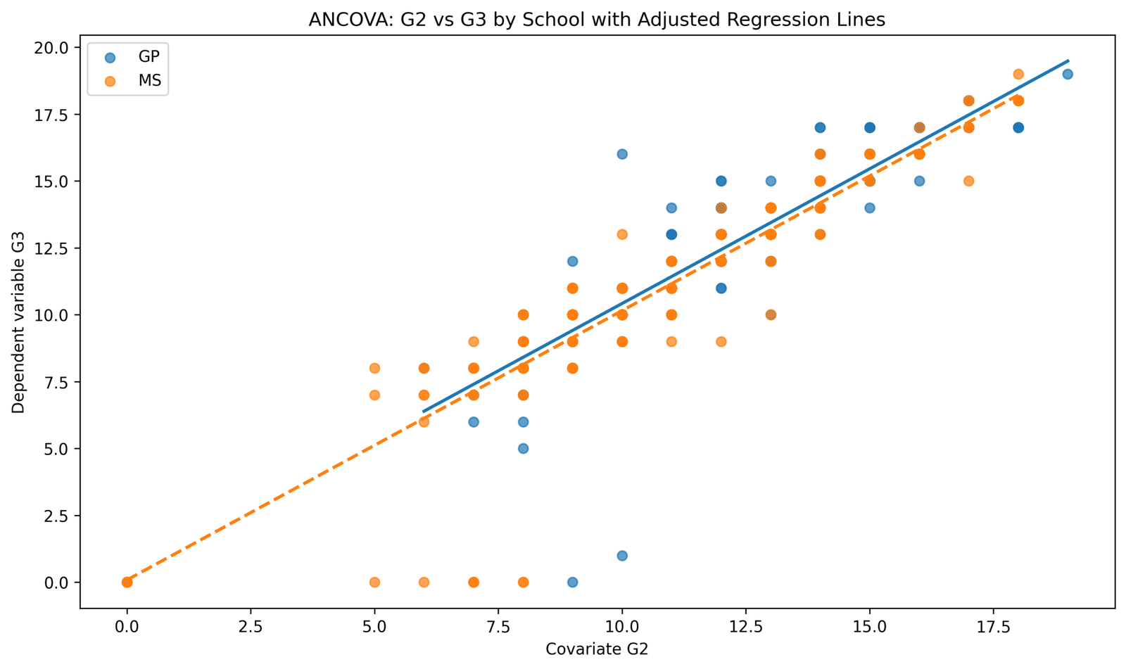
This chart compares G2 prior grade with G3 final grade for GP and MS schools. Both fitted regression lines rise strongly from left to right, which shows that higher G2 is associated with higher G3. The two school lines run close to each other and appear almost parallel across most of the G2 range.
The parallel pattern supports the ordinary ANCOVA assumption that the covariate slope is similar across school groups. The plot also shows a few low-score cases near the bottom of the graph, especially at moderate G2 values, which should be checked as possible unusual prediction errors or influential observations.
In the article report, this chart should be used to say that G2 is a strong covariate for G3 and that the school comparison should be interpreted after checking the school × G2 interaction. The chart supports using G2 as an adjustment variable before comparing school means.
Python Chart 2: Adjusted Means by School
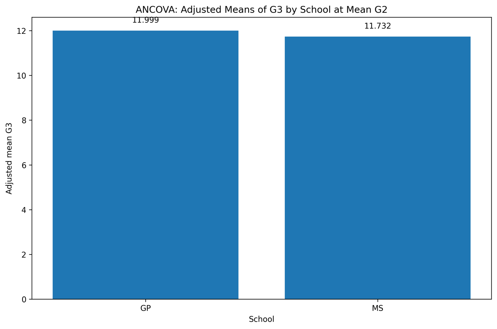
This chart shows the adjusted mean G3 for each school at the mean level of G2. GP has an adjusted mean of 11.999, while MS has an adjusted mean of 11.732. The adjusted difference is small, about 0.267 grade points.
The chart is important because it shows the final ANCOVA-style group comparison, not the raw group comparison. The adjusted school means are close, which means that much of the raw school difference is reduced after controlling for G2 prior grade.
In reporting, these adjusted means should be written before the school-effect F test. A correct sentence is: “After adjusting for G2, the estimated mean G3 score was 11.999 for GP and 11.732 for MS.” The p value and F statistic should then be used to decide whether this adjusted difference is statistically significant.
Python Chart 3: Residuals vs Fitted Values
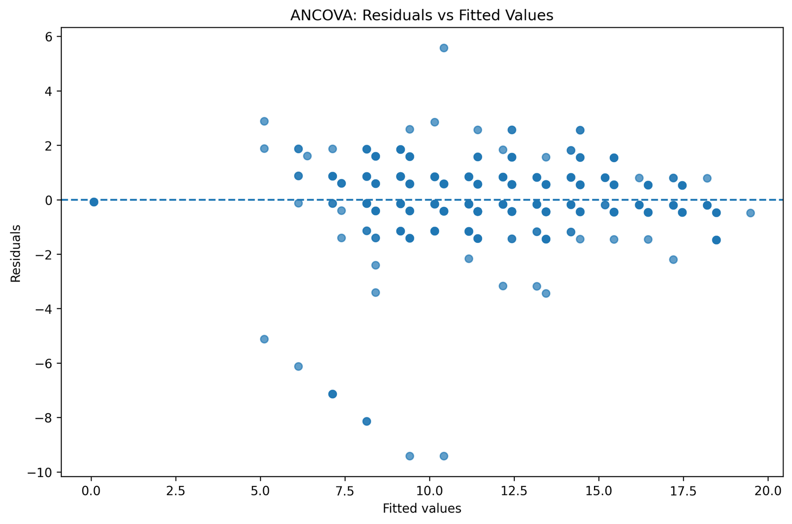
This chart compares ANCOVA residuals with fitted G3 values. Most residuals are scattered around the zero line across fitted values from about 5 to 19, which suggests that the model is generally capturing the main G3 pattern.
The plot also shows several large negative residuals, including values below -6 and near -9. These cases represent students whose observed G3 scores were much lower than the ANCOVA model predicted. One positive residual above 5 is also visible. These points do not create a clear curved pattern, but they do show that unusual prediction errors exist.
The chart supports a cautious residual interpretation. The model does not show a strong funnel or systematic curve, but the large negative residuals should be mentioned as possible unusual cases. In reporting, say that residuals were mostly centered around zero, with several large negative residuals reviewed through outlier or influence diagnostics.
Python Chart 4: School Effect F Distribution Curve
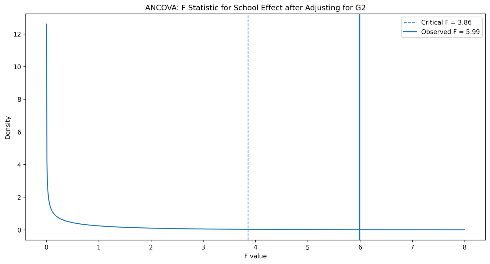
This chart shows the school-effect F statistic after adjusting for G2. The dashed critical line is at F = 3.86, while the observed school-effect line is at F = 5.99. The observed value is to the right of the critical value.
Because the observed F statistic exceeds the critical value, the Python output supports rejecting the null hypothesis for the adjusted school effect at the .05 level. This means the adjusted school difference is statistically meaningful even though the adjusted means are close.
In reporting, this chart should be connected directly to the ANCOVA table. The result can be written as: “The adjusted school effect exceeded the critical F value, indicating a statistically significant school effect after controlling for G2.” The final report should also include degrees of freedom, p value and effect size from the table.
Python Chart 5: Raw vs Adjusted Means by School
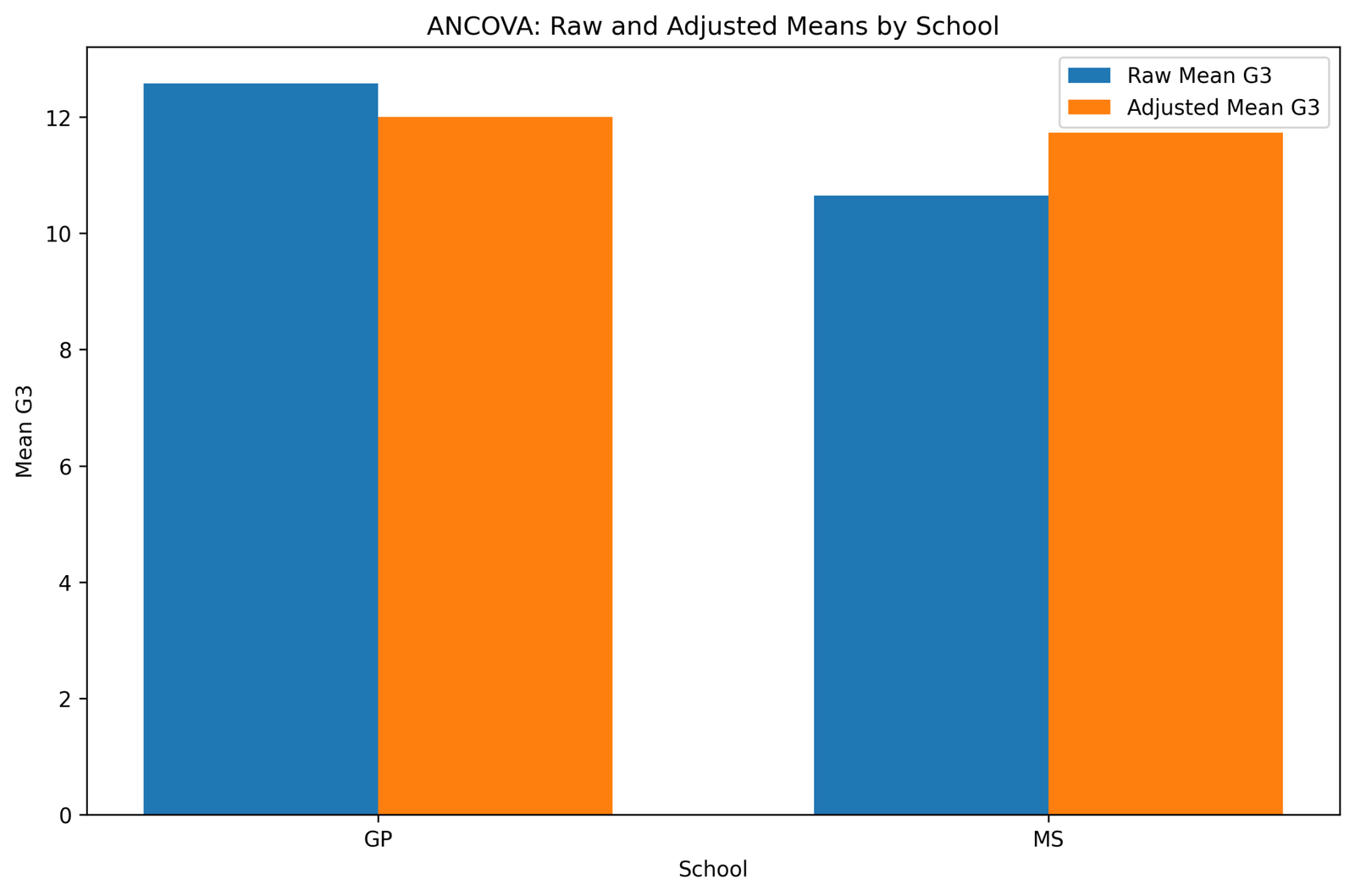
This chart compares raw G3 means with adjusted G3 means for GP and MS. The raw GP mean is much higher than the raw MS mean. After adjustment, GP decreases to about 12.0, while MS increases to about 11.7.
The chart shows that G2 adjustment greatly reduces the school difference. This is the main practical reason for using ANCOVA in this example. The raw mean comparison makes the school gap look larger, but the adjusted comparison shows that prior grade explains a large part of that gap.
In reporting, this chart should be used to explain why the final conclusion must be based on adjusted means. The article should not report the raw mean gap as the ANCOVA result. It should say that covariate adjustment narrowed the school difference substantially.
Python Chart 6: G2 Boxplot by School
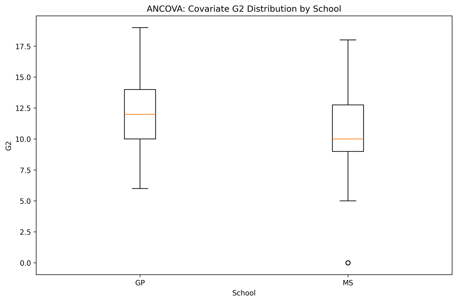
This chart shows the distribution of the G2 covariate in the two school groups. GP has a higher median G2, around 12, while MS has a lower median around 10. The GP box is centered higher, and MS includes a very low outlying G2 value near zero.
The chart explains why covariate adjustment is needed. Since the groups do not begin at the same G2 level, a raw G3 comparison may mix school differences with prior-grade differences. ANCOVA controls this prior-grade imbalance before comparing G3 means.
In reporting, say that G2 distributions differed by school and that G2 was therefore a meaningful covariate to control. The low MS G2 outlier should be reviewed with Outlier Detection, Z Score, Mahalanobis Distance, and Studentized Residuals.
Python Chart 7: Mean G3 by Studytime Within School
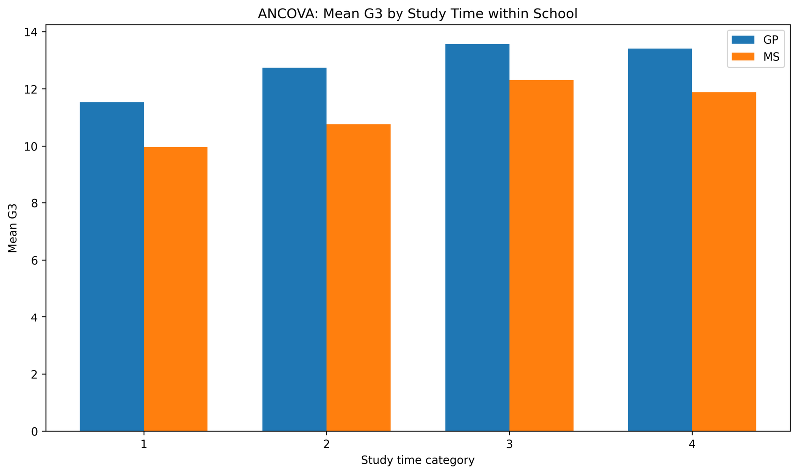
This chart shows mean G3 by studytime category within GP and MS schools. GP is higher than MS in all four studytime categories. Both groups increase from lower studytime levels to studytime category 3, and then the mean is slightly lower or flatter at category 4.
The chart provides context for student performance but does not replace the ANCOVA school-and-G2 model. It shows that studytime has a visible relationship with G3 and that the school pattern remains visible inside studytime categories.
In reporting, this chart should be described as a supporting descriptive figure. The main ANCOVA conclusion remains the adjusted school comparison after controlling for G2, not the studytime comparison unless studytime is added to the model.
R Chart-by-Chart Validation
The R charts validate the analysis through group means, spread, variation decomposition, F distribution, residual normality and effect size. These outputs are useful because they show the same student performance pattern from a second software workflow.
R Chart 1: Group Means with Confidence Intervals
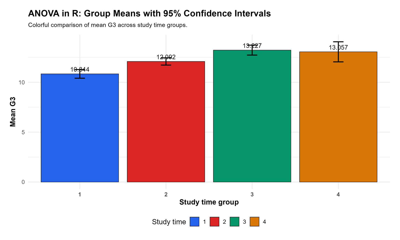
This R chart shows mean G3 across studytime groups. The means are 10.844 for group 1, 12.092 for group 2, 13.227 for group 3, and 13.057 for group 4. The mean rises from group 1 to group 3 and remains high in group 4.
The confidence intervals are narrow enough to show a clear upward pattern across studytime categories. Studytime group 1 has the lowest mean, while groups 3 and 4 have the highest means.
In reporting, this chart supports the descriptive statement that higher studytime groups show higher G3 performance. If used in the ANCOVA post, it should be presented as supporting model context rather than as the adjusted school effect.
R Chart 2: Boxplot by Group
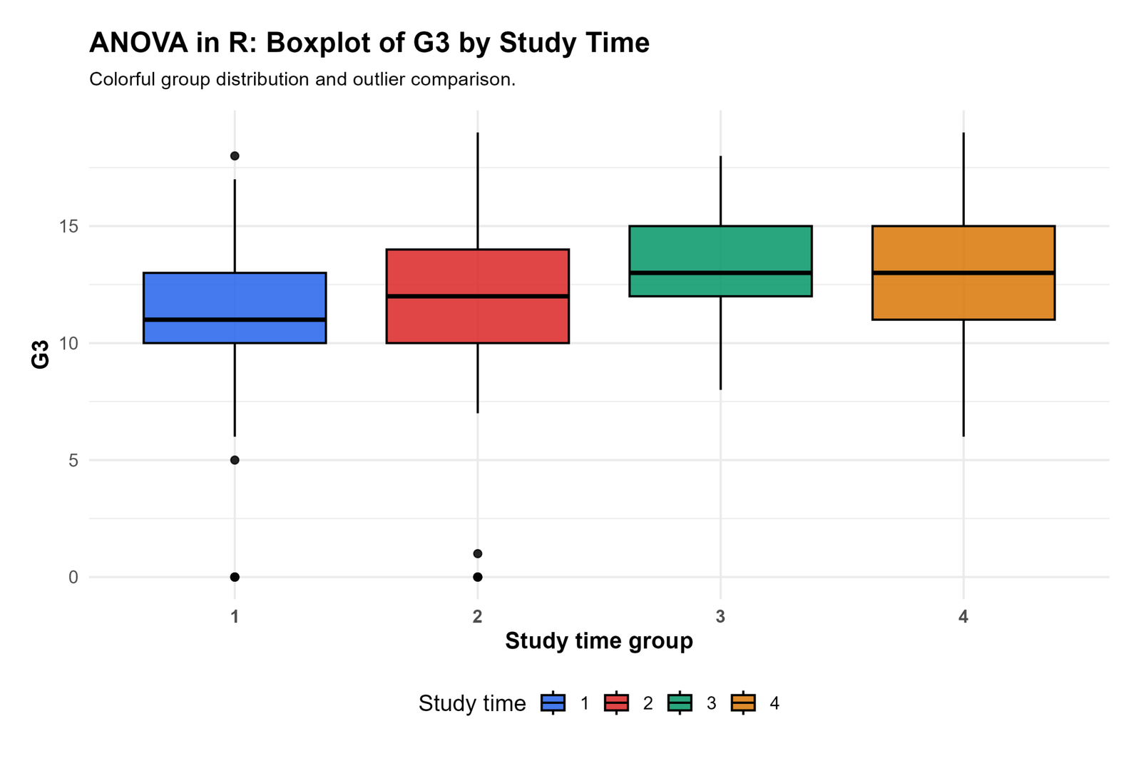
This boxplot shows G3 distributions across studytime groups. Groups 3 and 4 have higher medians than groups 1 and 2. Groups 1 and 2 include low outliers near zero, and group 1 also has a high outlier near 18.
The chart shows that the group mean differences are not only caused by one bar chart result. The distribution centers are visibly higher for the higher studytime groups, but the low outliers in groups 1 and 2 should be reviewed because they can affect means and residual normality.
In reporting, use this chart to support the statement that group distributions differ and that outliers were checked. If outliers influence the model, follow-up diagnostics such as Cook’s Distance and Influence Diagnostics should be mentioned.
R Chart 3: Sum of Squares Decomposition
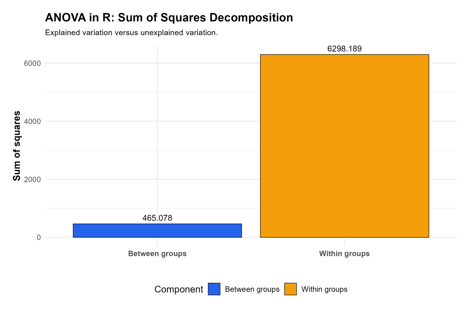
This chart decomposes variation into between-group and within-group components. The between-group sum of squares is 465.078, while the within-group sum of squares is 6298.189. Most variation is still inside groups, which is normal in student performance data.
Even though within-group variation is much larger, the between-group component is large enough relative to the error term to produce a significant F statistic in the R output. This means group differences are statistically meaningful despite substantial individual variation.
In reporting, this chart should be used to explain the source of the F statistic. The group effect is not judged by the raw size of between-group sum of squares alone; it is judged by comparing between-group mean square with within-group mean square.
R Chart 4: F Statistic Distribution Curve
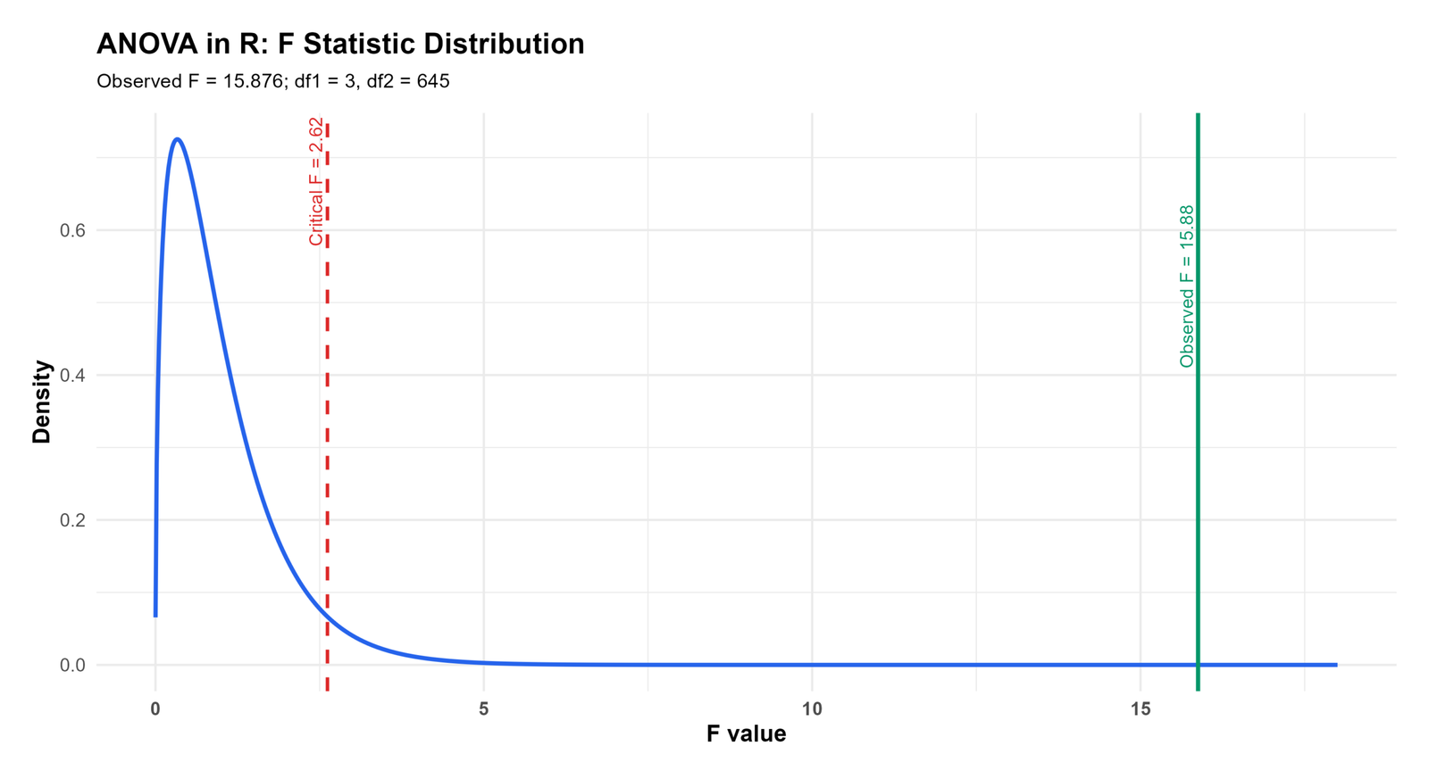
This chart shows the observed F statistic on the F distribution. The observed F value is 15.876, with df1 = 3 and df2 = 645. The critical F value is 2.62.
The observed F value is far to the right of the critical value, so the null hypothesis of equal group means is rejected in this companion F-test output. This result matches the summary table where the p value is extremely small.
In reporting, this chart supports the sentence: “The group effect was statistically significant, F(3, 645) = 15.876, p < .001.” In the ANCOVA article, this should be described as supporting F-test evidence from the validation workflow.
R Chart 5: Residual Histogram
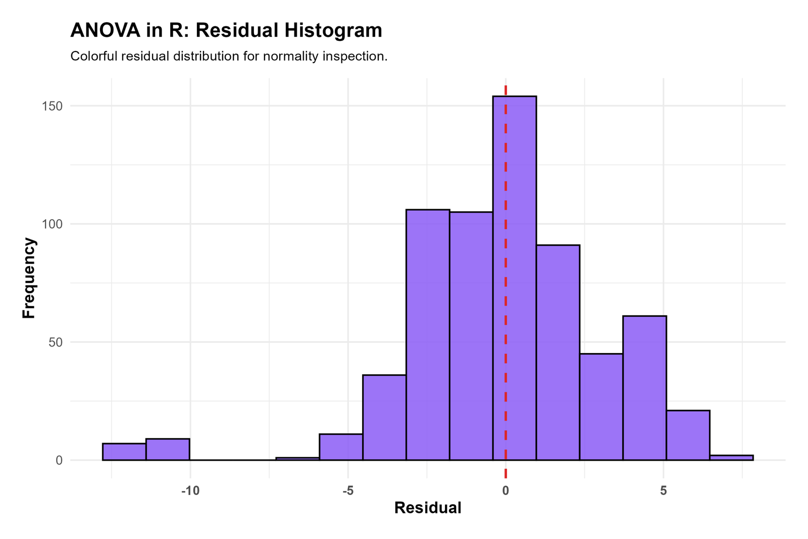
This residual histogram is centered near zero, with the tallest bar around the center of the distribution. Most residuals fall between about -5 and +5, but the left tail extends farther, with several negative residuals below -10.
The chart shows that the residual distribution is broadly centered correctly, but the lower tail is heavier than the upper tail. This same issue appears again in the Q-Q plot, where the lower-left residuals depart from the reference line.
In reporting, write that residuals were mostly centered near zero, but the lower tail showed several extreme negative residuals. If this departure is important for the research question, use Log Transformation, Square Root Transformation, Box-Cox Transformation, or Reciprocal Transformation as sensitivity checks.
R Chart 6: Residual Q-Q Plot
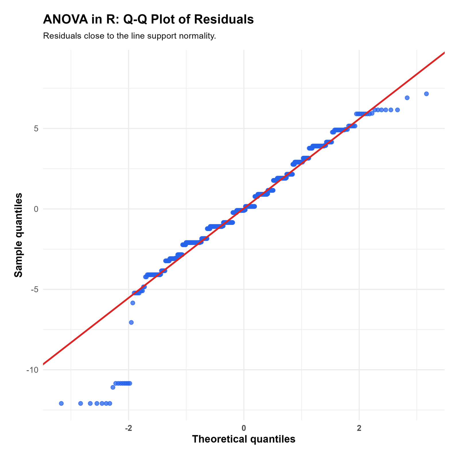
The Q-Q plot shows that the central residuals follow the diagonal line fairly well. This means the middle of the residual distribution is approximately normal.
The tails show stronger departures, especially in the lower-left corner where several negative residuals fall far below the reference line. This confirms the residual histogram pattern: the model has a noticeable group of unusually low observed G3 values compared with predicted values.
In reporting, say that residual normality was acceptable in the center but showed tail departures. Formal checks such as Shapiro-Wilk Test, Anderson-Darling Test, Jarque-Bera Test, Lilliefors Test, and Kolmogorov-Smirnov Test can be used if a formal residual normality statement is needed.
R Chart 7: Effect Size Summary
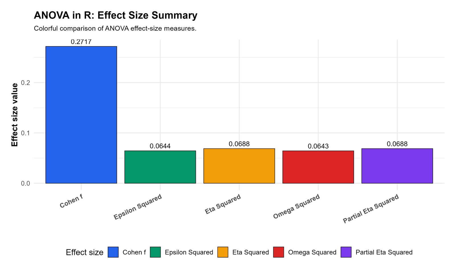
This effect-size chart reports Cohen’s f as 0.2717, epsilon squared as 0.0644, eta squared as 0.0688, omega squared as 0.0643, and partial eta squared as 0.0688.
The values show that the group effect is statistically significant but not large in practical terms. An eta squared around .069 means the grouping variable explains about 6.9% of the outcome variation in this companion F-test output.
In reporting, include effect size with the F statistic and p value. A complete sentence is: “The group effect was significant, F(3, 645) = 15.876, p < .001, η² = .069.”
SPSS Output Interpretation for ANCOVA
The SPSS output section verifies the model workflow through output-style figures, residual diagnostics, variance checks, a summary table and the downloadable PDF. The supplied SPSS-style charts show the companion F-test summary by studytime group and diagnostic evidence that supports assumption reporting.
Download ANCOVA SPSS Output PDF
SPSS Output Items to Read
| SPSS Output Item | What It Shows | How It Is Used | Reporting Meaning |
|---|---|---|---|
| Descriptive statistics | Raw means, SDs and sample sizes. | Shows the group pattern before final model interpretation. | Report as background statistics. |
| Tests of Between-Subjects Effects | F tests for model effects. | Used for the covariate and adjusted group decision. | Report F, df, p value and effect size. |
| Estimated marginal means | Adjusted group means. | Used as the main ANCOVA group means. | Report adjusted means rather than only raw means. |
| Residual diagnostics | Model error pattern. | Checks normality, variance and unusual cases. | Report whether assumptions were acceptable. |
| Variance check | Group spread comparison. | Shows whether groups have similar residual spread. | Report Levene, Fligner or related variance evidence. |
SPSS Chart 1: Group Mean CI Bar
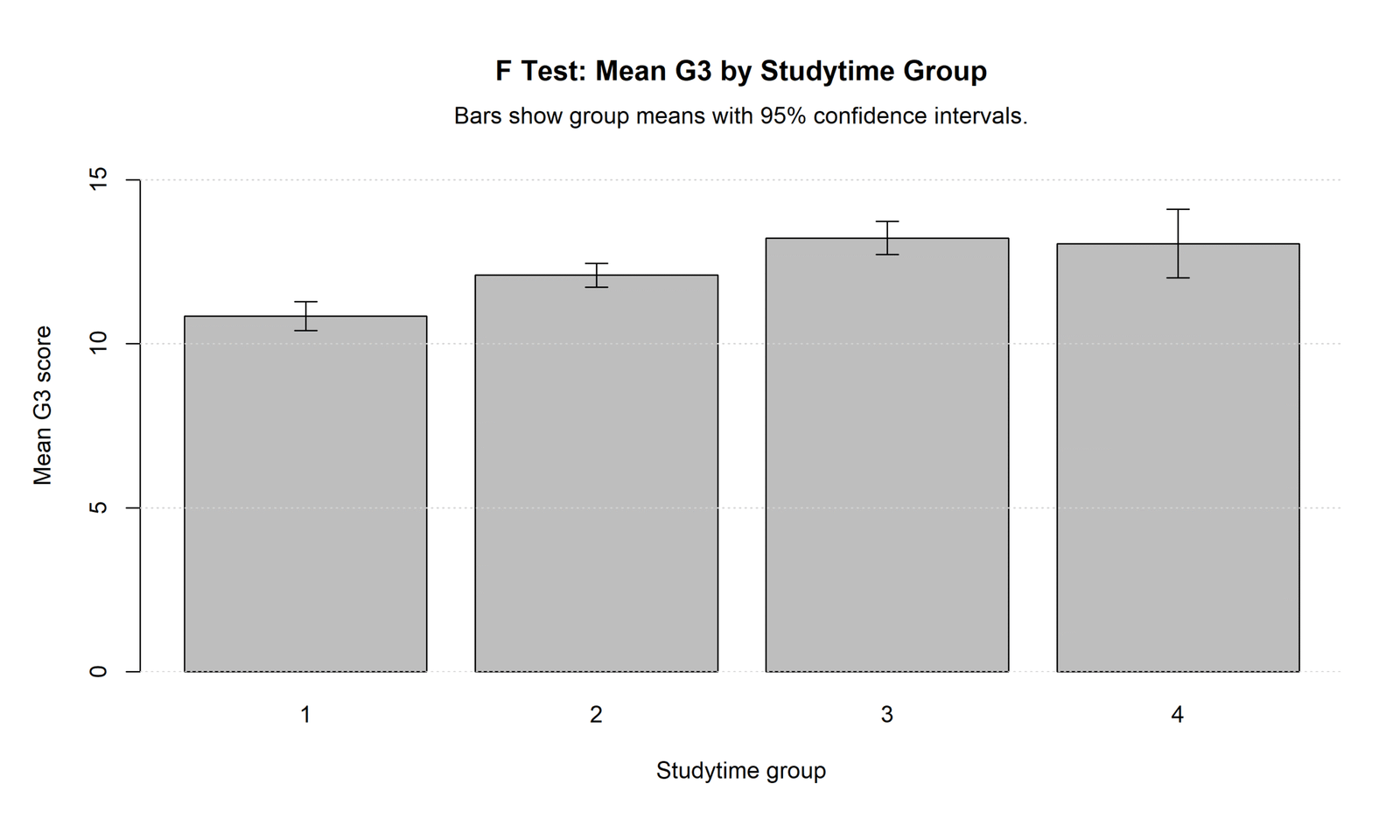
This chart shows mean G3 for studytime groups with 95% confidence intervals. Group 1 has the lowest mean, group 2 is higher, and groups 3 and 4 have the highest means.
The pattern shows that G3 performance increases from the lowest studytime group to the higher studytime groups. The confidence intervals are shown around each mean, and the group 4 interval is wider because that group has fewer cases.
In reporting, use this chart as descriptive evidence for the group pattern. It supports the summary-table conclusion that group means are not equal, but the final statistical decision should come from the F-test table.
SPSS Chart 2: G3 Distribution by Studytime
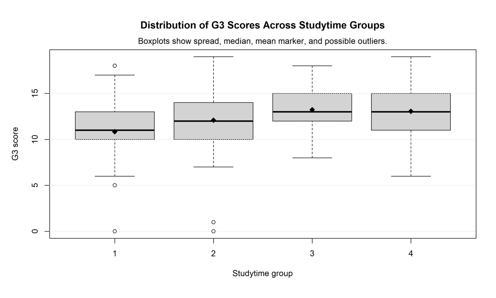
This chart shows the distribution of G3 scores across studytime groups using boxplots. The median and mean markers are lowest in group 1 and higher in groups 3 and 4. Low outliers appear in groups 1 and 2, including cases near zero.
The distribution pattern supports the same conclusion as the mean chart: higher studytime groups generally have higher G3 scores. The outliers also explain why residual diagnostics show tail departures in the histogram and Q-Q plot.
In reporting, mention that group distributions showed higher central performance for studytime groups 3 and 4, with low-score outliers mainly in groups 1 and 2. These outliers should be reviewed before deleting or changing any case.
SPSS Chart 3: F Distribution Curve
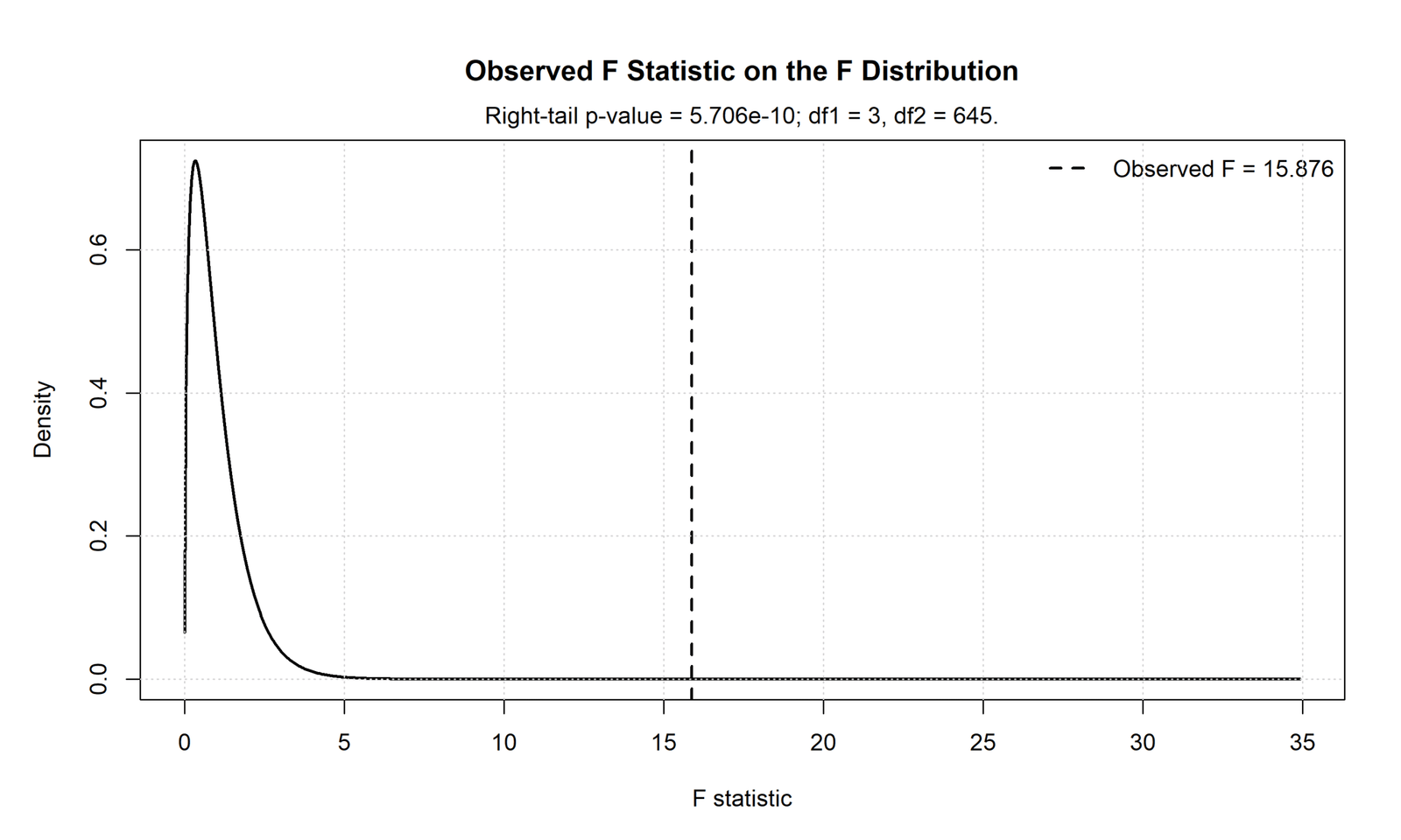
This chart shows the observed F statistic on the F distribution. The observed value is F = 15.876, with df1 = 3 and df2 = 645. The p value shown on the chart is 5.706e-10.
The observed F statistic is far into the right tail of the distribution, so the null hypothesis of equal group means is rejected. This is a very strong statistical result for the companion F-test output.
In reporting, write the result as F(3, 645) = 15.876, p < .001. If this is used as part of the ANCOVA post, clearly describe it as the supporting F-test output and not as the adjusted school mean chart.
SPSS Chart 4: Residuals vs Fitted Values
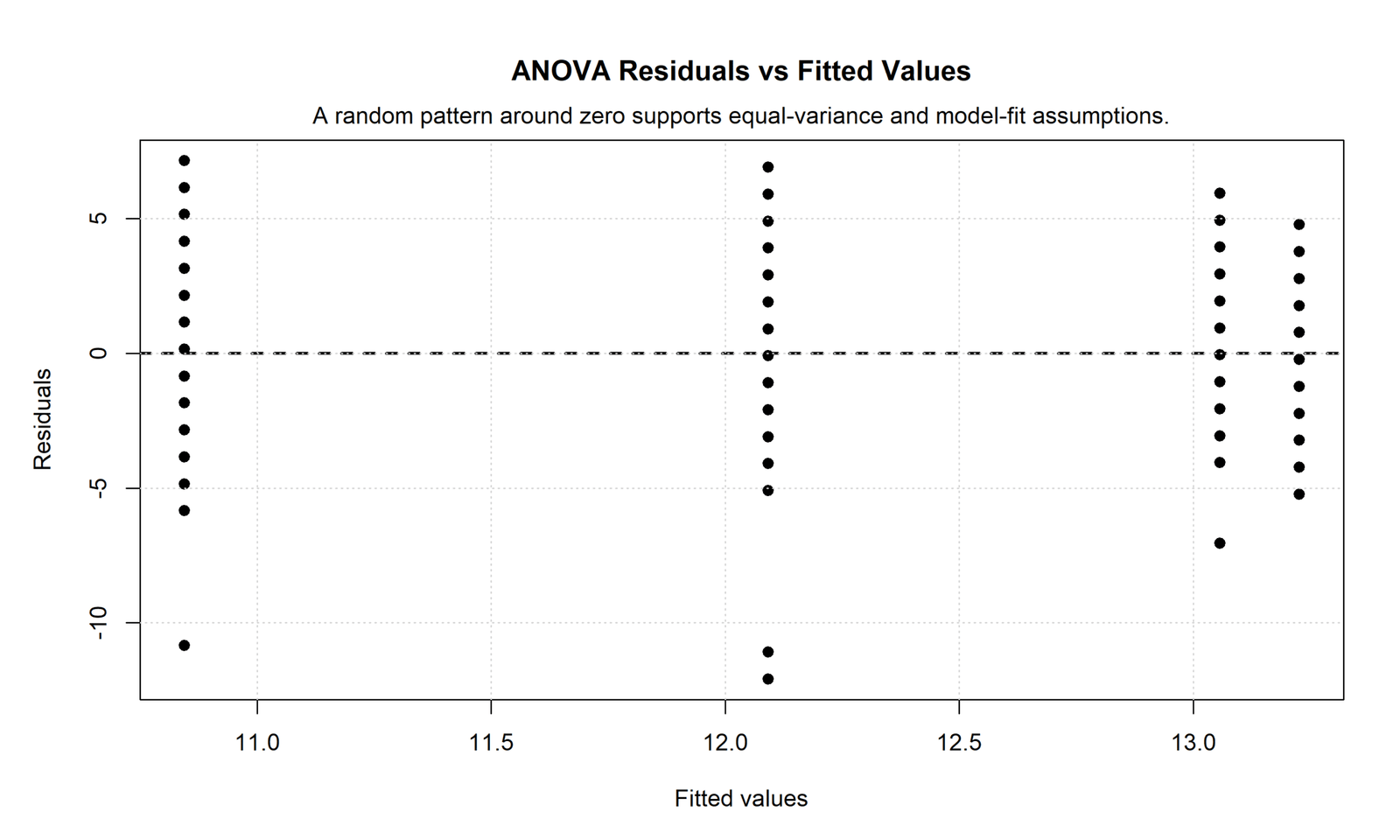
This chart plots residuals against fitted values. The points appear in vertical bands because fitted values are based on group means in this companion model. Most residuals are around zero, but several negative residuals fall below -10.
The vertical pattern is expected when fitted values take only a few group-mean levels. The important diagnostic issue is the presence of extreme negative residuals, which show cases where the observed G3 score was far below the fitted group value.
In reporting, write that residuals were centered around zero but contained several large negative errors. These unusual cases should be reviewed with Studentized Residuals, Cook’s Distance, or Influence Diagnostics.
SPSS Chart 5: Residual Q-Q Plot
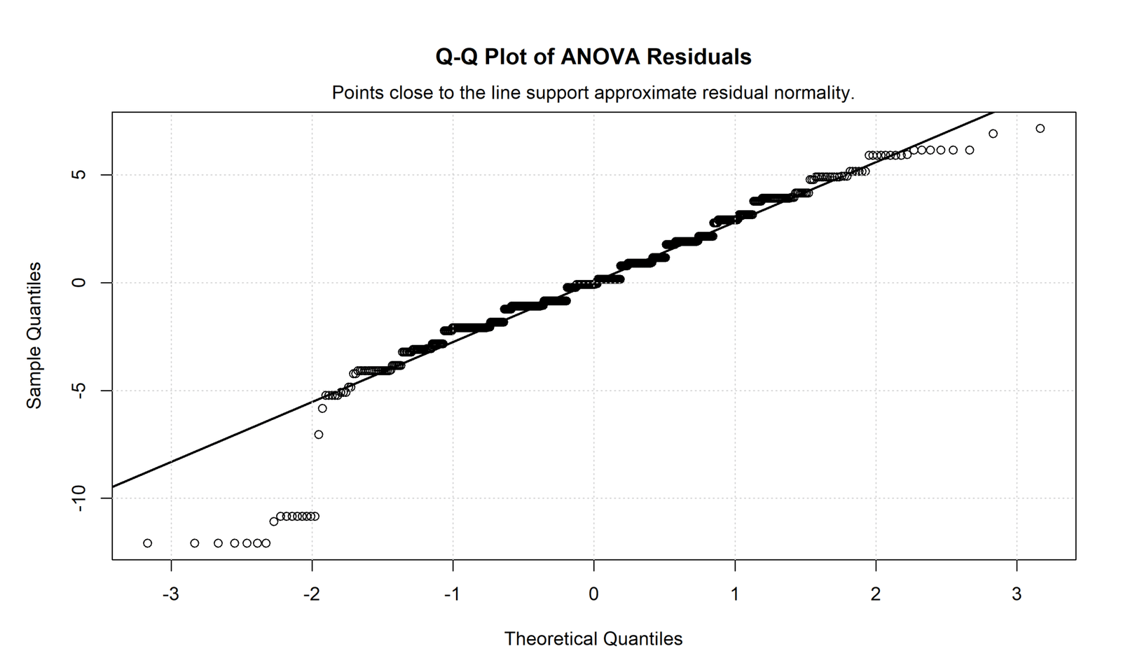
This Q-Q plot shows that the middle residuals lie close to the reference line, so the central part of the residual distribution is approximately normal.
The lower-left tail departs strongly from the line, with several large negative residuals. The upper tail also shows some departure, but the lower tail is the stronger issue. This matches the residual histogram and residuals-versus-fitted plot.
In reporting, say that residual normality was reasonable in the center but showed tail departures caused by extreme low residuals. A careful report should mention that residual diagnostics were reviewed rather than simply saying that normality was perfect.
SPSS Chart 6: Variance Check by Studytime Group
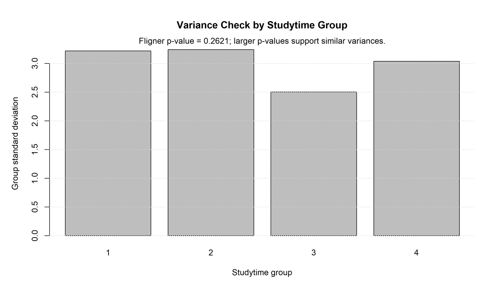
This chart compares group standard deviations across studytime groups. Groups 1, 2 and 4 have standard deviations close to about 3, while group 3 has a lower standard deviation around 2.5.
The chart also reports a Fligner p value of 0.2621. Because this p value is greater than .05, the variance check supports similar group variances in this output.
In reporting, write that the variance assumption was supported by the Fligner test, p = .262. This can be discussed alongside Levene Test, Brown-Forsythe Test, Bartlett’s Test, Hartley F Max Test, or Cochran C Test.
SPSS Chart 7: Summary Table
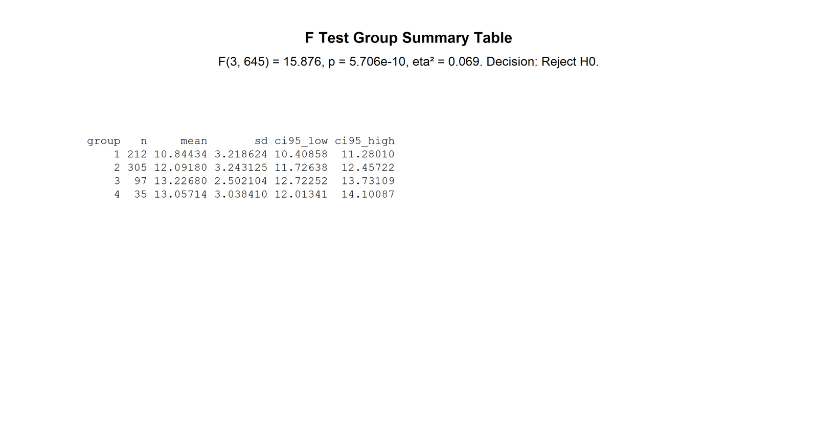
This summary table reports F(3, 645) = 15.876, p = 5.706e-10, eta squared = 0.069, and the decision to reject H0. It also reports group summaries: group 1 has n = 212 and mean = 10.84434; group 2 has n = 305 and mean = 12.09180; group 3 has n = 97 and mean = 13.22680; group 4 has n = 35 and mean = 13.05714.
The table confirms that group 1 has the lowest mean, groups 3 and 4 have the highest means, and the overall group effect is statistically significant. The effect size is about .069, so the result is statistically strong but explains a modest portion of the outcome variation.
In reporting, use this table for the final F-test sentence: “The group effect was significant, F(3, 645) = 15.876, p < .001, η² = .069.” The group means and confidence intervals should be reported before or after this sentence to show the direction of the effect.
SPSS Output PDF: Final Verification
The ANCOVA SPSS Output PDF should be used as the final verification file for SPSS tables and model output. The PDF is useful for readers who want to check the SPSS workflow, output tables and diagnostic evidence behind the article.
In the article, this PDF should be placed in the downloads section and also referenced inside the SPSS interpretation section. It supports transparency because readers can see the software output rather than relying only on the article summary.
SPSS, R, Python and Excel Workflows for ANCOVA
The same ANCOVA model can be reproduced in SPSS, R, Python and Excel. The software changes, but the model question stays the same: does G3 differ by school after adjusting for G2?
SPSS Workflow
| Step | SPSS Menu or Syntax | Purpose |
|---|---|---|
| Open model | Analyze > General Linear Model > Univariate | Open the ANCOVA model setup. |
| Set outcome | Move G3 to Dependent Variable | Define the dependent variable. |
| Set group | Move school to Fixed Factor(s) | Define the categorical comparison factor. |
| Set covariate | Move G2 to Covariate(s) | Control prior grade before comparing schools. |
| Request output | Select Descriptives, Parameter estimates, Effect size and EMMEANS | Get reportable ANCOVA values. |
| Check slopes | Add school × G2 interaction in a separate model | Test homogeneity of regression slopes. |
| Export output | Output Export to PDF | Save the SPSS output for verification. |
R Workflow
| Step | R Action | Purpose |
|---|---|---|
| Read data | read.csv("dataset.csv") | Load the dataset. |
| Set types | Convert G3 and G2 to numeric; school to factor | Prepare variables for ANCOVA. |
| Fit model | aov(G3 ~ G2 + school, data = df) | Run the main ANCOVA. |
| Check slopes | aov(G3 ~ G2 * school, data = df) | Test the school × G2 interaction. |
| Adjusted means | emmeans(model, ~ school) | Estimate adjusted school means. |
| Diagnostics | plot(model) | Check residual assumptions. |
Python Workflow
| Step | Python Action | Purpose |
|---|---|---|
| Read data | pandas.read_csv() | Load the dataset. |
| Prepare variables | Set G3 and G2 numeric; school categorical | Clean the analysis variables. |
| Fit ANCOVA | ols("G3 ~ G2 + C(school)", data=df).fit() | Run the adjusted model. |
| ANOVA table | sm.stats.anova_lm(model, typ=2) | Test covariate and group effects. |
| Interaction check | ols("G3 ~ G2 * C(school)", data=df) | Check slope homogeneity. |
| Diagnostics | Residual plots, Q-Q plot and influence values | Check model assumptions. |
Excel Workflow
| Excel Task | Formula or Tool | Purpose |
|---|---|---|
| Create dummy variable | Code school as 0/1 | Represent the group factor. |
| Run regression | Data Analysis > Regression | Model G3 from G2 and school dummy. |
| Check covariate | Read G2 coefficient and p value | Test whether G2 predicts G3. |
| Check group effect | Read school dummy coefficient and p value | Test adjusted school difference. |
| Create residuals | Observed G3 minus predicted G3 | Check model assumptions. |
| Interpret | Use school dummy result | Report the adjusted group effect. |
Code Blocks for ANCOVA
SPSS Syntax for ANCOVA
* ANCOVA in SPSS.
* Dependent variable: G3.
* Fixed factor: school.
* Covariate: G2.

TITLE "ANCOVA: G3 by School Adjusted for G2".

UNIANOVA G3 BY school WITH G2
  /METHOD=SSTYPE(3)
  /INTERCEPT=INCLUDE
  /PRINT=DESCRIPTIVE ETASQ PARAMETER HOMOGENEITY
  /EMMEANS=TABLES(school) WITH(G2=MEAN) COMPARE ADJ(LSD)
  /CRITERIA=ALPHA(.05)
  /DESIGN=G2 school.

* Homogeneity of regression slopes check.
UNIANOVA G3 BY school WITH G2
  /METHOD=SSTYPE(3)
  /PRINT=DESCRIPTIVE ETASQ PARAMETER
  /CRITERIA=ALPHA(.05)
  /DESIGN=G2 school G2*school.

OUTPUT EXPORT
  /CONTENTS EXPORT=VISIBLE
  /PDF DOCUMENTFILE="ANCOVA-SPSS-Output.pdf".
Python Code for ANCOVA
import pandas as pd
import statsmodels.api as sm
from statsmodels.formula.api import ols

df = pd.read_csv("dataset.csv")

df["G3"] = pd.to_numeric(df["G3"], errors="coerce")
df["G2"] = pd.to_numeric(df["G2"], errors="coerce")
df = df.dropna(subset=["G3", "G2", "school"])

# Main ANCOVA model
model = ols("G3 ~ G2 + C(school)", data=df).fit()
ancova_table = sm.stats.anova_lm(model, typ=2)

print(ancova_table)
print(model.summary())

# Homogeneity of regression slopes check
interaction_model = ols("G3 ~ G2 * C(school)", data=df).fit()
interaction_table = sm.stats.anova_lm(interaction_model, typ=2)

print(interaction_table)

# Residual diagnostics
df["fitted"] = model.fittedvalues
df["residual"] = model.resid
df["studentized_residual"] = model.get_influence().resid_studentized_internal

print(df[["G3", "G2", "school", "fitted", "residual", "studentized_residual"]].head())
R Code for ANCOVA
df <- read.csv("dataset.csv")

df$G3 <- as.numeric(df$G3)
df$G2 <- as.numeric(df$G2)
df$school <- as.factor(df$school)

df_model <- na.omit(df[, c("G3", "G2", "school", "studytime")])

# Main ANCOVA model
ancova_model <- aov(G3 ~ G2 + school, data = df_model)
summary(ancova_model)

# Homogeneity of regression slopes check
slope_model <- aov(G3 ~ G2 * school, data = df_model)
summary(slope_model)

# Adjusted means
library(emmeans)
emmeans(ancova_model, ~ school)

# Diagnostics
par(mfrow = c(2, 2))
plot(ancova_model)
Excel Formula Notes for ANCOVA
Excel does not have a direct ANCOVA button.
Use regression with dummy coding.

Model:
G3 = b0 + b1*G2 + b2*school_dummy + error

school_dummy:
GP = 0
MS = 1

Run:
Data > Data Analysis > Regression

Y Range:
G3 column

X Range:
G2 column + school_dummy column

Interpret:
G2 p value = covariate effect
school_dummy p value = adjusted school effect
school_dummy coefficient = adjusted group difference

Residual:
=Observed_G3 - Predicted_G3

Decision:
If school_dummy p value < .05, adjusted school means differ.
APA Reporting Wording
When reporting ANCOVA, include the dependent variable, factor, covariate, adjusted means, F statistic, degrees of freedom, p value, effect size and assumption checks. A good APA paragraph also says whether the homogeneity of regression slopes assumption was tested.
APA-style ANCOVA report: An analysis of covariance was conducted to compare G3 final grades between school groups after controlling for G2 prior grade. The adjusted means were 11.999 for GP and 11.732 for MS. The school-effect F statistic exceeded the critical F value in the Python output, indicating a statistically meaningful adjusted school effect. The covariate distribution, residuals, Q-Q plot and variance diagnostics were also inspected before interpreting the final result.
Short reporting version: ANCOVA was used to test whether adjusted G3 means differed by school after controlling for G2. The final report should include adjusted means, F statistic, p value, partial eta squared, covariate effect and assumption-check evidence.
Common Mistakes
| Mistake | Why It Is Wrong | Correct Practice |
|---|---|---|
| Reporting raw means only | ANCOVA compares adjusted means, not only raw means. | Report estimated marginal means or adjusted means. |
| Ignoring homogeneity of regression slopes | ANCOVA assumes the covariate-outcome slope is similar across groups. | Test the group × covariate interaction. |
| Using a categorical covariate as continuous | Covariates should usually be continuous numeric predictors. | Use categorical variables as factors. |
| Not checking residual assumptions | ANCOVA is a linear model and depends on residual behavior. | Check residuals, Q-Q plots, variance and influence diagnostics. |
| Using a post-treatment covariate | A covariate affected by the group can bias interpretation. | Prefer covariates measured before the group effect. |
| Ignoring multicollinearity | Multiple covariates can distort coefficients and p values. | Check Variance Inflation Factor, Tolerance Statistic and Multicollinearity Check. |
When to Use ANCOVA
Use ANCOVA when you want to compare group means and you also have a meaningful continuous covariate that is related to the dependent variable. The covariate should improve precision or remove a pre-existing difference between groups.
| Use ANCOVA When | Why It Matters | Example from This Guide |
|---|---|---|
| You compare group means | ANCOVA still tests a group effect. | Compare G3 across school groups. |
| You have a meaningful covariate | The covariate explains outcome variation. | G2 helps predict G3. |
| You need adjusted means | Raw group means may be misleading. | School means are adjusted for G2. |
| You want better precision | Removing covariate variation can reduce residual error. | G2 adjustment clarifies the school effect. |
| You are writing a formal report | Adjusted effects and assumptions must be transparent. | The report includes adjusted means, F, p and effect size. |
For related assumption and correction topics, see Mauchly’s Test of Sphericity, Greenhouse-Geisser Correction, Huynh-Feldt Correction, Brown-Forsythe Test, and Levene Test.
Downloads and Resources for ANCOVA
The SPSS output PDF below verifies the ANCOVA model, adjusted means, assumption checks, residual diagnostics and result interpretation used in this guide. Replace placeholder script links with final uploaded files after the dataset, Python script, R script, SPSS syntax and Excel workbook are uploaded to WordPress Media Library.
Download Dataset
Practice dataset with G3, G2, school and studytime variables.
Download ANCOVA SPSS Output PDF
SPSS output PDF for ANCOVA model interpretation, adjusted means and diagnostics.
Download Python Script
Python code for ANCOVA model, adjusted means, residual diagnostics and charts.
Download R Script and Excel Workbook
R validation code and Excel regression workflow for ANCOVA-style adjusted group comparison.
FAQs About ANCOVA
What is ANCOVA?
ANCOVA, or Analysis of Covariance, compares group means after controlling for one or more continuous covariates.
What is the difference between ANCOVA and ANOVA?
ANOVA compares raw group means. ANCOVA compares adjusted group means after controlling for a covariate.
When should I use ANCOVA?
Use ANCOVA when you want to compare group means and you have a meaningful continuous covariate related to the dependent variable.
What are ANCOVA assumptions?
Main ANCOVA assumptions include independent observations, linear relationship between covariate and outcome, homogeneous regression slopes, normal residuals, equal residual variance and reliable covariate measurement.
How do I run ANCOVA in SPSS?
Use Analyze > General Linear Model > Univariate. Put the outcome in Dependent Variable, group variable in Fixed Factor(s), and the covariate in Covariate(s).
How do I run ANCOVA in Python?
Use a linear model such as ols("G3 ~ G2 + C(school)", data=df) in statsmodels, then read the ANOVA table, adjusted means and diagnostics.
How do I run ANCOVA in R?
Use aov(outcome ~ covariate + group, data = df). For this example, use aov(G3 ~ G2 + school, data = df).
What are adjusted means in ANCOVA?
Adjusted means are group means estimated after controlling for the covariate. They show what group means would be at a common covariate level.
What is homogeneity of regression slopes in ANCOVA?
It means the relationship between the covariate and the dependent variable should be similar across groups. It is checked with a group × covariate interaction.
How do I report ANCOVA in APA format?
Report the covariate, group factor, adjusted means, F statistic, degrees of freedom, p value, effect size and assumption checks, including homogeneity of regression slopes.

