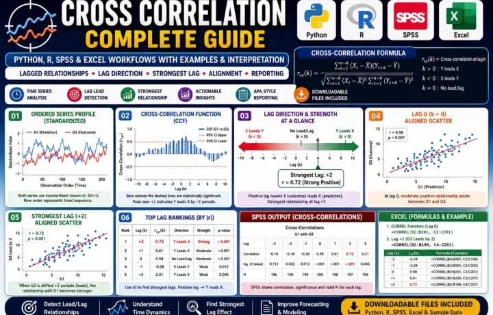
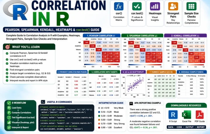
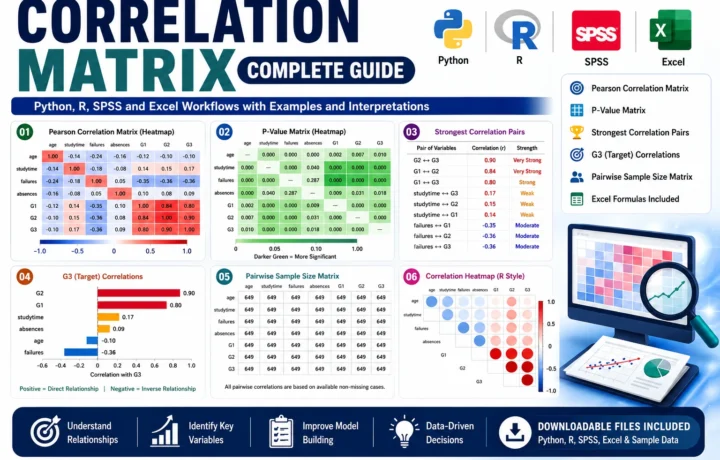
Charts should make results easier to understand. A beautiful chart that hides the point is less useful than a simple chart with clear labels and honest scale choices.
Choose the chart by question
Use bar charts for category comparisons, line charts for change over time, scatterplots for relationships, and boxplots for distributions. The chart type should match the data type.
Avoid 3D effects, crowded legends, and unclear colors. Academic charts should be readable in print and on mobile screens.
Label for interpretation
Titles, axis labels, units, sample notes, and source notes help readers understand the figure without guessing.
When using R, save reusable scripts so charts can be reproduced. Reproducibility is a strong research practice.
Quick checklist
- Chart purpose
- Readable labels
- Correct scale
- Export quality
- Source note
How SALARCAFE can help
Charts and visual reporting using SPSS, R, and publication-friendly styles.
- SPSS chart cleanup
- R visualizations
- Survey dashboards
- Tables and figures
- Presentation-ready exports
View the Data Visualization (SPSS/R) service details.
This article is written for practical decision-making: clear scope, current service expectations, and helpful next steps without keyword stuffing.