
Percentiles and Quartiles: SPSS, Python, R and Excel Guide with Quartile Interpretation
Percentiles and Quartiles divide ordered data into meaningful positions. Percentiles show the value below which a given percentage of observations falls, while quartiles divide the data into four ordered parts. This Percentiles and Quartiles guide explains Q1, median, Q3, IQR, percentile curves, boxplots, SPSS output, Python charts, R charts and Excel calculation steps using G3 final grade data.
Quick Answer: Percentiles and Quartiles
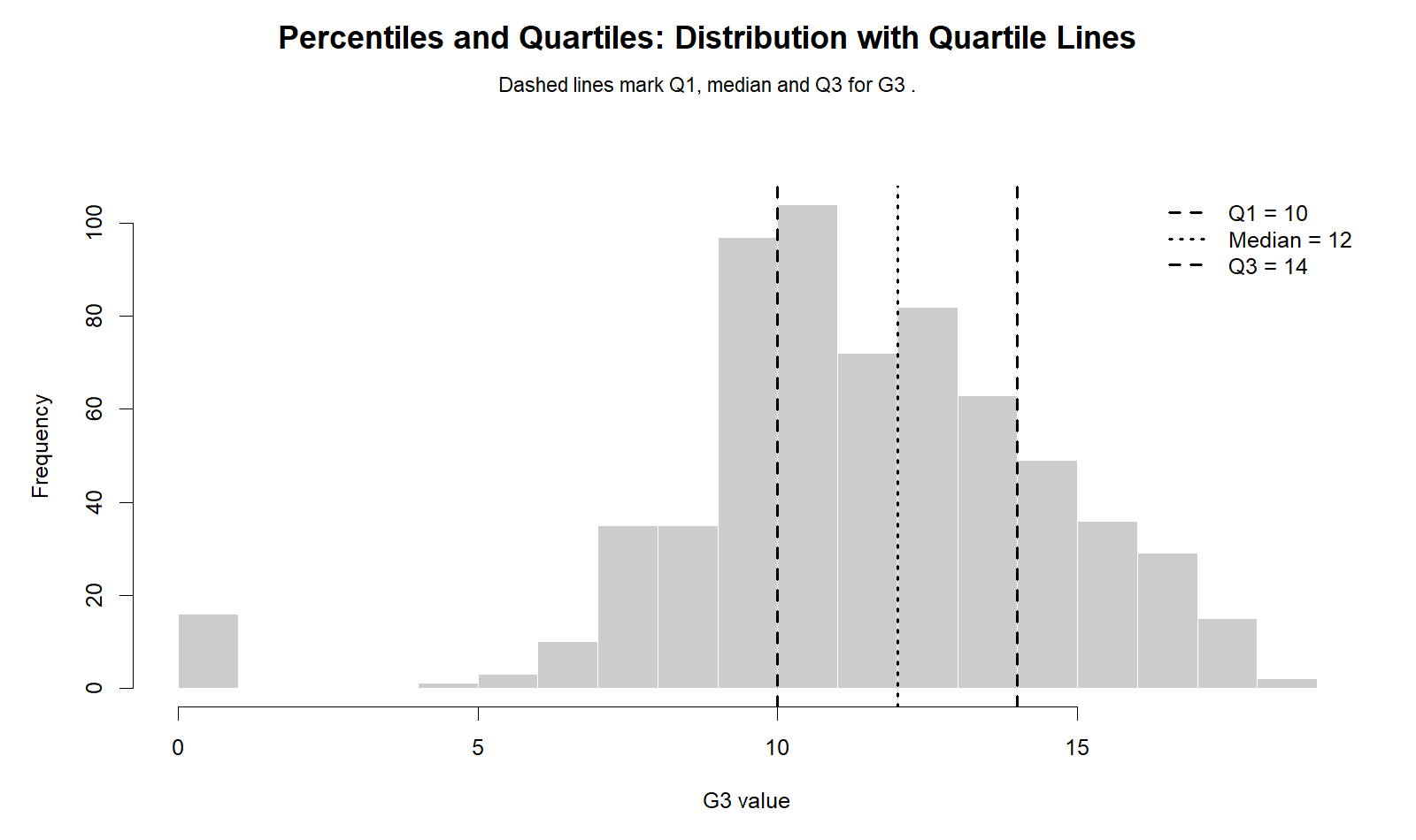
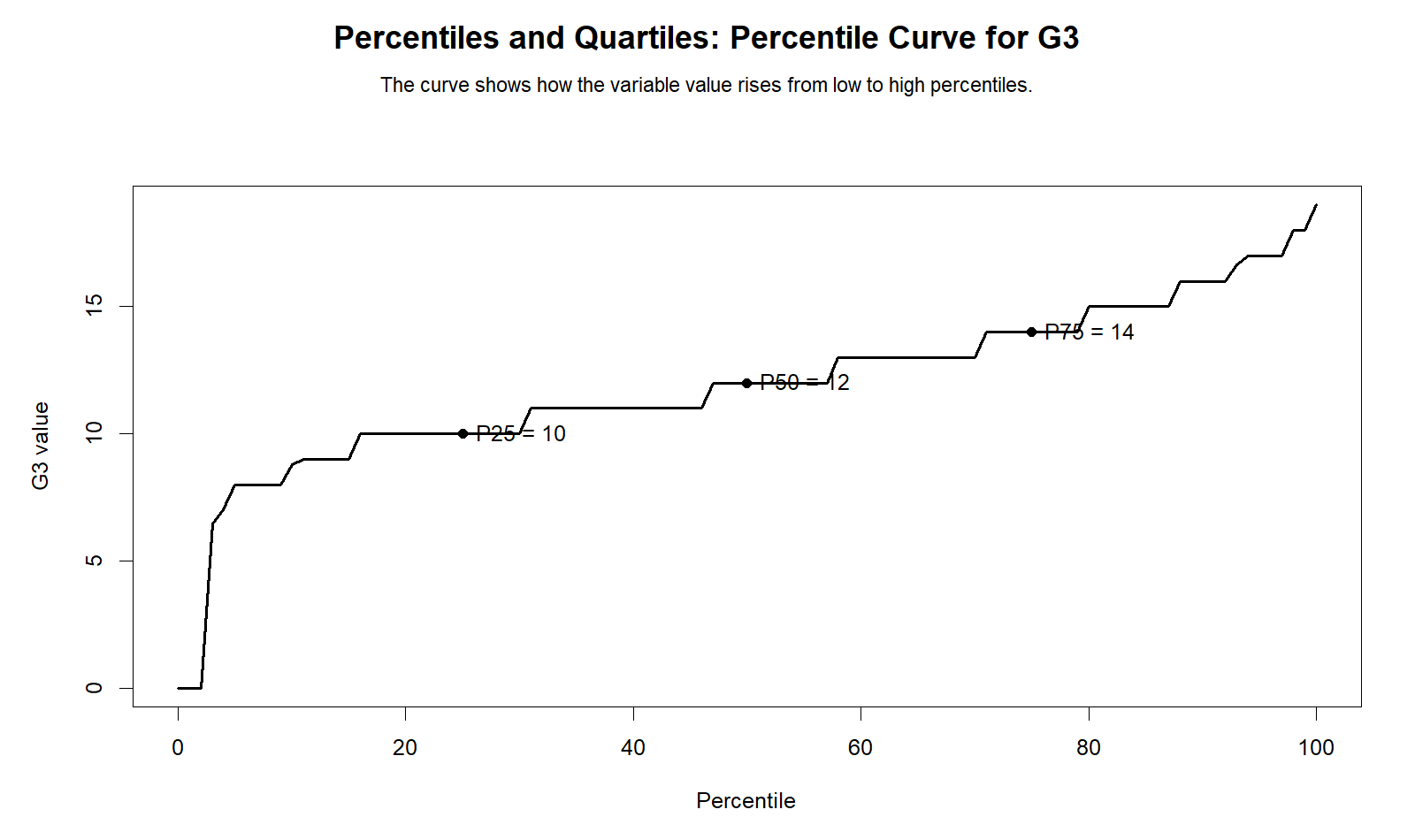
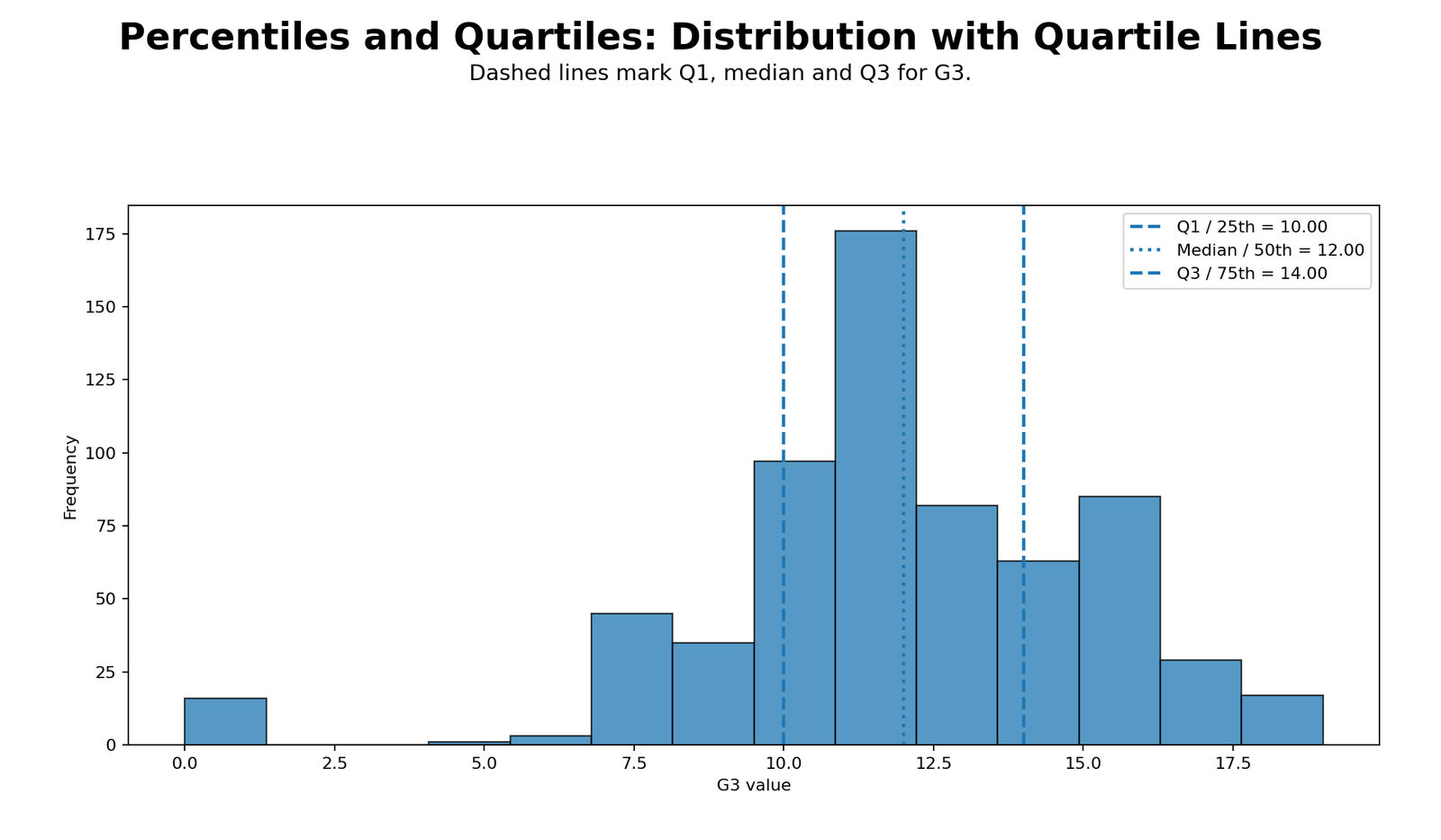
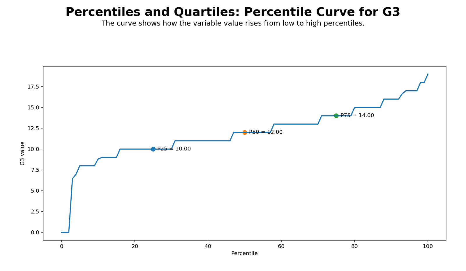
Percentiles and Quartiles are position-based descriptive statistics. In this example, the 25th percentile of G3 is 10, the 50th percentile or median is 12, and the 75th percentile is 14. This means that about 25% of students scored at or below 10, about 50% scored at or below 12, and about 75% scored at or below 14.
The interquartile range is IQR = Q3 − Q1 = 14 − 10 = 4. Therefore, the middle 50% of G3 final grades lie between 10 and 14. In plain reporting language, Percentiles and Quartiles show that the central half of students scored within a fairly narrow four-point band, while some low scores and high scores create a wider full range from 0 to 19.
Main Percentiles and Quartiles Result
G3 final grade: Q1 = 10, median = 12, Q3 = 14, IQR = 4, minimum = 0 and maximum = 19.
Interpretation: The middle 50% of students scored between 10 and 14. The 90th percentile is 16 and the 95th percentile is 17, showing that the strongest upper-end results are concentrated in the high teens.
Conclusion: Percentiles and Quartiles are more robust than the mean when the dataset includes skewness, outliers or a discrete grade scale.
Table of Contents
- What Are Percentiles and Quartiles?
- Percentiles and Quartiles Formulas
- Dataset and Verified SPSS Results
- G3 Percentile Table
- Quartile Summary for Key Variables
- G3 Quartile Groups
- Python Chart-by-Chart Interpretation
- R Chart-by-Chart Interpretation
- SPSS Workflow and Output Interpretation
- R, Python and Excel Workflows
- APA and Report Writing
- When to Use Percentiles and Quartiles
- Downloads and Resources
- Related Guides
- FAQs
What Are Percentiles and Quartiles?
Percentiles and Quartiles are descriptive statistics used to understand the position of values inside an ordered dataset. A percentile tells us the value below which a certain percentage of the data falls. For example, the 25th percentile is the value at or below which about 25% of observations fall. The 90th percentile is the value at or below which about 90% of observations fall.
Quartiles are special percentiles. The first quartile, or Q1, is the 25th percentile. The second quartile, or Q2, is the median or 50th percentile. The third quartile, or Q3, is the 75th percentile. Together, Q1, Q2 and Q3 provide a compact description of the distribution center and spread.
Percentiles and Quartiles are especially useful when a mean alone is not enough. A mean can be pulled by extreme values, while quartiles focus on ordered positions. This is why quartiles are central to box plot interpretation, five number summary, descriptive statistics and outlier checking.
Simple interpretation: If G3 has Q1 = 10, median = 12 and Q3 = 14, then the lower quarter is around 10 or below, the middle point is 12, and the upper quarter begins around 14. The middle half of the distribution lies between 10 and 14.
Percentiles and Quartiles Formulas
There are several software-specific percentile calculation methods, so exact percentile values can sometimes differ slightly between SPSS, R, Python and Excel. However, the concept is the same: sort the values from smallest to largest, then identify the value at a selected cumulative position.
Quartile definitions:
Q1 = 25th percentile
Q2 = 50th percentile = median
Q3 = 75th percentile
IQR = Q3 − Q1
For this G3 example, Percentiles and Quartiles are interpreted as follows:
| Measure | Value | Meaning |
|---|---|---|
| Q1 / 25th percentile | 10 | About 25% of G3 scores are at or below 10. |
| Q2 / 50th percentile / Median | 12 | About half of G3 scores are at or below 12. |
| Q3 / 75th percentile | 14 | About 75% of G3 scores are at or below 14. |
| IQR | 4 | The middle 50% of G3 scores lie across a four-point range from 10 to 14. |
Dataset and Verified SPSS Results for Percentiles and Quartiles
This Percentiles and Quartiles guide uses the student performance dataset. The main variable is G3 final grade, and the supporting variables are G1, G2, age and absences. The SPSS output contains 649 valid cases and no missing values for these variables.
| Variable | Valid N | Missing | Mean | Median | Std. Deviation | Minimum | Maximum | Role |
|---|---|---|---|---|---|---|---|---|
| G1 | 649 | 0 | 11.40 | 11.00 | 2.745 | 0 | 19 | First-period grade |
| G2 | 649 | 0 | 11.57 | 11.00 | 2.914 | 0 | 19 | Second-period grade |
| G3 | 649 | 0 | 11.91 | 12.00 | 3.231 | 0 | 19 | Main final-grade variable |
| age | 649 | 0 | 16.74 | 17.00 | 1.218 | 15 | 22 | Student age |
| absences | 649 | 0 | 3.66 | 2.00 | 4.641 | 0 | 32 | School absences |
Verified result: G3 has mean = 11.91, median = 12.00, mode = 11, standard deviation = 3.231, minimum = 0, maximum = 19, Q1 = 10, Q2 = 12 and Q3 = 14. These values are the foundation of the Percentiles and Quartiles interpretation in this post.
G3 Percentile Table for Percentiles and Quartiles
The SPSS percentile table gives a more detailed view of G3 than quartiles alone. Quartiles focus on the 25th, 50th and 75th percentiles, while the full percentile table also includes the 5th, 10th, 90th and 95th percentiles.
| G3 Percentile | Value | Interpretation |
|---|---|---|
| 5th percentile | 8.00 | Only a small lower-end group scored at or below about 8. |
| 10th percentile | 8.00 | About 10% of scores are at or below 8. |
| 25th percentile / Q1 | 10.00 | The lower quartile boundary is 10. |
| 50th percentile / Median / Q2 | 12.00 | The central score is 12. |
| 75th percentile / Q3 | 14.00 | The upper quartile boundary is 14. |
| 90th percentile | 16.00 | About 90% of students scored at or below 16. |
| 95th percentile | 17.00 | The top 5% of scores are above about 17. |
This table shows why Percentiles and Quartiles are useful for student grade interpretation. Instead of saying only “the mean is 11.91,” we can say that the central half of students scored between 10 and 14, and that the high-performing upper tail starts around 16 to 17.
Quartile Summary for Key Variables
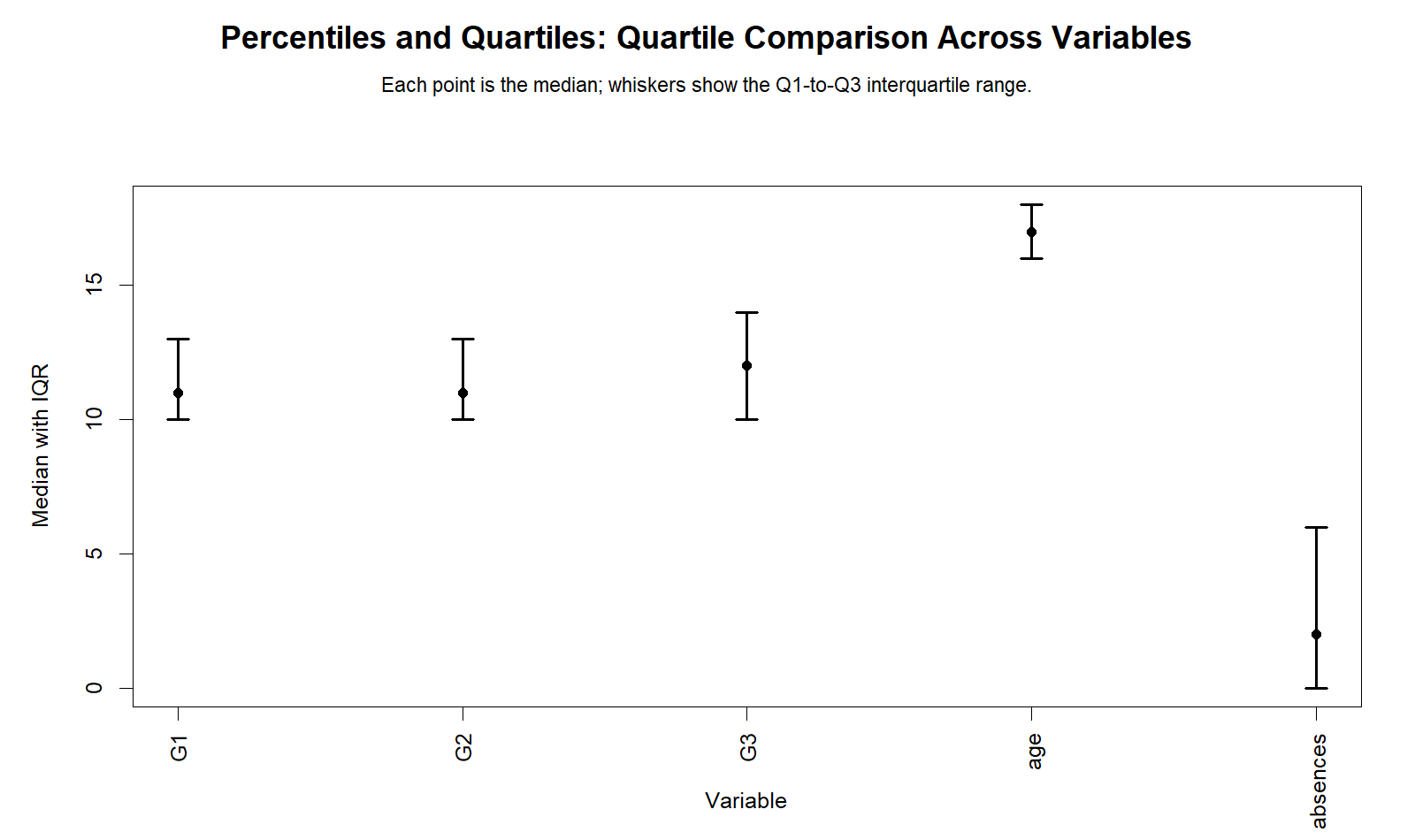
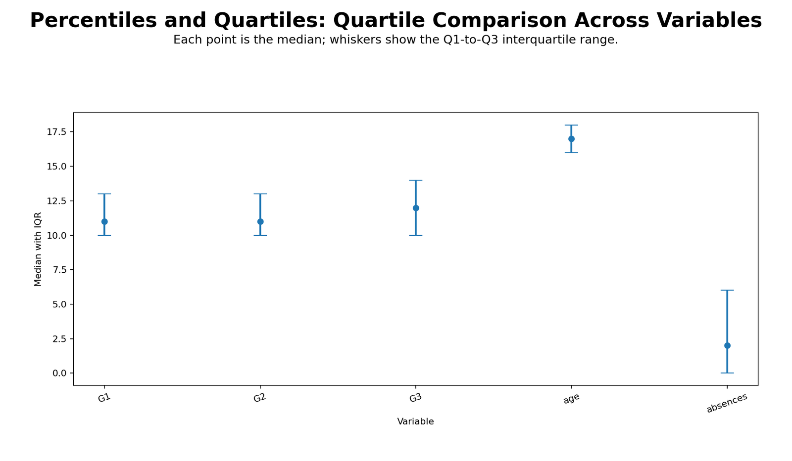
The Percentiles and Quartiles summary below compares G1, G2, G3, age and absences. This comparison helps identify which variables are tightly concentrated and which variables have wider spread.
| Variable | Q1 / 25th | Median / 50th | Q3 / 75th | IQR | Interpretation |
|---|---|---|---|---|---|
| G1 | 10.00 | 11.00 | 13.00 | 3.00 | Middle 50% of first-period grades fall between 10 and 13. |
| G2 | 10.00 | 11.00 | 13.00 | 3.00 | Middle 50% of second-period grades also fall between 10 and 13. |
| G3 | 10.00 | 12.00 | 14.00 | 4.00 | Final grade has a slightly wider middle spread than G1 and G2. |
| age | 16.00 | 17.00 | 18.00 | 2.00 | Age is tightly concentrated between 16 and 18. |
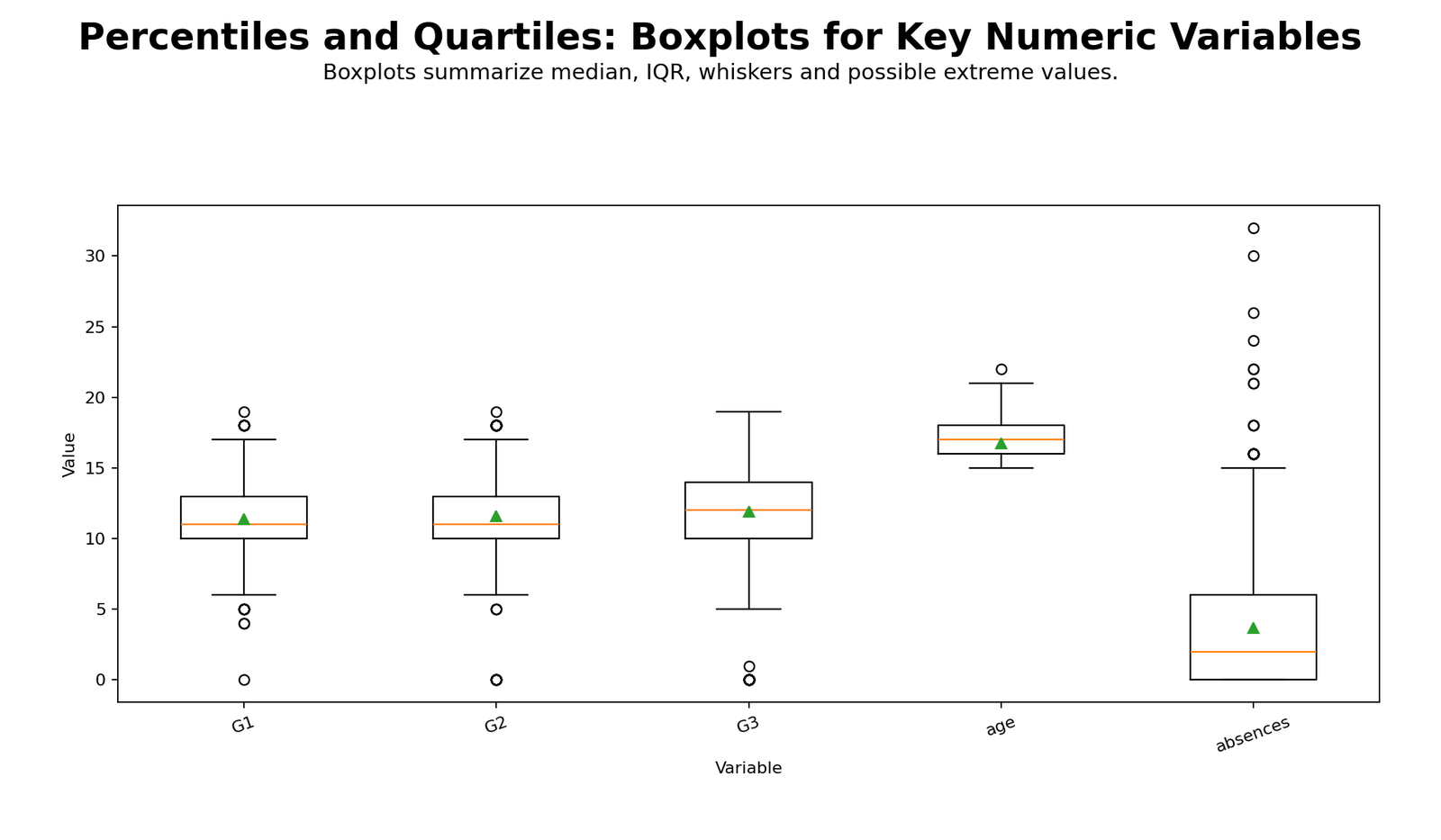
| absences | 0.00 | 2.00 | 6.00 | 6.00 | Absences are more spread out and right-skewed. |
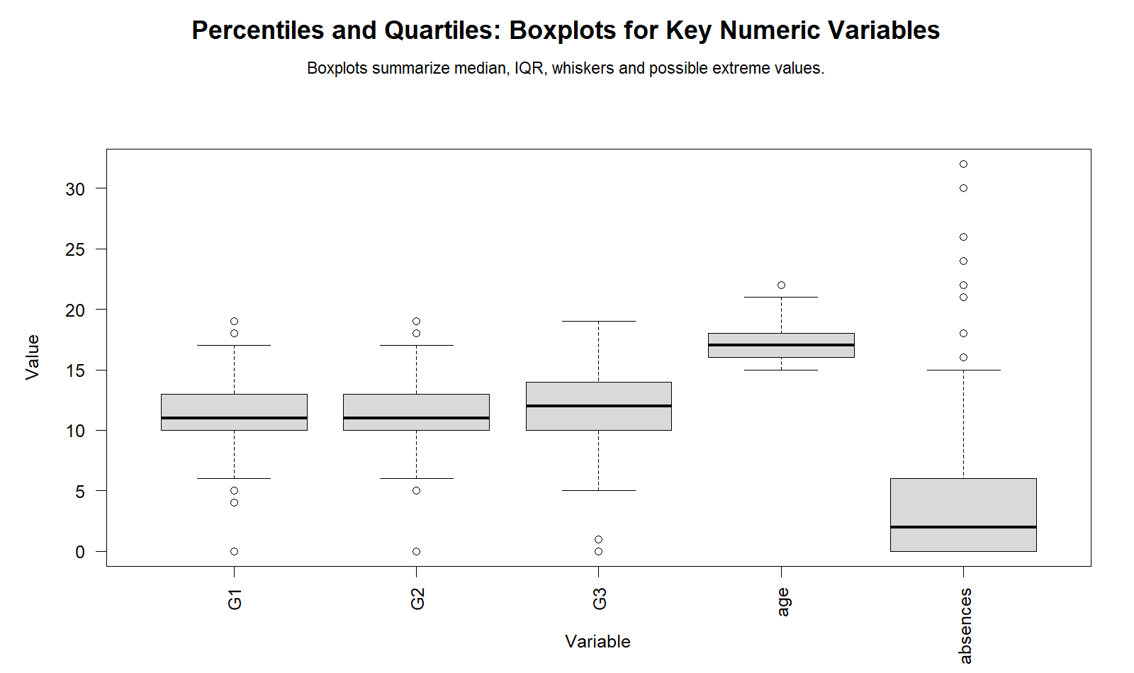
Important interpretation: Absences have the largest IQR among the variables shown here. This means the middle 50% of absence values spread from 0 to 6, while some students have much higher absence counts. In contrast, age has a narrow IQR of only 2.
G3 Quartile Groups
SPSS can also create quartile groups. In this Percentiles and Quartiles analysis, G3 was ranked in ascending order and divided into four percentile groups. Because G3 has many tied grade values, the groups are not exactly 25% each. This is normal when the variable is discrete and many students share the same score.
| G3 Quartile Group | Frequency | Percent | Cumulative Percent | Meaning |
|---|---|---|---|---|
| 1 | 197 | 30.4% | 30.4% | Lowest G3 quartile band. |
| 2 | 104 | 16.0% | 46.4% | Lower-middle G3 quartile band. |
| 3 | 217 | 33.4% | 79.8% | Upper-middle G3 quartile band. |
| 4 | 131 | 20.2% | 100.0% | Highest G3 quartile band. |
G3 Mean and Range by Quartile Group
| G3 Quartile Group | N | Mean | Median | Std. Deviation | Minimum | Maximum | Interpretation |
|---|---|---|---|---|---|---|---|
| 1 | 197 | 8.42 | 9.00 | 2.699 | 0 | 10 | Lowest score band, including very low G3 values. |
| 2 | 104 | 11.00 | 11.00 | 0.000 | 11 | 11 | All cases in this band have G3 = 11 because of tied values. |
| 3 | 217 | 12.96 | 13.00 | 0.789 | 12 | 14 | Middle-to-upper score band. |
| 4 | 131 | 16.12 | 16.00 | 1.089 | 15 | 19 | Highest score band. |
Python Chart-by-Chart Interpretation for Percentiles and Quartiles
The Python charts below explain Percentiles and Quartiles visually. Each chart should be read together with the SPSS table because the chart shows the pattern and the SPSS output provides the verified values.
R Chart-by-Chart Interpretation for Percentiles and Quartiles
The R charts repeat the same Percentiles and Quartiles analysis in a second workflow. This helps confirm that the interpretation is based on the data values, not on one software package.
SPSS Workflow for Percentiles and Quartiles
The SPSS output for this Percentiles and Quartiles guide includes percentile tables, quartile summaries, boxplot review, G3 quartile groups and G3 summary by quartile band.
Open the Percentiles and Quartiles SPSS Output PDF
SPSS Menu Steps
| Goal | SPSS Menu Path | Purpose |
|---|---|---|
| Get percentile table for G3 | Analyze > Descriptive Statistics > Frequencies > Statistics | Select percentiles such as 5, 10, 25, 50, 75, 90 and 95. |
| Get quartiles for key variables | Analyze > Descriptive Statistics > Frequencies | Request quartiles for G1, G2, G3, age and absences. |
| Review boxplots | Analyze > Descriptive Statistics > Explore > Plots | Create boxplots and check medians, IQR and possible extreme values. |
| Create quartile groups | Transform > Rank Cases | Create percentile groups for G3. |
| Summarize G3 by quartile group | Analyze > Compare Means > Means | Report mean, median, standard deviation, minimum and maximum by quartile group. |
SPSS Syntax for Percentiles and Quartiles
* Percentiles and Quartiles - SPSS Syntax.

TITLE "Percentiles and Quartiles".

DATASET ACTIVATE PercentilesQuartilesData.

* Percentile table for G3.
FREQUENCIES VARIABLES=G3
  /FORMAT=NOTABLE
  /STATISTICS=MEAN MEDIAN MODE STDDEV VARIANCE SKEWNESS SESKEW KURTOSIS SEKURT RANGE MINIMUM MAXIMUM
  /PERCENTILES=5 10 25 50 75 90 95
  /ORDER=ANALYSIS.

* Quartile summary for key numeric variables.
FREQUENCIES VARIABLES=G1 G2 G3 age absences
  /FORMAT=NOTABLE
  /STATISTICS=MEAN MEDIAN STDDEV RANGE MINIMUM MAXIMUM
  /PERCENTILES=25 50 75
  /ORDER=ANALYSIS.

* Boxplot review.
EXAMINE VARIABLES=G1 G2 G3 age absences
  /PLOT=BOXPLOT
  /STATISTICS=DESCRIPTIVES
  /CINTERVAL=95
  /MISSING=LISTWISE
  /NOTOTAL.

* Create G3 quartile groups.
RANK VARIABLES=G3 (A)
  /NTILES(4)
  /PRINT=YES
  /TIES=MEAN
  /RANK INTO G3_quartile.

FREQUENCIES VARIABLES=G3_quartile
  /ORDER=ANALYSIS.

* Summary of G3 by quartile group.
MEANS TABLES=G3 BY G3_quartile
  /CELLS=COUNT MEAN MEDIAN STDDEV MIN MAX.

OUTPUT EXPORT
  /CONTENTS EXPORT=VISIBLE
  /PDF DOCUMENTFILE="Percentiles-and-Quartiles-SPSS-Output.pdf".
R, Python and Excel Workflows for Percentiles and Quartiles
Python Workflow for Percentiles and Quartiles
import pandas as pd
import numpy as np

df = pd.read_csv("dataset.csv")

numeric_vars = ["G1", "G2", "G3", "age", "absences"]
for col in numeric_vars:
    df[col] = pd.to_numeric(df[col], errors="coerce")

# Main G3 percentiles
g3 = df["G3"].dropna()

percentile_values = {
    "P5": np.percentile(g3, 5),
    "P10": np.percentile(g3, 10),
    "Q1 / P25": np.percentile(g3, 25),
    "Median / P50": np.percentile(g3, 50),
    "Q3 / P75": np.percentile(g3, 75),
    "P90": np.percentile(g3, 90),
    "P95": np.percentile(g3, 95)
}

q1 = np.percentile(g3, 25)
median = np.percentile(g3, 50)
q3 = np.percentile(g3, 75)
iqr = q3 - q1

print("G3 Percentiles and Quartiles")
print(percentile_values)
print("IQR:", iqr)

# Quartile summary for key variables
summary_rows = []
for col in numeric_vars:
    values = df[col].dropna()
    q1 = np.percentile(values, 25)
    q2 = np.percentile(values, 50)
    q3 = np.percentile(values, 75)
    summary_rows.append({
        "variable": col,
        "q1": q1,
        "median": q2,
        "q3": q3,
        "iqr": q3 - q1,
        "minimum": values.min(),
        "maximum": values.max()
    })

summary = pd.DataFrame(summary_rows)
print(summary)
R Workflow for Percentiles and Quartiles
# R: Percentiles and Quartiles

df <- read.csv("dataset.csv")

numeric_vars <- c("G1", "G2", "G3", "age", "absences")

# Main G3 percentiles
g3_percentiles <- quantile(
  df$G3,
  probs = c(.05, .10, .25, .50, .75, .90, .95),
  na.rm = TRUE
)

print(g3_percentiles)

q1 <- quantile(df$G3, .25, na.rm = TRUE)
median_g3 <- quantile(df$G3, .50, na.rm = TRUE)
q3 <- quantile(df$G3, .75, na.rm = TRUE)
iqr_g3 <- IQR(df$G3, na.rm = TRUE)

cat("Q1:", q1, "\n")
cat("Median:", median_g3, "\n")
cat("Q3:", q3, "\n")
cat("IQR:", iqr_g3, "\n")

# Quartile summary for key variables
quartile_summary <- data.frame(
  variable = numeric_vars,
  q1 = sapply(df[numeric_vars], quantile, probs = .25, na.rm = TRUE),
  median = sapply(df[numeric_vars], quantile, probs = .50, na.rm = TRUE),
  q3 = sapply(df[numeric_vars], quantile, probs = .75, na.rm = TRUE),
  iqr = sapply(df[numeric_vars], IQR, na.rm = TRUE)
)

print(quartile_summary)
Excel Workflow for Percentiles and Quartiles
Excel can calculate Percentiles and Quartiles quickly using built-in formulas. Put the G3 values in one column, for example cells A2:A650, then use these formulas:
| Task | Excel Formula | Meaning |
|---|---|---|
| Q1 / 25th percentile | =QUARTILE.INC(A2:A650,1) | Returns the first quartile. |
| Median / Q2 | =MEDIAN(A2:A650) | Returns the 50th percentile. |
| Q3 / 75th percentile | =QUARTILE.INC(A2:A650,3) | Returns the third quartile. |
| IQR | =QUARTILE.INC(A2:A650,3)-QUARTILE.INC(A2:A650,1) | Returns the interquartile range. |
| 90th percentile | =PERCENTILE.INC(A2:A650,0.90) | Returns the value at the 90th percentile. |
| 95th percentile | =PERCENTILE.INC(A2:A650,0.95) | Returns the value at the 95th percentile. |
APA and Report Writing for Percentiles and Quartiles
A clear Percentiles and Quartiles report should include the valid sample size, Q1, median, Q3, IQR, minimum and maximum. When interpreting student grades, it is also useful to include the 90th and 95th percentiles to describe the upper end of the distribution.
APA-style report: G3 final grade scores were summarized using percentiles and quartiles. There were 649 valid cases and no missing values. The median G3 score was 12.00, with Q1 = 10.00 and Q3 = 14.00. The interquartile range was 4.00, indicating that the middle 50% of students scored between 10 and 14. The minimum score was 0 and the maximum score was 19. The 90th percentile was 16.00 and the 95th percentile was 17.00.
For a shorter report, write: “The middle 50% of G3 final grades fell between 10 and 14, with a median of 12.” This sentence gives the reader a practical understanding of the distribution without requiring a full technical table.
When to Use Percentiles and Quartiles
Percentiles and Quartiles are useful when the goal is to describe position, spread and ordered performance rather than only average performance. They are common in education, psychology, business analytics, survey analysis, health scores, ranking systems and outlier detection.
| Use Percentiles and Quartiles When | Why It Helps |
|---|---|
| You need to describe the middle 50% of values. | Q1 and Q3 show the central band more clearly than minimum and maximum. |
| The distribution includes outliers. | The median and IQR are less affected by extreme values than the mean and range. |
| You want to compare spread across variables. | IQR allows a compact comparison of middle spread. |
| You need a boxplot interpretation. | Boxplots are built from quartiles, median, whiskers and possible outliers. |
| You want to classify cases into quartile groups. | Quartile bands can divide students or observations into lower, middle and upper performance groups. |
Best practical use: Use Percentiles and Quartiles with mean, standard deviation, histogram and boxplot. Together, they give a complete descriptive picture: average level, typical position, middle spread, full range and possible outliers.
Downloads and Resources for Percentiles and Quartiles
Use the SPSS output PDF and chart links below to review the complete Percentiles and Quartiles analysis.
External References
FAQs About Percentiles and Quartiles
What are Percentiles and Quartiles?
Percentiles and Quartiles are position-based descriptive statistics. Percentiles show values at selected percentage positions, while quartiles divide ordered data into four parts using Q1, median and Q3.
What is Q1 in Percentiles and Quartiles?
Q1 is the first quartile, also called the 25th percentile. In this G3 example, Q1 = 10, meaning about 25% of students scored at or below 10.
What is Q2 in Percentiles and Quartiles?
Q2 is the second quartile, also called the median or 50th percentile. In this G3 example, Q2 = 12, meaning about half of students scored at or below 12.
What is Q3 in Percentiles and Quartiles?
Q3 is the third quartile, also called the 75th percentile. In this G3 example, Q3 = 14, meaning about 75% of students scored at or below 14.
What is the IQR for G3?
The IQR for G3 is Q3 minus Q1, so IQR = 14 − 10 = 4. This means the middle 50% of G3 scores lie between 10 and 14.
Why are Percentiles and Quartiles useful?
Percentiles and Quartiles are useful because they describe ordered position and middle spread. They are less sensitive to extreme values than the mean and standard deviation.
How do I calculate Percentiles and Quartiles in Excel?
Use formulas such as QUARTILE.INC(range,1) for Q1, MEDIAN(range) for Q2, QUARTILE.INC(range,3) for Q3 and PERCENTILE.INC(range,0.90) for the 90th percentile.

