
.oic-ct-wrap{–primary:#12355b;–accent:#0f766e;–line:#dbe4ef;–text:#172033;–muted:#5b6679;–soft:#f8fbff;–code:#0f172a;max-width:1120px;margin:0 auto;color:var(–text);font-family:system-ui,-apple-system,BlinkMacSystemFont,”Segoe UI”,Arial,sans-serif;line-height:1.78}
.oic-ct-wrap *{box-sizing:border-box}
.oic-ct-hero{background:linear-gradient(135deg,#f8fbff 0%,#eef8f7 100%);border:1px solid var(–line);border-radius:24px;padding:32px;margin:12px 0 26px}
.oic-ct-kicker{display:inline-block;color:var(–accent);background:#e6fffb;border:1px solid #b6f0e9;border-radius:999px;padding:6px 12px;font-weight:800;font-size:13px;letter-spacing:.05em;text-transform:uppercase;margin-bottom:14px}
.oic-ct-lead{font-size:20px;line-height:1.7;margin:0}
.oic-ct-ad{border:1px dashed #aebbd0;background:#fbfbfc;color:#697386;border-radius:16px;padding:18px;text-align:center;margin:28px 0}
.oic-ct-ad span{display:block;text-transform:uppercase;letter-spacing:.08em;font-size:12px;color:#8993a6;margin-bottom:6px}
.oic-ct-wrap h2{color:var(–primary);font-size:30px;line-height:1.3;margin:44px 0 14px}
.oic-ct-wrap h3{color:#1d3f61;font-size:22px;margin:30px 0 10px}
.oic-ct-wrap p{margin:0 0 18px}
.oic-ct-wrap a{color:#0f5fa8;text-decoration:underline}
.oic-ct-card{background:#fff;border:1px solid var(–line);border-radius:20px;padding:22px;margin:24px 0;box-shadow:0 8px 24px rgba(15,23,42,.04)}
.oic-ct-note{background:#f8fbff;border-left:5px solid var(–primary);border-radius:16px;padding:18px 20px;margin:22px 0}
.oic-ct-success{background:#ecfdf5;border:1px solid #bbf7d0;border-radius:18px;padding:18px 20px;margin:22px 0}
.oic-ct-warning{background:#fff7ed;border:1px solid #fed7aa;border-radius:18px;padding:18px 20px;margin:22px 0}
.oic-ct-grid{display:grid;grid-template-columns:repeat(4,minmax(0,1fr));gap:16px;margin:24px 0}
.oic-ct-stat{background:#fff;border:1px solid var(–line);border-radius:18px;padding:18px}
.oic-ct-stat span{display:block;color:var(–muted);font-size:13px;margin-bottom:8px}
.oic-ct-stat strong{display:block;color:var(–primary);font-size:22px}
.oic-ct-table-wrap{overflow-x:auto;border:1px solid var(–line);border-radius:18px;margin:22px 0}
.oic-ct-table{width:100%;min-width:760px;border-collapse:collapse;background:#fff}
.oic-ct-table th{background:#edf5ff;color:#17324d;text-align:left;padding:13px;border-bottom:1px solid var(–line)}
.oic-ct-table td{padding:13px;border-bottom:1px solid #eef2f6;vertical-align:top}
.oic-ct-table tr:last-child td{border-bottom:none}
.oic-ct-figure{margin:28px 0;border:1px solid var(–line);border-radius:22px;overflow:hidden;background:#fff;box-shadow:0 8px 26px rgba(15,23,42,.05)}
.oic-ct-figure img{width:100%;height:auto;display:block}
.oic-ct-figure figcaption{padding:14px 18px;color:var(–muted);font-size:14px;border-top:1px solid var(–line);background:#fbfdff}
.oic-ct-code{background:var(–code);color:#e5e7eb;border-radius:18px;padding:18px;overflow-x:auto;font-size:14px;line-height:1.65;margin:18px 0 26px}
.oic-ct-code code{color:#e5e7eb;font-family:Consolas,Monaco,”Courier New”,monospace}
.oic-ct-downloads{display:grid;grid-template-columns:repeat(2,minmax(0,1fr));gap:16px;margin:24px 0}
.oic-ct-download{display:block;text-decoration:none;background:#fff;border:1px solid var(–line);border-radius:18px;padding:18px;color:var(–primary)}
.oic-ct-download strong{display:block;font-size:18px;margin-bottom:6px}
.oic-ct-download span{color:var(–muted);font-size:14px}
.oic-ct-faq details{border:1px solid var(–line);border-radius:16px;padding:16px 18px;margin:12px 0;background:#fff}
.oic-ct-faq summary{cursor:pointer;font-weight:800;color:var(–primary)}
.oic-ct-faq p{margin-top:12px}
.oic-ct-toc ul{margin:10px 0 0 20px}
.oic-ct-toc li{margin:7px 0}
@media(max-width:850px){.oic-ct-grid{grid-template-columns:repeat(2,minmax(0,1fr))}.oic-ct-downloads{grid-template-columns:1fr}}
@media(max-width:560px){.oic-ct-grid{grid-template-columns:1fr}.oic-ct-wrap h2{font-size:25px}.oic-ct-lead{font-size:18px}.oic-ct-hero{padding:24px}}
Descriptive Statistics Guide
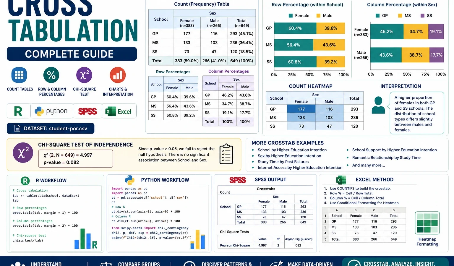
Cross Tabulation is a basic but powerful descriptive statistics method used to summarize the relationship between two categorical variables. This complete guide explains cross-tabulation tables, counts, row percentages, column percentages, chi-square association testing, R charts, Python charts, SPSS output and Excel workflow using student performance data.
Quick Answer: Cross Tabulation Result
A Cross Tabulation was used to compare categorical variables in the student performance dataset. The analysis included school by sex, school by higher education intention, sex by higher education intention, study time by past failures, internet access by higher education intention, school support by higher education intention, romantic relationship by study time and school by sex heatmap counts.
Main finding: Cross tabulation shows clear category patterns. GP has 56.0% female and 44.0% male students, while MS has 64.6% female and 35.4% male students. Higher education intention is high in both schools, but it is higher in GP at 92.4% than MS at 83.6%. Students with internet access also show a higher higher-education intention rate, 90.6%, compared with 85.4% among students without internet access.
Important interpretation note: A cross-tabulation table is mainly descriptive. It tells how categories are distributed together. If you need a formal statistical decision about whether two categorical variables are associated, use the chi-square test of independence together with the crosstab table.
Table of Contents
- What is Cross Tabulation?
- Cross Tabulation Formula and Logic
- Cross Tabulation and Chi-Square Hypotheses
- Dataset and Variables Used
- Verified Cross Tabulation Results
- Chart-by-Chart Interpretation
- R Code for Cross Tabulation
- Python Code for Cross Tabulation
- SPSS Syntax and Interpretation
- Excel Method
- Download Output and Resources
- APA Style Reporting
- When Should You Use Cross Tabulation?
- References and Related Guides
- FAQs
What Is Cross Tabulation?
Cross Tabulation, also called a crosstab, contingency table or two-way table, is a descriptive statistics method used to summarize the relationship between two categorical variables. It shows how many observations fall into each combination of categories.
For example, if one variable is school and another variable is sex, a cross tabulation answers questions such as: how many female students are in GP school, how many male students are in GP school, how many female students are in MS school, and how many male students are in MS school?
Cross tabulation is often the first step in categorical data analysis. It is simple, but it gives a strong view of the data. It can show whether a category distribution looks balanced or uneven. It can also show whether two variables appear related before running a formal statistical test.
Simple meaning: Cross tabulation is a table that counts how two categorical variables appear together. Row percentages and column percentages then convert the counts into easier-to-understand proportions.
Cross tabulation is very useful for survey data, educational data, health data, marketing research, social science studies and business reports. Whenever the variables are categorical, such as yes/no, male/female, school type, study group, pass/fail or support/no support, cross tabulation can be used to summarize the relationship.
Cross Tabulation Formula and Logic
The logic of cross tabulation begins with cell counts. Each cell in the table represents a combination of one row category and one column category.
Cell Count:
n_ij = number of observations in row category i and column category j

Row Percentage:
Row % = n_ij / row total × 100

Column Percentage:
Column % = n_ij / column total × 100

Total Percentage:
Total % = n_ij / grand total × 100
The most important choice is whether to read row percentages, column percentages or total percentages. In this post, the charts mainly use row percentages. That means each bar adds up to 100%, and the percentages describe the distribution inside each row category.
| Cross-tab element | Meaning | Example from this post |
|---|---|---|
| Cell count | Raw number of cases in one category combination | GP female count = 237 |
| Row percentage | Percentage within a row group | 56.0% of GP students are female |
| Column percentage | Percentage within a column group | Percentage of females who belong to GP or MS |
| Total percentage | Percentage of the full dataset | GP female cases as a percentage of all 649 students |
| Chi-square test | Formal association test for two categorical variables | Tests whether school and sex are independent |
Cross Tabulation and Chi-Square Hypotheses
Cross tabulation itself is descriptive, so it does not always require a hypothesis. But when cross tabulation is used with a chi-square test of independence, the analysis becomes a formal test of association between two categorical variables.
| Hypothesis | Meaning | Applied to cross tabulation |
|---|---|---|
| H0 | The two categorical variables are independent. | The row variable and column variable are not associated. |
| H1 | The two categorical variables are associated. | The distribution of one variable changes across categories of the other variable. |
Chi-square test statistic:

χ² = Σ (Observed Count - Expected Count)² / Expected Count
If the chi-square p-value is below .05, the usual conclusion is that the two variables have a statistically significant association. If the p-value is greater than .05, the data do not provide enough evidence of association at the 5% level.
Assumption note: The chi-square test should be interpreted carefully when expected cell counts are very small. If many expected counts are below 5, Fisher’s exact test, category merging or an alternative method may be more appropriate.
Dataset and Variables Used
This guide uses the student-por.csv student performance dataset with 649 rows. The cross tabulation examples focus on categorical variables related to school, sex, study time, support, internet access, romantic relationship status and higher education intention.
| Item | Variable | Role in this cross tabulation guide |
|---|---|---|
| School group | school | Used as a row variable for school-based crosstabs. |
| Sex | sex | Used to compare gender composition and higher education intention. |
| Higher education intention | higher | Used to compare whether students plan to continue higher education. |
| Study time | studytime | Used to compare study-time categories with past failure history. |
| Past failures | failures | Used as a column variable in study time by past failures analysis. |
| Internet access | internet | Used to compare higher education intention by internet access. |
| School support | schoolsup | Used to compare higher education intention by school support group. |
| Romantic relationship | romantic | Used to compare study-time distribution by relationship status. |
External dataset source: UCI Machine Learning Repository: Student Performance dataset.
Verified Cross Tabulation Results
The analysis created cross-tabulation tables, row-percentage charts, heatmap counts and SPSS chi-square output. The most important descriptive results are summarized below.
| Cross tabulation | Key row-percentage result | Interpretation |
|---|---|---|
| School × Sex | GP: 56.0% female, 44.0% male; MS: 64.6% female, 35.4% male | MS has a higher female share than GP in this sample. |
| School × Higher education intention | GP: 92.4% yes; MS: 83.6% yes | Higher education intention is high in both schools, but higher in GP. |
| Sex × Higher education intention | Female: 90.9% yes; Male: 87.2% yes | Both groups show high intention, with females slightly higher. |
| Study time × Past failures | Zero failures rise from 76.9% in the lowest study group to 94.3% in the highest study group | Higher study time is associated with fewer past failures descriptively. |
| Internet access × Higher education intention | No internet: 85.4% yes; Internet: 90.6% yes | Students with internet access show higher higher-education intention. |
| School support × Higher education intention | No support: 88.5% yes; Support: 97.1% yes | Students receiving school support show very high higher-education intention. |
| Romantic relationship × Study time | No relationship: 34.9% study under 2 hours; Yes relationship: 28.9% study under 2 hours | Study-time distribution differs slightly by romantic relationship status. |
| School × Sex heatmap | GP female = 237, GP male = 186, MS female = 146, MS male = 80 | The raw count heatmap confirms the school and sex distribution. |
The SPSS output confirms the school by sex crosstab with 649 valid cases and a Pearson chi-square result of χ² = 4.476, df = 1, p = .034. This indicates a statistically significant association between school and sex at the .05 level. The Cramer’s V value is .083, which suggests a small association in practical terms.
Chart-by-Chart Interpretation of the Cross Tabulation Analysis
This section explains the uploaded R and Python charts. The Python charts use the corrected title spacing, while the R charts provide the same row-percentage logic with a different visual style. Together, they confirm the same descriptive patterns.
Chart 1: School by Sex Cross Tabulation
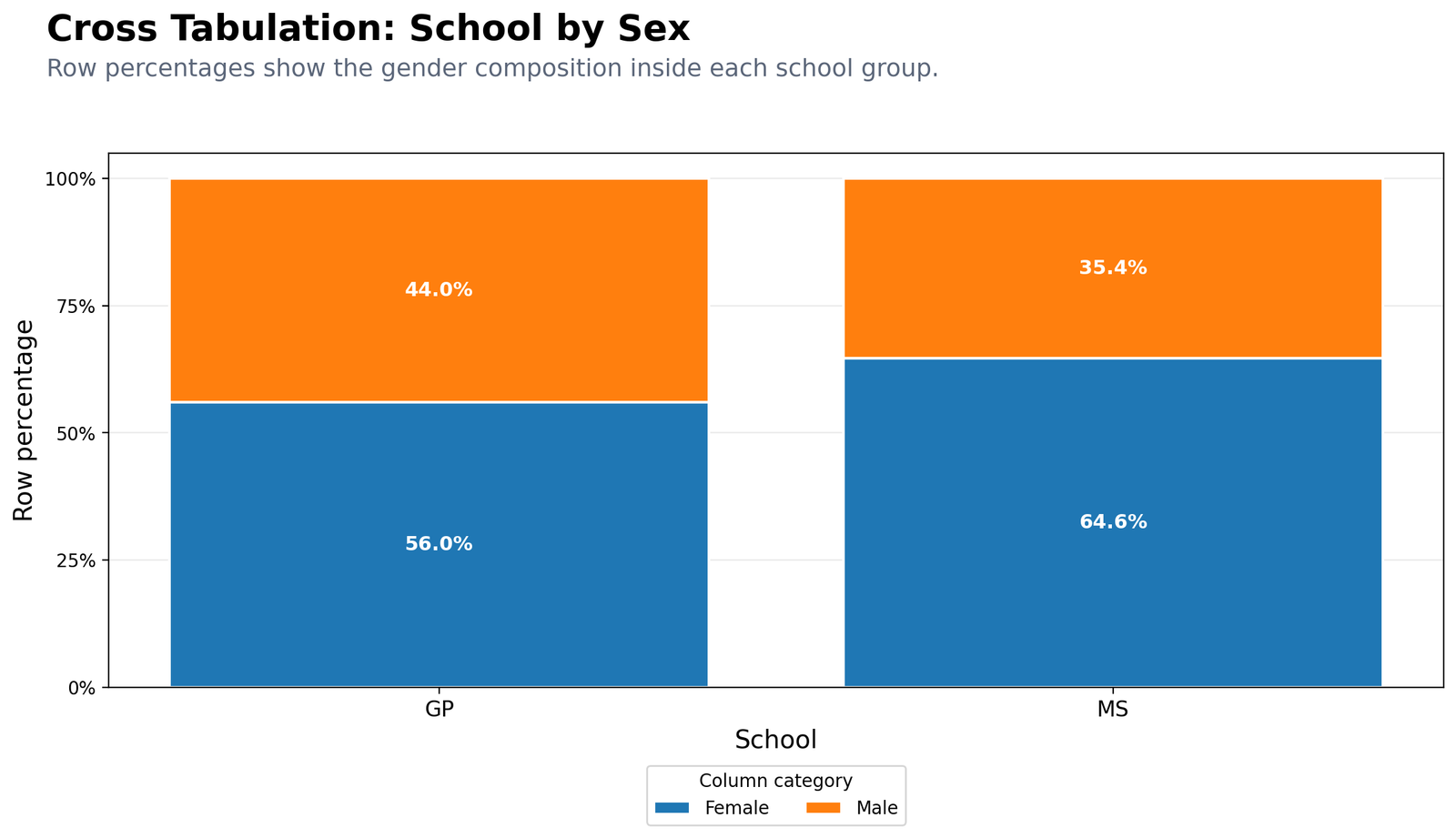
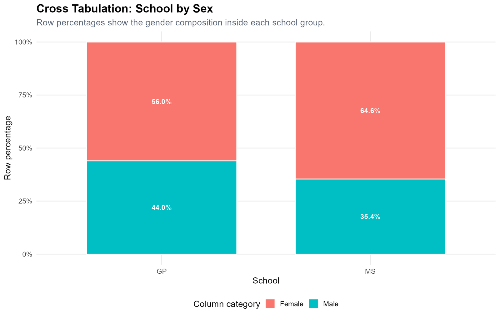
Specific interpretation: In GP, 56.0% of students are female and 44.0% are male. In MS, 64.6% of students are female and 35.4% are male. This means both schools have more female students than male students in this sample, but the female share is higher in MS.
Decision from Chart 1: The school by sex distribution is not identical across schools. The SPSS chi-square output supports this with p = .034, although the effect size is small.
Chart 2: School by Higher Education Intention
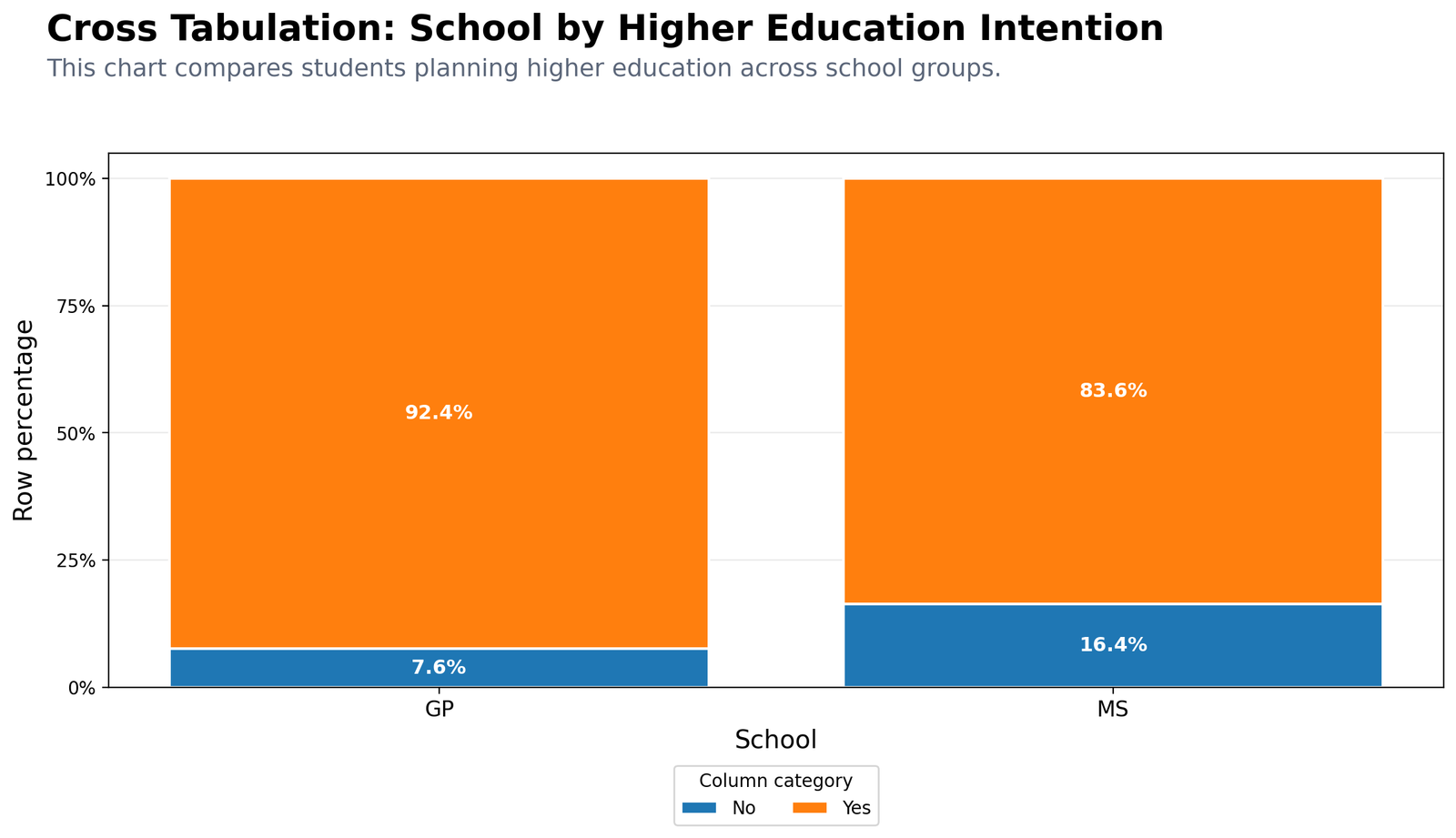
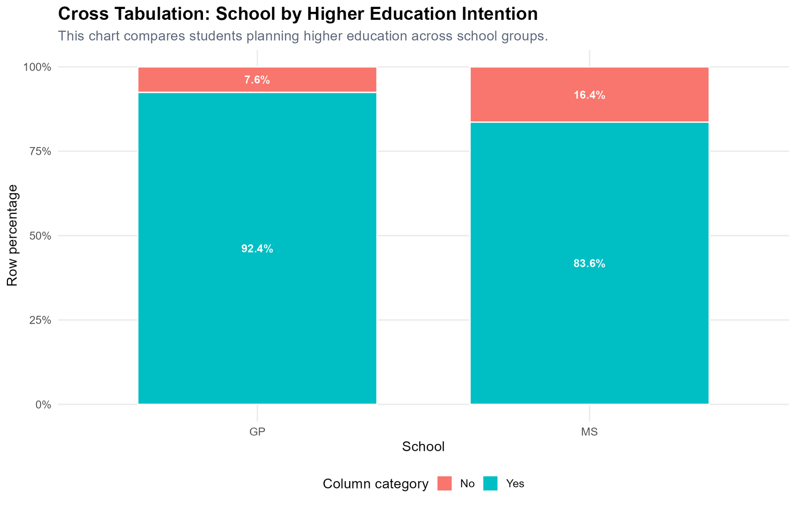
Specific interpretation: Higher education intention is high in both schools. In GP, 92.4% of students answered yes and 7.6% answered no. In MS, 83.6% answered yes and 16.4% answered no. The difference is descriptive but important for educational interpretation because the no category is more than twice as high in MS compared with GP.
Decision from Chart 2: GP students show a stronger intention to pursue higher education than MS students in this sample.
Chart 3: Sex by Higher Education Intention
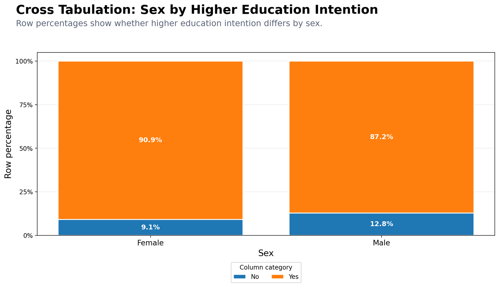
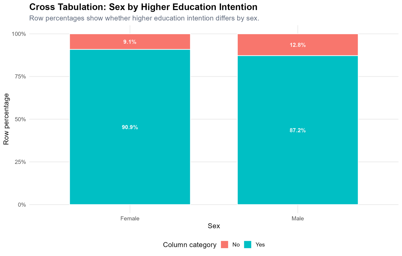
Specific interpretation: Female students show 90.9% yes for higher education intention, while male students show 87.2% yes. Both rates are high, but females are slightly higher. The no percentage is 9.1% for females and 12.8% for males.
Decision from Chart 3: Higher education intention is strong across both sex groups, with a slightly higher yes percentage among female students.
Chart 4: Study Time by Past Failures
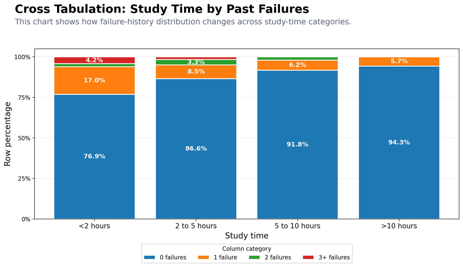
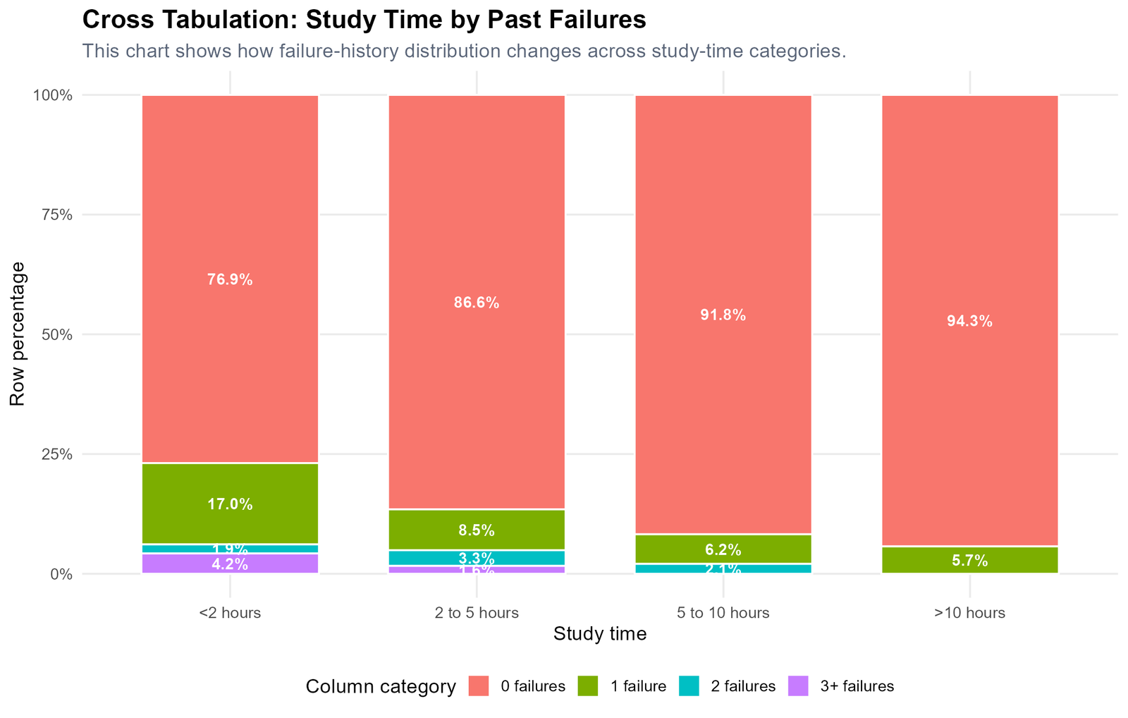
Specific interpretation: Students in the lowest study-time group have 76.9% zero failures. This rises to 86.6% in the 2 to 5 hours group, 91.8% in the 5 to 10 hours group and 94.3% in the more than 10 hours group. This shows a clear descriptive pattern: higher study time is linked with a higher share of students having zero past failures.
Decision from Chart 4: Study time and failure history show an educationally meaningful pattern, even though formal chi-square interpretation must consider small expected cell counts.
Chart 5: Internet Access by Higher Education Intention
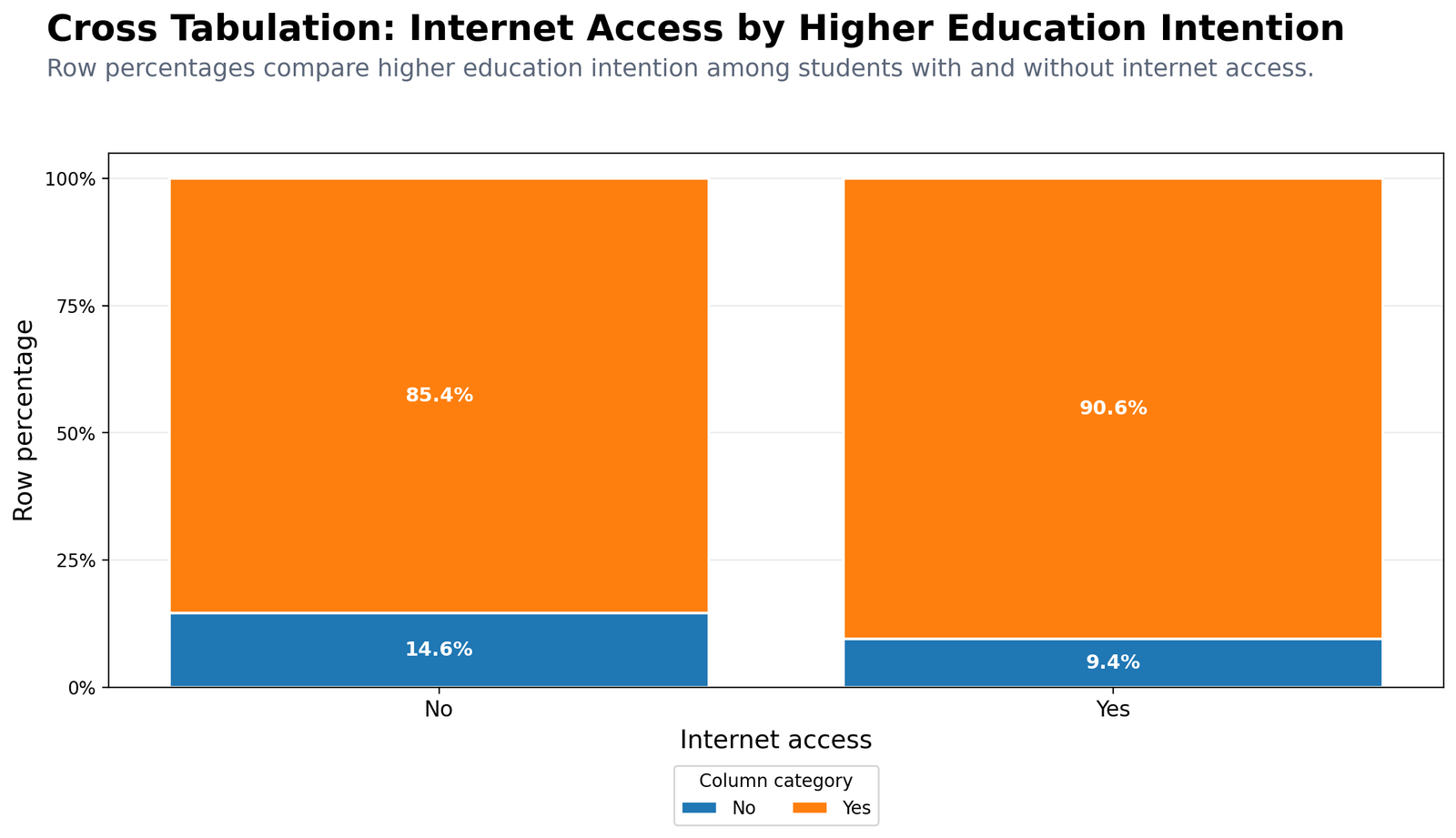
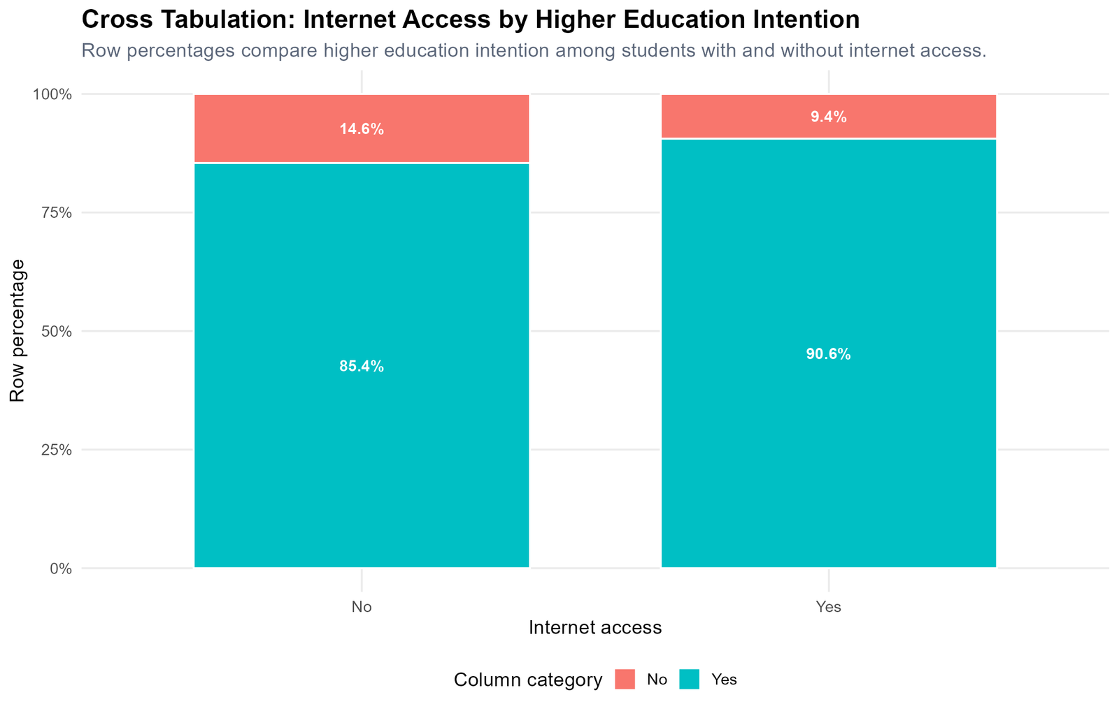
Specific interpretation: Among students without internet access, 85.4% plan higher education and 14.6% do not. Among students with internet access, 90.6% plan higher education and 9.4% do not. The difference suggests that internet access may be connected with stronger educational aspiration.
Decision from Chart 5: Students with internet access have a higher yes percentage for higher education intention than students without internet access.
Chart 6: School Support by Higher Education Intention
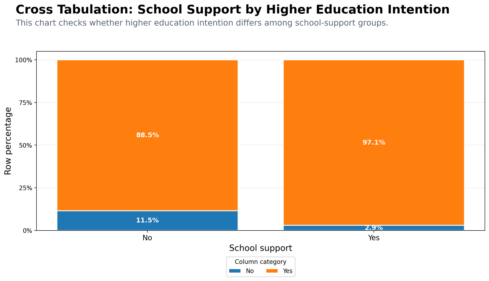
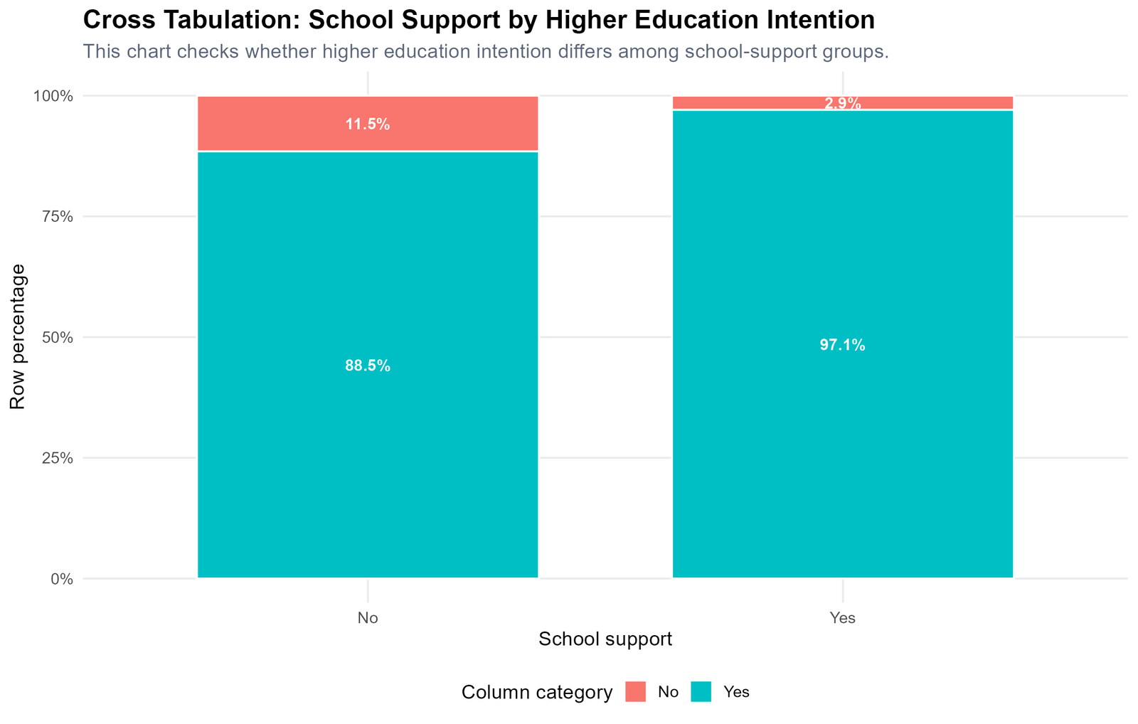
Specific interpretation: Students without school support show 88.5% yes for higher education intention. Students receiving school support show 97.1% yes. This is a strong descriptive difference. The no percentage is 11.5% among students without support but only 2.9% among students with school support.
Decision from Chart 6: The school support group shows a very high higher-education intention rate, suggesting that support may be linked with stronger continuation plans.
Chart 7: Romantic Relationship by Study Time
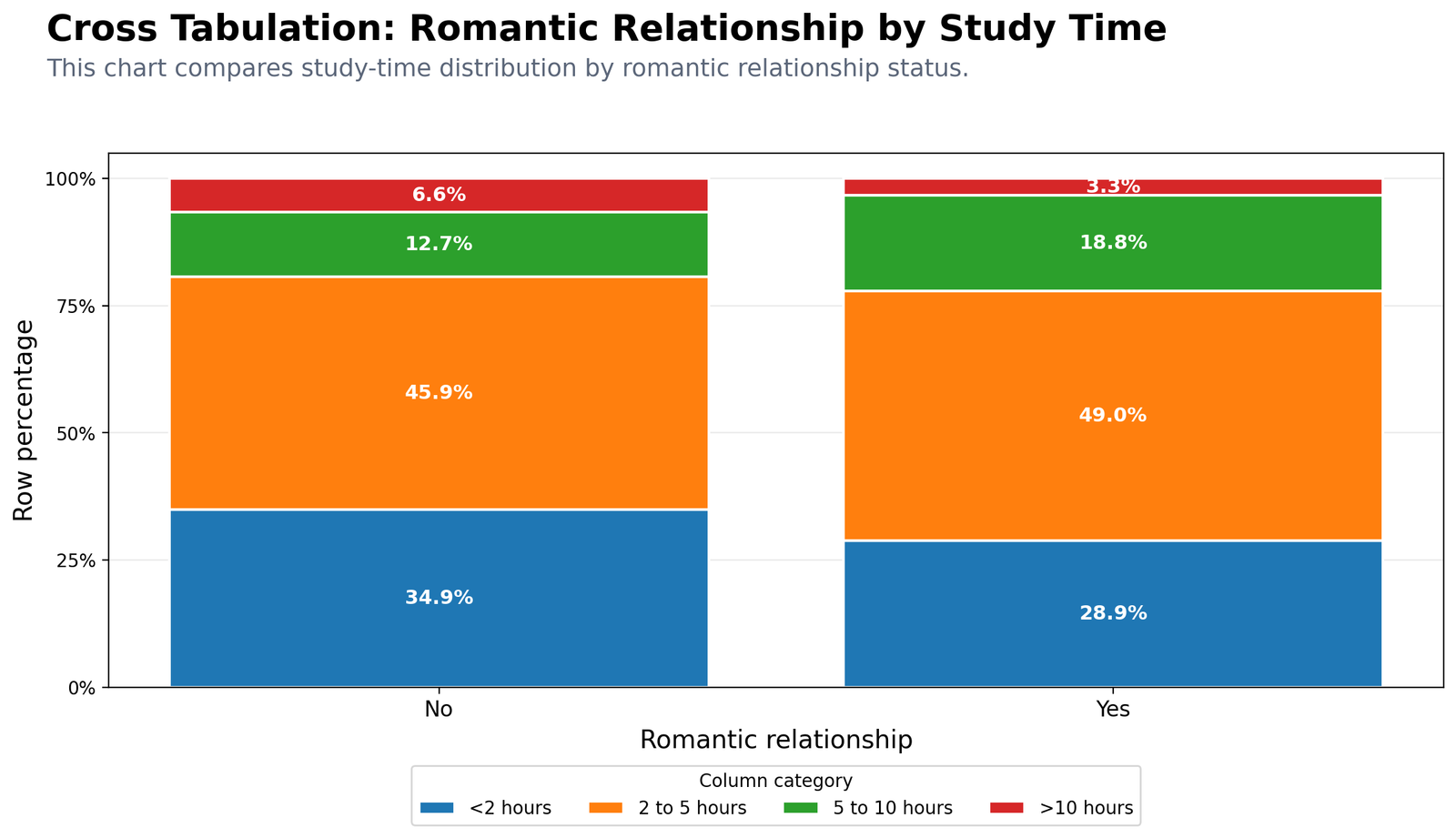
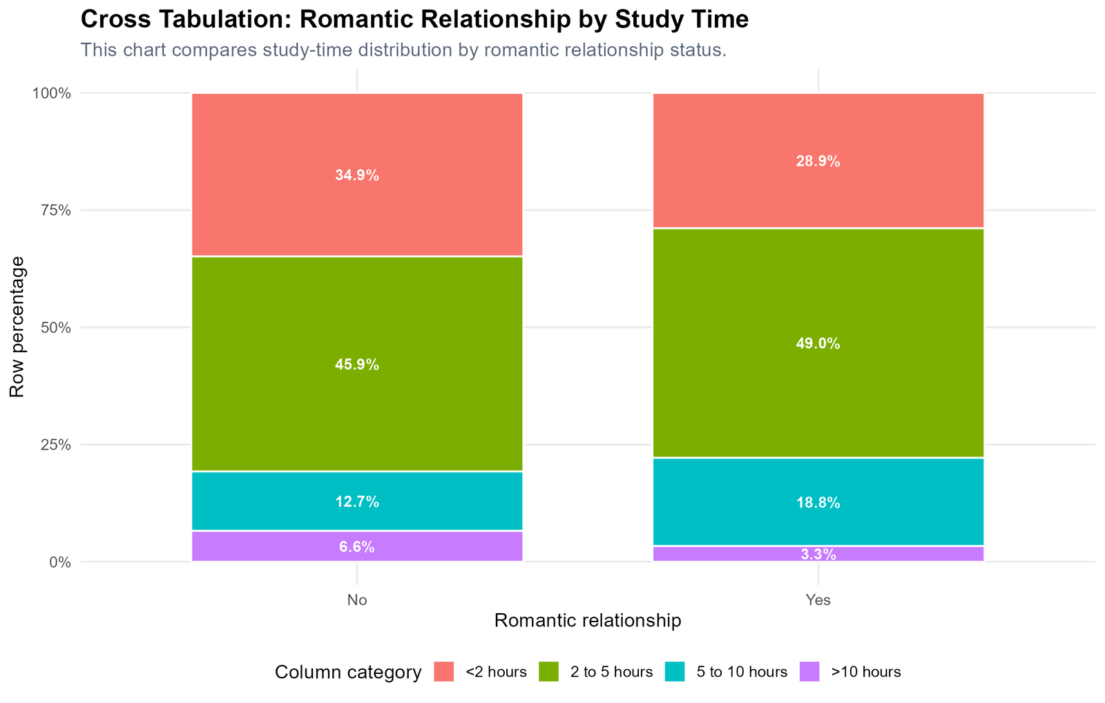
Specific interpretation: Students not in a romantic relationship have 34.9% in the under 2 hours study group, 45.9% in the 2 to 5 hours group, 12.7% in the 5 to 10 hours group and 6.6% in the more than 10 hours group. Students in a romantic relationship have 28.9%, 49.0%, 18.8% and 3.3% respectively.
Decision from Chart 7: The study-time distribution is not identical across romantic relationship groups, but the overall differences are moderate.
Chart 8: School by Sex Heatmap Count Table
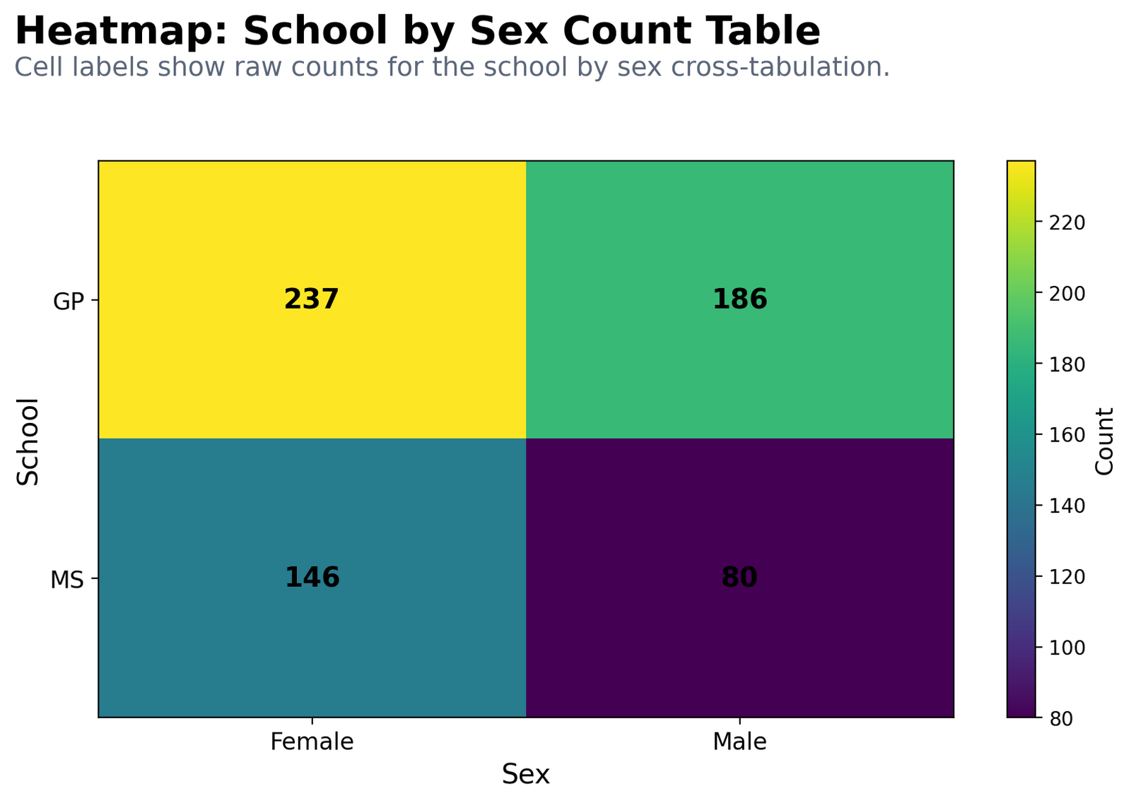
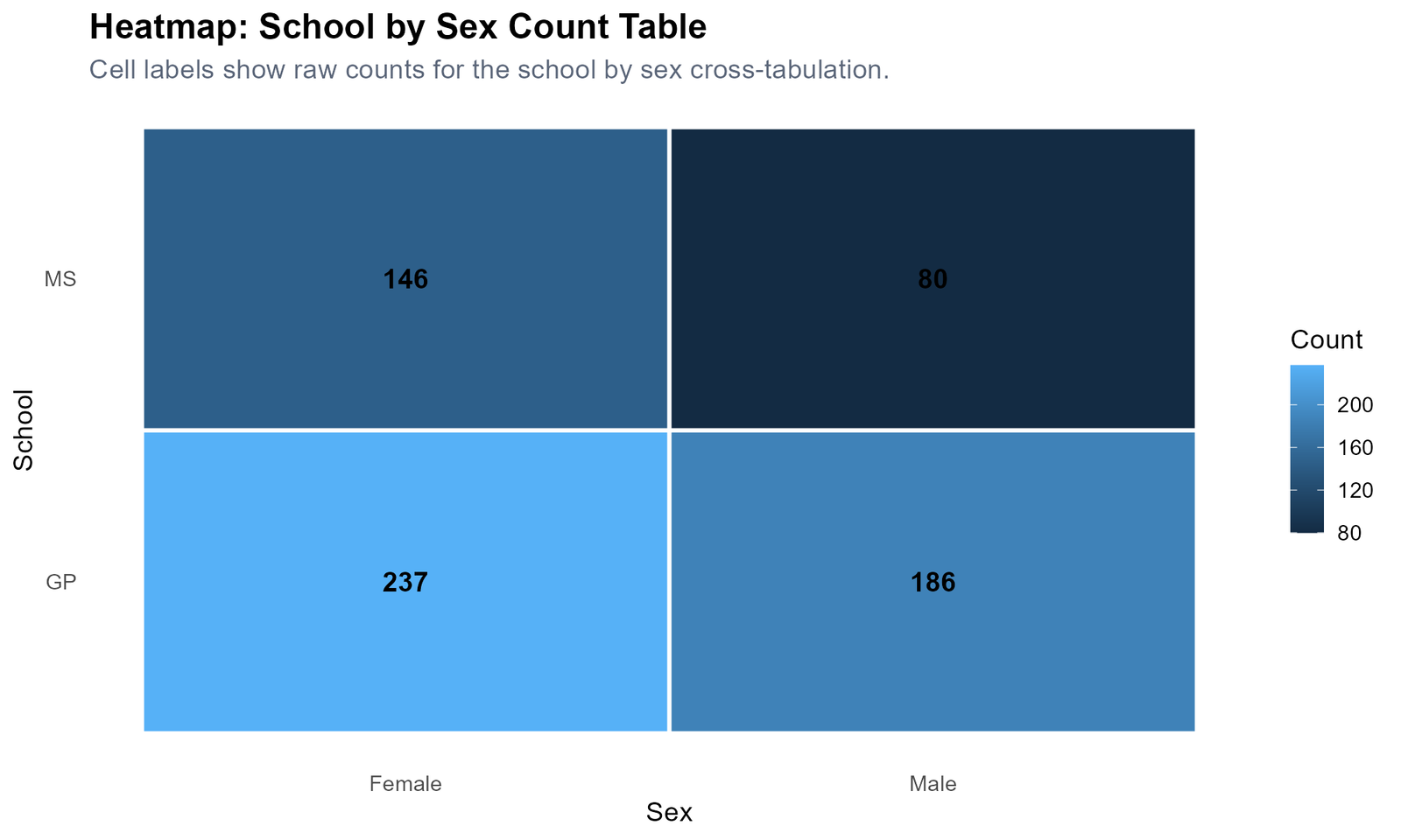
Specific interpretation: The heatmap shows the raw counts behind the school by sex row percentages. GP has 237 female and 186 male students. MS has 146 female and 80 male students. The largest cell is GP female, and the smallest cell is MS male.
Decision from Chart 8: The raw count heatmap confirms the percentage chart and makes the actual sample size behind each category visible.
R Code for Cross Tabulation
R can create cross-tabulation tables, row percentages, column percentages, chi-square tests and publication-ready charts. The workflow below shows the essential structure.
library(readr)
library(dplyr)
library(tidyr)
library(ggplot2)
library(scales)

folder <- "D:/DATA ANALYSIS/A Basic Descriptive Statistics Guides/Cross Tabulation"
data_file <- file.path(folder, "clean data set.csv")

df <- read_csv(data_file, show_col_types = FALSE)

df_clean <- df %>%
  mutate(
    sex = factor(sex, levels = c("F", "M"), labels = c("Female", "Male")),
    higher = factor(higher, levels = c("no", "yes"), labels = c("No", "Yes")),
    internet = factor(internet, levels = c("no", "yes"), labels = c("No", "Yes")),
    schoolsup = factor(schoolsup, levels = c("no", "yes"), labels = c("No", "Yes")),
    romantic = factor(romantic, levels = c("no", "yes"), labels = c("No", "Yes"))
  )

# Count table
table(df_clean$school, df_clean$sex)

# Row percentage table
prop.table(table(df_clean$school, df_clean$sex), margin = 1) * 100

# Chi-square test
chisq.test(table(df_clean$school, df_clean$sex), correct = FALSE)
R interpretation: The R workflow creates the same school by sex cross-tabulation shown in the charts. Row percentages are used to compare the sex distribution inside each school group.
Python Code for Cross Tabulation
Python is useful for automatic cross-tabulation workflows because it can create count tables, percentage tables, chi-square summaries, clean SPSS-ready files and charts in one script.
import pandas as pd
import numpy as np
from scipy.stats import chi2_contingency

folder = r"D:\DATA ANALYSIS\A Basic Descriptive Statistics Guides\Cross Tabulation"
data_file = folder + r"\clean data set.csv"

df = pd.read_csv(data_file)

df["sex"] = df["sex"].map({"F": "Female", "M": "Male"})
df["higher"] = df["higher"].map({"no": "No", "yes": "Yes"})

# Count cross tabulation
count_table = pd.crosstab(df["school"], df["sex"])

# Row percentage table
row_percent = pd.crosstab(df["school"], df["sex"], normalize="index") * 100

# Column percentage table
column_percent = pd.crosstab(df["school"], df["sex"], normalize="columns") * 100

# Chi-square test
chi2, p, dof, expected = chi2_contingency(count_table, correction=False)

print(count_table)
print(row_percent.round(2))
print("Chi-square:", chi2)
print("df:", dof)
print("p-value:", p)
Python chart note: For publication charts, use a non-overlapping title and subtitle layout with fig.suptitle(), fig.text() and fig.subplots_adjust(). This keeps the title and subtitle clean in the final uploaded images.
SPSS Syntax and Interpretation for Cross Tabulation
SPSS has a built-in Crosstabs procedure. It can produce count tables, row percentages, column percentages, expected counts, chi-square tests, Phi and Cramer’s V.
The uploaded SPSS output file is available below:
View Cross Tabulation SPSS Output PDF
SPSS Menu Method
| Step | SPSS menu action | Purpose |
|---|---|---|
| 1 | Analyze → Descriptive Statistics → Crosstabs | Open the crosstab dialog. |
| 2 | Put the row variable in Rows | Example: school. |
| 3 | Put the column variable in Columns | Example: sex or higher. |
| 4 | Click Cells | Select observed counts, row percentages, column percentages and total percentages. |
| 5 | Click Statistics | Select Chi-square and Phi/Cramer’s V. |
| 6 | Click OK | Read the crosstab table and chi-square output. |
SPSS Syntax Example
CROSSTABS
  /TABLES=school BY sex
  /FORMAT=AVALUE TABLES
  /STATISTICS=CHISQ PHI
  /CELLS=COUNT ROW COLUMN TOTAL EXPECTED
  /COUNT ROUND CELL.

OUTPUT SAVE
  OUTFILE='D:\DATA ANALYSIS\A Basic Descriptive Statistics Guides\Cross Tabulation\Python_Output\pdf\Cross-Tabulation-SPSS-Output.spv'
  LOCK=NO.

OUTPUT EXPORT
  /CONTENTS EXPORT=ALL LAYERS=PRINTSETTING MODELVIEWS=PRINTSETTING
  /PDF DOCUMENTFILE='D:\DATA ANALYSIS\A Basic Descriptive Statistics Guides\Cross Tabulation\Python_Output\pdf\Cross-Tabulation-SPSS-Output.pdf'
  /EMBEDBOOKMARKS=YES
  /EMBEDFONTS=YES.
SPSS export note: The PDF output folder must already exist before running the syntax. SPSS does not reliably create missing Windows folders automatically. Save both the editable SPSS Viewer file and the PDF output for a complete workflow.
Excel Method for Cross Tabulation
Excel can perform cross tabulation with a PivotTable. This is the easiest Excel method because it automatically creates count tables and percentage tables.
Excel PivotTable Steps
| Step | Excel action | Example |
|---|---|---|
| 1 | Select the dataset | Select all columns and rows. |
| 2 | Insert → PivotTable | Create a new PivotTable. |
| 3 | Drag school to Rows | School becomes the row category. |
| 4 | Drag sex to Columns | Sex becomes the column category. |
| 5 | Drag sex again to Values | Set Values to Count. |
| 6 | Show Values As → % of Row Total | Create row percentages. |
| 7 | Insert stacked bar chart | Visualize the row percentages. |
Excel interpretation: For school by sex, Excel should show GP with 56.0% female and 44.0% male, while MS should show 64.6% female and 35.4% male when row percentages are used.
Download Output and Resources
The SPSS PDF output and dataset source are available below. Use the SPSS output for formal crosstab and chi-square tables, and use the R/Python charts for visual interpretation.
APA Style Reporting for Cross Tabulation
A cross tabulation report should include the variables, sample size, key percentages and chi-square result if a formal test is used. Do not only report the p-value. Explain the direction of the category pattern.
APA-style report: A cross tabulation was conducted to examine the association between school and sex. In GP, 56.0% of students were female and 44.0% were male. In MS, 64.6% were female and 35.4% were male. The chi-square test showed a statistically significant association between school and sex, χ²(1, N = 649) = 4.476, p = .034, although the effect size was small, Cramer’s V = .083.
For a shorter report, use the following version:
A school by sex cross tabulation showed that GP had 56.0% female students and MS had 64.6% female students. The association was statistically significant, χ²(1, N = 649) = 4.476, p = .034, Cramer's V = .083.When Should You Use Cross Tabulation?
Use Cross Tabulation when both variables are categorical and you want to understand how their categories are distributed together. It is especially useful before chi-square testing because it shows the actual table pattern that the test is evaluating.
| Analysis situation | Use cross tabulation to check | Why it helps |
|---|---|---|
| Survey analysis | Response by gender, age group or region | Shows category distribution clearly. |
| Education data | School by pass/fail or intention | Shows student outcomes by group. |
| Business data | Customer type by purchase status | Reveals customer behavior patterns. |
| Health data | Treatment group by recovery status | Summarizes categorical outcomes. |
| Chi-square testing | Observed and expected counts | Supports formal association testing. |
If your variables are numeric rather than categorical, use descriptive statistics, correlation, t tests, ANOVA or regression instead. If one numeric variable is converted into groups, cross tabulation can then be used with the grouped version.
References and Related Guides
Cross tabulation is part of categorical data analysis and connects naturally with chi-square testing, descriptive statistics and assumption-checking methods. These related guides can support the next step of analysis:
| Related guide | Why it helps |
|---|---|
| Chi-Square Test | Formal test for association between categorical variables. |
| Descriptive Statistics | Foundation for summarizing data before statistical testing. |
| One-Proportion Z Test | Useful when analyzing one categorical proportion. |
| Confidence Interval | Explains uncertainty around sample estimates. |
| Q-Q Plot | Useful when checking numeric variable assumptions. |
| Levene’s Test | Useful for variance assumption checking in group comparisons. |
| Brown-Forsythe Test | Robust variance comparison method. |
| Cramer-von Mises Test | Distribution-based goodness-of-fit testing. |
FAQs About Cross Tabulation
What is Cross Tabulation in simple words?
Cross Tabulation is a table that shows how two categorical variables are distributed together. It counts how many cases fall into each combination of row and column categories.
What is another name for Cross Tabulation?
Cross Tabulation is also called a crosstab, contingency table or two-way table.
What is the difference between row percentage and column percentage?
Row percentage explains the distribution within each row category. Column percentage explains the distribution within each column category. The correct choice depends on the research question.
What is the main result of the school by sex cross tabulation?
GP has 56.0% female and 44.0% male students. MS has 64.6% female and 35.4% male students. The chi-square test for school by sex is significant, χ²(1, N = 649) = 4.476, p = .034.
Can Cross Tabulation be used with numeric variables?
Cross Tabulation is designed for categorical variables. Numeric variables must first be grouped into categories before using cross tabulation.
How do I create Cross Tabulation in SPSS?
In SPSS, go to Analyze, Descriptive Statistics, Crosstabs. Put one variable in Rows and another in Columns. Then select counts, row percentages, column percentages and chi-square statistics.
How do I create Cross Tabulation in Excel?
In Excel, use a PivotTable. Put one categorical variable in Rows, another in Columns and a count variable in Values. Then use Show Values As to display row percentages or column percentages.
What does the chi-square test add to Cross Tabulation?
The chi-square test adds a formal statistical decision. It tests whether the row variable and column variable are independent or associated.
What is Cramer’s V in Cross Tabulation?
Cramer’s V is an effect-size measure for association between categorical variables. It helps explain how strong the relationship is after the chi-square test.
Should I report counts or percentages in Cross Tabulation?
Report both if possible. Counts show the actual sample size, while percentages make the pattern easier to compare across groups.
{
“@context”: “https://schema.org”,
“@graph”: [
{
“@type”: “Organization”,
“@id”: “https://onlineinternetcafe.com/#organization”,
“name”: “Salar Cafe”,
“url”: “https://onlineinternetcafe.com/”
},
{
“@type”: “BreadcrumbList”,
“@id”: “https://onlineinternetcafe.com/cross-tabulation/#breadcrumb”,
“itemListElement”: [
{
“@type”: “ListItem”,
“position”: 1,
“name”: “Home”,
“item”: “https://onlineinternetcafe.com/”
},
{
“@type”: “ListItem”,
“position”: 2,
“name”: “Cross Tabulation”,
“item”: “https://onlineinternetcafe.com/cross-tabulation/”
}
]
},
{
“@type”: “ImageObject”,
“@id”: “https://onlineinternetcafe.com/cross-tabulation/#primaryimage”,
“url”: “https://onlineinternetcafe.com/wp-content/uploads/2026/06/chart_01_python_school_by_sex_cross_tabulation.png”,
“caption”: “Cross Tabulation for school by sex with row percentages, R, Python, SPSS and Excel interpretation.”
},
{
“@type”: “Article”,
“@id”: “https://onlineinternetcafe.com/cross-tabulation/#article”,
“headline”: “Cross Tabulation: Complete R, Python, SPSS and Excel Guide”,
“description”: “Cross Tabulation explained with student performance data, including count tables, row percentages, column percentages, chi-square test, R charts, Python charts, SPSS output, Excel method and full interpretation.”,
“mainEntityOfPage”: “https://onlineinternetcafe.com/cross-tabulation/”,
“image”: {
“@id”: “https://onlineinternetcafe.com/cross-tabulation/#primaryimage”
},
“author”: {
“@type”: “Organization”,
“name”: “Salar Cafe”
},
“publisher”: {
“@id”: “https://onlineinternetcafe.com/#organization”
},
“datePublished”: “2026-06-16”,
“dateModified”: “2026-06-16”
},
{
“@type”: “FAQPage”,
“@id”: “https://onlineinternetcafe.com/cross-tabulation/#faq”,
“mainEntity”: [
{
“@type”: “Question”,
“name”: “What is Cross Tabulation in simple words?”,
“acceptedAnswer”: {
“@type”: “Answer”,
“text”: “Cross Tabulation is a table that shows how two categorical variables are distributed together. It counts how many cases fall into each combination of row and column categories.”
}
},
{
“@type”: “Question”,
“name”: “What is another name for Cross Tabulation?”,
“acceptedAnswer”: {
“@type”: “Answer”,
“text”: “Cross Tabulation is also called a crosstab, contingency table or two-way table.”
}
},
{
“@type”: “Question”,
“name”: “What is the difference between row percentage and column percentage?”,
“acceptedAnswer”: {
“@type”: “Answer”,
“text”: “Row percentage explains the distribution within each row category. Column percentage explains the distribution within each column category.”
}
},
{
“@type”: “Question”,
“name”: “How do I create Cross Tabulation in SPSS?”,
“acceptedAnswer”: {
“@type”: “Answer”,
“text”: “In SPSS, go to Analyze, Descriptive Statistics, Crosstabs. Put one variable in Rows and another in Columns. Then select counts, row percentages, column percentages and chi-square statistics.”
}
},
{
“@type”: “Question”,
“name”: “What does the chi-square test add to Cross Tabulation?”,
“acceptedAnswer”: {
“@type”: “Answer”,
“text”: “The chi-square test adds a formal statistical decision. It tests whether the row variable and column variable are independent or associated.”
}
}
]
}
]
}

