
Lagged correlation, cross-correlation function, strongest lag and aligned series
Cross Correlation: Python, R, SPSS and Excel Complete Guide
Cross Correlation measures how two ordered series are related at different lags. Instead of asking only whether two variables are correlated in the same row, cross-correlation asks whether one series is more strongly related to earlier or later values of the other series. This guide explains cross-correlation with Python charts, R charts, SPSS output, Excel formulas, lag direction, strongest lag, aligned scatterplots and reporting wording.
Quick Answer: Cross Correlation Result
The cross-correlation analysis used G1 as the X series and G3 as the Y series. The analysis used the row order as the ordered sequence. The lag convention was: positive lag means Xt is compared with Yt+lag. In simple words, a positive lag asks whether G1 is associated with later G3 values, while a negative lag asks whether G3 is earlier relative to G1.
The main result showed that the strongest absolute cross-correlation occurred at lag 0, with r = 0.826387 and p = 1.617571e-163. This means the strongest relationship is the same-row relationship between G1 and G3, not a delayed relationship. The 95% confidence interval for lag 0 was approximately 0.800326 to 0.849331, and the result was outside the approximate 95% band.
Final interpretation: G1 and G3 have a strong positive same-row relationship. The lagged results show smaller correlations than lag 0, so this analysis does not suggest that a delayed row shift improves the association. The best practical conclusion is that earlier grade performance and final grade performance are strongly related in the same ordered position.
Important caution: Cross-correlation depends on meaningful row or time order. If the data rows are not truly ordered by time or sequence, lag interpretation becomes weak. Use cautious wording such as “is associated with” rather than causal wording.
Table of Contents
- What Is Cross Correlation?
- Lag Direction and Interpretation
- Cross Correlation Formula
- Dataset and Variables Used
- Verified Cross Correlation Results
- Python Chart-by-Chart Interpretation
- R Chart-by-Chart Interpretation
- SPSS Output Interpretation
- Excel Worked File Explanation
- Python, R, SPSS and Excel Workflows
- Code Blocks and Excel Formulas
- How to Report Cross Correlation
- Common Mistakes
- Downloads and Resources
- Related Statistical Guides
- FAQs About Cross Correlation
What Is Cross Correlation?
Cross correlation is a lag-based correlation method used to compare two ordered series. A normal Pearson correlation compares X and Y in the same row. Cross-correlation repeats the comparison after shifting one series forward or backward by different lag values.
This is useful when the researcher wants to know whether one series leads or follows another series. For example, in a time-series setting, a researcher may ask whether advertising today is related to sales next week. In this student-grade example, the ordered rows are used to demonstrate the mechanics of lagged cross-correlation with G1 and G3.
Cross-correlation is connected to Durbin-Watson Test, p-value, confidence interval, descriptive statistics and standard deviation because the final interpretation depends on sequence order, association strength, uncertainty and data quality.
Lag Direction and Interpretation
The lag convention used in this report is:
With X = G1 and Y = G3, a positive lag means the current G1 value is compared with a later G3 value. A negative lag means G3 is earlier relative to G1. Lag 0 means no shifting: G1 and G3 are compared in the same row.
| Lag Type | Meaning in This Report | Example Interpretation |
|---|---|---|
| Lag 0 | G1 and G3 are compared in the same row. | Same-row / no lag correlation. |
| Positive lag | G1 is compared with later G3 values. | G1 leads G3 by the lag number. |
| Negative lag | G3 is earlier relative to G1. | G3 leads G1 by the absolute lag number. |
| Strongest absolute lag | The lag with the largest absolute value of r. | Shows the most pronounced lagged association. |
Key result: The strongest absolute lag is lag 0. This means the same-row G1-G3 relationship is stronger than any shifted relationship in the tested lag range.
Cross Correlation Formula
For each lag, the analysis aligns the two series and calculates the Pearson correlation between the aligned values. A simplified lagged cross-correlation formula is:
Here, k is the lag. If k = 0, the formula becomes a same-row Pearson correlation. If k is positive, X is compared with later Y. If k is negative, Y is earlier relative to X.
The report also calculates a t statistic, two-tailed p-value, Fisher 95% confidence interval, approximate 95% band and an outside-band decision for each lag. This makes the output more informative than a simple lag plot alone.
Dataset and Variables Used
The analysis used G1 as the X series and G3 as the Y series. G1 represents the first-period grade, while G3 represents the final grade. Both series had 649 valid observations.
| Series | N | Mean | Standard Deviation | Minimum | Median | Maximum |
|---|---|---|---|---|---|---|
| G1 | 649 | 11.399076 | 2.745265 | 0 | 11 | 19 |
| G3 | 649 | 11.906009 | 3.230656 | 0 | 12 | 19 |
The same-row SPSS context also shows strong relationships among grade variables: G1 with G2 is about .865, G1 with G3 is about .826, and G2 with G3 is about .919. These same-row correlations help explain why the lag 0 cross-correlation is the strongest result.
Verified Cross Correlation Results
The top lag table ranks the largest absolute cross-correlations. Lag 0 is clearly strongest, with r = 0.826387. The next lag values are much smaller, even when statistically significant.
| Rank | Lag | Pair N | Cross-correlation r | p-value | Lag Direction | Interpretation |
|---|---|---|---|---|---|---|
| 1 | 0 | 649 | 0.826387 | 1.617571e-163 | Same row | Strongest absolute cross-correlation. |
| 2 | -2 | 647 | 0.253746 | 5.779680e-11 | G3 leads G1 by 2 rows | Small-to-moderate lagged association. |
| 3 | 2 | 647 | 0.228025 | 4.455435e-09 | G1 leads G3 by 2 rows | Small-to-moderate lagged association. |
| 4 | -3 | 646 | 0.211993 | 5.338968e-08 | G3 leads G1 by 3 rows | Smaller than lag 0. |
| 5 | 1 | 648 | 0.199643 | 2.992007e-07 | G1 leads G3 by 1 row | Weak-to-moderate lagged association. |
| 6 | -1 | 648 | 0.194014 | 6.470112e-07 | G3 leads G1 by 1 row | Weak-to-moderate lagged association. |
The final decision is straightforward: the strongest relationship is the same-row association. Lagged values exist and some are statistically significant, but they do not exceed lag 0. Therefore, this report should emphasize the strong same-row G1-G3 association rather than claiming a delayed lead-lag effect.
Python Chart-by-Chart Interpretation
The Python charts show the ordered series profile, cross-correlation function, lag direction strength, same-row scatterplot, strongest-lag scatterplot and ranked lag results.
Python Chart 1: Ordered Series Profile
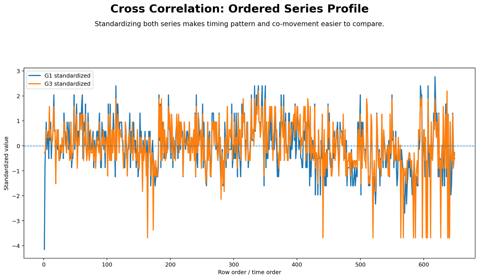
This chart standardizes G1 and G3 so their patterns can be compared on the same scale. Standardization removes the original unit difference and makes co-movement easier to see. When the two lines move in similar directions, it suggests that the two series share an ordered pattern.
The chart supports the later cross-correlation result because G1 and G3 often move together in the same row order. This is why lag 0 becomes the strongest association in the cross-correlation table.
Python Chart 2: Cross Correlation Function
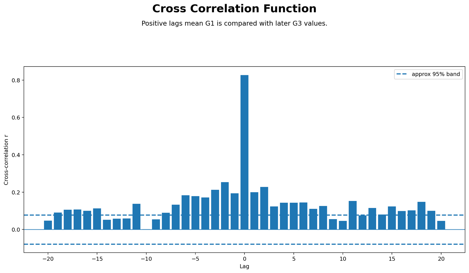
The cross-correlation function chart plots r values across the tested lags. The largest spike occurs at lag 0, where r = 0.8264. The surrounding lag values are much smaller, so the chart visually confirms that the same-row association dominates the lagged pattern.
This chart is the main diagnostic plot for cross-correlation. If a positive or negative lag were stronger than lag 0, the tallest spike would appear away from zero. Here, the strongest spike is at zero, so the best interpretation is no meaningful row delay beyond the same-row relationship.
Python Chart 3: Lag Direction Strength
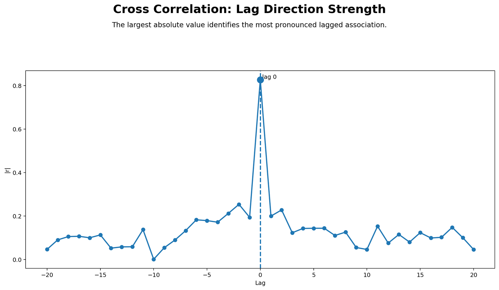
This chart focuses on absolute strength, so both positive and negative correlations can be compared by size. Lag 0 has the largest absolute cross-correlation, making it the strongest lag overall. The next strongest lags are smaller and do not change the main conclusion.
The direction labels help prevent a common mistake. A positive lag is not automatically “better” than a negative lag. The researcher must read the lag convention and then interpret whether X leads Y or Y leads X.
Python Chart 4: Lag 0 Aligned Scatterplot
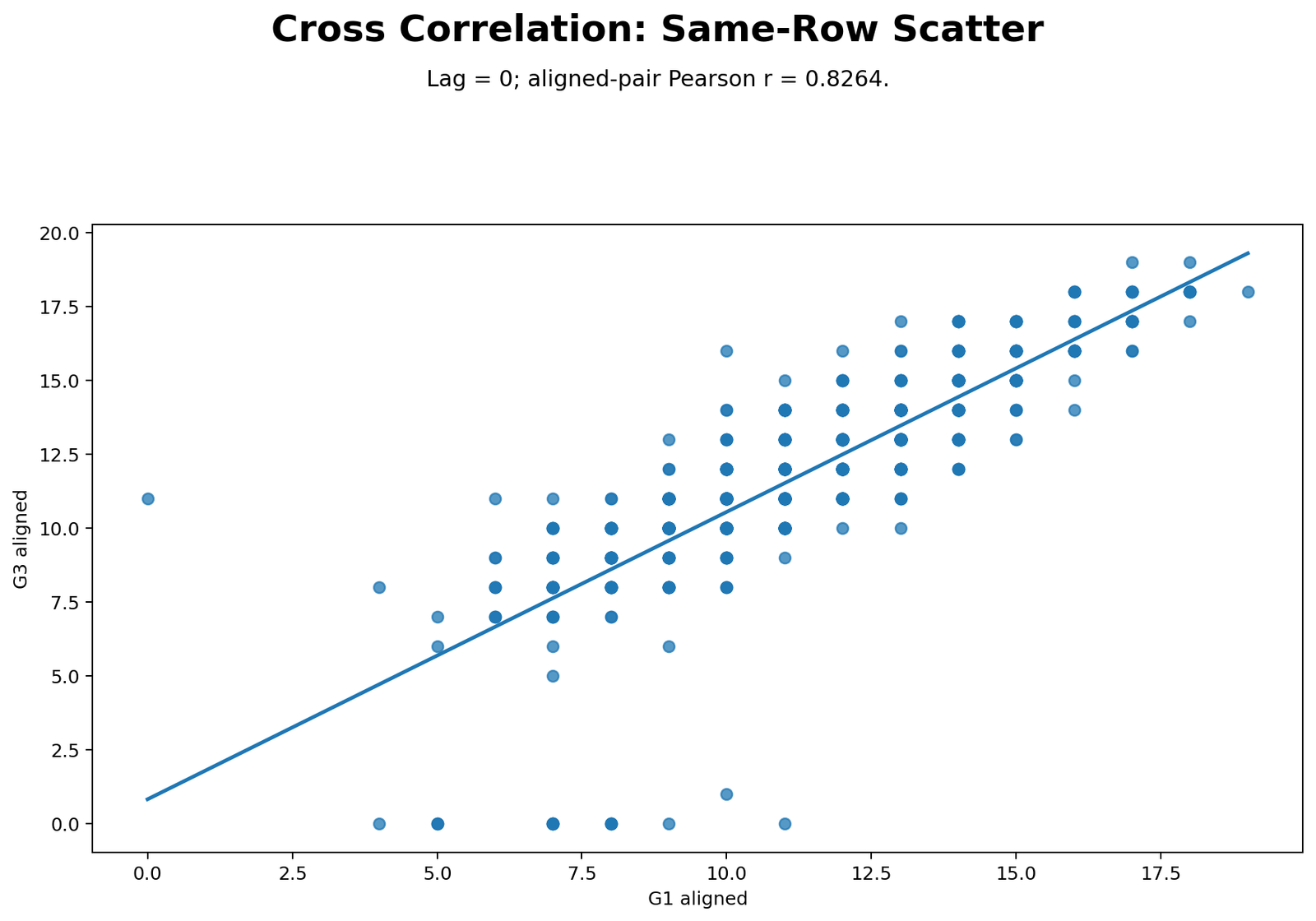
The lag 0 scatterplot shows the same-row relationship between G1 and G3. The points form a clear upward pattern. This matches the strong Pearson value of r = 0.8264. Students with higher G1 values generally have higher G3 values.
This chart is important because it proves that the strongest cross-correlation is not just a table value. The aligned data visually show a strong positive relationship without shifting the series.
Python Chart 5: Strongest Lag Aligned Scatterplot
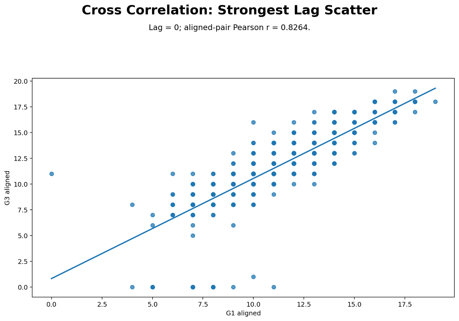
Because the strongest lag is lag 0, this chart confirms the same aligned relationship shown in the lag 0 scatterplot. The strongest-lag view is useful because in another dataset the strongest lag might not be zero. Here, it reinforces the conclusion that the same-row alignment is the best alignment.
The practical interpretation is that shifting G1 or G3 does not improve the relationship. The strongest association occurs when the two series are compared directly in the same ordered position.
Python Chart 6: Top Lag Rankings
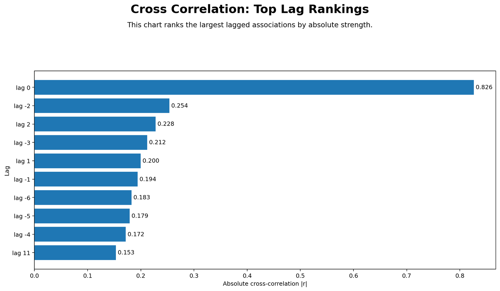
The top lag ranking chart places the strongest lags in order. Lag 0 is clearly first. Lag -2, lag +2, lag -3, lag +1 and lag -1 follow with much smaller absolute correlations. This ranking chart is useful for quickly summarizing the lag evidence.
The correct reporting decision is to highlight lag 0 as the main finding and describe other lags as secondary. The lagged correlations are not strong enough to replace the same-row interpretation.
R Chart-by-Chart Interpretation
The R charts validate the same cross-correlation result with colorful output. They repeat the ordered profile, cross-correlation function, lag strength, lag 0 scatterplot, strongest-lag scatterplot and top lag ranking.
R Chart 1: Colorful Ordered Series Profile

The R ordered profile confirms the same pattern as the Python chart. G1 and G3 are standardized and compared across row order. The visual co-movement supports a strong same-row relationship.
R Chart 2: Colorful Cross Correlation Function
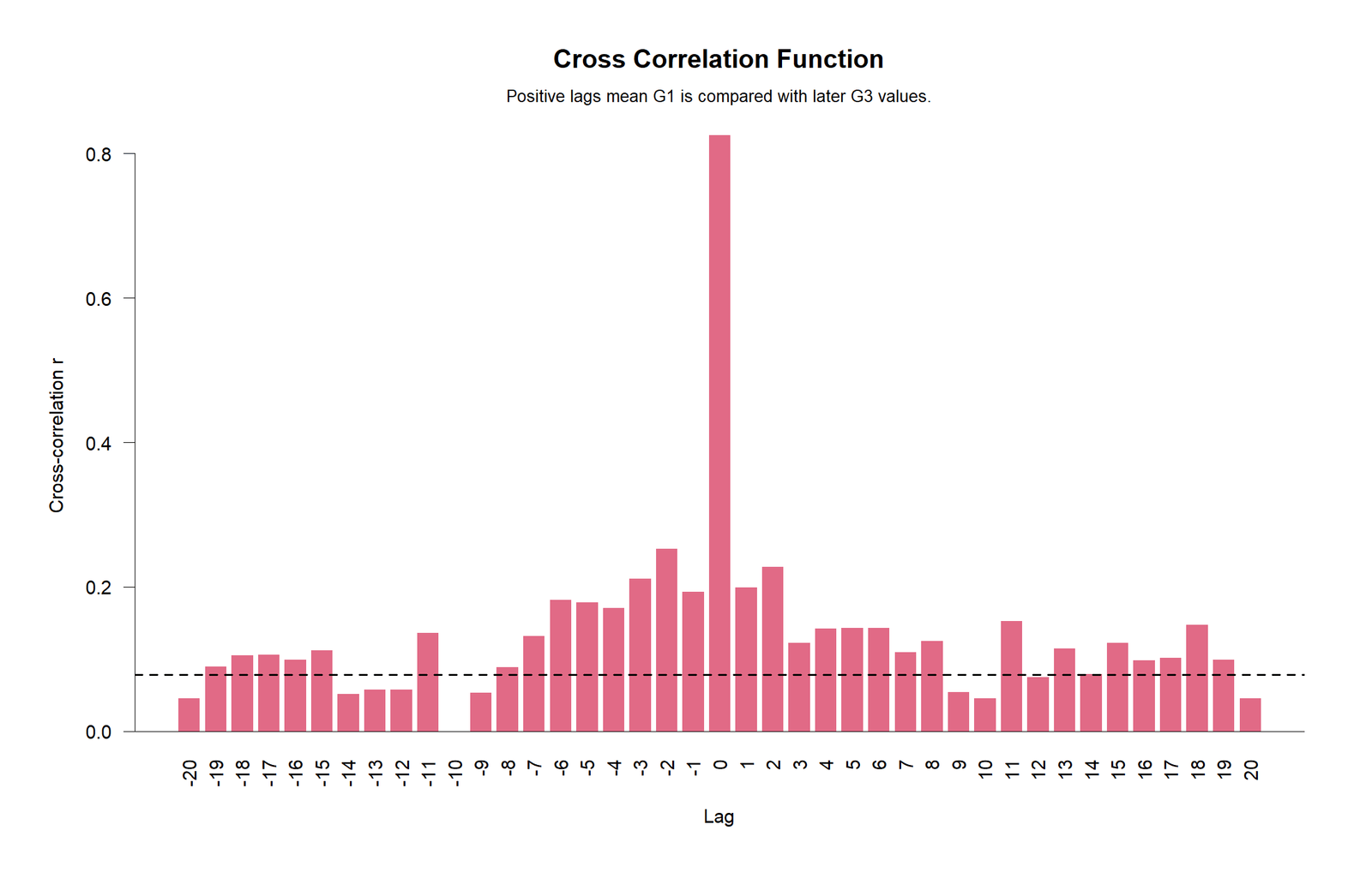
The R cross-correlation function again shows the tallest spike at lag 0. This confirms that the strongest relationship is not a lead-lag shift but the same-row association between G1 and G3.
R Chart 3: Colorful Lag Direction Strength

The lag direction strength chart ranks lags by magnitude. Lag 0 is the strongest absolute result. The next lags are smaller, so the same-row interpretation remains the primary finding.
R Chart 4: Colorful Lag 0 Aligned Scatterplot
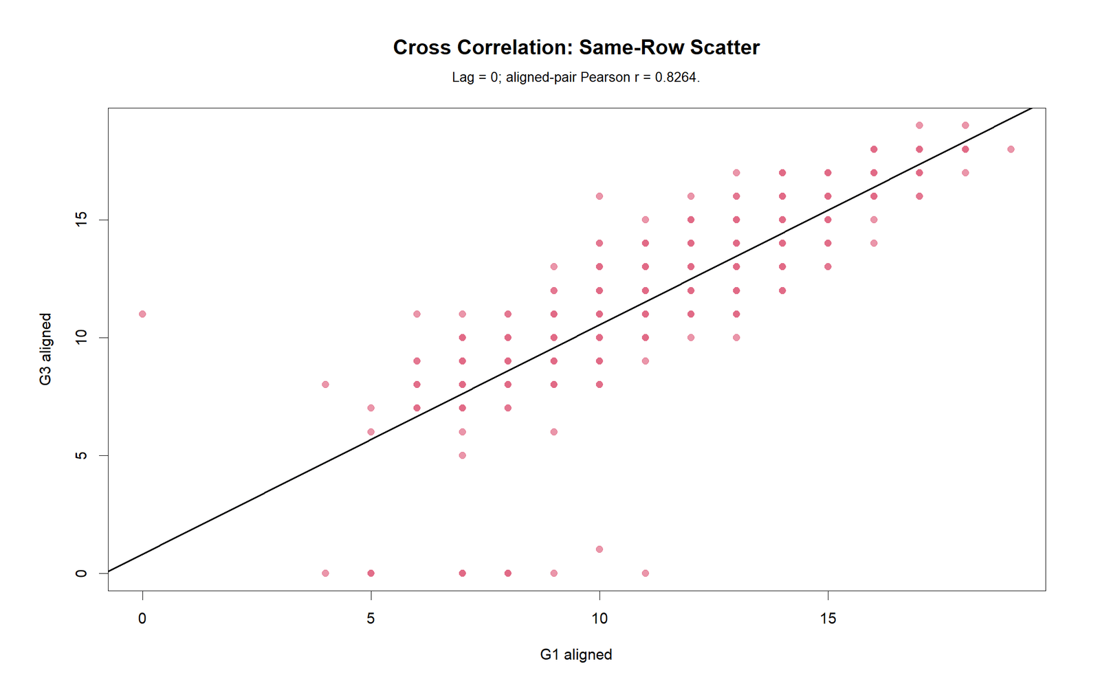
The R lag 0 scatterplot shows the strong upward relationship between G1 and G3. The reported aligned-pair Pearson value is approximately r = 0.8264. This confirms the same-row association visually.
R Chart 5: Colorful Strongest Lag Scatterplot
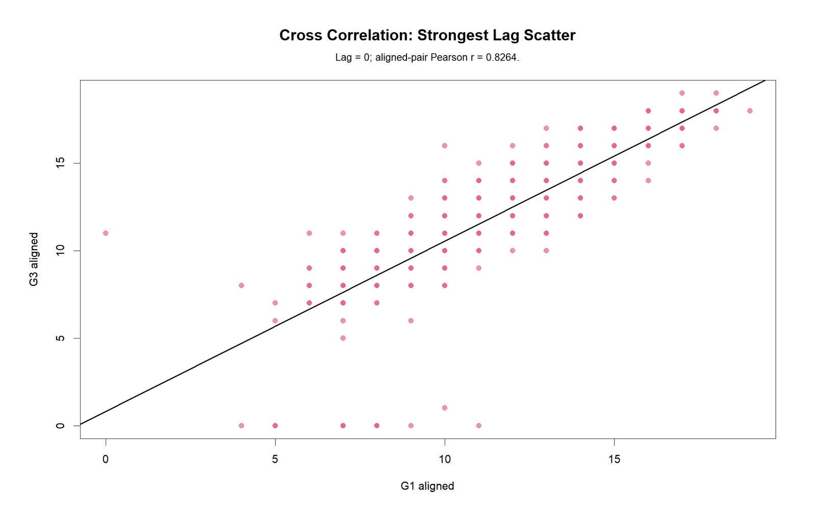
The strongest lag scatterplot is also based on lag 0. This is an important validation point: both the lag 0 chart and strongest-lag chart point to the same relationship, not to a delayed lead-lag effect.
R Chart 6: Colorful Top Lag Rankings

The R top lag ranking chart confirms the Python ranking. Lag 0 is the strongest, followed by smaller lagged correlations. The chart provides a clean summary for the final report section.
SPSS Output Interpretation
The SPSS output gives a formal same-row Pearson correlation context before the lagged cross-correlation interpretation. It confirms that the grade variables are strongly related in the original row alignment.
Open the SPSS Cross Correlation Output PDF
| SPSS Relationship | Pearson r | Significance | Interpretation |
|---|---|---|---|
| G1 with G2 | .865 | p < .001 | Very strong positive same-row grade relationship. |
| G1 with G3 | .826 | p < .001 | Strong positive same-row relationship used as lag 0 context. |
| G2 with G3 | .919 | p < .001 | Very strong positive relationship between second-period and final grade. |
| Absences with G3 | -.091 | p = .020 | Weak negative relationship with final grade. |
| Studytime with G3 | .250 | p < .001 | Positive but smaller relationship with final grade. |
| Failures with G3 | -.393 | p < .001 | Moderate negative relationship with final grade. |
The SPSS output should be treated as a formal correlation context for the cross-correlation post. It helps readers understand why lag 0 is strong: G1 and G3 already have a strong same-row association.
Excel Worked File Explanation
The Excel workbook is a fully worked cross-correlation file. It is designed so students can replace the sample series with their own X and Y columns and watch the lag formulas update automatically.
Download the Cross Correlation Fully Worked Excel File
| Excel Sheet | Purpose | Main Formula Idea |
|---|---|---|
| README | Explains how to use the workbook. | Instructions and workbook notes. |
| Data | Holds X and Y series values. | Raw input values for G1 and G3 or replacement series. |
| Settings | Stores names, row counts and dynamic results. | COUNT, INDEX, MATCH and strongest-lag formulas. |
| Cross_Correlation | Calculates lag -20 to +20. | CORREL, OFFSET, T.DIST.2T, ATANH and TANH. |
| Lag0_Work | Shows manual Pearson calculation for lag 0. | Deviation, cross-product and denominator steps. |
| Strongest_Lag_Work | Builds manual calculation for strongest lag. | INDEX with lag offset. |
| Interpretation | Turns results into reporting language. | Formula-driven narrative and caution notes. |
The Excel workbook is especially useful for teaching because it does not only give the final r value. It shows how aligned pairs change by lag, how each lag correlation is calculated, and how the strongest lag is identified.
Python, R, SPSS and Excel Workflows
| Software | Main Workflow | Best Use |
|---|---|---|
| Python | Use pandas/numpy to align lags, scipy for Pearson r and p-values, matplotlib for ordered profiles, CCF plots and scatterplots. | Automated chart generation and reproducible reports. |
| R | Use ccf-style lag logic, cor.test, Fisher confidence intervals and R plotting. | Statistical validation and colorful publication charts. |
| SPSS | Use Pearson correlations for same-row context and lagged variables for selected lag checks. | Formal output PDF and classroom reporting. |
| Excel | Use CORREL, OFFSET, INDEX, T.DIST.2T, ATANH and TANH formulas. | Fully worked formula learning and manual verification. |
Code Blocks and Excel Formulas
Python Code for Cross Correlation
import pandas as pd
import numpy as np
from scipy import stats

df = pd.read_csv("dataset.csv")

x_name = "G1"
y_name = "G3"
max_lag = 20

work = df[[x_name, y_name]].dropna().copy()
x = work[x_name].astype(float).to_numpy()
y = work[y_name].astype(float).to_numpy()

rows = []

for lag in range(-max_lag, max_lag + 1):
    if lag < 0:
        x_aligned = x[-lag:]
        y_aligned = y[:len(y) + lag]
        direction = f"{y_name} leads {x_name} by {abs(lag)} row(s)"
    elif lag > 0:
        x_aligned = x[:len(x) - lag]
        y_aligned = y[lag:]
        direction = f"{x_name} leads {y_name} by {lag} row(s)"
    else:
        x_aligned = x
        y_aligned = y
        direction = "Same-row / no lag correlation"

    n = len(x_aligned)
    r, p = stats.pearsonr(x_aligned, y_aligned)
    t_stat = r * np.sqrt((n - 2) / (1 - r**2))

    z = np.arctanh(r)
    se = 1 / np.sqrt(n - 3)
    ci_low, ci_high = np.tanh([z - 1.96 * se, z + 1.96 * se])
    approx_band = 1.96 / np.sqrt(n)

    rows.append({
        "lag": lag,
        "pair_n": n,
        "cross_correlation_r": r,
        "t_statistic": t_stat,
        "p_value_two_tailed": p,
        "ci95_lower": ci_low,
        "ci95_upper": ci_high,
        "approx_95_band": approx_band,
        "outside_approx_95_band": abs(r) > approx_band,
        "lag_direction_interpretation": direction,
        "absolute_correlation": abs(r)
    })

result = pd.DataFrame(rows)
result = result.sort_values("absolute_correlation", ascending=False)

print(result.head(10))
result.to_csv("cross_correlation_results.csv", index=False)
R Code for Cross Correlation
df <- read.csv("dataset.csv", stringsAsFactors = FALSE)

x_name <- "G1"
y_name <- "G3"
max_lag <- 20

work <- na.omit(df[, c(x_name, y_name)])
x <- as.numeric(work[[x_name]])
y <- as.numeric(work[[y_name]])

rows <- data.frame()

for(lag in -max_lag:max_lag){
  if(lag < 0){
    x_aligned <- x[(abs(lag) + 1):length(x)]
    y_aligned <- y[1:(length(y) + lag)]
    direction <- paste(y_name, "leads", x_name, "by", abs(lag), "row(s)")
  } else if(lag > 0){
    x_aligned <- x[1:(length(x) - lag)]
    y_aligned <- y[(lag + 1):length(y)]
    direction <- paste(x_name, "leads", y_name, "by", lag, "row(s)")
  } else {
    x_aligned <- x
    y_aligned <- y
    direction <- "Same-row / no lag correlation"
  }

  n <- length(x_aligned)
  test <- cor.test(x_aligned, y_aligned, method = "pearson")
  r <- unname(test$estimate)
  t_stat <- unname(test$statistic)
  p_value <- test$p.value

  z <- atanh(r)
  se <- 1 / sqrt(n - 3)
  ci <- tanh(c(z - 1.96 * se, z + 1.96 * se))
  approx_band <- 1.96 / sqrt(n)

  rows <- rbind(rows, data.frame(
    lag = lag,
    pair_n = n,
    cross_correlation_r = r,
    t_statistic = t_stat,
    p_value_two_tailed = p_value,
    ci95_lower = ci[1],
    ci95_upper = ci[2],
    approx_95_band = approx_band,
    outside_approx_95_band = abs(r) > approx_band,
    lag_direction_interpretation = direction,
    absolute_correlation = abs(r)
  ))
}

rows <- rows[order(-rows$absolute_correlation), ]
print(head(rows, 10))
write.csv(rows, "cross_correlation_results_r.csv", row.names = FALSE)
SPSS Syntax for Same-Row Context and Lagged Checks
* Cross Correlation context in SPSS.
OUTPUT CLOSE ALL.
OUTPUT NEW NAME=Cross_Correlation_Output.

* Same-row Pearson correlations before lagged checks.
CORRELATIONS
  /VARIABLES=G1 G2 G3 absences studytime failures
  /PRINT=TWOTAIL
  /MISSING=PAIRWISE.

* Example selected lag variables.
* Positive lag example: G1_t compared with later G3.
COMPUTE G3_lead1 = LAG(G3, -1).
COMPUTE G3_lead2 = LAG(G3, -2).

* Negative lag example: earlier G3 relative to G1.
COMPUTE G3_lag1 = LAG(G3, 1).
COMPUTE G3_lag2 = LAG(G3, 2).
EXECUTE.

CORRELATIONS
  /VARIABLES=G1 G3 G3_lead1 G3_lead2 G3_lag1 G3_lag2
  /PRINT=TWOTAIL
  /MISSING=PAIRWISE.

OUTPUT EXPORT
  /CONTENTS EXPORT=VISIBLE
  /PDF DOCUMENTFILE='Cross-Correlation-SPSS-Output.pdf'.
Excel Formula Patterns for Cross Correlation
Lagged cross-correlation:
=CORREL(aligned_X_range, aligned_Y_range)

t statistic:
=r*SQRT((n-2)/(1-r^2))

Two-tailed p-value:
=T.DIST.2T(ABS(t), n-2)

Fisher z:
=ATANH(r)

Fisher 95% CI lower:
=TANH(z - 1.96/SQRT(n-3))

Fisher 95% CI upper:
=TANH(z + 1.96/SQRT(n-3))

Approximate 95% band:
=1.96/SQRT(n)

Decision:
=IF(ABS(r)>approx_band,"Outside 95% band","Inside 95% band")
How to Report Cross Correlation
A good cross-correlation report should state the two series, lag convention, lag range, strongest lag, coefficient, p-value, confidence interval and whether the strongest result is same-row or lagged.
APA-style report: A cross-correlation analysis was conducted using G1 as the X series and G3 as the Y series across lags -20 to +20. Positive lags compared G1t with later G3 values. The strongest absolute cross-correlation occurred at lag 0, r = .826, p < .001, 95% CI [.800, .849]. This indicates a strong same-row relationship between G1 and G3. Lagged correlations were smaller than the lag 0 result, so the analysis did not support a stronger delayed association.
Reporting caution: Do not say that G1 causes G3 simply because the same-row correlation is strong. Cross-correlation is an association method. Causal interpretation requires research design, timing logic and control of confounding variables.
Common Mistakes in Cross Correlation
| Mistake | Why It Is a Problem | Better Practice |
|---|---|---|
| Ignoring row order | Cross-correlation only makes sense when row order has meaning. | Use time-ordered or sequence-ordered data. |
| Confusing positive and negative lags | Lag direction depends on the chosen convention. | State the lag convention clearly before interpreting. |
| Reporting only the strongest lag | The strongest lag may be only slightly stronger or based on fewer pairs. | Report pair N, r, p-value, confidence interval and lag direction. |
| Forgetting lag 0 | Lag 0 may explain most of the association. | Compare lag 0 with shifted lag values. |
| Claiming causation | Cross-correlation does not prove cause and effect. | Use association wording unless the design supports causal claims. |
| Ignoring trends | Shared trends can inflate cross-correlation. | Check trends, stationarity and residual patterns when working with true time series. |
Downloads and Resources
Download R Report PDFR cross-correlation output with colorful validation charts.
Download SPSS Output PDFSPSS same-row Pearson context and output PDF.
Download Excel Worked FileFormula-based workbook with lag -20 to +20 calculations.
Open Python CCF ChartCross-correlation function across tested lags.
Open R Top Lag RankingsColorful ranking of strongest lagged associations.
External References
For software documentation, see the R documentation for acf/ccf, the statsmodels documentation for ccf, and the SciPy documentation for signal.correlate.
FAQs About Cross Correlation
What is cross correlation?
Cross correlation measures the association between two ordered series at different lags. It shows whether the strongest relationship occurs in the same row or after shifting one series forward or backward.
What was the strongest lag in this report?
The strongest absolute cross-correlation was at lag 0, with r = 0.826387. This means the same-row relationship between G1 and G3 was strongest.
What does a positive lag mean?
In this report, a positive lag means Xt is compared with Yt+lag. Since X is G1 and Y is G3, a positive lag means G1 is compared with later G3 values.
Is cross correlation the same as Pearson correlation?
No. Pearson correlation compares two variables in the same row. Cross correlation repeats Pearson-style comparisons after shifting one series by multiple lags.
Can cross correlation prove causation?
No. Cross correlation shows lagged association, not causation. Causal wording needs a research design that supports timing, control variables and causal inference.
Can Excel calculate cross correlation?
Yes. Excel can calculate cross correlation using aligned ranges with CORREL, OFFSET, INDEX, T.DIST.2T, ATANH and TANH formulas. The downloadable workbook in this post includes a fully worked example.

