
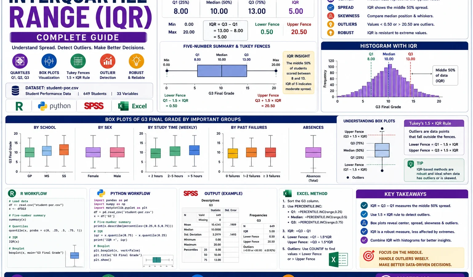
Descriptive Statistics Guide
Interquartile Range is a robust descriptive statistic that measures the spread of the middle 50% of a dataset. It is calculated as Q3 minus Q1 and is especially useful when a variable has skewness, unusual values or outliers. This complete guide explains Q1, median, Q3, IQR, Tukey 1.5 × IQR fences, possible outliers, box plots, histogram interpretation, R charts, Python charts, SPSS output and Excel workflow using student performance data.
Quick Answer: Interquartile Range Result
An Interquartile Range analysis was used to describe the middle spread of the student performance dataset. The main outcome variable was G3 final grade. For G3, the first quartile was 10, the median was 12, the third quartile was 14 and the IQR was 4.
Main finding: The middle 50% of G3 final grades falls between 10 and 14. The median is 12. Tukey’s lower fence is 4 and the upper fence is 20, so the possible G3 outliers are low-end scores below 4 rather than high-end scores above the upper fence.
Important interpretation note: IQR is not the same as the full range. The full G3 range is 0 to 19, but the IQR focuses only on the central 50% of values. This is why IQR is more robust than the range when extreme values are present.
Table of Contents
- What Is Interquartile Range?
- Why IQR Is Needed with Mean and Standard Deviation
- Interquartile Range Formula and Tukey Fences
- Dataset and Variables Used
- Verified Interquartile Range Results
- Chart-by-Chart Interpretation
- R Code for Interquartile Range
- Python Code for Interquartile Range
- SPSS Syntax and Interpretation
- Excel Method
- Download Output and Resources
- APA Style Reporting
- When Should You Use Interquartile Range?
- References and Related Guides
- FAQs
What Is Interquartile Range?
Interquartile Range, usually written as IQR, is the distance between the third quartile and the first quartile. The first quartile, Q1, is the 25th percentile. The third quartile, Q3, is the 75th percentile. The IQR therefore describes the spread of the middle half of a dataset.
In simple words, IQR ignores the lowest 25% and the highest 25% of values and focuses on the central 50%. This makes it very useful for skewed data, ordinal scales, exam marks, clinical measures, survey scores, absence counts and other variables where extreme values can distort the mean or the range.
Interquartile Range is commonly reported with the five-number summary, box plot interpretation, histogram interpretation, frequency distribution and descriptive statistics. It is also helpful before more advanced analysis because it quickly shows whether the middle spread is narrow, wide or affected by outlier fences.
Simple meaning: IQR tells how spread out the middle 50% of values are. A small IQR means the central values are close together. A large IQR means the central values are more spread out.
Why IQR Is Needed with Mean and Standard Deviation
The mean and standard deviation are important descriptive measures, but they can be sensitive to extreme values. If a dataset has skewness, unusual low values, unusual high values or many outliers, the mean and standard deviation may not fully describe the typical spread. IQR helps by giving a resistant measure of spread.
For G3 final grade, the mean is 11.9060 and the standard deviation is 3.23066. These values are useful, but they do not show where the middle half of students are located. IQR adds that missing information by showing that the middle 50% of final grades is between 10 and 14.
| Measure | What it uses | How it reacts to outliers | Best interpretation use |
|---|---|---|---|
| Range | Minimum and maximum | Very sensitive | Shows total spread from lowest to highest value. |
| Standard deviation | All values around the mean | Sensitive | Best for roughly symmetric numeric distributions. |
| Interquartile Range | Q1 and Q3 | Robust | Best for central spread, skewed data and outlier-aware reporting. |
| Coefficient of variation | Standard deviation relative to mean | Sensitive to mean and outliers | Useful when comparing relative variation across different scales. |
When you need relative variation, use the coefficient of variation. When you need uncertainty around a mean or proportion, use a confidence interval. When you need a robust spread summary, IQR is usually the better descriptive statistic.
Interquartile Range Formula and Tukey Fences
The basic IQR formula is simple. First find Q1 and Q3. Then subtract Q1 from Q3. Tukey’s 1.5 × IQR rule can then be used to flag possible outliers.
Interquartile Range:
IQR = Q3 - Q1

Tukey lower fence:
Lower fence = Q1 - 1.5 × IQR

Tukey upper fence:
Upper fence = Q3 + 1.5 × IQR

Possible low outlier:
Value < Lower fence

Possible high outlier:
Value > Upper fence
For the G3 final grade variable, Q1 = 10 and Q3 = 14. Therefore, the IQR is 14 – 10 = 4. The lower fence is 10 – 1.5 × 4 = 4. The upper fence is 14 + 1.5 × 4 = 20.
G3 formula result: IQR = 14 – 10 = 4. Lower fence = 4. Upper fence = 20. Scores below 4 are possible low-end outliers. Since the maximum observed G3 is 19, there are no high-end G3 outliers by this rule.
Outlier warning: Tukey fences flag possible outliers, not automatic errors. A low G3 value can be a real score, a missing-code problem or a special case. Always inspect the data before deleting observations.
Dataset and Variables Used
This guide uses the student-por.csv student performance dataset with 649 rows. The main outcome is G3, which represents final grade. The analysis also uses G1, G2, age, absences, study time, failures, family relationship, free time, going out, weekday alcohol use, weekend alcohol use and health as numeric variables for IQR comparison.
| Item | Variable | Role in this IQR guide |
|---|---|---|
| First-period grade | G1 | Used to compare grade spread before G3. |
| Second-period grade | G2 | Used to compare middle grade spread before final grade. |
| Final grade | G3 | Main numeric outcome for quartiles, IQR and Tukey fences. |
| Absences | absences | Used to show high-end outliers and a wider central spread. |
| Study time | studytime | Used for G3 group box plots and central-spread comparison. |
| Failure group | failures / failure_group | Used to show how prior failures shift the G3 median and IQR. |
| School group | school | Used to compare G3 median and IQR between GP and MS schools. |
External dataset source: UCI Machine Learning Repository: Student Performance dataset.
Verified Interquartile Range Results
The R, Python and SPSS outputs show the same main pattern. G3 has Q1 = 10, median = 12, Q3 = 14 and IQR = 4. Absences has the widest IQR among the listed numeric variables, with Q1 = 0, median = 2, Q3 = 6 and IQR = 6. G1 and G2 each have IQR = 3, while G3 has a slightly wider central spread.
| Variable | N | Q1 | Median | Q3 | IQR | Lower fence | Upper fence | Possible outliers | Outlier % |
|---|---|---|---|---|---|---|---|---|---|
| G1 | 649 | 10.00 | 11.00 | 13.00 | 3.00 | 5.50 | 17.50 | 16 | 2.47 |
| G2 | 649 | 10.00 | 11.00 | 13.00 | 3.00 | 5.50 | 17.50 | 25 | 3.85 |
| G3 | 649 | 10.00 | 12.00 | 14.00 | 4.00 | 4.00 | 20.00 | 16 | 2.47 |
| age | 649 | 16.00 | 17.00 | 18.00 | 2.00 | 13.00 | 21.00 | 1 | 0.15 |
| absences | 649 | 0.00 | 2.00 | 6.00 | 6.00 | -9.00 | 15.00 | 21 | 3.24 |
| studytime | 649 | 1.00 | 2.00 | 2.00 | 1.00 | -0.50 | 3.50 | 35 | 5.39 |
| failures | 649 | 0.00 | 0.00 | 0.00 | 0.00 | 0.00 | 0.00 | 100 | 15.41 |
The failures variable needs careful interpretation because Q1, median and Q3 are all zero. This does not mean the variable has no information. It means at least 75% of students have zero failures, so the middle 50% is concentrated at zero. Values above zero become possible outliers by the strict 1.5 × IQR rule, but they are also meaningful category values.
G3 Interquartile Range by Groups
| Grouping variable | Group level | N | Q1 | Median | Q3 | IQR | Lower fence | Upper fence | Possible outliers |
|---|---|---|---|---|---|---|---|---|---|
| school | GP | 423 | 11.00 | 13.00 | 14.00 | 3.00 | 6.50 | 18.50 | 6 |
| school | MS | 226 | 9.00 | 11.00 | 13.00 | 4.00 | 3.00 | 19.00 | 14 |
| sex | Female | 383 | 10.00 | 12.00 | 14.00 | 4.00 | 4.00 | 20.00 | 7 |
| sex | Male | 266 | 10.00 | 11.00 | 13.00 | 3.00 | 5.50 | 17.50 | 15 |
| studytime | <2 hours | 212 | 10.00 | 11.00 | 13.00 | 3.00 | 5.50 | 17.50 | 10 |
| studytime | 2 to 5 hours | 305 | 10.00 | 12.00 | 14.00 | 4.00 | 4.00 | 20.00 | 8 |
| studytime | 5 to 10 hours | 97 | 12.00 | 13.00 | 15.00 | 3.00 | 7.50 | 19.50 | 0 |
| studytime | >10 hours | 35 | 11.00 | 13.00 | 15.00 | 4.00 | 5.00 | 21.00 | 0 |
| failure | 0 failures | 549 | 11.00 | 12.00 | 14.00 | 3.00 | 6.50 | 18.50 | 10 |
| failure | 1 failure | 70 | 8.00 | 10.00 | 10.00 | 2.00 | 5.00 | 13.00 | 9 |
| failure | 2 failures | 16 | 7.75 | 9.50 | 10.00 | 2.25 | 4.38 | 13.38 | 2 |
| failure | 3+ failures | 14 | 8.00 | 8.50 | 10.00 | 2.00 | 5.00 | 13.00 | 1 |
Chart-by-Chart Interpretation of the Interquartile Range Analysis
This section explains the uploaded Python and R charts. Python charts use a clear publication layout, while R charts confirm the same quartile, IQR and outlier-fence patterns in a second software workflow.
Chart 1: G3 Quartiles and IQR Box Plot
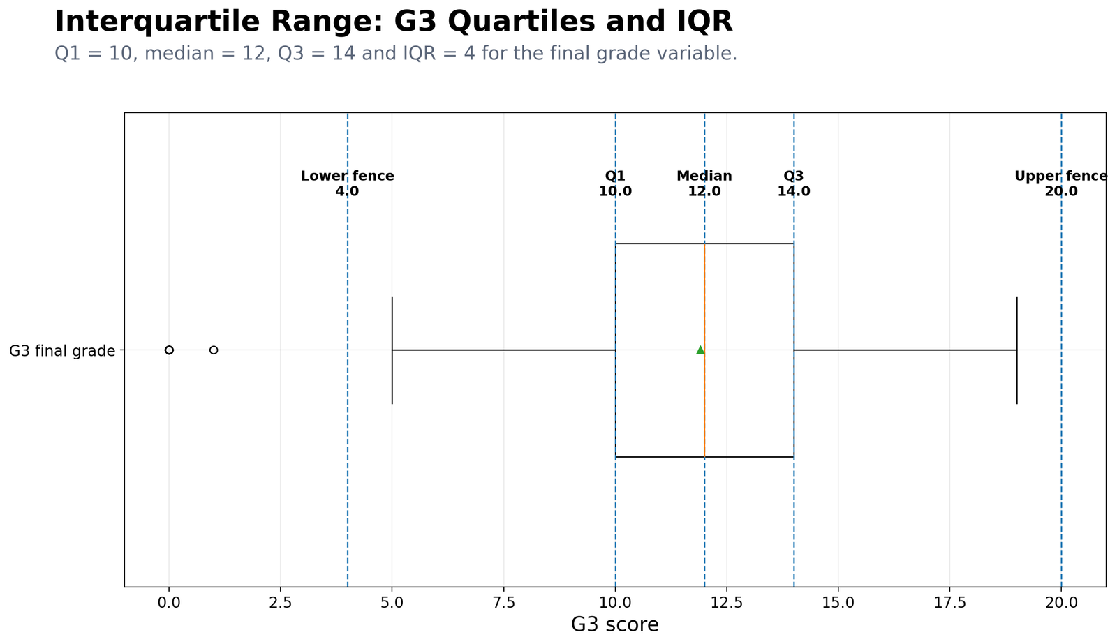
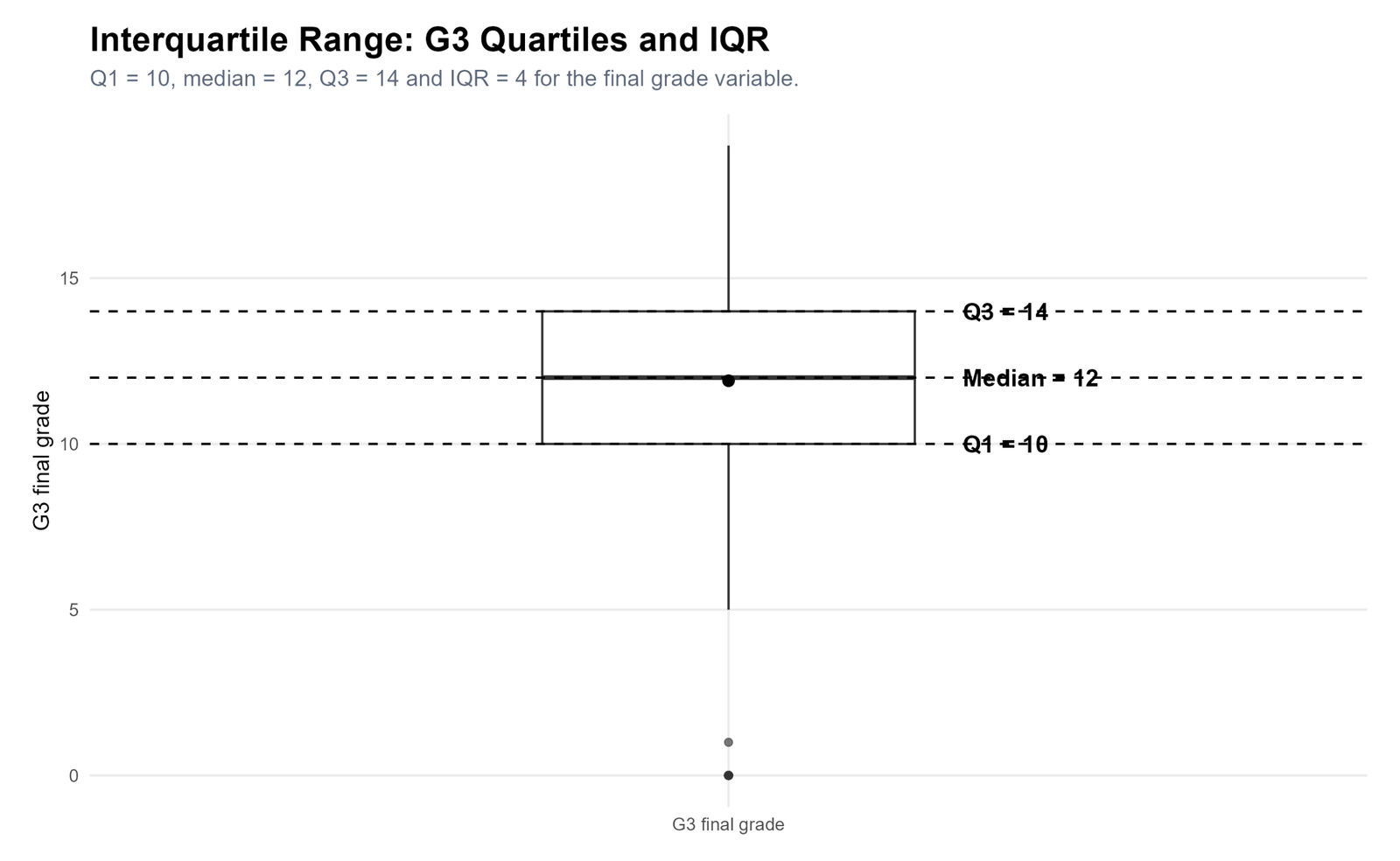
Specific interpretation: The G3 box shows that the middle half of final grades lies between 10 and 14. The median is 12. The lower fence is 4, and the upper fence is 20. The plotted low values show why an IQR-based outlier check is useful before making decisions from the mean alone.
Decision from Chart 1: The central grade spread is moderate. The main outlier concern is low G3 scores, not high G3 scores.
Chart 2: Interquartile Range Across Numeric Variables
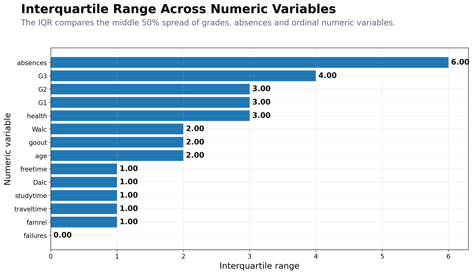
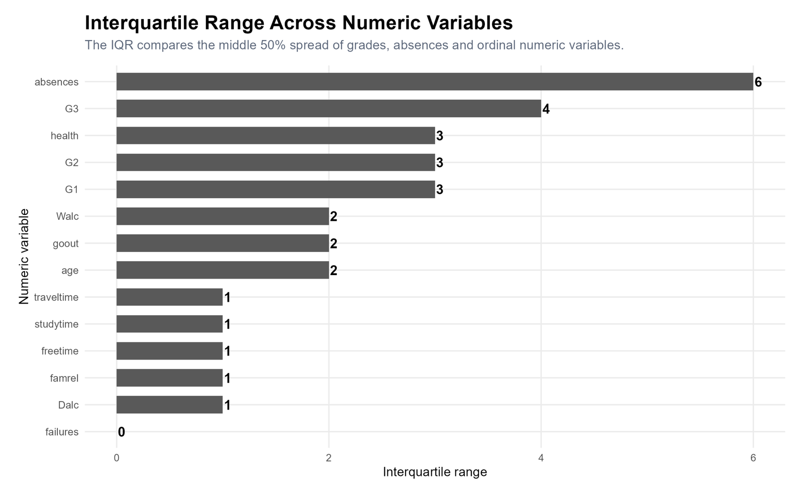
Specific interpretation: Absences has the largest IQR at 6, meaning the middle 50% of absence counts is wider than the middle 50% of grade scores. G3 has IQR = 4. G1, G2 and health have IQR = 3. Variables such as studytime, freetime, family relationship and weekday alcohol use have smaller IQR values because they are ordinal variables with limited scale ranges.
Decision from Chart 2: Absences is the most spread-out central variable, while G3 has the widest central grade spread among G1, G2 and G3.
Chart 3: Grade Quartiles for G1, G2 and G3
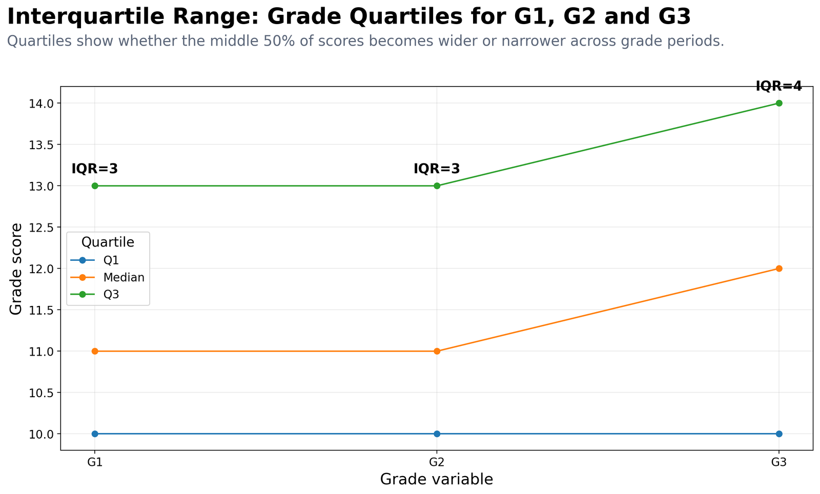
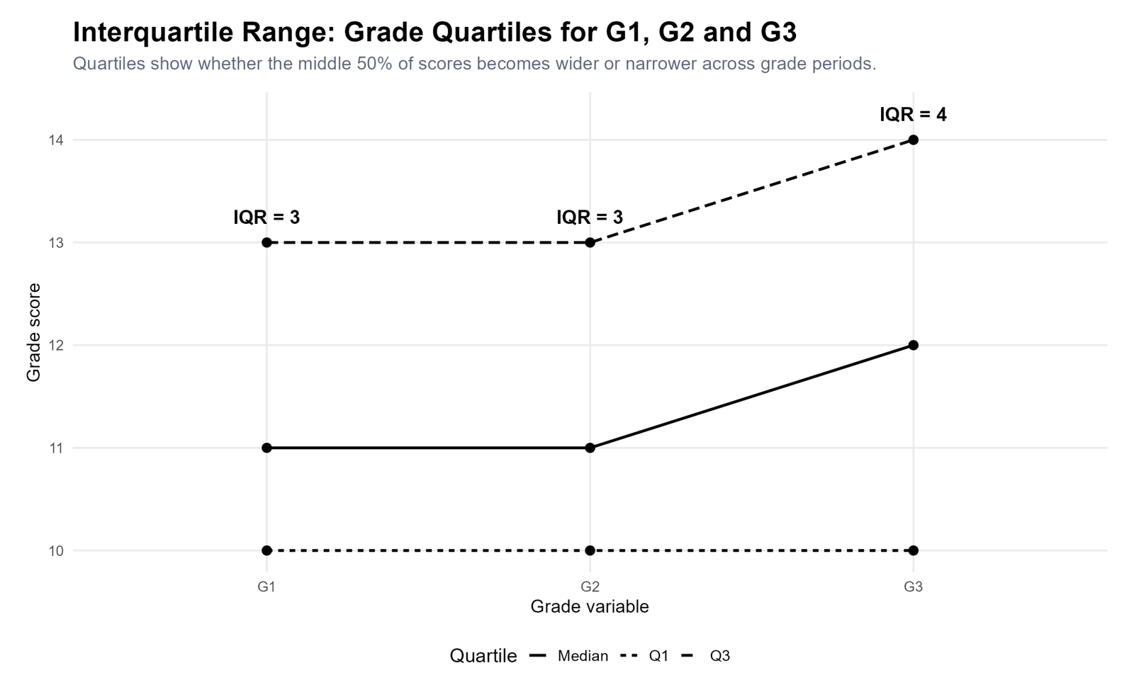
Specific interpretation: G1 and G2 both have Q1 = 10, median = 11 and Q3 = 13, so their IQR is 3. G3 has Q1 = 10, median = 12 and Q3 = 14, so its IQR is 4. This means the final grade distribution is slightly wider in the central 50% than the earlier grade periods.
Decision from Chart 3: Central final-grade variation increases slightly by G3, and the median also rises from 11 to 12.
Chart 4: G3 Distribution by School
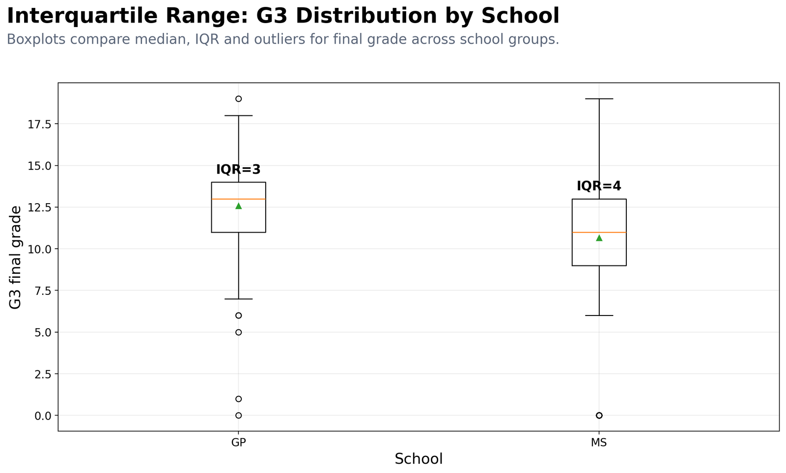
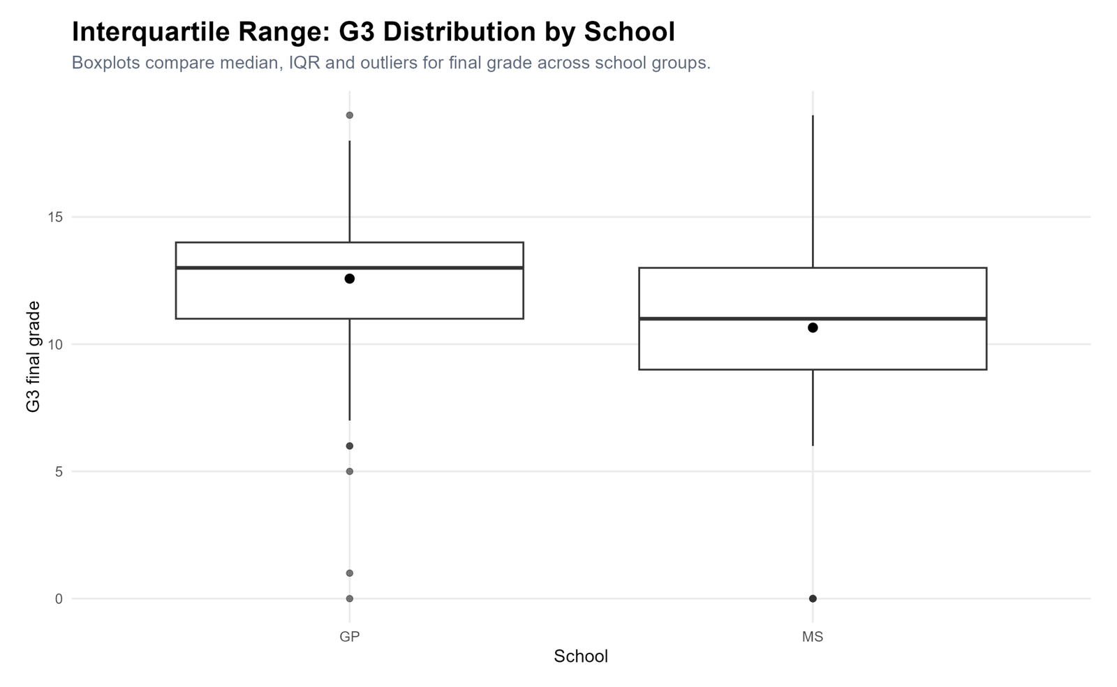
Specific interpretation: GP has Q1 = 11, median = 13, Q3 = 14 and IQR = 3. MS has Q1 = 9, median = 11, Q3 = 13 and IQR = 4. GP therefore has a higher central final-grade band, while MS has a wider middle spread.
Decision from Chart 4: School differences are visible in both center and spread. GP students have a higher G3 median, while MS students show more central variation.
Chart 5: G3 Spread in Binary Groups
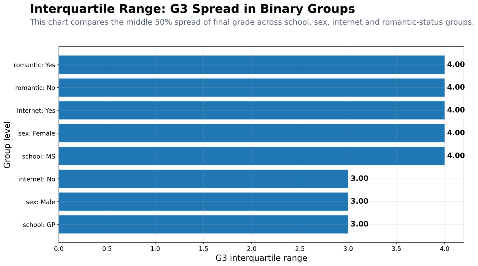
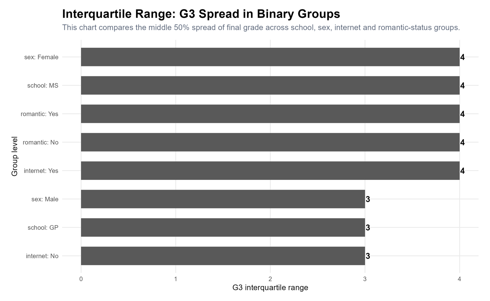
Specific interpretation: Several groups have G3 IQR = 4, including female students, MS school, internet-yes students and both romantic-status groups. Male students, GP school and internet-no students have IQR = 3. These values show that central spread differs slightly across groups, even when the overall G3 IQR is 4.
Decision from Chart 5: IQR is useful because it shows spread differences that are not obvious from the mean alone.
Chart 6: G3 by Study Time
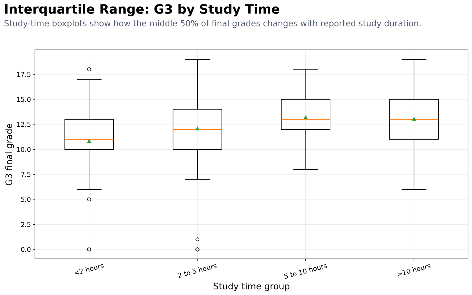
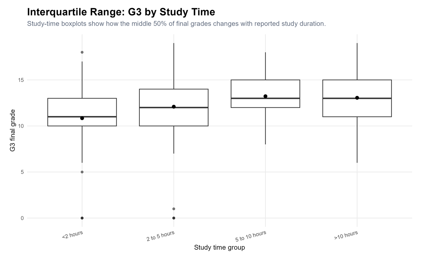
Specific interpretation: Students studying less than 2 hours have median G3 = 11 and IQR = 3. The 2 to 5 hours group has median = 12 and IQR = 4. The 5 to 10 hours group has median = 13 and IQR = 3. The more than 10 hours group also has median = 13 but IQR = 4.
Decision from Chart 6: Higher study-time groups have higher medians, but the spread is not perfectly linear. IQR helps separate center from spread.
Chart 7: G3 by Failure Group
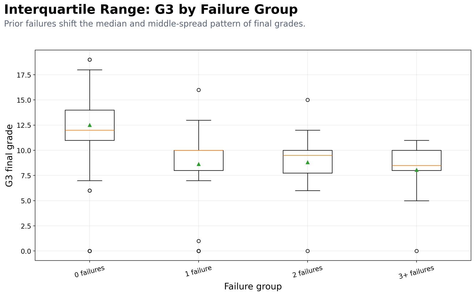
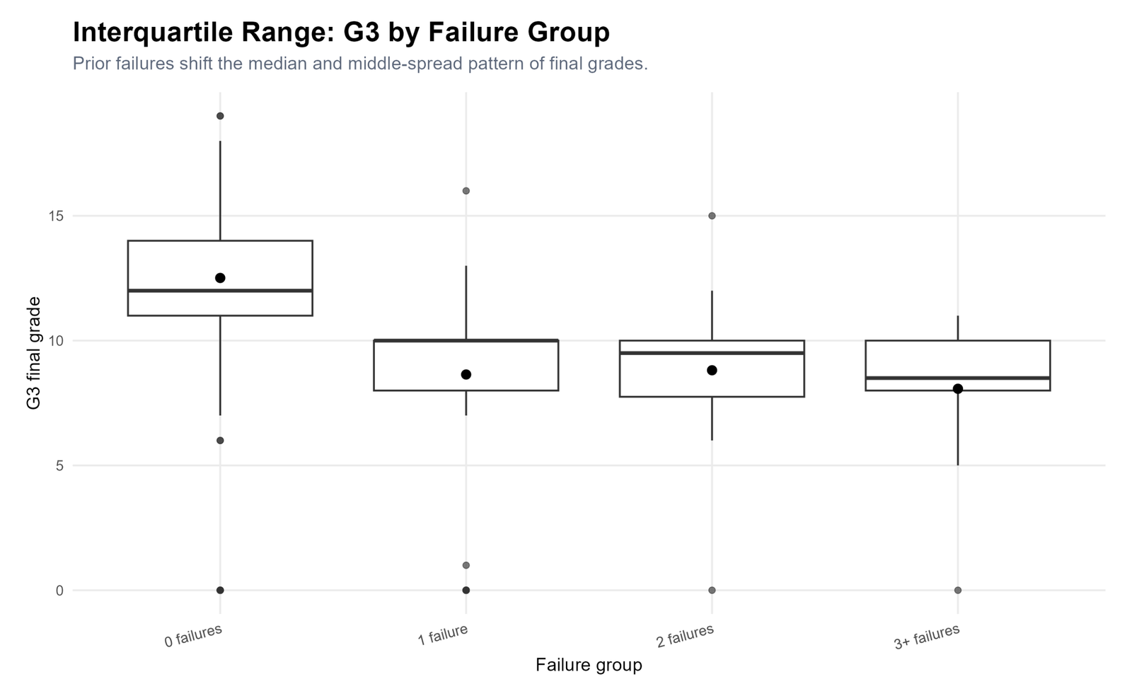
Specific interpretation: Students with zero failures have median G3 = 12 and IQR = 3. Students with one failure have median = 10 and IQR = 2. Students with two failures have median = 9.5 and IQR = 2.25. Students with three or more failures have median = 8.5 and IQR = 2.
Decision from Chart 7: Prior failure history shifts the G3 distribution downward. The main change is a lower median, not a wider central spread.
Chart 8: Tukey Outlier Fences for G3
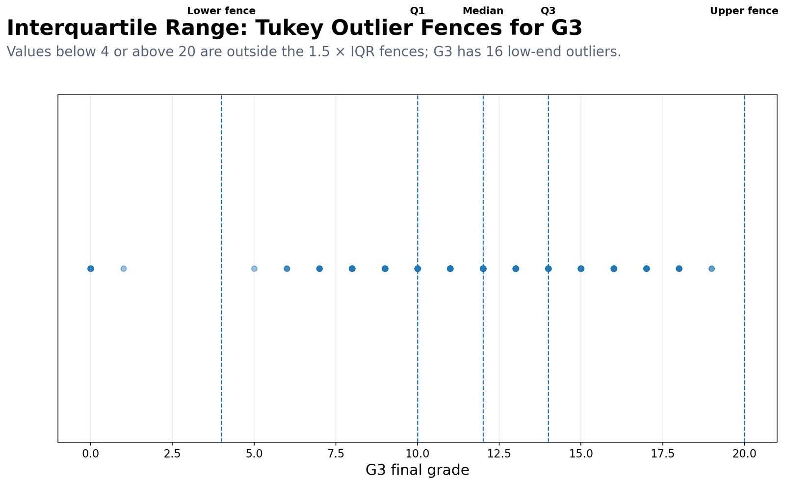
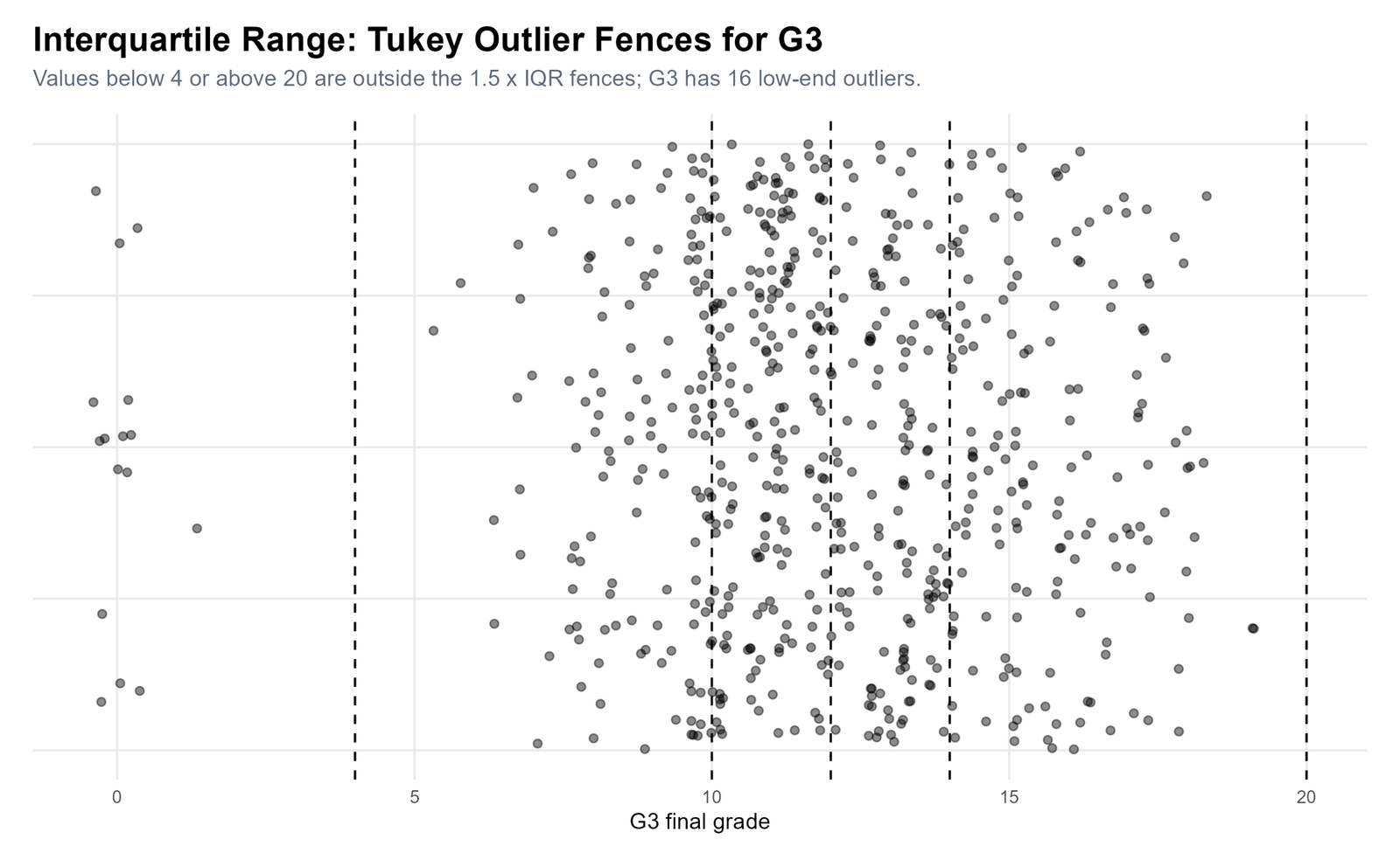
Specific interpretation: The G3 lower fence is 4, and the upper fence is 20. Because the maximum G3 value is 19, there are no high-end outliers using Tukey’s rule. The possible outliers are low-end scores below 4. The summary table reports 16 possible G3 outliers, which is about 2.47% of the dataset.
Decision from Chart 8: Do not remove these scores automatically. Investigate whether they are real low performance scores, data-entry errors or special cases.
Chart 9: Tukey Outlier Fences for Absences
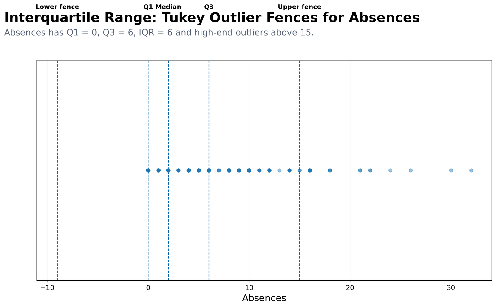
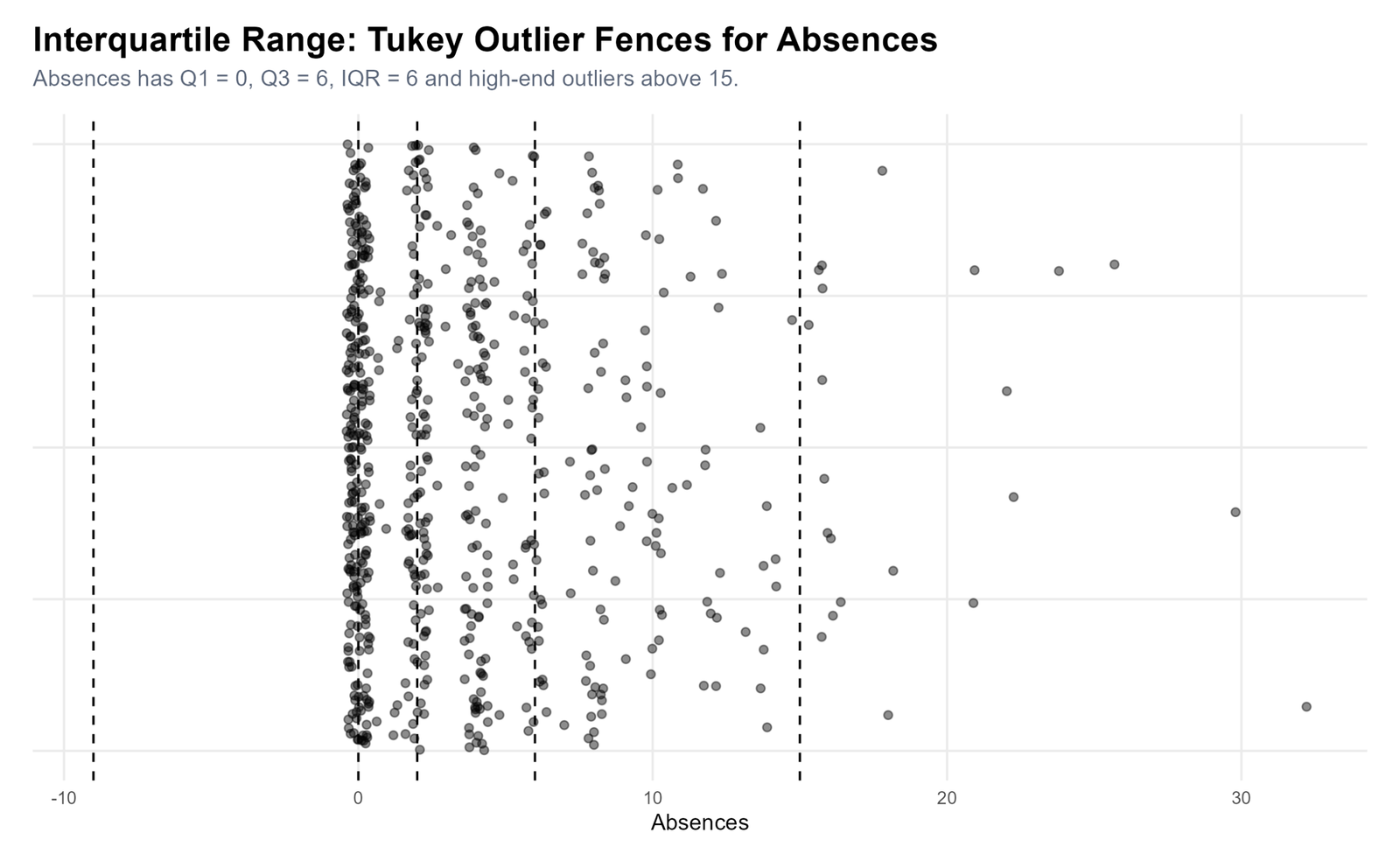
Specific interpretation: Absences has Q1 = 0, median = 2, Q3 = 6 and IQR = 6. The upper fence is 15, so absence values above 15 are possible high-end outliers. The summary table reports 21 possible absence outliers, about 3.24% of cases.
Decision from Chart 9: Absences is more skewed than G3 and should be interpreted with robust summaries and visual checks.
Chart 10: G3 Histogram with Quartiles
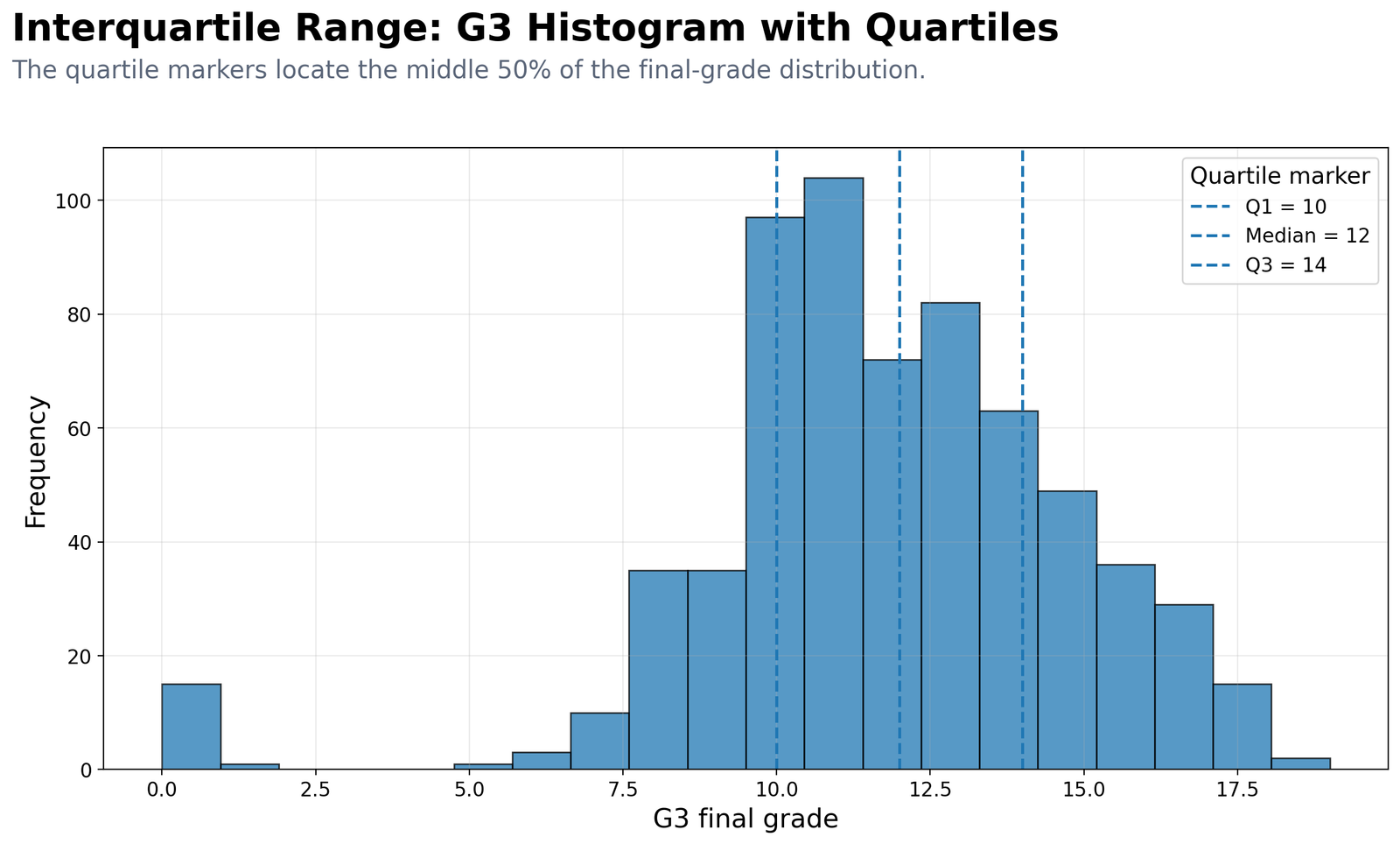
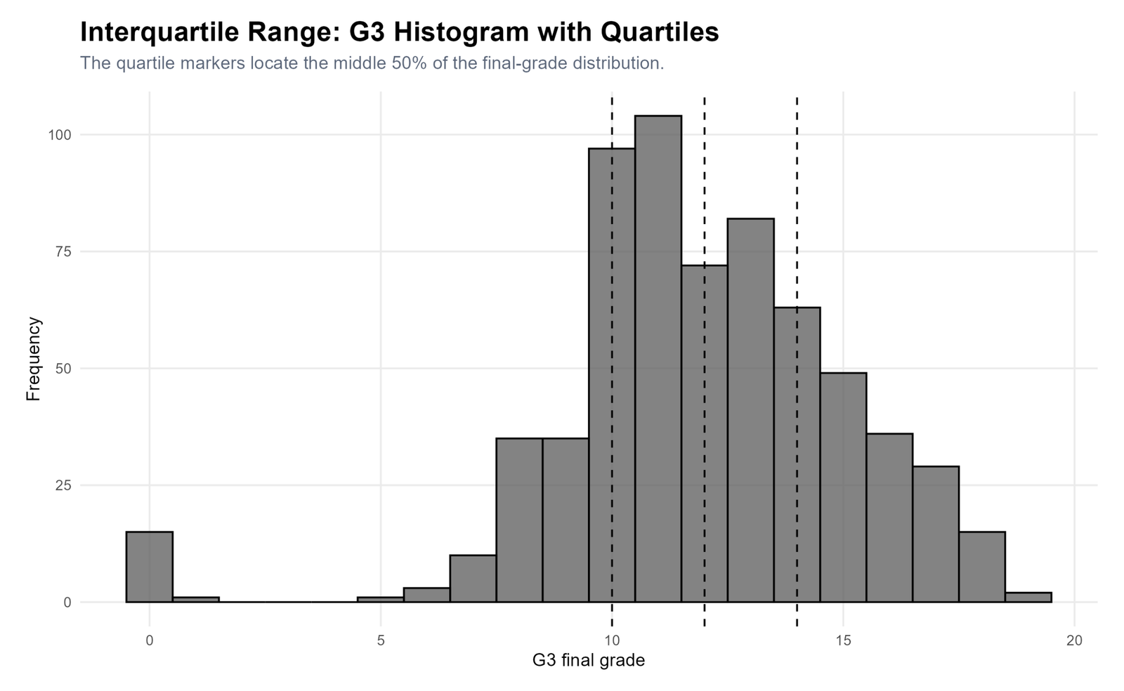
Specific interpretation: The histogram shows that many G3 scores cluster around the middle of the grade scale. Quartile markers locate the middle 50% between 10 and 14. The lower tail includes a small number of very low scores, which explains why Tukey’s rule flags low-end outliers.
Decision from Chart 10: Use the histogram with the box plot. The histogram shows distribution shape, while the box plot summarizes quartiles and outliers.
R Code for Interquartile Range
R can calculate quartiles, IQR, Tukey fences, outlier counts, tables, charts, clean SPSS-ready data and PDF reports. The simplified workflow below follows the same logic used for the uploaded R output.
library(readr)
library(dplyr)
library(ggplot2)

folder <- "D:/DATA ANALYSIS/A Basic Descriptive Statistics Guides/Interquartile Range"
data_file <- file.path(folder, "dataset.csv")

charts_dir <- file.path(folder, "R_Output", "charts")
tables_dir <- file.path(folder, "R_Output", "tables")
pdf_dir    <- file.path(folder, "R_Output", "pdf")
clean_dir  <- file.path(folder, "R_Output", "clean_data")

dir.create(charts_dir, recursive = TRUE, showWarnings = FALSE)
dir.create(tables_dir, recursive = TRUE, showWarnings = FALSE)
dir.create(pdf_dir, recursive = TRUE, showWarnings = FALSE)
dir.create(clean_dir, recursive = TRUE, showWarnings = FALSE)

df <- read_csv(data_file, show_col_types = FALSE)

df_clean <- df %>%
  mutate(
    sex = factor(sex, levels = c("F", "M"), labels = c("Female", "Male")),
    internet = factor(internet, levels = c("no", "yes"), labels = c("No", "Yes")),
    romantic = factor(romantic, levels = c("no", "yes"), labels = c("No", "Yes")),
    studytime_group = factor(studytime, levels = c(1, 2, 3, 4),
      labels = c("<2 hours", "2 to 5 hours", "5 to 10 hours", ">10 hours")),
    failure_group = case_when(
      failures == 0 ~ "0 failures",
      failures == 1 ~ "1 failure",
      failures == 2 ~ "2 failures",
      failures >= 3 ~ "3+ failures",
      TRUE ~ NA_character_
    )
  )

write_csv(df_clean, file.path(clean_dir, "interquartile_range_clean_data_for_spss.csv"))

iqr_summary <- function(x) {
  x <- na.omit(as.numeric(x))
  q1 <- as.numeric(quantile(x, 0.25, type = 7))
  med <- median(x)
  q3 <- as.numeric(quantile(x, 0.75, type = 7))
  iqr_value <- q3 - q1
  lower <- q1 - 1.5 * iqr_value
  upper <- q3 + 1.5 * iqr_value
  outliers <- sum(x < lower | x > upper)
  tibble(
    n = length(x),
    q1 = q1,
    median = med,
    q3 = q3,
    iqr = iqr_value,
    lower_fence = lower,
    upper_fence = upper,
    outlier_count = outliers,
    outlier_percent = outliers / length(x) * 100
  )
}

numeric_vars <- c("G1", "G2", "G3", "age", "absences", "studytime",
                  "failures", "famrel", "freetime", "goout", "Dalc", "Walc", "health")

summary_table <- bind_rows(lapply(numeric_vars, function(v) {
  bind_cols(variable = v, iqr_summary(df_clean[[v]]))
}))

write_csv(summary_table, file.path(tables_dir, "interquartile_range_summary.csv"))

# G3 result
g3_result <- iqr_summary(df_clean$G3)
print(g3_result)

# Basic chart
ggplot(df_clean, aes(y = G3)) +
  geom_boxplot() +
  labs(
    title = "Interquartile Range: G3 Quartiles and IQR",
    subtitle = "Q1 = 10, median = 12, Q3 = 14 and IQR = 4.",
    x = "G3 final grade",
    y = "G3"
  )
R interpretation: R confirms that G3 has Q1 = 10, median = 12, Q3 = 14 and IQR = 4. It also confirms that absences has the widest IQR among the listed numeric variables.
Python Code for Interquartile Range
Python is useful for automatic IQR reporting because it can calculate values, save clean SPSS-ready data, create publication-ready charts and export summary tables in one workflow.
from pathlib import Path
import numpy as np
import pandas as pd
import matplotlib.pyplot as plt
from matplotlib.backends.backend_pdf import PdfPages

MAIN_FOLDER = Path(r"D:\DATA ANALYSIS\A Basic Descriptive Statistics Guides\Interquartile Range")

CHARTS_DIR = MAIN_FOLDER / "Python_Output" / "charts"
TABLES_DIR = MAIN_FOLDER / "Python_Output" / "tables"
PDF_DIR = MAIN_FOLDER / "Python_Output" / "pdf"
CLEAN_DIR = MAIN_FOLDER / "Python_Output" / "clean_data"

for folder in [CHARTS_DIR, TABLES_DIR, PDF_DIR, CLEAN_DIR]:
    folder.mkdir(parents=True, exist_ok=True)

candidate_files = [
    MAIN_FOLDER / "dataset.csv",
    MAIN_FOLDER / "dataset(1).csv",
    MAIN_FOLDER / "student-por.csv",
    MAIN_FOLDER / "clean data set.csv",
    MAIN_FOLDER / "clean_data.csv",
]

existing_files = [p for p in candidate_files if p.exists()]
if existing_files:
    DATA_FILE = existing_files[0]
else:
    csv_files = list(MAIN_FOLDER.glob("*.csv"))
    if not csv_files:
        raise FileNotFoundError("No CSV dataset found in the Interquartile Range folder.")
    DATA_FILE = csv_files[0]

df = pd.read_csv(DATA_FILE)

df_clean = df.copy()
df_clean["sex"] = df_clean["sex"].map({"F": "Female", "M": "Male"}).fillna(df_clean["sex"])
df_clean["internet"] = df_clean["internet"].map({"no": "No", "yes": "Yes"}).fillna(df_clean["internet"])
df_clean["romantic"] = df_clean["romantic"].map({"no": "No", "yes": "Yes"}).fillna(df_clean["romantic"])
df_clean["studytime_group"] = df_clean["studytime"].map({
    1: "<2 hours",
    2: "2 to 5 hours",
    3: "5 to 10 hours",
    4: ">10 hours"
}).fillna(df_clean["studytime"].astype(str))

def failure_label(x):
    if pd.isna(x):
        return np.nan
    if x == 0:
        return "0 failures"
    if x == 1:
        return "1 failure"
    if x == 2:
        return "2 failures"
    return "3+ failures"

df_clean["failure_group"] = df_clean["failures"].apply(failure_label)

clean_csv = CLEAN_DIR / "interquartile_range_clean_data_for_spss.csv"
df_clean.to_csv(clean_csv, index=False)

def iqr_summary(series):
    x = pd.to_numeric(series, errors="coerce").dropna()
    q1 = x.quantile(0.25)
    med = x.median()
    q3 = x.quantile(0.75)
    iqr_value = q3 - q1
    lower = q1 - 1.5 * iqr_value
    upper = q3 + 1.5 * iqr_value
    outliers = ((x < lower) | (x > upper)).sum()
    return {
        "n": len(x),
        "q1": q1,
        "median": med,
        "q3": q3,
        "iqr": iqr_value,
        "lower_fence": lower,
        "upper_fence": upper,
        "outlier_count": int(outliers),
        "outlier_percent": outliers / len(x) * 100
    }

numeric_vars = ["G1", "G2", "G3", "age", "absences", "studytime",
                "failures", "famrel", "freetime", "goout", "Dalc", "Walc", "health"]

summary = pd.DataFrame([
    {"variable": v, **iqr_summary(df_clean[v])}
    for v in numeric_vars
])

summary.to_csv(TABLES_DIR / "interquartile_range_summary.csv", index=False)

g3_result = iqr_summary(df_clean["G3"])
print(g3_result)

# Basic G3 box plot
fig, ax = plt.subplots(figsize=(13, 8))
ax.boxplot(pd.to_numeric(df_clean["G3"], errors="coerce").dropna(), vert=False)
ax.set_title("Interquartile Range: G3 Quartiles and IQR")
ax.set_xlabel("G3 final grade")
fig.savefig(CHARTS_DIR / "chart_01_python_g3_quartiles_iqr_boxplot.png", dpi=200, bbox_inches="tight")
plt.close(fig)

# PDF report container
pdf_file = PDF_DIR / "Interquartile-Range-Python-Output-Report.pdf"
with PdfPages(pdf_file) as pdf:
    fig, ax = plt.subplots(figsize=(13, 8))
    ax.axis("off")
    ax.text(0.05, 0.90, "Interquartile Range Output Summary", fontsize=22, fontweight="bold")
    ax.text(0.05, 0.80, f"G3 Q1={g3_result['q1']}, median={g3_result['median']}, Q3={g3_result['q3']}, IQR={g3_result['iqr']}", fontsize=14)
    pdf.savefig(fig, bbox_inches="tight")
    plt.close(fig)
Python output note: Run Python before SPSS. The Python script creates the clean SPSS-ready CSV file, output folders, charts, tables and PDF report structure. SPSS then uses the clean CSV and exports the SPSS PDF into the project folder.
SPSS Syntax and Interpretation for Interquartile Range
SPSS can calculate quartiles through Frequencies and can summarize medians through Means. The uploaded SPSS PDF output includes frequency tables, descriptive statistics, percentile output, group medians and manual IQR summary tables.
The uploaded SPSS output file is available below:
View Interquartile Range SPSS Output PDF
SPSS Menu Method
| Need | SPSS menu path | Output to read |
|---|---|---|
| Quartiles and median | Analyze → Descriptive Statistics → Frequencies → Statistics | 25th percentile, median and 75th percentile. |
| Box plot and outliers | Graphs → Chart Builder → Boxplot | Box, whiskers and possible outlier points. |
| Group medians | Analyze → Compare Means → Means | N, mean, standard deviation, median, minimum and maximum by group. |
| Manual Tukey fences | Compute from Q1 and Q3 | Lower fence, upper fence and possible outlier count. |
SPSS Syntax Example with PDF Export
SET PRINTBACK=ON MPRINT=ON DECIMAL=DOT.
SET UNICODE=ON.

HOST COMMAND=['cmd /c if not exist "D:\DATA ANALYSIS\A Basic Descriptive Statistics Guides\Interquartile Range\Python_Output\pdf" mkdir "D:\DATA ANALYSIS\A Basic Descriptive Statistics Guides\Interquartile Range\Python_Output\pdf"'].

GET DATA
 /TYPE=TXT
 /FILE='D:\DATA ANALYSIS\A Basic Descriptive Statistics Guides\Interquartile Range\Python_Output\clean_data\interquartile_range_clean_data_for_spss.csv'
 /ENCODING='UTF8'
 /DELCASE=LINE
 /DELIMITERS=","
 /QUALIFIER='"'
 /ARRANGEMENT=DELIMITED
 /FIRSTCASE=2
 /VARIABLES=
 school A8
 sex A12
 age F8.2
 address A8
 famsize A8
 Pstatus A8
 Medu F8.2
 Fedu F8.2
 Mjob A20
 Fjob A20
 reason A20
 guardian A20
 traveltime F8.2
 studytime F8.2
 failures F8.2
 schoolsup A8
 famsup A8
 paid A8
 activities A8
 nursery A8
 higher A8
 internet A8
 romantic A8
 famrel F8.2
 freetime F8.2
 goout F8.2
 Dalc F8.2
 Walc F8.2
 health F8.2
 absences F8.2
 G1 F8.2
 G2 F8.2
 G3 F8.2
 studytime_group A20
 failure_group A20.
CACHE.
EXECUTE.

DATASET NAME InterquartileRangeMain WINDOW=FRONT.

TITLE "Interquartile Range: Five-Number Summary and Quartiles".

FREQUENCIES VARIABLES=G1 G2 G3 age absences studytime failures famrel freetime goout Dalc Walc health
 /FORMAT=NOTABLE
 /PERCENTILES=25 50 75
 /STATISTICS=MINIMUM MAXIMUM MEAN MEDIAN STDDEV RANGE
 /ORDER=ANALYSIS.

MEANS TABLES=G3 BY school sex internet romantic studytime failures
 /CELLS=COUNT MEAN STDDEV MEDIAN MIN MAX.

OUTPUT SAVE
 OUTFILE='D:\DATA ANALYSIS\A Basic Descriptive Statistics Guides\Interquartile Range\Python_Output\pdf\Interquartile-Range-SPSS-Output.spv'
 LOCK=NO.

OUTPUT EXPORT
 /CONTENTS EXPORT=ALL LAYERS=PRINTSETTING MODELVIEWS=PRINTSETTING
 /PDF DOCUMENTFILE='D:\DATA ANALYSIS\A Basic Descriptive Statistics Guides\Interquartile Range\Python_Output\pdf\Interquartile-Range-SPSS-Output.pdf'
 /EMBEDBOOKMARKS=YES
 /EMBEDFONTS=YES.
Excel Method for Interquartile Range
Excel can calculate IQR directly with quartile formulas. It is useful when you need a simple teaching method, quick verification or a small manual report.
Excel Steps for IQR
| Step | Excel action | Formula idea |
|---|---|---|
| 1 | Place the G3 scores in one column. | Example range: A2:A650 |
| 2 | Calculate Q1. | =QUARTILE.INC(A2:A650,1) |
| 3 | Calculate median. | =MEDIAN(A2:A650) |
| 4 | Calculate Q3. | =QUARTILE.INC(A2:A650,3) |
| 5 | Calculate IQR. | =Q3_cell-Q1_cell |
| 6 | Calculate Tukey fences. | =Q1_cell-1.5*IQR_cell and =Q3_cell+1.5*IQR_cell |
| 7 | Flag possible outliers. | =IF(OR(A2<lower_fence,A2>upper_fence),"Possible outlier","Normal") |
Excel Result for G3
Using the G3 column, Excel should return Q1 = 10, median = 12, Q3 = 14 and IQR = 4. The lower fence is 4 and the upper fence is 20. Any G3 value below 4 is flagged as a possible low-end outlier.
Download Output and Resources
The SPSS PDF output and dataset source are available below. Use the SPSS output for formal tables and use the Python and R charts for visual interpretation of quartiles, IQR and outlier fences.
APA Style Reporting for Interquartile Range
An IQR report should include the median, Q1, Q3, IQR and outlier-fence interpretation when relevant. For skewed variables, report median and IQR together instead of relying only on mean and standard deviation.
APA-style report for G3: The final grade variable had a median of 12, with the middle 50% of scores falling between 10 and 14, IQR = 4. Tukey’s 1.5 × IQR rule produced a lower fence of 4 and an upper fence of 20, identifying 16 possible low-end outliers.
APA-style report for absences: Absences were positively skewed, with a median of 2 and an interquartile range from 0 to 6, IQR = 6. Values above 15 were flagged as possible high-end outliers using Tukey’s rule.
APA-style report for school groups: GP students had a higher median G3 score than MS students. The GP group had median = 13 and IQR = 3, while the MS group had median = 11 and IQR = 4, suggesting a lower and slightly wider central final-grade distribution in the MS group.
Short report:
The G3 final grade distribution had Q1 = 10, median = 12, Q3 = 14 and IQR = 4. Tukey fences were 4 and 20. Sixteen G3 values were flagged as possible low-end outliers, so the IQR and box plot should be reported alongside the mean and standard deviation.
When Should You Use Interquartile Range?
Use Interquartile Range when you need a robust measure of spread. It is especially useful when the data contain skewness, extreme values, unusual low scores, unusual high scores or ordinal numeric scales.
| Analysis situation | Use IQR because | Related method |
|---|---|---|
| Skewed numeric data | IQR is less affected by the tail than standard deviation. | Histogram Interpretation |
| Box plot reporting | The box itself represents Q1 to Q3. | Box Plot Interpretation |
| Outlier detection | Tukey fences use 1.5 × IQR. | Five-Number Summary |
| Before parametric tests | IQR helps you understand spread and possible outliers before testing. | Levene Test |
| Ordinal numeric scales | IQR describes central spread without over-interpreting the mean. | Descriptive Statistics |
If your next analysis compares group means, check variance assumptions with Levene Test, Brown-Forsythe Test or Cochran C Test. If your analysis depends on normality, support IQR interpretation with Q-Q Plot Normality Check, Q-Q Plot Normality Check, P-P Plot Normality Check, D’Agostino-Pearson Test, Kolmogorov-Smirnov Test, Lilliefors Test, Ryan-Joiner Test or Cramer-von Mises Test.
References and Related Guides
Interquartile Range connects with descriptive statistics, outlier detection, normality testing, transformations, group comparison, repeated-measures assumptions and regression diagnostics. These related guides can support the next step of analysis:
| Related guide | Why it helps |
|---|---|
| Descriptive Statistics | Explains the wider set of summary measures around IQR. |
| Five-Number Summary | Directly supports minimum, Q1, median, Q3 and maximum reporting. |
| Frequency Distribution | Shows how values are distributed before quartiles are interpreted. |
| Histogram Interpretation | Helps explain the shape behind IQR and quartiles. |
| Box Plot Interpretation | Explains the visual meaning of Q1, median, Q3, whiskers and outliers. |
| Coefficient of Variation | Useful when spread needs to be compared relative to the mean. |
| Confidence Interval | Useful when reporting uncertainty around estimated values. |
| Effect Size | Pairs with IQR when practical group differences need interpretation. |
| Central Limit Theorem | Explains why large-sample averages can still behave well even when raw values are skewed. |
| Reciprocal Transformation | Supports transformation decisions when extreme skewness affects analysis. |
| Cross Tabulation | Useful when numeric IQR findings are compared with categorical group patterns. |
| One-Tailed T Test | Group comparisons should be supported by descriptive spread and outlier checks. |
| One-Sample Z Test | Connects one-sample inference with descriptive center and spread. |
| One-Proportion Z Test | Useful when analysis changes from numeric spread to proportions. |
| Mauchly’s Test of Sphericity | Relevant when the same outcome is measured repeatedly and repeated-measures assumptions are checked. |
| Greenhouse-Geisser Correction | Supports repeated-measures analysis when sphericity is violated. |
| Goldfeld-Quandt Test | Checks changing variance in regression contexts where spread matters. |
| Ramsey RESET Test | Useful after descriptive analysis when regression specification needs checking. |
| Clinical Trial Data Analysis Using R | Clinical reporting often uses median and IQR for skewed outcomes. |
External references: UCI Student Performance dataset, IBM SPSS Statistics, R Project, and Python.
FAQs About Interquartile Range
What is Interquartile Range in simple words?
Interquartile Range is the spread of the middle 50% of values. It is calculated as Q3 minus Q1.
What is the IQR formula?
The formula is IQR = Q3 – Q1. Q1 is the 25th percentile, and Q3 is the 75th percentile.
What is the G3 Interquartile Range in this guide?
For G3 final grade, Q1 = 10, median = 12, Q3 = 14 and IQR = 4.
How are Tukey outlier fences calculated?
The lower fence is Q1 – 1.5 × IQR, and the upper fence is Q3 + 1.5 × IQR. Values outside these fences are possible outliers.
What are the Tukey fences for G3?
For G3, the lower fence is 4 and the upper fence is 20. Values below 4 are possible low-end outliers.
Is IQR better than standard deviation?
IQR is better when the data are skewed or contain outliers. Standard deviation is useful when the distribution is roughly symmetric and the mean is a good center measure.
Can I calculate IQR in Excel?
Yes. Use QUARTILE.INC or QUARTILE.EXC to calculate Q1 and Q3, then subtract Q1 from Q3.
Why does the failures variable have IQR = 0?
Because Q1, median and Q3 are all zero. Most students have zero past failures, so the middle 50% of the variable is concentrated at zero.
Should possible outliers be deleted?
No. Tukey fences identify possible outliers, not automatic errors. Check the source, meaning and influence of the values before deciding what to do.
What chart is best for Interquartile Range?
A box plot is the best visual chart for IQR because the box directly shows Q1, median and Q3. A histogram is useful beside it because it shows the full distribution shape.

