
Descriptive Statistics, Minimum, Maximum and Data Spread
Range: Formula, Interpretation, SPSS, Python, R and Excel Guide
Range is the simplest measure of spread in descriptive statistics. It is calculated by subtracting the minimum value from the maximum value. A larger Range means the data cover a wider interval, while a smaller Range means the values are more tightly bounded. This guide explains Range with verified SPSS output, Python charts, R validation charts, Excel workflow, group range comparison, APA reporting wording, common mistakes, and downloadable resources.
Quick Answer: Range Result
The verified SPSS output calculated Range for five variables: G1, G2, G3, age, and absences. Each variable had N = 649 valid cases and 0 missing cases. The largest range was for absences, where the minimum was 0, the maximum was 32, and the range was 32. The grade variables G1, G2, and G3 each had a range of 19, from a minimum of 0 to a maximum of 19. The age variable had the smallest range, from 15 to 22, giving a range of 7.
Hypothesis-style interpretation: Range is a descriptive statistic, not a significance test. It does not have a p-value and it does not test a null hypothesis. The practical decision is based on comparing minimum, maximum, and spread across variables. In this output, absences has the widest total spread, while age has the narrowest total spread. The grade variables have the same total range but different standard deviations, medians, skewness values, and interquartile ranges.
Final interpretation: The Range analysis shows that absences has the widest overall spread because values run from 0 to 32. The three grade variables all run from 0 to 19, so they have equal ranges of 19. Age has the smallest range because the observed ages are limited from 15 to 22. Range is useful for a quick first look at spread, but it should be interpreted with the interquartile range, standard deviation, variance, boxplots, and outlier checks.
Important note: Range uses only two numbers: the minimum and maximum. This makes it easy to understand, but also sensitive to extreme values. A single unusually low or high observation can change the range strongly. For a more stable middle-spread measure, compare range with the five-number summary, box plot interpretation, and interquartile range.
Table of Contents
- What Is Range?
- Range Formula
- Range Decision Logic
- Dataset and Variables Used
- Verified SPSS Output Interpretation
- Python Chart-by-Chart Interpretation
- R Chart-by-Chart Validation
- SPSS, R, Python and Excel Workflows
- Code Blocks for Range
- APA Reporting Wording
- Common Mistakes
- When to Use Range
- Downloads and Resources
- Related Guides
- FAQs
What Is Range?
Range is the distance between the smallest and largest value in a dataset. It is one of the simplest measures of dispersion. If the minimum and maximum values are far apart, the range is large. If they are close together, the range is small.
Range is often used at the beginning of a descriptive analysis because it quickly shows the total span of the observed data. For example, in this SPSS output, absences has a minimum of 0 and a maximum of 32, so its range is 32. This immediately tells us that the absence variable covers a much wider raw span than age, which has a range of only 7.
However, range does not tell us how the values are distributed between the minimum and maximum. Two variables can have the same range but very different shapes. In this example, G1, G2, and G3 all have a range of 19, but their means, standard deviations, medians, skewness, kurtosis, and interquartile ranges are not identical. Therefore, range should be used with other descriptive statistics.
Practical meaning: Range tells the total observed width of the data. It answers: “What is the distance from the lowest observed value to the highest observed value?”
Range Formula
The formula for range is direct:
For the G3 final grade variable, the SPSS output reports:
For the absences variable, the SPSS output reports:
For the age variable, the SPSS output reports:
| Variable | Minimum | Maximum | Range Calculation | Range |
|---|---|---|---|---|
| G1 | 0 | 19 | 19 − 0 | 19 |
| G2 | 0 | 19 | 19 − 0 | 19 |
| G3 | 0 | 19 | 19 − 0 | 19 |
| age | 15 | 22 | 22 − 15 | 7 |
| absences | 0 | 32 | 32 − 0 | 32 |
Formula caution: Range is easy to calculate, but it ignores all values between the minimum and maximum. A variable can have a large range because of one extreme value, even if most observations are close together.
Range Decision Logic
Range is not a hypothesis test. It does not produce a test statistic, p-value, confidence interval, or reject/fail-to-reject decision. Instead, range is a descriptive measure used to compare total observed spread.
| Statement | Decision Logic | Meaning in This Output |
|---|---|---|
| Descriptive purpose | Compare maximum minus minimum | Absences has the widest total spread. |
| No null hypothesis | Range is not inferential | No p-value is reported or needed. |
| Outlier sensitivity | Check minimum and maximum carefully | Absences maximum of 32 strongly affects its range. |
| Complementary statistics | Use IQR, SD and boxplot with range | G1, G2 and G3 share range 19 but differ in other spread measures. |
Decision summary: Range shows total spread, not statistical significance. The correct conclusion is that absences has the largest total observed spread, age has the smallest total observed spread, and G1, G2, and G3 have equal observed grade spans.
Interpretation nuance: Because range is based only on two endpoints, it should not be used alone to describe variability. Use it as a first descriptive summary, then confirm spread with descriptive statistics, variance, standard deviation, IQR, and boxplots.
Dataset and Variables Used
The worked example uses student performance variables. The variables included in the SPSS range output are G1, G2, G3, age, and absences. The range is especially useful here because the variables are measured on different scales. Grades run from 0 to 19, age runs from 15 to 22, and absences runs from 0 to 32.
| Variable | Role | N | Mean | Standard Deviation | Range | Why It Matters |
|---|---|---|---|---|---|---|
| G1 | First period grade | 649 | 11.40 | 2.745 | 19 | Shows full observed spread of first grade scores. |
| G2 | Second period grade | 649 | 11.57 | 2.914 | 19 | Shows full observed spread of second grade scores. |
| G3 | Final grade | 649 | 11.91 | 3.231 | 19 | Main outcome variable with full grade span from 0 to 19. |
| age | Student age | 649 | 16.74 | 1.218 | 7 | Smallest total spread among selected variables. |
| absences | School absences | 649 | 3.66 | 4.641 | 32 | Largest total spread and strongest endpoint distance. |
For broader descriptive context, connect range with five-number summary, box plot interpretation, histogram interpretation, coefficient of variation, and standard deviation.
Verified SPSS Output Interpretation
The SPSS output provides the range, minimum, maximum, mean, median, standard deviation, variance, interquartile range, skewness, and kurtosis for the selected variables. The most important values for range interpretation are the minimum, maximum, and range rows.
SPSS Range Table
| Variable | N | Minimum | Maximum | Range | IQR | Interpretation |
|---|---|---|---|---|---|---|
| G1 | 649 | 0 | 19 | 19 | 3 | Full grade span is 19 points, while the middle 50% covers 3 points. |
| G2 | 649 | 0 | 19 | 19 | 3 | Same total range as G1, with slightly larger SD. |
| G3 | 649 | 0 | 19 | 19 | 4 | Final grade has full span of 19 and wider middle spread than G1/G2. |
| age | 649 | 15 | 22 | 7 | 2 | Age is tightly bounded compared with grades and absences. |
| absences | 649 | 0 | 32 | 32 | 6 | Absences has the widest total range and a long right tail. |
SPSS Detailed Spread Context
| Variable | Mean | Median | SD | Variance | Skewness | Kurtosis | Spread Meaning |
|---|---|---|---|---|---|---|---|
| G1 | 11.40 | 11.00 | 2.745 | 7.536 | -.003 | .037 | Range is 19, but shape is close to symmetric. |
| G2 | 11.57 | 11.00 | 2.914 | 8.489 | -.360 | 1.662 | Range is 19, with more tail behavior than G1. |
| G3 | 11.91 | 12.00 | 3.231 | 10.437 | -.913 | 2.712 | Range is 19, with negative skew and higher kurtosis. |
| age | 16.74 | 17.00 | 1.218 | 1.484 | .417 | .072 | Small range because age is naturally restricted. |
| absences | 3.66 | 2.00 | 4.641 | 21.537 | 2.021 | 5.781 | Largest range and strongest right-skewed spread. |
SPSS G3 Range by Sex
| Group | N | Mean | Median | SD | Minimum | Maximum | Range |
|---|---|---|---|---|---|---|---|
| Female | 383 | 12.25 | 12.00 | 3.124 | 0 | 19 | 19 |
| Male | 266 | 11.41 | 11.00 | 3.321 | 0 | 19 | 19 |
Both female and male groups have the same G3 range of 19, because both groups include scores from 0 to 19. However, the group means and standard deviations differ. Female students have a higher mean G3 score, while male students have a slightly larger standard deviation. This shows why range alone is not enough for group comparison.
SPSS G3 Range Bands
| G3 Range Band | N | Percent | Mean | SD | Minimum | Maximum | Band Meaning |
|---|---|---|---|---|---|---|---|
| Band 1 | 197 | 30.4% | 8.42 | 2.699 | 0 | 10 | Lowest grade range band. |
| Band 2 | 104 | 16.0% | 11.00 | .000 | 11 | 11 | Single-score band at G3 = 11. |
| Band 3 | 217 | 33.4% | 12.96 | .789 | 12 | 14 | Middle-high grade band. |
| Band 4 | 131 | 20.2% | 16.12 | 1.089 | 15 | 19 | Highest grade range band. |
SPSS interpretation summary: The main range result is that absences has the largest range at 32, while age has the smallest range at 7. G1, G2, and G3 all have equal ranges of 19, but their other spread and shape statistics show different patterns.
Python Chart-by-Chart Interpretation
The Python charts show the Range analysis visually. They include a distribution with minimum and maximum, a range comparison chart, minimum-maximum intervals, and group range comparison.
Python Chart 1: Distribution with Minimum and Maximum
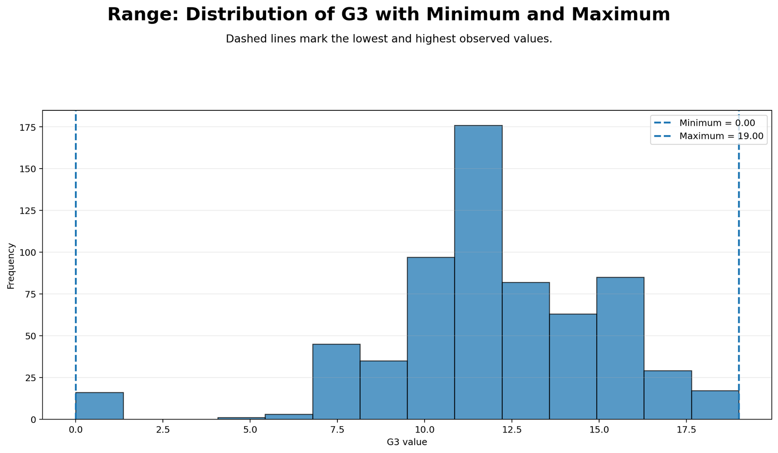
This chart shows how the range is created from the two endpoints of the distribution. The minimum and maximum values define the full observed span of the variable. For G3, the minimum is 0 and the maximum is 19, so the range is 19. The chart helps readers see that range does not depend on the center of the distribution. It depends only on the lowest and highest observed values.
The distribution view is useful because it also reminds us of the limitation of range. Even if most observations are concentrated near the middle, the range is still determined by the endpoints. Therefore, a distribution chart should be read together with the range value.
Python Chart 2: Range Comparison
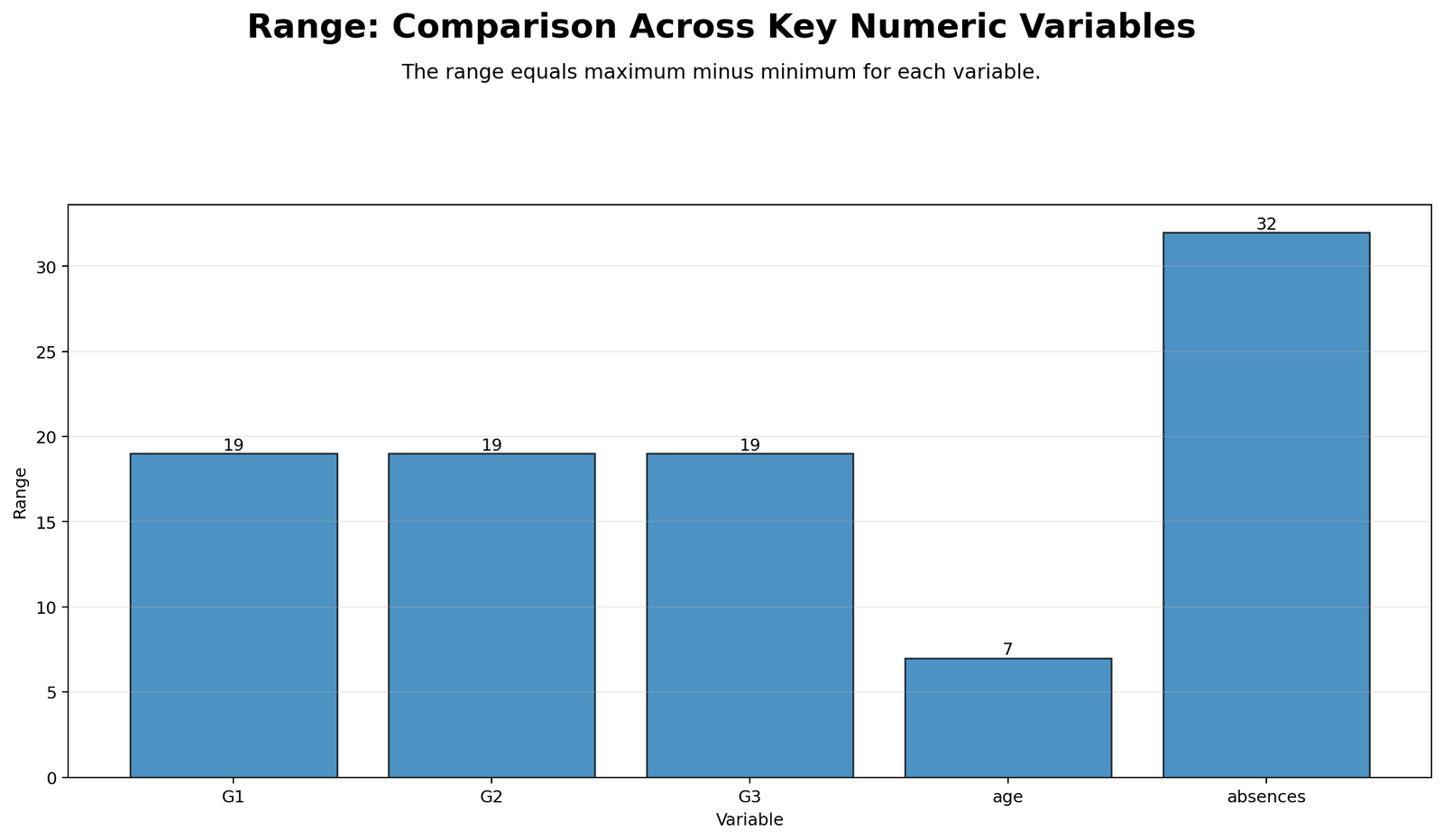
This chart compares range values across variables. Absences has the largest range at 32. G1, G2, and G3 each have a range of 19. Age has the smallest range at 7. The chart makes the main result very clear: absence counts cover the widest raw span in the dataset.
The comparison chart also shows why variable scale matters. A range of 32 absences is not directly the same kind of measurement as a range of 19 grade points. Therefore, when comparing variables measured on different scales, range should be interpreted carefully and supported with standardized or relative spread measures when needed.
Python Chart 3: Minimum Maximum Intervals
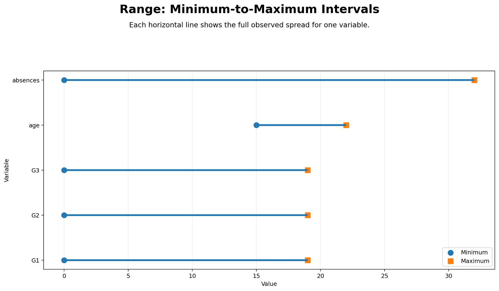
This chart displays the range as an interval from minimum to maximum. It is one of the best ways to explain range visually because the entire line represents the full observed span. For grade variables, the interval runs from 0 to 19. For age, the interval runs from 15 to 22. For absences, the interval runs from 0 to 32.
The interval chart helps readers understand why age has a small range even though it has meaningful variation. Age is naturally restricted in this student dataset. Absences, on the other hand, has a long maximum endpoint, which creates the widest interval.
Python Chart 4: Group Range Comparison
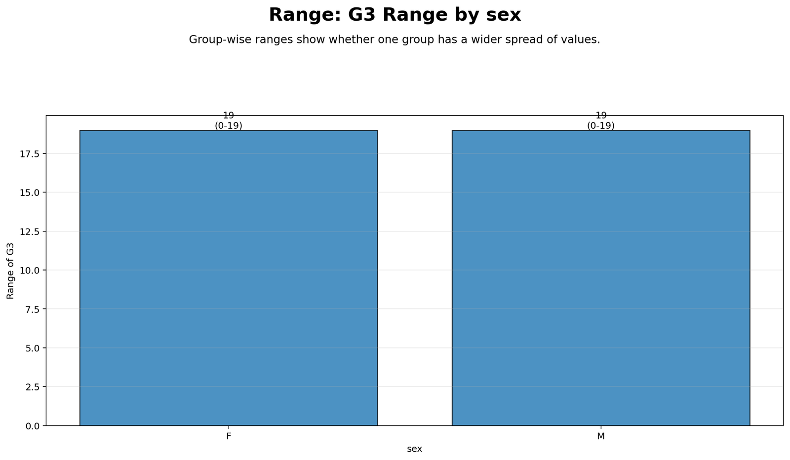
This chart compares G3 range for female and male students. SPSS shows that both groups have a minimum of 0, a maximum of 19, and a range of 19. Therefore, the total observed grade span is the same for both groups.
However, the same range does not mean the two groups have identical distributions. Female students have a mean G3 of 12.25, while male students have a mean G3 of 11.41. Male students have a slightly larger standard deviation. This chart teaches an important point: group range can be equal even when group averages and distributions differ.
R Chart-by-Chart Validation
The R charts validate the same Range interpretation using a separate software workflow. The R figures match the Python and SPSS conclusion: absences has the widest total range, age has the narrowest range, and G1, G2, and G3 have equal grade ranges.
R Chart 1: Distribution with Minimum and Maximum
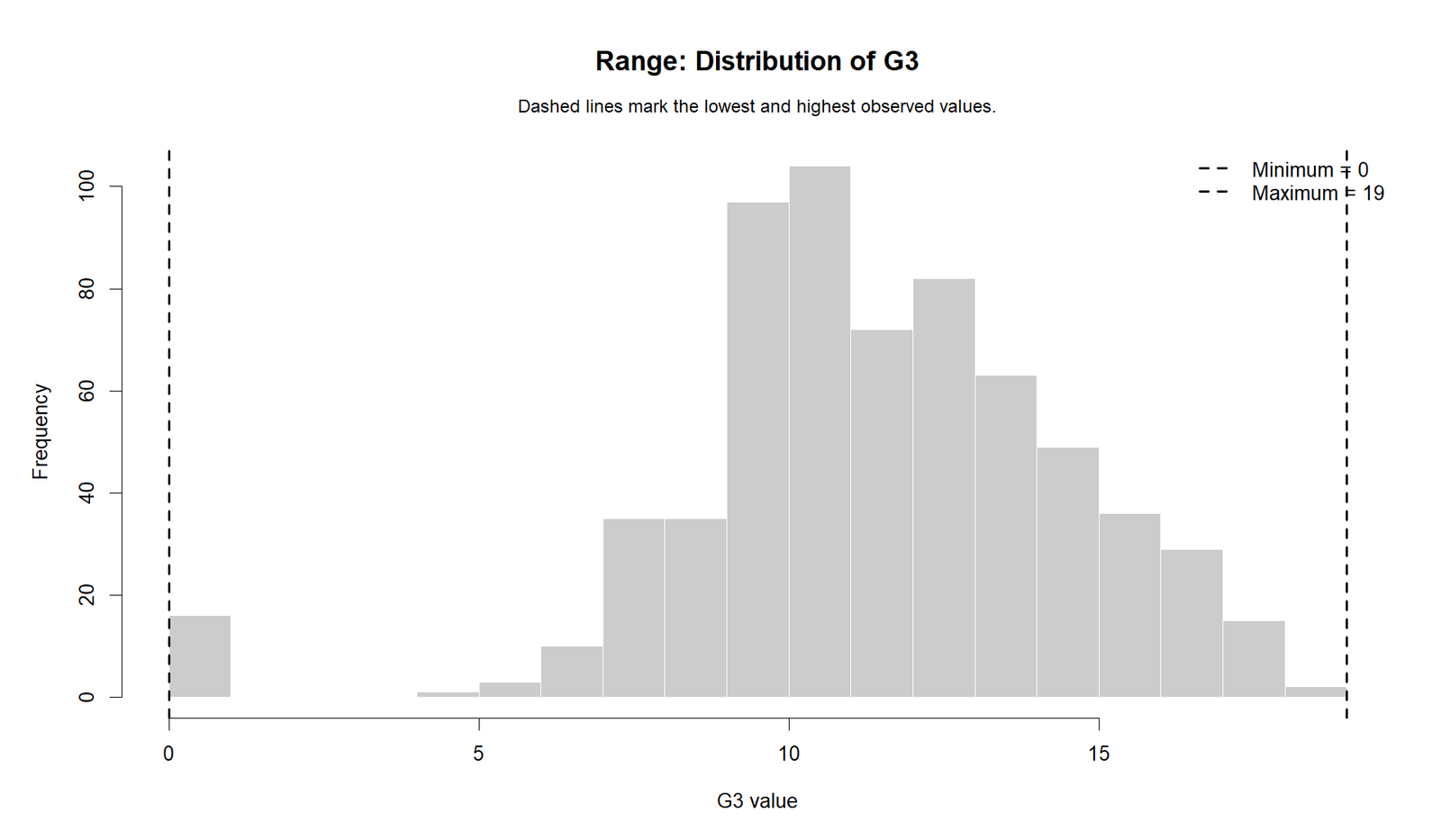
The R distribution chart confirms that range is based on endpoints. The minimum and maximum values define the observed span, while the histogram shows how the values are distributed within that span. This validates the Python interpretation.
R Chart 2: Range Comparison
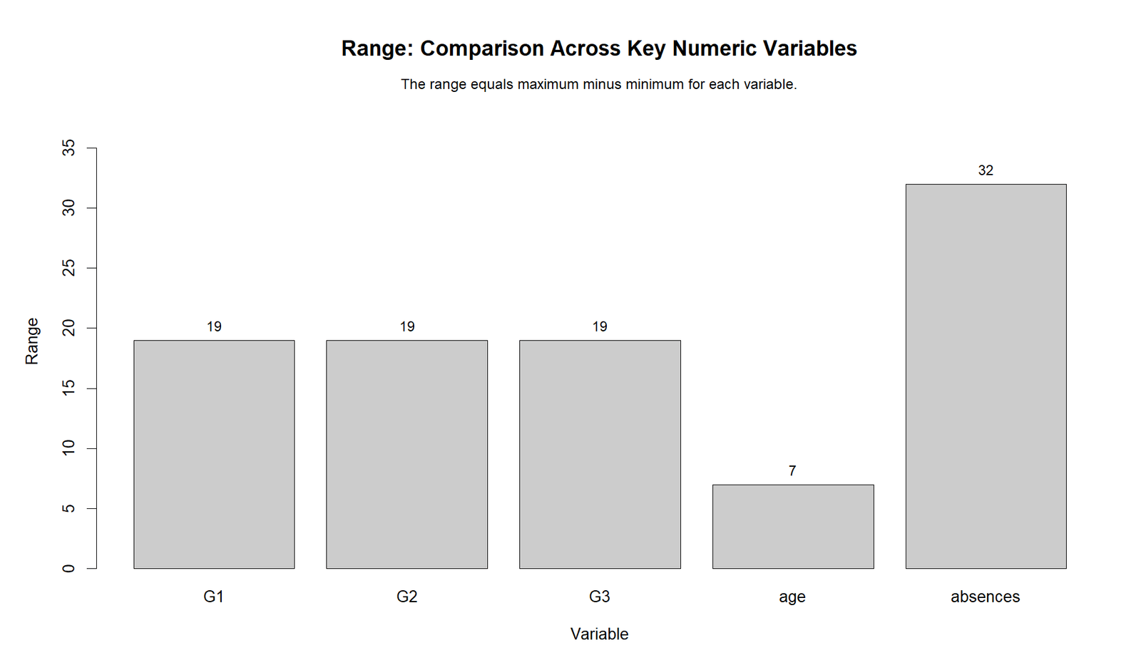
The R range comparison confirms the same ranking: absences has range 32, G1/G2/G3 have range 19, and age has range 7. This validates that the range calculation is consistent across software.
R Chart 3: Minimum Maximum Intervals
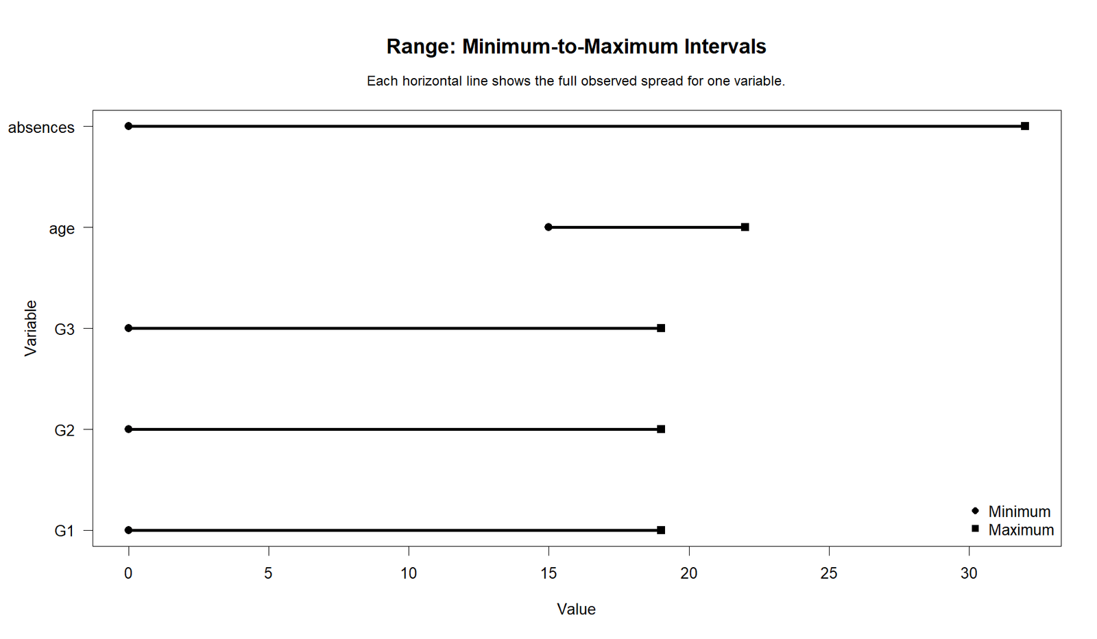
The R interval chart confirms the minimum-to-maximum spans. The grade variables share the same endpoint interval, age is tightly bounded, and absences stretches the farthest. This is a clear visual explanation of the range formula.
R Chart 4: Group Range Comparison
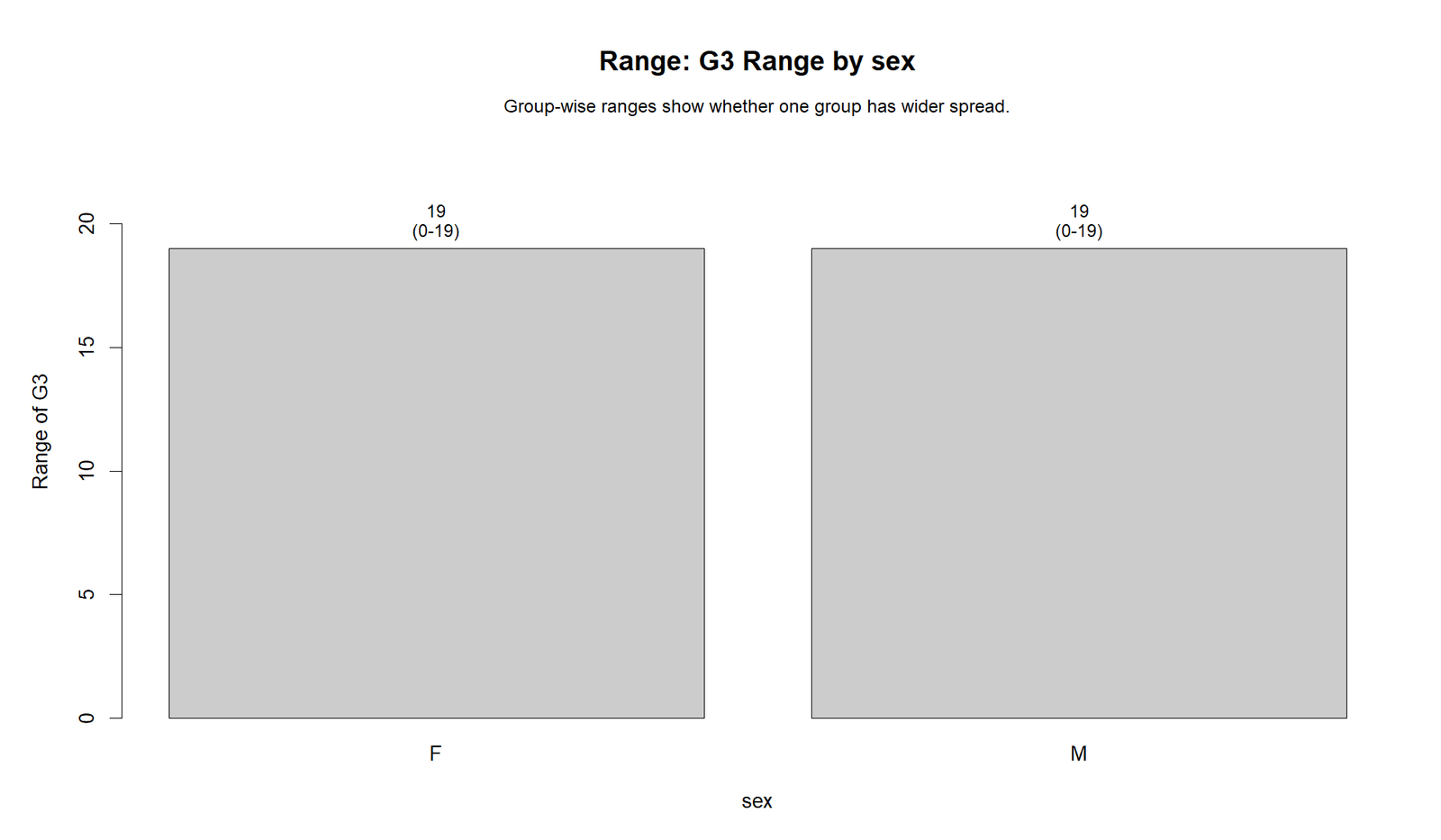
The R group comparison confirms that female and male students have the same G3 range of 19. This validates the SPSS group range output and shows that range equality does not necessarily mean mean equality or identical distribution shape.
SPSS, R, Python and Excel Workflows for Range
The Range workflow is simple in all major software. The key steps are to calculate the minimum, calculate the maximum, subtract the minimum from the maximum, and then interpret the result with other descriptive statistics.
SPSS Workflow
| Step | SPSS Menu or Syntax | Purpose |
|---|---|---|
| Open dataset | File > Open > Data | Load the SPSS-ready dataset. |
| Run Frequencies | Analyze > Descriptive Statistics > Frequencies | Request range, minimum, maximum, mean and standard deviation. |
| Run Explore | Analyze > Descriptive Statistics > Explore | Get range with IQR, boxplots and detailed spread. |
| Group range | Split File or Frequencies by group | Compare range across groups such as sex. |
| Export output | File > Export or OUTPUT EXPORT | Save SPSS output PDF for reporting. |
R Workflow
| Step | R Action | Purpose |
|---|---|---|
| Read data | read.csv() | Load the dataset. |
| Calculate minimum | min(x, na.rm=TRUE) | Find the smallest value. |
| Calculate maximum | max(x, na.rm=TRUE) | Find the largest value. |
| Calculate range | max(x)-min(x) | Find total observed spread. |
| Group comparison | aggregate() or dplyr | Compare range across groups. |
Python Workflow
| Step | Python Action | Purpose |
|---|---|---|
| Read data | pandas.read_csv() | Load the dataset into a DataFrame. |
| Calculate minimum | series.min() | Find the smallest value. |
| Calculate maximum | series.max() | Find the largest value. |
| Calculate range | series.max() - series.min() | Find total spread. |
| Create plots | matplotlib | Generate WordPress-ready charts. |
Excel Workflow
| Excel Task | Formula or Tool | Purpose |
|---|---|---|
| Minimum | =MIN(A2:A650) | Find the smallest value. |
| Maximum | =MAX(A2:A650) | Find the largest value. |
| Range | =MAX(A2:A650)-MIN(A2:A650) | Calculate range. |
| Group minimum | =MINIFS(value_range, group_range, "F") | Find minimum for a group. |
| Group maximum | =MAXIFS(value_range, group_range, "F") | Find maximum for a group. |
| Group range | =MAXIFS(...)-MINIFS(...) | Compare group spread. |
Code Blocks for Range
SPSS Syntax for Range
* Range analysis in SPSS.
* Variables: G1 G2 G3 age absences.

TITLE "Range Analysis".

FREQUENCIES VARIABLES=G1 G2 G3 age absences
  /FORMAT=NOTABLE
  /STATISTICS=MEAN MEDIAN STDDEV VARIANCE RANGE MINIMUM MAXIMUM.

EXAMINE VARIABLES=G1 G2 G3 age absences
  /PLOT BOXPLOT
  /COMPARE GROUPS
  /STATISTICS DESCRIPTIVES
  /CINTERVAL 95
  /MISSING LISTWISE
  /NOTOTAL.

SORT CASES BY sex.
SPLIT FILE LAYERED BY sex.

FREQUENCIES VARIABLES=G3
  /FORMAT=NOTABLE
  /STATISTICS=MEAN MEDIAN STDDEV RANGE MINIMUM MAXIMUM.

SPLIT FILE OFF.

RANK VARIABLES=G3 (A)
  /NTILES(4)
  /PRINT=YES
  /TIES=MEAN
  /RANK INTO G3_range_band.

MEANS TABLES=G3 BY G3_range_band
  /CELLS=COUNT MEAN STDDEV MIN MAX.

OUTPUT EXPORT
  /CONTENTS EXPORT=VISIBLE
  /PDF DOCUMENTFILE="Range-SPSS-Output.pdf".
Python Code for Range
import pandas as pd

df = pd.read_csv("dataset.csv")

variables = ["G1", "G2", "G3", "age", "absences"]

rows = []
for var in variables:
    x = pd.to_numeric(df[var], errors="coerce").dropna()
    rows.append({
        "variable": var,
        "n": len(x),
        "mean": x.mean(),
        "median": x.median(),
        "std": x.std(ddof=1),
        "minimum": x.min(),
        "maximum": x.max(),
        "range": x.max() - x.min(),
        "iqr": x.quantile(0.75) - x.quantile(0.25)
    })

range_table = pd.DataFrame(rows)
print(range_table)

# Group range for G3 by sex
group_range = (
    df.assign(G3=pd.to_numeric(df["G3"], errors="coerce"))
      .dropna(subset=["G3"])
      .groupby("sex")["G3"]
      .agg(n="count", mean="mean", median="median", std="std", minimum="min", maximum="max")
      .reset_index()
)

group_range["range"] = group_range["maximum"] - group_range["minimum"]
print(group_range)
R Code for Range
# Range analysis in R

df <- read.csv("dataset.csv")

variables <- c("G1", "G2", "G3", "age", "absences")

rows <- list()

for(v in variables){
  x <- as.numeric(df[[v]])
  x <- x[!is.na(x)]

  rows[[v]] <- data.frame(
    variable = v,
    n = length(x),
    mean = mean(x),
    median = median(x),
    sd = sd(x),
    minimum = min(x),
    maximum = max(x),
    range = max(x) - min(x),
    iqr = IQR(x)
  )
}

range_table <- do.call(rbind, rows)
print(range_table)

# Group range for G3 by sex
group_rows <- list()

for(g in unique(df$sex)){
  x <- as.numeric(df$G3[df$sex == g])
  x <- x[!is.na(x)]

  group_rows[[as.character(g)]] <- data.frame(
    group = g,
    n = length(x),
    mean = mean(x),
    median = median(x),
    sd = sd(x),
    minimum = min(x),
    maximum = max(x),
    range = max(x) - min(x)
  )
}

group_table <- do.call(rbind, group_rows)
print(group_table)
Excel Formulas for Range
Assume values are in A2:A650.

Minimum:
=MIN(A2:A650)

Maximum:
=MAX(A2:A650)

Range:
=MAX(A2:A650)-MIN(A2:A650)

Mean:
=AVERAGE(A2:A650)

Median:
=MEDIAN(A2:A650)

Standard deviation:
=STDEV.S(A2:A650)

Interquartile range:
=QUARTILE.INC(A2:A650,3)-QUARTILE.INC(A2:A650,1)

Group minimum for female group:
=MINIFS(G3_range, sex_range, "F")

Group maximum for female group:
=MAXIFS(G3_range, sex_range, "F")

Group range for female group:
=MAXIFS(G3_range, sex_range, "F")-MINIFS(G3_range, sex_range, "F")

Interpretation:
A larger range means a wider distance between the lowest and highest observed value.
Range should be interpreted with IQR, standard deviation, histogram and boxplot.
APA Reporting Wording for Range
When reporting range, include the minimum, maximum, range value, sample size, and a short interpretation. If comparing groups, report group-specific minimums, maximums, ranges, and means.
APA-Style Full-Sample Report
Descriptive statistics were calculated for G1, G2, G3, age, and absences. The widest observed range was found for absences, which ranged from 0 to 32, range = 32. G1, G2, and G3 each ranged from 0 to 19, range = 19. Age ranged from 15 to 22, range = 7. These results indicate that absences had the largest total observed spread, while age had the narrowest total spread.
APA-Style Group Range Report
G3 range was also compared by sex. Female students had G3 scores ranging from 0 to 19, range = 19, M = 12.25, SD = 3.124. Male students also had G3 scores ranging from 0 to 19, range = 19, M = 11.41, SD = 3.321. Although both groups had the same total range, their means and standard deviations differed.
Student-Friendly Report Example
The range results showed that absences had the widest spread because the values went from 0 to 32. Age had the smallest spread because values went only from 15 to 22. The grade variables G1, G2, and G3 all had the same range of 19, but this does not mean their distributions were identical. Range should be interpreted with standard deviation, IQR, and boxplots.
Common Mistakes in Range Interpretation
| Mistake | Why It Is a Problem | Correct Practice |
|---|---|---|
| Using range alone | Range uses only minimum and maximum. | Report range with IQR, SD, variance and plots. |
| Ignoring outliers | One extreme value can inflate the range. | Check boxplots and outlier rules. |
| Comparing different scales directly | Age, grades and absences are measured differently. | Use context and consider relative spread. |
| Assuming equal range means equal distribution | Two groups can have the same range but different means and SDs. | Compare center, spread and shape together. |
| Calling range a hypothesis test | Range has no p-value. | Treat it as descriptive statistics. |
| Ignoring measurement limits | Some variables have natural lower or upper limits. | Interpret range within the variable scale. |
Key reminder: Range is useful for quick spread, but it is highly sensitive to endpoints. For stronger descriptive reporting, combine it with the five-number summary, IQR, box plot interpretation, variance, and standard deviation.
When to Use Range
Use Range when you need a quick, easy-to-explain measure of total observed spread. It is especially helpful in introductory descriptive statistics, data screening, dashboard summaries, and first-pass variable comparison.
| Use Range When | Why It Helps | Example from This Guide |
|---|---|---|
| You need a quick spread summary | Range is easy to calculate and explain. | G3 range = 19. |
| You need minimum and maximum context | Range directly depends on endpoints. | Absences runs from 0 to 32. |
| You compare variables at first glance | Range shows which variables span wider raw intervals. | Absences has widest raw spread. |
| You compare groups descriptively | Group range shows endpoint spread by category. | Female and male G3 both have range 19. |
| You prepare a descriptive statistics section | Range supports mean, median, SD and IQR. | The SPSS table reports all spread measures together. |
For fuller interpretation, compare range with descriptive statistics, five-number summary, histogram interpretation, box plot interpretation, coefficient of variation, and effect size.
Downloads and Resources for Range
The resources below include the SPSS output PDF, Python charts, and R validation charts used in this guide.
Download SPSS Output PDF
Verified SPSS output for range, minimum, maximum, IQR, detailed spread, group range and G3 range bands.
Copy Range Code
Use the SPSS, Python, R and Excel code blocks to reproduce the Range analysis.
Python Chart 2: Range Comparison
Visual comparison of range values across variables.
Python Chart 3: Minimum Maximum Intervals
Minimum-to-maximum interval chart for Range interpretation.
FAQs About Range
What is Range in statistics?
Range is the difference between the maximum and minimum value in a dataset. It shows the total observed spread.
What is the Range formula?
The formula is Range = Maximum Value − Minimum Value.
What was the range of G3 in this example?
G3 had a minimum of 0 and a maximum of 19, so the range was 19.
Which variable had the largest range?
Absences had the largest range. It ran from 0 to 32, so its range was 32.
Which variable had the smallest range?
Age had the smallest range. It ran from 15 to 22, so its range was 7.
Do G1, G2 and G3 have the same range?
Yes. G1, G2 and G3 each had a minimum of 0 and a maximum of 19, so each had a range of 19.
Does Range have a p-value?
No. Range is a descriptive statistic, not a hypothesis test. It does not produce a p-value.
Why is Range sensitive to outliers?
Range uses only the lowest and highest values. One extreme value can strongly change the range.
Is Range better than standard deviation?
Range is simpler, but standard deviation uses all values. Range is useful for endpoints, while standard deviation is better for overall spread around the mean.
Is Range the same as IQR?
No. Range uses the minimum and maximum. IQR uses the middle 50% of the data, from Q1 to Q3, so it is less sensitive to extreme values.
How do I calculate Range in Excel?
Use =MAX(range)-MIN(range). For example, =MAX(A2:A650)-MIN(A2:A650).
How do I calculate Range in SPSS?
Use Analyze > Descriptive Statistics > Frequencies, then select Range, Minimum and Maximum in the Statistics menu.

