
Multivariate ANCOVA, Multiple Dependent Variables, Covariate Adjustment and Diagnostics
MANCOVA: Formula, Multivariate ANCOVA, Covariates, SPSS, Python, R and Excel Guide
MANCOVA, or Multivariate Analysis of Covariance, tests whether groups differ across several related dependent variables after adjusting for one or more covariates. In this worked example, G1, G2 and G3 are treated as multiple dependent variables, sex is the grouping factor, and absences is the covariate. The output includes mean profiles, covariate scatterplots, univariate ANCOVA follow-ups, residual Q-Q plots, residuals versus fitted values, correlation matrices, R report PDF and SPSS output PDF.
Quick Answer: MANCOVA Result
The worked MANCOVA example shows that female students have higher mean profiles than male students across all three dependent variables. The mean profile chart places females above males for G1, G2 and G3. The mean score increases from G1 to G3 for both groups, with the female line rising from about 11.6 to about 12.3 and the male line rising from about 11.1 to about 11.4.
The follow-up ANCOVA p-value chart shows that both the grouping factor and the covariate matter after adjustment. In the Python chart, sex is significant for G1, G2 and G3, and absences is also significant for all three outcomes. The strongest covariate p value is for G1 with absences, while G3 with absences is still below .05 but is the largest of the covariate p values.
Final interpretation: The MANCOVA workflow supports a meaningful group profile difference across G1, G2 and G3 while adjusting for absences. The dependent variables are strongly related to each other, which supports a multivariate approach, and the covariate has a negative relationship with the grade outcomes. Follow-up ANCOVA results show that both sex and absences contribute to the adjusted outcome pattern.
Important reporting point: MANCOVA should not be reduced to three separate ANCOVAs only. The multivariate model is used because G1, G2 and G3 are related outcomes. The univariate ANCOVA p-values are follow-up evidence after the multivariate design is justified.
Table of Contents
- What Is MANCOVA?
- MANCOVA Formula
- MANCOVA Hypotheses
- Dataset and Variables Used
- Python Chart-by-Chart Interpretation
- R Chart-by-Chart Validation
- SPSS Output and R Report PDFs
- SPSS, R, Python and Excel Workflows
- Code Blocks for MANCOVA
- APA Reporting Wording
- Common Mistakes
- When to Use MANCOVA
- Downloads and Resources
- Related Guides
- FAQs
What Is MANCOVA?
MANCOVA is the multivariate extension of ANCOVA. It is used when the researcher has more than one dependent variable and wants to compare groups after adjusting for one or more covariates. It combines the logic of ANCOVA and multivariate outcome testing.
In this example, the dependent variables are G1, G2 and G3. These variables measure grade outcomes at different stages, so they are naturally related. The correlation matrix confirms that the three grade outcomes are strongly correlated, with G1-G2 around 0.86, G2-G3 around 0.92 and G1-G3 around 0.83.
The covariate is absences. The correlation matrix shows that absences has weak negative correlations with the grade outcomes: about -0.15 with G1, -0.12 with G2 and -0.09 with G3. This supports the idea that absences should be controlled when comparing group profiles.
Simple definition: MANCOVA tests whether groups differ across a set of related dependent variables after adjusting for covariates. In this worked example, sex groups are compared across G1, G2 and G3 after adjusting for absences.
For related concepts, review ANCOVA, ANOVA in SPSS, ANOVA in Python, ANOVA in R, ANOVA Assumptions, Effect Size, P Value, and Null and Alternative Hypothesis.
MANCOVA Formula
MANCOVA can be written as a multivariate linear model. Instead of one dependent variable, the model contains a vector of dependent variables.
For this worked example, the model is:
The grouping term tests whether the multivariate grade profile differs by sex. The covariate term adjusts the outcomes for absences. The residual term contains the outcome variation that remains after the group and covariate are included.
Follow-up ANCOVA Model
After the multivariate model, each dependent variable can be examined with a follow-up ANCOVA. In the supplied charts, follow-up p values are shown for G1, G2 and G3. The p values for sex and absences are below .05 across the outcomes.
Covariate Interpretation
The covariate scatterplots show a downward trend between absences and each grade outcome. This means students with more absences tend to have lower grade scores, so controlling for absences improves the fairness of group comparison.
| Model Component | Variable in This Example | Role | Interpretation |
|---|---|---|---|
| Dependent variable 1 | G1 | First grade outcome | Part of the multivariate grade profile. |
| Dependent variable 2 | G2 | Second grade outcome | Strongly correlated with G1 and G3. |
| Dependent variable 3 | G3 | Final grade outcome | Highest profile point in the mean chart. |
| Group factor | sex | Group comparison variable | Female profile is above male profile across outcomes. |
| Covariate | absences | Adjustment variable | Negatively related to the grade outcomes. |
MANCOVA Hypotheses
MANCOVA tests whether group profiles are equal after adjusting for the covariate. The null hypothesis says that the adjusted multivariate mean vector is the same across groups. The alternative hypothesis says that the adjusted multivariate mean vectors differ.
| Hypothesis Area | Null Hypothesis | Alternative Hypothesis | Evidence in This Output |
|---|---|---|---|
| Multivariate group profile | Adjusted G1, G2 and G3 profiles are equal across sex groups. | Adjusted profiles differ across sex groups. | Female profile is consistently above male profile. |
| Covariate adjustment | Absences does not explain the dependent variables. | Absences explains part of one or more outcomes. | Absences p values are below .05 in follow-up charts. |
| Univariate follow-up | Each outcome has no adjusted group or covariate effect. | At least one source matters for that outcome. | Sex and absences are below alpha for G1, G2 and G3. |
Decision for this example: The chart set supports a meaningful MANCOVA interpretation because the dependent variables are strongly related, the group mean profiles differ across sex, and the covariate absences contributes to the adjusted outcome pattern.
Dataset and Variables Used
The worked example uses student performance data. The dependent variables are G1, G2 and G3. The grouping variable is sex, and the covariate is absences. This design is suitable for MANCOVA because the grade outcomes are strongly correlated and because absences has a visible negative association with the grade outcomes.
| Variable | Role | Why It Matters | Where It Appears |
|---|---|---|---|
| G1 | Dependent variable | First grade outcome in the multivariate model. | Mean profile, scatterplot, p-value chart and residual plots. |
| G2 | Dependent variable | Second grade outcome strongly related to G1 and G3. | Mean profile, scatterplot, p-value chart and residual plots. |
| G3 | Dependent variable | Final grade outcome and highest profile point. | Mean profile, scatterplot, p-value chart and residual plots. |
| sex | Grouping factor | Compares female and male adjusted outcome profiles. | Mean profile and follow-up ANCOVA p-values. |
| absences | Covariate | Adjusts for attendance-related differences. | Scatterplots, p-values and correlation matrix. |
For supporting background, review Descriptive Statistics, Correlation, Standard Deviation, Variance, Confidence Interval, Box Plot Interpretation, Q-Q Plot Normality Check and Outlier Detection.
Python Chart-by-Chart Interpretation
The Python chart sequence explains the MANCOVA result through mean profiles, covariate relationships, follow-up p-values, residual diagnostics and outcome-covariate correlation structure.
Python Chart 1: MANCOVA Mean Profile by Group
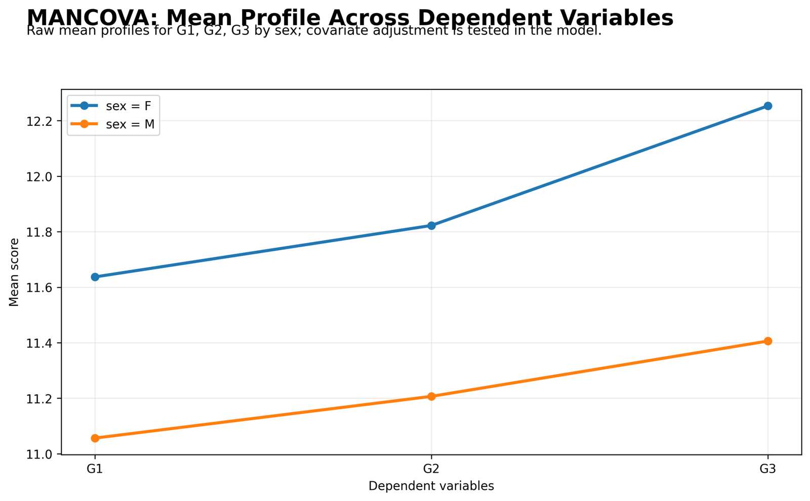
This chart shows the mean profile across the three dependent variables. Female students have higher mean scores than male students at G1, G2 and G3. The female line rises from about 11.6 at G1 to about 12.3 at G3, while the male line rises from about 11.1 to about 11.4.
The two profiles move upward across the grade outcomes, but they remain separated throughout the chart. This supports a multivariate group comparison because the difference is not isolated to only one dependent variable.
The chart also shows why follow-up tests are useful. The multivariate profile suggests group differences, and the later p-value chart identifies which individual outcomes and sources contribute to that pattern.
Python Chart 2: Covariate Scatter for G1
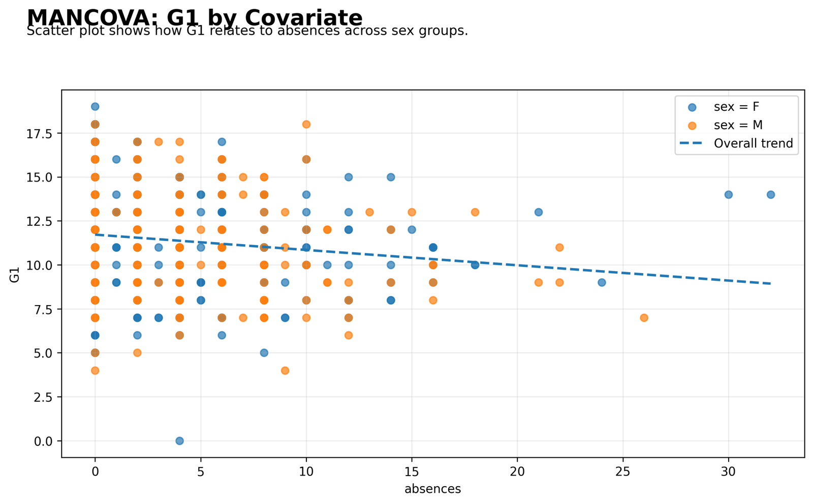
This scatterplot shows the relationship between absences and G1. The overall trend line slopes downward, meaning higher absences are associated with lower G1 scores.
The points are concentrated at low absence values, with a smaller number of students having very high absences. Both sex groups appear across the same absence range, so the covariate is relevant to both groups.
This chart supports the use of absences as a covariate. Since absences is related to G1, adjusting for it helps compare sex groups more fairly.
Python Chart 3: Covariate Scatter for G2
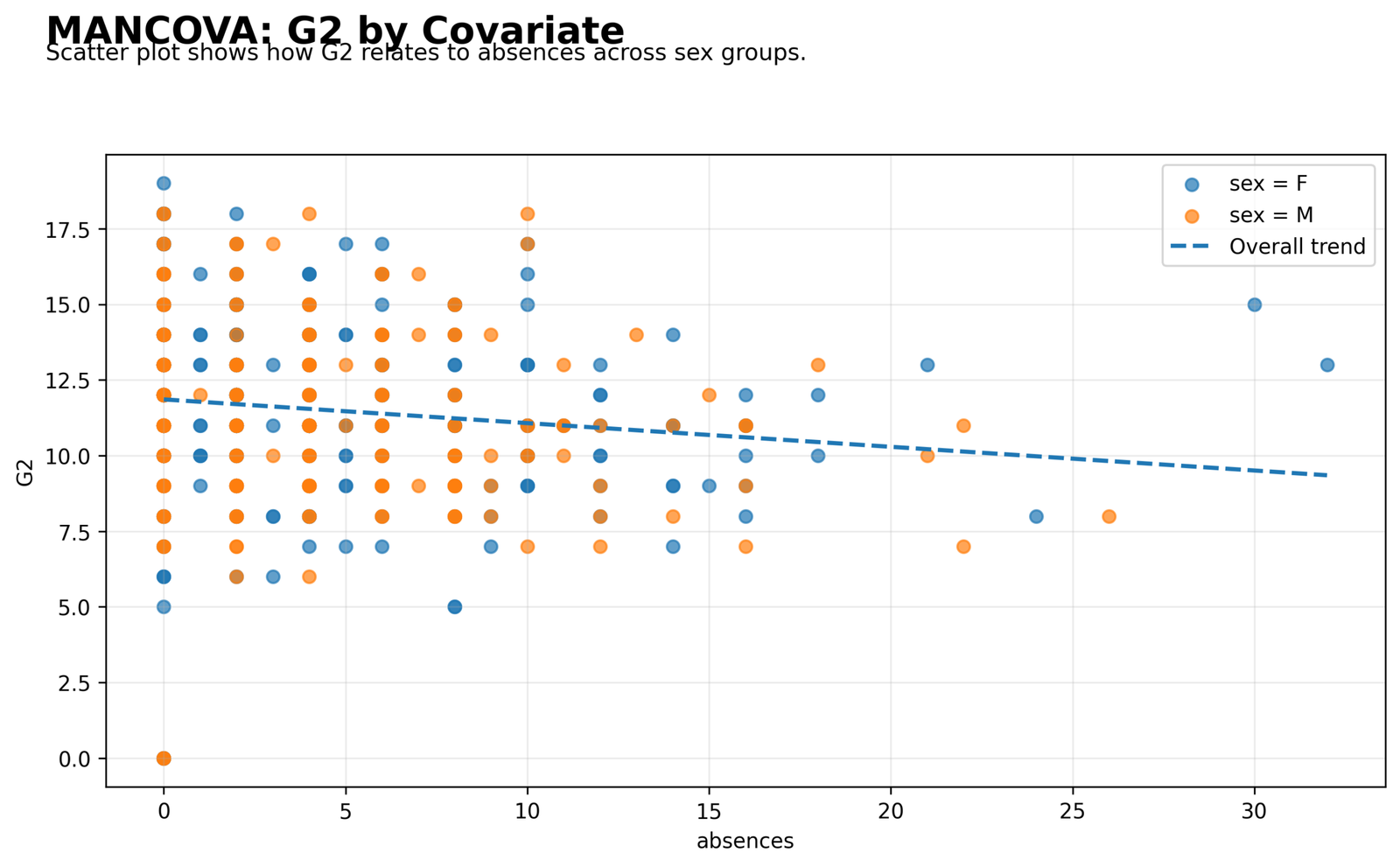
This chart shows G2 against absences. The trend line again moves downward, so students with more absences tend to have lower G2 scores.
The distribution of points is similar to the G1 scatterplot. Many observations are located between 0 and 10 absences, while fewer points extend into the higher absence range.
The chart supports the same covariate logic for G2. Absences is not only connected to one outcome; it has a visible relationship with multiple grade outcomes.
Python Chart 4: Covariate Scatter for G3
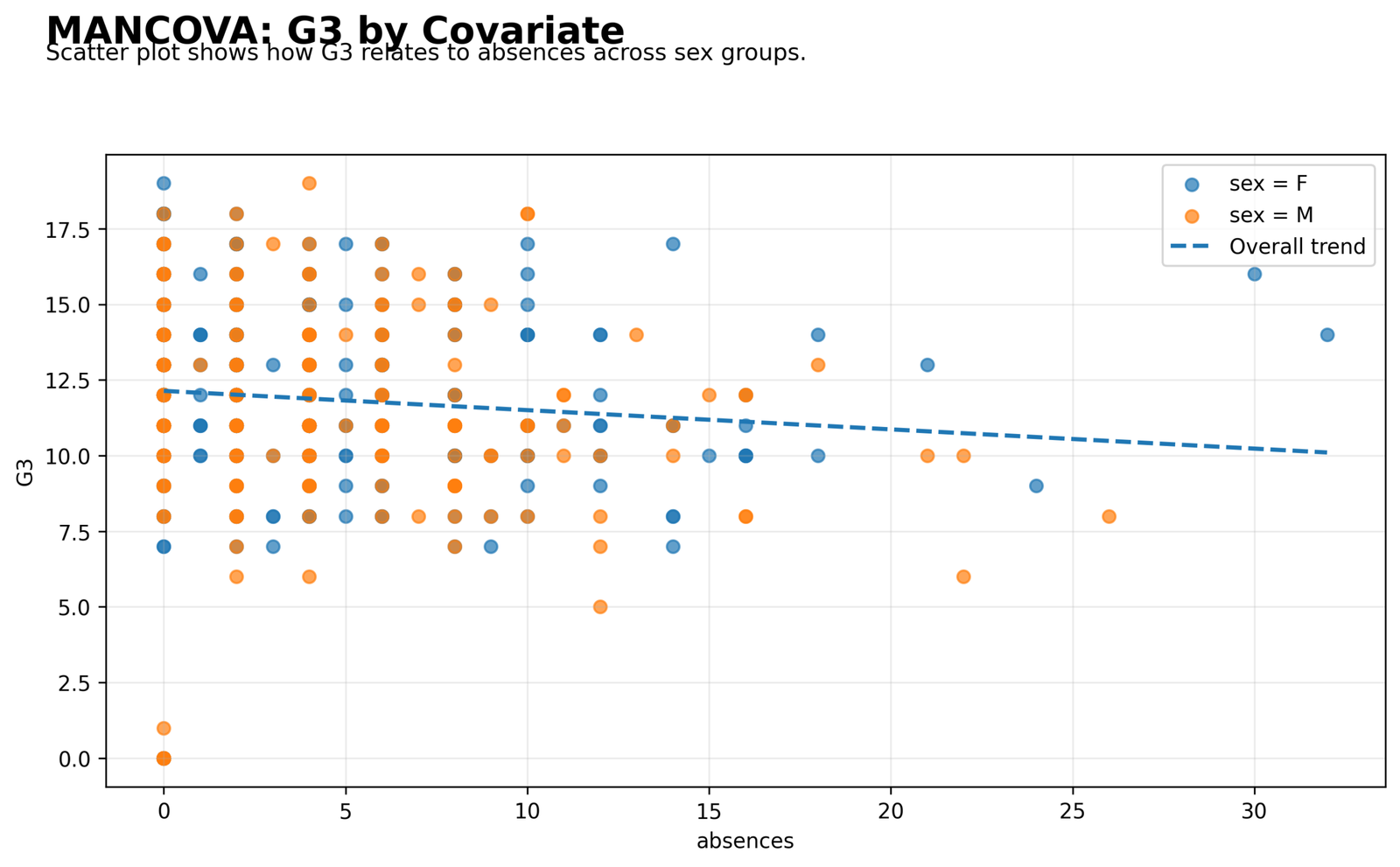
This scatterplot shows the final grade outcome G3 against absences. The same negative attendance pattern remains visible, with higher absence values tending to align with lower G3 scores.
The association appears weaker for G3 than for G1 and G2 in the correlation matrix, but the follow-up p-value chart still shows G3 with absences below the .05 threshold.
This chart supports keeping absences in the MANCOVA model because the final outcome also has a covariate relationship that should be adjusted.
Python Chart 5: Univariate ANCOVA P-Values
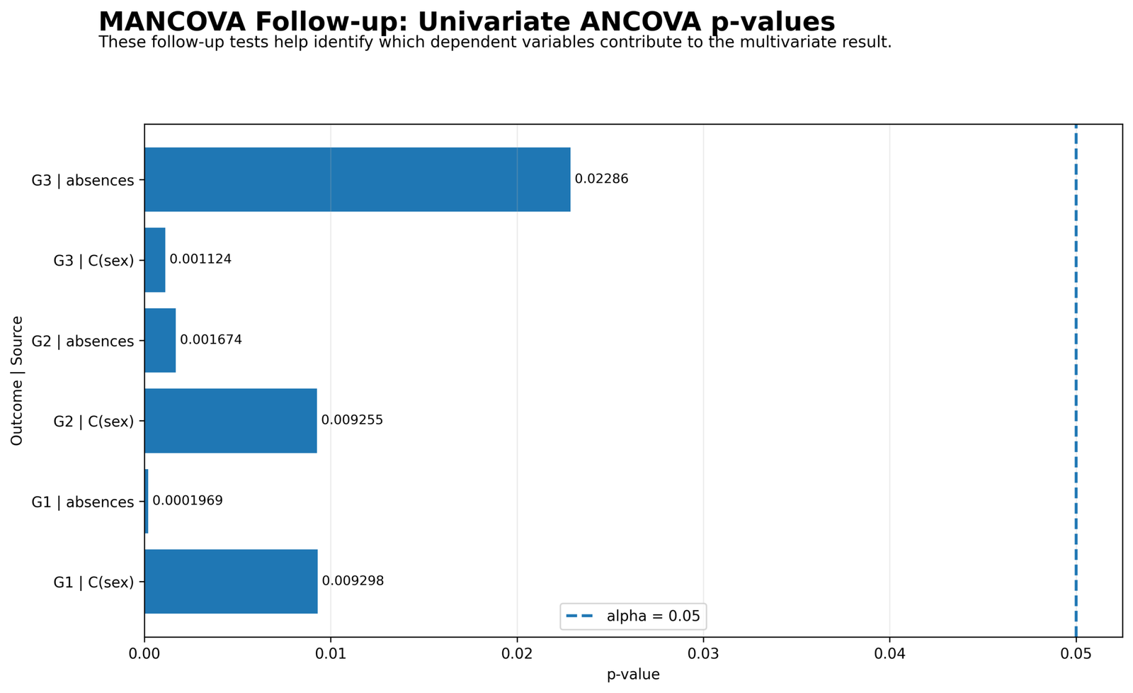
This chart shows the follow-up p values after the multivariate model. For G1, absences has p = 0.0001969 and sex has p = 0.009298. For G2, absences has p = 0.001674 and sex has p = 0.009255. For G3, absences has p = 0.02286 and sex has p = 0.001124.
All six p values are below the alpha line at .05. This means both sex and absences contribute to the adjusted models for all three outcomes.
This chart gives the strongest follow-up evidence. It shows that the multivariate profile difference is supported by individual outcome models, while the covariate also remains important.
Python Chart 6: Residual Q-Q Plot for G1
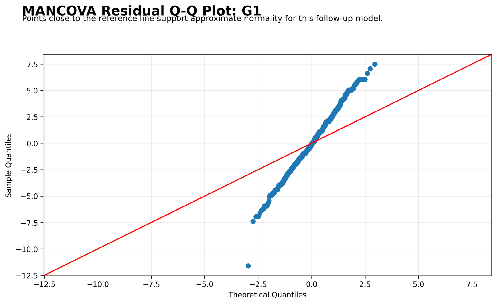
The G1 residual Q-Q plot shows that the central residuals broadly follow the reference pattern, while the tails depart more strongly. The lower tail contains points that fall away from the line.
This pattern means residual normality is approximate rather than perfect. The MANCOVA result can still be interpreted, but the residual shape should be reported honestly.
Python Chart 7: Residual Q-Q Plot for G2
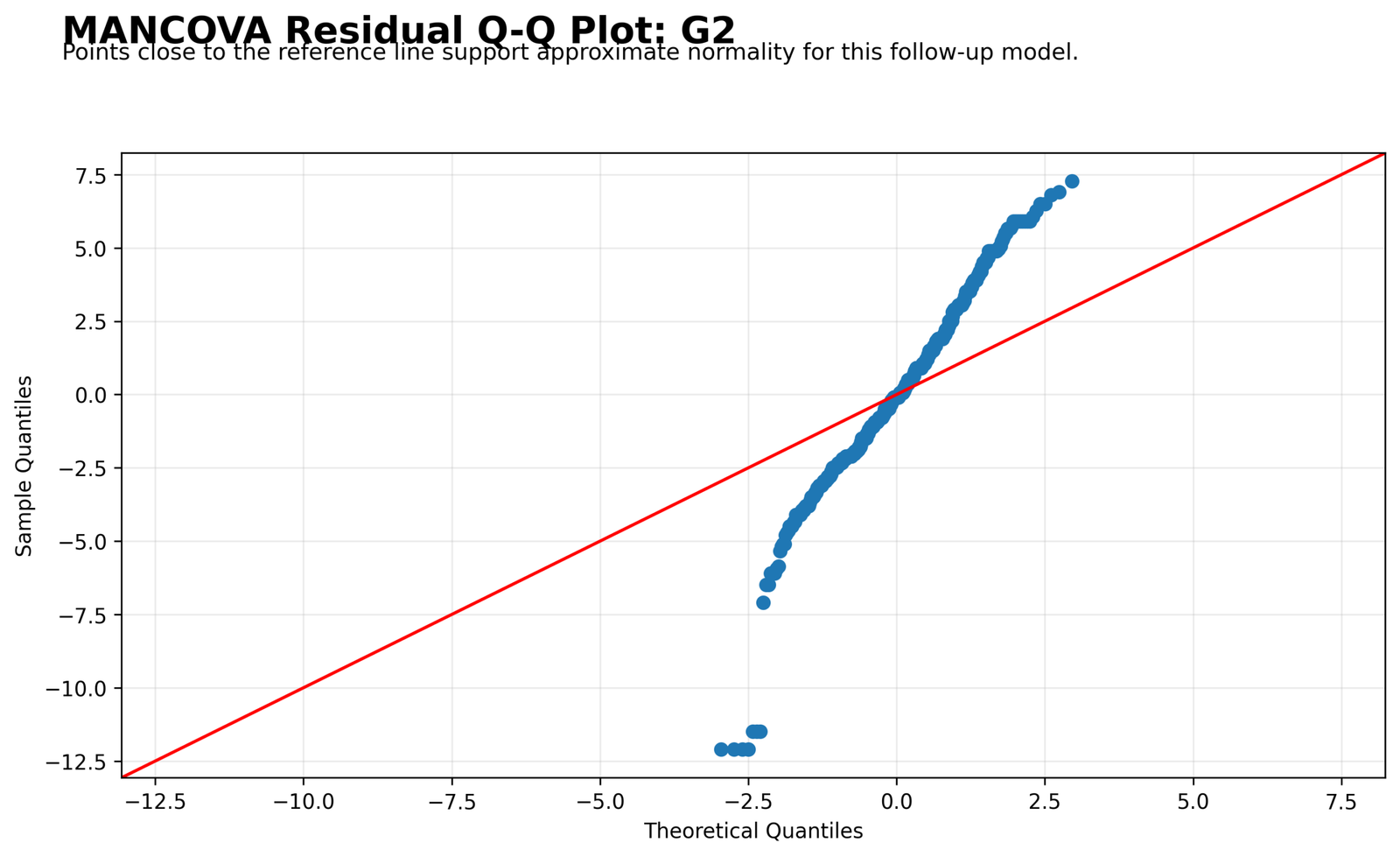
The G2 Q-Q plot follows the same diagnostic pattern. The middle portion stays closer to the line, but the tails show departures from the expected normal pattern.
The plot supports a cautious assumptions statement. G2 contributes to the multivariate model, but its residuals are not perfectly normal across the full range.
Python Chart 8: Residual Q-Q Plot for G3
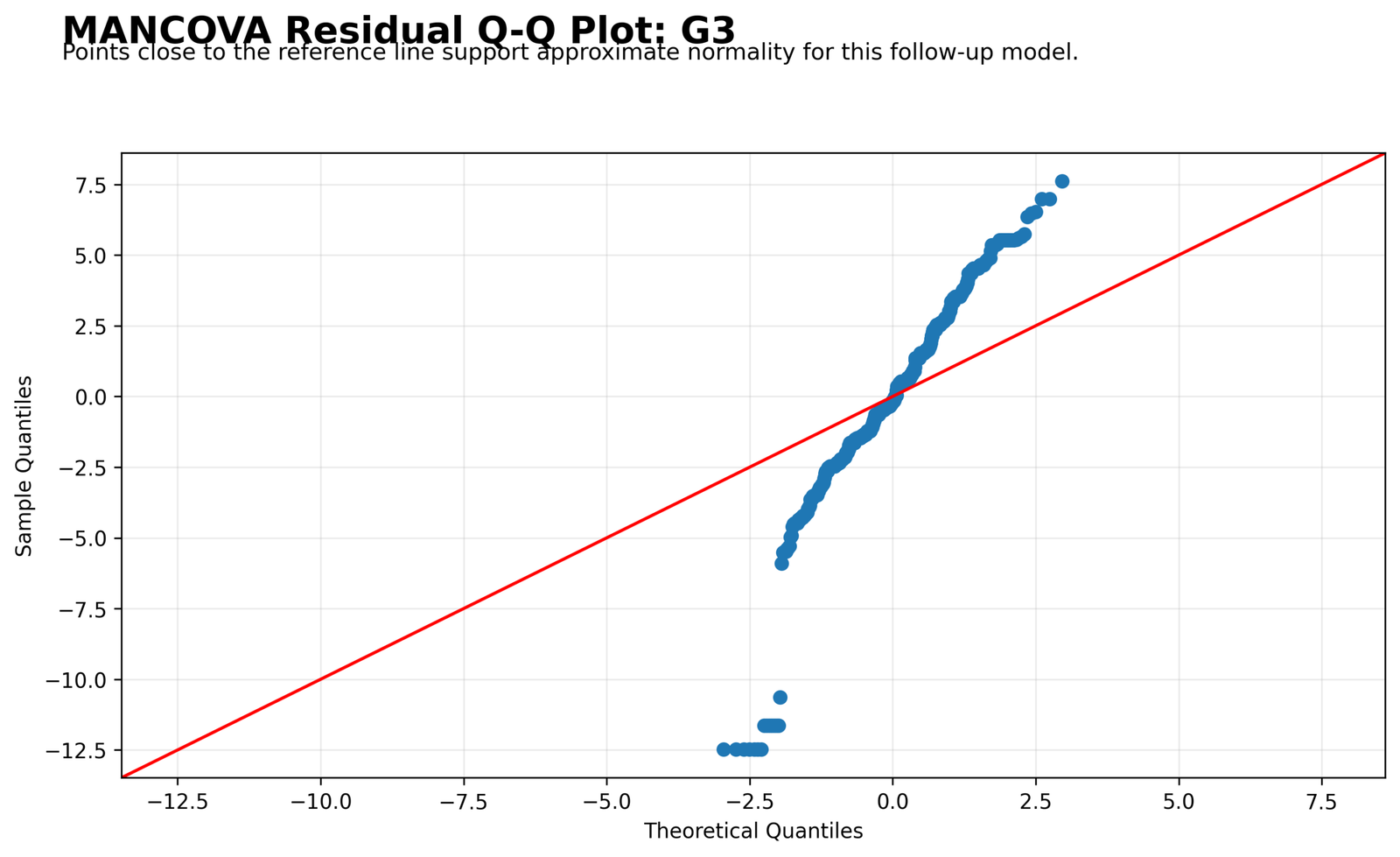
The G3 Q-Q plot shows visible departures in the residual tails. This is common in grade data because very low or very high scores can create non-normal residual behavior.
The diagnostic message is the same as for G1 and G2. The model gives useful group and covariate evidence, but the residual shape should be discussed in the assumptions section.
Python Chart 9: Residuals vs Fitted for G1
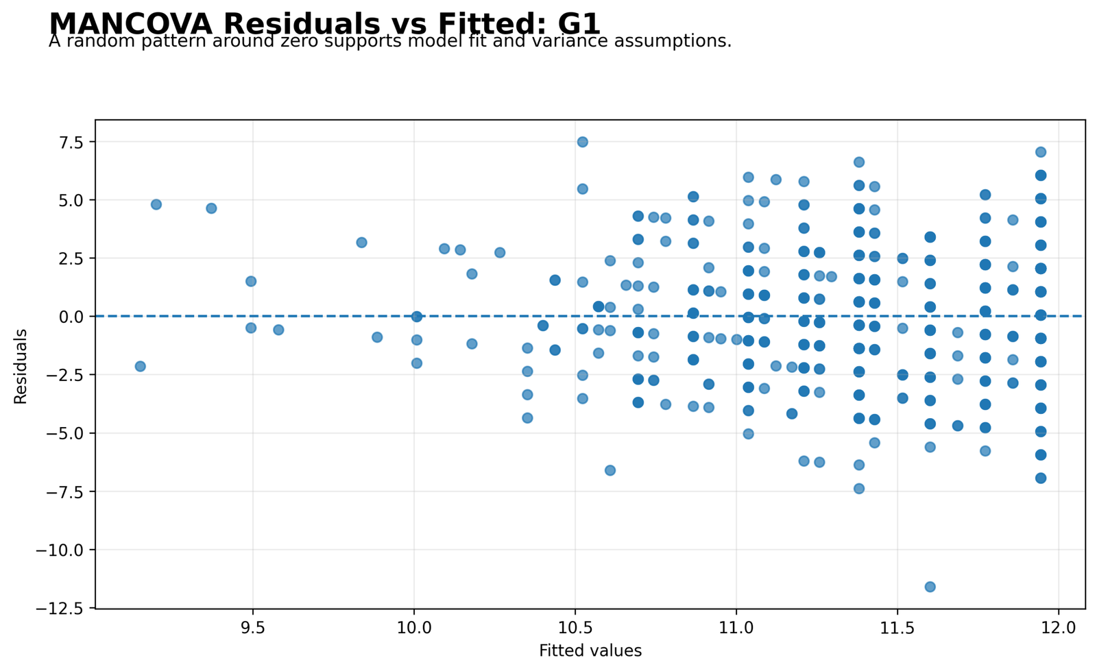
This chart compares G1 residuals with fitted values. Most residuals are centered around zero, but the plot also shows wider vertical spread at some fitted-value ranges.
The residual pattern indicates that the model captures the average relationship but does not perfectly predict every G1 observation. This is expected because MANCOVA adjusts group profiles, not individual outcomes perfectly.
Python Chart 10: Residuals vs Fitted for G2
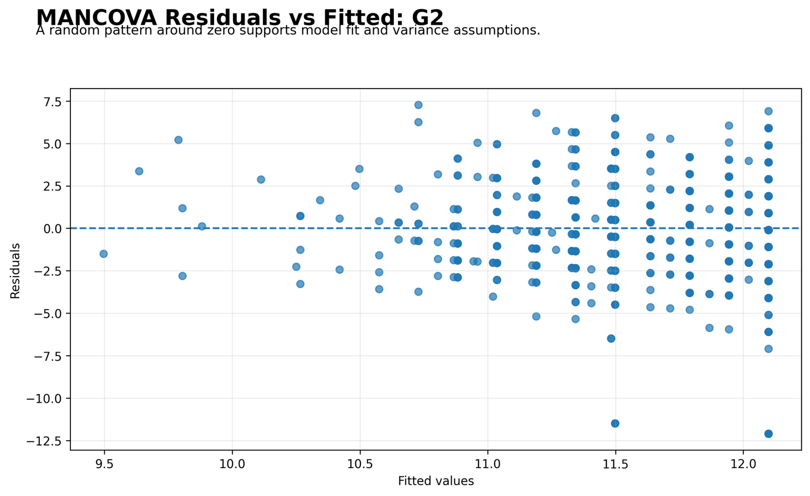
The G2 residuals-versus-fitted chart shows residuals scattered around zero with visible spread across fitted values. The plot does not show a flat perfect band, so diagnostic context is needed.
The chart supports a balanced interpretation. The adjusted model gives meaningful p-values, but residual spread remains and should be reported as part of model checking.
Python Chart 11: Residuals vs Fitted for G3
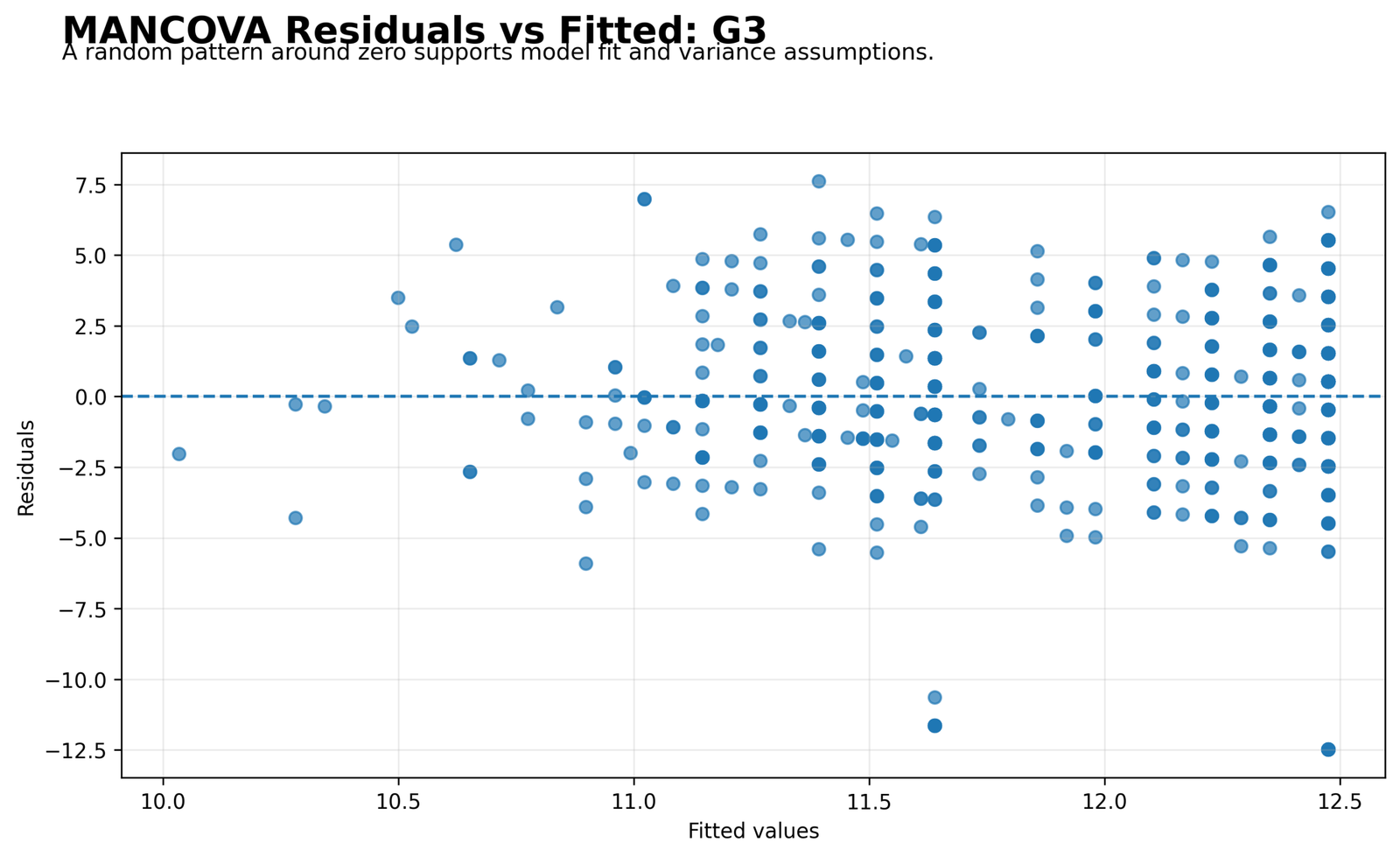
The G3 residual plot again shows residuals around the zero reference with visible spread. Several observations are farther away from the fitted pattern, which means individual final grades still contain unexplained variation.
This plot should be discussed with the G3 Q-Q plot. Together, they show that the model is useful for group and covariate adjustment, but residual behavior is not perfectly ideal.
Python Chart 12: MANCOVA Correlation Matrix
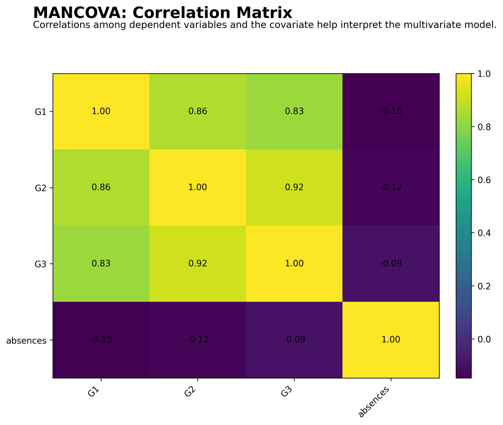
The correlation matrix confirms that G1, G2 and G3 are strongly related outcomes. G1 and G2 correlate at 0.86, G2 and G3 correlate at 0.92, and G1 and G3 correlate at 0.83.
Absences has weak negative correlations with the grade outcomes: -0.15 with G1, -0.12 with G2 and -0.09 with G3. This means students with more absences tend to have slightly lower grade outcomes.
This chart justifies the MANCOVA design. The dependent variables are related enough to analyze as a multivariate set, and the covariate is connected to the outcomes in the expected direction.
R Chart-by-Chart Validation
The R validation charts repeat the MANCOVA workflow in a second software environment. They confirm the mean profile, covariate relationships, follow-up p-values, correlation structure and residual normality patterns.
R Chart 1: MANCOVA Mean Profile by Group
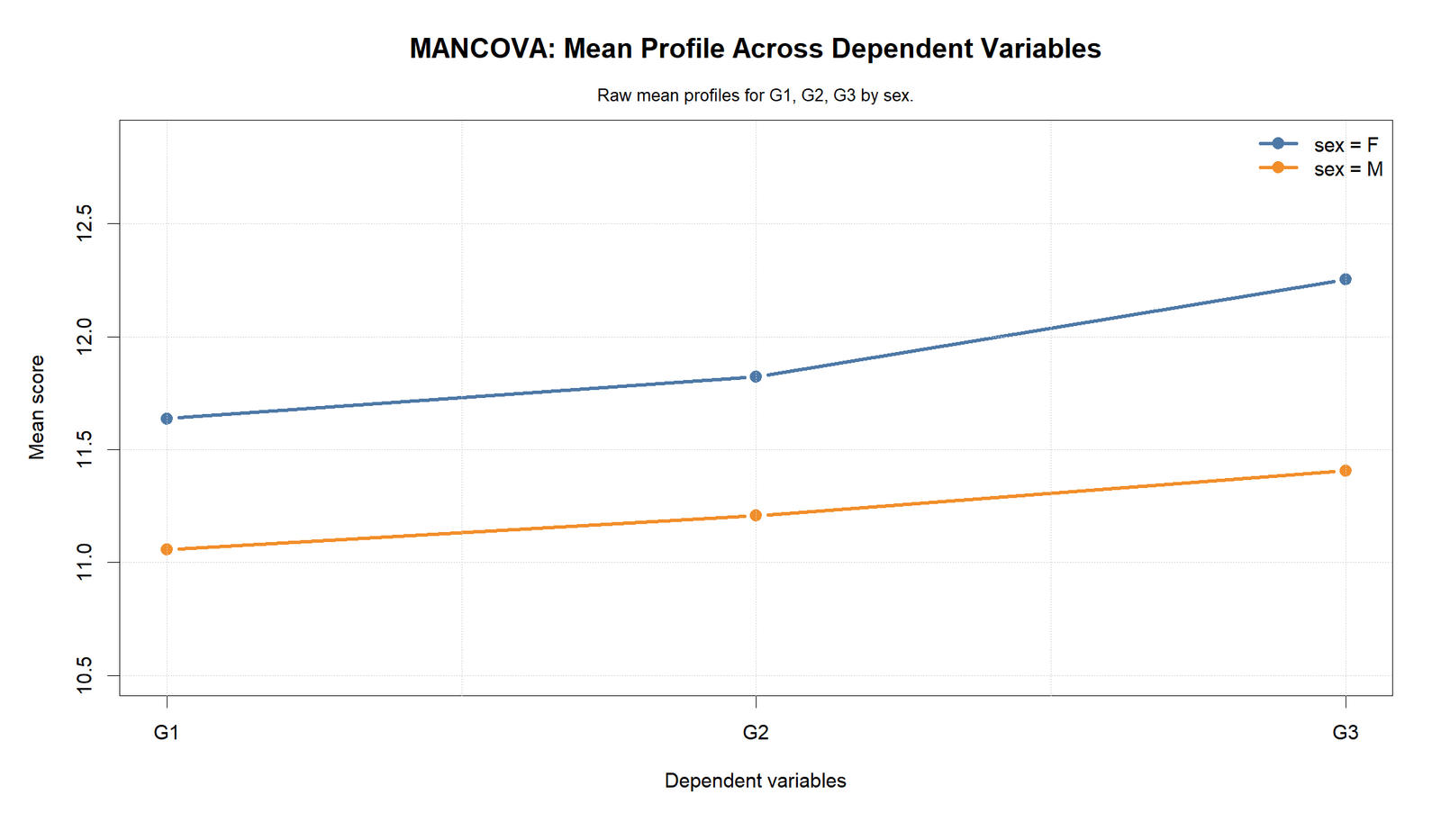
The R mean profile confirms the same pattern as Python. Female means are above male means for G1, G2 and G3. Both lines rise from G1 to G3.
The separation between the lines remains visible across the dependent variables. This supports the interpretation that the group profile difference is not limited to one outcome.
R Chart 2: Covariate Scatter for G1
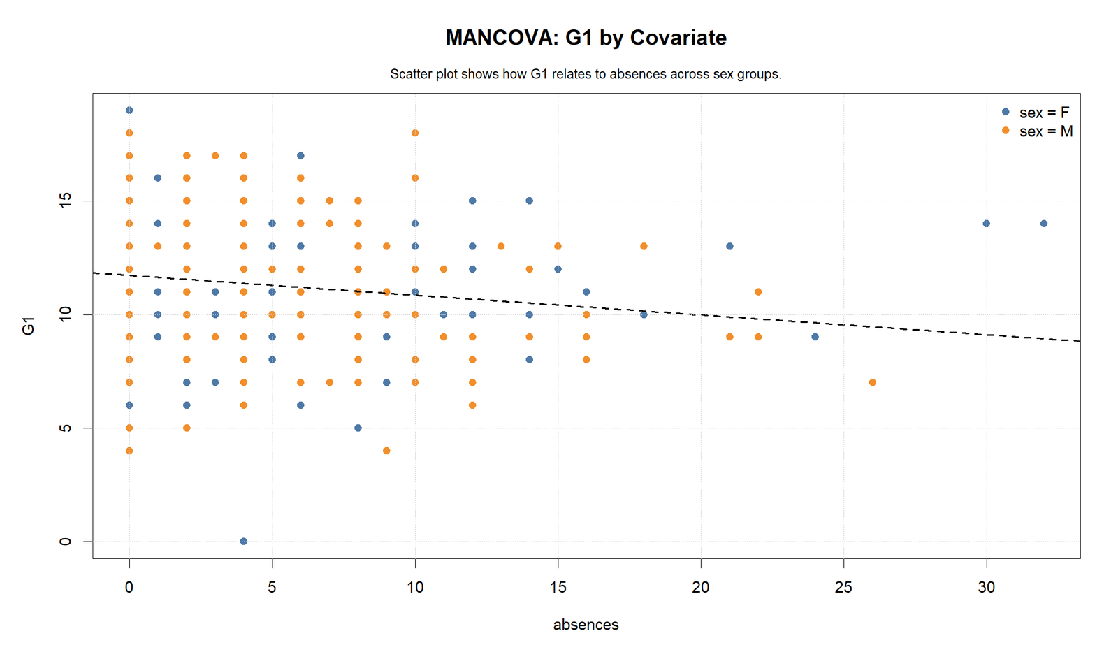
The R G1 scatterplot confirms the downward covariate trend. Higher absences are associated with lower G1 scores.
The visible spread also shows why a covariate-adjusted model is appropriate. Absences is not just a background variable; it helps explain part of the grade outcome variation.
R Chart 3: Covariate Scatter for G2
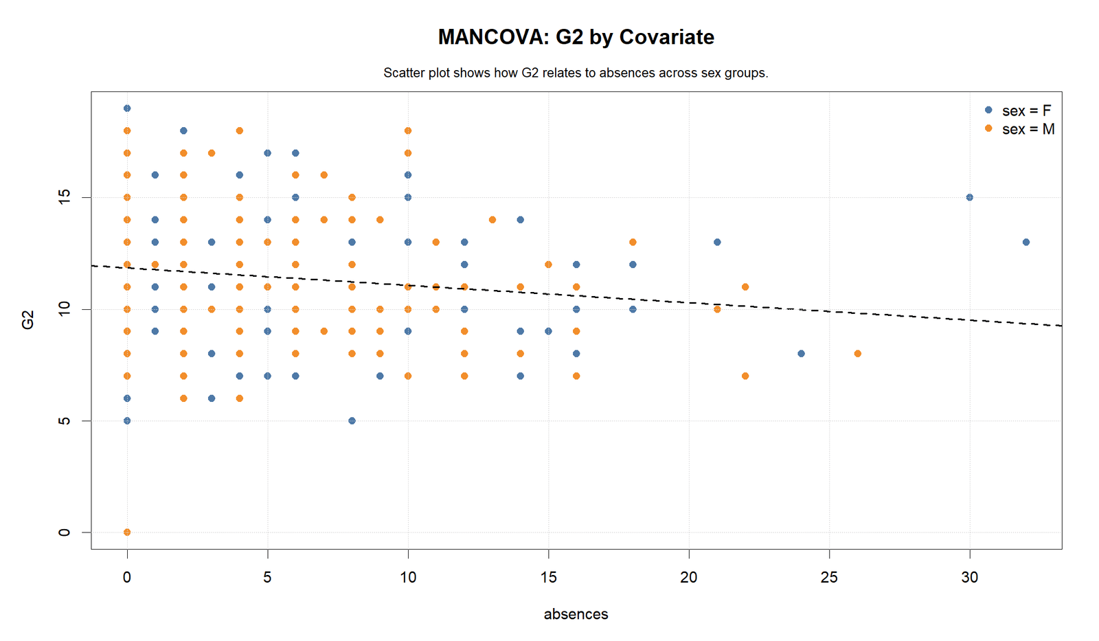
The R G2 scatterplot shows the same attendance pattern. The overall association between absences and G2 is negative.
This supports the follow-up result where absences is significant for G2. The covariate has both visible and statistical relevance.
R Chart 4: Covariate Scatter for G3
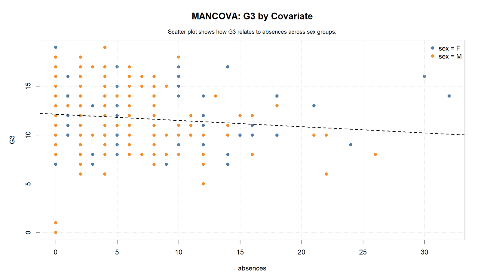
The R G3 scatterplot again shows a negative covariate direction. The relationship is weaker than the relationship among the grade outcomes, but it is still relevant to the final grade model.
The follow-up p-value chart supports this visual result because G3 with absences remains below the .05 threshold.
R Chart 5: Univariate ANCOVA P-Values
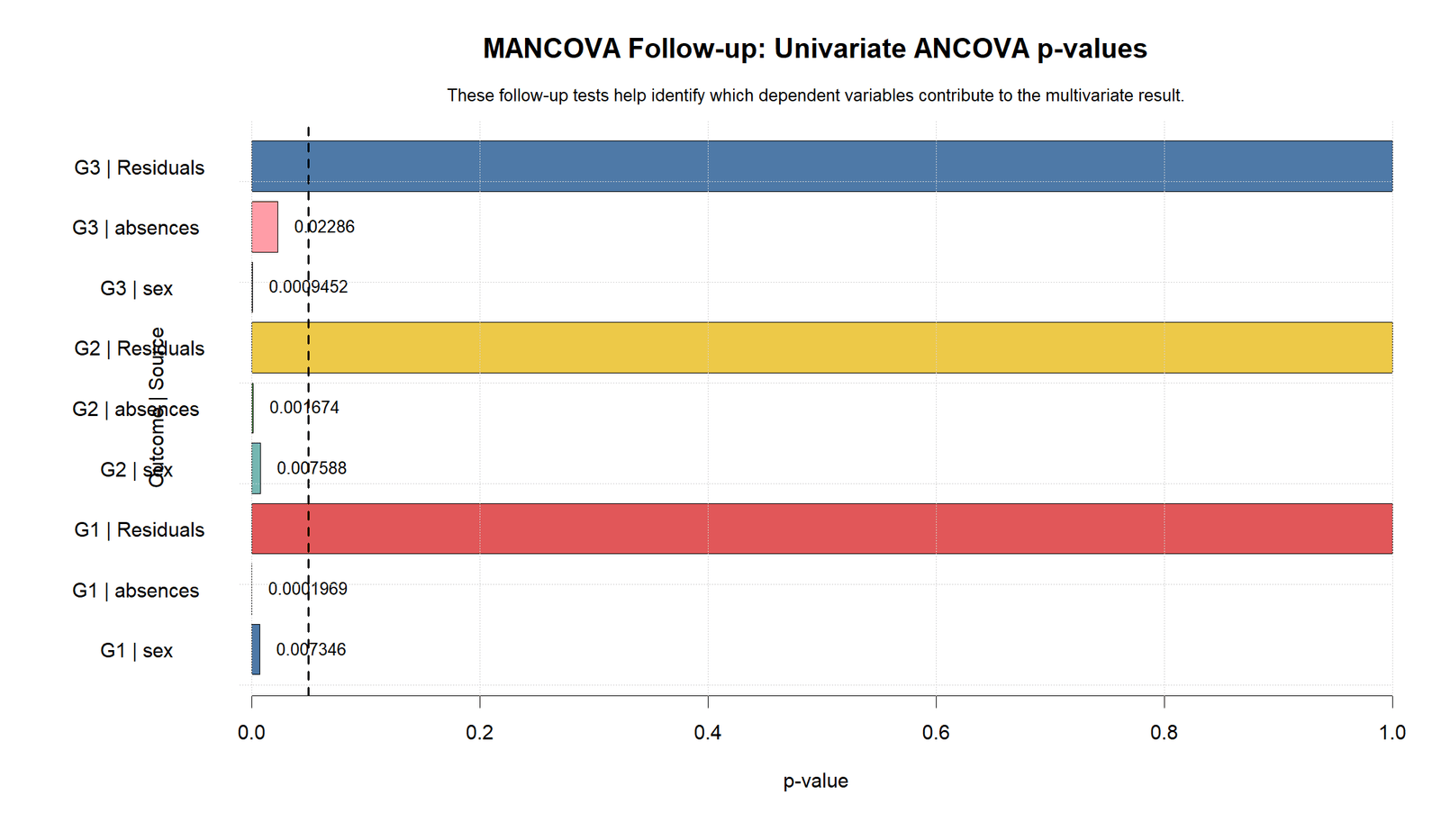
The R p-value chart confirms that the follow-up sources are below the .05 decision line for the displayed sex and absences terms. G1 with absences is labelled 0.0001969, G2 with absences is 0.001674, and G3 with absences is 0.02286.
The sex p values are also below .05 in the R validation chart, with G3 sex shown below .001. This confirms that the group factor contributes to the adjusted outcomes.
The chart also includes residual reference bars at 1.0, which are not interpreted as substantive effects. The substantive decisions come from the sex and absences terms.
R Chart 6: MANCOVA Correlation Matrix
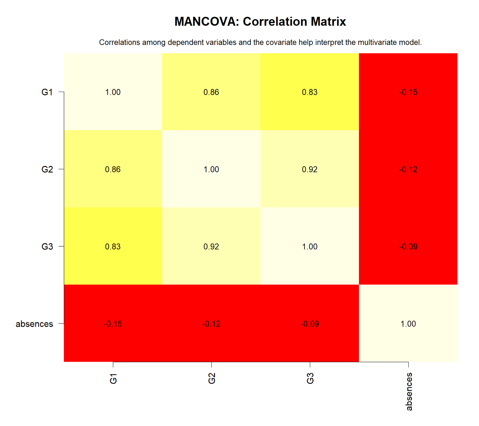
The R correlation matrix repeats the same correlation structure. The grade outcomes are highly correlated with each other: G1-G2 is 0.86, G2-G3 is 0.92 and G1-G3 is 0.83.
Absences remains weakly negative with each grade outcome. This validates the MANCOVA setup: the outcomes belong together, and absences is a reasonable covariate.
R Chart 7: Residual Q-Q Plot for G1
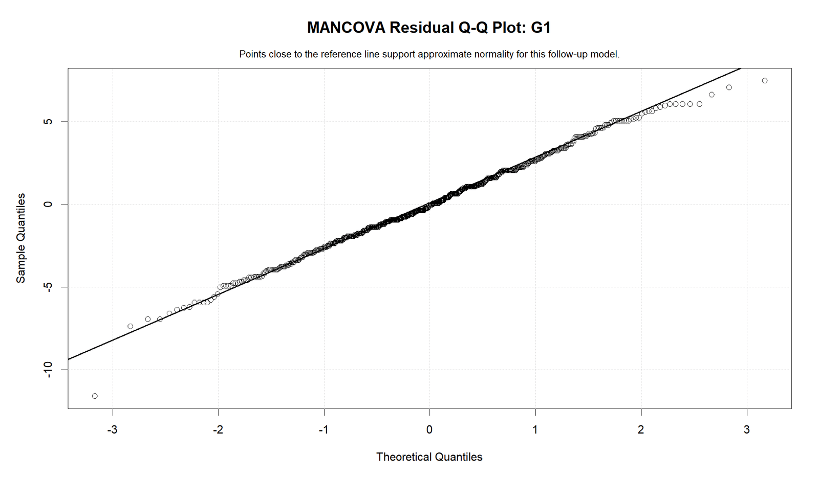
The R Q-Q plot for G1 confirms that the residual distribution is not perfectly normal in the tails. The central pattern is more stable, while the tail points depart more strongly.
This diagnostic result should be included in the assumptions discussion rather than ignored.
R Chart 8: Residual Q-Q Plot for G2
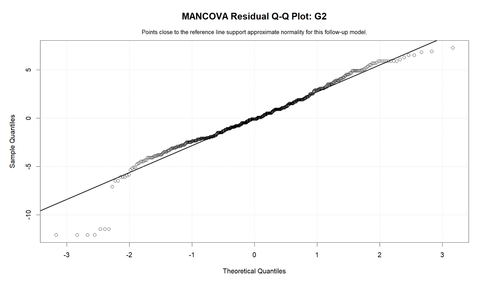
The R Q-Q plot for G2 shows the same general diagnostic pattern. The residuals follow the reference line more closely in the center than in the tails.
The chart supports a practical conclusion: the model is useful, but residual normality is approximate.
R Chart 9: Residual Q-Q Plot for G3
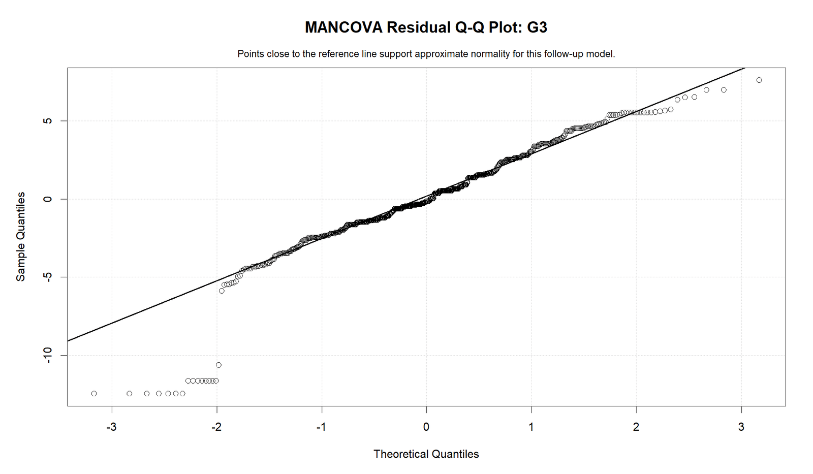
The R Q-Q plot for G3 confirms tail departures for the final grade outcome. This matches the Python diagnostic pattern.
The final report should state that the MANCOVA and follow-up ANCOVAs are meaningful, while residual diagnostics show imperfect normality in the tails.
SPSS Output and R Report PDFs
The supplied downloadable files support the MANCOVA workflow. The R report provides the validation output, and the SPSS PDF provides the menu-based output for reporting and screenshots.
Download MANCOVA SPSS Output PDF
Output Items to Read
| Output Item | What It Shows | How It Is Used | Reporting Meaning |
|---|---|---|---|
| Mean profile | Average G1, G2 and G3 by sex. | Shows group profile direction. | Female profile is above male profile. |
| Covariate scatterplots | Grades by absences. | Checks covariate relationship. | Absences has a negative relationship with outcomes. |
| Univariate ANCOVA p-values | Follow-up p-values for sex and absences. | Identifies which outcomes contribute. | Sex and absences are below .05 for G1, G2 and G3. |
| Correlation matrix | Relations among outcomes and covariate. | Justifies multivariate analysis. | G1, G2 and G3 are strongly related. |
| Residual diagnostics | Q-Q plots and residual patterns. | Checks model assumptions. | Tail departures should be reported. |
Report interpretation summary: The MANCOVA output supports a multivariate grade-profile comparison because G1, G2 and G3 are highly related. Female students have higher mean profiles than male students, and absences is a meaningful covariate with a negative relationship to grade outcomes.
SPSS, R, Python and Excel Workflows for MANCOVA
The same MANCOVA workflow can be reproduced in SPSS, R and Python. Excel can prepare summaries and charts, but full MANCOVA should be run in SPSS, R or Python because Excel does not provide a complete multivariate covariance-adjusted model through the standard Data Analysis ToolPak.
SPSS Workflow
| Step | SPSS Menu or Syntax | Purpose |
|---|---|---|
| Open data | File > Open > Data | Load G1, G2, G3, sex and absences. |
| Run GLM Multivariate | Analyze > General Linear Model > Multivariate | Fit MANCOVA. |
| Set dependent variables | Dependent Variables: G1, G2, G3 | Define multivariate outcome vector. |
| Set fixed factor | Fixed Factor: sex | Define group comparison. |
| Set covariate | Covariate: absences | Adjust outcomes for absences. |
| Request options | Descriptives, effect size, homogeneity tests | Support reporting and assumptions. |
| Export output | OUTPUT EXPORT | Save SPSS output PDF. |
R Workflow
| Step | R Action | Purpose |
|---|---|---|
| Read data | read.csv("dataset.csv") | Load dataset. |
| Define variables | cbind(G1, G2, G3) | Create outcome matrix. |
| Fit MANCOVA | manova(cbind(G1,G2,G3) ~ sex + absences) | Run multivariate model. |
| Read tests | summary(model, test="Pillai") | Get multivariate test statistics. |
| Follow-up ANCOVA | summary.aov(model) | Read univariate follow-ups. |
| Diagnostics | Residual plots for each outcome | Check residual behavior. |
Python Workflow
| Step | Python Action | Purpose |
|---|---|---|
| Read data | pandas.read_csv() | Load dataset. |
| Fit multivariate model | MANOVA.from_formula("G1 + G2 + G3 ~ sex + absences") | Run MANCOVA-style model. |
| Follow-up ANCOVAs | ols("G1 ~ C(sex) + absences") | Test each outcome separately. |
| Covariate plots | Scatterplots by outcome | Show absences relationship. |
| Correlation matrix | df[["G1","G2","G3","absences"]].corr() | Check multivariate outcome structure. |
| Diagnostics | Q-Q plots and residuals versus fitted | Check model assumptions. |
Excel Workflow
| Excel Task | Formula or Tool | Purpose |
|---|---|---|
| Clean variables | Keep G1, G2, G3, sex and absences | Prepare MANCOVA dataset. |
| Mean profiles | PivotTable means by sex | Create profile chart. |
| Covariate scatterplots | Insert scatter chart | Show grade-outcome relationships with absences. |
| Correlation matrix | =CORREL(range1,range2) | Check relationships among G1, G2, G3 and absences. |
| Full MANCOVA | Use SPSS, R or Python | Excel is not recommended for the complete multivariate model. |
Code Blocks for MANCOVA
SPSS Syntax for MANCOVA
* MANCOVA in SPSS.
* Dependent variables: G1 G2 G3.
* Fixed factor: sex.
* Covariate: absences.

TITLE "MANCOVA: G1 G2 G3 by Sex Adjusting for Absences".

GLM G1 G2 G3 BY sex WITH absences
  /METHOD=SSTYPE(3)
  /INTERCEPT=INCLUDE
  /PRINT=DESCRIPTIVE ETASQ HOMOGENEITY PARAMETER
  /CRITERIA=ALPHA(.05)
  /DESIGN=absences sex.

OUTPUT EXPORT
  /CONTENTS EXPORT=VISIBLE
  /PDF DOCUMENTFILE="mancova_output.pdf".
Python Code for MANCOVA
import pandas as pd
import statsmodels.api as sm
from statsmodels.multivariate.manova import MANOVA
from statsmodels.formula.api import ols

df = pd.read_csv("dataset.csv")

for col in ["G1", "G2", "G3", "absences"]:
    df[col] = pd.to_numeric(df[col], errors="coerce")

df["sex"] = df["sex"].astype("category")
df_model = df.dropna(subset=["G1", "G2", "G3", "sex", "absences"]).copy()

# Multivariate model
mancova_model = MANOVA.from_formula("G1 + G2 + G3 ~ C(sex) + absences", data=df_model)
print(mancova_model.mv_test())

# Follow-up ANCOVAs
for outcome in ["G1", "G2", "G3"]:
    model = ols(f"{outcome} ~ C(sex) + absences", data=df_model).fit()
    anova_table = sm.stats.anova_lm(model, typ=2)
    print("\nOutcome:", outcome)
    print(anova_table)

# Correlation matrix
corr = df_model[["G1", "G2", "G3", "absences"]].corr()
print(corr)
R Code for MANCOVA
df <- read.csv("dataset.csv")

df$G1 <- as.numeric(df$G1)
df$G2 <- as.numeric(df$G2)
df$G3 <- as.numeric(df$G3)
df$absences <- as.numeric(df$absences)
df$sex <- as.factor(df$sex)

df_model <- na.omit(df[, c("G1", "G2", "G3", "sex", "absences")])

# MANCOVA model
model <- manova(cbind(G1, G2, G3) ~ sex + absences, data = df_model)

summary(model, test = "Pillai")
summary(model, test = "Wilks")
summary.aov(model)

# Correlation matrix
cor(df_model[, c("G1", "G2", "G3", "absences")])

# Follow-up ANCOVAs
summary(aov(G1 ~ sex + absences, data = df_model))
summary(aov(G2 ~ sex + absences, data = df_model))
summary(aov(G3 ~ sex + absences, data = df_model))
Excel Notes for MANCOVA
Excel can help prepare MANCOVA summaries, but it should not be used as the main MANCOVA engine.

Useful Excel steps:
1. Create a PivotTable for mean G1, G2 and G3 by sex.
2. Create scatterplots for absences against G1, G2 and G3.
3. Calculate correlations:
   =CORREL(G1_range,G2_range)
   =CORREL(G2_range,G3_range)
   =CORREL(G1_range,G3_range)
   =CORREL(absences_range,G1_range)
4. Run the full MANCOVA in SPSS, R or Python.
5. Use Excel only for tables, visual checks and reporting support.
APA Reporting Wording
When reporting MANCOVA, state the dependent variables, group factor, covariate, multivariate result, follow-up ANCOVA evidence and diagnostic notes. The dependent variables should be reported as a related outcome set, not as unrelated tests.
APA-style report: A MANCOVA was used to compare sex groups across G1, G2 and G3 while adjusting for absences. The mean profile showed higher scores for female students across all three outcomes. The correlation matrix supported a multivariate analysis because G1, G2 and G3 were strongly correlated. Follow-up ANCOVAs showed that both sex and absences were significant predictors for G1, G2 and G3, with absences showing a negative relationship with grade outcomes. Residual diagnostics showed tail departures, so the model was interpreted with diagnostic caution.
Short reporting version: The MANCOVA profile showed higher adjusted grade outcomes for female students across G1, G2 and G3 after accounting for absences. Follow-up ANCOVA results showed significant sex and absences effects across the grade outcomes.
Common Mistakes
| Mistake | Why It Is Wrong | Correct Practice |
|---|---|---|
| Treating MANCOVA as three unrelated ANCOVAs | MANCOVA is designed for related outcomes. | Report the multivariate model first, then follow-ups. |
| Ignoring the covariate | Absences has visible and statistical links with outcomes. | Explain adjustment for absences. |
| Ignoring correlation among outcomes | The dependent variables must be considered as a related set. | Use the correlation matrix to justify MANCOVA. |
| Overstating residual normality | The Q-Q plots show tail departures. | Mention residual diagnostics in the report. |
| Using Excel as the main MANCOVA tool | Excel does not provide a complete standard MANCOVA workflow. | Use SPSS, R or Python for the model. |
| Skipping assumption checks | MANCOVA depends on multivariate and univariate assumptions. | Review ANOVA Assumptions, Q-Q Plot Normality Check, Levene Test, and Outlier Detection. |
When to Use MANCOVA
Use MANCOVA when you have multiple related dependent variables, at least one categorical grouping factor and at least one covariate that should be controlled. In this example, G1, G2 and G3 are strongly related grade outcomes, sex is the grouping factor and absences is the covariate.
| Situation | Use MANCOVA? | Reporting Note |
|---|---|---|
| Several related numeric outcomes | Yes | Use a multivariate model. |
| One categorical group factor and one covariate | Yes | Compare adjusted outcome profiles. |
| Only one outcome variable | No | Use ANCOVA instead. |
| No covariate | Use MANOVA | MANCOVA specifically includes covariate adjustment. |
| Outcome is binary or count-based | No | Use another generalized model. |
For related guides, see ANCOVA, ANOVA in Python, ANOVA in R, ANOVA in SPSS, ANOVA Effect Size, Balanced ANOVA, Brown Forsythe ANOVA, Cohen’s F Formula, Effect Size and T Test vs ANOVA.
Downloads and Resources for MANCOVA
Use these resources to reproduce the MANCOVA workflow. The R report and SPSS output PDF are included as verification files. Script and workbook placeholders can be replaced after the final downloadable files are uploaded to the WordPress Media Library.
Download Dataset
Practice dataset with G1, G2, G3, sex and absences variables.
Download MANCOVA R Report PDF
R report PDF for MANCOVA charts, follow-up ANCOVA p-values and diagnostics.
Download MANCOVA SPSS Output PDF
SPSS output PDF for multivariate ANCOVA interpretation and reporting.
Download Python Script
Python code for MANCOVA, follow-up ANCOVAs, covariate plots and diagnostics.
Download R Script and Excel Workbook
R workflow and Excel support workbook for MANCOVA summaries.
FAQs About MANCOVA
What is MANCOVA?
MANCOVA is Multivariate Analysis of Covariance. It compares groups across multiple related dependent variables while adjusting for one or more covariates.
What variables were used in this MANCOVA example?
The dependent variables were G1, G2 and G3. The group factor was sex, and the covariate was absences.
Why use MANCOVA instead of ANCOVA?
MANCOVA is used because there are multiple related outcomes. G1, G2 and G3 are strongly correlated, so a multivariate approach is appropriate.
What did the mean profile show?
The mean profile showed that female students had higher mean scores than male students across G1, G2 and G3.
What did the covariate scatterplots show?
The covariate scatterplots showed a negative relationship between absences and the grade outcomes. Higher absences tended to align with lower grades.
Were the follow-up ANCOVA p-values significant?
Yes. The supplied p-value charts show sex and absences below the .05 threshold for G1, G2 and G3.
What did the correlation matrix show?
G1, G2 and G3 were strongly positively correlated. Absences had weak negative correlations with the grade outcomes.
Can MANCOVA be done in Excel?
Excel can prepare summaries, scatterplots and correlations, but the full MANCOVA model should be run in SPSS, R or Python.
Can MANCOVA be done in SPSS?
Yes. Use Analyze > General Linear Model > Multivariate, enter G1, G2 and G3 as dependent variables, sex as the fixed factor and absences as the covariate.
How do I report this MANCOVA in APA style?
A concise report is: A MANCOVA compared sex groups across G1, G2 and G3 while adjusting for absences. Female students showed higher grade profiles, and follow-up ANCOVAs showed significant sex and absences effects across the outcomes.

