Normality Checking and Visual Diagnostics
Q-Q Plot Normality Check is one of the clearest visual methods for checking whether a numeric variable follows a normal distribution. This complete guide explains how to read a normal Q-Q plot, how to compare observed sample quantiles with theoretical normal quantiles, how to support the visual result with Shapiro-Wilk and other normality tests, and how to run the same analysis in R, Python, SPSS and Excel using the student-por.csv G3 final grade example.
Google AdSense top placement reserved here
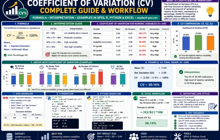
Quick Answer: Q-Q Plot Normality Check Result
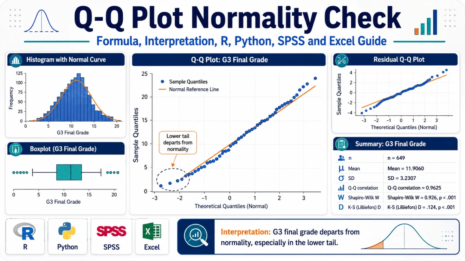
A Q-Q Plot Normality Check was performed on the G3 final grade variable from the student-por.csv dataset. The visual Q-Q plot showed that the middle part of the distribution followed the normal reference line reasonably well, but the lower tail departed strongly from the line because several students had very low final grades. Formal normality tests supported the visual conclusion. The Shapiro-Wilk result was W = 0.9260 with p < .001, so the normality assumption for G3 was not supported.
Final report sentence: Visual inspection of the Q-Q plot indicated that G3 final grade departed from normality, especially in the lower tail. This visual result was supported by skewness = -0.9129, excess kurtosis = 2.7122, Q-Q correlation = 0.9625, and Shapiro-Wilk test, W = 0.9260, p < .001. Therefore, the normality assumption for G3 was not supported.
Important reporting note: A Q-Q plot should not be judged only by one number. In this example, the Q-Q correlation is high, but the plot still shows meaningful tail departure. Always read the visual pattern first, then confirm the decision with formal tests such as Shapiro-Wilk, Anderson-Darling, Lilliefors, Cramer-von Mises or Kolmogorov-Smirnov.
Table of Contents
- What is a Q-Q Plot Normality Check?
- Q-Q Plot Formula and Logic
- Normality Hypotheses Used with Q-Q Plot Checking
- Dataset and Variables Used
- Verified Results for G3 Final Grade
- Chart-by-Chart Interpretation
- R Code for Q-Q Plot Normality Check
- Python Code for Q-Q Plot Normality Check
- SPSS Syntax and Interpretation
- Excel Method
- APA Reporting
- FAQs
What Is a Q-Q Plot Normality Check?
A Q-Q Plot Normality Check is a visual method used to compare a sample distribution with a theoretical normal distribution. The term Q-Q means quantile-quantile. A quantile is a position-based value in a distribution. In a normal Q-Q plot, the observed sample quantiles are placed against the theoretical quantiles that would be expected if the data were normally distributed.
When a variable is normally distributed, the plotted points fall close to a straight diagonal reference line. When the points curve away from the line, form an S-shape, flatten in the upper tail, drop sharply in the lower tail or show extreme outliers, the variable is not behaving like a normal distribution.
The Q-Q Plot Normality Check is especially useful because it shows where normality fails. A p-value can tell us that a distribution is statistically non-normal, but a Q-Q plot shows whether the problem is in the center, the lower tail, the upper tail, both tails or because of outliers.
Practical note: For large samples, formal tests such as Shapiro-Wilk can reject normality even for small departures. That is why a Q-Q plot is valuable. It allows the analyst to judge whether the non-normality is practically serious or only statistically detectable.
In this worked example, the Q-Q plot is applied to the G3 final grade variable from the student-por.csv dataset. The result is not perfectly normal. The center of the distribution looks fairly close to normal, but the lower tail clearly departs because several students have very low grades. This tail departure is also supported by the Shapiro-Wilk p-value below .001.
For a complete assumption-checking workflow, Q-Q Plot Normality Check can be used together with related normality and distribution tests such as the Kolmogorov-Smirnov Test, DAgostino Pearson Test, Cramer von Mises Test and Lilliefors Test. If the analysis is regression-based, residual normality should also be checked along with influence and diagnostic tools such as Influence Diagnostics.
Q-Q Plot Formula and Logic
The Q-Q plot does not test normality by one simple formula in the same way that a t test or z test does. Instead, it compares two ordered sets of quantiles:
Observed sample quantiles vs Theoretical normal quantilesThe observed sample values are first sorted from smallest to largest. Each sorted value receives a plotting position. That plotting position is then converted into a theoretical normal quantile. If the sample comes from a normal distribution, the observed values and theoretical normal quantiles should form an approximately straight line.
Step 1: Sort the observed values from smallest to largest
Step 2: Assign each value a cumulative probability position
Step 3: Convert each probability into a theoretical normal quantile
Step 4: Plot observed sample quantiles against theoretical normal quantiles
Step 5: Read the distance from the straight reference line
The main idea is simple: if the data are normal, the observed quantiles should match the normal quantiles. If the observed lower tail is too low, points fall below the line on the left. If the upper tail is too high, points rise above the line on the right. If both tails depart, the plot may form an S-shape.
| Q-Q plot pattern | Meaning | Interpretation in normality checking |
|---|---|---|
| Points close to straight line | Sample quantiles match normal quantiles | Normality is visually reasonable. |
| Lower-left points far below line | Lower tail is too low or has outliers | Left-tail departure from normality. |
| Upper-right points far above line | Upper tail is too high or has outliers | Right-tail departure from normality. |
| S-shaped curve | Tails differ from normal distribution | Skewness, heavy tails or light tails may be present. |
| Flat steps | Many repeated values | Common in scores, grades, Likert scales and rounded data. |
Normality Hypotheses Used with Q-Q Plot Checking
A Q-Q plot itself is visual, so it does not have a formal null hypothesis unless it is supported by a statistical normality test. In this post, the visual Q-Q Plot Normality Check is supported by the Shapiro-Wilk test and other formal normality tests.
| Hypothesis | Meaning | Applied to this example |
|---|---|---|
| H0 | The variable follows a normal distribution. | G3 final grade is normally distributed. |
| H1 | The variable does not follow a normal distribution. | G3 final grade departs from normality. |
Because the Shapiro-Wilk p-value is below .001, the null hypothesis of normality is rejected. The visual Q-Q plot agrees with this decision because the lower tail does not follow the normal reference line.
Google AdSense middle placement reserved here
Dataset and Variables Used
This worked example uses the student-por.csv student performance dataset. The main variable checked for normality is G3, which represents the final grade. Earlier grade variables G1 and G2 are also used for comparison charts. The school and sex variables are used to check whether the G3 normality pattern changes across groups.
| Item | Verified value | Explanation |
|---|---|---|
| Dataset | student-por.csv | Student performance dataset used for grade-based statistical examples. |
| Main variable | G3 | Final grade variable checked with Q-Q Plot Normality Check. |
| Comparison variables | G1, G2 | Earlier grade variables used to compare Q-Q plot patterns. |
| Grouping variables | school, sex | Used for subgroup Q-Q plot checking. |
| Valid sample size | 649 | Total valid observations used for G3 normality checking. |
External dataset source: UCI Machine Learning Repository: Student Performance dataset.
Verified Q-Q Plot Normality Check Results
The Q-Q Plot Normality Check was reproduced with Python, R and SPSS-compatible output. The main conclusion is that G3 final grade departs from normality. The central values are not the main problem. The main problem appears in the lower tail, where very low grades create a clear departure from the expected normal quantile pattern.
Descriptive Statistics for G3
| Statistic | Verified value | Interpretation |
|---|---|---|
| N | 649 | Large sample size; formal tests can detect even moderate departures from normality. |
| Mean | 11.9060 | Average final grade is around 11.91. |
| Standard deviation | 3.2307 | G3 scores vary by about 3.23 grade points around the mean. |
| Skewness | -0.9129 | Negative skewness means the distribution has a longer or stronger lower tail. |
| Excess kurtosis | 2.7122 | Positive excess kurtosis indicates heavier tails or a sharper peak than a normal distribution. |
| Q-Q correlation | 0.9625 | High overall Q-Q association, but not enough to prove normality because tails depart. |
| Shapiro-Wilk W | 0.9260 | Test statistic for normality; lower than 1, showing departure from normality. |
| Shapiro-Wilk p-value | < .001 | Reject the null hypothesis that G3 is normally distributed. |
Normality Test Summary
The formal tests agree with the visual Q-Q plot. Shapiro-Wilk, Anderson-Darling, Jarque-Bera, Lilliefors, Cramer-von Mises and Kolmogorov-Smirnov all support the conclusion that G3 is not normally distributed. The exact strength differs by test because each test reacts differently to skewness, kurtosis, tail departure, repeated values and sample size.
| Normality check | Displayed result | What it means for G3 |
|---|---|---|
| Shapiro-Wilk | p < .001 | Strong evidence that G3 is not normally distributed. |
| Anderson-Darling | p < .001 | Strong tail-sensitive evidence against normality. |
| Jarque-Bera | p < .001 | Skewness and kurtosis differ from normal expectations. |
| Lilliefors | p < .001 | Normality rejected after estimating mean and standard deviation. |
| Cramer-von Mises | p = 0.0013 | Distributional difference from normality is significant. |
| Kolmogorov-Smirnov on standardized G3 | p < .001 | Standardized G3 still departs from the normal model. |
Chart-by-Chart Interpretation of the Q-Q Plot Normality Check
This section explains each chart used in the Q-Q Plot Normality Check. The purpose is not only to show the graphs, but to interpret what each graph proves about the normality of G3 final grade. The overall result is clear: G3 is partly close to normal in the middle, but the tails, especially the lower tail, do not follow the normal distribution.
Chart 1: Q-Q Plot Normality Check for G3 Final Grade

Specific interpretation: This is the main Q-Q plot for the G3 final grade variable. The x-axis shows the theoretical normal quantiles, and the y-axis shows the observed sample quantiles of G3. If G3 were normally distributed, the plotted points would follow the straight reference line closely from the lower tail to the upper tail.
In this chart, the middle part of the distribution follows the line fairly well. Many points between approximately 8 and 17 lie close to the reference line, which means the central part of G3 has some normal-like structure. However, the lower-left side of the chart clearly moves away from the line. Several observations are clustered near 0, which is much lower than expected under a normal model.
The upper-right tail also shows flattening because G3 is a bounded grade variable. Grades cannot increase infinitely like a theoretical normal distribution. Therefore, the chart shows a common educational-score pattern: the middle behaves reasonably, but the tails break the normality assumption.
Decision from Chart 1: The Q-Q plot does not support perfect normality. G3 has a visible lower-tail departure, so the normality assumption should be treated as violated or at least doubtful.
Chart 2: Histogram and Normal Curve for G3

Specific interpretation: This chart compares the actual G3 distribution with a fitted normal curve. The histogram shows the observed grade density, while the normal curve shows the shape that would be expected if the same mean and standard deviation followed a normal distribution.
The highest concentration of G3 scores lies around the middle grade range, especially between about 10 and 14. That is why the distribution may look partly bell-shaped at first glance. However, the fitted normal curve does not match the observed distribution perfectly. The observed distribution has extra low-end values near zero, and the center is more concentrated than a smooth normal model would expect.
This chart explains why the Q-Q plot rejects normality. The problem is not that the whole distribution is random or unusable. The problem is that the distribution is bounded, slightly left-skewed and affected by low-grade observations. These features create visible differences from the normal curve.
Decision from Chart 2: The histogram supports the Q-Q plot result. G3 is roughly mound-shaped in the center, but the lower tail and bounded grade scale make it non-normal.
Chart 3: Deviation from the Q-Q Reference Line

Specific interpretation: This chart is more diagnostic than the basic Q-Q plot because it shows the distance between the observed sample quantiles and the Q-Q reference line. The dashed horizontal line at zero represents perfect agreement with the normal reference line. Points above or below zero show where the distribution departs from normality.
The strongest negative deviation appears in the lower-left part of the chart. This means the lowest observed G3 values are much smaller than expected under a normal distribution. In simple words, there are too many very low grades compared with what the normal model predicts.
The middle part of the chart stays closer to zero, meaning the central grade values are more consistent with the normal model. The right side also bends downward, showing that the upper tail is not perfectly normal either. This is expected because G3 is limited by the grade scale and cannot extend indefinitely.
Decision from Chart 3: The deviation chart confirms that the main normality violation comes from the tails, especially the lower tail. This supports the Shapiro-Wilk result of p < .001.
Chart 4: Q-Q Plot Comparison for G1, G2 and G3

Specific interpretation: This chart compares the Q-Q patterns of G1, G2 and G3. These three variables represent grade measurements from the same student performance dataset. The comparison is important because it shows whether the non-normality problem is unique to G3 or also appears in earlier grade variables.
G1 follows the reference line reasonably in the middle and upper range, but it still has low-end departures. G2 also shows a lower-tail issue, with several values near zero pulling away from the line. G3 shows the clearest lower-tail departure because its very low values are more visible and its upper tail also flattens near the maximum grade range.
The comparison shows that the grade variables are not continuous, unrestricted, perfectly normal variables. They are bounded score variables with repeated grade values. This creates step-like Q-Q patterns and tail departures.
Decision from Chart 4: G1, G2 and G3 are not perfectly normal, but G3 is the main final-grade variable and shows strong visible departure. This supports using G3 as the main example for the Q-Q Plot Normality Check.
Chart 5: Q-Q Plot Normality Check for G3 by School

Specific interpretation: This chart separates the G3 Q-Q plot by school group. The two school categories are GP and MS. This subgroup check matters because sometimes a total-sample normality problem is created by combining different groups. If each group were normal separately, the combined sample might only look non-normal because of group mixing.
In the GP group, the central grade values follow the reference line fairly well, but the lower tail still departs from normality. In the MS group, the low-score tail is more visible because more observations appear at the bottom of the plot. This means the total-sample non-normality is not only caused by mixing schools.
The school-level Q-Q plot shows that the same basic issue remains inside the groups: the central values are acceptable, but the tails are not fully normal. The MS group appears to have a stronger lower-tail issue than GP.
Decision from Chart 5: G3 normality is not fully supported within school groups. Both GP and MS show departures from the reference line, and MS shows a stronger low-score tail problem.
Chart 6: Q-Q Plot Normality Check for G3 by Sex

Specific interpretation: This chart checks G3 normality separately for female and male students. This is important because the total Q-Q plot may hide group-specific distribution patterns.
For the female group, the middle grade values follow the reference line reasonably well, but the lower tail contains very low values that pull away from normality. For the male group, the lower-tail departure is also clear, and the upper tail is flatter than expected. The male group appears slightly more affected by non-normal tail behavior.
The key message is that non-normality is not created by one sex group only. Both groups show visible deviations from the Q-Q reference line. This confirms that G3 normality is doubtful across subgroups.
Decision from Chart 6: G3 departs from normality in both female and male groups. The issue is not limited to one sex category.
Chart 7: Normality Test P-Value Summary

Specific interpretation: This chart summarizes several formal normality tests using -log10(p-value). Higher bars mean smaller p-values and stronger evidence against normality. The dashed vertical reference line represents the usual alpha = .05 decision boundary. Any bar beyond that line indicates that the test rejects normality at the 5% level.
The chart shows that multiple tests reject normality. Shapiro-Wilk, Anderson-Darling, Jarque-Bera and Kolmogorov-Smirnov all show strong evidence against normality. Lilliefors also rejects normality. Cramer-von Mises is displayed with p = 0.0013, which is also statistically significant.
This is important because the conclusion does not depend on one test only. The same decision is supported by several methods. The Q-Q plot gives the visual reason, while the p-value summary gives statistical confirmation.
Decision from Chart 7: Formal normality tests agree with the Q-Q plot. G3 rejects normality across multiple testing approaches.
Chart 8: Residual Q-Q Plot Normality Check

Specific interpretation: This chart checks normality of residuals instead of raw G3 scores. In regression and model-based analysis, residual normality is often more important than raw-variable normality. A residual is the difference between the observed value and the model-predicted value.
The residual Q-Q plot shows that many residuals in the middle range follow the reference line, but the lower tail strongly departs from normality. Several standardized residuals are far below the line, which means the model has unusually low observations that it does not explain well.
This result does not automatically make the model useless. However, it warns that parametric assumptions should be checked carefully. Depending on the purpose of analysis, the user may consider robust standard errors, transformation, ordinal models, nonparametric tests or bootstrapped confidence intervals.
Decision from Chart 8: The residual Q-Q plot shows non-normal residual tail behavior. Model-based normality assumptions should be checked before final reporting.
Chart 9: Boxplot Support for Normality Checking

Specific interpretation: This boxplot supports the Q-Q Plot Normality Check by showing spread, center and unusual values. A boxplot does not directly prove normality, but it helps identify skewness and outliers.
The plot shows that the main body of G3 values lies in the middle grade range, while low-end observations appear far below the central distribution. These low values are the same reason that the Q-Q plot bends away from the reference line in the lower tail.
The boxplot also shows that G3 is a bounded educational score, not an unrestricted continuous measurement. A bounded grade scale commonly produces non-normal patterns, especially when there are repeated scores and a few extremely low grades.
Decision from Chart 9: The boxplot supports the Q-Q plot conclusion. G3 has low-end observations that contribute to non-normality.
Chart 10: Formula and Interpretation Summary Panel

Specific interpretation: This summary panel brings together the main numerical results used to interpret the Q-Q Plot Normality Check. It explains that a Q-Q plot compares observed sample quantiles with theoretical normal quantiles. It also reports the verified values for G3: n = 649, mean = 11.9060, SD = 3.2307, skewness = -0.9129, excess kurtosis = 2.7122, Q-Q correlation = 0.9625, Shapiro-Wilk W = 0.9260, and Shapiro-Wilk p-value < .001.
The most important point is that a high Q-Q correlation does not automatically prove normality. The Q-Q correlation summarizes overall linearity, but it can hide important tail departures. In this example, the central points are fairly linear, yet the lower tail clearly violates the normal pattern.
Decision from Chart 10: The summary panel confirms the final conclusion: G3 is not normally distributed, mainly because of tail departure, negative skewness and significant normality tests.
Final combined chart interpretation: The Q-Q Plot Normality Check shows that G3 final grade is not perfectly normally distributed. The main Q-Q plot shows a clear lower-tail departure, the histogram shows a bounded and partly peaked grade distribution, the deviation chart identifies where the reference-line errors occur, subgroup Q-Q plots show that the issue appears within school and sex groups, the p-value summary shows that several formal normality tests reject normality, the residual Q-Q plot warns that model residuals also need attention, and the boxplot confirms that low-end observations are responsible for much of the departure.
Google AdSense middle placement reserved here
R Code for Q-Q Plot Normality Check
The following R workflow can be used to reproduce the Q-Q Plot Normality Check, histogram, normality statistics and summary output for G3. Update the folder path before running the code.
# Q-Q Plot Normality Check in R
# Update this folder path
folder <- "D:/low kda score priority basis posts/first post/Q Q Plot Normality Check"
data_file <- file.path(folder, "student-por.csv")
out_dir <- file.path(folder, "R_Output")
dir.create(out_dir, showWarnings = FALSE, recursive = TRUE)

# Load data
df <- read.csv(data_file, sep = ";", stringsAsFactors = FALSE)

# Clean G3
g3 <- as.numeric(df$G3)
g3 <- g3[!is.na(g3)]

# Basic statistics
n <- length(g3)
mean_g3 <- mean(g3)
sd_g3 <- sd(g3)
skew_g3 <- mean((g3 - mean_g3)^3) / sd_g3^3
kurt_excess <- mean((g3 - mean_g3)^4) / sd_g3^4 - 3

# Shapiro-Wilk test
shapiro_result <- shapiro.test(g3)

# Q-Q correlation
qq <- qqnorm(g3, plot.it = FALSE)
qq_correlation <- cor(qq$x, qq$y)

# Save summary
summary_table <- data.frame(
  Statistic = c("n", "Mean", "SD", "Skewness", "Excess kurtosis", "Q-Q correlation", "Shapiro-Wilk W", "Shapiro-Wilk p-value"),
  Value = c(n, mean_g3, sd_g3, skew_g3, kurt_excess, qq_correlation, shapiro_result$statistic, shapiro_result$p.value)
)

write.csv(summary_table, file.path(out_dir, "r_qq_plot_normality_summary.csv"), row.names = FALSE)

# Q-Q plot
png(file.path(out_dir, "r_qq_plot_g3.png"), width = 1600, height = 900, res = 150)
qqnorm(g3, main = "R Q-Q Plot Normality Check for G3 Final Grade",
       xlab = "Theoretical normal quantiles",
       ylab = "Sample quantiles of G3")
qqline(g3, lwd = 2)
dev.off()

# Histogram with normal curve
png(file.path(out_dir, "r_histogram_normal_curve_g3.png"), width = 1600, height = 900, res = 150)
hist(g3, probability = TRUE, breaks = 16,
     main = "R Histogram and Normal Curve for G3",
     xlab = "G3 final grade",
     ylab = "Density")
curve(dnorm(x, mean = mean_g3, sd = sd_g3), add = TRUE, lwd = 2, lty = 2)
abline(v = mean_g3, lwd = 2)
dev.off()
R interpretation: If the Q-Q plot points fall close to the line, normality is visually acceptable. In this example, the central values are close to the line, but the lower tail departs strongly. The Shapiro-Wilk p-value below .001 confirms that G3 does not satisfy normality.
Python Code for Q-Q Plot Normality Check
The Python workflow below creates the same Q-Q plot normality check and supporting statistics. It also saves cleaned outputs that can be used in SPSS workflows.
# Q-Q Plot Normality Check in Python
# Update this folder path
import os
import numpy as np
import pandas as pd
import matplotlib.pyplot as plt
from scipy import stats

folder = r"D:\low kda score priority basis posts\first post\Q Q Plot Normality Check"
data_file = os.path.join(folder, "student-por.csv")
out_dir = os.path.join(folder, "Python_Output")
os.makedirs(out_dir, exist_ok=True)

# Load data
df = pd.read_csv(data_file, sep=";")

# Clean G3
df["G3"] = pd.to_numeric(df["G3"], errors="coerce")
g3 = df["G3"].dropna().to_numpy()

# Statistics
n = len(g3)
mean_g3 = np.mean(g3)
sd_g3 = np.std(g3, ddof=1)
skew_g3 = stats.skew(g3, bias=False)
kurt_excess = stats.kurtosis(g3, fisher=True, bias=False)
shapiro_w, shapiro_p = stats.shapiro(g3)

# Q-Q correlation
osm, osr = stats.probplot(g3, dist="norm", fit=False)
qq_corr = np.corrcoef(osm, osr)[0, 1]

summary = pd.DataFrame({
    "Statistic": [
        "n", "Mean", "SD", "Skewness", "Excess kurtosis",
        "Q-Q correlation", "Shapiro-Wilk W", "Shapiro-Wilk p-value"
    ],
    "Value": [
        n, mean_g3, sd_g3, skew_g3, kurt_excess,
        qq_corr, shapiro_w, shapiro_p
    ]
})

summary.to_csv(os.path.join(out_dir, "python_qq_plot_normality_summary.csv"), index=False)

# Q-Q plot
fig, ax = plt.subplots(figsize=(12, 7))
stats.probplot(g3, dist="norm", plot=ax)
ax.set_title("Python Q-Q Plot Normality Check for G3 Final Grade", fontweight="bold")
ax.set_xlabel("Theoretical normal quantiles")
ax.set_ylabel("Sample quantiles of G3")
ax.grid(True, alpha=0.25)
plt.tight_layout()
plt.savefig(os.path.join(out_dir, "python_qq_plot_g3.png"), dpi=200)
plt.close()

# Histogram with normal curve
x = np.linspace(min(g3), max(g3), 300)
normal_curve = stats.norm.pdf(x, mean_g3, sd_g3)

fig, ax = plt.subplots(figsize=(12, 7))
ax.hist(g3, bins=16, density=True, alpha=0.65, label="Observed grade density")
ax.plot(x, normal_curve, linestyle="--", linewidth=2, label="Normal curve")
ax.axvline(mean_g3, linewidth=2, label=f"Observed mean = {mean_g3:.2f}")
ax.set_title("Python Histogram and Normal Curve for G3", fontweight="bold")
ax.set_xlabel("G3 final grade")
ax.set_ylabel("Density")
ax.legend()
ax.grid(True, alpha=0.25)
plt.tight_layout()
plt.savefig(os.path.join(out_dir, "python_histogram_normal_curve_g3.png"), dpi=200)
plt.close()

# Save SPSS-ready clean CSV
clean_file = os.path.join(folder, "student_por_clean_for_spss.csv")
df.to_csv(clean_file, index=False)

print(summary)
print("SPSS-ready file saved as:", clean_file)
Python interpretation: Python confirms the same conclusion: the Q-Q plot is fairly linear in the center, but the lower tail departs from the normal reference line. The Shapiro-Wilk test gives p < .001, so G3 is not normally distributed.
SPSS Syntax for Q-Q Plot Normality Check
SPSS can create Q-Q plots, histograms, boxplots and Shapiro-Wilk normality tests through the EXAMINE procedure. Use the cleaned SPSS-ready file created from Python, or import the original student-por.csv file directly if it opens correctly.
Recommended file name for SPSS: Use student_por_clean_for_spss.csv or save it as student_por_clean_for_spss.sav. Keep this cleaned file name consistent in every folder so SPSS analysis is easier and errors are avoided.
* Q-Q Plot Normality Check in SPSS.
* Update the file path before running.

GET DATA
  /TYPE=TXT
  /FILE='D:\low kda score priority basis posts\first post\Q Q Plot Normality Check\student_por_clean_for_spss.csv'
  /ENCODING='UTF8'
  /DELCASE=LINE
  /DELIMITERS=","
  /QUALIFIER='"'
  /ARRANGEMENT=DELIMITED
  /FIRSTCASE=2
  /VARIABLES=
    school A10
    sex A10
    age F8.2
    G1 F8.2
    G2 F8.2
    G3 F8.2.
EXECUTE.

DATASET NAME QQPlotData.

* Descriptive statistics and normality plots for G3.
EXAMINE VARIABLES=G3
  /PLOT BOXPLOT HISTOGRAM NPPLOT
  /COMPARE GROUPS
  /STATISTICS DESCRIPTIVES
  /CINTERVAL 95
  /MISSING LISTWISE
  /NOTOTAL.

* Q-Q plot and normality check by school.
SORT CASES BY school.
SPLIT FILE LAYERED BY school.

EXAMINE VARIABLES=G3
  /PLOT BOXPLOT HISTOGRAM NPPLOT
  /COMPARE GROUPS
  /STATISTICS DESCRIPTIVES
  /CINTERVAL 95
  /MISSING LISTWISE
  /NOTOTAL.

SPLIT FILE OFF.

* Q-Q plot and normality check by sex.
SORT CASES BY sex.
SPLIT FILE LAYERED BY sex.

EXAMINE VARIABLES=G3
  /PLOT BOXPLOT HISTOGRAM NPPLOT
  /COMPARE GROUPS
  /STATISTICS DESCRIPTIVES
  /CINTERVAL 95
  /MISSING LISTWISE
  /NOTOTAL.

SPLIT FILE OFF.

* Optional: Compare G1, G2 and G3 normality.
EXAMINE VARIABLES=G1 G2 G3
  /PLOT BOXPLOT HISTOGRAM NPPLOT
  /COMPARE GROUPS
  /STATISTICS DESCRIPTIVES
  /CINTERVAL 95
  /MISSING LISTWISE
  /NOTOTAL.
How to Read the SPSS Output
| SPSS output item | What to check | How to report it |
|---|---|---|
| Normal Q-Q Plot | Whether points follow the diagonal line | Report the visual tail pattern, not only the test p-value. |
| Detrended Q-Q Plot | Where points deviate from zero | Use it to identify lower-tail or upper-tail departure. |
| Histogram | Shape, skewness, peak and outliers | Explain whether the distribution is bell-shaped or not. |
| Boxplot | Outliers and spread | Use it as support for the visual normality decision. |
| Shapiro-Wilk | Sig. value | If SPSS shows .000, report as p < .001. |
Excel Method for Q-Q Plot Normality Check
Excel does not provide a one-click professional Q-Q plot like R, Python or SPSS, but it can still be used to create a basic normal Q-Q plot. The method is based on sorting the data, calculating plotting positions and converting those positions into theoretical normal quantiles.
Excel Steps
| Step | Excel action | Formula example |
|---|---|---|
| 1 | Put G3 values in one column and sort them from smallest to largest. | Use Sort Smallest to Largest. |
| 2 | Create rank numbers from 1 to n. | 1, 2, 3, ... 649 |
| 3 | Calculate plotting position. | =(A2-0.5)/649 |
| 4 | Convert plotting position into theoretical normal quantile. | =NORM.S.INV(B2) |
| 5 | Create scatter plot. | X = theoretical quantile, Y = sorted G3 value |
| 6 | Add trendline or reference line. | Use linear trendline as a visual reference. |
Excel interpretation: If the scatter points follow a straight line, the variable is approximately normal. If the points curve away from the line, the variable departs from normality. For G3, Excel will show the same lower-tail departure seen in Python, R and SPSS.
Download Output and Resources
The complete Q-Q Plot Normality Check output PDF is available below. It includes the main charts and interpretation visuals used in this guide.
APA Style Reporting for Q-Q Plot Normality Check
Normality reporting should combine visual interpretation and formal test results. Do not write only “the data are not normal” without explaining why. In this example, the strongest reason is the lower-tail departure visible in the Q-Q plot.
APA-style report: A Q-Q Plot Normality Check was conducted for G3 final grade. Visual inspection showed that the central observations followed the normal reference line reasonably well, but the lower tail departed clearly from normality. Descriptive statistics also indicated negative skewness, skewness = -0.9129, and positive excess kurtosis, excess kurtosis = 2.7122. The Shapiro-Wilk test was significant, W = 0.9260, p < .001. Therefore, the normality assumption for G3 was not supported.
For a shorter report, use the following version:
Visual inspection of the Q-Q plot showed a clear lower-tail departure from normality for G3. The Shapiro-Wilk test was significant, W = 0.9260, p < .001, indicating that G3 was not normally distributed.When Should You Use a Q-Q Plot Normality Check?
Use a Q-Q Plot Normality Check whenever your analysis depends on normality or residual normality. This includes t tests, ANOVA, repeated-measures ANOVA, regression diagnostics, z tests for means under normal assumptions and many parametric confidence interval procedures. In practice, the Q-Q plot is often more informative than a p-value because it shows the type and location of non-normality.
| Analysis situation | What to check | Why Q-Q plot helps |
|---|---|---|
| One-sample t test | Normality of the outcome variable | Shows whether the sample distribution has severe tail problems. |
| Independent-samples t test | Normality within each group | Shows whether one group causes the assumption problem. |
| ANOVA | Normality within groups or residuals | Shows whether parametric results are trustworthy. |
| Regression | Normality of residuals | Checks model error behavior, not only raw variable shape. |
| Educational score analysis | Bounded grade distributions | Reveals tail departures caused by minimum and maximum score limits. |
Important: In large samples, small deviations can become statistically significant. Therefore, the Q-Q plot should be interpreted together with sample size, research design, skewness, kurtosis, outliers and the robustness of the planned statistical test.
References and Related Guides
This guide uses the student-por.csv dataset and focuses on practical Q-Q Plot Normality Check interpretation. For deeper assumption testing and related workflows, read these connected guides:
| Related guide | Why it helps |
|---|---|
| Kolmogorov-Smirnov Test | Formal distribution comparison and normality checking. |
| DAgostino Pearson Test | Normality checking through skewness and kurtosis. |
| Cramer von Mises Test | Distribution-based normality testing with full-sample sensitivity. |
| Lilliefors Test | Normality testing when mean and standard deviation are estimated. |
| Influence Diagnostics | Regression diagnostics, residual checks and unusual observation detection. |
FAQs About Q-Q Plot Normality Check
What is a Q-Q Plot Normality Check?
A Q-Q Plot Normality Check compares observed sample quantiles with theoretical normal quantiles. If the points follow a straight line, normality is visually reasonable. If the points curve away from the line, the data depart from normality.
How do I interpret a Q-Q plot?
Look at the whole line pattern. Points close to the line indicate approximate normality. Lower-tail or upper-tail departures show skewness, outliers or bounded data. In this example, G3 departs mainly in the lower tail.
Is a high Q-Q correlation enough to prove normality?
No. A high Q-Q correlation can show strong overall linearity, but it can still hide tail departures. In this example, the Q-Q correlation is 0.9625, but Shapiro-Wilk p < .001 and the lower-tail Q-Q pattern still reject normality.
Should I trust the Q-Q plot or Shapiro-Wilk test?
Use both. The Q-Q plot shows the pattern and location of non-normality. Shapiro-Wilk gives a formal test result. In large samples, the visual plot is especially important because formal tests can detect small departures.
What does lower-tail departure mean in a Q-Q plot?
Lower-tail departure means the smallest observed values are not behaving like the smallest values expected from a normal distribution. In the G3 example, several very low grades create this lower-tail departure.
Can I use a t test if the Q-Q plot is not perfect?
Sometimes yes, especially with large samples and mild deviations. However, if there are strong outliers, severe skewness or non-normal residuals, consider robust methods, transformation, nonparametric tests or bootstrapping.
How do I create a Q-Q plot in SPSS?
Use Analyze > Descriptive Statistics > Explore, place the variable in the dependent list, open Plots, select Normality plots with tests, and run the output. The SPSS EXAMINE syntax in this guide does the same workflow.
How do I report Shapiro-Wilk p-value when SPSS shows .000?
Do not report p = .000. Write p < .001. SPSS displays .000 because of rounding, not because the p-value is literally zero.
Google AdSense bottom placement reserved here