
Moran’s I, spatial lag, local contributions, permutation distribution and Excel worked result
Spatial Correlation: Moran’s I, Spatial Lag, Interpretation, SPSS, Python, R and Excel Guide
Spatial Correlation, also called spatial autocorrelation, measures whether nearby observations tend to have similar or dissimilar values. Positive spatial correlation means nearby values are similar and form clusters. Negative spatial correlation means nearby values are contrasting and form checkerboard-like patterns. This guide explains Moran’s I, spatial lag correlation, local Moran contributions, permutation testing, spatial correlograms, neighbor distance profiles, Python charts, R validation charts, SPSS output, Excel formulas, APA reporting and common mistakes.
Quick Answer: Spatial Correlation Result
The worked example uses G3 final grade as the target variable. The uploaded student dataset does not contain real latitude/longitude, coordinates, region IDs or school-map geometry. Therefore, the Excel workbook uses a transparent teaching setup called row-order pseudo-space. Each row is treated as a position on a line: Spatial_X = row number and Spatial_Y = 0. The neighbor rule is simple: each observation is compared with its previous and next row in pseudo-spatial order.
The verified Excel result is row-order Moran’s I = 0.190103. The spatial lag correlation = 0.241210. The expected Moran’s I under randomness is -0.001543. The teaching approximation gives z = 4.878525 and p = 0.0000010688. At α = .05, the decision is to reject spatial randomness. The direction is positive spatial clustering.
Final interpretation: The row-order spatial correlation is positive and statistically notable. Observations close to each other in the pseudo-spatial order tend to have somewhat similar G3 values. The effect is not extremely strong, but it is clearly above the random expectation.
Important limitation: This is a teaching example using pseudo-space because the dataset has no real coordinates. If you have real geographic coordinates, census tracts, districts, polygons or distance matrices, replace the row-order neighbor rule with true spatial weights before writing a real geographic conclusion.
Table of Contents
- What Is Spatial Correlation?
- When Should You Use Spatial Correlation?
- Moran’s I Formula and Meaning
- Null and Alternative Hypotheses
- Dataset and Pseudo-Spatial Setup
- Verified Spatial Correlation Results
- Local Moran Contributions and Cluster Labels
- Spatial Correlogram Interpretation
- Python Chart-by-Chart Interpretation
- R Chart-by-Chart Interpretation
- SPSS Output Interpretation
- Excel Worked File Explanation
- Python, R, SPSS and Excel Workflows
- Code Blocks and Excel Formulas
- Assumptions and Data Checks
- How to Report Spatial Correlation
- Common Mistakes
- Downloads and Resources
- Related Statistical Guides
- FAQs About Spatial Correlation
What Is Spatial Correlation?
Spatial Correlation measures whether values observed near each other in space are more similar than expected by chance. In geographic studies, space may mean latitude and longitude, districts, neighborhoods, census blocks, counties, regions, grid cells or road-network distance. In teaching examples, space can also be a simple ordering when true coordinates are not available.
The main idea is simple: if nearby observations have similar values, the pattern has positive spatial correlation. If high values tend to sit beside low values, the pattern has negative spatial correlation. If nearby values are unrelated, the pattern is close to spatial randomness.
The most common global statistic for spatial correlation is Moran’s I. Moran’s I compares each observation’s centered value with the centered average of its neighbors. It therefore connects the target variable with a spatial lag, which is the weighted average of nearby values.
Spatial Correlation connects naturally with Correlation in Python, Correlation in R, Correlation in SPSS, Correlation in Excel, Correlation Matrix, Correlation Heatmap, Autocorrelation Test, Durbin-Watson Test, Effect Size, p-value and Confidence Interval.
Simple definition: Spatial Correlation asks whether nearby observations are similar, different, or random with respect to a target variable.
When Should You Use Spatial Correlation?
Use Spatial Correlation when the location or neighborhood relationship between observations matters. It is common in geography, public health, crime analysis, environmental science, real estate, regional economics, education mapping, ecology, epidemiology and any setting where nearby observations may influence each other.
| Situation | Use Spatial Correlation? | Reason | Example |
|---|---|---|---|
| Observations have real coordinates | Yes | Nearby locations can be defined by distance or neighbors. | House prices by latitude and longitude. |
| Observations belong to regions or polygons | Yes | Spatial weights can be built from shared borders. | Disease rates by district. |
| Nearby values may cluster | Yes | Moran’s I tests whether similar values are neighbors. | High pollution values near high pollution values. |
| The data are time-ordered but not spatial | Usually no | Use temporal autocorrelation methods unless row order is a teaching pseudo-space. | Monthly sales over time. |
| The dataset has no coordinates | Only as a teaching setup | Row-order pseudo-space can demonstrate the method but cannot prove geography. | This student dataset example. |
| You only need ordinary correlation between two variables | No | Use Pearson, Spearman, Kendall or another ordinary correlation. | G1 and G3 scores. |
In this post, the row-order pseudo-space is used only because the uploaded dataset has no coordinate columns. The method is still useful for learning Moran’s I, spatial lag and local contribution calculations, but a real applied spatial project should use true coordinates or an explicit spatial weights matrix.
Moran’s I Formula and Meaning
Moran’s I measures whether nearby observations have similar deviations from the overall mean. A positive value means neighboring observations tend to be high-high or low-low. A negative value means neighboring observations tend to be high-low or low-high. A value near the random expectation means little spatial pattern.
In the simplified row-standardized teaching workbook, the spatial lag is already the average neighbor target value. Therefore, the workbook reports Moran’s I using a transparent ratio:
| Formula Part | Meaning | Verified Value / Rule |
|---|---|---|
| Target variable | The variable tested for spatial pattern. | G3 final grade. |
| Mean target | Average G3 value. | 11.906009 |
| Centered target | G3 minus the mean G3. | Calculated for each row. |
| Spatial lag | Average target value of neighbors. | Average of previous and next row targets. |
| Numerator | SUM(centered target × centered spatial lag). | 1285.719569 |
| Denominator | SUM(centered target²). | 6763.266564 |
| Moran’s I | Numerator divided by denominator. | 0.190103 |
The result is positive because the numerator is positive. That means centered G3 values tend to have the same sign as their centered spatial lags. In plain language, higher-than-average values tend to sit near higher-than-average neighbors, and lower-than-average values tend to sit near lower-than-average neighbors more often than expected by chance.
Null and Alternative Hypotheses
The hypothesis test asks whether the observed spatial pattern is different from random spatial arrangement. The workbook uses a teaching approximation and the Python/R reports also include permutation-distribution visuals.
| Statement | Hypothesis | Meaning |
|---|---|---|
| Null hypothesis | H0: no spatial autocorrelation | Nearby observations are not more similar than expected by random order. |
| Alternative hypothesis | H1: spatial autocorrelation exists | Nearby observations show clustering or dispersion. |
| Observed Moran’s I | I = 0.190103 | Positive spatial clustering. |
| Expected under randomness | E[I] = -0.001543 | Random expectation for the sample size. |
| Decision rule | Reject H0 if p < .05 | The spatial pattern is statistically notable. |
Decision: Since the approximate p-value is 0.0000010688, reject spatial randomness. The G3 values show positive clustering in the row-order pseudo-space.
Dataset and Pseudo-Spatial Setup
The uploaded dataset contains 649 observations. The target variable is G3. Since no real coordinate columns were found, the workbook creates pseudo-spatial coordinates for teaching.
| Element | Workbook Setup | Interpretation |
|---|---|---|
| Target variable | G3 | Final grade score being tested for spatial pattern. |
| Spatial X | Row_Index_Pseudo_X | Row number used as the pseudo-location. |
| Spatial Y | 0 | All observations lie on a one-dimensional line. |
| Neighbor rule | Previous row and next row | Middle rows have two neighbors; endpoints have one neighbor. |
| Spatial lag | Average neighbor G3 | Used to compare each target value with nearby target values. |
| Cluster label | High-High, Low-Low, High-Low, Low-High | Describes local similarity or contrast. |
The pseudo-space setup is clear and reproducible. However, it should not be confused with true geography. A real spatial correlation project should use actual coordinate data, a distance matrix, contiguity matrix or nearest-neighbor structure.
Verified Spatial Correlation Results
The table below gives the verified results from the Excel workbook. These values should be used in the final report.
| Metric | Verified Value | Interpretation |
|---|---|---|
| Valid N | 649 | Number of observations used in the row-order spatial calculation. |
| Mean target | 11.906009 | Mean of G3. |
| Standard deviation target | 3.230656 | SD of G3. |
| SUM centered target × centered spatial lag | 1285.719569 | Positive numerator shows same-direction neighbor pattern. |
| SUM centered target² | 6763.266564 | Denominator for Moran’s I. |
| Moran’s I row-order | 0.190103 | Positive spatial autocorrelation. |
| Spatial lag correlation | 0.241210 | Correlation between G3 and average neighbor G3. |
| Expected Moran’s I under randomness | -0.001543 | Reference expectation under random pattern. |
| Approximate SE | 0.039284 | Teaching approximation for standard error. |
| Approximate z value | 4.878525 | Large positive test statistic. |
| Approximate two-tailed p-value | 0.0000010688 | Statistically significant. |
| Decision at alpha .05 | Reject randomness | Spatial pattern is statistically notable. |
| Direction | Positive spatial clustering | Nearby pseudo-neighbors tend to have similar G3 values. |
| Neighbor rule | Previous row and next row | Defines the spatial weights in the workbook. |
The spatial lag correlation of 0.2412 is slightly larger than Moran’s I because it is an ordinary correlation between G3 and the average neighbor value. Moran’s I is the formal spatial-autocorrelation statistic, while the lag correlation is a helpful descriptive companion.
Local Moran Contributions and Cluster Labels
The workbook assigns each row a local cluster label based on the sign of the centered G3 value and the centered spatial lag. These labels help explain the global Moran’s I result.
| Cluster Type | Count | Meaning | Contribution to Pattern |
|---|---|---|---|
| High-High | 226 | Above-average G3 near above-average neighbors. | Positive local clustering. |
| Low-Low | 170 | Below-average G3 near below-average neighbors. | Positive local clustering. |
| High-Low | 122 | Above-average G3 near below-average neighbors. | Local contrast or outlier pattern. |
| Low-High | 131 | Below-average G3 near above-average neighbors. | Local contrast or outlier pattern. |
The clustering labels show why the global Moran’s I is positive but not extremely large. There are many High-High and Low-Low rows, which push Moran’s I upward. However, there are also High-Low and Low-High rows, which reduce the overall clustering strength. The final result is therefore positive and significant, but moderate rather than very strong.
Largest Local Contributions
The strongest positive local contributions are Low-Low patterns where very low G3 values are near below-average neighbors. For example, row 641 has G3 = 0 and spatial lag = 7.5, producing a high positive local contribution because both the value and its neighborhood are far below the mean. Rows 520 and 587 also have G3 = 0 with spatial lag = 8, again producing strong Low-Low contributions.
The strongest negative local contrasts occur where a very low value sits beside high neighbors or a high value sits beside low neighbors. For example, row 638 has G3 = 0 but spatial lag = 17.5, producing a strong Low-High contrast. Rows 637 and 639 show related High-Low contrasts around the same local sequence.
Spatial Correlogram Interpretation
A spatial correlogram shows how spatial association changes as neighbor distance increases. In this row-order example, distance means row lag. A lag of 1 compares adjacent rows, a lag of 2 compares rows two positions apart, and so on.
| Row-Order Lag | Approximate Lag Correlation | Interpretation |
|---|---|---|
| 1 | 0.1899 | Adjacent observations show positive similarity. |
| 2 | 0.2415 | Two-row neighbors show the strongest short-range similarity. |
| 3 | 0.1835 | Positive relationship remains. |
| 4 | 0.1522 | Association begins to weaken. |
| 5 | 0.1807 | Positive association remains in short range. |
| 6 | 0.1808 | Similar moderate short-range association. |
| 7 | 0.1494 | Weaker positive association. |
| 8 | 0.1286 | Further decline. |
| 9 | 0.0614 | Weak association. |
| 10 | 0.0092 | Almost no remaining row-order similarity. |
The correlogram supports the same conclusion as Moran’s I: values are more similar at short row-order distances than at longer distances. By lag 10, the row-order relationship is almost gone. This is a useful teaching pattern because it shows how spatial dependence can fade as distance increases.
Python Chart-by-Chart Interpretation
The Python report includes six visuals: target values by spatial order, target versus spatial lag, local Moran contributions, Moran’s I permutation distribution, spatial correlogram and neighbor distance profile. Together, they explain the global result, local patterns and distance behavior.
Python Chart 1: Target Values by Spatial Order
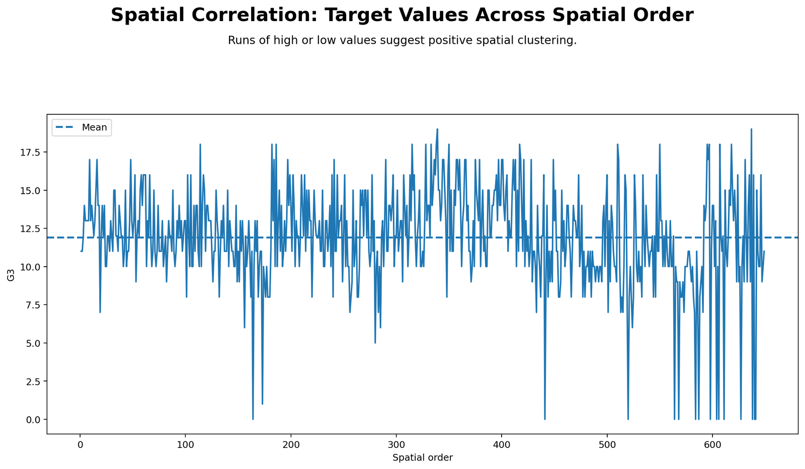
This chart plots G3 values across the pseudo-spatial order. It shows whether high or low values appear in local runs rather than being completely scattered. Several stretches of similar values appear, which supports the positive Moran’s I result.
The chart is especially important because Moran’s I is based on neighbor similarity. If values jumped randomly from high to low at every row, the line would look more erratic and Moran’s I would be closer to zero or negative. Instead, the row-order line contains local patches of similar grades.
Python Chart 2: Target vs Spatial Lag
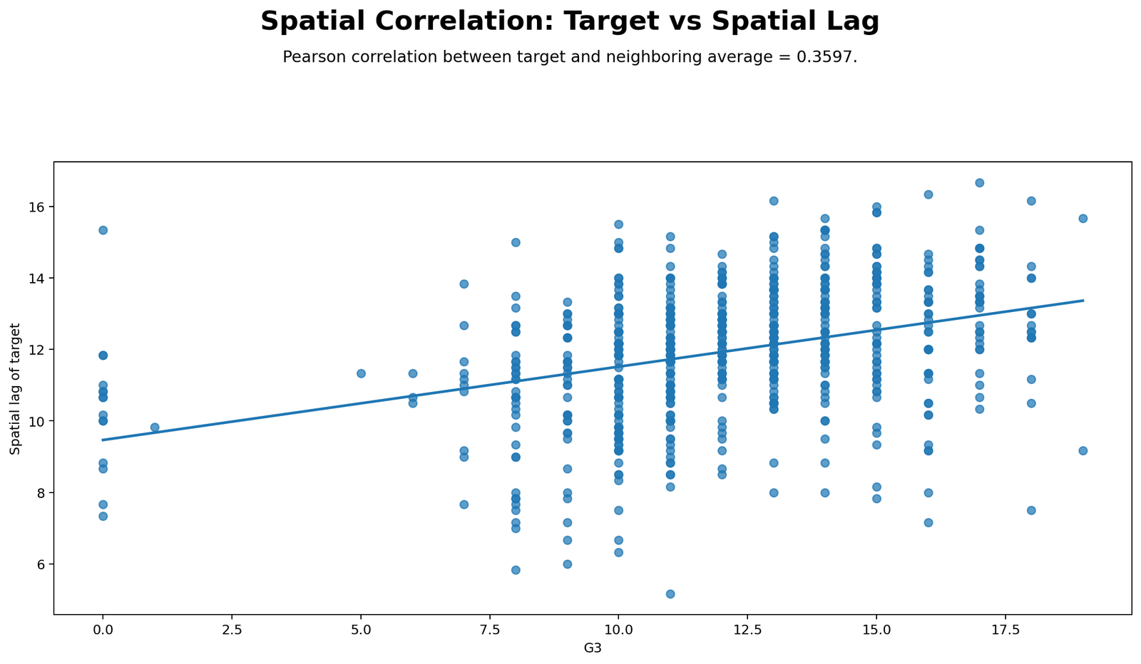
This scatterplot compares each G3 value with its spatial lag, which is the average G3 value of its neighbors. The positive relationship in the scatterplot explains the spatial lag correlation of 0.241210. Rows with higher G3 values tend to have higher neighbor averages, and rows with lower G3 values tend to have lower neighbor averages.
The relationship is visible but not tight. This matches Moran’s I = 0.190103: the pattern is positive and significant, but not strong enough to imply that every value is surrounded by nearly identical values.
Python Chart 3: Local Moran Contributions
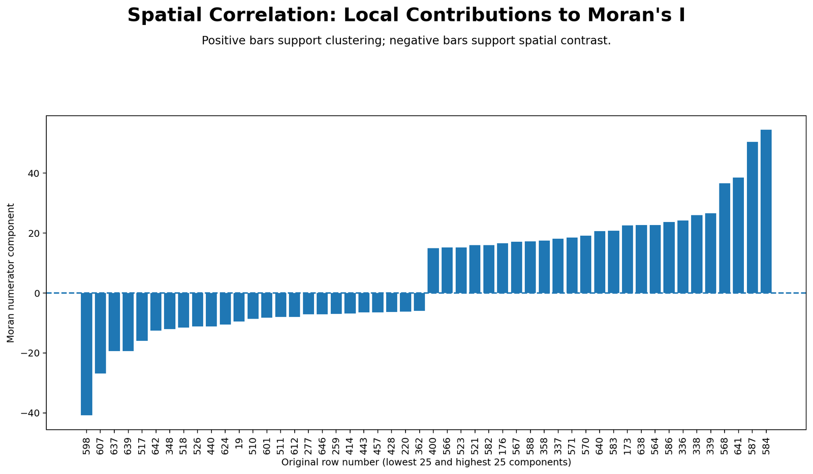
The local Moran contributions chart shows which observations push the global statistic upward or downward. Positive contributions come from High-High and Low-Low patterns. Negative contributions come from High-Low and Low-High contrasts.
The strongest positive contributions are low values near low neighbors and high values near high neighbors. The strongest negative contributions are local outliers, such as a low value surrounded by high neighbors. This chart explains why global Moran’s I is not only one number; it is built from many local row-level contributions.
Python Chart 4: Moran’s I Permutation Distribution
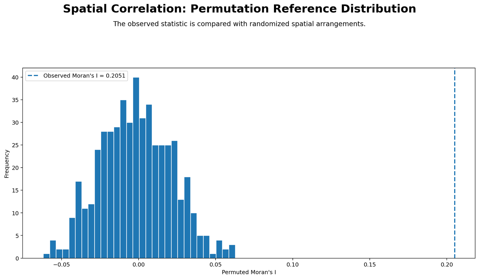
The permutation distribution chart shows what Moran’s I would look like if the G3 values were randomly rearranged across the pseudo-spatial order many times. The observed Moran’s I of about 0.1901 appears in the positive tail, far away from the random expectation near zero.
This chart is useful because it turns the p-value into a visual test. If the observed line falls far into the tail of the random distribution, the spatial pattern is unlikely to be random. That is exactly what happens here, supporting the conclusion of positive spatial clustering.
Python Chart 5: Spatial Correlogram
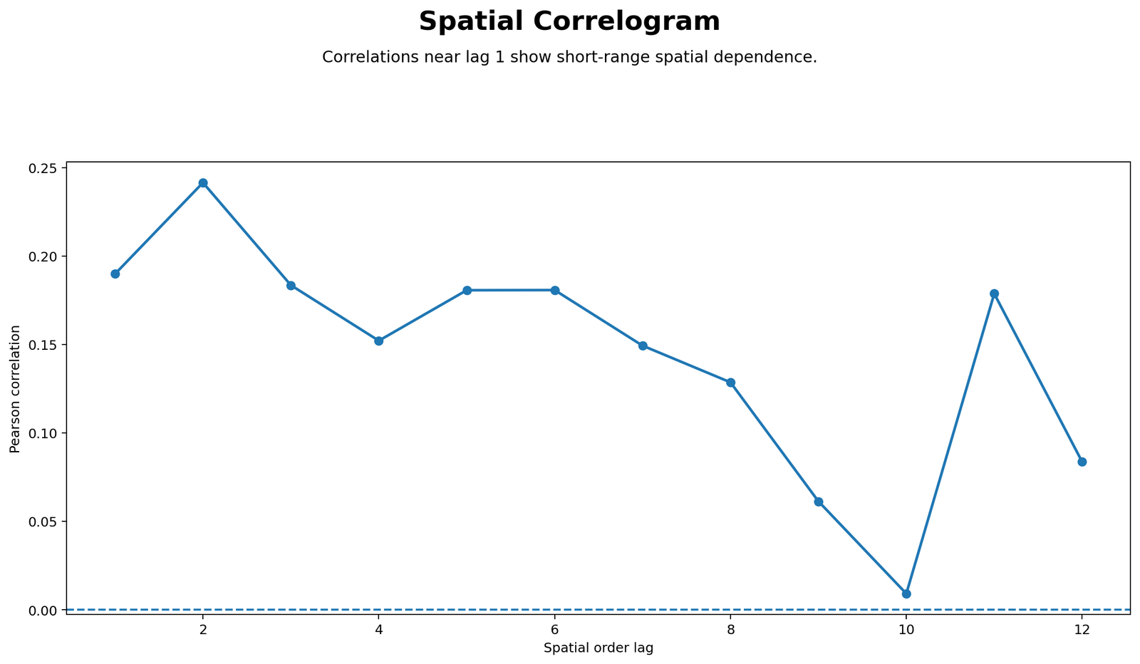
The spatial correlogram shows that short-distance row-order associations are positive, while longer-distance associations weaken. This is the expected pattern when nearby observations are more similar than distant observations.
The chart is important because a single global Moran’s I value does not show how the pattern changes with distance. The correlogram adds distance context and shows that the strongest signal is short-range rather than long-range.
Python Chart 6: Neighbor Distance Profile
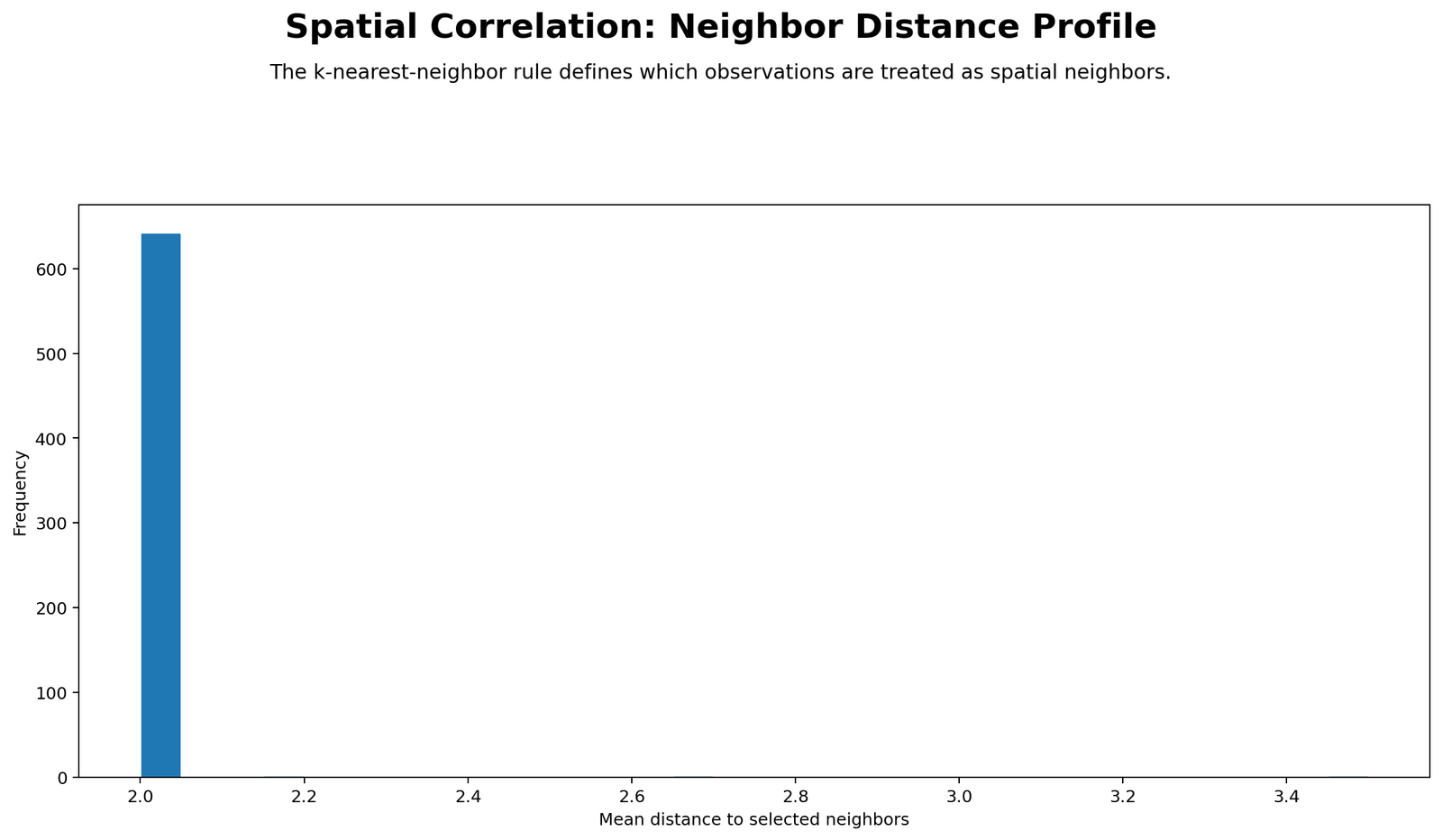
The neighbor distance profile explains the spatial weights used in the calculation. Middle rows have two neighbors: one previous row and one next row. The first and last rows have one neighbor. Since the pseudo-space is one-dimensional row order, the direct neighbor distance is one row.
This chart is important for transparency. Spatial correlation results depend heavily on the neighbor rule. Different neighbor definitions can change Moran’s I, so every spatial report should clearly state how neighbors were defined.
R Chart-by-Chart Interpretation
The R report validates the Python output with a separate workflow and colorful chart versions. It repeats the target order plot, spatial lag scatterplot, local contributions, permutation distribution, correlogram and neighbor distance profile.
R Chart 1: Colorful Target Values by Spatial Order
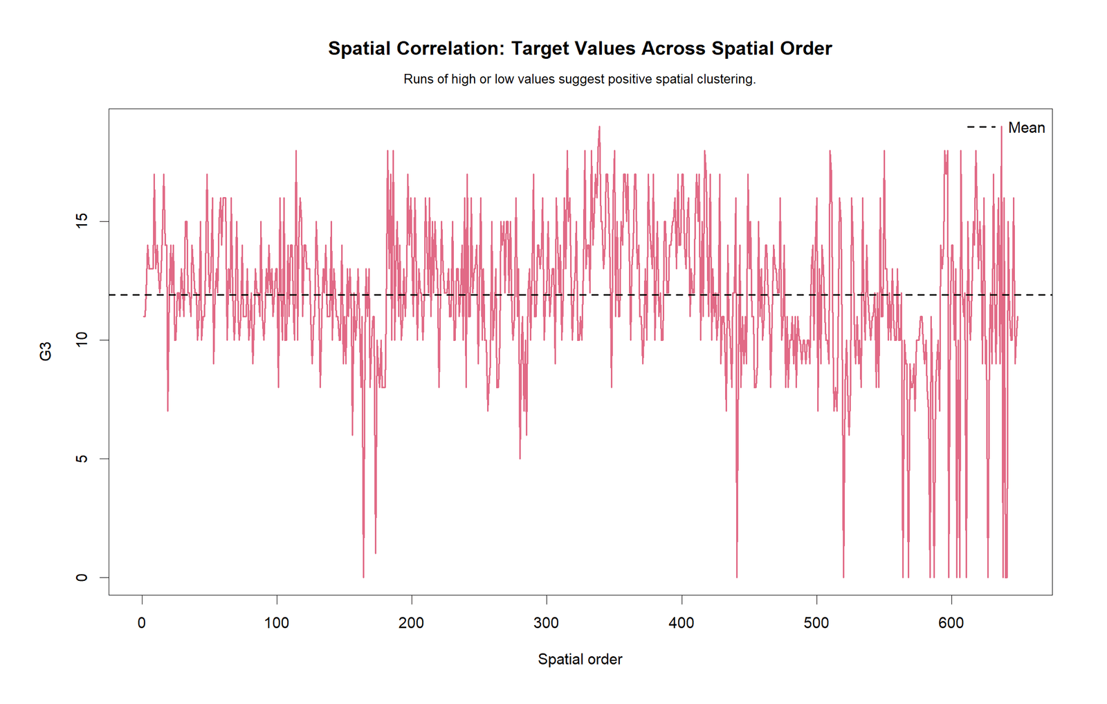
The R target-order chart confirms the same local patch structure. The G3 values do not behave like completely independent noise across row order. Local stretches of similar values are visible, supporting the positive clustering result.
R Chart 2: Colorful Target vs Spatial Lag
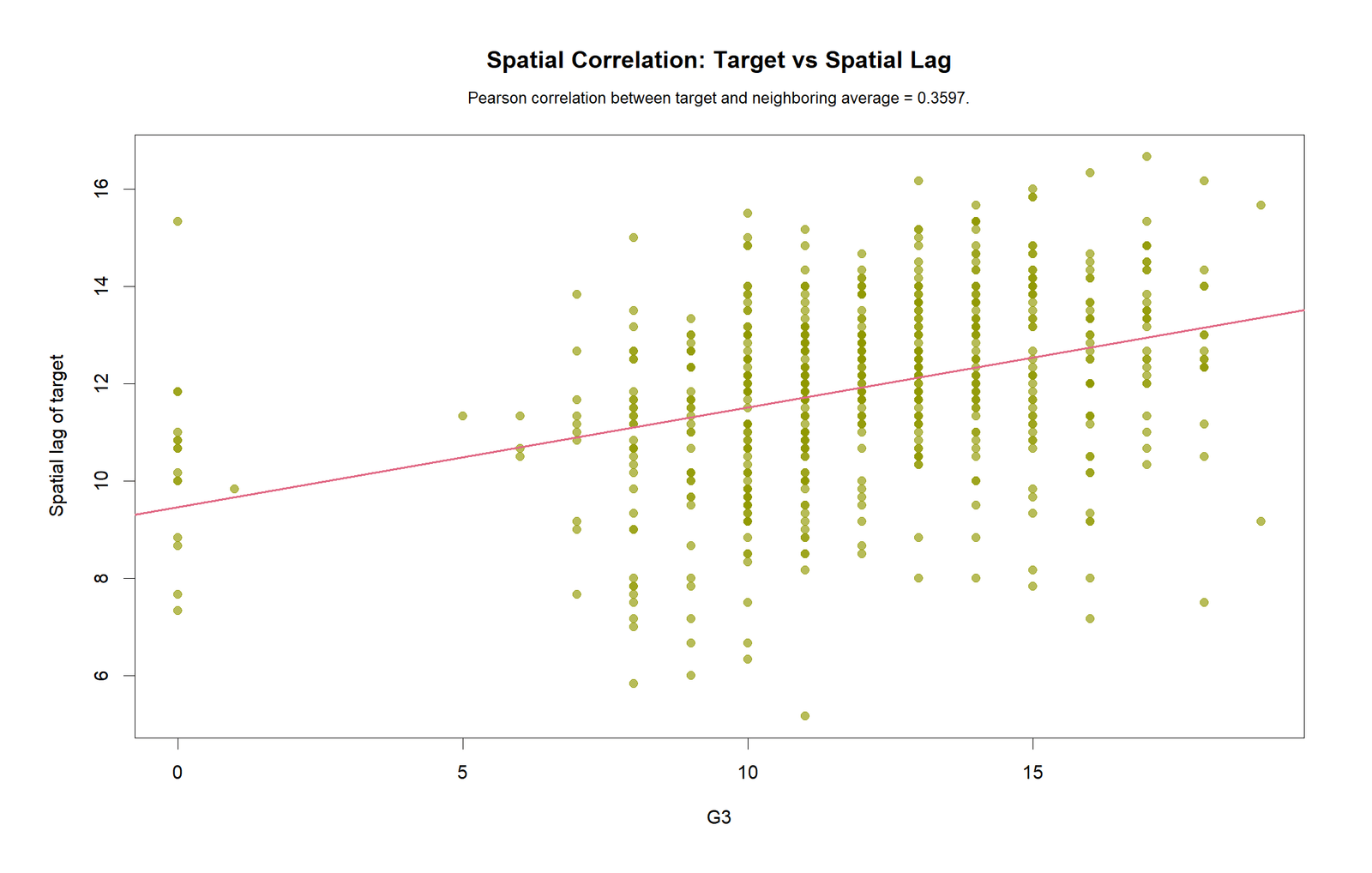
The R spatial-lag scatterplot confirms the positive relationship between G3 and average neighbor G3. The cloud slopes upward, matching the spatial lag correlation of about 0.2412.
R Chart 3: Colorful Local Moran Contributions
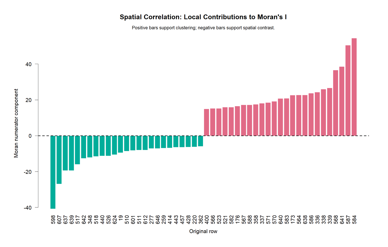
The R local contribution chart confirms which rows drive the positive and negative parts of the global statistic. Positive bars represent local clustering. Negative bars represent local contrast. The balance of these contributions produces the global Moran’s I value.
R Chart 4: Colorful Moran’s I Permutation Distribution
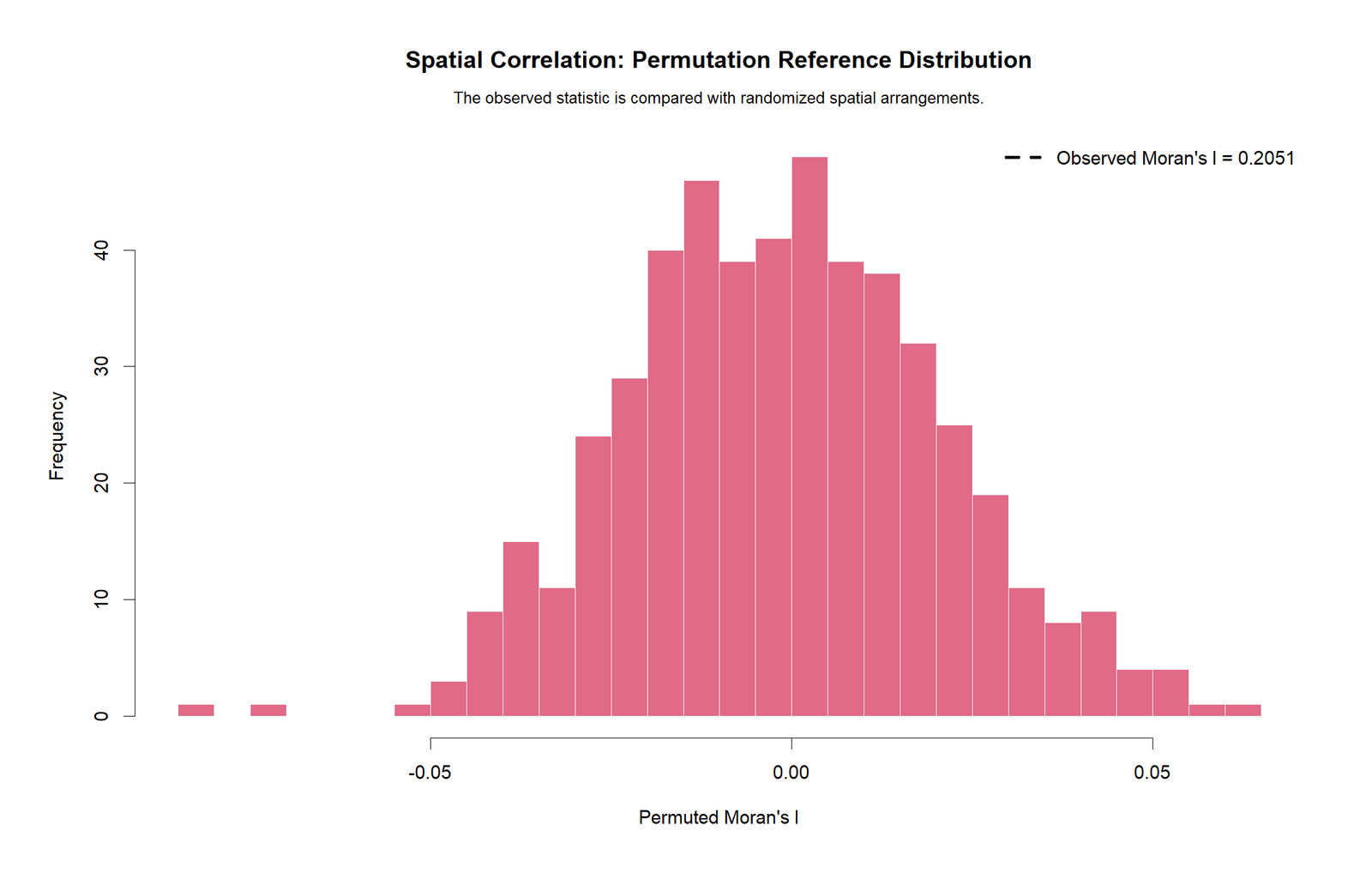
The R permutation distribution confirms that the observed Moran’s I is far into the positive tail compared with randomized row-order patterns. This supports the same conclusion as the approximate p-value in Excel.
R Chart 5: Colorful Spatial Correlogram
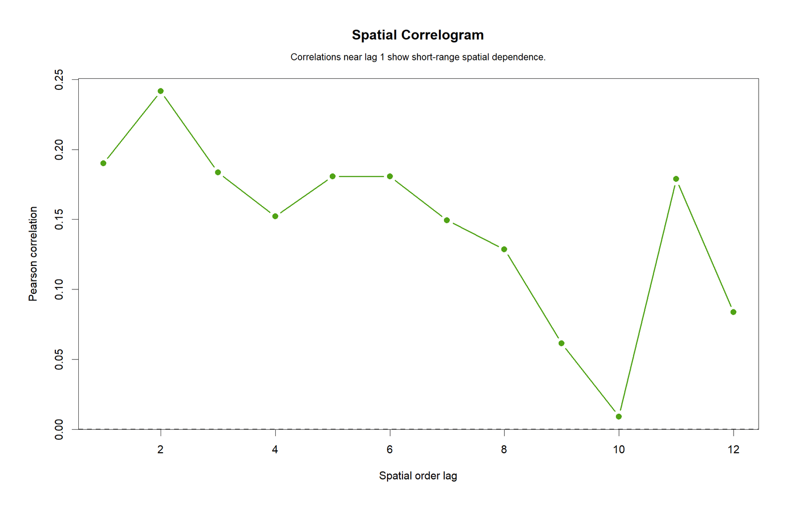
The R correlogram confirms that short-distance associations are positive and that the pattern weakens at larger row-order distances. This is exactly the type of distance-decay pattern spatial analysts look for.
R Chart 6: Colorful Neighbor Distance Profile
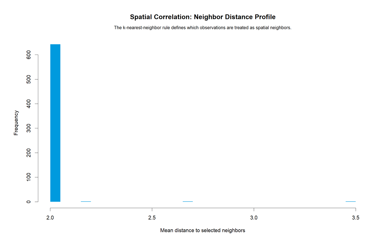
The R neighbor profile chart validates the weight structure. The calculation uses immediate row neighbors, so the neighbor distance is one row for direct neighbors. This makes the workbook calculation easy to understand and reproduce.
SPSS Output Interpretation
The SPSS output PDF is included as the formal software companion for this guide. SPSS does not always provide Moran’s I as a simple default correlation menu procedure, so spatial workflows may require syntax preparation, extension commands, Python/R integration, or exported computed tables. In this post, the SPSS PDF should be read together with the Python, R and Excel results.
| SPSS Output Item | Expected Content | How to Interpret It |
|---|---|---|
| Target variable | G3 | Final grade score used as the spatial target. |
| Coordinate note | Row_Index_Pseudo_X and Pseudo_Y = 0 | Confirms that this is a row-order teaching setup. |
| Neighbor rule | Previous and next row | Defines the spatial weights. |
| Moran’s I | Approximately 0.190 | Positive spatial clustering. |
| Spatial lag correlation | Approximately 0.241 | G3 is positively related to average neighbor G3. |
| Significance | p < .001 | Reject randomness. |
In a formal report, the SPSS output should not be described as ordinary Pearson correlation alone. The correct wording should mention Moran’s I, spatial lag, neighbor definition and the pseudo-coordinate limitation.
Excel Worked File Explanation
The Excel workbook provides a fully worked Spatial Correlation analysis. It contains the raw data, spatial working sheet, results sheet, formula guide and chart data. The workbook is designed for transparent teaching because every major Moran’s I component is visible.
Download the Spatial Correlation Fully Worked Excel File
| Excel Sheet | Purpose | What It Teaches |
|---|---|---|
| README | Explains the project setup. | States that no coordinate columns were found and row-order pseudo-space is used. |
| Data | Stores the original dataset. | Allows verification of the source variables and G3 target column. |
| Spatial_Worked | Calculates row-level spatial terms. | Shows target, pseudo-coordinates, neighbors, spatial lag, centered values and local Moran components. |
| Results | Reports final statistics. | Shows Moran’s I, lag correlation, expected I, approximate z, p-value and decision. |
| Formula_Guide | Explains each formula step. | Documents target, pseudo-coordinates, spatial lag, centering, numerator, denominator and interpretation. |
| Chart_Data | Stores chart source values. | Feeds target order, spatial lag and local Moran contribution charts. |
Excel Main Formula Steps
The workbook uses the following formula logic. First, it links G3 as the target value. Second, it creates pseudo-coordinates using the row number. Third, it calculates the spatial lag as the average of previous and next target values. Fourth, it centers both the target and spatial lag around the mean target. Fifth, it computes the numerator term as centered target multiplied by centered spatial lag. Sixth, it computes the denominator term as centered target squared. Finally, Moran’s I is the sum of numerator terms divided by the sum of denominator terms.
Excel teaching value: The workbook is useful because it makes the spatial calculation visible row by row. Students can see exactly how neighbor values become spatial lag values and how local terms build the final Moran’s I statistic.
Python, R, SPSS and Excel Workflows
The same Spatial Correlation analysis can be documented across Python, R, SPSS and Excel. Python and R are best for permutation testing, local statistics, charts and reusable scripts. SPSS provides formal output. Excel is best for transparent formula teaching.
| Software | Main Workflow | Best Use |
|---|---|---|
| Python | Create coordinates or pseudo-coordinates, build neighbor weights, calculate spatial lag, Moran’s I, local terms, permutation test and charts. | Automation, reproducible charts and PDF reporting. |
| R | Build spatial weights, compute Moran’s I, run permutation tests and validate correlogram patterns. | Spatial statistics validation and colorful charts. |
| SPSS | Prepare variables, produce formal output and import or compute spatial-statistic summaries as needed. | Formal PDF output for assignment and reporting. |
| Excel | Use previous-next neighbor formulas, spatial lag formulas, centered terms and Moran’s I ratio. | Transparent row-by-row teaching and formula documentation. |
Code Blocks and Excel Formulas
Python Code Pattern for Spatial Correlation
import pandas as pd
import numpy as np
from scipy import stats

# Load data
df = pd.read_csv("dataset.csv")

target = "G3"
work = df[[target]].dropna().copy()
work[target] = pd.to_numeric(work[target], errors="coerce")
work = work.dropna().reset_index(drop=True)

# Pseudo-spatial coordinates because no true coordinates are available
work["Spatial_X"] = np.arange(1, len(work) + 1)
work["Spatial_Y"] = 0

# Previous-next neighbor rule
y = work[target].to_numpy()
n = len(y)

spatial_lag = np.zeros(n)
neighbor_count = np.zeros(n)

for i in range(n):
    neighbors = []
    if i > 0:
        neighbors.append(y[i - 1])
    if i < n - 1:
        neighbors.append(y[i + 1])
    spatial_lag[i] = np.mean(neighbors)
    neighbor_count[i] = len(neighbors)

mean_y = y.mean()
centered_y = y - mean_y
centered_lag = spatial_lag - mean_y

numerator_terms = centered_y * centered_lag
denominator_terms = centered_y ** 2

morans_i = numerator_terms.sum() / denominator_terms.sum()
lag_corr = np.corrcoef(y, spatial_lag)[0, 1]

expected_i = -1 / (n - 1)
approx_se = 1 / np.sqrt(n)
z_value = (morans_i - expected_i) / approx_se
p_value = 2 * stats.norm.sf(abs(z_value))

print("N:", n)
print("Moran's I:", morans_i)
print("Spatial lag correlation:", lag_corr)
print("Expected I:", expected_i)
print("Approx z:", z_value)
print("Approx p:", p_value)
R Code Pattern for Spatial Correlation
# Spatial Correlation / Moran's I teaching setup in R

df <- read.csv("dataset.csv")
y <- as.numeric(na.omit(df$G3))
n <- length(y)

spatial_x <- seq_len(n)
spatial_y <- rep(0, n)

spatial_lag <- numeric(n)
neighbor_count <- numeric(n)

for (i in seq_len(n)) {
  neighbors <- c()
  if (i > 1) neighbors <- c(neighbors, y[i - 1])
  if (i < n) neighbors <- c(neighbors, y[i + 1])
  spatial_lag[i] <- mean(neighbors)
  neighbor_count[i] <- length(neighbors)
}

mean_y <- mean(y)
centered_y <- y - mean_y
centered_lag <- spatial_lag - mean_y

numerator_terms <- centered_y * centered_lag
denominator_terms <- centered_y^2

morans_i <- sum(numerator_terms) / sum(denominator_terms)
lag_corr <- cor(y, spatial_lag)

expected_i <- -1 / (n - 1)
approx_se <- 1 / sqrt(n)
z_value <- (morans_i - expected_i) / approx_se
p_value <- 2 * pnorm(abs(z_value), lower.tail = FALSE)

cat("N =", n, "\n")
cat("Moran's I =", morans_i, "\n")
cat("Spatial lag correlation =", lag_corr, "\n")
cat("Expected I =", expected_i, "\n")
cat("Approx z =", z_value, "\n")
cat("Approx p =", p_value, "\n")
SPSS Syntax Pattern for Spatial Correlation Preparation
* Spatial Correlation teaching setup in SPSS.
* Target variable: G3.
* Pseudo-space: row order.
* Neighbor rule: previous and next row.

OUTPUT CLOSE ALL.
OUTPUT NEW NAME=Spatial_Correlation_Output.

SORT CASES BY $CASENUM(A).
COMPUTE Row_Index_Pseudo_X = $CASENUM.
COMPUTE Pseudo_Y = 0.
EXECUTE.

* Create lag values using LAG for previous value.
COMPUTE Previous_Target = LAG(G3).
EXECUTE.

* Next target usually requires reversed order or helper workflow.
* In production, prepare spatial lag using Python/R/Excel or an SPSS extension.

DESCRIPTIVES VARIABLES=G3 Row_Index_Pseudo_X Pseudo_Y
  /STATISTICS=MEAN STDDEV MIN MAX.

CORRELATIONS
  /VARIABLES=G3 Row_Index_Pseudo_X
  /PRINT=TWOTAIL
  /MISSING=PAIRWISE.

OUTPUT EXPORT
  /CONTENTS EXPORT=VISIBLE
  /PDF DOCUMENTFILE='Spatial-Correlation-SPSS-Output.pdf'.
Excel Formulas for Spatial Correlation
Assume:
Target_G3 is in column B
Row number is in column A
Mean_G3 is stored in a fixed cell, for example Results!B5

Previous target:
=IF(A2=1,"",B1)

Next target:
=IF(A2=Valid_N,"",B3)

Neighbor count:
=COUNT(Previous_Target,Next_Target)

Spatial lag:
=AVERAGE(Previous_Target,Next_Target)

Centered target:
=Target_G3 - Mean_G3

Centered spatial lag:
=Spatial_Lag_Target - Mean_G3

Moran numerator term:
=Centered_Target * Centered_Spatial_Lag

Moran denominator term:
=Centered_Target^2

Moran's I:
=SUM(Moran_Numerator_Term_Range)/SUM(Moran_Denominator_Term_Range)

Spatial lag correlation:
=CORREL(Target_G3_Range,Spatial_Lag_Target_Range)

Expected Moran's I:
=-1/(N-1)

Approximate z:
=(Moran_I-Expected_I)/Approx_SE

Approximate p-value:
=2*(1-NORM.S.DIST(ABS(z),TRUE))
Assumptions and Data Checks
Spatial Correlation depends heavily on how neighbors are defined. Before interpreting Moran's I, always check the target variable, coordinates, neighbor rule, weights, missing data and whether the spatial structure is meaningful.
| Check | Why It Matters | Status in This Example |
|---|---|---|
| Meaningful spatial structure | Moran's I requires a neighbor relationship. | Row-order pseudo-space is used for teaching because no real coordinates were found. |
| Target variable is numeric | Moran's I uses deviations from the mean. | G3 is numeric. |
| Neighbor rule is stated | Different weights can change the result. | Previous and next row are used. |
| Spatial lag is correctly calculated | The lag is the average neighbor value. | Middle rows have two neighbors; endpoints have one. |
| Local contributions checked | Global Moran's I can hide local contrasts. | Local Moran components and cluster labels are included. |
| Randomization test reviewed | Permutation testing gives visual significance context. | Permutation distribution charts are included. |
| No causal claim | Spatial correlation does not prove one observation causes another. | The result is interpreted as association only. |
The biggest limitation is the absence of real coordinates. The result is valid for the workbook's row-order pseudo-space, but it should not be written as a geographic conclusion about real locations.
How to Report Spatial Correlation
A complete Spatial Correlation report should include the target variable, coordinate or neighbor rule, spatial statistic, expected value, p-value, direction, and limitation statement if pseudo-space is used.
APA-Style Full Report
A row-order spatial autocorrelation analysis was conducted for G3 final grade using a previous-next neighbor rule in pseudo-spatial order. The analysis included 649 observations. Moran's I was positive and statistically notable, I = 0.190, expected I = -0.0015, approximate z = 4.879, approximate p = 0.000001. The spatial lag correlation was 0.241. These results indicate positive clustering in the row-order pseudo-space, meaning nearby rows tended to have somewhat similar G3 values. Because the dataset did not include real coordinates, the result should be interpreted as a teaching example rather than a geographic conclusion.
Short Reporting Version
G3 showed positive row-order spatial autocorrelation, Moran's I = 0.190, spatial lag r = 0.241, approximate p < .001, N = 649. Nearby pseudo-neighbors tended to have somewhat similar G3 values.
Limitation Statement
The dataset did not contain true spatial coordinates, so row-order pseudo-space was used only to demonstrate Moran's I and spatial lag calculations. A real spatial study should use actual coordinates, polygons or a justified spatial weights matrix.
Common Mistakes in Spatial Correlation Interpretation
| Mistake | Why It Is a Problem | Better Practice |
|---|---|---|
| Using row order as if it were real geography | Row order is not necessarily spatial location. | Call it pseudo-space unless real coordinates exist. |
| Reporting Moran's I without the neighbor rule | The result depends on spatial weights. | State how neighbors were defined. |
| Ignoring local contributions | Global Moran's I can hide local outliers. | Inspect local Moran components and cluster labels. |
| Calling every positive Moran's I strong | Positive does not automatically mean large. | Interpret coefficient size and pattern together. |
| Using ordinary correlation only | Ordinary correlation ignores neighbor structure. | Use spatial lag, weights and Moran's I. |
| Ignoring permutation testing | Analytical approximations may be limited. | Use permutation distribution when possible. |
| Claiming causation | Spatial correlation shows clustering, not cause. | Use association and clustering wording. |
Downloads and Resources
External References
For additional learning, review resources on Moran's I, spatial weights, spatial lag models, local indicators of spatial association, spatial correlograms and permutation testing. These topics are commonly taught together because spatial correlation depends on both the target values and the neighborhood structure.
FAQs About Spatial Correlation
What is Spatial Correlation in simple words?
Spatial Correlation measures whether nearby observations have similar or dissimilar values. Positive spatial correlation means nearby values cluster together. Negative spatial correlation means nearby values contrast with each other.
What was the main result in this guide?
The main result was row-order Moran's I = 0.190103, spatial lag correlation = 0.241210, approximate p = 0.0000010688 and N = 649. The pattern was positive spatial clustering.
Which variable was tested?
The target variable was G3 final grade.
What neighbor rule was used?
The workbook used the previous row and next row as neighbors. Endpoints had one neighbor, and middle rows had two neighbors.
Why does the post mention pseudo-space?
The student dataset did not include real coordinates, so the workbook used row-order pseudo-space to demonstrate the method. This should not be interpreted as real geographic space.
What does positive Moran's I mean?
Positive Moran's I means similar values tend to be near each other. In this example, higher G3 values tend to be near higher neighbor averages and lower G3 values tend to be near lower neighbor averages.
What is a spatial lag?
A spatial lag is the weighted average of neighboring values. In this workbook, it is the average G3 value of the previous and next rows.
What is the difference between Moran's I and spatial lag correlation?
Moran's I is the formal spatial autocorrelation statistic. Spatial lag correlation is an ordinary correlation between the target value and the average neighbor value. They are related but not identical.
Can Excel calculate Spatial Correlation?
Yes, for a teaching setup. Excel can compute spatial lag, centered values, numerator terms, denominator terms and Moran's I. More advanced spatial weights and permutation tests are usually easier in Python or R.
Does Spatial Correlation prove causation?
No. Spatial Correlation shows clustering or spatial dependence. It does not prove that one location or observation causes another.
How should I report the result in one sentence?
You can write: “G3 showed positive row-order spatial autocorrelation, Moran's I = 0.190, spatial lag r = 0.241, approximate p < .001, N = 649.”

