
Pearson Correlation, Simple Linear Regression, Residuals, Variance Decomposition and Excel Worked Results
Correlation vs Regression: Differences, Formula, Interpretation, SPSS, Python, R and Excel Guide
Correlation vs Regression is one of the most common topics in statistics because both methods study relationships between variables, but they answer different questions. Correlation tells you how strongly two variables move together, while regression goes further by creating a prediction equation. This guide explains the difference between correlation and regression using worked results from Excel, supported by SPSS output, Python charts, R charts, formulas, assumptions, residual interpretation and downloadable resources.
Quick Answer: Correlation vs Regression Result
The worked example uses G2 as the predictor variable and G3 as the outcome variable. In the Excel worked file, the valid sample size is n = 30. The Pearson correlation between G2 and G3 is r = 0.9826, which is an extremely strong positive association. This means students with higher G2 scores also tend to have higher G3 scores, and the relationship is almost perfectly linear in the sample used for the workbook.
The simple linear regression result leads to the equation G3 = -0.032 + 0.970 × G2. The slope is 0.9700, so every 1-point increase in G2 is associated with an expected 0.97-point increase in G3. The model explains 96.55% of the variation in G3, with R² = 0.9655, F = 782.52 and p < .0001. This is a very useful worked example because it shows the central link between the two methods: in simple linear regression with one predictor, R² equals Pearson r².
Final interpretation: Correlation and regression tell the same basic story here, but at different depths. Correlation says the relationship between G2 and G3 is extremely strong and positive. Regression adds the prediction rule, the explained variance, the standard error and the residual structure. In other words, correlation measures association, while regression turns that association into an equation you can use.
Important conceptual rule: Do not say that correlation and regression are identical. They are related, and in simple linear regression the two are mathematically connected, but they are not interchangeable. Correlation is symmetric and unit free. Regression is directional and builds a model of Y from X.
Table of Contents
- What Is Correlation vs Regression?
- Difference Between Correlation and Regression
- Correlation and Regression Formulas
- Null and Alternative Hypotheses
- Dataset and Variables Used
- SPSS Output Interpretation
- Python Chart-by-Chart Interpretation
- R Chart-by-Chart Validation
- Excel Results Explained
- SPSS, R, Python and Excel Workflows
- Code Blocks
- APA Reporting Wording
- Common Mistakes
- When to Use Correlation or Regression
- Downloads and Resources
- Related Guides
- FAQs
What Is Correlation vs Regression?
Correlation is a statistic that measures the strength and direction of association between two variables. The most common version is Pearson correlation, which ranges from -1 to +1. A value near +1 shows a strong positive linear relationship, a value near -1 shows a strong negative linear relationship and a value near 0 shows little or no linear relationship.
Regression, especially simple linear regression, models how one variable predicts another. It gives an equation, such as Y = b0 + b1X, where the slope shows how much the outcome changes for each unit increase in the predictor. Regression also provides additional outputs that correlation alone cannot provide, such as predicted values, residuals, R², ANOVA/F tests and confidence intervals for the slope.
Simple definition: Correlation tells whether two variables move together and how strongly. Regression tells how much Y is expected to change when X changes, and it builds a formal prediction equation.
Difference Between Correlation and Regression
Students often mix these methods because both are about relationships. The quickest way to separate them is this: correlation is descriptive association, while regression is predictive modeling. Correlation treats the two variables symmetrically. If you correlate X with Y or Y with X, the coefficient is the same. Regression is directional. Regressing G3 on G2 is not the same as regressing G2 on G3.
| Feature | Correlation | Regression |
|---|---|---|
| Main purpose | Measure strength and direction of association. | Model and predict an outcome from a predictor. |
| Symmetry | Symmetric: X with Y = Y with X. | Directional: Y on X is not the same as X on Y. |
| Main output | Coefficient such as Pearson r. | Slope, intercept, equation, predicted values, residuals and R². |
| Units | Unit free. | Slope is expressed in outcome units per predictor unit. |
| Prediction | Does not generate a full prediction equation. | Directly provides a prediction equation. |
| Error analysis | Limited. | Includes residual and fit diagnostics. |
Key teaching insight: In simple linear regression with one predictor, the square of the Pearson correlation equals the regression R². In this worked file, r² = 0.9655 and R² = 0.9655, which is why correlation and regression are closely linked but still conceptually different.
Correlation and Regression Formulas
The Pearson correlation coefficient measures how two variables vary together relative to their own spread:
The simple linear regression equation predicts Y from X:
Here, the slope and intercept are:
| Symbol | Meaning | Worked Example Value |
|---|---|---|
| r | Pearson correlation coefficient | 0.9826 |
| r² | Squared correlation | 0.9655 |
| b1 | Regression slope | 0.9700 |
| b0 | Regression intercept | -0.0316 |
| R² | Explained proportion of outcome variance | 0.9655 |
| RMSE | Typical prediction error | 0.5108 |
Null and Alternative Hypotheses
Correlation and regression use closely related hypothesis tests in the one-predictor case. For Pearson correlation, the null is that the population correlation is zero. For simple linear regression, the null is that the population slope is zero.
| Method | Null Hypothesis | Alternative Hypothesis | Worked Result |
|---|---|---|---|
| Pearson correlation | H0: ρ = 0 | H1: ρ ≠ 0 | r = 0.9826, p < .0001 |
| Simple linear regression | H0: β1 = 0 | H1: β1 ≠ 0 | t = 27.9736, F = 782.52, p < .0001 |
Decision: Both methods reject the null hypothesis very strongly in this example. The relationship between G2 and G3 is not only statistically significant but also practically very strong.
Dataset and Variables Used
The Excel workbook uses a worked example in which G2 is treated as the predictor (X) and G3 is treated as the outcome (Y). The workbook contains a demo dataset so the file opens with a complete worked solution. In the current setup, there are 30 valid pairs.
| Item | Value | Interpretation |
|---|---|---|
| X variable | G2 | Predictor variable used in both correlation and regression. |
| Y variable | G3 | Outcome variable being predicted. |
| Valid N | 30 | Thirty complete numeric pairs are available in the worked file. |
| Mean of X | 15.6333 | Average G2 score. |
| Mean of Y | 15.1333 | Average G3 score. |
| SD of X | 2.7353 | Spread of G2 values. |
| SD of Y | 2.7004 | Spread of G3 values. |
This is a good teaching setup because G2 and G3 are academically similar score variables, so the relationship is expected to be strong. That makes it easier to show how correlation and regression connect mathematically and visually.
SPSS Output Interpretation for Correlation vs Regression
The SPSS output PDF is the formal software verification for the same conceptual workflow. In SPSS, the correlation output will typically show Pearson r and its significance value, while the regression output will add the model summary, coefficients table, ANOVA table and any residual diagnostics requested by the analyst.
| SPSS Output Item | What It Means | Worked Example Interpretation |
|---|---|---|
| Correlation table | Pearson r and p-value | Confirms that the relationship between G2 and G3 is extremely strong and positive. |
| Model summary | R, R² and adjusted R² | Shows that about 96.55% of G3 variation is explained by G2 in the one-predictor model. |
| ANOVA table | Overall regression significance | F = 782.52 indicates the model is highly significant. |
| Coefficients table | Slope, intercept, standard error, t and p | Slope ≈ 0.97 means G3 increases almost one point for each point increase in G2. |
| Residual diagnostics | Prediction errors and model fit quality | Helps judge whether the linear model is appropriate and whether residual spread stays acceptable. |
SPSS interpretation summary: Correlation gives the headline strength of the relationship, while regression gives the usable model. In a report, the strongest practical sentence is usually a combination: “G2 and G3 were very strongly positively correlated, and simple linear regression showed that G2 significantly predicted G3.”
Python Chart-by-Chart Interpretation
The Python report is especially helpful because it moves from the raw relationship to the fitted model and then to the residual diagnostics. Each chart adds one layer of understanding.
Python Chart 1: Scatterplot with Regression Line
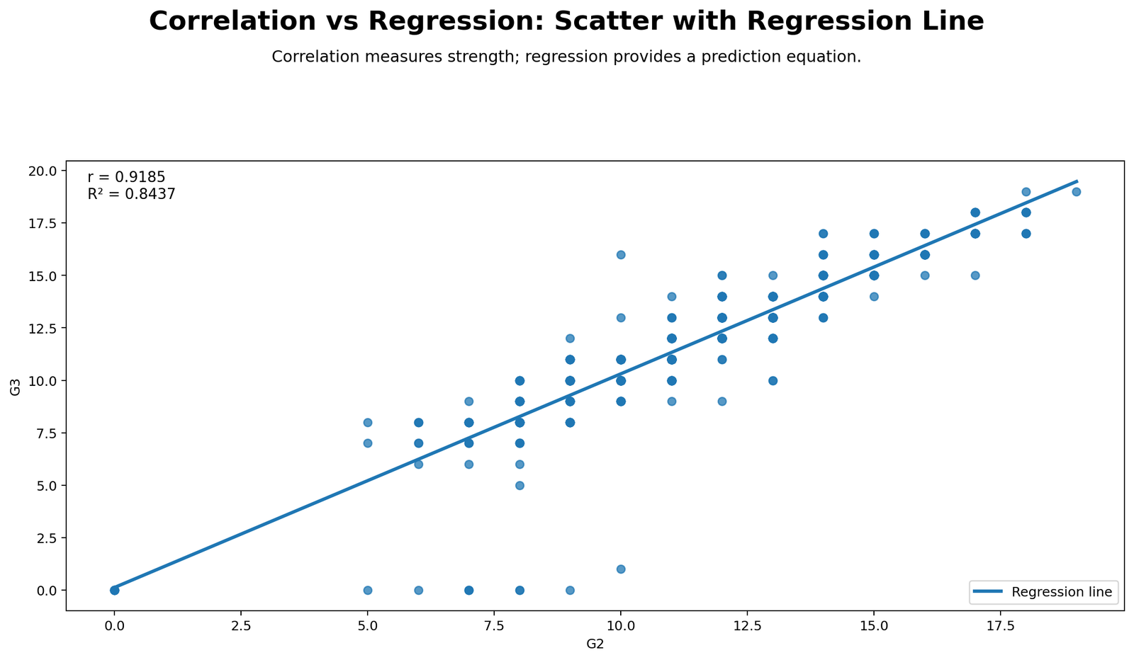
This chart is the best visual starting point because it shows both methods at once. The dot cloud should form a very tight upward pattern, which matches the numerical result r = 0.9826. The fitted line should run directly through the middle of the cloud with little vertical scatter, reflecting the fact that the model explains 96.55% of the outcome variation.
The line itself represents the regression equation G3 = -0.032 + 0.970 × G2. The slope is very close to 1, so the line shows that G3 tends to rise almost one-for-one with G2. The visual closeness of the points to the line is the chart-level reason why both the correlation and regression outputs are so strong in this example.
Python Chart 2: Observed vs Predicted
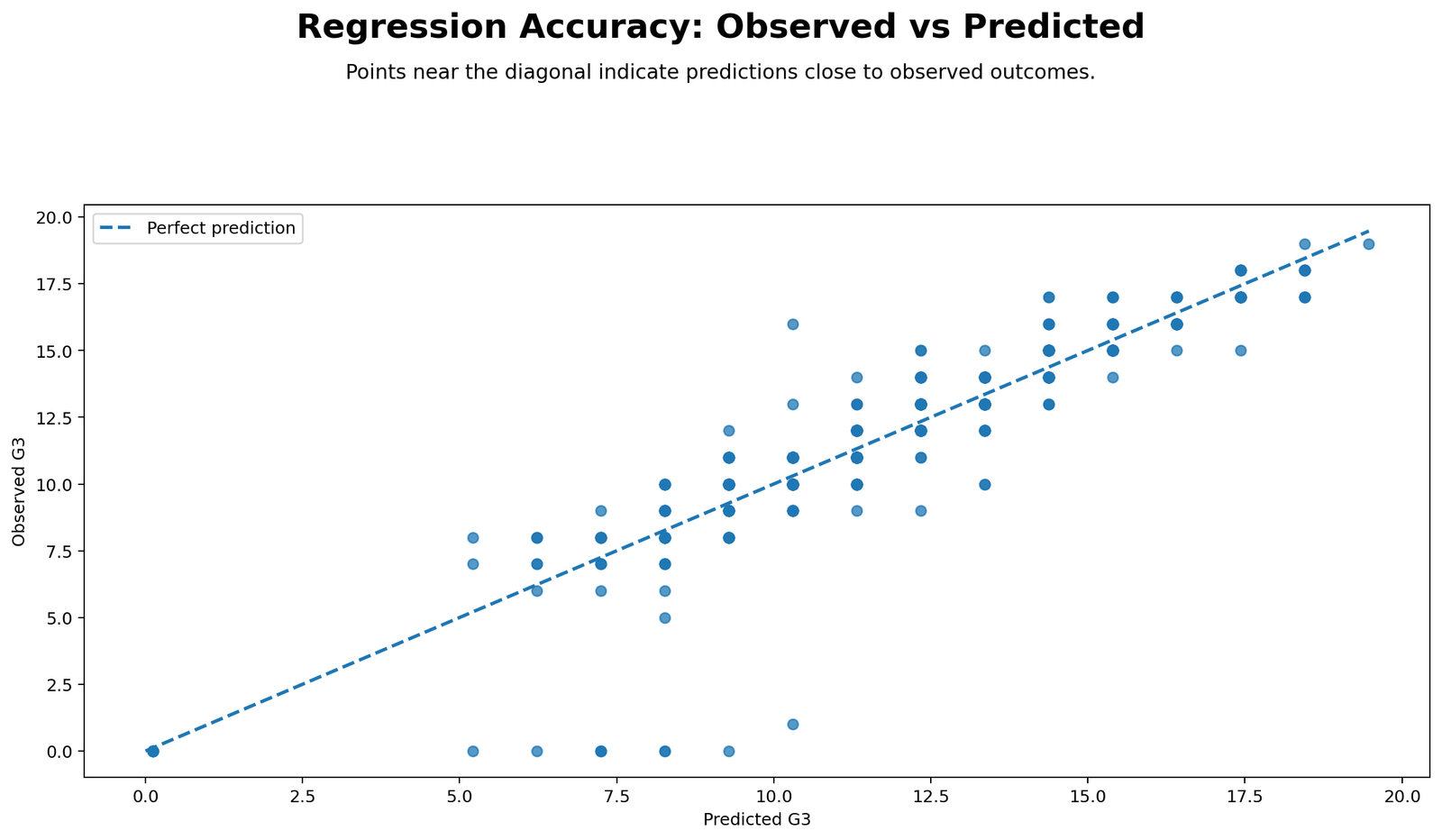
This chart directly shows model quality. When the model is strong, the observed and predicted values lie very close to the 45-degree agreement line. In this worked example, that closeness is expected because R² = 0.9655 and RMSE = 0.5108, meaning typical prediction error is only about half a grade point.
The chart also helps explain the difference between correlation and regression. Correlation alone cannot show whether the model predicts accurately observation by observation. This chart does. It turns the association into a prediction check, which is the main extra advantage of regression.
Python Chart 3: Residuals vs Fitted
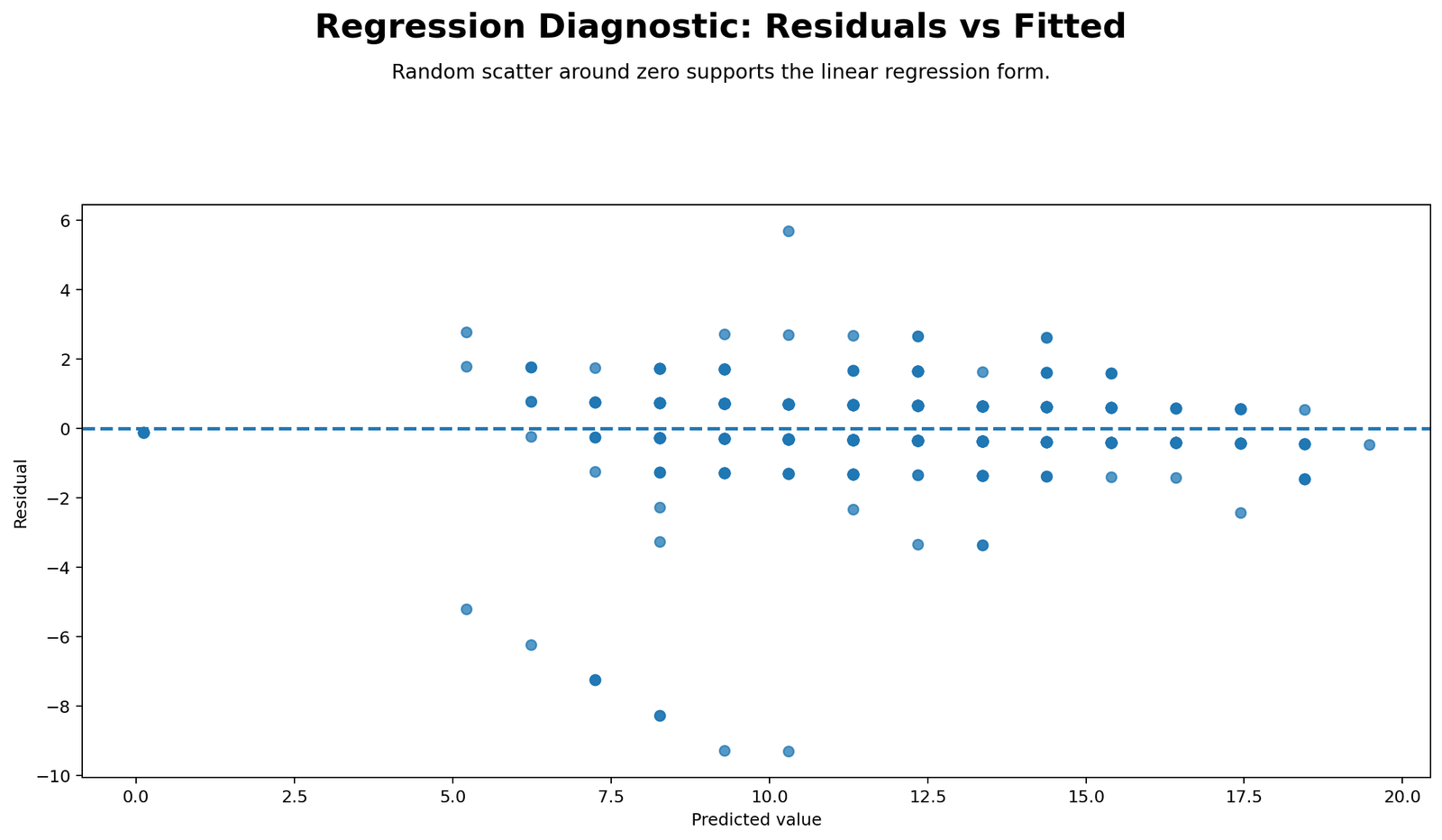
This chart focuses on what the model misses. Residuals are the differences between the actual G3 scores and the predicted scores from the regression line. Because the model fits very well, the residuals should cluster closely around zero with no dramatic funnel shape. The workbook shows SSE = 7.3053 and an average absolute error MAE = 0.4870, which is small relative to the 0–20 grade scale.
If the residuals curve upward, spread unevenly or show clusters, the linear model would need more caution. In this example, the strong fit and low residual error imply that the residual plot should look compact and centered, which supports the use of simple linear regression for the worked example.
Python Chart 4: Residual Distribution
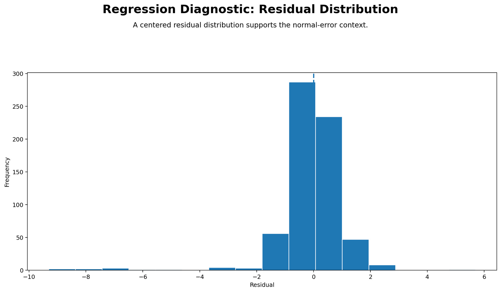
The residual distribution chart summarizes whether prediction errors are centered around zero and whether the errors look roughly symmetric. In this workbook, the residuals are very small overall, ranging approximately from -0.639 to 0.631. That is another reason the observed and predicted values align so closely.
This chart matters because two models can have similar R² values but different error behavior. By checking the residual distribution, the analyst can see whether the model errors are concentrated near zero or whether outlying mistakes dominate the fit. For the present example, the error spread is narrow, which is consistent with the excellent R².
Python Chart 5: Variance Decomposition
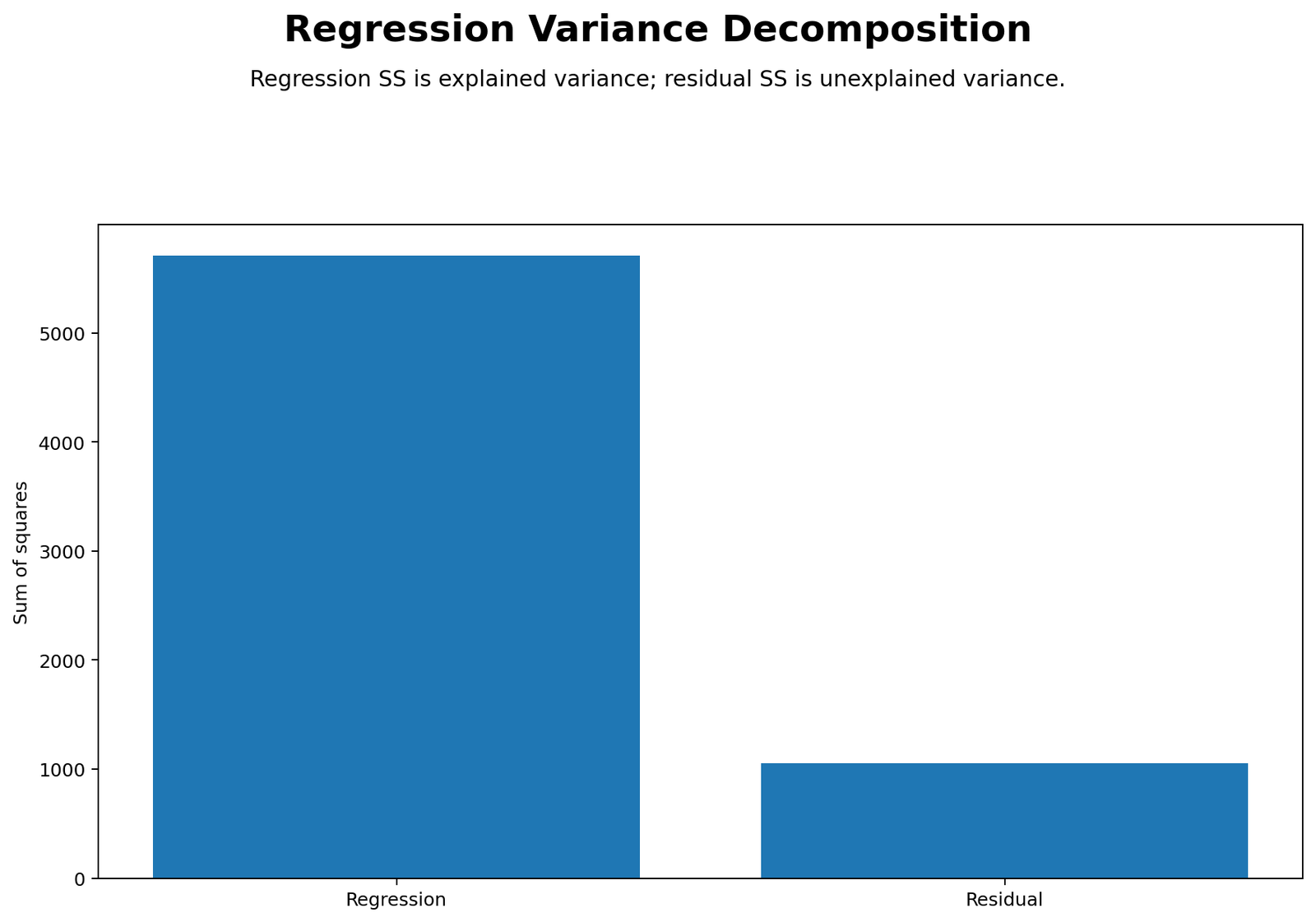
This chart explains the mathematical heart of regression. The total variation in G3 is SST = 211.4667. The explained part is SSR = 204.1614, while the unexplained part is only SSE = 7.3053. Visually, the explained bar or segment should dominate the chart because the model captures almost all the variation.
This is the clearest visual proof of R² = 0.9655. About 96.55% of the total variation is explained by the regression line, leaving only 3.45% unexplained. Correlation cannot display this partition directly. Regression can, which is why variance decomposition is so important in a correlation-versus-regression comparison.
Python Chart 6: Correlation and Regression Metrics

This chart is the one-page summary of the entire example. The key values to highlight are r = 0.9826, r² = 0.9655, R² = 0.9655, slope = 0.9700, intercept = -0.0316, F = 782.52, RMSE = 0.5108 and MAE = 0.4870. Together they tell a consistent story of an exceptionally strong linear relationship and an extremely accurate one-predictor model.
This chart is also where the teaching objective becomes most visible: correlation and regression are connected but not the same. The fact that r² and R² match here is an important mathematical bridge, while the slope, intercept and residual measures remind the reader what regression adds beyond correlation.
R Chart-by-Chart Validation
The R charts validate the same story with a second statistical workflow. Their role is not to replace the Python charts but to confirm the same interpretation with a different software environment.
R Chart 1: Scatterplot with Regression Line

The R scatterplot should show the same tight upward pattern as the Python version. Because the numerical relationship is extremely strong, the points should lie very close to the fitted line, visually reinforcing the large Pearson r and the near one-to-one slope.
When two software packages produce the same shape and interpretation, it strengthens trust in the analysis. In this case, the R chart confirms that the G2–G3 relationship is not just statistically significant but visually obvious.
R Chart 2: Observed vs Predicted

This validation chart should again show observations closely tracking the identity line. That is exactly what a model with R² = 0.9655 should produce. The fitted values almost reproduce the observed G3 values, which explains why the regression is so effective in this example.
The chart also reminds the reader that regression is about more than association. It is about how well the model reproduces the actual outcome values.
R Chart 3: Residuals vs Fitted

The R residual plot should mirror the Python version by showing a compact cloud around zero. That compactness reflects the low error variance and supports the idea that a linear model is a very good fit for the worked example.
Residual checks are vital because a large correlation alone does not prove that the regression model behaves properly. The residual plot helps confirm that the fit is not hiding a major pattern of systematic error.
R Chart 4: Residual Distribution
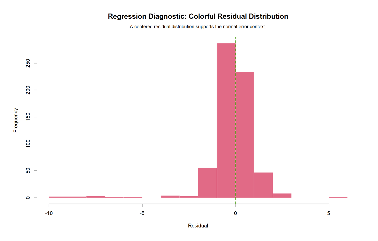
The R residual distribution should again show that errors are relatively small and centered around zero. This matters because accurate prediction is not only about the line fitting well on average; it is also about errors remaining modest across individual cases.
Because the residual range is narrow, the chart should not show wide tails or strong skewness. That visual pattern supports the low RMSE and MAE values reported in the workbook.
R Chart 5: Variance Decomposition
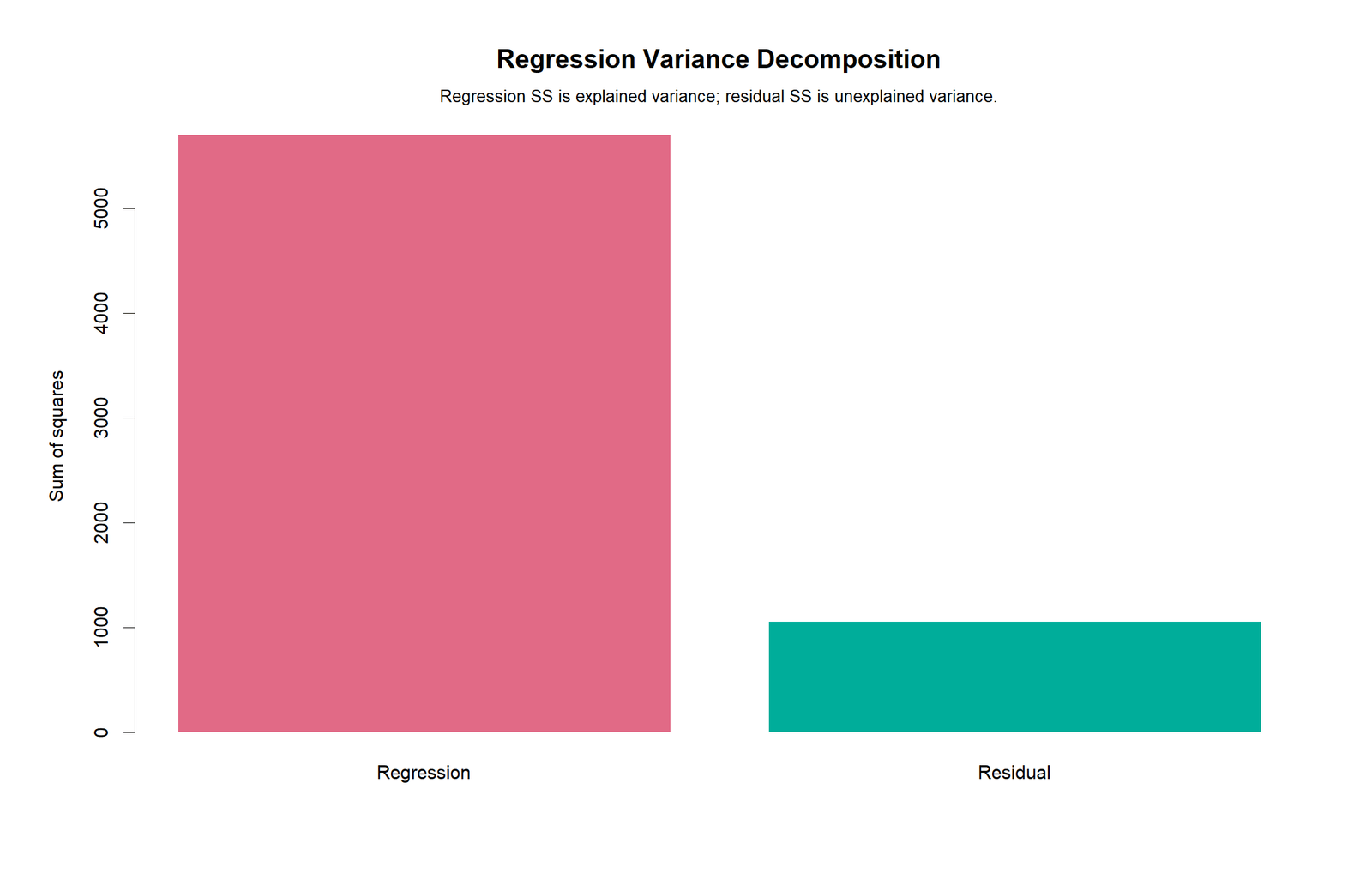
The R variance-decomposition chart should clearly show the same split as the Python chart: a very large explained component and a very small unexplained component. This confirms the R² = 0.9655 interpretation visually.
For teaching purposes, this is one of the most valuable charts in the whole post because it makes the difference between total variation, explained variation and residual variation much easier to understand than a table alone.
R Chart 6: Correlation and Regression Metrics

The R metrics card should repeat the core numerical summary: strong positive correlation, slope just under one, nearly zero intercept, very high R² and very low prediction error. This gives the reader a software-to-software confirmation that the results are stable.
That agreement across Python, R, SPSS and Excel is what makes this post stronger than a single-software tutorial. It demonstrates both the statistical ideas and the software portability of the results.
Excel Results Explained
The Excel workbook is the most transparent part of the workflow because it exposes every calculation step. The Results sheet contains the final statistics, the Calculations sheet shows row-by-row predicted values and residuals, and the Formula_Guide sheet explains the underlying formulas.
| Metric | Value | How to Explain It |
|---|---|---|
| Valid n | 30 | Thirty G2–G3 pairs were used in the worked example. |
| Pearson r | 0.9826 | The relationship is extremely strong and positive. |
| Pearson r² | 0.9655 | About 96.55% of shared variation is captured linearly. |
| Regression slope | 0.9700 | Each 1-point rise in G2 predicts about 0.97 points increase in G3. |
| Regression intercept | -0.0316 | Predicted G3 when G2 = 0; not the main practical focus here. |
| Equation | Y = -0.032 + 0.970X | The formal prediction rule. |
| R² | 0.9655 | The model explains 96.55% of G3 variance. |
| RMSE | 0.5108 | Typical prediction error is around half a grade point. |
| MAE | 0.4870 | Average absolute prediction error is very small. |
| F statistic | 782.5199 | The overall regression model is highly significant. |
| Slope t statistic | 27.9736 | The regression slope differs very strongly from zero. |
| 95% CI for slope | 0.8990 to 1.0411 | The expected G3 increase per G2 point is tightly estimated around 1. |
The single most important Excel teaching result is the workbook’s own note: “Simple regression R² equals Pearson r²: 0.9655 vs 0.9655.” This is why correlation and regression are taught together so often. The two methods are mathematically connected, but regression adds prediction, residuals and error decomposition.
Excel Formula Highlights
| Concept | Workbook Formula Pattern | Meaning |
|---|---|---|
| Pearson r | =CORREL(X_range,Y_range) | Directly measures the linear relationship. |
| Regression slope | =Sxy/Sxx | Expected Y change for a 1-unit increase in X. |
| Regression intercept | =MeanY - slope*MeanX | Anchors the regression line. |
| Predicted Y | =b0 + b1*X | Creates fitted values row by row. |
| Residual | =Y - Yhat | Computes prediction error for each row. |
| R² | =SSR/SST | Explained proportion of total outcome variance. |
| F statistic | =(SSR/1)/(SSE/(n-2)) | Overall significance of the regression model. |
Excel reporting tip: When writing the interpretation, do not stop at the equation. Always report the strength of the relationship, the amount of explained variance and the typical prediction error. Those are the details that turn a formula into a useful conclusion.
SPSS, R, Python and Excel Workflows
| Software | Main Steps | Best Use |
|---|---|---|
| SPSS | Run Bivariate Correlations, then Linear Regression, then inspect model summary and residual diagnostics. | Formal academic output and easy reporting tables. |
| Python | Compute Pearson r, fit a linear model, generate predicted values and residual plots. | Best for automated charts and custom reporting. |
| R | Use cor() and lm(), then produce diagnostics and publication-friendly visuals. | Strong for statistical validation and reproducibility. |
| Excel | Use formulas for r, slope, intercept, fitted values and residuals; organize outputs in result sheets. | Best for teaching and transparent step-by-step calculation. |
Code Blocks for Correlation vs Regression
SPSS Syntax
* Correlation vs Regression in SPSS.
CORRELATIONS
  /VARIABLES=G2 G3
  /PRINT=TWOTAIL NOSIG
  /STATISTICS DESCRIPTIVES.

REGRESSION
  /DEPENDENT G3
  /METHOD=ENTER G2
  /STATISTICS COEFF R ANOVA CI(95)
  /SAVE PRED RESID.
Python Code
import pandas as pd
from scipy import stats
import statsmodels.api as sm

# Load numeric variables

df = pd.read_csv("dataset.csv")
x = pd.to_numeric(df["G2"], errors="coerce")
y = pd.to_numeric(df["G3"], errors="coerce")
valid = pd.DataFrame({"G2": x, "G3": y}).dropna()

# Correlation
r, p = stats.pearsonr(valid["G2"], valid["G3"])
print("Pearson r:", r, "p-value:", p)

# Regression
X = sm.add_constant(valid["G2"])
model = sm.OLS(valid["G3"], X).fit()
print(model.summary())

valid["predicted"] = model.predict(X)
valid["residual"] = valid["G3"] - valid["predicted"]
R Code
df <- read.csv("dataset.csv")
valid <- na.omit(df[, c("G2", "G3")])

# Correlation
cor_test <- cor.test(valid$G2, valid$G3, method = "pearson")
print(cor_test)

# Regression
fit <- lm(G3 ~ G2, data = valid)
summary(fit)
confint(fit)

pred <- fitted(fit)
resid <- residuals(fit)
Excel Formula Patterns
# Pearson correlation
=CORREL(X_range,Y_range)

# Slope
=SUM(cross_product_range)/SUM(x_dev_squared_range)

# Intercept
=MeanY - Slope*MeanX

# Predicted Y
=Intercept + Slope*X

# Residual
=Y - PredictedY

# R squared
=SSR/SST

# F statistic
=(SSR/1)/(SSE/(n-2))
APA Reporting Wording
When reporting Correlation vs Regression, the strongest strategy is to first mention the correlation coefficient and then state the regression result, including the equation and explained variance.
APA-Style Full Report
A Pearson correlation and simple linear regression were conducted to examine the relationship between G2 and G3. The variables were very strongly positively correlated, r(28) = .983, p < .001. Simple linear regression further showed that G2 significantly predicted G3, F(1, 28) = 782.52, p < .001, with R2 = .965. The fitted equation was G3 = -0.032 + 0.970(G2), indicating that each 1-point increase in G2 was associated with an expected 0.97-point increase in G3. The 95% confidence interval for the slope was [0.899, 1.041].
Short APA-Style Version
G2 and G3 were very strongly positively correlated, r = .983, p < .001. Regression analysis showed that G2 significantly predicted G3, R2 = .965, with the equation G3 = -0.032 + 0.970(G2).
Practical Report Wording
The relationship between G2 and G3 is not only strong but also highly predictive. The regression model shows that G2 is an excellent single predictor of G3 in the worked example, explaining more than 96% of the final-grade variation and leaving only a small prediction error.
Common Mistakes in Correlation vs Regression Interpretation
| Mistake | Why It Is a Problem | Better Practice |
|---|---|---|
| Using correlation when a prediction equation is needed | Correlation does not produce fitted values or residuals. | Use regression when the goal is prediction. |
| Using regression language for pure correlation results | Correlation does not imply one variable predicts the other directionally. | Keep the concepts distinct in writing. |
| Ignoring residual diagnostics | A significant model may still have poor error behavior. | Check residual plots, RMSE and residual distribution. |
| Confusing r with slope | r is unit free; slope is in Y-units per X-unit. | Report both and explain their roles separately. |
| Assuming causation | Neither method proves causation by itself. | Describe the result as association or prediction unless causal design exists. |
| Forgetting the r² = R² link only applies to simple regression | The equivalence breaks when multiple predictors are added. | State clearly that the link holds here because there is one predictor. |
When to Use Correlation or Regression
Use correlation when the goal is to summarize the strength and direction of the relationship between two variables. Use regression when the goal is to predict an outcome, estimate a slope, compare explained and unexplained variance or examine residual behavior.
In practice, researchers often use both methods together. Correlation provides the first overview, and regression provides the deeper predictive interpretation. This is especially common in educational, business, social-science and health datasets where one variable is expected to help explain another.
Downloads and Resources
FAQs About Correlation vs Regression
What is the main difference between correlation and regression?
Correlation measures the strength and direction of association, while regression builds a directional prediction model and provides an equation.
Can correlation and regression both be used together?
Yes. Correlation often provides the first summary, and regression follows when prediction or modeling is needed.
Does R squared always equal Pearson r squared?
No. That equality holds for simple linear regression with one predictor. It does not generally hold in multiple regression the same way.
What was the Pearson correlation in the worked example?
The worked Excel example gave a Pearson correlation of approximately 0.9826 between G2 and G3.
What was the regression equation in the worked example?
The fitted equation was G3 = -0.032 + 0.970 × G2.
How much variation did the model explain?
The simple linear regression explained about 96.55% of the variation in G3, so R² was 0.9655.
Why are residual plots important?
Residual plots show whether the errors are centered and reasonably stable. They help assess whether the regression model is appropriate.
Does a strong correlation prove causation?
No. A strong correlation or even a strong regression model does not prove causation unless the study design supports causal inference.

