
Pearson Matrix, Spearman Matrix, Strongest Pairs, Target Variable Ranking and Excel Worked Calculation
Correlation Heatmap: Formula, Interpretation, SPSS, Python and Excel Guide
Correlation Heatmap is a visual correlation matrix that helps you read many variable relationships at once. In this guide, you will learn how to interpret a Pearson correlation heatmap, a Spearman correlation heatmap, a significant-only heatmap, strongest Pearson pairs, G3 target-variable correlations, pairwise valid sample-size heatmaps, SPSS output, Python charts and the fully worked Excel calculation.
Quick Answer: Correlation Heatmap Result
The correlation heatmap analysis included 16 numeric variables: age, Medu, Fedu, traveltime, studytime, failures, famrel, freetime, goout, Dalc, Walc, health, absences, G1, G2 and G3. The target variable for ranking was G3. The analysis used N = 649 valid observations with no missing values for the included variables, so the pairwise sample-size heatmap should remain constant across the matrix.
The strongest Pearson correlation was G2 with G3, r = 0.9185, showing a very strong positive relationship between the second-period grade and final grade. The next strongest academic links were G1 with G2, r = 0.8650, and G1 with G3, r = 0.8264. These three cells create the dominant academic-performance block in the heatmap. The strongest negative relationship involving G3 was failures with G3, r = -0.3933, meaning students with more prior failures tended to have lower final grades.
Final interpretation: The heatmap shows a clear academic-grade cluster. G1, G2 and G3 move together strongly, with G2 being the closest variable to G3. Failures is the clearest negative academic warning variable. Parental education variables move together moderately to strongly, and alcohol-use variables also form a meaningful positive pair.
Important caution: A correlation heatmap does not prove causation. It is a strong exploratory and reporting tool, but the final interpretation should still use coefficient size, direction, p-values, sample size and practical meaning.
Table of Contents
- What Is a Correlation Heatmap?
- Why Use a Correlation Heatmap?
- Pearson vs Spearman Heatmap
- Correlation Formula
- Null and Alternative Hypotheses
- Dataset and Variables Used
- SPSS Output Interpretation
- Python Chart-by-Chart Interpretation
- Excel Results Explained
- SPSS, Python and Excel Workflows
- Code Blocks for Correlation Heatmap
- APA Reporting Wording
- Common Mistakes
- When to Use a Correlation Heatmap
- Downloads and Resources
- Related Guides
- FAQs
What Is a Correlation Heatmap?
A correlation heatmap is a color-coded correlation matrix. Each cell represents the relationship between two variables. The number inside the cell is usually a Pearson r or Spearman rho coefficient, while the color helps the reader identify strong positive, strong negative and near-zero relationships quickly.
For example, a cell value of 0.9185 between G2 and G3 means the two grade variables have a very strong positive relationship. A value of -0.3933 between failures and G3 means the relationship is negative: as the number of failures increases, final grade tends to decrease. A heatmap lets readers see both patterns without scrolling through a long table of correlations.
This type of chart is often used before regression, feature selection, multicollinearity checks and exploratory data analysis. It works well with supporting guides such as descriptive statistics, histogram interpretation, Q-Q plot normality check, P-P plot normality check and effect size.
Simple definition: A correlation heatmap is a visual table that shows how variables relate to each other. The number gives the coefficient, and the color gives a fast visual summary of strength and direction.
Why Use a Correlation Heatmap?
A normal correlation table can become difficult to read when the dataset contains many variables. This example has 16 variables, meaning there are many pairwise relationships to inspect. A heatmap solves that problem by turning the matrix into a visual pattern.
| Use | What the Heatmap Helps You Find | Example from This Report |
|---|---|---|
| Find strong relationships | Quickly locate the darkest or strongest cells. | G2–G3 is the strongest Pearson pair. |
| Identify variable clusters | See groups of variables that move together. | G1, G2 and G3 form an academic-grade cluster. |
| Spot negative relationships | Find variables that move in opposite directions. | failures has negative correlations with G1, G2 and G3. |
| Screen for redundancy | Find variables so similar that they may overlap in modeling. | G2 and G3 are highly related, so regression users should watch multicollinearity. |
| Check target-variable relationships | Rank variables by their association with an outcome. | G2 and G1 are the strongest positive correlates of G3. |
Pearson vs Spearman Correlation Heatmap
The Pearson heatmap and Spearman heatmap answer similar but not identical questions. Pearson correlation focuses on linear relationships using the original numeric values. Spearman correlation focuses on rank-order relationships and is often more robust when variables are ordinal, skewed or tied.
| Method | Best Use | What It Measures | Report Example |
|---|---|---|---|
| Pearson r | Numeric variables with approximately linear relationships. | Linear association between original values. | G2–G3 Pearson r = 0.9185. |
| Spearman rho | Ordinal, skewed or monotonic relationships. | Association between ranks. | G2–G3 Spearman rho = 0.9445. |
| Significant-only heatmap | Highlighting cells that pass alpha .05. | Statistically supported pairwise relationships. | G2–G3, G1–G2, G1–G3 and failures–G3 remain important. |
In this report, Pearson and Spearman agree on the main story. The grade variables remain the strongest cluster, and failures remains negatively related to academic performance. This agreement strengthens the interpretation because the conclusion is not dependent on one single coefficient method.
Best practice: Use Pearson when linear raw-score relationships are the main goal. Use Spearman as a robustness check, especially for ordered variables such as studytime, health, alcohol-use measures and relationship scales.
Correlation Formula
The Pearson correlation coefficient is calculated from paired deviations around the two variable means:
In the Excel workbook, the fully worked Pearson example uses G1 as X and G3 as Y. The workbook reports n = 649, Mean X = 11.3991, Mean Y = 11.9060, sum cross-products = 4749.3436, sum X deviation squared = 4883.6394, sum Y deviation squared = 6763.2666, and a final Pearson result of r = 0.8264. The Excel CORREL check returns the same value.
The Spearman rank correlation can be calculated by first ranking both variables and then applying Pearson correlation to the ranks. A common shortcut formula is:
The significance of a Pearson coefficient is commonly tested with:
Null and Alternative Hypotheses
Each pair in a correlation heatmap can be tested separately. The hypothesis usually asks whether the population correlation is zero.
| Statement | Hypothesis | Meaning |
|---|---|---|
| Null hypothesis | H0: ρ = 0 | The two variables have no population correlation. |
| Alternative hypothesis | H1: ρ ≠ 0 | The two variables have a nonzero population correlation. |
| Decision rule | p < .05 | The pair is treated as statistically significant at alpha .05. |
Decision context: Many top pairs in this report are statistically significant because the coefficients are large and the sample size is strong. For example, the Pearson report gives G2–G3 p = 5.64 × 10-263, which is far below .05. Still, do not report only p-values; always report coefficient size and direction.
Dataset and Variables Used
The analysis used student performance variables related to demographics, parental education, study behavior, social behavior, alcohol use, absences and academic grades. The target-variable ranking focused on G3 final grade.
| Variable | Mean | Standard Deviation | Minimum | Maximum |
|---|---|---|---|---|
| age | 16.7442 | 1.2181 | 15 | 22 |
| Medu | 2.5146 | 1.1346 | 0 | 4 |
| Fedu | 2.3066 | 1.0999 | 0 | 4 |
| traveltime | 1.5686 | 0.7487 | 1 | 4 |
| studytime | 1.9307 | 0.8295 | 1 | 4 |
| failures | 0.2219 | 0.5932 | 0 | 3 |
| famrel | 3.9307 | 0.9557 | 1 | 5 |
| freetime | 3.1803 | 1.0511 | 1 | 5 |
| goout | 3.1849 | 1.1758 | 1 | 5 |
| Dalc | 1.5023 | 0.9248 | 1 | 5 |
| Walc | 2.2804 | 1.2844 | 1 | 5 |
| health | 3.5362 | 1.4463 | 1 | 5 |
| absences | 3.6595 | 4.6408 | 0 | 32 |
| G1 | 11.3991 | 2.7453 | 0 | 19 |
| G2 | 11.5701 | 2.9136 | 0 | 19 |
| G3 | 11.9060 | 3.2307 | 0 | 19 |
Because every listed variable has 649 valid observations and 0 missing values, differences in the heatmap are not caused by changing sample sizes. That makes the correlation matrix cleaner to interpret.
SPSS Output Interpretation for Correlation Heatmap
The SPSS output is used as a verification layer for the matrix. SPSS is strong for producing formal correlation tables, significance values and pairwise N values. For a WordPress or thesis-style article, the SPSS matrix is usually summarized rather than copied in full, because a full 16-variable matrix is too large for casual reading.
Open the SPSS Correlation Heatmap output PDF
| SPSS Output Area | What to Check | Interpretation for This Post |
|---|---|---|
| Correlation table | Pearson or Spearman coefficients. | The grade variables should show the strongest positive block. |
| Sig. two-tailed values | p-values for each pair. | The strongest grade pairs and failures relationships should be statistically significant. |
| N values | Valid cases per pair. | N should stay at 649 for the included variables. |
| Descriptive statistics | Means and standard deviations. | Used to explain the scale of age, grades, studytime, failures and absences. |
The SPSS interpretation should focus on the same evidence shown by Python and Excel: strong positive academic-grade relationships, moderate education and alcohol-use pairings, and a negative relationship between prior failures and final academic performance.
Python Chart-by-Chart Interpretation
The Python report gives six visual outputs. These charts move from a complete matrix view to more focused summaries that are easier to report in a final article.
Python Chart 1: Pearson Correlation Heatmap
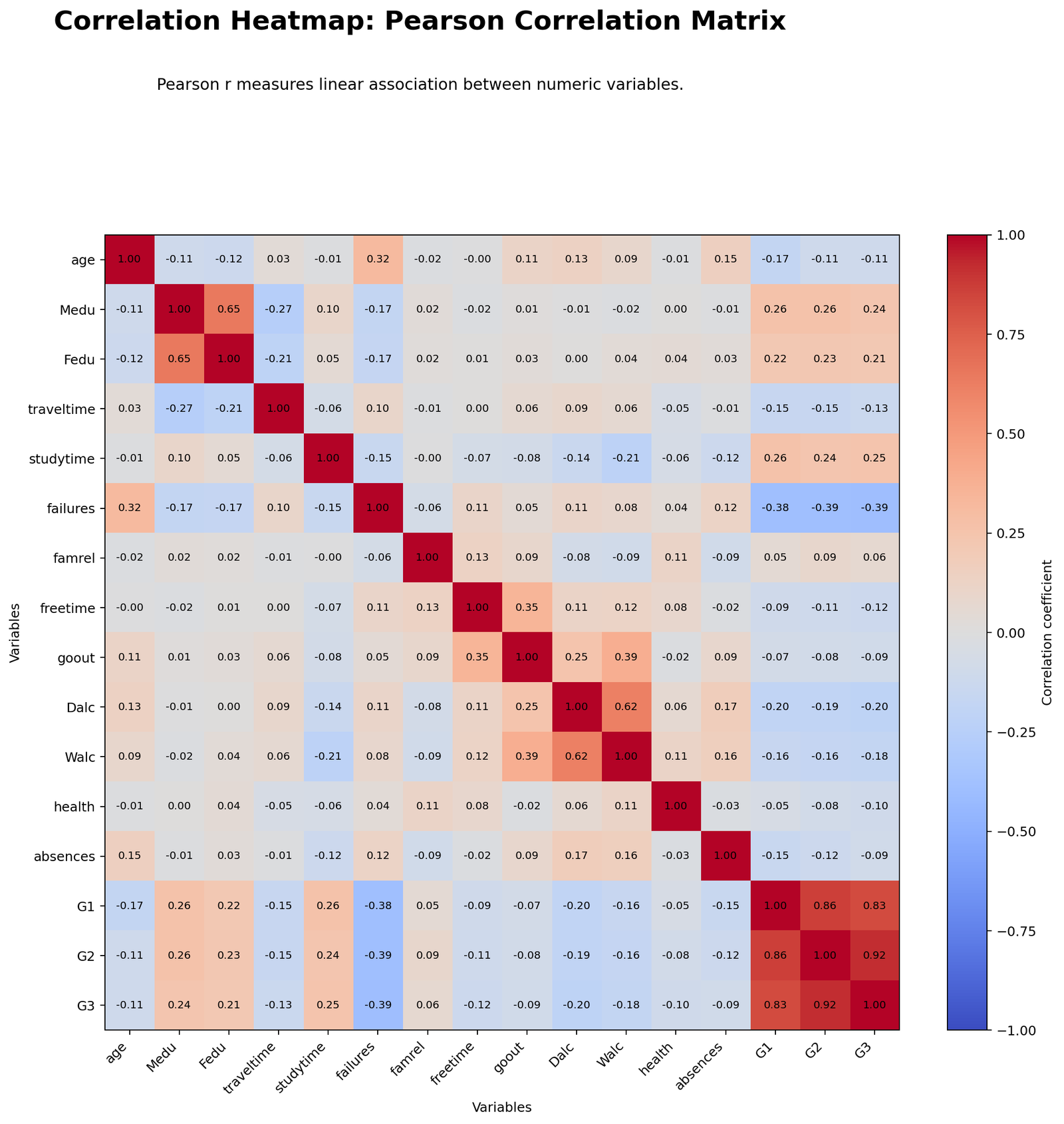
The Pearson heatmap shows the linear correlation structure among all 16 numeric variables. The strongest visible block should be the grade cluster containing G1, G2 and G3. The report confirms that G2–G3 is the strongest cell with r = 0.9185, followed by G1–G2 with r = 0.8650 and G1–G3 with r = 0.8264. This means the academic grade variables move together very strongly.
The Pearson matrix also highlights meaningful non-grade relationships. Medu–Fedu has a strong positive relationship, showing that mother’s and father’s education levels tend to rise together. Dalc–Walc is also strongly positive, meaning daily alcohol use and weekend alcohol use follow a similar pattern. On the negative side, failures is visibly connected with lower grade variables, especially failures–G3 at r = -0.3933.
Python Chart 2: Spearman Correlation Heatmap
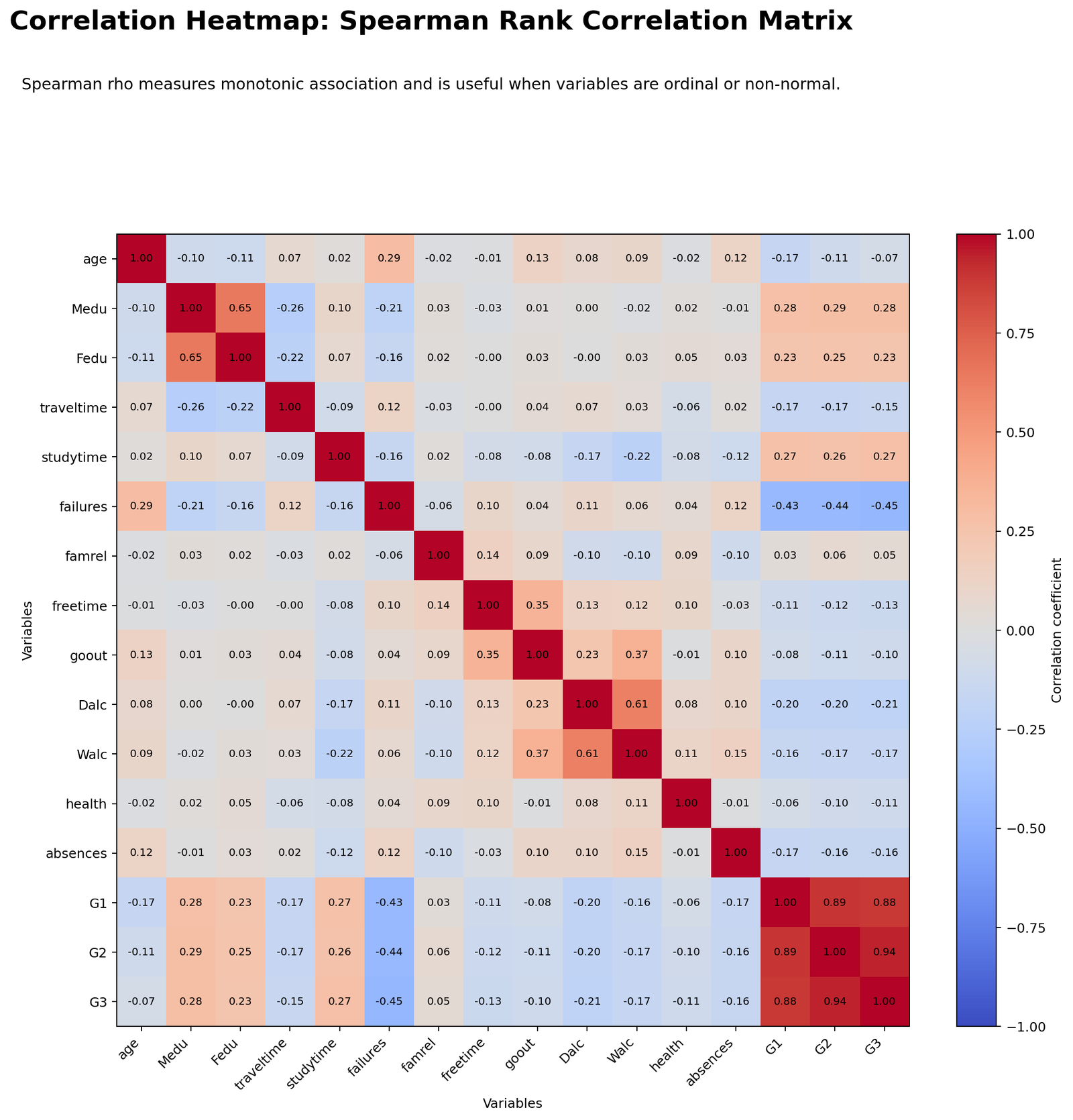
The Spearman heatmap checks whether the main relationships remain when variables are ranked. This is useful because several variables are ordinal-style scales, such as studytime, famrel, freetime, goout, Dalc, Walc and health. In the Excel workbook, the top pair G2–G3 has Spearman rho = 0.9445, which is even slightly stronger than its Pearson value.
The important interpretation is that the main story remains stable. The academic-grade cluster remains very strong, failures still has a negative relationship with grades, and the alcohol-use variables still move together. This supports the conclusion that the heatmap is not only capturing one fragile linear pattern; the strongest relationships also hold under rank-based correlation.
Python Chart 3: Significant Pearson Correlation Heatmap
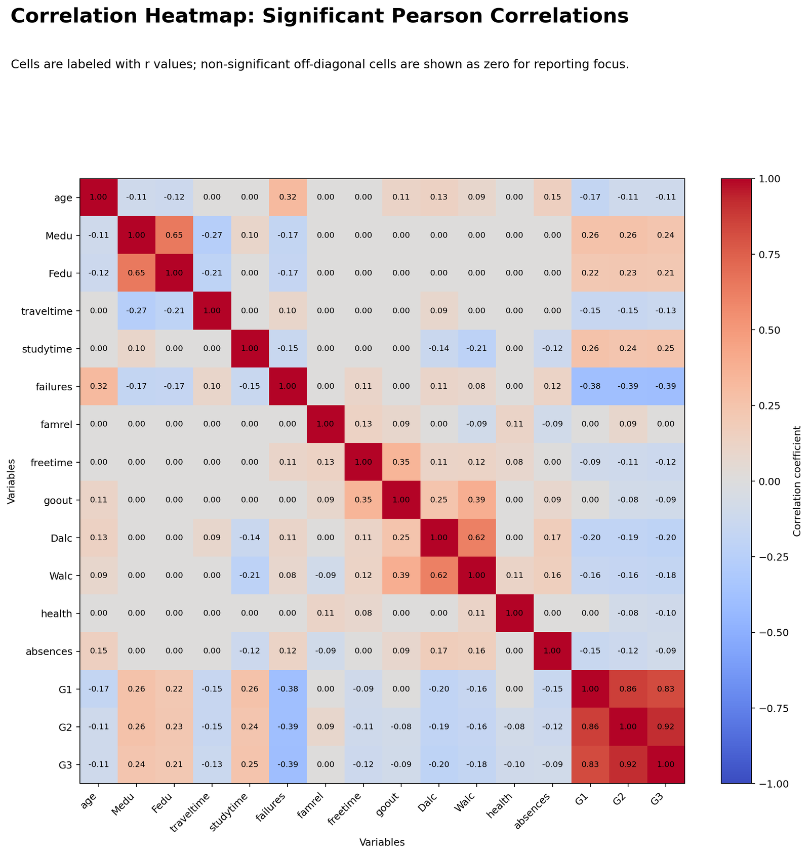
The significant-only Pearson heatmap helps reduce noise by emphasizing statistically supported cells. Since the sample size is 649, even weak relationships can become statistically significant. That is why this chart must be interpreted together with effect size. Large cells such as G2–G3, G1–G2 and G1–G3 are both statistically significant and practically meaningful.
Smaller target-variable relationships, such as G3 with health or G3 with age, may be statistically significant but are not nearly as important as the grade variables. A strong post should teach readers to separate statistical significance from practical strength rather than treating every colored significant cell as equally important.
Python Chart 4: Strongest Pearson Pairs
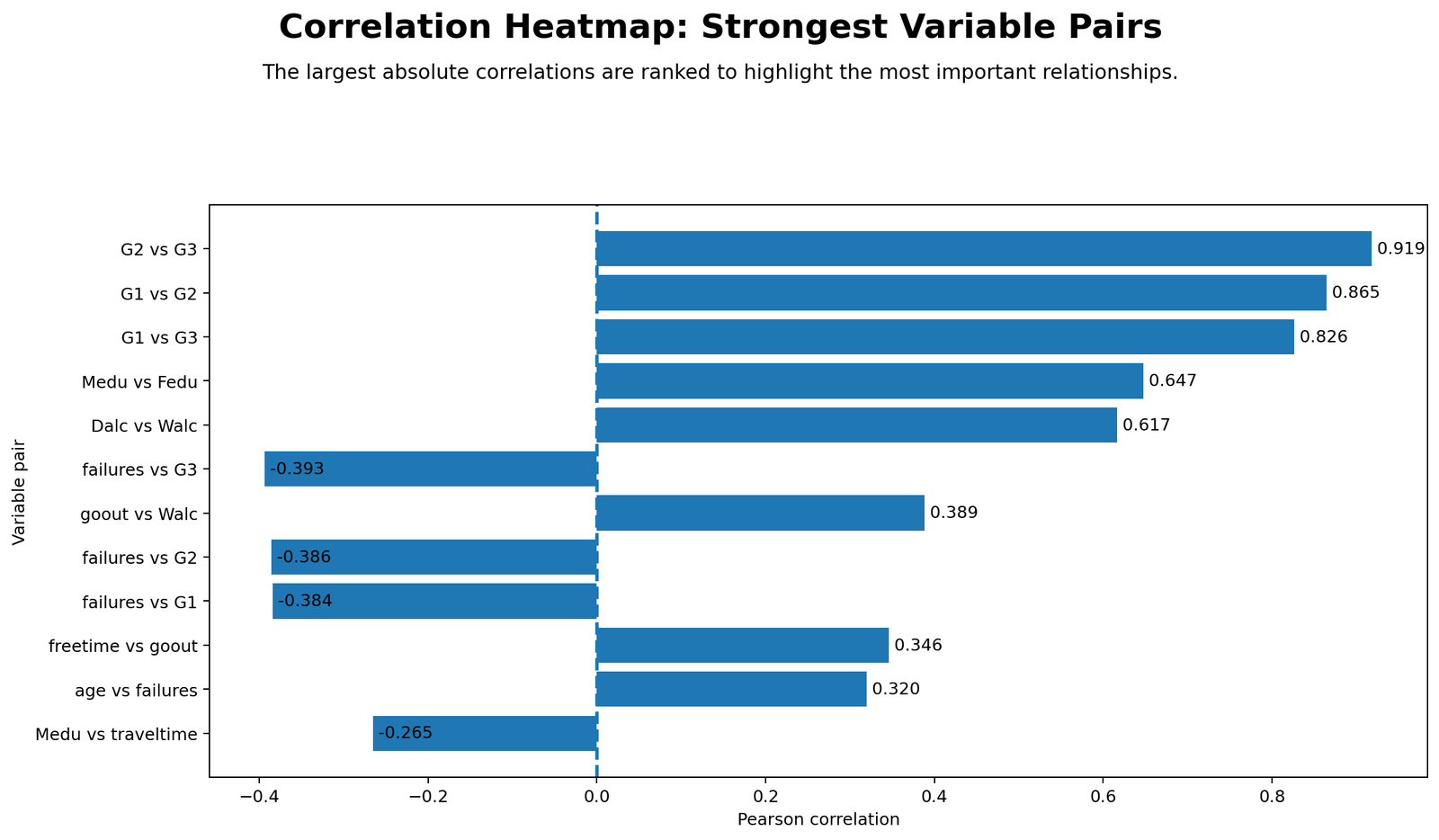
This chart turns the large matrix into a simple ranked list. The top Pearson pairs are G2–G3, G1–G2, G1–G3, Medu–Fedu, Dalc–Walc, failures–G3, goout–Walc, failures–G2, failures–G1 and freetime–goout. This ranking is much easier for readers to remember than a full matrix.
The strongest-pairs chart is also useful for writing a conclusion. It tells us that academic performance variables dominate the dataset, parental education variables form a strong family-background pair, alcohol-use variables move together, and failures has a negative academic relationship. These are the key insights worth reporting, not every small correlation in the heatmap.
Python Chart 5: Target Variable Correlations
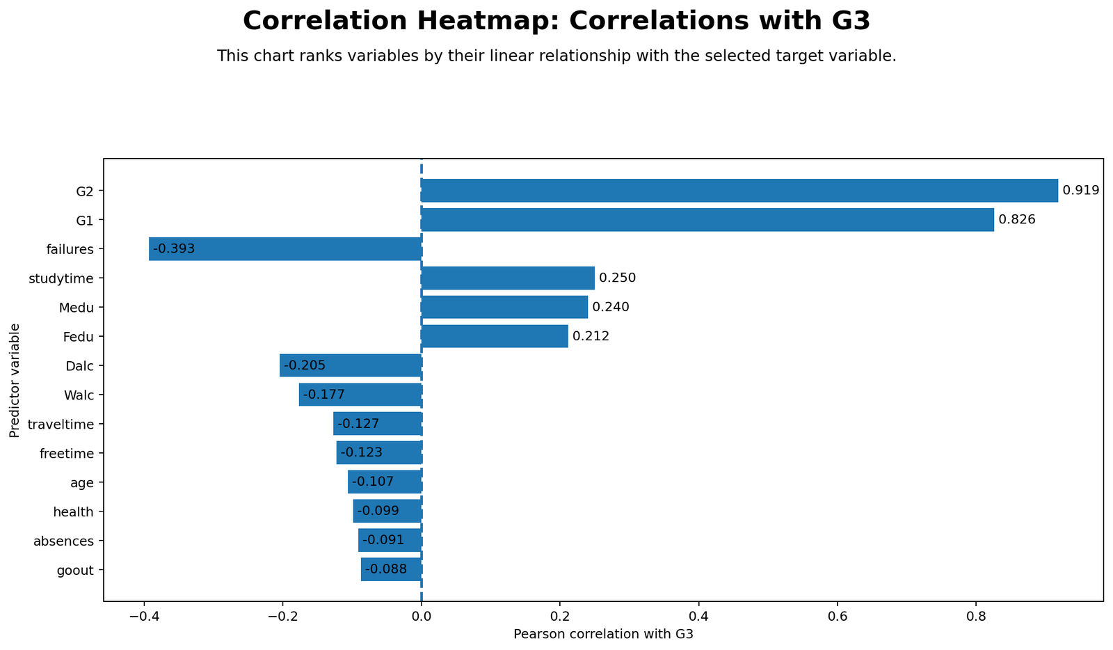
This chart focuses only on the outcome variable G3. The strongest positive target correlation is G2 with r = 0.9185, followed by G1 with r = 0.8264. After the grade variables, the positive associations are much smaller: studytime at r = 0.2498, Medu at r = 0.2402 and Fedu at r = 0.2118.
The negative side is also important. failures is the strongest negative correlate of G3 at r = -0.3933. Alcohol variables are also negative, with Dalc at r = -0.2047 and Walc at r = -0.1766. Traveltime, freetime, age and health are statistically significant but weaker. This chart is the best one to use if the article needs to answer “what relates most strongly to final grade?”
Python Chart 6: Pairwise Valid Sample Size Heatmap
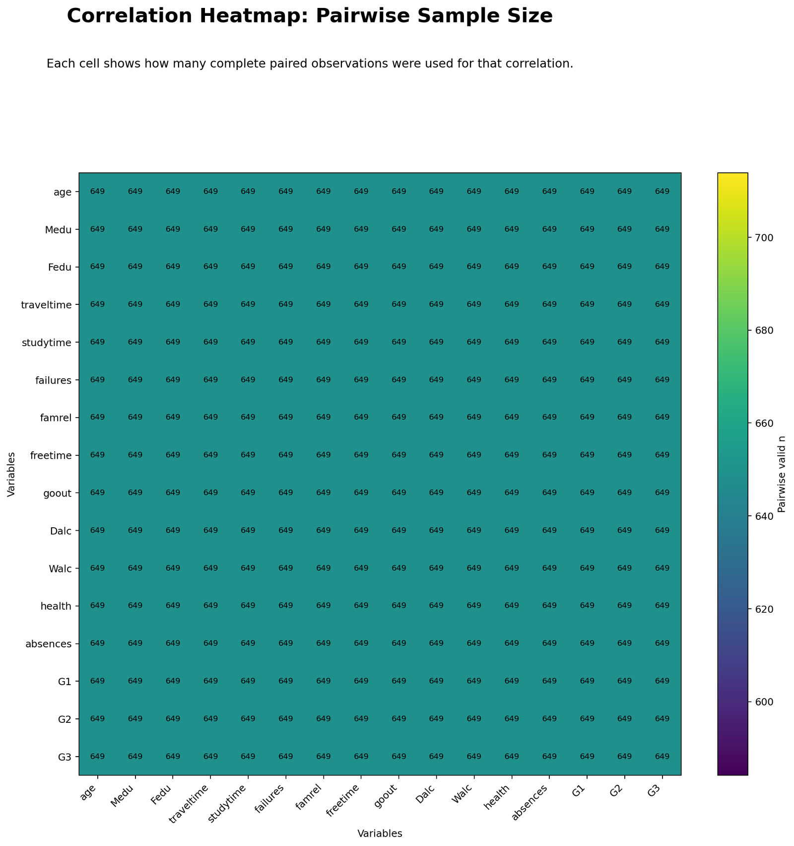
The pairwise sample-size heatmap checks whether all correlations are based on the same amount of data. In many real datasets, some cells are based on fewer observations because of missing values. Here, the result is clean: the report and workbook show 649 valid observations and 0 missing values for the included variables.
This matters because it makes the matrix easier to compare. A difference between two coefficients is not being driven by one coefficient using many fewer observations. Instead, the color differences mainly reflect actual differences in association strength.
Excel Results Explained
The uploaded Excel workbook is more than a download link. It contains a complete teaching workflow with these sheets: Dashboard, Dataset, Numeric_Data, Rank_Data, Pearson_Heatmap, Pearson_P_Values, Spearman_Heatmap, Spearman_P_Values, Worked_Calculation and Interpretation. This structure is excellent for students because it shows the raw data, transformed numeric data, rank data, heatmap matrices, p-values and one manual Pearson calculation.
The Excel dashboard confirms the same strongest pairs as the Python report. The strongest Pearson pair is G2 with G3, r = 0.918548, with Spearman rho = 0.944451. The next strongest pairs are G1–G2, G1–G3, Medu–Fedu, Dalc–Walc and failures–G3. The Excel interpretation sheet explains that positive cells mean the variables move together, negative cells mean one tends to increase while the other decreases, and near-zero cells indicate weak relationships.
Excel Dashboard Summary
| Variable 1 | Variable 2 | Pearson r | Spearman rho | Strength | Direction |
|---|---|---|---|---|---|
| G2 | G3 | 0.918548 | 0.944451 | Very strong | Positive |
| G1 | G2 | 0.864982 | 0.893065 | Strong | Positive |
| G1 | G3 | 0.826387 | 0.883288 | Strong | Positive |
| Medu | Fedu | 0.647477 | 0.647194 | Moderate | Positive |
| Dalc | Walc | 0.616561 | 0.613056 | Moderate | Positive |
| failures | G3 | -0.393316 | -0.448360 | Weak to moderate | Negative |
| goout | Walc | 0.388680 | 0.372455 | Weak to moderate | Positive |
| failures | G2 | -0.385782 | -0.435741 | Weak to moderate | Negative |
Excel Worked Pearson Calculation: G1 with G3
The worked-calculation sheet shows a transparent manual calculation for G1 and G3. It uses G1 as X and G3 as Y. The workbook reports n = 649, mean X = 11.3991, mean Y = 11.9060, sum cross-products = 4749.3436, sum X deviation squared = 4883.6394 and sum Y deviation squared = 6763.2666. The manual formula gives r = 0.826387, and the CORREL check gives the same result.
This is a strong Excel teaching example because it proves the heatmap cell is not magic. Each heatmap value is built from deviations from the mean, cross-products and total variation. Conditional formatting then turns the matrix into a visual chart.
Excel Formula Steps
| Step | Excel Formula Pattern | Purpose |
|---|---|---|
| Pearson correlation | =CORREL(range_x,range_y) | Calculates the linear correlation coefficient. |
| Rank variables | =RANK.AVG(value,range,1) | Creates ranks for Spearman correlation. |
| Spearman correlation | =CORREL(rank_x,rank_y) | Calculates rank-based correlation. |
| Pairwise valid N | =COUNTIFS(range_x,"<>",range_y,"<>") | Counts valid paired observations. |
| t statistic for r | =r*SQRT((n-2)/(1-r^2)) | Converts correlation to a test statistic. |
| Two-tailed p-value | =T.DIST.2T(ABS(t),n-2) | Calculates significance for Pearson r. |
| Heatmap format | Conditional Formatting → Color Scales | Turns the coefficient matrix into a heatmap. |
SPSS, Python and Excel Workflows for Correlation Heatmap
| Software | Workflow | Best Use |
|---|---|---|
| SPSS | Run Pearson or Spearman correlations, check significance, inspect N values and export output. | Formal statistics output and thesis-style verification. |
| Python | Compute matrices, p-values, strongest pairs, target ranking and heatmap figures. | Best for automated charts and publication-ready visuals. |
| Excel | Use CORREL, ranks, p-value formulas and conditional formatting. | Best for step-by-step teaching and manually checking the formula. |
Code Blocks for Correlation Heatmap
SPSS Syntax for Correlation Heatmap
* Correlation Heatmap correlation matrix in SPSS.
* Dataset should already be open.

OUTPUT CLOSE ALL.
OUTPUT NEW NAME=Correlation_Heatmap_Output.

CORRELATIONS
  /VARIABLES=age Medu Fedu traveltime studytime failures famrel freetime goout Dalc Walc health absences G1 G2 G3
  /PRINT=TWOTAIL NOSIG
  /STATISTICS DESCRIPTIVES.

NONPAR CORR
  /VARIABLES=age Medu Fedu traveltime studytime failures famrel freetime goout Dalc Walc health absences G1 G2 G3
  /PRINT=SPEARMAN TWOTAIL.

OUTPUT EXPORT
  /CONTENTS EXPORT=VISIBLE
  /PDF DOCUMENTFILE='Correlation-Heatmap-SPSS-Output.pdf'.
Python Code for Correlation Heatmap
import pandas as pd
import numpy as np
from scipy import stats

cols = ["age","Medu","Fedu","traveltime","studytime","failures","famrel","freetime",
        "goout","Dalc","Walc","health","absences","G1","G2","G3"]

df = pd.read_csv("dataset.csv")[cols].apply(pd.to_numeric, errors="coerce")

pearson = df.corr(method="pearson")
spearman = df.corr(method="spearman")
pairwise_n = df.notna().T.dot(df.notna())

# Pearson p-value matrix
pvals = pd.DataFrame(np.nan, index=cols, columns=cols)
for c1 in cols:
    for c2 in cols:
        valid = df[[c1, c2]].dropna()
        if len(valid) > 2:
            pvals.loc[c1, c2] = stats.pearsonr(valid[c1], valid[c2])[1]

# Strongest Pearson pairs
pairs = []
for i in range(len(cols)):
    for j in range(i + 1, len(cols)):
        c1, c2 = cols[i], cols[j]
        r = pearson.loc[c1, c2]
        p = pvals.loc[c1, c2]
        pairs.append([c1, c2, r, abs(r), p])

pairs = pd.DataFrame(pairs, columns=["variable_1", "variable_2", "r", "abs_r", "p"])
pairs = pairs.sort_values("abs_r", ascending=False)
print(pairs.head(12))

# Target variable ranking
print(pearson["G3"].drop("G3").sort_values(key=lambda x: x.abs(), ascending=False))
Excel Formula Pattern
# Pearson r
=CORREL(B2:B650,C2:C650)

# Rank values for Spearman
=RANK.AVG(B2,$B$2:$B$650,1)

# Spearman rho after creating rank columns
=CORREL(rank_x_range,rank_y_range)

# Pearson test statistic
=r*SQRT((n-2)/(1-r^2))

# Two-tailed p-value
=T.DIST.2T(ABS(t),n-2)

# Heatmap styling
Select matrix → Home → Conditional Formatting → Color Scales
APA Reporting Wording for Correlation Heatmap
When reporting a heatmap, include the method, variables, sample size, strongest pairs, target-variable findings and the pairwise N issue. Do not report only that “a heatmap was created.”
APA-Style Full Report
A correlation heatmap was produced for 16 numeric variables from the student performance dataset. Pearson and Spearman correlations were inspected, and G3 was used as the target variable for ranking. All included variables had 649 valid observations and no missing values. The strongest Pearson association was between G2 and G3, r = .919, followed by G1 and G2, r = .865, and G1 and G3, r = .826. Additional positive relationships were observed between Medu and Fedu, r = .647, and between Dalc and Walc, r = .617. The strongest negative association with G3 was failures, r = -.393. The Spearman results supported the same pattern, with G2 and G3 showing rho = .944.
Short APA-Style Version
The correlation heatmap showed a very strong grade cluster among G1, G2 and G3. The strongest Pearson pair was G2 with G3, r = .919, and the strongest negative target relationship was failures with G3, r = -.393. Pairwise valid sample size was constant at 649.
Practical Interpretation Wording
The heatmap suggests that final grade is most closely connected with earlier grade performance. Studytime and parental education have smaller positive relationships with G3, while failures and alcohol-use variables show negative relationships. These findings are correlational and should be used for screening, interpretation and model planning rather than causal claims.
Common Mistakes in Correlation Heatmap Interpretation
| Mistake | Why It Is a Problem | Better Practice |
|---|---|---|
| Only reading the colors | Colors can hide the exact coefficient and direction. | Report exact r or rho values for key cells. |
| Ignoring negative signs | A strong negative cell has a different meaning from a strong positive cell. | Always describe direction in words. |
| Reporting every cell | A large matrix becomes unreadable. | Focus on strongest pairs and target-variable ranking. |
| Confusing significance with importance | Large samples can make small correlations significant. | Use p-values together with coefficient size. |
| Ignoring Spearman | Ordinal variables may not behave perfectly linearly. | Use Spearman as a robustness check. |
| Claiming causation | Correlation does not prove cause and effect. | Use association language. |
When to Use a Correlation Heatmap
Use a correlation heatmap when you have several numeric or ordered variables and want to understand their relationship structure. It is especially useful before regression analysis, machine learning feature selection, multicollinearity checks, data cleaning and research reporting.
Do not use it as the final proof of a causal relationship. After a heatmap, you may need deeper analysis such as multiple linear regression, variance inflation factor, outlier detection, normal distribution checks and parametric vs nonparametric tests.
Downloads and Resources
SPSS Correlation Heatmap Output PDFSPSS correlation tables, significance values and output verification.
Excel Fully Worked FileDashboard, dataset, numeric data, rank data, Pearson and Spearman heatmaps, p-values and worked Pearson calculation.
FAQs About Correlation Heatmap
What is a correlation heatmap?
A correlation heatmap is a color-coded matrix showing pairwise correlation coefficients among several variables.
How do I read a correlation heatmap?
Read the variable names on the row and column, then inspect the cell value and color. The value tells the coefficient, while the color shows strength and direction quickly.
What was the strongest correlation in this report?
The strongest Pearson correlation was G2 with G3, r = 0.9185. In the Excel workbook, the Spearman rho for the same pair was 0.9445.
What was the strongest negative relationship with G3?
The strongest negative target relationship was failures with G3, r = -0.3933.
Should I use Pearson or Spearman for a heatmap?
Use Pearson for linear numeric relationships and Spearman for rank-based or ordinal-style relationships. Reporting both is often helpful.
Can I create a correlation heatmap in Excel?
Yes. Use CORREL for the matrix and Conditional Formatting color scales to create the heatmap. For Spearman, rank the variables first and then apply CORREL to the rank columns.
Does a correlation heatmap prove causation?
No. It shows association, not cause and effect. Use causal language only when supported by research design and additional analysis.

