
Pearson Correlation Assumptions, Spearman Alternative and Excel Worked Results
Correlation Assumptions: Pearson, Spearman, SPSS, Python, R and Excel Guide
Correlation Assumptions help you decide whether a Pearson correlation can be reported confidently or whether a Spearman rank correlation should be reported as a safer alternative. In this guide, the default pair is G2 as the X variable and G3 as the Y variable. You will learn how to check complete paired cases, linearity, normality, residual spread, bivariate outliers, Pearson versus Spearman agreement, SPSS output, Python charts, R validation charts and Excel workbook results.
Quick Answer: Correlation Assumptions Result
The correlation assumptions report tested the relationship between G2 and G3 using N = 649 complete paired cases. The Pearson correlation was r = 0.9185, with a 95% Fisher-z confidence interval from 0.9056 to 0.9298, and p = 5.6424 × 10-263. The Spearman rank correlation was even slightly stronger at ρ = 0.9445.
The assumption decision is not a simple “all assumptions perfect” result. Complete paired cases passed, and the linearity/monotonic agreement check passed because the difference between Pearson and Spearman was only 0.0259. However, normality was flagged, residual spread was flagged by the Breusch-Pagan test (p = 7.195 × 10⁻⁵), and bivariate influence was flagged with 19 Mahalanobis-distance flags and 20 Cook-distance flags. The best final report is: Pearson can be reported with caution, but Spearman should also be reported.
Final interpretation: The relationship between G2 and G3 is extremely strong and clearly positive. Students with higher second-period grades also tend to have higher final grades. The scatterplot and Pearson-Spearman agreement support the relationship as linear or at least strongly monotonic, but assumption checks show enough normality, spread and influence warnings that Spearman should be reported alongside Pearson.
Reporting choice: Use Pearson as the main coefficient only with assumption caveats. Add Spearman as a robust confirmation because several assumption checks need attention. This is stronger than reporting only a p-value because it explains why the coefficient is large, why it is statistically significant and why assumption diagnostics still matter.
Table of Contents
- What Are Correlation Assumptions?
- Pearson vs Spearman Assumptions
- Pearson and Spearman Correlation Formulas
- Null and Alternative Hypotheses
- Dataset and Variables Used
- Assumption Decision Summary
- SPSS Output Interpretation
- Python Chart-by-Chart Interpretation
- R Chart-by-Chart Validation
- Excel Results Explained
- SPSS, Python, R and Excel Workflows
- Code Blocks for Correlation Assumptions
- APA Reporting Wording
- Common Mistakes
- When to Use Each Correlation Choice
- Downloads and Resources
- Related Guides
- FAQs
What Are Correlation Assumptions?
Correlation assumptions are the data conditions that should be checked before interpreting a correlation coefficient. For Pearson correlation, the key checks are complete paired data, quantitative variables, approximate linearity, limited influential outliers, reasonably stable residual spread and acceptable distributional behavior. For Spearman correlation, the assumptions are more flexible because the coefficient is based on ranks, but the relationship should still be monotonic.
These assumptions matter because Pearson correlation is designed to summarize a linear relationship between two variables. If the relationship is curved, strongly affected by a few extreme cases, or based on ordinal values with strong skewness, the Pearson coefficient can give a misleading impression. That is why a good correlation report should include scatterplots, histograms, Q-Q plots, outlier checks and a comparison between Pearson and Spearman when needed.
In this example, the correlation between G2 and G3 is very strong. The assumptions do not destroy the result, but they change how it should be reported. The correct wording is not “all assumptions were perfect.” The correct wording is that the relationship is very strong, linear or monotonic, statistically significant and should be reported with caution because normality, residual spread and outlier influence need attention.
Simple definition: Correlation assumptions are checks that tell whether Pearson correlation is appropriate as the main result or whether Spearman correlation should be added as a robust alternative.
Pearson vs Spearman Assumptions
Many readers search for assumptions for Pearson correlation because Pearson is the most common coefficient. However, correlation analysis should not stop with Pearson when the data show non-normality, ties, outliers or ordinal measurement. Spearman correlation is often a better companion result because it checks whether the relationship remains strong after converting raw values to ranks.
| Area | Pearson Correlation | Spearman Correlation | Result in This Example |
|---|---|---|---|
| Relationship form | Linear relationship preferred | Monotonic relationship preferred | Pass: Pearson and Spearman agree strongly. |
| Variables | Continuous or approximately interval-scale | Ordinal, ranked or continuous | G2 and G3 are grade-score variables. |
| Normality | Approximate normality helps inference | Less dependent on normality | Flag: Shapiro-Wilk p-values are below .05. |
| Outliers | Sensitive to influential outliers | More robust to outliers | Flag: Mahalanobis and Cook-distance checks show influence warnings. |
| Spread | More stable when residual spread is roughly constant | Less focused on residual spread | Flag: Breusch-Pagan p = 7.195 × 10⁻⁵. |
| Best wording | Report with assumption caveats | Report as robust confirmation | Use both Pearson and Spearman. |
Best practice: When Pearson is very strong but assumptions are flagged, do not throw the result away automatically. Instead, report Pearson with caution and add Spearman as a robustness check. In this example, both coefficients tell the same core story.
Pearson and Spearman Correlation Formulas
The Pearson correlation coefficient compares how two variables vary together relative to their own spread:
The significance test for Pearson correlation can be written as:
Spearman correlation applies the same correlation logic to ranked values rather than raw scores. The classic no-ties shortcut formula is:
| Symbol | Meaning | Value in Main Result |
|---|---|---|
| x | X variable | G2 |
| y | Y variable | G3 |
| n | Complete paired observations | 649 |
| r | Pearson correlation | 0.9185 |
| ρ | Spearman rank correlation | 0.9445 |
| r2 | Shared linear variance | About 84.37% for G2 vs G3 |
Null and Alternative Hypotheses
The hypothesis statement for correlation assumptions focuses on whether the population association is zero. The assumptions tell us how confidently Pearson can be interpreted, while the p-value tests whether the observed relationship is statistically different from zero.
| Statement | Hypothesis | Meaning |
|---|---|---|
| Null hypothesis | H0: ρ = 0 | There is no population association between G2 and G3. |
| Alternative hypothesis | H1: ρ ≠ 0 | There is a population association between G2 and G3. |
| Pearson assumption decision | Use with caution | Pearson is very strong, but assumption flags require careful wording. |
| Spearman robustness decision | Report also | The rank-based result confirms the same strong positive relationship. |
Decision: The null hypothesis is rejected because the Pearson p-value is far below .05. However, assumption diagnostics are flagged, so the result should be reported as a strong positive correlation with Pearson caveats and Spearman confirmation.
Dataset and Variables Used
The main Python, R and SPSS outputs use G2 as the X variable and G3 as the Y variable. Both variables are grade-score variables from the student performance dataset. G2 represents the second-period grade, while G3 represents the final grade.
| Variable | N | Mean | SD | Minimum | Maximum | Skewness | Excess Kurtosis |
|---|---|---|---|---|---|---|---|
| G2 | 649 | 11.5701 | 2.9136 | 0 | 19 | -0.3603 | 1.6625 |
| G3 | 649 | 11.9060 | 3.2307 | 0 | 19 | -0.9129 | 2.7122 |
The summary already gives important assumption clues. Both variables are grade scores bounded between 0 and 19, and both have a lower-end tail. G3 is more negatively skewed and has higher excess kurtosis than G2. That helps explain why the normality checks are flagged even though the sample size is large and the relationship is extremely strong.
Before reporting correlation, it is useful to review descriptive statistics, histogram interpretation, box plot interpretation, outlier detection, standard deviation, skewness and kurtosis.
Assumption Decision Summary
The assumption summary is the most important section for a correlation assumptions article. It tells whether Pearson is safe, questionable or should be replaced by Spearman. This report gives a mixed but interpretable result.
| Assumption | Status | Evidence | Interpretation |
|---|---|---|---|
| Complete paired cases | Pass | n = 649 | No missing-pair problem for G2 and G3. |
| Approximate normality for Pearson | Flag | G2 Shapiro-Wilk W = 0.9617, p = 5.583 × 10⁻¹²; G3 W = 0.9260, p = 2.416 × 10⁻¹⁷ | Both variables show possible non-normality. |
| Linearity / monotonic agreement | Pass | |Pearson − Spearman| = 0.0259 | The Pearson and Spearman results tell almost the same story. |
| Constant residual spread | Flag | Breusch-Pagan p = 7.195 × 10⁻⁵ | Residual spread may not be constant across fitted values. |
| No influential bivariate outliers | Flag | Mahalanobis flags = 19; Cook flags = 20 | Some observations may have unusual leverage or influence. |
| Recommended reporting choice | Decision | Pearson can be reported with caution, but Spearman should also be reported. | Report both coefficients rather than hiding assumption warnings. |
Decision in plain English: The correlation is so strong that the overall conclusion is stable, but a responsible report should acknowledge non-normality, possible heteroscedasticity and influential observations.
SPSS Output Interpretation for Correlation Assumptions
The SPSS output confirms the same assumption workflow. The complete paired case count is 649 valid cases with 0 missing cases. SPSS descriptive statistics show G2 mean = 11.57, SD = 2.914, and G3 mean = 11.91, SD = 3.231. Both variables range from 0 to 19.
Open the SPSS Correlation Assumptions output PDF
| SPSS Output Item | Value | Interpretation |
|---|---|---|
| Complete paired cases | 649 valid, 0 missing | The correlation uses a full paired sample. |
| G2 descriptive statistics | M = 11.57, SD = 2.914, min = 0, max = 19 | G2 has a broad grade-score distribution. |
| G3 descriptive statistics | M = 11.91, SD = 3.231, min = 0, max = 19 | G3 has a slightly higher mean and larger spread. |
| G2 skewness / kurtosis | Skewness = -0.360, kurtosis = 1.662 | G2 has mild negative skewness and heavier tails than normal. |
| G3 skewness / kurtosis | Skewness = -0.913, kurtosis = 2.712 | G3 is more negatively skewed and more peaked/heavy-tailed. |
| Shapiro-Wilk tests | G2 W = .962, p < .001; G3 W = .926, p < .001 | Normality is flagged for both variables. |
The SPSS interpretation should not be reduced to “normality failed.” With N = 649, formal normality tests are very sensitive and can flag small-to-moderate departures. The better SPSS conclusion is that normality is not perfect, so Q-Q plots, scatterplots, residual plots and Spearman correlation should be used to support the Pearson interpretation.
SPSS reporting note: In SPSS, combine the descriptive output, normality tables, scatterplot and Pearson/Spearman correlation output. Do not make the decision from the Shapiro-Wilk p-value alone.
Python Chart-by-Chart Interpretation
The Python charts explain the assumptions visually. They move from the main relationship to trend shape, variable distributions, Q-Q plots, residual spread, bivariate influence and the wider correlation-matrix context.
Python Chart 1: Scatterplot with Linear Fit
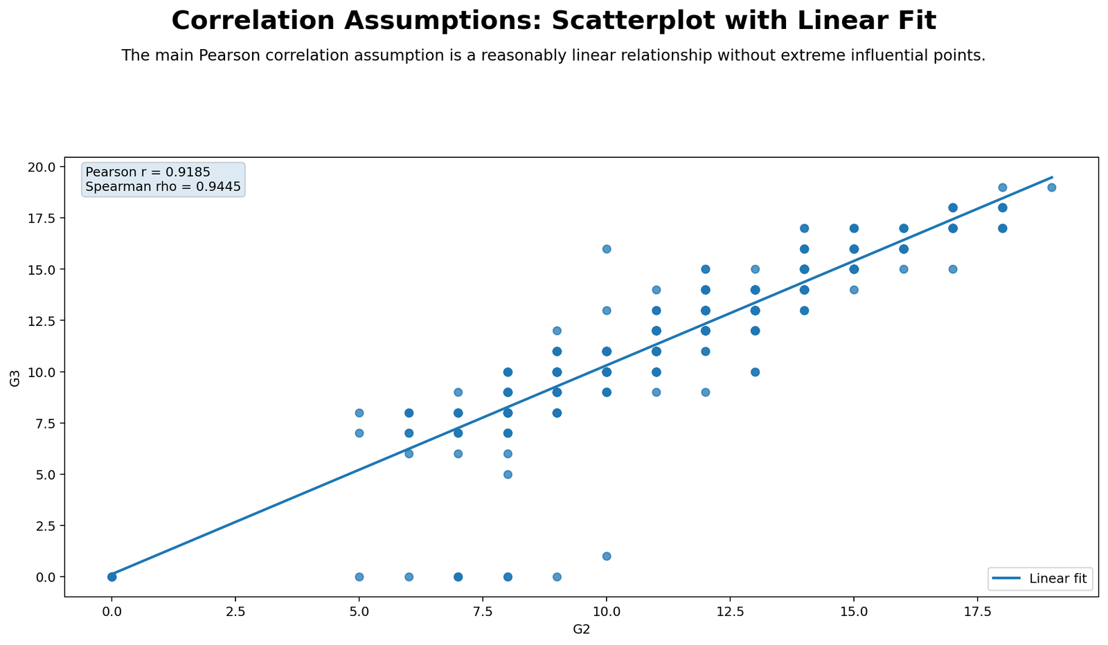
This chart shows the main relationship that Pearson correlation is trying to summarize. The points follow a clear upward pattern, and the fitted line rises strongly from left to right. The Pearson result printed in the report is r = 0.9185, while the Spearman result is ρ = 0.9445. Both values confirm a very strong positive relationship between second-period grade and final grade.
The scatterplot supports the linearity assumption because the cloud is not random and not mainly curved. However, the plot also shows score boundaries and repeated grade values, which is normal for school grade data. That is why the correlation can be reported as very strong, but the assumption section should still mention non-normality and influence checks instead of claiming that the data are perfectly ideal.
Python Chart 2: Linearity Binned Trend
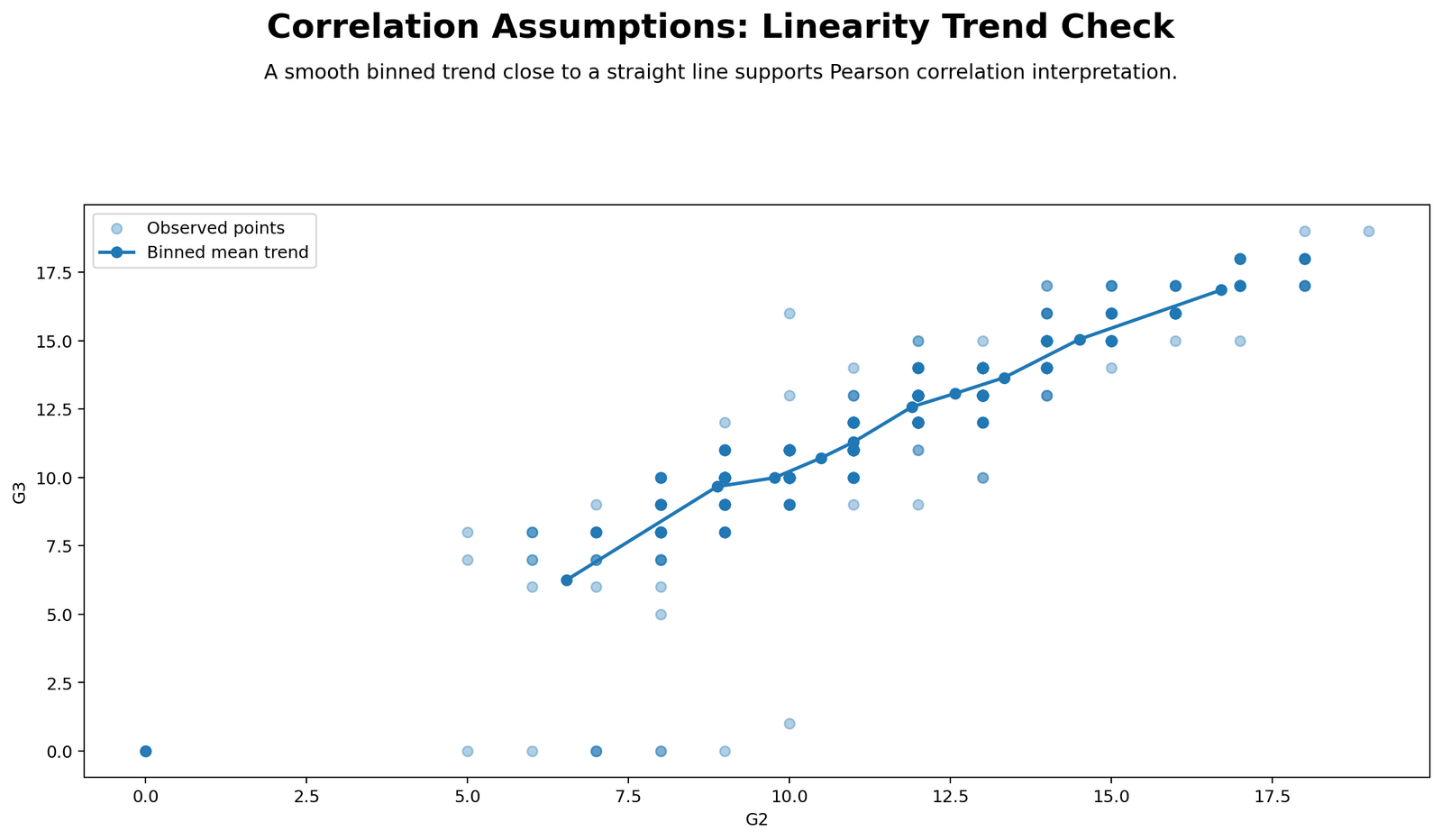
The binned trend chart summarizes average G3 values across ordered ranges of G2. The trend should rise steadily as G2 increases, which supports the Pearson interpretation. This chart is useful because individual points can overlap heavily in grade data, while binned means reveal the underlying pattern more clearly.
The key result is that the binned trend does not contradict the fitted linear line. The report also shows that the absolute difference between Pearson and Spearman is only 0.0259, which means the raw-score and rank-score interpretations are very close. This is why linearity/monotonic agreement is marked as Pass.
Python Chart 3: Histogram of X Variable G2
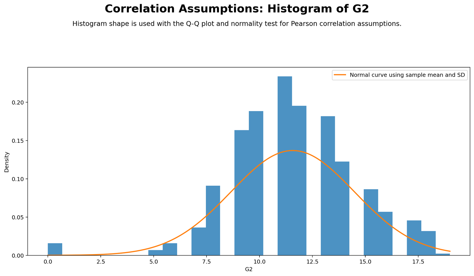
The G2 histogram shows the distribution of the X variable. G2 has a mean of about 11.57, a standard deviation of about 2.91, a minimum of 0 and a maximum of 19. The distribution is not perfectly normal because grade scores are bounded and include some very low scores.
The normality statistics confirm what the histogram suggests. G2 has skewness of -0.3603, excess kurtosis of 1.6625, and Shapiro-Wilk W = 0.9617 with p = 5.583 × 10⁻¹². This is a normality flag for Pearson inference, not a reason to ignore the correlation. It means Pearson should be interpreted with plots and a Spearman comparison.
Python Chart 4: Histogram of Y Variable G3
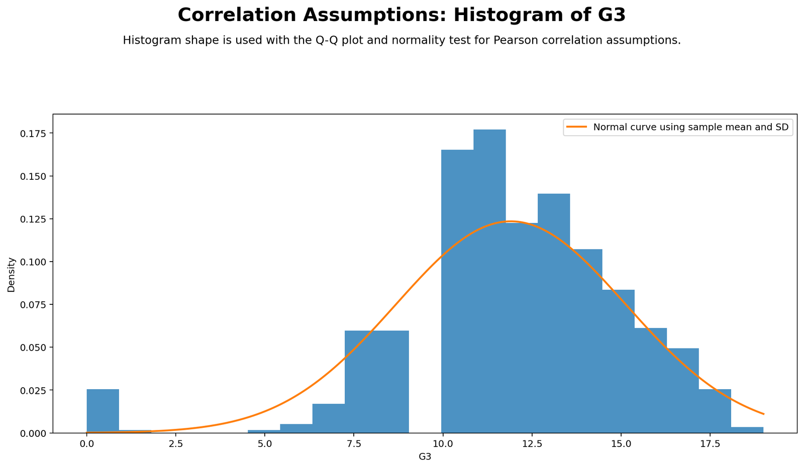
The G3 histogram shows the final grade distribution. G3 has a mean of about 11.91, a standard deviation of about 3.23, and the same 0-to-19 grade-score range. Compared with G2, G3 is more negatively skewed because a small set of very low final scores pulls the lower tail outward.
The diagnostic numbers make the issue clear: G3 has skewness of -0.9129, excess kurtosis of 2.7122, and Shapiro-Wilk W = 0.9260 with p = 2.416 × 10⁻¹⁷. This is why the report marks approximate normality as Flag. The practical response is to report Spearman alongside Pearson.
Python Chart 5: Q-Q Plot of G2
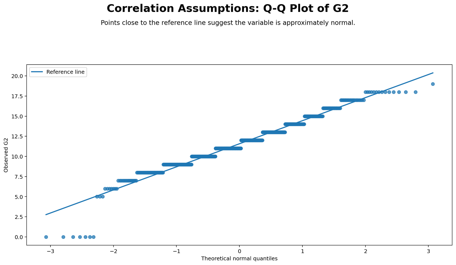
The Q-Q plot of G2 checks whether observed grade scores fall close to a normal reference line. The middle part of the distribution should be fairly organized, but the tails are expected to deviate because grade scores are bounded and include repeated integer values. This is common in education datasets.
The chart should be interpreted together with the histogram and Shapiro-Wilk test. It does not mean the relationship is unusable. It means the normality assumption is not perfectly met. Since the scatterplot and Spearman result remain strong, the best conclusion is Pearson with caution, not Pearson rejection.
Python Chart 6: Q-Q Plot of G3
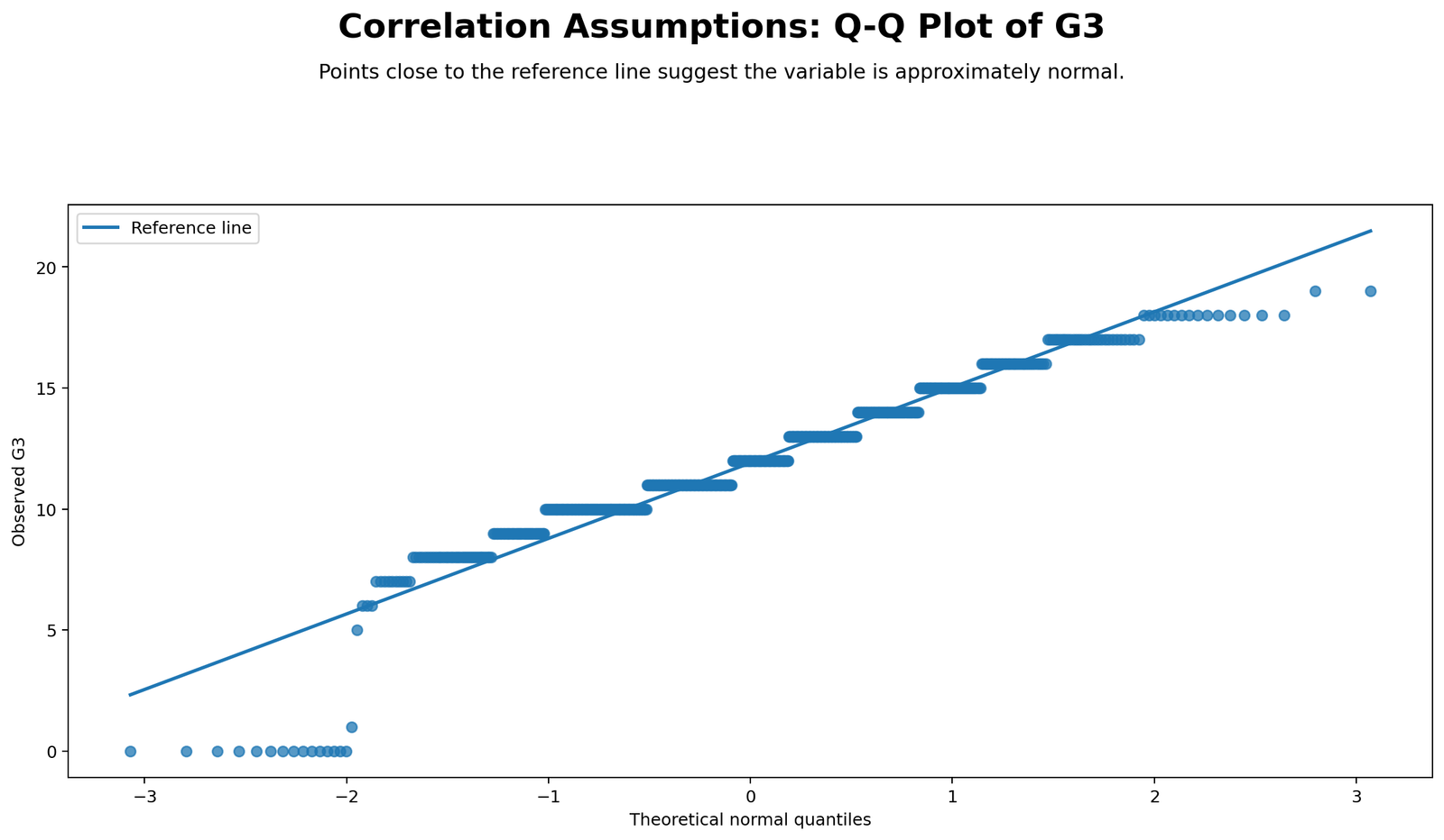
The Q-Q plot of G3 is more important than the G2 plot because G3 shows stronger skewness and kurtosis. Tail departures are expected, especially around the lower end where very low final scores appear. These departures explain why G3 has a smaller Shapiro-Wilk statistic than G2.
This chart supports the same decision shown in the assumption summary. G3 is not perfectly normal, but the relationship with G2 is still extremely strong. In a written report, say that normality was flagged and that Spearman correlation confirmed the Pearson conclusion.
Python Chart 7: Residuals vs Fitted Values
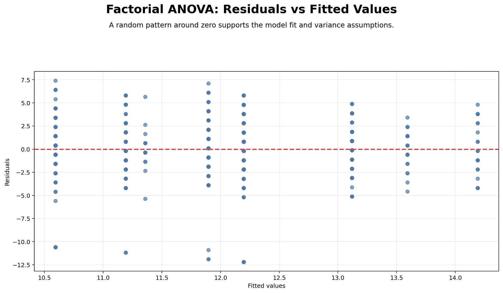
The residuals vs fitted chart checks whether the vertical spread of prediction errors is roughly consistent across fitted G3 values. Ideally, residuals should form a fairly even band around zero. In this report, the Breusch-Pagan result is significant, p = 7.195 × 10⁻⁵, so constant residual spread is marked as a flag.
The practical interpretation is that Pearson still captures a very strong positive relationship, but uncertainty may not be evenly distributed across all grade levels. This matters for formal inference and for regression-style interpretation. For a correlation post, it strengthens the case for also reporting Spearman and for using cautious wording.
Python Chart 8: Bivariate Outlier Distance
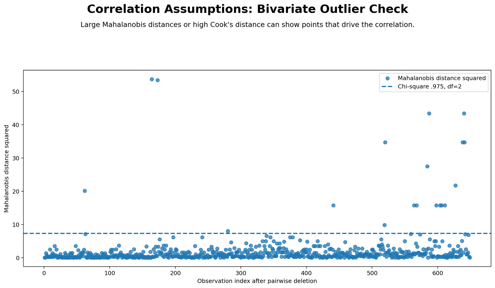
This chart checks whether unusual paired observations may influence the correlation. The report uses a Mahalanobis critical value of about 7.3778 for df = 2 at the .975 level. It flags 19 observations by Mahalanobis distance and 20 observations by Cook distance, using a Cook threshold of 4/n = 0.006163.
The result does not mean the correlation is false. A relationship as strong as r = 0.9185 is unlikely to be created by one or two points alone. However, the influence flags mean the analyst should inspect unusual cases and avoid overstating the result without mentioning robust confirmation. This is where Mahalanobis distance, Cook’s distance and outlier detection become important.
Python Chart 9: Numeric Correlation Matrix
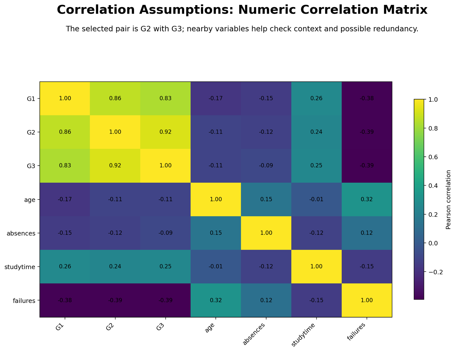
The numeric correlation matrix explains why the G2-G3 result is not isolated. The grade variables form a strong positive cluster: G1 with G2 = 0.86, G1 with G3 = 0.83, and G2 with G3 = 0.92. This confirms that the strongest relationships are concentrated among related academic performance variables.
The matrix also shows useful context around negative relationships. Failures is negatively related to grades, with values near -0.38 to -0.39 against G1, G2 and G3. Studytime is positively related to grades at around 0.24 to 0.26. These supporting patterns make the G2-G3 finding easier to interpret inside the wider dataset.
R Chart-by-Chart Validation
The R report validates the Python workflow with the same variables and the same main results. It reports Pearson r = 0.9185480, Spearman ρ = 0.9444512, G2 and G3 normality flags, Breusch-Pagan p = 7.195 × 10⁻⁵, 19 Mahalanobis flags and Cook-distance flags. The chart explanations below follow the same order as the R output files.
R Chart 1: Colorful Scatterplot with Linear Fit

The R scatterplot confirms the same strong upward pattern visible in Python. The plotted points rise with the fitted line, and the chart labels the main coefficients: Pearson near 0.9185 and Spearman near 0.9445. This agreement tells readers that the result is not dependent on one software package.
The scatterplot also shows why correlation assumptions must still be discussed. Even when the relationship is strong, grade data can have repeated values, lower-end clusters and bounded score limits. The chart supports Pearson interpretation but does not remove the need for normality and influence checks.
R Chart 2: Colorful Linearity Binned Trend

The R binned trend gives a clean summary of the relationship across the G2 score range. The binned means rise as G2 increases, which supports the idea that a single positive correlation coefficient is meaningful.
This chart is a strong companion to the scatterplot because it reduces overplotting. It supports the report’s Pass decision for linearity/monotonic agreement and helps justify why Pearson can still be included even though other assumptions are flagged.
R Chart 3: Colorful Histogram of G2

The R histogram repeats the G2 distribution check. The distribution is centered near 11.57 with a standard deviation near 2.91. It is not perfectly bell-shaped because the data are bounded grade scores.
The R normality table reports G2 Shapiro-Wilk W = 0.9617 and p = 5.583 × 10⁻¹². This supports the same conclusion: G2 is usable for correlation interpretation, but normality is flagged and should be acknowledged.
R Chart 4: Colorful Histogram of G3

The R histogram of G3 confirms that the final-grade distribution has stronger tail behavior than G2. G3 has mean near 11.91, standard deviation near 3.23, skewness near -0.913 and excess kurtosis near 2.712.
Because G3 is the outcome-style variable in the scatterplot, this distribution matters for Pearson inference. The chart supports the decision to report Pearson with caution and to include Spearman as a robust rank-based confirmation.
R Chart 5: Colorful Q-Q Plot of G2

The R Q-Q plot helps the reader see normality instead of relying only on the p-value. Points that depart from the reference line, especially in the tails, explain why the formal normality test is significant.
The correct interpretation is practical rather than mechanical. The Q-Q plot flags imperfect normality, but the relationship with G3 remains clear and very strong. That is why the conclusion should not reject correlation analysis outright.
R Chart 6: Colorful Q-Q Plot of G3

The R Q-Q plot for G3 confirms stronger non-normality than G2. The lower tail and bounded score range are the main reasons the plot should not look perfectly straight.
This chart should be used to teach a balanced decision. Normality is not ideal, but the rank-based Spearman result is even stronger than Pearson. That makes the result more credible when reported correctly.
R Chart 7: Colorful Residuals vs Fitted Values

The R residual plot checks whether prediction errors are evenly spread. The Breusch-Pagan p-value of 7.195 × 10⁻⁵ flags possible heteroscedasticity, meaning the residual spread may change across the fitted range.
This does not change the direction of the relationship, but it affects the confidence with which Pearson inference is interpreted. The safest wording is to report Pearson as very strong while adding Spearman and noting the residual-spread flag.
R Chart 8: Colorful Bivariate Outlier Check

The R bivariate outlier chart repeats the influence check. The report identifies 19 Mahalanobis-distance flags and Cook-distance influence flags using the same threshold logic as the Python workflow.
The presence of influence flags is not surprising in a grade dataset with a few very low scores. The chart tells the reader to inspect unusual observations and avoid writing that the relationship is “perfectly assumption-free.”
R Chart 9: Colorful Numeric Correlation Matrix

The R numeric matrix confirms the broader academic-performance pattern. The grade variables cluster strongly together: G1, G2 and G3 all have high positive correlations with one another. Failures is negatively associated with the grade variables, while studytime has modest positive grade correlations.
This matrix helps the reader see that G2 and G3 are not an isolated pair chosen to make the result look strong. They are part of a consistent academic-performance structure in the dataset.
Excel Results Explained
The Excel workbook adds a full assumption-screening layer that goes beyond one chart. It contains sheets for raw data, numeric data, variable-level assumptions, pairwise assumptions, a correlation matrix and a worked example. The workbook screened 16 numeric variables, 120 pairwise relationships, and found 77 significant Pearson pairs at p < .05. It also found 0 variables marked approximately normal by the workbook’s Jarque-Bera screening rule and 5 variables with many outliers.
Excel Workbook Summary
| Excel Area | Workbook Result | Interpretation |
|---|---|---|
| Variables screened | 16 | The workbook checks the numeric variables used in the correlation workflow. |
| Rows in uploaded dataset | 649 | The analysis has a large sample for correlation screening. |
| Variables approximately normal | 0 | The workbook’s JB normality approximation flags all variables as non-normal/skewed. |
| Variables with many outliers | 5 | studytime, failures, famrel, freetime and Dalc need extra caution. |
| Pairwise relationships screened | 120 | All pairwise combinations among the 16 numeric variables were evaluated. |
| Pearson OK pairwise decisions | 0 | The workbook recommends Pearson caveats and robust checks rather than blind Pearson reporting. |
| Significant Pearson pairs | 77 | Many relationships are statistically significant, but effect size still matters. |
The variable-level assumptions sheet shows why Pearson should be treated cautiously across the full dataset. Every numeric variable is flagged as non-normal/skewed by the workbook’s Jarque-Bera screening rule. The outlier screen marks five variables as having many outliers. Failures is especially important because it has strong skewness and a high outlier percentage, but it is also meaningfully related to grade outcomes.
Excel Worked Example: G1 vs G3
The workbook’s fully worked example uses G1 and G3. This is different from the main Python/R/SPSS pair of G2 and G3, but it is useful because it shows every Excel formula step. The Excel result for G1 versus G3 is also very strong: r = 0.8264, R² = 0.6829, t(647) = 37.3292, with a p-value displayed as 0 due to Excel rounding for an extremely small p-value.
| Excel Step | Result | Formula Meaning |
|---|---|---|
| Pairwise N | 649 | All cases have both G1 and G3 values. |
| Mean of G1 | 11.3991 | Average first-period grade. |
| Mean of G3 | 11.9060 | Average final grade. |
| SD of G1 | 2.7453 | Spread of the X variable. |
| SD of G3 | 3.2307 | Spread of the Y variable. |
| Covariance | 7.3292 | Positive covariance shows the variables increase together. |
| Pearson r | 0.8264 | Very strong positive linear association. |
| R² | 0.6829 | About 68.29% shared linear variance in the simple pairwise sense. |
| t statistic | 37.3292 | Very large test statistic for H0: r = 0. |
| df | 647 | Degrees of freedom for the Pearson correlation test. |
| Assumption decision | Use Pearson cautiously; compare Spearman/robust correlation | Normality and outlier checks require caveated reporting. |
The Excel interpretation is consistent with the main report. Grade variables are strongly related, but assumption screening warns against mechanical Pearson-only reporting. A high correlation does not cancel the need to inspect scatterplots, Q-Q plots, residual spread and outlier influence.
Excel Formula Steps
| Step | Excel Formula Pattern | Purpose |
|---|---|---|
| Pairwise valid N | =COUNTIFS(X_range,"<>",Y_range,"<>") | Counts cases with both variables present. |
| Mean | =AVERAGE(range) | Finds the center of each variable. |
| Standard deviation | =STDEV.S(range) | Finds the spread of each variable. |
| Covariance | =COVARIANCE.S(X_range,Y_range) | Shows whether variables move together. |
| Pearson r | =CORREL(X_range,Y_range) | Calculates the correlation coefficient. |
| R squared | =r^2 | Calculates shared linear variance. |
| t statistic | =r*SQRT((n-2)/(1-r^2)) | Tests H0: r = 0. |
| p-value | =T.DIST.2T(ABS(t),n-2) | Two-tailed Pearson significance test. |
| Assumption decision | =IF(...,"Pearson OK","Use Pearson cautiously") | Combines sample size, normality and outlier checks. |
SPSS, Python, R and Excel Workflows for Correlation Assumptions
The same assumptions can be checked in all four tools. The most important principle is that the analyst should not rely on one number alone. A strong correlation should be supported by plots, diagnostic checks and a reporting decision.
| Software | Main Steps | Best Use |
|---|---|---|
| SPSS | Run descriptives, Explore normality tests and plots, scatterplot, Pearson and Spearman correlations, and export the Viewer output. | Formal output PDF for academic reporting. |
| Python | Use pandas, scipy and statsmodels to calculate Pearson, Spearman, confidence intervals, Breusch-Pagan, Mahalanobis distance, Cook distance and charts. | Automated diagnostics and publication-quality chart generation. |
| R | Use cor.test(), Shapiro-Wilk, linear model diagnostics, bptest if available, and ggplot2-style charts. | Statistical validation and robust visualization. |
| Excel | Use CORREL, COVARIANCE.S, STDEV.S, SKEW, KURT, COUNTIFS, T.DIST.2T and conditional decision formulas. | Step-by-step teaching and formula transparency. |
Code Blocks for Correlation Assumptions
SPSS Syntax for Correlation Assumptions
* Correlation Assumptions in SPSS.
* Default variables: G2 and G3.

OUTPUT CLOSE ALL.
OUTPUT NEW NAME=Correlation_Assumptions_Output.

FREQUENCIES VARIABLES=G2 G3
  /STATISTICS=MEAN STDDEV MINIMUM MAXIMUM SKEWNESS KURTOSIS.

DESCRIPTIVES VARIABLES=G2 G3
  /STATISTICS=MEAN STDDEV MIN MAX SKEWNESS KURTOSIS.

EXAMINE VARIABLES=G2 G3
  /PLOT BOXPLOT HISTOGRAM NPPLOT
  /STATISTICS DESCRIPTIVES
  /CINTERVAL 95
  /MISSING LISTWISE.

GRAPH
  /SCATTERPLOT(BIVAR)=G2 WITH G3
  /TITLE='Correlation Assumptions: Scatterplot of G2 and G3'.

CORRELATIONS
  /VARIABLES=G2 G3
  /PRINT=TWOTAIL
  /MISSING=PAIRWISE.

NONPAR CORR
  /VARIABLES=G2 G3
  /PRINT=SPEARMAN TWOTAIL
  /MISSING=PAIRWISE.

REGRESSION
  /DEPENDENT G3
  /METHOD=ENTER G2
  /SAVE PRED RESID COOK LEVER.

OUTPUT EXPORT
  /CONTENTS EXPORT=VISIBLE
  /PDF DOCUMENTFILE='Correlation-Assumptions-SPSS-Output.pdf'.
Python Code for Correlation Assumptions
import pandas as pd
import numpy as np
from scipy import stats
import statsmodels.api as sm
from statsmodels.stats.diagnostic import het_breuschpagan

df = pd.read_csv("dataset.csv")
work = df[["G2", "G3"]].apply(pd.to_numeric, errors="coerce").dropna()

x = work["G2"].to_numpy()
y = work["G3"].to_numpy()
n = len(work)

pearson_r, pearson_p = stats.pearsonr(x, y)
spearman_rho, spearman_p = stats.spearmanr(x, y)

# Fisher z confidence interval for Pearson r
z = np.arctanh(pearson_r)
se = 1 / np.sqrt(n - 3)
ci_low, ci_high = np.tanh([z - 1.96 * se, z + 1.96 * se])

# Normality checks
shapiro_x = stats.shapiro(x)
shapiro_y = stats.shapiro(y)

# Linear model and residual diagnostics
X = sm.add_constant(x)
model = sm.OLS(y, X).fit()
residuals = model.resid
fitted = model.fittedvalues
bp_stat, bp_p, _, _ = het_breuschpagan(residuals, X)

# Mahalanobis distance for bivariate outliers
xy = work[["G2", "G3"]].to_numpy()
center = xy.mean(axis=0)
cov = np.cov(xy, rowvar=False)
inv_cov = np.linalg.inv(cov)
md2 = np.array([(row-center) @ inv_cov @ (row-center).T for row in xy])
md_cutoff = stats.chi2.ppf(0.975, df=2)
md_flags = int((md2 > md_cutoff).sum())

influence = model.get_influence()
cooks_d = influence.cooks_distance[0]
cook_cutoff = 4 / n
cook_flags = int((cooks_d > cook_cutoff).sum())

print("N:", n)
print("Pearson r:", pearson_r, "p:", pearson_p, "95% CI:", ci_low, ci_high)
print("Spearman rho:", spearman_rho, "p:", spearman_p)
print("Shapiro G2:", shapiro_x)
print("Shapiro G3:", shapiro_y)
print("Breusch-Pagan p:", bp_p)
print("Mahalanobis flags:", md_flags)
print("Cook flags:", cook_flags)
R Code for Correlation Assumptions
# Correlation Assumptions in R
df <- read.csv("dataset.csv")
work <- na.omit(df[, c("G2", "G3")])

# Pearson and Spearman
pearson_result <- cor.test(work$G2, work$G3, method = "pearson")
spearman_result <- cor.test(work$G2, work$G3, method = "spearman", exact = FALSE)

print(pearson_result)
print(spearman_result)

# Normality
print(shapiro.test(work$G2))
print(shapiro.test(work$G3))

# Residual model
fit <- lm(G3 ~ G2, data = work)
summary(fit)
plot(fitted(fit), resid(fit),
     xlab = "Fitted G3",
     ylab = "Residual",
     main = "Residuals vs Fitted")
abline(h = 0, lty = 2)

# Mahalanobis distance
xy <- work[, c("G2", "G3")]
md2 <- mahalanobis(xy, colMeans(xy), cov(xy))
cutoff <- qchisq(.975, df = 2)
sum(md2 > cutoff)
Excel Formulas for Correlation Assumptions
Pairwise N:
=COUNTIFS(G2_range,"<>",G3_range,"<>")

Mean:
=AVERAGE(G2_range)

Standard deviation:
=STDEV.S(G2_range)

Pearson correlation:
=CORREL(G2_range,G3_range)

Covariance:
=COVARIANCE.S(G2_range,G3_range)

R squared:
=r^2

t statistic:
=r*SQRT((n-2)/(1-r^2))

Two-tailed p-value:
=T.DIST.2T(ABS(t),n-2)

Skewness:
=SKEW(range)

Excess kurtosis:
=KURT(range)

Outlier fences:
=QUARTILE.INC(range,1)-1.5*IQR
=QUARTILE.INC(range,3)+1.5*IQR
APA Reporting Wording for Correlation Assumptions
When reporting Correlation Assumptions, include the coefficient, sample size, confidence interval, p-value and the assumption decision. Do not simply write that Pearson correlation was significant. State whether the assumptions were fully satisfied or whether a robust alternative was also reported.
APA-Style Full Report
A correlation assumptions check was conducted before interpreting the relationship between G2 and G3. The analysis included 649 complete paired observations. Pearson correlation showed a very strong positive relationship, r = .919, 95% CI [.906, .930], p < .001. Spearman rank correlation produced a similar conclusion, ρ = .944, p < .001. Complete paired cases and linearity/monotonic agreement were acceptable, but normality was flagged for both variables, residual spread was flagged by the Breusch-Pagan test, and bivariate influence checks identified Mahalanobis and Cook-distance flags. Therefore, Pearson was reported with caution and Spearman was reported as a robust confirmation.
Short APA-Style Version
G2 and G3 were very strongly and positively correlated, r(647) = .919, 95% CI [.906, .930], p < .001. Because normality, residual spread and influence diagnostics were flagged, Spearman correlation was also reported and confirmed the conclusion, ρ = .944, p < .001.
Excel Worked-Example Wording
In the Excel worked example, G1 and G3 showed a very strong positive Pearson correlation, r = .826, R2 = .683, t(647) = 37.329, p < .001. The Excel assumption decision recommended reporting Pearson cautiously and comparing Spearman or another robust correlation because normality and outlier screening were flagged.
Common Mistakes in Correlation Assumptions Interpretation
| Mistake | Why It Is a Problem | Better Practice |
|---|---|---|
| Using only the p-value | A huge sample can make many correlations significant. | Report r, confidence interval, charts and assumption decision. |
| Rejecting Pearson automatically when Shapiro-Wilk is significant | Large samples make normality tests sensitive. | Inspect histograms, Q-Q plots and Spearman agreement. |
| Ignoring bivariate outliers | A few influential points can distort Pearson r. | Check Mahalanobis distance and Cook distance. |
| Forgetting linearity | Pearson summarizes linear relationships, not every relationship shape. | Use scatterplots and binned trends. |
| Assuming Spearman has no assumptions | Spearman still needs a monotonic relationship and meaningful ordering. | Use Spearman as a robust alternative, not a magic fix. |
| Reporting “assumptions met” when flags exist | This hides diagnostic warnings. | Write “Pearson reported with caution; Spearman also reported.” |
When to Use Each Correlation Choice
Use Pearson correlation when both variables are quantitative, the relationship is approximately linear, the variables are not dominated by influential outliers and the distributional checks are acceptable enough for the research context. In this example, the relationship between G2 and G3 is clearly linear or monotonic, but several assumption checks are flagged.
Use Spearman correlation when variables are ordinal, skewed, non-normal, rank-like or potentially affected by outliers. In this example, Spearman is not a replacement because Pearson is meaningless; Spearman is a confirmation that the very strong positive relationship remains when ranks are used.
For broader analysis, correlation assumptions connect naturally with normal distribution, Shapiro-Wilk test, Lilliefors test, D’Agostino-Pearson test, Breusch-Pagan test, Mahalanobis distance, Cook’s distance and influence diagnostics.
Downloads and Resources for Correlation Assumptions
R Correlation Assumptions Report PDFIndependent R validation of the same assumptions workflow and chart sequence.
SPSS Correlation Assumptions Output PDFSPSS Viewer output with descriptive statistics, complete-pair checks and normality diagnostics.
Excel Fully Worked FileFormula-based workbook for variable screening, pairwise assumptions, correlation matrix and worked G1 vs G3 example.
FAQs About Correlation Assumptions
What are the main assumptions for Pearson correlation?
The main assumptions are paired observations, quantitative variables, approximate linearity, limited influential outliers, reasonable distributional behavior and stable spread around the fitted relationship.
What was the Pearson result for G2 and G3?
The Pearson correlation between G2 and G3 was r = 0.9185, with p far below .001 and a 95% confidence interval from about 0.9056 to 0.9298.
Why should Spearman also be reported?
Spearman should also be reported because normality, residual spread and influence diagnostics were flagged. Spearman confirmed the result with ρ = 0.9445.
Does non-normality always make Pearson correlation invalid?
No. Non-normality is a warning, especially for inference, but it does not automatically invalidate Pearson. Inspect plots, sample size, outliers and Spearman agreement.
What did the residual spread check show?
The Breusch-Pagan p-value was about 7.195 × 10^-5, which flagged possible heteroscedasticity or non-constant residual spread.
How many outlier or influence flags were found?
The report flagged 19 observations by Mahalanobis distance and 20 observations by Cook distance.
What did the Excel workbook add?
The workbook screened 16 numeric variables, 120 pairwise relationships, and included a fully worked G1 vs G3 example with r = 0.8264 and R² = 0.6829.
Can Pearson still be reported in this example?
Yes. Pearson can be reported with caution because the relationship is extremely strong and linear/monotonic agreement passed, but Spearman should also be reported.

