
Linear association, correlation matrix, p-values, confidence intervals and Excel worked formulas
Pearson Correlation: Formula, Interpretation, Python, R, SPSS and Excel Guide
Pearson Correlation, also called the Pearson product-moment correlation coefficient or Pearson r, measures the strength and direction of a linear relationship between two quantitative variables. This guide explains Pearson r using a student performance dataset with 649 rows, 16 numeric variables and 120 pairwise correlations. The strongest pair is G2 and G3, with r = 0.918548, showing a very strong positive linear association between second-period grade and final grade.
Quick Answer: Pearson Correlation Result
The main Pearson Correlation analysis uses 16 numeric variables and 649 complete observations. The workbook calculates 120 pairwise Pearson correlations, including correlations with the main outcome variable G3 final grade.
The strongest absolute correlation is between G2 and G3. The Pearson correlation coefficient is r = 0.918548, which is a very strong positive linear association. The shared variance is r² = 0.843730, meaning approximately 84.37% of the variation in one variable is linearly shared with the other in this pairwise relationship.
Final interpretation: G2 and G3 have a very strong positive Pearson correlation. Students with higher second-period grades tend to have higher final grades. This is a linear association result, not proof of causation.
Important reporting point: Pearson r measures linear association. Before reporting it, check linearity, outliers, approximate normality for inference and independence of observations. The uploaded workbook includes assumption diagnostics and outlier context for this reason.
Table of Contents
- What Is Pearson Correlation?
- When Should You Use Pearson Correlation?
- Pearson Correlation Formula
- Null and Alternative Hypotheses
- Dataset and Variables Used
- Descriptive Statistics and Assumption Diagnostics
- Verified Pearson Correlation Results
- Correlations with G3
- Strongest Pairwise Pearson Correlations
- Python Chart-by-Chart Interpretation
- R Chart-by-Chart Interpretation
- SPSS Output and Workflow Interpretation
- Excel Worked File Explanation
- Python, R, SPSS and Excel Workflows
- Code Blocks and Excel Formulas
- Pearson Correlation Assumptions
- How to Report Pearson Correlation
- Common Mistakes
- Downloads and Resources
- Related Statistical Guides
- FAQs About Pearson Correlation
What Is Pearson Correlation?
Pearson Correlation is a statistical measure that describes the strength and direction of a linear relationship between two quantitative variables. The coefficient is usually written as r. It ranges from -1 to +1. A value close to +1 means a strong positive linear relationship. A value close to -1 means a strong negative linear relationship. A value close to 0 means little or no linear relationship.
A positive Pearson correlation means that higher values of one variable tend to occur with higher values of the other variable. A negative Pearson correlation means that higher values of one variable tend to occur with lower values of the other variable. In this post, the strongest positive example is G2 with G3, where students with higher second-period grades tend to have higher final grades.
Pearson correlation is best understood visually with a scatterplot. If the points form an upward-sloping cloud, the correlation is positive. If the points form a downward-sloping cloud, the correlation is negative. If the points are widely scattered without a clear line-like pattern, Pearson r is near zero. The stronger and tighter the line-like pattern, the larger the absolute value of r.
This guide connects Pearson r with Correlation in Python, Correlation in R, Correlation in SPSS, Correlation in Excel, Correlation Matrix, Correlation Heatmap, Correlation Assumptions, Correlation vs Regression, p-value, effect size and confidence interval.
Simple definition: Pearson Correlation measures how closely two quantitative variables follow a straight-line relationship.
When Should You Use Pearson Correlation?
Use Pearson Correlation when both variables are numeric and the research question is about linear association. It is especially useful when you want to summarize the relationship between two continuous or quantitative variables with one coefficient.
| Situation | Use Pearson Correlation? | Reason |
|---|---|---|
| Both variables are numeric | Yes | Pearson r is designed for quantitative variables. |
| The scatterplot shows a roughly straight-line pattern | Yes | Pearson r measures linear association. |
| You want a correlation matrix of several numeric variables | Yes | Pearson matrices are common for exploratory analysis. |
| The variables are ordinal with strong ties | Use caution | Spearman or Kendall may be better for purely ordinal variables. |
| The relationship is curved or nonlinear | Usually no | Pearson r may miss nonlinear association. |
| There are extreme influential outliers | Use caution | Outliers can inflate or weaken Pearson r. |
| The goal is prediction or explanation with multiple predictors | Not by itself | Use regression after correlation screening. |
In the student performance example, the main grade variables G1, G2 and G3 are numeric grade scores. Pearson correlation is therefore useful for studying their linear relationships. However, the workbook also includes outlier and distribution checks because variables such as failures, Dalc, absences and grade scores may contain skewness, repeated values or influential observations.
Pearson Correlation Formula
The Pearson correlation coefficient is calculated by comparing how two variables vary together relative to their individual variation.
In this formula, xᵢ and yᵢ are paired observations, x̄ is the mean of X, and ȳ is the mean of Y. The numerator measures how X and Y move together. The denominator standardizes that movement so the final coefficient is always between -1 and +1.
| Formula Element | Meaning | How to Understand It |
|---|---|---|
| xᵢ − x̄ | Deviation of each X value from the X mean | Shows whether each X value is above or below average. |
| yᵢ − ȳ | Deviation of each Y value from the Y mean | Shows whether each Y value is above or below average. |
| Σ[(xᵢ − x̄)(yᵢ − ȳ)] | Sum of paired cross-products | Positive when X and Y tend to rise together; negative when one rises as the other falls. |
| √[Σ(xᵢ − x̄)² Σ(yᵢ − ȳ)²] | Standardizing denominator | Scales the coefficient to the -1 to +1 range. |
| r² | Shared variance | For G2–G3, r² = 0.8437, meaning about 84.37% shared linear variance. |
The significance test for Pearson r uses:
The degrees of freedom are:
For the strongest pair G2–G3, n = 649, r = 0.918548, df = 647, and the p-value is extremely small. In normal reporting, this is written as p < .001.
Null and Alternative Hypotheses
The Pearson correlation hypothesis test checks whether the population correlation is zero. For the strongest pair, the hypotheses are about the relationship between G2 and G3.
| Statement | Hypothesis | Meaning |
|---|---|---|
| Null hypothesis | H0: ρ = 0 | There is no linear association between the two variables in the population. |
| Alternative hypothesis | H1: ρ ≠ 0 | There is a nonzero linear association between the two variables. |
| Decision rule | Reject H0 if p < .05 | The correlation is statistically significant. |
| Result for G2–G3 | r = 0.918548, p < .001 | Reject H0; very strong positive linear association. |
Decision: The G2–G3 Pearson correlation is statistically significant. The practical strength is also very large because the coefficient is close to +1.
Dataset and Variables Used
The analysis uses the student performance dataset. The workbook selected 16 numeric variables for Pearson correlation. These variables include demographic, academic, lifestyle, attendance and grade variables.
| No. | Variable | Role | Reason Included |
|---|---|---|---|
| 1 | age | Numeric analysis variable | Student age; used to check grade and behavior associations. |
| 2 | Medu | Numeric/ordinal education variable | Mother education level. |
| 3 | Fedu | Numeric/ordinal education variable | Father education level. |
| 4 | traveltime | Numeric/ordinal variable | Travel time category. |
| 5 | studytime | Numeric/ordinal variable | Study time category. |
| 6 | failures | Numeric/count-like variable | Number of past class failures. |
| 7 | famrel | Numeric/ordinal variable | Family relationship quality. |
| 8 | freetime | Numeric/ordinal variable | Free time after school. |
| 9 | goout | Numeric/ordinal variable | Going out with friends. |
| 10 | Dalc | Numeric/ordinal variable | Weekday alcohol consumption. |
| 11 | Walc | Numeric/ordinal variable | Weekend alcohol consumption. |
| 12 | health | Numeric/ordinal variable | Current health status. |
| 13 | absences | Numeric count variable | Number of school absences. |
| 14 | G1 | Grade variable | First-period grade. |
| 15 | G2 | Grade variable | Second-period grade. |
| 16 | G3 | Main outcome grade | Final grade and main outcome for correlation summaries. |
Although Pearson correlation is a numeric method, some selected variables are ordinal-style numeric variables. This is common in educational examples, but it should be reported carefully. For purely ordinal interpretation, Spearman or Kendall methods may also be considered.
Descriptive Statistics and Assumption Diagnostics
The Excel workbook includes descriptive statistics and practical assumption diagnostics for each selected variable. These values help readers understand the scale, spread, skewness and possible outlier issues before interpreting Pearson r.
| Variable | N | Mean | Std. Dev. | Minimum | Median | Maximum | Skewness | IQR Outliers |
|---|---|---|---|---|---|---|---|---|
| age | 649 | 16.7442 | 1.2181 | 15 | 17 | 22 | 0.4168 | 1 |
| Medu | 649 | 2.5146 | 1.1346 | 0 | 2 | 4 | -0.0300 | 0 |
| Fedu | 649 | 2.3066 | 1.0999 | 0 | 2 | 4 | 0.2153 | 0 |
| traveltime | 649 | 1.5686 | 0.7487 | 1 | 1 | 4 | 1.2476 | 16 |
| studytime | 649 | 1.9307 | 0.8295 | 1 | 2 | 4 | 0.6996 | 35 |
| failures | 649 | 0.2219 | 0.5932 | 0 | 0 | 3 | 3.0927 | 100 |
| famrel | 649 | 3.9307 | 0.9557 | 1 | 4 | 5 | -1.1059 | 51 |
| freetime | 649 | 3.1803 | 1.0511 | 1 | 3 | 5 | -0.1813 | 45 |
| absences | 649 | 3.6595 | 4.6408 | 0 | 2 | 32 | 2.0207 | 21 |
| G1 | 649 | 11.3991 | 2.7453 | 0 | 11 | 19 | -0.0028 | 16 |
| G2 | 649 | 11.5701 | 2.9136 | 0 | 11 | 19 | -0.3603 | 25 |
| G3 | 649 | 11.9060 | 3.2307 | 0 | 12 | 19 | -0.9129 | 16 |
The grade variables are numeric and suitable for Pearson correlation, but the outlier and distribution checks still matter. For example, failures is heavily skewed because many students have zero failures. Absences is also skewed, with some higher absence counts. These are the types of variables where Pearson correlation should be interpreted along with scatterplots and outlier context.
Verified Pearson Correlation Results
The workbook dashboard identifies G2–G3 as the strongest absolute pair. This is the main result used for the strongest pair scatterplot and top correlation interpretation.
| Result Item | Value | Interpretation |
|---|---|---|
| Dataset rows | 649 | All selected variables have complete numeric values in the workbook. |
| Numeric variables | 16 | Variables included in the Pearson correlation matrix. |
| Pairwise correlations | 120 | All unique pairs among 16 variables. |
| Strongest absolute pair | G2–G3 | Second-period grade and final grade. |
| Pearson r | 0.918548 | Very strong positive linear association. |
| R squared | 0.843730 | About 84.37% shared linear variance. |
| Approximate t statistic | 59.104 | Very large test statistic for H0: r = 0. |
| 95% CI for r | 0.9056 to 0.9298 | The population correlation is estimated to be very high. |
| p-value | < .001 | Statistically significant. |
| Decision | Reject H0 | There is a significant positive linear association. |
The strongest pair is expected because G2 and G3 are consecutive grade outcomes. G2 is the second-period grade and G3 is the final grade, so they measure closely related academic performance. The scatterplot should show a tight upward pattern, which is consistent with r = 0.918548.
Correlations with G3
Because G3 is the final grade, the workbook dashboard summarizes each selected variable’s Pearson correlation with G3. This section is useful for understanding which variables are most closely related to final grade.
| Variable | Pearson r with G3 | Direction | Practical Strength | Interpretation |
|---|---|---|---|---|
| G2 | 0.918548 | Positive | Very strong | Second-period grade is the strongest correlate of final grade. |
| G1 | 0.826387 | Positive | Very strong | First-period grade strongly predicts the final-grade pattern. |
| failures | -0.393316 | Negative | Moderate | More past failures are associated with lower final grades. |
| studytime | 0.249789 | Positive | Weak | More studytime is associated with slightly higher final grades. |
| Medu | 0.240151 | Positive | Weak | Higher mother education is weakly associated with higher G3. |
| Fedu | 0.211800 | Positive | Weak | Higher father education is weakly associated with higher G3. |
| Dalc | -0.204719 | Negative | Weak | Higher weekday alcohol consumption is associated with lower G3. |
| Walc | -0.176619 | Negative | Weak | Higher weekend alcohol consumption is associated with lower G3. |
| traveltime | -0.127173 | Negative | Weak | Longer travel time is weakly associated with lower G3. |
| freetime | -0.122705 | Negative | Weak | More free time is weakly associated with lower G3. |
| age | -0.106505 | Negative | Weak | Older students have a weak negative association with G3. |
| health | -0.098851 | Negative | Negligible | Health has a very small negative linear association with G3. |
| absences | -0.091379 | Negative | Negligible | Absences show a small negative association with final grade. |
| goout | -0.087641 | Negative | Negligible | Going out has a very small negative association with G3. |
| famrel | 0.063361 | Positive | Negligible | Family relationship has little linear association with G3. |
The most important pattern is that grade variables dominate the G3 correlations. G2 and G1 are far stronger than demographic, lifestyle or attendance variables. Failures is the strongest negative non-grade relationship with G3.
Strongest Pairwise Pearson Correlations
The full correlation matrix contains 120 unique variable pairs. The strongest pairs by absolute value are listed below.
| Rank | Pair | Pearson r | R Squared | Direction | Strength | Interpretation |
|---|---|---|---|---|---|---|
| 1 | G2–G3 | 0.918548 | 0.843730 | Positive | Very strong | Second-period grade and final grade are strongly linearly connected. |
| 2 | G1–G2 | 0.864982 | 0.748193 | Positive | Very strong | First-period and second-period grades move together strongly. |
| 3 | G1–G3 | 0.826387 | 0.682916 | Positive | Very strong | First-period grade is strongly associated with final grade. |
| 4 | Medu–Fedu | 0.647477 | 0.419226 | Positive | Strong | Mother and father education levels are strongly related. |
| 5 | Dalc–Walc | 0.616561 | 0.380148 | Positive | Strong | Weekday and weekend alcohol consumption move together. |
| 6 | failures–G3 | -0.393316 | 0.154697 | Negative | Moderate | More failures are associated with lower final grades. |
| 7 | goout–Walc | 0.388680 | 0.151072 | Positive | Moderate | Going out and weekend alcohol consumption are moderately related. |
| 8 | failures–G2 | -0.385782 | 0.148828 | Negative | Moderate | More failures are associated with lower second-period grades. |
| 9 | failures–G1 | -0.384210 | 0.147618 | Negative | Moderate | More failures are associated with lower first-period grades. |
| 10 | freetime–goout | 0.346352 | 0.119960 | Positive | Moderate | Free time and going out are moderately related. |
This table shows that Pearson correlation can reveal both academic and lifestyle relationships. Grade-to-grade relationships are the strongest, while parent education and alcohol-use patterns also show meaningful associations.
Python Chart-by-Chart Interpretation
The Python assets include five charts: Pearson correlation matrix, Pearson p-value heatmap, correlations with G3, strongest pair scatterplot and outlier context. These charts explain the relationship structure visually and support the Excel workbook values.
Python Chart 1: Pearson Correlation Matrix
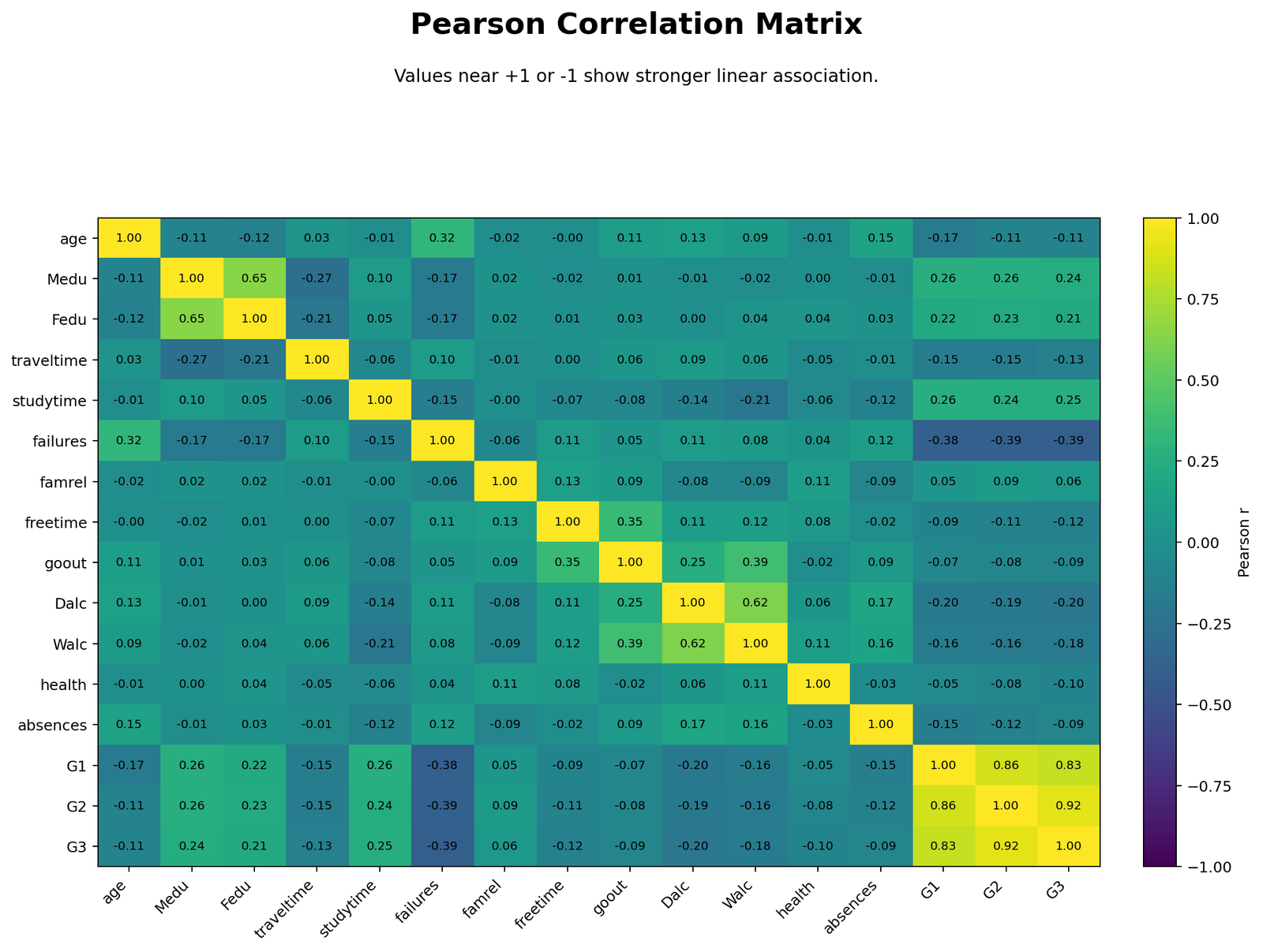
The Pearson correlation matrix heatmap shows all pairwise linear associations in one chart. The strongest positive block appears among G1, G2 and G3. This means the grade variables move together strongly across students.
The matrix also shows positive associations such as Medu–Fedu and Dalc–Walc. Medu–Fedu means mother education and father education are strongly related. Dalc–Walc means weekday and weekend alcohol consumption move together.
Negative cells show inverse linear relationships. The most important negative pattern for final grade is failures–G3, with r = -0.393316. Students with more past failures tend to have lower final grades.
Python Chart 2: Pearson p-value Heatmap
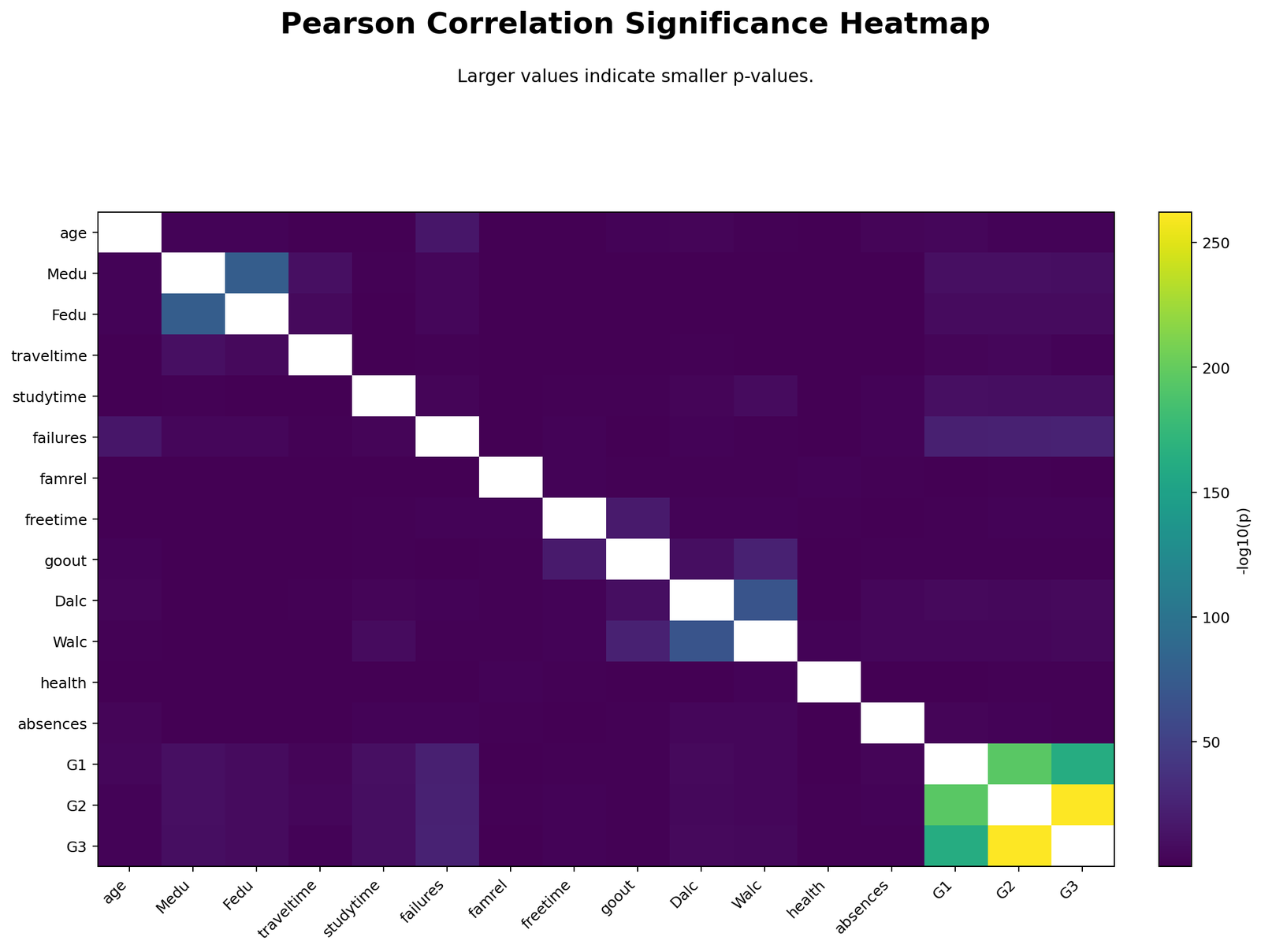
The p-value heatmap shows which correlations are statistically significant. Strong grade relationships have extremely small p-values. Many weaker relationships also become statistically significant because the sample size is large.
This chart should always be interpreted together with the coefficient matrix. The p-value tells whether the result is statistically detectable. The Pearson r value tells the strength and direction of the linear relationship. A small p-value does not automatically mean a strong correlation.
For example, some G3 correlations such as goout or absences may be statistically significant but practically small. The correct report should include both r and p-value.
Python Chart 3: Correlations with G3
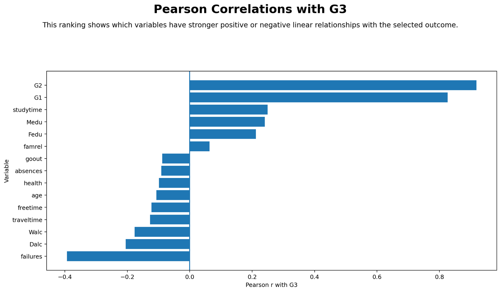
This chart focuses on the main outcome variable, G3. It shows that G2 has the strongest positive relationship with G3, followed by G1. These two grade variables dominate the G3 correlation pattern.
The strongest negative relationship with G3 is failures. This makes sense educationally because students with more past failures tend to have lower final grades.
Other variables, such as studytime, Medu, Fedu, Dalc and Walc, have weaker relationships with G3. They may be statistically meaningful, but they are much smaller than the grade-to-grade relationships.
Python Chart 4: Strongest Pair Scatterplot
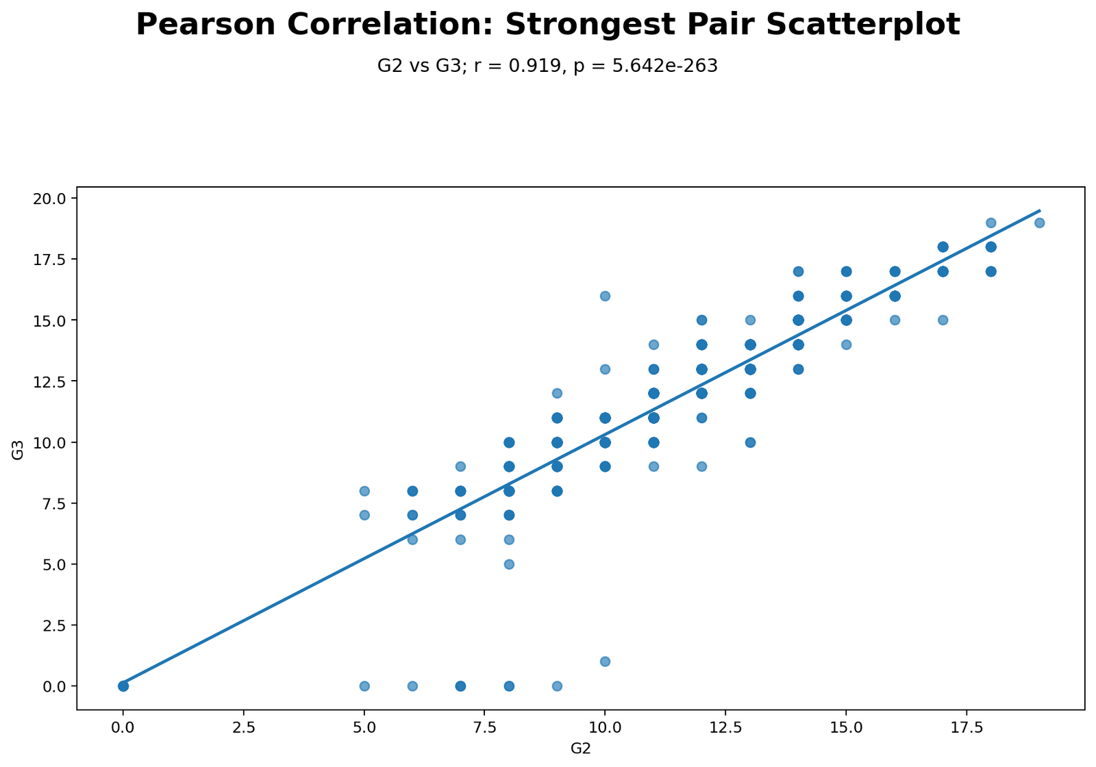
The strongest pair scatterplot shows the relationship between G2 and G3. The points form a tight upward pattern. This visual pattern matches the Pearson correlation coefficient r = 0.918548.
This chart is the best visual explanation of the main result. It shows that students with higher second-period grades usually have higher final grades. The cloud is not perfectly straight, but it is strongly linear and positive.
When reporting this chart, avoid causal wording. Do not say that G2 causes G3. A better statement is that G2 and G3 have a very strong positive linear association.
Python Chart 5: Outlier Context
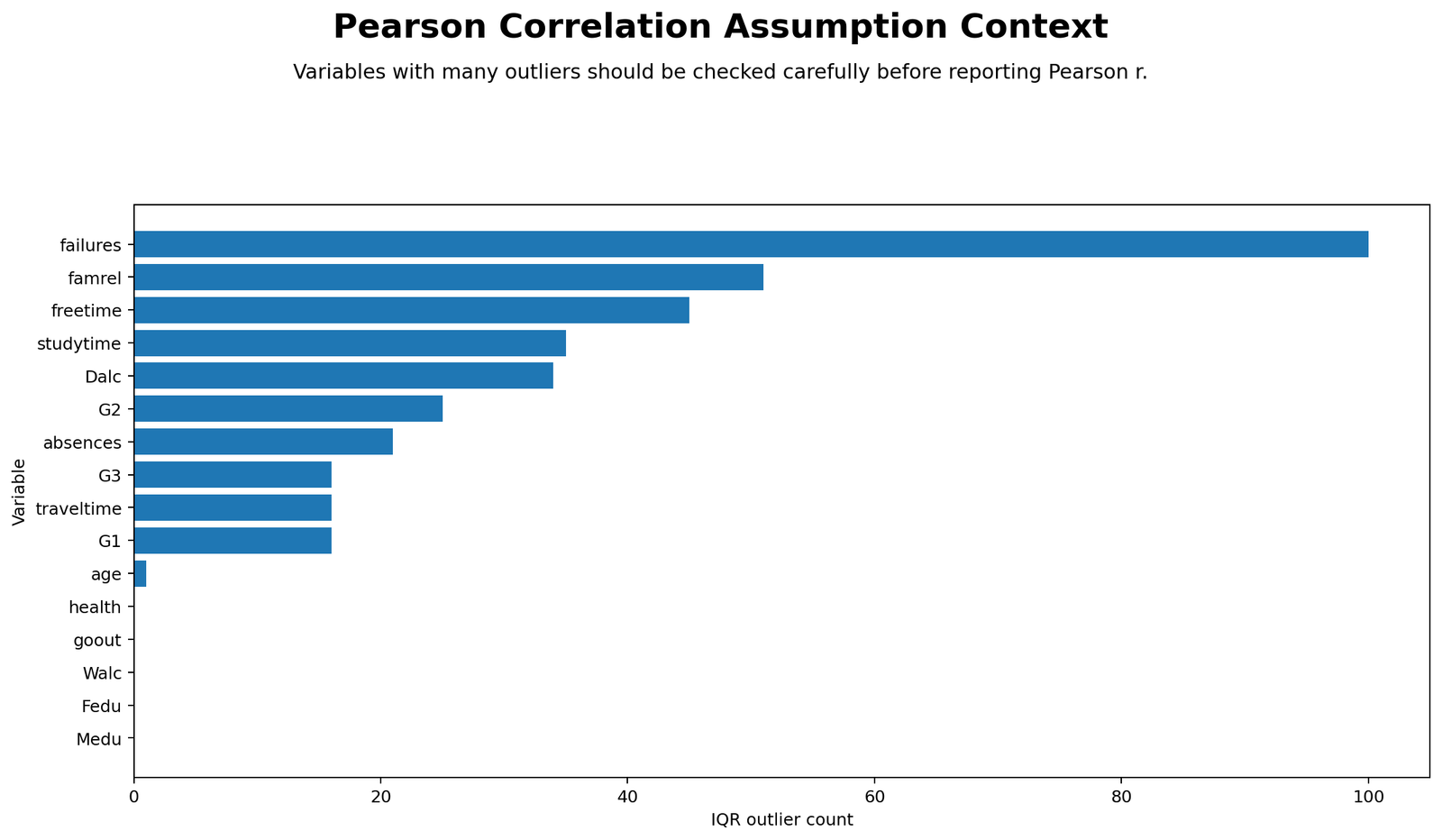
The outlier context chart is important because Pearson correlation can be sensitive to influential observations. Extreme points can inflate, weaken or reverse a correlation depending on where they appear in the scatterplot.
The workbook flags several variables for review, including failures, absences, G1, G2 and G3. This does not mean Pearson correlation is invalid. It means the results should be interpreted with scatterplots and diagnostics, not only with numeric r values.
For the strongest G2–G3 relationship, the correlation remains very high, but the outlier chart still supports responsible reporting. For variables such as absences and failures, outlier context is even more important because these distributions are skewed.
R Chart-by-Chart Interpretation
The R assets validate the same analysis with colorful charts. The R report includes a Pearson correlation matrix, correlations with G3, strongest pair scatterplot and outlier context chart.
R Chart 1: Colorful Pearson Correlation Matrix
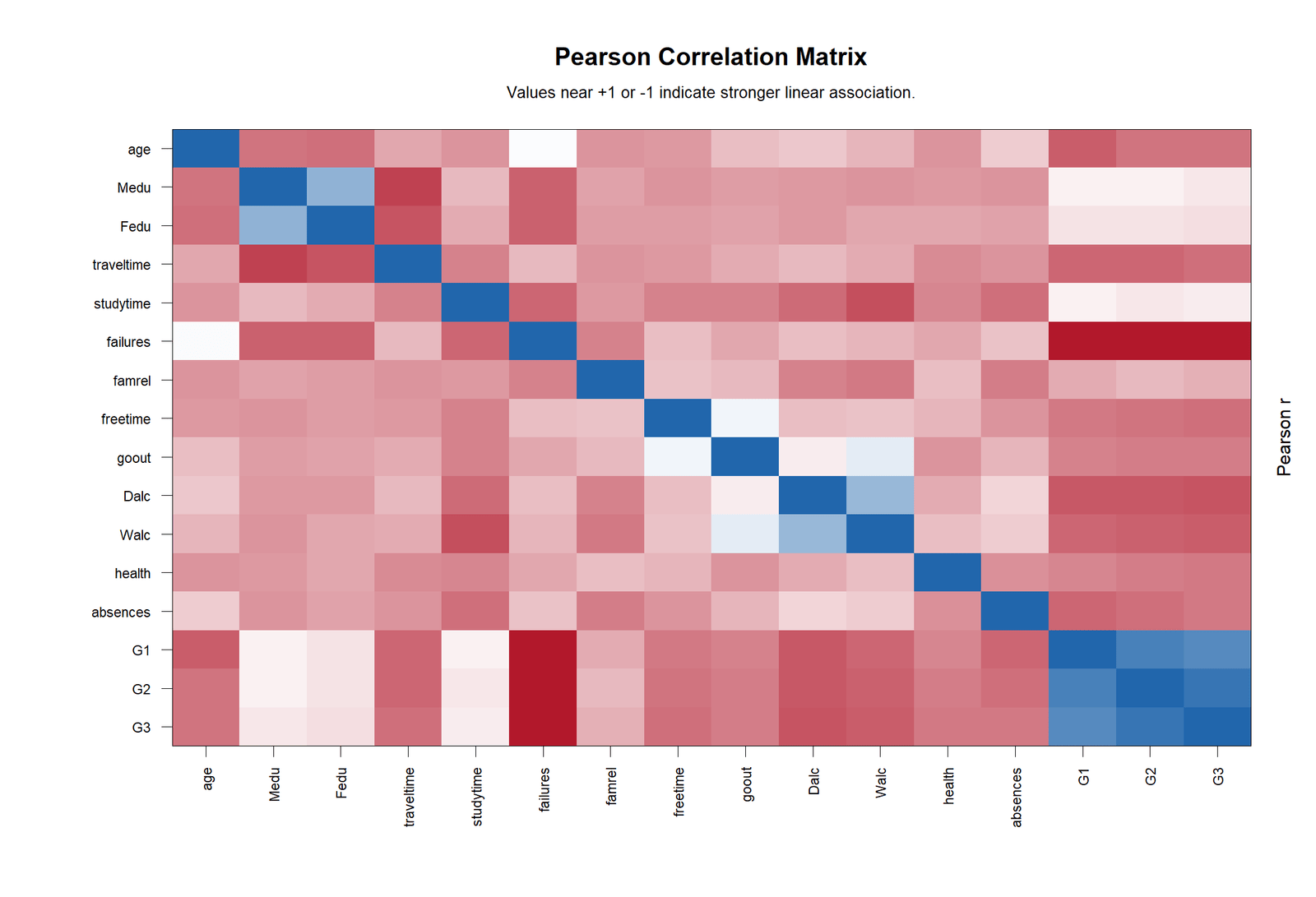
The R correlation matrix confirms the same overall structure as the Python heatmap. The grade variables form the strongest positive cluster. Medu and Fedu also show a strong positive relationship, and Dalc and Walc show a strong positive lifestyle relationship.
This chart is useful because it validates the matrix pattern in a second software environment. When Python, R and Excel show the same relationship structure, the result is more trustworthy for readers.
R Chart 2: Colorful Correlations with G3
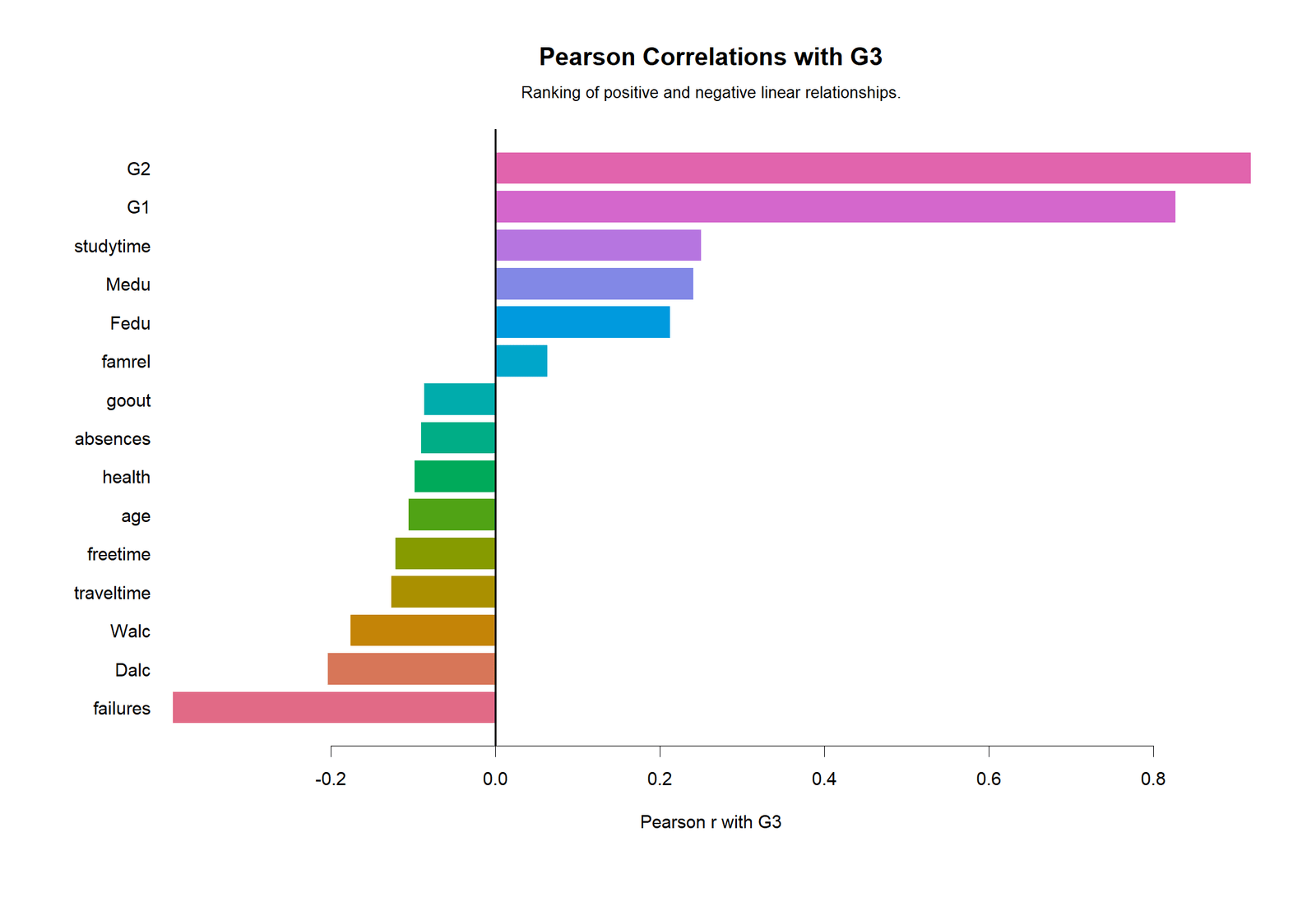
The R G3 chart confirms that G2 and G1 are the strongest positive correlates of final grade. Failures is the strongest negative correlate. Studytime, parent education and alcohol-use variables have weaker but interpretable relationships.
This chart is ideal for students writing a report because it narrows the full matrix down to the final-grade outcome. It shows which predictors or background variables are most associated with G3.
R Chart 3: Colorful Strongest Pair Scatterplot
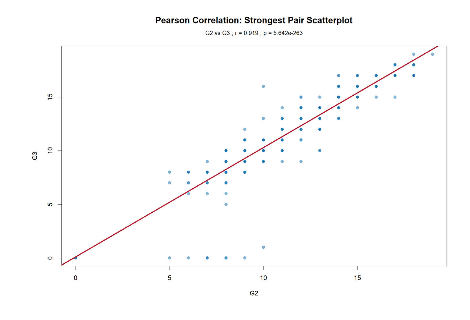
The R scatterplot again shows the tight upward relationship between G2 and G3. The pattern supports the very strong positive Pearson coefficient.
Scatterplots are essential for Pearson correlation because they show whether the relationship is approximately linear. A high r should be supported by a line-like cloud, and the G2–G3 chart provides that visual support.
R Chart 4: Colorful Outlier Context
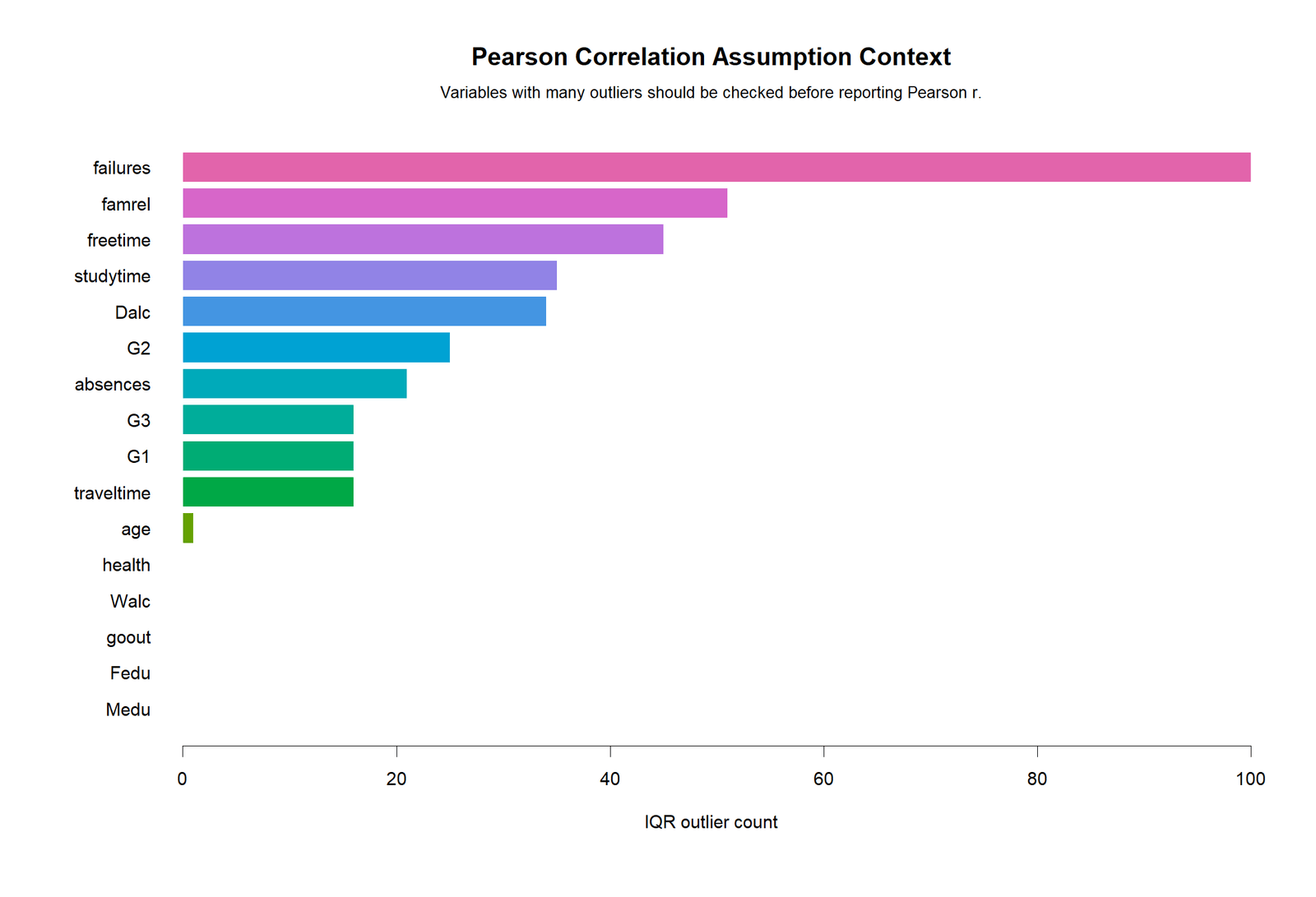
The R outlier context chart reinforces the same assumption check as the Python chart. Some variables contain skewness or possible influential values. This is expected in real educational data.
The correct conclusion is not to reject Pearson correlation automatically. The correct conclusion is to combine Pearson r with visual checks. If a relationship is driven by a small number of extreme observations, Spearman correlation, robust correlation or a regression diagnostic check may be useful.
SPSS Output and Workflow Interpretation
The SPSS output PDF is included in the resources. SPSS is commonly used for Pearson correlation because it produces a clean correlation table with coefficients, significance values and sample sizes.
Open the SPSS Pearson Correlation Output PDF
In SPSS, Pearson correlation is usually run through Analyze → Correlate → Bivariate. Select the numeric variables, choose Pearson, select two-tailed significance, and request means and standard deviations if needed.
| SPSS Step | Action | Purpose |
|---|---|---|
| 1 | Open the dataset in SPSS | Ensure variables such as G1, G2 and G3 are numeric. |
| 2 | Go to Analyze → Correlate → Bivariate | Open the bivariate correlation dialog. |
| 3 | Move selected variables into the Variables box | Include all numeric variables for the matrix. |
| 4 | Select Pearson | Requests Pearson product-moment correlation. |
| 5 | Select two-tailed significance | Tests whether r differs from zero. |
| 6 | Interpret coefficient, Sig. and N | Report r, p-value and sample size. |
For the strongest pair, SPSS should be interpreted as: G2 and G3 have a very strong positive Pearson correlation, r ≈ .919, p < .001, N = 649. When reporting SPSS output, always include whether the test is two-tailed and whether missing values were handled pairwise or listwise.
Excel Worked File Explanation
The Excel workbook is a fully worked Pearson Correlation analysis file. It contains raw data, selected variables, descriptive statistics, a Pearson correlation matrix, pairwise N, p-value matrix, confidence interval sheets, pairwise results, assumptions, formulas and a dashboard.
Download the Pearson Correlation Full Excel Analysis File
| Excel Sheet | Purpose | What It Teaches |
|---|---|---|
| README | Explains workbook structure and use. | Shows dataset rows, numeric variables and sheet purpose. |
| Data | Stores the original uploaded dataset. | Makes the analysis self-contained. |
| Variables | Lists selected numeric variables. | Shows which variables enter the Pearson matrix. |
| Descriptive_Stats | Summarizes variables and diagnostics. | Shows N, missing, mean, SD, skewness, kurtosis and outlier counts. |
| Pearson_Matrix | Formula-based Pearson r matrix. | Uses Excel CORREL for all variable pairs. |
| Pairwise_N | Counts paired numeric observations. | Checks sample size for each pair. |
| P_Values | Stores two-tailed p-values. | Uses t statistics and T.DIST.2T logic. |
| CI95_Lower | Lower confidence interval matrix. | Uses Fisher z transformation. |
| CI95_Upper | Upper confidence interval matrix. | Uses Fisher z transformation. |
| Pairwise_Results | One row per variable pair. | Provides r, r², t statistic, df, p-value, CI, decision and interpretation. |
| Assumptions | Assumption checklist. | Reviews numeric scale, linearity, outliers, normality and independence. |
| Formulas_Method | Formula documentation. | Explains CORREL, p-value, CI and r² formulas. |
| Dashboard | Summary and chart-ready values. | Highlights G3 correlations and strongest pair. |
Excel Formula Method
The workbook uses the following Excel formula logic:
| Item | Excel Formula / Method | Purpose |
|---|---|---|
| Pearson r | =CORREL(x_range,y_range) | Computes Pearson product-moment correlation coefficient. |
| Pairwise N | =SUMPRODUCT(--ISNUMBER(x_range),--ISNUMBER(y_range)) | Counts valid paired numeric observations. |
| t statistic | =r*SQRT((n-2)/(1-r^2)) | Test statistic for H0: r = 0. |
| Degrees of freedom | =n-2 | Degrees of freedom for Pearson correlation test. |
| Two-tailed p-value | =T.DIST.2T(ABS(t),df) | Two-tailed significance value. |
| Fisher lower CI | =TANH(ATANH(r)-NORM.S.INV(0.975)/SQRT(n-3)) | Lower 95% confidence limit for r. |
| Fisher upper CI | =TANH(ATANH(r)+NORM.S.INV(0.975)/SQRT(n-3)) | Upper 95% confidence limit for r. |
| Effect size | =r^2 | Shared variance between the two variables. |
The Excel dashboard is especially useful because it provides the final story quickly: 649 dataset rows, 16 numeric variables, 120 variable pairs, main outcome G3, strongest pair G2–G3 and the interpretation rule for coefficient strength.
Python, R, SPSS and Excel Workflows
Pearson Correlation can be calculated in all four tools. The same statistical result should appear if the same variables, missing-value rules and numeric coding are used.
| Software | Main Workflow | Best Use |
|---|---|---|
| Python | Use pandas for data preparation, scipy for Pearson r and p-values, and matplotlib for heatmaps and scatterplots. | Automated charts, reproducible analysis and blog asset generation. |
| R | Use cor(), cor.test(), pairwise loops and visualization tools for correlation matrices and scatterplots. | Statistical validation and colorful publication-style graphics. |
| SPSS | Use Analyze → Correlate → Bivariate, select Pearson, and request two-tailed significance. | Formal output table for research reports and student assignments. |
| Excel | Use CORREL, SUMPRODUCT, T.DIST.2T, Fisher z formulas and dashboard sheets. | Formula teaching, transparent workbook verification and manual reporting. |
For a complete Salar Cafe workflow, use Excel to verify the formulas, Python to generate the main blog charts, R to validate the outputs, and SPSS to provide the official-style statistical output PDF.
Code Blocks and Excel Formulas
Python Code for Pearson Correlation
import pandas as pd
from scipy import stats

df = pd.read_csv("dataset.csv")

x_var = "G2"
y_var = "G3"

work = df[[x_var, y_var]].dropna().copy()
work[x_var] = pd.to_numeric(work[x_var], errors="coerce")
work[y_var] = pd.to_numeric(work[y_var], errors="coerce")
work = work.dropna()

r, p_value = stats.pearsonr(work[x_var], work[y_var])
n = len(work)
dfree = n - 2
t_value = r * ((dfree / (1 - r**2)) ** 0.5)

print("Variable X:", x_var)
print("Variable Y:", y_var)
print("N:", n)
print("Pearson r:", r)
print("R squared:", r**2)
print("t statistic:", t_value)
print("df:", dfree)
print("p-value:", p_value)
Python Code for Pearson Correlation Matrix
import pandas as pd
from scipy import stats

df = pd.read_csv("dataset.csv")

vars_used = [
    "age", "Medu", "Fedu", "traveltime", "studytime", "failures",
    "famrel", "freetime", "goout", "Dalc", "Walc", "health",
    "absences", "G1", "G2", "G3"
]

data = df[vars_used].apply(pd.to_numeric, errors="coerce")

corr_matrix = data.corr(method="pearson")

p_matrix = pd.DataFrame(index=vars_used, columns=vars_used, dtype=float)
n_matrix = pd.DataFrame(index=vars_used, columns=vars_used, dtype=float)

for x in vars_used:
    for y in vars_used:
        pair = data[[x, y]].dropna()
        n_matrix.loc[x, y] = len(pair)
        if x == y:
            p_matrix.loc[x, y] = None
        else:
            r, p = stats.pearsonr(pair[x], pair[y])
            p_matrix.loc[x, y] = p

print(corr_matrix)
print(p_matrix)
R Code for Pearson Correlation
df <- read.csv("dataset.csv", stringsAsFactors = FALSE)

x_var <- "G2"
y_var <- "G3"

work <- na.omit(df[, c(x_var, y_var)])
work[[x_var]] <- as.numeric(work[[x_var]])
work[[y_var]] <- as.numeric(work[[y_var]])

test <- cor.test(work[[x_var]], work[[y_var]], method = "pearson")

print(test)

cat("N:", nrow(work), "\n")
cat("Pearson r:", unname(test$estimate), "\n")
cat("R squared:", unname(test$estimate)^2, "\n")
cat("p-value:", test$p.value, "\n")
R Code for Pearson Correlation Matrix
df <- read.csv("dataset.csv", stringsAsFactors = FALSE)

vars_used <- c(
  "age", "Medu", "Fedu", "traveltime", "studytime", "failures",
  "famrel", "freetime", "goout", "Dalc", "Walc", "health",
  "absences", "G1", "G2", "G3"
)

data <- df[vars_used]
data[] <- lapply(data, as.numeric)

corr_matrix <- cor(data, use = "pairwise.complete.obs", method = "pearson")

p_matrix <- matrix(NA, nrow = length(vars_used), ncol = length(vars_used))
rownames(p_matrix) <- vars_used
colnames(p_matrix) <- vars_used

for(i in seq_along(vars_used)){
  for(j in seq_along(vars_used)){
    if(i != j){
      pair <- na.omit(data[, c(vars_used[i], vars_used[j])])
      p_matrix[i, j] <- cor.test(pair[[1]], pair[[2]], method = "pearson")$p.value
    }
  }
}

print(corr_matrix)
print(p_matrix)
SPSS Syntax for Pearson Correlation
* Pearson Correlation in SPSS.
OUTPUT CLOSE ALL.
OUTPUT NEW NAME=Pearson_Correlation_Output.

DESCRIPTIVES VARIABLES=age Medu Fedu traveltime studytime failures famrel freetime goout Dalc Walc health absences G1 G2 G3
  /STATISTICS=MEAN STDDEV MIN MAX.

CORRELATIONS
  /VARIABLES=age Medu Fedu traveltime studytime failures famrel freetime goout Dalc Walc health absences G1 G2 G3
  /PRINT=TWOTAIL
  /MISSING=PAIRWISE.

GRAPH
  /SCATTERPLOT(BIVAR)=G2 WITH G3
  /TITLE='Strongest Pearson Correlation Pair: G2 with G3'.

OUTPUT EXPORT
  /CONTENTS EXPORT=VISIBLE
  /PDF DOCUMENTFILE='Pearson-Correlation-SPSS-Output.pdf'.
Excel Formula Patterns for Pearson Correlation
Assume:
X_range = G2 values
Y_range = G3 values

Pearson r:
=CORREL(X_range,Y_range)

R squared:
=r^2

Pairwise N:
=SUMPRODUCT(--ISNUMBER(X_range),--ISNUMBER(Y_range))

Degrees of freedom:
=N-2

t statistic:
=r*SQRT((N-2)/(1-r^2))

Two-tailed p-value:
=T.DIST.2T(ABS(t),N-2)

Fisher z:
=ATANH(r)

Standard error of z:
=1/SQRT(N-3)

95% CI lower:
=TANH(ATANH(r)-NORM.S.INV(0.975)/SQRT(N-3))

95% CI upper:
=TANH(ATANH(r)+NORM.S.INV(0.975)/SQRT(N-3))

Decision:
=IF(p_value<0.05,"Significant correlation","Not significant")
Pearson Correlation Assumptions
Pearson correlation is simple to calculate, but the interpretation depends on assumptions and data checks. The workbook includes an assumptions sheet covering numeric scale, linearity, outliers, approximate normality for inference and independence.
| Assumption | What It Means | Workbook Check | Decision Guide |
|---|---|---|---|
| Numeric scale variables | Pearson correlation is for quantitative variables. | Variables sheet lists numeric variables only. | Use numeric variables for r; use Spearman or Kendall for ordinal-heavy variables. |
| Linear relationship | The association should be approximately linear. | Dashboard and scatterplots show selected relationships. | If the pattern is curved, Pearson r may understate or misrepresent association. |
| No extreme influential outliers | Outliers can strongly distort Pearson r. | Descriptive_Stats uses IQR outlier counts. | Review scatterplots and consider robust or rank methods if outliers dominate. |
| Approximate normality for inference | Bivariate normality is ideal for p-values and confidence intervals. | Skewness and kurtosis are calculated. | Use graphs and sample-size context; do not rely on one number alone. |
| Independence of observations | Rows should represent independent students or observations. | Design assumption. | If rows are repeated or clustered, use a different model. |
For this dataset, Pearson correlation is appropriate for grade-to-grade relationships, especially G2–G3 and G1–G3. For variables with strong skewness or ordinal categories, Pearson r should be interpreted alongside scatterplots and possibly compared with rank-based measures.
How to Report Pearson Correlation
A complete Pearson correlation report should include the variables, sample size, coefficient, confidence interval if available, p-value, direction, strength and practical interpretation. It should also mention that correlation does not prove causation.
APA-style strongest-pair report: A Pearson product-moment correlation was computed to examine the linear association between G2 and G3. The relationship was very strong and positive, r(647) = .919, p < .001, N = 649. This indicates that students with higher second-period grades tended to have higher final grades. The shared variance was approximately 84.37%.
G3-focused report: G3 was most strongly correlated with G2, r = .919, and G1, r = .826. The strongest negative correlation with G3 was failures, r = -.393. This suggests that prior grade performance is the dominant correlate of final grade, while past failures have a moderate negative association.
Assumption-aware wording: Pearson correlation measures linear association. Scatterplots and outlier checks should be reviewed before final interpretation, especially for skewed or count-like variables such as failures and absences.
Common Mistakes in Pearson Correlation Interpretation
| Mistake | Why It Is a Problem | Better Practice |
|---|---|---|
| Claiming correlation proves causation | Pearson r is an association measure, not a causal test. | Use “associated with” instead of “causes.” |
| Reporting only p-value | p-value does not show strength or direction. | Report r, p-value and interpretation. |
| Ignoring scatterplots | Pearson r can hide nonlinear patterns or outliers. | Always inspect scatterplots. |
| Using Pearson for ordinal-only data without caution | Ordinal spacing may not be equal. | Consider Spearman or Kendall as comparison methods. |
| Ignoring outliers | A few extreme values can distort r. | Use outlier context charts and diagnostics. |
| Confusing r and r² | r shows direction and strength; r² shows shared variance. | Report both only when useful and explain the difference. |
| Calling a weak significant correlation strong | Large samples can make small r values significant. | Use effect-size labels based on r magnitude. |
| Comparing correlations without context | Different variables can have different distributions and outlier patterns. | Use charts and assumptions before ranking importance. |
Downloads and Resources
Download R Report PDFR validation report with colorful Pearson correlation charts.
Download SPSS Output PDFSPSS output file for Pearson bivariate correlations.
Download Excel Worked FileFully worked Excel file with formulas, matrix, p-values, confidence intervals and dashboard.
Open Python Correlation MatrixMain Pearson r heatmap for all selected variables.
Open Python Strongest Pair ScatterplotG2 and G3 scatterplot showing the strongest relationship.
External References
For additional learning, review documentation and textbooks on Pearson product-moment correlation, Fisher z confidence intervals, bivariate correlation testing, correlation matrices, scatterplot interpretation and outlier diagnostics.
FAQs About Pearson Correlation
What is Pearson Correlation?
Pearson Correlation measures the strength and direction of a linear relationship between two quantitative variables. It is reported as r, ranging from -1 to +1.
What was the strongest Pearson correlation in this guide?
The strongest pair was G2 and G3, with Pearson r = 0.918548. This is a very strong positive linear association.
What does r = 0.918548 mean?
It means G2 and G3 move together very strongly in a positive linear direction. Students with higher G2 scores tend to have higher G3 scores.
What is the difference between r and r squared?
r shows direction and strength of linear association. r squared shows the proportion of shared linear variance. For G2–G3, r² is about 0.8437, or 84.37%.
Which variable has the strongest negative correlation with G3?
Failures has the strongest negative correlation with G3, r = -0.393316. This means more failures are associated with lower final grades.
Can Pearson correlation prove causation?
No. Pearson correlation measures association only. It does not prove that one variable causes another.
Can Excel calculate Pearson correlation?
Yes. Excel can calculate Pearson correlation with CORREL. The uploaded workbook also uses formulas for p-values, confidence intervals, pairwise N and r squared.
Can SPSS calculate Pearson correlation?
Yes. In SPSS, use Analyze → Correlate → Bivariate, select Pearson, and choose two-tailed significance.
What should I report in APA style?
You can write: “A Pearson correlation showed a very strong positive relationship between G2 and G3, r(647) = .919, p < .001, N = 649.”
When should I avoid Pearson correlation?
Use caution when the relationship is nonlinear, variables are purely ordinal, observations are not independent, or extreme outliers dominate the result. In those cases, consider scatterplots, Spearman correlation, Kendall correlation or regression diagnostics.

