
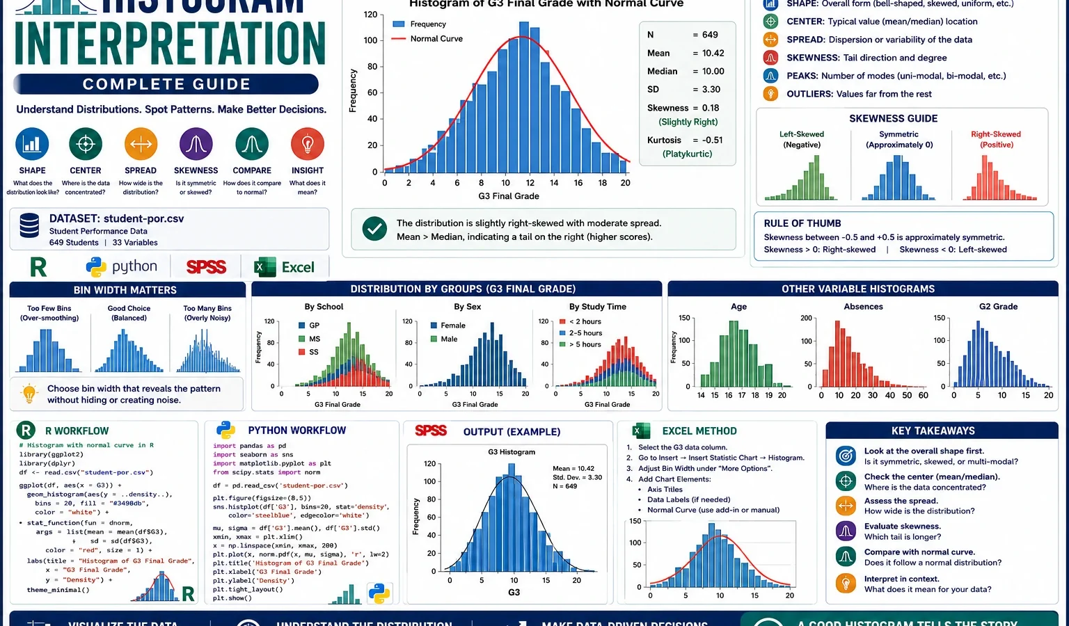
Descriptive Statistics Guide
Histogram Interpretation explains the shape, center, spread, skewness, peaks, gaps, unusual values and bin-width behavior of a numeric variable. This complete guide uses student performance data to interpret G3 final grade, G1, G2, absences, age, school groups, sex groups and study-time groups with detailed R charts, Python charts, SPSS syntax, SPSS output logic and Excel workflow.
Quick Answer: Histogram Interpretation Result
A Histogram Interpretation analysis was used to examine the distribution shape of major numeric variables in the student performance dataset. The main outcome was G3 final grade. The G3 histogram shows a middle-centered distribution, mean approximately 11.91, median 12, standard deviation approximately 3.23, minimum 0 and maximum 19. The distribution is not perfectly normal because a visible low-score tail remains.
Main finding: The G3 final-grade histogram is centered around the middle of the grading scale. The mean and median are very close, but the low-score tail means the distribution should be described as approximately middle-centered rather than perfectly normal. Absences show a much stronger right-skew pattern, so absences require median, quartiles and grouped-frequency interpretation.
Important interpretation note: A histogram does not prove normality. It is a visual first step. Use it with Q-Q plots, P-P plots, Kolmogorov-Smirnov tests, Lilliefors tests, D’Agostino-Pearson tests or Ryan-Joiner tests when formal distribution checking is required.
Table of Contents
- What Is Histogram Interpretation?
- Why Histogram Interpretation Is Needed Before Tests
- Histogram Formulas and Logic
- Dataset and Variables Used
- Verified Histogram Interpretation Results
- Chart-by-Chart Interpretation
- R Code for Histogram Interpretation
- Python Code for Histogram Interpretation
- SPSS Syntax and Interpretation
- Excel Method
- Download Output and Resources
- APA Style Reporting
- When Should You Use Histogram Interpretation?
- References and Related Guides
- FAQs
What Is Histogram Interpretation?
Histogram Interpretation is the process of reading a histogram to explain how a numeric variable is distributed. A histogram divides a numeric scale into intervals called bins and counts how many observations fall inside each bin. The height of each bar shows frequency.
A good histogram explanation includes shape, center, spread, skewness, possible outliers, gaps, peaks and bin width. It also explains what the shape means for the next analysis step. For example, a roughly bell-shaped histogram may support parametric thinking, while a strongly skewed histogram may suggest median-based reporting, grouped summaries or transformations.
In this guide, the main variable is G3 final grade. The histogram is also compared across G1, G2, school, sex and study-time groups. This makes the guide more complete than a simple one-chart explanation because it shows how histogram interpretation changes when the same outcome is examined by subgroup.
Simple meaning: Histogram interpretation tells where the data are concentrated, whether the values are balanced or skewed, how wide the distribution is, and whether unusual values or tails could affect later analysis.
Why Histogram Interpretation Is Needed Before Tests
Histogram interpretation should come before many statistical tests because it shows the actual shape of the data. A p-value or test statistic does not tell the reader whether the raw data are skewed, bounded, clustered, gapped or affected by unusual values. A histogram makes those patterns visible.
For example, before using a one-sample z-test, one-tailed t-test or confidence interval, it is useful to know whether the outcome is roughly centered or strongly skewed. Before comparing groups, it is useful to inspect subgroup histograms and then continue with assumption checks such as Levene Test or Brown-Forsythe Test where appropriate.
| Question | Histogram answers | Next analysis step |
|---|---|---|
| Where are most observations located? | Shows the central cluster and peak area. | Report mean, median and main score range. |
| Is the variable skewed? | Shows whether the tail stretches left or right. | Use median, quartiles, transformation or robust method if needed. |
| Does the distribution look approximately normal? | Gives a visual screening only. | Use Q-Q plots, P-P plots and formal normality tests. |
| Do subgroups look different? | Displays distribution shape by school, sex or study time. | Use group tests and effect sizes if needed. |
| Does bin width affect the story? | Shows whether conclusions remain stable with different bins. | Report stable patterns, not minor bar noise. |
Histogram Formulas and Logic
Histogram formulas are simple, but interpretation requires care. The most important point is that a histogram is based on counts inside bins. If bin width changes, the visual details can change, so the final explanation should focus on stable distribution patterns.
Histogram frequency:
f_j = number of observations inside bin j

Relative frequency:
relative frequency_j = f_j / n

Percentage:
percentage_j = (f_j / n) × 100

Density:
density_j = f_j / (n × bin width)

Mean:
mean = sum(x) / n

Median:
median = middle ordered value

Basic skewness idea:
negative skew = left tail
positive skew = right tail

Interpretation checklist:
shape, center, spread, skewness, peaks, gaps, tails, outliers and bin width
Bin warning: A histogram can look different when bin width changes. Do not over-interpret one small bar. A strong interpretation should remain true across reasonable bin choices.
Dataset and Variables Used
This guide uses the student performance dataset with 649 rows. The main numeric outcome is G3, which represents final grade. The analysis also uses G1, G2, age and absences as numeric variables, plus school, sex and studytime as grouping variables for subgroup histograms.
| Item | Variable | Role in this histogram guide |
|---|---|---|
| Final grade | G3 | Main histogram variable for shape, center, spread, skewness and normal-curve comparison. |
| Earlier grades | G1 and G2 | Used to compare score distributions across first-period, second-period and final grades. |
| Absences | absences | Used to demonstrate strong right skew and tail interpretation. |
| Age | age | Used to describe the sample-age concentration. |
| School group | school | Used to compare G3 shape between GP and MS. |
| Sex group | sex | Used to compare G3 shape between female and male students. |
| Study-time group | studytime | Used to compare G3 shape across weekly study-time categories. |
External dataset source: UCI Machine Learning Repository: Student Performance dataset.
Verified Histogram Interpretation Results
The R and Python charts agree on the main descriptive pattern. G3 final grade is centered close to 12, with mean around 11.91, median 12, standard deviation around 3.23, minimum 0 and maximum 19. The G3 distribution is not perfectly normal because of low-score values and a visible tail. Absences show stronger right skew than the grade variables.
| Variable or chart | Main pattern | Interpretation |
|---|---|---|
| G3 final grade | Mean ≈ 11.91, median = 12, SD ≈ 3.23 | Middle-centered distribution with low-score tail. |
| G1, G2 and G3 comparison | All grade variables cluster in the middle range | Grade distributions are broadly similar but not identical. |
| G3 normal curve overlay | Bell-like center but imperfect fit | Use formal normality checks before claiming normality. |
| Absences | Strong right skew | Median and grouped summaries are important. |
| Age | Narrow school-age concentration | Sample is age-concentrated, mostly around 16 to 18. |
| Subgroup histograms | School, sex and study-time panels show shape differences | Group comparisons should consider sample size, spread and tail behavior. |
| Bin-width comparison | Visual detail changes with bins | Interpret stable patterns, not arbitrary bar changes. |
These results make histogram interpretation a natural first step before advanced procedures. If the next question is distribution fit, use Cramer-von Mises Test, D’Agostino-Pearson Test or Q-Q Plot Normality Check Guide. If the next question is practical group difference, use Effect Size.
Chart-by-Chart Interpretation of the Histogram Analysis
This section follows the same attached-format style: each chart has a Python figure, an R figure, a specific interpretation and a decision statement. The purpose is not only to display images but to explain what each chart proves, what it does not prove and what the next statistical step should be.
Chart 1: G3 Final Grade Histogram with Mean and Median
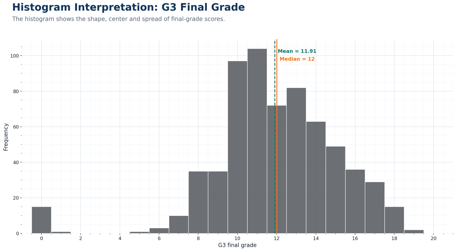
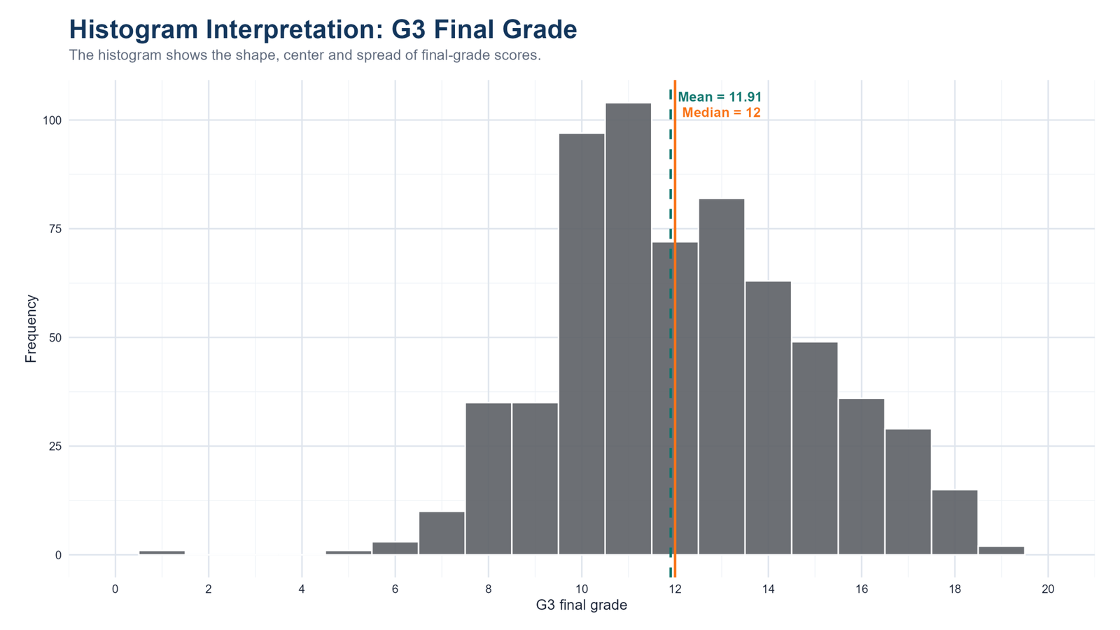
Specific interpretation: The G3 final-grade histogram is the central figure for this guide. It shows that most final grades are concentrated in the middle of the 0 to 20 score scale. The mean is about 11.91 and the median is 12, so the center is stable and easy to explain. When the mean and median are close, the usual interpretation is that the middle of the distribution is not being pulled dramatically by extreme values. However, the chart also shows a low-score tail, including very low or zero scores, so the shape is not perfectly symmetric.
Decision from Chart 1: The practical decision from this chart is that G3 should be described as a middle-centered distribution with a visible left-side tail. In a report, do not write only the mean. Pair the mean with the median, spread and shape. This is exactly why histogram reading should be used beside descriptive statistics, five-number summary and box plot interpretation.
Chart 2: G1, G2 and G3 Histogram Comparison
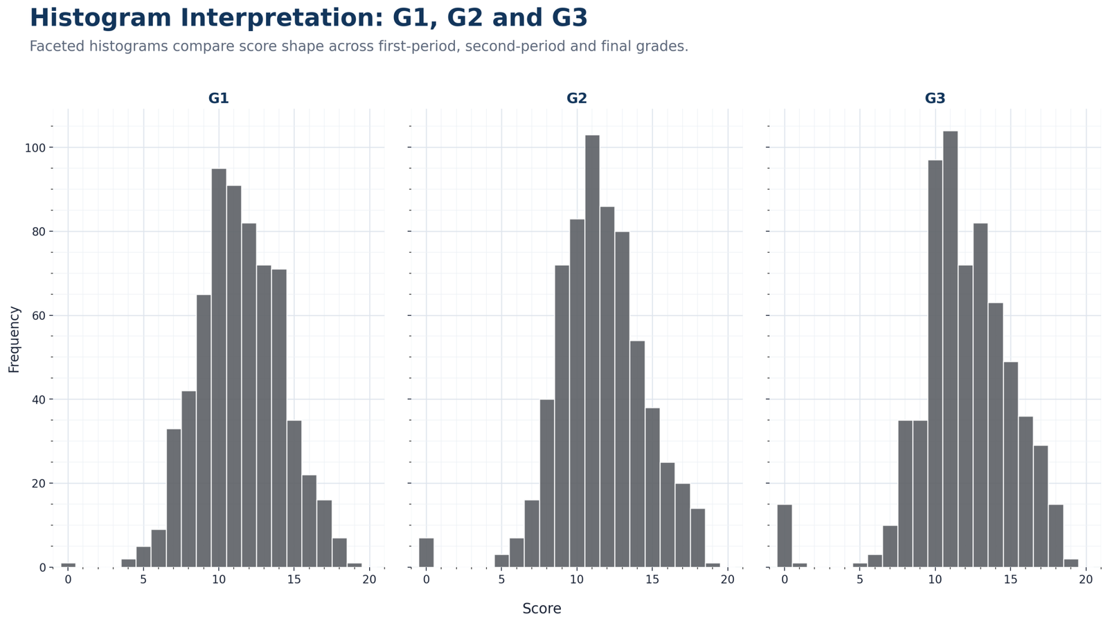
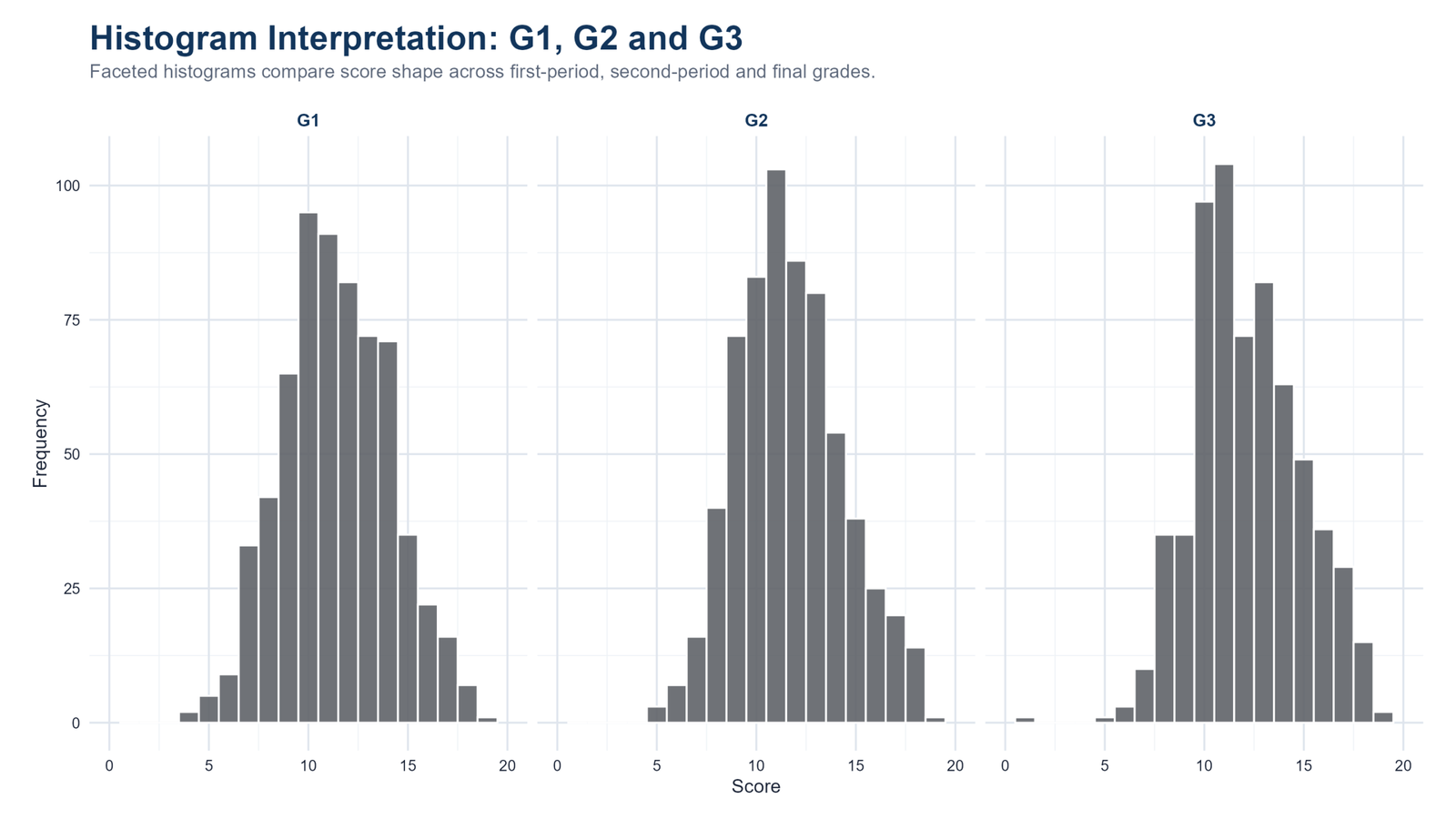
Specific interpretation: This chart compares first-period grades, second-period grades and final grades. The three panels show that all grade variables are concentrated in the middle score range, but the shapes are not identical. G1, G2 and G3 each have their own peak height, tail behavior and spread. This matters because a table of means alone can make the three grade variables look more similar than they really are.
Decision from Chart 2: The decision from this chart is that grade development should be treated as a sequence, not as one repeated identical variable. G2 and G3 look especially connected, which supports later correlation or regression work. If the goal is to move from visual description to practical strength, the next logical guide is effect size; if the goal is uncertainty around averages, use a confidence interval.
Chart 3: G3 Histogram with Normal Curve
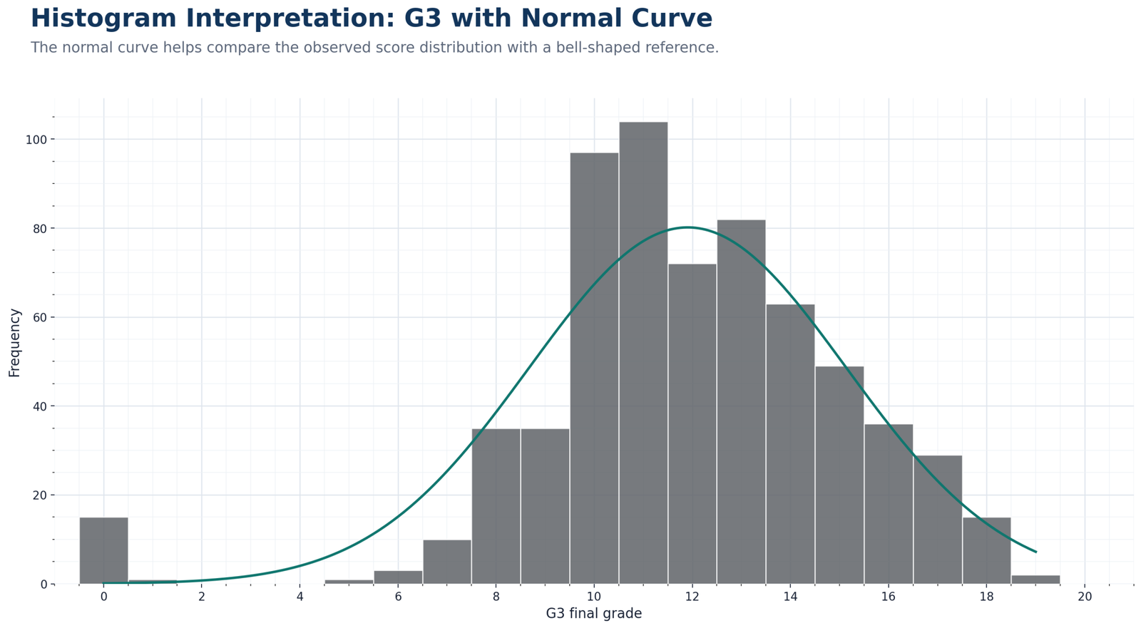
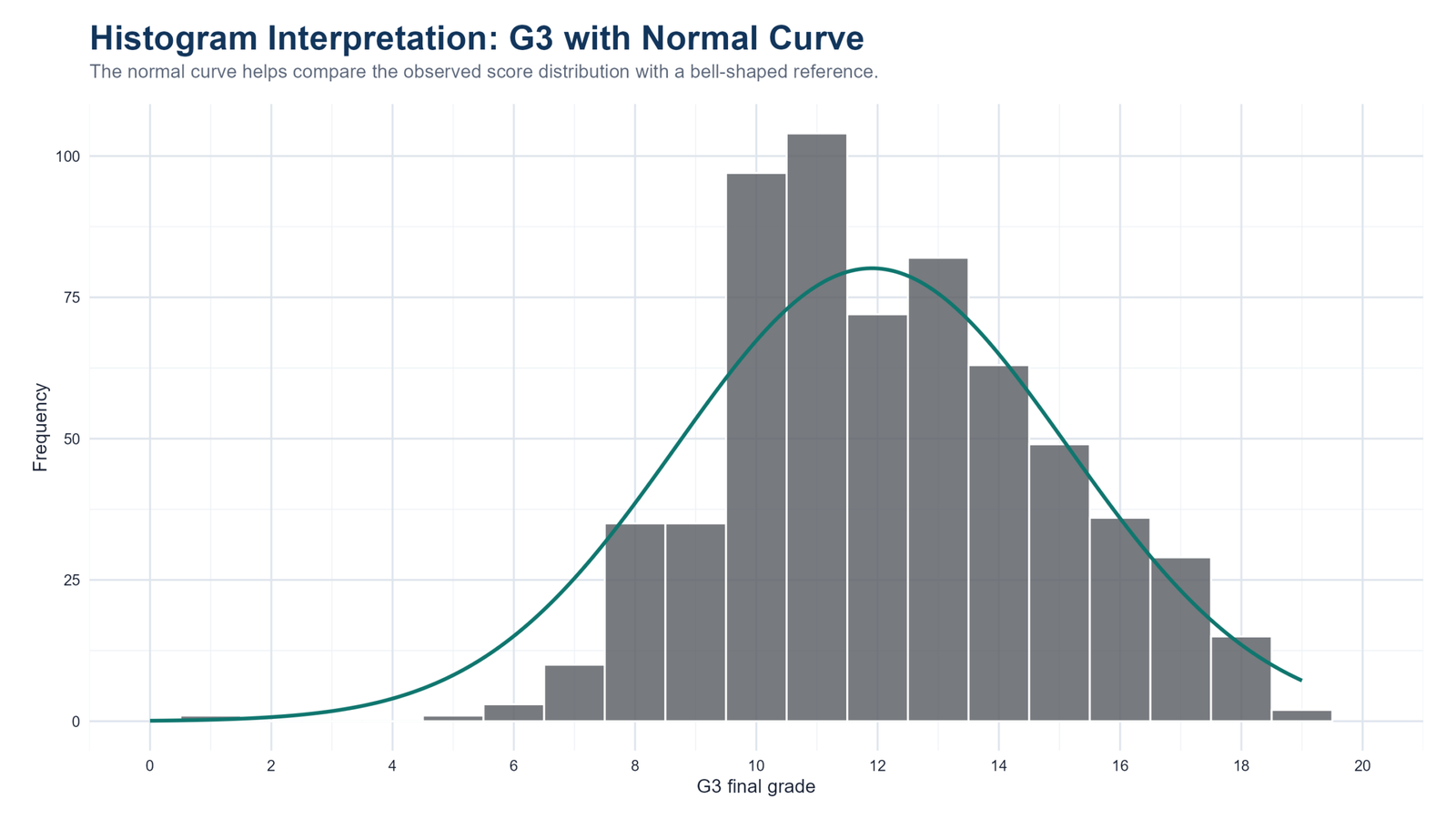
Specific interpretation: The normal-curve overlay helps compare the observed G3 distribution with a bell-shaped reference. The center of the histogram is reasonably close to the normal curve, which is why a quick visual check may suggest approximate normality. But the fit is not perfect. The low-score tail, the bounded grade scale and the uneven bar heights show that the observed distribution is not a perfect normal distribution.
Decision from Chart 3: The decision from this chart is to treat the histogram as an initial diagnostic, not as final proof of normality. For formal normality checking, continue with a Q-Q plot normality check, P-P plot normality check, Kolmogorov-Smirnov test, Lilliefors test, D’Agostino-Pearson test or Ryan-Joiner test.
Chart 4: Absences Histogram and Skewness
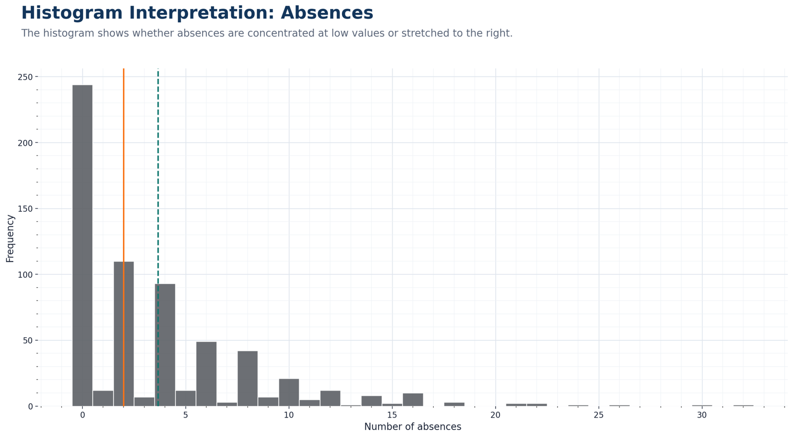
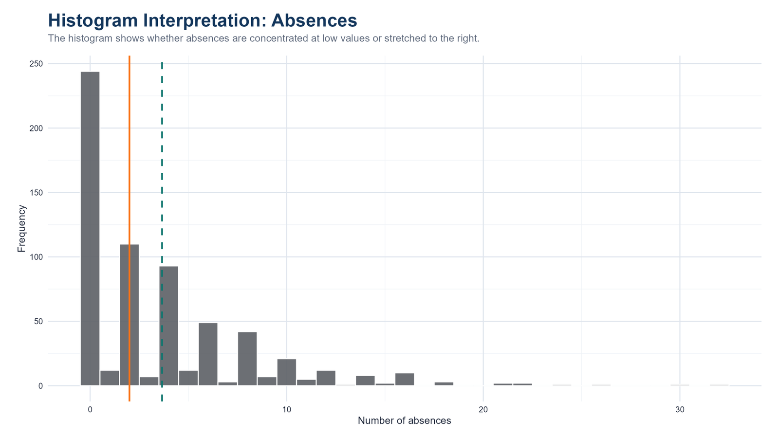
Specific interpretation: The absences histogram is very different from the G3 histogram. Most students have zero or low absence counts, while a smaller number of students have much higher absence values. This creates a strong right-skewed distribution. In a right-skewed histogram, the tallest bars are usually near the lower end of the scale and the tail stretches to the right.
Decision from Chart 4: The decision from this chart is that absences should not be summarized by the mean alone. The median, quartiles and grouped frequency categories are more meaningful for explaining the typical student. If a later model needs a less skewed predictor, transformation guides such as reciprocal transformation may become useful. This chart also supports checking spread with the coefficient of variation.
Chart 5: Age Distribution Histogram
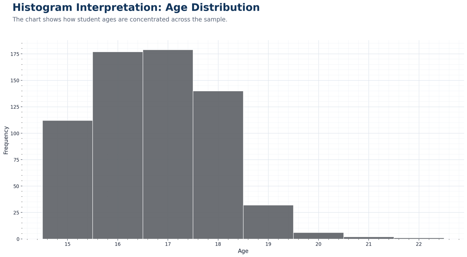
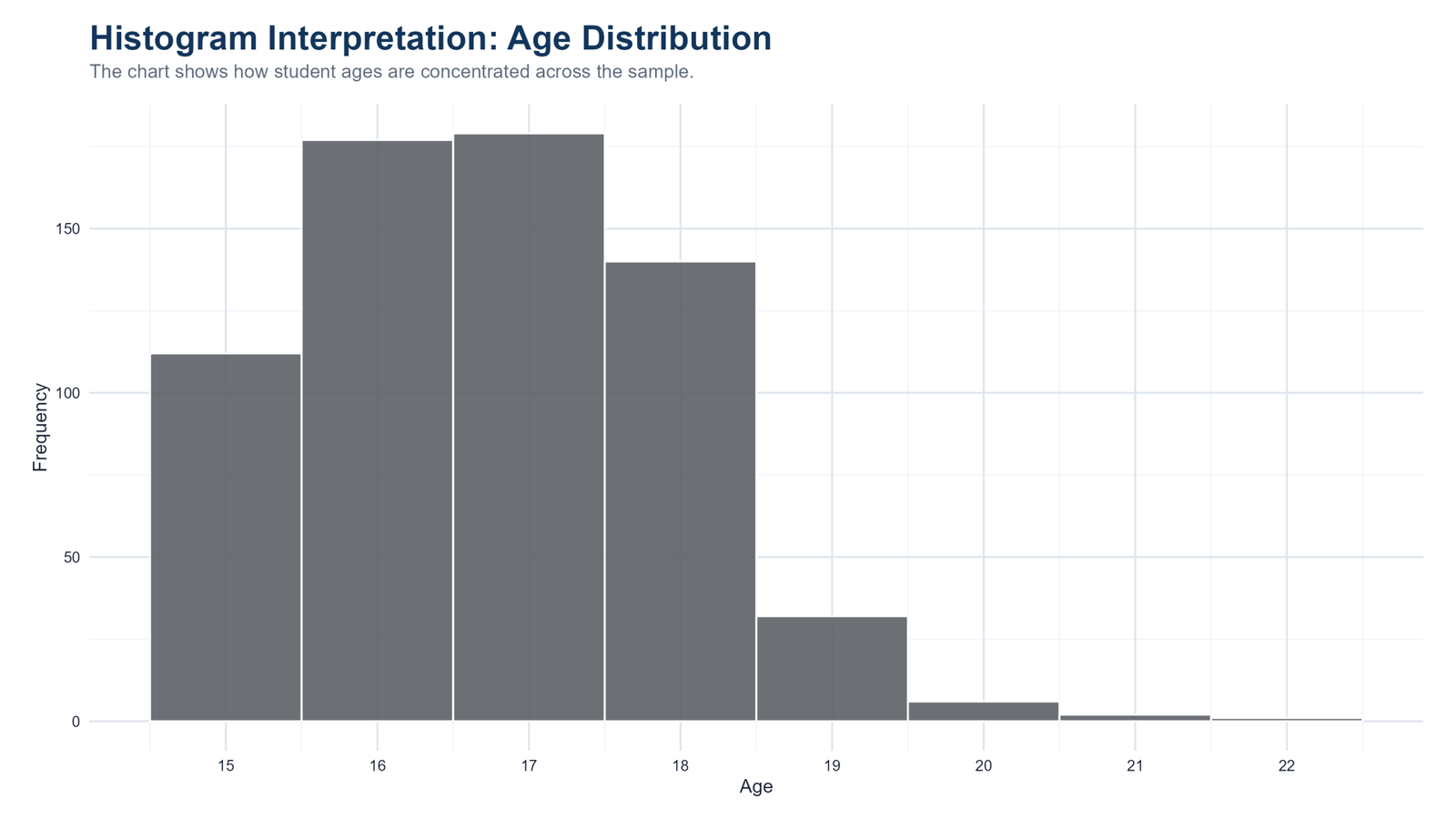
Specific interpretation: The age histogram shows a narrow distribution. Most students are concentrated around ages 16, 17 and 18, with very few older cases. This is expected in a school dataset, but it is still important to show visually because it confirms that the sample is not spread evenly across a wide age range.
Decision from Chart 5: The decision from this chart is that age is mainly a sample-description variable in this workflow. It provides context for the dataset but does not show the same distributional complexity as absences. In a descriptive post, this chart belongs beside frequency distribution tables because it tells readers who is represented in the data.
Chart 6: G3 Histogram by School
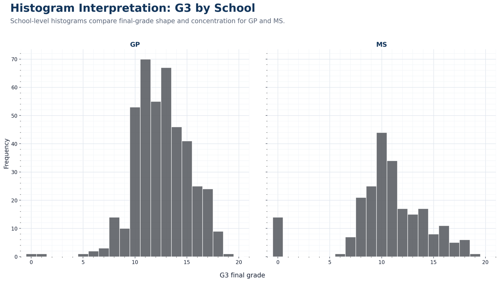
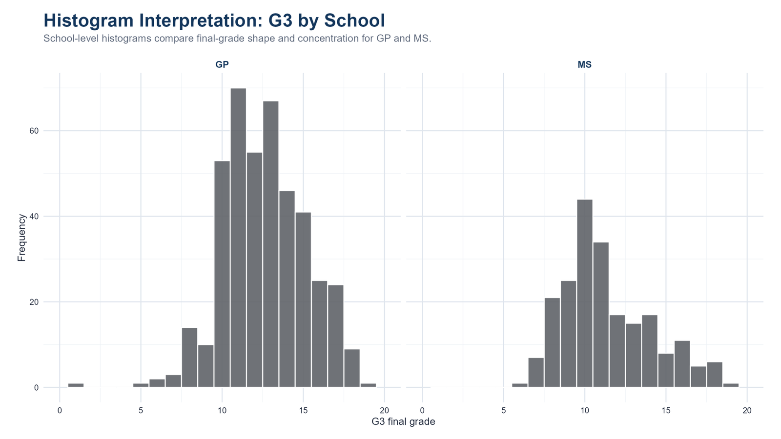
Specific interpretation: The school-level histogram splits the final-grade distribution into GP and MS groups. This matters because a single overall histogram can hide subgroup patterns. The GP panel has more observations and a more stable-looking middle concentration. The MS panel has fewer observations and a different shape, making the school comparison visually meaningful before formal testing.
Decision from Chart 6: The decision from this chart is that school should be considered a relevant grouping factor for G3 interpretation. If the next step is a formal group comparison, variance checks such as Levene Test, Brown-Forsythe Test or Cochran C Test can support the choice of test. For categorical school summaries, use cross tabulation.
Chart 7: G3 Histogram by Sex
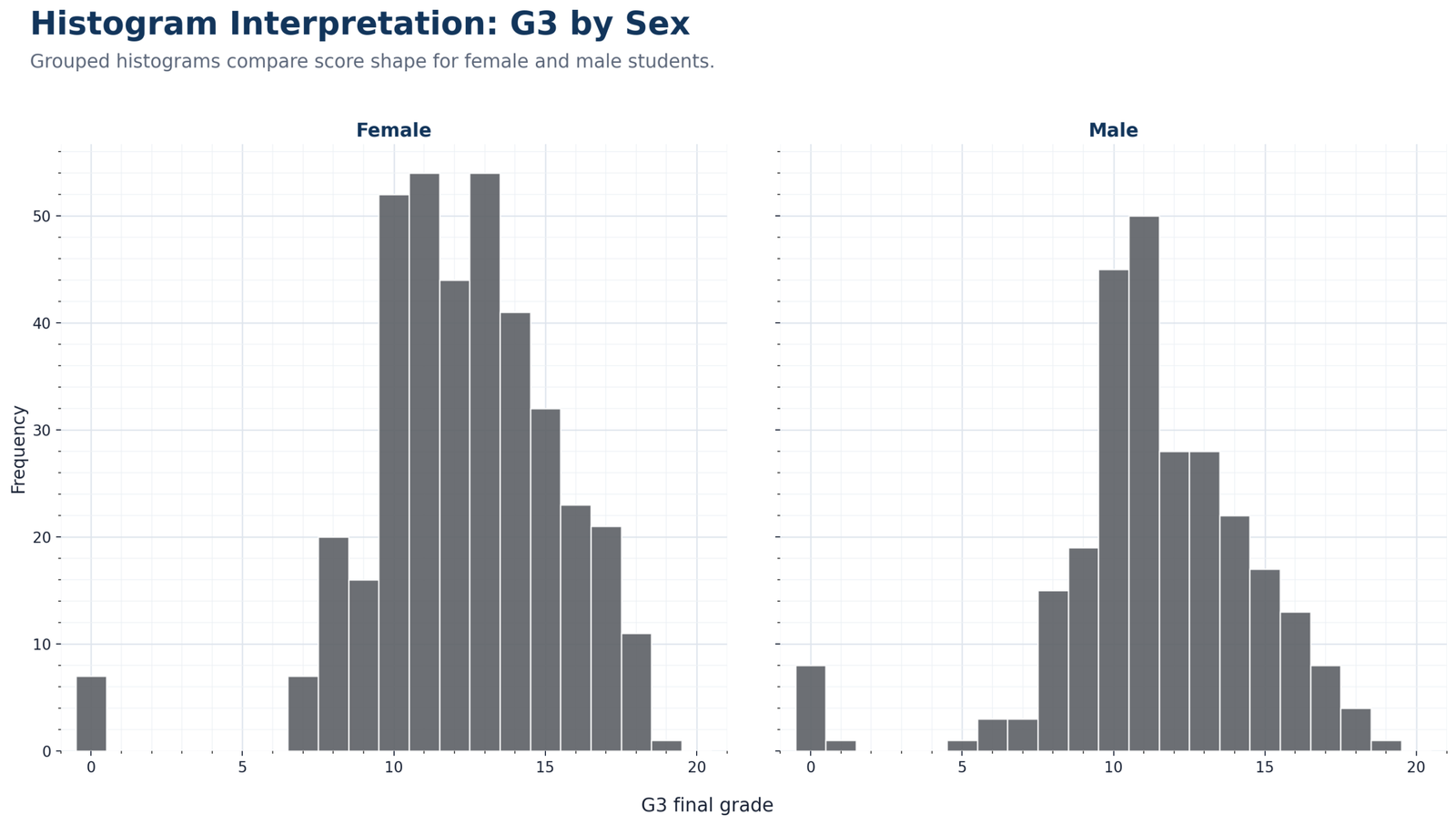
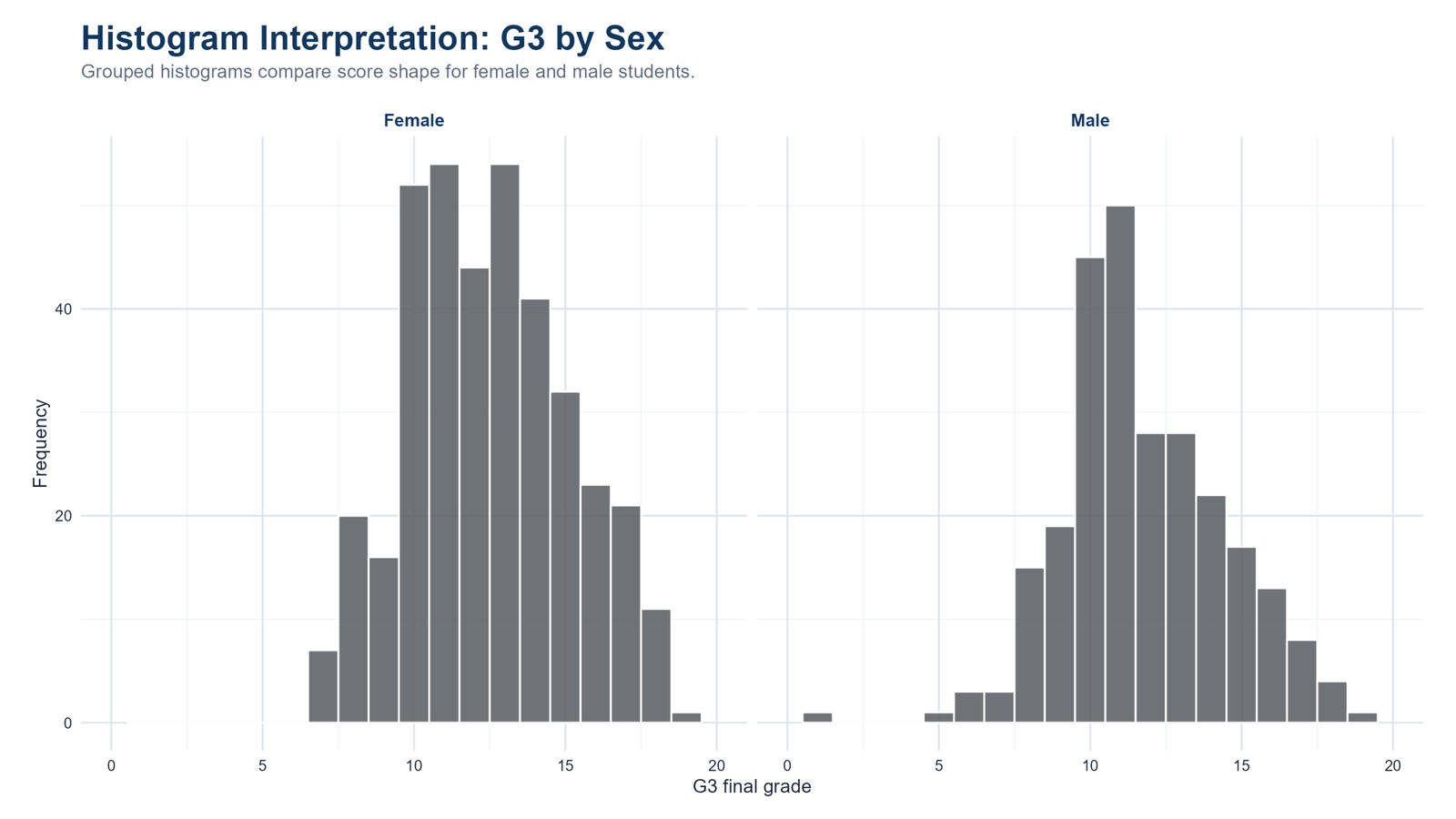
Specific interpretation: The sex-based histogram compares female and male G3 distributions. Both groups remain centered in the middle score range, but the panel view helps show differences in sample size, peak height, spread and tail behavior. It also prevents a common mistake: readers should not interpret taller bars as better performance without considering how many students are in each group.
Decision from Chart 7: The decision from this chart is to describe sex-group differences carefully and visually before making any inferential claim. If a later test is used, the post should report both significance and practical magnitude. That is where effect size becomes important, because it tells whether a visible difference is practically large or small.
Chart 8: G3 Histogram by Study Time
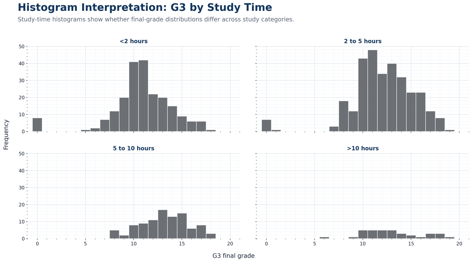
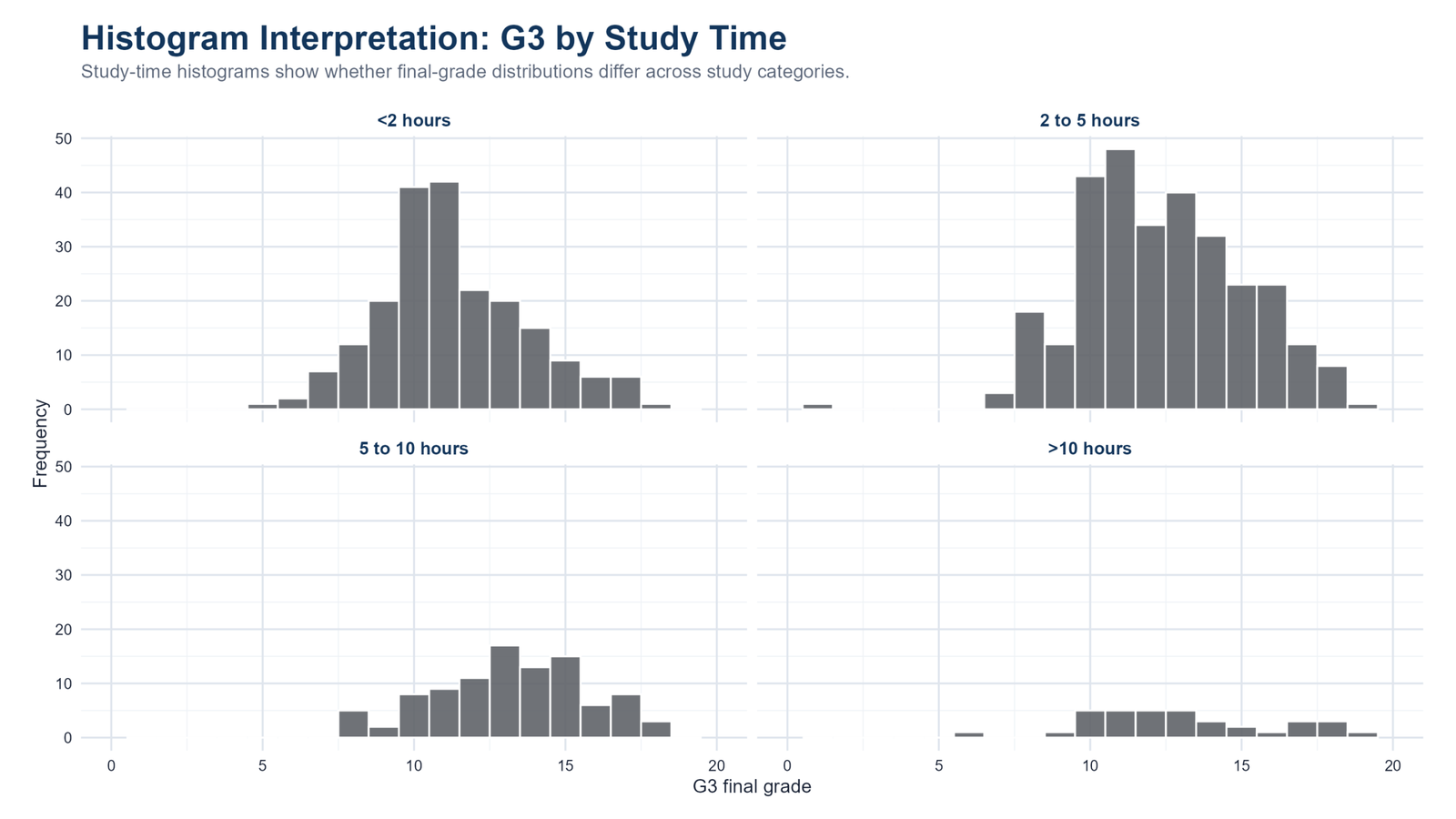
Specific interpretation: The study-time histogram compares final-grade shape across weekly study-time categories. Larger study-time categories show clearer distributions because they contain more students. Smaller categories, especially the highest study-time group, naturally look more irregular because fewer observations are available. This is a sample-size issue, not necessarily a meaningful educational pattern.
Decision from Chart 8: The decision from this chart is that study-time groups should be interpreted with both distribution shape and group size in mind. The histogram helps decide whether group comparison is worth exploring, but it should be followed by descriptive tables, confidence intervals or group tests before making strong conclusions.
Chart 9: Major Numeric Variables Histogram Panel
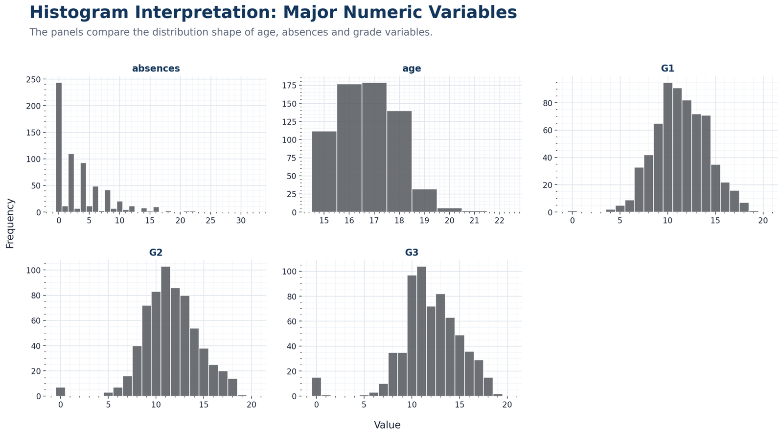
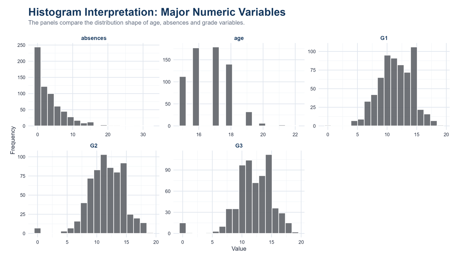
Specific interpretation: This panel is one of the most useful charts because it places several numeric variables side by side. Absences is strongly right-skewed, age is tightly concentrated, and grade variables sit mostly in the middle of a bounded score scale. Seeing these shapes together prevents the analyst from treating all numeric variables as if they behave the same way.
Decision from Chart 9: The decision from this chart is that analysis should be variable-specific. Grade variables may support approximate normality discussion, absences requires skewness-aware reporting, and age is mostly a compact demographic descriptor. This is the type of visual screening that should come before one-sample z-test, one-tailed t-test or regression diagnostics such as the Ramsey RESET test.
Chart 10: G3 Bin-Width Comparison
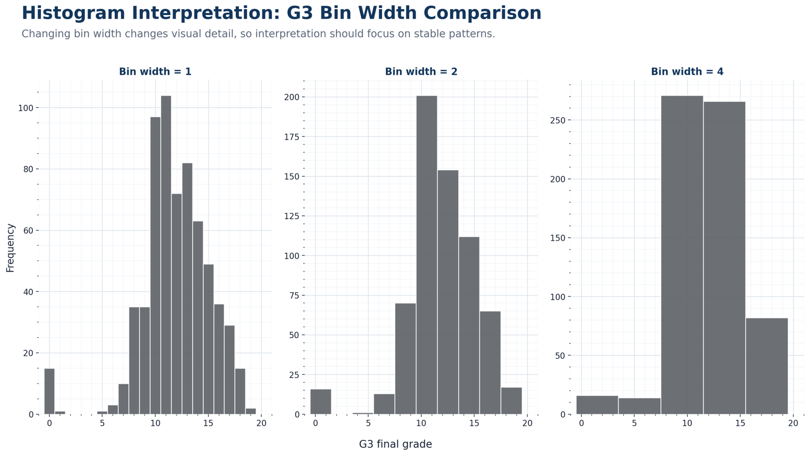
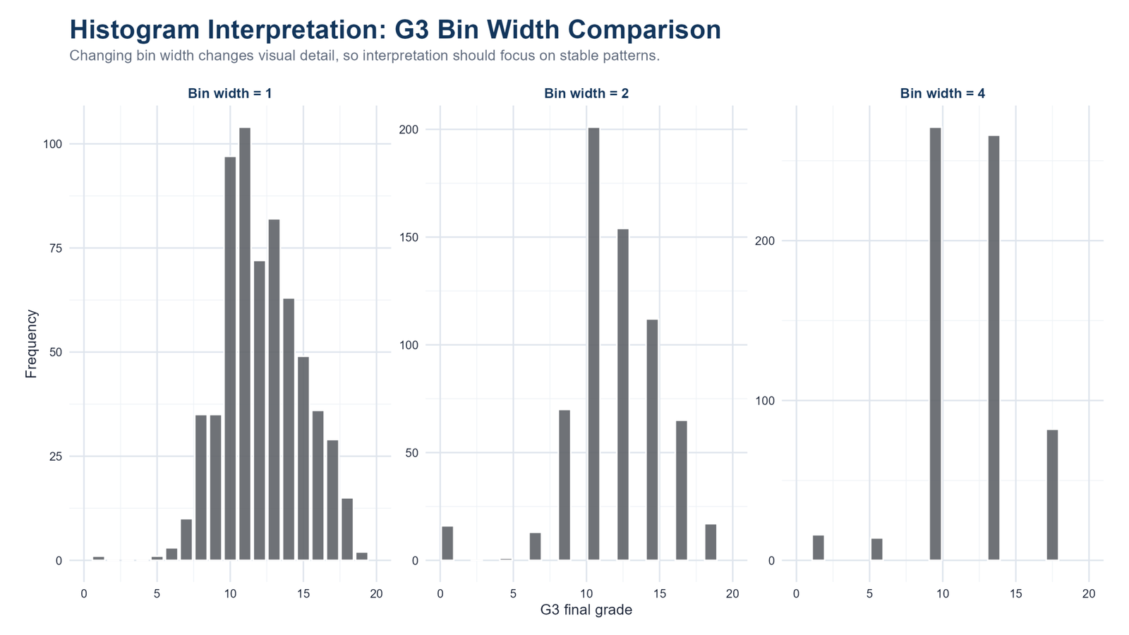
Specific interpretation: The bin-width comparison is a methodological chart. It shows that changing bin width changes the visible detail in the histogram. Narrow bins reveal more small fluctuations, while wider bins smooth the pattern and combine more values into fewer bars. However, the core G3 story remains stable: the scores are centered in the middle range with some low-score tail behavior.
Decision from Chart 10: The decision from this chart is to report stable distribution patterns rather than over-reading individual bar heights. A histogram is sensitive to bin settings, so a strong interpretation should survive reasonable changes in bin width. This principle also helps readers understand why visual checks should be paired with formal tools like the Cramer-von Mises test when distribution fit is a research question.
R Code for Histogram Interpretation
R can produce the same chart sequence using ggplot2, descriptive summaries and grouped histograms. The simplified workflow below shows the main logic for G3 and subgroup histogram interpretation.
library(readr)
library(dplyr)
library(ggplot2)

folder <- "D:/DATA ANALYSIS/A Basic Descriptive Statistics Guides/Histogram Interpretation"
data_file <- file.path(folder, "dataset.csv")

df <- read_csv(data_file, show_col_types = FALSE) %>%
  mutate(
    sex = factor(sex, levels = c("F", "M"), labels = c("Female", "Male")),
    studytime_group = factor(studytime,
      levels = c(1, 2, 3, 4),
      labels = c("<2 hours", "2 to 5 hours", "5 to 10 hours", ">10 hours")
    )
  )

df %>%
  summarise(
    n = n(),
    mean_G3 = mean(G3, na.rm = TRUE),
    median_G3 = median(G3, na.rm = TRUE),
    sd_G3 = sd(G3, na.rm = TRUE),
    min_G3 = min(G3, na.rm = TRUE),
    max_G3 = max(G3, na.rm = TRUE)
  )

ggplot(df, aes(x = G3)) +
  geom_histogram(binwidth = 1, boundary = 0, fill = "grey45", color = "white") +
  geom_vline(xintercept = mean(df$G3, na.rm = TRUE), linetype = "dashed") +
  geom_vline(xintercept = median(df$G3, na.rm = TRUE)) +
  labs(
    title = "Histogram Interpretation: G3 Final Grade",
    subtitle = "The chart shows shape, center and spread of final-grade scores.",
    x = "G3 final grade",
    y = "Frequency"
  ) +
  theme_minimal(base_size = 14)
R interpretation: R confirms the same story as Python. G3 is middle-centered, absences are right-skewed, age is narrowly concentrated and subgroup histograms add useful detail for school, sex and study-time comparisons.
Python Code for Histogram Interpretation
Python is useful because it can calculate descriptive statistics, save clean SPSS-ready data, create publication-ready charts and export output folders in one workflow.
from pathlib import Path
import pandas as pd
import matplotlib.pyplot as plt
from scipy.stats import skew

folder = Path(r"D:\DATA ANALYSIS\A Basic Descriptive Statistics Guides\Histogram Interpretation")
data_file = folder / "dataset.csv"

df = pd.read_csv(data_file)
df["sex"] = df["sex"].map({"F": "Female", "M": "Male"})
df["studytime_group"] = df["studytime"].map({
    1: "<2 hours",
    2: "2 to 5 hours",
    3: "5 to 10 hours",
    4: ">10 hours"
})

out = folder / "Python_Output"
(out / "clean_data").mkdir(parents=True, exist_ok=True)
(out / "charts").mkdir(parents=True, exist_ok=True)
(out / "pdf").mkdir(parents=True, exist_ok=True)

df.to_csv(out / "clean_data" / "histogram_interpretation_clean_data_for_spss.csv", index=False)

g3 = df["G3"].dropna()
print("N:", len(g3))
print("Mean:", round(g3.mean(), 2))
print("Median:", round(g3.median(), 2))
print("SD:", round(g3.std(), 2))
print("Minimum:", g3.min())
print("Maximum:", g3.max())
print("Skewness:", round(skew(g3, bias=False), 3))

fig, ax = plt.subplots(figsize=(16, 9))
ax.hist(g3, bins=range(0, 22), edgecolor="white", color="grey")
ax.axvline(g3.mean(), linestyle="--", linewidth=2)
ax.axvline(g3.median(), linewidth=2)
ax.set_xlabel("G3 final grade")
ax.set_ylabel("Frequency")

fig.suptitle("Histogram Interpretation: G3 Final Grade",
             fontsize=24, fontweight="bold", x=0.03, ha="left")
fig.text(0.03, 0.91,
         "The histogram shows the shape, center and spread of final-grade scores.",
         fontsize=14, ha="left")
fig.subplots_adjust(top=0.84)
fig.savefig(out / "charts" / "chart_01_python_g3_histogram_mean_median.png",
            dpi=200, bbox_inches="tight")
plt.close(fig)
Python chart title note: Use fig.suptitle(), fig.text() and fig.subplots_adjust(top=...) so the title and subtitle never overlap. This keeps WordPress images readable and matches the chart style used in this post.
SPSS Syntax and Interpretation for Histogram Interpretation
SPSS can create histograms through Frequencies, Explore and Graphs. For this workflow, the safest approach is to use the clean Python-generated SPSS-ready CSV file. That keeps variable labels, categories and chart logic consistent across Python and SPSS.
The SPSS PDF output should be uploaded to WordPress after running the syntax. Suggested hosted file path:
SPSS Menu Method
| Need | SPSS menu path | Output to read |
|---|---|---|
| Basic histogram | Graphs → Chart Builder → Histogram | Bar shape, center, spread and tails. |
| Histogram with normal curve | Analyze → Descriptive Statistics → Frequencies → Charts | Histogram and normal curve overlay. |
| Descriptive support | Analyze → Descriptive Statistics → Descriptives | Mean, standard deviation, minimum and maximum. |
| Median and quartiles | Analyze → Descriptive Statistics → Explore | Median, quartiles, boxplots and distribution checks. |
SPSS Syntax Example with PDF Export
SET PRINTBACK=ON MPRINT=ON DECIMAL=DOT.
SET UNICODE=ON.

HOST COMMAND=['cmd /c if not exist "D:\DATA ANALYSIS\A Basic Descriptive Statistics Guides\Histogram Interpretation\Python_Output\pdf" mkdir "D:\DATA ANALYSIS\A Basic Descriptive Statistics Guides\Histogram Interpretation\Python_Output\pdf"'].

GET DATA
 /TYPE=TXT
 /FILE='D:\DATA ANALYSIS\A Basic Descriptive Statistics Guides\Histogram Interpretation\Python_Output\clean_data\histogram_interpretation_clean_data_for_spss.csv'
 /ENCODING='UTF8'
 /DELCASE=LINE
 /DELIMITERS=","
 /QUALIFIER='"'
 /ARRANGEMENT=DELIMITED
 /FIRSTCASE=2
 /VARIABLES=
 school A8
 sex A12
 age F8.2
 studytime F8.2
 failures F8.2
 schoolsup A8
 higher A8
 internet A8
 romantic A8
 absences F8.2
 G1 F8.2
 G2 F8.2
 G3 F8.2
 studytime_group A20.
CACHE.
EXECUTE.

DATASET NAME HistogramMain WINDOW=FRONT.

VARIABLE LABELS
 G1 "First period grade"
 G2 "Second period grade"
 G3 "Final grade"
 age "Student age"
 absences "Number of absences"
 studytime "Weekly study time".

VALUE LABELS studytime
 1 "<2 hours"
 2 "2 to 5 hours"
 3 "5 to 10 hours"
 4 ">10 hours".
EXECUTE.

TITLE "Histogram Interpretation".
SUBTITLE "G3, age and absences".

DESCRIPTIVES VARIABLES=G1 G2 G3 age absences
 /STATISTICS=MEAN STDDEV MIN MAX.

FREQUENCIES VARIABLES=G3 age absences
 /FORMAT=NOTABLE
 /STATISTICS=MEAN MEDIAN STDDEV MINIMUM MAXIMUM SKEWNESS
 /HISTOGRAM NORMAL.

EXAMINE VARIABLES=G3 BY school
 /PLOT=HISTOGRAM BOXPLOT
 /STATISTICS=DESCRIPTIVES
 /CINTERVAL=95
 /MISSING=LISTWISE.

EXAMINE VARIABLES=G3 BY sex
 /PLOT=HISTOGRAM BOXPLOT
 /STATISTICS=DESCRIPTIVES
 /CINTERVAL=95
 /MISSING=LISTWISE.

OUTPUT SAVE
 OUTFILE='D:\DATA ANALYSIS\A Basic Descriptive Statistics Guides\Histogram Interpretation\Python_Output\pdf\Histogram-Interpretation-SPSS-Output.spv'
 LOCK=NO.

OUTPUT EXPORT
 /CONTENTS EXPORT=ALL LAYERS=PRINTSETTING MODELVIEWS=PRINTSETTING
 /PDF DOCUMENTFILE='D:\DATA ANALYSIS\A Basic Descriptive Statistics Guides\Histogram Interpretation\Python_Output\pdf\Histogram-Interpretation-SPSS-Output.pdf'
 /EMBEDBOOKMARKS=YES
 /EMBEDFONTS=YES.

EXECUTE.
SPSS export note: SPSS will not always create missing folders automatically. The syntax includes a Windows HOST COMMAND to create the PDF folder, but if your SPSS blocks host commands, create Python_Output\pdf manually before running the export block.
Excel Method for Histogram Interpretation
Excel can create histograms quickly, but interpretation still follows the same statistical logic. You need to choose a bin width, read the center, inspect spread, identify skewness and compare the histogram with numerical summaries.
Excel Steps for Histogram Interpretation
| Step | Excel action | What to interpret |
|---|---|---|
| 1 | Place G3 scores in one column. | Make sure the variable is numeric. |
| 2 | Insert → Statistic Chart → Histogram. | Read bar height and concentration. |
| 3 | Right-click axis → Format Axis → Bin width. | Check whether the pattern changes with bin width. |
| 4 | Calculate mean and median. | =AVERAGE(range) and =MEDIAN(range) |
| 5 | Calculate spread. | =STDEV.S(range), =MIN(range), =MAX(range) |
| 6 | Calculate skewness. | =SKEW(range) |
Excel interpretation: If mean and median are close, the center is stable. If skewness is large or the histogram has a long tail, use the median and quartiles beside the mean. If changing bin width changes only minor details but not the main shape, report the stable pattern.
Download Output and Resources
The SPSS PDF output and dataset source are available below. Use the SPSS output for formal tables and use the R/Python charts for detailed visual interpretation.
APA Style Reporting for Histogram Interpretation
A histogram report should describe the visible distribution pattern and support it with numerical summaries. Do not write only that the histogram is shown. Explain the center, spread, tail and interpretation.
APA-style report for G3: The histogram of G3 final grades showed a middle-centered distribution with most scores concentrated around 10 to 14. The mean was approximately 11.91 and the median was 12, indicating a stable central location. Scores ranged from 0 to 19, and the low-score tail suggested that the distribution was not perfectly normal.
APA-style report for absences: The absences histogram showed strong positive skew. Most students had zero or low absences, while fewer students had high absence counts. Because the distribution was skewed, median, quartiles and grouped-frequency summaries should be reported beside the mean.
APA-style report for subgroups: Subgroup histograms showed that G3 distribution shape varied across school, sex and study-time categories. These visual differences should be treated as descriptive evidence and followed by formal tests, assumption checks and effect sizes where required.
Short report:
Histogram interpretation showed that G3 final grades were centered near 12, with mean about 11.91, median 12 and SD about 3.23. The histogram was middle-centered but not perfectly normal because low-score values created a visible tail. Absences showed strong right skew, so median and grouped-frequency summaries were preferred for that variable.
When Should You Use Histogram Interpretation?
Use Histogram Interpretation whenever you need to understand a numeric variable before formal analysis. It is especially important before normality testing, confidence intervals, t tests, z tests, ANOVA, regression and transformation decisions.
| Analysis situation | Why a histogram helps | Related next guide |
|---|---|---|
| Descriptive statistics | Shows the shape behind mean, median and standard deviation. | Descriptive Statistics |
| Frequency distribution | Visualizes bin counts for numeric variables. | Frequency Distribution |
| Outlier and spread checking | Shows tails and unusual bar positions. | Box Plot Interpretation |
| Normality screening | Shows whether a bell shape is plausible. | Q-Q Plot Normality Check |
| Skewed variable handling | Shows whether transformation or robust reporting may be needed. | Reciprocal Transformation |
| Group comparison | Shows subgroup shape before formal tests. | Effect Size |
If the histogram suggests assumption problems, continue with formal tools. For distribution fit, use Kolmogorov-Smirnov Test, Lilliefors Test, D’Agostino-Pearson Test or Cramer-von Mises Test. For model checking, use diagnostics such as the Goldfeld-Quandt Test or Ramsey RESET Test.
References and Related Guides
Histogram interpretation connects directly with descriptive statistics, normality checking, transformations, group comparisons, variance assumptions and regression diagnostics. These related guides support the next step of analysis:
| Related guide | Why it helps |
|---|---|
| D’Agostino-Pearson Test | Formal normality test based on skewness and kurtosis. |
| Cramer-von Mises Test | Distribution-fit test useful after a histogram suggests non-normality. |
| Cochran C Test | Variance homogeneity check for grouped comparisons. |
| Brown-Forsythe Test | Robust alternative for checking variance equality. |
| Greenhouse-Geisser Correction | Correction used when repeated-measures sphericity is violated. |
| Goldfeld-Quandt Test | Regression heteroscedasticity test after visual diagnostics. |
| Kolmogorov-Smirnov Test | Formal distribution comparison often used with normality checking. |
| One-Tailed T Test | Inferential test that should be supported by visual and descriptive evidence. |
| One-Sample Z Test | Mean comparison method that benefits from histogram-based distribution reading. |
| One-Proportion Z Test | Proportion test; useful contrast with numeric histograms. |
| Mauchly’s Test of Sphericity | Repeated-measures assumption test. |
| Levene Test | Variance equality test before group mean comparison. |
| Lilliefors Test | Normality test related to Kolmogorov-Smirnov logic. |
| Q-Q Plot Normality Check Guide | Visual normality check that complements histogram interpretation. |
| P-P Plot Normality Check | Probability plot check that complements histograms. |
| Cross Tabulation | Categorical summary for non-numeric variables. |
| Confidence Interval | Uncertainty estimate after descriptive distribution reading. |
| Coefficient of Variation | Relative spread measure useful for comparing variability. |
| Clinical Trial Data Analysis Using R | Applied R workflow where histograms are part of exploratory checking. |
| Box Plot Interpretation | Box plots provide quartiles and outlier context beside histograms. |
| Central Limit Theorem | Explains sampling behavior and why histograms of data and means differ. |
| Reciprocal Transformation | Transformation option for strongly skewed variables. |
| Ryan-Joiner Test | Normality test that can follow histogram screening. |
| Ramsey RESET Test | Regression specification check after exploratory visuals. |
| Q-Q Plot Normality Check | Another normality-check guide for the same workflow. |
| Descriptive Statistics | Core numerical summaries used before histogram interpretation. |
| Effect Size | Practical magnitude reporting after group or model comparisons. |
| Five Number Summary | Quartile-based summary that pairs well with histograms. |
| Frequency Distribution | Counting framework behind histogram bins and categorical distributions. |
External references: UCI Student Performance dataset, IBM SPSS Statistics, R Project, and Python.
FAQs About Histogram Interpretation
What is Histogram Interpretation in simple words?
Histogram Interpretation means reading the bars of a histogram to explain where values are concentrated, how wide the distribution is, whether it is skewed and whether unusual values or tails are present.
What does the G3 histogram show in this guide?
The G3 histogram shows that final grades are centered near 12, with mean about 11.91 and median 12. The distribution has a middle concentration but also a visible low-score tail.
Is the G3 final grade histogram normal?
It has a bell-like center, but it is not perfectly normal because of the low-score tail and bounded grade scale. Formal normality checks should use Q-Q plots, P-P plots and normality tests.
Why are absences right-skewed?
Absences are right-skewed because many students have zero or few absences, while a smaller number have high absence counts. This creates a long right tail.
Why does bin width matter in histogram interpretation?
Bin width controls how much detail the histogram shows. Narrow bins can look noisy, while wide bins can hide detail. Good interpretation focuses on patterns that remain stable across reasonable bin choices.
What is the difference between a histogram and a bar chart?
A histogram is for numeric intervals, while a bar chart is for separate categories. For example, G3 scores can use a histogram, while school or sex categories usually use bar charts.
Can Excel be used for histogram interpretation?
Yes. Excel can create histograms and calculate mean, median, standard deviation, minimum, maximum and skewness. It is useful for simple teaching and reporting workflows.
Should histogram interpretation be used before statistical tests?
Yes. Histogram interpretation should be used before many tests because it shows the shape, spread and unusual values in the data before inferential assumptions are applied.
SEO Tags: Histogram Interpretation, histogram, histogram interpretation in statistics, histogram shape, histogram skewness, mean median histogram, normal curve histogram, SPSS histogram, R histogram, Python histogram, Excel histogram, student performance data, G3 final grade histogram, descriptive statistics, frequency distribution, normality test, Q-Q plot, P-P plot

