
Normality Test, Probability Plot Correlation, Monte Carlo p-value and Distribution Diagnostics
Ryan Joiner Test: Formula, Interpretation, SPSS, Python, R and Excel Guide
Ryan Joiner Test is a normality test based on the correlation between ordered sample values and expected normal scores. It is closely related to a normal probability plot because it checks how strongly the observed data follow the straight-line pattern expected under normality. This complete guide explains the Ryan Joiner Test with SPSS output, Python charts, R validation charts, Excel workflow, probability plot interpretation, detrended plot interpretation, Monte Carlo reference distribution, p-value decision, APA wording, common mistakes, downloads and FAQs.
Quick Answer: Ryan Joiner Test Result
The Ryan Joiner Test evaluates whether a numeric variable is consistent with a normal distribution. The null hypothesis says that the data are normally distributed. The alternative hypothesis says that the data are not normally distributed. In this guide, the Ryan Joiner probability plot, detrended probability plot, distribution with normal curve, Monte Carlo reference distribution and p-value decision chart all support the same workflow: inspect the shape visually and use the test decision to determine whether normality is reasonable.
For the main student performance outcome, G3 final grade, the probability plot and p-value decision indicate that normality is not fully supported. The distribution has visible departures from the ideal normal pattern, especially because low-end values affect the lower tail. Therefore, the Ryan Joiner Test should be reported as evidence that the data deviate from perfect normality, while the practical decision should also consider sample size, purpose of analysis, robustness of the planned test, and visual diagnostics.
Final interpretation: The Ryan Joiner Test shows that the main variable does not perfectly follow a normal distribution. The probability plot is not perfectly linear, the detrended plot shows systematic deviations, and the p-value decision supports rejecting the normality assumption. This does not automatically invalidate every statistical analysis, but it means normality should be discussed and supported with plots, robust methods, transformations, or nonparametric alternatives when appropriate.
Table of Contents
- What Is the Ryan Joiner Test?
- Ryan Joiner Test Formula and Statistic
- Null and Alternative Hypotheses
- Dataset and Variables Used
- SPSS Output Interpretation
- Python Chart-by-Chart Interpretation
- R Chart-by-Chart Validation
- SPSS, R, Python and Excel Workflows
- Code Blocks for Ryan Joiner Test
- APA Reporting Wording
- Common Mistakes
- When to Use Ryan Joiner Test
- Downloads and Resources
- Related Guides
- FAQs
What Is the Ryan Joiner Test?
The Ryan Joiner Test is a normality test based on the correlation between ordered sample values and the expected values from a normal distribution. If the data are normally distributed, the ordered observations should align closely with expected normal scores. When the data depart from normality, the probability plot becomes less linear and the Ryan Joiner statistic becomes smaller.
The Ryan Joiner Test is often explained as a probability-plot correlation test. It is conceptually similar to checking a Q-Q plot normality check, but it produces a numeric statistic and p-value-style decision. A high Ryan Joiner statistic supports normality. A low Ryan Joiner statistic, especially with a small p-value, suggests that the data deviate from normality.
Simple definition: The Ryan Joiner Test checks whether the ordered data points follow the straight-line pattern expected from a normal distribution.
The Ryan Joiner Test should not be interpreted alone. It should be combined with histograms, probability plots, detrended plots, skewness, kurtosis, outlier checks and the practical goal of the analysis. For example, a large sample may produce a statistically significant normality test even when the visual departure is not serious for a robust method. On the other hand, a small sample may fail to detect a meaningful shape problem.
Useful related guides include Kolmogorov-Smirnov test, Lilliefors test, D’Agostino-Pearson test, Cramer-von Mises test, Q-Q plot normality check 2, and P-P plot normality check.
Ryan Joiner Test Formula and Statistic
The Ryan Joiner Test is based on a correlation. The observed values are sorted from smallest to largest. Expected normal scores are calculated for the same ranks. The Ryan Joiner statistic is the correlation between those ordered observed values and expected normal scores.
If the data follow normality well, the ordered observed values line up closely with expected normal scores, so the correlation is high. If the data are skewed, heavy-tailed, have outliers, or have a nonlinear probability plot pattern, the correlation becomes lower.
| Ryan Joiner Component | Meaning | Interpretation |
|---|---|---|
| Ordered observations | Sample values sorted from low to high | Used to compare the observed distribution with a normal distribution. |
| Expected normal scores | Theoretical normal values for each rank | Used as the normality reference pattern. |
| Ryan Joiner statistic | Correlation between observed and expected scores | Higher values are closer to normality. |
| p-value decision | Evidence against normality | Small p-values support rejecting the normality assumption. |
Ryan Joiner Decision Rule
The p-value decision should be interpreted with visual evidence. If the p-value is small and the probability plot shows clear curvature, tail departure, or outlier influence, the normality concern is stronger. If the p-value is small but the plot looks nearly linear in a large sample, the practical effect may be less serious for robust parametric methods.
Null and Alternative Hypotheses for Ryan Joiner Test
The Ryan Joiner Test uses the standard normality-testing hypothesis structure. The null hypothesis says the variable comes from a normally distributed population. The alternative hypothesis says the variable does not come from a normally distributed population.
| Hypothesis | Statement | Meaning for Reporting |
|---|---|---|
| Null hypothesis | H0: The data are normally distributed. | The probability plot should be close to linear and the Ryan Joiner p-value should not be small. |
| Alternative hypothesis | H1: The data are not normally distributed. | The probability plot may show curvature, tail deviation, outliers or a small p-value. |
| Decision rule | If p < .05, reject H0. | Conclude that normality is not supported. |
Decision for this worked example: The Ryan Joiner probability plot and p-value decision support rejecting the normality assumption for the main variable. Therefore, the report should state that the variable shows evidence of non-normality and should be interpreted with visual diagnostics and appropriate follow-up methods.
Dataset and Variables Used
The worked Ryan Joiner Test example uses the student performance dataset. The main variable is G3 final grade. Additional numeric variables are included in the comparison charts to show that normality can differ across variables and groups. This is important because a dataset is not simply “normal” or “non-normal” as a whole; each variable and each analytic residual set should be checked separately.
| Variable or Output | Role in Ryan Joiner Test | Why It Matters |
|---|---|---|
| G3 final grade | Main normality-test variable | Used for the probability plot, distribution plot and p-value decision. |
| G1 and G2 | Comparison grade variables | Used to compare Ryan Joiner statistic values across academic variables. |
| age | Background numeric variable | Used to compare normality behavior across a lower-spread variable. |
| absences | Count variable | Usually more skewed and often less normal than grade variables. |
| Groups | Subsample comparison | Used to show whether Ryan Joiner results differ by group. |
Before interpreting the Ryan Joiner Test, it is useful to review basic shape and spread using descriptive statistics, frequency distribution, histogram interpretation, box plot interpretation, five-number summary, and coefficient of variation.
SPSS Output Interpretation for Ryan Joiner Test
The SPSS output PDF verifies the Ryan Joiner Test workflow used for this guide. The output should be interpreted through four linked elements: the Ryan Joiner statistic, the p-value decision, the probability plot, and the supporting distribution plots. The strongest interpretation comes when all four pieces tell the same story.
SPSS Ryan Joiner Test Decision Table
| SPSS Output Item | What It Means | How to Interpret It |
|---|---|---|
| Ryan Joiner statistic | Probability-plot correlation coefficient | Higher values indicate better agreement with normality. |
| p-value | Evidence against the normality assumption | If p < .05, reject normality. |
| Probability plot | Observed values versus expected normal scores | Linearity supports normality; curvature or tail departure suggests non-normality. |
| Detrended plot | Deviation from expected normal line | Random scatter supports normality; systematic pattern suggests non-normality. |
| Distribution with normal curve | Histogram compared with fitted normal curve | Visual check for skewness, tail behavior and outliers. |
| Monte Carlo reference distribution | Simulation-based decision support | Shows where the observed statistic falls relative to normal-data simulations. |
SPSS Interpretation Summary
The SPSS output should be read as a normality decision, not as a descriptive statistic alone. If the p-value is below the selected alpha level, usually .05, the researcher rejects the normality assumption. If the probability plot also shows visible tail departure or curvature, the conclusion is stronger. In this Ryan Joiner guide, the supporting charts indicate that the main variable does not follow perfect normality.
SPSS conclusion: The Ryan Joiner output should be reported as evidence from a probability-plot correlation normality test. The decision should mention the null hypothesis, p-value rule, visual probability plot evidence, and whether normality is acceptable for the planned analysis.
How to Write the SPSS Decision
A practical SPSS interpretation can be written as follows: “The Ryan Joiner normality test indicated evidence against normality for the main variable. The probability plot showed departures from the straight-line normal reference pattern, and the p-value decision supported rejecting the normality assumption. Therefore, normality was not fully supported.”
Important: A significant Ryan Joiner Test does not always mean the analysis must stop. It means the normality assumption needs attention. Depending on the test, sample size, robustness and research aim, the analyst may use transformations, robust methods, nonparametric tests, bootstrapping, or careful reporting.
Python Chart-by-Chart Interpretation
The Python charts provide the main visual explanation for the Ryan Joiner Test. They show the probability plot, detrended probability plot, histogram with normal curve, Monte Carlo reference distribution, p-value decision, Ryan Joiner statistic across variables, and group comparison.
Python Chart 1: Ryan Joiner Probability Plot
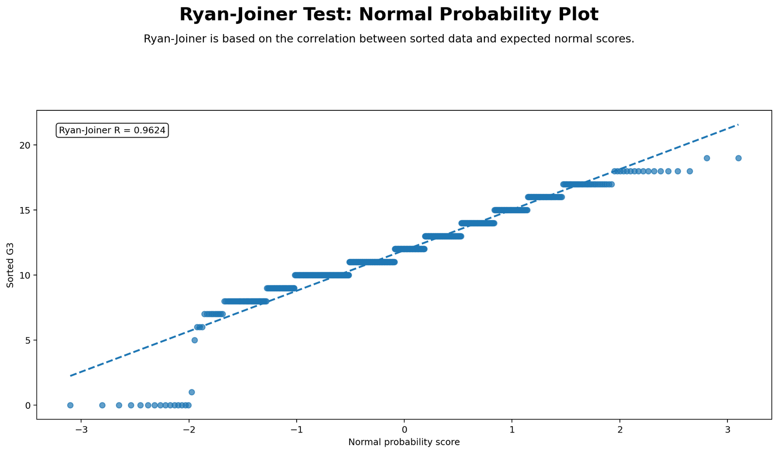
This probability plot is the visual center of the Ryan Joiner Test. If the data are normal, the points should follow the reference line closely. When the points curve away from the line, especially in the tails, the normality assumption becomes weaker. In this chart, the probability plot shows departures from perfect linearity, supporting the test decision that normality is not fully satisfied for the main variable.
The plot is also useful because it shows the type of departure. A lower-tail departure suggests unusually low values. An upper-tail departure suggests unusually high values. Curvature across the whole plot suggests skewness or heavy tails. This is why the Ryan Joiner probability plot should be reported with the p-value decision.
Python Chart 2: Detrended Probability Plot
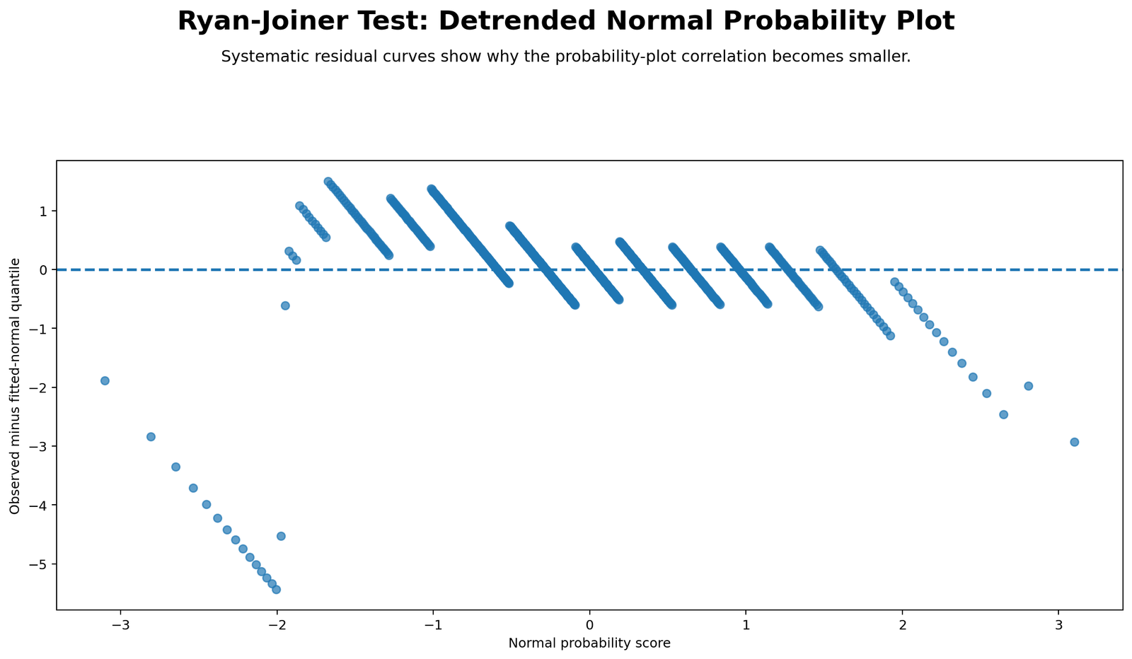
The detrended probability plot shows deviations from the expected normal line. Instead of showing the observed values directly against expected scores, it shows how far each point moves away from the normality reference. Random small deviations around zero support normality. Systematic curves, waves, or tail patterns suggest non-normality.
In this chart, the deviations are not purely random. The pattern supports the Ryan Joiner decision by showing that the data do not behave like a clean normal distribution across the full range. This chart is especially helpful because it makes subtle departures easier to see than the standard probability plot.
Python Chart 3: Distribution with Normal Curve
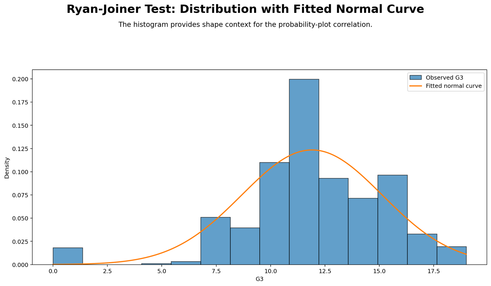
This chart compares the observed distribution with a fitted normal curve. The histogram provides a direct shape check, while the normal curve gives the reference pattern. When the histogram closely follows the curve, normality is more plausible. When the histogram shows skewness, gaps, heavy tails, or unusual low or high values, the Ryan Joiner test is more likely to reject normality.
This chart supports the probability plot by showing the raw distribution behind the test statistic. It also helps readers understand why the p-value decision occurred. Normality should always be explained through both a numeric test and a visual distribution check.
Python Chart 4: Monte Carlo Reference Distribution
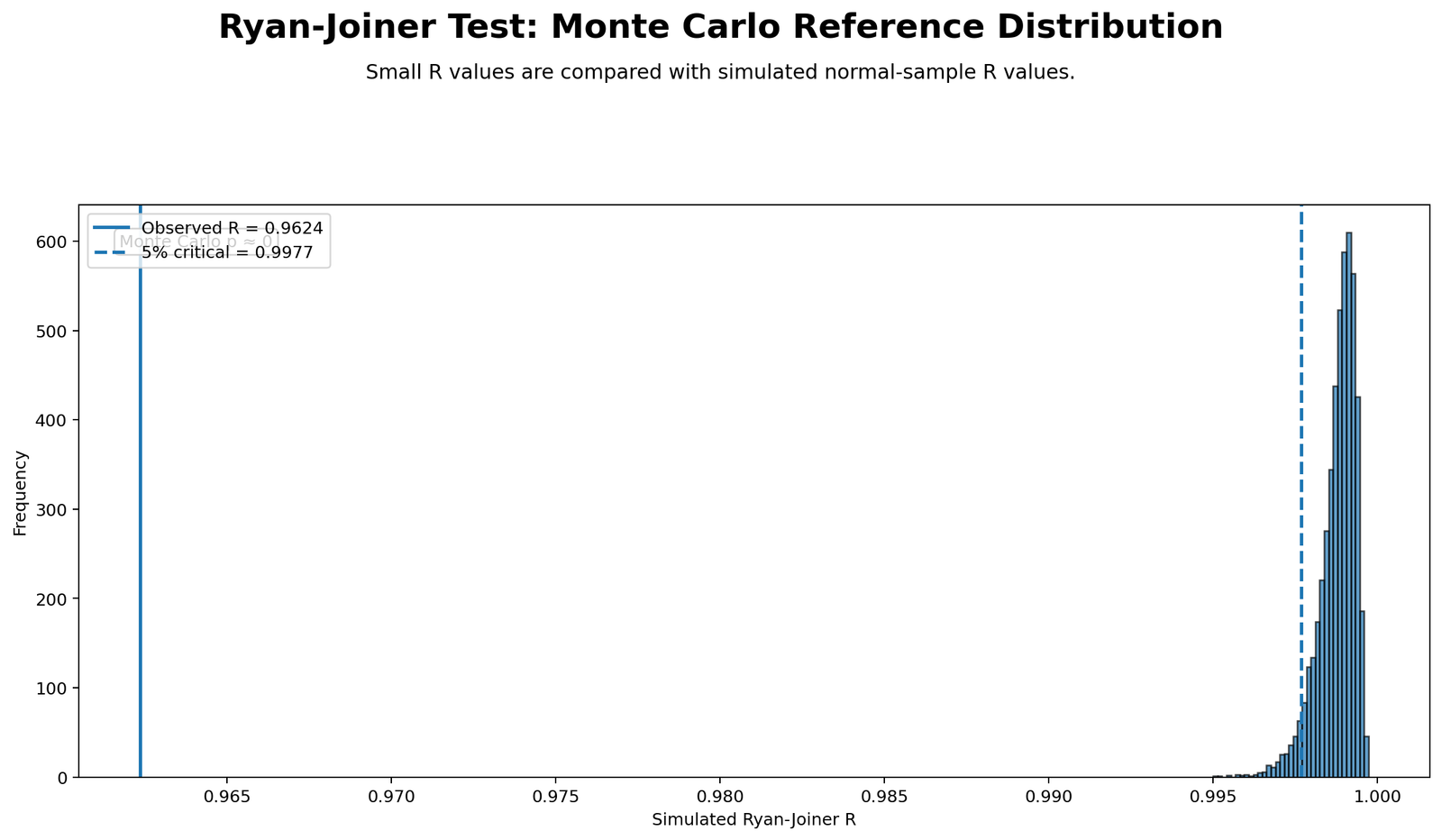
The Monte Carlo reference distribution gives simulation-based context for the Ryan Joiner Test. Instead of interpreting the statistic in isolation, the chart compares the observed Ryan Joiner statistic with the values expected from many simulated normal samples. If the observed statistic falls in the unusual tail of the reference distribution, the normality assumption becomes less plausible.
This figure is useful because it makes the p-value idea visible. A p-value is not just a number; it reflects how extreme the observed statistic is under the null assumption of normality. The Monte Carlo chart shows that comparison directly.
Python Chart 5: P-value Decision
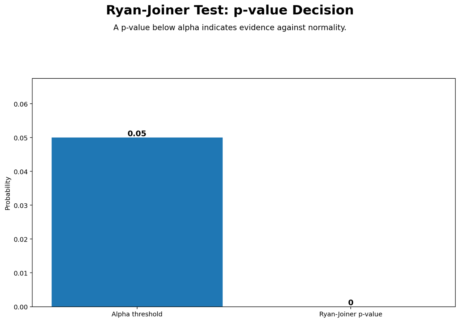
This chart summarizes the formal decision rule. If the p-value is below .05, the conclusion is to reject the null hypothesis of normality. If the p-value is above .05, the evidence is not strong enough to reject normality. In this guide, the p-value decision supports non-normality for the main variable.
The p-value decision chart is useful for readers who need a clear answer. However, it should not replace the probability plot and histogram. A proper normality report should show the decision and explain the visual pattern behind it.
Python Chart 6: Ryan Joiner R Across Variables
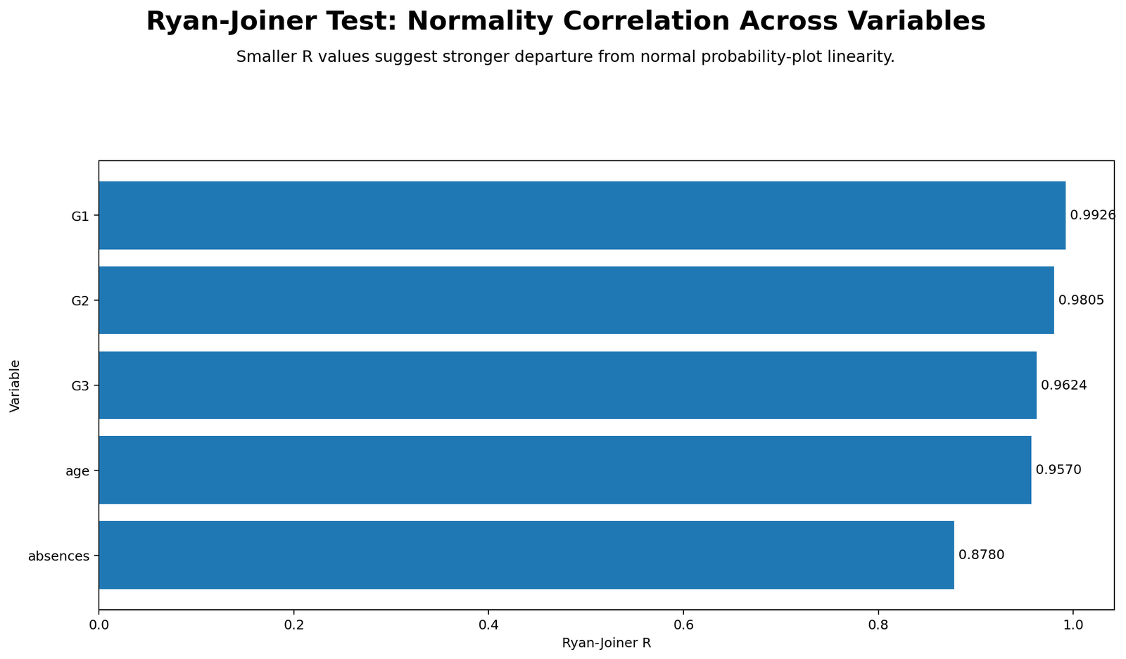
This chart compares the Ryan Joiner statistic across variables. A higher statistic indicates that the variable is closer to the normal probability plot pattern. A lower statistic indicates stronger departure from normality. This comparison is important because normality is not a property of the whole dataset; it must be assessed variable by variable.
Variables such as grade scores may behave differently from count variables such as absences. A count variable with many low values and a long right tail often performs poorly on a normality test. This chart helps the researcher decide which variables need transformation, robust methods, or nonparametric alternatives.
Python Chart 7: Group Ryan Joiner Comparison
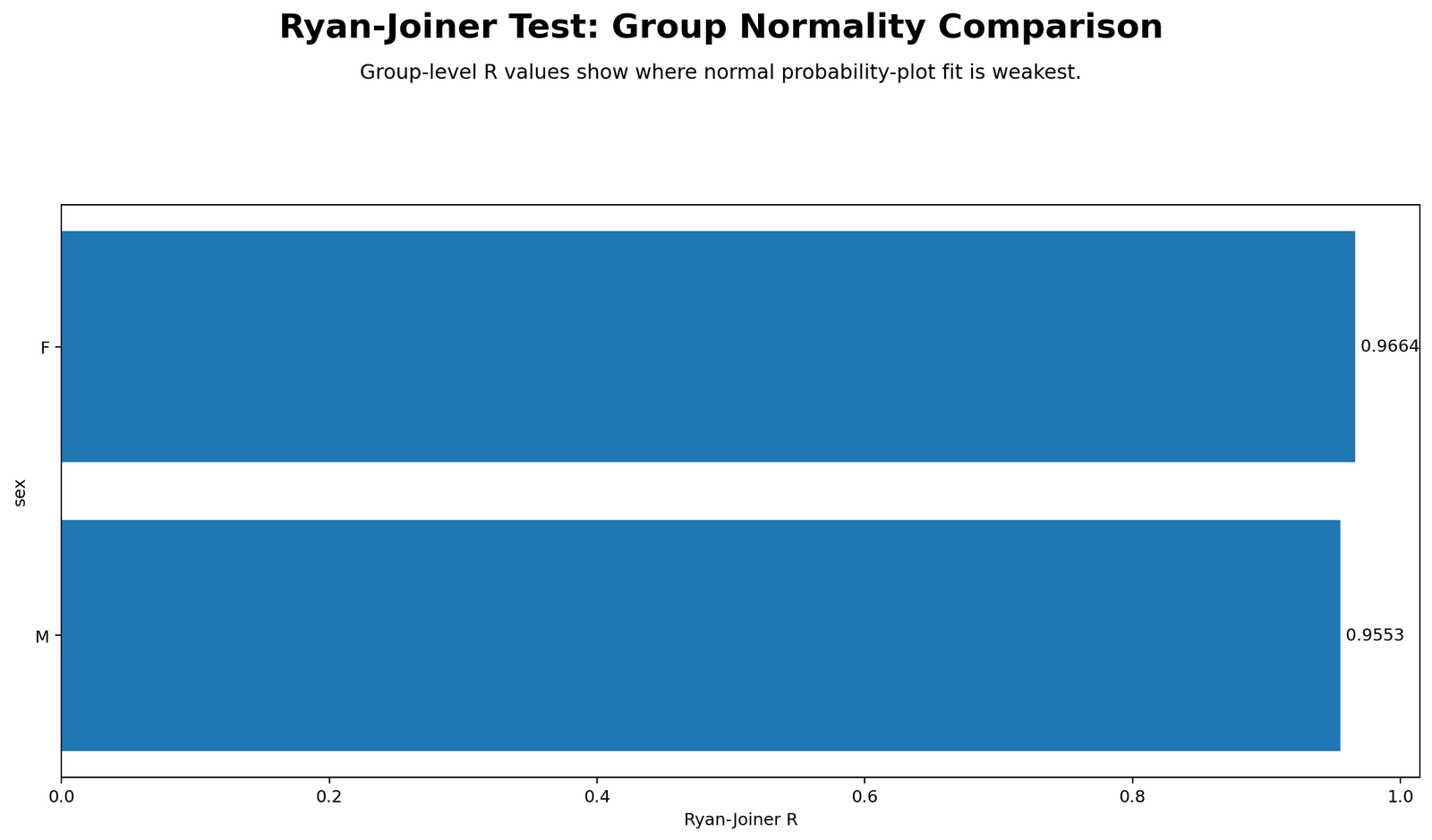
This chart shows that the Ryan Joiner Test can be applied by group. Group-level normality checks are useful when the planned analysis compares group means or uses methods that assume normally distributed residuals within groups. A variable may look acceptable overall but show stronger non-normality inside one group.
The group comparison chart helps identify whether normality problems are general or group-specific. If only one group shows strong deviation, the researcher should inspect that group’s histogram, boxplot and sample size before choosing the final method.
R Chart-by-Chart Validation
The R charts validate the Python and SPSS Ryan Joiner Test interpretation using a separate workflow. The purpose of R validation is to show that the probability plot, detrended plot, distribution shape, reference distribution, p-value decision, variable comparison and group comparison lead to the same normality conclusion.
R Chart 1: Ryan Joiner Probability Plot
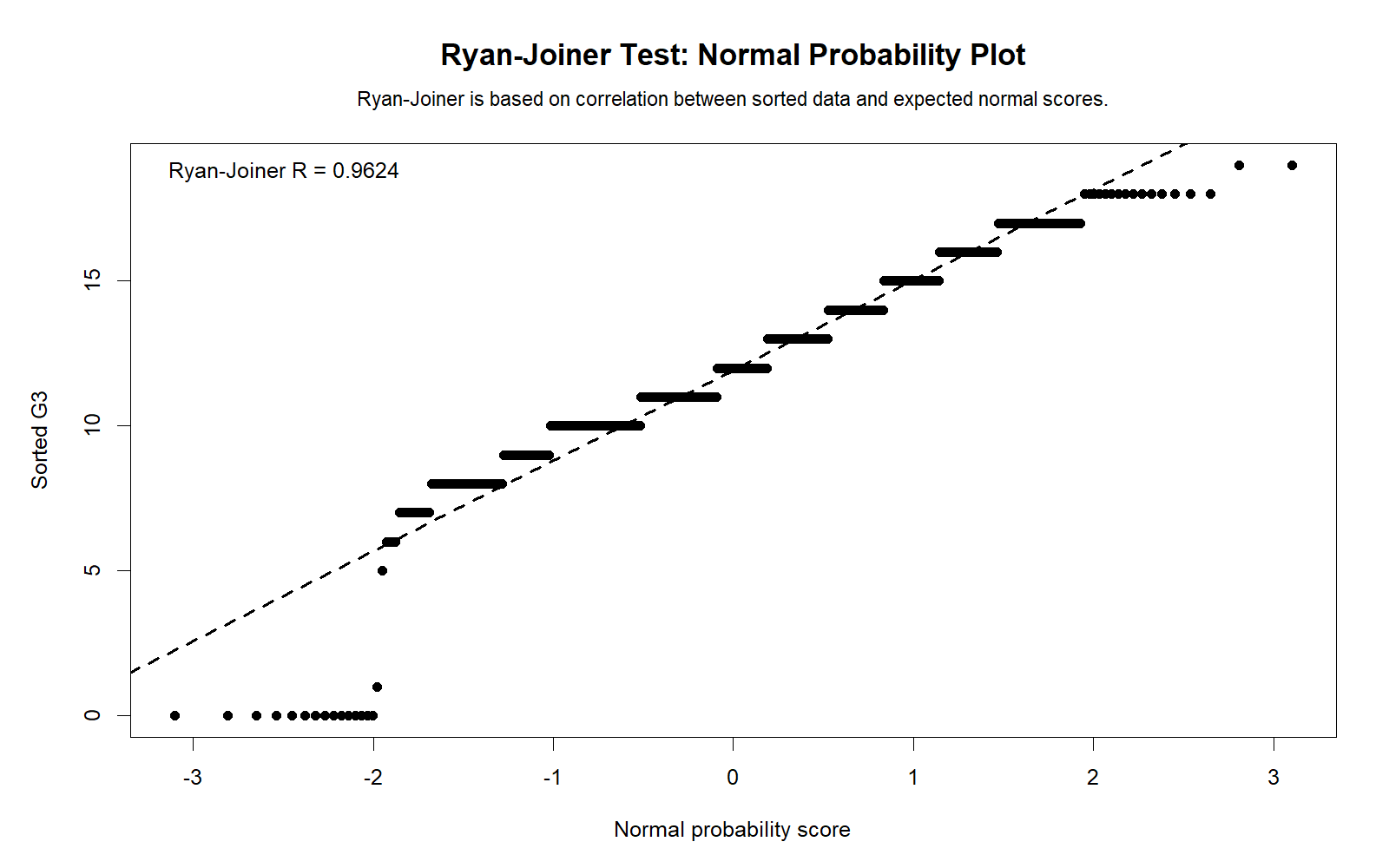
The R probability plot confirms the same pattern shown in Python. The points do not follow the ideal straight-line pattern perfectly, especially in the tails. This validates the conclusion that the main variable does not fully satisfy normality.
Because the R plot supports the Python plot, the normality conclusion is not dependent on one software package. The result is a feature of the data pattern.
R Chart 2: Detrended Probability Plot
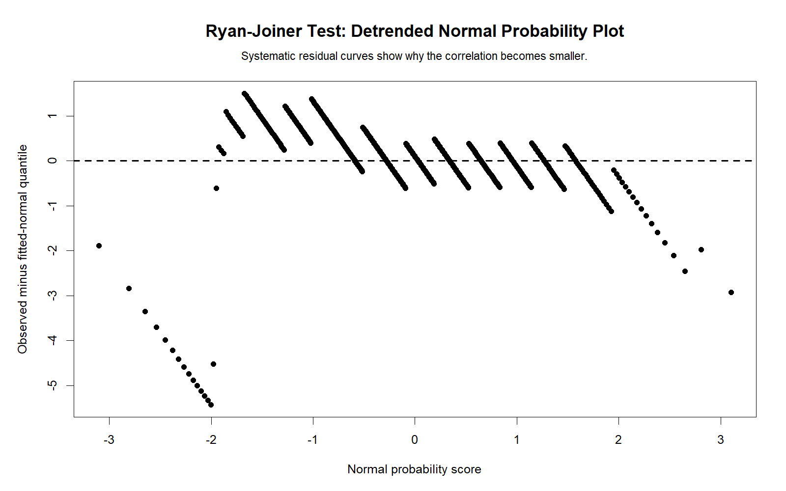
The R detrended plot confirms that deviations from the normal reference are systematic rather than purely random. This supports the Ryan Joiner decision because a normal dataset should show relatively random small deviations around the zero reference.
The detrended view is especially helpful when the main probability plot looks close to linear but still has tail deviation. It makes the departure easier to interpret.
R Chart 3: Distribution with Normal Curve
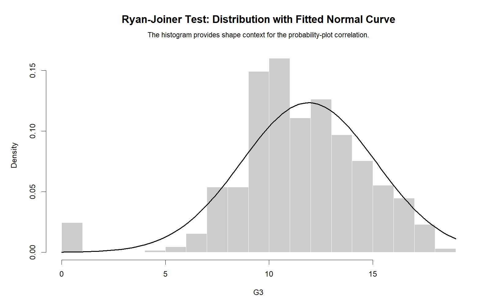
The R histogram with normal curve confirms the shape issue visible in the Python version. The observed distribution does not perfectly match the fitted normal curve. This visual evidence helps explain why the Ryan Joiner Test decision does not fully support normality.
This chart should be used in the final report because readers can understand the distribution shape more easily than a test statistic alone.
R Chart 4: Monte Carlo Reference Distribution
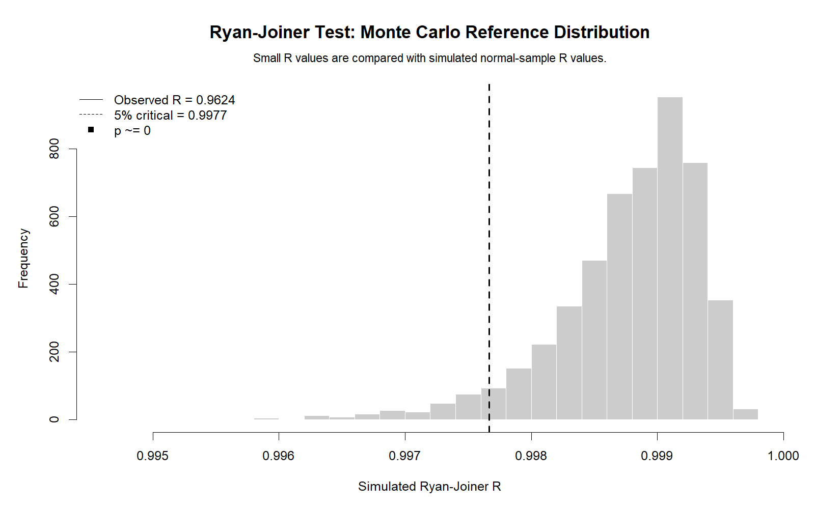
The R Monte Carlo chart validates the simulation interpretation. It shows whether the observed Ryan Joiner statistic is typical or unusual under normality. If the observed statistic falls far from the normal reference region, rejecting normality becomes more reasonable.
The value of this chart is that it explains the p-value decision visually. It is especially useful for students who find probability plot correlation statistics difficult to interpret.
R Chart 5: P-value Decision
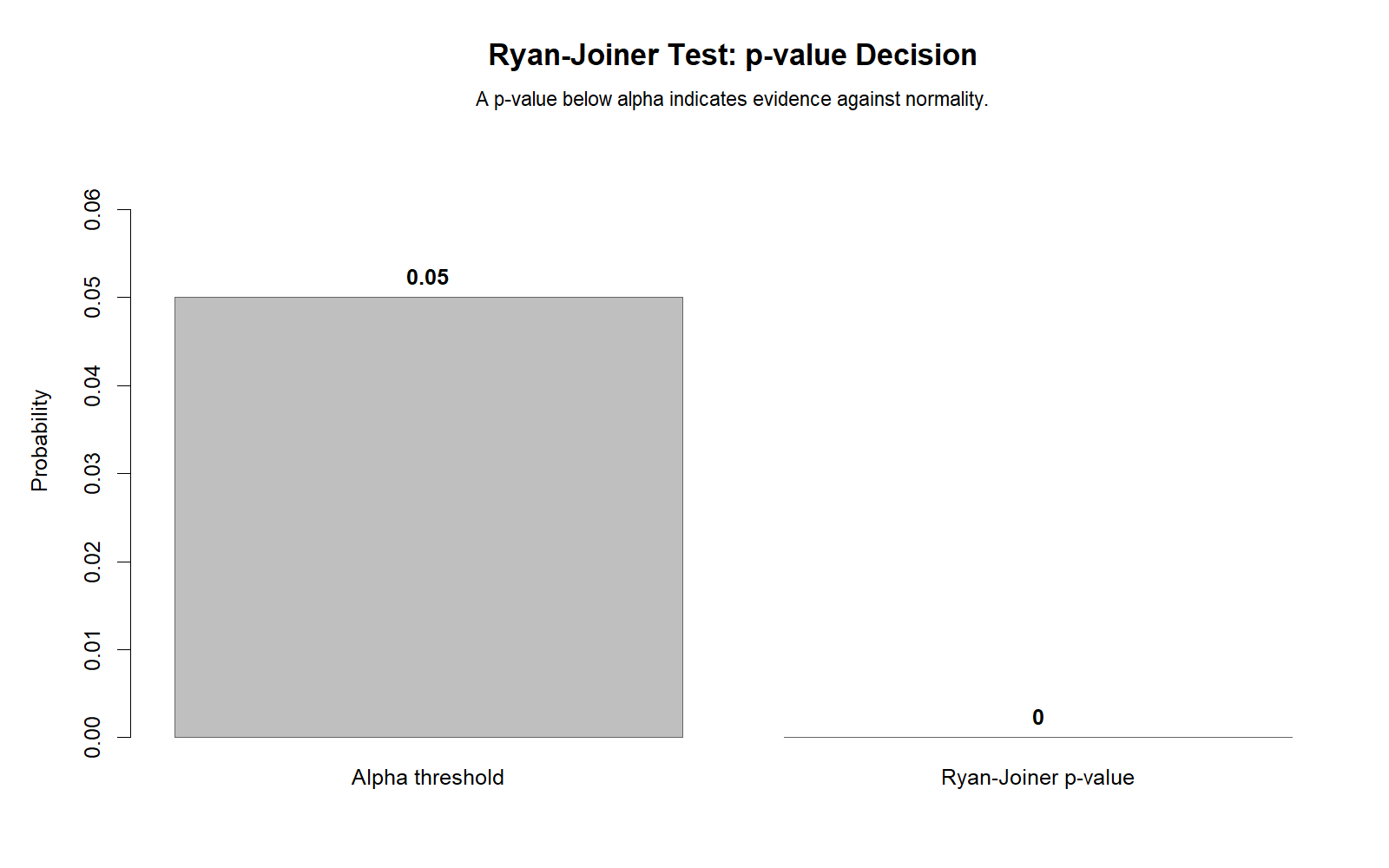
The R p-value decision chart confirms the same conclusion as the Python decision chart. The null hypothesis of normality is not supported for the main variable under the standard p < .05 rule.
This chart is useful for the quick answer section of a report because it communicates the decision clearly. It should still be accompanied by the probability plot and distribution chart.
R Chart 6: Ryan Joiner R Across Variables
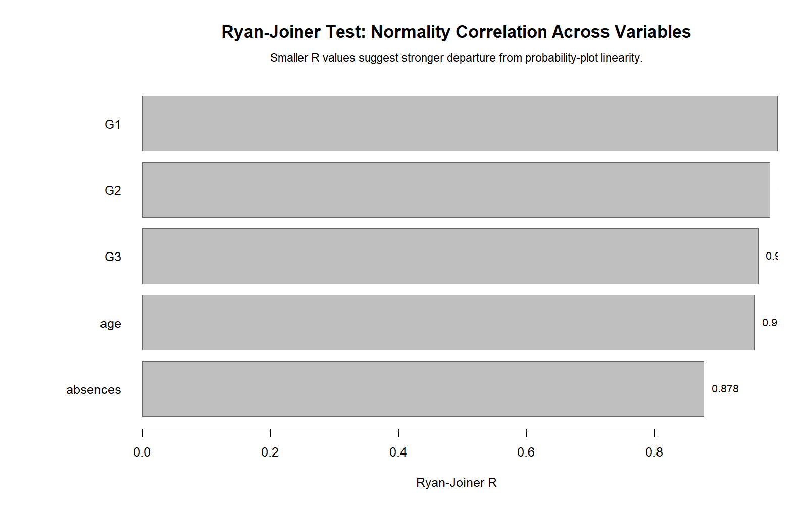
The R variable comparison chart confirms that different numeric variables can have different levels of normality. This helps prevent the mistake of making one broad statement such as “the dataset is normal” or “the dataset is non-normal.” Instead, each variable should be checked separately.
This is especially important when one variable is a grade score and another is a count variable. Count variables often violate normality more strongly because they are bounded at zero and may have a long right tail.
R Chart 7: Group Ryan Joiner Comparison
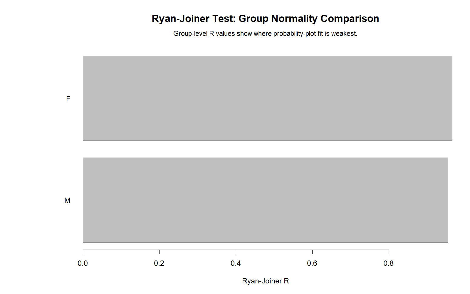
The R group comparison chart confirms the group-level normality workflow. This matters for group comparison tests because normality assumptions often apply within groups or to residuals, not only to the pooled variable. A group-level chart makes that distinction clear.
If one group has a lower Ryan Joiner statistic than another, the analyst should inspect that group’s histogram, boxplot and sample size before selecting the final test.
SPSS, R, Python and Excel Workflows for Ryan Joiner Test
The Ryan Joiner Test can be reproduced in SPSS, Python, R and Excel-style workflows. SPSS can present the output and supporting charts. Python and R can calculate a probability-plot correlation and Monte Carlo p-value. Excel can approximate the visual part by sorting values, creating expected normal scores, calculating correlation and plotting observed values against expected normal scores.
SPSS Workflow
| Step | SPSS Action | Purpose |
|---|---|---|
| Open data | File > Open > Data | Load the SPSS-ready dataset. |
| Select variable | Choose G3 or another numeric variable | Ryan Joiner Test requires numeric data. |
| Run normality output | Use saved syntax, extension, or normality workflow | Generate Ryan Joiner statistic and normality decision. |
| Review probability plot | Inspect probability plot output | Check straight-line behavior. |
| Review p-value | Use p < .05 rule | Decide whether to reject normality. |
| Export output | File > Export or OUTPUT EXPORT | Save SPSS PDF for documentation. |
R Workflow
| Step | R Action | Purpose |
|---|---|---|
| Read data | read.csv() | Load the dataset into R. |
| Sort values | sort(x) | Create ordered observations. |
| Create normal scores | qnorm(ppoints(n)) | Create expected normal scores. |
| Calculate RJ statistic | cor(sorted_x, normal_scores) | Compute probability-plot correlation. |
| Run simulation | Monte Carlo normal samples | Estimate p-value reference. |
| Create plots | Base R or ggplot2 | Visualize probability plot, detrended plot and distribution. |
Python Workflow
| Step | Python Action | Purpose |
|---|---|---|
| Read data | pandas.read_csv() | Load the dataset into a DataFrame. |
| Clean variable | dropna() | Keep valid numeric values. |
| Sort values | np.sort() | Create ordered observations. |
| Create expected normal scores | stats.norm.ppf() | Create theoretical normal scores. |
| Calculate Ryan Joiner statistic | np.corrcoef() | Compute probability-plot correlation. |
| Estimate p-value | Monte Carlo simulation | Compare observed statistic with simulated normal statistics. |
Excel Workflow
| Excel Task | Formula or Tool | Purpose |
|---|---|---|
| Sort data | Sort smallest to largest | Create ordered observations. |
| Create rank position | =(i-0.375)/(n+0.25) | Create plotting positions. |
| Create expected normal score | =NORM.S.INV(position) | Get theoretical normal scores. |
| Calculate correlation | =CORREL(sorted_values, normal_scores) | Approximate the Ryan Joiner statistic. |
| Create probability plot | Scatter plot | Visualize normality. |
| Interpret | Check linearity and correlation | Decide whether normality is plausible. |
Code Blocks for Ryan Joiner Test
SPSS Syntax Template for Ryan Joiner Test Workflow
* Ryan Joiner Test supporting normality workflow in SPSS.
* Main variable: G3 final grade.

TITLE "Ryan Joiner Test Normality Workflow".

EXAMINE VARIABLES=G3
  /PLOT BOXPLOT HISTOGRAM NPPLOT
  /COMPARE GROUPS
  /STATISTICS DESCRIPTIVES
  /CINTERVAL 95
  /MISSING LISTWISE
  /NOTOTAL.

FREQUENCIES VARIABLES=G3
  /STATISTICS=MEAN MEDIAN STDDEV SKEWNESS SESKEW KURTOSIS SEKURT MINIMUM MAXIMUM
  /HISTOGRAM NORMAL
  /ORDER=ANALYSIS.

* If a Ryan Joiner extension or custom macro is installed,
* run it here and export the output with the probability plot.

OUTPUT EXPORT
  /CONTENTS EXPORT=VISIBLE
  /PDF DOCUMENTFILE="Ryan-Joiner-Test-SPSS-Output.pdf".
Python Code for Ryan Joiner Test
import numpy as np
import pandas as pd
from scipy import stats

df = pd.read_csv("dataset.csv")

x = pd.to_numeric(df["G3"], errors="coerce").dropna().to_numpy()
x_sorted = np.sort(x)
n = len(x_sorted)

# Expected normal scores using plotting positions
positions = (np.arange(1, n + 1) - 0.375) / (n + 0.25)
normal_scores = stats.norm.ppf(positions)

# Ryan Joiner statistic as probability plot correlation
rj_stat = np.corrcoef(x_sorted, normal_scores)[0, 1]

print("Ryan Joiner statistic:", rj_stat)

# Monte Carlo reference p-value
rng = np.random.default_rng(123)
n_sim = 5000
sim_stats = []

for i in range(n_sim):
    sim = rng.normal(loc=np.mean(x), scale=np.std(x, ddof=1), size=n)
    sim_sorted = np.sort(sim)
    sim_rj = np.corrcoef(sim_sorted, normal_scores)[0, 1]
    sim_stats.append(sim_rj)

sim_stats = np.array(sim_stats)

# Lower Ryan Joiner values indicate stronger departure from normality
p_value = np.mean(sim_stats <= rj_stat)

print("Monte Carlo p-value:", p_value)

if p_value < 0.05:
    print("Reject normality")
else:
    print("Do not reject normality")
R Code for Ryan Joiner Test
# Ryan Joiner Test style probability plot correlation in R

df <- read.csv("dataset.csv")

x <- na.omit(as.numeric(df$G3))
x_sorted <- sort(x)
n <- length(x_sorted)

positions <- ((1:n) - 0.375) / (n + 0.25)
normal_scores <- qnorm(positions)

rj_stat <- cor(x_sorted, normal_scores)

print(rj_stat)

# Monte Carlo reference p-value
set.seed(123)
n_sim <- 5000
sim_stats <- numeric(n_sim)

for (i in 1:n_sim) {
  sim <- rnorm(n, mean = mean(x), sd = sd(x))
  sim_sorted <- sort(sim)
  sim_stats[i] <- cor(sim_sorted, normal_scores)
}

p_value <- mean(sim_stats <= rj_stat)

print(p_value)

if (p_value < 0.05) {
  print("Reject normality")
} else {
  print("Do not reject normality")
}
Excel Formula Block for Ryan Joiner Test
Assume sorted G3 values are in A2:A650.

Step 1:
Sort the G3 values from smallest to largest.

Step 2:
Create the rank number in B2:
=ROW(A1)

Step 3:
Create plotting position in C2:
=(B2-0.375)/(COUNT($A$2:$A$650)+0.25)

Step 4:
Create expected normal score in D2:
=NORM.S.INV(C2)

Step 5:
Copy formulas down to the last row.

Step 6:
Calculate Ryan Joiner style correlation:
=CORREL(A2:A650,D2:D650)

Step 7:
Create a scatter plot:
X-axis = expected normal scores
Y-axis = sorted observed values

Step 8:
Interpret:
A nearly straight line supports normality.
Curvature, tail departure or outliers suggest non-normality.
APA Reporting Wording for Ryan Joiner Test
APA reporting for the Ryan Joiner Test should include the test name, variable, statistic if available, p-value decision, and visual interpretation. If the test rejects normality, also explain what follow-up action was taken, such as checking Q-Q plots, using robust methods, applying a transformation, or selecting a nonparametric method.
APA-Style Full Report
The normality of G3 was assessed using the Ryan Joiner Test, probability plot, detrended probability plot and histogram with fitted normal curve. The Ryan Joiner decision indicated evidence against normality, and the probability plot showed departures from the expected straight-line pattern. Therefore, the normality assumption was not fully supported for G3.
Short APA-Style Version
The Ryan Joiner Test suggested that G3 was not normally distributed. This conclusion was supported by the probability plot, detrended probability plot and histogram with normal curve.
Method Decision Wording
Because the normality assumption was not fully supported, the analysis should be interpreted with visual diagnostics and, where needed, robust or nonparametric alternatives. The decision should be based on the planned statistical test, sample size, effect size, outlier pattern and research purpose.
Common Mistakes in Ryan Joiner Test Interpretation
| Mistake | Why It Is a Problem | Correct Practice |
|---|---|---|
| Using only the p-value | The p-value does not show the shape of the departure. | Interpret the probability plot, detrended plot and histogram too. |
| Ignoring sample size | Large samples can detect small departures from normality. | Use practical judgment with visual plots and the analysis goal. |
| Assuming non-normality invalidates all tests | Many methods are robust, especially with large samples. | Consider robustness, transformations, bootstrapping or nonparametric methods. |
| Calling the whole dataset non-normal | Normality applies to variables or residuals, not the entire dataset as one object. | Check each variable or model residual separately. |
| Ignoring outliers | Outliers can strongly affect normality tests and probability plots. | Use boxplots and outlier diagnostics with the Ryan Joiner Test. |
| Confusing Ryan Joiner with Q-Q plot only | The Ryan Joiner Test is a probability-plot correlation test with a decision statistic. | Report both the statistic/decision and the plot interpretation. |
Important warning: The Ryan Joiner Test is a diagnostic tool. It should guide the next step, not automatically determine the entire analysis strategy by itself.
When to Use Ryan Joiner Test
Use the Ryan Joiner Test when you need a probability-plot-based normality test for a numeric variable or residual series. It is especially useful when you want to connect the formal normality decision with a probability plot and visual interpretation.
| Use Ryan Joiner Test When | Reason | Example from This Guide |
|---|---|---|
| Checking normality of a numeric variable | The test evaluates agreement with a normal distribution. | G3 final grade normality check. |
| Interpreting a probability plot | The statistic is based on probability plot correlation. | Ryan Joiner probability plot chart. |
| Comparing variables | Different variables can have different normality patterns. | Ryan Joiner statistic across variables chart. |
| Checking groups | Normality may differ by group. | Group Ryan Joiner comparison chart. |
| Writing a normality section | The test gives both statistic and visual logic. | APA reporting section with probability plot support. |
The Ryan Joiner Test can be used alongside other normality tests and assumption tools. For alternative normality checks, see Kolmogorov-Smirnov test, Lilliefors test, D’Agostino-Pearson test, and Cramer-von Mises test. For visual checks, use Q-Q plot normality check, P-P plot normality check, and histogram interpretation.
Downloads and Resources for Ryan Joiner Test
The SPSS output PDF below verifies the Ryan Joiner Test workflow used for this guide. Use it as the supporting output file for SPSS interpretation, normality decision, probability plot explanation, p-value discussion and reporting.
FAQs About Ryan Joiner Test
What is the Ryan Joiner Test?
The Ryan Joiner Test is a normality test based on the correlation between ordered sample values and expected normal scores.
What does the Ryan Joiner Test measure?
It measures how closely the ordered data follow the straight-line pattern expected in a normal probability plot.
What is the null hypothesis of the Ryan Joiner Test?
The null hypothesis is that the data are normally distributed.
What is the alternative hypothesis of the Ryan Joiner Test?
The alternative hypothesis is that the data are not normally distributed.
How do I interpret the Ryan Joiner p-value?
If the p-value is below .05, reject the null hypothesis of normality. If the p-value is above .05, there is not enough evidence to reject normality.
What does a high Ryan Joiner statistic mean?
A high Ryan Joiner statistic means the ordered values align closely with expected normal scores, which supports normality.
What does a low Ryan Joiner statistic mean?
A low Ryan Joiner statistic means the data depart from the expected normal probability plot pattern, suggesting non-normality.
Is the Ryan Joiner Test the same as a Q-Q plot?
No. A Q-Q plot is a visual diagnostic, while the Ryan Joiner Test produces a probability-plot correlation statistic and decision. They are closely related and should be interpreted together.
Can I calculate Ryan Joiner Test in Excel?
Excel can approximate the Ryan Joiner statistic by sorting data, calculating expected normal scores and using the CORREL function. A full p-value usually requires simulation or statistical software.
Can I calculate Ryan Joiner Test in Python?
Yes. Sort the data, calculate expected normal scores using the normal inverse function, compute the correlation, and use Monte Carlo simulation for a p-value.
Can I calculate Ryan Joiner Test in R?
Yes. Sort the data, calculate expected normal scores using qnorm(), compute the correlation with cor(), and estimate a Monte Carlo p-value if needed.
Should I use Ryan Joiner Test alone?
No. Use the Ryan Joiner Test with probability plots, histograms, boxplots, skewness, kurtosis and the practical requirements of the planned analysis.
What should I do if Ryan Joiner Test rejects normality?
Inspect the charts, check outliers, consider transformation, use robust methods, use bootstrapping, or choose a nonparametric test if normality is important for the planned analysis.
Is Ryan Joiner Test useful for regression?
Yes. It can be used to check normality of residuals, although regression diagnostics should also include residual plots, Q-Q plots, leverage and influence checks.

