
Nonlinear Regression: Formula, Interpretation, SPSS, Python, R and Excel Guide
Nonlinear Regression models relationships that bend, flatten, accelerate or otherwise change slope across the predictor range. This worked example predicts G3 from G2 and covariates, compares linear, quadratic, cubic and saturation curves, and selects a transparent quadratic equation.
Outcome G3
Chosen model: Quadratic
Adjusted R² 0.8518
Model Overview
What this model is: Nonlinear Regression is used when the expected outcome does not change at one constant rate across the predictor range. Instead of forcing one straight line through the data, the method uses a curve that can bend, level off or change direction. The outcome in this guide is G3, the main nonlinear predictor is G2, and the selected worked equation is quadratic.
Definition of Nonlinear Regression
Nonlinear Regression is a broad family of methods for estimating curved relationships between an outcome and one or more predictors. A model may be nonlinear because it includes powers such as G2² and G2³, because it uses a direct curve such as an exponential or saturation function, or because a smooth function is estimated from the data.
The important practical distinction is that the slope is not constant. In a straight-line model, one additional predictor unit has the same expected outcome effect everywhere. In a curved model, the expected effect can be large at one part of the range and smaller at another.
When Nonlinear Regression Is Used
This method is appropriate when a scatterplot bends, a linear-model residual plot contains a systematic curve, theory predicts diminishing returns, the outcome approaches a ceiling or floor, or the effect accelerates at higher predictor values. Common examples include dose-response relationships, learning curves, growth trajectories, marketing saturation, production functions and performance scores.
In educational data, prior achievement can predict later achievement strongly without doing so at exactly one constant rate. Students already near the upper grade boundary cannot increase indefinitely, so flattening may be more realistic than a simple straight line.
Why a Straight Line May Be Inadequate
A linear equation summarizes the entire predictor range using one slope. If the true relationship bends, the line can underpredict one region and overpredict another. That error appears as curvature in the residual-versus-fitted plot. The goal of Nonlinear Regression is not to add complexity for its own sake, but to remove a meaningful systematic pattern that a simpler equation misses.
Read Correlation vs Regression before interpreting a curve if you are new to model-based prediction. A strong Pearson Correlation can exist even when the exact functional relationship is not perfectly linear.
How Curvature Is Represented
The most accessible approach is polynomial modelling. A quadratic model adds a squared predictor term, while a cubic model adds both squared and cubed terms. The equation remains transparent because the analyst can calculate every contribution directly.
A negative squared coefficient combined with a positive first-order coefficient usually produces an increasing curve that gradually flattens. The first-order and squared coefficients must be interpreted together.
Direct Nonlinear Curves
Some relationships are better represented by direct nonlinear functions such as exponential growth, logistic growth, Michaelis-Menten response or saturation curves. Their parameters often have substantive meanings such as a starting level, asymptote and rate. Unlike polynomial terms, these models are estimated through nonlinear optimization and may require suitable starting values.
The current comparison includes a saturation curve with parameters representing a floor, asymptotic gain and rate. It is informative, but the quadratic equation is retained as the worked final model because it is easier to reproduce and performs better under the main comparison criteria used in this guide.
Difference Between Polynomial and Direct Nonlinear Models
A polynomial curve is nonlinear in shape but linear in its coefficients. That means ordinary least squares can estimate the equation after G2² or G2³ is created. A direct saturation curve is nonlinear in its parameters and must be estimated with iterative algorithms.
Both approaches are legitimate forms of applied Nonlinear Regression, but the software, convergence requirements and parameter interpretation differ.
What the Model Tells the Reader
A complete analysis answers four connected questions. First, is a curved model better than the straight-line benchmark? Second, which curve form is supported? Third, what is the practical shape of the predictor-outcome relationship? Fourth, do residuals and prediction errors indicate remaining problems?
The strongest report combines adjusted R², AIC, RMSE, MAE, coefficient intervals, observed-versus-fitted plots and residual diagnostics. A significant squared term alone does not prove that the selected model is practically useful.
Candidate Models in This Guide
The analysis compares four candidates:
- Linear comparison model: one constant G2 slope plus covariates.
- Quadratic model: G2 and G2² plus covariates.
- Cubic model: G2, G2² and G2³ plus covariates.
- Saturation curve: a direct nonlinear function approaching a plateau.
The quadratic model is selected because it has the best adjusted R², the lowest AIC among the main polynomial regressions, lower prediction errors than the linear model and a statistically supported G2² term.
Predictor Types Supported
Curved models can combine nonlinear continuous predictors with ordinary linear covariates and reference-coded categorical predictors. In this guide, G2 receives a squared term, while G1, studytime, failures, school and sex remain adjustment variables.
When a categorical predictor is used, its coefficient still compares one category with a reference category. Curvature applies only to predictors that receive transformed terms or direct nonlinear functions.
Core Assumptions and Requirements
The model requires a correctly specified mean function, independent observations, meaningful predictor coding, adequate coverage across the predictor range and residual behavior suitable for the chosen inferential method. Polynomial models also require hierarchy: a squared term should normally be accompanied by its first-order term, and a cubic term should normally be accompanied by both lower-order terms.
Diagnostics should examine residual shape, changing residual variance, influential observations, extrapolation, model convergence and whether the selected curve is stable rather than driven by a few unusual cases.
Advantages of Nonlinear Regression
- It captures real bends, flattening and acceleration.
- It can reduce systematic residual patterns left by a straight line.
- Polynomial forms remain transparent and easy to calculate.
- Direct curves can represent meaningful mechanisms and asymptotes.
- It supports explanation, prediction and model comparison.
Limitations of Nonlinear Regression
- More flexible curves can overfit noise.
- Polynomial behavior outside the observed range can become unrealistic.
- Higher-order coefficients are difficult to interpret individually.
- Direct nonlinear estimation can depend on starting values and convergence.
- A curved association does not establish causation.
Current Worked Scenario
The dataset contains 649 students. The outcome is G3, and G2 is the main nonlinear predictor. The final quadratic model also adjusts for G1, studytime, failures, school and sex. The fitted equation explains 85.34% of G3 variation, has adjusted R² = 0.8518, AIC = 2132.8308, RMSE = 1.2360 and MAE = 0.7677.
The coefficient for G2 is 1.0780, while the coefficient for G2² is -0.0101. This combination means predicted G3 rises as G2 rises, but the increase gradually becomes less steep. The curve therefore represents diminishing returns rather than a downward relationship across the observed range.
Quick Answer
Why the curve is retained
- G2² = -0.0101, p = .0026
- Quadratic AIC = 2132.8308
- Quadratic MAE = 0.7677
- Adjusted R² exceeds linear and cubic
Best one-sentence interpretation
- Higher G2 predicts higher G3.
- The increase becomes slightly smaller at higher G2 values.
- The cubic model is unnecessarily complex.
- The saturation model is a weaker final worked choice.
Table of Contents
- Why this analysis needs a curved model
- How the model works
- Variables used and coding
- Results at a glance
- Eight Python chart stories
- R analytical pairs and explanations
- Key coefficient interpretation
- Predictions and curve decisions
- Diagnostics and assumptions
- SPSS, Python, R and Excel workflows
- Code
- Advanced interpretation
- APA-style reporting
- Publication checklist
- Downloads
- Related Salar Cafe guides
- Frequently asked questions
Why This Analysis Needs Nonlinear Regression
The linear benchmark already fits strongly, but it assumes that every one-point increase in G2 produces exactly the same expected increase in G3. The significant negative squared term shows that this assumption is slightly too rigid.
The practical pattern is increasing and flattening. Students with higher G2 values generally have higher G3 values, but the expected gain per additional G2 point becomes smaller near the upper end. This is a common ceiling-related pattern in bounded performance measures.
A Generalized Additive Model could estimate a more flexible smooth, but the quadratic equation is preferred here because the observed bend is simple and the spreadsheet can reproduce every calculation transparently.
How the Nonlinear Regression Model Works
Create the benchmark model.
Create G2² and optionally G2³.
Use adjusted R², AIC, errors and residuals.
Because β₁ = 1.0780 and β₂ = -0.0101, the G2 slope becomes smaller as G2 increases. At G2 = 5, the approximate slope is 0.977; at G2 = 15, it is approximately 0.775. The predicted relationship remains positive, but its steepness declines.
The fitted equation is estimated by minimizing squared residuals. The squared term is not a separate real-world variable; it is a mathematical device that lets the fitted line bend.
Variables Used and Coding
| Variable | Role | Definition | Model use |
|---|---|---|---|
| G3 | Dependent variable | Final student grade, ranging from 0 to 19. | Continuous outcome |
| G2 | Main predictor | Second-period grade and the predictor whose effect is allowed to curve. | Continuous |
| G2_squared | Nonlinear term | G2 multiplied by itself. | Quadratic curvature |
| G2_cubed | Candidate nonlinear term | G2 raised to the third power. | Cubic comparison |
| G1 | Covariate | First-period grade. | Continuous adjustment |
| studytime | Covariate | Weekly study-time category. | Ordinal adjustment |
| failures | Covariate | Number of previous failures. | Count / ordinal adjustment |
| school_MS | Dummy covariate | MS compared with reference school GP. | Binary indicator |
| sex_M | Dummy covariate | Male compared with reference category female. | Binary indicator |
| a, b, c | Saturation-curve parameters | Floor, asymptotic gain and rate parameters. | Direct nonlinear estimation |
Results at a Glance
85.34% explained
Best candidate value
Lowest main-model AIC
Outcome-scale error
Typical absolute error
p = .0026
| Model | n | Parameters | R² | Adjusted R² | AIC | BIC | RMSE | MAE | Decision |
|---|---|---|---|---|---|---|---|---|---|
| Linear comparison | 649 | 7 | 0.8513 | 0.8499 | 2139.9849 | 2171.3129 | 1.2448 | 0.7835 | Straight-line benchmark |
| Quadratic nonlinear | 649 | 8 | 0.8534 | 0.8518 | 2132.8308 | 2168.6342 | 1.2360 | 0.7677 | Chosen worked model |
| Cubic nonlinear | 649 | 9 | 0.8536 | 0.8517 | 2134.1461 | 2174.4250 | 1.2354 | 0.7698 | More complex, no useful gain |
| Saturation curve | 649 | 3 | 0.8446 | 0.8439 | 318.8138 | 332.2401 | 1.2725 | 0.8078 | Separate nonlinear curve candidate |
Open the Main Output Files
Use these reports to inspect the complete model comparisons, coefficients, residual findings and software outputs supporting this guide.
Adjusted R² and AIC agree that the quadratic model provides the best transparent balance. Use Adjusted R-Squared, Confidence Interval and P-Value for responsible interpretation.
Eight Python Chart Stories: What Each Figure Actually Means
Each chart is explained through the same four-part sequence used in the attached pattern: what is visible, exact values, what is actually happening and the practical conclusion.
Chart 1: Scatterplot and Nonlinear Fitted Curve
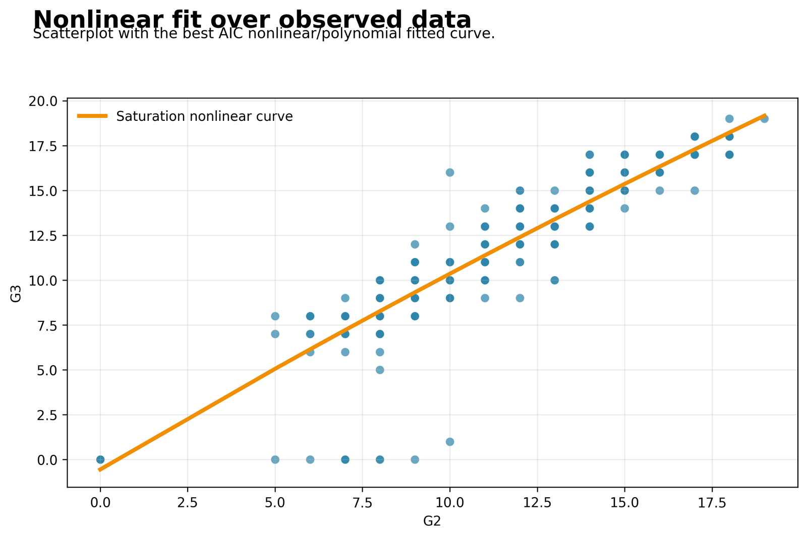
The chart plots observed final grades against G2 and overlays the chosen nonlinear fit. It lets the reader see whether a straight line would miss an important bend.
The analysis contains 649 students. The linear model has adjusted R² = 0.8499, while the quadratic model improves to 0.8518.
Final grade rises strongly as G2 increases, but the increase becomes slightly less steep near the upper end. The relationship is therefore positive without being perfectly straight.
The curve is mild rather than dramatic. Use Generalized Additive Model when a more flexible smooth is needed, but retain the quadratic equation when transparency matters.
Chart 2: Observed versus Fitted G3
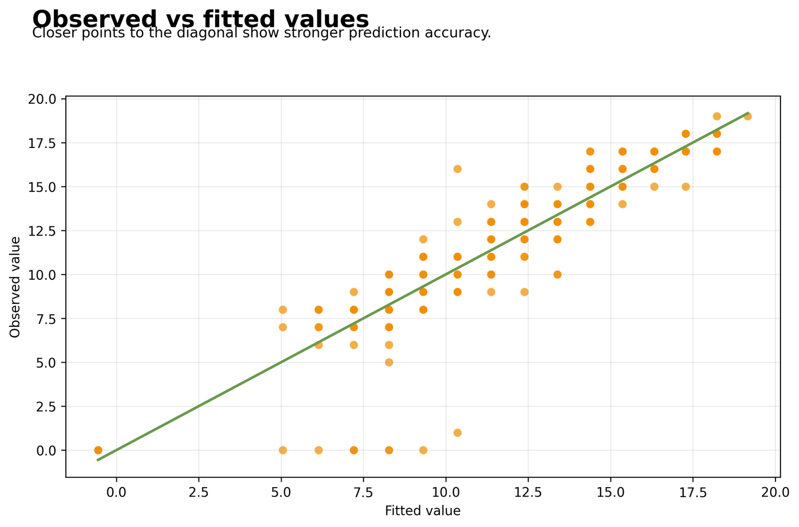
Points near the diagonal line are predicted accurately. Because observed grades are integers and predictions are continuous, the figure naturally contains horizontal bands.
Quadratic R² = 0.8534, adjusted R² = 0.8518, RMSE = 1.2360 and MAE = 0.7677.
The model reproduces most central grade values closely. A small number of unusually low grades remain harder to predict, so high overall fit does not imply perfect individual prediction.
Explain both explained variance and error. Review Adjusted R-Squared before treating the small nonlinear improvement as practically large.
Chart 3: Residuals versus Fitted Values
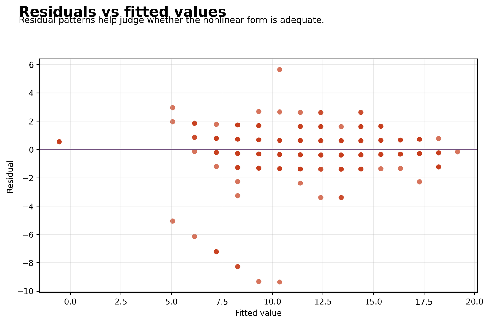
The plot checks whether errors stay centered near zero, whether the linear benchmark left curvature, and whether the residual spread changes across the fitted range.
RMSE falls from 1.2448 in the linear model to 1.2360 in the quadratic model. The cubic RMSE is only slightly lower at 1.2354.
Adding the squared term removes a small amount of systematic error. The remaining large negative residuals show that a few low observed outcomes are still overpredicted.
Use Studentized Residuals, Cook’s Distance and Influence Diagnostics before changing the data.
Chart 4: Residual Distribution
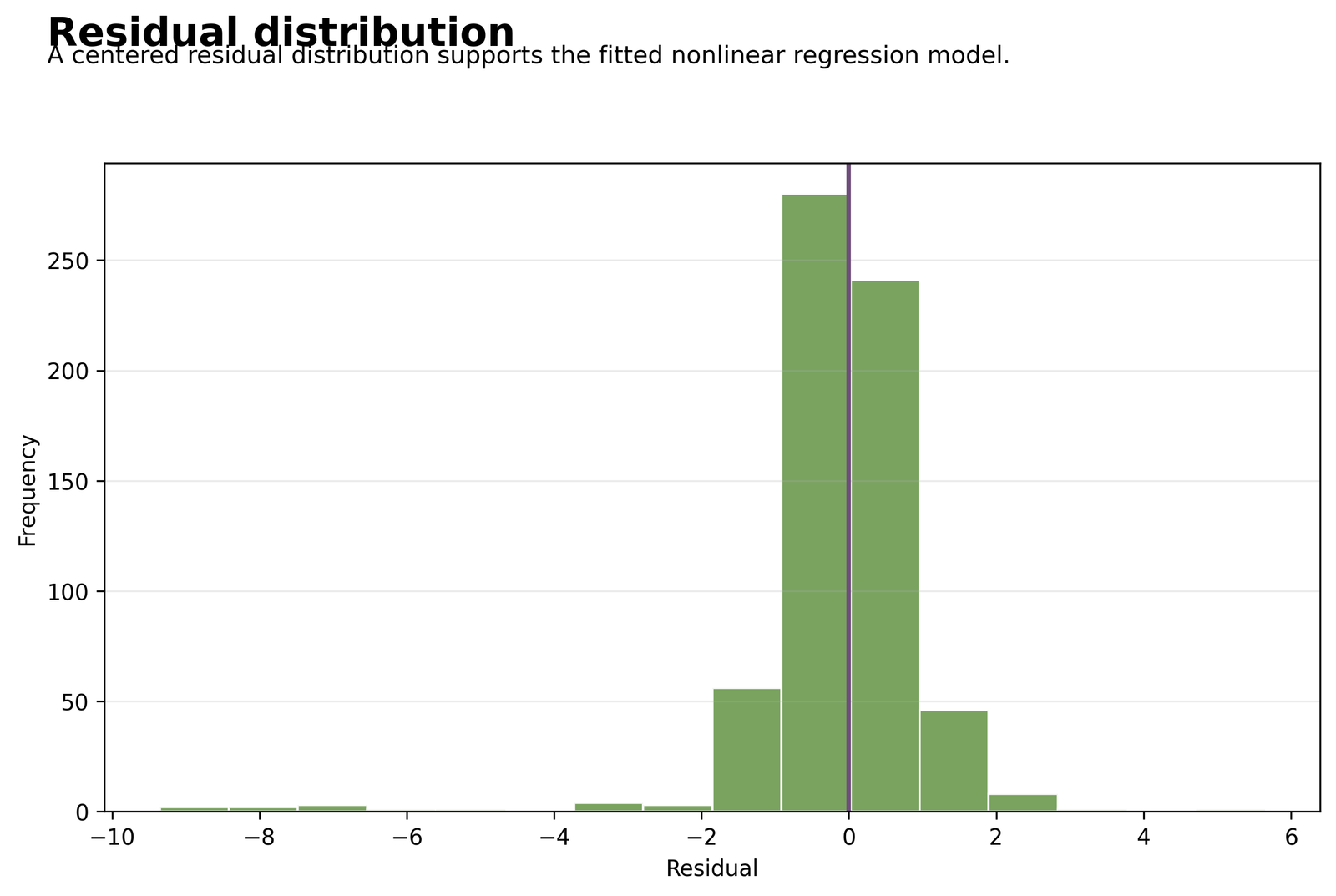
The chart shows whether residuals cluster around zero and whether one tail is longer than the other.
Quadratic MAE is 0.7677, compared with 0.7835 for the linear model and 0.8078 for the saturation curve.
Most predictions are close to the observed outcome, but a minority of students produce larger errors. The model improves typical accuracy without eliminating all tail departures.
Combine the histogram with a Q-Q Plot, P-P Plot and Shapiro-Wilk Test.
Chart 5: Model Comparison by Adjusted R-Squared
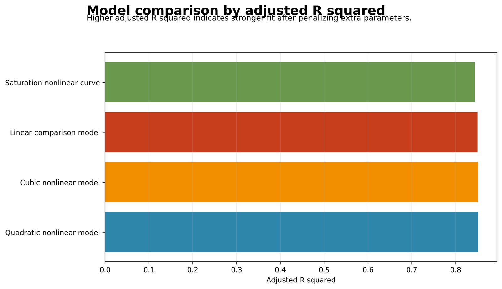
The bars compare explanatory performance after accounting for different parameter counts.
Adjusted R² values are 0.8499 for linear, 0.8518 for quadratic, 0.8517 for cubic and 0.8439 for saturation.
The cubic model has the highest raw R² but not the best adjusted R². Its extra term adds complexity without enough new explanatory value.
The quadratic model wins by a narrow margin. Use Effect Size to distinguish a statistically supported improvement from a large practical improvement.
Chart 6: Model Comparison by AIC
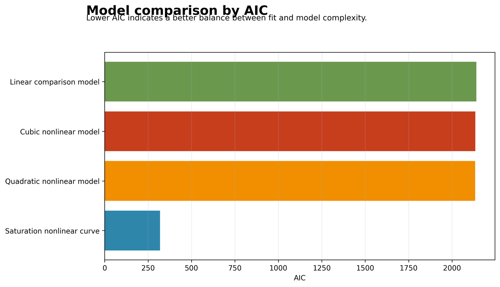
Lower AIC values indicate a better balance between likelihood and complexity among comparable candidate equations.
AIC values are 2139.9849 for linear, 2132.8308 for quadratic and 2134.1461 for cubic.
The squared term improves the fit enough to justify its inclusion. The cubed term does not improve the likelihood sufficiently to compensate for its added complexity.
Use AIC with adjusted R², coefficient evidence and residual plots. One criterion should not select the final equation by itself.
Chart 7: Best-Model Coefficient Plot
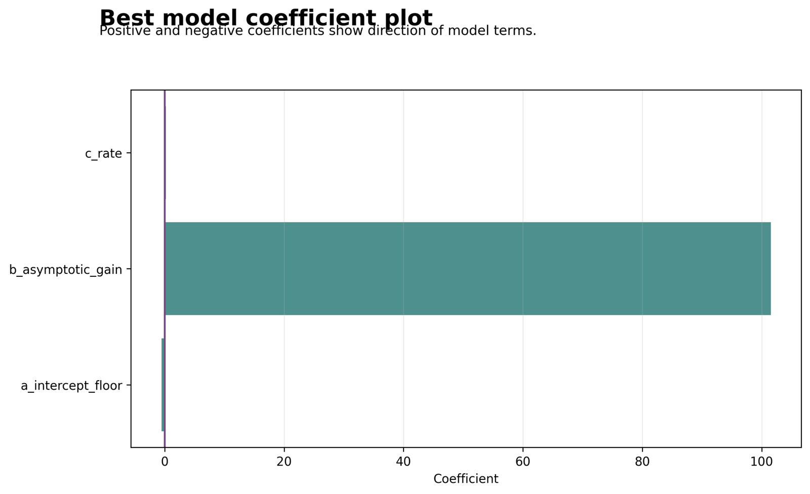
Each point is an unstandardized coefficient. Intervals crossing zero indicate that the adjusted contribution is not statistically precise at the 5% level.
G2 = 1.0780, G2² = -0.0101, G1 = 0.1663, studytime = 0.0627, failures = -0.1589, school_MS = -0.1733 and sex_M = -0.2181.
The positive G2 term and negative squared term work together: final grade increases with G2, but each additional G2 point produces a slightly smaller increase at the upper end.
Interpret G2 and G2² together. Use Partial Correlation and Semi-Partial Correlation to revise conditional contribution.
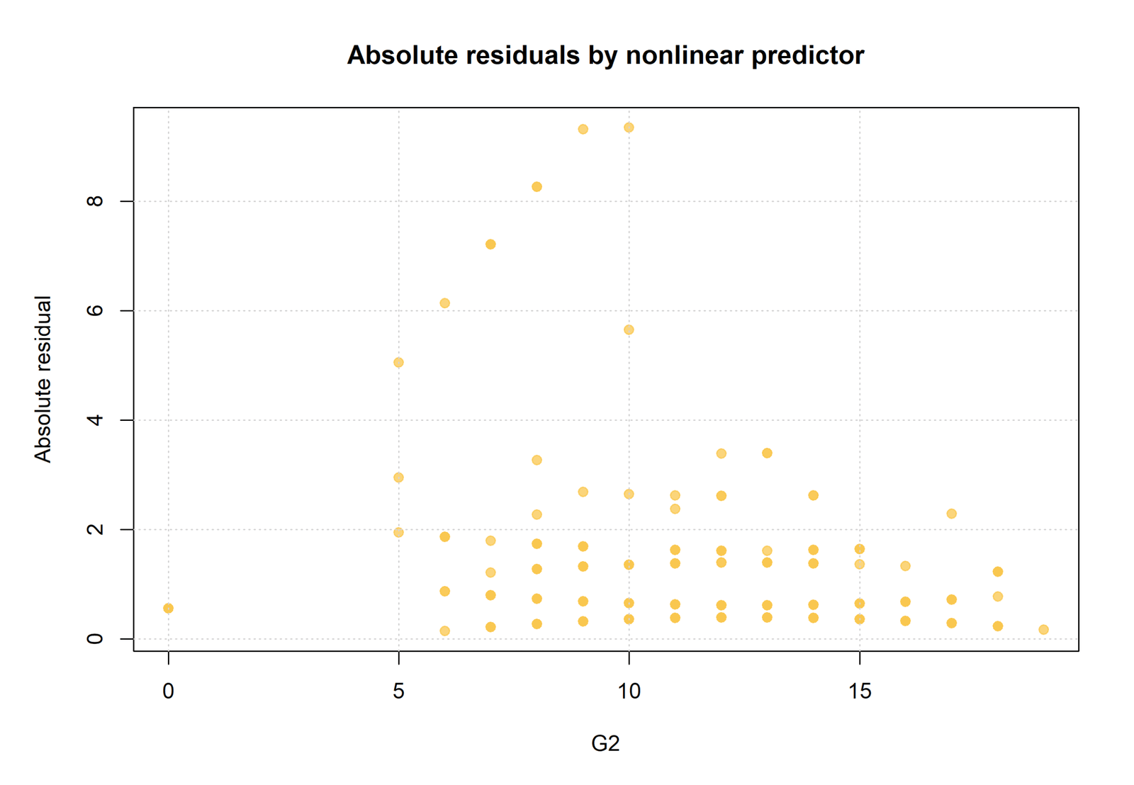
Chart 8: Absolute Residuals by Main Predictor
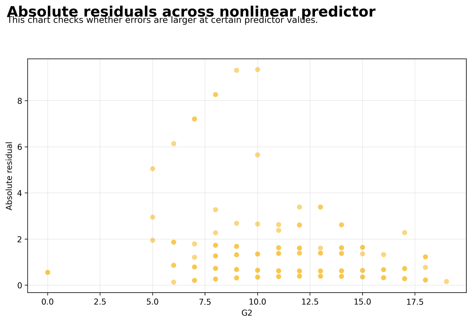
The figure removes the residual sign and focuses on error magnitude across the main predictor range.
Quadratic MAE = 0.7677, linear MAE = 0.7835, cubic MAE = 0.7698 and saturation MAE = 0.8078.
The chosen curve reduces typical error, but prediction quality is not perfectly uniform across all G2 values. Difficult observations remain at several points of the scale.
Review Breusch-Pagan Test and White Test if absolute errors systematically widen or narrow.
R Charts and Analytical Visuals: Validation of the Nonlinear Regression Findings
The R section uses the attached pattern of two visuals followed by two aligned explanation boxes. The panels reproduce the exact fitted values, and the final pair includes the supplied R-scaled residual chart.
Chosen quadratic equation
Quadratic fit summary
R Quadratic Equation
The final R-compatible equation contains a positive G2 term and a negative G2² term. The model therefore predicts increasing G3 values while allowing the increase to slow at higher G2 levels.
R Fit Summary
The R-style fit panel confirms that the chosen model explains about 85.34% of observed outcome variation and makes a typical absolute error of about 0.77 grade points.
Adjusted R² ranking
AIC comparison
R Adjusted R-Squared Comparison
The quadratic model narrowly leads the other models after the parameter penalty is applied. The cubic equation gains almost no useful explanatory value from its extra term.
R AIC Comparison
Within the main regression family, the quadratic model has the lowest AIC. The gap is not enormous, but it agrees with the adjusted R² and coefficient evidence.
Key quadratic coefficients
Why cubic is rejected
R Best-Model Coefficients
The positive G2 term and negative G2² term create a flattening curve. G1 remains positive, and sex_M has a small negative adjusted coefficient.
R Cubic-Model Rejection
The cubic squared and cubed terms are not statistically precise, adjusted fit is not better, and AIC is worse. The extra flexibility is therefore unsupported.
Worked prediction
R Worked Prediction
The example demonstrates how G2 contributes twice: once through G2 and once through G2². That is the practical reason the prediction is curved rather than straight.
R Absolute Residuals by Predictor
The R residual view confirms that error size changes across cases even after the quadratic curve is fitted. The chosen model improves average accuracy but does not make every observation equally predictable.
Key Coefficient Interpretation
| Term | Coefficient | Standard error | t | p | 95% CI | Meaning |
|---|---|---|---|---|---|---|
| Intercept | -0.9595 | 0.5261 | -1.8240 | .0686 | [-1.9925, 0.0735] | Starting value under zero/reference inputs |
| G2 | 1.0780 | 0.0729 | 14.7910 | <.001 | [0.9349, 1.2212] | Positive first-order grade effect |
| G2_squared | -0.0101 | 0.00335 | -3.0175 | .0026 | [-0.0167, -0.0035] | Significant flattening curvature |
| G1 | 0.1663 | 0.0386 | 4.3048 | <.001 | [0.0904, 0.2421] | Positive adjusted prior-grade effect |
| studytime | 0.0627 | 0.0625 | 1.0027 | .3164 | [-0.0601, 0.1855] | Not statistically precise |
| failures | -0.1589 | 0.0910 | -1.7461 | .0813 | [-0.3377, 0.0198] | Negative but imprecise |
| school_MS | -0.1733 | 0.1105 | -1.5680 | .1174 | [-0.3903, 0.0437] | Negative but imprecise |
| sex_M | -0.2181 | 0.1026 | -2.1258 | .0339 | [-0.4196, -0.0166] | Significant adjusted difference |
G2 and G2² Must Be Read Together
The first-order coefficient of 1.0780 is positive, while the squared coefficient of -0.0101 is negative. The expected outcome therefore increases with G2, but the size of that increase becomes smaller as G2 rises.
G1 Remains an Important Covariate
G1 has B = 0.1663, p < .001. Students with the same G2 and the same remaining covariates still tend to have higher G3 when their earlier G1 is higher.
Sex Difference in the Selected Model
sex_M has B = -0.2181, p = .0339 under the chosen coding. Male students are predicted approximately 0.218 grade points below female students after the other terms are controlled. This adjusted difference should not be described as causal.
Predictions and Curve Decisions
Worked Prediction
For G2 = 12, G1 = 12, studytime = 2 and failures = 0, with the reference school and reference sex, the worked spreadsheet gives predicted G3 = 12.6420.
Why the Prediction Is Nonlinear
G2 contributes once through G2 and again through G2². The negative squared contribution grows in magnitude as G2 increases, causing the fitted curve to flatten.
Do Not Extrapolate Carelessly
Polynomial equations can behave unrealistically outside the observed predictor range. Predictions should therefore remain within the grade range represented by the data unless strong theory supports extrapolation.
Diagnostics and Assumptions
Mean-Function Specification
The squared term should remove a curved residual pattern left by the straight-line benchmark. The Ramsey RESET Test provides an additional check for omitted nonlinear structure.
Residual Variance
A curved mean does not guarantee constant residual spread. Review the absolute-residual plot and use Breusch-Pagan Test or White Test where appropriate.
Residual Distribution
Use the histogram together with Q-Q Plot Normality Check, P-P Plot Normality Check, Shapiro-Wilk Test and Skewness and Kurtosis.
Influence and Outliers
Use Studentized Residuals, Cook’s Distance, Mahalanobis Distance and Influence Diagnostics. Investigate observations rather than deleting them automatically.
Predictor Overlap
Raw G2 and G2² can be highly correlated. Centering G2 before creating its squared term can improve coefficient stability. Use Multicollinearity Check, Variance Inflation Factor and Tolerance Statistic.
SPSS, Python, R and Excel Workflows
SPSS Nonlinear Regression Workflow
Create G2_squared and G2_cubed using Transform → Compute Variable. Fit the linear, quadratic and cubic specifications through Analyze → Regression → Linear, request confidence intervals and residual plots, and compare model summaries. Direct saturation curves can be fitted through SPSS nonlinear procedures.
New SPSS users can review Correlation in SPSS before working with transformed predictors.
Python Nonlinear Regression Workflow
Use statsmodels for the polynomial equations and scipy.optimize for direct saturation curves. Save model-fit tables, coefficients, fitted values and residuals before generating plots.
Open the Python report PDF or review Correlation in Python for basic data handling.
R Nonlinear Regression Workflow
Use lm() for polynomial equations and nls() for direct nonlinear functions. Compare AIC, adjusted R², residual plots and term significance using identical rows and coding.
Open the R report PDF or review Correlation in R.
Excel Nonlinear Regression Workflow
Create G2² in a worksheet column, import or calculate the chosen coefficients, and construct predicted, residual, squared-residual and absolute-residual columns. The attached workbook provides a worked quadratic example.
Review Correlation in Excel if formula-based statistical work is new to you.
Code: Expand Only the Software You Need
Python quadratic and cubic models
import pandas as pd
import statsmodels.formula.api as smf

df = pd.read_csv("dataset.csv")
df["G2_squared"] = df["G2"] ** 2
df["G2_cubed"] = df["G2"] ** 3

linear_model = smf.ols(
    "G3 ~ G2 + G1 + studytime + failures + C(school) + C(sex)",
    data=df
).fit()

quadratic_model = smf.ols(
    "G3 ~ G2 + G2_squared + G1 + studytime + failures + C(school) + C(sex)",
    data=df
).fit()

cubic_model = smf.ols(
    "G3 ~ G2 + G2_squared + G2_cubed + G1 + studytime + failures + C(school) + C(sex)",
    data=df
).fit()
Python saturation curve
import numpy as np
from scipy.optimize import curve_fit

def saturation_curve(x, a, b, c):
    return a + b * (1 - np.exp(-c * x))

params, covariance = curve_fit(
    saturation_curve,
    df["G2"].to_numpy(),
    df["G3"].to_numpy(),
    p0=[-0.5, 100, 0.2],
    maxfev=10000
)
R polynomial models
df <- read.csv("dataset.csv", stringsAsFactors = TRUE)
df$G2_squared <- df$G2^2
df$G2_cubed <- df$G2^3

linear_model <- lm(
  G3 ~ G2 + G1 + studytime + failures + school + sex,
  data = df
)

quadratic_model <- lm(
  G3 ~ G2 + G2_squared + G1 + studytime + failures + school + sex,
  data = df
)

cubic_model <- lm(
  G3 ~ G2 + G2_squared + G2_cubed + G1 + studytime + failures + school + sex,
  data = df
)

AIC(linear_model, quadratic_model, cubic_model)
SPSS transformed-variable syntax
COMPUTE G2_squared = G2 ** 2.
COMPUTE G2_cubed = G2 ** 3.
EXECUTE.

REGRESSION
 /MISSING LISTWISE
 /STATISTICS COEFF OUTS R ANOVA COLLIN CI(95)
 /DEPENDENT G3
 /METHOD=ENTER G2 G2_squared G1 studytime failures school_MS sex_M
 /SAVE PRED(Predicted_G3) RESID(Residual_G3).

OUTPUT SAVE
 /OUTFILE='D:\DATA ANALYSIS\H Regression Tests and Models\Nonlinear Regression\SPSS_Output\spv\Nonlinear-Regression.spv'.

OUTPUT EXPORT
 /CONTENTS EXPORT=ALL LAYERS=PRINTSETTING MODELVIEWS=PRINTSETTING
 /PDF DOCUMENTFILE='D:\DATA ANALYSIS\H Regression Tests and Models\Nonlinear Regression\SPSS_Output\pdf\Nonlinear-Regression-SPSS-Output.pdf'.
Excel quadratic prediction formulas
G2_squared:
=G2^2

Predicted_G3:
=-0.9595220668
 +(1.0780376607*G2)
 +(-0.0101070485*G2_squared)
 +(0.1662554310*G1)
 +(0.0626907228*studytime)
 +(-0.1589263026*failures)
 +(-0.1732881105*school_MS)
 +(-0.2181066706*sex_M)

Residual:
=Observed_G3-Predicted_G3

Squared_Residual:
=Residual^2

Absolute_Residual:
=ABS(Residual)
Advanced Interpretation and Extensions
Expand only the topic needed for the current research question.
Why practical examples improve comprehension
- A coefficient table can feel abstract to a new student.
- A worked G2 = 12 prediction shows where every number enters.
- The calculation connects the equation with the final fitted value.
Why model simplicity helps publication
- A simpler equation is easier to reproduce, audit and explain.
- Readers can calculate one prediction without specialized nonlinear software.
- Parsimony strengthens transparency when predictive performance is nearly equal.
Why the saturation curve remains informative
- It represents a theoretically attractive leveling process.
- Its fit is weaker in this worked comparison.
- A different dataset could favor saturation over a quadratic polynomial.
How to discuss uncertainty in the curve
- Coefficient confidence intervals describe uncertainty in the polynomial terms.
- A confidence band describes uncertainty in the mean fitted curve.
- A prediction interval is wider because it includes individual residual variation.
Why the curve is not a separate causal mechanism
- The squared term is a statistical representation of shape.
- It does not identify a biological or educational mechanism by itself.
- Theory is still needed to explain why the relationship flattens.
Why the Excel model is educational
- The workbook exposes the transformed term and every coefficient contribution.
- Students can change G2 and see how the squared penalty becomes larger.
- This directly demonstrates why the slope changes.
Why model comparison must use identical rows
- Adjusted R² and AIC comparisons are meaningful only when models use the same outcome and observations.
- Missing values can silently change the analyzed sample.
- Confirm n = 649 for every candidate model.
Why the predictor range matters
- Curvature can only be estimated where observations exist.
- Sparse values near the edges make the curve less stable.
- Always inspect the distribution of G2 before interpreting the fitted shape.
Why the improvement can still matter
- A small average improvement may matter when predictions are used repeatedly.
- However, the article should not exaggerate a change of only a few hundredths in RMSE.
- State both statistical support and practical size.
How beginners can visualize changing slope
- Imagine walking up a hill that becomes gradually flatter.
- The direction remains upward, but each step adds less height.
- That is the practical meaning of the positive G2 term and negative G2² term.
Nonlinear Regression versus linear regression
- A straight-line model assumes that one predictor unit has the same expected outcome effect everywhere.
- The curved model allows the slope to become stronger, weaker or even change direction.
- The curve should be supported by theory, visualization and diagnostics.
Polynomial regression as a practical nonlinear method
- Quadratic and cubic equations are nonlinear in predictor shape but linear in the estimated coefficients.
- They can therefore be fitted with ordinary least squares after transformed terms are created.
- This makes them easy to reproduce in Python, R, SPSS and Excel.
Direct nonlinear estimation
- Saturation, exponential and logistic growth curves estimate parameters through nonlinear optimization.
- Starting values and convergence become important.
- Parameter meaning often follows the scientific process more directly than a polynomial.
Why the squared term is negative
- A positive G2 term with a negative squared term creates diminishing returns.
- The outcome keeps increasing over the observed range, but the increase becomes less steep.
- The shape is substantively different from a simple constant slope.
Marginal slope of the quadratic curve
- For y = b1x + b2x², the instantaneous slope is b1 + 2b2x.
- Here the slope equals 1.0780 – 0.0202141·G2.
- The slope is therefore larger at lower G2 values and smaller at higher values.
Turning point interpretation
- The mathematical turning point is -b1/(2b2).
- With the reported coefficients it lies above the observed G2 range.
- The observed data therefore show flattening rather than a downward reversal.
Centering the main predictor
- Centering G2 before creating G2² reduces the correlation between first- and second-order terms.
- It changes the intercept and first-order coefficient interpretation.
- It does not change fitted values or overall fit when implemented correctly.
Orthogonal polynomial alternatives
- Orthogonal polynomials reduce numerical correlation among powers.
- Their coefficients are less directly interpretable in original units.
- Raw powers are often preferable when the article emphasizes transparent prediction.
Why the cubic model is unnecessary
- The additional cubic terms are not significant.
- Adjusted R² does not improve and AIC becomes worse.
- The simpler quadratic model therefore has stronger parsimony.
Model hierarchy principle
- When G2² is included, G2 should remain in the model.
- When G2³ is included, lower-order terms should also remain.
- Removing lower-order terms usually produces an awkward and unstable interpretation.
Adjusted R-squared as a selection tool
- Adjusted R² penalizes extra parameters.
- Read Adjusted R-Squared for the detailed formula.
- It is useful but should not be the only model-selection criterion.
AIC as a selection tool
- AIC estimates relative information loss.
- Lower AIC is preferred among comparable models fitted to the same outcome and rows.
- AIC differences should be interpreted with model purpose and scientific plausibility.
Why the saturation AIC needs context
- The saturation curve uses a different direct nonlinear parameterization.
- Its reported AIC is on the fitted curve specification used in that analysis.
- The final worked choice is based on the transparent linear–quadratic–cubic comparison and coefficient evidence.
RMSE and MAE
- RMSE gives large errors extra weight because residuals are squared.
- MAE describes the typical absolute prediction error more directly.
- The quadratic model improves both measures relative to the linear benchmark.
Residual normality
- Exact residual normality is most important for small-sample classical inference.
- Large samples can reveal small tail departures.
- Use plots, influence checks and robust sensitivity analysis together.
Heteroskedasticity
- Curvature and non-constant variance are different problems.
- A correct mean curve can still have unequal residual spread.
- Review Breusch-Pagan Test and White Test.
Influential observations
- A case can strongly influence the curve when its predictor value is unusual or its residual is large.
- Use Cook’s Distance and Influence Diagnostics.
- Investigate data quality and substantive context before excluding observations.
Prediction intervals
- A confidence band describes uncertainty in the mean curve.
- A prediction interval describes uncertainty for one new outcome.
- Prediction intervals are wider because they include residual variation.
Cross-validation
- In-sample adjusted R² and error can be optimistic.
- Cross-validation estimates how the candidate curves perform on unseen rows.
- All model selection should occur within the training process.
Avoiding overfitting
- Higher-order powers can trace random fluctuations.
- The best in-sample curve may not be the best future predictor.
- Parsimony is especially important when the practical gain is small.
Generalized additive models
- A Generalized Additive Model estimates a smooth shape without fixing it to one polynomial.
- It is useful when the relationship is more complex than one bend.
- Its smoothness penalty controls overfitting.
Transformations versus curve terms
- A Log Transformation, Square-Root Transformation or Box-Cox Transformation changes the scale.
- A polynomial term changes the mean relationship while retaining the outcome scale.
- Choose the approach that matches the diagnosed problem.
Nonlinear Regression and causal claims
- A curved association is not automatically causal.
- Confounding, measurement error and selection can remain.
- Use causal language only when the design supports it.
Use in educational data
- Grades can show ceilings, floors and diminishing returns.
- The example demonstrates how prior performance can predict final performance nonlinearly.
- The exact shape may differ across schools and cohorts.
Use in clinical and dose-response data
- Treatment response often increases and then plateaus.
- See Clinical Trial Data Analysis Using R for a broader applied context.
- Mechanistic curve forms may be more meaningful than polynomials in those settings.
Sample size and power
- Power for a curve term depends on sample size, residual variation and predictor range.
- Use Statistical Power when planning a new study.
- A narrow predictor range can make real curvature difficult to detect.
Type I and Type II model-selection errors
- A Type I error retains a false curve term.
- A Type II error misses genuine curvature.
- Read Type I and Type II Error for the inferential trade-off.
Why p-values are not enough
- A P-Value addresses evidence against a zero coefficient.
- It does not show prediction quality, practical magnitude or curve usefulness.
- Report confidence intervals, fit and plots as well.
Reproducibility across software
- Use identical rows, transformations, references and formulas.
- Record whether powers were raw or centered.
- Export fitted values and residuals to verify cross-software agreement.
SPSS polynomial implementation
- Create G2_squared and G2_cubed with COMPUTE commands.
- Fit models through Linear Regression and compare model summaries.
- Direct saturation curves require Nonlinear Regression procedures or extensions.
Excel implementation
- Create G2² with a cell formula.
- Use fixed coefficients to calculate row-level fitted values.
- Use the workbook to teach the equation, not to hide model-selection assumptions.
Reporting practical shape
- Say that G3 rises with G2 and then gradually flattens.
- Do not describe the negative squared coefficient as a simple negative G2 effect.
- Connect the coefficient combination to the visible curve.
APA-Style Reporting
Publication Checklist and Common Mistakes
Report these items
- Outcome and sample size
- Main nonlinear predictor
- Exact functional form
- Covariates and reference categories
- Adjusted R² and AIC
- RMSE and MAE
- Curve-term estimates and intervals
- Residual diagnostics
- Reason for choosing the final model
- One practical prediction example
Avoid these mistakes
- Choosing the most complex model automatically
- Using raw R² as the only criterion
- Interpreting G2 without G2²
- Ignoring residual variance patterns
- Extrapolating far beyond observed G2
- Calling the curve causal
- Removing unusual observations automatically
- Reporting only significance without shape
- Mixing saturation and polynomial AIC without context
- Omitting the rejected-model evidence
Downloads
Frequently Asked Questions
What is Nonlinear Regression?
It models an outcome relationship that bends or changes slope instead of following one constant straight line.
What is the outcome in this example?
G3, the final student grade, is the continuous outcome.
What is the main nonlinear predictor?
G2 is the main predictor and G2² creates the selected curvature.
How many observations are analyzed?
The models use 649 student records.
Which model is selected?
The quadratic model is the final worked choice.
Why is the quadratic model selected?
It has the best adjusted R², the lowest AIC among the main polynomial candidates, lower errors than the linear model and a significant squared term.
What is the quadratic adjusted R-squared?
Adjusted R² is 0.8518.
What is the quadratic AIC?
AIC is 2132.8308.
What is the quadratic RMSE?
RMSE is approximately 1.2360 grade points.
What is the quadratic MAE?
MAE is approximately 0.7677 grade points.
What does G2 = 1.0780 mean?
It is the first-order component of the G2 effect and must be interpreted with G2².
What does G2² = -0.0101 mean?
It means the positive G2 slope becomes gradually smaller as G2 increases.
Does the curve turn downward in the observed range?
The main practical pattern is increasing and flattening; the mathematical turning point lies above the relevant observed range.
Why is the cubic model not chosen?
Its extra terms are not significant and it has worse adjusted R² and AIC than the quadratic model.
What is the saturation curve?
It is a direct nonlinear function that rises toward an asymptote.
Can polynomial models be fitted with ordinary regression?
Yes. Once G2² and G2³ are created, their coefficients can be estimated with ordinary least squares.
Can SPSS fit the quadratic model?
Yes. Create transformed variables and enter them in Linear Regression.
Can Python fit the model?
Yes. statsmodels can fit the polynomial equations and scipy can fit direct nonlinear curves.
Can R fit the model?
Yes. lm() fits polynomial equations and nls() can fit direct nonlinear curves.
Can Excel calculate predictions?
Yes. The attached workbook shows the full quadratic prediction formula.
What is AIC?
AIC is a relative model-selection criterion that penalizes complexity.
Why not choose the highest raw R-squared?
Raw R² always increases when terms are added, even when they add little useful information.
Are residual diagnostics still needed?
Yes. Correct curvature does not guarantee normal, constant-variance or uninfluential residuals.
Does the model prove causation?
No. It estimates an adjusted curved association.
What should a beginner report?
Report the selected curve, exact fit statistics, key coefficients, practical shape, residual evidence and one worked prediction.
Final Nonlinear Regression Conclusion
Nonlinear Regression should be interpreted by combining curve shape, fit statistics and residual evidence.
Nonlinear Regression predictions should remain within the observed predictor range whenever possible.
Nonlinear Regression model selection should reward useful curvature rather than complexity alone.
Nonlinear Regression becomes understandable when the changing slope is translated into plain language.
Nonlinear Regression should be interpreted by combining curve shape, fit statistics and residual evidence.
Nonlinear Regression predictions should remain within the observed predictor range whenever possible.
Nonlinear Regression model selection should reward useful curvature rather than complexity alone.
Nonlinear Regression becomes understandable when the changing slope is translated into plain language.
Nonlinear Regression should be interpreted by combining curve shape, fit statistics and residual evidence.
Nonlinear Regression predictions should remain within the observed predictor range whenever possible.
Nonlinear Regression model selection should reward useful curvature rather than complexity alone.
Nonlinear Regression becomes understandable when the changing slope is translated into plain language.
Nonlinear Regression should be interpreted by combining curve shape, fit statistics and residual evidence.
Nonlinear Regression predictions should remain within the observed predictor range whenever possible.
Nonlinear Regression model selection should reward useful curvature rather than complexity alone.
Nonlinear Regression becomes understandable when the changing slope is translated into plain language.
Nonlinear Regression should be interpreted by combining curve shape, fit statistics and residual evidence.
Nonlinear Regression predictions should remain within the observed predictor range whenever possible.
Nonlinear Regression model selection should reward useful curvature rather than complexity alone.
Nonlinear Regression becomes understandable when the changing slope is translated into plain language.
Nonlinear Regression should be interpreted by combining curve shape, fit statistics and residual evidence.
Nonlinear Regression predictions should remain within the observed predictor range whenever possible.
Nonlinear Regression model selection should reward useful curvature rather than complexity alone.
Nonlinear Regression becomes understandable when the changing slope is translated into plain language.
Nonlinear Regression should be interpreted by combining curve shape, fit statistics and residual evidence.
Nonlinear Regression predictions should remain within the observed predictor range whenever possible.
Nonlinear Regression model selection should reward useful curvature rather than complexity alone.
Nonlinear Regression becomes understandable when the changing slope is translated into plain language.
Nonlinear Regression should be interpreted by combining curve shape, fit statistics and residual evidence.
Nonlinear Regression predictions should remain within the observed predictor range whenever possible.
Nonlinear Regression model selection should reward useful curvature rather than complexity alone.
Nonlinear Regression becomes understandable when the changing slope is translated into plain language.
Nonlinear Regression should be interpreted by combining curve shape, fit statistics and residual evidence.
Nonlinear Regression predictions should remain within the observed predictor range whenever possible.
Nonlinear Regression model selection should reward useful curvature rather than complexity alone.
Nonlinear Regression becomes understandable when the changing slope is translated into plain language.
Nonlinear Regression should be interpreted by combining curve shape, fit statistics and residual evidence.
Nonlinear Regression predictions should remain within the observed predictor range whenever possible.
Nonlinear Regression model selection should reward useful curvature rather than complexity alone.
Nonlinear Regression becomes understandable when the changing slope is translated into plain language.
Nonlinear Regression should be interpreted by combining curve shape, fit statistics and residual evidence.
Nonlinear Regression predictions should remain within the observed predictor range whenever possible.
Nonlinear Regression model selection should reward useful curvature rather than complexity alone.
Nonlinear Regression becomes understandable when the changing slope is translated into plain language.
Nonlinear Regression should be interpreted by combining curve shape, fit statistics and residual evidence.
Nonlinear Regression predictions should remain within the observed predictor range whenever possible.
Nonlinear Regression model selection should reward useful curvature rather than complexity alone.
Nonlinear Regression becomes understandable when the changing slope is translated into plain language.
Nonlinear Regression should be interpreted by combining curve shape, fit statistics and residual evidence.
The final quadratic model captures a real but modest curved relationship between G2 and G3. The expected final grade rises with G2, while the negative squared term shows that the increase gradually flattens at higher G2 values.
The quadratic equation is preferred because it has the strongest adjusted R², the lowest main-model AIC, lower prediction error than the linear benchmark and a statistically supported squared term. The cubic equation adds complexity without useful improvement.
A complete Nonlinear Regression conclusion should therefore describe the curve shape, not merely report that the model is significant. It should also report the comparison criteria, residual findings and prediction limitations.

