
G Test: Formula, Interpretation, Goodness-of-Fit Example, Python, R, SPSS and Excel Guide
G Test is the likelihood-ratio counterpart to the Pearson chi-square goodness-of-fit test. This complete guide explains the hypotheses, formula, interpretation, worked manual calculation, Python and R charts, software workflows, APA reporting, common mistakes and downloads through a one-variable four-category example based on students’ school-choice reason.
649 observations
G² = 142.6067
df = 3, p = 1.04 × 10⁻³⁰
G Test Model Overview
G Test, often called the likelihood-ratio goodness-of-fit test or the log-likelihood ratio test for one-way categorical data, compares observed category frequencies with expected frequencies under a null model. In the current example, the variable reason has four categories—course, home, other and reputation—and the null hypothesis states that all four categories are equally likely.
What question does the G Test answer?
The question is whether the observed distribution of school-choice reason is consistent with the theoretical distribution stated in the null hypothesis. Here, the null probabilities are all 0.25, so each category is expected to appear equally often. If you need background on hypothesis logic, see null and alternative hypothesis, hypothesis testing and p-value.
How it differs from Pearson’s chi-square goodness-of-fit test
Both procedures compare observed and expected frequencies, and both usually give very similar conclusions for moderate and large samples. The difference is in the test statistic. Pearson’s test uses squared standardized residuals, whereas the G Test uses the likelihood-ratio expression 2 Σ O ln(O/E). In this example, both point to the same conclusion: the reason distribution is far from equal.
Worked example at a glance
The observed counts are 285 for course, 149 for home, 72 for other and 143 for reputation. Under equal probabilities, each category would be expected to occur 162.25 times. The likelihood-ratio statistic is G² = 142.6067 with df = 3 and p = 1.0360 × 10⁻³⁰, so the equal-probability null is decisively rejected.
Quick Answer: G Test Result
The G Test compares the observed distribution of reason with an equal-probability null model. Because the sample size is 649 and the departures from equality are large, the result is overwhelmingly significant.
Test summary
- Procedure: one-way G Test for goodness of fit
- Null model: four equal category probabilities
- Statistic: G² = 142.6067
- Degrees of freedom: 3
- P-value: 1.0360 × 10⁻³⁰
- Decision at α = .05: reject H0
Substantive meaning
- Course is strongly overrepresented.
- Other is strongly underrepresented.
- Home and reputation are slightly below expectation.
- The pattern is not a small random fluctuation around equality.
- The equal-probability model is not a plausible description of the data.
Table of Contents
- Research question, hypotheses and design
- When to use the G Test
- G Test formula and manual calculation
- Variables and data dictionary
- Observed counts and complete results
- G Test versus chi-square goodness-of-fit
- G Test calculator workflow
- Python chart interpretations
- R chart pairs and interpretation
- Python, R, SPSS and Excel workflows
- Expandable software code
- Assumptions, limitations and advanced interpretation
- APA reporting for the G Test
- Common mistakes and how to correct them
- Reports and worked Excel download
- Related Salar Cafe guides
- Frequently asked questions
- Conclusion
Research Question, Hypotheses and Data Design
reason, a one-way categorical variable with four levels.Research question
Does the observed distribution of school-choice reason match an equal-probability model across the categories course, home, other and reputation?
Null and alternative hypotheses
| Hypothesis | Statistical statement | Meaning |
|---|---|---|
| Null hypothesis | H0: p1 = p2 = p3 = p4 = 0.25 | All four reasons are equally likely. |
| Alternative hypothesis | H1: not all pj equal 0.25 | At least one category probability differs. |
Design behind the test
This is a one-variable goodness-of-fit design. There is no second grouping variable, so this is not a chi-square test of independence and not a chi-square test of homogeneity. Instead, one observed categorical distribution is compared with a theoretical distribution.
Why the expected model must be stated first
The goodness-of-fit logic starts with a declared model. If the expected proportions are chosen after inspecting the observed counts, the inferential meaning breaks down. In this workbook, the expected probabilities are equal by design, so the expected count in each cell is 649 × 0.25 = 162.25.
When to Use the G Test
Use the G Test when
- You have one categorical variable and want to compare it with a theoretical distribution.
- The expected frequencies come from theory, policy, genetics, fairness or a declared benchmark.
- You want a likelihood-ratio alternative to Pearson’s chi-square goodness-of-fit test.
- All observed counts are positive, so the log term is well-defined.
- Sample size is large enough for the chi-square approximation to be reliable.
Choose another method when
- You have two categorical variables and need association, independence or homogeneity testing.
- You have binary paired data; then matched methods are needed.
- You need an exact small-sample one-way test; a binomial or multinomial exact approach may be more appropriate.
- Your outcome is quantitative rather than categorical.
- Expected probabilities are unknown or data-derived in a way that changes the null model.
Simple test-selection logic
If one variable, you may need a goodness-of-fit test.
If yes, compare observed counts with that model.
Use the G Test for the likelihood-ratio statistic, or Pearson chi-square for the squared-residual version.
For broader context, compare this method with chi-square goodness-of-fit test, binomial test and exact test for proportions. They answer related but not identical questions.
G Test Formula and Manual Calculation
The G Test statistic for a one-way goodness-of-fit analysis is:
Here, Oj is the observed count in category j and Ej is the expected count under the null hypothesis.
Step 1: Compute expected counts
Step 2: Calculate the component for each category
| Category | Observed O | Expected E | 2 O ln(O/E) |
|---|---|---|---|
| course | 285 | 162.25 | 321.10997 |
| home | 149 | 162.25 | −25.38723 |
| other | 72 | 162.25 | −116.99600 |
| reputation | 143 | 162.25 | −36.12001 |
Step 3: Add the components
Step 4: Determine the degrees of freedom
Step 5: Obtain the p-value
Under the null hypothesis, the statistic is approximately chi-square distributed with 3 degrees of freedom. The verified p-value is 1.0360142426607893 × 10⁻³⁰.
Variables and Data Dictionary
| Variable | Role | Categories | Total N | Meaning in analysis |
|---|---|---|---|---|
| reason | Observed categorical variable | course, home, other, reputation | 649 | School-choice reason being tested against a theoretical distribution. |
| Expected model | Null distribution | 0.25, 0.25, 0.25, 0.25 | 649 | Equal category probabilities under H0. |
Observed and expected table
| Reason | Observed count | Observed proportion | Expected count | Difference O − E |
|---|---|---|---|---|
| course | 285 | 0.439137 | 162.25 | +122.75 |
| home | 149 | 0.229584 | 162.25 | −13.25 |
| other | 72 | 0.110940 | 162.25 | −90.25 |
| reputation | 143 | 0.220339 | 162.25 | −19.25 |
| Total | 649 | 1.000000 | 649 | 0 |
The observed proportions show that course accounts for 43.91% of responses, while other accounts for only 11.09%. Under the null model, each category would account for exactly 25%. See also frequency and relative frequency tables and descriptive statistics.
Observed Counts and Complete Results
43.91%, well above expectation
11.09%, well below expectation
Likelihood-ratio statistic
k − 1 categories
Essentially zero at standard precision
Large overall departure from the null model
| Metric | Value | Interpretation |
|---|---|---|
| G Test statistic | 142.6067318 | Large likelihood-ratio departure from the null distribution. |
| Degrees of freedom | 3 | One less than the number of categories. |
| P-value | 1.0360142426607893e-30 | Reject the equal-probability null decisively. |
| Pearson chi-square | 146.4329738 | Very similar conclusion from the Pearson statistic. |
| Cohen’s w | 0.4750038 | Large standardized effect for a goodness-of-fit design. |
Which categories drive the result?
The biggest positive departure is course, which exceeds expectation by 122.75 responses. The strongest negative departure is other, which falls short of expectation by 90.25 responses. The categories home and reputation are also below expectation, but their departures are much smaller. This means the rejection is not spread evenly across all categories; it is driven mainly by an excess of course responses and a deficit of other responses.
G Test Versus Chi-Square Goodness-of-Fit
Uses the likelihood-ratio statistic 2 Σ O ln(O/E).
Uses the squared-residual statistic Σ (O−E)²/E.
Both are usually compared with a chi-square distribution using the same degrees of freedom.
In many applications, both give nearly identical decisions.
| Method | Statistic | df | P-value | Decision |
|---|---|---|---|---|
| G Test | 142.6067 | 3 | 1.0360 × 10⁻³⁰ | Reject H0 |
| Pearson chi-square | 146.4330 | 3 | Extremely small | Reject H0 |
The two statistics are close because the sample is large and the departures are clear. In teaching contexts, it is helpful to emphasize that the G Test has a likelihood-ratio interpretation, which often connects naturally to generalized linear models, deviance and log-likelihood reasoning. If you want to explore the Pearson counterpart in full detail, see chi-square goodness-of-fit test.
G Test Calculator Workflow
A reliable G Test calculator should allow the user to enter observed counts and expected probabilities or expected counts, then return the statistic, degrees of freedom, p-value and the contribution of each category.
Calculator inputs for the worked example
| Input | Value | Meaning |
|---|---|---|
| Observed counts | 285, 149, 72, 143 | Observed frequency for each reason category. |
| Expected probabilities | 0.25, 0.25, 0.25, 0.25 | Equal null model. |
| Total sample size | 649 | Total number of responses. |
| Alternative model | Unrestricted multinomial | Observed proportions are free to differ. |
Calculator steps
- Enter the observed counts in the correct order.
- Specify the expected probabilities or expected counts.
- Check that expected counts sum to the same total as observed counts.
- Review each category contribution, not just the final p-value.
- Report both the G Test result and the observed-versus-expected pattern.
Python Chart Interpretations
Chart 1: Observed and expected countsPython
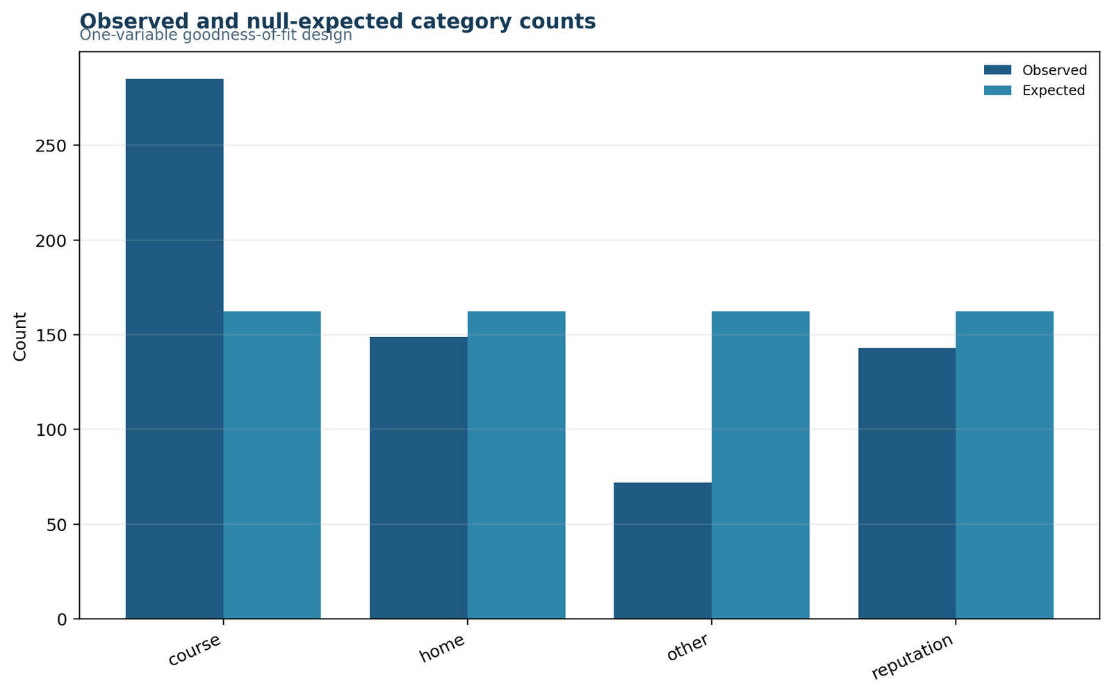
Course stands far above the expected bar, while other falls far below it.
Observed counts are 285, 149, 72 and 143 versus 162.25 expected in every category.
The equal-probability model does not match the observed count structure.
The observed-versus-expected difference is the foundation of the G Test statistic.
Chart 2: Observed proportionsPython
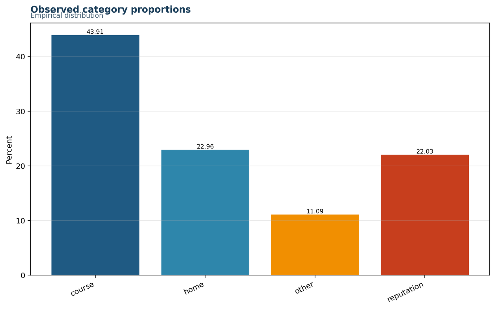
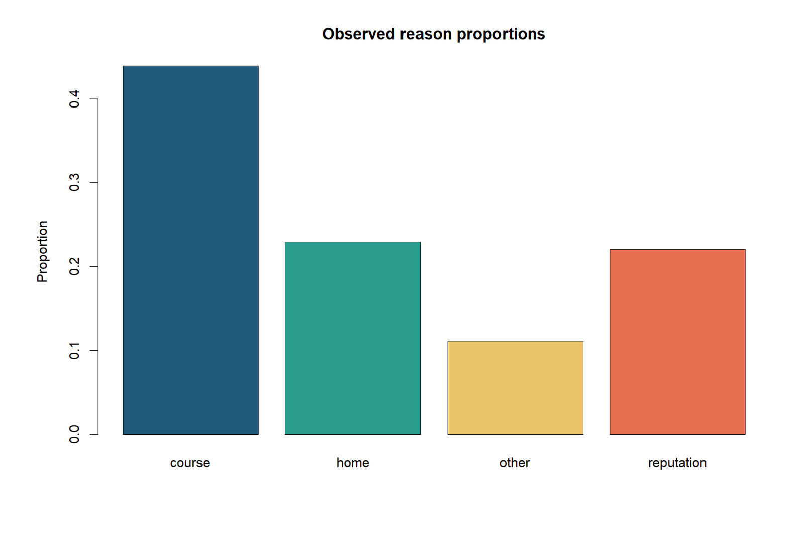
Course is close to 44%, whereas other is close to 11%, far from the 25% benchmark.
Course 0.4391, home 0.2296, other 0.1109 and reputation 0.2203.
The departure from equality is not subtle; it is visually substantial.
Proportions often communicate the substantive difference more clearly than counts alone.
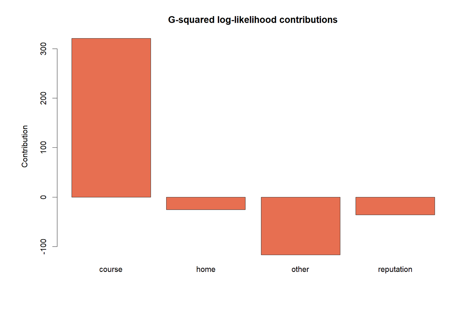
Chart 3: G Test contributionsPython
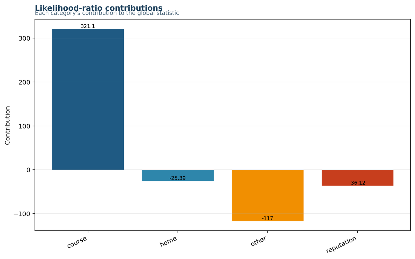
Course contributes the largest positive amount to G², while other makes the largest negative signed departure in the decomposition view.
The category components are 321.1100, −25.3872, −116.9960 and −36.1200 before summation.
The total statistic is driven mostly by two categories: course and other.
Knowing which categories drive the mismatch improves interpretation beyond a single p-value.
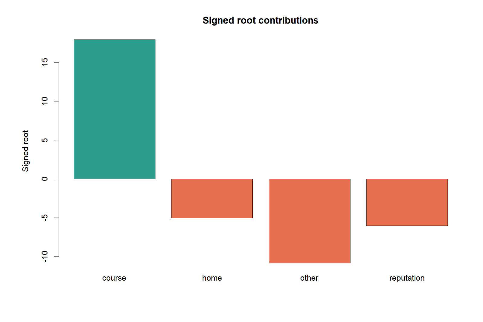
Chart 4: Signed contributionsPython
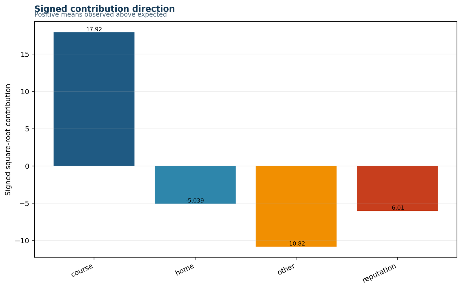
Course is the only strongly positive departure, while home, other and reputation are negative relative to expectation.
Observed minus expected values are +122.75, −13.25, −90.25 and −19.25.
Positive values indicate overrepresentation and negative values indicate underrepresentation.
Direction helps explain the substantive story behind the test statistic.
Chart 5: Null distributionPython
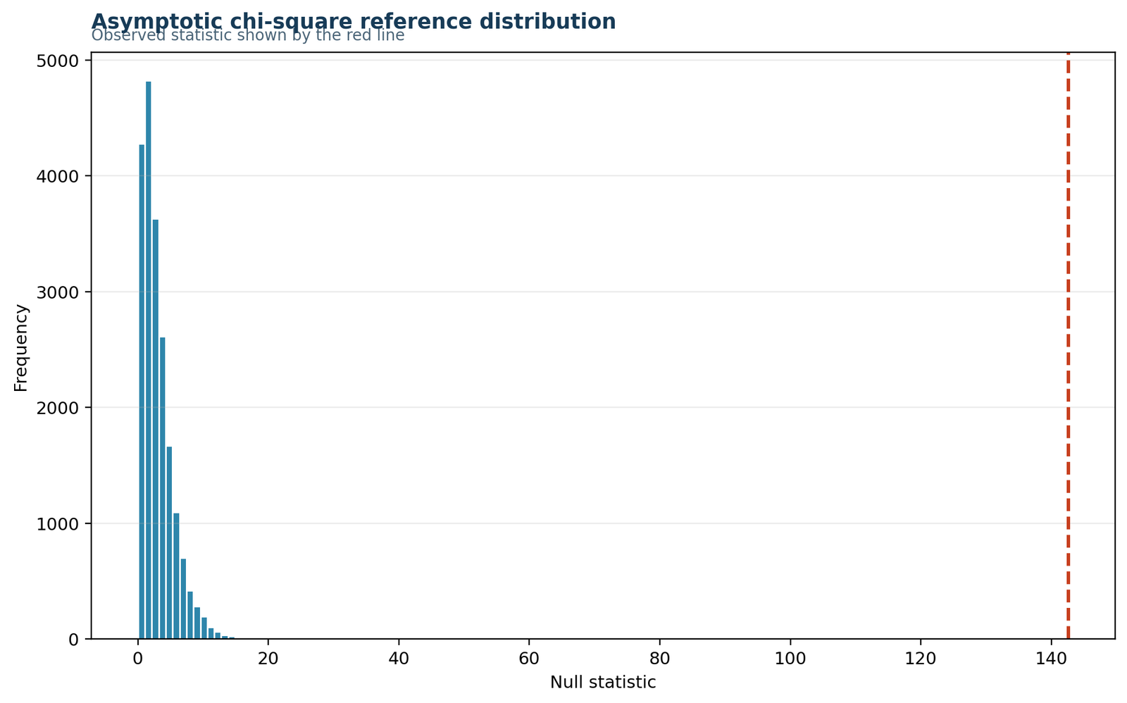
The observed statistic lies far into the right tail of the reference distribution.
G² = 142.6067 with df = 3 produces a p-value of about 1.04 × 10⁻³⁰.
This statistic is far too large to attribute to ordinary sampling variation under the null.
The null-distribution view turns the observed mismatch into a formal inference.
Chart 6: Result summaryPython
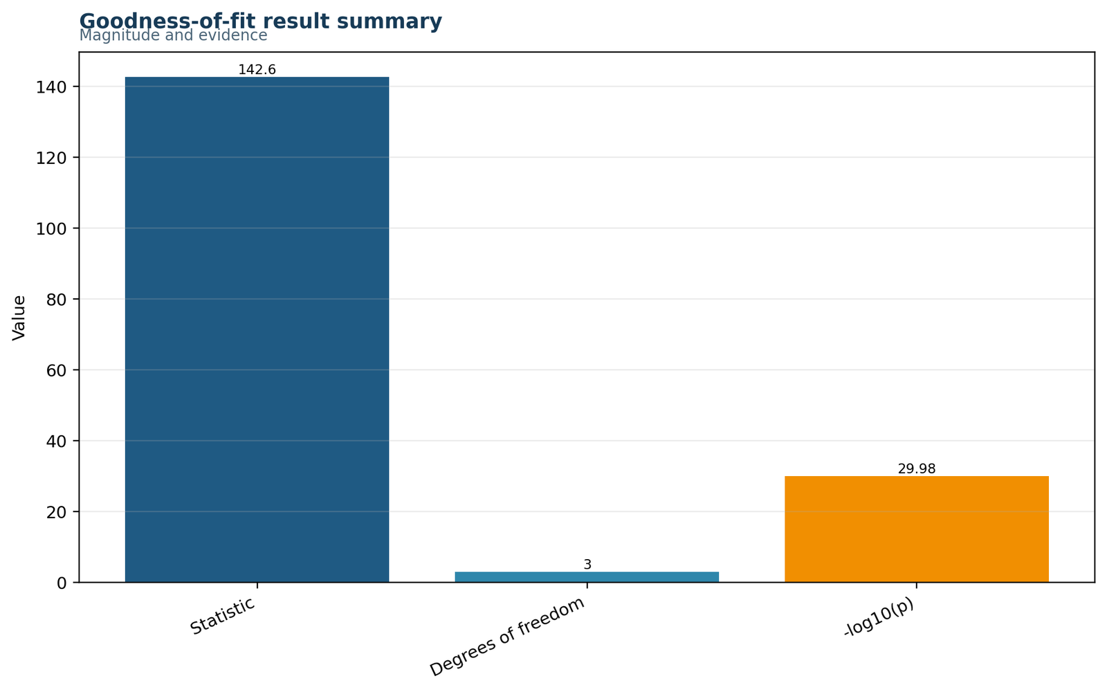
The summary panel condenses the statistic, degrees of freedom, p-value and conclusion.
G² = 142.6067, df = 3, p ≈ 1.04 × 10⁻³⁰, reject H0.
The equal-probability model is decisively unsupported by the data.
This is the most concise chart for slides, reports and quick interpretation.
R Chart Pairs and Interpretation
The R workflow presents the same inferential story in paired charts. This makes it easier to compare counts with proportions, contribution magnitude with direction, and cumulative departure with the final decision.
R pair 1: Observed versus expected counts and contribution by category
Count imbalance is easy to see
The left panel shows the excess of course responses and the deficit of other responses. The right panel quantifies that imbalance by contribution size.
Not all categories matter equally
The result is not driven by every category to the same degree. The primary departures come from course and other, while home and reputation contribute much less.
R pair 2: Signed root residuals and observed proportions
Direction and size are both visible
The residual-style panel shows which categories are above expectation and which are below it. The proportional panel shows how far each category lies from the 25% target.
Proportions clarify the substantive story
Course accounts for almost 44% of the sample, while other accounts for only about 11%. That large separation from the null model explains the strong test result.
R pair 3: Cumulative departure and result summary
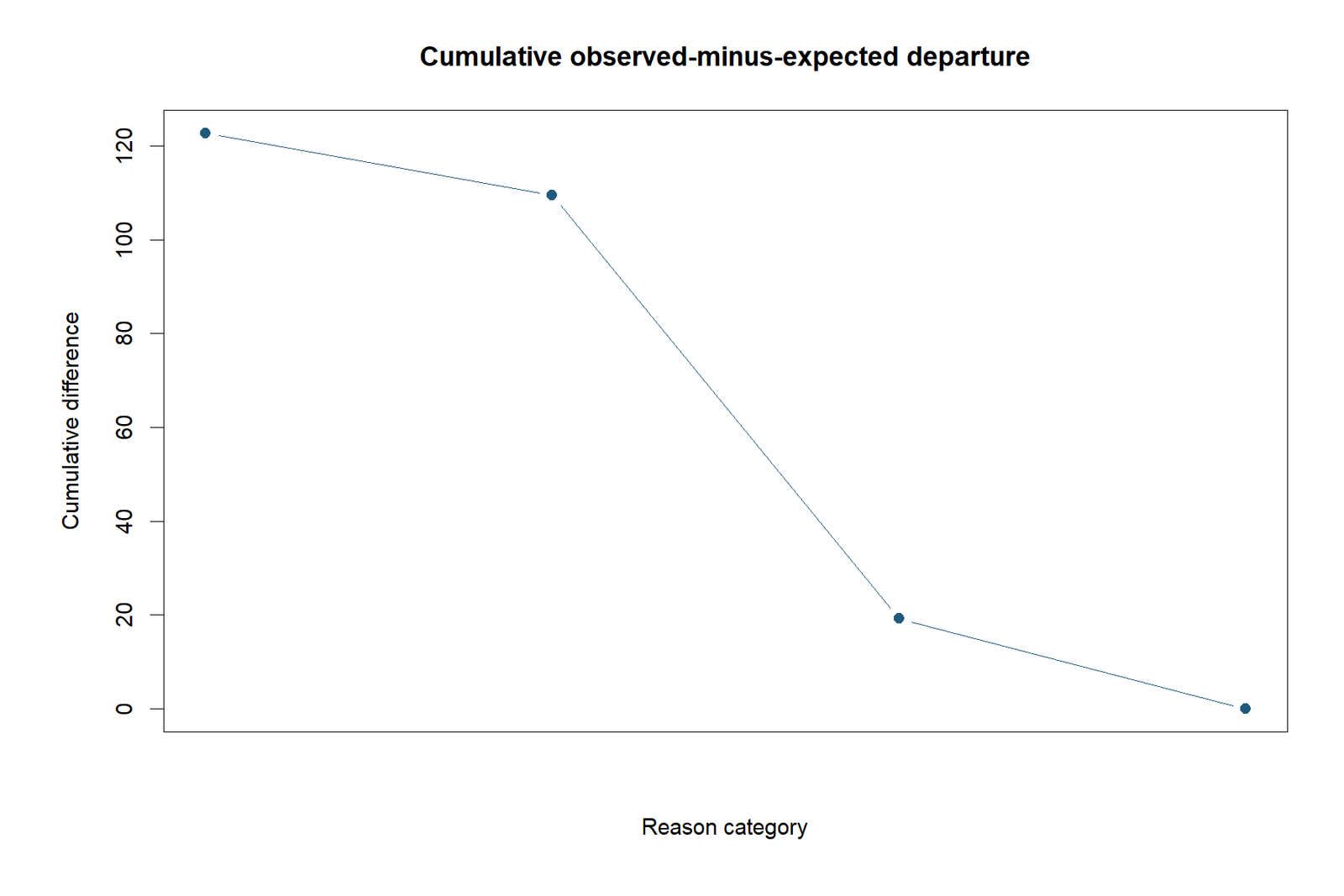
The departure builds quickly
The cumulative panel shows that the mismatch between observed and expected frequencies is not a tiny fluctuation. The overall departure accumulates rapidly because the main categories deviate strongly from the null model.
The final inference is unambiguous
The summary chart brings the result together: G² = 142.6067, df = 3 and p less than .001 by a very large margin, so the null of equal category probabilities is rejected.
G Test in Python, R, SPSS and Excel
Python workflow
Python can compute the one-way G Test directly from the observed counts and expected probabilities. It is also convenient for building observed-versus-expected charts and contribution plots. Related material is also covered in categorical data analysis in Python.
- Enter the observed counts.
- Define the null probabilities.
- Calculate expected counts and G².
- Obtain the p-value from a chi-square reference distribution.
- Create diagnostic charts and a result summary.
R workflow
R is well suited to likelihood-ratio and Pearson goodness-of-fit testing, along with publication-ready residual and proportion plots. For broader background, see categorical data analysis in R.
- Create a count vector.
- Specify the expected probabilities.
- Compute the G statistic manually or through likelihood-ratio tools.
- Compare with Pearson’s chi-square if desired.
- Visualize contributions and the final decision.
SPSS workflow
SPSS provides goodness-of-fit procedures and descriptive outputs for one-way categorical data. The SPSS report here confirms the same inferential conclusion as the Python and R reports. See categorical data analysis in SPSS.
- Define the categorical variable.
- Request one-way frequencies and goodness-of-fit output.
- Confirm the null proportions.
- Export the output PDF.
- Match the SPSS result against the verified workbook.
Excel workflow
The Excel workbook shows every calculation explicitly: the observed table, expected counts, category components, diagnostics and reporting summary. This is especially useful when teaching the likelihood-ratio formula step by step.
- Enter the counts in a table.
- Calculate expected counts from null probabilities.
- Use the natural-log formula for each component.
- Sum the components to obtain G².
- Use the chi-square right-tail function for the p-value.
Expandable Software Code
Python pseudo-code for the G Test
observed = [285, 149, 72, 143]
p0 = [0.25, 0.25, 0.25, 0.25]
n = sum(observed)
expected = [n * p for p in p0]
G2 = 2 * sum(o * math.log(o / e) for o, e in zip(observed, expected))
df = len(observed) - 1
p_value = chi2_sf(G2, df)
R pseudo-code for the G Test
observed <- c(285, 149, 72, 143)
p0 <- c(0.25, 0.25, 0.25, 0.25)
expected <- sum(observed) * p0
G2 <- 2 * sum(observed * log(observed / expected))
df <- length(observed) - 1
p_value <- pchisq(G2, df = df, lower.tail = FALSE)
Excel formula idea
=2*Observed*LN(Observed/Expected)
=SUM(component_range)
=CHISQ.DIST.RT(G_statistic, degrees_of_freedom)
Assumptions, Limitations and Advanced Interpretation
Assumptions
- Observations are independent.
- The categories are mutually exclusive and collectively exhaustive.
- The expected probabilities are declared before testing.
- Observed counts are positive for the log expression.
- The chi-square approximation is adequate for the sample size.
Limitations
- The G Test does not tell you why the distribution differs.
- It does not estimate causal effects.
- It can be sensitive to very large sample sizes.
- It summarizes the global mismatch but not all practical implications.
- It is not a substitute for a two-way association test.
Because the sample size is 649 and the expected counts are all 162.25, the chi-square approximation is very safe here. The result is therefore easy to trust from an asymptotic perspective. For related background on design and assumptions, see chi-square assumptions and effect size.
APA Reporting for the G Test
Short APA statement
A one-way G Test showed that the observed distribution of school-choice reason differed significantly from an equal-probability model, G²(3, N = 649) = 142.61, p < .001.
Longer APA statement
A likelihood-ratio goodness-of-fit analysis was conducted to test whether the four-category school-choice reason variable followed an equal distribution. The result was statistically significant, G²(3, N = 649) = 142.61, p < .001, indicating that the observed category frequencies did not match the theoretical equal-probability model. Course was substantially overrepresented, whereas other was substantially underrepresented.
When teaching or presenting this result, it is helpful to report the observed counts and expected counts alongside the inferential statement. Students preparing for exams can compare this style with the resources in AP Statistics Formula Sheet and What Is the AP Statistics Exam?.
Common Mistakes and How to Correct Them
Common mistakes
- Using the G Test when there are actually two variables and the design is an independence table.
- Choosing expected probabilities after looking at the data.
- Reporting only “significant” without the category pattern.
- Ignoring the observed-versus-expected direction of departure.
- Forgetting that goodness-of-fit tests a model, not a practical consequence.
How to fix them
- Confirm whether the design is one-way or two-way before testing.
- State the theoretical distribution in advance.
- Include counts, statistic, degrees of freedom and p-value.
- Identify which categories are over- and underrepresented.
- Add an effect size such as Cohen’s w when appropriate.
Reports and Worked Excel Download
R PDF reportR output and chart workflow for the same goodness-of-fit analysis.
SPSS PDF outputSPSS output for the one-way goodness-of-fit analysis.
Worked Excel analysisTransparent workbook showing the observed table, calculations, diagnostics and reporting sheet.
Frequently Asked Questions
What is the G Test used for?
The G Test is used to compare observed categorical frequencies with expected frequencies under a null model. In this article, it is used as a one-way goodness-of-fit test.
What is the formula for the G Test?
The one-way G Test formula is G² = 2 Σ O ln(O/E), where O is the observed count and E is the expected count.
What is the difference between the G Test and chi-square?
The G Test uses a likelihood-ratio statistic, while Pearson’s chi-square uses a squared-residual statistic. In many practical settings, both give very similar conclusions.
Can the G Test be used for independence tables?
Yes, there is a two-way likelihood-ratio chi-square test for contingency tables, but that is a different design from the one-way goodness-of-fit example shown here.
How do I report a G Test result?
Report the statistic, degrees of freedom, p-value, sample size, null model and the category pattern. A concise example is G²(3, N = 649) = 142.61, p < .001.
What does a significant G Test mean?
It means the observed category distribution differs from the theoretical distribution stated in the null hypothesis.
Conclusion
G Test is a powerful and interpretable way to assess whether an observed categorical distribution matches a theoretical model. In this worked example, the school-choice reason variable did not come close to the equal-probability null. The likelihood-ratio statistic was extremely large, G²(3, N = 649) = 142.61, p < .001, with the main departure coming from an excess of course responses and a deficit of other responses.
The practical lesson is just as important as the inferential one: after a significant G Test, the analyst should explain which categories are above expectation and which are below it. If you want to continue building your categorical-data toolkit, the next useful pages are p-value, significance level and test statistic, chi-square calculator, frequency and relative frequency tables and AP Statistics Formula Sheet.

