
Nonlinear Additive Effects, Smooth Functions, Model Fit and Diagnostics
Generalized Additive Model: Formula, Interpretation, Python, R, SPSS and Excel Guide
Generalized Additive Models extend regression by replacing selected straight-line effects with smooth functions. This fully worked guide predicts final grade G3 for 649 students, names every variable, separates the Python and R specifications, explains sixteen charts with real numerical values, compares GAM with a linear model, and provides SPSS, Python, R and Excel workflows.
Quick Answer: Generalized Additive Model Result
The Python GAM used G3 as the continuous outcome. Smooth cubic B-spline terms were fitted for G1, G2, and absences; linear terms were included for studytime, failures, and traveltime; and categorical controls were school, sex, and address. All 649 students were included.
The Python GAM achieved R² = 0.8589, adjusted R² = 0.8544, RMSE = 1.2126, MAE = 0.7639, and AIC = 2133.9981. The linear comparison model had adjusted R² 0.8511 and RMSE 1.2368. GAM reduced fitted RMSE by 0.0242, approximately 1.96%.
Main conclusion: G2 has the strongest nonlinear additive relationship with G3. G1 also contributes, and R identifies a weaker significant smooth effect of absences. GAM improves fit over a linear benchmark, but the gain is modest and should be weighed against additional complexity.
Software distinction: Python and R do not fit identical formulas. Python uses fixed five-degree-of-freedom splines for G1, G2, and absences. R uses REML-selected smoothness for G1, G2, studytime, failures, absences, and age. Their results are reported separately rather than merged.
Table of Contents
- What Is a Generalized Additive Model?
- Why Use a GAM Instead of Linear Regression?
- Generalized Additive Model Formula
- Smooth Functions, Splines, Knots and Basis Functions
- Effective Degrees of Freedom and Smoothness
- Family and Link Functions
- When to Use Generalized Additive Models
- Assumptions and Practical Checks
- Variables Used and Data Dictionary
- Python GAM Formula and Results
- Python Chart-by-Chart Interpretation
- R GAM Formula and Results
- R Chart-by-Chart Interpretation
- GAM vs Linear Model: Detailed Comparison
- How to Interpret GAM Smooth Effects
- Residual and Influence Diagnostics
- Validation and Generalization
- Worked Excel GAM-Style Calculation
- SPSS Workflow for a Generalized Additive Model
- Python, R, SPSS and Excel Workflows
- Code Blocks
- APA-Style Reporting
- Common GAM Mistakes
- Downloads
- Related Salar Cafe Guides
- FAQs
What Is a Generalized Additive Model?
A Generalized Additive Model, usually abbreviated as GAM, is a regression model in which the expected outcome is expressed as the sum of smooth functions of predictor variables plus optional linear and categorical effects. The word additive means the predictor contributions are added together. The word generalized means the framework can use different outcome distributions and link functions, just as a generalized linear model can.
A conventional linear regression assumes that one unit of X has the same effect on Y at every value of X. A GAM relaxes that restriction. It allows the relationship to rise quickly, flatten, reverse, form a threshold, or follow another smooth pattern estimated from the data. This flexibility is especially useful when theory suggests a relationship is monotonic but not perfectly straight.
In this worked example, the outcome is final grade G3. Previous grades G1 and G2 are likely to have strong relationships with G3, but the change in expected final grade may not be identical across the entire grade scale. Absences may also have a weak effect at low values and a stronger effect after attendance problems become substantial. GAM estimates those shapes directly.
Simple definition: a GAM is a regression model that adds together flexible smooth predictor effects instead of forcing every numeric variable to have one constant straight-line slope.
Why Use a GAM Instead of Linear Regression?
Linear regression is transparent and efficient, but its straight-line assumption can hide thresholds, diminishing returns, plateaus, and curved associations. Adding polynomial terms can model curvature, but the researcher must choose the polynomial order and the resulting shape can behave unrealistically at the edges. GAMs use controlled smooth functions and penalization or fixed basis dimensions to obtain flexible but stable curves.
In the Python results, the linear comparison model already fits very well, with adjusted R² 0.8511 and RMSE 1.2368. GAM improves those values to adjusted R² 0.8544 and RMSE 1.2126. The improvement is small because G1 and G2 already have strong nearly linear relationships with G3. GAM is still valuable because it reveals the upper-end flattening of G2 and the adjusted shape of G1.
| Feature | Linear Regression | Generalized Additive Model |
|---|---|---|
| Numeric predictor effect | One constant slope. | A smooth estimated function. |
| Curvature | Must be specified with transformations or polynomial terms. | Estimated from spline basis functions and smoothness control. |
| Interpretation | Simple coefficient per predictor. | Shape plot, effective degrees of freedom, and smooth-term test. |
| Complexity | Usually lower. | Usually higher and requires tuning or smoothness selection. |
| Best use | Approximately straight relationships. | Continuous relationships that may curve without abrupt jumps. |
Generalized Additive Model Formula
Y is the outcome, g() is the link function, f₁ through fₚ are smooth functions, and the Z variables are ordinary linear or categorical effects. For a Gaussian identity-link GAM, g(E[Y]) is simply the expected value of Y.
Python Formula Used in This Post
Python represents each smooth with a cubic B-spline basis using five degrees of freedom. The complete basis-expanded formula contains five columns for G1, five for G2, and five for absences, plus the linear and dummy-coded terms.
R Formula Used in This Post
R uses mgcv::gam with REML smoothness selection. The basis dimensions k define the maximum flexibility, but the effective degrees of freedom are selected from the data and are generally lower than the maximum.
Smooth Functions, Splines, Knots and Basis Functions
A smooth function is not one unrestricted curve fitted through every point. It is built from a set of simpler basis functions. Each basis function covers part of the predictor range, and the model estimates weights that combine them into one continuous effect. Cubic B-splines are commonly used because they join smoothly and provide stable local flexibility.
Knots identify locations where the spline basis can change its curvature. Modern GAM software often handles basis construction automatically, so analysts usually specify a basis dimension or maximum complexity rather than manually selecting every knot. Too little flexibility can miss meaningful curvature; too much flexibility can follow random noise.
Python’s formula uses five degrees of freedom for each of G1, G2, and absences. This produces five basis coefficients per smooth. Those coefficients are mathematical components, not five separate substantive predictors. The complete smooth curve and its confidence band are the appropriate interpretation.
R’s mgcv implementation controls overfitting by penalizing excessive wiggliness and selecting smoothness with REML. A term can begin with a basis dimension of k = 10 yet end with an effective degrees of freedom value near 1 when the data support an almost straight line.
Effective Degrees of Freedom in a GAM
Effective degrees of freedom, abbreviated EDF, summarize the complexity of a fitted smooth. An EDF close to 1 indicates an approximately linear relationship. Values above 1 indicate increasing curvature. EDF is not simply the number of bends visible to the eye, but it is a useful measure of how much flexibility the model used.
| R Smooth | EDF | p-value | Interpretation |
|---|---|---|---|
| s(G1) | 1.0138 | 0.00001336 | Significant and almost linear adjusted effect. |
| s(G2) | 2.6945 | <0.001 | Strong significant effect with meaningful curvature. |
| s(studytime) | 1.4407 | 0.3511 | No significant independent smooth contribution. |
| s(failures) | 1.5558 | 0.1028 | Some fitted curvature but insufficient evidence at .05. |
| s(absences) | 3.1028 | 0.02396 | Significant nonlinear additive effect. |
| s(age) | 1.7687 | 0.3233 | No significant adjusted smooth contribution. |
EDF should be interpreted together with the smooth plot and uncertainty. A high EDF with a non-significant test may reflect an unstable pattern with limited support. A low EDF with a small p-value can represent a reliable near-linear contribution.
GAM Family and Link Functions
The generalized additive framework can be applied to continuous, binary, count, and other outcomes. The family describes the response distribution and the link connects the expected outcome to the additive predictor. This post uses a Gaussian family with an identity link because G3 is analyzed as a continuous grade.
| Outcome Type | Common Family | Common Link | Example |
|---|---|---|---|
| Continuous | Gaussian | Identity | Final grade G3. |
| Binary | Binomial | Logit | Pass versus not pass; see Binary Logistic Regression. |
| Count | Poisson | Log | Number of events or absences. |
| Overdispersed count | Negative binomial | Log | Counts with variance larger than the mean. |
| Positive skewed continuous | Gamma | Log or inverse | Costs or waiting times. |
Changing the family changes residual definitions, interpretation, and performance measures. A binary GAM predicts probabilities and log odds; the Gaussian GAM in this post predicts G3 directly.
When to Use Generalized Additive Models
Use a GAM when the outcome type can be represented by a suitable family and one or more numeric predictors may have smooth nonlinear relationships with the outcome. GAMs are especially useful when the shape is unknown but should remain continuous and reasonably smooth.
| Research Situation | Why GAM Helps | Example in This Dataset |
|---|---|---|
| Diminishing returns | The curve can rise and then flatten. | G2 approaches a plateau near the highest grades. |
| Threshold or delayed effect | The curve can remain flat and change after a point. | Absences may matter more after attendance becomes substantial. |
| Unknown continuous shape | No polynomial order must be selected in advance. | Adjusted G1 and G2 effects. |
| Mixed smooth and categorical controls | Continuous curves can be estimated while controlling groups. | School, sex, and address shift the expected G3 level. |
| Non-Gaussian outcome | Families and links extend GAM beyond continuous regression. | A binary pass outcome could use a binomial GAM. |
Do not select GAM only because it is more flexible. If smooth plots are nearly straight, validation does not improve, and interpretation becomes unnecessarily difficult, a linear or generalized linear model may be preferable.
Assumptions and Practical Checks for Generalized Additive Models
| Assumption or Check | Meaning | Application in This Example |
|---|---|---|
| Correct outcome family | The distribution and link should match the response. | G3 is treated as Gaussian with identity link. |
| Independent observations | Rows should not contain unmodeled repeated or clustered measurements. | Each row represents one student; stronger school clustering may require a mixed model. |
| Adequate coverage | Each smooth needs enough data across its range. | G1 and G2 have many observations in the middle but fewer at extremes. |
| Controlled smoothness | Curves should not be too rigid or too wiggly. | Python fixes df = 5; R selects smoothness with REML. |
| No severe concurvity | One smooth should not be almost reproducible from other smooths. | G1 and G2 are related and should be checked for overlapping information. |
| Reasonable residual pattern | Residuals should be centered without strong remaining curves or funnels. | Most residuals are near zero, but several large negative cases remain. |
| Influence review | Rare cases can strongly affect smooth shapes. | Observed G3 = 0 cases require examination. |
| Validation | Flexible models require out-of-sample checking. | Current charts are fitted-data diagnostics; external validation is still needed. |
Multicollinearity in a GAM is often discussed as concurvity when smooth terms overlap nonlinearly. Classical variance inflation factors and tolerance statistics remain useful for linear components, while smooth-specific diagnostics are required for nonlinear dependence.
Variables Used and Data Dictionary
The variable set differs between Python and R. The table names each variable, explains its meaning, and states how it enters each model.
| Variable | Meaning | Python Role | R Role |
|---|---|---|---|
| G3 | Final grade, observed from 0 to 19; mean approximately 11.906. | Continuous outcome. | Continuous outcome. |
| G1 | First-period grade. | Cubic B-spline smooth, df = 5. | REML smooth s(G1), k = 10, edf = 1.0138. |
| G2 | Second-period grade. | Cubic B-spline smooth, df = 5. | REML smooth s(G2), k = 10, edf = 2.6945. |
| absences | Number of school absences. | Cubic B-spline smooth, df = 5. | REML smooth s(absences), k = 10, edf = 3.1028. |
| studytime | Weekly study-time category. | Linear predictor. | Smooth s(studytime), k = 3, edf = 1.4407. |
| failures | Number of previous class failures. | Linear predictor. | Smooth s(failures), k = 3, edf = 1.5558. |
| traveltime | Home-to-school travel-time category. | Linear predictor. | Not included in the reported R formula. |
| age | Student age in years. | Not included in the reported Python formula. | Smooth s(age), k = 7, edf = 1.7687. |
| school | GP or MS school; GP is the reference. | Categorical control. | Parametric categorical control. |
| sex | Female or male; female is the reference. | Categorical control. | Parametric categorical control. |
| address | Rural or urban; rural is the reference. | Categorical control. | Parametric categorical control. |
Do not combine coefficient tables: Python’s fixed spline basis and R’s penalized smooths use different parameterizations. The individual Python spline coefficients cannot be matched one-to-one with R effective degrees of freedom or smooth-term tests.
Python Generalized Additive Model Results
| Python Model Statistic | GAM | Linear Comparison | Interpretation |
|---|---|---|---|
| N | 649 | 649 | Both models use the same observations. |
| Model degrees of freedom | 20 | 9 | GAM is more flexible. |
| Residual degrees of freedom | 628 | 639 | Additional spline terms use more degrees of freedom. |
| R² | 0.8589 | 0.8532 | GAM explains 0.57 percentage points more variance. |
| Adjusted R² | 0.8544 | 0.8511 | The advantage remains after complexity adjustment. |
| RMSE | 1.2126 | 1.2368 | GAM lowers RMSE by 0.0242. |
| MAE | 0.7639 | 0.7792 | GAM lowers average absolute error by 0.0153. |
| AIC | 2133.9981 | 2137.6467 | Lower GAM AIC gives modest support to added flexibility. |
| BIC | 2227.9822 | 2182.4011 | BIC favors the simpler linear model. |
Python Parametric Terms and Selected Spline Components
| Term | Coefficient | SE | p-value | 95% CI | Interpretation |
|---|---|---|---|---|---|
| Intercept | 0.5163 | 1.0965 | 0.6379 | [−1.6370, 2.6696] | Not interpreted alone because spline bases and reference coding affect the zero point. |
| school: MS vs GP | −0.1079 | 0.1221 | 0.3774 | [−0.3476, 0.1319] | No significant adjusted school shift. |
| sex: M vs F | −0.2233 | 0.1027 | 0.0301 | [−0.4250, −0.0216] | Small negative adjusted parametric difference in Python. |
| address: U vs R | 0.1668 | 0.1180 | 0.1579 | [−0.0649, 0.3986] | No significant adjusted address shift. |
| First G2 spline basis | 2.6803 | 1.0890 | 0.0141 | [0.5417, 4.8189] | One component of the jointly strong G2 smooth. |
| Second G2 spline basis | 7.2835 | 0.6757 | <0.001 | [5.9566, 8.6104] | One component of the G2 curve. |
| Third G2 spline basis | 12.3530 | 0.6557 | <0.001 | [11.0653, 13.6407] | One component of the G2 curve. |
| Fourth G2 spline basis | 15.4141 | 0.8004 | <0.001 | [13.8423, 16.9859] | One component of the G2 curve. |
| Fifth G2 spline basis | 15.5358 | 1.0342 | <0.001 | [13.5050, 17.5667] | One component of the upper-end G2 curve. |
Individual spline basis p-values do not replace a joint smooth-term test. The correct substantive interpretation comes from the combined fitted curve and its uncertainty.
Python Chart-by-Chart Interpretation with Real Data Values
The Python report supplies eight figures. Every explanation below identifies the variables and incorporates the actual sample size, model statistics, curve values, residual ranges, or model-comparison numbers visible in the analysis.
Python Chart 1: Outcome Distribution for G3
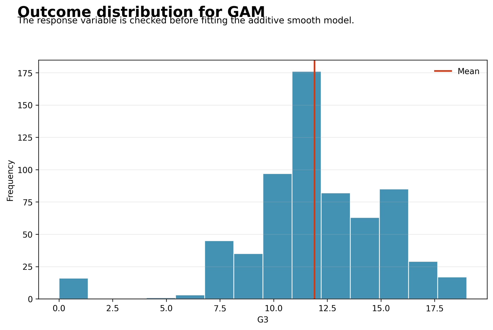
The response variable is G3, the final student grade. The Python analysis used all 649 rows and the full observed range extends from 0 to 19. The mean is approximately 11.906, shown by the vertical reference line near 11.9. The tallest part of the histogram is concentrated around grades 10 to 12, while substantial numbers also occur from roughly 13 to 16. Only a small group lies at the extreme low end, including several observations at G3 = 0.
This distribution is important because the GAM uses a Gaussian family with an identity link and predicts G3 on its original grade scale. The central concentration supports a continuous-outcome model, but the small cluster of zero and very low grades creates an asymmetric lower tail. Those rare cases later appear as large negative residuals because their previous academic values sometimes imply much higher fitted grades than the outcomes actually observed.
The histogram does not by itself determine whether a GAM is required. Its role is to document the outcome scale, identify unusual values, and provide context for RMSE and MAE. The fitted Python GAM has RMSE = 1.2126 and MAE = 0.7639, meaning the average absolute fitted error is less than one grade point despite the low-grade exceptions.
Python Chart 2: Observed G3 vs GAM Fitted Values
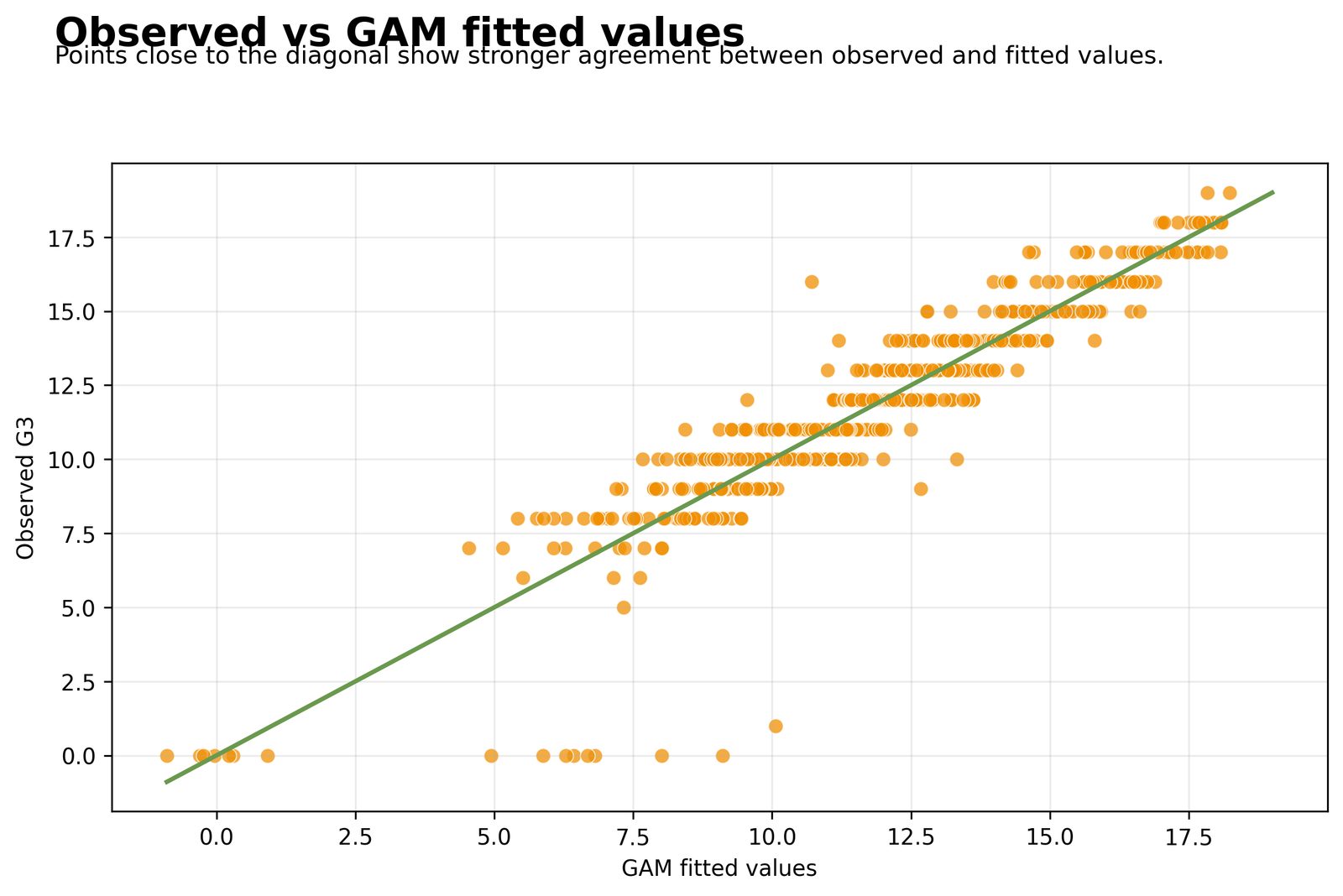
This scatterplot places the Python GAM fitted value on the horizontal axis and observed G3 on the vertical axis for all 649 students. The diagonal line represents perfect agreement. Most points between fitted values of approximately 7 and 18 follow the diagonal closely, which is consistent with R² = 0.8589 and adjusted R² = 0.8544. The model therefore explains about 85.89% of the observed variation in final grades.
The horizontal bands occur because G3 takes integer values. The largest departures from the diagonal are concentrated among observed grades of 0. Several students receive fitted values around 5 to 10 even though the observed outcome is zero. There are also a few moderate discrepancies, such as observed grades around 9 or 10 with fitted values near 13, but the majority of the cloud remains close to the reference line.
The chart demonstrates strong fitted agreement, but it is an in-sample diagnostic rather than an independent test-set evaluation. The correct conclusion is that the additive spline model fits the available data well. Claims about prediction in new schools or future cohorts require cross-validation or external validation beyond this fitted-value plot.
Python Chart 3: Residuals vs Fitted Values
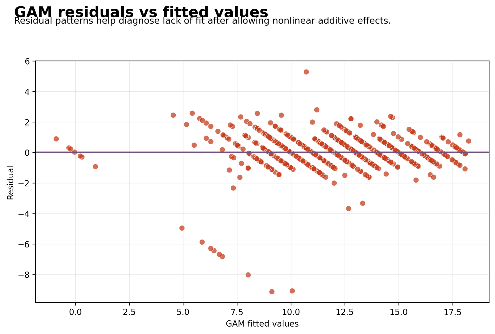
Residuals are calculated as observed G3 minus fitted G3. Most Python residuals fall between approximately −2 and +2.5 and remain centered around the horizontal zero line. This agrees with the fitted MAE of 0.7639 and shows that the GAM is reasonably balanced for most students.
The diagonal striping is expected because the outcome is integer-valued while fitted values are continuous. More important are the unusual points: several negative residuals fall near −5 to −9, and the most extreme observations are around fitted values of 8 to 10 with residuals near −8.0 to −9.2. These students received much lower final grades than their G1, G2, absences, and control variables would normally predict. A positive residual above +5 near a fitted value around 10.5 represents the opposite situation—an observed grade substantially above the fitted value.
The residual cloud does not show a strong smooth curve across the fitted range, suggesting that the spline terms captured much of the systematic nonlinearity. Nevertheless, the extreme residuals warrant case-level review using studentized residuals, Cook’s distance, Mahalanobis distance, and influence diagnostics.
Python Chart 4: GAM and Linear Model Comparison
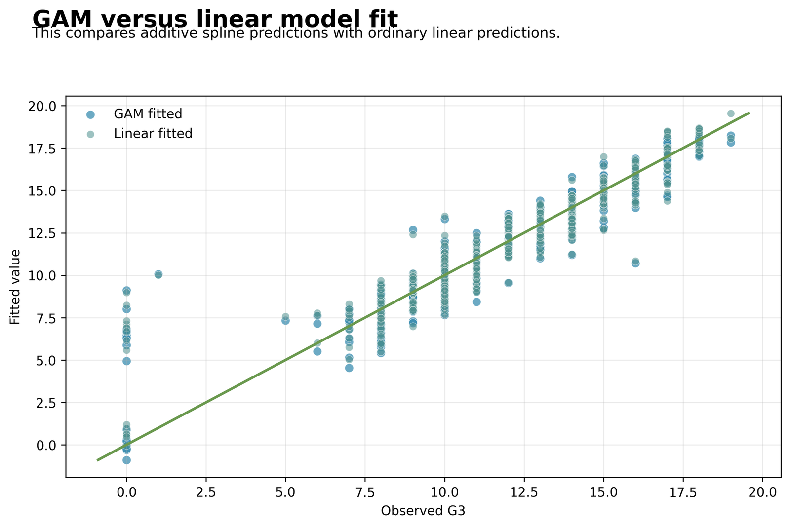
This chart compares the fitted values from the Python GAM with those from the standard linear comparison model across observed G3. Both sets of predictions follow the diagonal closely, confirming that most of the relationship between previous and final grades is already strong and approximately monotonic. The GAM points depart slightly from the linear points where the smooth functions adjust for curvature, especially at the lower and middle grade ranges.
The numerical comparison shows a small but consistent GAM advantage. The GAM has R² = 0.8589, adjusted R² = 0.8544, RMSE = 1.2126, and MAE = 0.7639. The linear model has R² = 0.8532, adjusted R² = 0.8511, RMSE = 1.2368, and MAE = 0.7792. GAM reduces RMSE by 0.0242, approximately 1.96%, and improves adjusted R² by 0.0033.
Model complexity must also be acknowledged. GAM uses 20 model degrees of freedom compared with 9 for the linear model. Its AIC is lower (2133.9981 vs 2137.6467), favoring GAM by 3.6486 points, but its BIC is higher (2227.9822 vs 2182.4011) because BIC penalizes the additional spline parameters more strongly. Thus, GAM offers a modest fit improvement rather than an overwhelming replacement of the simpler linear model.
Python Chart 5: Estimated Smooth Effects
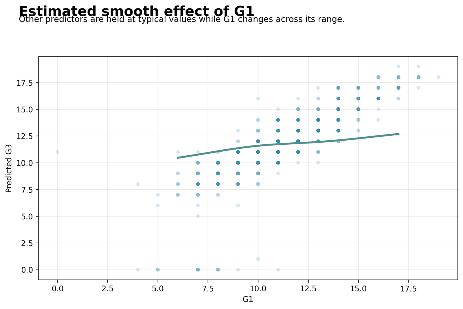
The Python G1 smooth-effect chart varies G1, the first-period grade, while holding G2, absences, studytime, failures, traveltime, school, sex, and address at typical or reference values. The fitted curve begins near a predicted G3 of about 10.4 when G1 is around 6, rises to roughly 11.6 near G1 = 10, and reaches approximately 12.7 by G1 = 17.
The shape is positive but shallow and slightly curved. The increase is more noticeable from G1 values around 6 to 10, flattens through the middle range near 10 to 14, and rises modestly again at the upper end. This is not a raw G1–G3 relationship because the much stronger G2 smooth and all controls remain in the model. The adjusted effect of G1 is therefore smaller than the simple correlation between first-period and final grades.
Python represents G1 with a five-degree-of-freedom cubic B-spline basis. Individual basis coefficients are not interpreted as separate substantive effects because the smooth is the combined weighted sum of all basis functions. The chart is the correct interpretive object: it shows how the expected G3 changes across G1 after adjustment, rather than treating each spline coefficient as an independent variable.
Python Chart 6: GAM Fit-Quality Summary
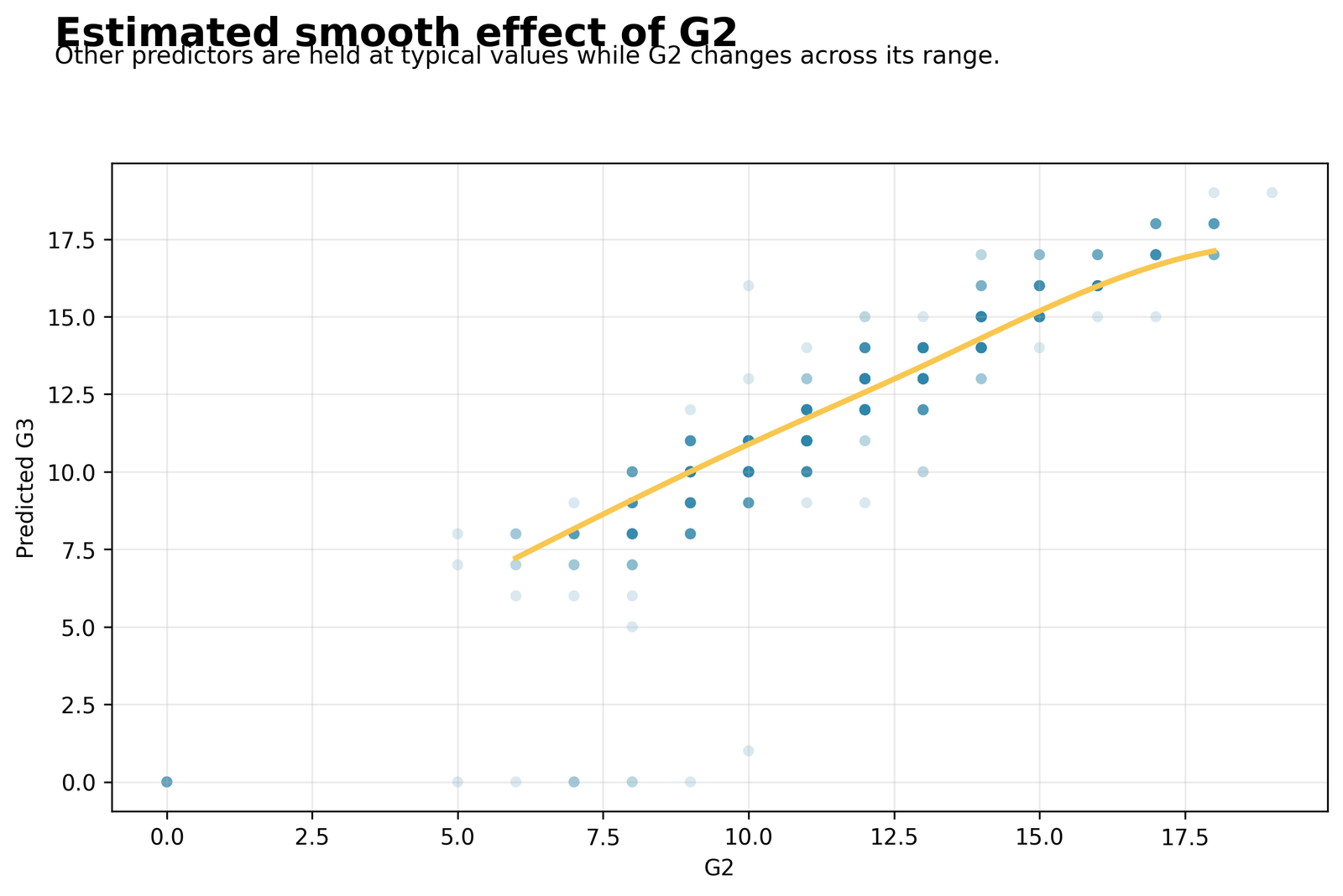
The Python G2 smooth-effect chart shows the strongest relationship in the model. Holding the other variables constant, predicted G3 rises from approximately 7.1 at G2 = 6 to around 10.9 at G2 = 10, approximately 14.4 at G2 = 14, and about 17.1 at G2 = 18. The relationship is nearly linear through much of the range but gently bends and begins to flatten near the highest G2 values.
All five G2 cubic B-spline basis coefficients reported in the Python table are statistically significant: 2.6803 (p = .0141), 7.2835 (p < .001), 12.3530 (p < .001), 15.4141 (p < .001), and 15.5358 (p < .001). These coefficients jointly construct the smooth curve. Their increasing sizes are not interpreted as five separate grade effects; they indicate that the spline basis strongly contributes to predicting G3.
The practical message is that G2, the second-period grade, is the main academic predictor of G3. The slight upper-end flattening means that the expected increase in final grade becomes smaller as G2 approaches its maximum. This is precisely the type of shape that a GAM can estimate without forcing one constant straight-line slope over the entire range.
Python Chart 7: Observed and Fitted Values by the Main Predictor
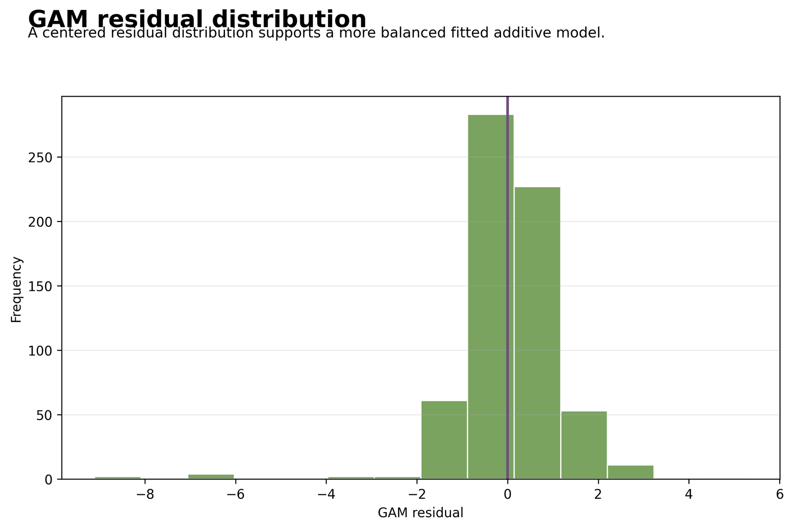
The Python residual histogram is sharply centered near zero. The largest bars are in the intervals immediately below and above zero, containing the great majority of the 649 residuals. The vertical line at zero passes through the central mass, supporting the conclusion that the model is not systematically biased upward or downward for most observations.
The right tail is relatively short, extending to about +5.3, while the left tail reaches approximately −9.2. This negative skew is driven by students whose observed final grade was much lower than predicted, especially several G3 = 0 cases. Most residuals still lie from approximately −2 to +2, which is compatible with RMSE 1.2126 and MAE 0.7639.
A centered histogram does not guarantee normality. The long negative tail should be assessed using a Q–Q plot, P–P plot, and appropriate normality diagnostics such as the Shapiro–Wilk test. With 649 observations, graphical shape and practical impact are often more informative than relying on a single normality p-value.
Python Chart 8: GAM vs Linear Model Error
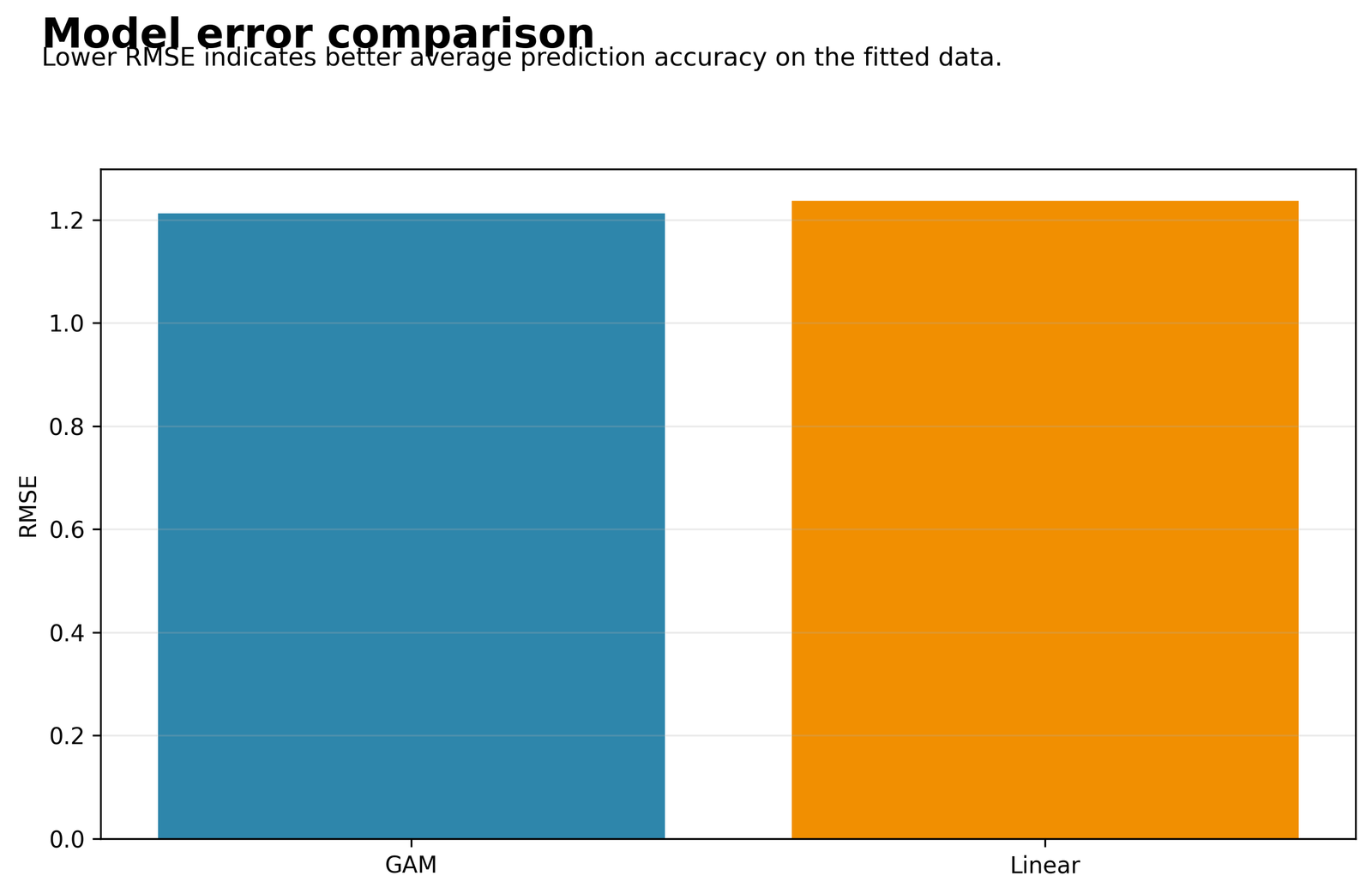
The model-error bar chart displays the fitted RMSE for the Python GAM and the ordinary linear comparison model. The GAM bar is 1.2126, while the linear-model bar is 1.2368. Because lower RMSE indicates smaller average squared prediction error, GAM is better by 0.0242 grade points on the RMSE scale.
The relative reduction is approximately 1.96%. The corresponding MAE values show the same direction: 0.7639 for GAM versus 0.7792 for the linear model, an improvement of 0.0153. Adjusted R² also favors GAM, 0.8544 vs 0.8511. These consistent differences indicate a real but modest improvement from modeling nonlinear additive effects.
The chart should not be used alone to declare GAM universally superior. The gain is small, the comparison is fitted on the same data, and GAM uses eleven additional model degrees of freedom. The best report combines this RMSE advantage with AIC, BIC, smooth-effect plots, residual diagnostics, and validation performance.
R Generalized Additive Model Results
R uses mgcv::gam with REML smoothness selection, a Gaussian family, and identity link. The model smooths six numeric variables and adds school, sex, and address as parametric factors.
| R Fit Statistic | Value | Interpretation |
|---|---|---|
| N | 649 | All students used. |
| Family / link | Gaussian / identity | G3 predicted on its original scale. |
| RMSE | 1.215615 | Average squared-error scale of about 1.22 grade points. |
| MAE | 0.752088 | Average absolute fitted error below one grade point. |
| R² | 0.8581986 | 85.82% of outcome variance explained. |
| Adjusted R² | 0.8549355 | Strong fit after accounting for model complexity. |
| Deviance explained | 0.8581986 | Same proportion for Gaussian identity-link fitting. |
| Baseline linear RMSE | 1.240967 | GAM improves RMSE by 0.025352. |
| AIC | 2133.224 | Model fit with complexity penalty. |
R Parametric Terms
| Term | Estimate | SE | Statistic | p-value | Decision |
|---|---|---|---|---|---|
| Intercept | 11.958705 | 0.119644 | 99.9524 | <0.001 | Expected centered/reference level. |
| schoolMS | −0.121175 | 0.118400 | −1.0234 | 0.3065 | Not significant. |
| sexM | −0.197397 | 0.102630 | −1.9234 | 0.0549 | Close to .05 but not significant. |
| addressU | 0.101092 | 0.112877 | 0.8956 | 0.3708 | Not significant. |
R Smooth-Term Tests
| Smooth Term | EDF | Reference df | Statistic | p-value | Decision |
|---|---|---|---|---|---|
| s(G1) | 1.013800 | 1.025841 | 19.335926 | 0.00001336 | Significant additive effect. |
| s(G2) | 2.694538 | 3.412959 | 195.393731 | <0.001 | Strong significant nonlinear effect. |
| s(studytime) | 1.440731 | 1.686153 | 1.446380 | 0.351093 | Not significant. |
| s(failures) | 1.555764 | 1.801520 | 2.931408 | 0.102785 | Not significant. |
| s(absences) | 3.102760 | 3.837271 | 2.803430 | 0.023959 | Significant nonlinear/additive effect. |
| s(age) | 1.768733 | 2.239434 | 1.059336 | 0.323271 | Not significant. |
R Chart-by-Chart Interpretation with Real Data Values
The supplied R media include eight chart placements. The R explanations use the exact mgcv fit statistics, effective degrees of freedom, smooth-term p-values, and values visible in the charts. They are not copied from the Python interpretation because the fitted formula is different.
R Chart 1: Outcome Distribution for G3
The R workflow uses the same outcome G3 and the same 649 students, so the distribution remains centered near 11.906 with a range from 0 to 19. The R histogram uses narrower grade intervals than the Python plot, showing especially high frequencies around grades 9, 10, 11, and 12. The orange mean line is near 11.9.
R fits a Gaussian identity-link GAM through mgcv::gam. The outcome scale is therefore unchanged: an R fitted value of 12 represents an expected final grade of approximately 12. The low-grade tail remains important because it produces the most extreme residuals even though the overall R model achieves RMSE = 1.215615 and MAE = 0.752088.
R Chart 2: Observed G3 vs GAM Fitted Values
The R observed-versus-fitted plot shows most points aligned closely with the diagonal from fitted values of approximately 6 to 19. The R GAM explains 85.8199% of the variation in G3, with R² = 0.8581986 and adjusted R² = 0.8549355. Its explained deviance is also 0.8581986 because the model uses a Gaussian family with an identity link.
As in Python, the largest disagreements involve observed G3 values of zero paired with fitted values around 5 to 10. This agreement between software is important: the unusual cases are features of the dataset rather than artifacts of one implementation. The R plot therefore supports strong overall fit but also confirms that low-outcome students require diagnostic review.
R Chart 3: Residuals vs Fitted Values
The R residual-versus-fitted chart is centered around zero for most observations. Residuals commonly fall between approximately −2 and +2.5. The most extreme negative points approach −9, while the largest positive point is above +5. The same striped structure appears because the observed outcome is integer-valued.
R’s overall errors are RMSE = 1.215615 and MAE = 0.752088. MAE is slightly lower than Python’s 0.7639, while RMSE is slightly higher than Python’s 1.2126. These tiny differences arise from the different GAM specifications: R smooths six numeric variables with REML-selected complexity, whereas Python smooths three variables with fixed five-degree-of-freedom B-splines.
No strong broad curve is visible after smoothing, but the lower tail remains asymmetric. Investigating the extreme observations and checking variance stability with the Breusch–Pagan test or White test can help determine whether additional modeling is required.
R Chart 4: GAM and Linear Model Comparison
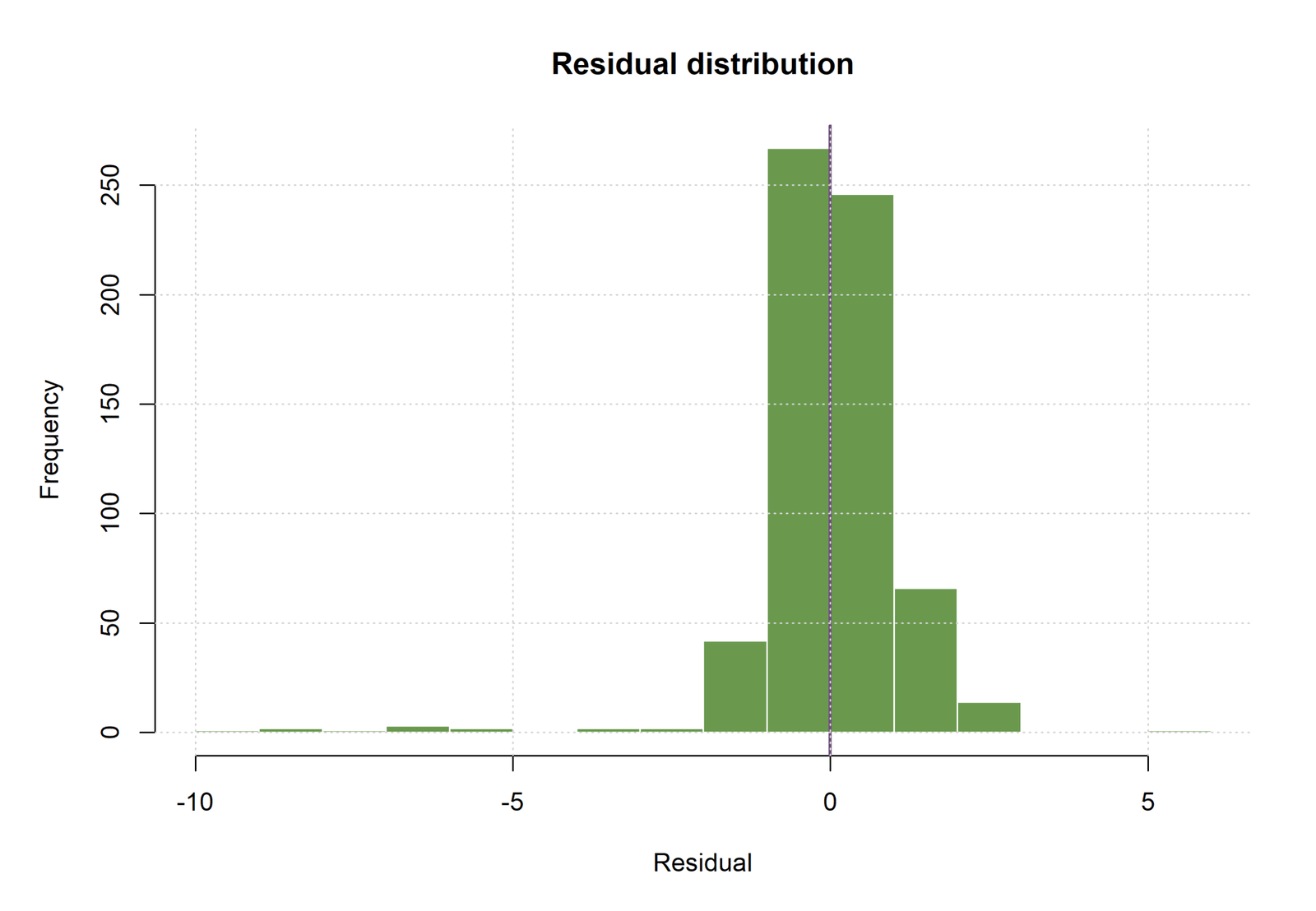
The R residual-distribution chart places most observations in the two bins around zero. Approximately 265 residuals are in the principal negative-to-zero bin and roughly 245 residuals are in the principal zero-to-positive bin, with smaller groups extending to approximately +3 and a sparse left tail toward −10. These frequencies are read from the displayed histogram and illustrate the concentration implied by MAE 0.752088.
The distribution is not perfectly symmetric. A small number of residuals below −5 produce a longer negative tail than the positive side. This does not erase the strong overall fit, but it means a statement such as “residuals are perfectly normal” would be inaccurate. A better conclusion is that residuals are strongly centered near zero with several important negative outliers.
R Chart 5: Estimated Smooth Effects
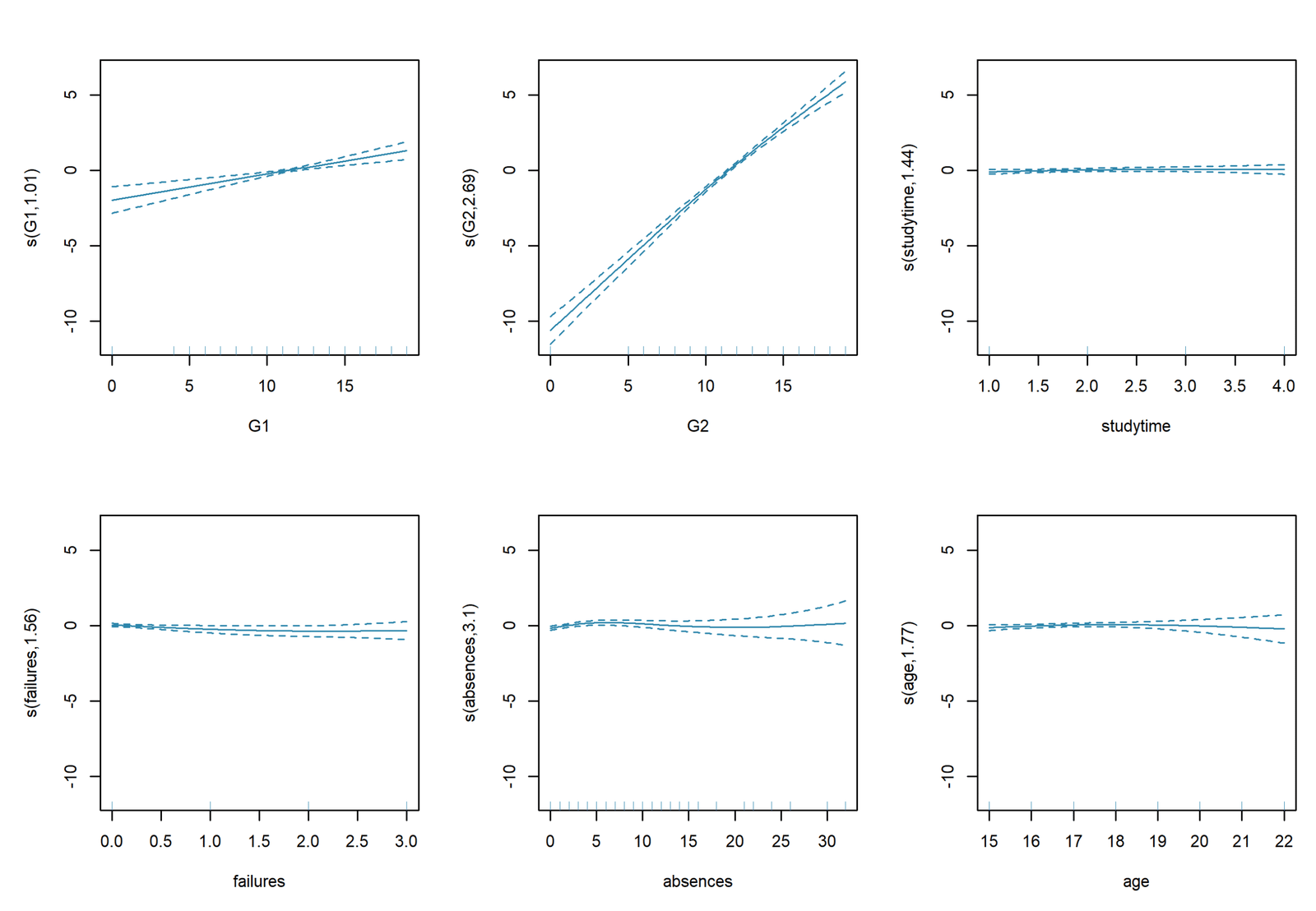
The R smooth-effects panel summarizes six functions estimated by REML: s(G1), s(G2), s(studytime), s(failures), s(absences), and s(age). The effective degrees of freedom show how nonlinear each fitted function is. G1 has edf = 1.0138, so its adjusted effect is almost linear. G2 has edf = 2.6945, indicating meaningful curvature. Absences has the largest complexity, edf = 3.1028.
Three R smooth terms are statistically significant at α = .05. s(G1) has statistic 19.3359 and p = 1.3361 × 10⁻⁵. s(G2) has statistic 195.3937 and p < .001. s(absences) has statistic 2.8034 and p = .02396. Studytime (p = .3511), failures (p = .1028), and age (p = .3233) are not significant after adjustment.
The smooth panel should be interpreted through the direction and shape of each function rather than p-values alone. G2 is the dominant increasing curve; G1 contributes a smaller near-linear positive pattern; and absences shows a weaker nonlinear relationship. The other functions remain in the model but provide insufficient evidence of an independent smooth contribution at the .05 level.
R Chart 6: GAM Fit-Quality Summary
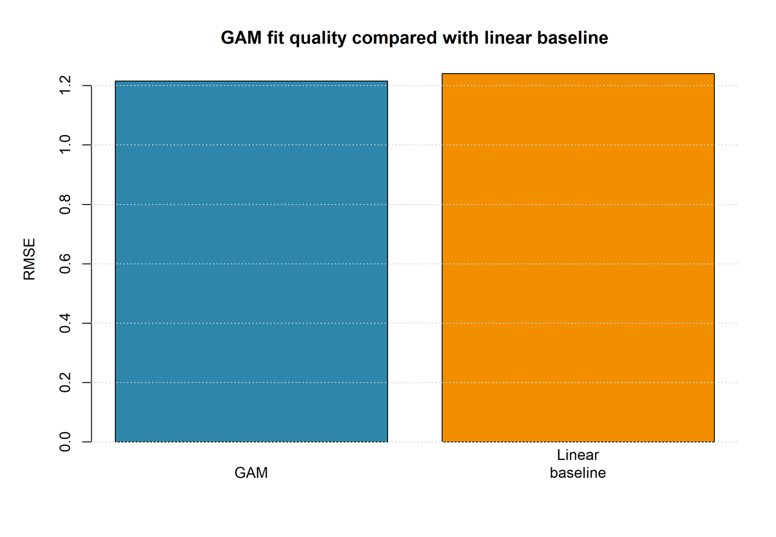
The R fit-quality chart compares RMSE values directly. The GAM bar is 1.215615 and the baseline linear-model bar is 1.240967. R therefore reduces RMSE by 0.025352, approximately 2.04%. The R GAM also has R² = 0.8581986, adjusted R² = 0.8549355, deviance explained 85.8199%, and AIC = 2133.224.
The numerical conclusion agrees closely with Python: flexible smooth terms improve fit slightly compared with a straight-line baseline. The gain is consistent across both software packages, but it remains modest. The evidence supports using GAM when interpretation of the nonlinear shapes matters, while a linear model remains a reasonable simpler benchmark.
R Chart 7: Observed and Fitted Values by the Main Predictor
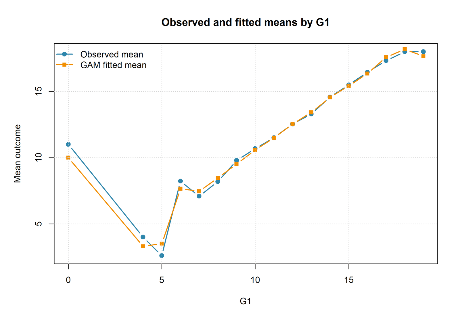
This R chart groups observations by G1 and compares the observed mean G3 with the GAM fitted mean. The two lines nearly overlap across most G1 values. At G1 = 0, the observed mean is near 11 while the fitted mean is near 10, reflecting a very small and unusual group. Around G1 = 4–5, means fall to approximately 2.5–4.0, then rise sharply through G1 values 6 to 10.
From approximately G1 = 10 onward, observed and fitted means increase almost together: around 10.6 at G1 = 10, 12.5 at G1 = 12, 15.4 at G1 = 15, and approximately 18 at G1 = 18–19. The close overlap demonstrates good calibration of mean predictions across the main predictor’s observed levels.
The grouped curve is not identical to the partial smooth effect. It combines the actual distribution of other predictors within each G1 level, whereas a partial-effect plot holds other variables constant. Both views are useful: the grouped plot describes fitted performance in the observed data, and the partial smooth isolates the adjusted G1 contribution.
R Chart 8: GAM vs Linear Model Error
The R model-error comparison uses the same interpretation as the dedicated fit-quality chart. The R GAM RMSE is 1.215615 and the linear baseline RMSE is 1.240967. The reduction of 0.025352 confirms that nonlinear additive functions produce slightly smaller average fitted error.
Python reports a nearly identical pattern, with RMSE 1.2126 for GAM and 1.2368 for the linear model. The agreement across implementations strengthens the substantive conclusion: allowing curvature in previous grades and attendance-related variables improves fit, but the improvement is approximately two percent rather than a dramatic transformation.
GAM vs Linear Model: Detailed Statistical Comparison
The central modeling question is whether the smooth functions improve fit enough to justify their additional complexity. Both software packages answer this question in the same direction: GAM has slightly lower RMSE than the linear baseline.
| Comparison | GAM | Linear | Difference |
|---|---|---|---|
| Python adjusted R² | 0.8544 | 0.8511 | +0.0033 for GAM. |
| Python RMSE | 1.2126 | 1.2368 | −0.0242 for GAM. |
| Python MAE | 0.7639 | 0.7792 | −0.0153 for GAM. |
| Python AIC | 2133.9981 | 2137.6467 | −3.6486 for GAM. |
| Python BIC | 2227.9822 | 2182.4011 | +45.5811; BIC favors linear. |
| R RMSE | 1.215615 | 1.240967 | −0.025352 for GAM. |
AIC and BIC disagree because they penalize complexity differently. AIC allows more flexibility when it improves fit enough to support expected predictive accuracy, while BIC penalizes additional parameters more strongly. The lower GAM AIC and higher GAM BIC indicate that the evidence for added smoothness is useful but not overwhelming.
The decision should depend on purpose. For a concise explanatory model, the linear specification may be sufficient. For understanding the G2 plateau, the adjusted G1 shape, or the nonlinear attendance effect, GAM adds information that a single slope cannot provide.
How to Interpret Generalized Additive Model Smooth Effects
A smooth plot shows the predictor’s adjusted contribution while other model terms are controlled. The horizontal location is the predictor value. The vertical scale may show the partial contribution or a predicted outcome, depending on how the chart was produced. Confidence bands show uncertainty and are usually wider where data are sparse.
Interpret Shape Before Individual Basis Coefficients
The Python output contains five coefficients for every fixed B-spline smooth. Those values are not separate effects of G1 or G2. They are weights used to build one curve. Reporting that the third G2 basis coefficient equals 12.3530 is incomplete unless the reader is told that the combined curve rises strongly and begins to flatten near high G2.
Use EDF to Describe Complexity
R estimates G1 EDF near 1, supporting an almost straight adjusted relationship. G2 EDF 2.6945 indicates moderate curvature. Absences EDF 3.1028 indicates a more flexible shape, although its statistical evidence is weaker than G2.
A Significant Smooth Is Not Necessarily Strongly Nonlinear
R’s G1 smooth is significant but EDF is only 1.0138. The conclusion is that G1 contributes significantly, not that it has a highly curved effect. Conversely, a term can have EDF above 1 but remain non-significant because the estimated shape is uncertain.
A Smooth Effect Is Conditional
The G1 curve is estimated after G2 and all controls are included. It is therefore much flatter than the raw G1–G3 association. This conditional interpretation is the same principle used in partial correlation and semi-partial correlation, but GAM allows the adjusted relationship to be nonlinear.
Residual, Influence and Model Diagnostics
GAM flexibility does not remove the need for diagnostic analysis. The model can still be influenced by rare observations, miss interactions, show unequal error variance, or overfit sparse regions.
Residual Centering
Both Python and R residual histograms are centered around zero, and most residuals lie within approximately ±2. This supports balanced fitted performance. The long negative tail, reaching roughly −9, shows that a few low final grades are poorly predicted.
Residual Shape
The residual-versus-fitted plots do not show a strong smooth curve across the main fitted range, suggesting that the selected smooths captured most broad nonlinearity. The diagonal bands arise from integer-valued G3 and are not automatically a problem.
Influential Cases
Students with observed G3 = 0 and fitted values near 8–10 may strongly affect the lower-range smooth. Each should be checked for data errors, unusual attendance, prior failures, or legitimate exceptional outcomes. Do not delete cases solely because their residuals are large.
Normality and Variance
For Gaussian inference, residual shape can be reviewed with a Q–Q plot, P–P plot, Shapiro–Wilk test, skewness and kurtosis check, and graphical residual analysis. Unequal variance can be explored through the Breusch–Pagan test and White test on a comparable diagnostic model.
Concurvity
Because G1 and G2 are strongly related, their smooth effects may overlap. Concurvity diagnostics should be examined in R. High concurvity means that one smooth can be approximated by other model terms, making the separate curves less stable even when overall prediction remains strong.
Validation, Overfitting and Generalization
The reported Python and R RMSE values are fitted-data summaries. They demonstrate how closely the models reproduce the analyzed sample, but they do not by themselves estimate performance in new data. Flexible smooths can overfit if basis dimensions are too large or smoothing penalties are too weak.
A stronger evaluation uses k-fold cross-validation, repeated cross-validation, or a train/test split in which all preprocessing and smoothness selection occur within the training data. The linear benchmark must be evaluated on the same folds so that error differences are comparable.
External validation should use students from a later period or another school. The model may lose accuracy if grading practices, course structure, attendance patterns, or student characteristics differ. Smooth-effect shapes should also be compared across cohorts, not only overall RMSE.
Reporting rule: call RMSE 1.2126 a fitted-model RMSE unless it was calculated on held-out or cross-validated predictions. Do not label an in-sample statistic as test error.
Worked Excel GAM-Style Calculation
The uploaded Excel workbook is an educational GAM-style approximation rather than a replacement for full spline estimation in Python or R. It uses standardized G1, G2, and absences values, then adds linear, squared, and cubic terms to demonstrate how an additive nonlinear prediction is assembled.
Excel Coefficient Inputs
| Term | Worked Coefficient | Role |
|---|---|---|
| Intercept | 12.30 | Baseline fitted value. |
| G1_z | 1.20 | Linear standardized G1 contribution. |
| G1_z² | −0.15 | Quadratic G1 curvature. |
| G1_z³ | 0.05 | Cubic G1 curvature. |
| G2_z | 1.65 | Linear standardized G2 contribution. |
| G2_z² | −0.10 | Quadratic G2 curvature. |
| G2_z³ | 0.04 | Cubic G2 curvature. |
| Absences_z | −0.30 | Linear attendance contribution. |
| Absences_z² | −0.08 | Quadratic attendance curvature. |
| Absences_z³ | 0.02 | Cubic attendance curvature. |
Worked Excel Summary
| Worked Metric | Value | Meaning |
|---|---|---|
| N | 20 | Illustrative observations, not the full 649-row model. |
| Observed mean | 12.3000 | Mean observed G3 in the worked sheet. |
| Predicted mean | 11.9884 | Mean fitted value. |
| RMSE | 0.4962 | Worked in-sample root mean squared error. |
| MAE | 0.4034 | Worked mean absolute error. |
| SSE | 4.9241 | Residual sum of squares. |
| SST | 204.2000 | Total sum of squares. |
| R² | 0.975886 | Illustrative fit for the 20-row worked example. |
Core Excel Formulas
Standardized G1:
=(G1-AVERAGE(G1_range))/STDEV.S(G1_range)

G1 squared:
=G1_z^2

G1 cubed:
=G1_z^3

Predicted G3:
=Intercept
 + B_G1*G1_z + B_G1_2*G1_z^2 + B_G1_3*G1_z^3
 + B_G2*G2_z + B_G2_2*G2_z^2 + B_G2_3*G2_z^3
 + B_Abs*Abs_z + B_Abs_2*Abs_z^2 + B_Abs_3*Abs_z^3

Residual:
=Observed_G3-Predicted_G3

Absolute residual:
=ABS(Residual)

Squared residual:
=Residual^2

RMSE:
=SQRT(AVERAGE(Squared_Residual_Range))

MAE:
=AVERAGE(Absolute_Residual_Range)

R-squared:
=1-SUM(Squared_Residual_Range)/
   DEVSQ(Observed_G3_Range)
Excel limitation: polynomial terms illustrate nonlinear additive calculations, but they do not reproduce mgcv REML smoothness selection or the exact Python B-spline basis. Use the workbook for teaching and transparent calculation, and use Python or R for the full GAM.
SPSS Workflow for a Generalized Additive Model
Standard SPSS regression menus do not provide the same full GAM functionality as mgcv. A practical SPSS workflow uses embedded Python or R to estimate the model, then writes fitted values, residuals, and summary tables back to SPSS for SAV, SPV, and PDF output.
No GAM-specific SPSS PDF URL was supplied with the current media set, so this post does not invent SPSS coefficients or provide an unrelated download. The workflow below explains how the analysis should be constructed.
| SPSS Stage | Action | Expected Output |
|---|---|---|
| Import | Read dataset.csv and verify G3, G1, G2, absences, controls, and missing values. | Active SPSS dataset and data dictionary. |
| Embedded analysis | Use Python statsmodels/patsy or R mgcv through integration. | GAM coefficients, smooth summaries, fitted values, residuals, fit statistics. |
| Return results | Create SPSS datasets for predictions and summary tables. | SAV files for model results and row-level diagnostics. |
| Viewer output | Display model specification, fit, charts, and reporting text. | SPV output. |
| PDF export | Export all Viewer contents with compatibility-safe syntax. | GAM SPSS PDF report. |
Python, R, SPSS and Excel GAM Workflows
| Software | Main Method | Strength | Important Limitation |
|---|---|---|---|
| Python | Patsy cubic B-splines plus statsmodels OLS. | Transparent fixed basis design and detailed coefficient tables. | Fixed df does not automatically select smoothness. |
| R | mgcv::gam with REML. | Automatic smoothness selection, EDF, smooth tests, and concurvity tools. | Requires careful interpretation of partial smooths. |
| SPSS | Embedded Python or R integration. | Combines GAM estimation with SPSS data management and Viewer export. | Not a native standard-menu GAM workflow. |
| Excel | Standardized polynomial additive approximation. | Transparent worked formulas suitable for teaching. | Does not reproduce penalized spline estimation. |
Code Blocks for Generalized Additive Models
Python GAM-Style Spline Model
import pandas as pd
import numpy as np
import statsmodels.formula.api as smf
from sklearn.metrics import mean_absolute_error, mean_squared_error

df = pd.read_csv("dataset.csv")

gam_formula = (
    "G3 ~ bs(G1, df=5, degree=3, include_intercept=False)"
    " + bs(G2, df=5, degree=3, include_intercept=False)"
    " + bs(absences, df=5, degree=3, include_intercept=False)"
    " + studytime + failures + traveltime"
    " + C(school) + C(sex) + C(address)"
)

linear_formula = (
    "G3 ~ G1 + G2 + absences + studytime + failures + traveltime"
    " + C(school) + C(sex) + C(address)"
)

gam_model = smf.ols(gam_formula, data=df).fit()
linear_model = smf.ols(linear_formula, data=df).fit()

gam_fitted = gam_model.fittedvalues
linear_fitted = linear_model.fittedvalues

gam_rmse = mean_squared_error(df["G3"], gam_fitted) ** 0.5
gam_mae = mean_absolute_error(df["G3"], gam_fitted)
linear_rmse = mean_squared_error(df["G3"], linear_fitted) ** 0.5

print(gam_model.summary())
print("GAM adjusted R-squared:", gam_model.rsquared_adj)
print("GAM RMSE:", gam_rmse)
print("GAM MAE:", gam_mae)
print("Linear RMSE:", linear_rmse)
R mgcv GAM
library(mgcv)

df <- read.csv("dataset.csv")

gam_model <- gam(
  G3 ~
    s(G1, k = 10) +
    s(G2, k = 10) +
    s(studytime, k = 3) +
    s(failures, k = 3) +
    s(absences, k = 10) +
    s(age, k = 7) +
    school + sex + address,
  data = df,
  family = gaussian(link = "identity"),
  method = "REML"
)

linear_model <- lm(
  G3 ~ G1 + G2 + studytime + failures +
    absences + age + school + sex + address,
  data = df
)

gam_fitted <- fitted(gam_model)
gam_residual <- residuals(gam_model)

gam_rmse <- sqrt(mean((df$G3 - gam_fitted)^2))
gam_mae <- mean(abs(df$G3 - gam_fitted))
linear_rmse <- sqrt(mean((df$G3 - fitted(linear_model))^2))

summary(gam_model)
gam.check(gam_model)
concurvity(gam_model, full = TRUE)

print(gam_rmse)
print(gam_mae)
print(linear_rmse)
SPSS Syntax Pattern with Embedded Python
SET PRINTBACK=OFF MPRINT=OFF RESULTS=ON DECIMAL=DOT.
OUTPUT CLOSE ALL.
OUTPUT NEW NAME=GAMOutput.
OUTPUT ACTIVATE GAMOutput.

GET DATA
  /TYPE=TXT
  /FILE='D:\DATA ANALYSIS\H Regression Tests and Models\Generalized Additive Model\dataset.csv'
  /ENCODING='UTF8'
  /DELCASE=LINE
  /DELIMITERS=","
  /ARRANGEMENT=DELIMITED
  /FIRSTCASE=2
  /IMPORTCASE=ALL.

DATASET NAME GAMData.
EXECUTE.

BEGIN PROGRAM Python3.
# Read the active SPSS dataset.
# Fit the Python B-spline GAM-style model.
# Return fitted values, residuals, model-fit tables,
# smooth-effect values, and chart data to SPSS.
END PROGRAM.

OUTPUT SAVE
  OUTFILE='D:\DATA ANALYSIS\H Regression Tests and Models\Generalized Additive Model\SPSS_Output\spv\Generalized-Additive-Model-SPSS-Output.spv'.

OUTPUT EXPORT
  /CONTENTS EXPORT=ALL LAYERS=PRINTSETTING MODELVIEWS=PRINTSETTING
  /PDF DOCUMENTFILE='D:\DATA ANALYSIS\H Regression Tests and Models\Generalized Additive Model\SPSS_Output\pdf\Generalized-Additive-Model-SPSS-Report.pdf'.
APA-Style Reporting for a Generalized Additive Model
Python Report
A generalized additive model was fitted to predict final grade (G3) for 649 students. Cubic B-spline smooths with five degrees of freedom were included for G1, G2, and absences; studytime, failures, and traveltime were entered as linear predictors; and school, sex, and address were included as categorical controls. The GAM explained 85.89% of the variance in G3, R² = .859, adjusted R² = .854, with RMSE = 1.213 and MAE = 0.764. A linear comparison model produced adjusted R² = .851 and RMSE = 1.237. Thus, GAM reduced fitted RMSE by 0.024, approximately 1.96%, and had a lower AIC (2134.00 vs 2137.65), although BIC favored the simpler linear model. The smooth-effect plots indicated a strong increasing G2 relationship with mild upper-end flattening and a smaller positive adjusted G1 relationship.
R Report
A Gaussian identity-link generalized additive model was estimated in R using REML smoothness selection. Smooth terms were specified for G1, G2, studytime, failures, absences, and age, with school, sex, and address entered as parametric factors. The model explained 85.82% of the variance and deviance in G3, R² = .858, adjusted R² = .855, RMSE = 1.216, MAE = 0.752, and AIC = 2133.22. Significant smooth effects were observed for G1, edf = 1.014, p < .001; G2, edf = 2.695, p < .001; and absences, edf = 3.103, p = .024. Smooth effects for studytime, failures, and age were not statistically significant.
Short Interpretation
Generalized additive modeling provided a small improvement over linear regression and revealed that G2 has the strongest adjusted relationship with final grade. G1 contributes an almost linear positive effect, while absences shows a weaker nonlinear association in R. Residuals are centered near zero overall, but several G3 = 0 cases produce large negative residuals and should be reviewed.
Common Generalized Additive Model Mistakes
| Mistake | Why It Is Incorrect | Better Practice |
|---|---|---|
| Not naming variables | Readers cannot tell what is smoothed or controlled. | List G3, every smooth predictor, linear predictor, and categorical reference group. |
| Interpreting spline basis coefficients separately | Basis coefficients jointly form one curve. | Interpret the smooth plot, EDF, uncertainty, and joint term test. |
| Assuming significant means nonlinear | A significant smooth may have EDF near 1. | Use EDF to distinguish near-linear and curved effects. |
| Using too many basis functions without penalty | The model can fit noise. | Use REML/GCV or validate fixed-df choices. |
| Reporting only R² | Fit does not describe error scale or complexity. | Report adjusted R², RMSE, MAE, AIC/BIC, and residual diagnostics. |
| Calling fitted RMSE test error | In-sample performance is optimistic. | Label fitted metrics correctly and add cross-validation. |
| Ignoring concurvity | Overlapping smooths can destabilize interpretation. | Check smooth dependence, especially between G1 and G2. |
| Deleting low-grade cases automatically | Extreme outcomes may be valid and informative. | Investigate data quality and influence before exclusion. |
| Merging Python and R coefficients | The formulas and spline parameterizations differ. | Report each software model separately. |
| Claiming a dramatic improvement | RMSE improves by only about two percent. | Describe the gain as modest and emphasize shape interpretation. |
Generalized Additive Model Downloads
R Generalized Additive Model Reportmgcv REML results, parametric terms, smooth-term tests and R charts.
The worked Excel workbook was supplied for preparing this post, but no hosted WordPress download URL was supplied. Add its hosted URL to this section after uploading the workbook to the Media Library.
FAQs About Generalized Additive Models
What is a Generalized Additive Model?
A GAM is a regression model that represents selected numeric predictors with smooth functions while adding their effects together with linear or categorical terms.
What is the outcome in this example?
The continuous outcome is G3, the final student grade, observed from 0 to 19 with a mean near 11.906.
Which variables are smoothed in Python?
Python uses five-degree-of-freedom cubic B-splines for G1, G2, and absences.
Which variables are smoothed in R?
R smooths G1, G2, studytime, failures, absences, and age using mgcv with REML smoothness selection.
What does EDF mean?
Effective degrees of freedom measure smooth complexity. EDF near 1 is approximately linear; higher values indicate more curvature.
Which R smooth terms are significant?
G1, G2, and absences are significant at α = .05. Studytime, failures, and age are not significant after adjustment.
How well does the Python GAM fit?
Python reports R² = 0.8589, adjusted R² = 0.8544, RMSE = 1.2126, and MAE = 0.7639.
How well does the R GAM fit?
R reports R² = 0.8581986, adjusted R² = 0.8549355, RMSE = 1.215615, and MAE = 0.752088.
Is GAM better than the linear model?
GAM has approximately two percent lower fitted RMSE in both Python and R, but the improvement is modest and GAM is more complex.
Why does BIC prefer the linear model?
BIC applies a stronger complexity penalty. Python GAM improves fit but uses 20 model degrees of freedom instead of 9.
Can a significant smooth be almost linear?
Yes. R’s G1 smooth is highly significant but has EDF = 1.0138, indicating an almost linear adjusted relationship.
Why are individual spline coefficients not interpreted?
They are basis weights that jointly create one smooth function. The curve, EDF, uncertainty, and joint test are the meaningful outputs.
What do the large negative residuals mean?
They represent students whose observed G3 was much lower than the model predicted, including several observed zero grades.
Can GAM be performed in SPSS?
Yes, commonly through embedded Python or R integration, with results returned to SPSS for SAV, SPV, and PDF output.
Can Excel fit the same GAM?
Excel can demonstrate additive polynomial calculations, but it does not directly reproduce penalized spline smoothness selection used by R or the fixed B-spline basis used by Python.
What is concurvity?
Concurvity is nonlinear overlap among smooth terms. It is similar in purpose to multicollinearity and can make separate smooth effects unstable.

