
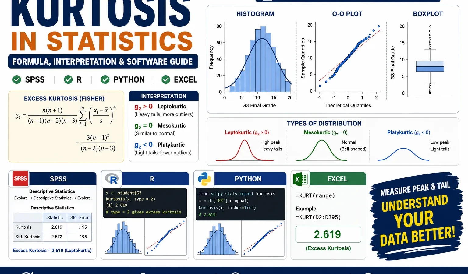
Tail Weight, Peak Shape, Null Hypothesis and Distribution Interpretation
Kurtosis measures whether a distribution has heavier tails, lighter tails, or a normal-like tail pattern. In hypothesis language, kurtosis analysis can test whether the distribution has normal-like excess kurtosis or whether it departs from the normal reference value. This guide explains the null hypothesis for kurtosis, alternative hypothesis for kurtosis, formula, SPSS output, R charts, Python charts, Excel method and reporting using the student-por.csv dataset.
Quick Answer: Kurtosis Result for G3
The main variable analyzed was G3 final grade. The SPSS and Python/R outputs show N = 649, mean = 11.906, standard deviation = 3.231, Fisher’s excess kurtosis = 2.712 and Pearson kurtosis = 5.712. Because SPSS reports excess kurtosis, a normal distribution is interpreted around 0. The G3 value of 2.712 is clearly positive, so the distribution is interpreted as leptokurtic, meaning heavier tails and/or a sharper peak than a normal distribution.
Hypothesis decision: The null hypothesis says that G3 has normal-like kurtosis, or H0: excess kurtosis = 0. The alternative hypothesis says that G3 does not have normal-like kurtosis, or H1: excess kurtosis ≠ 0. Since the approximate kurtosis z value is about 14.104 and the p-value is extremely small, the null hypothesis is rejected. In practical words, G3 final grade does not have normal-like kurtosis; it has significantly positive excess kurtosis.
Final report sentence: Kurtosis analysis of G3 final grade showed positive excess kurtosis, g2 = 2.712, with SE = 0.192 and an approximate kurtosis z value of about 14.104. The null hypothesis that G3 has normal-like excess kurtosis was rejected, p < .001. This indicates a leptokurtic distribution, meaning the final-grade distribution has heavier tails and a sharper concentration pattern than a normal distribution. The result should be interpreted together with the histogram, Q-Q plot and boxplot because kurtosis is affected by tail observations and extreme scores.
Important note: Kurtosis is often descriptive, but a hypothesis-style decision is useful for reporting and SEO clarity. Do not report the chart value as p = 0 or p = .000. When software shows a very small p-value, write p < .001. Also remember that rejecting the null hypothesis does not mean the data are unusable. It means the distribution shape is not normal-like in tail weight and should be interpreted with visual evidence.
Table of Contents
- What Is Kurtosis?
- Kurtosis Formula and Types
- Null and Alternative Hypothesis for Kurtosis
- Dataset and Clean SPSS-Ready Files Used
- Verified SPSS, R and Python Results
- Python Charts and Interpretation
- R Validation Charts
- How to Calculate Kurtosis in Python, R, SPSS and Excel
- How to Report Kurtosis
- Common Mistakes
- Download SPSS Output
- FAQs
What Is Kurtosis?
Kurtosis is a descriptive statistic that helps explain the shape of a distribution, especially the weight of its tails and the concentration of values around the center. In beginner statistics, kurtosis is often described as “peakedness,” but that explanation is incomplete. A better interpretation is that kurtosis describes how much of the distribution is concentrated in the center and how much probability weight appears in the tails compared with a normal distribution.
In this guide, kurtosis is demonstrated with G3 final grade from the student performance dataset. The G3 variable has many scores around the middle grade range, but it also includes very low values such as 0 and 1. These tail values make the distribution depart from a normal reference curve. That is why the histogram, Q-Q plot and boxplot are important. The number alone tells us that kurtosis is positive, but the charts show where that positive kurtosis is coming from.
For a complete shape diagnosis, kurtosis should be read with descriptive statistics, histogram interpretation, Q-Q plot normality checks, P-P plot normality checks and box plot interpretation. If you are deciding whether the distribution is normal enough for a test, also compare kurtosis with formal normality methods such as the Kolmogorov-Smirnov test, Lilliefors test and DAgostino Pearson test.
Practical meaning: Kurtosis is useful when you want to know whether extreme values are more common than expected under a normal distribution. In a student-grade dataset, positive kurtosis may indicate that most students cluster around the central grade range while a smaller group of students falls far away from the center, especially toward very low scores.
Kurtosis Formula and Types
Kurtosis is based on the fourth standardized moment. The basic population kurtosis formula is:
Kurtosis = E[(X - μ)^4] / σ^4Where X is the variable, μ is the mean and σ is the standard deviation. Because deviations are raised to the fourth power, values far from the mean receive much greater weight. That is why kurtosis is sensitive to tail behavior and outliers.
There are two common ways to report kurtosis:
| Type | Formula idea | Normal distribution value | Interpretation in this post |
|---|---|---|---|
| Fisher’s excess kurtosis | Pearson kurtosis − 3 | 0 | SPSS, Python, R and Excel report the main value as excess kurtosis. |
| Pearson kurtosis | Raw kurtosis value | 3 | For G3, Pearson kurtosis is 5.712 because 2.712 + 3 = 5.712. |
| Excess kurtosis value | Distribution type | Meaning | Simple interpretation |
|---|---|---|---|
| Close to 0 | Mesokurtic | Similar tail weight to a normal distribution. | The distribution is normal-like in tail shape. |
| Positive | Leptokurtic | Heavier tails and/or sharper peak than normal. | Extreme values are more influential than in a normal pattern. |
| Negative | Platykurtic | Lighter tails or flatter shape than normal. | The distribution is more spread out or bounded with fewer heavy tails. |
In the current analysis, G3 excess kurtosis = 2.712. Since this is positive and clearly above the common practical threshold of +1, the distribution is interpreted as leptokurtic. This means the tails and peak are stronger than expected under a normal curve. The histogram and boxplot show that very low grade values are especially important in creating this pattern.
Null and Alternative Hypothesis for Kurtosis
Kurtosis is commonly used as a descriptive statistic, but a hypothesis framework makes the interpretation clearer for reports, assignments and SEO-friendly statistical guides. The hypothesis is based on whether the observed excess kurtosis is close to the normal-reference value or significantly different from it.
| Hypothesis | Statement | Meaning for G3 final grade |
|---|---|---|
| Null hypothesis | H0: excess kurtosis = 0 | G3 has normal-like kurtosis. Its tail weight is not meaningfully different from a normal distribution. |
| Alternative hypothesis | H1: excess kurtosis ≠ 0 | G3 does not have normal-like kurtosis. Its tail weight differs from the normal reference value. |
| Directional practical alternative | H1: excess kurtosis > 0 | G3 is leptokurtic, meaning it has heavier tails and/or sharper concentration than normal. |
The approximate test can be written as:
z = excess kurtosis / standard error of kurtosisFor G3, the excess kurtosis is 2.712 and the standard error of kurtosis is 0.192. Therefore, the approximate z value is:
z ≈ 2.712 / 0.192 = 14.104Hypothesis decision: Because the approximate z value is very large and the p-value is below .001, reject the null hypothesis. The G3 final-grade distribution does not have normal-like kurtosis. The positive direction of the result supports the practical conclusion that G3 is leptokurtic.
Reporting caution: In large samples, even small deviations from normal shape can become statistically significant. That is why this post does not rely only on the null hypothesis decision. It also uses the histogram, Q-Q plot and boxplot to explain the practical source of the kurtosis result.
Dataset and Clean SPSS-Ready Files Used
This kurtosis example uses the student-por.csv student performance dataset. The main outcome variable is G3 final grade. Additional numeric variables were also checked to compare kurtosis across the dataset, including G1, G2, absences, age, failures, studytime, traveltime, famrel, freetime, goout, Dalc, Walc, health, Medu and Fedu.
SPSS workflow rule: The SPSS output was generated from a clean SPSS-ready data file. This is the safest workflow because SPSS can misread raw CSV files when delimiters, text columns or numeric formats are inconsistent. A clean SPSS-ready file keeps the variable names, numeric columns and output export stable.
| Item | Value or file | Explanation |
|---|---|---|
| Main dataset | student-por.csv | Student performance dataset used for the worked example. |
| SPSS-ready file | kurtosis_spss_ready_data.sav | Clean file used by SPSS for frequencies, descriptives, normality tests and output export. |
| Main variable | G3 | Final grade / main outcome for kurtosis analysis. |
| Valid N | 649 | No missing cases were reported for the variables shown in the SPSS output. |
| Hypothesis focus | Normal-like excess kurtosis vs non-normal kurtosis | The null hypothesis checks whether G3 excess kurtosis is equal to 0. |
| Software workflow | Python, R, SPSS and Excel | Python and R produced charts; SPSS produced the official output PDF; Excel formulas are shown for manual calculation. |
External dataset source: UCI Machine Learning Repository: Student Performance dataset.
Verified SPSS, R and Python Results
The kurtosis result was checked in SPSS, Python and R. SPSS reports kurtosis as excess kurtosis, where a normal distribution is approximately 0. The main G3 result was positive and large enough to support a leptokurtic interpretation. The Python and R charts visually confirmed the same conclusion: G3 is centered around the middle grades, but its tails, especially the low-score tail, depart from the normal reference pattern.
Hypothesis Result for G3 Kurtosis
| Component | Result | Decision |
|---|---|---|
| Null hypothesis | H0: G3 excess kurtosis = 0 | Assumes normal-like kurtosis. |
| Alternative hypothesis | H1: G3 excess kurtosis ≠ 0 | Assumes G3 kurtosis differs from normal. |
| Observed excess kurtosis | 2.712 | Positive value supports leptokurtic shape. |
| Standard error | 0.192 | Used to calculate approximate z. |
| Approximate z | 14.104 | Very large departure from the null value of 0. |
| p-value decision | p < .001 | Reject the null hypothesis. |
| Final interpretation | Leptokurtic | G3 has heavier tails and/or sharper concentration than normal. |
SPSS Descriptive Statistics for Main Variables
| Variable | N | Minimum | Maximum | Mean | Standard deviation | Skewness | Excess kurtosis | Interpretation |
|---|---|---|---|---|---|---|---|---|
| G3 final grade | 649 | 0.00 | 19.00 | 11.9060 | 3.23066 | -0.913 | 2.712 | Leptokurtic; reject H0 of normal-like kurtosis. |
| G2 second period grade | 649 | 0.00 | 19.00 | 11.5701 | 2.91364 | -0.360 | 1.662 | Positive excess kurtosis; moderately heavy-tailed. |
| G1 first period grade | 649 | 0.00 | 19.00 | 11.3991 | 2.74527 | -0.003 | 0.037 | Very close to normal-like excess kurtosis. |
| Absences | 649 | 0.00 | 32.00 | 3.6595 | 4.64076 | 2.021 | 5.781 | Strongly leptokurtic because many small values and some large absence values create a heavy right tail. |
| Age | 649 | 15.00 | 22.00 | 16.7442 | 1.21814 | 0.417 | 0.072 | Close to normal-like excess kurtosis, though age is bounded. |
G3 Detailed SPSS Output
| Statistic | G3 value | Interpretation |
|---|---|---|
| Valid N | 649 | The analysis used all 649 valid G3 cases. |
| Mean | 11.9060 | The average final grade is about 11.91. |
| 95% CI for mean | 11.6570 to 12.1550 | The mean estimate is stable with a narrow confidence interval. |
| Median | 12.0000 | The central score is close to the mean. |
| 5% trimmed mean | 12.0574 | The trimmed mean is slightly higher than the mean, showing that low values pull the mean downward. |
| Standard deviation | 3.23066 | Individual scores vary by about 3.23 grade points around the mean. |
| Interquartile range | 4.00 | The middle 50% of students are concentrated in a relatively narrow band. |
| Skewness | -0.913 | Negative skewness shows a stronger low-score tail. |
| Excess kurtosis | 2.712 | The value is far above 0, so the null hypothesis of normal-like kurtosis is rejected. |
| Kolmogorov-Smirnov | D = .124, p < .001 | The G3 distribution significantly departs from normality. |
| Shapiro-Wilk | W = .926, p < .001 | The normality test supports the visual evidence of non-normal shape. |
SPSS transcript interpretation: The G3 distribution has a mean of 11.9060, median of 12.0000 and standard deviation of 3.23066. Its skewness is -0.913, showing a left-tail influence, and its excess kurtosis is 2.712, showing heavier tails than a normal distribution. Since the excess kurtosis is far above the null value of 0, the null hypothesis of normal-like kurtosis is rejected. Both Kolmogorov-Smirnov and Shapiro-Wilk tests are significant at p < .001, so G3 should not be described as perfectly normal.
Python Charts and Interpretation
1. Kurtosis Histogram for G3
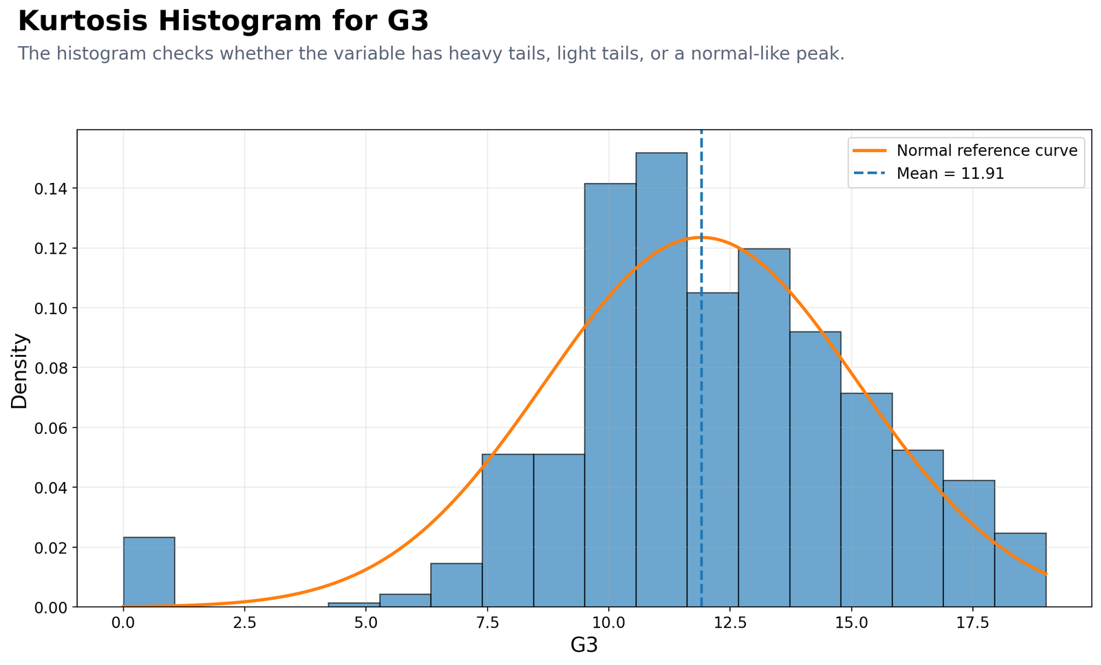
This histogram compares the observed G3 grade distribution with a normal reference curve. Most G3 scores are concentrated between about 10 and 15, with the dashed mean line at approximately 11.91. Under the null hypothesis, the G3 distribution would have normal-like excess kurtosis, so the bars would follow the normal reference curve more closely in both the center and the tails. Instead, the observed bars show a strong central concentration, a visible group of very low scores near 0, and a right side that extends toward 19. These tail observations are important because kurtosis is highly sensitive to values far from the mean. The main message is not simply that the chart has a high peak; rather, the chart shows a combination of central clustering and tail departures. That is why G3 receives a positive excess kurtosis value of 2.712. The low-score tail also explains why the 5% trimmed mean is slightly higher than the ordinary mean: removing extreme low values raises the average. Therefore, the histogram supports rejecting the null hypothesis of normal-like kurtosis and supports the leptokurtic interpretation, but it should be read together with the Q-Q plot and boxplot before making the final distribution-shape statement.
2. Q-Q Plot Support for Kurtosis: G3
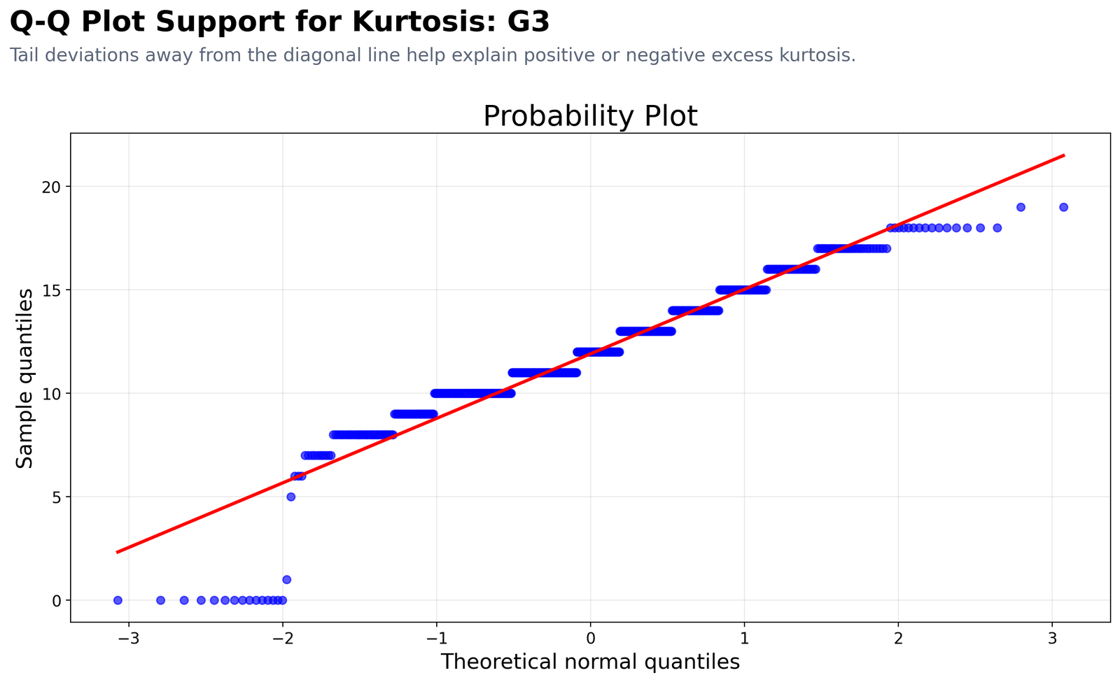
The Q-Q plot gives stronger evidence about tail behavior than the histogram alone. If the null hypothesis were true and G3 had normal-like kurtosis, the plotted points would stay near the diagonal reference line from the lower tail to the upper tail. In this chart, the middle grade values follow the line reasonably well, which means the central part of the distribution is not the main problem. The strongest departures appear in the tails. At the lower end, several observations cluster around 0, creating a flat step pattern far from what a smooth normal distribution would produce. At the upper end, the highest scores also deviate from the diagonal line, although the low-score tail is visually more influential. The staircase pattern happens because G3 is a discrete grade variable with repeated integer values from 0 to 19, not a continuous measurement. This plot supports the kurtosis hypothesis decision because the alternative hypothesis says tail weight differs from normal, and the Q-Q plot shows exactly where those tail deviations occur. It also supports the negative skewness result because the lower tail is more visibly unusual than the upper tail.
3. Boxplot Tail Check for G3
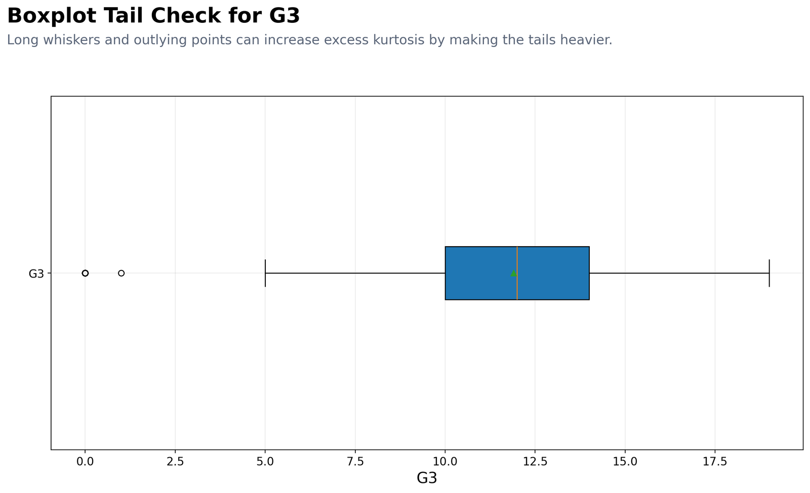
The boxplot explains the tail structure behind the kurtosis value. The middle box is concentrated roughly from 10 to 14, and the median is close to 12. This agrees with the SPSS interquartile range of 4.00, meaning the middle half of students are grouped within about four grade points. The right whisker extends toward the high-grade end, while the lower side includes very low outlying points around 0 and 1. These low outliers are important because kurtosis gives strong weight to values far from the mean. A few tail values can therefore increase excess kurtosis even when the majority of observations are clustered in a normal-looking central band. The null hypothesis expects normal-like tail weight, but the boxplot shows tail observations that make the normal-like assumption weak. This chart also shows why kurtosis and skewness should be interpreted together. The positive kurtosis tells us the tails are heavier than normal, while the negative skewness tells us that the lower tail has stronger influence than the upper tail. In reporting, this means G3 should be described as leptokurtic with low-end tail influence, not simply as “peaked.”
4. Excess Kurtosis Across Numeric Variables
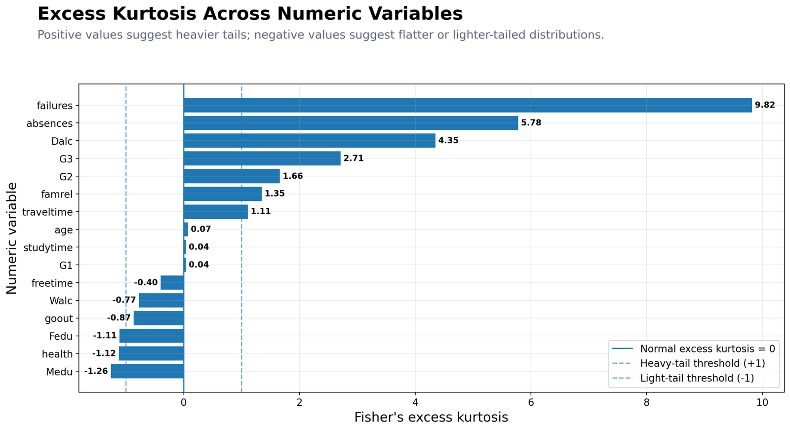
This horizontal bar chart compares excess kurtosis across multiple numeric variables. The vertical reference line at 0 represents the null hypothesis value for normal-like excess kurtosis. The dashed threshold around +1 marks variables with practically heavier tails, while the dashed threshold around -1 marks variables with noticeably lighter or flatter tails. The strongest positive kurtosis appears for failures = 9.82, followed by absences = 5.78, Dalc = 4.35, G3 = 2.71 and G2 = 1.66. These variables have heavier tails because they either contain rare extreme values, many repeated low values, or strong clustering with a few distant observations. For example, absences is a count variable where many students have low absences but some students have very high absence counts. G3 is not as extreme as failures or absences, but it is still clearly above the +1 threshold, so rejecting the null hypothesis for G3 is not only statistically meaningful; it also has a visible practical explanation. Variables such as G1 = 0.04, studytime = 0.04 and age = 0.07 are close to zero, so their excess kurtosis is much closer to the null hypothesis value. On the negative side, Medu = -1.26, health = -1.12 and Fedu = -1.11 are lighter-tailed or flatter, which often happens with bounded ordinal variables. This chart is useful because it shows that kurtosis is not a one-variable issue; different variable types in the same dataset can have very different tail behavior.
5. Kurtosis Result and Interpretation Card
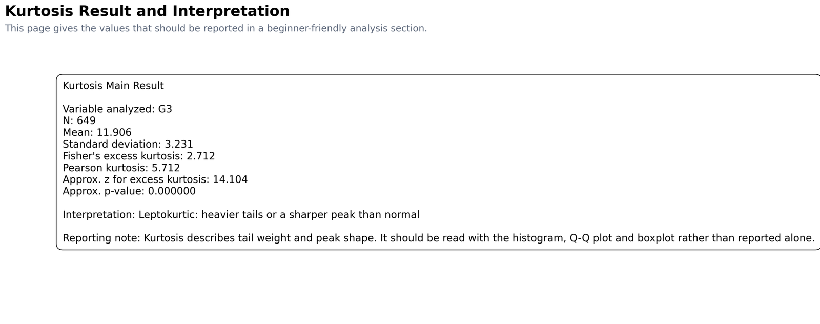
The result card summarizes the values that should be used in a report: N = 649, mean = 11.906, standard deviation = 3.231, Fisher’s excess kurtosis = 2.712, Pearson kurtosis = 5.712, approximate z = 14.104 and an extremely small p-value. The null hypothesis is that excess kurtosis equals 0, meaning normal-like kurtosis. The alternative hypothesis is that excess kurtosis differs from 0. Since the approximate z value is very large and the p-value is below .001, the correct decision is to reject the null hypothesis. The most important interpretation line is that G3 is leptokurtic, meaning heavier tails or a sharper peak than normal. The card is especially useful for students because it separates Fisher’s excess kurtosis from Pearson kurtosis. Many reporting mistakes happen because users forget that SPSS reports excess kurtosis, not Pearson kurtosis. If the report uses SPSS, Python or R excess kurtosis, the normal reference value is 0. If it uses Pearson kurtosis, the normal reference value is 3. The chart displays the p-value as 0.000000, but the written report should use p < .001. The card also correctly reminds the reader that the hypothesis decision should not be reported alone. The histogram, Q-Q plot and boxplot explain the practical reason for rejecting the null hypothesis.
R Validation Charts
The R charts reproduce the same kurtosis story using a separate software workflow. This is useful because it confirms that the result is not only a Python charting artifact or an SPSS output issue. The R histogram, Q-Q plot, boxplot, variable comparison chart and result card all support the same conclusion: reject the null hypothesis of normal-like G3 kurtosis and interpret G3 as leptokurtic.
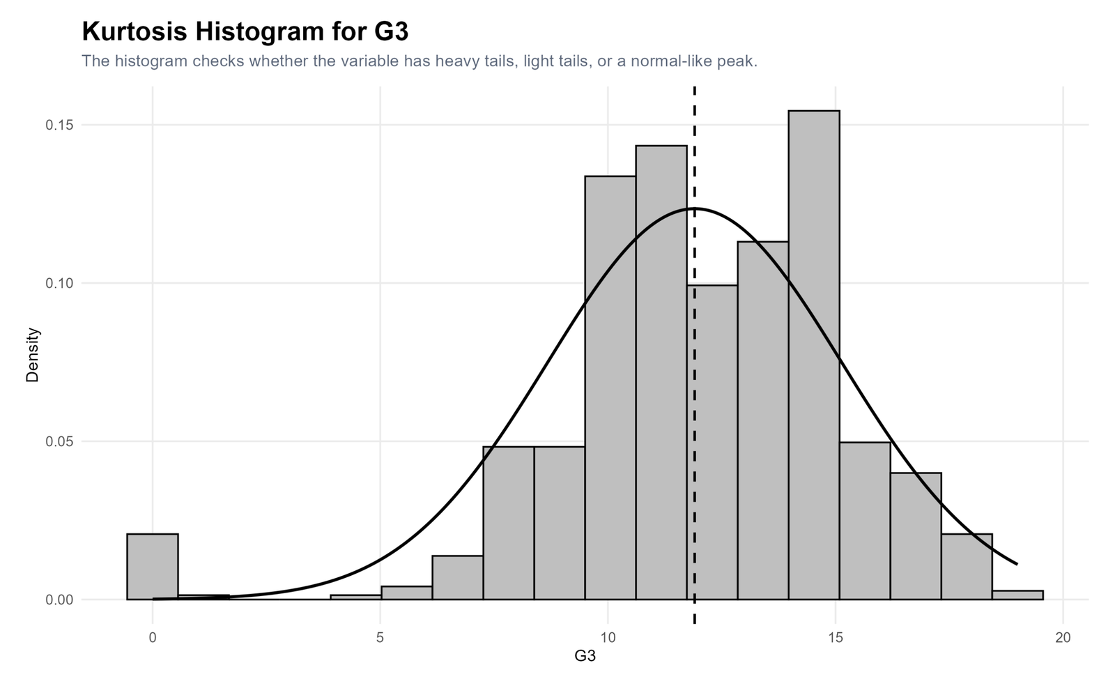
The R histogram confirms the same central clustering and tail behavior shown in Python. Most scores are concentrated in the middle grade range, while the low-end tail includes unusually small values. Under the null hypothesis, the histogram would look more normal-like in its central shape and tails. Instead, the observed pattern supports a positive excess kurtosis result. This chart validates the conclusion that G3 is leptokurtic rather than normal-like in kurtosis.
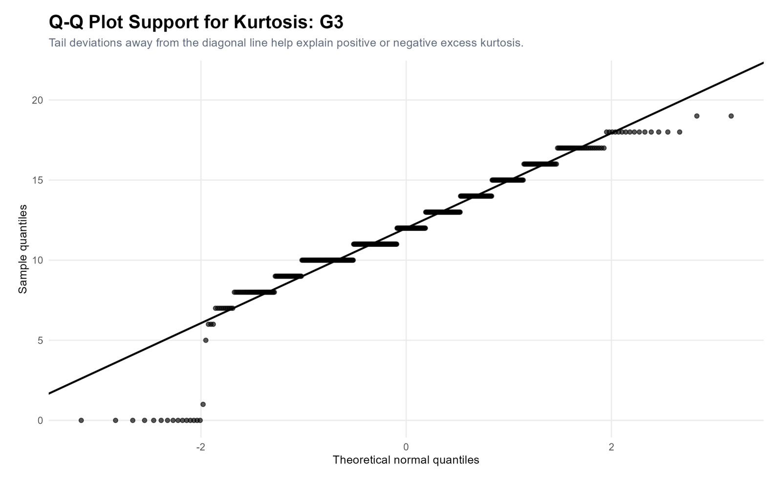
The R Q-Q plot again shows that the center of the distribution follows the normal line better than the tails. The repeated grade values create visible steps, and the lowest observations depart strongly from the reference line. This confirms the interpretation that kurtosis is being driven by tail behavior. Since the null hypothesis assumes normal-like tail behavior, the R Q-Q plot supports the decision to reject that null hypothesis.
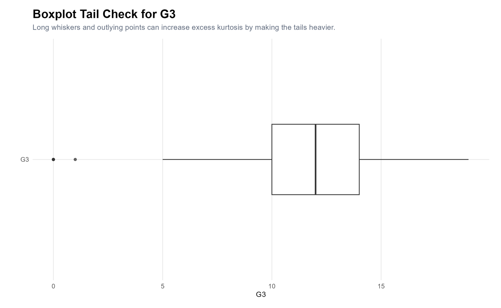
The R boxplot makes the same practical point as the Python boxplot. The middle 50% of G3 values is compact, but low-end observations lie far from the central box. These values increase the fourth moment used in the kurtosis formula. Therefore, the boxplot supports the decision to reject the null hypothesis of normal-like kurtosis and report G3 as a leptokurtic distribution with low-tail influence.
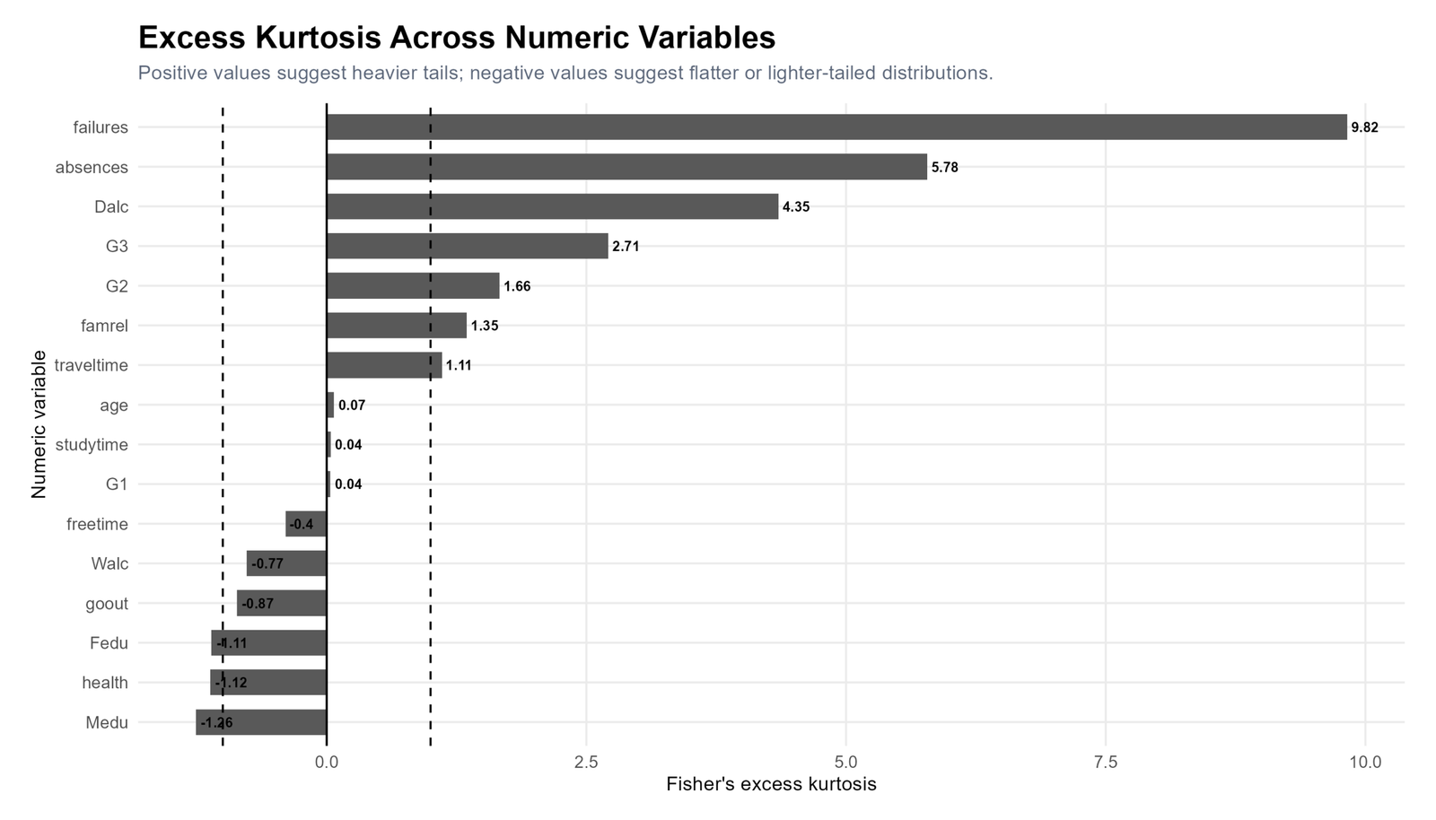
The R variable-comparison chart confirms that G3 is not the only variable with positive kurtosis. Failures and absences show much stronger tail weight, while G1, age and studytime are close to zero. This comparison prevents overinterpretation of G3. It shows that G3 is meaningfully leptokurtic, but some count-like or bounded variables in the dataset are even more extreme. From a hypothesis perspective, variables close to 0 are closer to the null hypothesis value, while variables far above +1 or below -1 show stronger practical departures from normal-like kurtosis.
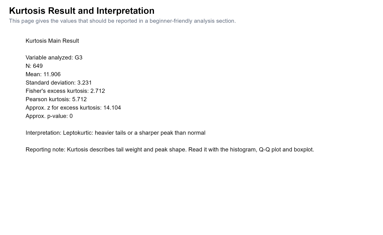
The R result card gives the same reportable values: G3 has positive excess kurtosis and should be described as leptokurtic. The agreement between R, Python and SPSS increases confidence in the result. In a final report, the R card can be used as a visual summary, while the SPSS output PDF can be used as the formal verification file. The hypothesis decision remains the same: reject the null hypothesis of normal-like kurtosis and conclude that G3 has a significant positive kurtosis pattern.
How to Calculate Kurtosis in Python, R, SPSS and Excel
Kurtosis in Python
Python can calculate Fisher’s excess kurtosis, Pearson kurtosis, approximate z value and a hypothesis-style p-value. The example below assumes the clean dataset contains the G3 variable.
import pandas as pd
import numpy as np
from scipy import stats

df = pd.read_csv("spss_ready_data.csv")
g3 = pd.to_numeric(df["G3"], errors="coerce").dropna()

n = len(g3)
mean_g3 = g3.mean()
sd_g3 = g3.std(ddof=1)

# Fisher's excess kurtosis: normal reference = 0
excess_kurtosis = stats.kurtosis(g3, fisher=True, bias=False)

# Pearson kurtosis: normal reference = 3
pearson_kurtosis = excess_kurtosis + 3

# Approximate standard error, z value and two-sided p-value
se_kurtosis = np.sqrt(24 / n)
z_kurtosis = excess_kurtosis / se_kurtosis
p_value = 2 * (1 - stats.norm.cdf(abs(z_kurtosis)))

print("Null hypothesis: excess kurtosis = 0")
print("Alternative hypothesis: excess kurtosis != 0")
print("N:", n)
print("Mean:", round(mean_g3, 3))
print("SD:", round(sd_g3, 3))
print("Fisher excess kurtosis:", round(excess_kurtosis, 3))
print("Pearson kurtosis:", round(pearson_kurtosis, 3))
print("Approx z:", round(z_kurtosis, 3))
print("Approx p-value:", p_value)

if p_value < 0.05:
    print("Decision: Reject the null hypothesis.")
else:
    print("Decision: Fail to reject the null hypothesis.")
Kurtosis in R
R can calculate excess kurtosis using packages such as moments or e1071. The code below gives a simple reproducible workflow with null and alternative hypothesis wording.
install.packages("moments")
library(moments)

student <- read.csv("spss_ready_data.csv")
g3 <- na.omit(as.numeric(student$G3))

n <- length(g3)
mean_g3 <- mean(g3)
sd_g3 <- sd(g3)

# moments::kurtosis gives Pearson kurtosis
pearson_kurtosis <- moments::kurtosis(g3)
excess_kurtosis <- pearson_kurtosis - 3

se_kurtosis <- sqrt(24 / n)
z_kurtosis <- excess_kurtosis / se_kurtosis
p_value <- 2 * (1 - pnorm(abs(z_kurtosis)))

cat("Null hypothesis: excess kurtosis = 0\n")
cat("Alternative hypothesis: excess kurtosis != 0\n")
cat("N:", n, "\n")
cat("Mean:", round(mean_g3, 3), "\n")
cat("SD:", round(sd_g3, 3), "\n")
cat("Fisher excess kurtosis:", round(excess_kurtosis, 3), "\n")
cat("Pearson kurtosis:", round(pearson_kurtosis, 3), "\n")
cat("Approx z:", round(z_kurtosis, 3), "\n")
cat("Approx p-value:", p_value, "\n")

if (p_value < 0.05) {
  cat("Decision: Reject the null hypothesis.\n")
} else {
  cat("Decision: Fail to reject the null hypothesis.\n")
}
Kurtosis in SPSS
SPSS reports excess kurtosis in the Frequencies, Explore and Descriptives outputs. In this analysis, SPSS reported G3 kurtosis as 2.712 with standard error 0.192. The hypothesis statement should be written in the report because SPSS does not automatically print “reject H0” for kurtosis.
* Kurtosis Analysis in SPSS.
* Null hypothesis: G3 excess kurtosis = 0.
* Alternative hypothesis: G3 excess kurtosis is not equal to 0.

SET UNICODE=ON.
SET DECIMAL=DOT.
SET PRINTBACK=OFF.
SET MPRINT=OFF.

GET FILE="D:\DATA ANALYSIS\A Basic Descriptive Statistics Guides\Kurtosis\SPSS_Output\sav\kurtosis_spss_ready_data.sav".
DATASET NAME Kurtosis_Data WINDOW=FRONT.

TITLE "Kurtosis Analysis for Student Performance Data".

FREQUENCIES VARIABLES=G3 G2 G1 absences age
 /STATISTICS=MEAN MEDIAN STDDEV VARIANCE SKEWNESS SESKEW KURTOSIS SEKURT MINIMUM MAXIMUM RANGE
 /ORDER=ANALYSIS.

EXAMINE VARIABLES=G3
 /PLOT BOXPLOT HISTOGRAM NPPLOT
 /COMPARE GROUPS
 /STATISTICS DESCRIPTIVES
 /CINTERVAL 95
 /MISSING LISTWISE
 /NOTOTAL.

DESCRIPTIVES VARIABLES=G3 G2 G1 absences age
 /STATISTICS=MEAN STDDEV MIN MAX SKEWNESS KURTOSIS.

OUTPUT EXPORT
 /CONTENTS EXPORT=VISIBLE
 /PDF DOCUMENTFILE="D:\DATA ANALYSIS\A Basic Descriptive Statistics Guides\Kurtosis\SPSS_Output\Kurtosis-SPSS-Output.pdf".
Kurtosis in Excel
Excel uses the KURT function to calculate excess kurtosis. This means a normal distribution is interpreted around 0. Excel does not automatically give a hypothesis decision, but you can calculate an approximate z value and p-value manually.
| Excel task | Example formula | Purpose |
|---|---|---|
| Mean | =AVERAGE(B2:B650) | Calculates the average G3 score. |
| Standard deviation | =STDEV.S(B2:B650) | Calculates the sample standard deviation. |
| Fisher's excess kurtosis | =KURT(B2:B650) | Calculates Excel excess kurtosis, where normal is about 0. |
| Pearson kurtosis | =KURT(B2:B650)+3 | Converts excess kurtosis to Pearson kurtosis. |
| Approximate SE | =SQRT(24/COUNT(B2:B650)) | Approximates the standard error of excess kurtosis. |
| Approximate z | =KURT(B2:B650)/SQRT(24/COUNT(B2:B650)) | Calculates a rough kurtosis z statistic. |
| Two-sided p-value | =2*(1-NORM.S.DIST(ABS(z_cell),TRUE)) | Tests the null hypothesis that excess kurtosis equals 0. |
How to Report Kurtosis
A strong kurtosis report should include the variable, sample size, null hypothesis, alternative hypothesis, mean, standard deviation, excess kurtosis value, standard error, approximate z value, p-value decision and visual confirmation. Do not report kurtosis as a single isolated number. Connect it to the histogram, Q-Q plot and boxplot.
APA-style report: Kurtosis was examined for G3 final grade using 649 valid cases. The null hypothesis stated that G3 had normal-like excess kurtosis, H0: g2 = 0, while the alternative hypothesis stated that G3 excess kurtosis differed from 0. The distribution had a mean of 11.906 and a standard deviation of 3.231. SPSS reported positive excess kurtosis, g2 = 2.712, SE = 0.192, approximate z = 14.104, p < .001. Therefore, the null hypothesis was rejected. The histogram, Q-Q plot and boxplot showed central clustering with low-end tail observations, so the distribution should be described as leptokurtic rather than perfectly normal.
Plain-language report: The G3 final-grade distribution is mostly centered around the middle grades, but some very low scores create heavier tails than expected under a normal distribution. The null hypothesis of normal-like kurtosis was rejected, so G3 is best described as leptokurtic.
If kurtosis is being checked before a hypothesis test or model, combine it with other assumptions. For mean-based testing, see the one-sample z test, one-tailed t test and confidence interval guides. For model diagnostics, also review Ramsey RESET test, Goldfeld-Quandt test, Brown-Forsythe test and Levene test.
Common Mistakes
1. Forgetting to state the null and alternative hypothesis
For SEO and reporting clarity, state the hypothesis when the post uses a decision. For kurtosis, the null hypothesis is usually excess kurtosis = 0, and the alternative hypothesis is that excess kurtosis differs from 0.
2. Saying kurtosis only means peakedness
Kurtosis is often taught as peakedness, but that is incomplete. It is better understood as tail weight and concentration pattern. The G3 result is positive because the distribution has central clustering and important tail departures.
3. Confusing Fisher's excess kurtosis with Pearson kurtosis
SPSS, Excel and many statistical outputs report excess kurtosis, where the normal reference is 0. Pearson kurtosis uses 3 as the normal reference. For G3, excess kurtosis is 2.712 and Pearson kurtosis is 5.712.
4. Reporting p = .000
Software sometimes displays very small p-values as .000 or 0.000000. In final writing, report p < .001.
5. Ignoring charts after rejecting the null hypothesis
Rejecting the null hypothesis tells us that the kurtosis differs from normal-like kurtosis, but it does not explain why. The histogram shows the overall shape, the Q-Q plot shows tail departures and the boxplot shows outlying values. Reporting the decision alone can be misleading.
6. Treating all positive kurtosis as a serious problem
Positive kurtosis means heavier tails than normal, but its importance depends on the research question, sample size, variable type and statistical method. With large samples, some tests are robust, while other procedures may require transformation, robust methods or careful diagnostics.
Download SPSS Output and Verification Files
The SPSS output PDF verifies the descriptive statistics, kurtosis values, normality tests, histogram, Q-Q plot, detrended Q-Q plot and boxplot used in this guide. The hypothesis decision in this post is based on the reported excess kurtosis value and standard error.
External References for Kurtosis
This post uses verified Python, R and SPSS outputs together with standard statistical documentation and dataset references.
FAQs About Kurtosis
What is kurtosis?
Kurtosis is a descriptive statistic that measures tail weight and concentration pattern in a distribution. It helps show whether a variable has heavier or lighter tails than a normal distribution.
What is the null hypothesis for kurtosis?
The null hypothesis for kurtosis is usually that excess kurtosis equals 0. This means the distribution has normal-like kurtosis.
What is the alternative hypothesis for kurtosis?
The alternative hypothesis is that excess kurtosis is not equal to 0. In a directional interpretation, a positive value suggests a leptokurtic distribution and a negative value suggests a platykurtic distribution.
What was the kurtosis hypothesis decision for G3?
For G3, excess kurtosis was 2.712 with standard error 0.192. The approximate z value was about 14.104, so the null hypothesis of normal-like kurtosis was rejected.
What does positive kurtosis mean?
Positive excess kurtosis means the distribution is leptokurtic. It has heavier tails and/or a sharper concentration pattern than a normal distribution.
What does negative kurtosis mean?
Negative excess kurtosis means the distribution is platykurtic. It is flatter or lighter-tailed than a normal distribution.
What is excess kurtosis?
Excess kurtosis is Pearson kurtosis minus 3. In excess kurtosis, a normal distribution has a reference value of 0.
What is Pearson kurtosis?
Pearson kurtosis is the raw kurtosis value where a normal distribution has a reference value of 3. For G3, Pearson kurtosis was 5.712.
What was the kurtosis result for G3?
G3 final grade had Fisher's excess kurtosis of 2.712 and Pearson kurtosis of 5.712. This means the G3 distribution was leptokurtic.
Does kurtosis prove that data are not normal?
Kurtosis alone does not prove everything about normality. It should be combined with histograms, Q-Q plots, boxplots and formal tests such as Shapiro-Wilk or Kolmogorov-Smirnov.
How do I calculate kurtosis in Excel?
Use =KURT(range). Excel returns excess kurtosis, so a normal distribution is interpreted around 0.
How does SPSS report kurtosis?
SPSS reports excess kurtosis. In this guide, SPSS reported G3 kurtosis as 2.712 with standard error 0.192.
Why should kurtosis be interpreted with a boxplot?
A boxplot shows outliers and whiskers. Since kurtosis is sensitive to tail observations, the boxplot helps explain why the kurtosis value is high or low.

