Normality Diagnostics, Quantile-Quantile Plot, Detrended Q-Q Plot and Assumption Checking
Q-Q Plot Normality Check: Interpretation, SPSS, Python, R and Excel Guide
Q-Q Plot Normality Check is a visual diagnostic used to compare observed data quantiles with expected normal quantiles. If the points follow the diagonal reference line, the variable is close to normal. If the points curve away from the line, the variable may have skewness, heavy tails, outliers, or other non-normal shape. This guide explains Q-Q Plot Normality Check with verified SPSS output, Python charts, R validation charts, Excel workflow, Q-Q residuals, detrended Q-Q plots, APA reporting wording, common mistakes, and downloadable resources.
Google AdSense top placement reserved here
Quick Answer: Q-Q Plot Normality Check Result
The verified SPSS output checks Q-Q plot normality for five numeric variables: G3, G2, G1, age, and absences. Each variable has N = 649 valid cases and 0 missing cases. For the main G3 final grade variable, SPSS reports mean = 11.91, standard deviation = 3.231, skewness = -0.913, and kurtosis = 2.712. This means the Q-Q plot should be expected to show visible departures from a perfect normal line, especially in the tails.
The manual Q-Q calculation for G3 gives qq_n = 649, qq_mean = 11.91, qq_sd = 3.23, maximum absolute Q-Q residual = 5.42009, and mean absolute Q-Q residual = .51630. These residuals show that the observed G3 values do not perfectly match expected normal quantiles. The first sorted cases include several observed values of 0, while the expected normal values are positive, creating large negative residuals in the lower tail.
Hypothesis-style interpretation: A Q-Q plot is visual, so it does not directly produce a p-value. However, the same SPSS output reports formal normality tests. For G3, the Shapiro-Wilk statistic is .926 and p < .001. Therefore, the formal normality decision is to reject normality. The visual Q-Q plot supports this decision by showing that G3 points do not perfectly follow the normal reference line.
Final interpretation: The Q-Q Plot Normality Check shows that G3 is not perfectly normal. The points depart from the normal reference line, the detrended Q-Q plot shows visible deviations, and the formal normality tests reject normality. However, the Q-Q plot should be interpreted practically: the main issue is not that every point fails, but that the tails and extreme low values create visible departures from the expected normal pattern.
Important note: A Q-Q plot is a visual diagnostic, not a standalone significance test. Use it together with the Shapiro-Wilk Test, Kolmogorov-Smirnov Test, Skewness and Kurtosis Normality Check, histogram, and sample-size context.
Table of Contents
- What Is Q-Q Plot Normality Check?
- Q-Q Plot Formula and Quantile Calculation
- Null and Alternative Hypothesis for Q-Q Plot Normality
- Dataset and Variables Used
- Verified SPSS Output Interpretation
- Python Chart-by-Chart Interpretation
- R Chart-by-Chart Validation
- SPSS, R, Python and Excel Workflows
- Code Blocks for Q-Q Plot Normality Check
- APA Reporting Wording
- Common Mistakes
- When to Use Q-Q Plot Normality Check
- Downloads and Resources
- Related Guides
- FAQs
What Is Q-Q Plot Normality Check?
Q-Q Plot Normality Check compares the quantiles of observed data with the quantiles expected from a normal distribution. The term Q-Q means quantile-quantile. In a normal Q-Q plot, the horizontal axis usually represents observed values or theoretical values depending on software, while the vertical axis represents the corresponding expected normal values or observed quantiles. The key idea is simple: if the data are normally distributed, the plotted points should form an approximately straight line.
A Q-Q plot is especially useful because it shows where the data depart from normality. A histogram may show the general shape, but a Q-Q plot shows whether the lower tail, upper tail, center, or outliers are causing the problem. If the middle points follow the line but the ends curve away, the main issue is in the tails. If the whole plot bends, the distribution may be skewed. If a few points are far away, outliers may be present.
In this guide, the main example is G3 final grade. The SPSS output shows that G3 has mean = 11.91, SD = 3.231, skewness = -0.913, and kurtosis = 2.712. These values explain why the Q-Q plot is not perfectly straight. The data have negative skew and heavy-tail behavior, so the Q-Q plot shows visible departures from the normal reference line.
Practical meaning: The Q-Q plot answers this question: “Do the observed values line up with what we would expect if the data were normal?” If yes, the points follow the line. If no, the points bend, curve, fan out, or depart from the line.
Q-Q Plot Formula and Quantile Calculation
A Q-Q plot is built by sorting the observed values and comparing them with expected normal quantiles. A common plotting position formula is:
Here, i is the rank of the sorted observation and n is the sample size. After calculating the plotting probability, the expected normal z value is:
For a normal Q-Q plot on the original variable scale, the expected normal value can be calculated as:
The Q-Q residual then compares the observed sorted value with the expected normal value:
| Q-Q Plot Element | Formula or Meaning | Interpretation |
|---|---|---|
| Sorted observed value | x(i) | The actual data value after sorting from smallest to largest. |
| Plotting probability | (i − 0.5) / n | Approximate cumulative probability for the ranked observation. |
| Theoretical z value | Φ−1(pi) | The expected standard normal quantile. |
| Expected normal value | Mean + z × SD | The value expected if the variable followed a normal distribution. |
| Q-Q residual | Observed − Expected | Positive or negative difference from normal expectation. |
| Absolute Q-Q residual | |Observed − Expected| | Size of departure from normal expectation. |
Formula caution: Different software packages may use slightly different plotting positions or axis orientation. The interpretation remains the same: points close to a straight line support approximate normality, while systematic departures suggest non-normality.
Null and Alternative Hypothesis for Q-Q Plot Normality
A Q-Q plot is visual, so it does not directly test a hypothesis. However, it supports the normality decision used in formal tests. The null hypothesis says the variable follows a normal distribution. The alternative hypothesis says the variable does not follow a normal distribution.
| Statement | Decision Logic | Meaning in This Output |
|---|---|---|
| Normality null hypothesis | H0: the variable follows a normal distribution | Q-Q points should follow the normal reference line closely. |
| Normality alternative hypothesis | H1: the variable does not follow a normal distribution | Q-Q points show systematic departures from the line. |
| Formal test support | Use Shapiro-Wilk or Kolmogorov-Smirnov p-value | SPSS reports p < .001 for the variables. |
| Visual test support | Use Q-Q plot, detrended Q-Q plot and residuals | G3 has visible Q-Q departures and maximum absolute residual 5.42009. |
Hypothesis-style decision: For G3, the formal normality tests reject normality, and the Q-Q plot supports that result visually. The conclusion is that G3 does not perfectly follow a normal distribution. The most important practical evidence is the pattern of tail departures, the detrended Q-Q deviations, and the Q-Q residual summary.
Interpretation nuance: A Q-Q plot should not be judged by one or two small deviations. Look for systematic curvature, tail separation, strong residuals, and repeated patterns. Mild deviations can be acceptable in many large-sample analyses, especially when the statistical method is robust.
Dataset and Variables Used
The worked example uses student performance variables. The full-sample Q-Q plot normality check includes G3, G2, G1, age, and absences. SPSS also provides a group-level Q-Q plot context for G3 by sex.
| Variable | N | Mean | Standard Deviation | Skewness | Kurtosis | Q-Q Plot Meaning |
|---|---|---|---|---|---|---|
| G3 | 649 | 11.91 | 3.231 | -.913 | 2.712 | Main final grade variable; negative skew and heavy tails create visible Q-Q departures. |
| G2 | 649 | 11.57 | 2.914 | -.360 | 1.662 | Mild negative skew and positive kurtosis cause moderate Q-Q departures. |
| G1 | 649 | 11.40 | 2.745 | -.003 | .037 | Closest to normal shape by skewness and kurtosis. |
| age | 649 | 16.74 | 1.218 | .417 | .072 | Age is discrete and restricted, so Q-Q points may form step-like patterns. |
| absences | 649 | 3.66 | 4.641 | 2.021 | 5.781 | Strong right skew and heavy tails produce the strongest Q-Q departures. |
For descriptive context before interpreting Q-Q plots, review descriptive statistics, frequency distribution, histogram interpretation, box plot interpretation, and five-number summary.
Google AdSense middle placement reserved here
Verified SPSS Output Interpretation
The SPSS output provides normal Q-Q plots, detrended Q-Q plots, descriptives, tests of normality, manual Q-Q values, and group normality context. The main variable is G3 final grade, but the output also includes G2, G1, age, and absences.
SPSS Case Processing Summary
| Variable | Valid N | Missing N | Total N | Interpretation |
|---|---|---|---|---|
| G3 | 649 | 0 | 649 | All cases are included in the main Q-Q plot normality check. |
| G2 | 649 | 0 | 649 | Complete second-period grade data. |
| G1 | 649 | 0 | 649 | Complete first-period grade data. |
| age | 649 | 0 | 649 | Complete age data. |
| absences | 649 | 0 | 649 | Complete absences data. |
SPSS Descriptive Statistics for Q-Q Plot Context
| Variable | Mean | SD | Minimum | Maximum | Range | Skewness | Kurtosis |
|---|---|---|---|---|---|---|---|
| G3 | 11.91 | 3.231 | 0 | 19 | 19 | -.913 | 2.712 |
| G2 | 11.57 | 2.914 | 0 | 19 | 19 | -.360 | 1.662 |
| G1 | 11.40 | 2.745 | 0 | 19 | 19 | -.003 | .037 |
| age | 16.74 | 1.218 | 15 | 22 | 7 | .417 | .072 |
| absences | 3.66 | 4.641 | 0 | 32 | 32 | 2.021 | 5.781 |
SPSS Tests of Normality
| Variable | Kolmogorov-Smirnov | Shapiro-Wilk | Formal Decision | Q-Q Plot Meaning |
|---|---|---|---|---|
| G3 | D = .124, p < .001 | W = .926, p < .001 | Reject normality. | Q-Q plot departures are expected, especially in tails. |
| G2 | D = .088, p < .001 | W = .962, p < .001 | Reject normality. | Mild-to-moderate Q-Q deviations. |
| G1 | D = .086, p < .001 | W = .986, p < .001 | Reject normality formally. | Closest practical Q-Q pattern among selected variables. |
| age | D = .175, p < .001 | W = .916, p < .001 | Reject normality. | Restricted discrete ages create visible Q-Q patterning. |
| absences | D = .215, p < .001 | W = .772, p < .001 | Reject normality strongly. | Strong right-skewed Q-Q departure. |
Manual Q-Q Plot Calculation for G3
| Manual Q-Q Output Item | Value | Interpretation |
|---|---|---|
| Q-Q sample size | 649 | The manual Q-Q calculation uses the full G3 sample. |
| Q-Q mean | 11.91 | Expected normal values are centered around the G3 mean. |
| Q-Q standard deviation | 3.23 | Expected normal values use the G3 standard deviation. |
| Maximum absolute Q-Q residual | 5.42009 | The largest observed-to-expected departure is substantial. |
| Mean absolute Q-Q residual | .51630 | The average absolute departure from normal expectation is about half a grade point. |
First 20 Sorted G3 Q-Q Cases
| Rank Example | Observed G3 | Expected Normal Value | Q-Q Residual Pattern | Interpretation |
|---|---|---|---|---|
| Rank 1 | 0 | 1.67490 | -1.67490 | The lowest observed score is below normal expectation. |
| Rank 5 | 0 | 3.95641 | -3.95641 | Repeated zero values create lower-tail deviation. |
| Rank 10 | 0 | 4.86398 | -4.86398 | Expected value is much higher than observed zero. |
| Rank 15 | 0 | 5.42009 | -5.42009 | Largest listed lower-tail residual in the first sorted cases. |
| Rank 17 | 5 | 5.59730 | -.59730 | Observed and expected values become closer after the zero cluster. |
| Rank 20 | 6 | 5.83201 | .16799 | Observed value is close to expected normal value in this rank. |
SPSS Group Q-Q Plot Normality Context for G3 by Sex
| Group | N | Mean | SD | Skewness | Kurtosis | Shapiro-Wilk | Q-Q Plot Interpretation |
|---|---|---|---|---|---|---|---|
| Female | 383 | 12.25 | 3.124 | -.857 | 2.683 | W = .934, p < .001 | Reject normality; Q-Q plot shows non-normal tail behavior. |
| Male | 266 | 11.41 | 3.321 | -.980 | 2.803 | W = .913, p < .001 | Reject normality; slightly stronger departure than female group. |
SPSS interpretation summary: The Q-Q plots and detrended Q-Q plots support the formal normality-test results. G3 is not perfectly normal, with visible lower-tail departures caused partly by extreme low scores. Absences shows the strongest non-normal pattern, while G1 is closest to normal shape among the selected variables.
Python Chart-by-Chart Interpretation
The Python charts show the Q-Q Plot Normality Check visually. They include the main Q-Q plot, detrended Q-Q plot, histogram with normal curve, P-P plot comparison, Q-Q residual comparison across variables, skewness/kurtosis context, and group Q-Q residual comparison.
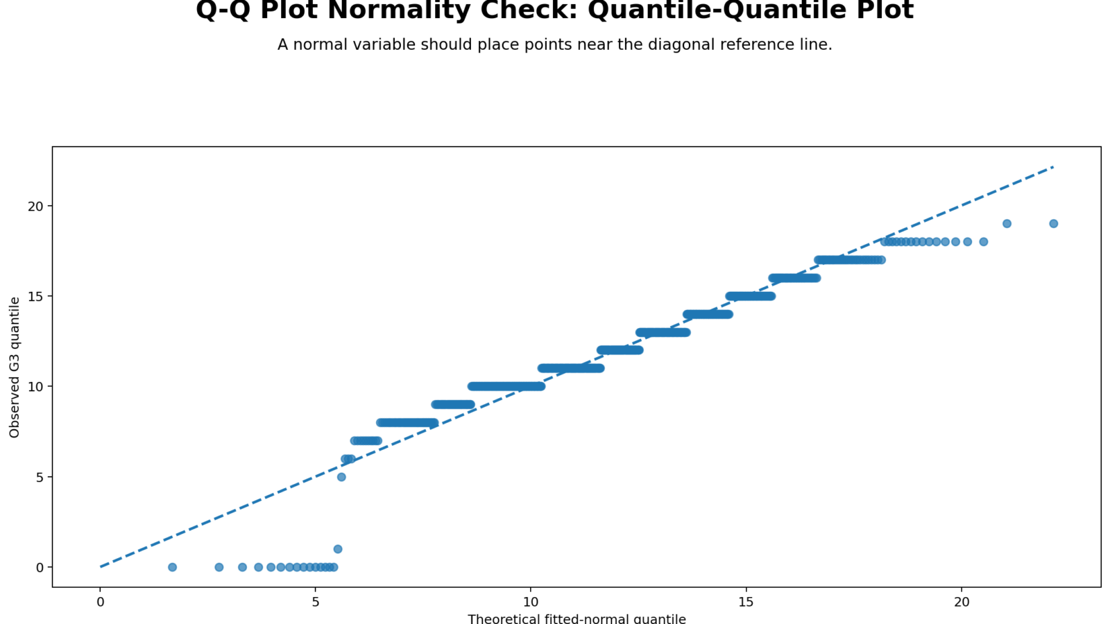
Python Chart 1: Q-Q Plot Normality Check
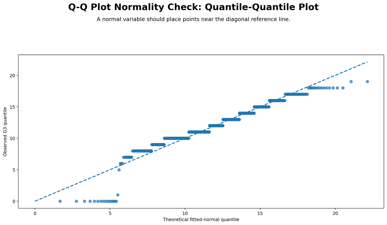
This chart is the main Q-Q Plot Normality Check. If G3 were perfectly normal, the points would follow the diagonal reference line closely. Instead, the points show visible departures, especially near the lower tail. This agrees with the SPSS result that G3 has Shapiro-Wilk W = .926 and p < .001.
The Q-Q plot is more informative than a p-value alone because it shows where the normality problem occurs. For G3, the lower-tail points are pulled away from the line because there are very low grade values, including zeros. The central points may be closer to the line, but tail departures show that the distribution is not perfectly normal.
Python Chart 2: Detrended Q-Q Plot
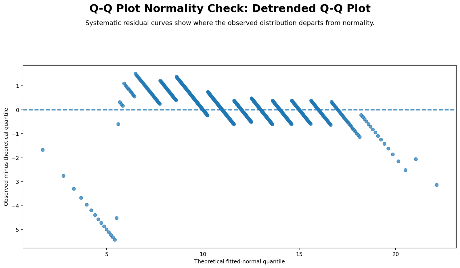
The detrended Q-Q plot displays the difference between observed and expected normal values. Values close to zero indicate good normal alignment. Values above or below zero show where the data deviate from normality. This chart makes the departures easier to see than the ordinary Q-Q plot.
For G3, the detrended plot confirms that the deviations are not random noise only. The pattern shows systematic tail departure. This supports the interpretation that G3 has non-normal features, especially because its skewness is -.913 and kurtosis is 2.712.
Python Chart 3: Distribution with Normal Curve
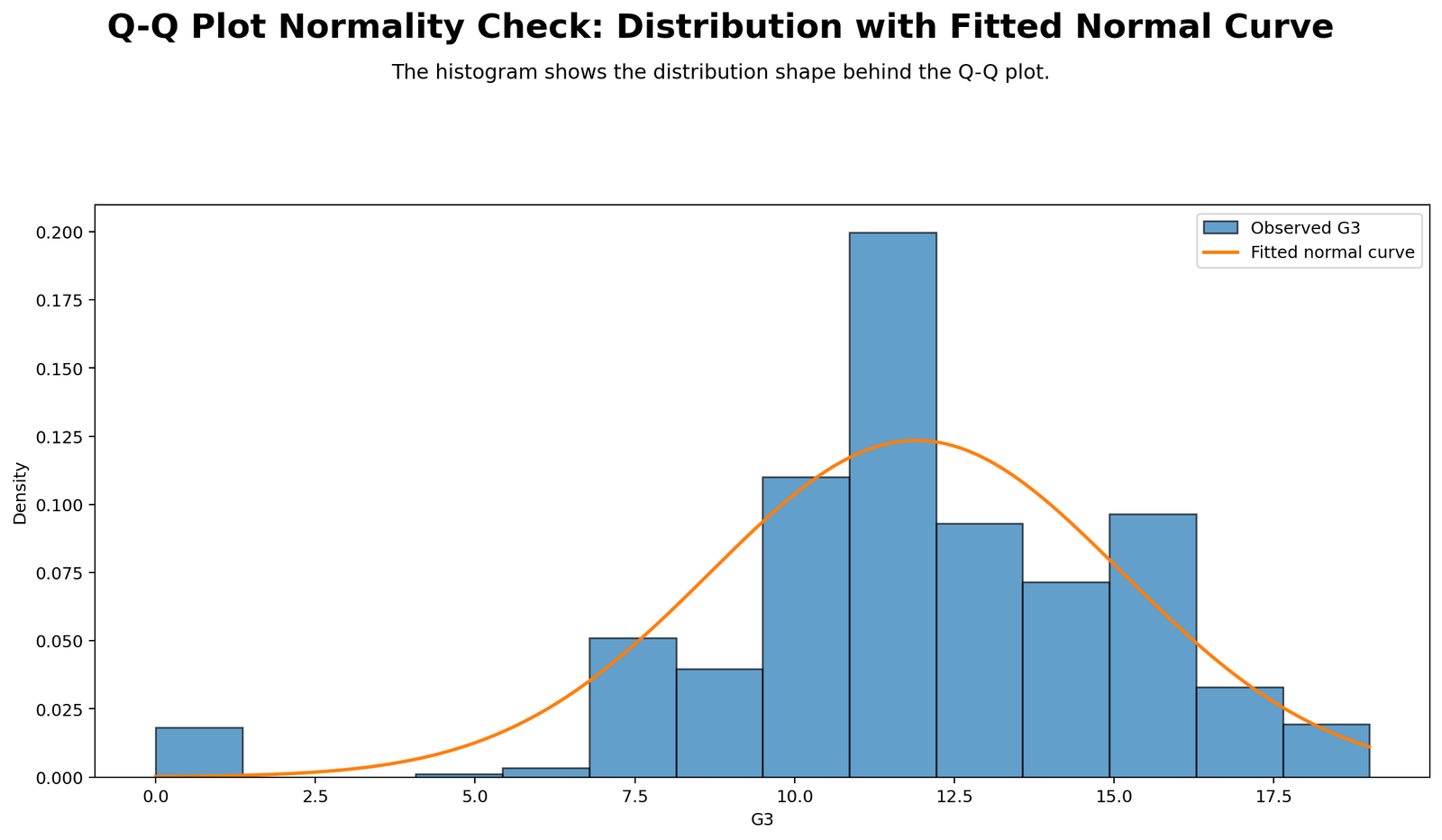
This chart shows the observed distribution with a normal curve overlay. The histogram helps explain why the Q-Q plot departs from the line. G3 has a mean of 11.91, standard deviation of 3.231, and values ranging from 0 to 19. The shape is not a perfect bell curve because the distribution has negative skewness and heavy tails.
The histogram and Q-Q plot should be interpreted together. The histogram shows the overall shape, while the Q-Q plot shows detailed quantile-level departure. Together, they provide stronger evidence than either chart alone.
Python Chart 4: P-P Plot Comparison
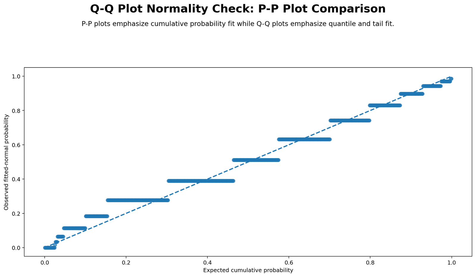
The P-P plot comparison helps distinguish two related normality plots. A Q-Q plot compares quantiles and is especially sensitive to tail behavior. A P-P plot compares cumulative probabilities and often emphasizes the center of the distribution more than the extreme tails. This chart shows why both can be useful.
For normality checking, the Q-Q plot is often preferred when tail behavior matters. In this G3 example, tail departures are important because the lower end includes several very low values. Therefore, the Q-Q plot is more useful than a P-P plot alone.
Python Chart 5: Q-Q Residuals Across Variables
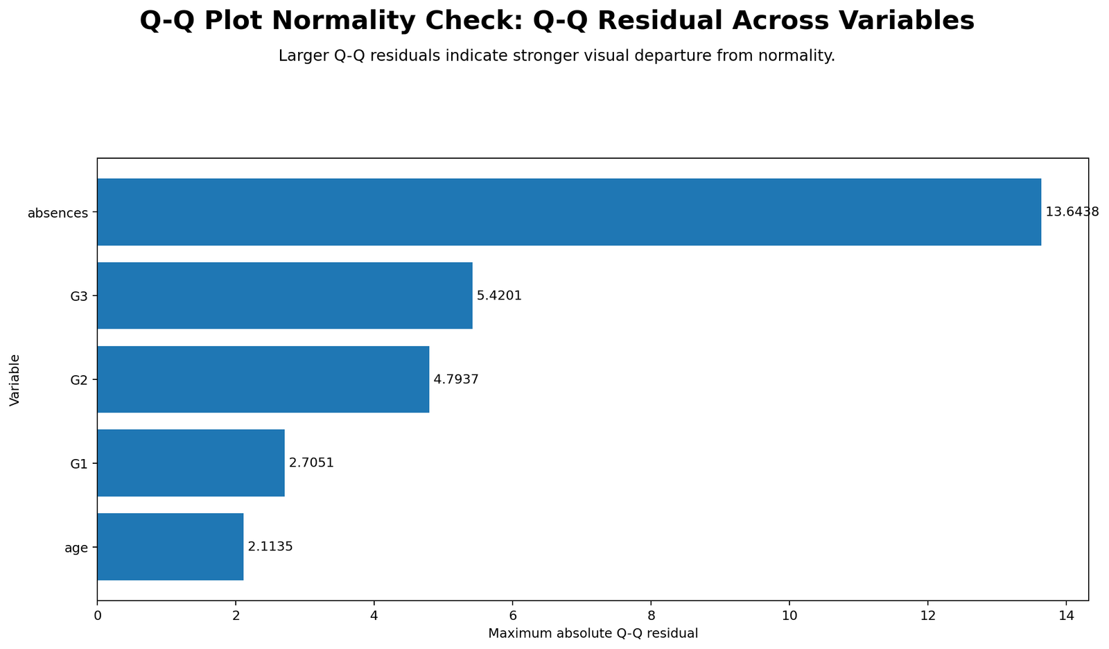
This chart compares Q-Q residual patterns across G3, G2, G1, age, and absences. Variables with larger Q-Q residuals depart more from normal expectation. Based on SPSS shape values, absences should show the strongest departure because it has skewness = 2.021 and kurtosis = 5.781. G1 should show the closest Q-Q alignment because its skewness and kurtosis are near zero.
The residual comparison chart is useful because it summarizes normality visually across multiple variables. Instead of looking only at one Q-Q plot, the chart helps identify which variables need more attention, transformation, or robust methods.
Python Chart 6: Skewness and Kurtosis Context
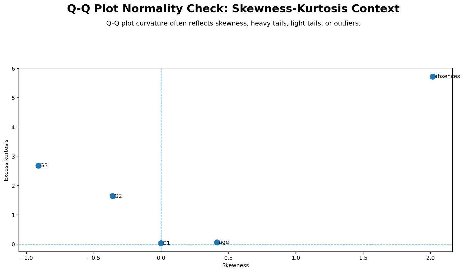
This chart explains why Q-Q plot departures happen. Skewness tells whether the distribution is asymmetric, while kurtosis tells whether the distribution has unusual peak or tail behavior. G3 has negative skewness and positive kurtosis, so its Q-Q plot shows tail-related departure. Absences has strong positive skewness and high kurtosis, so its Q-Q plot should show even stronger non-normality.
This chart is important for teaching interpretation. A Q-Q plot shows the visual pattern, but skewness and kurtosis explain the shape reason behind that pattern.
Python Chart 7: Group Q-Q Residual Comparison
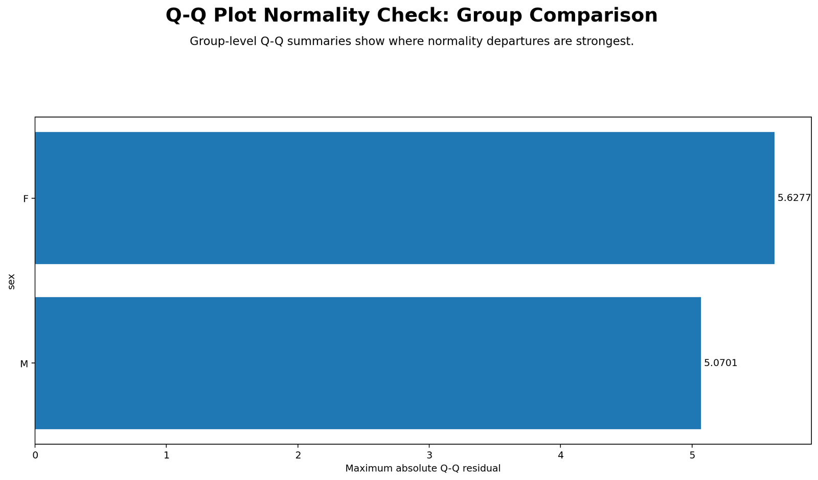
This chart compares Q-Q residuals for G3 by sex group. SPSS shows that female students have N = 383, mean = 12.25, SD = 3.124, and Shapiro-Wilk W = .934. Male students have N = 266, mean = 11.41, SD = 3.321, and Shapiro-Wilk W = .913. Both groups reject normality at p < .001.
The group comparison matters because many statistical tests require checking assumptions within groups, not only in the total sample. The male group has a slightly lower W statistic and slightly larger standard deviation, suggesting slightly stronger departure from normality than the female group.
R Chart-by-Chart Validation
The R charts validate the same Q-Q Plot Normality Check using a separate software workflow. The R results confirm the Python and SPSS interpretation: G3 departs from perfect normality, the detrended Q-Q plot shows systematic deviations, and group-level Q-Q behavior should be checked when comparing groups.
R Chart 1: Q-Q Plot Normality Check
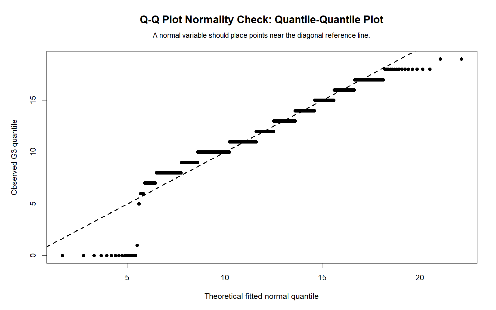
The R Q-Q plot validates the Python Q-Q plot. The points do not form a perfect straight line, which supports the SPSS conclusion that G3 is formally non-normal. This independent validation strengthens the interpretation.
R Chart 2: Detrended Q-Q Plot
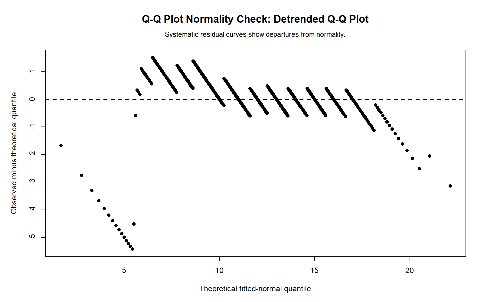
The R detrended Q-Q plot confirms the same deviation pattern as Python and SPSS. Values away from zero show that the observed data do not fully match expected normal values.
R Chart 3: Distribution with Normal Curve
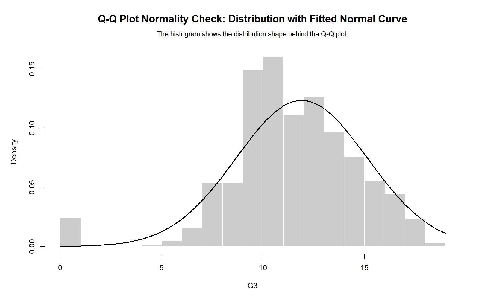
The R distribution chart confirms that the observed G3 distribution is not a perfect normal bell shape. The histogram supports the Q-Q plot by showing the overall distribution pattern.
R Chart 4: P-P Plot Comparison
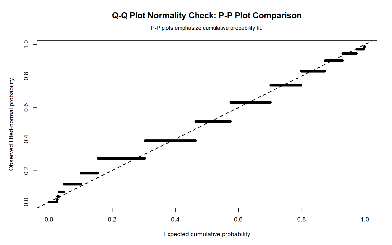
The R P-P comparison confirms that Q-Q and P-P plots emphasize different parts of the distribution. The Q-Q plot is especially useful for tail departure, while the P-P plot gives a cumulative probability perspective.
R Chart 5: Q-Q Residuals Across Variables
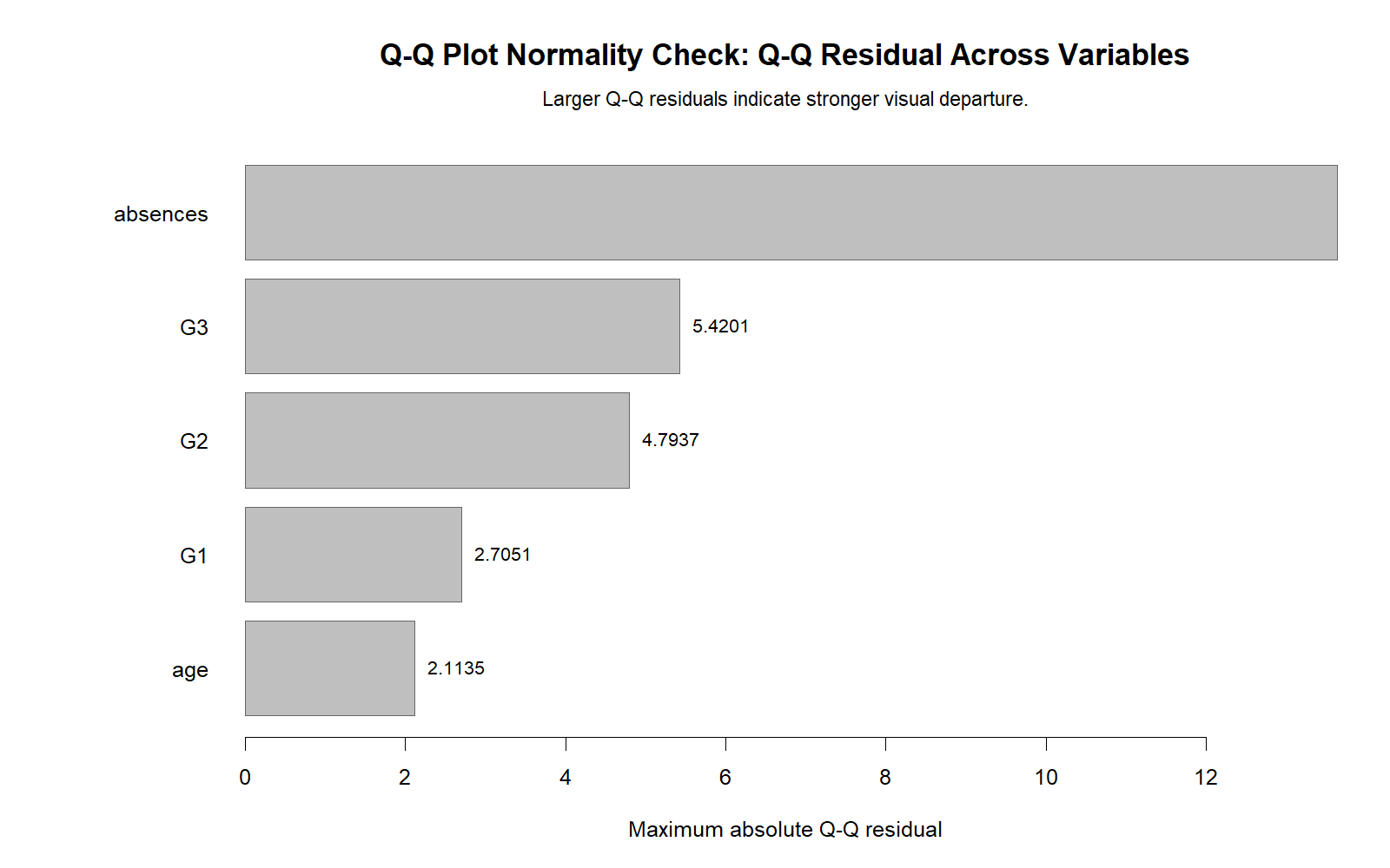
The R residual comparison validates the Python residual chart. Variables with stronger skewness and kurtosis show larger Q-Q departures. Absences is expected to be the strongest case, while G1 is closest to normal.
R Chart 6: Skewness and Kurtosis Context
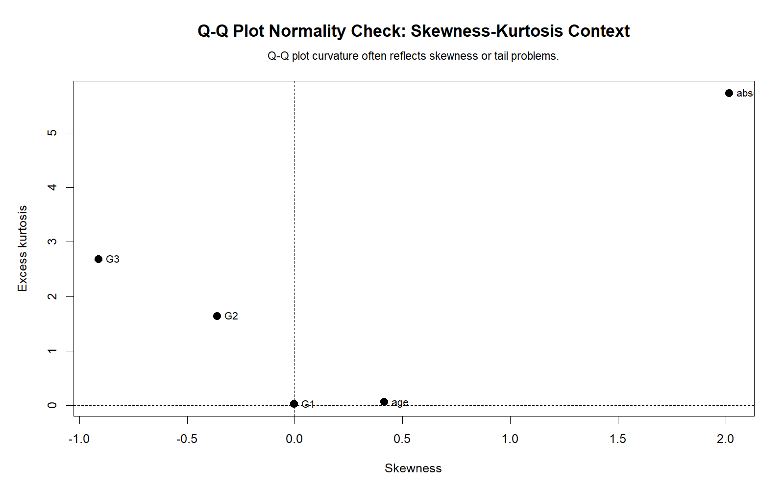
The R skewness-kurtosis chart validates the explanation for the Q-Q plot deviations. Shape statistics explain why some variables depart more strongly from the normal line than others.
R Chart 7: Group Q-Q Residual Comparison
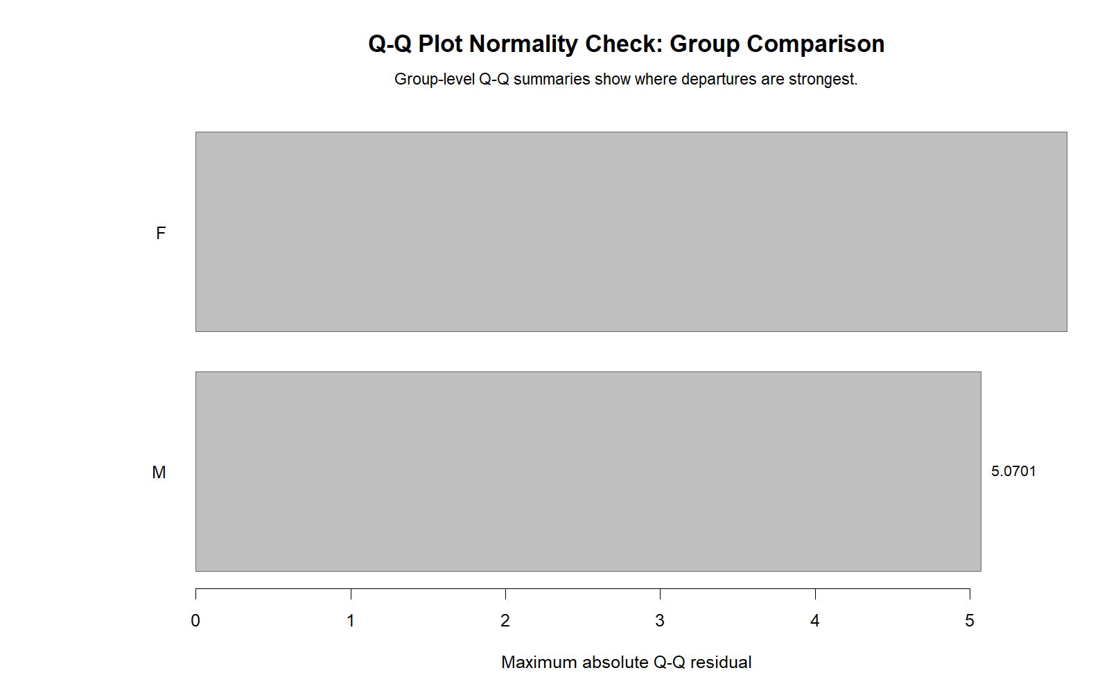
The R group comparison confirms the SPSS group normality context. Both female and male groups show non-normality for G3. This supports checking grouped Q-Q plots when the later analysis compares groups.
Google AdSense in-content placement reserved here
SPSS, R, Python and Excel Workflows for Q-Q Plot Normality Check
The same Q-Q Plot Normality Check can be created in SPSS, R, Python, and Excel. SPSS creates Q-Q plots directly through Explore. R and Python can calculate theoretical quantiles and plot observed values against expected normal values. Excel can build a manual Q-Q plot using sorted values and the NORM.S.INV formula.
SPSS Workflow
| Step | SPSS Menu or Syntax | Purpose |
|---|---|---|
| Open dataset | File > Open > Data | Load the SPSS-ready dataset. |
| Run Explore | Analyze > Descriptive Statistics > Explore | Prepare normality plots and descriptive statistics. |
| Add variables | Dependent List | Add G3, G2, G1, age and absences. |
| Request normality plots | Plots > Normality plots with tests | Create Q-Q plots, detrended Q-Q plots and formal tests. |
| Group Q-Q plots | Add factor such as sex | Check normality separately across groups. |
| Export output | File > Export or OUTPUT EXPORT | Save SPSS output PDF for reporting. |
R Workflow
| Step | R Action | Purpose |
|---|---|---|
| Read data | read.csv() | Load the dataset. |
| Select variable | na.omit(df$G3) | Remove missing values before plotting. |
| Create Q-Q plot | qqnorm() | Plot observed values against expected normal quantiles. |
| Add reference line | qqline() | Add the normal reference line. |
| Run normality test | shapiro.test() | Support visual interpretation with p-value evidence. |
Python Workflow
| Step | Python Action | Purpose |
|---|---|---|
| Read data | pandas.read_csv() | Load the dataset into a DataFrame. |
| Select variable | pd.to_numeric(...).dropna() | Clean the numeric variable. |
| Create Q-Q plot | scipy.stats.probplot() | Generate theoretical and observed quantile comparison. |
| Create detrended plot | Observed − expected values | Show residual deviations from normal expectation. |
| Create charts | matplotlib | Generate WordPress-ready Q-Q plots and residual charts. |
Excel Workflow
| Excel Task | Formula or Tool | Purpose |
|---|---|---|
| Sort values | Data > Sort | Sort observed values from smallest to largest. |
| Create rank | =ROW()-1 | Generate rank order for each sorted value. |
| Plotting probability | =(rank-0.5)/N | Calculate expected cumulative probability. |
| Theoretical z | =NORM.S.INV(probability) | Calculate expected standard normal quantile. |
| Expected value | =mean+z*sd | Convert expected z value to the original variable scale. |
| Q-Q plot | Insert > Scatter Plot | Plot expected value against observed sorted value. |
Code Blocks for Q-Q Plot Normality Check
SPSS Syntax for Q-Q Plot Normality Check
* Q-Q Plot Normality Check in SPSS.
* Variables: G3 G2 G1 age absences.

TITLE "Q-Q Plot Normality Check".

EXAMINE VARIABLES=G3 G2 G1 age absences
  /PLOT BOXPLOT HISTOGRAM NPPLOT
  /COMPARE GROUPS
  /STATISTICS DESCRIPTIVES
  /CINTERVAL 95
  /MISSING LISTWISE
  /NOTOTAL.

* Group Q-Q plot normality check for G3 by sex.
EXAMINE VARIABLES=G3 BY sex
  /PLOT BOXPLOT HISTOGRAM NPPLOT
  /COMPARE GROUPS
  /STATISTICS DESCRIPTIVES
  /CINTERVAL 95
  /MISSING LISTWISE
  /NOTOTAL.

OUTPUT EXPORT
  /CONTENTS EXPORT=VISIBLE
  /PDF DOCUMENTFILE="Q-Q-Plot-Normality-Check-SPSS-Output.pdf".
Python Code for Q-Q Plot Normality Check
import pandas as pd
import numpy as np
from scipy import stats
import matplotlib.pyplot as plt

df = pd.read_csv("dataset.csv")

x = pd.to_numeric(df["G3"], errors="coerce").dropna()
n = len(x)

# Shapiro-Wilk support test
w_stat, p_value = stats.shapiro(x)
print("Shapiro-Wilk W:", w_stat)
print("p-value:", p_value)

# Q-Q plot
fig, ax = plt.subplots(figsize=(8, 6))
stats.probplot(x, dist="norm", plot=ax)
ax.set_title("Q-Q Plot Normality Check for G3")
ax.set_xlabel("Theoretical normal quantiles")
ax.set_ylabel("Observed ordered values")
plt.tight_layout()
plt.show()

# Manual Q-Q values
observed = np.sort(x.to_numpy())
rank = np.arange(1, n + 1)
probability = (rank - 0.5) / n
theoretical_z = stats.norm.ppf(probability)
expected_value = x.mean() + theoretical_z * x.std(ddof=1)
qq_residual = observed - expected_value

qq_summary = {
    "n": n,
    "mean": x.mean(),
    "sd": x.std(ddof=1),
    "max_abs_residual": np.max(np.abs(qq_residual)),
    "mean_abs_residual": np.mean(np.abs(qq_residual))
}

print(qq_summary)

qq_table = pd.DataFrame({
    "rank": rank,
    "observed": observed,
    "probability": probability,
    "theoretical_z": theoretical_z,
    "expected_value": expected_value,
    "qq_residual": qq_residual,
    "abs_residual": np.abs(qq_residual)
})

print(qq_table.head(20))
R Code for Q-Q Plot Normality Check
# Q-Q Plot Normality Check in R

df <- read.csv("dataset.csv")

x <- as.numeric(df$G3)
x <- x[!is.na(x)]
n <- length(x)

# Shapiro-Wilk support test
print(shapiro.test(x))

# Q-Q plot
qqnorm(x, main = "Q-Q Plot Normality Check for G3")
qqline(x, col = "red")

# Manual Q-Q values
observed <- sort(x)
rank <- seq_along(observed)
probability <- (rank - 0.5) / n
theoretical_z <- qnorm(probability)
expected_value <- mean(x) + theoretical_z * sd(x)
qq_residual <- observed - expected_value

qq_summary <- data.frame(
  n = n,
  mean = mean(x),
  sd = sd(x),
  max_abs_residual = max(abs(qq_residual)),
  mean_abs_residual = mean(abs(qq_residual))
)

print(qq_summary)

qq_table <- data.frame(
  rank = rank,
  observed = observed,
  probability = probability,
  theoretical_z = theoretical_z,
  expected_value = expected_value,
  qq_residual = qq_residual,
  abs_residual = abs(qq_residual)
)

print(head(qq_table, 20))
Excel Formulas for Manual Q-Q Plot
Assume sorted observed values are in A2:A650.

Step 1: Sort the variable from smallest to largest.

Step 2: Create rank in B2:
=ROW()-1

Step 3: Calculate sample size in a fixed cell, for example E1:
=COUNT(A2:A650)

Step 4: Calculate plotting probability in C2:
=(B2-0.5)/$E$1

Step 5: Calculate theoretical normal z value in D2:
=NORM.S.INV(C2)

Step 6: Calculate sample mean in E2:
=AVERAGE($A$2:$A$650)

Step 7: Calculate sample standard deviation in F2:
=STDEV.S($A$2:$A$650)

Step 8: Calculate expected normal value in G2:
=$E$2 + D2*$F$2

Step 9: Calculate Q-Q residual in H2:
=A2-G2

Step 10: Calculate absolute residual in I2:
=ABS(H2)

Step 11: Create Q-Q plot:
Insert a scatter plot using expected normal values and observed sorted values.

Interpretation:
Points close to a straight line support approximate normality.
Systematic curves, tail departures or large residuals suggest non-normality.
APA Reporting Wording for Q-Q Plot Normality Check
When reporting a Q-Q Plot Normality Check, describe the visual pattern and support it with formal tests or shape statistics. Do not report the Q-Q plot as if it directly gives a p-value. Instead, say what the plot showed and how that agrees or disagrees with Shapiro-Wilk, Kolmogorov-Smirnov, skewness, and kurtosis.
APA-Style Q-Q Plot Report
Normality was evaluated using normal Q-Q plots, detrended Q-Q plots, histograms, skewness, kurtosis, and formal normality tests. For G3, the Q-Q plot showed visible departures from the normal reference line, especially in the lower tail. The manual Q-Q calculation showed a maximum absolute Q-Q residual of 5.42009 and a mean absolute residual of .51630. Formal normality tests also rejected normality for G3, Shapiro-Wilk W = .926, p < .001. Therefore, G3 did not meet the normality assumption perfectly.
APA-Style Group Q-Q Plot Report
G3 normality was also checked by sex group. The female group had M = 12.25, SD = 3.124, skewness = -0.857, kurtosis = 2.683, and Shapiro-Wilk W = .934, p < .001. The male group had M = 11.41, SD = 3.321, skewness = -0.980, kurtosis = 2.803, and Shapiro-Wilk W = .913, p < .001. Q-Q plots indicated non-normality in both groups, with slightly stronger departure in the male group.
Student-Friendly Report Example
The Q-Q plot showed that G3 scores were not perfectly normal because the points did not stay on the diagonal line. The detrended Q-Q plot also showed visible deviations from normality. The formal Shapiro-Wilk test confirmed this result with p < .001. Therefore, the G3 distribution should be described as non-normal, mainly because of tail departures and extreme low scores.
Common Mistakes in Q-Q Plot Normality Check
| Mistake | Why It Is a Problem | Correct Practice |
|---|---|---|
| Expecting every point to sit exactly on the line | Real data almost never match a perfect normal line exactly. | Look for systematic patterns and large tail departures. |
| Using Q-Q plot as a p-value test | The Q-Q plot is visual and does not directly produce a p-value. | Use Shapiro-Wilk or K-S tests for formal p-values. |
| Ignoring detrended Q-Q plots | Ordinary Q-Q plots may hide smaller deviations. | Use detrended Q-Q plots to inspect residual departures. |
| Ignoring sample size | Large samples can make formal tests significant even with moderate visual departure. | Use plots, shape statistics, and practical context together. |
| Checking only the total sample | Group-based tests often require group-level normality checks. | Check Q-Q plots by group when using t-tests or ANOVA. |
| Confusing Q-Q plots with P-P plots | They compare different things and emphasize different distribution areas. | Use Q-Q plots for quantile and tail behavior; use P-P plots for cumulative probability comparison. |
Key reminder: A Q-Q plot is one part of normality checking. It should be interpreted with histograms, P-P plots, skewness, kurtosis, Shapiro-Wilk, Kolmogorov-Smirnov, and the statistical test you plan to use.
When to Use Q-Q Plot Normality Check
Use Q-Q Plot Normality Check when you need to visually inspect whether a variable, residual, or group distribution follows a normal pattern. It is especially useful before parametric tests, regression diagnostics, ANOVA, t-tests, correlation, and transformation decisions.
| Use Q-Q Plot When | Why It Helps | Example from This Guide |
|---|---|---|
| You need visual normality evidence | Q-Q plots show whether points follow the normal reference line. | G3 points depart from the line in the tails. |
| You want to locate the normality problem | Q-Q plots show whether issues are in the center or tails. | G3 lower-tail values create large residuals. |
| You compare variables | Q-Q residuals show which variables are more non-normal. | Absences departs more than G1. |
| You compare groups | Group Q-Q plots show within-group assumption patterns. | Female and male G3 both reject normality. |
| You plan transformations | Q-Q plots show whether transformation improves shape. | Absences may need square root transformation. |
For a complete normality workflow, combine this guide with P-P Plot Normality Check, Shapiro-Wilk Test, Kolmogorov-Smirnov Test, Lilliefors Test, D’Agostino-Pearson Test, and Skewness and Kurtosis Normality Check.
Downloads and Resources for Q-Q Plot Normality Check
The resources below include the SPSS output PDF, Python charts, and R validation charts used in this guide.
Download SPSS Output PDF
Verified SPSS output for Q-Q plots, detrended Q-Q plots, manual Q-Q values, normality tests and group normality context.
Copy Q-Q Plot Code
Use the SPSS, Python, R and Excel code blocks to reproduce the Q-Q Plot Normality Check.
Python Chart 1: Q-Q Plot
Main Q-Q plot comparing observed quantiles with normal quantiles.
Python Chart 2: Detrended Q-Q Plot
Residual-style plot showing deviations from normality.
FAQs About Q-Q Plot Normality Check
What is a Q-Q Plot Normality Check?
A Q-Q Plot Normality Check compares observed data quantiles with expected normal quantiles. If the points follow the reference line, the data are approximately normal.
What does Q-Q mean?
Q-Q means quantile-quantile. The plot compares quantiles from observed data with quantiles from a theoretical distribution.
How do I interpret a normal Q-Q plot?
Points close to the line support approximate normality. Curved patterns, tail departures, or distant points suggest non-normality.
What was the Q-Q Plot result for G3 in this example?
The G3 Q-Q plot showed visible departure from normality. The manual Q-Q calculation reported a maximum absolute residual of 5.42009 and a mean absolute residual of .51630.
Did formal tests support the Q-Q Plot result?
Yes. For G3, the Shapiro-Wilk test was W = .926 with p < .001, so formal normality was rejected.
What is a detrended Q-Q plot?
A detrended Q-Q plot shows deviations from the normal reference line. Values close to zero support normality, while systematic deviations suggest non-normality.
What is a Q-Q residual?
A Q-Q residual is the difference between the observed sorted value and the expected normal value. Larger residuals indicate stronger departure from normal expectation.
Which variable was closest to normal in this output?
G1 was closest to normal shape because its skewness was -0.003, kurtosis was 0.037, and Shapiro-Wilk W was .986.
Which variable was most non-normal in this output?
Absences was most non-normal because it had strong positive skewness of 2.021, high kurtosis of 5.781, and a low Shapiro-Wilk W statistic of .772.
Is a Q-Q plot the same as a P-P plot?
No. A Q-Q plot compares quantiles and is especially useful for tail behavior. A P-P plot compares cumulative probabilities and often emphasizes the center more.
How do I create a Q-Q plot in SPSS?
Use Analyze > Descriptive Statistics > Explore, place the variable in the Dependent List, click Plots, and select Normality plots with tests.
How do I create a Q-Q plot in Python?
Use scipy.stats.probplot() or statsmodels Q-Q plot functions on a clean numeric variable.
How do I create a Q-Q plot in R?
Use qqnorm(x) and qqline(x), where x is a numeric vector without missing values.
How do I create a Q-Q plot in Excel?
Sort the observed values, calculate plotting probabilities, convert them to normal quantiles using NORM.S.INV(), and create a scatter plot of expected values against observed values.
Google AdSense bottom placement reserved here