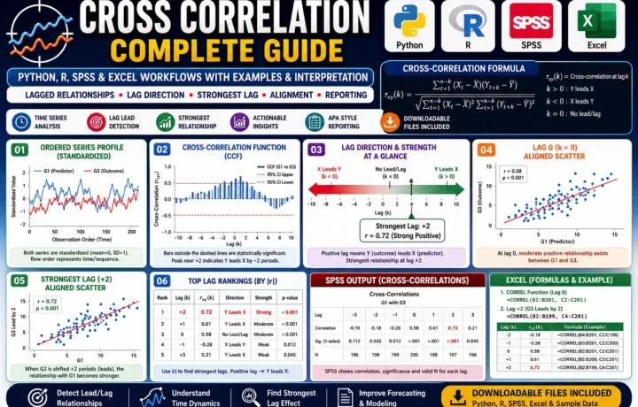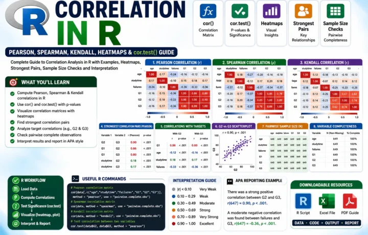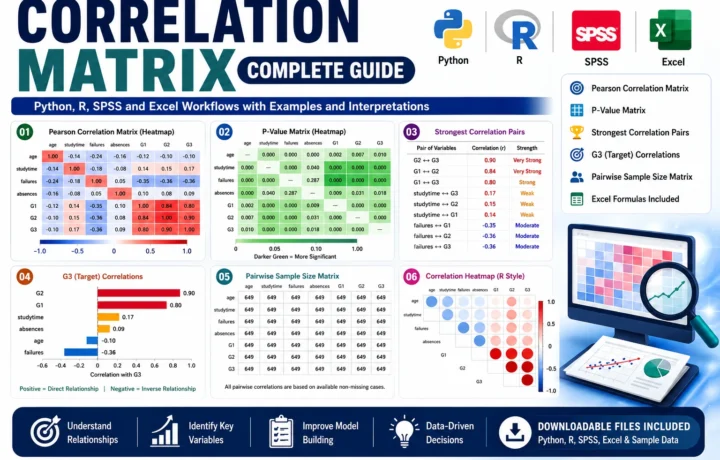
Time Series Diagnostics, Serial Correlation, ACF, PACF, Ljung-Box and Durbin-Watson
Autocorrelation Test: Formula, Interpretation, SPSS, Python, R and Excel Guide
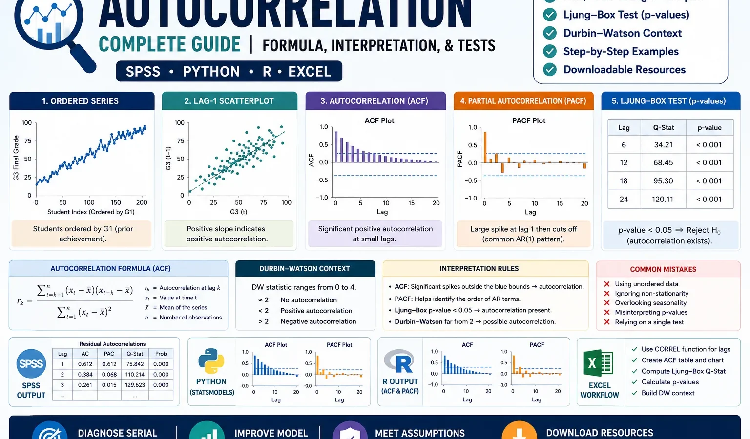
Autocorrelation measures whether observations in an ordered series are related to earlier observations from the same series. It is also called serial correlation when the order represents time or sequence. This guide explains the Autocorrelation test with ordered-series charts, lag 1 scatterplot, ACF, PACF, Ljung-Box p-values, Durbin-Watson context, SPSS output, Python charts, R validation charts, Excel workflow, code blocks, APA wording, common mistakes, downloadable resources, related guides and FAQ schema.
Google AdSense top placement reserved here
Quick Answer: Autocorrelation Result
The worked Autocorrelation example checks whether the ordered values of G3 final grade behave independently across row order or whether earlier observations help explain later observations. The visible output does not show a completely random sequence. The ordered plot contains several large negative shocks, the ACF plot shows notable positive spikes at lags 2, 3, 7 and 9, the Ljung-Box p-value plot drops below .05 from the early cumulative lags onward, and the Durbin-Watson context value is about 1.857.
The main interpretation is balanced. The Durbin-Watson value of 1.857 is close to the no-autocorrelation reference value of 2, so the first-order residual warning is not severe by itself. However, the ACF/PACF and Ljung-Box charts show that dependence is not only a one-lag question. The series has small but visible serial structure across selected later lags, especially around lag 2 and lag 9.
Final interpretation: The G3 ordered series shows evidence of autocorrelation across selected lags. It is not a strong first-order-only pattern, because Durbin-Watson remains near 2, but the ACF/PACF and Ljung-Box charts support reporting serial dependence. For regression work, this means the independence assumption should be checked carefully before relying on ordinary standard errors and p-values.
Important reporting point: Autocorrelation depends on order. If the row order is not a true time or measurement sequence, the result should be described as an ordered-row diagnostic rather than a true time-series conclusion.
Table of Contents
- What Is Autocorrelation?
- Autocorrelation Formula
- Null and Alternative Hypotheses
- Dataset and Ordered Series Used
- SPSS Output Interpretation
- Python Chart-by-Chart Interpretation
- R Chart-by-Chart Validation
- SPSS, R, Python and Excel Workflows
- Code Blocks for Autocorrelation
- APA Reporting Wording
- Common Mistakes
- When to Use Autocorrelation
- Downloads and Resources
- Related Guides
- FAQs
What Is Autocorrelation?
Autocorrelation is the correlation of a variable with lagged versions of itself. Instead of asking whether two different variables are related, autocorrelation asks whether a value at one position in an ordered series is related to values that came before it. If today’s value is related to yesterday’s value, or if row 50 is related to row 49, the series may contain autocorrelation.
Autocorrelation is common in time series data, repeated measurements, financial prices, weather records, educational progress data, sensor data and regression residuals. Positive autocorrelation means high values tend to be followed by high values and low values tend to be followed by low values. Negative autocorrelation means high values tend to be followed by low values and low values tend to be followed by high values.
The worked example is useful because it shows a realistic result. The lag 1 relationship is weak, but several later ACF and PACF bars are visible. That means the analyst should not stop at a single Durbin-Watson value. The complete interpretation needs the ordered plot, lag scatterplot, ACF, PACF and Ljung-Box p-values together.
Simple definition: Autocorrelation is a lagged relationship inside the same variable. A lag 1 autocorrelation compares each observation with the immediately previous observation. A lag 2 autocorrelation compares each observation with the value two steps earlier.
Autocorrelation matters because many statistical methods assume independent errors or independent observations. If the independence assumption is violated, confidence intervals, p-values, model selection and forecasting decisions can become unreliable. Related diagnostics include the Durbin-Watson test, Ramsey RESET test, Goldfeld-Quandt test, Q-Q plot normality check and P-P plot normality check.
Autocorrelation Formula
The lag k autocorrelation compares each value in a series with the value k positions earlier. The sample autocorrelation formula can be written as:
Here, rk is the autocorrelation at lag k, yt is the current observation, yt-k is the lagged observation and ȳ is the series mean. Values near +1 show strong positive autocorrelation. Values near -1 show strong negative autocorrelation. Values near 0 suggest weak or no linear autocorrelation at that lag.
| Term | Meaning | Interpretation in This Guide |
|---|---|---|
| Lag 1 | Current value compared with previous value | The scatterplot shows only a slight upward first-order relationship. |
| ACF | Autocorrelation function | The chart shows notable positive spikes at selected lags, especially 2 and 9. |
| PACF | Partial autocorrelation function | The chart suggests direct lag effects remain at lag 2 and lag 9 after earlier lags are controlled. |
| Ljung-Box test | Joint test of autocorrelation across lags | The p-value line falls below .05 after the early lags, supporting serial dependence. |
| Durbin-Watson | Regression residual autocorrelation diagnostic | The value of about 1.857 is close to 2, so first-order autocorrelation is not severe by this check alone. |
Threshold rule: ACF and PACF bars outside the approximate 95% limits deserve interpretation. Ljung-Box p-values below .05 support rejecting the no-autocorrelation null. Durbin-Watson values close to 2 are usually treated as weak first-order autocorrelation evidence.
Null and Alternative Hypotheses for Autocorrelation
The hypothesis depends on the method being used. For a lag-specific autocorrelation, the null states that the lag correlation is zero. For a Ljung-Box test, the null states that the series has no meaningful autocorrelation up to the tested lag.
| Test Component | Null Hypothesis | Alternative Hypothesis | Decision Rule |
|---|---|---|---|
| Lag autocorrelation | ρk = 0 | ρk ≠ 0 | Review ACF spike and confidence bands. |
| Ljung-Box test | No autocorrelation up to selected lag | At least one tested lag has autocorrelation | Reject H0 when p < .05. |
| Durbin-Watson context | No first-order residual autocorrelation | First-order residual autocorrelation exists | Values close to 2 support independence. |
Decision for this example: The Ljung-Box p-value plot supports rejecting the no-autocorrelation assumption across the cumulative lag set, even though the Durbin-Watson statistic of about 1.857 is close to 2. The correct conclusion is that first-order autocorrelation is mild, but selected later lags show meaningful serial structure.
Dataset and Ordered Series Used
The worked example uses the student performance dataset and focuses on G3 final grade as the ordered series. When a true date, semester, month, timestamp or measurement-order column is available, that column should define the time sequence. When no time column is available, row order can be used only as a documented observation sequence.
| Item | Use in This Guide | Why It Matters for Autocorrelation Analysis |
|---|---|---|
| G3 | Primary ordered numeric series | The autocorrelation charts show whether G3 values are related across sequence positions. |
| Observation order | Default sequence when no date column is used | Autocorrelation has meaning only when order is meaningful and documented. |
| Centered analysis series | G3 after mean centering or residual-style adjustment | The ordered plot is centered around zero so positive and negative runs are easier to see. |
| Lag 1 value | Previous G3 value in the sequence | Used for the lag 1 scatterplot and first-order autocorrelation check. |
| ACF and PACF lags | Multiple lag checks | Show whether dependence appears only at lag 1 or across several later lags. |
Before interpreting Autocorrelation, it is useful to understand the series using descriptive statistics, frequency distributions, histograms, box plots, and the five-number summary.
Google AdSense middle placement reserved here
SPSS Output Interpretation for Autocorrelation
The SPSS output PDF provides the official SPSS verification for the Autocorrelation workflow. In SPSS, the analyst should first prepare the ordered series, compute lagged values when a lag scatterplot is needed, run ACF/PACF output, and then use Durbin-Watson when the question is about regression residual independence.
Open the SPSS Autocorrelation output PDF
SPSS Autocorrelation Output Summary
| SPSS Output Item | What It Checks | How to Interpret It for This Example |
|---|---|---|
| Ordered series output | Whether the variable changes randomly or shows runs, waves or clusters | The visible charts show large negative dips and small runs around zero, so order should be discussed. |
| Lag 1 relationship | Whether each value is related to the previous value | The scatterplot has a slight upward fitted line, suggesting weak positive first-order dependence. |
| ACF table or plot | Autocorrelation at several lags | Notable positive spikes appear at lags 2, 3, 7 and 9, while most later lags remain small. |
| PACF table or plot | Direct lag effects after accounting for earlier lags | Lag 2 and lag 9 remain the clearest direct lag signals. |
| Ljung-Box p-values | Joint no-autocorrelation decision across cumulative lags | The p-values drop below .05 from the early lag range, supporting serial dependence. |
| Durbin-Watson statistic | First-order autocorrelation in regression residuals | The charted value is about 1.857, close to 2, so first-order autocorrelation is not severe by this measure alone. |
SPSS Reporting Decision
| Diagnostic Evidence | Observed Pattern | Reporting Meaning |
|---|---|---|
| Ordered sequence | Most values cluster around zero, with several large negative shocks | The series is not visually smooth, but it contains nonrandom-looking dips that justify lag checks. |
| Lag 1 scatterplot | Dense central cloud with a weak upward fitted line | First-order dependence is present only weakly. |
| ACF/PACF | Selected positive spikes cross or approach the reference limits | Autocorrelation appears at specific lags rather than continuously across all lags. |
| Ljung-Box | P-values below .05 after early cumulative lags | The no-autocorrelation null is not supported across the tested lag set. |
| Durbin-Watson | DW ≈ 1.857 | Close to 2, so report mild first-order context rather than strong first-order autocorrelation. |
SPSS interpretation summary: The SPSS output should be used as the formal audit file. Report the ordered variable, the order rule, the ACF/PACF pattern, the Ljung-Box decision and the Durbin-Watson context. The strongest conclusion is not “severe lag 1 autocorrelation”; the better conclusion is “selected lag autocorrelation is present, with mild first-order context.”
Python Chart-by-Chart Interpretation
The Python charts show the complete Autocorrelation diagnostic workflow. They move from the raw ordered series to lag-based visual evidence, then to ACF/PACF structure, Ljung-Box p-values and Durbin-Watson context. Each chart below is interpreted directly from the visible output.
Python Chart 1: Ordered Series Plot
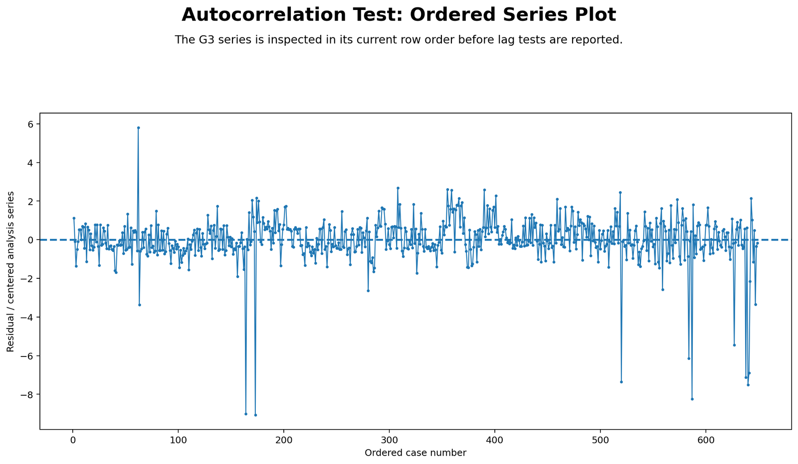
The ordered series is centered around the zero line, and most observations stay within about two units of zero. This means the usual movement of the series is fairly compact. The chart is not dominated by one smooth trend from left to right, but it does show visible local runs and several strong downward shocks. Two of the deepest drops appear around the middle-left section of the sequence, near cases around 160 to 175, where the series falls close to -9. Later in the sequence, additional negative drops appear around the 520 range, the 585 range and the final 630 to 650 range.
The positive side is smaller than the negative side. One early positive spike rises close to +6, and several later positive movements reach roughly +2 to +3. This uneven pattern explains why the lag tests are needed: the series is mostly centered, but the repeated negative shocks and local clusters suggest that the ordered values may not be fully independent. The chart supports a cautious autocorrelation report rather than a simple “random sequence” statement.
Python Chart 2: Lag 1 Scatterplot
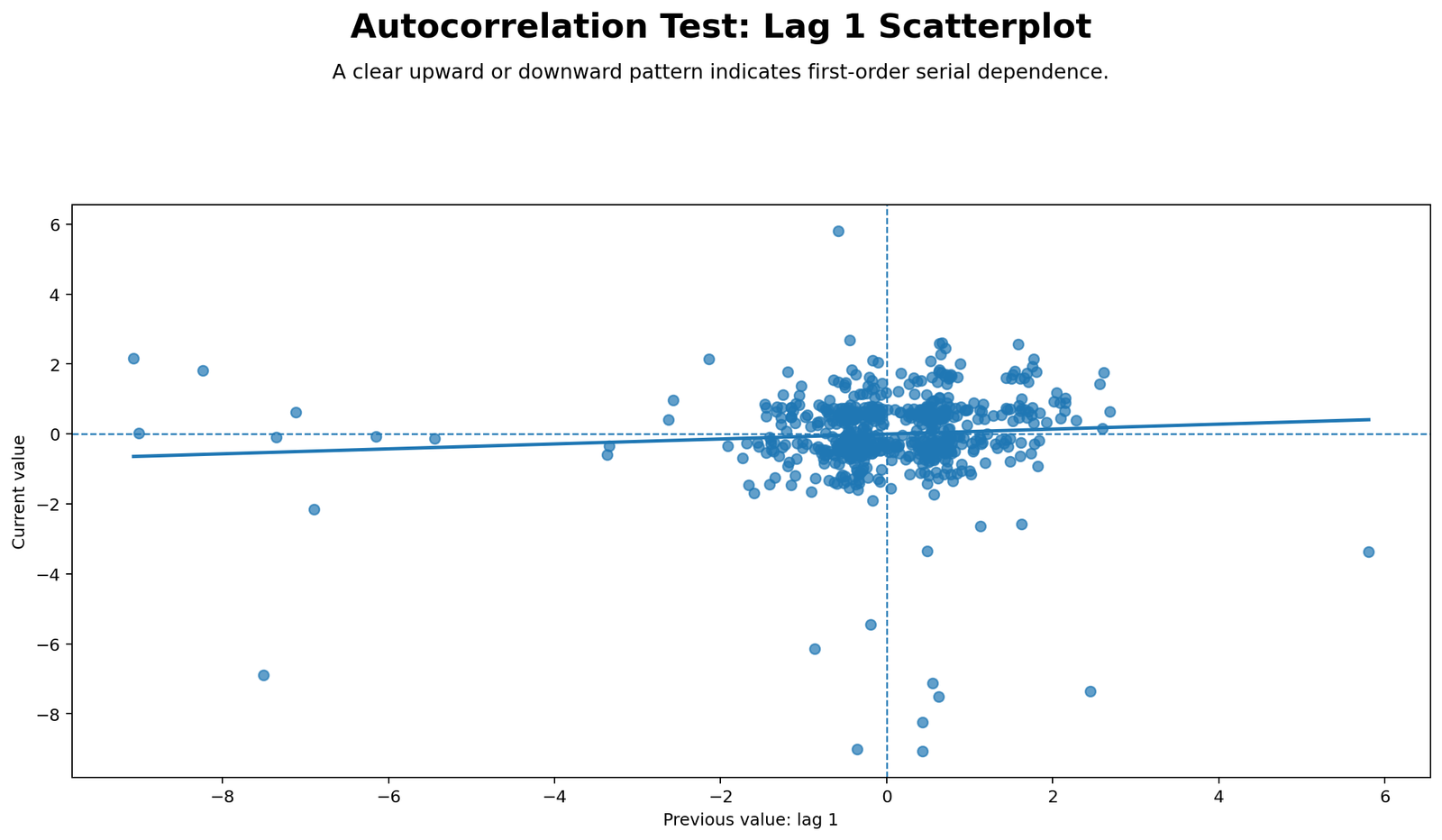
The lag 1 scatterplot places the previous value on the horizontal axis and the current value on the vertical axis. Most points form a dense central cloud around previous values from about -1 to +2 and current values from about -1 to +2. The fitted line tilts slightly upward, so the chart suggests weak positive first-order autocorrelation: larger previous values are associated with slightly larger current values, but the relationship is not steep.
The outlying pairs are important. Several points show current values far below zero even when the previous value is near zero, and one point on the far right shows a high previous value followed by a lower current value. These off-center points weaken the visual strength of the lag 1 relationship. Therefore, the chart should be reported as weak positive first-order serial dependence, not as a strong lag 1 pattern. This also explains why Durbin-Watson is close to 2 while the wider ACF/Ljung-Box checks still detect dependence at later lags.
Python Chart 3: Autocorrelation Function ACF
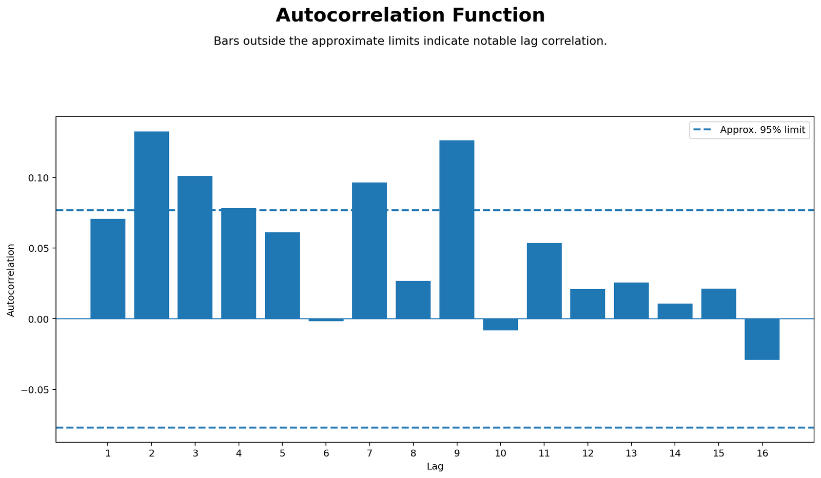
The ACF chart shows positive autocorrelation at several lags. Lag 1 is positive but remains close to the approximate 95% reference limit. Lag 2 is the first clear spike and rises to roughly .13, which is visibly above the dashed limit. Lag 3 is also positive at about .10, and lag 4 sits close to the upper limit. The later pattern is not flat: lag 7 is again positive, and lag 9 is another clear peak around .12 to .13.
This chart is the strongest visual evidence that the series has selected lag dependence. The dependence is not a smooth decay across every lag; instead, it appears at specific positive lags. After lag 9, the bars become smaller, and later lags mostly stay within the reference limits, with only a small negative value near lag 16. The correct chart-specific conclusion is that the G3 ordered series has notable positive autocorrelation at lags 2, 3, 7 and 9, while most other lags are weak.
Python Chart 4: Partial Autocorrelation PACF
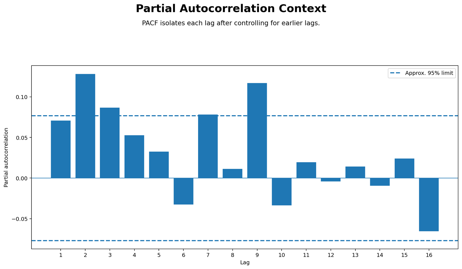
The PACF chart clarifies which lag relationships remain after controlling for earlier lags. Lag 2 is the clearest positive partial autocorrelation and rises above the upper reference line. Lag 3 remains positive and is near or above the same limit. Lag 7 is also positive and close to the reference boundary, while lag 9 is a clear positive direct lag signal. Several middle lags, such as lags 4 and 5, remain positive but smaller.
The negative bars are limited and less dominant. Lag 6 and lag 10 fall below zero, and lag 16 is the largest negative bar, but it is not the main visual message of the chart. The PACF therefore supports the ACF conclusion: the series is not driven only by adjacent observations. Lag 2 and lag 9 remain important after shorter lag effects are accounted for, which is why the article should discuss selected-lag autocorrelation rather than only first-order autocorrelation.
Python Chart 5: Ljung-Box P-Values
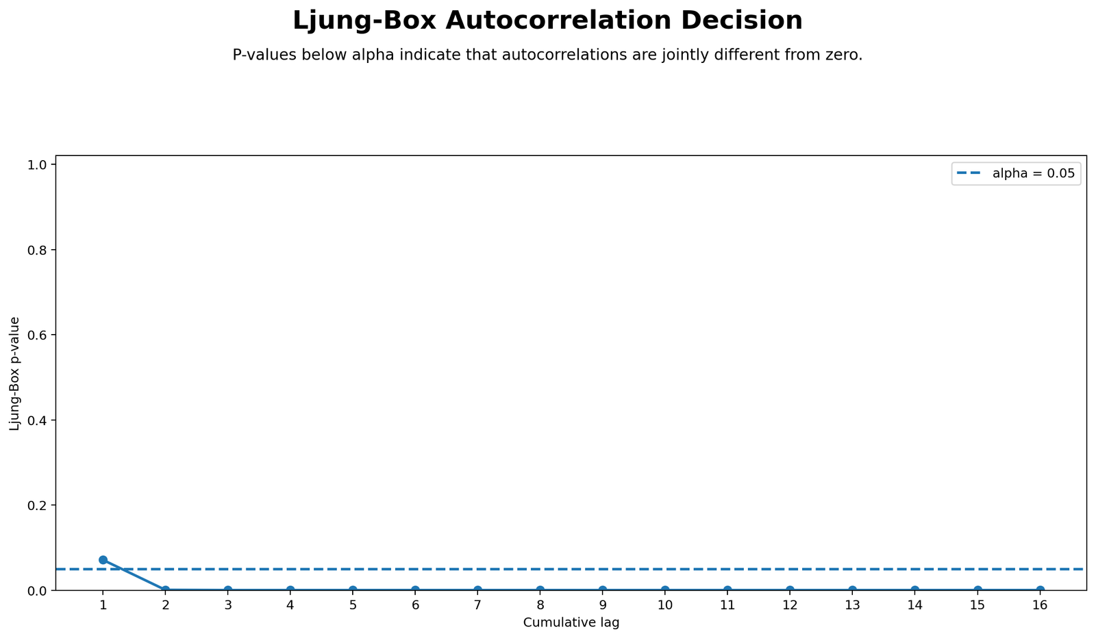
The Ljung-Box chart begins with a p-value slightly above the .05 reference line at lag 1. After the early lag range, the p-values drop below the alpha line and remain very close to the bottom of the plot across the remaining cumulative lags. This means the first lag alone is not the strongest evidence, but the combined lag structure quickly becomes statistically meaningful.
This is the chart that turns the ACF pattern into a formal decision. Since the p-value line stays below .05 after the early cumulative lags, the no-autocorrelation null is not supported for the tested lag set. In a report, this chart should be written as evidence of joint serial correlation across lags, especially when interpreted together with the ACF spikes at lags 2, 3, 7 and 9.
Python Chart 6: Durbin-Watson Context
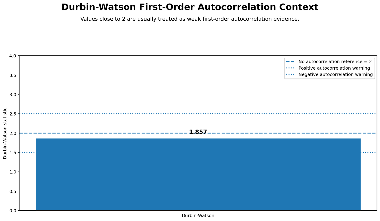
The Durbin-Watson chart displays a value of approximately 1.857. The no-autocorrelation reference is 2, and the chart also shows warning guidance around the lower and upper regions. Because 1.857 sits close to 2, the chart does not indicate severe first-order positive autocorrelation. It suggests only a mild positive first-order tendency.
This chart is important because it prevents overstatement. If the report looked only at Durbin-Watson, the conclusion would be that first-order autocorrelation is weak. If the report looked only at Ljung-Box and ACF, it would emphasize serial dependence across selected later lags. The correct combined interpretation is that the series has selected-lag autocorrelation even though the first-order Durbin-Watson warning is mild.
R Chart-by-Chart Validation
The R charts validate the same interpretation with a separate statistical workflow. R repeats the ordered series, lag scatterplot, ACF, PACF, Ljung-Box and Durbin-Watson context checks, which gives software-to-software confirmation. The color version also makes the important bars easier to separate from ordinary within-limit bars.
R Chart 1: Ordered Series Plot
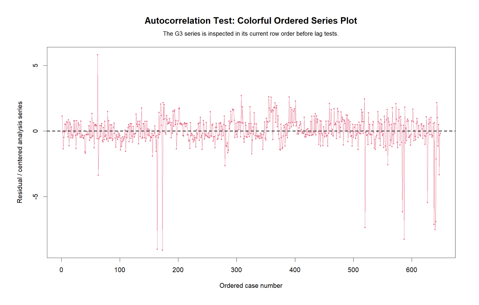
The R ordered series chart confirms the same sequence shape as the Python chart. Most centered G3 values remain close to the zero line, but the line has several sharp downward movements. The deepest negative points again appear in the middle-left part of the sequence and near the later case ranges, while the positive movements are smaller and less frequent. This creates an asymmetric pattern where negative shocks stand out more strongly than positive shocks.
The colorful R version makes the same report decision clearer: the series is not a smooth trend, but it is not completely pattern-free either. The repeated dips and local runs justify checking lag dependence. This chart supports the explanation that autocorrelation should be interpreted from multiple diagnostics, not only from the ordered line plot.
R Chart 2: Lag 1 Scatterplot
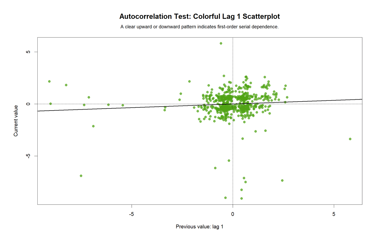
The R lag 1 scatterplot again shows a dense cluster around the center and a slightly upward fitted line. Most observations are concentrated near zero on both axes, so the main body of the data does not show a strong first-order relationship. The positive slope is visible, but it is shallow.
The chart also contains several unusual lag pairs, including points with current values far below zero and points where a high previous value is followed by a much lower current value. These pairs explain why the lag 1 relationship remains weak. The R chart therefore validates the Python conclusion: lag 1 dependence exists only mildly, and the stronger evidence comes from the broader ACF/PACF and Ljung-Box results.
R Chart 3: Autocorrelation Function ACF
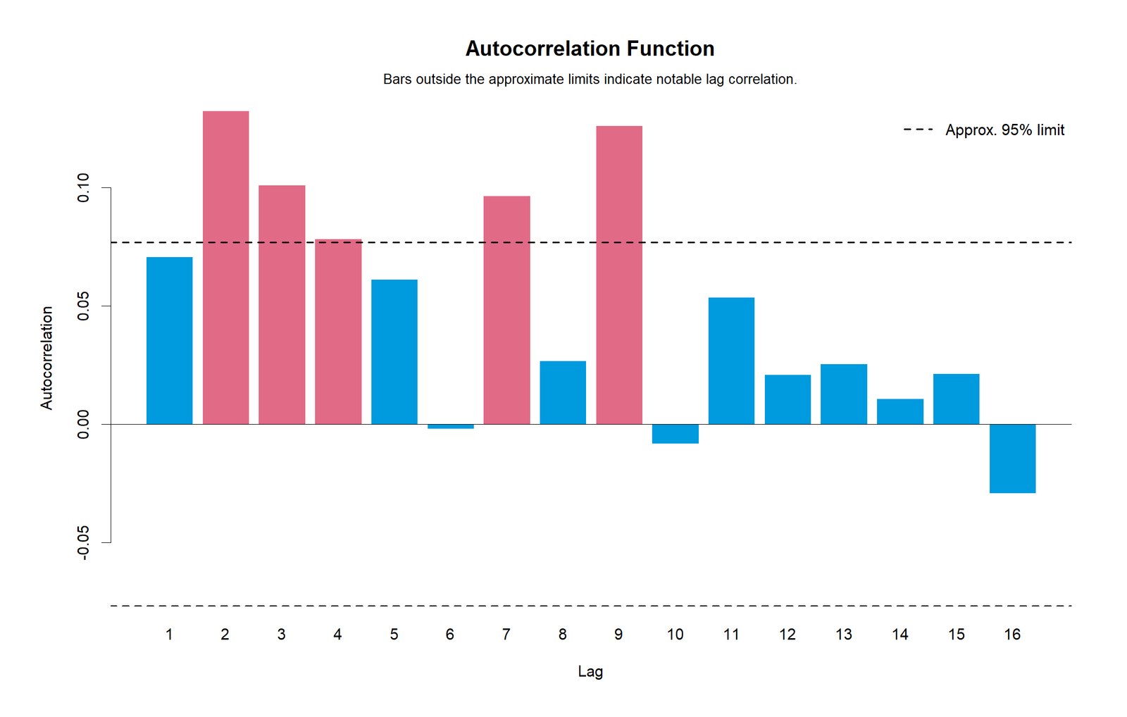
The R ACF plot uses color to highlight the important bars. The strongest positive spikes are visible at lag 2 and lag 9, and positive bars at lags 3, 4 and 7 also stand out. Lag 1 is positive but not the dominant feature. After lag 9, most bars are smaller, and the final negative bar near lag 16 remains modest compared with the positive peaks.
This R chart confirms that the autocorrelation pattern is not a Python-only result. The same lag structure appears again: selected positive lag relationships are present, especially at lag 2 and lag 9. The report should therefore say that autocorrelation is present across selected lags, not that every lag is correlated and not that the whole sequence is governed by a single first-order process.
R Chart 4: Partial Autocorrelation PACF
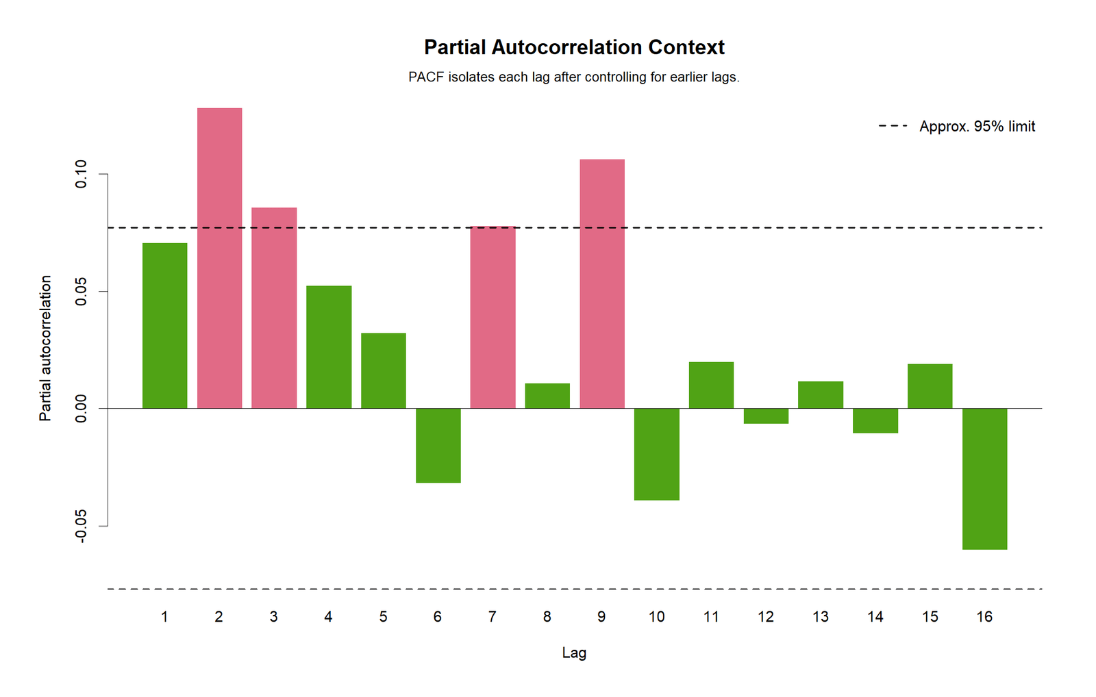
The R PACF plot shows that lag 2 remains the clearest direct positive lag. Lag 3 is also positive, lag 7 reaches the reference area, and lag 9 remains an important positive spike. The smaller green bars around lags 4, 5, 8, 11, 13 and 15 suggest that many later partial relationships are weak after earlier lags are controlled.
The negative side is not the main result. Lag 16 is negative and visible, but the strongest repeated signal is still positive at selected lags. The R PACF chart supports the same interpretation as Python: the ordered series has direct lag structure at a few specific positions, especially lag 2 and lag 9, so the diagnostic conclusion should mention selected-lag autocorrelation.
R Chart 5: Ljung-Box P-Values
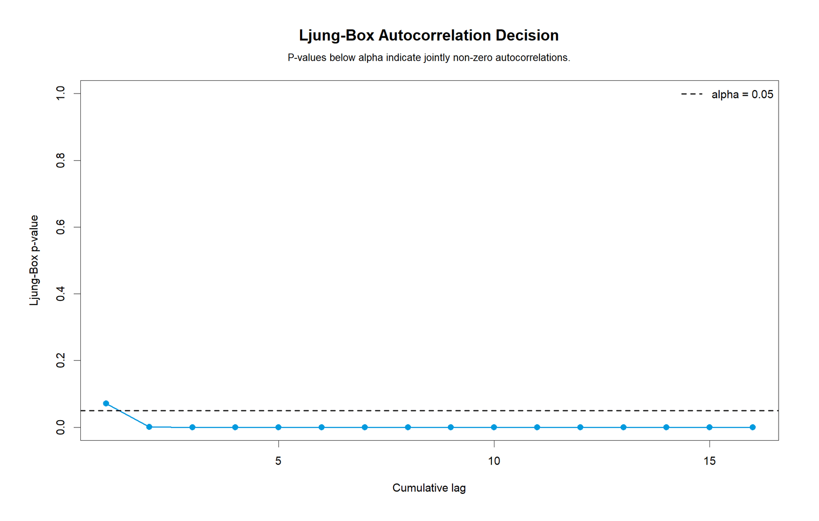
The R Ljung-Box chart mirrors the Python p-value pattern. The first point is close to or just above the .05 line, but the p-values quickly fall under the alpha threshold and remain near zero through the later cumulative lags. This means the formal evidence becomes strong once more than the first lag is tested.
This chart is especially useful for the final decision paragraph. The ACF and PACF show where the lag relationships occur; the Ljung-Box plot shows that the combined lag evidence is statistically meaningful. The R output therefore validates the conclusion that the ordered G3 series should not be described as fully independent across the tested lag range.
R Chart 6: Durbin-Watson Context
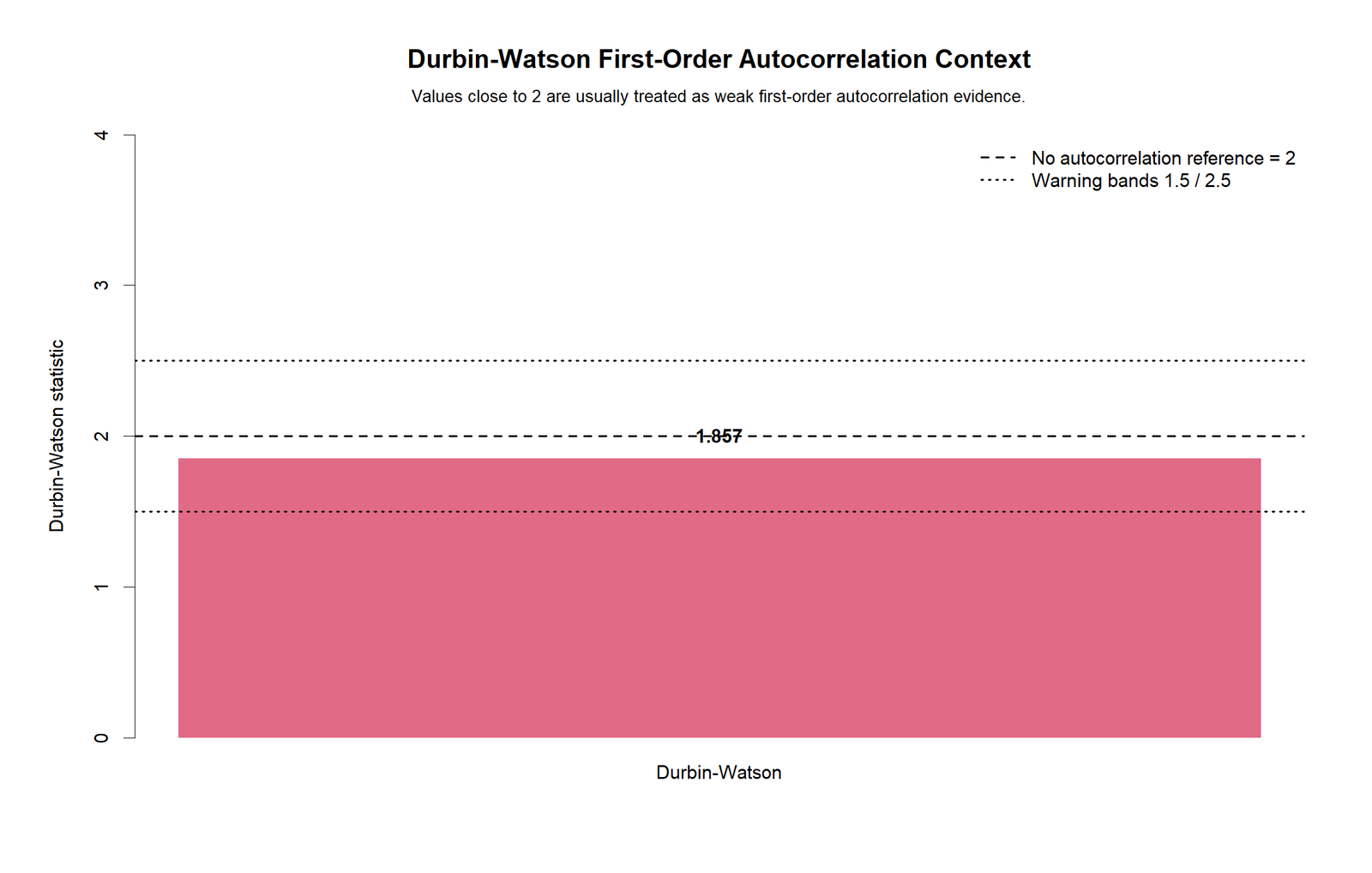
The R Durbin-Watson chart again reports approximately 1.857. The bar sits close to the horizontal reference at 2 and between the broad warning guide lines. This confirms that the first-order autocorrelation warning is mild rather than severe.
The value is still slightly below 2, so the direction is toward positive autocorrelation, but it is not far enough away from 2 to be the main evidence by itself. The final report should combine this with the ACF/PACF and Ljung-Box charts: Durbin-Watson gives weak first-order context, while Ljung-Box and the lag plots show selected-lag serial dependence.
Google AdSense in-content placement reserved here
SPSS, R, Python and Excel Workflows for Autocorrelation
The same autocorrelation workflow can be reproduced in SPSS, R, Python and Excel. The software differs, but the logic is the same: define the order, create lagged values, inspect lag relationships, calculate ACF/PACF, run Ljung-Box or a similar portmanteau test, and use Durbin-Watson when regression residual independence is the question.
SPSS Workflow
| Step | SPSS Menu or Syntax | Purpose |
|---|---|---|
| Open dataset | File > Open > Data | Load the clean dataset and verify the order variable. |
| Sort the series | Data > Sort Cases | Make sure the row order represents time, sequence or the documented observation order. |
| Create lag variable | Transform > Compute Variable with LAG() | Create the previous value used in the lag 1 scatterplot. |
| Run ACF/PACF | Analyze > Forecasting or ACF syntax | Check autocorrelation and partial autocorrelation across multiple lags. |
| Check Durbin-Watson | Regression statistics option | Use when the issue is first-order autocorrelation in regression residuals. |
| Export output | OUTPUT EXPORT | Save the SPSS Viewer output as PDF for reporting. |
R Workflow
| Step | R Action | Purpose |
|---|---|---|
| Read data | read.csv() | Load the dataset. |
| Define order | Sort by time/order column | Make sure the sequence is meaningful. |
| Lag 1 check | cor(series[-1], series[-length(series)]) | Calculate the first-order lag correlation. |
| ACF and PACF | acf() and pacf() | Draw lag correlation plots. |
| Ljung-Box | Box.test(type = "Ljung-Box") | Test whether autocorrelation is jointly meaningful. |
Python Workflow
| Step | Python Action | Purpose |
|---|---|---|
| Read data | pandas.read_csv() | Load the dataset into a DataFrame. |
| Prepare series | pd.to_numeric(...).dropna() | Keep a clean numeric ordered series. |
| Lag scatterplot | series.shift(1) | Compare current values with previous values. |
| ACF and PACF | statsmodels.tsa.stattools.acf and pacf | Estimate lag correlation structure. |
| Ljung-Box | acorr_ljungbox() | Get p-values for cumulative lag tests. |
| Durbin-Watson | durbin_watson() | Check first-order residual-style autocorrelation context. |
Excel Workflow
| Excel Task | Formula or Tool | Purpose |
|---|---|---|
| Place series in order | Sort by date/order column | Make the sequence valid before lag calculations. |
| Create lag 1 column | Copy previous row value | Build the previous-value column. |
| Calculate lag autocorrelation | =CORREL(current_range, lagged_range) | Estimate autocorrelation at each lag. |
| Draw lag scatterplot | Insert > Scatter | Visualize first-order dependence. |
| Calculate Durbin-Watson | =SUMXMY2(resid_t,resid_t_minus_1)/SUMSQ(resid) | Manual residual autocorrelation context. |
Code Blocks for Autocorrelation
SPSS Syntax for Autocorrelation
* Autocorrelation test in SPSS using native SPSS commands.
* Put this syntax inside the Autocorrelation folder and keep dataset.csv in the same folder.

SET PRINTBACK=ON MPRINT=ON.
OUTPUT CLOSE ALL.
OUTPUT NEW NAME=Autocorrelation_Output.

GET DATA
  /TYPE=TXT
  /FILE="dataset.csv"
  /ENCODING="UTF8"
  /DELCASE=LINE
  /DELIMITERS=","
  /ARRANGEMENT=DELIMITED
  /FIRSTCASE=2
  /VARIABLES=G3 F8.2.
EXECUTE.

COMPUTE case_order=$CASENUM.
COMPUTE G3_lag1=LAG(G3).
COMPUTE G3_centered=G3-MEAN(G3).
EXECUTE.

TITLE "Autocorrelation Test for Ordered G3 Series".
GRAPH /LINE(SIMPLE)=VALUE(G3_centered) BY case_order.
GRAPH /SCATTERPLOT(BIVAR)=G3_lag1 WITH G3.

ACF VARIABLES=G3
  /NOLOG
  /MXAUTO=16
  /SERROR=IND
  /PACF.

REGRESSION
  /DEPENDENT G3
  /METHOD=ENTER case_order
  /STATISTICS COEFF OUTS R ANOVA DW.

OUTPUT EXPORT
  /CONTENTS EXPORT=VISIBLE
  /PDF DOCUMENTFILE="Autocorrelation-Test-SPSS-Output.pdf".
Python Code for Autocorrelation
import pandas as pd
import numpy as np
from statsmodels.tsa.stattools import acf, pacf
from statsmodels.stats.diagnostic import acorr_ljungbox
from statsmodels.stats.stattools import durbin_watson

# Load data. Use a real time/order column if available.
df = pd.read_csv("dataset.csv")
series = pd.to_numeric(df["G3"], errors="coerce").dropna().reset_index(drop=True)
centered = series - series.mean()

# Lag 1 autocorrelation
lag1 = centered.autocorr(lag=1)
print("Lag 1 autocorrelation:", lag1)

# ACF and PACF values
acf_values = acf(centered, nlags=16, fft=False)
pacf_values = pacf(centered, nlags=16, method="yw")

# Ljung-Box test
lb = acorr_ljungbox(centered, lags=list(range(1, 17)), return_df=True)
print(lb)

# Durbin-Watson context
dw = durbin_watson(centered)
print("Durbin-Watson context:", dw)
R Code for Autocorrelation
# Autocorrelation analysis in R

df <- read.csv("dataset.csv")
series <- as.numeric(df$G3)
series <- na.omit(series)
centered <- series - mean(series)

# Lag 1 autocorrelation
lag1 <- cor(centered[-1], centered[-length(centered)])
print(lag1)

# ACF and PACF plots
acf(centered, lag.max = 16, main = "Autocorrelation Function for G3")
pacf(centered, lag.max = 16, main = "Partial Autocorrelation Function for G3")

# Ljung-Box test for selected lags
for (k in 1:16) {
  print(Box.test(centered, lag = k, type = "Ljung-Box"))
}

# Durbin-Watson context using centered series
dw <- sum(diff(centered)^2) / sum(centered^2)
print(dw)
Excel Formulas for Autocorrelation
Assume ordered G3 values are in B2:B650.

Lag 1 column in C3:
=B2

Lag 1 autocorrelation:
=CORREL(B3:B650,C3:C650)

Lag k autocorrelation pattern:
Create a lagged column for each k and use CORREL(current_range, lagged_range).

Durbin-Watson context for residuals in D2:D650:
=SUMXMY2(D3:D650,D2:D649)/SUMSQ(D2:D650)

Decision flag for Ljung-Box or p-value output:
=IF(p_value_cell<0.05,"Autocorrelation detected","No strong autocorrelation evidence")
APA Reporting Wording for Autocorrelation
When reporting an Autocorrelation diagnostic, describe the ordered variable, how the order was defined, the lag evidence, the ACF/PACF pattern, the Ljung-Box decision and the Durbin-Watson context when regression residual independence is relevant. Do not report only “autocorrelation was checked” without explaining which lags were important and whether the result changes the independence assumption.
APA-Style Full Report
An autocorrelation diagnostic was conducted for the ordered G3 series. Visual inspection of the ordered series showed that most centered values remained close to the zero reference line, but several sharp negative dips appeared in the later part of the sequence and around the earlier extreme rows. The lag 1 scatterplot showed only a weak positive first-order relationship because the point cloud was concentrated around the center with a slight upward fitted line rather than a strong diagonal band. The ACF plot showed selected positive lag structure, especially at lags 2, 3, 7 and 9, with the strongest visible bars around lag 2 and lag 9 crossing the approximate 95% reference band. The PACF plot supported this selected-lag pattern because lag 2 and lag 9 remained visibly positive after earlier lags were controlled. The Ljung-Box p-value plot moved below the .05 reference line after the early cumulative lags and stayed close to zero across the remaining lag range, indicating that the no-autocorrelation assumption was not supported for the tested lags. The Durbin-Watson context value was approximately 1.857, which is close to the no-autocorrelation reference value of 2, suggesting that the first-order component alone was mild even though the ACF/PACF and Ljung-Box evidence indicated selected-lag serial dependence.
Short APA-Style Version
Autocorrelation diagnostics were reviewed using the ordered-series plot, lag 1 scatterplot, ACF, PACF, Ljung-Box p-values and Durbin-Watson context. The lag 1 pattern was weak, and the Durbin-Watson value was close to 2 at approximately 1.857. However, the ACF/PACF charts showed selected positive lag effects, especially around lags 2 and 9, and the Ljung-Box p-values fell below .05 across the tested lag range. Therefore, the ordered G3 series should be discussed as showing evidence of selected-lag autocorrelation rather than complete independence.
Independence and Modeling Decision Wording
The independence assumption should be discussed because the ACF/PACF and Ljung-Box evidence suggests that some observations are related to earlier observations in the ordered sequence. The result does not mean that observations should be deleted. Instead, the analyst should confirm that the order is meaningful, consider time-series or autoregressive modeling when prediction is the goal, and use robust standard errors, generalized least squares or residual-correlation adjustments when regression inference is affected.
Common Mistakes in Autocorrelation Interpretation
| Mistake | Why It Is a Problem | Better Practice |
|---|---|---|
| Testing autocorrelation without meaningful order | Autocorrelation depends on sequence. | Use a true time/order column or clearly state the row-order assumption. |
| Using only Durbin-Watson for every problem | Durbin-Watson mainly checks first-order residual autocorrelation. | Use ACF, PACF and Ljung-Box for broader time-series diagnostics. |
| Calling DW = 1.857 a severe problem | The value is below 2, but still close to the no-autocorrelation reference. | Report it as mild first-order context and combine it with ACF/PACF evidence. |
| Ignoring lag 2 and lag 9 spikes | Autocorrelation can appear at later lags even if lag 1 is weak. | Discuss the exact lag pattern shown by the ACF and PACF charts. |
| Deleting observations to remove autocorrelation | Autocorrelation is usually a structure problem, not an outlier problem. | Model the dependence or correct standard errors instead. |
When to Use Autocorrelation
Use an Autocorrelation test when observations have a natural order and independence matters. This includes time series, repeated measures, sensor logs, economic indicators, stock prices, weather records, monthly sales, learning progress and regression residuals sorted by time. They are especially useful when the goal is residual independence checking, serial dependence screening, forecasting preparation or transparent regression reporting.
| Use Autocorrelation When | Why It Matters | Example from This Guide |
|---|---|---|
| You have ordered observations | Autocorrelation requires a meaningful sequence. | G3 was analyzed in ordered row sequence. |
| You need independence diagnostics | Many tests and regression models assume independent errors. | The Durbin-Watson context was approximately 1.857. |
| You want lag-specific evidence | Dependence may appear at lag 2 or lag 9 even when lag 1 is weak. | ACF and PACF showed selected lag spikes. |
| You need formal lag testing | Visual spikes should be supported by p-values. | Ljung-Box p-values dropped below .05 after early cumulative lags. |
| You compare software outputs | SPSS, Python and R should agree when the same ordered series is used. | The Python and R charts showed the same diagnostic pattern. |
Do not use autocorrelation as a general correlation test for unrelated rows. If the order is arbitrary, use Pearson correlation, Spearman correlation, regression diagnostics or group comparison methods instead. The key question is always whether earlier observations can predict later observations in the same series.
For related assumption and regression topics, see Ordinary Least Squares Regression, Regression Residual Analysis, Generalized Least Squares Regression, Levene’s Test, Brown-Forsythe Test, Kolmogorov-Smirnov Test, and Cramer-von Mises Test.
Downloads and Resources for Autocorrelation
The resources below verify the chart outputs and provide worked files for readers who want to reproduce the same Autocorrelation workflow in Python, R, SPSS and Excel. Use the PDF reports for visual interpretation and the Excel workbook for manual lag-correlation practice.
R Autocorrelation Report PDFIncludes R validation charts for the same autocorrelation workflow.
SPSS Autocorrelation Output PDFSPSS output file for audit, reporting and classroom interpretation.
Excel Fully Worked FileExcel workbook for lag correlation, formulas and manual autocorrelation explanation.
FAQs About Autocorrelation
What is autocorrelation in simple words?
Autocorrelation means a value in an ordered series is related to earlier values from the same series. For example, today’s value may be related to yesterday’s value.
What is the difference between autocorrelation and correlation?
Correlation compares two different variables. Autocorrelation compares one variable with lagged versions of itself.
What does positive autocorrelation mean?
Positive autocorrelation means high values tend to follow high values and low values tend to follow low values. In this guide, the lag 1 line is slightly upward and several ACF/PACF bars are positive.
What does negative autocorrelation mean?
Negative autocorrelation means high values tend to follow low values and low values tend to follow high values. Negative ACF or PACF bars below the reference limit would support that pattern.
What did the ACF chart show in this example?
The ACF chart showed notable positive spikes at selected lags, especially lag 2 and lag 9, with additional positive signal near lag 3 and lag 7.
What did the Ljung-Box chart show in this example?
The Ljung-Box p-values dropped below .05 after the early cumulative lags and stayed close to zero, supporting evidence of serial dependence across the tested lag set.
What does Durbin-Watson = 1.857 mean?
A Durbin-Watson value of about 1.857 is close to the no-autocorrelation reference value of 2. It suggests mild positive first-order context, not severe first-order autocorrelation.
Can I calculate autocorrelation in Excel?
Yes. Create lagged columns and use CORREL for each lag. Durbin-Watson can also be calculated using squared differences of residuals.