
Survival Analysis, Time-to-Event Modeling, Censoring and Acceleration Factors
Accelerated Failure Time Model: Interpretation, SPSS, Python, R and Excel Guide
Accelerated Failure Time Model analysis is a parametric survival-regression method that models survival time directly instead of modeling the hazard ratio only. This guide explains the exact variables used in this worked example: aft_time as the time variable, aft_event as the event/censoring indicator, and G1, G2, studytime, age, Medu, Fedu, school_MS, sex_M and address_U as predictors. It also covers Log-Normal AFT, Weibull AFT, acceleration factors, SPSS output, Python charts, R validation report, Excel formulas, APA wording and downloadable files.
Quick Answer: Accelerated Failure Time Model Result
The worked analysis used 649 rows from the student-performance dataset. Because the dataset does not contain a native survival duration variable, the teaching workflow created aft_time = absences + 1. The event variable was coded as aft_event = 1 when G3 < 10 or failures > 0; otherwise the observation was treated as right censored. The model therefore demonstrates the mechanics of AFT modeling, censoring and acceleration-factor interpretation on a prepared educational dataset.
Exact variables used in the model: the outcome/time field is aft_time; the event/status field is aft_event; the academic predictors are G1 and G2; the student-background predictors are studytime, age, Medu and Fedu; and the 0/1 coded categorical predictors are school_MS, sex_M and address_U. In plain language, the model asks whether grades, study time, age, parent education, school code, sex code and address code stretch or compress the prepared time-to-event variable.
The final fitted comparison showed 151 events and 498 right-censored cases, giving an event rate of approximately 23.27%. The Weibull AFT model had the better fit by AIC, with AIC = 1000.245, BIC = 1049.475, log likelihood = -489.123 and shape = 1.384. The Log-Normal AFT model had AIC = 1018.302, BIC = 1067.532, log likelihood = -498.151 and sigma = 1.081.
Final interpretation: The Weibull AFT model fit the prepared time-to-event outcome better than the Log-Normal AFT model because it had the lower AIC and BIC. The strongest acceleration-factor pattern was school_MS with an acceleration factor of about 0.602, meaning the predicted event time was shorter for that coded group in the fitted model. However, the coefficient table shows the individual terms were not statistically significant at alpha .05, so the effect-size direction should be reported cautiously.
Important teaching note: This example uses a constructed time and event outcome because the student dataset is not a native clinical survival dataset. For real medical, engineering, insurance or retention analysis, the time variable should be a genuine observed duration and the event indicator should match the actual failure, death, churn, claim, relapse or completion event.
Table of Contents
- What Is an Accelerated Failure Time Model?
- When to Use an AFT Model
- AFT Model Formula and Acceleration Factor
- Null and Alternative Hypotheses
- Dataset and Variables Used
- Model Fit: Log-Normal AFT vs Weibull AFT
- Coefficient and Acceleration-Factor Interpretation
- SPSS Output Interpretation
- Python Chart-by-Chart Interpretation
- R Charts, Tables and Validation
- Excel Worked Results Explained
- SPSS, R, Python and Excel Workflows
- Code Blocks for AFT Models
- APA Reporting Wording
- Common Mistakes
- Downloads and Resources
- Related Guides
- FAQs
What Is an Accelerated Failure Time Model?
An Accelerated Failure Time Model is a parametric survival-regression model for time-to-event data. Instead of describing covariate effects as hazard ratios, the AFT model describes covariate effects as time ratios or acceleration factors. This makes the interpretation direct: a coefficient can be transformed into exp(coefficient), which tells whether a predictor is associated with longer or shorter predicted survival time.
In an AFT model, a value above 1 for the acceleration factor means the expected event time is multiplied upward. A value below 1 means the expected event time is multiplied downward. For example, an acceleration factor of 1.20 suggests a 20% longer predicted time to event, while an acceleration factor of 0.80 suggests a 20% shorter predicted time to event, assuming the model and distribution are appropriate.
AFT models are commonly used in survival analysis, reliability engineering, health studies, insurance time-to-claim modeling, customer churn timing, employee retention, time-to-graduation and other situations where the outcome is a duration and some observations may be censored.
Simple definition: An AFT model predicts the log of survival time as a function of covariates. Its main applied interpretation is the acceleration factor: above 1 means longer predicted time, below 1 means shorter predicted time.
When to Use an Accelerated Failure Time Model
Use an AFT model when the outcome is a time until an event and a parametric survival distribution is acceptable. AFT models are especially useful when the researcher wants to describe how predictors stretch or compress survival time instead of only reporting hazard ratios.
| Situation | Use AFT? | Reason |
|---|---|---|
| Time until disease relapse | Yes | The outcome is a duration and some patients may be censored. |
| Time until machine failure | Yes | Reliability data often follows parametric survival distributions. |
| Time until customer churn | Yes | The model can estimate whether customer features delay or accelerate churn. |
| Final grade score only | No, not directly | A numeric score is not a survival duration unless a defensible time-to-event variable is created. |
| Binary pass/fail only | No, not directly | A binary outcome alone is better handled with logistic regression unless time is also available. |
| Strong proportional hazards violation | Consider AFT | AFT may be a useful alternative when the time-ratio interpretation is more appropriate. |
Before using AFT, check whether you have a meaningful duration variable, a valid event indicator, independent censoring, enough events, and a reasonable distributional choice. For supporting diagnostic concepts, see outlier detection, log transformation, Box-Cox transformation, p-value and confidence interval.
AFT Model Formula and Acceleration Factor
The basic AFT model writes the log survival time as a linear predictor plus an error term:
Here, T is the survival time, X variables are predictors, β values are coefficients, σ is the scale parameter and ε follows a distribution such as normal, logistic or extreme value depending on the chosen AFT family.
The most useful applied transformation is:
| Acceleration Factor | Meaning | Plain-Language Interpretation |
|---|---|---|
| > 1 | Longer predicted time to event | The predictor delays the event or stretches survival time. |
| = 1 | No time-ratio change | The predictor does not change predicted survival time. |
| < 1 | Shorter predicted time to event | The predictor accelerates the event or compresses survival time. |
In the worked results, school_MS had an acceleration factor of 0.602 in the Weibull model. As a time ratio, that is interpreted as shorter predicted time to event for the coded group, but the large confidence interval and nonsignificant p-value mean this should not be treated as a confirmed population effect.
Null and Alternative Hypotheses for an AFT Model
The hypothesis for each coefficient asks whether that predictor changes log survival time after other model terms are controlled.
| Statement | Hypothesis | Meaning |
|---|---|---|
| Null hypothesis | H0: β = 0 | The predictor does not change the expected log time to event. |
| Alternative hypothesis | H1: β ≠ 0 | The predictor changes the expected log time to event. |
| Acceleration-factor null | H0: exp(β) = 1 | The predictor has no multiplicative time-ratio effect. |
| Model comparison question | Lower AIC/BIC is preferred | The distribution with smaller information criteria is usually preferred among fitted candidates. |
Decision for the worked model: The Weibull distribution was preferred by AIC and BIC, but the individual covariate p-values in the coefficient table were not below .05. Therefore, the strongest conclusion is model-fit preference for Weibull AFT, not strong evidence that a specific predictor has a statistically significant acceleration effect.
Dataset and Variables Used
The workbook uses the student-performance dataset and prepares a time-to-event demonstration. The most important point is that the reader must know exactly what each variable name means before interpreting the AFT coefficients. In this post, aft_time is the model time variable, aft_event is the event/censoring indicator, and the predictors are G1, G2, studytime, age, Medu, Fedu, school_MS, sex_M and address_U.
Plain-English Variable Dictionary for This AFT Model
| Variable Name in File | Role in the AFT Model | Plain-English Meaning / Coding | How to Read It in This Post |
|---|---|---|---|
| aft_time | Time-to-event outcome | Prepared as absences + 1 so every time value is positive. | The duration scale used by Log-Normal AFT, Weibull AFT and Kaplan-Meier charts. |
| aft_event | Event/status indicator | 1 = event observed; 0 = right censored. | Separates the 151 event cases from the 498 censored cases. |
| absences | Source variable for time | Number of school absences in the original student data. | Used only to construct aft_time; the model time is not raw absences. |
| G3 | Source variable for event definition | Final grade score. | Part of the event rule: G3 < 10 contributes to aft_event = 1. |
| failures | Source variable for event definition | Number of previous class failures. | Part of the event rule: failures > 0 contributes to aft_event = 1. |
| G1 | Predictor | First-period grade. | Academic predictor used to estimate whether earlier performance changes predicted event time. |
| G2 | Predictor | Second-period grade. | Academic predictor used alongside G1 in the fitted AFT model. |
| studytime | Predictor | Study-time category in the student dataset. | Learning-effort predictor; interpreted through its acceleration factor. |
| age | Predictor | Student age. | Demographic predictor for time-to-event differences. |
| Medu | Predictor | Mother’s education level. | Family-background predictor. |
| Fedu | Predictor | Father’s education level. | Family-background predictor. |
| school_MS | Dummy predictor | 1 for the MS school code and 0 for the reference school code. | Strongest acceleration-factor direction in the dashboard, but not statistically significant. |
| sex_M | Dummy predictor | 1 for M and 0 for the reference sex code. | Categorical predictor; an acceleration factor below 1 means shorter fitted time for the M-coded group. |
| address_U | Dummy predictor | 1 for U address code and 0 for the reference address code. | Categorical predictor; an acceleration factor above 1 means longer fitted time for the U-coded group. |
How the Created Outcome Should Be Understood
The created time variable is aft_time = absences + 1. Adding 1 avoids zero time values because survival models require positive time. The event variable is aft_event, where 1 means the prepared event occurred and 0 means the case is right censored. The event rule is based on low final grade and past failure: aft_event = 1 when G3 < 10 or failures > 0. This makes the example useful for teaching AFT mechanics, but it must be described as a prepared educational survival outcome rather than a naturally observed medical or engineering failure time.
Variables Used in Each Output
| Output Area | Variables Shown | What the Reader Should Understand |
|---|---|---|
| Time distribution chart | aft_time | Shows the distribution of the prepared positive duration. |
| Event/censoring count chart | aft_event | Shows event cases (1) and right-censored cases (0). |
| Kaplan-Meier curve | aft_time + aft_event | Shows observed survival probability over the prepared time scale. |
| Observed vs predicted median-time charts | aft_time, aft_event, and all predictors | Compares observed timing with fitted AFT predictions. |
| Acceleration-factor plot | G1, G2, studytime, age, Medu, Fedu, school_MS, sex_M, address_U | Shows whether each predictor stretches or compresses fitted event time. |
| Model-fit comparison chart | Model statistics: AIC, BIC and log likelihood | Chooses between Log-Normal AFT and Weibull AFT. |
| Excel AFT calculator | aft_time, aft_event, G1, G2, studytime, age plus coefficients | Shows row-level likelihood calculations and fitted linear predictor values. |
The key sample counts were N = 649, 151 events and 498 censored observations. For background on distribution and scale, see standard deviation, standard error, normal distribution and standard normal distribution.
Model Fit: Log-Normal AFT vs Weibull AFT
The workbook fits and compares two parametric AFT models: Log-Normal AFT and Weibull AFT. Both models use the same time/status structure: aft_time is the survival-time variable and aft_event is the event indicator. Both models also use the same predictors: G1, G2, studytime, age, Medu, Fedu, school_MS, sex_M and address_U. AIC and BIC are used as the main model-comparison statistics. Smaller values generally indicate the preferred model among the fitted candidates.
| Model | N | Events | Right Censored | Parameters | Log Likelihood | AIC | BIC | Scale / Shape | Decision |
|---|---|---|---|---|---|---|---|---|---|
| Log-Normal AFT | 649 | 151 | 498 | 11 | -498.151 | 1018.302 | 1067.532 | 1.081 | Higher AIC/BIC |
| Weibull AFT | 649 | 151 | 498 | 11 | -489.123 | 1000.245 | 1049.475 | 1.384 | Preferred by AIC/BIC |
The Weibull AFT model improved the AIC by about 18.06 points compared with the Log-Normal AFT model. The Weibull model also had the lower BIC and a better log likelihood. Therefore, the fitted results support the Weibull AFT model as the better parametric choice for this prepared outcome.
Coefficient and Acceleration-Factor Interpretation
The coefficient table shows each model term, its estimated coefficient, standard error, z value, p value, confidence interval and acceleration factor. These terms are not abstract labels: G1 means first-period grade, G2 means second-period grade, studytime means study-time category, age is student age, Medu and Fedu are parent education levels, and school_MS, sex_M and address_U are 0/1 coded categorical variables. In an AFT model, the acceleration factor is often easier to explain than the raw coefficient.
Selected Weibull AFT Coefficients
| Term | Coefficient | p-value | Acceleration Factor | Interpretation |
|---|---|---|---|---|
| G1 | 0.0937 | 0.9620 | 1.0983 | First-period grade is associated with slightly longer fitted aft_time, but not statistically significant. |
| G2 | 0.2100 | 0.9260 | 1.2337 | Second-period grade is associated with longer fitted aft_time, but not statistically significant. |
| studytime | 0.0654 | 0.9866 | 1.0676 | Study-time category is associated with slightly longer fitted aft_time, but not statistically significant. |
| age | -0.0208 | 0.9910 | 0.9794 | Student age is associated with slightly shorter fitted aft_time, but not statistically significant. |
| Medu | 0.0285 | 0.9768 | 1.0289 | Mother’s education level is associated with slightly longer fitted aft_time, but not statistically significant. |
| Fedu | 0.0409 | 0.9707 | 1.0418 | Father’s education level is associated with slightly longer fitted aft_time, but not statistically significant. |
| school_MS | -0.5071 | 0.9014 | 0.6023 | MS school-code dummy has the strongest shorter-time direction, but not statistically significant. |
| sex_M | -0.0635 | 0.9739 | 0.9385 | M-coded sex dummy is associated with slightly shorter fitted aft_time, but not statistically significant. |
| address_U | 0.3100 | 0.9231 | 1.3635 | U-coded address dummy is associated with longer fitted aft_time, but not statistically significant. |
How to report these terms: Use the acceleration factor for practical interpretation, but do not call a predictor important merely because its acceleration factor is far from 1. Always check the p-value and confidence interval. In this worked model, all listed predictors are marked as not statistically significant at alpha .05.
SPSS Output Interpretation for Accelerated Failure Time Model
The SPSS output PDF provides the formal parametric survival-model output for the same AFT topic. It should be read together with the Python and R reports because the full article compares output formats across software. The most important SPSS interpretation points are the event definition, censoring status, fitted distribution, coefficient signs, p-values, confidence intervals and model-fit statistics.
Open the SPSS Accelerated Failure Time Model output PDF
| SPSS Output Item | What to Check | Interpretation Rule |
|---|---|---|
| Time variable | Confirm that aft_time is the duration field. | In this workbook, aft_time = absences + 1; it must be positive before fitting AFT. |
| Event variable | Confirm that aft_event is the status field. | aft_event = 1 means event observed; aft_event = 0 means right censored. |
| Censoring | Check number of events and right-censored cases. | Too few events can make coefficients unstable. |
| Distribution | Check Log-Normal, Weibull or other AFT family. | Different distributions can give different fitted survival curves. |
| Coefficients | Check G1, G2, studytime, age, Medu, Fedu, school_MS, sex_M and address_U. | Positive coefficients increase log aft_time; negative coefficients decrease log aft_time. |
| Acceleration factors | Use exp(coefficient). | Above 1 means longer predicted time; below 1 means shorter predicted time. |
| AIC/BIC | Compare fitted distributions. | Lower values support the preferred model among candidates. |
The SPSS report should not be interpreted as a simple linear regression output. The dependent variable is not a raw numeric score; it is a survival duration with censoring. Therefore, the correct wording is about predicted time to event and event acceleration, not ordinary mean differences.
Python Chart-by-Chart Interpretation with Real Data
The Python report contains eight charts based on 649 observations. The survival duration is aft_time = absences + 1, while aft_event = 1 identifies a prepared event when G3 < 10 or failures > 0. There are 151 observed events and 498 right-censored observations. The discussion below integrates the numerical results directly into the explanation instead of placing a separate table under every figure.
Python Chart 1: Time-to-Event Distribution
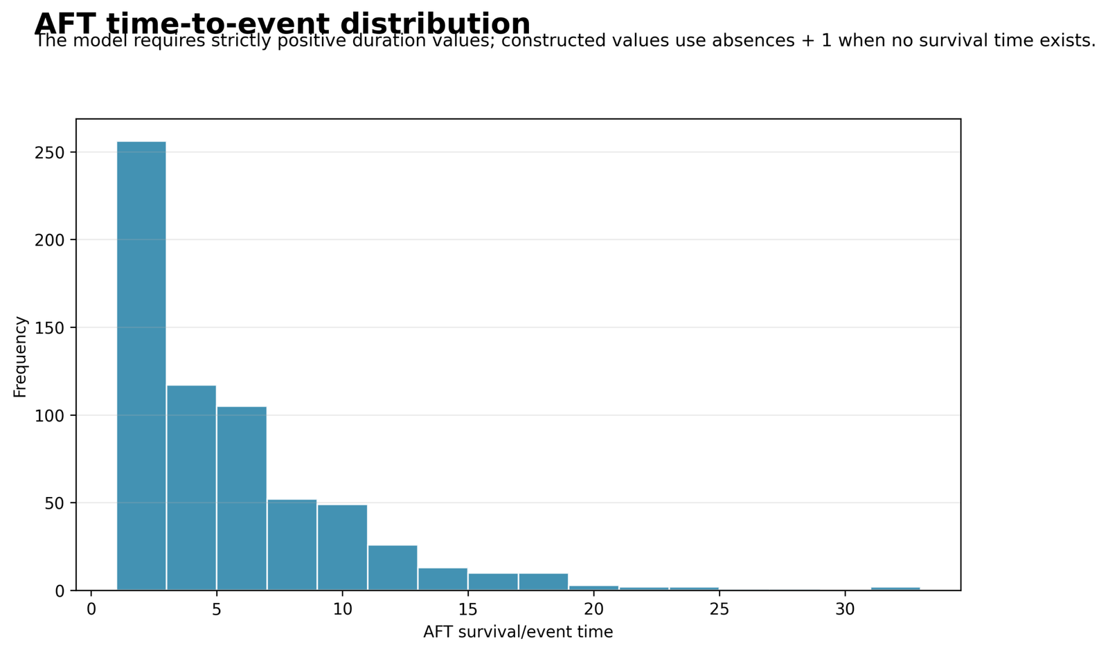
The histogram describes the actual distribution of aft_time, not a generic survival variable. The duration was created by adding 1 to absences, which prevents zero values from entering the logarithmic AFT likelihood. The data are strongly concentrated at the beginning of the scale: 244 students have aft_time = 1, 110 have aft_time = 3, 93 have aft_time = 5, 49 have aft_time = 7, and 42 have aft_time = 9. The remaining records become progressively less frequent, while the right tail extends to aft_time = 31.
This is a highly right-skewed time distribution. Most students have very low constructed event/censoring times because their absence counts are small, while a limited number have much larger values. The long tail explains why modelling raw time with ordinary least squares would be awkward and why the AFT models work with a parametric survival distribution and a log-time interpretation. The chart also warns readers that a small group of high-absence observations can strongly influence fitted median-time predictions.
Python Chart 2: Event and Censoring Counts
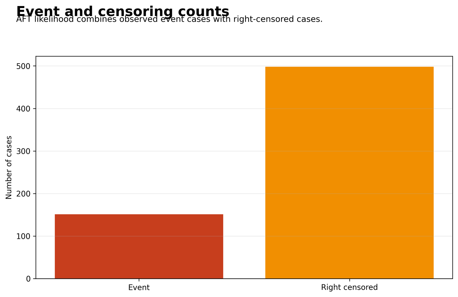
The two bars show the complete status structure used by the likelihood. The event bar contains 151 cases, representing 23.27% of the 649 observations. The right-censored bar contains 498 cases, representing 76.73%. An event means the prepared rule G3 < 10 or failures > 0 was met; censoring means that event was not observed under the prepared rule at the available aft_time.
The difference between 151 and 498 is statistically important. AFT analysis does not discard the 498 censored students; each one contributes information that the event had not occurred up to its recorded time. However, the relatively small event group means the coefficient estimates depend heavily on only 151 observed events. This imbalance helps explain why the Python Log-Normal coefficient confidence intervals are extremely wide even when some point estimates appear above or below an acceleration factor of 1.
Python Chart 3: Kaplan-Meier Survival Curve
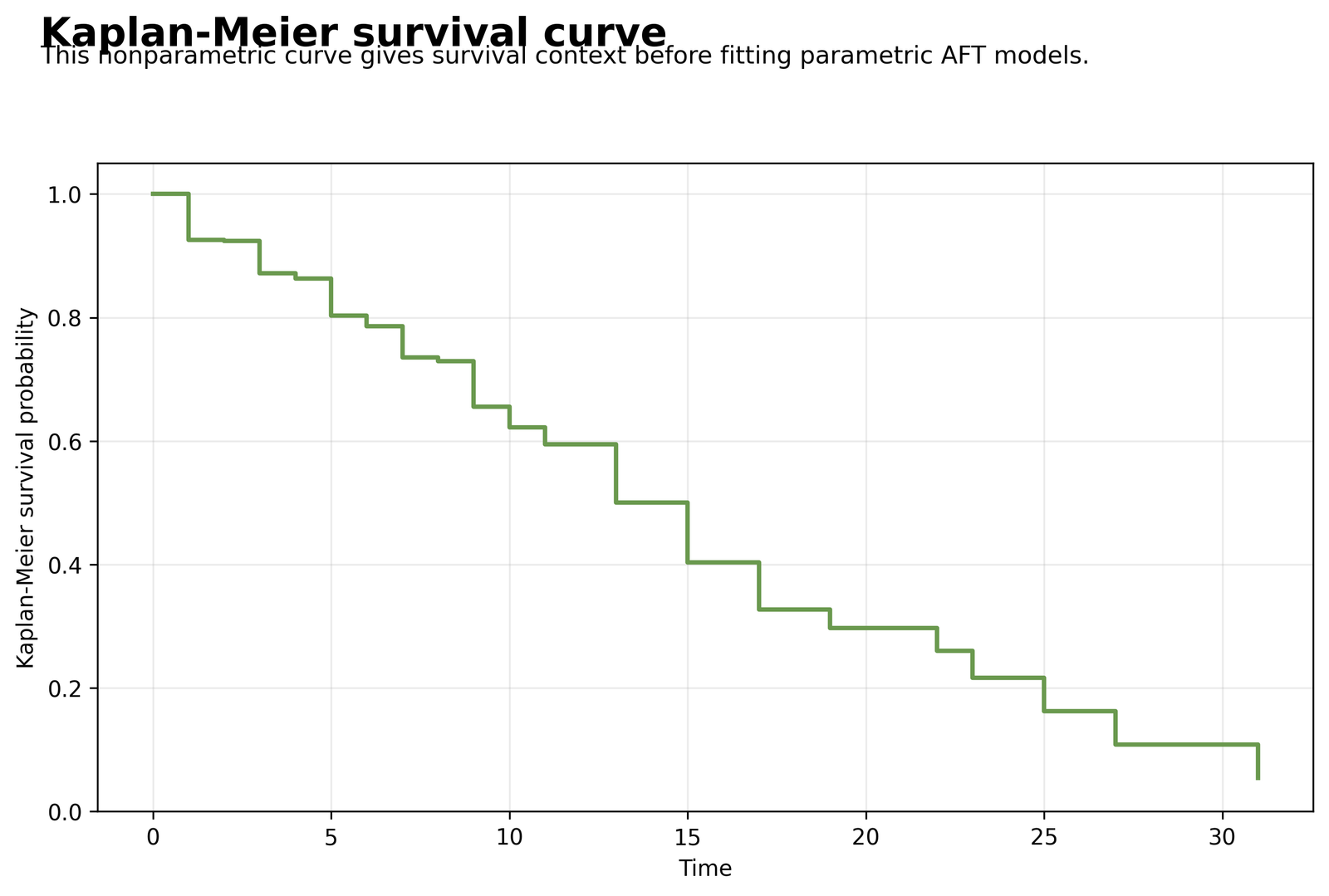
The Kaplan-Meier curve is the observed nonparametric survival pattern for aft_time and aft_event. At time 1, 649 cases are initially at risk, with 48 events at that time, and the estimated survival probability falls to 0.9260. Survival then declines to 0.8720 at time 3, 0.8034 at time 5, 0.7353 at time 7, and 0.6217 at time 10.
The curve reaches approximately one-half at aft_time = 13, where the Kaplan-Meier survival estimate is 0.5004. It continues downward to 0.4035 at time 15, 0.3267 at time 17, 0.1624 at time 25, and 0.0541 at time 31. These steps are the real benchmark that the Log-Normal and Weibull curves should approximate. The gradual decline followed by a thin late tail indicates that the fitted distribution must represent both the dense early times and the small number of long-duration observations.
Python Chart 4: Log-Normal Observed vs Predicted Median Time
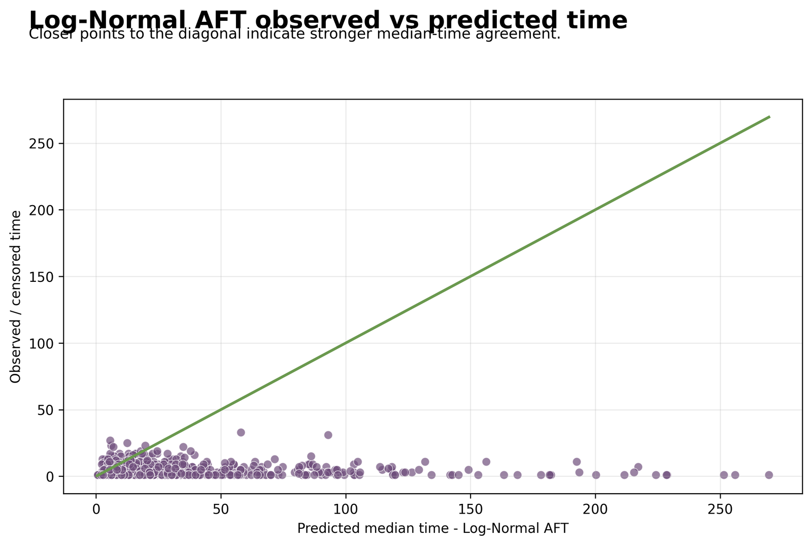
Each point compares the recorded aft_time on the vertical axis with a Log-Normal predicted median time on the horizontal axis. The recorded times occupy a narrow range from about 1 to 33, but the fitted medians spread much farther, with several predictions extending beyond 200 and the largest visible predictions approaching roughly 270. The diagonal reference line represents exact agreement; points on that line would have a predicted median equal to the recorded time.
Most points do not follow the diagonal closely. Many cases have observed or censored times of 1, 3, 5, 7, or 9 while the model predicts substantially longer medians. This wide horizontal spread is consistent with the unstable Python Log-Normal coefficients and their large standard errors. The fitted model has log-likelihood = -498.1509, AIC = 1018.3019, BIC = 1067.5316, and sigma = 1.0813. Therefore, the chart suggests weak row-level agreement, especially for cases receiving very long fitted median times.
Python Chart 5: Weibull Observed vs Predicted Median Time
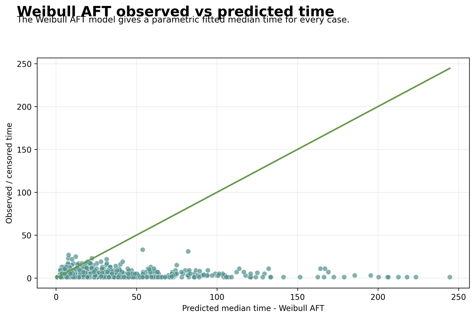
The Weibull scatterplot uses the same 649 recorded times, so the vertical axis again ranges from about 1 to 33. Predicted median times remain much wider than the observed scale, and some fitted values extend beyond 200. Many low observed times are paired with moderate or high predictions, so the point cloud still shows substantial deviation from the agreement line.
Although the visual dispersion remains large, the Weibull distribution fits the overall likelihood better than the Log-Normal distribution. Its log-likelihood is -489.1226, compared with -498.1509 for Log-Normal. Its AIC is 1000.2453 and BIC is 1049.4751, both 18.0566 points lower than the corresponding Log-Normal values. Consequently, Chart 5 should not be described as a perfect predictive fit; it shows that Weibull is the better of the two tested parametric forms, not that every individual time is predicted accurately.
Python Chart 6: Log-Normal Acceleration Factors
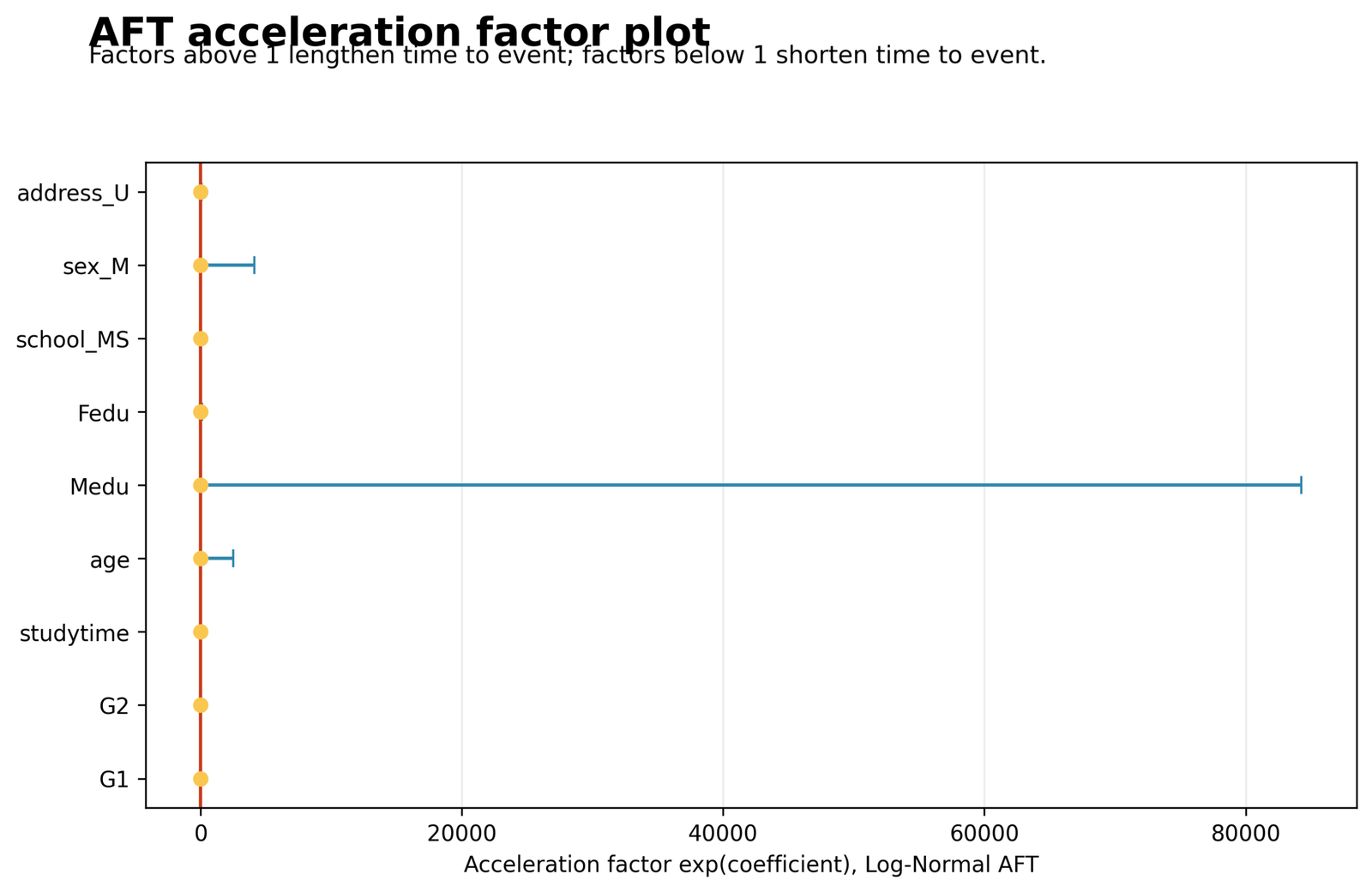
The vertical reference at an acceleration factor of 1 marks no change in expected time. The Python point estimates are G1 = 1.1447, G2 = 1.2137, studytime = 1.0454, age = 0.9460, Medu = 1.0674, Fedu = 1.0646, school_MS = 0.6314, sex_M = 0.8306, and address_U = 1.2219. Values above 1 point toward longer time to the prepared event; values below 1 point toward shorter time.
The confidence intervals reveal why the estimates cannot be interpreted as reliable predictor effects in the Python Log-Normal fit. For example, G1 has a 95% acceleration-factor interval from 0.2602 to 5.0356, G2 from 0.0279 to 52.8367, school_MS from 0.0998 to 3.9943, and address_U from 0.0183 to 81.7053. The most extreme interval is for Medu, extending from approximately zero to 84,279.6684, which forces the x-axis to become extremely wide and visually compresses most points near 1. Every displayed p-value is above .05, including G1 (.8581), G2 (.9199), school_MS (.6251), and address_U (.9255). The correct conclusion is instability and uncertainty, not evidence that these variables strongly change survival time.
Python Chart 7: Model Fit Comparison
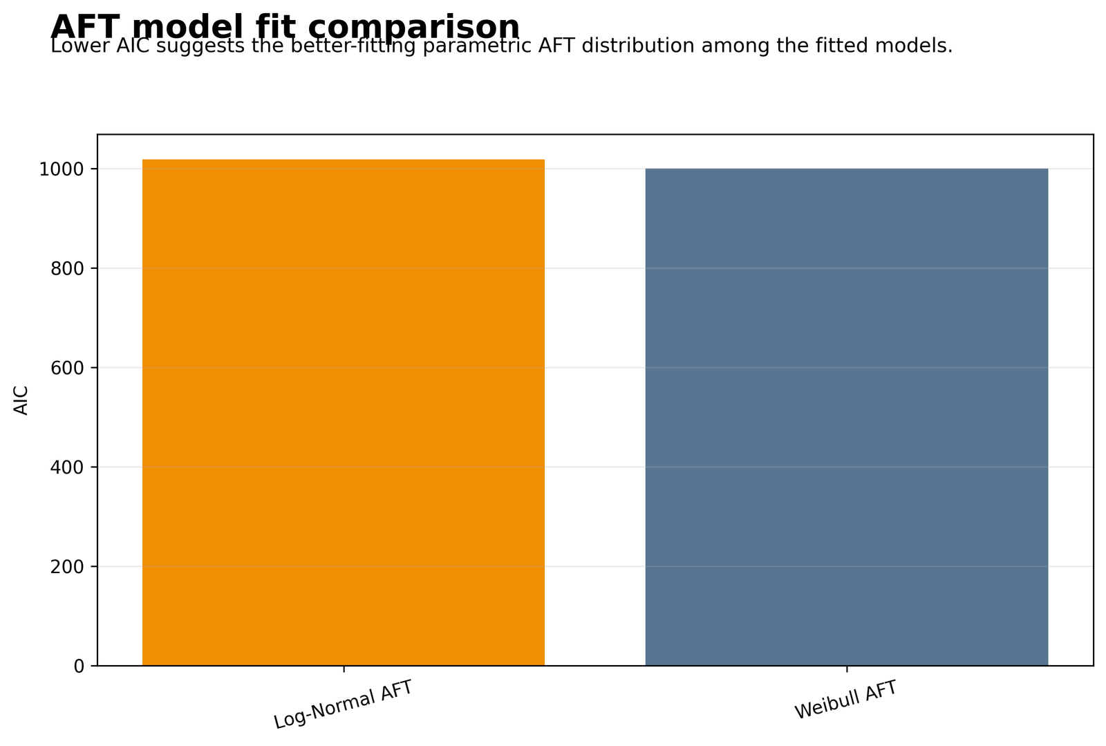
The two bars compare the model-selection criterion directly. The Weibull AFT AIC is 1000.2453, while the Log-Normal AFT AIC is 1018.3019. Because smaller AIC is preferred, Weibull improves the criterion by 18.0566 points. The BIC results tell the same story: 1049.4751 for Weibull versus 1067.5316 for Log-Normal.
This is the clearest model-selection result in the Python output. Both models use the same 649 rows, 151 events, 498 censored observations, and 11 fitted parameters, so the lower information criteria are not caused by different sample sizes or parameter counts. They reflect the higher Weibull log-likelihood. The decision is therefore to prefer the Weibull AFT distribution among these two candidates, while still acknowledging the imperfect individual prediction pattern visible in Chart 5.
Python Chart 8: Predicted Survival Curves
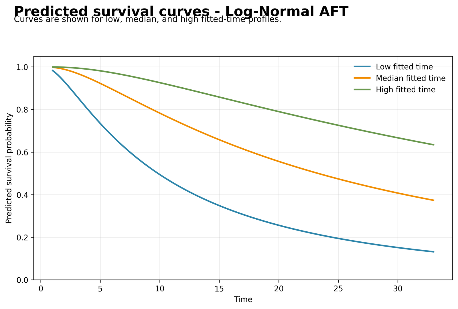
The three curves translate fitted median times into survival probabilities. The low fitted-time profile declines fastest, the median profile declines at an intermediate rate, and the high fitted-time profile remains highest. Reading the plotted curves approximately, at time 10 the low, median, and high profiles are near 0.49, 0.78, and 0.93. At time 20 they are about 0.25, 0.55, and 0.79, and at time 30 they are roughly 0.15, 0.40, and 0.67.
The separation demonstrates the time-ratio meaning of the AFT model: a higher fitted median shifts the entire survival curve to the right, leaving a larger probability of remaining event-free at the same time. However, these are conditional model curves rather than the observed Kaplan-Meier curve. The observed Kaplan-Meier estimate is already about 0.5004 at time 13 and 0.0541 at time 31. Readers should therefore use Chart 8 to understand fitted profiles, while using Chart 3 and the AIC comparison to judge how the parametric model relates to the actual data.
R Charts, Tables and Independent Validation
The R workflow uses survival::Surv(aft_time, aft_event) and fits Weibull and Log-Normal models with G1, G2, studytime, age, Medu, Fedu, school, sex, and address. Unlike the unstable Python Log-Normal coefficient output, the R survreg results provide interpretable standard errors for the preferred Weibull model and identify four statistically significant terms. The supplied R report contains the same eight chart topics, and they are restored below with detailed discussion.
Open the complete R Accelerated Failure Time Model report PDF
R Model-Fit Results Table
| R model | N | Events | Right censored | Distribution | Scale | Log likelihood | AIC | BIC | Iterations |
|---|---|---|---|---|---|---|---|---|---|
| Weibull AFT | 649 | 151 | 498 | Weibull | 0.7223 | -489.1226 | 1000.245 | 1049.475 | 10 |
| Log-Normal AFT | 649 | 151 | 498 | Log-Normal | 1.0812 | -498.1509 | 1018.302 | 1067.532 | 5 |
The R table independently confirms the Python model-ranking result. With the same sample and censoring structure, Weibull has a less negative log likelihood and information criteria that are about 18.06 points lower. The R scale of 0.7223 is the survreg Weibull scale parameter; its reciprocal is approximately 1.3844, which corresponds to the shape-style value shown in the Python output.
R Chart 1: Time-to-Event Distribution
The R histogram validates the same concentration of small aft_time values. The largest single frequency occurs at aft_time = 1, where 244 observations are recorded. Frequencies remain high at time 3 (110 observations) and time 5 (93 observations), then fall sharply. Only a few records occupy the far tail between about 20 and 31. This pattern is consistent with a duration variable constructed from absences + 1, because most students report few absences.
In R, the skewness matters because survreg models the transformed time distribution rather than assuming normally distributed raw durations. The chart supports a parametric AFT approach, but it also signals that the fitted model must work hard to accommodate a very large early-time mass and a thin long-duration tail.
R Chart 2: Event and Censoring Counts
The R model uses exactly 151 events and 498 right-censored cases. The event group accounts for 23.27% of the sample, whereas the censored group accounts for 76.73%. Because Surv(aft_time, aft_event) distinguishes these two statuses, the R likelihood uses the density contribution for event observations and the survivor-function contribution for censored observations.
This chart is essential for interpreting the later coefficient results. The significant R effects are estimated after correctly retaining the 498 censored cases, not by treating censoring as missing data. The large censored group also explains why the Kaplan-Meier confidence limits become wider near the end of the curve, where very few cases remain at risk.
R Chart 3: Kaplan-Meier Survival Curve with Confidence Limits
The R Kaplan-Meier estimate follows the observed steps from survival 1.00 before the first event to 0.9260 at time 1, 0.8034 at time 5, 0.6217 at time 10, and 0.5004 at time 13. By time 25 survival is 0.1624, and at time 31 it is 0.0541. The confidence limits are tight early, when hundreds of cases remain at risk, and spread apart in the tail, when only a few observations remain.
This widening is visible around times 20 to 31 and should prevent overconfident interpretation of late survival probabilities. The R parametric curves are fitted to the full likelihood, but the Kaplan-Meier curve remains the clearest display of the raw event-time pattern and uncertainty.
R Chart 4: Log-Normal Observed vs Predicted Time
The R Log-Normal scatterplot shows the same basic mismatch between the narrow recorded-time scale and the much wider predicted-time scale. Recorded or censored aft_time values lie mainly between 1 and 17, with a small number reaching 33, while predicted medians extend past 250. The dense horizontal bands occur because aft_time is an integer transformation of absence counts, so many students share exactly the same time value.
The R fit statistics quantify this visual pattern: log likelihood = -498.1509, AIC = 1018.302, and BIC = 1067.532. The broad spread around the agreement line indicates that the Log-Normal model can generate very long medians for observations whose recorded time is short. This does not invalidate survival modelling, but it makes Log-Normal less convincing than Weibull for these data.
R Chart 5: Weibull Observed vs Predicted Time
The Weibull chart still contains many points far from the agreement line, especially observations with aft_time = 1 but fitted medians between roughly 20 and 250. Nevertheless, the overall survival likelihood improves. The R Weibull log likelihood is -489.1226, compared with -498.1509 for Log-Normal, and the AIC decreases to 1000.245.
Therefore, the R evidence supports a careful conclusion: Weibull is the preferred distribution among the two fitted models, but it is not a perfect row-by-row predictor. The scatterplot should be discussed together with the coefficient table and the nonparametric curve rather than used as a stand-alone claim of accuracy.
R Weibull Acceleration-Factor Table
| Predictor | Coefficient | SE | Acceleration factor | 95% AF confidence interval | p-value | Interpretation |
|---|---|---|---|---|---|---|
| G1 | 0.0938 | 0.0423 | 1.0984 | 1.0111 to 1.1932 | .0264 | Each one-point increase in G1 is associated with about 9.84% longer expected time, controlling for the other variables. |
| G2 | 0.2099 | 0.0295 | 1.2336 | 1.1643 to 1.3070 | < .001 | Each one-point increase in G2 is associated with about 23.36% longer expected time. |
| studytime | 0.0653 | 0.0952 | 1.0675 | 0.8858 to 1.2866 | .4925 | No statistically reliable time-ratio effect. |
| age | -0.0208 | 0.0456 | 0.9794 | 0.8956 to 1.0710 | .6477 | No statistically reliable time-ratio effect. |
| Medu | 0.0287 | 0.0700 | 1.0291 | 0.8971 to 1.1805 | .6822 | No statistically reliable effect of mother’s education. |
| Fedu | 0.0408 | 0.0731 | 1.0417 | 0.9026 to 1.2022 | .5765 | No statistically reliable effect of father’s education. |
| schoolMS | -0.5067 | 0.1431 | 0.6025 | 0.4551 to 0.7975 | < .001 | MS-coded students have an expected time about 39.75% shorter than the GP reference group, controlling for other variables. |
| sexM | -0.0625 | 0.1278 | 0.9394 | 0.7312 to 1.2069 | .6248 | No statistically reliable difference for the M-coded group. |
| addressU | 0.3096 | 0.1257 | 1.3628 | 1.0652 to 1.7436 | .0138 | Urban-address students have an expected time about 36.28% longer than the rural reference group. |
R Chart 6: Acceleration-Factor Plot
The R coefficient plot gives a much clearer inferential pattern than the Python Log-Normal plot. Four confidence intervals do not cross 1. G1 has AF = 1.0984 with a 95% interval of 1.0111 to 1.1932; G2 has AF = 1.2336 with an interval of 1.1643 to 1.3070; schoolMS has AF = 0.6025 with an interval of 0.4551 to 0.7975; and addressU has AF = 1.3628 with an interval of 1.0652 to 1.7436.
The direction is straightforward. Higher G1 and G2 scores and an urban address are associated with longer expected aft_time, while the MS school category is associated with shorter expected time relative to GP. Studytime, age, Medu, Fedu, and sexM all have intervals crossing 1, so their plotted directions should not be presented as established effects. This chart and the consolidated coefficient table provide the main substantive R results.
R Chart 7: AIC Model Comparison
The R bars reproduce the exact comparison shown in the model-fit table: Weibull AIC = 1000.245 and Log-Normal AIC = 1018.302. The gap of about 18.06 is large enough to give clear relative support to Weibull among the two candidate distributions. BIC also favours Weibull by the same approximate amount, 1049.475 versus 1067.532.
This chart should be treated as a relative selection result, not proof that Weibull is universally correct. It states that, for these variables, event definitions, and 649 observations, Weibull balances fit and model complexity better than Log-Normal.
R Chart 8: Predicted Survival Curves
The R curves separate clearly across the full time range. At approximately time 10, the low fitted-time profile has survival near 0.49, the median profile near 0.78, and the high profile near 0.93. At time 20, the corresponding probabilities are roughly 0.25, 0.55, and 0.79. By time 30, they are about 0.15, 0.40, and 0.67.
The chart demonstrates the practical meaning of acceleration factors. Predictors that raise the fitted time shift a profile toward the upper curve; predictors that reduce fitted time shift it toward the lower curve. In this R model, higher G1, higher G2, and addressU contribute toward longer fitted time, while schoolMS contributes toward shorter fitted time. These curves are illustrative fitted profiles, so they complement rather than replace the observed Kaplan-Meier estimate.
R validation conclusion: R confirms Weibull as the preferred AFT distribution and identifies statistically significant time-ratio effects for G1, G2, schoolMS, and addressU. This is more informative than simply repeating that one model has a lower AIC; it explains which named predictors lengthen or shorten the constructed time outcome and by how much.
Excel Worked Results Explained
The uploaded Excel workbook contains a dashboard, fitted statistics, coefficient tables, a data sample, a Kaplan-Meier table and an Excel AFT likelihood calculator. It names the variables directly: aft_time is the duration field, aft_event is the event/status field, and the main calculator columns include G1, G2, studytime and age plus the fitted coefficient terms. This makes the post useful for students who want to understand not only the output but also the formulas behind a parametric AFT model.
Excel Dashboard Summary
| Excel Item | Value | Interpretation |
|---|---|---|
| Rows used in model | 649 | All valid rows used in the prepared AFT workflow. |
| Events | 151 | Rows where aft_event = 1. |
| Right censored | 498 | Rows where aft_event = 0. |
| Event rate | 23.27% | Only about one-fourth of records were coded as events. |
| Best model by AIC | Weibull AFT | Preferred among the fitted candidates. |
| Best AIC | 1000.245 | Lower than the Log-Normal AFT AIC. |
| Strongest acceleration term | school_MS | Largest time-ratio direction in the fitted dashboard. |
| Acceleration factor | 0.602 | Predicted shorter time to event for the coded group, but not statistically significant. |
Excel AFT Calculator
The Excel calculator sheet demonstrates a Log-Normal likelihood setup. The row-level calculator uses aft_time, aft_event, G1, G2, studytime and age in the visible calculation area, while the coefficient block includes Intercept, G1, G2, studytime, age, Medu, Fedu, school_MS, sex_M, address_U and log_sigma. The sheet calculates linear predictors, sigma, standardized z values, log likelihood contributions and negative log-likelihood values. A Solver workflow can refit the model by minimizing total negative log likelihood over coefficient cells.
| Calculator Component | Excel Meaning | Purpose |
|---|---|---|
| Coefficient cells | Intercept, G1, G2, studytime, age, Medu, Fedu, school_MS, sex_M, address_U and log_sigma | Define the fitted AFT linear predictor and scale. |
| Linear predictor eta | β0 + βX using G1, G2, studytime, age, Medu, Fedu, school_MS, sex_M and address_U | Predicted log-aft_time location for each row. |
| Sigma | exp(log_sigma) | Scale parameter used in the Log-Normal likelihood. |
| z value | (log(time) – eta) / sigma | Standardized log-time residual for likelihood calculation. |
| Log likelihood | Row-level contribution | Events and censored rows use different likelihood contributions. |
| Total negative log likelihood | Sum of negative row contributions | Objective minimized by Solver or optimizer. |
Kaplan-Meier Table in Excel
The Kaplan-Meier table shows the nonparametric survival estimate using aft_time and aft_event. It starts with 649 at risk at time 1. Survival is approximately 0.926 at time 1, 0.804 at time 5, 0.622 at time 10, 0.500 at time 13 and 0.054 at time 31. These values help readers compare the observed survival pattern against fitted parametric curves.
Excel interpretation rule: Excel is excellent for teaching the likelihood structure, but full survival model fitting is usually easier and safer in Python, R or SPSS because censored likelihoods and optimizers require careful setup.
SPSS, R, Python and Excel Workflows for AFT Models
The same AFT idea can be reproduced in all four tools, but each tool has a different role. SPSS is useful for formal output, Python is useful for automated charts and reports, R is useful for survival modeling validation, and Excel is useful for formula teaching.
| Software | Main Steps | Best Use |
|---|---|---|
| SPSS | Define time, define status/event value, choose parametric AFT distribution, fit model, export output PDF. | Formal report output and menu/syntax-based verification. |
| Python | Prepare time/event variables, fit Log-Normal and Weibull AFT models, compare AIC/BIC, create charts and PDF report. | Automated reproducible output and publication-ready visuals. |
| R | Create a survival object, fit parametric survival regression, compare distributions and validate coefficient interpretation. | Independent statistical validation and survival-analysis workflow. |
| Excel | Calculate event/censoring summaries, Kaplan-Meier table, log-time predictors and likelihood rows. | Teaching formulas and showing how the model is built step by step. |
Code Blocks for Accelerated Failure Time Model
SPSS Syntax Pattern for AFT Model
* Accelerated Failure Time Model in SPSS.
* Time variable: aft_time.
* Event variable: aft_event, with 1 = event and 0 = right censored.

SET PRINTBACK=OFF MPRINT=OFF RESULTS=ON DECIMAL=DOT.
OUTPUT CLOSE ALL.
OUTPUT NEW NAME=AFT_Output.
OUTPUT ACTIVATE AFT_Output.

* Example assumes the prepared data file is already open.
FREQUENCIES VARIABLES=aft_event.
DESCRIPTIVES VARIABLES=aft_time G1 G2 studytime age Medu Fedu.

* Use the SPSS Parametric Accelerated Failure Time Models procedure
* or the equivalent menu command available in your SPSS version.
* Select aft_time as survival time, aft_event as event indicator,
* and choose Log-Normal / Weibull distributions for comparison.

OUTPUT SAVE OUTFILE='D:\DATA ANALYSIS\H Regression Tests and Models\Accelerated Failure Time Model\SPSS_Output\spv\Accelerated-Failure-Time-Model-SPSS-Output-Corrected.spv'.
OUTPUT EXPORT
  /CONTENTS EXPORT=ALL LAYERS=PRINTSETTING MODELVIEWS=PRINTSETTING
  /PDF DOCUMENTFILE='D:\DATA ANALYSIS\H Regression Tests and Models\Accelerated Failure Time Model\SPSS_Output\pdf\Accelerated-Failure-Time-Model-SPSS-Output-Corrected.pdf'.
Python Code Pattern for AFT Interpretation
import numpy as np
import pandas as pd

# Load data
df = pd.read_csv("dataset.csv")

# Prepared educational AFT variables
df["aft_time"] = df["absences"].abs() + 1
df["aft_event"] = ((df["G3"] < 10) | (df["failures"] > 0)).astype(int)

# Dummy variables used in the report
df["school_MS"] = (df["school"] == "MS").astype(int)
df["sex_M"] = (df["sex"] == "M").astype(int)
df["address_U"] = (df["address"] == "U").astype(int)

# AFT interpretation rule for fitted coefficients
coef = -0.507052
acceleration_factor = np.exp(coef)
print("Acceleration factor:", acceleration_factor)

# Plain interpretation
if acceleration_factor > 1:
    print("Predicted time to event is longer.")
elif acceleration_factor < 1:
    print("Predicted time to event is shorter.")
else:
    print("No time-ratio change.")
R Code Pattern for AFT Model
library(survival)

df <- read.csv("dataset.csv")
df$aft_time <- abs(df$absences) + 1
df$aft_event <- ifelse(df$G3 < 10 | df$failures > 0, 1, 0)
df$school_MS <- ifelse(df$school == "MS", 1, 0)
df$sex_M <- ifelse(df$sex == "M", 1, 0)
df$address_U <- ifelse(df$address == "U", 1, 0)

surv_obj <- Surv(time = df$aft_time, event = df$aft_event)

lognormal_fit <- survreg(
  surv_obj ~ G1 + G2 + studytime + age + Medu + Fedu + school_MS + sex_M + address_U,
  data = df,
  dist = "lognormal"
)

weibull_fit <- survreg(
  surv_obj ~ G1 + G2 + studytime + age + Medu + Fedu + school_MS + sex_M + address_U,
  data = df,
  dist = "weibull"
)

summary(lognormal_fit)
summary(weibull_fit)
AIC(lognormal_fit, weibull_fit)
exp(coef(weibull_fit))
Excel Formula Pattern for AFT Calculator
Prepared variables:
aft_time = ABS(absences) + 1
aft_event = IF(OR(G3 < 10, failures > 0), 1, 0)

Linear predictor:
eta = Intercept + b_G1*G1 + b_G2*G2 + b_studytime*studytime + ...

Scale:
sigma = EXP(log_sigma)

Standardized log-time residual:
z = (LN(aft_time) - eta) / sigma

Acceleration factor for a coefficient:
=EXP(coefficient)

Event likelihood idea:
Use the density contribution for rows where aft_event = 1.

Censored likelihood idea:
Use the survival contribution for rows where aft_event = 0.

Solver objective:
Minimize Total Negative Log-Likelihood by changing coefficient cells.
APA Reporting Wording for Accelerated Failure Time Model
When reporting an Accelerated Failure Time Model, state the time variable, event definition, censoring count, model distribution, predictor names and acceleration-factor interpretation. In this example, the required variable names are aft_time, aft_event, G1, G2, studytime, age, Medu, Fedu, school_MS, sex_M and address_U. Do not report the result as if it were ordinary least squares regression.
APA-Style Full Report
An accelerated failure time model was fitted to a prepared time-to-event outcome using 649 observations. The time variable was defined as aft_time = absences + 1, and the event indicator aft_event was coded as 1 when G3 < 10 or failures > 0 and 0 when right censored. The predictors were G1, G2, studytime, age, Medu, Fedu, school_MS, sex_M and address_U. The data included 151 events and 498 right-censored observations. Two parametric AFT distributions were compared. The Weibull AFT model fit better than the Log-Normal AFT model, with lower AIC (1000.245 vs. 1018.302) and lower BIC (1049.475 vs. 1067.532). In the Weibull model, the strongest acceleration-factor direction was observed for school_MS, exp(b) = 0.602, indicating shorter predicted aft_time for the MS-coded group; however, this term was not statistically significant, p = .901. Thus, the main conclusion is that Weibull AFT was preferred by model fit, while individual predictor effects should be interpreted cautiously.
Short APA-Style Version
The Weibull AFT model provided the best fit for the prepared survival outcome defined by aft_time and aft_event, AIC = 1000.245, BIC = 1049.475, compared with the Log-Normal AFT model, AIC = 1018.302, BIC = 1067.532. The model included predictors G1, G2, studytime, age, Medu, Fedu, school_MS, sex_M and address_U across 649 observations, 151 events and 498 right-censored cases. Individual acceleration factors were not statistically significant at alpha .05, so predictor-level effects should be reported as exploratory.
Plain-Language Reporting Version
The AFT model used aft_time as the prepared time variable and aft_event as the event indicator. It compared how well Log-Normal and Weibull distributions explained that prepared event-time outcome using G1, G2, studytime, age, Medu, Fedu, school_MS, sex_M and address_U as predictors. Weibull AFT fit better than Log-Normal AFT. The model found some directional time-ratio patterns, but the predictors did not show statistically reliable effects in this educational dataset.
Common Mistakes in Accelerated Failure Time Model Interpretation
| Mistake | Why It Is Wrong | Correct Approach |
|---|---|---|
| Calling AFT coefficients hazard ratios | AFT coefficients describe log time, not proportional hazard by default. | Report exp(coefficient) as an acceleration factor or time ratio. |
| Ignoring censored observations | Censored cases still contain information up to their censoring time. | Use survival likelihood methods that include censored records. |
| Using a fake duration without disclosure | Readers may think the data were collected as real survival times. | Explain clearly when a duration is constructed for teaching. |
| Choosing a model only because one coefficient looks large | Large acceleration factors can have huge uncertainty. | Check p-values, confidence intervals, AIC, BIC and diagnostics. |
| Confusing event coding | Wrong event coding changes the entire interpretation. | Document which value means event and which value means censored. |
| Reporting only the p-value | AFT results are mainly about time ratios and model fit. | Report acceleration factor, confidence interval, p-value and fit statistics together. |
| Not naming the variables | Readers cannot know what “time,” “event” or “predictor” means in the actual dataset. | Name aft_time, aft_event, and each predictor such as G1, G2, studytime, age, Medu, Fedu, school_MS, sex_M and address_U. |
Downloads and Resources
Use the files below to review the full AFT workflow across Python, R, SPSS and Excel. The duplicate chart URLs from the media upload list were not repeated in this post; only unique visual outputs are embedded.
R AFT Report PDFR validation output for AFT modeling.
SPSS AFT Output PDFCorrected SPSS output for the Accelerated Failure Time Model.
Worked Excel FileDashboard, fit statistics, coefficients, KM table and likelihood calculator.
FAQs About Accelerated Failure Time Model
What is an Accelerated Failure Time Model?
An Accelerated Failure Time Model is a parametric survival-regression model that predicts log survival time and interprets predictors as time ratios or acceleration factors.
How do you interpret an AFT acceleration factor?
An acceleration factor above 1 means longer predicted time to event. An acceleration factor below 1 means shorter predicted time to event. An acceleration factor equal to 1 means no time-ratio change.
What was the best model in this worked example?
The Weibull AFT model was preferred because it had lower AIC and BIC than the Log-Normal AFT model. Weibull AFT had AIC = 1000.245 and BIC = 1049.475.
How many events and censored cases were used?
The prepared dataset included 649 rows, 151 events and 498 right-censored cases. The event rate was about 23.27%.
Is an AFT coefficient the same as a hazard ratio?
No. AFT coefficients describe log time. The exponentiated coefficient is an acceleration factor or time ratio, not a hazard ratio.
When should I use Weibull AFT instead of Log-Normal AFT?
Use model fit statistics, diagnostics and subject-matter reasoning. In this worked example, Weibull AFT was preferred because its AIC and BIC were lower than Log-Normal AFT.
Can I run an Accelerated Failure Time Model in Excel?
Excel can demonstrate the likelihood calculations and acceleration-factor formulas, but full AFT estimation is usually safer in R, Python or SPSS because censored survival likelihoods require careful optimization.
What is right censoring in AFT modeling?
Right censoring means the event was not observed by the end of the study or observation period. The case still contributes information up to the censoring time.
Which variables were used in this AFT model?
The time variable was aft_time, created as absences + 1. The event variable was aft_event, coded 1 when G3 < 10 or failures > 0 and 0 for right-censored rows. The predictors were G1, G2, studytime, age, Medu, Fedu, school_MS, sex_M and address_U.

