
R-only correlation analysis with cor(), cor.test(), Pearson, Spearman and Kendall
Correlation in R: Pearson, Spearman, Kendall, Heatmap and cor.test Guide
Correlation in R helps you measure the direction and strength of association between numeric variables using functions such as cor() and cor.test(). This R-only guide explains Pearson correlation, Spearman correlation, Kendall correlation, heatmap interpretation, strongest variable pairs, pairwise sample-size checks, completeness checks and report writing using the student performance dataset.
Quick Answer: Correlation in R Result
The R correlation report analyzed 649 rows and 12 numeric variables: G1, G2, G3, age, studytime, failures, absences, Medu, Fedu, traveltime, freetime and goout. The strongest Pearson relationship was between G2 and G3, with r = 0.918548. This is a very strong positive correlation, meaning students with higher second-period grades generally had higher final grades.
The next strongest Pearson correlations were G1 with G2, r = 0.864982, and G1 with G3, r = 0.826387. The strongest negative relationship involving final grade was G3 with failures, r = -0.393316. This means previous failures were moderately associated with lower final grades.
Final interpretation: The R output shows that grade variables form the strongest correlation cluster. G2 is very strongly and positively related to G3, G1 is strongly related to both G2 and G3, and failures are negatively related to grade performance. The result is statistically significant and practically meaningful for understanding final grade patterns.
R-only note: This post is written only for R users. It uses R functions, R code, R charts and R interpretation. It does not explain the same workflow in SPSS, Excel or Python.
Table of Contents
- What Is Correlation in R?
- Pearson, Spearman and Kendall Correlation in R
- Pearson Correlation Formula
- Dataset and Variables Used in R
- Verified R Correlation Results
- R Chart-by-Chart Interpretation
- R Workflow for Correlation Analysis
- Complete R Code Blocks
- How to Report Correlation in R
- Common Mistakes in R Correlation
- Downloads and Resources
- Related Statistical Guides
- FAQs About Correlation in R
What Is Correlation in R?
Correlation in R means using R to calculate how strongly two numeric variables are associated. The correlation coefficient usually ranges from -1 to +1. A positive coefficient means the variables tend to increase together. A negative coefficient means one variable tends to increase while the other decreases. A coefficient near zero means the linear or rank-based association is weak.
R is excellent for correlation analysis because it has built-in functions for Pearson, Spearman and Kendall correlation. The cor() function calculates correlation matrices, while cor.test() gives a test statistic, p-value and confidence interval for a pair of variables. R can also produce heatmaps, bar charts, scatterplots and report tables.
In this R report, the strongest relationship was G2 with G3. The value r = 0.918548 is very close to +1, so the relationship is very strong and positive. This means students with higher G2 values usually had higher G3 values.
Pearson, Spearman and Kendall Correlation in R
R can calculate different types of correlation depending on the measurement scale and the relationship shape. The R report includes Pearson, Spearman and Kendall heatmaps so that linear, monotonic and ordinal-concordance patterns can be compared.
| Correlation Method | R Function Pattern | Best Use | Interpretation |
|---|---|---|---|
| Pearson correlation | cor(data, method = "pearson") | Two numeric variables with a roughly linear relationship. | Measures linear association. This is the main coefficient used in the strongest-pairs ranking. |
| Spearman correlation | cor(data, method = "spearman") | Ranked, ordinal or monotonic relationships. | Measures whether variables move together in rank order. |
| Kendall correlation | cor(data, method = "kendall") | Ordinal concordance or smaller-sample rank association. | Measures agreement in pair ordering and is often more conservative. |
| Pairwise test | cor.test(x, y) | Testing one pair with a p-value and confidence interval. | Useful for final reporting of one important correlation. |
Practical rule: Use Pearson when the relationship is numeric and linear. Use Spearman when rank order matters or when the relationship is monotonic but not perfectly linear. Use Kendall when ordinal agreement is the main concern.
Pearson Correlation Formula
The Pearson correlation coefficient compares how two variables vary together relative to their own variation. R calculates this directly, but the formula explains the meaning of the value.
If r is positive, the variables move in the same direction. If r is negative, they move in opposite directions. If r is close to zero, the linear association is weak. The p-value tests whether the population correlation is likely to be different from zero.
For the main R result, G2 with G3 produced r = 0.918548 with an extremely small p-value. This means the association is both very strong and statistically significant.
Dataset and Variables Used in R
The R report used the student performance dataset and selected 12 numeric variables. Every selected numeric variable had complete values in the report, and every pairwise correlation used N = 649.
| Variable Group | Variables | Purpose in the R Correlation Report |
|---|---|---|
| Grade variables | G1, G2, G3 | Measure how earlier grades and final grade move together. |
| Academic effort and history | studytime, failures, absences | Check how study time, previous failures and absences relate to grade outcomes. |
| Family education | Medu, Fedu | Compare mother’s and father’s education with each other and with student outcomes. |
| Student context | age, traveltime, freetime, goout | Check background and lifestyle association patterns. |
The pairwise sample-size heatmap is important because correlation matrices can be misleading when some cells are based on fewer observations than others. In this R report, all displayed pairwise correlations use the same sample size, so the coefficients are easier to compare.
Verified R Correlation Results
The strongest Pearson relationship in the R report is G2 with G3, with r = 0.918548. This is a very strong positive relationship. The second strongest is G1 with G2, with r = 0.864982. The third strongest is G1 with G3, with r = 0.826387.
| Rank | Variable Pair | Pearson r | Direction | R Interpretation |
|---|---|---|---|---|
| 1 | G2 with G3 | 0.918548 | Positive | Very strong relationship between second-period grade and final grade. |
| 2 | G1 with G2 | 0.864982 | Positive | Very strong continuity between first and second grade periods. |
| 3 | G1 with G3 | 0.826387 | Positive | Very strong relationship between first-period grade and final grade. |
| 4 | Medu with Fedu | 0.647477 | Positive | Strong relationship between mother’s and father’s education. |
| 5 | G3 with failures | -0.393316 | Negative | Moderate negative relationship between previous failures and final grade. |
| 6 | G2 with failures | -0.385782 | Negative | Moderate negative relationship between failures and second-period grade. |
| 7 | G1 with failures | -0.384211 | Negative | Moderate negative relationship between failures and first-period grade. |
| 8 | freetime with goout | 0.346352 | Positive | Moderate positive lifestyle relationship. |
| 9 | age with failures | 0.319968 | Positive | Older students in the sample tend to have more previous failures. |
| 10 | Medu with traveltime | -0.265079 | Negative | Weak negative relationship between mother’s education and travel time. |
The p-values in the report show that the listed top Pearson correlations are statistically significant at alpha .05. The strongest grade correlations also remain important under practical interpretation because their coefficients are large, not merely because their p-values are small.
R Chart-by-Chart Interpretation
The R charts explain the correlation analysis visually. The Pearson heatmap shows the main linear matrix, the Spearman and Kendall heatmaps check rank-based patterns, the strongest-pairs chart ranks the most important relationships, and the sample-size/completeness charts confirm that the matrix is based on stable data coverage.
R Chart 1: Pearson Correlation Heatmap

The Pearson heatmap shows the complete linear correlation matrix. The strongest positive block is around G1, G2 and G3. The cell for G2 with G3 is about 0.92, showing a very strong positive linear relationship. The cells for G1 with G2 and G1 with G3 are also strongly positive.
The heatmap also shows meaningful negative relationships between failures and the grade variables. The relationship between G3 and failures is about -0.39, which is moderate and negative. This chart is the best overall view of the R result because it displays all numeric-variable relationships in one matrix.
R Chart 2: Spearman Correlation Heatmap

The Spearman heatmap measures rank-based monotonic relationships. It confirms the same main pattern as Pearson: G1, G2 and G3 remain the strongest positive cluster. The Spearman value for the G2-G3 relationship is even stronger visually, showing that students who rank high in G2 also tend to rank high in G3.
This chart is useful because it checks whether the Pearson results depend only on linear scale values. Since the Spearman pattern agrees with the Pearson pattern, the conclusion is stronger: grade variables are strongly associated both as raw numeric scores and as rank-order positions.
R Chart 3: Kendall Correlation Heatmap

The Kendall heatmap measures ordinal concordance. Kendall values are usually smaller than Pearson or Spearman values, but the direction and ranking pattern are still consistent. The grade variables remain the strongest positive cluster, while failures remain negatively related to grade outcomes.
This chart supports the reliability of the R result. When Pearson, Spearman and Kendall all point to the same main relationships, the interpretation does not depend on a single correlation method. The final report can confidently say that earlier grades and final grades are strongly associated.
R Chart 4: Strongest Pairwise Relationships

The strongest-pairs chart ranks the largest Pearson correlations. The top positive bar is G2 with G3, followed by G1 with G2 and G1 with G3. These bars show that grade variables dominate the strongest relationships in the dataset.
The chart also includes negative bars for G3 with failures, G2 with failures and G1 with failures. These negative bars are important because they show that previous failures are consistently associated with lower grades. The chart is easier to read than a full heatmap when the goal is to quickly identify the most important relationships.
R Chart 5: Strongest Pair Scatterplot

The scatterplot displays the strongest pair, G2 and G3. The points rise clearly from left to right, and the fitted line has a strong positive slope. This visual pattern matches the Pearson value of r = 0.919. The relationship is not perfect, but it is very strong.
This scatterplot is important because correlation should not be interpreted from a number alone. The graph confirms that the high correlation is visually reasonable and not just a table artifact. It also shows that students with higher G2 scores are generally concentrated at higher G3 scores.
R Chart 6: Pearson and Spearman Agreement

The Pearson-versus-Spearman chart checks whether linear correlations and rank-based correlations lead to similar conclusions. Points near the diagonal line mean both methods agree. In this R report, the main grade relationships remain strong under both methods.
This chart is useful for method validation. If Pearson and Spearman were very different for many pairs, the analysis would need closer inspection for nonlinear relationships or outliers. Here, the agreement supports the use of Pearson as the main report coefficient while still showing that rank-based results tell the same overall story.
R Chart 7: Pairwise Complete Sample Sizes

The pairwise sample-size heatmap shows 649 usable rows for every displayed pair of variables. This is an excellent result because all correlations are based on the same number of observations. When different cells use different sample sizes, the matrix can be harder to compare.
Because every cell uses the same N, the strongest-pairs ranking is easier to trust. The chart confirms that the strongest and weaker correlations are not being compared from uneven sample coverage.
R Chart 8: Numeric Variable Completeness
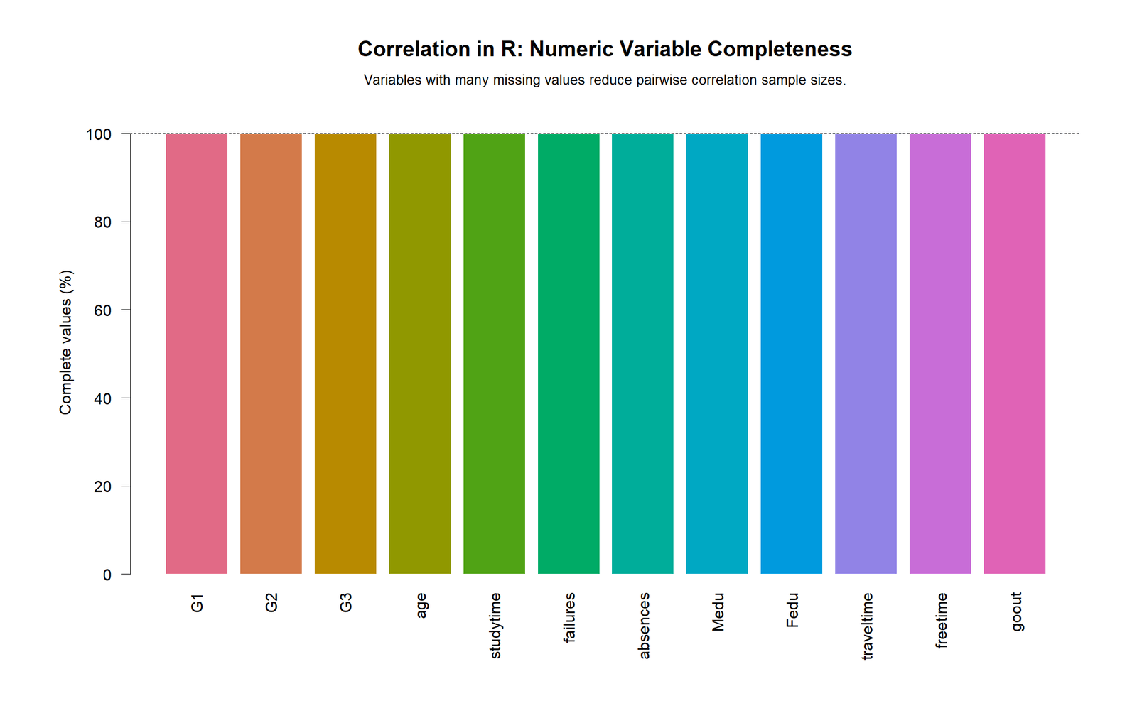
The numeric-variable completeness chart shows that all selected numeric variables have complete values in the R report. Each bar reaches 100%. This means missing values did not reduce the pairwise correlation sample sizes for the variables shown.
This chart is useful for quality control. Before interpreting a correlation matrix, a researcher should know whether missing data are affecting the analysis. Here, the completeness chart supports the reliability of the R output because all selected variables are fully available.
R Workflow for Correlation Analysis
A complete R correlation workflow should do more than calculate cor(data). It should prepare numeric variables, compute Pearson, Spearman and Kendall matrices, calculate p-values for Pearson pairs, adjust p-values when many pairs are tested, rank the strongest relationships, check pairwise sample sizes and create visual outputs.
| Step | R Task | Purpose |
|---|---|---|
| 1 | Load the CSV with read.csv() | Bring the dataset into R. |
| 2 | Select numeric variables | Correlation coefficients require numeric variables. |
| 3 | Use cor() for Pearson, Spearman and Kendall matrices | Calculate the main correlation structures. |
| 4 | Use cor.test() for pairwise p-values | Test whether each correlation differs from zero. |
| 5 | Use p.adjust(..., method = "BH") | Control false discovery rate when many correlations are tested. |
| 6 | Rank pairwise correlations | Find the strongest positive and negative relationships. |
| 7 | Check pairwise sample sizes | Confirm that matrix cells use enough observations. |
| 8 | Create R charts | Make the findings easier to interpret and publish. |
Complete R Code Blocks for Correlation in R
1. Load Data and Select Numeric Variables in R
# Correlation in R
# Dataset file should be named dataset.csv in your working directory

df <- read.csv("dataset.csv", stringsAsFactors = FALSE)

numeric_df <- df[sapply(df, is.numeric)]

cat("Number of rows:", nrow(df), "\n")
cat("Number of numeric variables:", ncol(numeric_df), "\n")
print(names(numeric_df))
2. Calculate Pearson, Spearman and Kendall Correlation Matrices
# Pearson correlation matrix
pearson_matrix <- cor(numeric_df, use = "pairwise.complete.obs", method = "pearson")

# Spearman correlation matrix
spearman_matrix <- cor(numeric_df, use = "pairwise.complete.obs", method = "spearman")

# Kendall correlation matrix
kendall_matrix <- cor(numeric_df, use = "pairwise.complete.obs", method = "kendall")

write.csv(round(pearson_matrix, 6), "r_pearson_correlation_matrix.csv")
write.csv(round(spearman_matrix, 6), "r_spearman_correlation_matrix.csv")
write.csv(round(kendall_matrix, 6), "r_kendall_correlation_matrix.csv")

print(round(pearson_matrix, 3))
3. Calculate Pairwise p-values with cor.test()
vars <- names(numeric_df)

results <- data.frame(
  method = character(),
  variable_1 = character(),
  variable_2 = character(),
  n_pairwise = integer(),
  correlation = numeric(),
  absolute_correlation = numeric(),
  p_value = numeric(),
  stringsAsFactors = FALSE
)

for(i in 1:(length(vars) - 1)){
  for(j in (i + 1):length(vars)){
    v1 <- vars[i]
    v2 <- vars[j]

    pair_data <- numeric_df[, c(v1, v2)]
    pair_data <- pair_data[complete.cases(pair_data), ]

    if(nrow(pair_data) >= 3){
      test <- cor.test(pair_data[[v1]], pair_data[[v2]], method = "pearson")

      results <- rbind(results, data.frame(
        method = "pearson",
        variable_1 = v1,
        variable_2 = v2,
        n_pairwise = nrow(pair_data),
        correlation = unname(test$estimate),
        absolute_correlation = abs(unname(test$estimate)),
        p_value = test$p.value
      ))
    }
  }
}

results$p_value_adjusted_bh <- p.adjust(results$p_value, method = "BH")
results <- results[order(-results$absolute_correlation), ]

write.csv(results, "r_pairwise_pearson_results.csv", row.names = FALSE)
head(results, 15)
4. Add Direction, Strength and Decision Labels
strength_label <- function(r){
  ar <- abs(r)
  if(ar >= 0.80) return("Very strong")
  if(ar >= 0.60) return("Strong")
  if(ar >= 0.30) return("Moderate")
  if(ar >= 0.10) return("Weak")
  return("Very weak")
}

results$direction <- ifelse(results$correlation > 0, "Positive",
                            ifelse(results$correlation < 0, "Negative", "Zero"))

results$strength_rule_of_thumb <- sapply(results$correlation, strength_label)

results$decision_alpha_0_05 <- ifelse(results$p_value_adjusted_bh < 0.05,
                                      "Significant", "Not significant")

write.csv(results, "r_pairwise_pearson_results_labeled.csv", row.names = FALSE)

head(results[, c("variable_1", "variable_2", "n_pairwise",
                 "correlation", "p_value_adjusted_bh",
                 "direction", "strength_rule_of_thumb",
                 "decision_alpha_0_05")], 15)
5. Pairwise Complete Sample Size Matrix in R
pairwise_n <- matrix(NA, nrow = length(vars), ncol = length(vars),
                     dimnames = list(vars, vars))

for(i in vars){
  for(j in vars){
    pairwise_n[i, j] <- sum(complete.cases(numeric_df[, c(i, j)]))
  }
}

write.csv(pairwise_n, "r_pairwise_sample_size_matrix.csv")
print(pairwise_n)
6. Variable Completeness Table in R
completeness <- data.frame(
  variable = names(numeric_df),
  complete_values = sapply(numeric_df, function(x) sum(!is.na(x))),
  total_rows = nrow(numeric_df),
  complete_percent = round(sapply(numeric_df, function(x) mean(!is.na(x)) * 100), 2),
  row.names = NULL
)

write.csv(completeness, "r_numeric_variable_completeness.csv", row.names = FALSE)
print(completeness)
7. Run cor.test() for the Strongest Pair
# Strongest pair from this report: G2 with G3
g2_g3_test <- cor.test(numeric_df$G2, numeric_df$G3, method = "pearson")

print(g2_g3_test)

cat("Pearson r:", unname(g2_g3_test$estimate), "\n")
cat("p-value:", g2_g3_test$p.value, "\n")
cat("95% CI:", g2_g3_test$conf.int[1], "to", g2_g3_test$conf.int[2], "\n")
8. Simple R Heatmap Code
png("chart_01_correlation_in_r_pearson_heatmap_colorful.png",
    width = 1400, height = 1100, res = 150)

op <- par(mar = c(8, 8, 5, 2))
image(1:ncol(pearson_matrix), 1:nrow(pearson_matrix),
      t(pearson_matrix[nrow(pearson_matrix):1, ]),
      axes = FALSE,
      col = colorRampPalette(c("#2166ac", "white", "#b2182b"))(100),
      zlim = c(-1, 1),
      xlab = "", ylab = "",
      main = "Correlation in R: Pearson Correlation Heatmap")

axis(1, at = 1:ncol(pearson_matrix), labels = colnames(pearson_matrix), las = 2)
axis(2, at = 1:nrow(pearson_matrix), labels = rev(rownames(pearson_matrix)), las = 2)

for(i in 1:nrow(pearson_matrix)){
  for(j in 1:ncol(pearson_matrix)){
    text(j, nrow(pearson_matrix) - i + 1,
         labels = sprintf("%.2f", pearson_matrix[i, j]),
         cex = 0.7)
  }
}

par(op)
dev.off()
9. R Scatterplot for G2 and G3
plot_data <- numeric_df[complete.cases(numeric_df[, c("G2", "G3")]), c("G2", "G3")]
r_value <- cor(plot_data$G2, plot_data$G3, method = "pearson")

png("chart_05_correlation_in_r_strongest_pair_scatter_colorful.png",
    width = 1200, height = 900, res = 150)

plot(plot_data$G2, plot_data$G3,
     pch = 19,
     col = rgb(0.1, 0.4, 0.8, 0.55),
     main = "Correlation in R: Scatterplot for the Strongest Pair",
     sub = paste0("G2 with G3, Pearson r = ", round(r_value, 3)),
     xlab = "G2",
     ylab = "G3")

abline(lm(G3 ~ G2, data = plot_data), lwd = 3)
grid()

dev.off()
How to Report Correlation in R
When reporting correlation in R, include the method, variables, sample size, coefficient, p-value, confidence interval when available and practical interpretation. The method matters because Pearson, Spearman and Kendall answer related but different questions.
APA-style report: A Pearson correlation was calculated in R to examine the relationship between G2 and G3. The analysis showed a very strong positive association, r = .919, N = 649, p < .001. Students with higher G2 scores tended to have higher G3 final grades.
Expanded interpretation: The strongest correlations in the R report were between grade variables. G2 was very strongly associated with G3, G1 was very strongly associated with both G2 and G3, and failures were moderately negatively associated with grade outcomes. These results suggest that previous academic performance and prior failures are the clearest numeric signals in the dataset.
A complete interpretation should also mention that correlation does not prove causation. The R result shows that G2 and G3 move together strongly, but it does not prove that G2 directly causes G3. For modeling work, the strong relationships among G1, G2 and G3 may also require multicollinearity checks and variance inflation factor review.
Common Mistakes in R Correlation
| Mistake | Why It Is a Problem | Better R Practice |
|---|---|---|
Using cor() on mixed data without selecting numeric variables | Correlation requires numeric variables. | Select numeric columns first with sapply(df, is.numeric). |
| Reporting only the heatmap | A heatmap does not show p-values or sample sizes. | Add cor.test(), p-value tables and pairwise N checks. |
| Ignoring missing values | Different pairs may use different sample sizes. | Use use = "pairwise.complete.obs" and create a sample-size matrix. |
| Assuming correlation proves causation | Correlation only measures association. | Use wording such as “is associated with” or “is related to.” |
| Confusing Pearson and Spearman | Pearson measures linear association; Spearman measures rank association. | Use both when the relationship may be monotonic but not linear. |
| Ignoring multiple testing | Many correlation tests increase false-positive risk. | Use p.adjust(), such as BH adjustment, for many pairwise tests. |
Downloads and Resources for Correlation in R
Use these R output files and images for reviewing the analysis, writing the report and preparing WordPress media.
Open Pearson HeatmapR heatmap for the Pearson correlation matrix.
Open Spearman HeatmapR heatmap for monotonic rank-based correlations.
Open Kendall HeatmapR heatmap for ordinal concordance correlations.
Open Strongest Correlations ChartR bar chart ranking strongest Pearson pairs.
Open G2-G3 ScatterplotR scatterplot for the strongest Pearson pair.
Open Pearson vs Spearman ChartR comparison chart checking agreement between Pearson and Spearman methods.
Open Pairwise Sample Size HeatmapR sample size matrix for correlation pairs.
Open Variable Completeness ChartR completeness chart for numeric variables.
Official R Documentation
For function details, see the official R documentation for cor() and cor.test().
FAQs About Correlation in R
How do I calculate correlation in R?
Use cor(x, y) for a simple coefficient or cor(data) for a full correlation matrix. Use cor.test(x, y) when you need a p-value and confidence interval for one pair.
How do I calculate a Pearson correlation matrix in R?
Select numeric variables and run cor(numeric_df, use = "pairwise.complete.obs", method = "pearson"). This returns the Pearson correlation matrix.
What is the strongest correlation in this R report?
The strongest Pearson correlation is between G2 and G3, with r = 0.918548. This is a very strong positive relationship.
What is the difference between cor() and cor.test() in R?
cor() calculates correlation coefficients or a correlation matrix. cor.test() tests one pair of variables and returns the correlation coefficient, p-value, test statistic and confidence interval when available.
Should I use Pearson or Spearman correlation in R?
Use Pearson for linear numeric relationships. Use Spearman for monotonic or rank-based relationships. In this R report, Pearson and Spearman tell a similar story for the main grade variables.
Does correlation in R prove causation?
No. Correlation measures association, not causation. A strong G2-G3 correlation means the variables move together, but it does not prove that one causes the other.

