
Correlation, Pearson matrix, p-values, heatmaps and software workflow
Correlation Matrix: Python, R, SPSS and Excel Complete Guide
A Correlation Matrix is a square table that shows the correlation coefficient between every pair of numeric variables. This guide explains the Pearson correlation matrix with verified Python charts, R charts, SPSS output and an Excel worked file. You will learn how to interpret the heatmap, p-value matrix, strongest correlation pairs, G3 target correlations, pairwise sample sizes and final reporting wording.
Quick Answer: Correlation Matrix Result
The correlation matrix used 649 students and 16 numeric variables: age, Medu, Fedu, traveltime, studytime, failures, famrel, freetime, goout, Dalc, Walc, health, absences, G1, G2 and G3. The focused target variable was G3, the final grade.
The strongest correlation pair was G2 with G3, with r = 0.918548. This is a very strong positive relationship, meaning students with higher second-period grades usually also had higher final grades. The next strongest grade relationships were G1 with G2, r = 0.864982, and G1 with G3, r = 0.826387. The strongest negative relationship involving final grade was failures with G3, r = -0.393316.
Final interpretation: The matrix shows a strong grade-performance cluster. G1, G2 and G3 are strongly and positively related. Failures are negatively related to grade outcomes. The pairwise sample-size matrix confirms that each pair used 649 valid observations, so the matrix is stable and easy to compare across variables.
Table of Contents
- What Is a Correlation Matrix?
- Pearson Correlation Matrix Formula
- Dataset and Variables Used
- Verified Correlation Matrix Results
- Python Correlation Matrix Charts
- R Correlation Matrix Charts
- SPSS Correlation Matrix Output
- Excel Correlation Matrix Worked File
- Python, R, SPSS and Excel Workflows
- Code Blocks and Formulas
- How to Report a Correlation Matrix
- Common Mistakes
- Downloads and Resources
- Related Guides
- FAQs
What Is a Correlation Matrix?
A Correlation Matrix is a table that displays the correlation coefficient for every pair of numeric variables in a dataset. Each row and column contains the same variable names. The diagonal values are always 1 because every variable is perfectly correlated with itself.
The most common version is the Pearson correlation matrix. Pearson correlation measures linear association. A value near +1 means a strong positive linear relationship. A value near -1 means a strong negative linear relationship. A value near 0 means the linear relationship is weak.
A correlation matrix is useful when you want to quickly see which variables move together, which variables move in opposite directions and which variables are weakly related. It is also useful before multicollinearity checks, variance inflation factor review and regression modeling.
Simple definition: A correlation matrix is a compact table of pairwise correlations. It shows the direction and strength of association among all numeric variables at once.
Pearson Correlation Matrix Formula
Each cell in a Pearson correlation matrix is calculated using the Pearson correlation coefficient formula:
The formula compares how two variables vary together relative to how much each variable varies on its own. When the variables increase together, the coefficient is positive. When one variable increases while the other decreases, the coefficient is negative.
The p-value for each correlation tests the null hypothesis that the population correlation is zero. In this post, the p-value matrix is included so readers can see which correlations are statistically significant at the .05 level.
Dataset and Variables Used
The analysis used the student performance dataset. The focused target variable was G3, the final grade. The matrix included 16 numeric variables and all pairwise sample sizes were N = 649.
| Variable Group | Variables | Purpose in Correlation Matrix |
|---|---|---|
| Grade variables | G1, G2, G3 | Measure how earlier grades relate to final grade performance. |
| Academic factors | studytime, failures, absences | Check study time, previous failures and absence patterns. |
| Family education | Medu, Fedu | Compare parental education variables with grades and with each other. |
| Student context | age, traveltime, famrel, freetime, goout, health | Check background, lifestyle and wellbeing relationships. |
| Alcohol variables | Dalc, Walc | Check weekday and weekend alcohol-use relationships. |
The Excel worked file contains separate sheets for the dataset, numeric data, summary statistics, correlation matrix, pairwise N matrix, p-value matrix, strongest pairs and G3-focused correlations.
Verified Correlation Matrix Results
The strongest correlation pair in the matrix is G2 with G3, with r = 0.918548. This is a very strong positive relationship. The second strongest is G1 with G2, r = 0.864982, followed by G1 with G3, r = 0.826387.
| Rank | Variable 1 | Variable 2 | Pairwise N | Pearson r | Direction | Strength | Decision |
|---|---|---|---|---|---|---|---|
| 1 | G2 | G3 | 649 | 0.918548 | Positive | Very strong | Statistically significant |
| 2 | G1 | G2 | 649 | 0.864982 | Positive | Strong | Statistically significant |
| 3 | G1 | G3 | 649 | 0.826387 | Positive | Strong | Statistically significant |
| 4 | Medu | Fedu | 649 | 0.647477 | Positive | Moderate | Statistically significant |
| 5 | Dalc | Walc | 649 | 0.616561 | Positive | Moderate | Statistically significant |
| 6 | failures | G3 | 649 | -0.393316 | Negative | Weak to moderate | Statistically significant |
| 7 | goout | Walc | 649 | 0.388680 | Positive | Weak to moderate | Statistically significant |
| 8 | failures | G2 | 649 | -0.385782 | Negative | Weak to moderate | Statistically significant |
| 9 | failures | G1 | 649 | -0.384210 | Negative | Weak to moderate | Statistically significant |
| 10 | freetime | goout | 649 | 0.346352 | Positive | Weak to moderate | Statistically significant |
For the focused target variable G3, the strongest positive correlations were G2, G1, studytime, Medu and Fedu. The strongest negative correlations with G3 were failures, Dalc, Walc, traveltime and freetime.
Python Correlation Matrix Charts
The Python output includes six charts and a PDF report. These charts show the Pearson matrix, p-value matrix, strongest pairs, target-variable correlations, pairwise sample sizes and the strongest pair scatterplot.
Python Chart 1: Pearson Correlation Heatmap
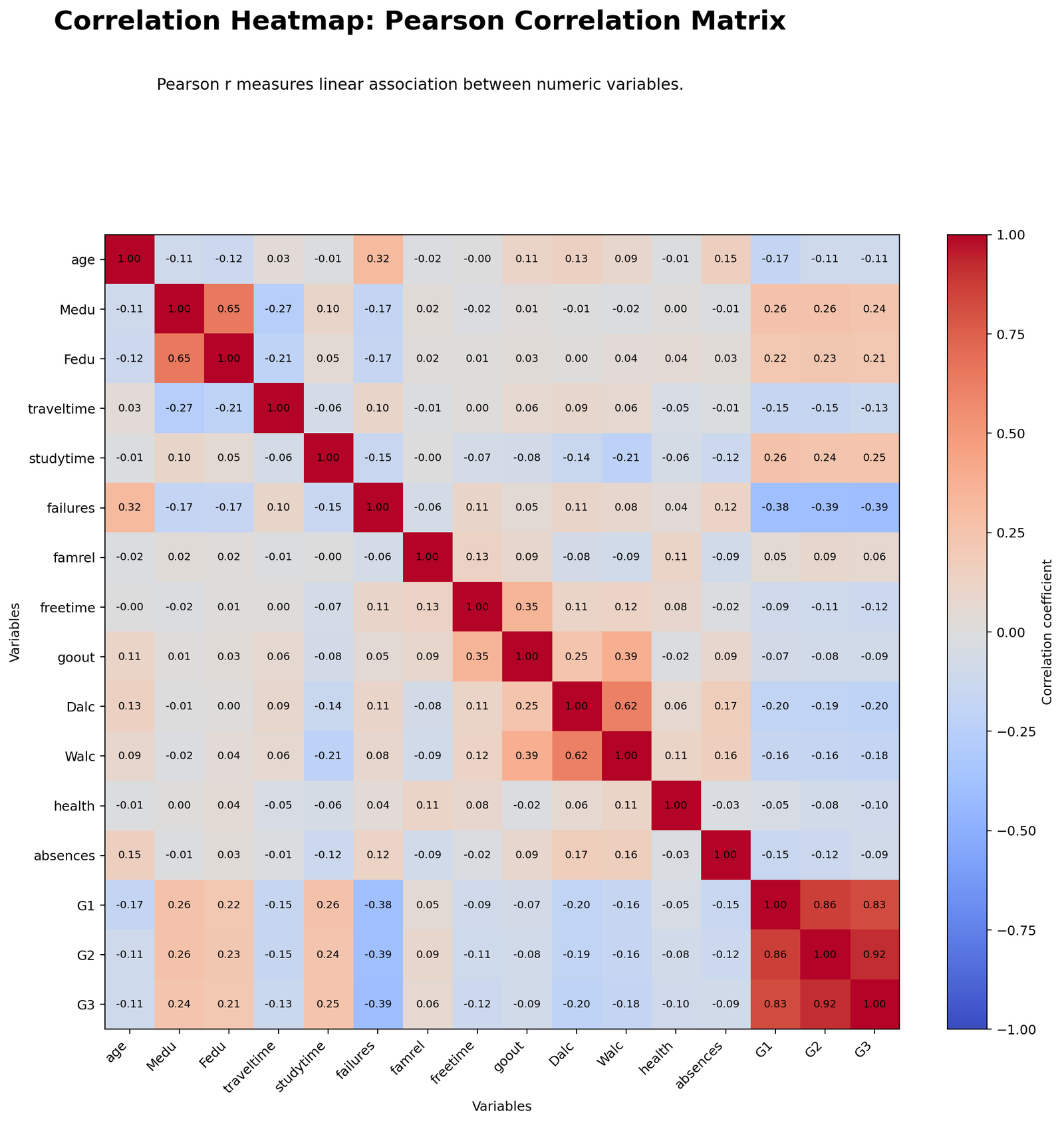
The Python Pearson heatmap shows the full linear correlation structure. The strongest positive block appears around G1, G2 and G3. The largest off-diagonal value is G2-G3, approximately 0.92. This means the second-period grade is very strongly related to the final grade.
The heatmap also shows negative relationships between failures and grade variables. These negative cells mean students with more previous failures tend to have lower grade scores.
Python Chart 2: Correlation p-value Heatmap
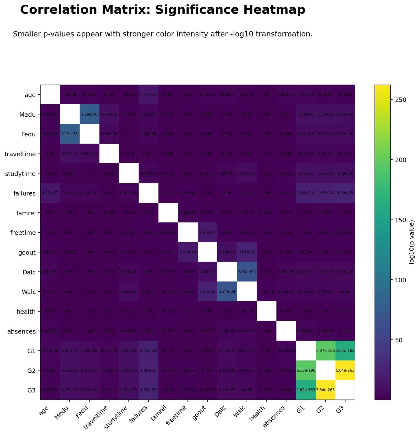
The p-value heatmap shows which Pearson correlations are statistically significant. Strong grade relationships have extremely small p-values. The chart is useful because a correlation matrix should not be interpreted only by color or coefficient size; significance testing adds evidence about whether the relationship is likely to be different from zero.
With 649 observations, even weak correlations may become statistically significant. The coefficient tells strength; the p-value tells statistical evidence.
Python Chart 3: Strongest Correlation Pairs
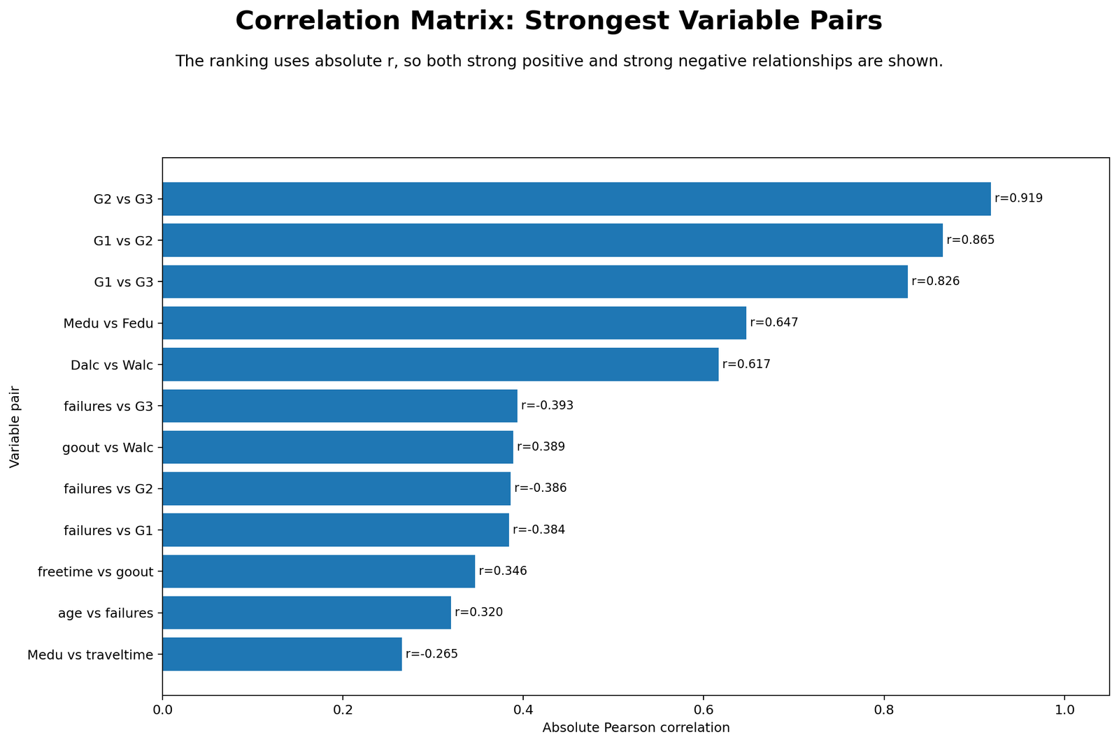
This chart ranks correlations by absolute strength. The top three pairs are G2-G3, G1-G2 and G1-G3. These are all strong positive grade relationships. The chart also includes negative relationships such as failures-G3, making it easier to identify both strong positive and strong negative patterns.
Python Chart 4: Target Variable Correlations with G3
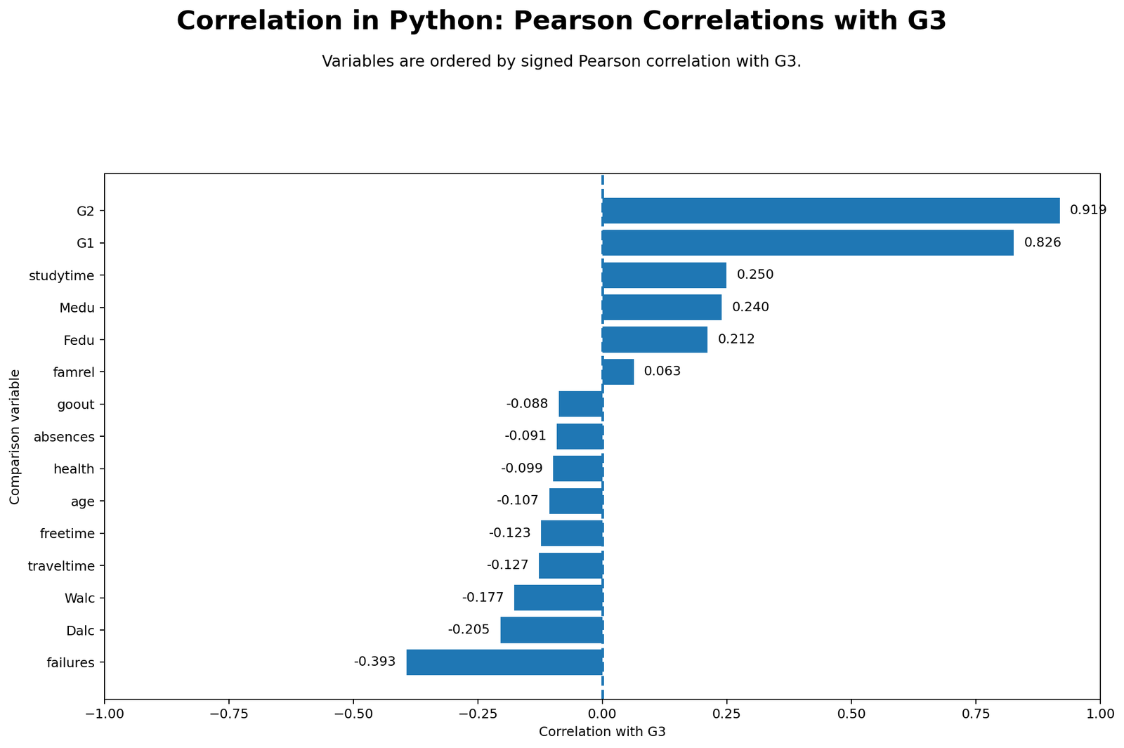
This chart focuses only on G3. The strongest positive bar is G2, followed by G1. Studytime and parental education variables are positive but much weaker. The strongest negative bar is failures, showing that prior failures are associated with lower final grades.
Python Chart 5: Pairwise Sample Size Matrix
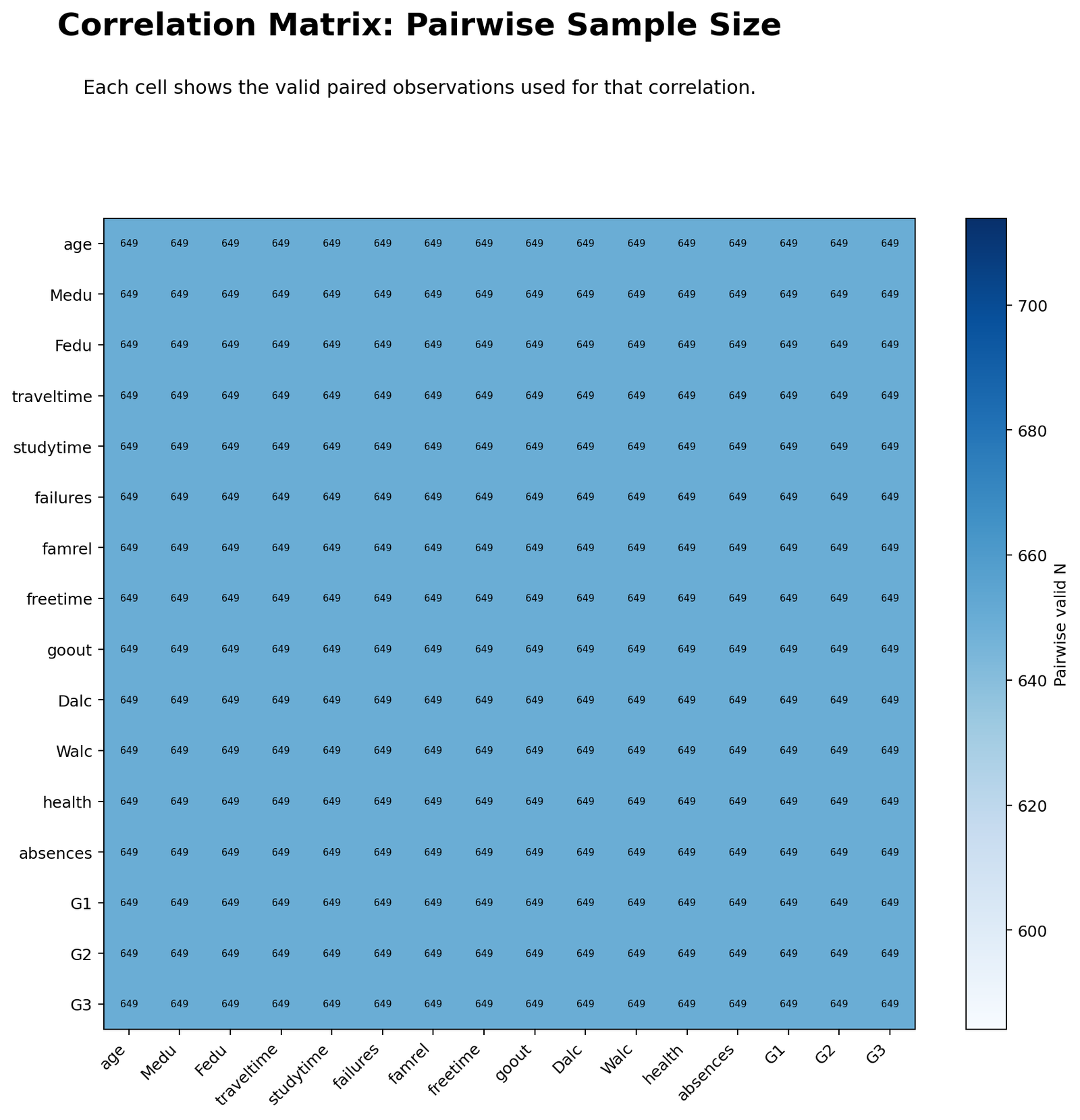
The pairwise sample size matrix confirms that each correlation used 649 valid observations. This is important because correlation matrices can become difficult to compare if some cells are based on fewer cases. Here, all displayed pairwise coefficients have the same N.
Python Chart 6: Top Correlation Scatterplot
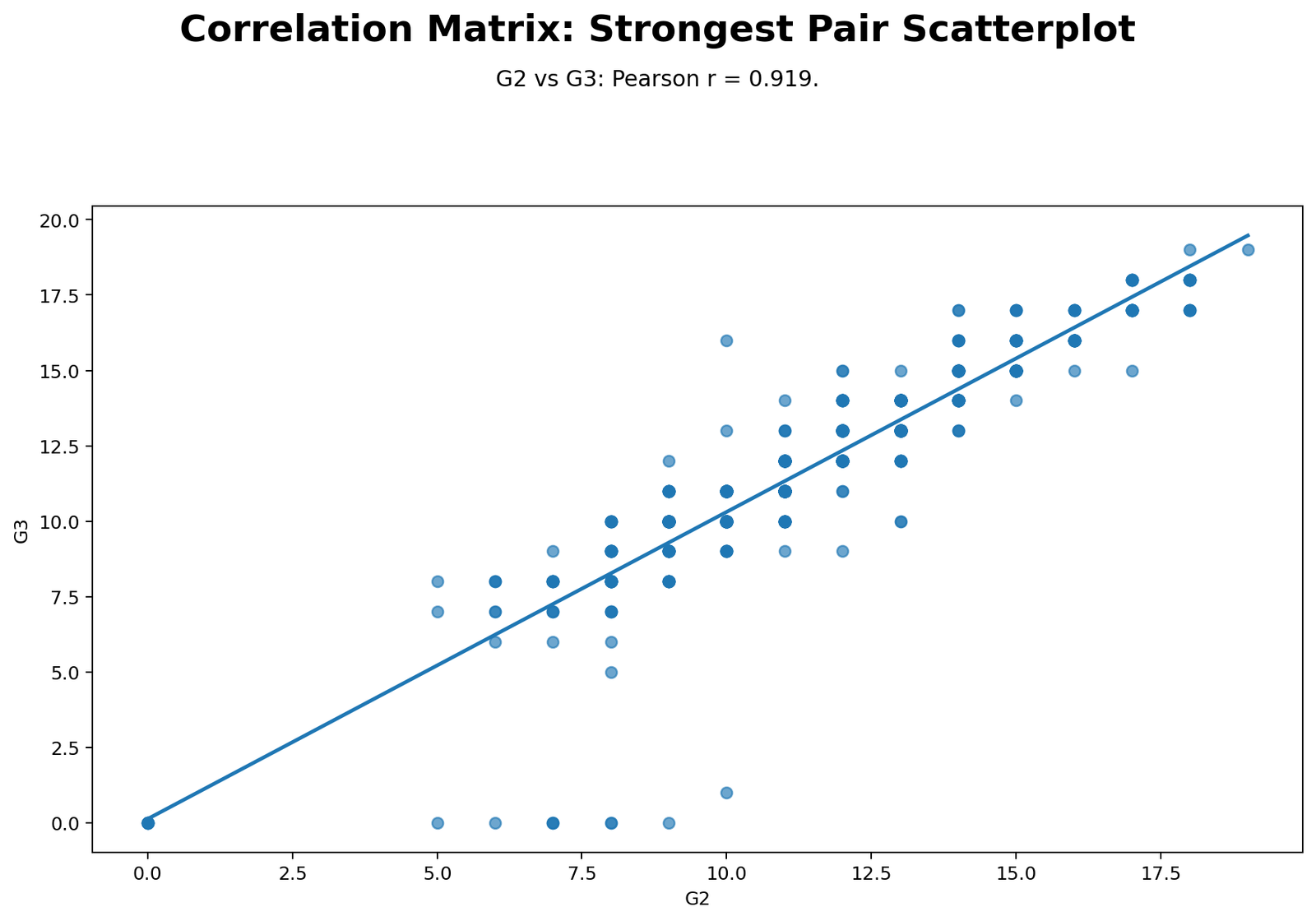
The scatterplot confirms the strongest Pearson result visually. Points rise clearly from left to right, showing a strong positive relationship between G2 and G3. The fitted line supports the reported Pearson coefficient of about 0.9185.
R Correlation Matrix Charts
The R output validates the same correlation matrix with colorful charts. It includes a Pearson heatmap, p-value heatmap, strongest-pairs chart, target-variable chart, pairwise sample-size matrix and top-pair scatterplot.
R Chart 1: Pearson Correlation Heatmap
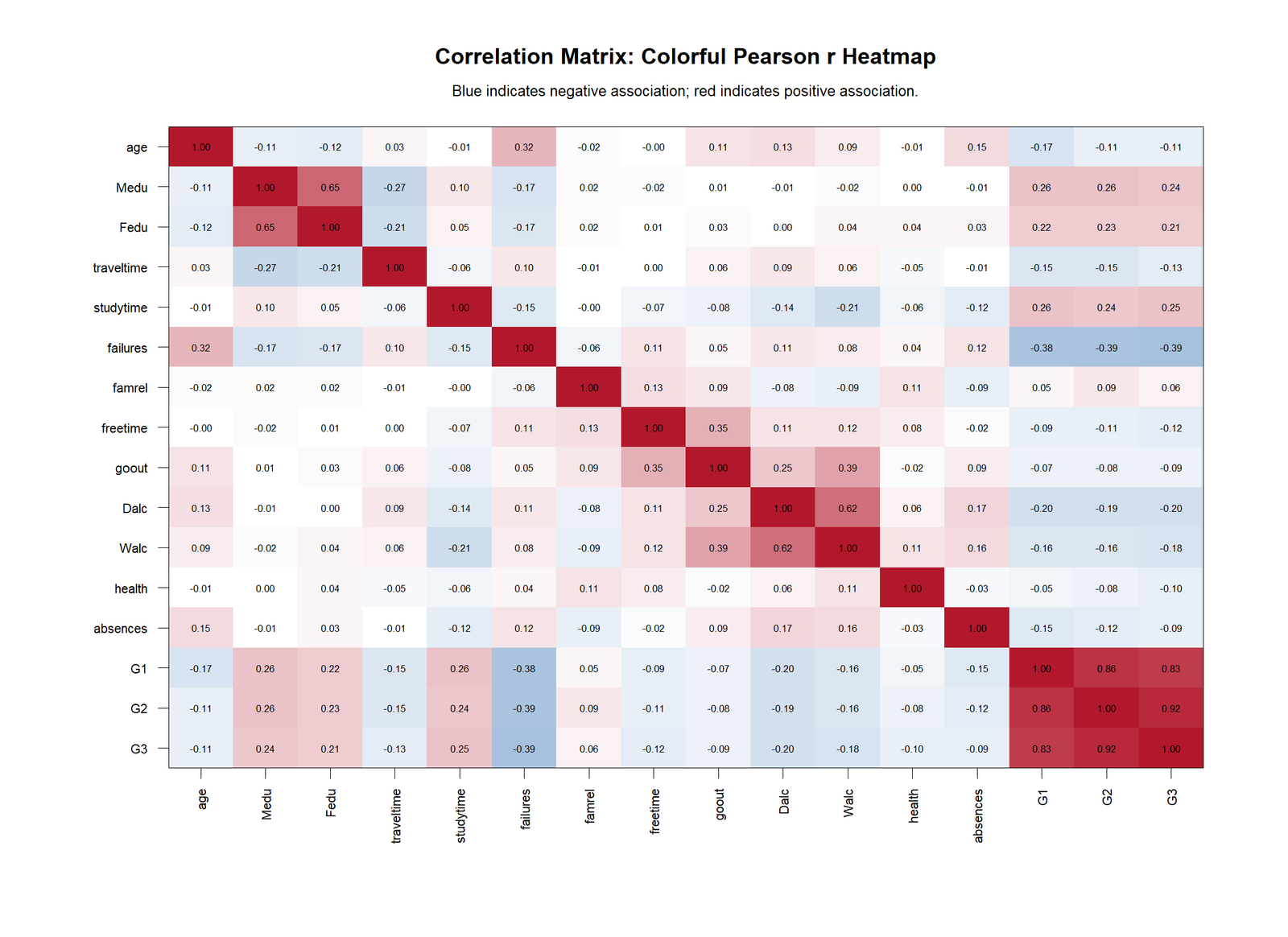
The R Pearson heatmap confirms the same main pattern as Python. The strongest cluster is formed by G1, G2 and G3. The G2-G3 value is the strongest relationship in the matrix.
R Chart 2: Correlation p-value Heatmap
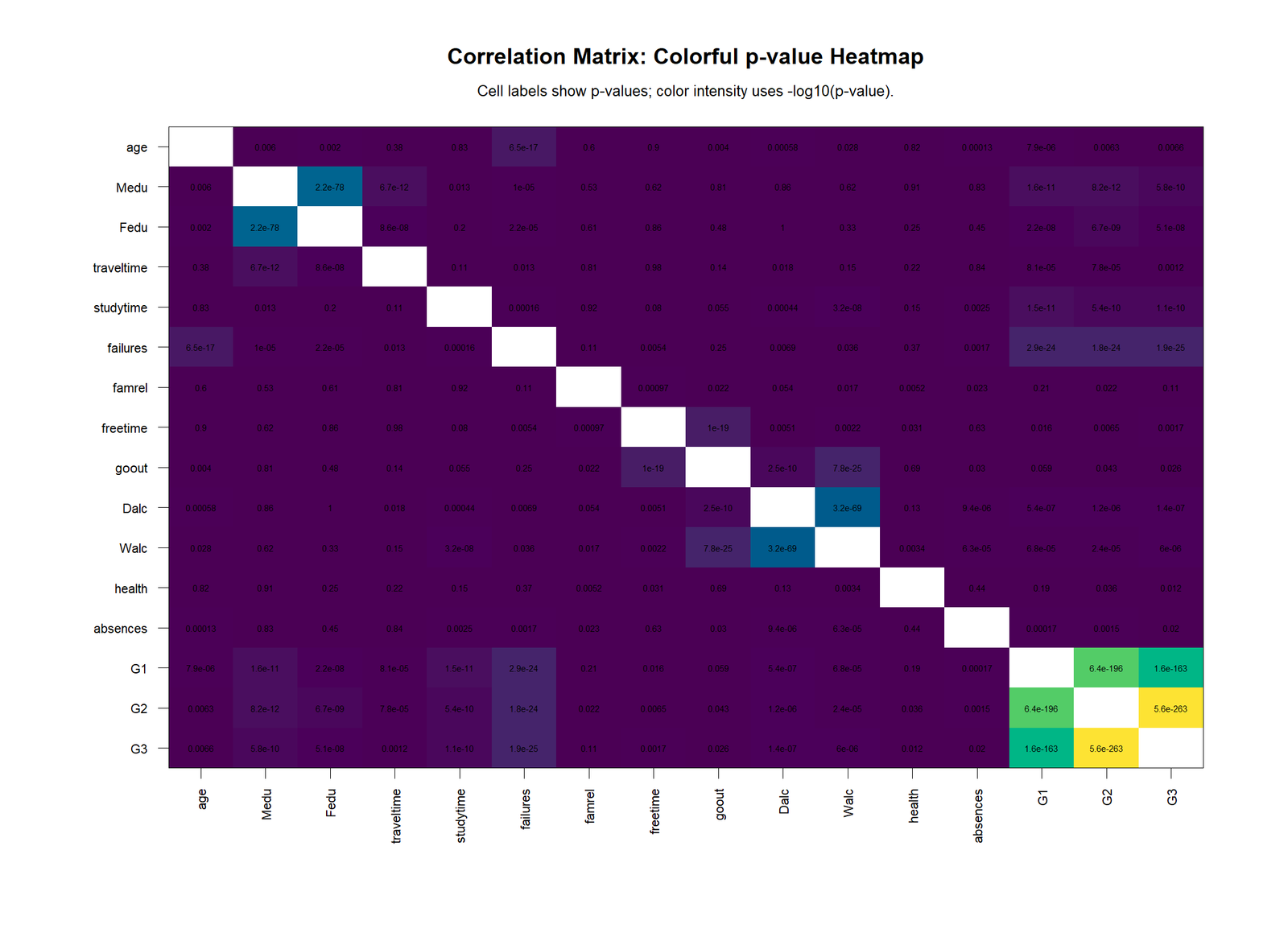
The R p-value heatmap highlights which relationships are statistically significant. The grade relationships and several academic-background relationships show very small p-values. This supports the conclusion that the main observed patterns are not random noise.
R Chart 3: Strongest Correlation Pairs

The R strongest-pairs chart makes the ranking easy to interpret. G2-G3 is first, followed by G1-G2 and G1-G3. Negative grade relationships with failures are also shown clearly.
R Chart 4: Target Variable Correlations
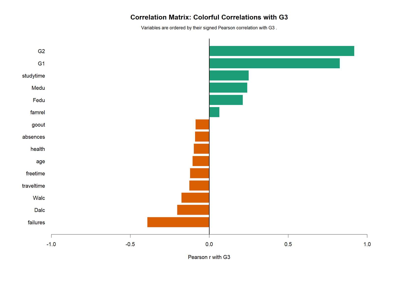
The R target-variable chart shows that G2 and G1 dominate positive correlations with G3. Failures are the strongest negative correlate. This chart is helpful for readers who care mainly about final grade rather than the entire matrix.
R Chart 5: Pairwise Sample Size Matrix
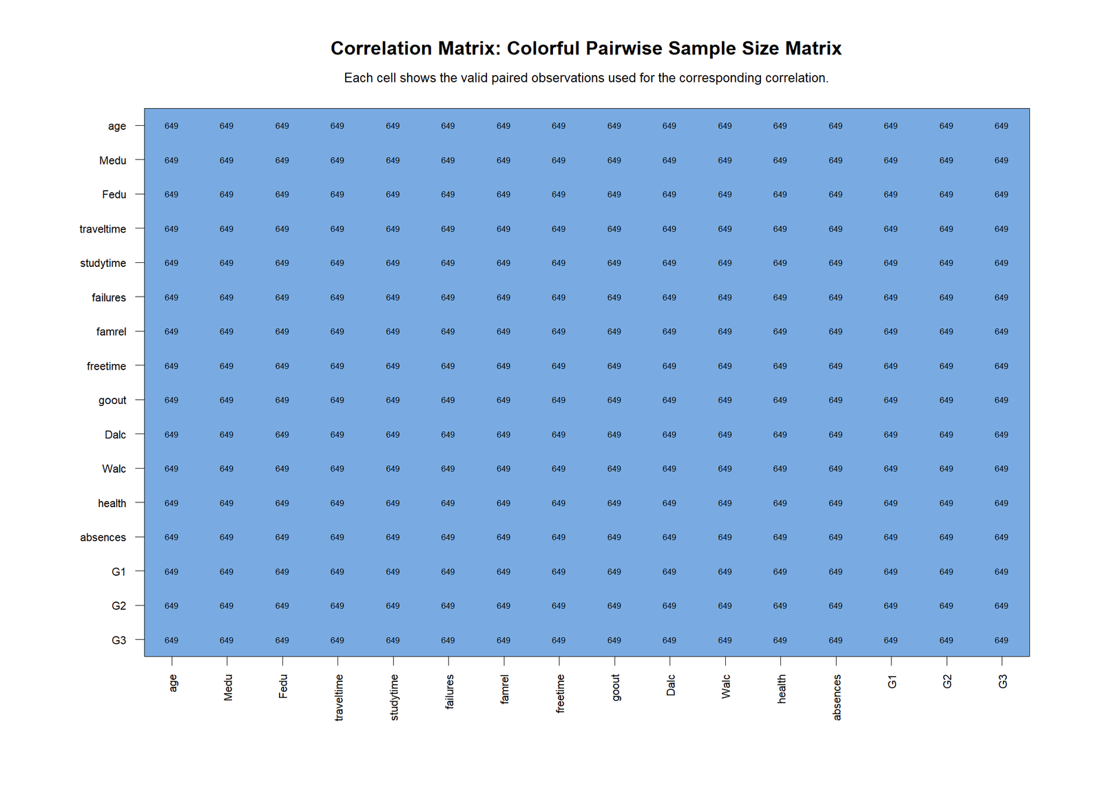
The R pairwise sample-size heatmap confirms that the same number of valid observations was used across the displayed matrix. This strengthens the comparison between coefficients because the reader is not comparing one pair based on many cases with another pair based on fewer cases.
R Chart 6: Top Correlation Scatterplot
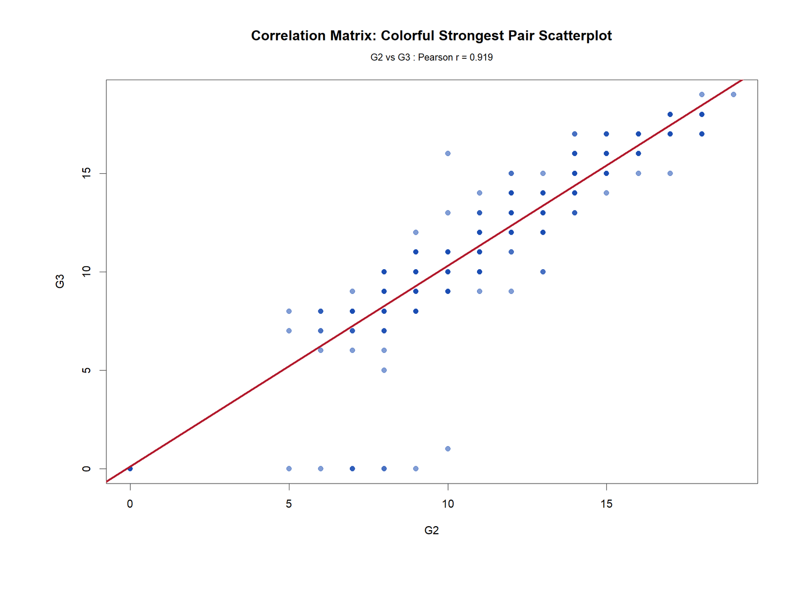
The R scatterplot validates the same strong positive relationship. The upward pattern between G2 and G3 is clear, which supports the very high Pearson coefficient. This chart is the easiest visual proof that the strongest matrix value is meaningful.
SPSS Correlation Matrix Output
The SPSS output provides a formal correlation matrix report suitable for students, assignments and thesis-style documentation. It shows Pearson correlations, significance values and valid sample sizes in the SPSS Viewer format.
Open the SPSS Correlation Matrix Output PDF
| SPSS Output Element | What It Shows | How to Interpret It |
|---|---|---|
| Pearson Correlation | The coefficient r for every variable pair. | Positive values mean variables increase together; negative values mean opposite direction. |
| Sig. 2-tailed | The p-value for the correlation test. | If p < .05, the relationship is statistically significant. |
| N | Valid paired sample size. | Shows how many observations were used for each correlation. |
| Diagonal values | Each variable correlated with itself. | Always 1.000 and not interpreted as a substantive result. |
The SPSS output should be used when a formal PDF report is needed. The interpretation remains the same as Python, R and Excel: the strongest relationship is between G2 and G3, while failures are negatively related to grades.
Excel Correlation Matrix Worked File
The Excel worked file contains the dataset, numeric data, summary statistics, correlation matrix, pairwise N matrix, p-value matrix, strongest pairs and G3-focused correlations. It is useful for students who want to see the formulas behind the matrix rather than only the finished chart.
Download the Excel Correlation Matrix Worked File
| Excel Sheet | Purpose | Why It Matters |
|---|---|---|
| README | Explains the workbook method and notes. | Helps readers understand the file structure before using formulas. |
| Dataset | Original data. | Shows the variables before analysis. |
| Numeric_Data | Numeric columns only. | Correlation matrix requires numeric variables. |
| Summary_Stats | N, missing, mean, standard deviation and quartiles. | Checks data quality before correlation. |
| Correlation_Matrix | Pearson r values. | Main matrix used for interpretation. |
| Pairwise_N | Valid sample size for each pair. | Confirms all pairs use sufficient data. |
| P_Values | Two-tailed p-values. | Shows statistical significance of each relationship. |
| Strongest_Pairs | Ranked correlation pairs. | Identifies the most important relationships quickly. |
| G3_Correlations | Target-variable view. | Focuses directly on final grade G3. |
The Excel file uses the standard Pearson correlation idea and calculates p-values using the t-test transformation:
The two-tailed p-value is then calculated from the t distribution. This makes the workbook a useful teaching file because it shows both the coefficient and its significance test.
Python, R, SPSS and Excel Workflows for Correlation Matrix
| Software | Main Steps | Best Use |
|---|---|---|
| Python | Use pandas to select numeric variables, scipy for p-values and matplotlib for heatmaps/scatterplots. | Automated reporting, chart generation and reproducible analysis. |
| R | Use cor(), cor.test(), p.adjust(), matrix reshaping and R charts. | Statistical validation and publication-style graphics. |
| SPSS | Use Analyze → Correlate → Bivariate or CORRELATIONS syntax. | Formal output tables and PDF reporting. |
| Excel | Use CORREL, COUNT, T.DIST.2T, formulas and conditional formatting. | Formula-based teaching and easy spreadsheet review. |
Code Blocks and Formulas
Python Code for Correlation Matrix
import pandas as pd
import numpy as np
from scipy import stats

df = pd.read_csv("dataset.csv")
numeric_df = df.select_dtypes(include=[np.number])

corr_matrix = numeric_df.corr(method="pearson")

cols = numeric_df.columns
pvals = pd.DataFrame(np.nan, index=cols, columns=cols)
pairwise_n = pd.DataFrame(np.nan, index=cols, columns=cols)

for x in cols:
    for y in cols:
        pair = numeric_df[[x, y]].dropna()
        pairwise_n.loc[x, y] = len(pair)
        if x != y and len(pair) >= 3:
            r, p = stats.pearsonr(pair[x], pair[y])
            pvals.loc[x, y] = p

corr_matrix.to_csv("correlation_matrix.csv")
pvals.to_csv("correlation_p_values.csv")
pairwise_n.to_csv("pairwise_sample_sizes.csv")

print(corr_matrix.round(3))
R Code for Correlation Matrix
df <- read.csv("dataset.csv", stringsAsFactors = FALSE)
numeric_df <- df[sapply(df, is.numeric)]

corr_matrix <- cor(numeric_df, use = "pairwise.complete.obs", method = "pearson")

vars <- names(numeric_df)
p_matrix <- matrix(NA, nrow = length(vars), ncol = length(vars),
                   dimnames = list(vars, vars))
n_matrix <- matrix(NA, nrow = length(vars), ncol = length(vars),
                   dimnames = list(vars, vars))

for(i in vars){
  for(j in vars){
    pair_data <- numeric_df[, c(i, j)]
    pair_data <- pair_data[complete.cases(pair_data), ]
    n_matrix[i, j] <- nrow(pair_data)

    if(i != j && nrow(pair_data) >= 3){
      test <- cor.test(pair_data[[i]], pair_data[[j]], method = "pearson")
      p_matrix[i, j] <- test$p.value
    }
  }
}

write.csv(round(corr_matrix, 6), "correlation_matrix_r.csv")
write.csv(p_matrix, "correlation_p_values_r.csv")
write.csv(n_matrix, "pairwise_sample_sizes_r.csv")

print(round(corr_matrix, 3))
SPSS Syntax for Correlation Matrix
* Correlation Matrix in SPSS.
OUTPUT CLOSE ALL.
OUTPUT NEW NAME=Correlation_Matrix_Output.

CORRELATIONS
  /VARIABLES=age Medu Fedu traveltime studytime failures famrel freetime goout Dalc Walc health absences G1 G2 G3
  /PRINT=TWOTAIL NOSIG
  /MISSING=PAIRWISE.

OUTPUT EXPORT
  /CONTENTS EXPORT=VISIBLE
  /PDF DOCUMENTFILE='Correlation-Matrix-SPSS-Output.pdf'.
Excel Formulas for Correlation Matrix
Correlation coefficient:
=CORREL(variable_x_range, variable_y_range)

Pairwise sample size:
=COUNT(variable_x_range)

t statistic for correlation:
=r*SQRT((n-2)/(1-r^2))

Two-tailed p-value:
=T.DIST.2T(ABS(t), n-2)

Decision:
=IF(p_value<0.05,"Statistically significant","Not statistically significant")
How to Report a Correlation Matrix
A correlation matrix report should describe the method, sample size, strongest positive relationships, strongest negative relationships, target-variable findings and whether p-values were tested. Do not report every cell in a large matrix. Summarize the most important patterns.
APA-style report: A Pearson correlation matrix was calculated for 16 numeric variables using 649 students. The strongest positive relationship was between G2 and G3, r = .919, indicating a very strong association between second-period grade and final grade. G1 was also strongly associated with G2, r = .865, and G3, r = .826. The strongest negative relationship involving final grade was between failures and G3, r = -.393. These results show that previous grade performance is strongly related to final grade, while previous failures are associated with lower final grade outcomes.
Important reporting note: A correlation matrix shows association, not causation. The strong relationship between G2 and G3 does not prove that G2 causes G3. It means the two grade variables move together strongly in this dataset.
Common Mistakes in Correlation Matrix Interpretation
| Mistake | Why It Is a Problem | Better Practice |
|---|---|---|
| Reporting every cell | Large matrices become unreadable. | Summarize strongest pairs and target-variable findings. |
| Ignoring p-values | A coefficient alone does not show statistical evidence. | Include a p-value matrix or significance note. |
| Ignoring sample size | Different pairs may use different valid observations. | Check the pairwise sample size matrix. |
| Confusing correlation with causation | Correlation does not prove cause and effect. | Use wording like “associated with” or “related to.” |
| Using non-numeric variables directly | Pearson correlation requires numeric data. | Select numeric variables or code categories properly. |
| Ignoring multicollinearity | Strong predictor-predictor correlations can affect regression. | Check VIF before regression modeling. |
Downloads and Resources
Download R Report PDFR correlation matrix output with colorful validation charts.
Download SPSS Output PDFFormal SPSS correlation matrix output.
Download Excel Worked FileExcel workbook with formulas, matrix, p-values and strongest pairs.
FAQs About Correlation Matrix
What is a correlation matrix?
A correlation matrix is a table that shows the correlation coefficient between every pair of numeric variables. It helps identify strong positive, strong negative and weak relationships.
What is the strongest correlation in this report?
The strongest correlation is between G2 and G3, with r = 0.918548. This is a very strong positive relationship.
How do I interpret negative values in a correlation matrix?
A negative value means one variable tends to decrease as the other increases. In this report, failures are negatively related to G3 final grade.
Can Excel create a correlation matrix?
Yes. Excel can create a correlation matrix using the CORREL function, Data Analysis ToolPak or formulas. The worked file in this guide includes formulas for r, p-values and decisions.
What is the difference between a correlation matrix and p-value matrix?
The correlation matrix shows the size and direction of relationships. The p-value matrix shows whether each relationship is statistically significant.
Does a correlation matrix prove causation?
No. A correlation matrix shows association only. It does not prove cause and effect.

