
Descriptive Statistics Guide
Five Number Summary is a core descriptive statistics method used to summarize a numeric variable with five values: minimum, first quartile, median, third quartile and maximum. This complete guide explains the five-number summary, IQR, outlier fences, boxplots, R charts, Python charts, SPSS output and Excel workflow using student performance data.
Quick Answer: Five Number Summary Result
Five Number Summary means describing a numeric distribution using minimum, Q1, median, Q3 and maximum. In this worked example, the student performance dataset contains 649 valid rows. The final grade variable G3 has a minimum of 0, Q1 of 10, median of 12, Q3 of 14, maximum of 19, and IQR of 4.
Main finding: The final grade variable is centered around a median of 12. The middle 50% of G3 scores fall between 10 and 14, because Q1 = 10 and Q3 = 14. The IQR is 4, which means the central half of students are spread across a four-point grade interval. The full range is wider, from 0 to 19, because a small number of very low scores appear in the lower tail.
Important interpretation note: A five-number summary is descriptive, not inferential. It describes the sample distribution and helps identify center, spread, skewness and unusual values. It does not prove statistical significance. If group differences need formal testing, continue with a t test, ANOVA, nonparametric test, confidence interval, or effect-size analysis after reading the five-number summary.
Table of Contents
- What is Five Number Summary?
- Five Number Summary Formula and Logic
- Five Number Summary and Statistical Decision Logic
- Dataset and Variables Used
- Verified Five Number Summary Results
- Chart-by-Chart Interpretation
- R Code for Five Number Summary
- Python Code for Five Number Summary
- SPSS Syntax and Interpretation
- Excel Method
- Download Output and Resources
- APA Style Reporting
- When Should You Use Five Number Summary?
- References and Related Guides
- FAQs
What Is Five Number Summary?
Five Number Summary is a descriptive statistics method that summarizes the distribution of a numeric variable using five values: minimum, first quartile, median, third quartile and maximum. These values show where the data starts, where the lower quarter ends, where the middle value lies, where the upper quarter begins and where the data ends.
The five-number summary is strongly connected with box plot interpretation because a boxplot is a visual display of the same logic. The box usually represents Q1 to Q3, the line inside the box represents the median, and the whiskers or points show the lower and upper ends of the distribution.
Five-number summary is especially useful when a variable is skewed or has outliers. A mean can be pulled toward extreme values, but the median and quartiles are more robust. This is why it is often reported together with IQR when the data are not perfectly symmetric. Before formal tests such as the one-tailed t-test, one-sample z-test, or confidence interval, the five-number summary gives a clear picture of the sample distribution.
Simple meaning: Five-number summary tells you the lowest value, lower quartile, middle value, upper quartile and highest value. It is one of the best ways to summarize spread and outliers without relying only on the mean.
Five Number Summary Formula and Logic
The logic of the five-number summary begins by sorting the numeric values from smallest to largest. Once the values are ordered, the minimum, Q1, median, Q3 and maximum can be identified. The IQR and outlier fences can then be calculated from Q1 and Q3.
Five Number Summary:

Minimum:
Smallest observed value

Q1:
First quartile; about 25% of observations are at or below Q1

Median:
Middle value; about 50% of observations are at or below the median

Q3:
Third quartile; about 75% of observations are at or below Q3

Maximum:
Largest observed value

Interquartile range:
IQR = Q3 - Q1

Outlier fences:
Lower fence = Q1 - 1.5 × IQR
Upper fence = Q3 + 1.5 × IQR
The interquartile range is the spread of the middle 50% of the data. In this example, G3 has Q1 = 10 and Q3 = 14, so IQR = 4. This means the central half of final grades fall within a four-point band. The IQR is more resistant to outliers than the full range because it ignores the lowest 25% and highest 25% of values.
| Five-number element | Meaning | Example from this post |
|---|---|---|
| Minimum | Smallest observed value | G3 minimum = 0 |
| Q1 | Lower quartile; 25% of values are at or below this point | G3 Q1 = 10 |
| Median | Middle value of the ordered data | G3 median = 12 |
| Q3 | Upper quartile; 75% of values are at or below this point | G3 Q3 = 14 |
| Maximum | Largest observed value | G3 maximum = 19 |
| IQR | Spread of the middle 50% | G3 IQR = 4 |
| Outlier fence | Rule for identifying unusual values | Used strongly for absences because absences are right-skewed |
Five Number Summary and Statistical Decision Logic
Five-number summary does not use null and alternative hypotheses because it is not a hypothesis test. However, it supports statistical decision-making by showing whether a variable is skewed, whether outliers exist, whether the median is stable, and whether groups differ descriptively before formal testing.
| Five-number finding | What it suggests | Possible next method |
|---|---|---|
| Median and quartiles are clear | The distribution can be summarized robustly | Report median and IQR with boxplot |
| Minimum is far below Q1 | Possible low-end unusual values | Review outliers, boxplot, and Q-Q plot normality check |
| Large IQR | High middle-spread variability | Use IQR comparison and coefficient of variation if relative spread matters |
| Absences have high upper outliers | Right-skewed count variable | Use median/IQR, transformation, or robust methods |
| Grouped boxplots differ | Groups may differ descriptively | Continue with t test, ANOVA, effect size, or nonparametric test |
Five-number summary workflow logic:

1. Sort the numeric values.
2. Find minimum, Q1, median, Q3 and maximum.
3. Calculate IQR as Q3 - Q1.
4. Calculate outlier fences if needed.
5. Use boxplots to compare distributions visually.
6. Choose formal tests only after understanding distribution shape.
Assumption note: Do not call a median difference statistically significant from a boxplot alone. The five-number summary shows the pattern, but a formal statistical test is required for significance.
Dataset and Variables Used
This guide uses the student-por.csv student performance dataset with 649 rows. The analysis focuses on numeric variables such as G1, G2, G3 and absences. Grouped five-number summaries are also created by school, sex and study time so that the final grade distribution can be compared across meaningful student groups.
| Item | Variable | Role in this five-number summary guide |
|---|---|---|
| First period grade | G1 | Compared with G2 and G3 using boxplots and five-number values. |
| Second period grade | G2 | Used to compare grade distribution before the final grade. |
| Final grade | G3 | Main outcome variable for minimum, Q1, median, Q3, maximum and IQR. |
| Absences | absences | Used to show skewness and outlier-fence interpretation. |
| School group | school | Used to compare G3 five-number structure by school. |
| Sex | sex | Used to compare G3 five-number structure by female and male students. |
| Study time | studytime | Used to compare G3 distribution across study-time categories. |
External dataset source: UCI Machine Learning Repository: Student Performance dataset.
Verified Five Number Summary Results
The analysis created five-number summary tables, IQR comparisons, grouped boxplots, outlier-fence charts, R output, Python output and SPSS output. The most important verified results are summarized below.
| Variable / output | Verified result | Interpretation |
|---|---|---|
| Valid cases | 649 rows | The five-number summary was calculated on 649 student records. |
| G3 minimum | 0 | The lowest observed final grade is 0. |
| G3 Q1 | 10 | About 25% of students scored 10 or below. |
| G3 median | 12 | The middle final grade is 12. |
| G3 Q3 | 14 | About 75% of students scored 14 or below. |
| G3 maximum | 19 | The highest observed final grade is 19. |
| G3 IQR | 4 | The middle 50% of final grades fall between 10 and 14. |
| Absences IQR | 6 | Absences have greater middle-spread variability than the grade variables. |
| G3 by school | GP median ≈ 13; MS median ≈ 11 | GP students show a higher typical final grade than MS students. |
| G3 by study time | Higher study-time groups show higher medians | Final-grade center improves descriptively with higher study time. |
The SPSS output confirms the same five-number summary logic through Explore tables, percentiles and boxplots. The SPSS PDF should be used as the formal output file, while the R and Python figures should be used for visual explanation in the WordPress post and student report.
Chart-by-Chart Interpretation of the Five Number Summary Analysis
This section explains every uploaded R and Python chart in detail. The Python charts use corrected non-overlapping title spacing, while the R charts provide the same five-number summary logic in another software environment. Together, the R and Python charts confirm the same descriptive results.
Chart 1: G3 Final Grade Five Number Summary Boxplot
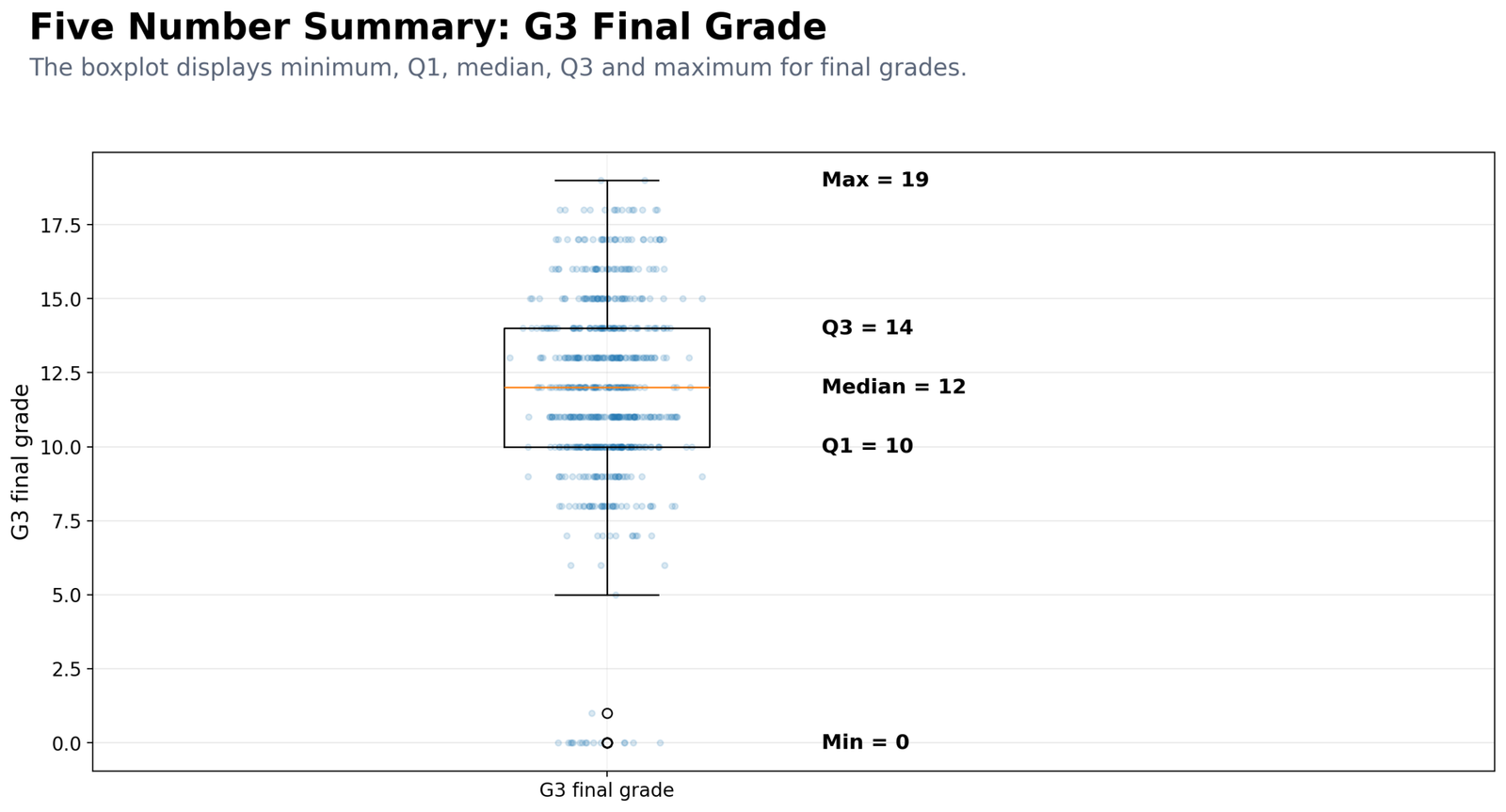
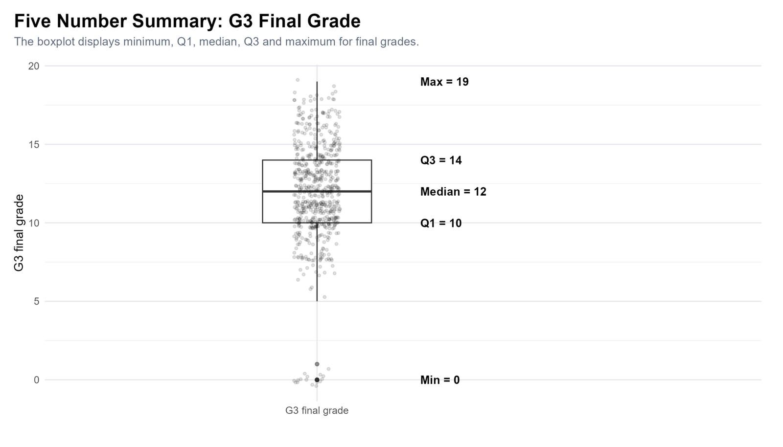
Specific interpretation: The G3 final grade boxplot shows the five-number summary directly. The minimum is 0, Q1 is 10, the median is 12, Q3 is 14, and the maximum is 19. The box begins at Q1 and ends at Q3, so the middle 50% of final grades fall between 10 and 14. The median line at 12 shows that half of students scored 12 or below and half scored 12 or above.
The lower part of the chart is important because the minimum value of 0 is far below the central box. This tells us that the lowest observed score is not representative of the typical student. The typical grade is better described by the median and IQR. The upper end reaches 19, showing high-performing students, but the upper side is not as visually separated from the main distribution as the lowest values.
Why this chart matters: It gives the full five-number result in one visual. It is stronger than only reporting the mean because it shows central location, spread, lower-end unusual scores and the upper grade limit at the same time.
Decision from Chart 1: Report G3 with median = 12 and IQR = 4. Include the full five-number summary as minimum = 0, Q1 = 10, median = 12, Q3 = 14 and maximum = 19. Mention that very low scores exist but the central half of students fall between 10 and 14.
Chart 2: Boxplot of G1, G2 and G3
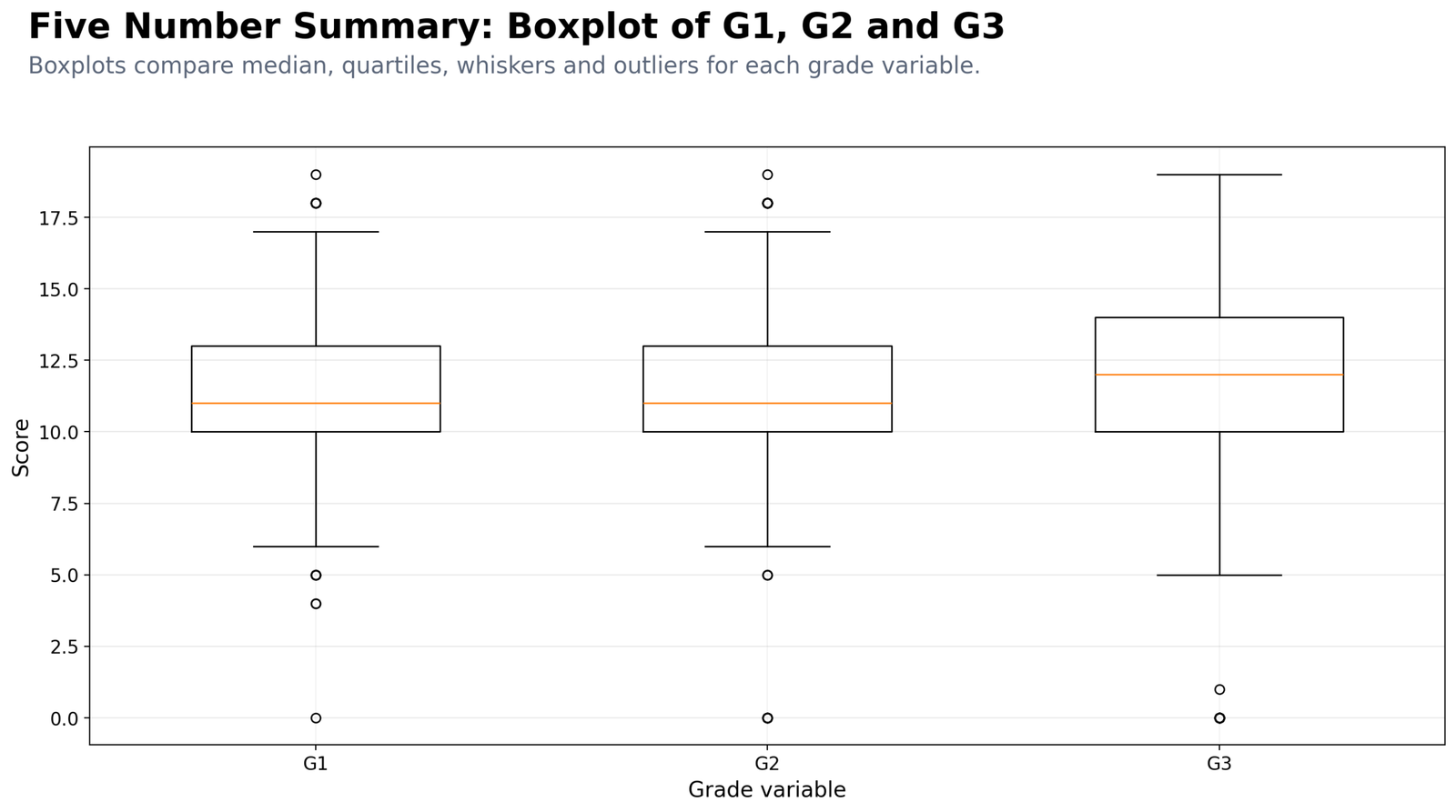
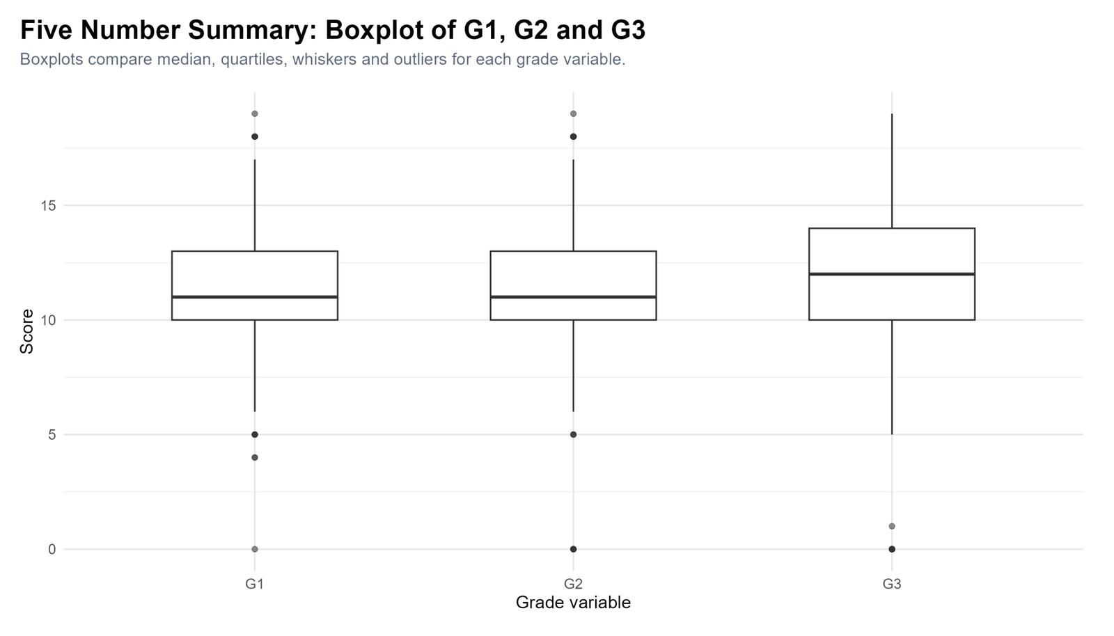
Specific interpretation: The G1, G2 and G3 boxplots show that the three grade variables have similar overall ranges, but G3 has a slightly higher center. G1 and G2 have median values around 11, while G3 has a median of 12. This suggests that the final grade distribution is slightly shifted upward compared with the earlier grade periods.
G1 and G2 have Q1 around 10 and Q3 around 13, giving an IQR of about 3. G3 has Q1 around 10 and Q3 around 14, giving an IQR of 4. This means the middle 50% of final grades are slightly more spread out than the middle 50% of G1 and G2 scores. Low-end values are visible across the grade variables, showing that some students performed far below the central group.
Why this chart matters: It compares three related numeric variables without hiding the distribution shape. Instead of only saying G3 has a higher median, the chart shows the quartiles, whiskers and low-end unusual values for each grade period.
Decision from Chart 2: Report that G3 has the highest median among the three grade variables and a slightly wider IQR. G1 and G2 are similar, while G3 shows a small upward shift in the final-grade distribution.
Chart 3: Min, Q1, Median, Q3 and Max Comparison for G1, G2 and G3
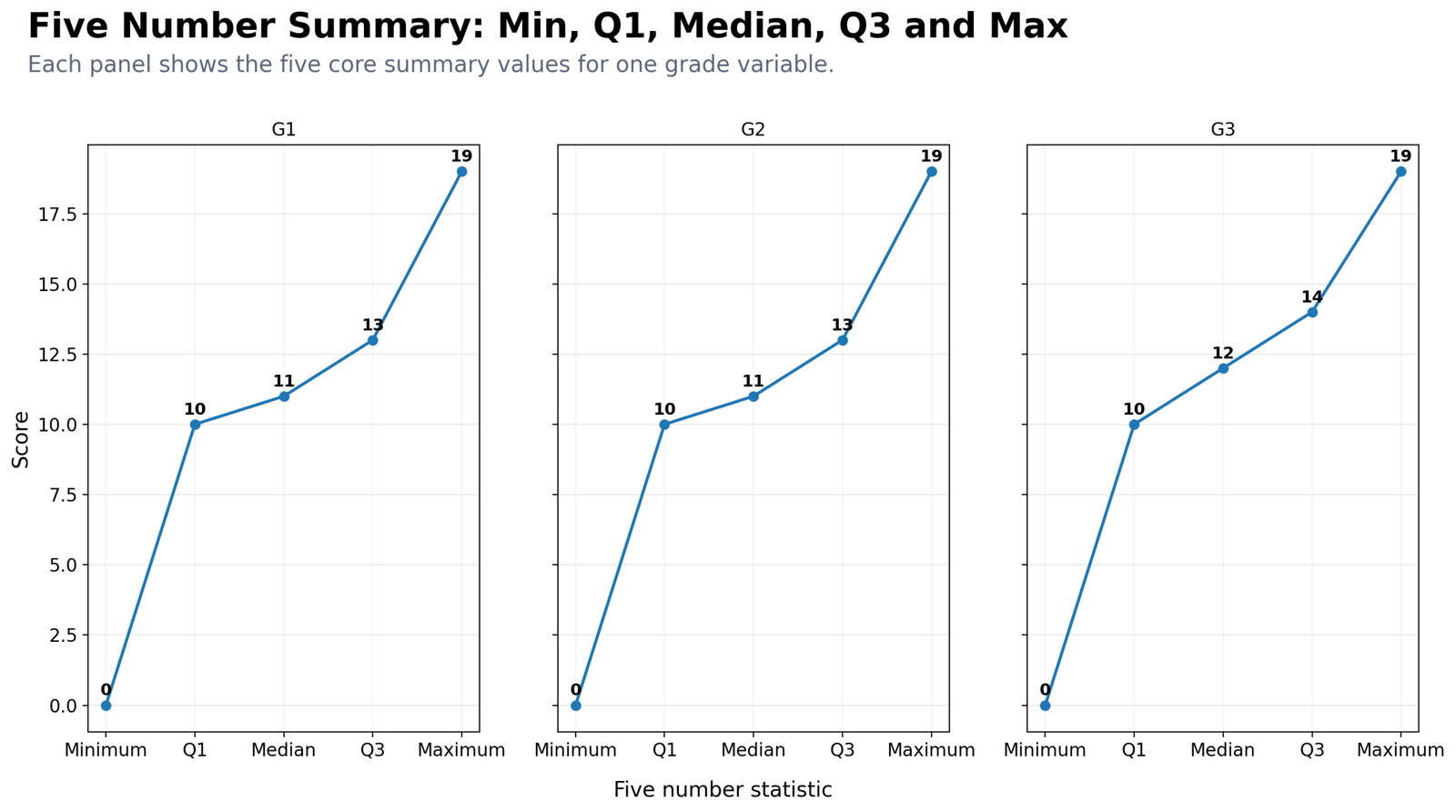
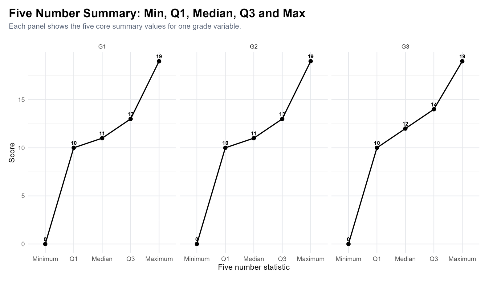
Specific interpretation: This chart labels the five-number values directly for G1, G2 and G3. G1 has minimum 0, Q1 10, median 11, Q3 13 and maximum 19. G2 follows the same structure: minimum 0, Q1 10, median 11, Q3 13 and maximum 19. G3 changes slightly, with minimum 0, Q1 10, median 12, Q3 14 and maximum 19.
The key improvement is visible at the median and Q3 levels. The minimum and maximum are the same across all three grade variables, but G3 rises in the middle and upper-middle part of the distribution. This means the final grade does not simply have the same pattern as G1 and G2; it has a slightly stronger central and upper-quartile outcome.
Why this chart matters: Some readers find exact quartile values difficult to extract from a boxplot. This panel makes the exact numbers clear and easy to report. It is especially useful for a blog post because it teaches the meaning of each five-number component.
Decision from Chart 3: Report that G1 and G2 share the same five-number structure, while G3 improves at the median and Q3 levels. The final-grade median is 12 and the final-grade Q3 is 14.
Chart 4: IQR Comparison Across Numeric Variables
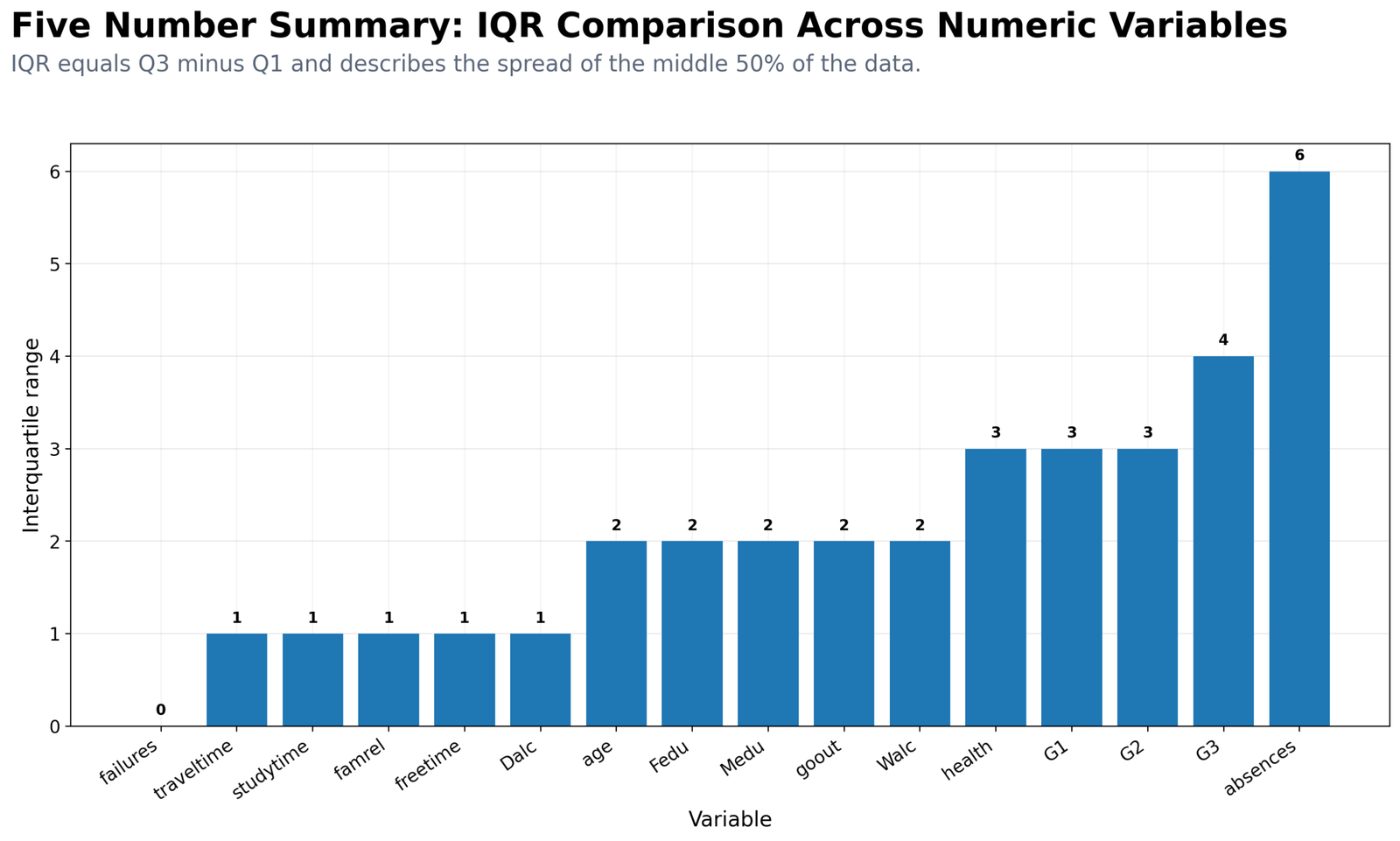
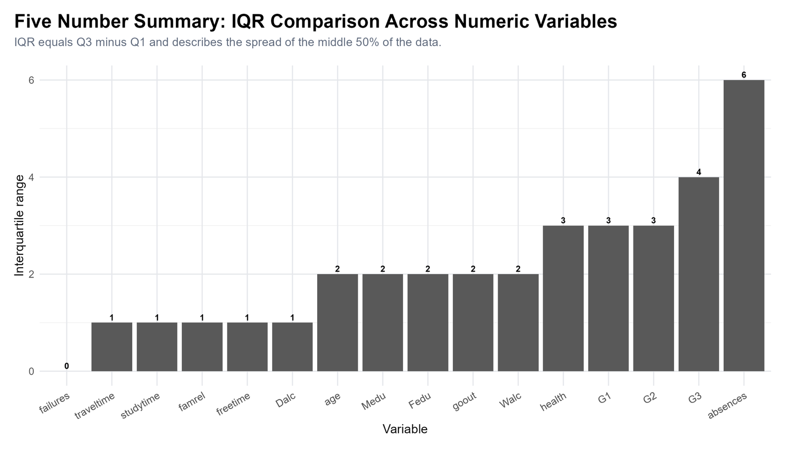
Specific interpretation: The IQR comparison chart shows which numeric variables have the largest spread in the middle 50% of values. Absences has the largest IQR at about 6. This means the central half of absence values varies more than the central half of most other numeric variables. G3 has an IQR of 4, while G1 and G2 each have an IQR of about 3.
Several ordinal variables have smaller IQR values because they are measured on short category scales. A small IQR does not mean a variable is useless; it means most observations are concentrated in a narrow middle range. For example, variables such as studytime, traveltime, health or family relationship quality naturally have limited response categories, so their IQR values are smaller than count or grade variables.
Why this chart matters: IQR is a robust spread measure. Unlike the range, it does not become large only because of a few extreme values. This chart shows that absences has the widest middle spread and deserves careful interpretation, while G3 is the most spread-out of the grade variables in the middle 50%.
Decision from Chart 4: Report that absences has the greatest middle-spread variability. For grades, report that G3 has a larger IQR than G1 and G2, showing more central spread in final grades.
Chart 5: G3 Distribution with Five Number Lines
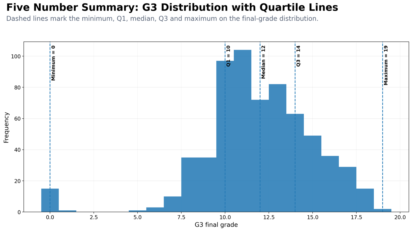
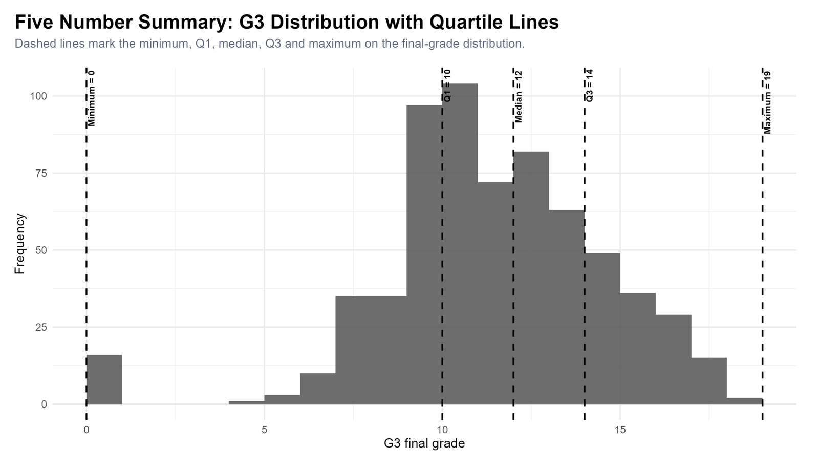
Specific interpretation: This chart places the five-number summary directly on the G3 histogram. The minimum line is at 0, Q1 is at 10, the median is at 12, Q3 is at 14 and the maximum is at 19. The tallest parts of the histogram are concentrated around the middle grade range, which confirms that most students score near the center rather than near the extreme ends.
The histogram explains why the minimum should not be treated as typical. A value of 0 is part of the observed range, but most students are not close to 0. The median and quartiles provide a better description of typical performance. The distance between Q1 and Q3 shows the middle 50% of students, while the full range shows the extreme endpoints.
Why this chart matters: It connects the table result to the actual shape of the distribution. The boxplot gives a compact summary, while this histogram shows where students are most concentrated and how the five summary lines sit inside the distribution.
Decision from Chart 5: Report the five-number summary and explain that most G3 scores cluster between Q1 = 10 and Q3 = 14. Add that the minimum value is much lower than the central cluster, so median and IQR should be emphasized in the interpretation.
Chart 6: Absences Five Number Summary and Outlier Fence
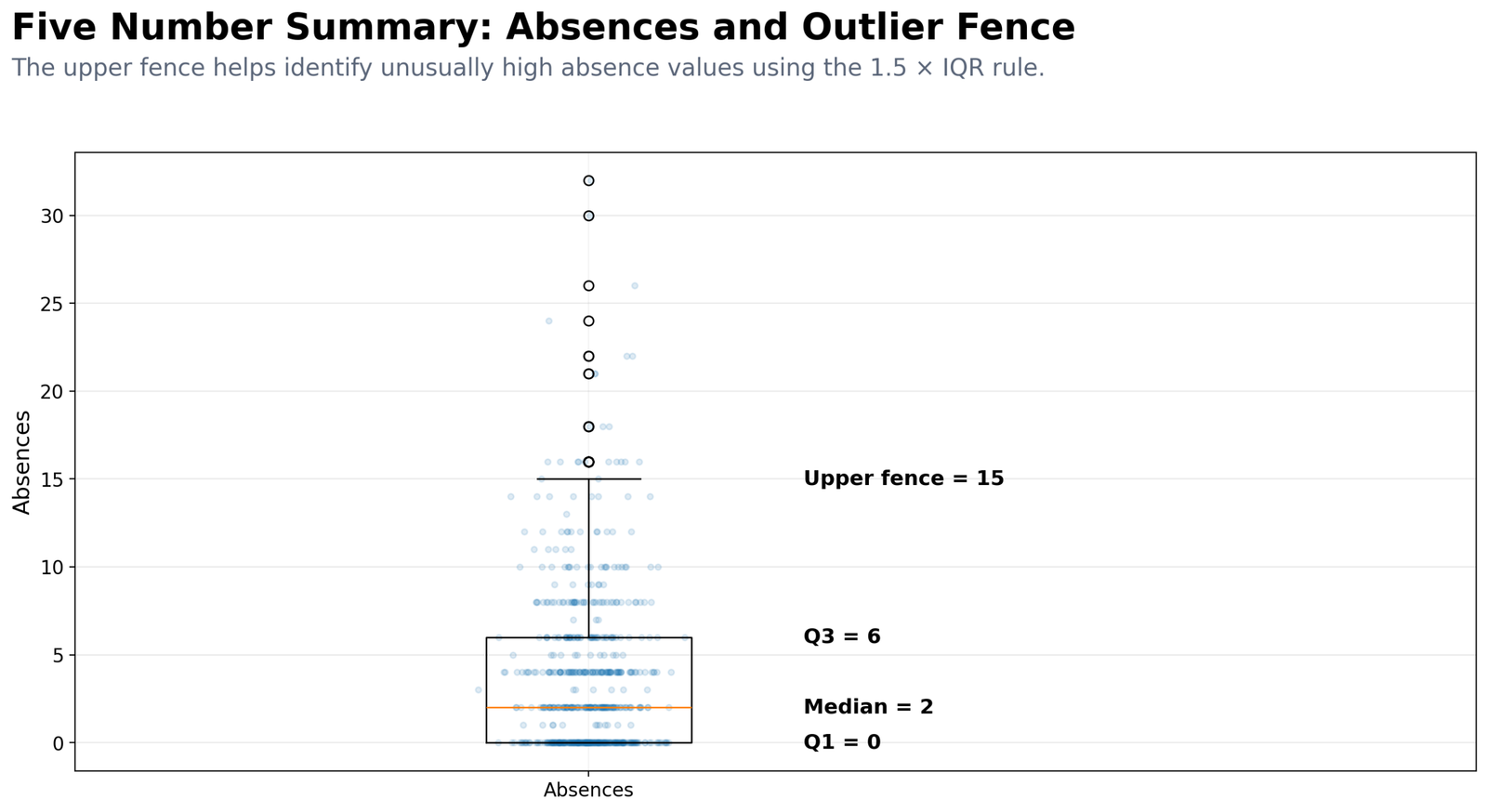
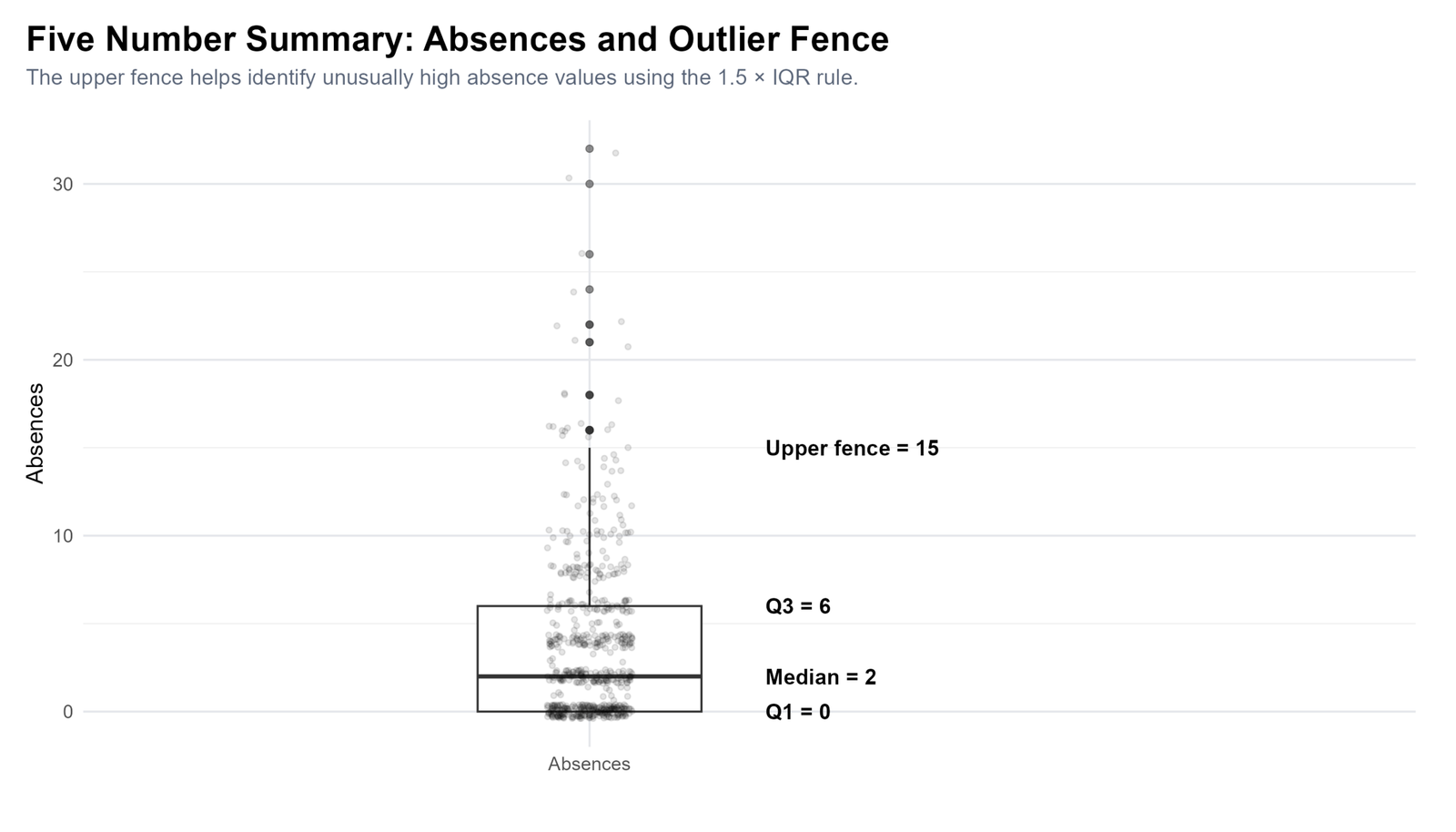
Specific interpretation: The absences chart shows why five-number summary is valuable for skewed variables. Absences have Q1 around 0, median around 2 and Q3 around 6. This means at least 25% of students have zero absences, the middle student has about 2 absences, and 75% of students have 6 or fewer absences.
The upper outlier fence is around 15. This comes from Q3 + 1.5 × IQR. Since the IQR is about 6, the upper fence is 6 + 1.5 × 6 = 15. Values above 15 are flagged as possible high outliers. The chart shows several students above this boundary, including very high absence values in the 20s and 30s.
Why this chart matters: It demonstrates outlier detection clearly. Instead of simply saying absences are skewed, the chart shows the quartiles, median and fence used to identify unusually high absence values.
Decision from Chart 6: Report absences with median and IQR rather than mean alone. A strong statement is: absences were right-skewed, with median about 2, Q1 about 0, Q3 about 6, IQR about 6, and several high outliers above the upper fence of 15.
Chart 7: G3 Five Number Summary by School
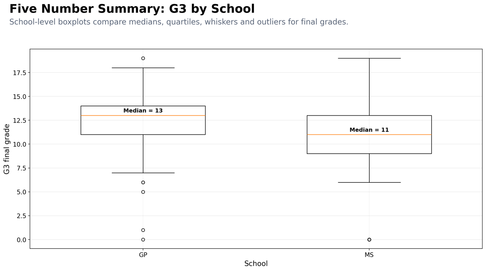
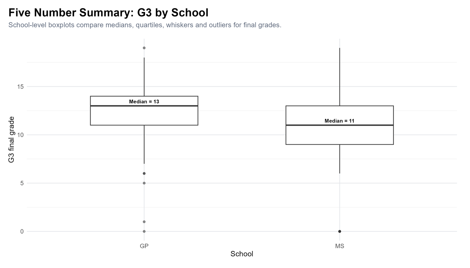
Specific interpretation: The school-level boxplot compares G3 final grade distributions for GP and MS. GP has a higher median, around 13, while MS has a lower median, around 11. This means the typical final grade is higher for GP students than for MS students in this sample.
The GP distribution is shifted upward compared with MS. The central box for GP sits higher, which means the difference is not only visible at the median but also across much of the middle 50% of students. MS has a lower central distribution and appears to contain more lower grade values.
Why this chart matters: It shows how a five-number summary can be used for group comparison. Instead of only comparing means, the chart compares medians, quartiles, whiskers and outliers. This gives a fuller view of school-level performance.
Decision from Chart 7: Report that GP has a higher G3 median than MS. This is a descriptive difference and should not be called statistically significant unless a formal test is run.
Chart 8: G3 Five Number Summary by Sex
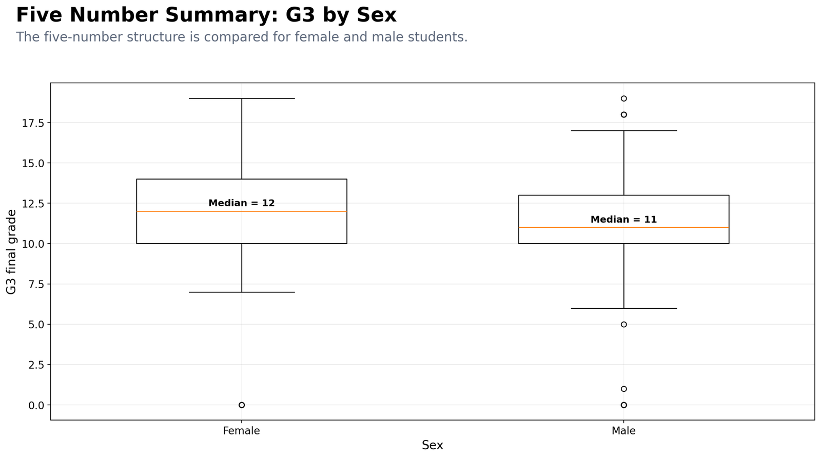
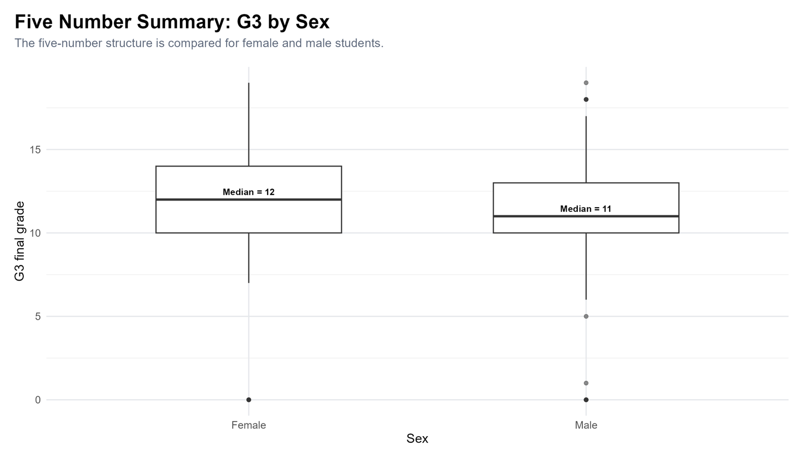
Specific interpretation: The sex-based boxplot compares G3 final grade distributions for female and male students. Female students have a median around 12, while male students have a median around 11. This shows a small descriptive difference in typical final-grade performance.
The boxes overlap substantially, which means the difference should not be exaggerated. Many female and male students share similar grade ranges. However, the female median is slightly higher, and the central distribution appears somewhat stronger for female students. Male students show more low-end values, which can affect the overall distribution.
Why this chart matters: It prevents overreliance on a single average. The chart shows the degree of overlap and the spread within each sex group. This is important because a difference in medians can exist even when group distributions overlap widely.
Decision from Chart 8: Report that female students have a slightly higher G3 median than male students, but the group distributions overlap, so the practical difference appears modest.
Chart 9: G3 Five Number Summary by Study Time
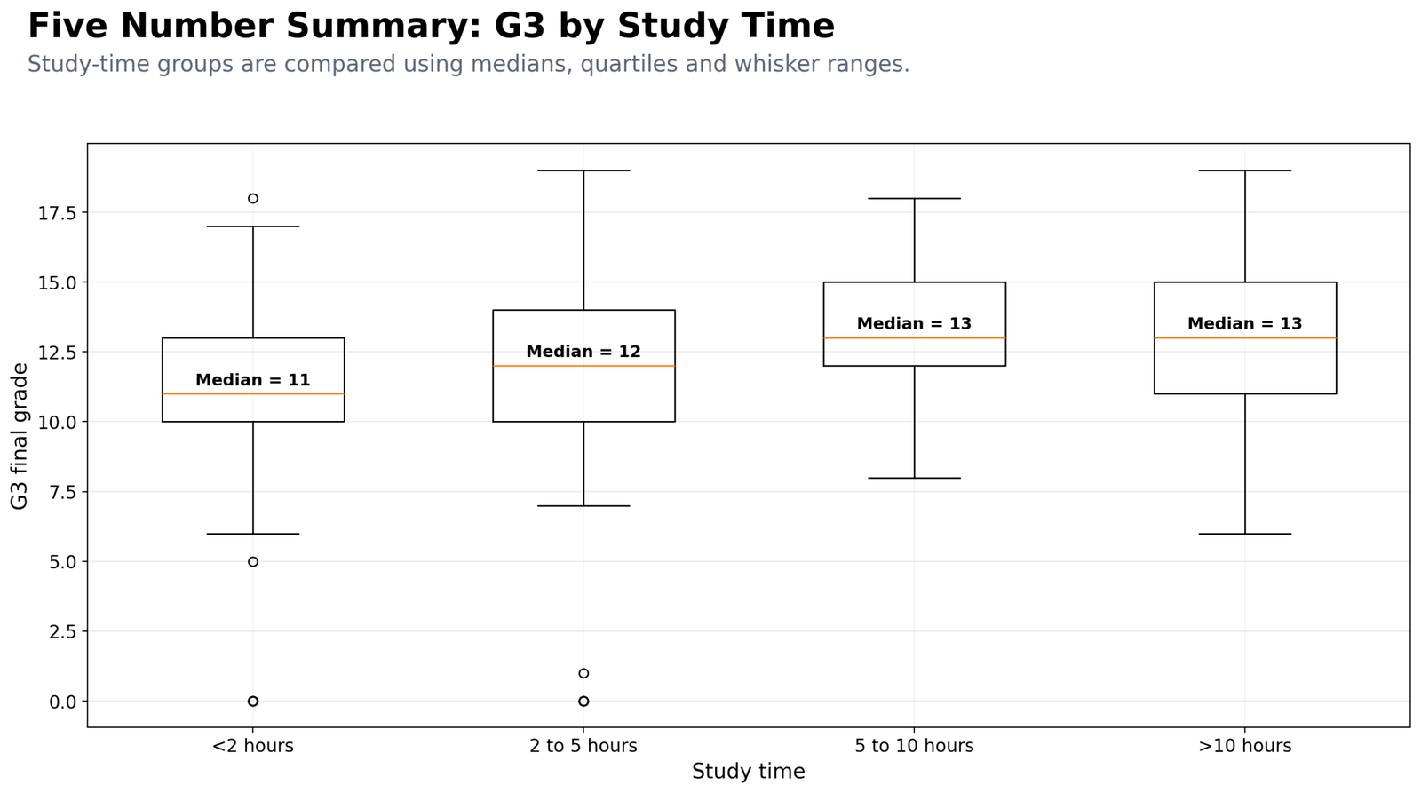
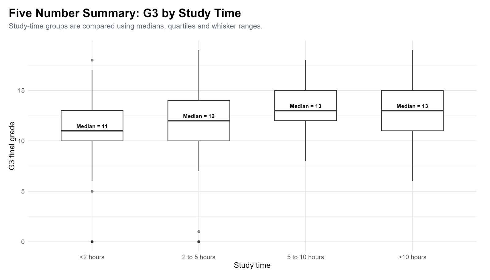
Specific interpretation: The study-time boxplot compares G3 final grade distributions across four study categories. Students studying less than 2 hours have a median around 11. Students studying 2 to 5 hours have a median around 12. Students studying 5 to 10 hours and more than 10 hours show medians around 13. This suggests a positive descriptive relationship between study time and final-grade center.
The lowest study-time group has more low-end values, including grades close to 0. The higher study-time groups are shifted upward, especially around the median. The more than 10 hours group may show wider spread because the group size is usually smaller and student outcomes can be more mixed.
Why this chart matters: It shows how grouped five-number summaries can reveal patterns hidden by the overall summary. The overall G3 median is 12, but group-specific medians show that students with more study time tend to have higher typical final grades.
Decision from Chart 9: Report that G3 median increases from about 11 in the lowest study-time group to about 13 in the higher study-time groups. Treat this as descriptive association, not proof of causation.
R Code for Five Number Summary
R can create five-number summary tables, IQR comparisons, grouped summaries and publication-ready boxplots. The workflow below shows the essential structure.
library(readr)
library(dplyr)
library(tidyr)
library(ggplot2)

folder <- "D:/DATA ANALYSIS/A Basic Descriptive Statistics Guides/Five Number Summary"
data_file <- file.path(folder, "student-por.csv")

df <- read_csv(data_file, show_col_types = FALSE)

# Five number summary for G3
summary(df$G3)

# Manual five-number summary
g3_summary <- tibble(
  variable = "G3",
  minimum = min(df$G3, na.rm = TRUE),
  q1 = quantile(df$G3, 0.25, na.rm = TRUE),
  median = median(df$G3, na.rm = TRUE),
  q3 = quantile(df$G3, 0.75, na.rm = TRUE),
  maximum = max(df$G3, na.rm = TRUE),
  iqr = IQR(df$G3, na.rm = TRUE)
)

print(g3_summary)

# Grade boxplot
df_long <- df %>%
  select(G1, G2, G3) %>%
  pivot_longer(cols = everything(), names_to = "grade_variable", values_to = "score")

ggplot(df_long, aes(x = grade_variable, y = score)) +
  geom_boxplot() +
  labs(
    title = "Five Number Summary: Boxplot of G1, G2 and G3",
    subtitle = "Boxplots compare median, quartiles, whiskers and outliers.",
    x = "Grade variable",
    y = "Score"
  ) +
  theme_minimal()
R interpretation: The R workflow confirms the same five-number summary values shown in the charts. It is useful for creating reproducible summaries, grouped boxplots and publication-ready figures for WordPress or academic reports.
Python Code for Five Number Summary
Python is useful for automatic five-number summary workflows because it can calculate quartiles, IQR values, outlier fences, clean SPSS-ready files and charts in one script.
import pandas as pd

folder = r"D:\DATA ANALYSIS\A Basic Descriptive Statistics Guides\Five Number Summary"
data_file = folder + r"\student-por.csv"

df = pd.read_csv(data_file)

def five_number_summary(series):
    series = series.dropna()
    q1 = series.quantile(0.25)
    q3 = series.quantile(0.75)
    iqr = q3 - q1
    return pd.Series({
        "minimum": series.min(),
        "q1": q1,
        "median": series.median(),
        "q3": q3,
        "maximum": series.max(),
        "iqr": iqr,
        "lower_fence": q1 - 1.5 * iqr,
        "upper_fence": q3 + 1.5 * iqr
    })

# G3 five-number summary
g3_summary = five_number_summary(df["G3"])
print(g3_summary)

# Grade summaries
grade_summary = df[["G1", "G2", "G3"]].apply(five_number_summary).T
print(grade_summary)

# Grouped summary by school
school_summary = df.groupby("school")["G3"].apply(five_number_summary)
print(school_summary)
Python chart note: For publication charts, use a non-overlapping title and subtitle layout with fig.suptitle(), fig.text() and fig.subplots_adjust(). This keeps the title and subtitle clean in final uploaded images.
SPSS Syntax and Interpretation for Five Number Summary
SPSS can calculate five-number summaries through the Explore procedure. It can produce descriptives, percentiles, medians, quartiles, boxplots, histograms and extreme-value tables. The uploaded SPSS output file is available below:
View Five Number Summary SPSS Output PDF
SPSS Menu Method
| Step | SPSS menu action | Purpose |
|---|---|---|
| 1 | Analyze → Descriptive Statistics → Explore | Open the procedure for medians, quartiles, percentiles and boxplots. |
| 2 | Move G3 to Dependent List | Analyze the final grade variable. |
| 3 | Move school, sex or studytime to Factor List | Create grouped five-number summaries. |
| 4 | Click Statistics | Select descriptives and percentiles. |
| 5 | Click Plots | Select boxplots and histograms. |
| 6 | Run and export output | Save SPSS Viewer output and PDF output. |
SPSS Syntax Example
EXAMINE VARIABLES=G1 G2 G3 absences
  /PLOT BOXPLOT HISTOGRAM
  /COMPARE GROUPS
  /STATISTICS DESCRIPTIVES EXTREME
  /PERCENTILES(25,50,75) HAVERAGE
  /CINTERVAL 95
  /MISSING LISTWISE
  /NOTOTAL.

EXAMINE VARIABLES=G3 BY school
  /PLOT BOXPLOT
  /COMPARE GROUPS
  /STATISTICS DESCRIPTIVES EXTREME
  /PERCENTILES(25,50,75) HAVERAGE
  /CINTERVAL 95
  /MISSING LISTWISE
  /NOTOTAL.

EXAMINE VARIABLES=G3 BY sex
  /PLOT BOXPLOT
  /COMPARE GROUPS
  /STATISTICS DESCRIPTIVES EXTREME
  /PERCENTILES(25,50,75) HAVERAGE
  /CINTERVAL 95
  /MISSING LISTWISE
  /NOTOTAL.

EXAMINE VARIABLES=G3 BY studytime
  /PLOT BOXPLOT
  /COMPARE GROUPS
  /STATISTICS DESCRIPTIVES EXTREME
  /PERCENTILES(25,50,75) HAVERAGE
  /CINTERVAL 95
  /MISSING LISTWISE
  /NOTOTAL.

OUTPUT SAVE
  OUTFILE='D:\DATA ANALYSIS\A Basic Descriptive Statistics Guides\Five Number Summary\Python_Output\pdf\Five-Number-Summary-SPSS-Output.spv'
  LOCK=NO.

OUTPUT EXPORT
  /CONTENTS EXPORT=ALL LAYERS=PRINTSETTING MODELVIEWS=PRINTSETTING
  /PDF DOCUMENTFILE='D:\DATA ANALYSIS\A Basic Descriptive Statistics Guides\Five Number Summary\Python_Output\pdf\Five-Number-Summary-SPSS-Output.pdf'
  /EMBEDBOOKMARKS=YES
  /EMBEDFONTS=YES.
SPSS export note: The PDF output folder must already exist before running the syntax. SPSS does not reliably create missing Windows folders automatically. Save both the editable SPSS Viewer file and the PDF output for a complete workflow.
SPSS interpretation: The SPSS output confirms the dataset size and provides percentile-based summaries for the numeric variables. For G3, the key interpretation is the five-number structure: minimum = 0, Q1 = 10, median = 12, Q3 = 14 and maximum = 19. The SPSS boxplots support the same visual pattern shown in Python and R.
Excel Method for Five Number Summary
Excel can calculate the five-number summary using formulas. It can also create boxplots in recent versions through Insert → Statistical Chart → Box and Whisker.
Excel Formula Method
| Statistic | Excel formula | Example purpose |
|---|---|---|
| Minimum | =MIN(A2:A650) | Lowest G3 final grade. |
| Q1 | =QUARTILE.INC(A2:A650,1) | First quartile. |
| Median | =MEDIAN(A2:A650) | Middle G3 final grade. |
| Q3 | =QUARTILE.INC(A2:A650,3) | Third quartile. |
| Maximum | =MAX(A2:A650) | Highest G3 final grade. |
| IQR | =Q3_cell-Q1_cell | Spread of the middle 50%. |
| Lower fence | =Q1_cell-1.5*IQR_cell | Low outlier boundary. |
| Upper fence | =Q3_cell+1.5*IQR_cell | High outlier boundary. |
Excel interpretation: Excel should reproduce the same G3 five-number values when the same cleaned data and quartile method are used: minimum = 0, Q1 = 10, median = 12, Q3 = 14 and maximum = 19.
Download Output and Resources
The SPSS PDF output and dataset source are available below. Use the SPSS output for official tables, and use the R/Python charts for detailed visual interpretation.
APA Style Reporting for Five Number Summary
A five-number summary report should include the variable name, sample size, minimum, Q1, median, Q3, maximum and IQR. If outliers are important, also describe the outlier fence or unusual values.
APA-style report: Five-number summaries were calculated for 649 student records. The final grade variable G3 had a minimum of 0, Q1 of 10, median of 12, Q3 of 14 and maximum of 19. The IQR was 4, indicating that the middle 50% of final grades fell between 10 and 14. Boxplots showed a small number of very low scores, so the median and IQR provide a useful robust summary of typical final-grade performance.
For a shorter report, use the following version:
The final grade variable G3 was summarized using a five-number summary. The values were minimum = 0, Q1 = 10, median = 12, Q3 = 14 and maximum = 19. The IQR was 4, showing that the middle 50% of final grades fell between 10 and 14.When Should You Use Five Number Summary?
Use Five Number Summary when you need a robust summary of a numeric variable. It is especially useful for skewed data, outlier checking, boxplot interpretation, grade analysis, and grouped distribution comparison.
| Analysis situation | Use five-number summary to check | Why it helps |
|---|---|---|
| Skewed numeric data | Median, Q1, Q3 and IQR | More robust than mean and standard deviation alone. |
| Outlier detection | Lower and upper fences | Identifies unusually low or high values. |
| Grade analysis | Minimum, quartiles and maximum | Shows student performance distribution clearly. |
| Group comparison | Grouped boxplots | Compares medians and spreads across groups. |
| Before formal testing | Distribution shape and spread | Helps choose parametric or nonparametric methods. |
If a variable is categorical, use cross-tabulation or frequency tables instead. If a numeric variable is roughly symmetric, you may report mean and standard deviation along with the five-number summary. If it is skewed, report the median and IQR prominently.
References and Related Guides
Five-number summary is part of descriptive statistics and connects naturally with boxplots, distribution checks, outlier detection and formal group comparison. These related guides support the next step of analysis:
| Related guide | Why it helps |
|---|---|
| Box Plot Interpretation | Explains how to read medians, quartiles, whiskers and outliers. |
| Confidence Interval | Explains uncertainty around sample estimates. |
| Central Limit Theorem | Explains why sampling distributions support inference. |
| Coefficient of Variation | Compares relative variability across variables. |
| Q-Q Plot Normality Check | Checks whether numeric values follow a normal pattern. |
| P-P Plot Normality Check | Supports visual distribution checking after descriptive summaries. |
| Kolmogorov-Smirnov Test | Formal distribution test after visual inspection. |
| Lilliefors Test | Normality test when mean and variance are estimated from data. |
| D’Agostino-Pearson Test | Normality test based on skewness and kurtosis. |
| Ryan-Joiner Test | Another normality-checking method for applied statistics. |
| Levene’s Test | Checks equality of variances after grouped summaries. |
| Brown-Forsythe Test | Robust variance comparison method. |
| One-Tailed T Test | Useful after descriptive analysis when testing a directional mean difference. |
| One-Sample Z Test | Formal test for comparing a sample mean with a fixed value. |
| Clinical Trial Data Analysis Using R | Shows how descriptive summaries support applied research workflows. |
FAQs About Five Number Summary
What is Five Number Summary in simple words?
Five Number Summary is a descriptive statistics method that summarizes a numeric variable using five values: minimum, Q1, median, Q3 and maximum.
What are the five values in Five Number Summary?
The five values are minimum, first quartile, median, third quartile and maximum.
What is the Five Number Summary for G3 in this example?
The G3 final grade has minimum = 0, Q1 = 10, median = 12, Q3 = 14 and maximum = 19. The IQR is 4.
What does IQR mean?
IQR means interquartile range. It is calculated as Q3 minus Q1 and shows the spread of the middle 50% of the data.
Why is Five Number Summary useful?
It is useful because it shows center, spread and possible outliers. It is more robust than the mean when the data are skewed or contain extreme values.
How is Five Number Summary related to a boxplot?
A boxplot is a visual display of the five-number summary. The box shows Q1 to Q3, the line shows the median, and the whiskers or points show the lower and upper values.
How do you find outliers using Five Number Summary?
Calculate IQR as Q3 minus Q1. Then calculate the lower fence as Q1 minus 1.5 times IQR and the upper fence as Q3 plus 1.5 times IQR. Values outside these fences are possible outliers.
Can Five Number Summary be used for categorical variables?
No. Five Number Summary is for numeric variables. For categorical variables, use frequency tables, percentages or cross-tabulation.
How do I create Five Number Summary in SPSS?
In SPSS, use Analyze, Descriptive Statistics, Explore. Put the numeric variable in the Dependent List and request percentiles and boxplots.
How do I create Five Number Summary in Excel?
Use MIN, QUARTILE.INC, MEDIAN and MAX formulas. Then calculate IQR as Q3 minus Q1.

