
Formula, worked example and software steps
Welch’s T-Test: Formula, Degrees of Freedom & Examples
Welch’s t-test compares two independent means without assuming equal variances. See the formula, Welch–Satterthwaite degrees of freedom, a verified worked example, and steps for SPSS, R, Python and Excel.
Quick Answer: Welch’s T Test Result
The worked example compares G3 final grade between two independent school groups: GP and MS. GP has 423 students, mean G3 approximately 12.5768, and standard deviation approximately 2.6256. MS has 226 students, mean G3 approximately 10.6504, and standard deviation approximately 3.8340.
Because the MS group has a much larger spread and the group sizes are not equal, Welch’s T Test is the correct safer interpretation. The Welch result is approximately t(340.49) = 6.75, p < .001. The mean difference is approximately 1.9264, and the 95% confidence interval is about 1.37 to 2.49. Since the interval is completely above zero, GP students scored significantly higher than MS students on average.
Final interpretation: Welch’s T Test rejects the null hypothesis of equal means. The GP group has a significantly higher mean G3 score than the MS group. Welch is preferred because the standard deviations are not similar and the sample sizes are unequal.
Important reporting point: Welch’s T Test does not pool the variances. It calculates a separate variance component for each group, then adjusts the degrees of freedom. That is why the Welch degrees of freedom are decimal rather than a whole number.
Table of Contents
- What Is Welch’s T Test?
- Welch’s T Test Formula
- Null and Alternative Hypothesis
- Dataset and Variables Used
- Python Chart-by-Chart Interpretation
- R Chart-by-Chart Validation
- SPSS Output Interpretation
- Python, R, SPSS and Excel Workflows
- Code Blocks for Welch’s T Test
- APA Reporting Wording
- Common Mistakes
- When to Use Welch’s T Test
- Downloads and Resources
- Related Guides
- FAQs
What Is Welch’s T Test?
Welch’s T Test is an independent two sample t test used when the two groups may have unequal variances. It compares two group means like the ordinary Student two sample t test, but it does not use the pooled variance assumption. Instead, Welch’s method keeps each group’s variance separate and adjusts the degrees of freedom using the Welch-Satterthwaite equation.
This matters because a two sample t test can give misleading standard errors when one group is much more variable than the other. In this example, GP and MS are independent groups, G3 is the numeric outcome, and the MS group has a larger standard deviation than the GP group. Therefore, Welch’s T Test is the correct conservative choice.
Simple definition: Welch’s T Test compares two independent means when equal variances should not be assumed.
For related topics, see T Test Assumptions, T Test for Unequal Variances, T Test for Equal Variances, Two Sample T Test, Levene Test, Brown-Forsythe Test, P Value, Confidence Interval, Effect Size, Standard Error, and Standard Deviation.
Welch’s T Test Formula
The Welch’s T Test formula compares the difference between two independent sample means with the Welch standard error.
In the formula, x̄1 and x̄2 are the two group means, s12 and s22 are the two group variances, and n1 and n2 are the group sample sizes. The major difference from Student’s t test is that Welch does not combine the variances into one pooled value.
Welch Standard Error
The standard error tells how much uncertainty exists in the difference between the two sample means. In this example, the Welch standard error is approximately 0.2852. The MS group contributes more to the standard error because it has the larger variance.
Welch-Satterthwaite Degrees of Freedom
The degrees of freedom are adjusted downward because the equal variance assumption is not used. In this example, the adjusted degrees of freedom are about 340.49, not the pooled value of 647. That decimal value is correct and should be reported.
Welch Confidence Interval
The Welch confidence interval gives the likely range for the true population mean difference. In this example, the interval is entirely positive, so the GP mean is significantly higher than the MS mean.
| Formula Component | Meaning | Worked Example Value | How to Interpret It |
|---|---|---|---|
| x̄1 | Group 1 mean | GP mean = 12.5768 | This is the average G3 score for GP students. |
| x̄2 | Group 2 mean | MS mean = 10.6504 | This is the average G3 score for MS students. |
| x̄1 − x̄2 | Mean difference | 1.9264 | GP is about 1.93 grade points higher than MS. |
| s1 | Group 1 SD | 2.6256 | GP scores have smaller spread. |
| s2 | Group 2 SD | 3.8340 | MS scores have larger spread. |
| SEWelch | Standard error | 0.2852 | The uncertainty in the mean difference is small compared with the difference. |
| t | Welch test statistic | 6.7545 | The mean difference is many standard errors away from zero. |
| df | Adjusted degrees of freedom | 340.49 | Welch adjusts df because variances are unequal. |
| p | Welch p value | < .001 | The group mean difference is statistically significant. |
Formula-table interpretation: The table shows that GP has the higher mean, MS has the larger variation, and Welch adjusts the standard error and degrees of freedom instead of pretending the two variances are equal. The significant p value means the observed group difference is too large to treat as random sampling noise.
Null and Alternative Hypothesis
Welch’s T Test uses the same mean-comparison hypotheses as the independent two sample t test. The difference is in the calculation of the standard error and degrees of freedom.
| Statement | Symbolic Form | Meaning for This Example | Decision Meaning |
|---|---|---|---|
| Null hypothesis | H0: μGP = μMS | GP and MS students have the same population mean G3 score. | Keep H0 only if the evidence is not strong enough. |
| Alternative hypothesis | H1: μGP ≠ μMS | GP and MS students have different population mean G3 scores. | Supported when p < .05. |
| Observed direction | x̄GP > x̄MS | GP has the higher observed mean. | Report that GP scored higher after rejecting H0. |
Decision for this example: Reject the null hypothesis because p < .001. The two groups do not have the same mean G3 score. Since GP has the higher sample mean, the practical conclusion is that GP students scored significantly higher than MS students.
Dataset and Variables Used
The worked example uses a student performance dataset. The dependent variable is G3 final grade. The grouping variable is school, with two independent groups: GP and MS. Welch’s T Test is appropriate because the outcome is numeric, the groups are independent, and the group variances differ.
| Variable or Group | Role | Why It Matters | Interpretation in This Example |
|---|---|---|---|
| G3 | Numeric outcome | The mean of this variable is compared between groups. | It represents final grade performance. |
| school | Grouping variable | Defines the two independent groups. | The groups are GP and MS. |
| GP | Group 1 | One independent school group. | Higher mean and smaller standard deviation. |
| MS | Group 2 | Second independent school group. | Lower mean and larger standard deviation. |
| studytime | Context variable | Used for additional descriptive interpretation. | Shows how G3 varies inside each school group. |
Before reporting the result, inspect the group statistics table, mean plot, variance diagnostic, boxplot, standard error components, confidence interval and method comparison table. These outputs show both the practical difference and the reason Welch’s method is preferred.
Python Chart-by-Chart Interpretation
The Python section appears first because the requested sequence is Python → R → SPSS. The Python outputs explain the Welch workflow from group means to variance diagnostics, formula components, adjusted degrees of freedom, p value and final method comparison.
Python Chart 1: Welch Group Means with Standard Errors
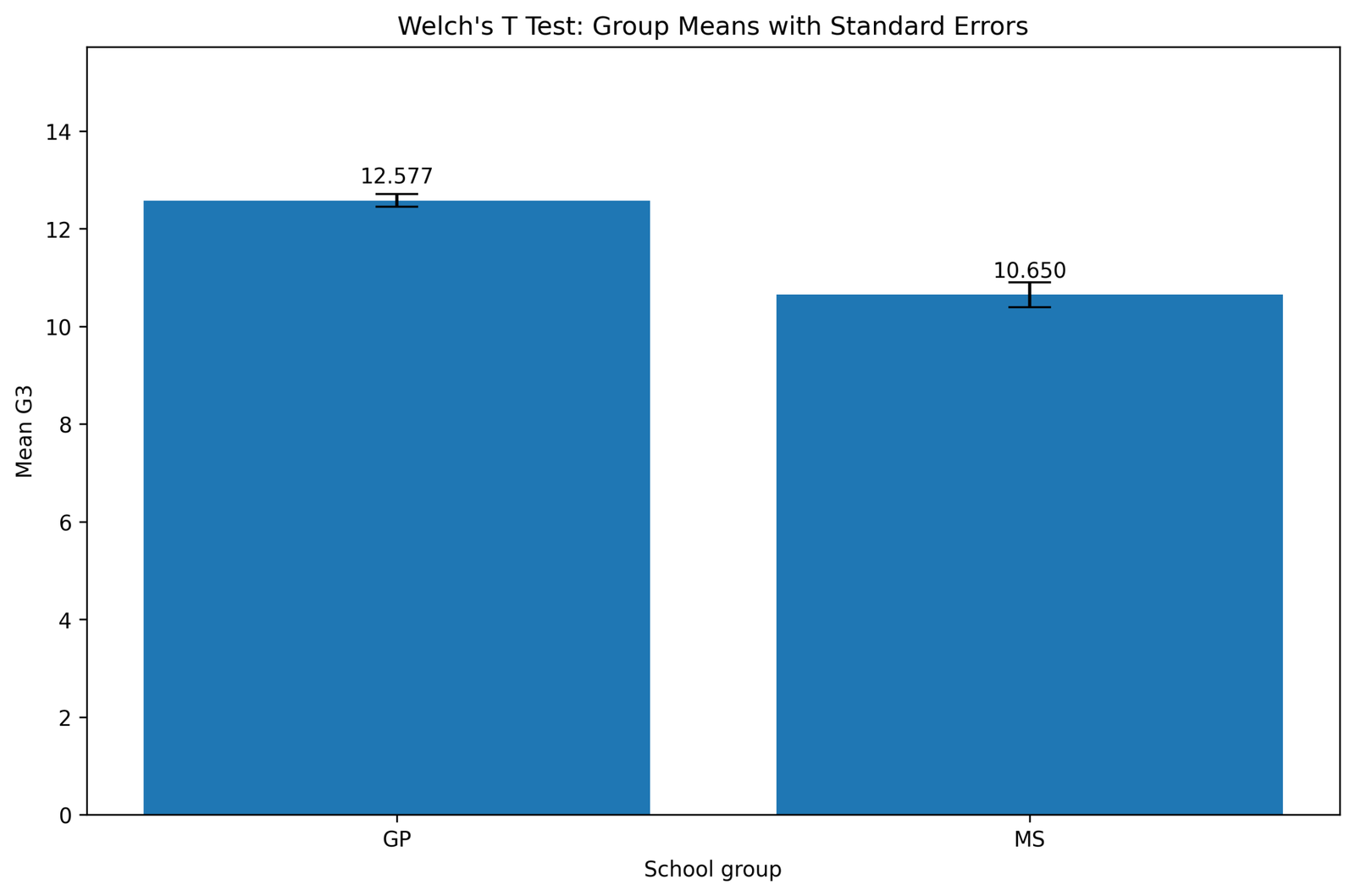
What this chart shows: This chart compares the mean G3 score for the GP and MS groups. The vertical bars represent the average G3 score, and the error bars represent uncertainty around each group mean.
How to read it: The GP bar is higher than the MS bar, which means GP students have a higher average final grade. The distance between the bars is the visual version of the mean difference used in the Welch test.
Statistical meaning: The chart suggests a real group difference, but the final decision must come from the Welch t statistic, p value and confidence interval. A higher bar alone is not enough; the difference must be large relative to the standard error.
Reporting conclusion: Use this figure to introduce the practical result: GP students scored higher on average than MS students before moving to the unequal-variance test result.
Python Chart 2: Welch Unequal Variance Diagnostic
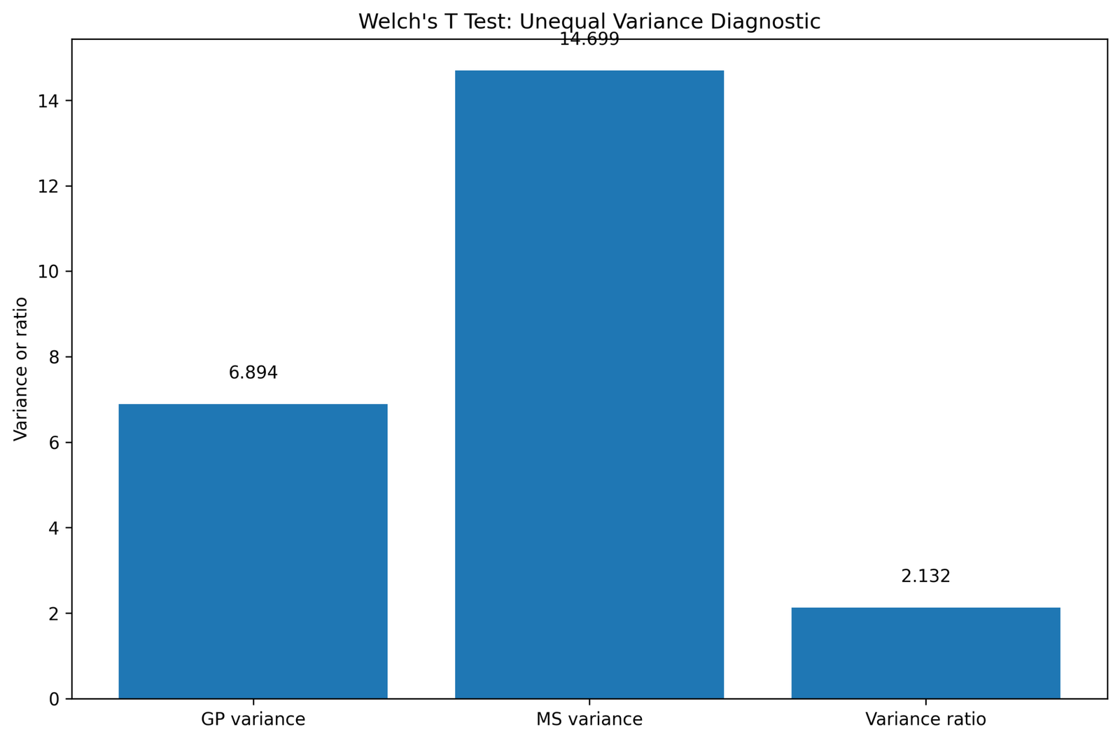
What this chart shows: This diagnostic chart compares the amount of spread or variance in the GP and MS groups. It is designed to answer whether the equal variance assumption is reasonable.
How to read it: The MS group shows a larger variance than GP. This means MS scores are more dispersed around their mean, while GP scores are more tightly clustered.
Statistical meaning: Unequal variance is the key reason for using Welch’s T Test. Student’s equal variance t test would pool the variances, but that pooling is less appropriate when one group is clearly more variable.
Reporting conclusion: State that the unequal variance diagnostic supports using Welch’s unequal variance t test instead of relying only on the pooled Student t test.
Python Chart 3: Welch Standard Error Components
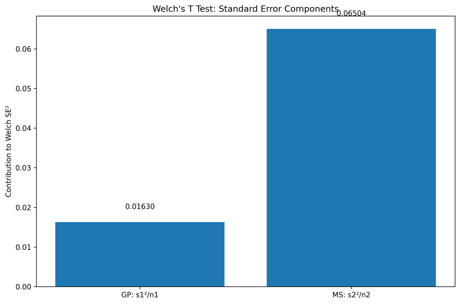
What this chart shows: This chart breaks the Welch standard error into two parts: the GP variance component and the MS variance component. Each part is calculated as group variance divided by group sample size.
How to read it: The group with the larger variance contributes more to the total standard error. In this example, MS contributes more uncertainty because its G3 scores are more spread out.
Statistical meaning: Welch’s method protects the test from pretending both groups have the same variance. The test statistic becomes the mean difference divided by this unequal-variance standard error.
Reporting conclusion: Use this chart to explain why Welch’s standard error is more appropriate than a pooled standard error. It directly supports the choice of Welch’s T Test.
Python Chart 4: Welch-Satterthwaite Degrees of Freedom Components
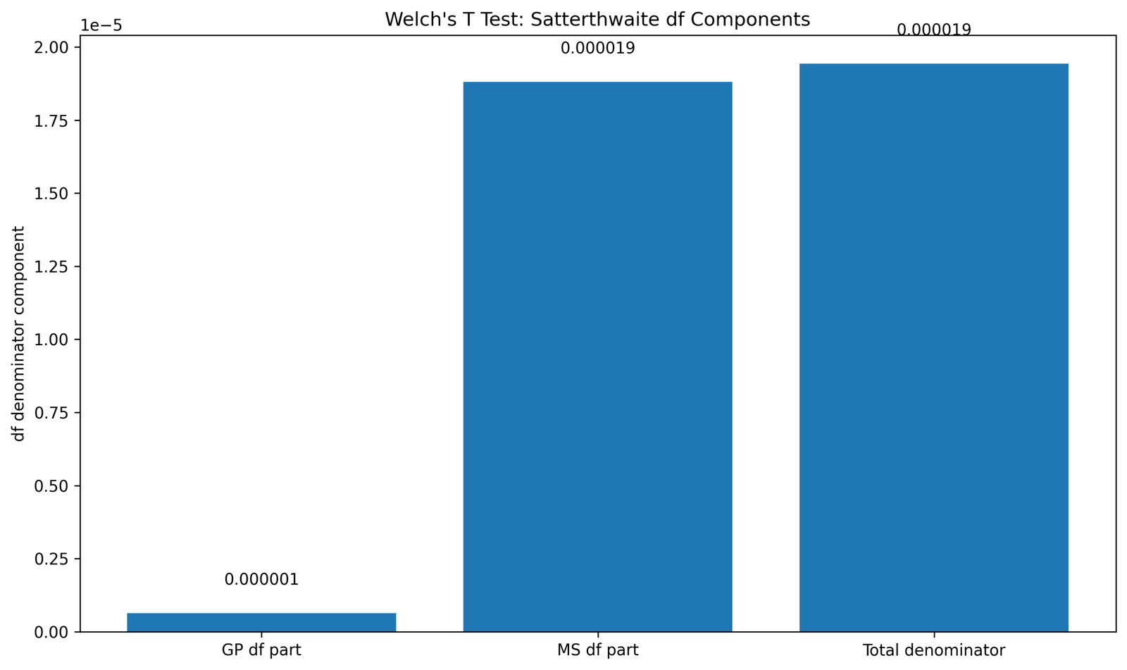
What this chart shows: This chart explains how the adjusted degrees of freedom are formed from the two standard error components and group sample sizes.
How to read it: Welch’s df is not simply n1 + n2 − 2. The formula gives more weight to the group that contributes more uncertainty, especially when variances are unequal.
Statistical meaning: The adjusted df is approximately 340.49. This is lower than the pooled df and reflects the uncertainty created by unequal variances.
Reporting conclusion: Decimal df should be reported normally: t(340.49) = 6.75. Do not round it to the pooled df, because that would change the test being reported.
Python Chart 5: Welch Mean Difference Confidence Interval
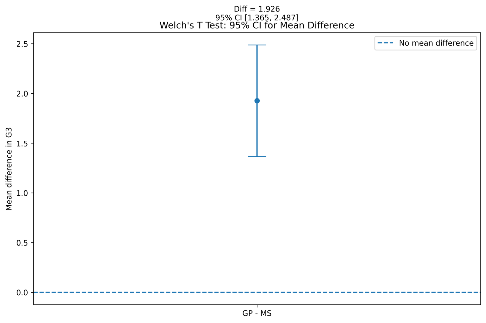
What this chart shows: This chart displays the confidence interval for the mean difference between GP and MS. The mean difference is GP minus MS.
How to read it: The confidence interval is fully above zero. This means the estimated difference is positive across the plausible range of values.
Statistical meaning: A confidence interval that excludes zero supports the same conclusion as a significant p value. Here, it means the two group means are significantly different.
Reporting conclusion: Report that GP scored higher than MS by about 1.93 points, with a 95% CI of approximately 1.37 to 2.49.
Python Chart 6: Welch T Distribution with Adjusted DF
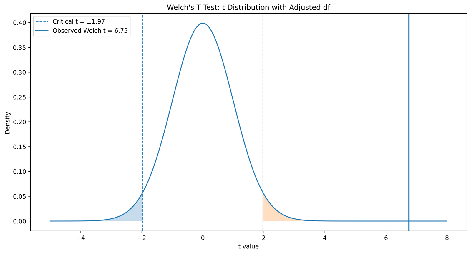
What this chart shows: This chart places the observed Welch t statistic on the t distribution using the adjusted Welch degrees of freedom.
How to read it: The t statistic is far from zero and falls into the extreme tail area of the distribution. Extreme values are unlikely if the null hypothesis is true.
Statistical meaning: The large t value creates a very small p value. This supports rejection of the null hypothesis that GP and MS have equal population means.
Reporting conclusion: Use this chart to explain the p value visually: the observed t statistic is so far from the null center that the result is statistically significant.
Python Chart 7: Welch vs Student P Value and Standard Error
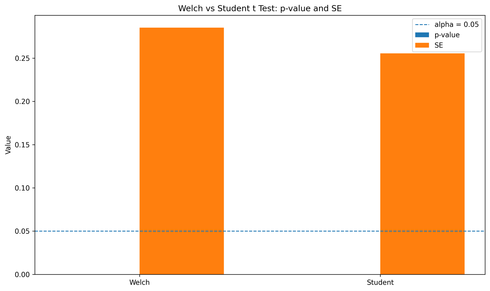
What this chart shows: This chart compares Welch’s unequal variance test with Student’s equal variance test. It focuses on standard error and p value differences.
How to read it: The two methods may both show statistical significance, but they are not based on the same assumption. Student’s test assumes equal variances, while Welch’s test does not.
Statistical meaning: When variances differ, Welch is preferred because it adjusts the standard error and degrees of freedom. The goal is not to choose the smaller p value but to choose the method that matches the data.
Reporting conclusion: Report Welch’s result when the equal variance assumption is doubtful. You may mention the Student comparison only as a secondary method check.
Python Chart 8: Welch Group Spread Boxplot
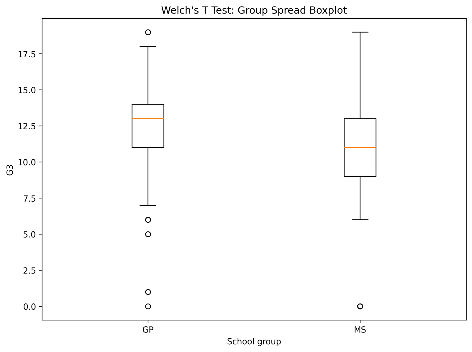
What this chart shows: The boxplot shows the median, interquartile range, spread and possible outliers for the GP and MS groups.
How to read it: The MS group has a wider spread, which means its G3 scores vary more. The GP group is more compact and has a higher center.
Statistical meaning: The boxplot supports the unequal variance diagnosis. It also helps identify whether outliers may be affecting the group mean and variance.
Reporting conclusion: Use this figure to support the assumption discussion: the groups are independent, but the spread is not equal, so Welch’s T Test is justified.
Python Chart 9: Welch Group Statistics Table
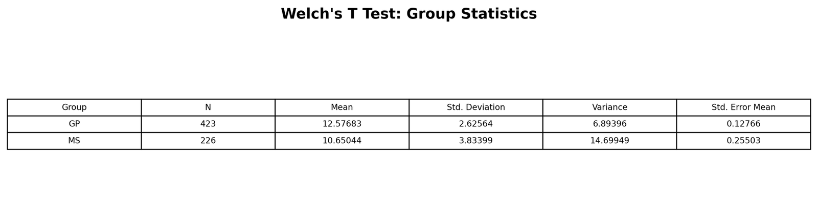
What this table shows: This table reports the descriptive statistics for each group: sample size, mean, standard deviation and variance.
How to read it: GP has more students, a higher mean and a smaller standard deviation. MS has fewer students, a lower mean and a larger standard deviation.
Statistical meaning: This table explains both parts of the Welch result: the mean difference explains the direction, while the variance difference explains why Welch is needed.
Reporting conclusion: Start the results section with this table information before reporting the t statistic. A complete report should include n, M and SD for both groups.
Python Chart 10: Welch Main Result Table

What this table shows: This is the main Welch’s T Test result table. It contains the test statistic, adjusted degrees of freedom, p value, mean difference and confidence interval.
How to read it: The p value is below .05, so the null hypothesis of equal means is rejected. The confidence interval is above zero, so the group difference is positive.
Statistical meaning: The result means the GP and MS population means are unlikely to be equal. The difference is statistically significant even after adjusting for unequal variances.
Reporting conclusion: This is the table to use for the final result sentence: Welch’s t(340.49) = 6.75, p < .001, with GP scoring higher than MS.
Python Chart 11: Welch Formula Components Table
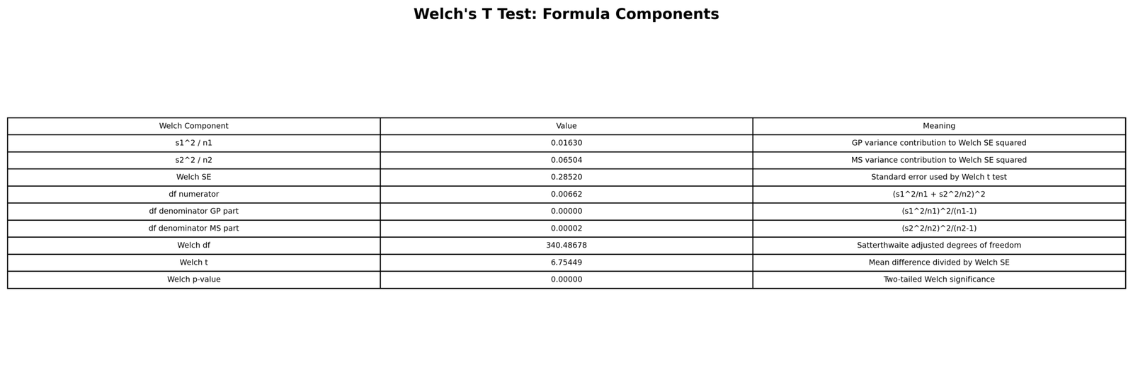
What this table shows: This table breaks down the Welch calculation into the exact components used in the formula: means, variances, sample sizes, standard error components and adjusted degrees of freedom.
How to read it: Each row connects a mathematical term to a value from the dataset. The variance divided by sample size terms are especially important because they build the Welch standard error.
Statistical meaning: The table proves that the Welch result is not a black box. It shows how the unequal variance structure directly affects the test statistic and df.
Reporting conclusion: Use this table when teaching or explaining the calculation. It is especially useful for readers who want to understand why the df is decimal.
Python Chart 12: Welch Method Comparison Table
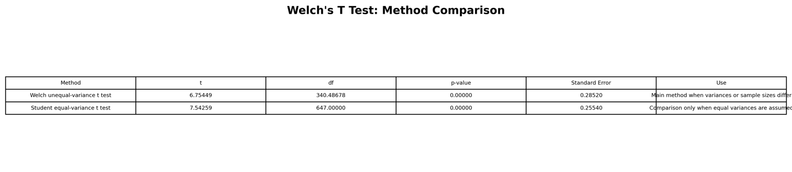
What this table shows: This table compares Welch’s T Test with Student’s equal variance t test. It shows the method difference, assumption difference and result difference.
How to read it: Student’s t test uses pooled variance and whole-number df. Welch’s t test uses separate variance components and adjusted decimal df.
Statistical meaning: When equal variance is doubtful, Welch is more defensible. The table helps readers understand that significance alone does not decide the method.
Reporting conclusion: Report Welch’s result as the main result and explain that Student’s t test is shown only for comparison.
R Chart-by-Chart Validation
The R validation outputs come second. These charts and tables confirm that the same result is reproduced outside Python. R is especially important because t.test() uses Welch’s unequal variance test by default for independent two-group comparisons.
R Chart 1: Welch Group Means with Standard Errors
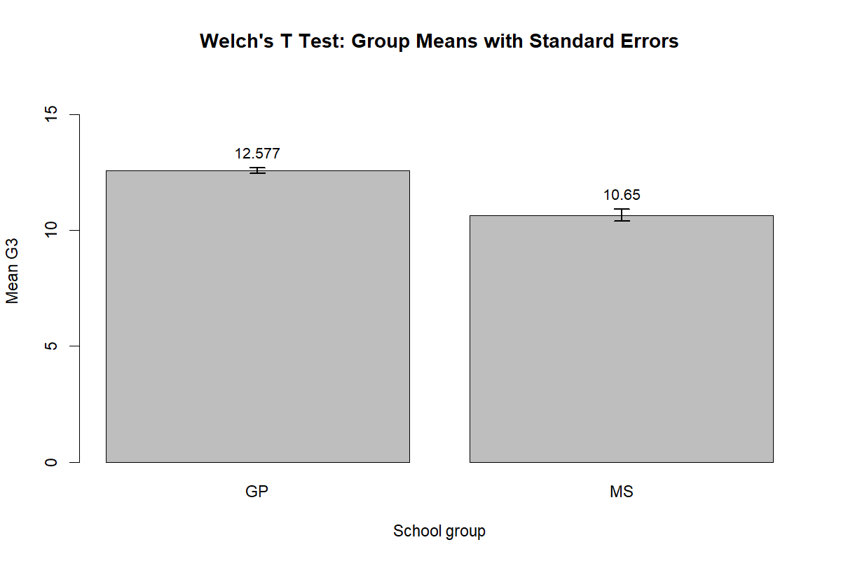
What this chart shows: This R chart displays the GP and MS mean G3 scores with standard error bars.
How to read it: GP has the higher mean, confirming the same direction seen in the Python output. The standard error bars show uncertainty around each mean estimate.
Statistical meaning: The visual pattern supports a difference between groups, but the Welch test is needed to determine whether the difference is statistically significant.
Reporting conclusion: Use this chart as R validation that the GP mean is higher than the MS mean.
R Chart 2: Welch Unequal Variance Diagnostic
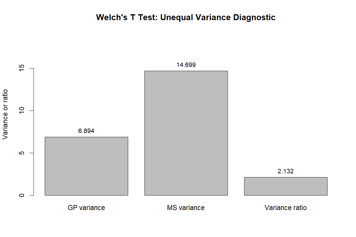
What this chart shows: This chart compares variance behavior between GP and MS using the R workflow.
How to read it: MS again shows greater variability. This repeats the Python conclusion and confirms the pattern is not software-specific.
Statistical meaning: Unequal variance supports Welch’s test because Welch does not force the two groups to share one pooled variance estimate.
Reporting conclusion: State that both Python and R diagnostics support the unequal variance interpretation.
R Chart 3: Welch Standard Error Components
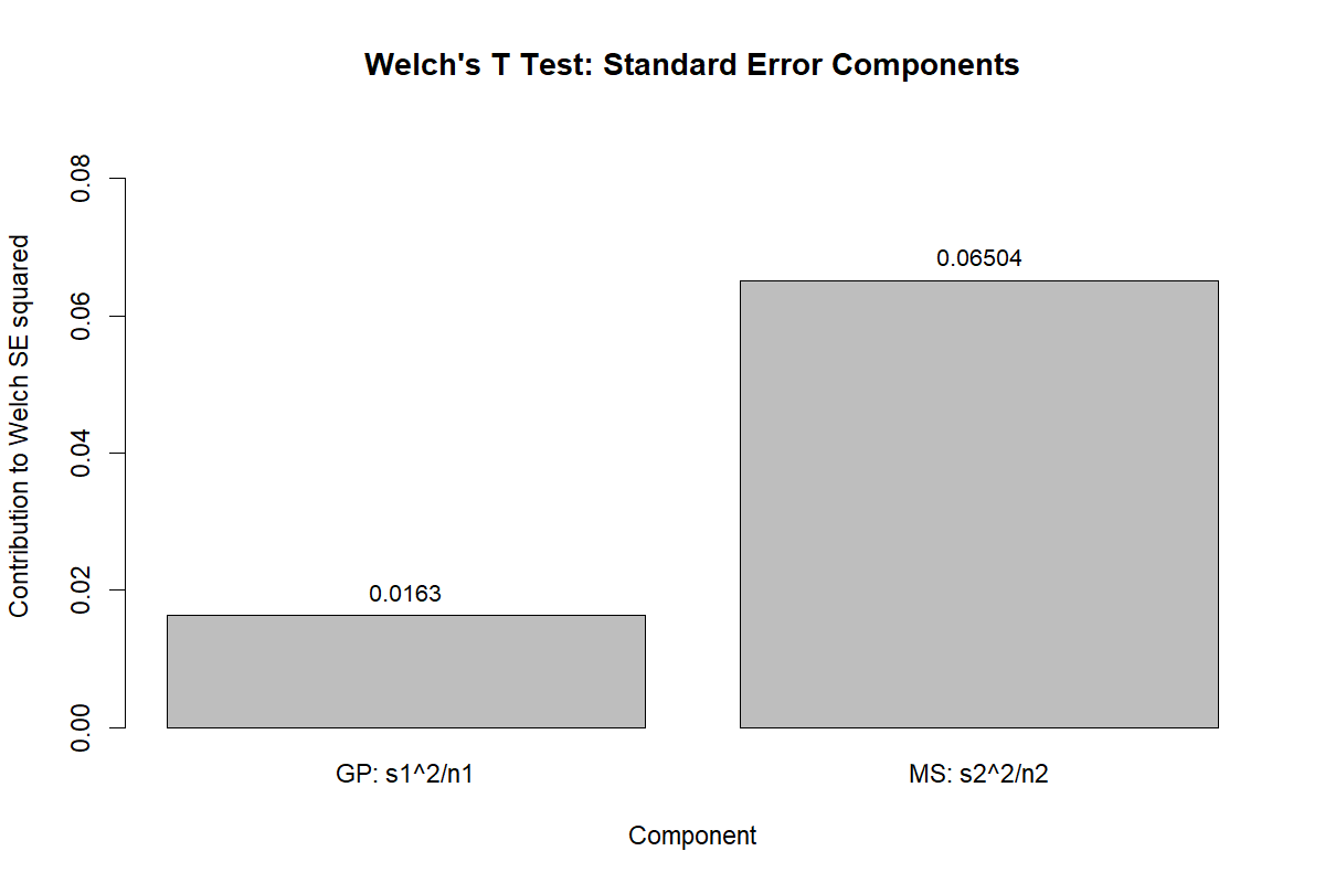
What this chart shows: The R chart shows how each group contributes to the Welch standard error.
How to read it: The larger MS variance creates the larger component of uncertainty. The GP component is smaller because its variance is smaller and its sample size is larger.
Statistical meaning: This chart confirms the mathematical reason for using Welch’s formula instead of the equal variance formula.
Reporting conclusion: Use this chart to explain how unequal variance changes the denominator of the t statistic.
R Chart 4: Welch-Satterthwaite DF Components
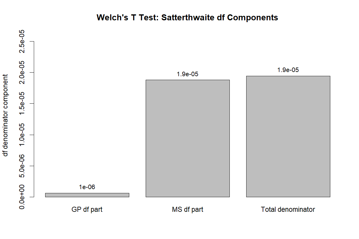
What this chart shows: This R output visualizes the components used to compute Welch’s adjusted degrees of freedom.
How to read it: The adjusted df comes from the balance between the two variance components and the two sample sizes. It is not a simple count of observations.
Statistical meaning: The chart confirms that Welch reduces the degrees of freedom when unequal variance creates extra uncertainty.
Reporting conclusion: Report the decimal df from R exactly or to two decimal places, for example t(340.49).
R Chart 5: Welch Mean Difference Confidence Interval
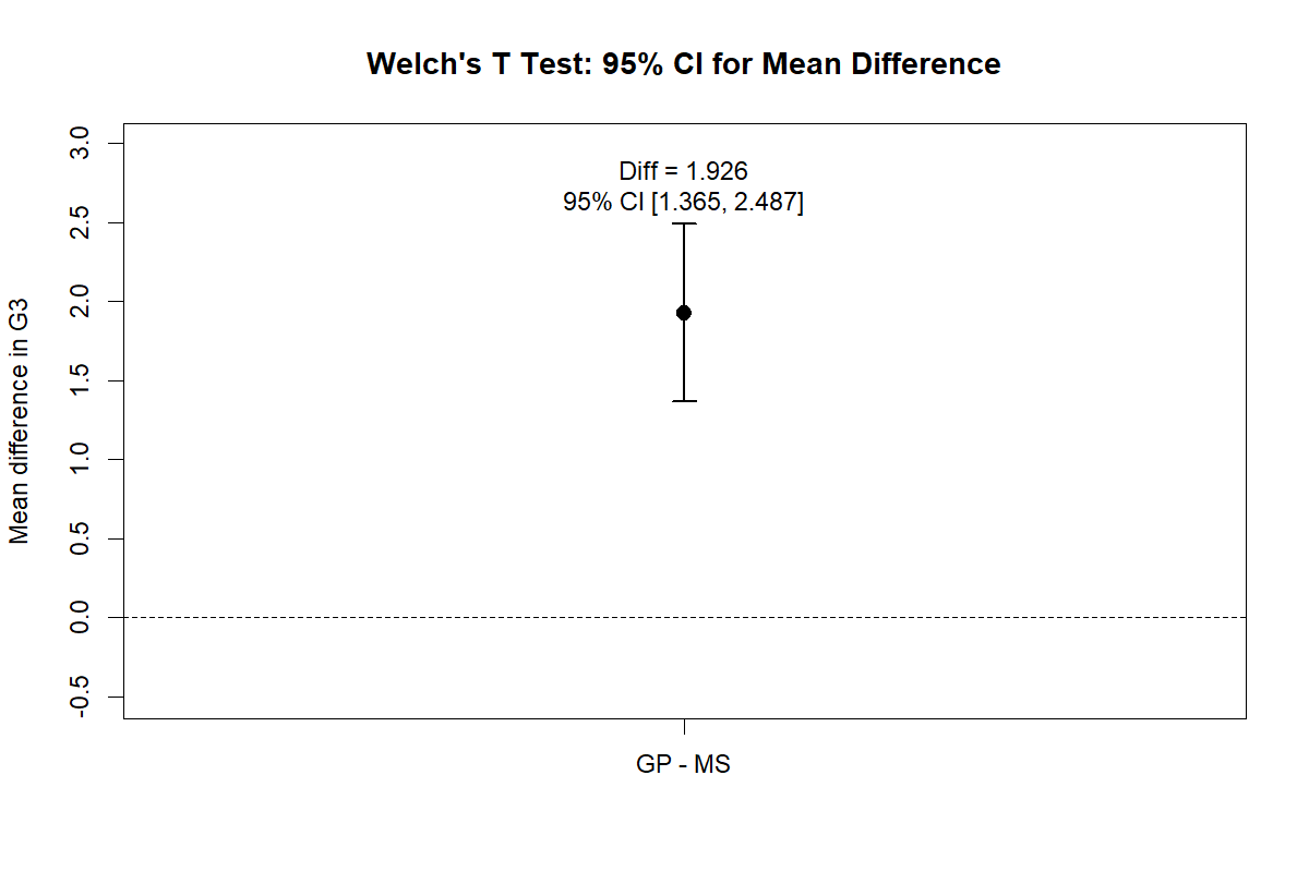
What this chart shows: This R chart gives the confidence interval for the GP minus MS mean difference.
How to read it: The interval remains fully above zero, which means the positive group difference is reliable.
Statistical meaning: A confidence interval above zero confirms that the significant result is in favor of GP.
Reporting conclusion: Report the mean difference with its interval, not only the p value. This makes the result more meaningful for readers.
R Chart 6: Welch T Distribution with Adjusted DF
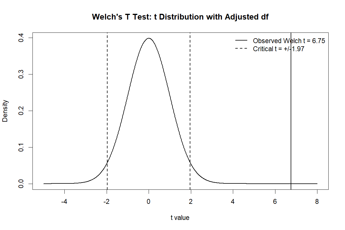
What this chart shows: This chart shows the R version of the Welch t distribution curve with adjusted df.
How to read it: The observed t value lies far from the center of the null distribution. Values that far away are rare if the true means are equal.
Statistical meaning: The chart visually explains why the p value is very small.
Reporting conclusion: Use it to explain the significance visually: the observed group difference is large relative to the Welch standard error.
R Chart 7: Welch vs Student P Value and Standard Error
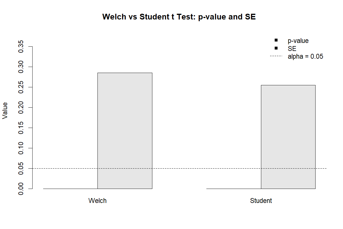
What this chart shows: This R chart compares the Welch and Student versions of the independent samples t test.
How to read it: The two methods differ because one assumes equal variance and the other does not. Welch adjusts the df and standard error.
Statistical meaning: If both methods are significant, that increases confidence in the broad conclusion, but Welch remains the better formal report when variances differ.
Reporting conclusion: Write that Welch’s test was used because the unequal variance assumption was more realistic for these groups.
R Chart 8: Welch Group Spread Boxplot
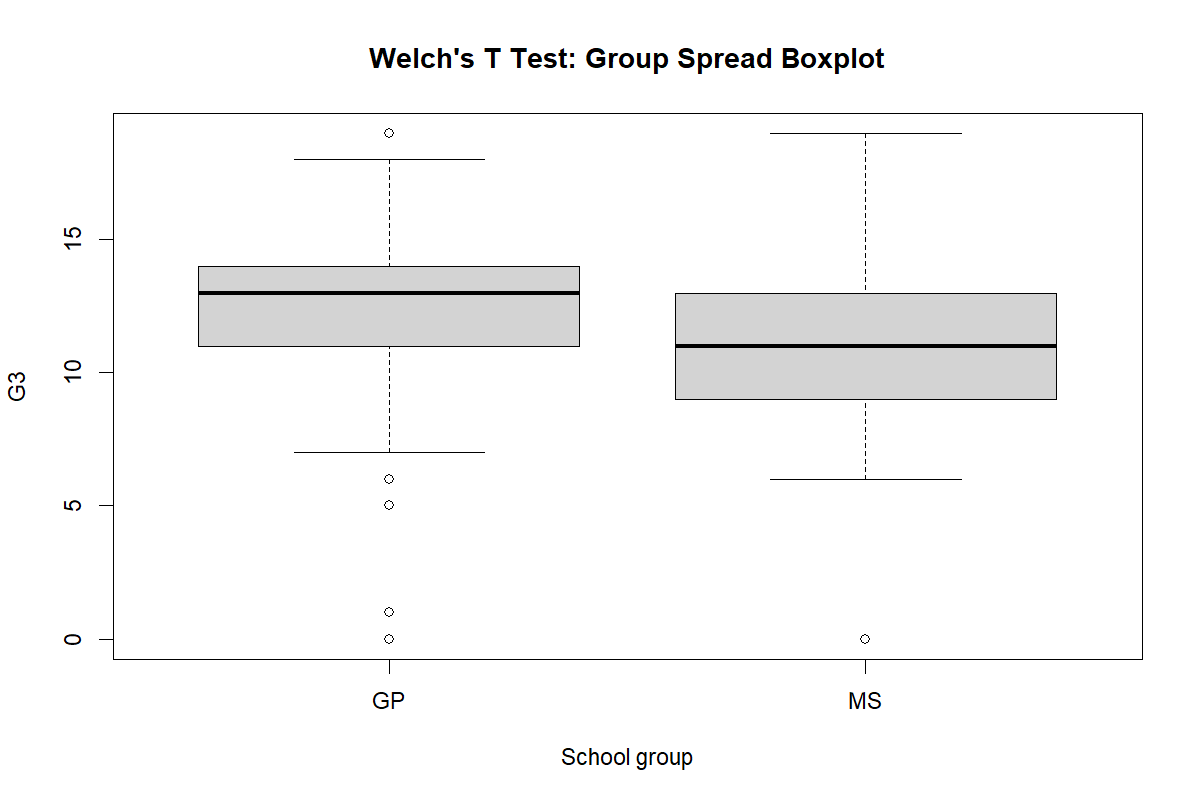
What this chart shows: The R boxplot shows the distribution, median, interquartile range and possible outliers for both groups.
How to read it: GP is higher in central tendency, while MS is more spread out. This combination is exactly the situation where Welch is useful.
Statistical meaning: The boxplot supports both the direction of the group difference and the unequal variance concern.
Reporting conclusion: Mention that visual diagnostics showed unequal spread, supporting Welch’s unequal variance t test.
R Chart 9: Welch Group Statistics Table
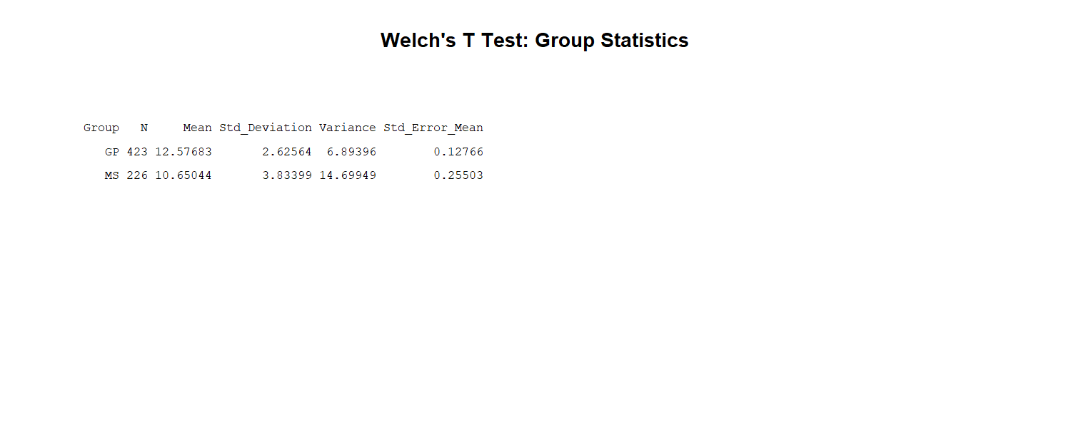
What this table shows: This R table gives the descriptive statistics used in the Welch test.
How to read it: Compare the n, mean, SD and variance columns. GP has higher mean and lower variation; MS has lower mean and higher variation.
Statistical meaning: The table confirms the same pattern already seen in the charts, so the numerical and visual evidence agree.
Reporting conclusion: Use the table values to write the first sentence of the results paragraph: GP had higher G3 scores than MS.
R Chart 10: Welch Main Result Table
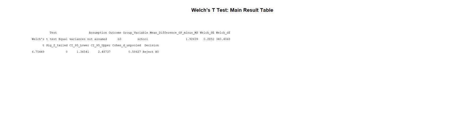
What this table shows: This is the main R Welch test result table.
How to read it: Read the t statistic, adjusted df, p value and confidence interval. The p value is below .001 and the confidence interval is positive.
Statistical meaning: R confirms the Python result. The two school groups differ significantly on mean G3.
Reporting conclusion: The R output can be cited as validation: Welch’s T Test found a significant GP versus MS difference.
R Chart 11: Welch Formula Components Table
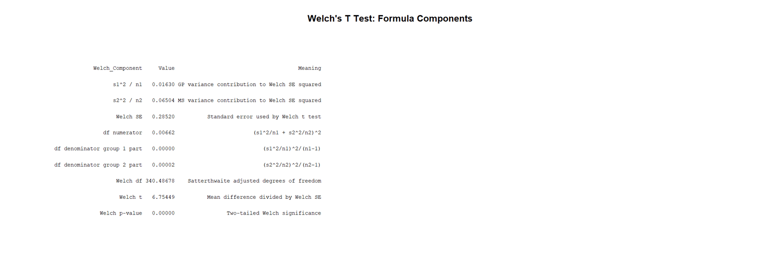
What this table shows: This table displays the formula inputs used by R to reproduce the Welch calculation.
How to read it: The group means determine the numerator of the test. The variance-over-n components determine the denominator and the degrees of freedom.
Statistical meaning: The table demonstrates that the R output is traceable to the Welch formula, not just a software command.
Reporting conclusion: This table is useful for transparent reporting, teaching, and checking the calculation manually.
R Chart 12: Welch Method Comparison Table
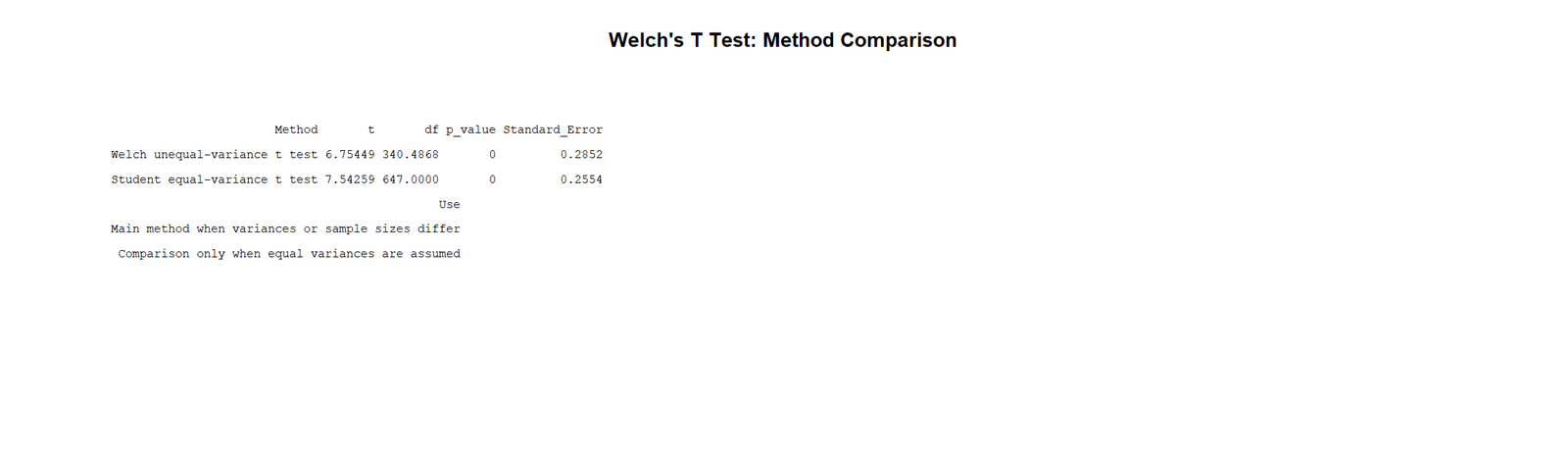
What this table shows: This table compares the Welch test and the Student equal variance t test using the R workflow.
How to read it: Focus on the method assumptions, df and standard error differences. Student assumes equal variances; Welch does not.
Statistical meaning: The table supports using Welch because the groups do not have equal spread.
Reporting conclusion: Report Welch as the primary result and use Student’s result only as a comparison, not as the main conclusion.
SPSS Output Interpretation for Welch’s T Test
The SPSS output comes third in the requested sequence. In SPSS, Welch’s T Test is interpreted from the Independent Samples Test table by reading the Equal variances not assumed row. The Equal variances assumed row is Student’s pooled t test, not Welch’s test.
SPSS Output Values to Read
| SPSS Output Item | What It Shows | How to Read It | Reporting Decision |
|---|---|---|---|
| Group Statistics | n, mean, SD and standard error for GP and MS. | Check which group has higher mean and larger spread. | Use these values before reporting the t test. |
| Levene’s Test | Equality of variance test. | If significant or variance pattern is clearly unequal, use Welch row. | Do not automatically report pooled row when variances differ. |
| Equal variances not assumed | Welch’s T Test row. | Read t, df, Sig. 2-tailed, mean difference and CI. | This is the main Welch result. |
| df | Adjusted degrees of freedom. | Decimal df is expected. | Report as t(340.49) or similar. |
| Sig. (2-tailed) | Welch p value. | If p < .05, reject H0. | Here, report significant difference. |
SPSS table interpretation: First read the Group Statistics table to understand the means and standard deviations. Next check the variance pattern. Then report the Equal variances not assumed row as Welch’s T Test. The final conclusion should include group means, Welch t, adjusted df, p value and confidence interval.
SPSS Chart 1: G3 Distribution by Group
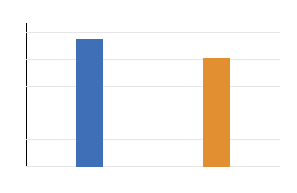
What this chart shows: This SPSS distribution chart shows the shape and spread of G3 scores separately for GP and MS.
How to read it: GP is centered at a higher grade level, while MS shows wider variation. The distributions overlap, but their centers are not the same.
Statistical meaning: The chart supports two points: there is a mean difference and there is unequal spread. Both are central to Welch’s T Test.
Reporting conclusion: Use this chart to explain the data pattern before presenting the Welch test table.
SPSS Chart 2: Group Means with Confidence Intervals
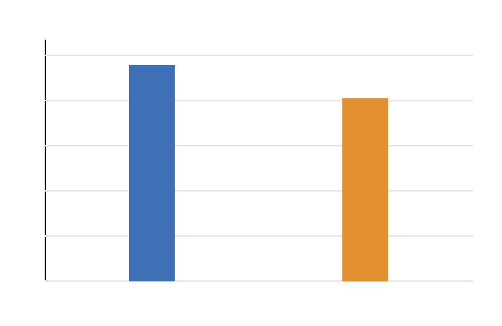
What this chart shows: This chart displays the mean G3 score for each school group with confidence intervals.
How to read it: GP has the higher mean. The intervals show uncertainty around each group mean, not the final mean difference interval.
Statistical meaning: The chart helps readers see the direction of the difference, but the formal result comes from the Welch test row.
Reporting conclusion: State that GP appears higher visually and that the Welch test confirms whether this observed difference is statistically significant.
SPSS Chart 3: Mean Difference Confidence Interval
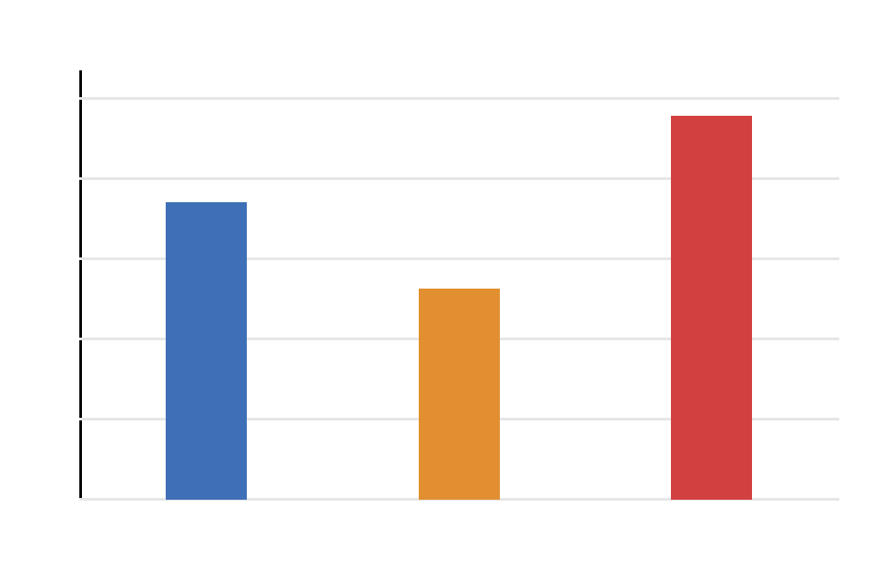
What this chart shows: This chart shows the confidence interval for the mean difference between GP and MS.
How to read it: The interval is above zero, which means the difference is positive across the plausible range.
Statistical meaning: Since the interval does not cross zero, the group difference is statistically significant at the chosen confidence level.
Reporting conclusion: Report the mean difference and confidence interval to show both significance and practical size.
SPSS Chart 4: T Statistic Distribution Curve
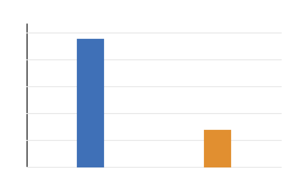
What this chart shows: This chart shows where the Welch t statistic falls on the t distribution.
How to read it: The t statistic is far from zero, meaning the observed difference is large compared with the Welch standard error.
Statistical meaning: A t statistic this large produces a very small p value, supporting rejection of the null hypothesis.
Reporting conclusion: Use this chart to explain why the p value is significant and why the result is not treated as random noise.
SPSS Chart 5: G3 Boxplot by Group

What this chart shows: The boxplot shows median, spread, interquartile range and possible outliers for both groups.
How to read it: MS has wider spread than GP. GP’s center is higher, while MS has more variability.
Statistical meaning: The boxplot is an assumption-supporting chart. It helps justify Welch’s unequal variance approach.
Reporting conclusion: Mention that visual spread differed between groups, so the unequal variance row was used.
SPSS Chart 6: Group Variance Comparison
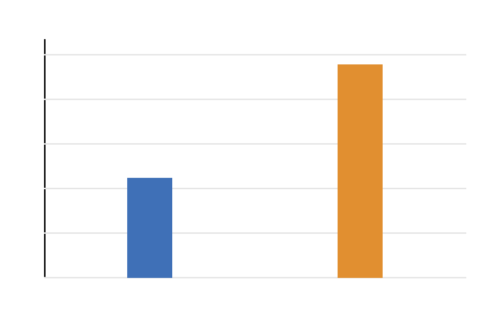
What this chart shows: This chart directly compares the variances of GP and MS.
How to read it: MS has the larger variance. This confirms that the two groups do not have similar spread.
Statistical meaning: Variance inequality is the main assumption reason for using Welch’s test. Welch accounts for this instead of pooling the two variances.
Reporting conclusion: Use this chart to justify the method choice: Welch’s T Test was used because the variance pattern was unequal.
SPSS Chart 7: Mean G3 by Study Time Within Group
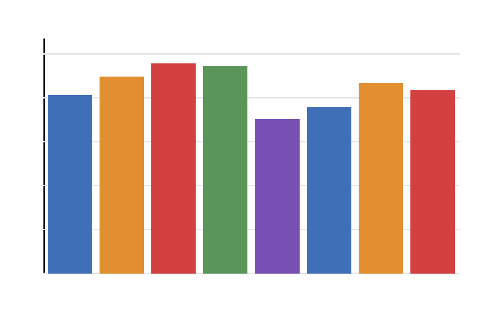
What this chart shows: This chart shows mean G3 across studytime categories within each school group.
How to read it: It gives extra context about whether the school difference appears across studytime levels or only in one subgroup.
Statistical meaning: This is not the main Welch test. It is a descriptive context chart that helps explain the outcome variable.
Reporting conclusion: Use this chart as supporting interpretation only. The formal Welch result remains the GP versus MS mean comparison on G3.
SPSS Chart 8: Welch’s T Test Group Summary Table
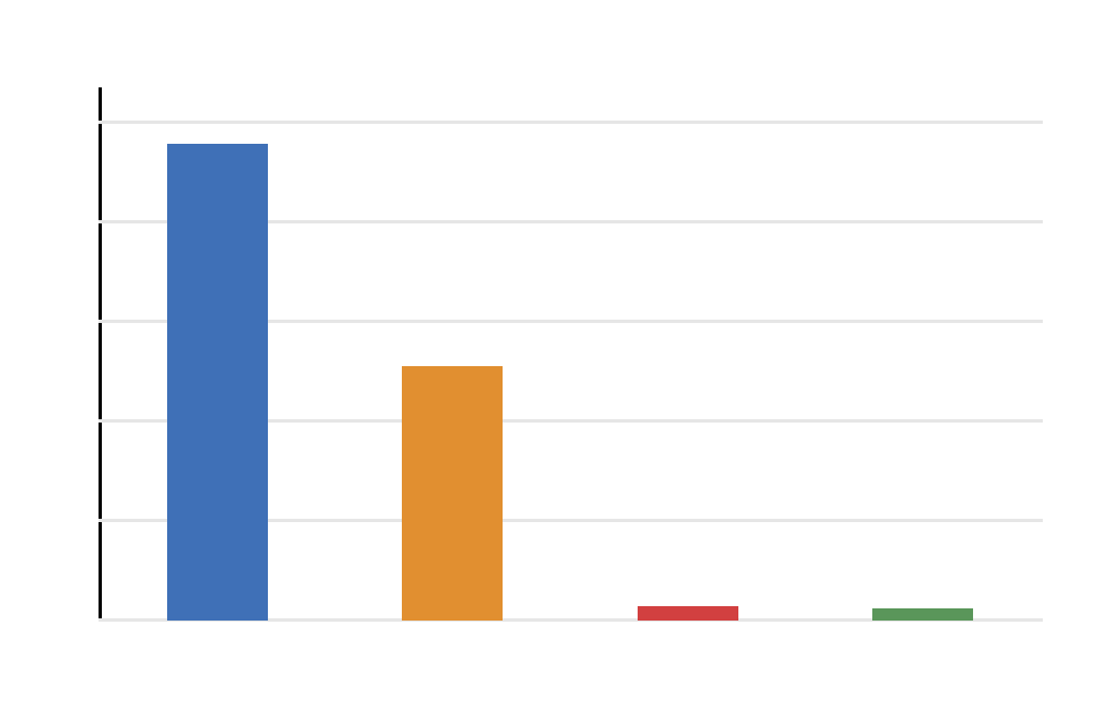
What this table shows: This table reports n, mean, standard deviation and variance for GP and MS.
How to read it: GP has a higher mean and smaller spread. MS has a lower mean and larger spread.
Statistical meaning: The table gives the descriptive evidence needed before interpreting the Welch p value. The mean difference explains the direction, and the SD difference explains the method choice.
Reporting conclusion: Start the SPSS results paragraph with these descriptive statistics, then report the Welch test result.
SPSS Chart 9: Welch’s T Test Main Result Table
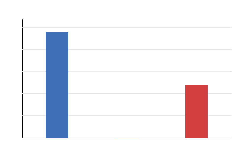
What this table shows: This is the main SPSS Welch result table. It reports t, adjusted df, Sig. 2-tailed, mean difference and confidence interval.
How to read it: Use the Equal variances not assumed row. The p value is below .001, and the confidence interval is above zero.
Statistical meaning: The result shows that GP and MS have significantly different mean G3 scores even when unequal variances are allowed.
Reporting conclusion: Report the Welch row as the final SPSS result: t(340.49) = 6.75, p < .001, with GP higher than MS.
SPSS Chart 10: Welch’s T Test Method Comparison Table
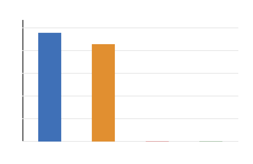
What this table shows: This table compares the equal variance Student t test with the unequal variance Welch t test.
How to read it: Look for differences in standard error, degrees of freedom and interpretation row. Welch uses adjusted df and is the correct row when equal variances are not assumed.
Statistical meaning: The table prevents a common mistake: reporting the pooled row just because it appears first in SPSS.
Reporting conclusion: Report Welch as the main method and use Student only as a comparison method.
Python, R, SPSS and Excel Workflows for Welch’s T Test
The same Welch’s T Test can be reproduced in Python, R, SPSS and Excel. The correct workflow is to use the unequal variance option and then report the adjusted degrees of freedom, p value and confidence interval.
Python Workflow
| Step | Python Action | Purpose | Output to Interpret |
|---|---|---|---|
| Read data | pandas.read_csv() | Load the dataset. | Confirm G3 and school columns exist. |
| Split groups | Create GP and MS arrays | Prepare two independent samples. | Check n for both groups. |
| Run Welch | stats.ttest_ind(gp, ms, equal_var=False) | Run unequal variance test. | Read statistic and p value. |
| Manual df | Welch-Satterthwaite formula | Calculate adjusted df. | Report decimal df. |
| Create charts | matplotlib | Build diagnostics and results. | Use charts for interpretation and reporting. |
R Workflow
| Step | R Action | Purpose | Output to Interpret |
|---|---|---|---|
| Read data | read.csv("dataset.csv") | Load the dataset. | Confirm variables. |
| Prepare variables | G3 numeric and school factor | Set analysis types. | Check group labels. |
| Run Welch | t.test(G3 ~ school, data = df) | Run R default Welch test. | Read t, df, p value and CI. |
| Compare Student | var.equal = TRUE | Optional comparison. | Use only as secondary evidence. |
SPSS Workflow
| Step | SPSS Action | Purpose | Output to Interpret |
|---|---|---|---|
| Open test | Analyze > Compare Means > Independent-Samples T Test | Open two-group test dialog. | Independent Samples Test table. |
| Select outcome | Move G3 into Test Variable(s) | Set numeric outcome. | G3 statistics. |
| Select group | Move school into Grouping Variable | Define groups. | GP and MS labels. |
| Define groups | Enter GP and MS | Tell SPSS which groups to compare. | Group Statistics table. |
| Read Welch row | Equal variances not assumed | Report Welch result. | t, df, Sig. 2-tailed and CI. |
Excel Workflow
| Excel Task | Formula or Tool | Purpose | Output to Interpret |
|---|---|---|---|
| Welch p value | =T.TEST(group1_range,group2_range,2,3) | Run unequal variance t test. | Two-tailed p value. |
| Welch SE | =SQRT(VAR.S(g1)/COUNT(g1)+VAR.S(g2)/COUNT(g2)) | Calculate standard error. | Denominator of t. |
| Welch t | =(AVERAGE(g1)-AVERAGE(g2))/SE | Calculate t statistic. | Distance from zero. |
| Welch df | Welch-Satterthwaite formula | Calculate adjusted degrees of freedom. | Decimal df. |
Code Blocks for Welch’s T Test
Python Code for Welch’s T Test
import pandas as pd
import numpy as np
from scipy import stats

df = pd.read_csv("dataset.csv")
df["G3"] = pd.to_numeric(df["G3"], errors="coerce")
df = df.dropna(subset=["G3", "school"])

gp = df.loc[df["school"] == "GP", "G3"]
ms = df.loc[df["school"] == "MS", "G3"]

welch_result = stats.ttest_ind(gp, ms, equal_var=False)

n1, n2 = gp.count(), ms.count()
mean1, mean2 = gp.mean(), ms.mean()
var1, var2 = gp.var(ddof=1), ms.var(ddof=1)

mean_diff = mean1 - mean2
v1 = var1 / n1
v2 = var2 / n2

welch_se = np.sqrt(v1 + v2)
welch_t = mean_diff / welch_se
welch_df = (v1 + v2) ** 2 / ((v1 ** 2) / (n1 - 1) + (v2 ** 2) / (n2 - 1))

alpha = 0.05
tcrit = stats.t.ppf(1 - alpha / 2, welch_df)
ci_low = mean_diff - tcrit * welch_se
ci_high = mean_diff + tcrit * welch_se

print("Welch's T Test")
print("Mean difference:", mean_diff)
print("Welch SE:", welch_se)
print("Welch t:", welch_t)
print("Welch df:", welch_df)
print("p value:", welch_result.pvalue)
print("95% CI:", ci_low, ci_high)
R Code for Welch’s T Test
df <- read.csv("dataset.csv")

df$G3 <- as.numeric(df$G3)
df$school <- as.factor(df$school)

df_model <- na.omit(df[, c("G3", "school", "studytime")])

welch_result <- t.test(G3 ~ school, data = df_model)
student_result <- t.test(G3 ~ school, data = df_model, var.equal = TRUE)

print(welch_result)
print(student_result)

aggregate(G3 ~ school, data = df_model, FUN = function(x) {
  c(n = length(x), mean = mean(x), sd = sd(x), variance = var(x))
})
SPSS Syntax for Welch’s T Test
* Welch's T Test in SPSS.
* Outcome: G3.
* Grouping variable: school.
* Groups: GP and MS.
* Report the "Equal variances not assumed" row.

TITLE "Welch's T Test: G3 by School".

T-TEST GROUPS=school('GP' 'MS')
  /VARIABLES=G3
  /MISSING=ANALYSIS
  /CRITERIA=CI(.95).

MEANS TABLES=G3 BY school
  /CELLS MEAN COUNT STDDEV VARIANCE SEMEAN.

EXAMINE VARIABLES=G3 BY school
  /PLOT BOXPLOT HISTOGRAM NPPLOT
  /STATISTICS DESCRIPTIVES
  /CINTERVAL 95
  /MISSING LISTWISE
  /NOTOTAL.

OUTPUT EXPORT
  /CONTENTS EXPORT=VISIBLE
  /PDF DOCUMENTFILE="Welchs-T-Test-SPSS-Output.pdf".
Excel Formulas for Welch’s T Test
Welch p value:
=T.TEST(group1_range,group2_range,2,3)

Welch standard error:
=SQRT(VAR.S(group1_range)/COUNT(group1_range)+VAR.S(group2_range)/COUNT(group2_range))

Welch t statistic:
=(AVERAGE(group1_range)-AVERAGE(group2_range))/Welch_SE

Welch degrees of freedom:
=((VAR.S(group1_range)/COUNT(group1_range)+VAR.S(group2_range)/COUNT(group2_range))^2)/
(((VAR.S(group1_range)/COUNT(group1_range))^2)/(COUNT(group1_range)-1)+
((VAR.S(group2_range)/COUNT(group2_range))^2)/(COUNT(group2_range)-1))

Decision:
=IF(p_value_cell<0.05,"Reject H0","Fail to reject H0")
APA Reporting Wording
When reporting Welch’s T Test, include the group means, standard deviations, Welch t statistic, adjusted degrees of freedom, p value, confidence interval and practical direction. Decimal degrees of freedom should be reported normally because they are expected in Welch’s method.
APA-style report: A Welch’s t test was conducted to compare G3 final grades between GP and MS students. GP students had a higher mean G3 score (M = 12.58, SD = 2.63) than MS students (M = 10.65, SD = 3.83). The difference was statistically significant, t(340.49) = 6.75, p < .001, 95% CI [1.37, 2.49]. Therefore, GP students scored significantly higher on average.
Short reporting version: Welch’s T Test showed that GP students scored significantly higher on G3 than MS students, t(340.49) = 6.75, p < .001.
Common Mistakes
| Mistake | Why It Is Wrong | Correct Practice |
|---|---|---|
| Reporting the equal variances assumed SPSS row | That row is Student’s t test, not Welch’s T Test. | Report the Equal variances not assumed row. |
| Thinking decimal df is an error | Welch-Satterthwaite df is often decimal. | Report decimal degrees of freedom normally. |
| Using pooled variance with unequal variances | Pooled variance assumes equality. | Use separate variance components in Welch’s formula. |
| Choosing the test by smallest p value | Method choice should depend on assumptions. | Choose Welch when variances or sample sizes differ. |
| Using Welch for paired data | Welch is for independent groups. | Use paired t test for repeated or matched measurements. |
| Reporting only p value | P value does not show size or direction. | Report means, SDs, mean difference and confidence interval. |
When to Use Welch’s T Test
Use Welch’s T Test when comparing two independent means and the equal variance assumption is doubtful. It is also a strong default option when group standard deviations or sample sizes are noticeably different.
| Research Situation | Correct Test | Example |
|---|---|---|
| Two independent groups with unequal variances | Welch’s T Test | Compare GP and MS when MS has larger spread. |
| Two independent groups with unequal sample sizes | Welch’s T Test | Compare groups where one group is much larger. |
| Two independent groups with similar variances | Student t test may be acceptable | Use equal variance version only when justified. |
| Two related measurements | Paired t test | Compare G1 and G3 for the same students. |
| Three or more groups | Welch ANOVA or one-way ANOVA | Compare G3 across studytime categories. |
Practice Resources
Use the complete Python, R, SPSS and Excel examples above to reproduce the analysis with your own dataset. Check variable types, missing values and group coding before running the test.
FAQs About Welch’s T Test
What is Welch’s T Test?
Welch’s T Test is an independent two sample t test used when two groups may have unequal variances. It compares two means without assuming equal population variances.
When should I use Welch’s T Test?
Use Welch’s T Test when comparing two independent groups and the group variances, standard deviations or sample sizes are noticeably different.
What is the Welch t test formula?
The formula is t = (mean1 - mean2) / sqrt(s1²/n1 + s2²/n2). It uses separate variance components instead of a pooled variance.
Why are Welch degrees of freedom decimal?
Welch uses the Welch-Satterthwaite equation to adjust degrees of freedom for unequal variances. This often produces decimal degrees of freedom.
What is Welch’s T Test vs Student t test?
Student’s t test assumes equal variances and uses a pooled variance. Welch’s T Test does not assume equal variances and adjusts the standard error and degrees of freedom.
How do I run Welch’s T Test in SPSS?
Run Independent-Samples T Test and report the Equal variances not assumed row. That row is the Welch result.
How do I run Welch’s T Test in R?
Use t.test(outcome ~ group, data = df). R uses Welch’s T Test by default for two independent groups unless var.equal = TRUE is added.
How do I run Welch’s T Test in Excel?
Use =T.TEST(group1_range, group2_range, 2, 3). The type value 3 tells Excel to use the unequal variance two sample t test.

