
Ordinal Data, Latent Thresholds, Correlation Matrix and Excel Worked Results
Polychoric Correlation: Formula, Interpretation, SPSS, Python, R and Excel Guide
Polychoric Correlation estimates the latent association between two ordered categorical variables. It is especially useful for Likert scales, ordinal survey items, coded education levels, study-time categories, family relationship ratings and other variables where the visible categories are ordered but not truly continuous. This complete guide explains the formula logic, threshold model, correlation matrix interpretation, SPSS output, Python charts, R validation charts, Excel worked results, APA wording, common mistakes and downloadable resources.
Quick Answer: Polychoric Correlation Result
The main analysis used 649 valid student records and 11 ordered categorical variables: Medu, Fedu, traveltime, studytime, failures, famrel, freetime, goout, Dalc, Walc and health. A polychoric correlation matrix was computed to estimate the latent bivariate-normal association behind these ordinal responses.
The strongest relationship was between Dalc and Walc, with polychoric r = 0.7746, approximate p = 7.33 × 10-131 and N = 649. This means weekday alcohol consumption and weekend alcohol consumption have a very strong positive latent association. The second strongest result was Medu with Fedu, r = 0.7037, approximate p = 4.07 × 10-98, showing that mother’s education and father’s education are also strongly and positively associated.
Final interpretation: The analysis found a strong positive ordinal association between weekday and weekend alcohol-use categories, a strong positive association between mother’s and father’s education levels, and several moderate lifestyle-pattern relationships. The negative coefficients for variables such as studytime with Walc and Medu with traveltime show that higher levels of one ordinal variable tend to align with lower latent levels of the other variable.
Important reporting note: Polychoric correlation is not the same as Pearson correlation. It assumes each ordinal variable is a categorized version of an underlying continuous latent variable. The p-values in this guide are approximate and should be reported as supporting evidence, while the correlation matrix, pairwise N and threshold logic should be emphasized.
Table of Contents
- What Is Polychoric Correlation?
- When to Use Polychoric Correlation
- Polychoric Correlation Formula and Threshold Logic
- Dataset and Ordinal Variables Used
- Excel Worked Results
- Polychoric Matrix and Strongest Pairs
- Python Chart-by-Chart Interpretation
- R Chart-by-Chart Validation
- SPSS Output Interpretation
- SPSS, R, Python and Excel Workflows
- Code Blocks for Polychoric Correlation
- APA Reporting Wording
- Common Mistakes
- Downloads and Resources
- Related Guides
- FAQs
What Is Polychoric Correlation?
Polychoric correlation is a correlation coefficient for two ordered categorical variables. It estimates the relationship between the unobserved continuous variables that are assumed to lie behind the observed ordinal categories. In simple words, it treats an ordinal scale as a set of thresholds on a hidden continuous scale and then estimates how strongly the two hidden scales move together.
For example, a response scale from 1 to 5 is ordered, but the distance between 1 and 2 may not be exactly the same as the distance between 4 and 5. Pearson correlation treats those distances as equal. Spearman correlation ranks the values. Polychoric correlation goes one step further by estimating a latent correlation under a threshold model. That is why it is frequently used with Likert-type items, factor analysis on ordinal data, CFA with ordinal indicators and ordinal correlation matrices.
In this guide, the variables are not ordinary continuous scores. They are ordered codes such as parental education, travel time, study time, number of past failures, family relationship rating, free time, going-out frequency, alcohol-use categories and health rating. Because these variables have meaningful order but limited category counts, a polychoric correlation matrix is more suitable than an ordinary correlation matrix based only on raw numeric codes.
Simple definition: Polychoric correlation estimates the latent correlation between two ordered categorical variables by assuming the observed categories are created by cutting underlying continuous normal variables at thresholds.
When to Use Polychoric Correlation
Use Polychoric Correlation when both variables are ordinal and have a clear order. It is most useful when the variables are not continuous measurements but categories that represent increasing levels. Typical examples include strongly disagree to strongly agree items, education levels, frequency ratings, symptom severity categories and ordered survey scales.
| Situation | Best Choice | Reason |
|---|---|---|
| Both variables are ordered categorical | Polychoric correlation | It estimates the latent association behind ordinal categories. |
| Both variables are continuous | Pearson correlation | Continuous variables can be directly compared on their numeric scale. |
| Variables are ordinal but no latent-normal assumption is desired | Spearman correlation | Spearman uses ranks and is easier to explain, but may underestimate latent association. |
| Both variables are binary cuts from latent variables | Tetrachoric correlation | Tetrachoric is the binary-binary special case of polychoric logic. |
| One variable is ordinal and one is continuous | Polyserial correlation | Polyserial handles one ordered categorical and one continuous variable. |
In factor analysis, polychoric matrices are often preferred for ordinal questionnaire items because factor extraction on Pearson correlations can be distorted when categories are few or skewed. This is why students often search for polychoric correlation factor analysis R, polychoric correlation lavaan, polychoric correlation matrix in R and polychoric correlation SPSS.
Polychoric Correlation Formula and Threshold Logic
Polychoric correlation is usually estimated by maximum likelihood rather than by a single simple hand formula. The model assumes two unobserved continuous variables, usually written as X* and Y*, follow a bivariate normal distribution. The observed ordinal variables are created when X* and Y* are cut into categories by threshold values.
The threshold values are estimated from the marginal category proportions. For example, if 56.39% of students are in the first travel-time category, the first latent threshold for traveltime is approximately z = 0.1610. Excel can reproduce this threshold idea using NORM.S.INV(cumulative proportion). The correlation itself is then estimated by finding the latent correlation that best matches the observed two-way ordinal frequency table.
| Part of the Model | Meaning | How It Appears in This Guide |
|---|---|---|
| Ordinal categories | Observed ordered codes such as 1, 2, 3, 4 or 5 | Dalc, Walc, famrel, freetime, goout and health use ordered levels. |
| Latent continuous variable | Unobserved continuous tendency behind the ordinal categories | Alcohol-use tendency behind Dalc and Walc categories. |
| Thresholds | Cut points that convert latent values into observed categories | Computed from cumulative category proportions in the Excel workbook. |
| Polychoric r | Estimated latent correlation between two ordinal variables | Dalc-Walc has r = 0.7746 in the final matrix. |
| Approximate p-value | Significance support based on r and N approximation | Reported for strongest-pair ranking, with p-values treated as approximate. |
Dataset and Ordinal Variables Used
The Excel workbook used 649 rows from the student dataset. The ordinal analysis included 11 variables. Every selected variable had a valid ordered coding structure, making it suitable for a polychoric matrix. The method note in the workbook states that the matrix was computed using a maximum-likelihood bivariate-normal threshold model, while Excel sheets provide checks, pairwise N, p-values, Spearman comparisons, Pearson comparisons, thresholds and crosstab support.
| Variable | Count | Observed Levels | Mean Code | Interpretation |
|---|---|---|---|---|
| Medu | 649 | 0, 1, 2, 3, 4 | 2.515 | Mother’s education level. |
| Fedu | 649 | 0, 1, 2, 3, 4 | 2.307 | Father’s education level. |
| traveltime | 649 | 1, 2, 3, 4 | 1.569 | Home-to-school travel time category. |
| studytime | 649 | 1, 2, 3, 4 | 1.931 | Weekly study-time category. |
| failures | 649 | 0, 1, 2, 3 | 0.222 | Number of past class failures. |
| famrel | 649 | 1, 2, 3, 4, 5 | 3.931 | Quality of family relationships. |
| freetime | 649 | 1, 2, 3, 4, 5 | 3.180 | Free time after school. |
| goout | 649 | 1, 2, 3, 4, 5 | 3.185 | Going out with friends. |
| Dalc | 649 | 1, 2, 3, 4, 5 | 1.502 | Workday alcohol consumption. |
| Walc | 649 | 1, 2, 3, 4, 5 | 2.280 | Weekend alcohol consumption. |
| health | 649 | 1, 2, 3, 4, 5 | 3.536 | Current health status rating. |
Before running a polychoric matrix, it is useful to review descriptive statistics, frequency distributions, histogram interpretation, correlation assumptions and parametric vs nonparametric tests so that the ordinal coding is clear before interpreting the matrix.
Excel Worked Results Explained
The attached Excel workbook is a fully worked companion file. Because Excel has no native POLYCHORIC function, the workbook provides the computed polychoric matrix along with formula-driven checks, pairwise N values, approximate p-values, Spearman comparisons, Pearson comparisons, thresholds and a crosstab example. This makes the workbook useful for students who need to understand the method even if the estimation was performed in Python, R or SPSS.
| Workbook Sheet | Purpose | How to Interpret It |
|---|---|---|
| Variable_Summary | Shows count, minimum, maximum, mean code, SD code and observed levels. | Confirms that the selected variables are ordinal and valid for the matrix. |
| Polychoric_Matrix | Main output matrix. | Shows latent correlation estimates between each pair of ordinal variables. |
| Strongest_Pairs | Ranked list of pairwise relationships. | Highlights which ordinal pairs are most important to discuss. |
| Thresholds | Category counts, proportions and latent z thresholds. | Explains how observed ordinal categories connect to the latent-normal model. |
| Crosstab_Example | Dalc by Walc frequency table. | Shows the observed two-way table behind the strongest pair. |
| Spearman_Comparison | Rank-correlation comparison matrix. | Shows how polychoric estimates compare with a nonparametric rank method. |
| Pearson_Comparison | Raw code correlation comparison matrix. | Shows how ordinary numeric-code correlation differs from latent correlation. |
| Excel_Formulas | Formula references and reporting notes. | Shows formulas for pairwise N, approximate p-values, Pearson checks and thresholds. |
Excel Crosstab Example: Dalc by Walc
The workbook includes a crosstab for the strongest pair, Dalc by Walc. The table shows that students with low weekday alcohol consumption are concentrated in lower weekend alcohol categories, while higher weekday categories have more observations in higher weekend categories. For example, Dalc = 1 has 241 observations at Walc = 1 and only 5 at Walc = 5, while Dalc = 5 has 15 observations at Walc = 5. This diagonal pattern explains the strong positive latent estimate of r = 0.7746.
| Dalc \ Walc | 1 | 2 | 3 | 4 | 5 |
|---|---|---|---|---|---|
| 1 | 241 | 113 | 64 | 28 | 5 |
| 2 | 3 | 34 | 43 | 34 | 7 |
| 3 | 1 | 1 | 9 | 20 | 12 |
| 4 | 1 | 1 | 4 | 5 | 6 |
| 5 | 1 | 1 | 0 | 0 | 15 |
Polychoric Matrix and Strongest Pairs
The most important part of any polychoric correlation analysis is the matrix itself. Values near +1 indicate a strong positive latent association, values near -1 indicate a strong negative latent association and values near 0 indicate little latent association. The strongest results in this project are shown below.
| Rank | Variable 1 | Variable 2 | Polychoric r | Approx p-value | Direction | Decision |
|---|---|---|---|---|---|---|
| 1 | Dalc | Walc | 0.7746 | 7.33 × 10-131 | Positive | Significant |
| 2 | Medu | Fedu | 0.7037 | 4.07 × 10-98 | Positive | Significant |
| 3 | goout | Walc | 0.4349 | 2.47 × 10⁻³¹ | Positive | Significant |
| 4 | freetime | goout | 0.3793 | 1.25 × 10⁻²³ | Positive | Significant |
| 5 | goout | Dalc | 0.3217 | 4.36 × 10⁻¹⁷ | Positive | Significant |
| 6 | Medu | traveltime | -0.3210 | 5.06 × 10⁻¹⁷ | Negative | Significant |
| 7 | Medu | failures | -0.3166 | 1.40 × 10⁻¹⁶ | Negative | Significant |
| 8 | Fedu | traveltime | -0.2708 | 2.25 × 10⁻¹² | Negative | Significant |
| 9 | studytime | Walc | -0.2679 | 3.96 × 10⁻¹² | Negative | Significant |
| 10 | studytime | failures | -0.2671 | 4.58 × 10⁻¹² | Negative | Significant |
The top positive results form two clear clusters. First, alcohol-use variables are strongly linked: weekday alcohol consumption and weekend alcohol consumption move together, and going out with friends is also positively related to weekend alcohol use. Second, parental education variables are strongly linked, with Medu and Fedu showing a strong positive relationship.
The strongest negative results also make practical sense. Higher mother’s education is negatively associated with traveltime and failures, while studytime is negatively associated with weekend alcohol use and failures. These negative signs do not mean “bad” or “good” by themselves; they simply show that higher ordinal levels on one variable tend to align with lower latent levels on the other variable.
Python Chart-by-Chart Interpretation
The Python output provides six publication-ready visuals: a correlation heatmap, an approximate p-value heatmap, a strongest-pair chart, ordinal variable distributions, threshold context and a polychoric versus Spearman comparison. These charts make the matrix easier to interpret than a table alone.
Python Chart 1: Polychoric Correlation Heatmap
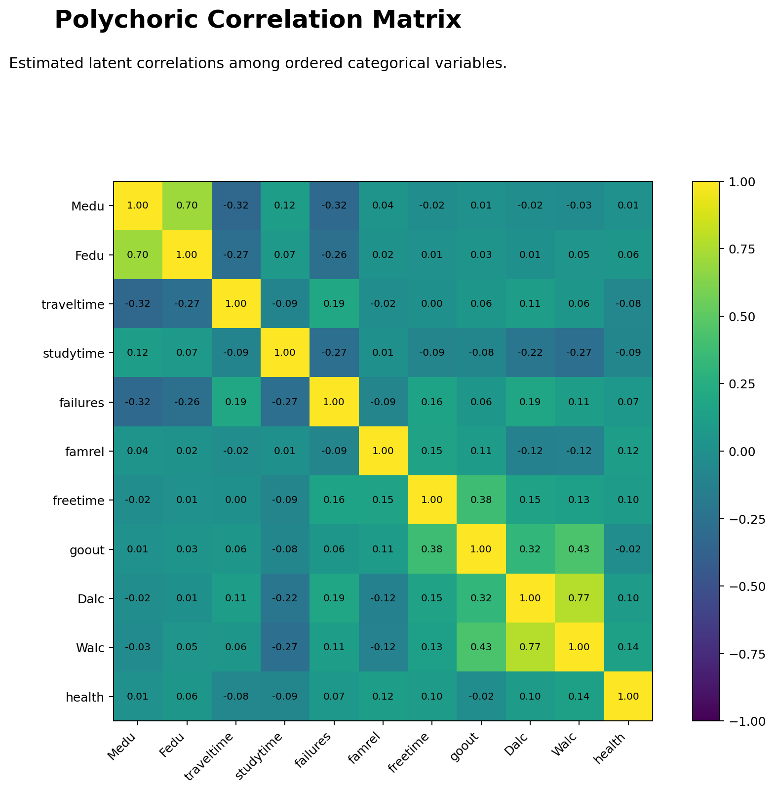
The heatmap is the main visual summary of the matrix. The strongest positive cell is Dalc with Walc, followed by Medu with Fedu. The lifestyle section also shows positive connections among goout, Walc, Dalc and freetime. The education-related cells show negative relationships with traveltime and failures, which helps explain the academic pattern in the data.
This chart should be used as the first interpretation figure because it shows both direction and relative magnitude. Stronger colors identify pairs that deserve explanation in the written report, while lighter cells show weaker or near-zero relationships.
Python Chart 2: Approximate P-Value Heatmap
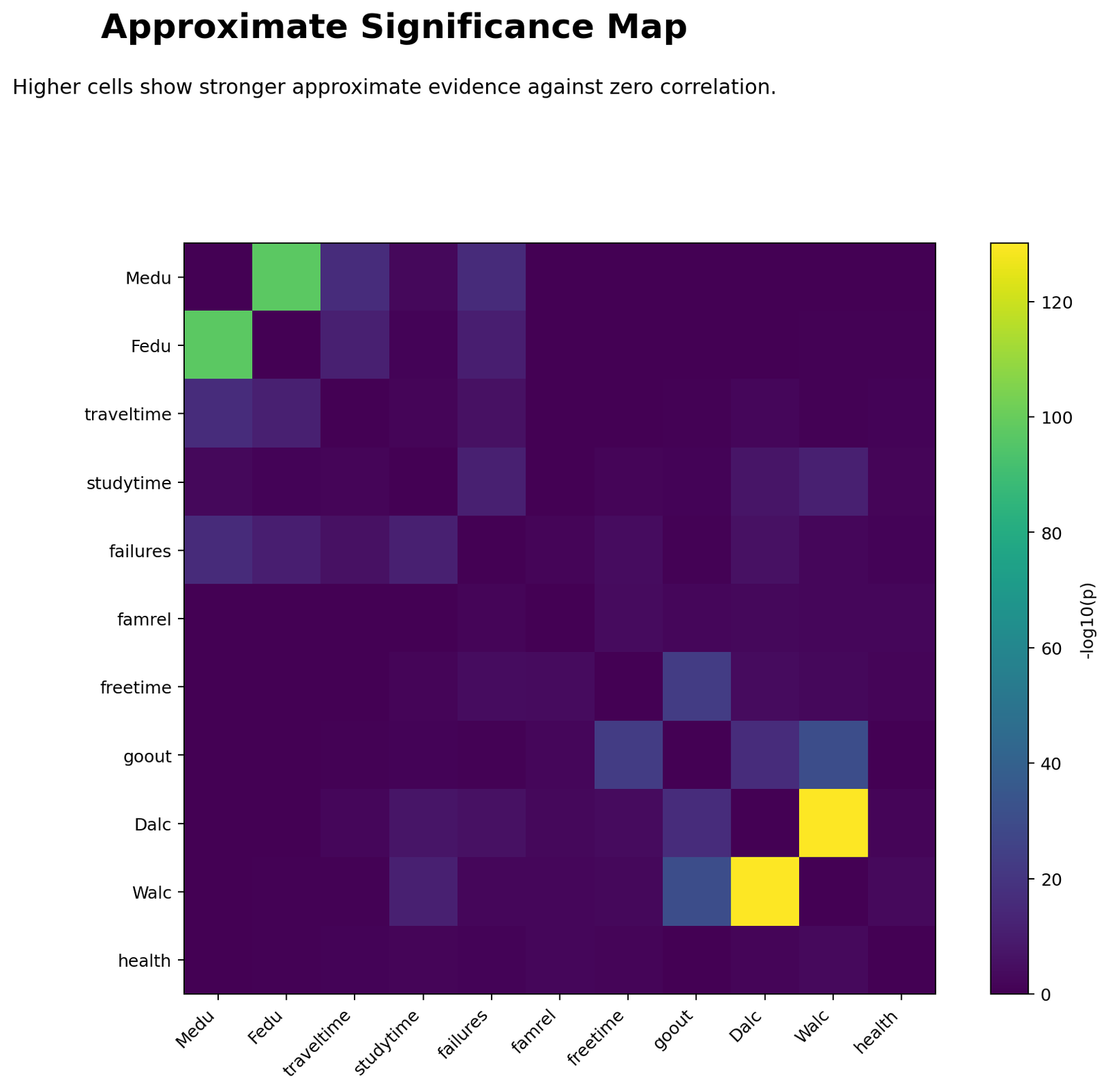
The p-value heatmap supports the strongest-pair interpretation. Very small p-values appear for Dalc-Walc, Medu-Fedu, goout-Walc, freetime-goout and several studytime or failure relationships. Because the sample size is large, even modest coefficients can become statistically significant.
The correct reporting approach is to combine coefficient size with p-value evidence. A tiny p-value does not automatically mean the association is practically large. The Dalc-Walc and Medu-Fedu relationships are important because they are both statistically significant and large in magnitude.
Python Chart 3: Strongest Polychoric Pairs
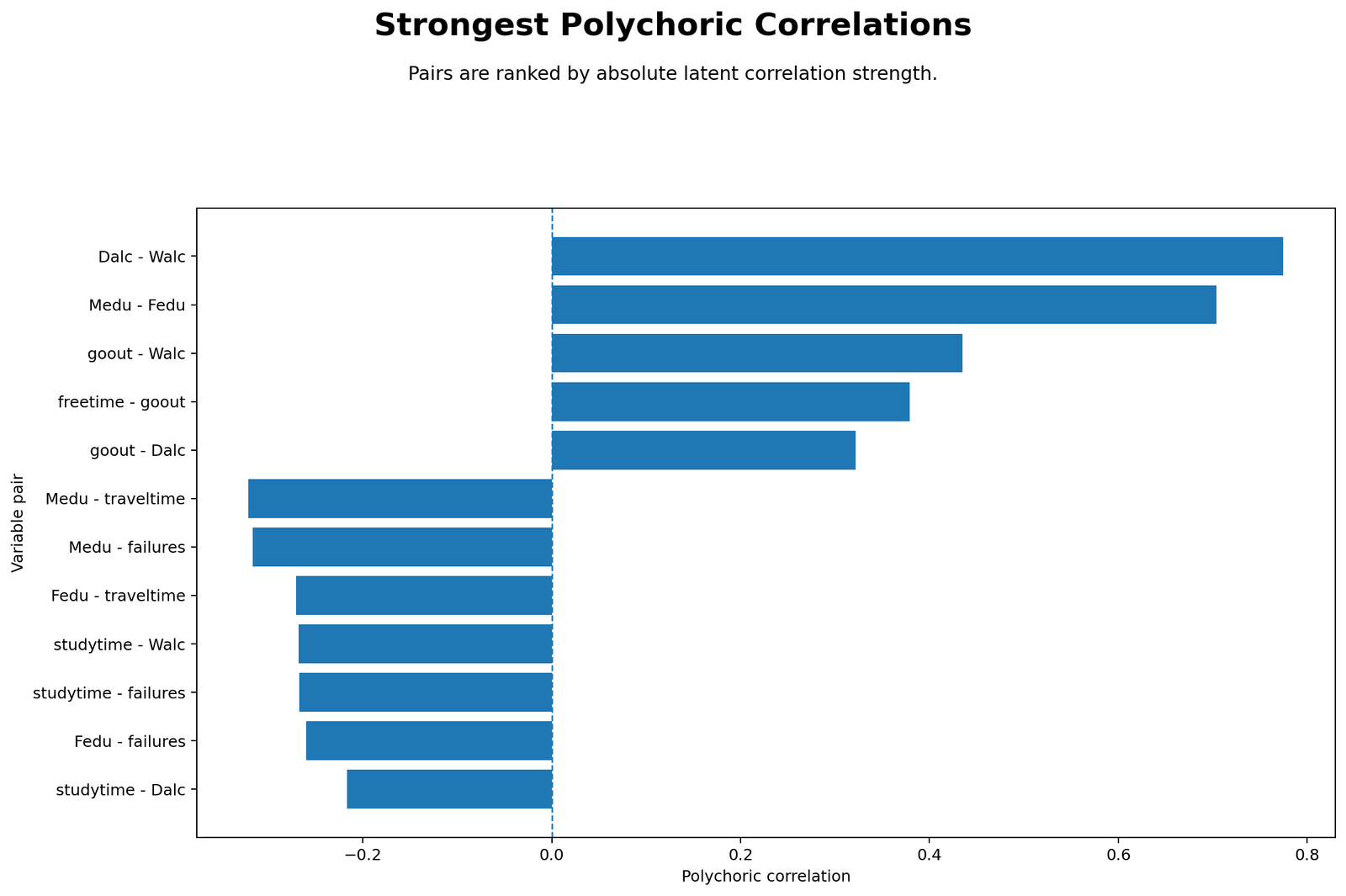
This chart converts the matrix into a ranked list. It clearly shows that Dalc-Walc is the dominant pair, with r = 0.7746, and Medu-Fedu is the second strongest pair, with r = 0.7037. The next tier includes goout-Walc, freetime-goout, goout-Dalc, Medu-traveltime and Medu-failures.
The chart is useful for report writing because readers can quickly see which relationships matter most. Instead of discussing every cell in the matrix, the report can focus on the strongest positive and strongest negative associations.
Python Chart 4: Ordinal Variable Distributions
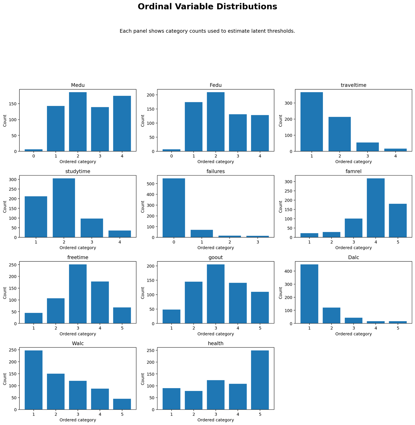
This chart shows how observations are distributed across ordinal levels. It is important because skewed category distributions can influence threshold estimates. Variables such as failures and Dalc have many observations in lower categories, while variables such as famrel and health have many observations in higher categories.
Polychoric correlation uses these marginal distributions to estimate latent thresholds. Therefore, this chart is not only descriptive; it helps explain why threshold modeling is needed when ordinal variables are unevenly distributed.
Python Chart 5: Polychoric Threshold Context
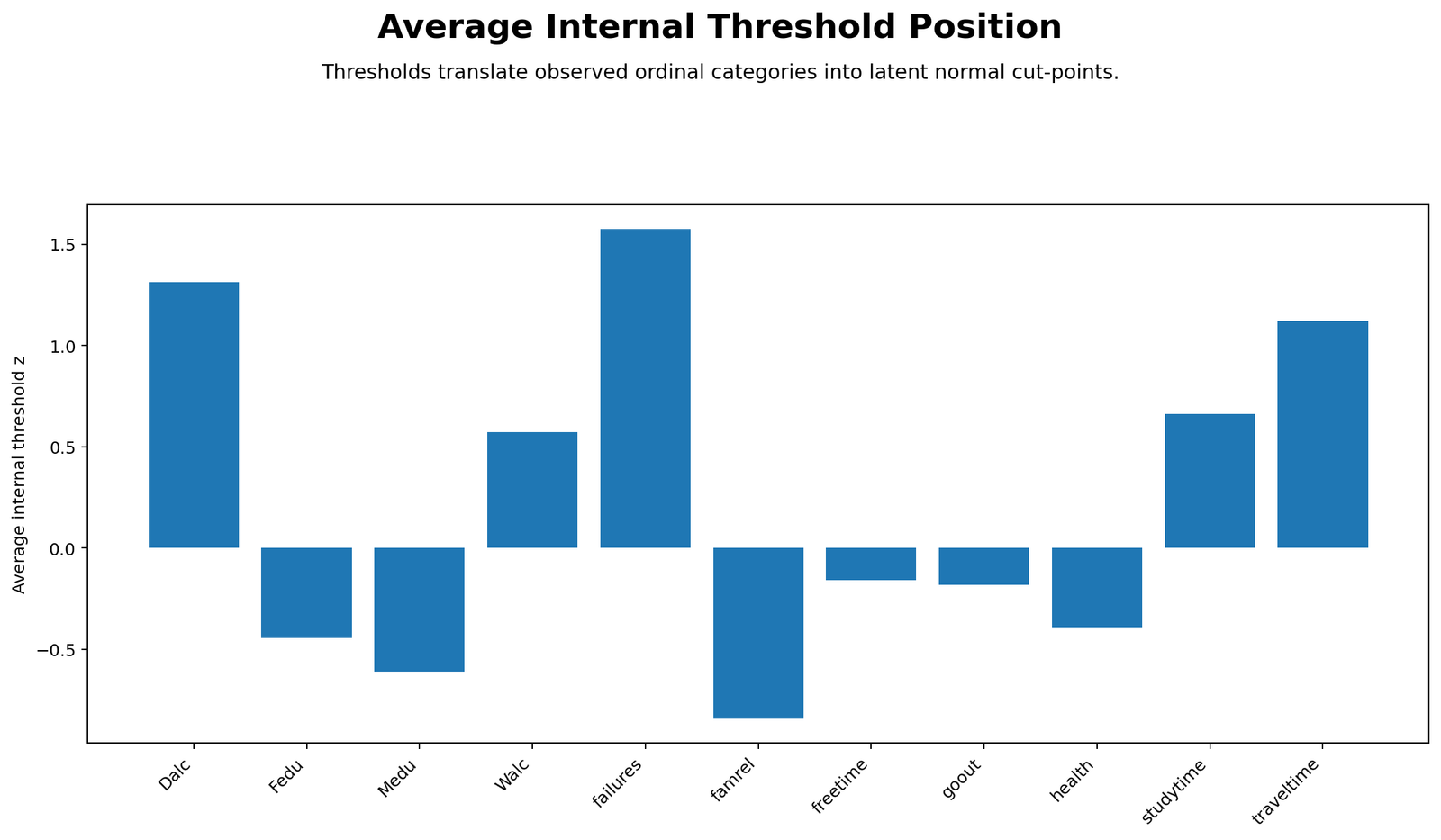
The threshold chart connects the observed ordinal categories to the latent-normal model. Category proportions are converted into cumulative proportions, and cumulative proportions are converted into z thresholds. For example, the threshold principle used in Excel is NORM.S.INV(cumulative category proportion).
This chart is important for students because it explains why polychoric correlation is not a simple Pearson correlation of category numbers. The method estimates relationships between latent continuous variables after accounting for how the ordinal categories were formed.
Python Chart 6: Polychoric vs Spearman Comparison
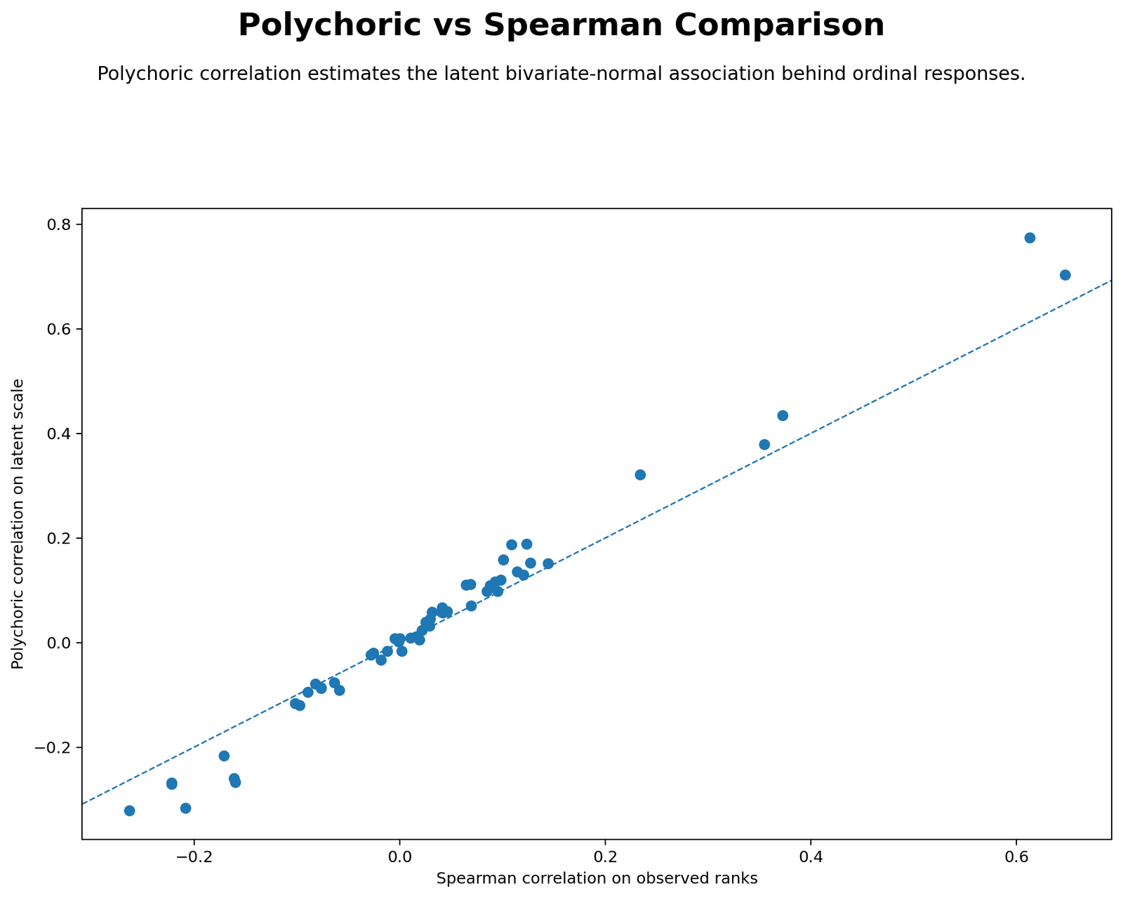
The comparison chart shows that polychoric estimates are often larger in magnitude than Spearman correlations. For example, Dalc-Walc is 0.7746 in the polychoric matrix but 0.6131 in the Spearman comparison. Medu-Fedu is 0.7037 polychoric and 0.6472 Spearman.
This difference is expected because Spearman works with ranks, while polychoric estimates latent correlation under an ordinal threshold model. The comparison helps readers understand why the chosen method matters for ordinal data.
R Chart-by-Chart Validation
The R output repeats the same analysis with colorful validation charts. Agreement between Python and R outputs is valuable because it shows that the matrix pattern is not a single-software artifact.
R Chart 1: Colorful Polychoric Correlation Heatmap
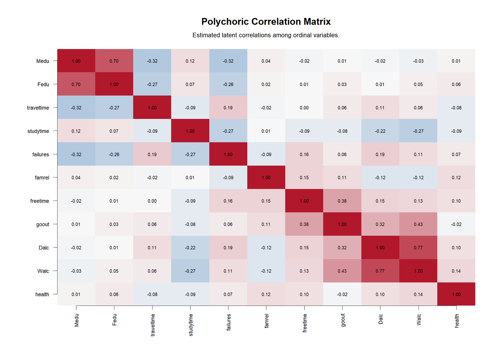
The R heatmap confirms the same structure found in Python. Dalc-Walc and Medu-Fedu are the two strongest positive associations, while education variables show negative links with traveltime and failures. This agreement supports the reliability of the final matrix.
R Chart 2: Colorful P-Value Heatmap
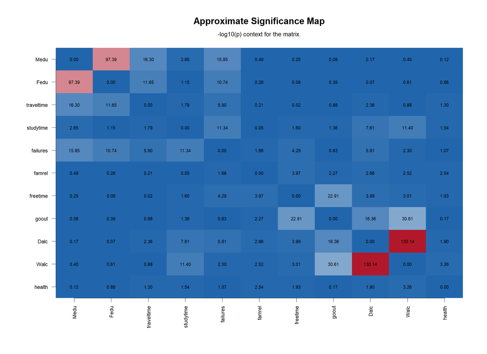
The R p-value heatmap reinforces that the strongest coefficients have extremely small approximate p-values. It also reminds the reader to distinguish statistical significance from effect size. In a large dataset, some smaller coefficients will still be significant.
R Chart 3: Colorful Strongest Polychoric Pairs
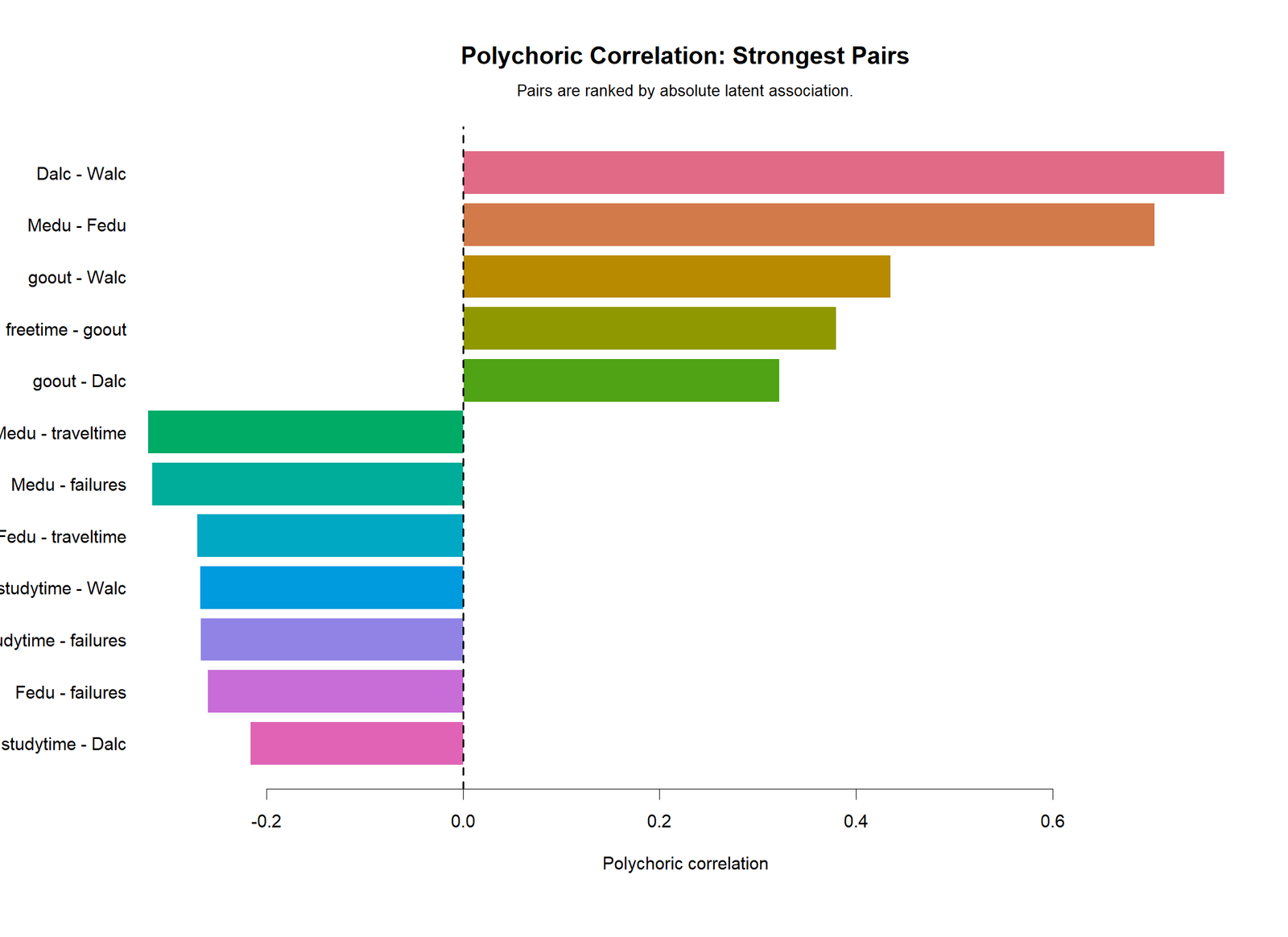
The R ranked-pairs chart is the easiest figure to use for a short results paragraph. It shows the positive and negative relationships that should be highlighted in the final interpretation, with Dalc-Walc and Medu-Fedu clearly at the top.
R Chart 4: Colorful Ordinal Variable Distributions
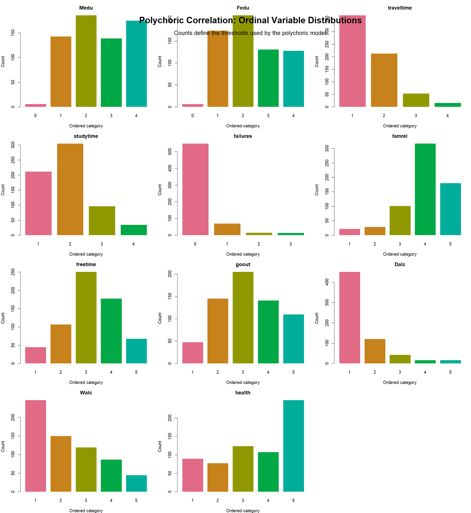
The R distribution chart confirms the same category imbalance patterns. This matters because polychoric correlation depends on threshold estimates. Variables with many observations in one category still can be used, but the category distribution should be reported and checked.
R Chart 5: Colorful Threshold Context
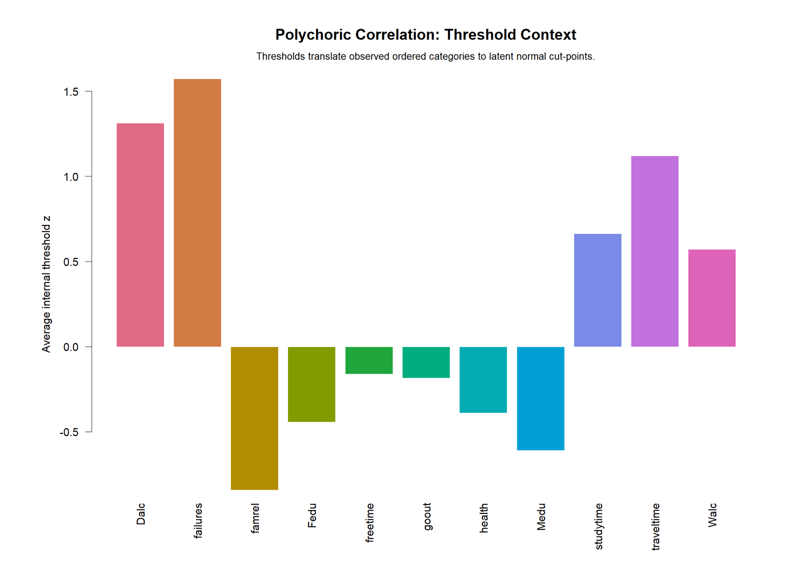
The R threshold context chart gives a visual explanation of how ordinal categories are treated as intervals on a latent continuous scale. This is one of the most important conceptual charts in the post because it explains the difference between observed codes and latent variables.
R Chart 6: Colorful Polychoric vs Spearman Comparison
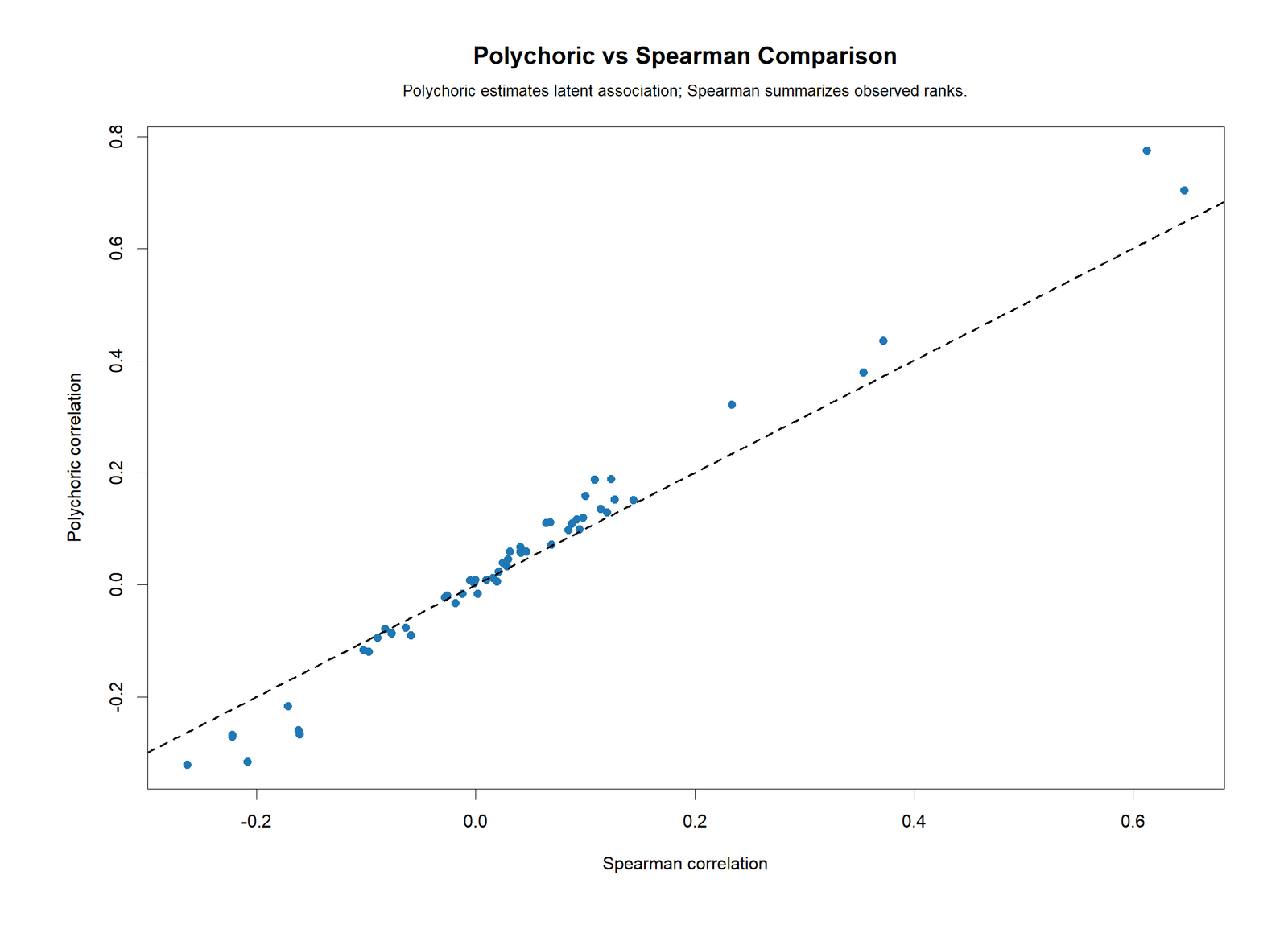
The R comparison chart confirms that polychoric estimates tend to be stronger than Spearman estimates for several ordinal pairs. This supports the main teaching point: method choice matters when the data are ordinal rather than truly continuous.
SPSS Output Interpretation for Polychoric Correlation
The SPSS output PDF provides the formal software output for the same project. Because standard SPSS menus do not always provide a direct polychoric command in the same way as Pearson correlations, SPSS workflows commonly rely on extension procedures, syntax-based routines, matrix handling or exported computations depending on the installation. In this project, the SPSS output is used as the reporting companion to the Python, R and Excel results.
Open the SPSS Polychoric Correlation output PDF
| SPSS Output Item | Interpretation |
|---|---|
| Ordinal variable list | Confirms that Medu, Fedu, traveltime, studytime, failures, famrel, freetime, goout, Dalc, Walc and health are the variables included in the ordinal matrix. |
| Pairwise N | Shows that the main matrix used 649 valid paired observations for the reported pairs. |
| Polychoric matrix | Provides the latent correlation estimates between ordinal variables. |
| Strongest pair summary | Highlights Dalc-Walc as the strongest positive pair and Medu-Fedu as the second strongest pair. |
| Reporting note | Reminds the reader that polychoric correlation assumes ordered categories arise from latent continuous variables. |
SPSS reporting note: If your SPSS installation cannot compute polychoric correlations directly from the menus, report the matrix generated by a validated script or extension and clearly state the estimation method. Do not label a Pearson correlation matrix of ordinal codes as a polychoric matrix.
SPSS, R, Python and Excel Workflows for Polychoric Correlation
The same logic can be explained in all four tools, but the workflow differs. R and Python are usually the best tools for actual estimation, SPSS is useful for formal output and reporting, and Excel is best for teaching the threshold and matrix interpretation steps.
| Software | Main Steps | Best Use |
|---|---|---|
| Python | Load ordinal variables, remove missing values, estimate polychoric correlations pair by pair, create heatmaps, p-value charts, threshold charts and comparison plots. | Automated chart generation and reproducible statistical reporting. |
| R | Use ordinal-friendly packages or functions, compute the polychoric matrix, compare with Spearman, export charts and PDF report. | Statistical validation, factor-analysis preparation and publication graphics. |
| SPSS | Prepare ordinal variables, run extension/syntax-based polychoric analysis or import validated matrix, export Viewer output to PDF. | Thesis-style output, institutional reporting and SPSS documentation. |
| Excel | Use computed matrix plus formulas for counts, thresholds, approximate p-values, Pearson checks and crosstab interpretation. | Step-by-step learning and transparent workbook explanation. |
Code Blocks for Polychoric Correlation
Python Code Outline for Polychoric Correlation
import pandas as pd
import numpy as np
from scipy import stats

# Load data
df = pd.read_csv("dataset.csv")
ordinal_vars = ["Medu", "Fedu", "traveltime", "studytime", "failures", "famrel", "freetime", "goout", "Dalc", "Walc", "health"]
work = df[ordinal_vars].dropna().copy()

# Spearman comparison is easy in Python
spearman_matrix = work.corr(method="spearman")

# Polychoric estimation requires a custom threshold likelihood function
# or a validated package/script. The core logic is:
# 1. Estimate thresholds from cumulative category proportions.
# 2. Build a two-way frequency table for each variable pair.
# 3. Find rho that maximizes the bivariate-normal threshold likelihood.
# 4. Store rho in the polychoric correlation matrix.

# Approximate p-value from r and N for reporting support
def approx_p_from_r(r, n):
    t = r * np.sqrt((n - 2) / (1 - r**2))
    return 2 * stats.t.sf(abs(t), df=n-2)

print("Rows used:", len(work))
print(spearman_matrix.round(3))
R Code Outline for Polychoric Correlation
# install.packages("psych")
library(psych)

df <- read.csv("dataset.csv")
ordinal_vars <- c("Medu", "Fedu", "traveltime", "studytime", "failures", "famrel", "freetime", "goout", "Dalc", "Walc", "health")
work <- na.omit(df[, ordinal_vars])

# Polychoric correlation matrix
pc <- psych::polychoric(work)
poly_matrix <- pc$rho
print(round(poly_matrix, 3))

# Spearman comparison
spearman_matrix <- cor(work, method = "spearman")
print(round(spearman_matrix, 3))

# Save matrix
write.csv(poly_matrix, "polychoric_correlation_matrix.csv")
SPSS Syntax Outline for Polychoric Correlation
* Polychoric Correlation SPSS workflow outline.
* Exact command availability depends on installed extensions/modules.

OUTPUT CLOSE ALL.
OUTPUT NEW NAME=Polychoric_Output.

FREQUENCIES VARIABLES=Medu Fedu traveltime studytime failures famrel freetime goout Dalc Walc health.

* Use a validated extension command, custom Python/R integration,
* or imported matrix procedure to compute the polychoric matrix.
* Always label the output as polychoric only when the threshold model is used.

OUTPUT EXPORT
  /CONTENTS EXPORT=VISIBLE
  /PDF DOCUMENTFILE='Polychoric-Correlation-SPSS-Output.pdf'.
Excel Formula Checks for Polychoric Correlation
Pairwise N:
=COUNTIFS(Ordinal_Data!B:B,"<>",Ordinal_Data!C:C,"<>")

Approximate p-value from r and N:
=T.DIST.2T(ABS(r*SQRT((N-2)/(1-r^2))),N-2)

Pearson comparison for coded ordinal values:
=CORREL(Ordinal_Data!B2:B650,Ordinal_Data!C2:C650)

Threshold principle:
=NORM.S.INV(cumulative_category_proportion)

Reporting rule:
Report the polychoric matrix, strongest pairs, variable levels, pairwise N and a note that p-values are approximate.
APA Reporting Wording for Polychoric Correlation
When reporting Polychoric Correlation, describe the ordinal variables, sample size, estimation method, strongest coefficients, direction, approximate significance evidence and the threshold-model assumption. Avoid writing as if the observed category numbers are continuous measurements.
APA-Style Full Report
A polychoric correlation matrix was computed for 11 ordered categorical variables using 649 valid observations. The analysis estimated latent bivariate-normal associations among Medu, Fedu, traveltime, studytime, failures, famrel, freetime, goout, Dalc, Walc and health. The strongest positive association was between weekday alcohol consumption and weekend alcohol consumption, rpoly = .775, approximate p < .001. The second strongest association was between mother's education and father's education, rpoly = .704, approximate p < .001. Moderate positive associations were also observed for goout with Walc, rpoly = .435, and freetime with goout, rpoly = .379. Negative associations included Medu with traveltime, rpoly = -.321, and Medu with failures, rpoly = -.317. These results suggest meaningful latent relationships among ordinal education, lifestyle and alcohol-use variables.
Short APA-Style Version
A polychoric correlation matrix showed that Dalc and Walc had the strongest positive latent association, rpoly = .775, followed by Medu and Fedu, rpoly = .704. The strongest negative relationships included Medu with traveltime, rpoly = -.321, and Medu with failures, rpoly = -.317. Approximate p-values supported statistical significance for the strongest pairs.
Common Mistakes in Polychoric Correlation
| Mistake | Why It Is a Problem | Better Practice |
|---|---|---|
| Using Pearson correlation for all ordinal variables | Pearson treats category distances as equal continuous units. | Use polychoric correlation when both variables are ordered categorical and a latent-threshold model is reasonable. |
| Ignoring category distributions | Highly skewed categories affect threshold estimates and interpretation. | Inspect ordinal distributions before interpreting the matrix. |
| Reporting p-values only | Large samples can make small coefficients significant. | Report coefficient size, direction, pairwise N and practical interpretation. |
| Calling Spearman a polychoric correlation | Spearman is a rank correlation, not a threshold-model estimate. | Label each method correctly and compare them when useful. |
| Using unordered categories | Polychoric correlation requires meaningful order. | Use methods for nominal categorical variables when categories are not ordered. |
| Not explaining the assumption | Readers may not understand the latent-variable model. | State that ordinal categories are treated as cuts of underlying continuous latent variables. |
Downloads and Resources
Use these files to verify the results, inspect the charts and compare software outputs.
FAQs About Polychoric Correlation
What is polychoric correlation?
Polychoric correlation estimates the latent correlation between two ordered categorical variables. It assumes the observed ordinal categories are created by cutting underlying continuous normal variables at threshold points.
When should I use polychoric correlation?
Use it when both variables are ordinal, such as Likert-scale items, education-level categories, frequency categories or ordered ratings, and when a latent continuous interpretation is reasonable.
What is the strongest result in this analysis?
The strongest pair is Dalc with Walc, with polychoric r = 0.7746 and approximate p = 7.33 × 10-131. This indicates a very strong positive latent association between weekday and weekend alcohol-use categories.
Is polychoric correlation the same as Spearman correlation?
No. Spearman correlation uses ranks. Polychoric correlation estimates a latent correlation under a threshold model. In this dataset, Dalc-Walc is 0.7746 in the polychoric matrix but 0.6131 in the Spearman comparison.
Can Excel calculate polychoric correlation directly?
Excel has no native POLYCHORIC function. It can support formula checks such as pairwise N, threshold calculations, approximate p-values, Pearson comparisons and crosstabs, but the actual polychoric estimate should be computed by a validated script or statistical package.
How do I report polychoric correlation in APA style?
Report the method, sample size, variables, coefficient, direction and approximate significance. For example: A polychoric correlation showed a strong positive association between Dalc and Walc, rpoly = .775, approximate p < .001, N = 649.

