
Paired Samples T Test, G1 vs G3, Within-Student Change, Mean Difference and Confidence Interval
T Test for Difference Between Paired Means: Formula, Interpretation, SPSS, Python, R and Excel Guide
T Test for Difference Between Paired Means is used when the same subjects are measured twice or when two measurements are naturally matched. Instead of comparing independent groups, it tests whether the average within-pair difference is significantly different from zero. In this worked example, the paired variables are G1 and G3 final-grade related scores for the same students. This guide explains paired mean comparison with SPSS output interpretation, Python charts, R validation charts, Excel workflow, code blocks, APA wording, common mistakes, downloadable resources, related guides and FAQ schema.
Quick Answer: T Test for Difference Between Paired Means Result
The worked T Test for Difference Between Paired Means compared G1 and G3 for the same 649 students. The average G1 score was approximately 11.399, while the average G3 score was approximately 11.906. The observed paired mean difference, calculated as G3 − G1, was approximately 0.507.
The paired samples t test shows that this within-student increase is statistically significant, with approximately t(648) = 7.09 and p < .001. The 95% confidence interval for the paired mean difference is approximately 0.367 to 0.647. Since the entire interval is above zero, the result supports the conclusion that average G3 is significantly higher than average G1.
Final interpretation: The T Test for Difference Between Paired Means shows a statistically significant increase from G1 to G3. The difference is positive, the confidence interval is fully above zero, and the paired t statistic supports rejecting the null hypothesis of no average within-student difference.
Important reporting point: This is a paired-means test, not an independent-groups test. G1 and G3 belong to the same students, so the correct analysis is based on within-student differences, not separate group comparisons.
Table of Contents
- What Is a T Test for Difference Between Paired Means?
- T Test for Difference Between Paired Means Formula
- Null and Alternative Hypothesis
- Dataset and Paired Variables Used
- SPSS Output Interpretation
- Python Chart-by-Chart Interpretation
- R Chart-by-Chart Validation
- SPSS, R, Python and Excel Workflows
- Code Blocks for T Test for Difference Between Paired Means
- APA Reporting Wording
- Common Mistakes
- When to Use T Test for Difference Between Paired Means
- Downloads and Resources
- Related Guides
- FAQs
What Is a T Test for Difference Between Paired Means?
A T Test for Difference Between Paired Means is a paired samples t test. It is used when two measurements are taken from the same participant, same object, same class, same patient, same item, or any naturally matched pair. The test first calculates a difference score for every pair, then tests whether the average difference is significantly different from zero.
In this example, G1 and G3 are paired measurements for the same students. The test does not compare two separate groups. Instead, it asks whether students’ average G3 score differs from their average G1 score. This makes the paired test more appropriate than an independent samples t test because the observations are linked within the same student.
The key idea is simple: if the average of the paired differences is close to zero, there is little evidence of change. If the average difference is far from zero relative to its standard error, the paired t test becomes significant.
Simple definition: A T Test for Difference Between Paired Means tests whether the average difference between two related measurements is zero. In this post, the paired difference is calculated as G3 − G1.
T Test for Difference Between Paired Means should be interpreted with paired means, mean difference, difference distribution, confidence interval, t statistic, p value, paired correlation and assumption checks. Related guides include Null and Alternative Hypothesis, P Value, Confidence Interval, Effect Size, Standard Error, T Test Assumptions, and Q-Q Plot.
T Test for Difference Between Paired Means Formula
The paired-means t test is calculated from the difference score for each pair. If the paired difference is defined as D = G3 − G1, the test statistic is:
Where D̄ is the mean paired difference, sD is the standard deviation of paired differences, and n is the number of paired observations.
The observed paired mean difference in this example is approximately:
The degrees of freedom are:
| Symbol | Meaning | Value in This Example |
|---|---|---|
| G1 | First paired measurement | Mean ≈ 11.399 |
| G3 | Second paired measurement | Mean ≈ 11.906 |
| D | Paired difference | G3 − G1 |
| D̄ | Mean paired difference | Approximately 0.507 |
| n | Number of pairs | 649 |
| df | Degrees of freedom | 648 |
| t | Paired t statistic | Approximately 7.09 |
Threshold rule: If the confidence interval for the paired mean difference does not include zero, the paired means are significantly different. In this example, the interval is fully above zero, so G3 is significantly higher than G1 on average.
Null and Alternative Hypothesis for T Test for Difference Between Paired Means
The T Test for Difference Between Paired Means tests whether the mean of paired differences equals zero. In this example, the difference is defined as G3 − G1.
| Statement | Hypothesis | Meaning |
|---|---|---|
| Null hypothesis | H0: μD = 0 | The average paired difference between G3 and G1 is zero. |
| Alternative hypothesis | H1: μD ≠ 0 | The average paired difference between G3 and G1 is not zero. |
| Observed direction | D̄ = G3 − G1 ≈ 0.507 | G3 is higher than G1 on average. |
Decision for this example: The null hypothesis is rejected because the paired t statistic is significant, t(648) ≈ 7.09, p < .001, and the confidence interval for the paired mean difference is entirely above zero.
Dataset and Paired Variables Used
The worked example uses a student performance dataset. The paired variables are G1 and G3. Both variables are measured for the same students, so the correct analysis is a paired-means t test.
| Variable or Value | Role | Why It Matters for Paired Means |
|---|---|---|
| G1 | First paired score | Baseline or earlier grade-related measurement. |
| G3 | Second paired score | Later or final grade-related measurement. |
| G3 − G1 | Paired difference | The within-student change tested by the paired t test. |
| 649 students | Number of pairs | Each student contributes one G1 score and one G3 score. |
| studytime | Context variable | Used to describe paired mean difference across study-time categories. |
Before interpreting a T Test for Difference Between Paired Means, examine the paired difference distribution, the confidence interval for the mean difference, paired change lines, and normality of difference scores. Helpful related guides include Descriptive Statistics, Confidence Interval, Standard Deviation, T Test Assumptions, and Box Plot Interpretation.
SPSS Output Interpretation for T Test for Difference Between Paired Means
In SPSS, the T Test for Difference Between Paired Means is produced through Analyze > Compare Means > Paired-Samples T Test. SPSS reports three important tables: Paired Samples Statistics, Paired Samples Correlations, and Paired Samples Test.
SPSS Paired Samples Statistics
| SPSS Output Item | G1 | G3 | Interpretation |
|---|---|---|---|
| N | 649 | 649 | Both variables are paired for the same students. |
| Mean | ≈ 11.399 | ≈ 11.906 | G3 has the higher average score. |
| Std. Deviation | Approximately 2.75 | Approximately 3.23 | G3 is slightly more variable than G1. |
SPSS Paired Samples Correlations
The paired samples correlation table shows how strongly G1 and G3 are related within the same students. A high positive correlation means students with higher G1 scores also tend to have higher G3 scores. In this example, the paired correlation is approximately 0.83, showing a strong positive relationship between the paired measurements.
SPSS Paired Samples Test
| SPSS Output Item | Value | Interpretation |
|---|---|---|
| Pair | G1 and G3 | The same students are measured twice. |
| Mean paired difference | G3 − G1 ≈ 0.507 | G3 is higher than G1 on average. |
| 95% CI for difference | Approximately 0.367 to 0.647 | The interval is fully above zero. |
| t | Approximately 7.09 | The paired mean difference is large relative to its standard error. |
| df | 648 | Degrees of freedom are n − 1. |
| Sig. (2-tailed) | < .001 | The paired mean difference is statistically significant. |
SPSS Paired Difference Interpretation
The SPSS-style interpretation is that G3 is significantly higher than G1 for the same students. The result is based on within-student differences, so it controls for stable student-level characteristics better than an independent-groups comparison would.
SPSS interpretation summary: A paired samples t test showed that G3 scores were significantly higher than G1 scores. The mean paired difference was approximately 0.507, 95% CI [0.367, 0.647], t(648) ≈ 7.09, p < .001.
Python Chart-by-Chart Interpretation
The Python charts below show the complete T Test for Difference Between Paired Means workflow. They include paired means, observed paired difference, distribution of paired differences, confidence interval, t statistic, paired change lines, study-time context and SPSS-style paired samples tables.
Python Chart 1: Paired Means G1 vs G3
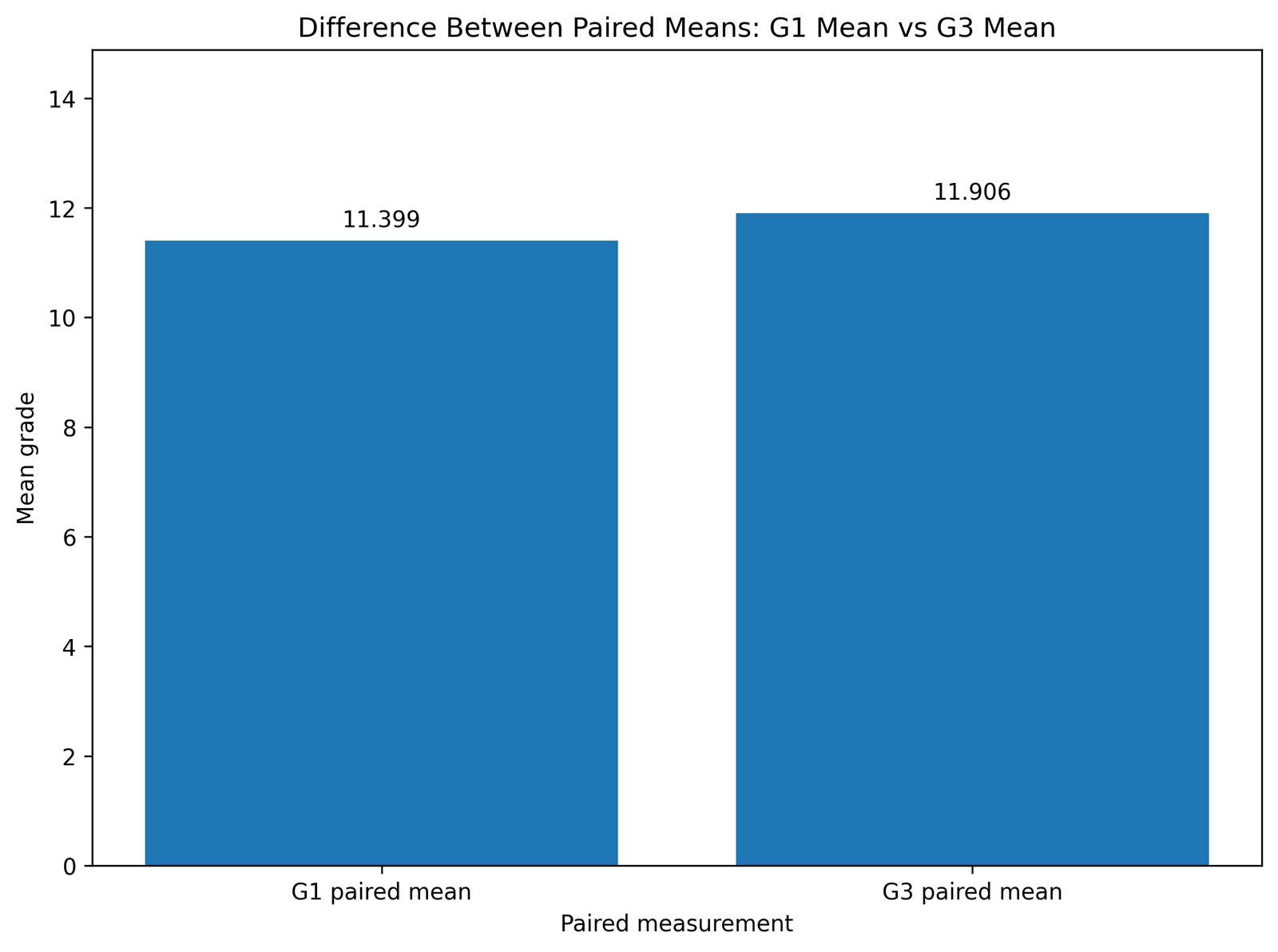
This chart compares the two paired means. The average G1 score is approximately 11.399, while the average G3 score is approximately 11.906. The G3 mean is higher, indicating a positive average change from G1 to G3.
The chart is useful because it shows the main paired comparison before the t statistic is interpreted. The visual result supports the direction of the paired difference.
Python Chart 2: Observed Difference Between Paired Means
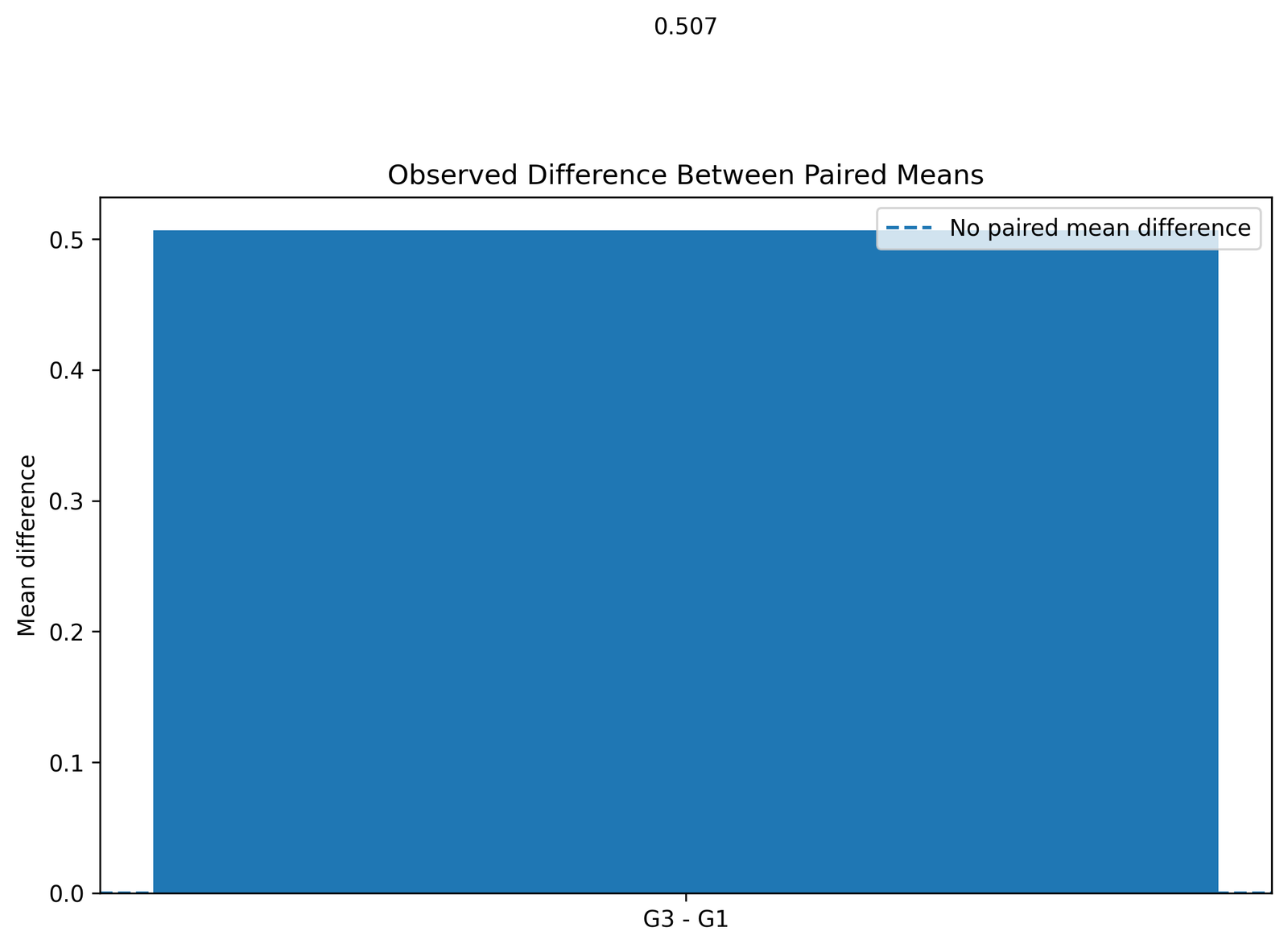
This chart focuses on the paired mean difference itself. The observed difference is approximately 0.507, calculated as G3 − G1. Because the value is positive, the average score increased from G1 to G3.
This chart translates the paired t test into the original grade scale. Readers can see that the average increase is about half a grade point.
Python Chart 3: Distribution of Paired Mean Differences
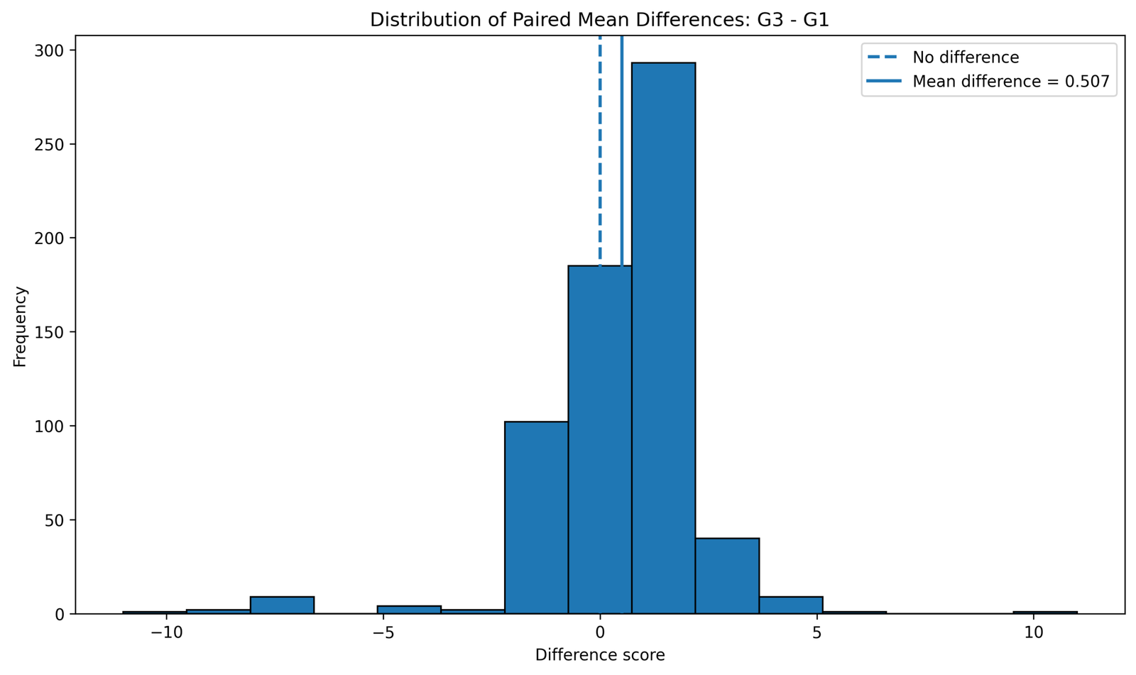
This chart examines the distribution of paired differences. The paired t test is based on these difference scores, not on the separate raw distributions of G1 and G3. The center of the distribution is above zero, which supports a positive paired mean difference.
The chart also helps check the normality assumption for paired differences. With 649 paired observations, the test is robust to moderate non-normality, but strong skewness or extreme difference scores should still be acknowledged.
Python Chart 4: Confidence Interval for Difference Between Paired Means
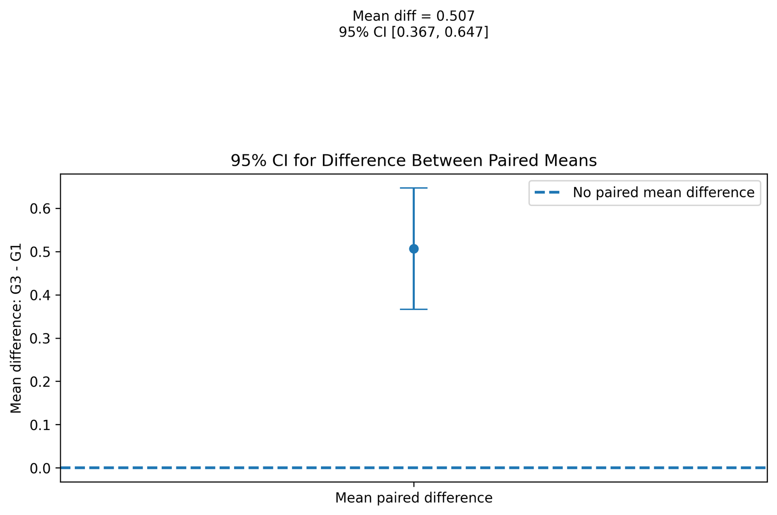
This chart shows the confidence interval for the paired mean difference. The interval is approximately 0.367 to 0.647, and it is fully above zero.
Because zero is not inside the interval, the average paired difference is statistically significant. The positive interval confirms that G3 is higher than G1 on average.
Python Chart 5: T Statistic for Difference Between Paired Means
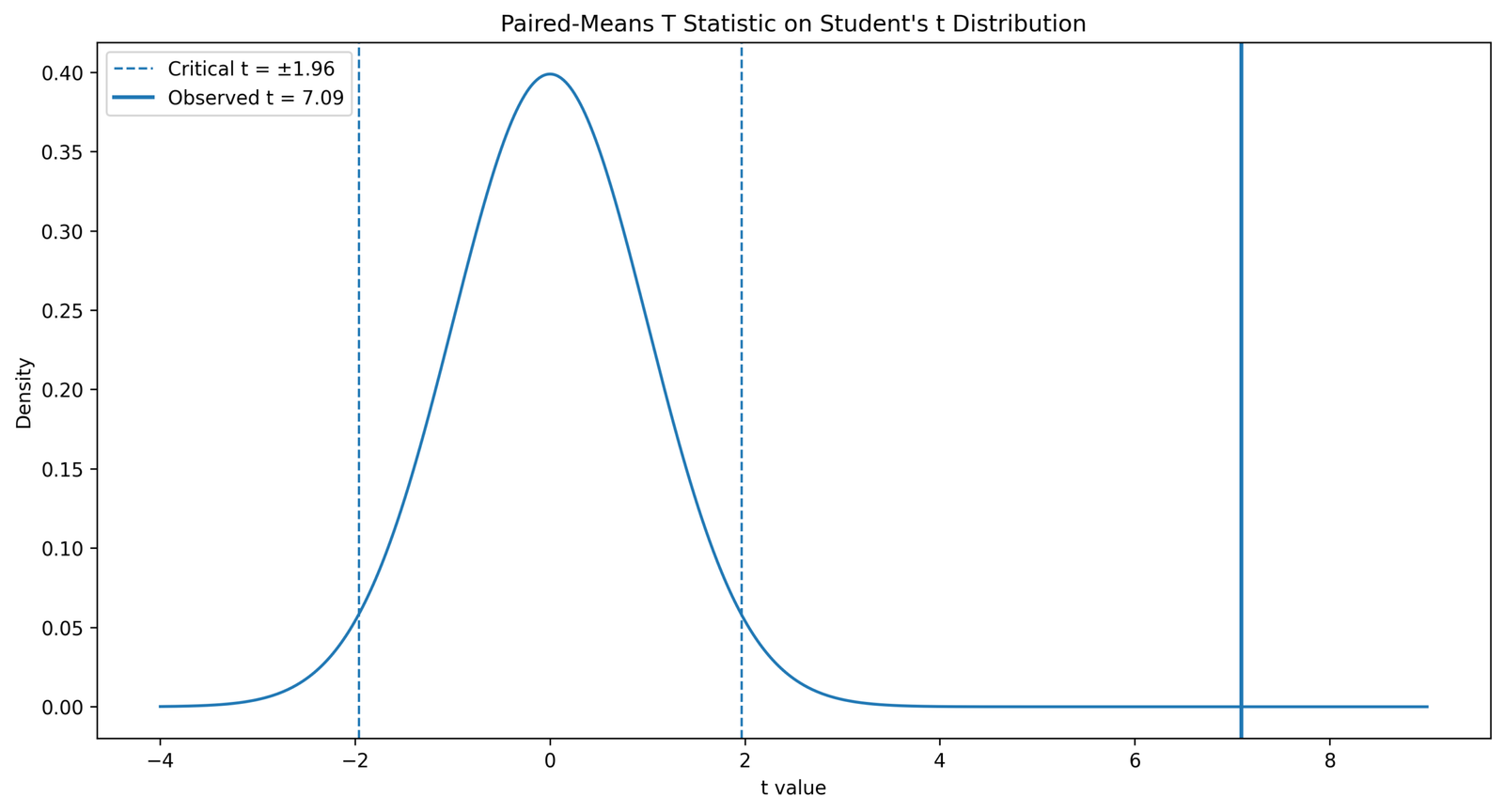
This chart places the paired t statistic in the t-test decision framework. The observed statistic is approximately t = 7.09 with df = 648. It is far from zero, which explains why the p value is less than .001.
The chart is the main inferential visual because it shows that the observed paired difference is large relative to its standard error.
Python Chart 6: Paired Change Lines for First 40 Students
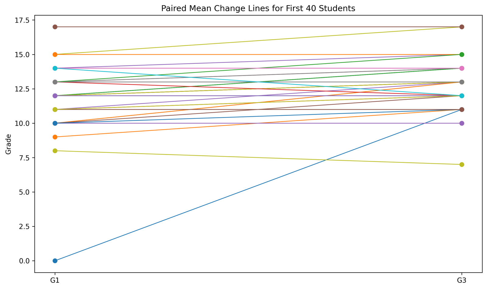
This paired-line chart shows individual within-student changes for the first 40 students. Each line connects a student’s G1 score to the same student’s G3 score. This is important because paired tests are about within-subject change, not independent group differences.
The chart helps readers understand why pairing matters. Some students improve, some decline, and some remain similar. The test evaluates whether the average of these individual changes differs from zero.
Python Chart 7: Mean Paired Difference by Study Time
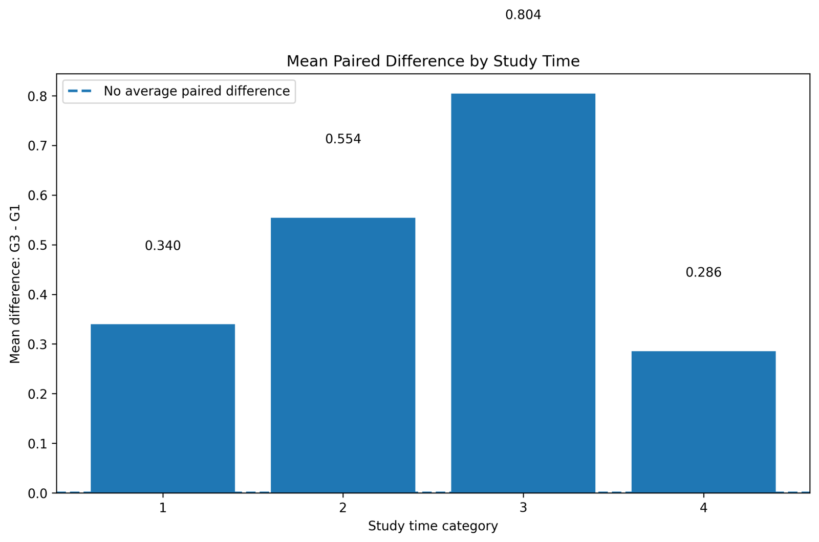
This context chart shows how the paired difference varies across study-time categories. It helps explain whether the average G3 − G1 change is similar across study-time groups or stronger in some categories.
This chart does not replace the paired t test, because the main hypothesis test evaluates the overall mean paired difference. However, it adds useful descriptive context to the interpretation.
Python Chart 8: Paired Samples Statistics Table
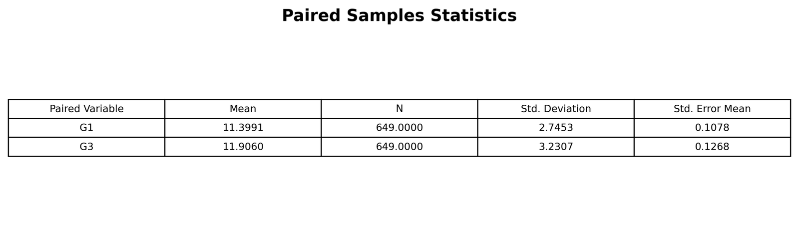
This table summarizes the paired variables before the hypothesis test. It reports the means, sample size, standard deviations and standard errors for G1 and G3. The key descriptive result is that G3 has the higher mean.
The table is important because paired t-test reporting should begin with descriptive statistics before moving to the paired difference test result.
Python Chart 9: Paired Samples Correlations Table
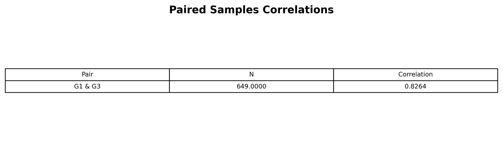
This table shows the correlation between paired measurements. A strong positive correlation means that students who score high on G1 tend to score high on G3 as well.
Paired correlation is useful because it explains why paired testing is efficient. The analysis uses within-student dependence rather than treating G1 and G3 as unrelated samples.
Python Chart 10: Paired Samples Test Table
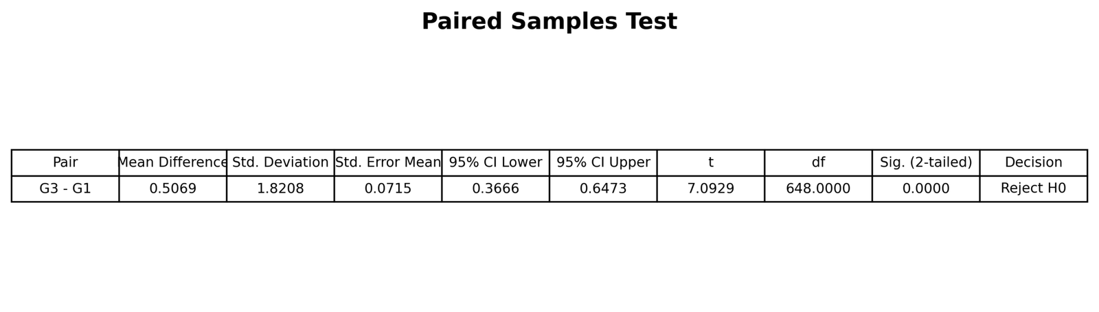
This table is the main inferential output. It reports the paired mean difference, standard deviation of differences, standard error, confidence interval, t statistic, degrees of freedom and p value.
The table supports rejecting the null hypothesis because the confidence interval does not include zero and the p value is below .001.
R Chart-by-Chart Validation
The R charts validate the Python and SPSS-style conclusions using a separate workflow. The same pattern appears: G3 has a higher mean than G1, the paired difference is positive, the confidence interval excludes zero, the t statistic is significant, and the paired samples tables support the same decision.
R Chart 1: Paired Means G1 vs G3
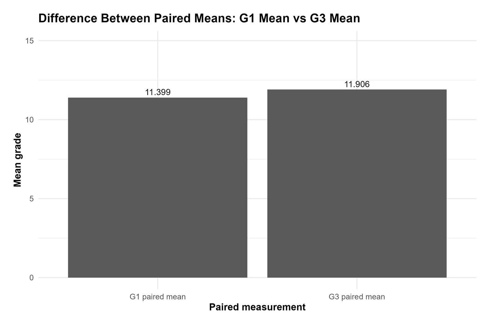
The R paired means chart confirms the Python result. G3 has the higher mean, while G1 has the lower mean. The difference is visible and supports a positive paired mean difference.
This validation chart confirms that the paired means result is reproducible across software.
R Chart 2: Observed Difference Between Paired Means
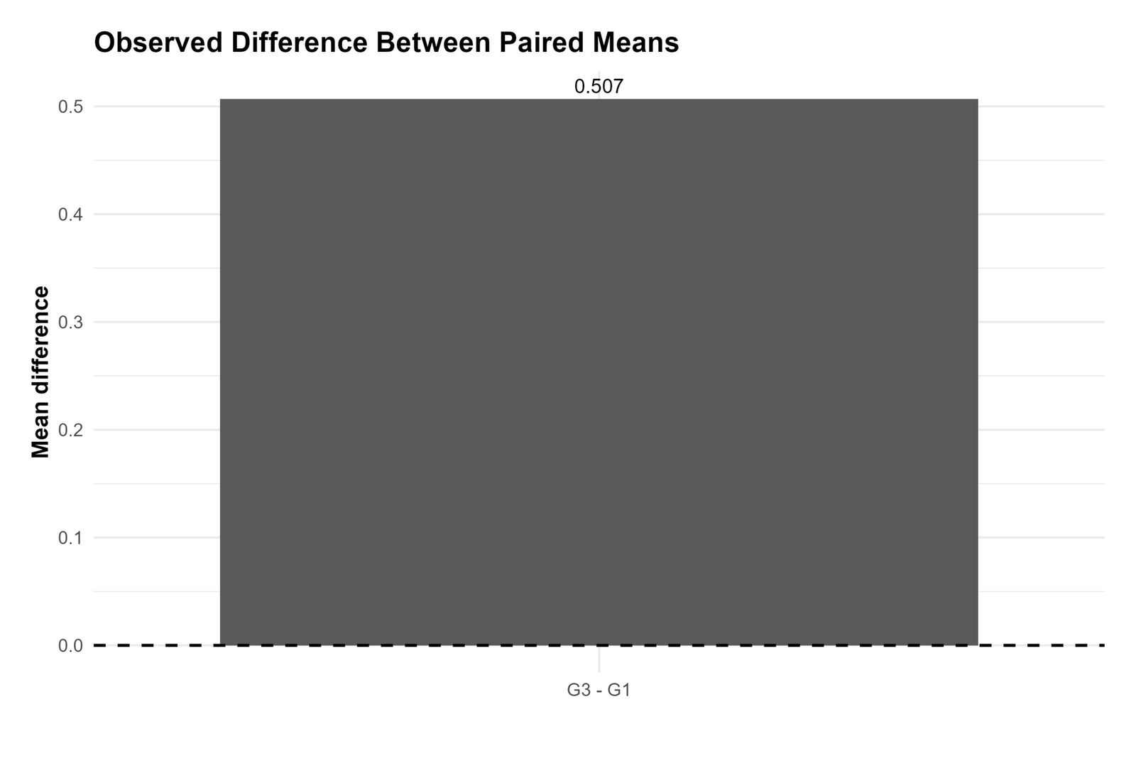
The R observed-difference chart confirms that the mean paired difference is positive. The average change from G1 to G3 is approximately 0.507.
This chart is useful because it expresses the result directly in original grade units.
R Chart 3: Distribution of Paired Mean Differences
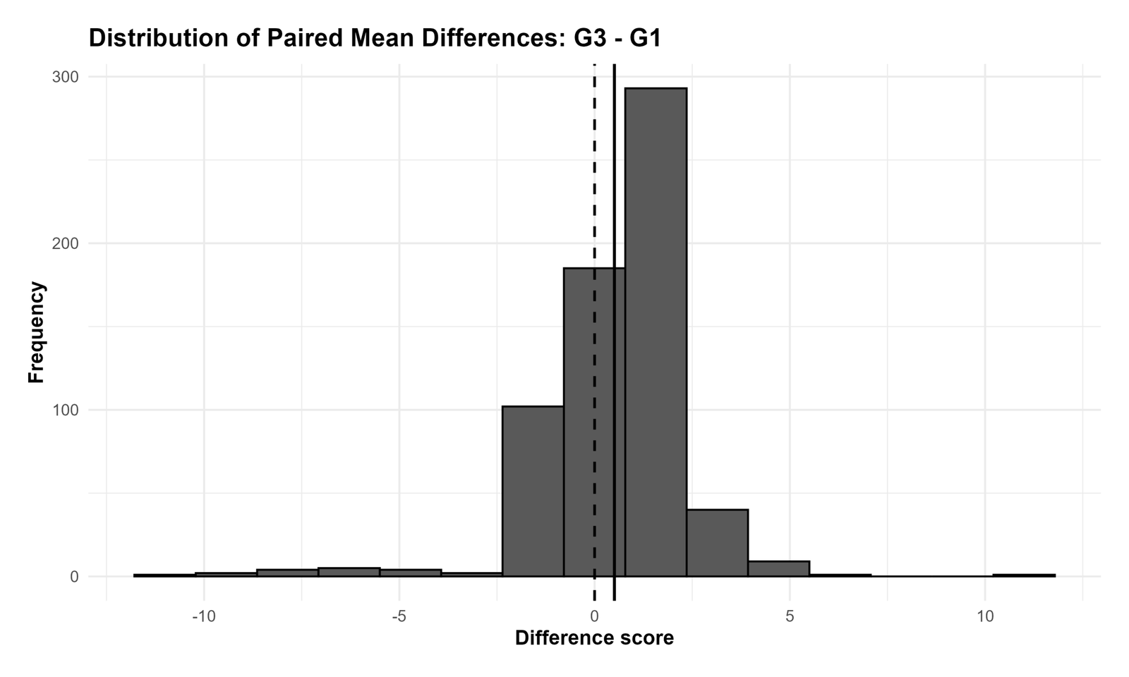
The R difference-distribution chart confirms that the paired differences are centered above zero. This supports the conclusion that G3 tends to be higher than G1 for the same students.
Since the paired t test is based on these difference scores, this chart is one of the most important assumption and interpretation visuals.
R Chart 4: Confidence Interval for Difference Between Paired Means
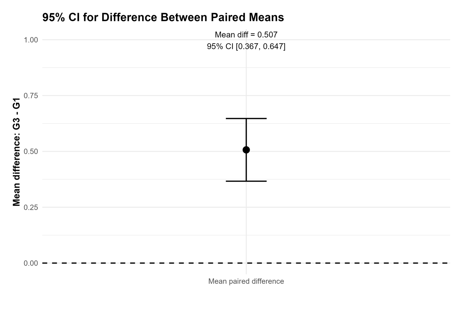
The R confidence interval chart confirms that the paired difference interval is fully above zero. This means the population mean paired difference is likely positive.
The chart supports the final reporting sentence that G3 is significantly higher than G1 on average.
R Chart 5: T Statistic for Difference Between Paired Means
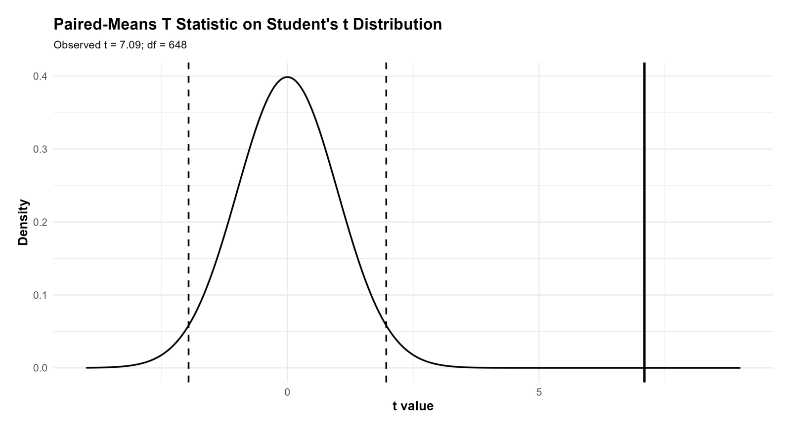
The R t statistic chart confirms the inferential result. The observed t statistic is far from zero, which explains why the paired samples t test is significant.
This chart validates the p-value conclusion visually and supports rejecting the null hypothesis of no paired mean difference.
R Chart 6: Paired Change Lines for First 40 Students
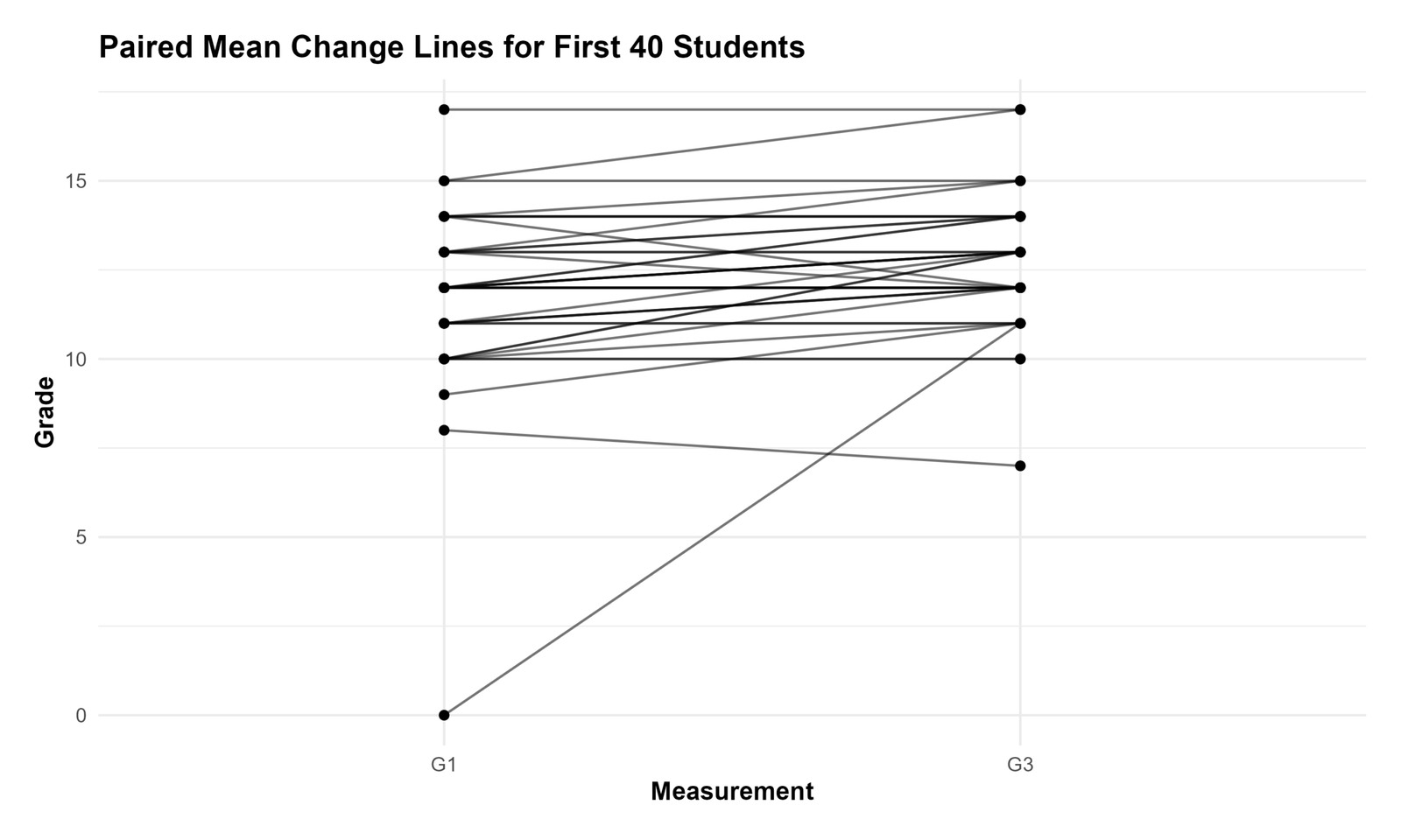
The R paired-line chart validates the within-student change pattern. Each line connects the same student’s G1 and G3 values, showing individual-level movement.
This chart is useful because it reminds readers that paired tests use matched observations. The test is based on within-student change rather than independent samples.
R Chart 7: Mean Paired Difference by Study Time
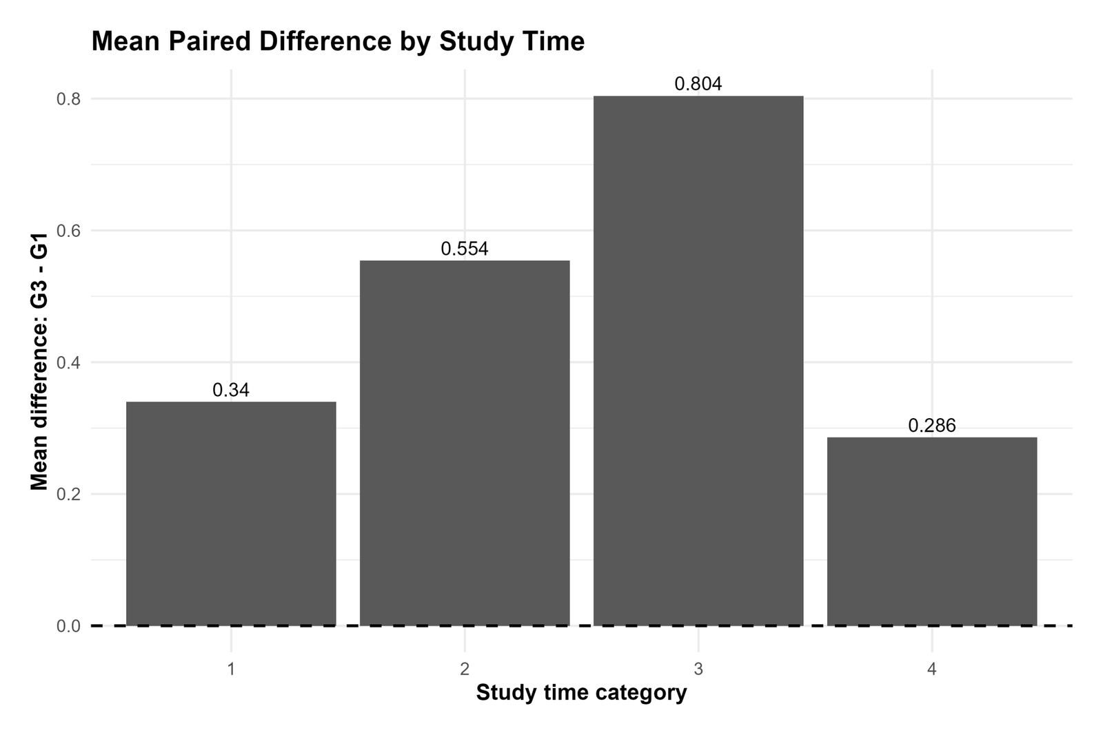
The R study-time context chart shows how the average G3 − G1 difference varies across study-time categories. It helps explain whether the overall paired increase is consistent across study habits.
The chart is descriptive context, not a replacement for the main paired t test. The formal result remains the paired test of the overall mean difference.
R Chart 8: Paired Samples Statistics Table
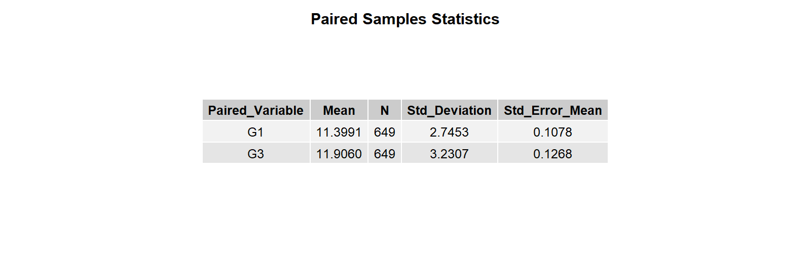
The R paired samples statistics table repeats the descriptive summary for G1 and G3. It confirms that both variables have the same number of paired observations and that G3 has the higher mean.
This table supports the descriptive part of the final report.
R Chart 9: Paired Samples Correlations Table

The R paired samples correlation table confirms that G1 and G3 are strongly related within students. This is expected because the same students are measured on both variables.
The correlation table is not the main hypothesis test, but it helps explain the paired structure of the data.
R Chart 10: Paired Samples Test Table
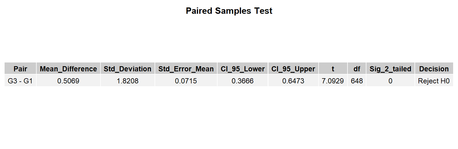
The R paired samples test table confirms the main inferential conclusion. The paired mean difference is statistically significant, and the confidence interval excludes zero.
This table provides the final numerical evidence for rejecting the null hypothesis.
Additional Output 1: Paired Means G1 vs G3
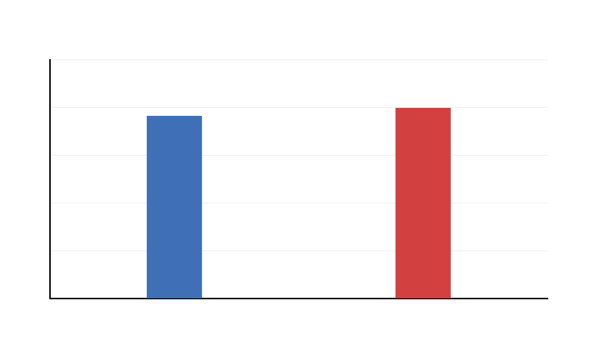
This additional output preserves the supplied chart set and repeats the main paired mean comparison. It confirms that G3 has the higher mean.
The repeated visual helps verify consistency across exported outputs.
Additional Output 2: Observed Difference Between Paired Means
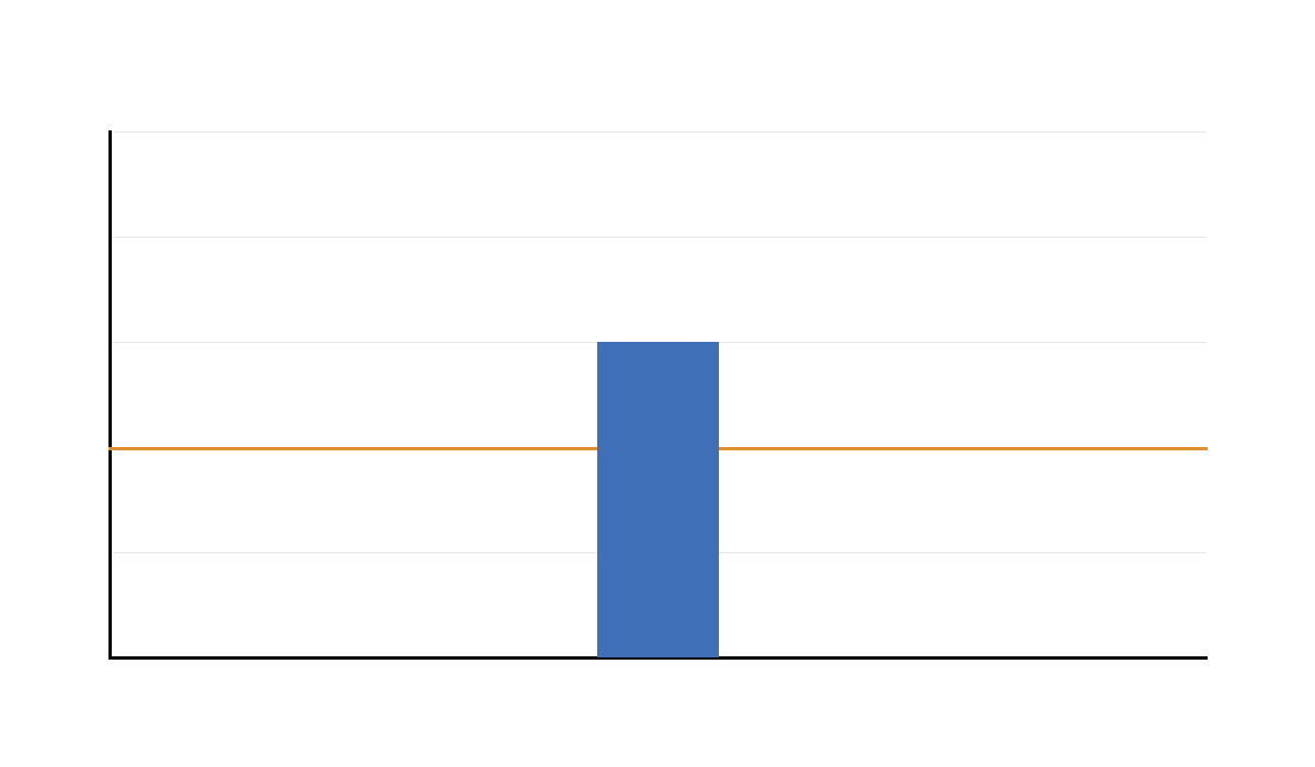
This additional chart confirms the positive paired difference between G3 and G1. The average paired change is above zero.
This output is useful for explaining the result in original grade units.
Additional Output 3: Distribution of Paired Mean Differences
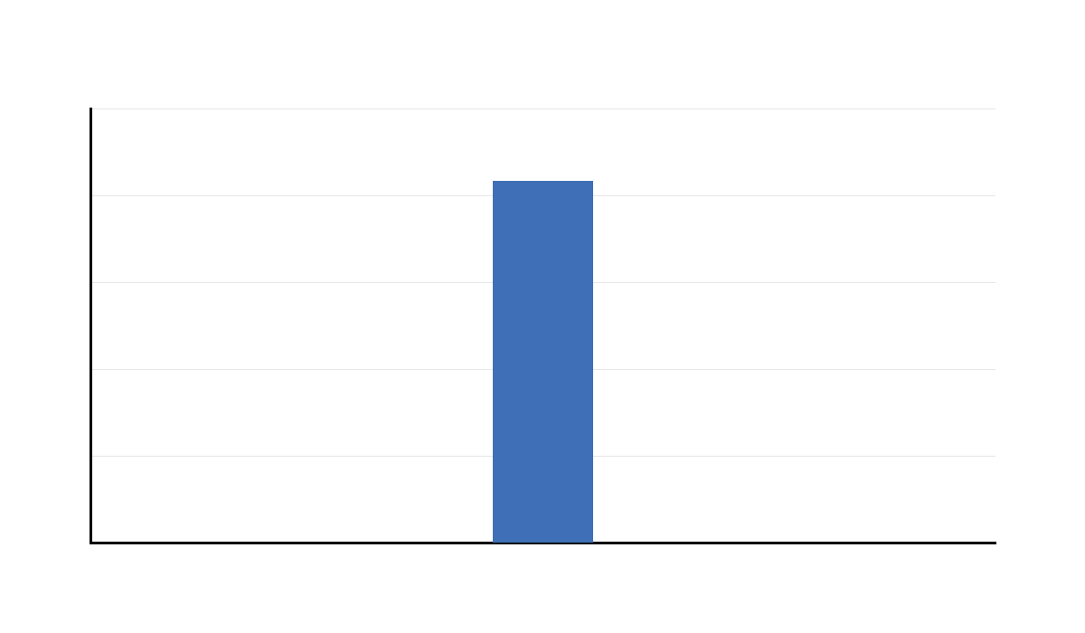
This additional distribution output confirms that the paired difference distribution is central to the paired t test. The test is based on the mean and variability of these difference scores.
The chart should be retained because it helps readers understand the paired-data assumption.
Additional Output 4: Confidence Interval for Difference Between Paired Means
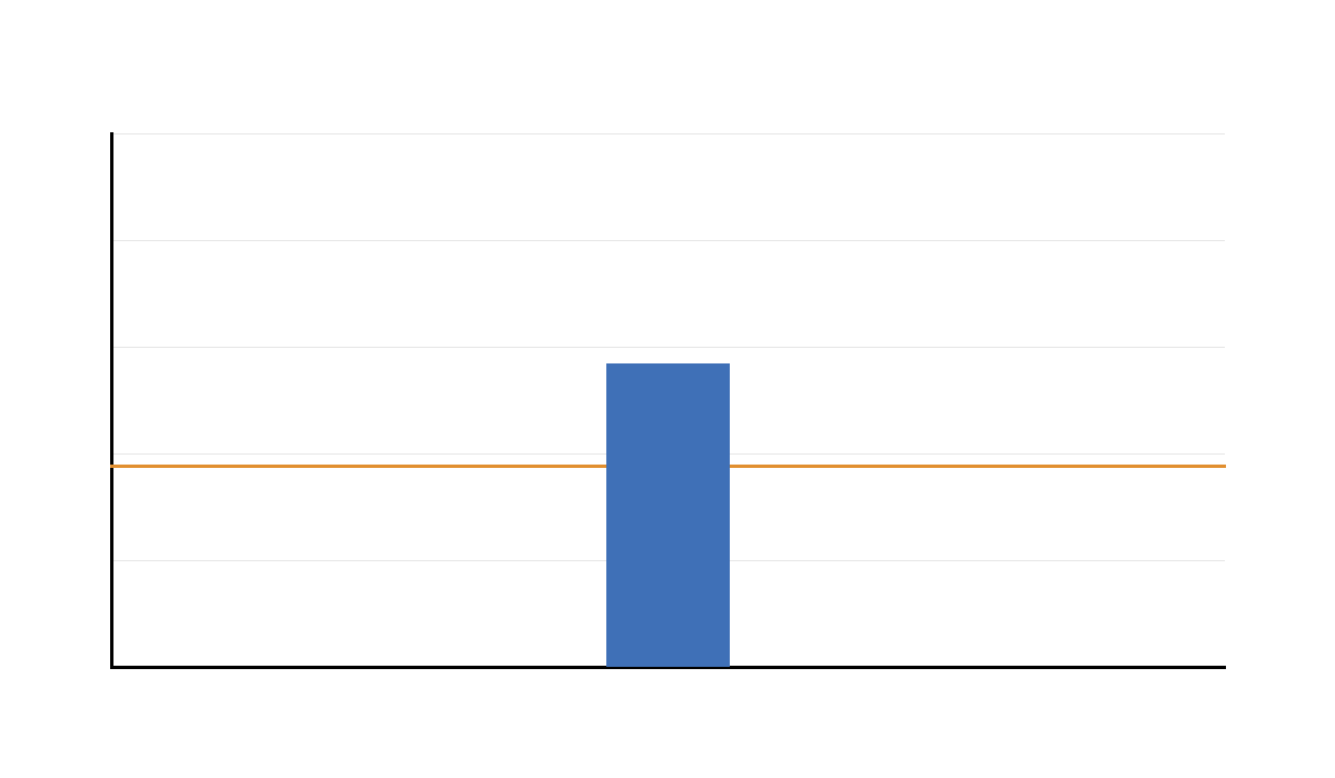
This additional confidence interval chart confirms the same final decision. The interval remains above zero, supporting a positive paired mean difference.
Confidence interval interpretation is important because it explains both the size and uncertainty of the paired change.
Additional Output 5: T Statistic for Difference Between Paired Means
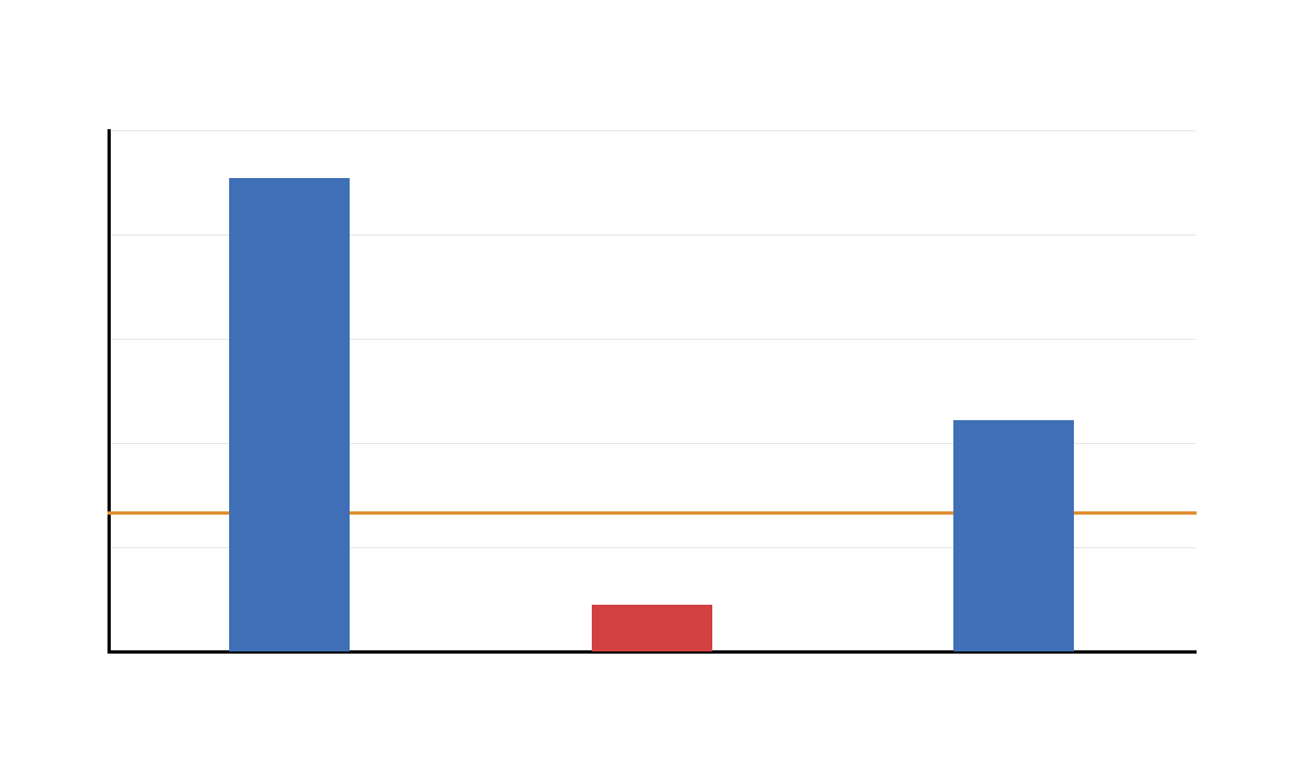
This additional t-statistic output confirms the inferential result. The observed t statistic is large enough to support statistical significance.
The chart reinforces why the null hypothesis of zero paired difference is rejected.
Additional Output 6: Paired Change Lines for First 40 Students
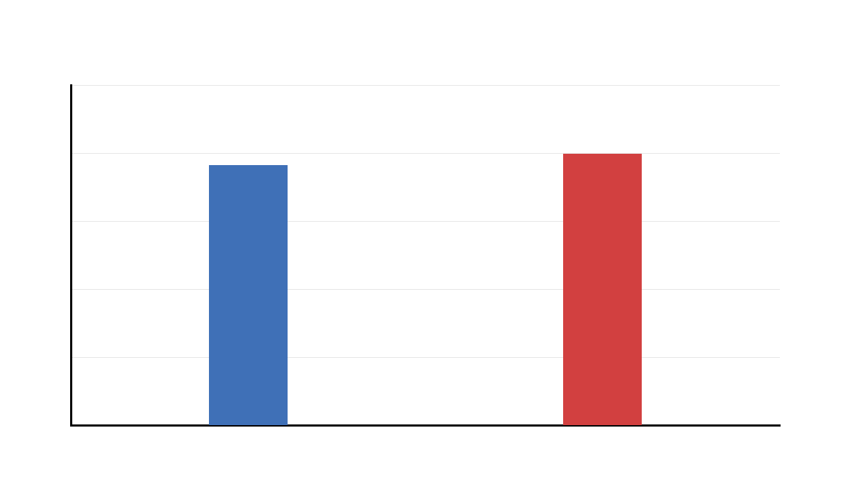
This additional paired-line chart reinforces the within-student nature of the analysis. Each line represents a matched pair of scores from the same student.
The visual is useful for explaining why the paired samples t test differs from an independent samples t test.
Additional Output 7: Mean Paired Difference by Study Time
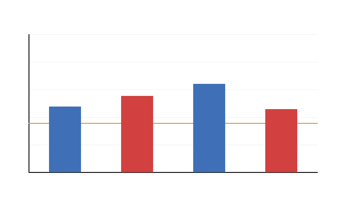
This additional context chart repeats the study-time comparison for paired differences. It helps readers see whether the average change differs across study-time levels.
The chart should be treated as descriptive context, while the main statistical test remains the overall paired samples t test.
Additional Output 8: Paired Samples Statistics Table
This additional statistics table confirms the descriptive paired summaries. It shows the mean and spread of G1 and G3 before testing the paired difference.
The table supports clear reporting because readers can see the raw paired means behind the t test.
Additional Output 9: Paired Samples Correlations Table
This additional correlations table confirms the association between paired measurements. A strong positive paired correlation is expected when both scores come from the same students.
The correlation helps explain the paired design but should not be confused with the paired t test result.
Additional Output 10: Paired Samples Test Table
This additional paired samples test table repeats the final inferential result. It confirms the paired mean difference, confidence interval, t statistic, degrees of freedom and p value.
The output provides the final statistical evidence that average G3 is significantly higher than average G1.
SPSS, R, Python and Excel Workflows for T Test for Difference Between Paired Means
The same T Test for Difference Between Paired Means workflow can be reproduced in SPSS, R, Python and Excel. SPSS runs it through the Paired-Samples T Test menu. R uses t.test() with paired = TRUE. Python uses scipy.stats.ttest_rel(). Excel can calculate paired differences manually or use the Analysis ToolPak paired two-sample t test.
SPSS Workflow
| Step | SPSS Menu or Syntax | Purpose |
|---|---|---|
| Open dataset | File > Open > Data | Load the clean dataset. |
| Run paired test | Analyze > Compare Means > Paired-Samples T Test | Open the paired-means procedure. |
| Select pair | Pair G1 with G3 | Define the two matched measurements. |
| Read statistics | Paired Samples Statistics | Compare paired means and standard deviations. |
| Read correlation | Paired Samples Correlations | Check association between paired measurements. |
| Interpret test | Paired Samples Test | Report mean difference, CI, t, df and p. |
| Export output | File > Export or OUTPUT EXPORT | Save a PDF for reporting and verification. |
R Workflow
| Step | R Action | Purpose |
|---|---|---|
| Read data | read.csv() | Load the dataset. |
| Select paired variables | G1 and G3 | Define matched measurements. |
| Create difference | diff <- G3 - G1 | Calculate paired differences. |
| Run paired t test | t.test(G3, G1, paired = TRUE) | Test whether the paired mean difference is zero. |
| Check assumptions | Histogram and Q-Q plot of differences | Evaluate normality of paired difference scores. |
Python Workflow
| Step | Python Action | Purpose |
|---|---|---|
| Read data | pandas.read_csv() | Load the dataset into a DataFrame. |
| Select paired variables | df["G1"] and df["G3"] | Extract matched measurements. |
| Create difference | diff = G3 - G1 | Calculate within-student change. |
| Run paired t test | stats.ttest_rel(G3, G1) | Calculate paired t statistic and p value. |
| Visualize result | matplotlib | Create paired means, difference, CI, t statistic and paired-line charts. |
Excel Workflow
| Excel Task | Formula or Tool | Purpose |
|---|---|---|
| Place paired scores | Put G1 and G3 in two columns | Keep each student’s values on the same row. |
| Create difference column | =G3_cell-G1_cell | Calculate paired difference for each student. |
| Mean difference | =AVERAGE(diff_range) | Estimate average paired change. |
| Standard error | =STDEV.S(diff_range)/SQRT(COUNT(diff_range)) | Estimate uncertainty in the mean difference. |
| Run paired t test | Data Analysis ToolPak > t-Test: Paired Two Sample for Means | Run the paired samples t test. |
Code Blocks for T Test for Difference Between Paired Means
SPSS Syntax for T Test for Difference Between Paired Means
* T Test for Difference Between Paired Means in SPSS.
* Paired variables: G1 and G3.

TITLE "T Test for Difference Between Paired Means: G1 vs G3".

T-TEST PAIRS=G1 WITH G3 (PAIRED)
  /CRITERIA=CI(.95)
  /MISSING=ANALYSIS.

DESCRIPTIVES VARIABLES=G1 G3
  /STATISTICS=MEAN STDDEV MIN MAX.

CORRELATIONS
  /VARIABLES=G1 G3
  /PRINT=TWOTAIL
  /MISSING=PAIRWISE.

OUTPUT EXPORT
  /CONTENTS EXPORT=VISIBLE
  /PDF DOCUMENTFILE="T-Test-for-Difference-Between-Paired-Means-SPSS-Output.pdf".
Python Code for T Test for Difference Between Paired Means
import pandas as pd
import numpy as np
from scipy import stats

df = pd.read_csv("dataset.csv")

data = df[["G1", "G3", "studytime"]].copy()
data["G1"] = pd.to_numeric(data["G1"], errors="coerce")
data["G3"] = pd.to_numeric(data["G3"], errors="coerce")
data = data.dropna(subset=["G1", "G3"])

g1 = data["G1"]
g3 = data["G3"]

diff = g3 - g1

n = len(diff)
mean_g1 = g1.mean()
mean_g3 = g3.mean()
mean_diff = diff.mean()
sd_diff = diff.std(ddof=1)
se_diff = sd_diff / np.sqrt(n)

t_stat, p_value = stats.ttest_rel(g3, g1)

dfree = n - 1
critical_t = stats.t.ppf(0.975, dfree)

ci_low = mean_diff - critical_t * se_diff
ci_high = mean_diff + critical_t * se_diff

paired_corr, paired_corr_p = stats.pearsonr(g1, g3)

cohens_dz = mean_diff / sd_diff

print("T Test for Difference Between Paired Means")
print("n pairs =", n)
print("Mean G1 =", mean_g1)
print("Mean G3 =", mean_g3)
print("Mean difference G3 - G1 =", mean_diff)
print("SD of differences =", sd_diff)
print("SE of differences =", se_diff)
print("t =", t_stat)
print("df =", dfree)
print("p =", p_value)
print("95% CI =", (ci_low, ci_high))
print("Paired correlation =", paired_corr)
print("Paired correlation p =", paired_corr_p)
print("Cohen's dz =", cohens_dz)
R Code for T Test for Difference Between Paired Means
# T Test for Difference Between Paired Means in R
# Paired variables: G1 and G3

df <- read.csv("dataset.csv")

df$G1 <- as.numeric(df$G1)
df$G3 <- as.numeric(df$G3)

df_model <- na.omit(df[, c("G1", "G3", "studytime")])

g1 <- df_model$G1
g3 <- df_model$G3

diff <- g3 - g1

result <- t.test(g3, g1, paired = TRUE, alternative = "two.sided", conf.level = 0.95)
print(result)

n <- length(diff)
mean_g1 <- mean(g1)
mean_g3 <- mean(g3)
mean_diff <- mean(diff)
sd_diff <- sd(diff)
se_diff <- sd_diff / sqrt(n)
paired_corr <- cor(g1, g3)
cohens_dz <- mean_diff / sd_diff

cat("n pairs =", n, "\n")
cat("Mean G1 =", mean_g1, "\n")
cat("Mean G3 =", mean_g3, "\n")
cat("Mean difference G3 - G1 =", mean_diff, "\n")
cat("SD of differences =", sd_diff, "\n")
cat("SE of differences =", se_diff, "\n")
cat("Paired correlation =", paired_corr, "\n")
cat("Cohen's dz =", cohens_dz, "\n")
Excel Formulas for T Test for Difference Between Paired Means
Step 1:
Place G1 values in column A and G3 values in column B.
Each row must represent the same student.

Step 2:
Create paired difference column:
=B2-A2

Step 3:
Calculate number of pairs:
=COUNT(C2:C650)

Step 4:
Calculate mean G1:
=AVERAGE(A2:A650)

Step 5:
Calculate mean G3:
=AVERAGE(B2:B650)

Step 6:
Calculate mean paired difference:
=AVERAGE(C2:C650)

Step 7:
Calculate standard deviation of differences:
=STDEV.S(C2:C650)

Step 8:
Calculate standard error of differences:
=STDEV.S(C2:C650)/SQRT(COUNT(C2:C650))

Step 9:
Calculate t statistic:
=AVERAGE(C2:C650)/(STDEV.S(C2:C650)/SQRT(COUNT(C2:C650)))

Step 10:
Calculate degrees of freedom:
=COUNT(C2:C650)-1

Step 11:
Calculate two-tailed p value:
=T.DIST.2T(ABS(t_cell),df_cell)

Step 12:
Calculate 95% CI lower:
=AVERAGE(C2:C650)-T.INV.2T(0.05,df_cell)*SE_cell

Step 13:
Calculate 95% CI upper:
=AVERAGE(C2:C650)+T.INV.2T(0.05,df_cell)*SE_cell

Step 14:
Calculate paired correlation:
=CORREL(A2:A650,B2:B650)

Step 15:
Run Excel ToolPak:
Data Analysis > t-Test: Paired Two Sample for Means
APA Reporting Wording for T Test for Difference Between Paired Means
The T Test for Difference Between Paired Means should be reported with both paired means, the number of pairs, mean paired difference, confidence interval, t statistic, degrees of freedom, p value and effect size. The report should clearly state the direction of the difference.
APA example: A paired samples t test was conducted to compare G1 and G3 scores for the same students. G3 scores were higher (M ≈ 11.91) than G1 scores (M ≈ 11.40). The paired mean difference was approximately 0.51, 95% CI [0.37, 0.65], and the difference was statistically significant, t(648) ≈ 7.09, p < .001.
Short reporting version: G3 scores were significantly higher than G1 scores in a paired samples t test, t(648) ≈ 7.09, p < .001, 95% CI [0.37, 0.65].
Common Mistakes in T Test for Difference Between Paired Means
| Mistake | Why It Is a Problem | Correct Practice |
|---|---|---|
| Using independent samples t test | G1 and G3 are measured on the same students, so observations are paired. | Use a paired samples t test. |
| Testing raw variables instead of differences | The paired test is based on within-pair differences. | Create and interpret the difference score, such as G3 − G1. |
| Ignoring direction of subtraction | G3 − G1 and G1 − G3 have opposite signs. | Define the subtraction order clearly before reporting. |
| Reporting only the p value | The p value does not show the size of the paired change. | Report means, mean difference, confidence interval and effect size. |
| Ignoring normality of differences | The paired t test assumes the difference scores are approximately normal, especially in smaller samples. | Check the distribution and Q-Q plot of paired differences. |
| Confusing paired correlation with paired t test | Correlation measures association, not mean change. | Use the paired samples test table to decide whether the mean difference is significant. |
When to Use T Test for Difference Between Paired Means
Use a T Test for Difference Between Paired Means when you have two related measurements and want to test whether their average difference is zero. The paired design is common in before-after studies, repeated measurements, matched samples and same-subject comparisons.
| Use Case | Example | Why Paired Means Test Fits |
|---|---|---|
| Education | Compare G1 and G3 scores for the same students. | Each student has both measurements. |
| Training evaluation | Compare pre-test and post-test scores. | The same participants are measured before and after training. |
| Health research | Compare blood pressure before and after treatment. | Each patient contributes a matched pair of values. |
| Business analysis | Compare customer rating before and after a service change. | The same customers provide paired responses. |
Do not use this test when the two sets of observations come from different unrelated groups. For unrelated groups, use an independent samples t test or Welch t test.
Downloads and Resources
Use the following downloadable resources to reproduce the T Test for Difference Between Paired Means workflow in SPSS, Python, R and Excel. Replace the placeholder links with the final hosted file URLs after uploading your scripts and templates to WordPress Media Library.
Download SPSS Syntax
Paired samples t test syntax with paired tables and PDF export.
Download Python Script
Python workflow with paired t test, confidence interval, paired correlation and charts.
Download R Script
R workflow with paired = TRUE and validation charts.
Download Excel Template
Excel formulas for paired differences, t statistic, p value, CI and paired correlation.
FAQs About T Test for Difference Between Paired Means
What is a T Test for Difference Between Paired Means?
A T Test for Difference Between Paired Means is a paired samples t test that checks whether the average difference between two related measurements is significantly different from zero.
What was tested in this example?
This example compared G1 and G3 scores for the same students. The paired difference was calculated as G3 minus G1.
What was the result of the paired means test?
G3 was higher than G1 on average. The paired mean difference was approximately 0.507, with t(648) ≈ 7.09 and p < .001.
How do I interpret the confidence interval?
The 95% confidence interval for the paired mean difference was approximately 0.367 to 0.647. Since the interval is fully above zero, the average paired difference is statistically significant and positive.
Why is this not an independent samples t test?
It is not an independent samples t test because G1 and G3 are measured on the same students. The observations are paired, so the test must use within-student differences.
What assumption matters most for paired t test?
The most important distribution assumption is that the paired difference scores are approximately normal, especially in small samples. With large samples, the test is more robust to moderate non-normality.
Can I run this test in Excel?
Yes. Use the Excel Data Analysis ToolPak and select t-Test: Paired Two Sample for Means, or manually calculate the paired differences, mean difference, standard error, t statistic, p value and confidence interval.

