
Descriptive Statistics Guide
Frequency Distribution explains how many observations appear in each category or grouped interval. It is the first descriptive step for categorical variables because it converts raw data into readable counts, percentages and cumulative percentages. This complete guide explains frequency tables, percentage tables, cumulative frequency, grouped frequency distributions, R charts, Python charts, SPSS output and Excel workflow using student performance data.
Quick Answer: Frequency Distribution Result
A Frequency Distribution was used to summarize the student performance dataset with 649 valid records. The analysis counted school group, sex, higher education intention, internet access, study time, past failures, age group, G3 final grade group, absences group and selected cross-tab frequency patterns.
Main finding: The dataset is dominated by GP students, female students, students who want higher education and students with internet access. GP has 423 students compared with 226 in MS. Female students are 383 compared with 266 male students. Higher education intention is strongly positive, with 580 students answering Yes. Internet access is also common, with 498 students answering Yes.
Important interpretation note: Frequency distribution is descriptive. It shows how the sample is arranged, but it does not prove statistical significance or causality. To test relationships between categorical variables, use cross-tabulation and a chi-square test after reviewing the frequency tables.
Table of Contents
- What Is Frequency Distribution?
- Why Frequency Distribution Is Needed
- Frequency Distribution Formulas and Logic
- Dataset and Variables Used
- Verified Frequency Distribution Results
- Chart-by-Chart Interpretation
- R Code for Frequency Distribution
- Python Code for Frequency Distribution
- SPSS Syntax and Interpretation
- Excel Method
- Download Output and Resources
- APA Style Reporting
- When Should You Use Frequency Distribution?
- References and Related Guides
- FAQs
What Is Frequency Distribution?
Frequency Distribution is a descriptive statistical method that shows how often each category, value or grouped interval appears in a dataset. For a categorical variable such as school, it tells how many observations belong to each school. For a binary variable such as internet access, it tells how many students answer Yes and how many answer No. For grouped numeric variables such as age group, absences group or G3 final grade group, it shows how many observations fall into each range.
Frequency distribution is often the first table in a data analysis report because it gives the reader a clear view of the sample structure. Before testing relationships, comparing means or building a regression model, the researcher should know whether groups are balanced, whether categories have enough observations and whether some categories dominate the sample.
A strong frequency distribution report should not only list counts. It should also explain percentages, cumulative percentages, category imbalance and the practical meaning of the largest and smallest groups. In this guide, every R and Python chart is explained in detail so that the reader understands both the visual pattern and the statistical meaning.
Simple meaning: Frequency distribution answers the question, “How many cases are in each category?” It turns raw data into count tables, percentage tables and bar charts that are easy to report.
Why Frequency Distribution Is Needed
Frequency distribution is needed because raw data is difficult to understand directly. A dataset with 649 rows may contain important patterns, but those patterns are hidden until the categories are counted. Frequency tables reveal the basic structure of the data: which groups are large, which groups are small and which variables are highly imbalanced.
For example, this dataset has 580 students who want higher education and only 69 who do not. Without a frequency table, a reader may wrongly assume the Yes and No groups are roughly similar. The frequency distribution makes the imbalance visible. Similarly, 549 students have zero previous failures, while only 14 students have three or more failures. That is important before interpreting any analysis involving failure history.
| Question | Frequency distribution answers | Why it matters |
|---|---|---|
| How many students are in each school? | GP = 423, MS = 226. | Shows school group imbalance before comparisons. |
| How many students are female or male? | Female = 383, Male = 266. | Shows sex composition of the sample. |
| How many students want higher education? | Yes = 580, No = 69. | Shows a very strong Yes majority. |
| How many students have internet access? | Yes = 498, No = 151. | Shows access level and the size of the non-access group. |
| Where are final grades concentrated? | The largest G3 band is 10 to 13 with 355 students. | Shows that most final grades are in the middle range. |
Frequency Distribution Formulas and Logic
Frequency distribution uses simple but powerful formulas. The most important measure is the count of observations in each category. Percentages are then calculated by dividing each count by the total sample size. Cumulative frequency and cumulative percentage are used when categories are ordered.
Frequency:
f = number of observations in a category

Relative frequency:
relative frequency = category frequency / total frequency

Percentage:
percentage = (category frequency / total frequency) × 100

Cumulative frequency:
cumulative frequency = running total across ordered categories

Cumulative percentage:
cumulative percentage = (cumulative frequency / total frequency) × 100| Output column | Meaning | Best interpretation |
|---|---|---|
| Frequency | The number of cases in a category. | Use it when the real number of observations matters. |
| Percent | The category share of the full dataset. | Use it when comparing relative category size. |
| Valid Percent | The category share after excluding missing values. | Use it when the variable contains missing values. |
| Cumulative Percent | The running percentage across ordered categories. | Use it for ordered categories such as age, study time, failures, absences or grade groups. |
Cutoff warning: Cumulative percent is meaningful only when categories have a natural order. It should not be heavily interpreted for unordered categories such as school, sex, address or job type.
Dataset and Variables Used
This guide uses the student performance dataset with 649 rows. The same cleaned data was used in R, Python and SPSS. The Python workflow also produced a clean SPSS-ready data file so that the SPSS output could reproduce the same frequency tables.
| Item | Variable | Role in this frequency distribution guide |
|---|---|---|
| School group | school | Used to count GP and MS students. |
| Sex | sex | Used to count female and male students. |
| Higher education intention | higher | Used to count Yes and No responses for continuing higher education. |
| Internet access | internet | Used to count whether students have internet access at home. |
| Study time | studytime_group | Used to report ordered study-time categories. |
| Past failures | failure_group | Used to report ordered failure-history categories. |
| Age | age_group | Used to summarize age composition. |
| Final grade | g3_grade_group | Used to summarize final grades into score bands. |
| Absences | absences_group | Used to summarize absence behavior into practical groups. |
External dataset source: UCI Machine Learning Repository: Student Performance dataset.
Verified Frequency Distribution Results
The R, Python and SPSS outputs agree on the main frequency distribution results. The dataset contains 649 valid student records. The most important descriptive finding is that several variables are strongly imbalanced. GP is the larger school group, Female is the larger sex category, Yes dominates higher education intention and Yes also dominates internet access.
| Frequency output | Verified result | Detailed interpretation |
|---|---|---|
| School | GP = 423 (65.18%); MS = 226 (34.82%) | The sample is weighted toward GP. This matters before school-level comparisons because GP has a much larger base count. |
| Sex | Female = 383 (59.01%); Male = 266 (40.99%) | The dataset contains more female than male students. The imbalance is moderate and should be reported in sample description. |
| Higher education intention | Yes = 580 (89.37%); No = 69 (10.63%) | The overwhelming majority of students want higher education. This is one of the strongest categorical patterns in the dataset. |
| Internet access | Yes = 498 (76.73%); No = 151 (23.27%) | Most students have internet access, but almost one-quarter do not. This makes internet access a meaningful access variable. |
| Study time | <2 hours = 212 (32.67%); 2 to 5 hours = 305 (47.00%); 5 to 10 hours = 97 (14.95%); >10 hours = 35 (5.39%) | Most students are in the lower-to-moderate study-time categories. Very high study time is uncommon. |
| Past failures | 0 failures = 549 (84.59%); 1 failure = 70 (10.79%); 2 failures = 16 (2.47%); 3+ failures = 14 (2.16%) | Most students have no previous failures. Higher-failure groups are small and should be interpreted carefully. |
| Age group | 15 or below = 112 (17.26%); 16 = 177 (27.27%); 17 = 179 (27.58%); 18 = 140 (21.57%); 19 or above = 41 (6.32%) | The sample is concentrated around ages 16 and 17, with relatively few older students. |
| G3 final grade group | 0 to 5 = 17 (2.62%); 6 to 9 = 83 (12.79%); 10 to 13 = 355 (54.70%); 14 to 16 = 148 (22.80%); 17 to 20 = 46 (7.09%) | Final grades are concentrated in the 10 to 13 band. More than half of the students are in this middle performance range. |
| Absences group | 0 absences = 244 (37.60%); 1 to 3 = 129 (19.88%); 4 to 7 = 157 (24.19%); 8+ = 119 (18.34%) | Absences are spread across several groups. No absences is the largest group, but high absences are still common enough to matter. |
The SPSS output also confirms the numeric context for the dataset. G3 final grade ranges from 0 to 19, with a mean around 11.91. That numeric overview is useful, but the main purpose of this post is the categorical and grouped frequency distribution.
Chart-by-Chart Interpretation of the Frequency Distribution Analysis
This section explains every uploaded R and Python chart in detail. The goal is not to show images only. Each chart is interpreted in terms of count, percentage, category balance and practical meaning for a data-analysis report.
R Frequency Distribution Charts
Chart 1: School Frequency Distribution
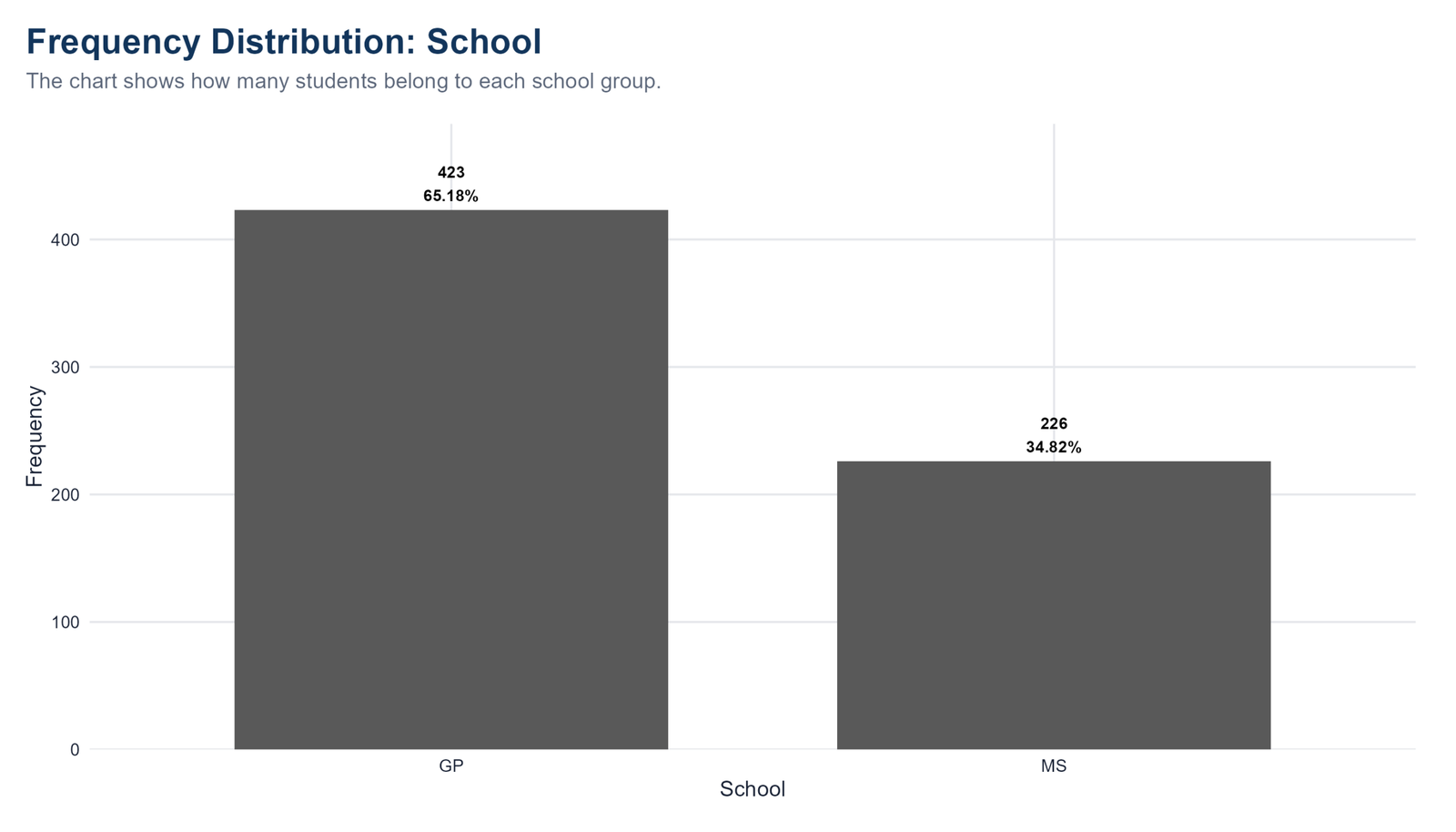
Specific interpretation: The R school frequency chart shows that the dataset is dominated by the GP school group. GP has 423 students, equal to 65.18% of the sample, while MS has 226 students, equal to 34.82%. This is not a small visual difference; the GP bar is almost twice as high as the MS bar. In practical reporting, this means that any school-based analysis should begin by acknowledging the unequal group sizes. GP contributes the majority of observations, so estimates for GP may be more stable simply because the group is larger. The chart does not test whether school affects grades, but it gives the first descriptive clue that school is an important grouping variable in the dataset.
Decision from Chart 1: This chart should be reported with both the count and the percentage because frequency distribution is strongest when readers can see the real number of observations and the relative share of the dataset at the same time.
Chart 2: Sex Frequency Distribution
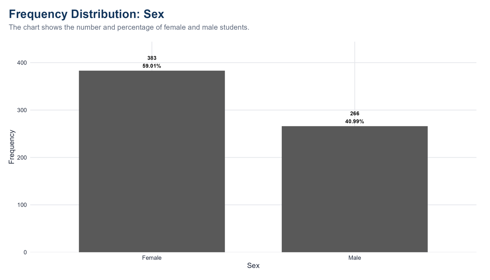
Specific interpretation: The R sex chart shows 383 female students, or 59.01%, and 266 male students, or 40.99%. This distribution is moderately unbalanced because the female group is larger by 117 cases. The difference is not as extreme as the school distribution, but it still matters when interpreting comparisons by sex. In a statistical report, this chart supports a clear sample-composition statement: female students form the larger share of the dataset. The chart also shows why both frequency and percentage labels are useful. The frequency gives the real number of students, while the percentage shows how much of the full sample each group represents.
Decision from Chart 2: This chart should be reported with both the count and the percentage because frequency distribution is strongest when readers can see the real number of observations and the relative share of the dataset at the same time.
Chart 3: Higher Education Intention
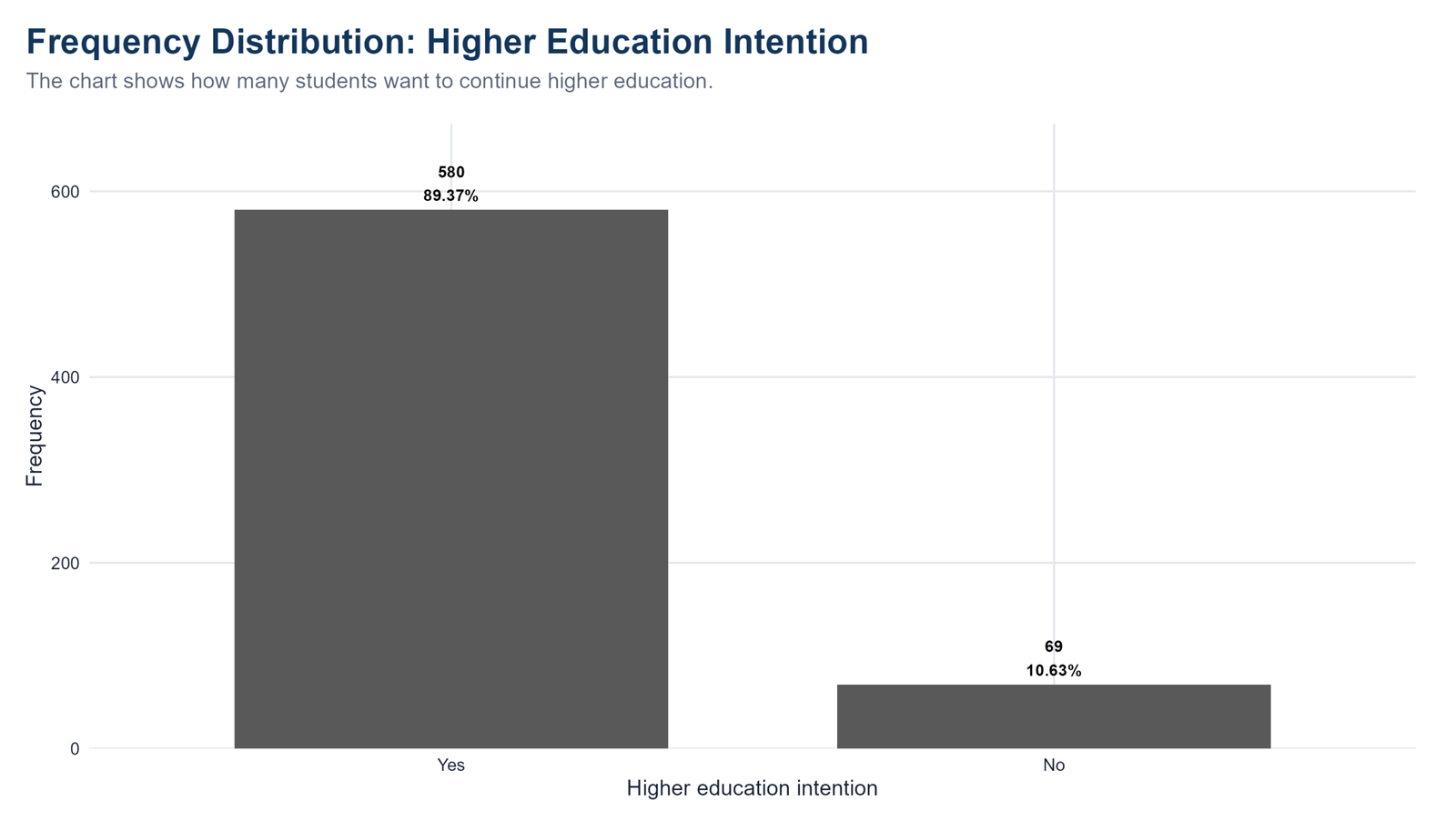
Specific interpretation: The R higher education chart shows the strongest majority pattern in the frequency distribution. A total of 580 students, or 89.37%, reported that they want to continue higher education, while only 69 students, or 10.63%, reported that they do not. The Yes bar is much taller than the No bar, making the conclusion visually immediate. This means higher education intention is not evenly distributed in the sample; it is overwhelmingly positive. When this variable is used later in cross-tabulation or logistic-style analysis, the small No category should be interpreted carefully because it contains far fewer cases than the Yes category.
Decision from Chart 3: This chart should be reported with both the count and the percentage because frequency distribution is strongest when readers can see the real number of observations and the relative share of the dataset at the same time.
Chart 4: Internet Access Frequency Distribution
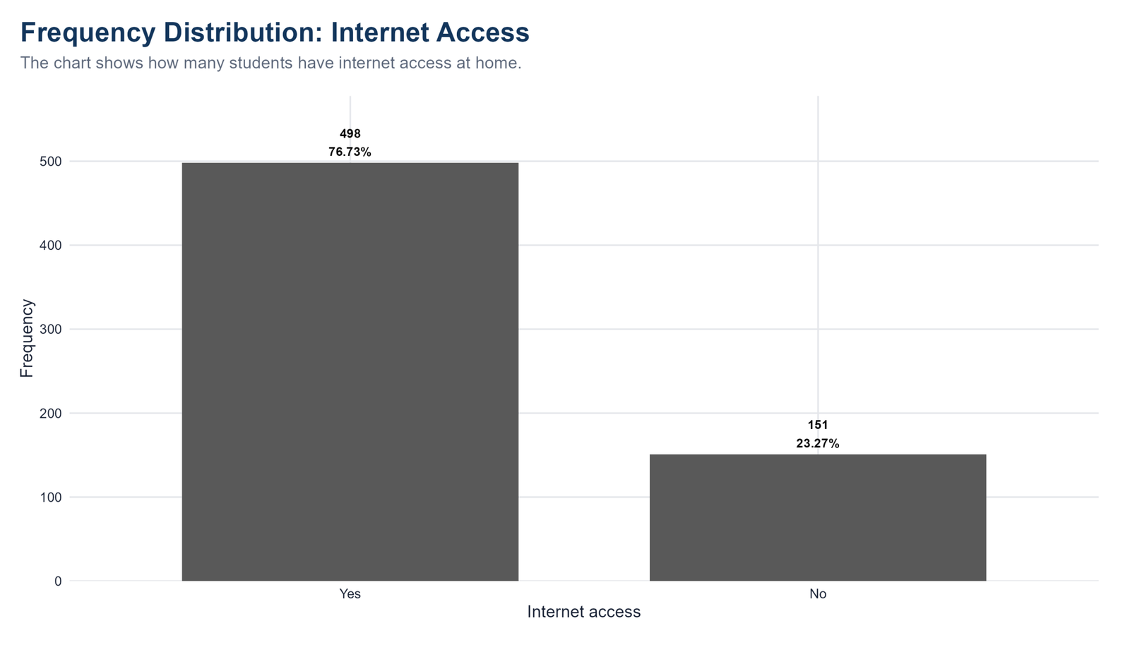
Specific interpretation: The R internet access chart shows that 498 students, or 76.73%, have internet access at home, while 151 students, or 23.27%, do not. The majority pattern is clear, but the No group is still large enough to matter in educational analysis. Nearly one-quarter of the students lack home internet access. This is important because internet access can be connected with study resources, homework completion, online learning, communication and general academic support. The chart is descriptive, so it does not prove that internet access changes grades, but it identifies a meaningful access variable for later group comparisons.
Decision from Chart 4: This chart should be reported with both the count and the percentage because frequency distribution is strongest when readers can see the real number of observations and the relative share of the dataset at the same time.
Chart 5: Study Time Frequency Distribution
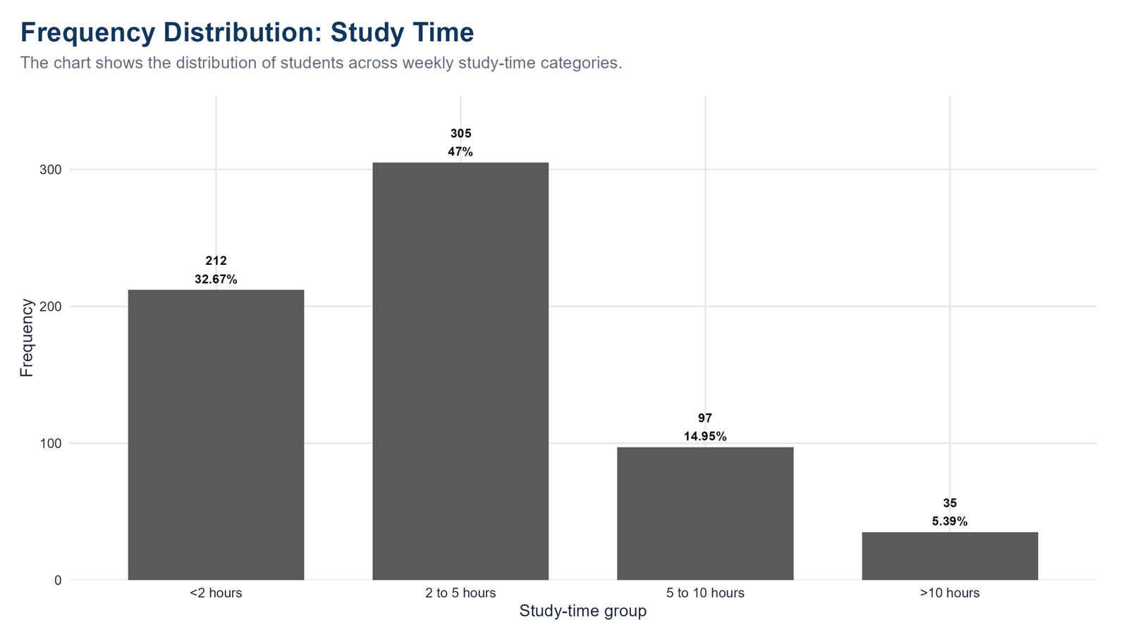
Specific interpretation: The R study-time chart shows that the largest category is 2 to 5 hours, with 305 students or 47.00% of the sample. The second largest category is less than 2 hours, with 212 students or 32.67%. Together, these two lower-to-moderate study categories contain more than three-quarters of the dataset. The 5 to 10 hours group has 97 students, or 14.95%, and the more than 10 hours group has only 35 students, or 5.39%. This means very high study time is uncommon in this dataset. For reporting, the key point is that the distribution is concentrated below 5 hours rather than evenly spread across all study-time levels.
Decision from Chart 5: This chart should be reported with both the count and the percentage because frequency distribution is strongest when readers can see the real number of observations and the relative share of the dataset at the same time.
Chart 6: Past Failures Frequency Distribution
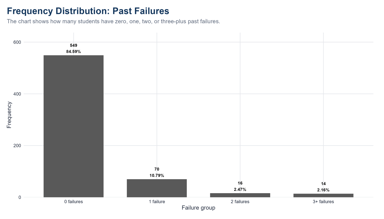
Specific interpretation: The R past-failures chart is highly concentrated in the zero-failure category. A total of 549 students, or 84.59%, have no previous failures. Only 70 students, or 10.79%, have one failure; 16 students, or 2.47%, have two failures; and 14 students, or 2.16%, have three or more failures. This is a strongly imbalanced ordered distribution. In a report, it should be described as a mostly no-failure sample. The small upper categories are important because they may be academically meaningful, but their small counts mean that later comparisons involving high-failure groups should not be overstated.
Decision from Chart 6: This chart should be reported with both the count and the percentage because frequency distribution is strongest when readers can see the real number of observations and the relative share of the dataset at the same time.
Chart 7: Age Group Frequency Distribution
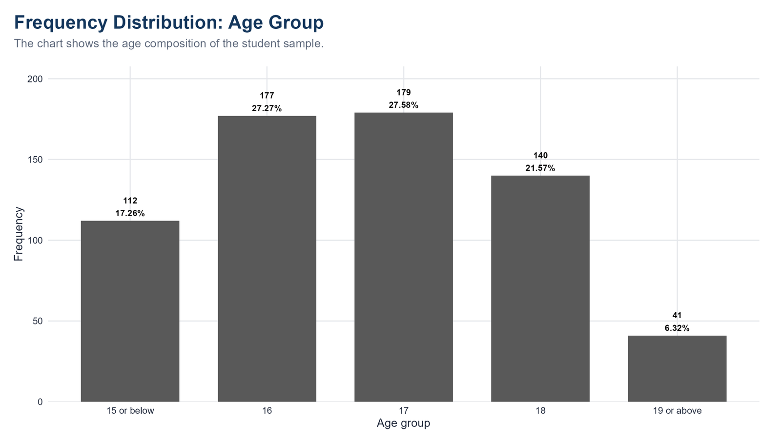
Specific interpretation: The R age group chart shows that the sample is concentrated around ages 16 and 17. The age 17 group is the largest with 179 students, or 27.58%, while the age 16 group is almost identical with 177 students, or 27.27%. Age 18 includes 140 students, or 21.57%, and age 15 or below includes 112 students, or 17.26%. The oldest category, 19 or above, has only 41 students, or 6.32%. This chart tells the reader that the dataset is mainly a mid-teen student sample. Older students are present, but they are a small minority.
Decision from Chart 7: This chart should be reported with both the count and the percentage because frequency distribution is strongest when readers can see the real number of observations and the relative share of the dataset at the same time.
Chart 8: G3 Final Grade Group Frequency Distribution
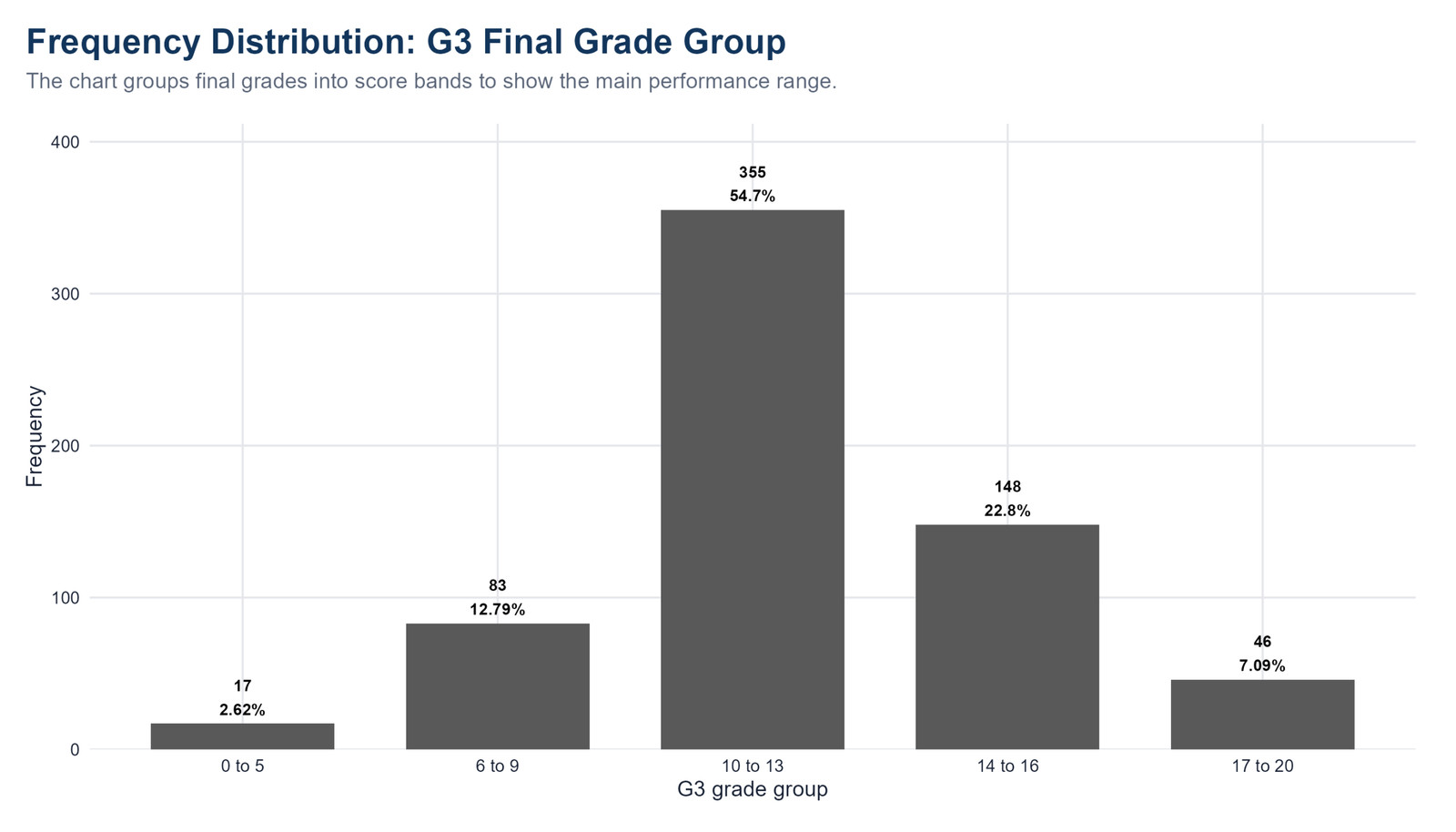
Specific interpretation: The R G3 grade-group chart converts final grades into practical score bands. The largest band is 10 to 13, containing 355 students or 54.70% of the sample. The second largest band is 14 to 16, with 148 students or 22.80%. The 6 to 9 band has 83 students, or 12.79%; the 17 to 20 band has 46 students, or 7.09%; and the 0 to 5 band has only 17 students, or 2.62%. This tells us that final grades are concentrated in the middle score range. The distribution is not dominated by very low or very high grades.
Decision from Chart 8: This chart should be reported with both the count and the percentage because frequency distribution is strongest when readers can see the real number of observations and the relative share of the dataset at the same time.
Chart 9: Absences Group Frequency Distribution
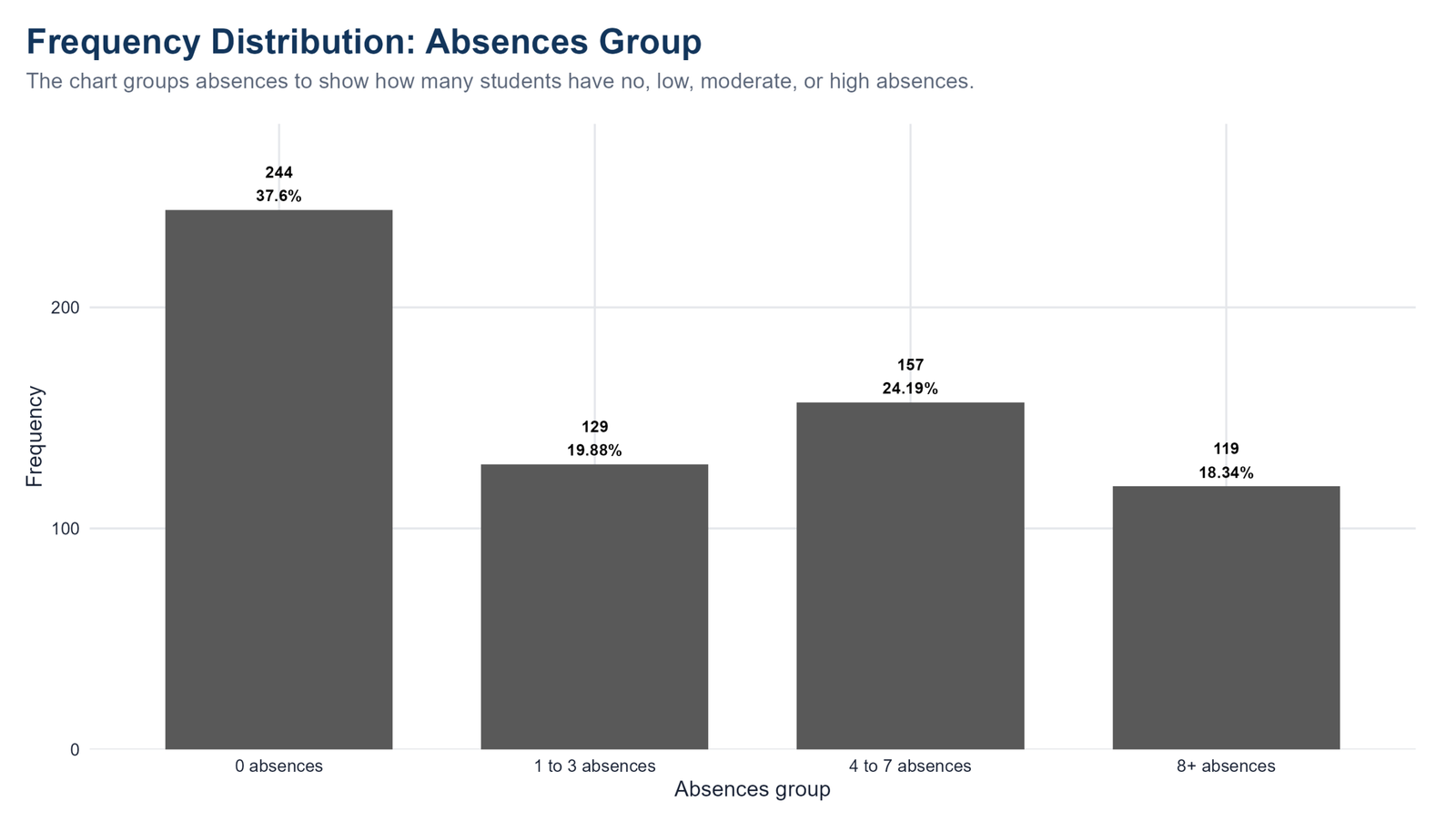
Specific interpretation: The R absences chart shows a more spread-out pattern than failures. The largest category is 0 absences, with 244 students or 37.60%. However, the 4 to 7 absences group has 157 students, or 24.19%, the 1 to 3 absences group has 129 students, or 19.88%, and the 8 or more absences group has 119 students, or 18.34%. This means absence behavior is not limited to a few unusual students. A considerable number of students have moderate or high absence counts. For later grade analysis, absences should be treated as a meaningful student-behavior variable.
Decision from Chart 9: This chart should be reported with both the count and the percentage because frequency distribution is strongest when readers can see the real number of observations and the relative share of the dataset at the same time.
Chart 10: School by Sex Frequency Distribution
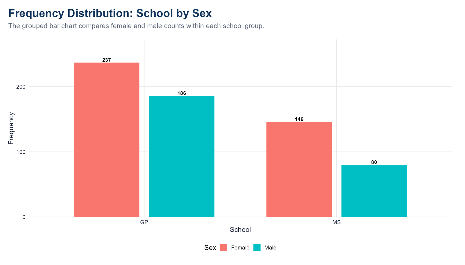
Specific interpretation: The R grouped bar chart breaks school membership into female and male counts. In GP, there are 237 female students and 186 male students. In MS, there are 146 female students and 80 male students. This chart adds a second layer to the frequency distribution because it shows the joint structure of two categorical variables. Female students are more numerous in both school groups, and the gap is especially noticeable in MS. This chart is a useful bridge between simple frequency tables and cross-tabulation because it helps readers see category combinations rather than single-variable counts only.
Decision from Chart 10: This chart should be reported with both the count and the percentage because frequency distribution is strongest when readers can see the real number of observations and the relative share of the dataset at the same time.
Chart 11: Higher Education by Internet Access
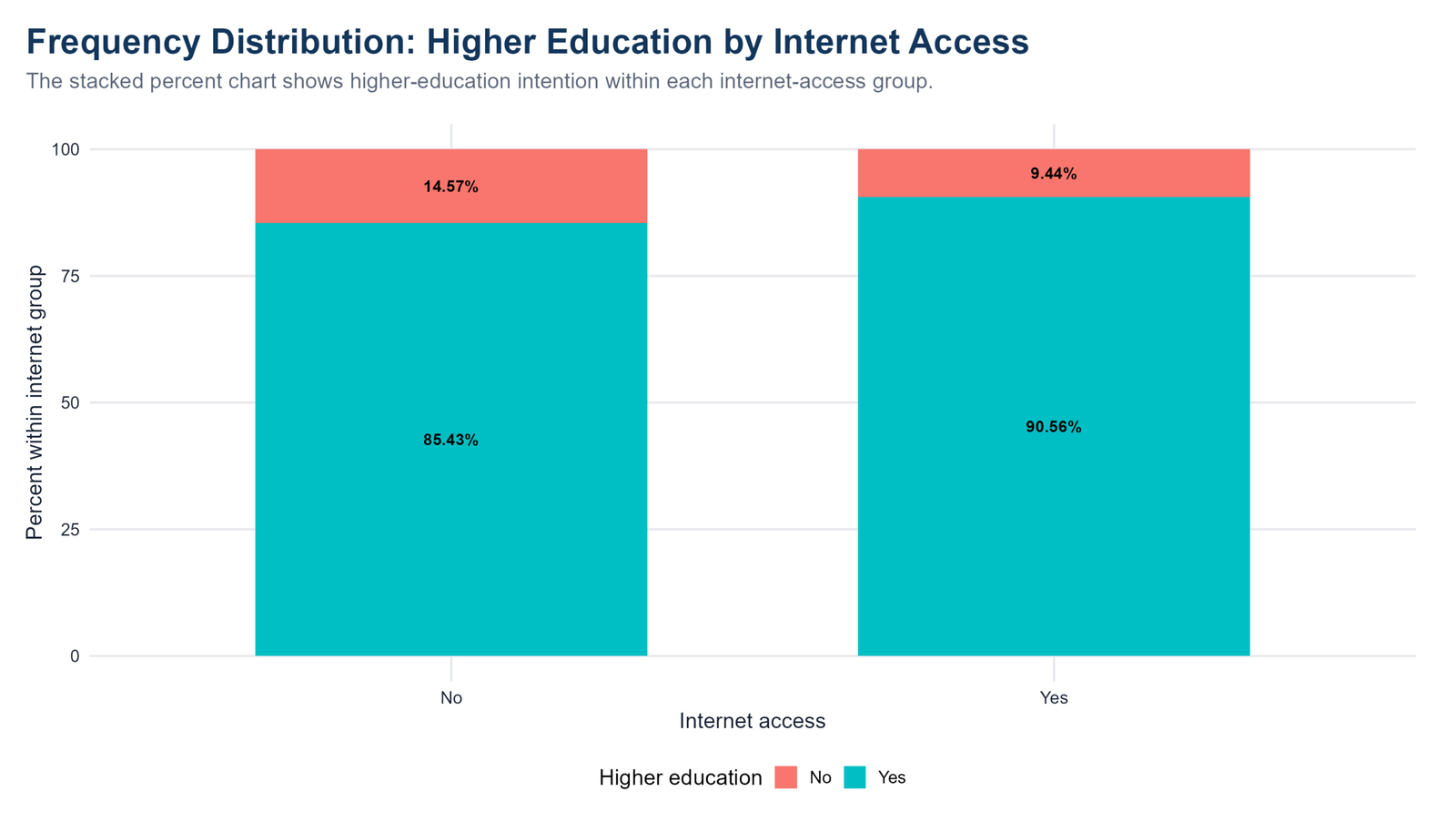
Specific interpretation: The R stacked percent chart compares higher education intention within internet access groups. Among students without internet access, 85.43% want higher education and 14.57% do not. Among students with internet access, 90.56% want higher education and 9.44% do not. The main message is that higher education intention is high in both groups, but it is somewhat higher among students with internet access. Because the chart uses percentages within internet groups, it avoids confusing raw group size with within-group tendency. A formal association test would require cross-tabulation and chi-square, but this chart gives a clear descriptive start.
Decision from Chart 11: This chart should be reported with both the count and the percentage because frequency distribution is strongest when readers can see the real number of observations and the relative share of the dataset at the same time.
Python Frequency Distribution Charts
Chart 12: School Frequency Distribution
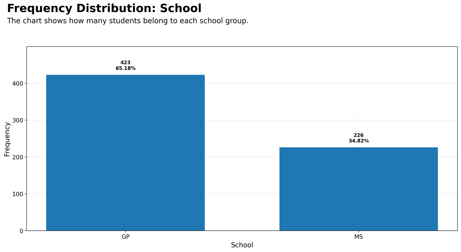
Specific interpretation: The Python school frequency chart confirms the same school pattern as the R chart. GP includes 423 students, while MS includes 226 students. The chart makes the group imbalance visually clear through the larger GP bar. This matters because school is later used as a grouping variable in many analyses. When one group has many more observations, the descriptive table should always be reported before interpreting means, percentages or statistical tests. The chart does not say that one school performs better; it only shows how the sample is distributed across the two school categories.
Decision from Chart 12: This chart should be reported with both the count and the percentage because frequency distribution is strongest when readers can see the real number of observations and the relative share of the dataset at the same time.
Chart 13: Sex Frequency Distribution
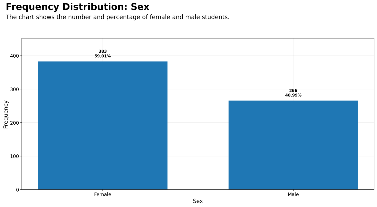
Specific interpretation: The Python sex chart shows 383 female students and 266 male students. In percentage terms, female students make up about 59.01% of the sample and male students make up about 40.99%. The chart is simple, but it is important because it gives the reader sample-composition context before any gender-based comparison is attempted. A balanced dataset would have similar bar heights, but this dataset has a noticeable female majority. In reporting, this should be described as a moderate imbalance rather than a perfectly even split.
Decision from Chart 13: This chart should be reported with both the count and the percentage because frequency distribution is strongest when readers can see the real number of observations and the relative share of the dataset at the same time.
Chart 14: Higher Education Intention
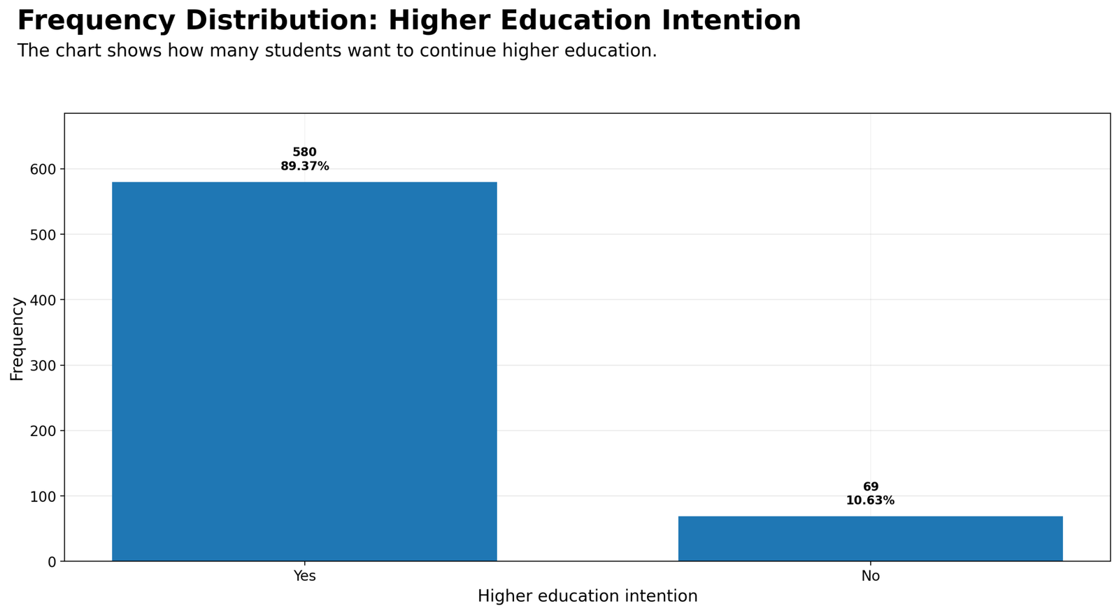
Specific interpretation: The Python higher education chart confirms that the Yes category strongly dominates the dataset. A total of 580 students report that they want to pursue higher education, while only 69 students report that they do not. The percentage split is 89.37% versus 10.63%. This means higher education intention is a common characteristic in the sample. When this variable is used in later analysis, the researcher should remember that the No group is small. A small comparison group can still be meaningful, but its results must be interpreted with caution.
Decision from Chart 14: This chart should be reported with both the count and the percentage because frequency distribution is strongest when readers can see the real number of observations and the relative share of the dataset at the same time.
Chart 15: Internet Access Frequency Distribution
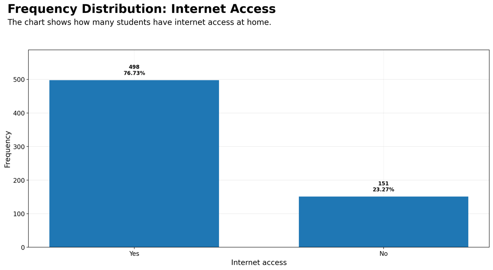
Specific interpretation: The Python internet access chart shows that 498 students have home internet access and 151 do not. The Yes category represents 76.73% of the dataset, while the No category represents 23.27%. The practical interpretation is that internet access is common, but non-access is not rare. In a student-performance context, a group of 151 students without home internet access is large enough to deserve attention. This chart provides a foundation for later descriptive comparisons, such as whether internet access is related to higher education intention or grade bands.
Decision from Chart 15: This chart should be reported with both the count and the percentage because frequency distribution is strongest when readers can see the real number of observations and the relative share of the dataset at the same time.
Chart 16: Study Time Frequency Distribution
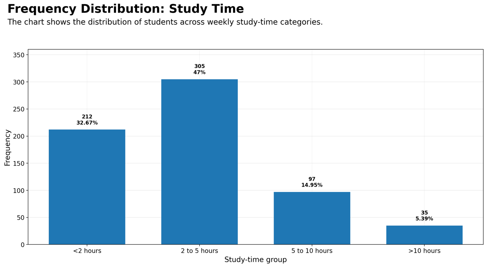
Specific interpretation: The Python study-time chart shows a clear concentration in the lower and middle study-time categories. The 2 to 5 hours group contains 305 students, making it the largest category at 47.00%. The less than 2 hours group contains 212 students, or 32.67%. The 5 to 10 hours group contains 97 students, and the more than 10 hours group contains only 35 students. This means that very high study time is uncommon. For a written report, the best interpretation is that most students report studying less than 5 hours per week according to the available category definitions.
Decision from Chart 16: This chart should be reported with both the count and the percentage because frequency distribution is strongest when readers can see the real number of observations and the relative share of the dataset at the same time.
Chart 17: Past Failures Frequency Distribution
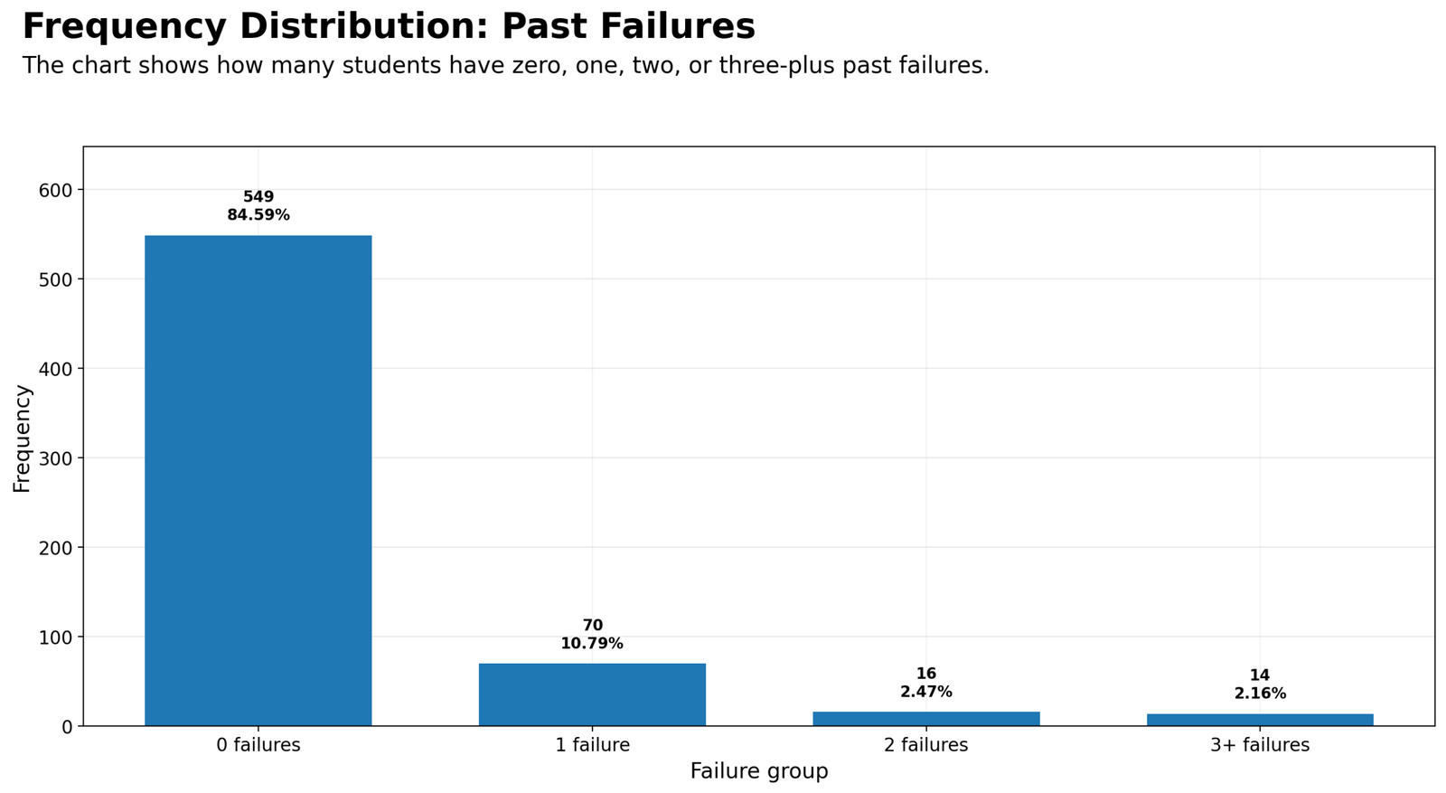
Specific interpretation: The Python failures chart confirms a strong zero-inflated pattern. Most students, 549 out of 649, have no previous failures. The remaining categories are much smaller: 70 students have one failure, 16 have two failures and 14 have three or more failures. The visual result is a very tall first bar followed by much smaller bars. This tells us that previous failure is not evenly distributed. For later statistical analysis, it may be useful to compare zero failures versus any failures or to keep the ordered groups while noting the small sample sizes in higher-failure categories.
Decision from Chart 17: This chart should be reported with both the count and the percentage because frequency distribution is strongest when readers can see the real number of observations and the relative share of the dataset at the same time.
Chart 18: Age Group Frequency Distribution
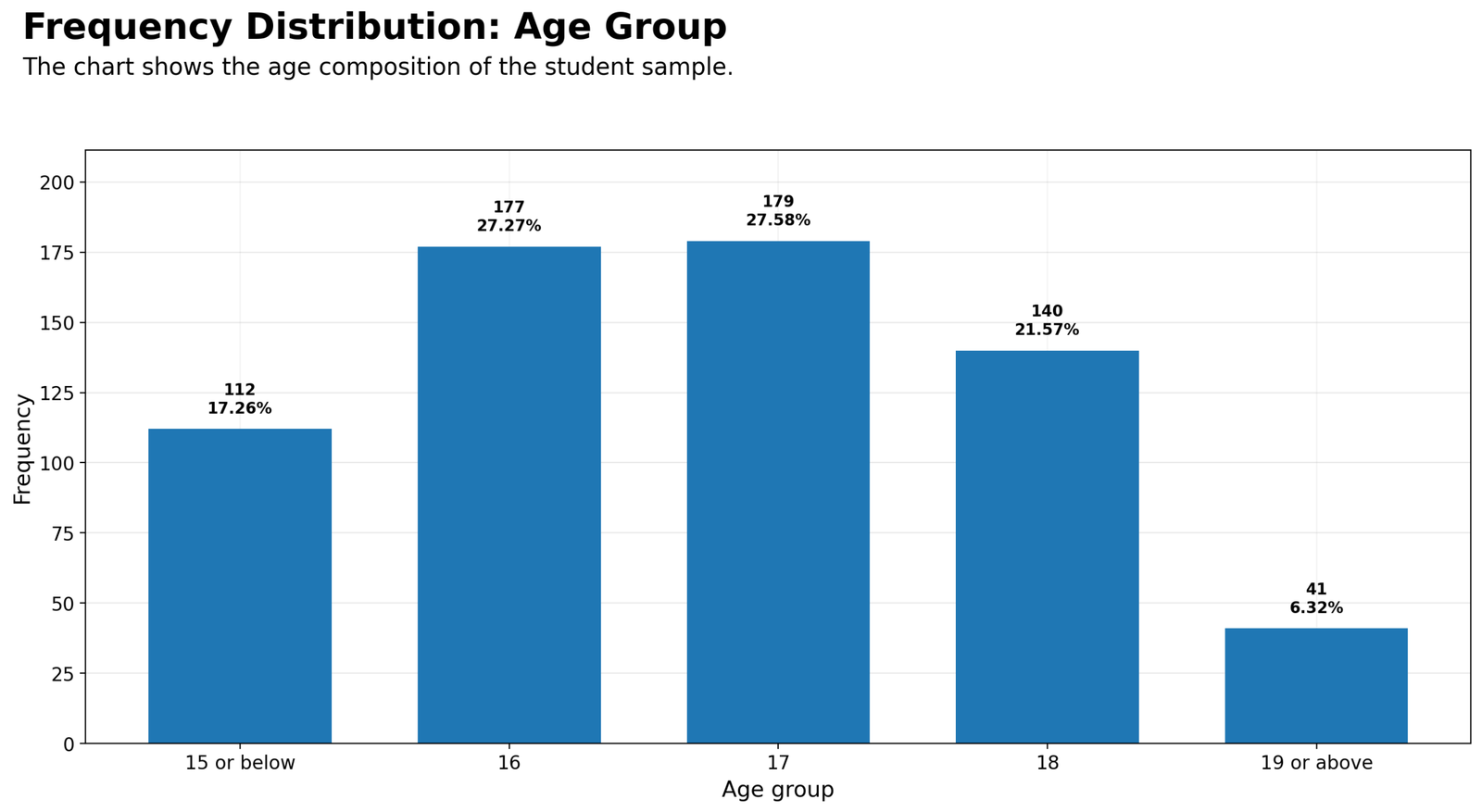
Specific interpretation: The Python age group chart shows that ages 16 and 17 are the central age categories. Age 17 has 179 students, age 16 has 177 students, age 18 has 140 students, age 15 or below has 112 students and age 19 or above has 41 students. This distribution tells us that the sample is mostly made up of typical secondary-school ages, with relatively few older students. Grouping age into categories makes the pattern easier for readers to understand than a long list of individual ages.
Decision from Chart 18: This chart should be reported with both the count and the percentage because frequency distribution is strongest when readers can see the real number of observations and the relative share of the dataset at the same time.
Chart 19: G3 Final Grade Group Frequency Distribution
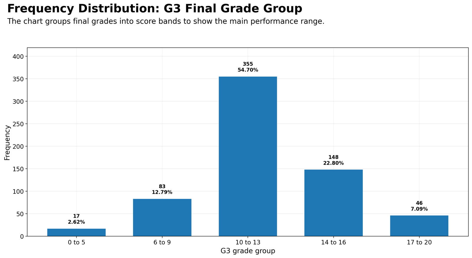
Specific interpretation: The Python G3 grade-group chart shows that the largest final-grade category is 10 to 13, with 355 students or 54.70% of the sample. The next largest group is 14 to 16, with 148 students or 22.80%. Lower performance bands and very high performance bands are smaller. This chart is valuable because it summarizes the outcome variable in a reader-friendly way. Instead of forcing readers to interpret every raw grade score from 0 to 20, the chart shows that most final grades are concentrated in the middle range.
Decision from Chart 19: This chart should be reported with both the count and the percentage because frequency distribution is strongest when readers can see the real number of observations and the relative share of the dataset at the same time.
Chart 20: Absences Group Frequency Distribution
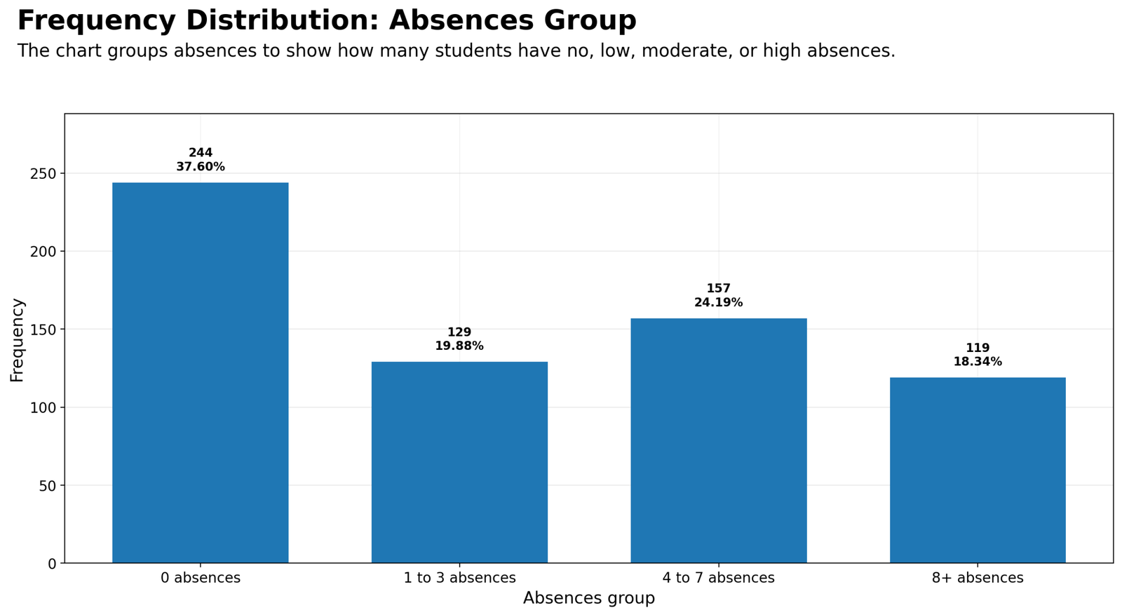
Specific interpretation: The Python absences chart shows 244 students with 0 absences, 129 students with 1 to 3 absences, 157 students with 4 to 7 absences and 119 students with 8 or more absences. This is a relatively distributed pattern compared with the failures chart. Although no absences is the largest group, a large number of students have nonzero absences. In practical interpretation, this suggests that absence behavior varies enough to be a useful explanatory or grouping variable in later analysis.
Decision from Chart 20: This chart should be reported with both the count and the percentage because frequency distribution is strongest when readers can see the real number of observations and the relative share of the dataset at the same time.
Chart 21: School by Sex Frequency Distribution
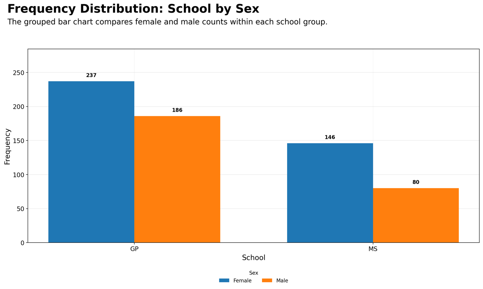
Specific interpretation: The Python school-by-sex chart shows the combined distribution of school and sex. GP includes 237 female students and 186 male students. MS includes 146 female students and 80 male students. This is a useful grouped frequency chart because it shows whether the sex composition is similar inside both school groups. Female students are more common in both schools, and the relative gap is larger in MS. The chart prepares the reader for a cross-tabulation interpretation by showing raw counts across two categorical dimensions.
Decision from Chart 21: This chart should be reported with both the count and the percentage because frequency distribution is strongest when readers can see the real number of observations and the relative share of the dataset at the same time.
Chart 22: Higher Education by Internet Access
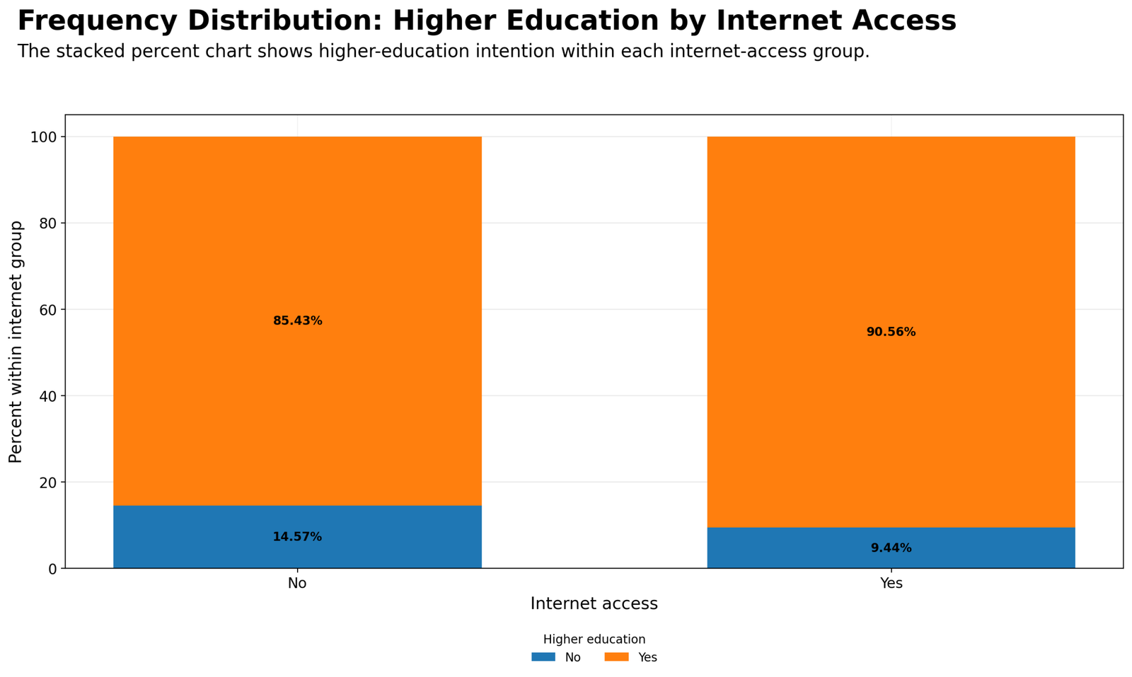
Specific interpretation: The Python stacked percent chart compares higher education intention within internet access categories. Among students without internet access, 85.43% intend to pursue higher education, while 14.57% do not. Among students with internet access, 90.56% intend to pursue higher education, while 9.44% do not. The chart shows that higher education intention is high regardless of internet access, but it is slightly higher in the internet-access group. This is a descriptive association pattern and should be followed by cross-tabulation if the goal is to test association formally.
Decision from Chart 22: This chart should be reported with both the count and the percentage because frequency distribution is strongest when readers can see the real number of observations and the relative share of the dataset at the same time.
R Code for Frequency Distribution
R can create frequency distribution tables using dplyr::count() and can create publication-ready bar charts using ggplot2. The simplified example below shows the logic for school frequency distribution.
library(readr)
library(dplyr)
library(ggplot2)

folder <- "D:/DATA ANALYSIS/A Basic Descriptive Statistics Guides/Frequency Distribution"
data_file <- file.path(folder, "dataset.csv")

df <- read_csv(data_file, show_col_types = FALSE)

school_freq <- df %>%
  count(school, name = "frequency") %>%
  mutate(
    percent = round(frequency / sum(frequency) * 100, 2),
    cumulative_frequency = cumsum(frequency),
    cumulative_percent = round(cumulative_frequency / sum(frequency) * 100, 2)
  )

ggplot(school_freq, aes(x = school, y = frequency)) +
  geom_col(width = 0.7) +
  geom_text(aes(label = paste0(frequency, "\n", percent, "%")),
            vjust = -0.25, fontface = "bold") +
  labs(
    title = "Frequency Distribution: School",
    subtitle = "The chart shows how many students belong to each school group.",
    x = "School",
    y = "Frequency"
  ) +
  theme_minimal()
R interpretation: The R output confirms the main frequency pattern: GP, Female, higher education Yes, internet Yes, 2 to 5 study hours, zero failures and the 10 to 13 G3 grade band are the largest categories in their respective variables.
Python Code for Frequency Distribution
Python can calculate frequency distribution using value_counts(), groupby() and percentage formulas. It is especially useful when the same script must create charts, tables, clean SPSS-ready data and PDF output.
import pandas as pd
import matplotlib.pyplot as plt

folder = r"D:\DATA ANALYSIS\A Basic Descriptive Statistics Guides\Frequency Distribution"
data_file = folder + r"\dataset.csv"

df = pd.read_csv(data_file)

school_freq = (
    df["school"]
    .value_counts()
    .rename_axis("category")
    .reset_index(name="frequency")
)

school_freq["percent"] = (
    school_freq["frequency"] / school_freq["frequency"].sum() * 100
).round(2)

school_freq["cumulative_frequency"] = school_freq["frequency"].cumsum()
school_freq["cumulative_percent"] = (
    school_freq["cumulative_frequency"] / school_freq["frequency"].sum() * 100
).round(2)

fig, ax = plt.subplots(figsize=(14, 8))
ax.bar(school_freq["category"], school_freq["frequency"])
ax.set_title("Frequency Distribution: School")
ax.set_xlabel("School")
ax.set_ylabel("Frequency")
plt.show()
Python chart title note: For publication images, separate the title and subtitle using fig.suptitle(), fig.text() and fig.subplots_adjust(top=...). This prevents title overlap and keeps the final WordPress images readable.
SPSS Syntax and Interpretation for Frequency Distribution
SPSS can create frequency distribution tables directly from the Frequencies command. It produces Frequency, Percent, Valid Percent and Cumulative Percent columns. It can also create bar charts for each selected variable. The clean Python-generated SPSS-ready data file was used for the SPSS workflow so that SPSS results match the R and Python outputs.
The uploaded SPSS output file is available below:
View Frequency Distribution SPSS Output PDF
SPSS Menu Method
| Frequency distribution need | SPSS menu path | Output to read |
|---|---|---|
| Main frequency table | Analyze → Descriptive Statistics → Frequencies | Frequency, Percent, Valid Percent and Cumulative Percent. |
| Bar chart | Frequencies → Charts → Bar charts | Visual count comparison across categories. |
| Cross-tab frequency | Analyze → Descriptive Statistics → Crosstabs | Counts and row/column percentages across two variables. |
| Grouped numeric frequency | Transform → Recode into Different Variables, then Frequencies | Ordered frequency table for age, grade or absence bands. |
SPSS Syntax Example with PDF Export
SET PRINTBACK=ON.
SET MPRINT=ON.
SET TVARS=NAMES.
SET TNUMBERS=VALUES.
SET UNICODE=ON.

GET DATA
 /TYPE=TXT
 /FILE="D:\DATA ANALYSIS\A Basic Descriptive Statistics Guides\Frequency Distribution\Python_Output\clean_data\frequency_distribution_clean_data_for_spss.csv"
 /ENCODING="UTF8"
 /DELCASE=LINE
 /DELIMITERS=","
 /QUALIFIER='"'
 /ARRANGEMENT=DELIMITED
 /FIRSTCASE=2
 /IMPORTCASE=ALL.
EXECUTE.

TITLE "Frequency Distribution SPSS Output".

FREQUENCIES VARIABLES=school sex higher internet
 /FORMAT=AVALUE
 /BARCHART FREQ
 /ORDER=ANALYSIS.

FREQUENCIES VARIABLES=age_group_num studytime_group_num failure_group_num absences_group_num g3_grade_group_num
 /FORMAT=AVALUE
 /BARCHART FREQ
 /ORDER=ANALYSIS.

CROSSTABS
 /TABLES=school BY sex
 /FORMAT=AVALUE TABLES
 /CELLS=COUNT ROW COLUMN TOTAL
 /COUNT ROUND CELL
 /BARCHART.

CROSSTABS
 /TABLES=internet BY higher
 /FORMAT=AVALUE TABLES
 /CELLS=COUNT ROW COLUMN TOTAL
 /COUNT ROUND CELL
 /BARCHART.

OUTPUT EXPORT
 /CONTENTS EXPORT=ALL LAYERS=PRINTSETTING MODELVIEWS=PRINTSETTING
 /PDF DOCUMENTFILE="D:\DATA ANALYSIS\A Basic Descriptive Statistics Guides\Frequency Distribution\Python_Output\pdf\Frequency-Distribution-SPSS-Output.pdf"
 /EMBEDBOOKMARKS=YES
 /EMBEDFONTS=YES.
SPSS export note: The PDF output folder should exist before running the syntax. If SPSS cannot create missing folders automatically, create Python_Output\pdf manually before running the output export command.
Excel Method for Frequency Distribution
Excel can create frequency distribution tables using PivotTables or formulas. For categorical variables, PivotTables are usually the fastest method. For grouped numeric variables, create a helper column first, then count each group.
Excel Steps for a PivotTable Frequency Distribution
| Step | Excel action | Purpose |
|---|---|---|
| 1 | Select the dataset range. | Prepare all rows and columns for summarizing. |
| 2 | Insert → PivotTable. | Create a summary table from the raw data. |
| 3 | Drag the category variable into Rows. | List every category such as GP and MS. |
| 4 | Drag the same variable into Values and set it to Count. | Calculate frequency. |
| 5 | Show Values As → % of Grand Total. | Calculate percentage distribution. |
| 6 | Insert a bar chart. | Visualize the frequency distribution. |
Excel Formula Method
Frequency:
=COUNTIF(range, category)

Percentage:
=COUNTIF(range, category) / COUNTA(range)

Cumulative frequency:
=SUM(first_frequency_cell:current_frequency_cell)

Cumulative percent:
=current_cumulative_frequency / total_frequency
Download Output and Resources
The SPSS PDF output and dataset source are available below. Use the SPSS output for formal tables and use the R/Python charts for visual interpretation of frequency and percentage patterns.
APA Style Reporting for Frequency Distribution
A frequency distribution report should include the sample size, the main categories, frequencies, percentages and a clear interpretation of imbalance. The report should not claim significance unless a statistical test was performed.
APA-style report for school: The frequency distribution showed that 423 students (65.18%) belonged to the GP school group and 226 students (34.82%) belonged to the MS school group. Therefore, the sample was weighted toward GP, and school-level comparisons should report group sizes before interpreting differences.
APA-style report for higher education intention: Higher education intention was strongly positive. A total of 580 students (89.37%) reported that they wanted to continue higher education, while 69 students (10.63%) reported that they did not.
APA-style report for G3 grade group: The G3 final-grade frequency distribution showed that the largest score band was 10 to 13, containing 355 students (54.70%). This indicates that final grades were concentrated in the middle performance range.
Short report:
Frequency distribution analysis was conducted on 649 student records. The sample included 423 GP students (65.18%) and 226 MS students (34.82%). Female students represented 383 cases (59.01%), while male students represented 266 cases (40.99%). Higher education intention was strongly positive, with 580 students (89.37%) answering Yes. The largest G3 final-grade group was 10 to 13, containing 355 students (54.70%).
When Should You Use Frequency Distribution?
Use Frequency Distribution at the beginning of almost every data analysis project. It is essential for categorical variables and useful for grouped numeric variables. It helps identify category imbalance, sample composition, missing data patterns and the practical structure of the dataset.
| Analysis situation | Recommended frequency output | Why it helps |
|---|---|---|
| Describing sample composition | Frequency and percentage table | Shows who or what is in the dataset. |
| Checking categorical variables | Bar chart and frequency table | Shows whether categories are balanced or dominated by one group. |
| Preparing cross-tabulation | Single-variable frequencies first | Helps identify small categories before making a two-way table. |
| Grouping numeric variables | Grouped frequency table | Makes age, grade or absence distributions easier to read. |
| Writing a report | Frequency, percent and key category interpretation | Turns raw counts into readable findings. |
After frequency distribution, the next natural step is often cross-tabulation, descriptive statistics, box plot interpretation, confidence interval analysis or effect size analysis.
References and Related Guides
Frequency distribution connects with descriptive statistics, categorical analysis, cross-tabulation, confidence intervals and data visualization. These related guides can support the next step of analysis:
| Related guide | Why it helps |
|---|---|
| Descriptive Statistics Explained | Extends frequency distribution into mean, median, standard deviation and numeric summaries. |
| Cross Tabulation | Uses frequency counts across two categorical variables. |
| Box Plot Interpretation | Explains median, quartiles and outliers after grouped summaries. |
| Confidence Interval | Moves from descriptive counts to uncertainty around estimates. |
| Coefficient of Variation | Compares relative variability across numeric variables. |
| Effect Size | Adds practical significance after group comparison or association analysis. |
| One-Proportion Z Test | Useful when testing a single categorical proportion. |
| Q-Q Plot Normality Check | Useful before parametric tests for numeric variables. |
| Kolmogorov-Smirnov Test | Formal distribution check after visual distribution summaries. |
| D’Agostino-Pearson Test | Normality testing through skewness and kurtosis. |
External references: UCI Student Performance dataset, IBM SPSS Statistics, R Project, and Python.
FAQs About Frequency Distribution
What is Frequency Distribution in simple words?
Frequency Distribution is a table or chart that shows how many observations appear in each category, value or group. It tells how the dataset is distributed across categories.
Why is Frequency Distribution important?
Frequency Distribution is important because it shows the structure of the dataset before advanced analysis. It reveals large groups, small groups, category imbalance and sample composition.
What is the difference between frequency and percentage?
Frequency is the actual number of observations in a category. Percentage is the category frequency divided by the total frequency and multiplied by 100.
When should cumulative percent be used?
Cumulative percent should be used for ordered categories such as age group, study-time group, failure group, absence group and grade group. It is less meaningful for unordered variables like school or sex.
What is the main frequency distribution result in this guide?
The main result is that GP is the larger school group, female students are the larger sex group, most students want higher education, most students have internet access, most students have no past failures and the largest G3 grade group is 10 to 13.
Can Frequency Distribution prove statistical significance?
No. Frequency Distribution is descriptive. It summarizes counts and percentages. To test statistical significance between categorical variables, use cross-tabulation and a chi-square test.
How do I create Frequency Distribution in SPSS?
In SPSS, go to Analyze, Descriptive Statistics, Frequencies. Move the variables into the Variables box, request frequency tables and add bar charts if needed.
How do I create Frequency Distribution in Excel?
In Excel, use a PivotTable for categorical variables or use COUNTIF formulas. A PivotTable can show counts and percentages of the grand total.
Final Summary
This Frequency Distribution guide analyzed 649 student records using R, Python, SPSS and Excel. The analysis showed that the sample is mostly GP students, mostly female students, strongly positive toward higher education and mostly equipped with internet access. The study-time distribution is concentrated in less than 5 hours, past failures are mostly zero, ages are concentrated around 16 and 17, the largest G3 final-grade group is 10 to 13 and absences are spread across several practical groups.
These findings are descriptive, but they are essential. Without frequency distribution, later analyses can be misunderstood. A good statistical report should always explain sample composition before testing relationships, comparing means or building models. Frequency distribution is therefore the foundation for cross-tabulation, descriptive statistics, confidence intervals, effect sizes and many other statistical methods.

