
Bland Altman Plot: Formula, Interpretation, Python, R, SPSS and Excel Guide
A Bland Altman plot evaluates agreement between two paired quantitative measurements by plotting each pair’s difference against its mean. This complete worked guide explains the formula, limits of agreement, proportional-bias check, confidence intervals, interpretation, assumptions, and reproducible workflows in Python, R, SPSS, and Excel.
What does the Bland Altman plot show?
The worked Bland Altman plot compares first-period grade G1 with final grade G3 for 649 students. The difference is defined as G3 − G1. The mean difference is 0.5069 grade points, so G3 is higher on average. The conventional 95% limits of agreement are −3.0617 to 4.0756. About 97.07% of observed differences lie inside those limits. However, the difference increases with the pair mean, r = .279, p < .001, and the estimated slope is 0.1778. This magnitude-related trend means a single constant pair of limits should be interpreted cautiously rather than treated as a complete verdict of interchangeability.
A Bland Altman plot does not decide whether the limits are acceptable. That decision requires a scientifically or practically justified tolerance established before the results are interpreted.
Result snapshot
What is a Bland Altman plot?
A mean-difference display for judging agreement, bias, spread, and magnitude-related patterns.
A Bland Altman plot, also called a Bland–Altman plot, mean-difference plot, or difference plot, places the average of two paired measurements on the horizontal axis and their difference on the vertical axis. The method was popularized by J. Martin Bland and Douglas Altman as an alternative to relying on correlation when the real question is whether two measurements agree closely enough for a stated purpose.
The question answered
The central question is not merely whether two measurements move together. It is whether their numerical differences are small, stable, and acceptable across the measurement range. A Bland Altman plot therefore displays systematic bias, random disagreement, unusual pairs, changing spread, and proportional bias in one visual framework.
For each subject, the pair mean locates the observation along the measurement scale. The pair difference shows how far one measurement is above or below the other. A horizontal line at the mean difference represents average bias. Two additional horizontal lines at the mean difference plus and minus 1.96 standard deviations represent conventional 95% limits of agreement when the difference distribution is suitably modeled by a constant mean and standard deviation.
What it does not prove
A high percentage of points within the limits does not automatically establish good agreement, because the limits are calculated from the same data and are expected to contain roughly 95% of observations under the model. The limits must be compared with a pre-specified tolerance. A Bland Altman plot also does not establish causation, calibration validity, reliability across all future settings, or interchangeability for every individual.
The plot should be interpreted with the measurement design, units, repeatability, sampling process, and intended decision in view. When the measurements are repeated on each subject, clustered, transformed, or measured with unequal precision, the simple independent-pair calculation may require an extension.
In the worked dataset, G1 and G3 are grades from different occasions rather than two instruments intended to measure an identical quantity at the same moment. The analysis is therefore a pedagogical paired-score agreement example. It describes how much first-period and final grades differ, but it should not be presented as proof that two clinical devices, laboratories, or measurement methods are interchangeable.
When should a Bland Altman plot be used?
Use it for paired quantitative measurements when the research objective is agreement rather than association.
Appropriate design
A standard Bland Altman plot requires two numerical observations for each independent subject or unit. Examples include a new device versus a reference device, two laboratories measuring the same specimen, two raters producing continuous scores, a field measurement versus a validated instrument, or two occasions when stability is scientifically meaningful.
Same scale and units
The ordinary difference is easiest to interpret when both variables use the same units and represent the same construct. If scales differ, convert them to a common meaningful scale before calculating a Bland Altman plot. Percentage or logarithmic differences may be more suitable when variability grows in proportion to magnitude.
Independent pairs
The simple formulas assume the paired differences are independent across subjects. Repeated replicates, multiple body sites, multiple raters, family clusters, classes, or longitudinal follow-up violate that independence. A repeated-measures Bland Altman plot or mixed-model method is then preferable.
Decision checklist
A Bland Altman plot is especially useful when a simple summary such as the mean absolute error hides direction. Positive and negative errors can cancel in an average difference, while the plot reveals both their spread and their location across the scale. It is also more informative than reporting only a paired t test, because a statistically significant mean difference can be very small in practical terms, and a non-significant mean difference can coexist with unacceptably wide individual differences.
Bland Altman plot formula and limits of agreement
Every plotted point and reference line follows from the pair mean and pair difference.
The Bland Altman plot formula begins with paired observations Ai and Bi for subject i. The horizontal coordinate is their mean, and the vertical coordinate is their difference. In this article, A is G1 and B is G3.
The pair mean is a practical estimate of the subject’s location on the common measurement scale. It allows the Bland Altman plot to show whether disagreement changes for low, middle, or high values.
A positive difference means G3 exceeds G1. A negative difference means G3 is lower than G1. The subtraction order must remain unchanged in calculations, labels, tables, and interpretation.
The mean bias estimates the average systematic difference. It is not a measure of individual agreement by itself. A mean close to zero may conceal large positive and negative discrepancies.
The standard deviation summarizes random variation around the mean bias. The standard Bland Altman plot assumes this spread is reasonably constant across the pair-mean range.
If the model is appropriate, approximately 95% of individual differences from the source population are expected between these limits. The limits describe the distribution of individual differences; they are not 95% confidence intervals for the mean bias.
Worked substitution
Width of the agreement band
The total interval width is 4.0756 − (−3.0617) = 7.1374 grade points. Relative to the 0–19 observed grade scale, that range is substantial. Whether it is acceptable depends on the intended use. A Bland Altman plot must therefore connect the statistical limits to a domain-defined maximum tolerable difference.
The interval is asymmetric around zero because the estimated bias is positive. It remains symmetric around the mean bias, as required by the conventional calculation.
How to make a Bland Altman plot in five steps
A reproducible sequence from paired-data validation to an evidence-based conclusion.
Verify pairing
Confirm that every row contains the two measurements from the same subject and that no pair is accidentally shifted, duplicated, or unmatched.
Compute means and differences
Create the pair mean and the directional difference. Label the direction clearly so positive values have an unambiguous meaning.
Estimate bias and limits
Calculate the mean difference, difference SD, and conventional 95% limits of agreement.
Inspect the pattern
Plot differences against means. Examine outliers, curvature, unequal spread, gaps, clusters, and a mean-related trend.
Judge acceptability
Compare the limits and their uncertainty with a pre-specified practical tolerance, then report limitations and sensitivity analyses.
Good analysis goes beyond drawing three horizontal lines. A complete Bland Altman plot workflow also checks the distribution of differences, quantifies the uncertainty of the bias and limits, examines whether differences are associated with magnitude, and records how missing pairs and unusual observations were handled. For a large discrete dataset such as grades, formal normality tests may reject strongly even when the central portion is concentrated. The shape, tails, outliers, and practical consequences should be described rather than reduced to a single p-value.
Variables used in the worked Bland Altman plot
The data dictionary separates original variables from calculated agreement variables.
| Variable | Role | Definition | Interpretation |
|---|---|---|---|
| G1 | Measurement A | First-period grade, observed from 0 to 19 | The earlier grade in each paired record. |
| G3 | Measurement B | Final grade, observed from 0 to 19 | The later grade in each paired record. |
| subject_id | Pair identifier | Unique row number from 1 to 649 | Preserves one-to-one pairing and supports case review. |
| ba_mean | Horizontal coordinate | (G1 + G3) / 2 | Average grade level for the pair. |
| ba_difference | Vertical coordinate | G3 − G1 | Positive values indicate a higher final grade. |
| mean_bias | Systematic difference | Mean of ba_difference | Average directional change across all pairs. |
| lower_limit | Agreement boundary | mean_bias − 1.96 × SD | Lower conventional 95% limit of agreement. |
| upper_limit | Agreement boundary | mean_bias + 1.96 × SD | Upper conventional 95% limit of agreement. |
Raw measurement summaries
Pair-derived summaries
The full student dataset contains additional demographic, family, study, support, and behavior variables, but they are not required for this Bland Altman plot. Restricting the primary agreement calculation to G1, G3, and the derived pair variables keeps the estimand clear. Additional variables can be used later for stratified exploration, but subgroup analysis should be planned carefully because small groups produce unstable limits.
Exact Bland Altman plot results
Bias, limits, point distribution, difference shape, and magnitude trend from all 649 complete pairs.
Primary Bland Altman plot finding
Conventional 95% limits of agreement
For a student with a comparable position on the observed grade scale, a final-minus-first-period difference from about three points lower to four points higher falls within the estimated population agreement band under the standard constant-bias model.
Observed positions relative to the limits
The positive mean bias indicates that final grades are, on average, about half a point higher than first-period grades. The 95% confidence interval for the mean bias excludes zero, and a paired mean test gives t(648) = 7.093, p < .001. That significance statement concerns average bias only. The Bland Altman plot addresses the broader agreement question by showing that individual differences are much more dispersed than the half-point average suggests.
The most common differences are 1 point, occurring for 191 students, and 0 points, occurring for 185 students. A further 102 students differ by 2 points and 85 differ by −1 point. Overall, 71.03% of pairs are within one grade point in absolute value, 89.37% are within two points, and 95.84% are within three points. These intuitive thresholds complement the Bland Altman plot, but they should be compared with a pre-defined acceptable error rather than selected after inspecting the data.
The difference distribution is discrete and non-normal. It has skewness −1.628 and excess kurtosis 10.023. The Shapiro–Wilk statistic is 0.811 with p < .001. The lower tail contains several extreme negative differences, including values near −11, while the upper tail has fewer extreme positive values. A large sample makes the estimated mean and standard deviation stable, but the visible asymmetry and magnitude trend are reasons to supplement the conventional Bland Altman plot with quantile summaries, regression-based limits, transformation checks, or bootstrap uncertainty.
Bland Altman plot charts from Python
Five publication-ready visuals summarize the core metrics, paired-data distribution, agreement limits, quantiles, and cross-check.
The Python chart set presents the worked Bland Altman plot analysis in a consistent visual sequence. The first chart stands alone as the overview, followed by two paired rows. Each figure should be interpreted with the exact numerical results rather than by visual height alone, because the pair count is on a different scale from the grade-point metrics.
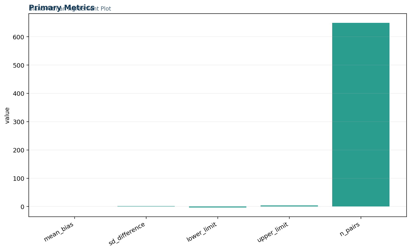
Figure 1. Primary Bland Altman plot metrics
The overview verifies a mean bias of 0.5069, difference SD of 1.8208, lower limit of −3.0617, upper limit of 4.0756, and 649 pairs. Because n = 649 is much larger than the other values, the grade-point bars appear compressed. Read the labels as the authoritative values.
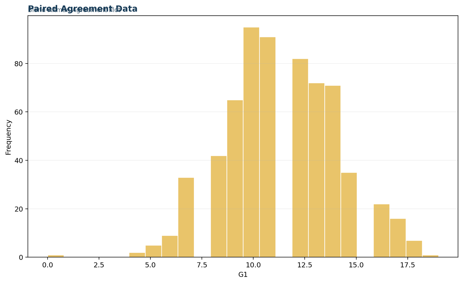
Figure 2. Paired agreement data distribution
This histogram displays the G1 measurement used in every pair. Values concentrate around the central grade range, with fewer observations near the boundaries. The restricted and discrete scale helps explain why the Bland Altman plot differences form horizontal bands rather than a continuous cloud.
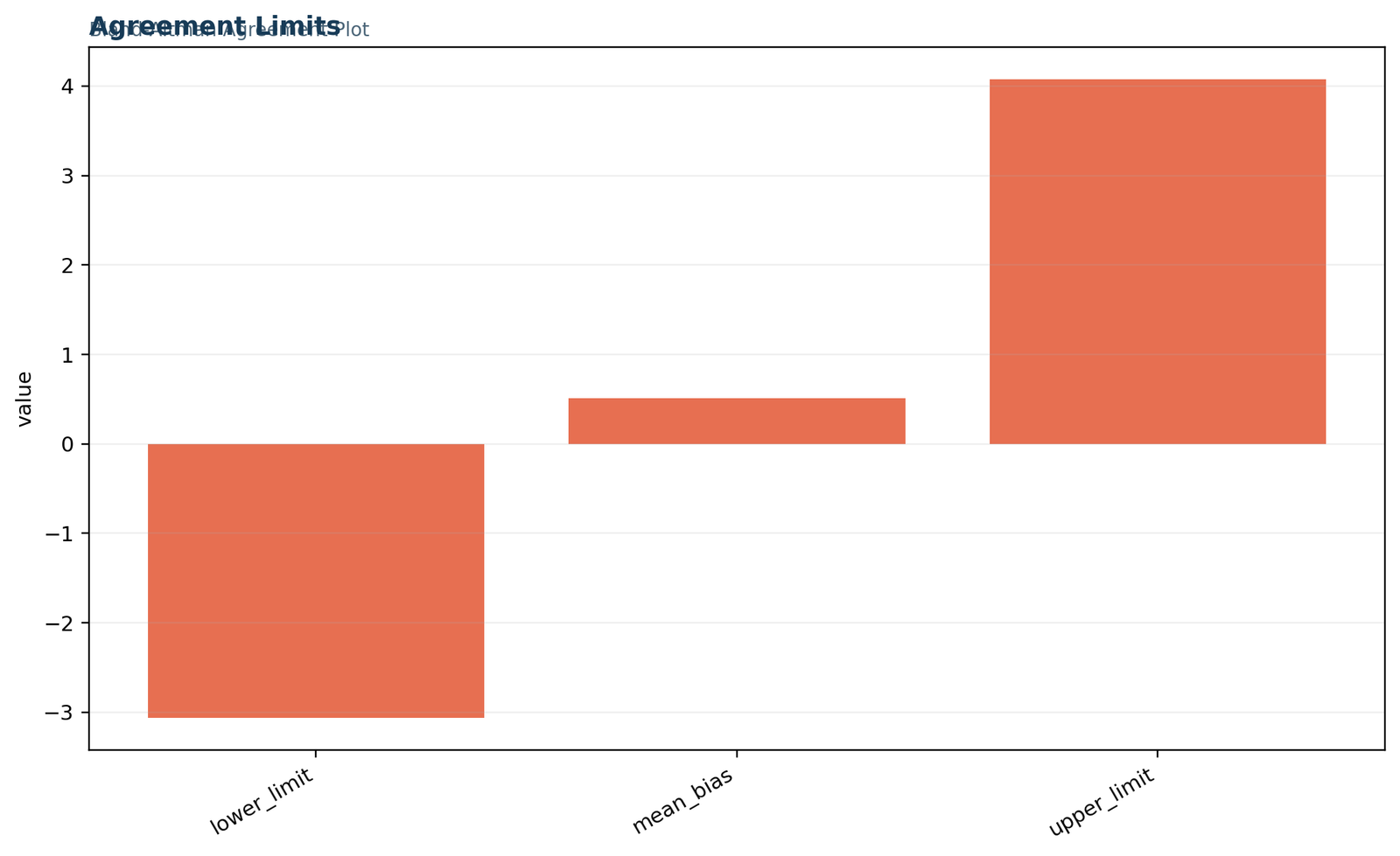
Figure 3. Mean bias and limits of agreement
The central bar is the positive mean bias, while the outer bars mark the conventional 95% agreement boundaries. The upper distance from zero is larger because the entire interval is centered on a positive bias. A practical tolerance must still be supplied before these limits are called acceptable.
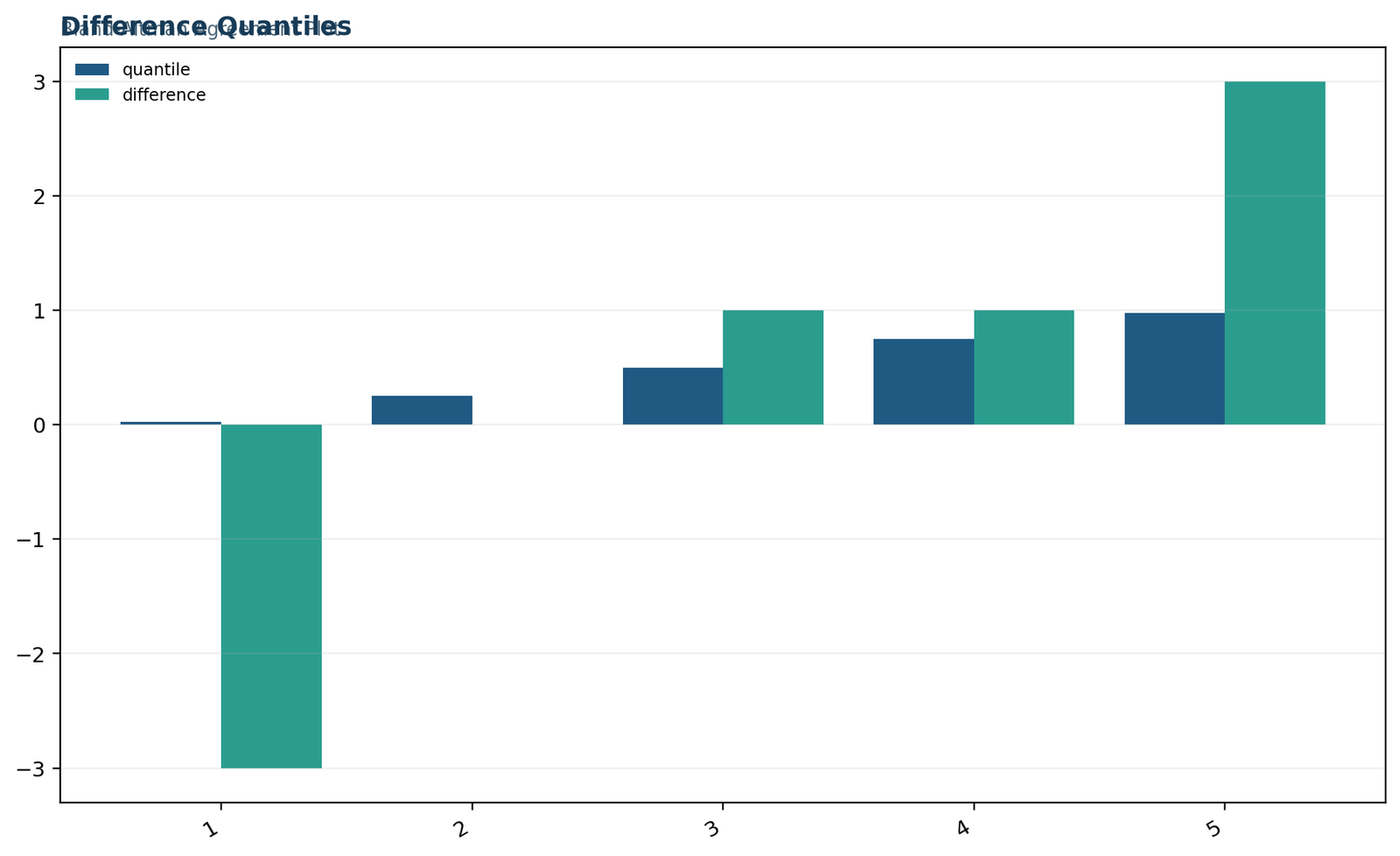
Figure 4. Difference quantiles
The 2.5th, 25th, 50th, 75th, and 97.5th percentiles of G3 − G1 are −3, 0, 1, 1, and 3. The narrow central range contrasts with the longer extreme tails. Quantiles therefore reveal features that the SD-based Bland Altman plot limits alone can obscure.
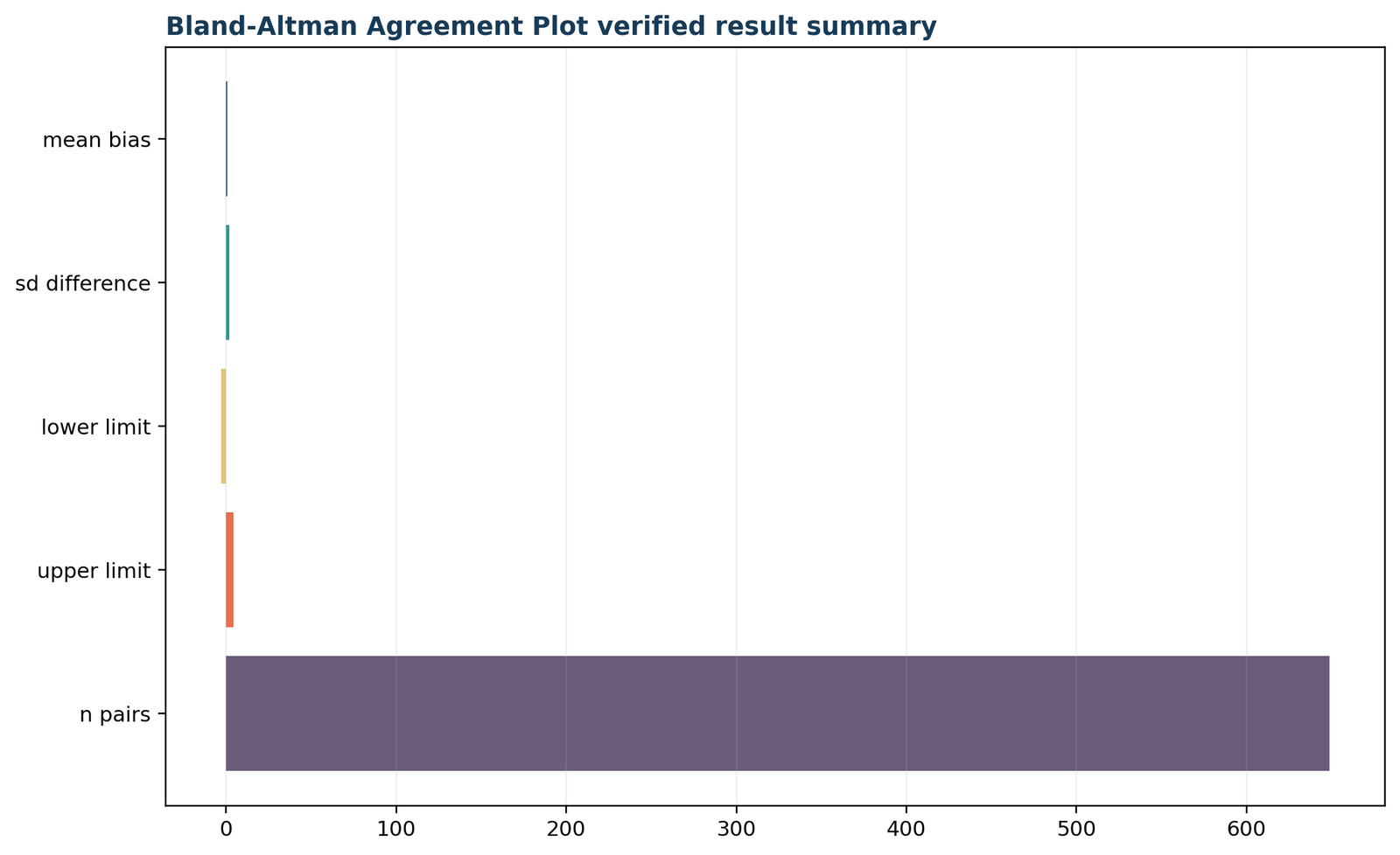
Figure 5. Verified result summary
The final Python visual repeats the essential outputs used for cross-software validation. The agreement metrics reproduce to numerical precision across the manual calculation, Python, R, SPSS, and the worked Excel file.
These figures intentionally separate descriptive distribution from agreement interpretation. A histogram of either original measurement cannot replace a Bland Altman plot, because agreement is defined through paired differences. Likewise, a bar chart of the three reference values cannot reveal magnitude-related patterns. The complete analysis should retain the actual mean-versus-difference scatter, inspect the raw pairs, and report the numerical limits with uncertainty.
Bland Altman plot charts from R
The R output mirrors the Python visual order to support transparent cross-platform verification.
The R chart set uses the same five verified assets and the same first-chart-wide layout. Matching the Python and R Bland Altman plot summaries is a quality-control step: it checks variable direction, denominators, standard-deviation convention, rounding, and limit formulas.
Figure 6. R primary metrics
R reproduces the same bias, difference SD, limits, and sample size. Agreement between platforms is expected because each uses the sample standard deviation and the 1.96 multiplier. A discrepancy would usually indicate reversed subtraction, population SD, row filtering, or missing-pair handling.
Figure 7. R paired-data distribution
The discrete 0–19 grade scale creates repeated values and ties. This is important when reading the Bland Altman plot: overlapping observations can make a point cloud appear sparser than the underlying number of pairs unless transparency, jitter, frequency encoding, or counts are used.
Figure 8. R agreement-limit summary
The R result places the bias at 0.5069 and the conventional limits at −3.0617 and 4.0756. The numerical interval, not the bar height, should be compared with the decision threshold for acceptable disagreement.
Figure 9. R difference quantiles
The median difference is 1, while both quartiles are 0 and 1. The 2.5th and 97.5th percentiles are −3 and 3. The positive mean exceeds the median pattern only slightly, but the extreme negative tail drives the strong negative skewness.
Figure 10. R verified result summary
The closing visual confirms that the R and Python computations agree. Cross-software agreement strengthens reproducibility, but it does not remove design limitations or determine whether the observed limits are practically acceptable.
When creating an R Bland Altman plot, use descriptive labels such as “Pair mean of G1 and G3” and “Difference: G3 − G1.” Add the mean bias and both limits as horizontal lines, and annotate their values. For crowded discrete data, use transparent points and show counts or a two-dimensional frequency display in a supplementary figure. A smooth or regression line can help reveal proportional bias, but it should not be mistaken for an inferential model unless its assumptions and confidence interval are reported.
How to create a Bland Altman plot in Python
A transparent pandas, NumPy, SciPy, and Matplotlib workflow with diagnostics.
A reproducible Python Bland Altman plot should calculate the pair variables explicitly rather than relying on hidden defaults. The following example assumes a data frame named df with numeric columns G1 and G3.
import numpy as np
import pandas as pd
import matplotlib.pyplot as plt
from scipy import statspaired = df[["G1", "G3"]].dropna().copy()
paired["ba_mean"] = paired[["G1", "G3"]].mean(axis=1)
paired["ba_difference"] = paired["G3"] - paired["G1"]
n = len(paired)
bias = paired["ba_difference"].mean()
sd_diff = paired["ba_difference"].std(ddof=1)
lower = bias - 1.96 * sd_diff
upper = bias + 1.96 * sd_diff
print({
"n_pairs": n,
"mean_bias": bias,
"sd_difference": sd_diff,
"lower_limit": lower,
"upper_limit": upper,
})
The use of ddof=1 requests the sample standard deviation. With the worked data, Python returns n = 649, bias = 0.5069337, SD = 1.8207560, lower limit = −3.0617480, and upper limit = 4.0756155. These values reproduce the verified Bland Altman plot output.
fig, ax = plt.subplots(figsize=(10, 6))

ax.scatter(

paired["ba_mean"],

paired["ba_difference"],

alpha=0.45,

edgecolors="none"

)

ax.axhline(bias, linestyle="-", label=f"Bias = {bias:.3f}")

ax.axhline(lower, linestyle="--", label=f"Lower LoA = {lower:.3f}")

ax.axhline(upper, linestyle="--", label=f"Upper LoA = {upper:.3f}")

ax.set_xlabel("Pair mean of G1 and G3")

ax.set_ylabel("Difference: G3 - G1")

ax.set_title("Bland-Altman Plot: G3 versus G1")

ax.legend()

fig.tight_layout()

plt.show()
Check proportional bias
fit = stats.linregress(

paired["ba_mean"],

paired["ba_difference"]

)

print(fit.slope, fit.intercept, fit.rvalue, fit.pvalue)
The estimated slope is 0.1778 and the Pearson correlation is .279. A positive slope means the directional difference tends to rise as the pair mean rises. This pattern should be shown on or alongside the Bland Altman plot.
Quantify outside-limit cases
below = (paired["ba_difference"] < lower).sum()

above = (paired["ba_difference"] > upper).sum()

inside = n - below - above

inside_pct = 100 * inside / n

print(below, above, inside, inside_pct)
The output is 16 below, 3 above, and 630 inside, corresponding to 97.07% inside the conventional limits. That percentage is descriptive and is not an acceptability test.
For uncertainty, Python can calculate a confidence interval for the bias from its standard error and approximate intervals for the limits. Bootstrap resampling is useful when differences are non-normal or when an empirical quantile approach is desired. Each bootstrap replicate must resample complete pairs, not the G1 and G3 columns independently, because independent resampling destroys the pairing that defines the Bland Altman plot.
How to create a Bland Altman plot in R
Base R calculations keep every quantity visible and easy to audit.
The R Bland Altman plot workflow uses complete paired rows, calculates the difference in the stated direction, and then draws the mean and limits. The base implementation avoids ambiguity about package-specific conventions.
paired <- na.omit(data.frame(G1 = dat$G1, G3 = dat$G3))
paired$ba_mean <- rowMeans(paired[c("G1", "G3")])
paired$ba_difference <- paired$G3 - paired$G1n_pairs <- nrow(paired)
mean_bias <- mean(paired$ba_difference)
sd_difference <- sd(paired$ba_difference)
lower_limit <- mean_bias - 1.96 * sd_difference
upper_limit <- mean_bias + 1.96 * sd_difference
c(
n_pairs = n_pairs,
mean_bias = mean_bias,
sd_difference = sd_difference,
lower_limit = lower_limit,
upper_limit = upper_limit
)
plot(

paired$ba_mean,

paired$ba_difference,

pch = 16,

cex = 0.75,

xlab = "Pair mean of G1 and G3",

ylab = "Difference: G3 - G1",

main = "Bland-Altman Plot: G3 versus G1"

)

abline(h = mean_bias, lwd = 2)

abline(h = c(lower_limit, upper_limit), lty = 2, lwd = 2)

legend(

"topleft",

legend = c(

sprintf("Bias = %.3f", mean_bias),

sprintf("Lower LoA = %.3f", lower_limit),

sprintf("Upper LoA = %.3f", upper_limit)

),

lty = c(1, 2, 2),

bty = "n"

)
Regression check in R
bias_model <- lm(ba_difference ~ ba_mean, data = paired)

summary(bias_model)

confint(bias_model)
The slope confidence interval excludes zero, confirming a mean-related difference pattern. A complete R Bland Altman plot report should give the slope and confidence interval rather than saying only that the cloud “looks tilted.”
Distribution diagnostics in R
summary(paired$ba_difference)

quantile(paired$ba_difference,

probs = c(.025, .25, .50, .75, .975))

hist(paired$ba_difference)

qqnorm(paired$ba_difference)

qqline(paired$ba_difference)
The quantiles are −3, 0, 1, 1, and 3. The diagnostic plots reveal a discrete central mass and long tails, particularly on the negative side.
Dedicated R packages can add confidence bands, repeated-measures variants, and formatted output. Before using them, verify the subtraction direction, definition of the limits, handling of replicates, and whether the package reports 1.96 or a small-sample t multiplier. Reproducing the basic numbers manually is a strong safeguard against a mislabeled Bland Altman plot.
How to make a Bland Altman plot in SPSS
Compute the pair mean and difference, obtain descriptives, draw the scatter, and evaluate diagnostics.
SPSS does not require a special command to construct a basic Bland Altman plot. The essential steps are to compute the pair-derived variables, calculate the bias and difference SD, derive the limits, and create a scatterplot of difference against mean.
COMPUTE ba_mean = (G1 + G3) / 2.
COMPUTE ba_difference = G3 - G1.
EXECUTE.DESCRIPTIVES VARIABLES = ba_difference ba_mean
/STATISTICS = MEAN STDDEV MIN MAX.
CORRELATIONS
/VARIABLES = ba_mean ba_difference
/PRINT = TWOTAIL NOSIG
/MISSING = PAIRWISE.
GRAPH
/SCATTERPLOT(BIVAR) = ba_mean WITH ba_difference.
EXAMINE VARIABLES = ba_difference
/PLOT = HISTOGRAM NPPLOT
/STATISTICS = DESCRIPTIVES.
The verified SPSS output reports 649 valid pairs. The difference mean is 0.5069, its SD is 1.82076, and the pair-mean average is 11.6525. The SPSS correlation between pair mean and difference is .279 with p < .001. The difference distribution has skewness −1.628, kurtosis 10.023, and Shapiro–Wilk W = .811, p < .001. These diagnostics support the same interpretation given by the Python and R Bland Altman plot workflows.
Adding reference lines
In the SPSS Chart Editor, add horizontal reference lines at 0.5069, −3.0617, and 4.0756. Label the vertical axis as “G3 − G1” and the horizontal axis as “Mean of G1 and G3.” A zero line can also help readers distinguish no difference from average bias.
SPSS interpretation priority
The SPSS normality table is not the final decision rule. With 649 observations and discrete grades, tiny deviations are easily significant. The Bland Altman plot pattern, tail behavior, regression trend, and practical tolerance are more informative than a binary normality-test result.
SPSS users can save the computed variables in a .sav file so every plotted point is auditable. A reporting dataset should retain the original pair identifier, both measurements, pair mean, pair difference, outside-limit flag, and any subgroup indicator used in planned sensitivity analyses.
How to create a Bland Altman plot in Excel
Use row-level formulas, named summary cells, and an XY scatter chart.
An Excel Bland Altman plot is reliable when the workbook separates raw data, row calculations, summary statistics, diagnostics, and reporting. Suppose G1 is in column B and G3 is in column C, beginning on row 2.
Row-level formulas
=AVERAGE(B2,C2)=C2-B2=ABS(E2)=IF(OR(E2<$H$5,E2>$H$6),"Outside","Inside")Copy the formulas through all complete paired rows. Never sort only one measurement column because that breaks the pairing.
Summary formulas
=AVERAGE(E2:E650)=STDEV.S(E2:E650)=H2-1.96*H3=H2+1.96*H3=COUNTIF(G2:G650,"Inside")/COUNTA(E2:E650)Create an XY scatter chart with the pair mean as X and the difference as Y. Add three helper series whose Y values repeat the bias, lower limit, and upper limit across the minimum and maximum X values. Format them as lines without markers. The finished Excel Bland Altman plot should state the direction G3 − G1 in its title or axis label.
Excel’s trendline can visualize proportional bias, but the displayed equation should be supplemented with the slope standard error, confidence interval, and p-value from the Data Analysis regression tool or the LINEST function. A trendline without uncertainty is descriptive, not a complete inferential assessment.
How to interpret a Bland Altman plot correctly
Read the bias, agreement width, pattern, extremes, uncertainty, and practical threshold together.
Correct Bland Altman plot interpretation is a sequence rather than a single statement. Begin with the difference direction, then evaluate average bias, the width of individual disagreement, the pattern across magnitude, tail behavior, and whether the interval meets a pre-defined criterion.
1. Direction
G3 − G1 is positive for 344 students, zero for 185, and negative for 120. Positive values mean the final grade is higher.
2. Average bias
The mean difference is 0.5069. The 95% confidence interval is 0.3666 to 0.6473, indicating a small but clearly positive average shift.
3. Individual spread
The conventional limits extend from −3.0617 to 4.0756. Individual differences can therefore be much larger than the average bias.
Statistical interpretation
Under the constant-bias, constant-SD model, approximately 95% of future differences from a comparable population are expected within the estimated limits, apart from sampling uncertainty. The observed sample has 97.07% within the limits. The mean difference is statistically different from zero, and the difference also varies systematically with the pair mean.
The Bland Altman plot therefore suggests positive average bias plus proportional bias. A single constant mean line is not an adequate description of the conditional difference at every grade level.
Practical interpretation
Suppose an educational decision requires two scores to differ by no more than two points. Limits of about −3.06 and 4.08 would be too wide even though most observations fall within them. If a four-point difference is acceptable for the intended use, the conclusion could differ. The practical threshold must come from the application, not from the data distribution.
This is why “95% of points are inside” is not enough to declare good agreement. A Bland Altman plot describes disagreement; subject-matter standards judge it.
Pattern-reading guide
| Visual pattern | Possible meaning | Recommended response |
|---|---|---|
| Cloud centered above zero | Measurement B tends to exceed A | Report positive bias and consider calibration. |
| Upward or downward trend | Proportional or magnitude-related bias | Fit difference-on-mean regression; consider regression-based limits. |
| Funnel-shaped spread | Heteroscedastic differences | Consider log or percentage differences, variance modeling, or conditional limits. |
| Curved pattern | Nonlinear bias or scale mismatch | Model the curve or reconsider transformation and measurement range. |
| Separated clusters | Subgroups, rounding, sites, devices, or protocols | Investigate planned strata and data provenance. |
| Extreme isolated pairs | Data error, rare condition, or genuine disagreement | Verify records; report sensitivity analysis without automatic deletion. |
Turn the Bland Altman plot into an agreement decision
A useful agreement conclusion requires more than describing the three horizontal lines. Before looking at the results, define the largest difference that would still be harmless for the intended decision. This value is often called the maximum acceptable difference, clinical agreement margin, equivalence margin, or practical tolerance. The name varies by discipline, but the principle is the same: the acceptable interval must come from consequences, measurement precision, policy, or expert judgment rather than from the observed standard deviation. When the tolerance is chosen after seeing the plot, the analysis becomes vulnerable to a moving standard that makes almost any result appear acceptable.
For the worked grades, suppose a school treats a difference within ±1 point as negligible because it would not alter any classification or intervention. The estimated limits of −3.0617 and 4.0756 are far wider than that margin, so the two occasions would not be sufficiently close for decisions requiring one-point interchangeability. A ±2-point tolerance would also be exceeded. A ±5-point tolerance would contain both limits, but that standard may be too permissive for many educational uses. The statistical output cannot decide which tolerance is defensible. It only shows the magnitude and direction of disagreement that the decision-maker must compare with the stated requirement.
The mean bias should be compared with the same practical scale. A bias of 0.5069 may be small relative to a 20-point grade range, yet it may matter when a cutoff is only one point away. Average bias can also be corrected mathematically, but subtracting a constant does not solve wide random disagreement or proportional bias. If every G3 score were reduced by 0.5069, the average difference would become approximately zero, while individual differences would still vary substantially and the positive magnitude trend would remain. Calibration is therefore not automatically equivalent to agreement.
Agreement decisions should also state the target population and operating range. The limits estimated here summarize 649 student pairs drawn from the observed grade distribution. They should not be assumed to apply to a different school system, a restricted group of high-performing students, or a population with a much wider score range. Because the difference becomes more positive as the pair mean rises, a single overall interval can conceal better agreement in one range and worse agreement in another. Stratified descriptive summaries or regression-based limits may be needed when the result will support decisions at specific grade levels.
A defensible conclusion can therefore be written in four parts: first, identify the subtraction direction; second, report bias and limits in the original units; third, describe proportional bias, non-constant spread, and unusual observations; and fourth, compare the estimated interval with the pre-specified acceptable interval. This structure prevents vague claims such as “agreement was good” and replaces them with a transparent decision that another analyst can reproduce.
Bland Altman plot assumptions and diagnostic checks
The standard limits are meaningful only when the design and difference model are suitable.
Paired and independent observations
Every row must contain two measurements from the same unit, and different units should be independent. Pairing errors can radically alter a Bland Altman plot. If each subject contributes several replicates, ordinary formulas underestimate or misallocate variability because within-subject and between-subject components are mixed.
Stable difference direction
The order B − A must be selected before analysis and preserved. A report that calculates G3 − G1 but labels the axis G1 − G3 reverses every directional conclusion. The sign of bias is meaningful only when the reference order is explicit.
Approximately constant bias
The horizontal mean line assumes expected difference does not change across magnitude. Here the positive slope contradicts that simplification. A regression-based Bland Altman plot can model the expected difference as a function of the pair mean.
Approximately constant spread
The conventional limits assume the SD of differences is stable across the measurement range. Residuals, binned SDs, absolute-difference plots, and a visual funnel check help assess this. A weak negative association between mean and absolute difference is present here, but the directional trend is the stronger feature.
Difference distribution
The mean ± 1.96 SD limits use a normal approximation for individual differences. Strong skewness, heavy tails, discreteness, or multimodality can make empirical coverage asymmetric. The worked differences are heavily discrete, negatively skewed, and leptokurtic.
Representative range
Agreement may appear better when the sample covers only a narrow range. A useful Bland Altman plot should include the range in which the measurements will be used. Extrapolating beyond observed pair means is risky, especially when proportional bias is present.
Normality in this dataset
The formal Shapiro–Wilk result is significant, and the histogram and Q–Q display show long tails. This does not invalidate every descriptive value. It means the conventional normal-theory interpretation should not be treated as exact. With n = 649, the bias is estimated precisely, while tail prediction and limit coverage remain sensitive to distribution shape. A robust Bland Altman plot assessment can add empirical 2.5th and 97.5th percentiles, bootstrap confidence intervals, or quantile regression.
Missing data also require a transparent rule. The standard calculation uses complete pairs. If G1 is present but G3 is missing, the row cannot contribute a difference or pair mean. The report should give the number of available records, excluded incomplete pairs, and any evidence that missingness depends on measurement magnitude or outcome.
Design checks before calculation
The most serious Bland Altman plot errors often occur before any formula is applied. Each row must represent the same person, item, sample, or unit measured twice. Identifiers should be checked for duplicates, one-to-many joins, transposed rows, and accidental sorting of a single column. A perfectly coded analysis cannot repair mismatched pairs. Analysts should therefore verify the pair count, compare identifiers across source systems, confirm the measurement dates or conditions, and document how duplicate or repeated records were resolved.
The two measurements must also be comparable in units and purpose. Converting one method from centimeters to millimeters without converting the other produces an obvious error, but subtler mismatches are common: one score may be rounded, averaged across replicates, adjusted for covariates, or taken after an intervention. Such differences may be scientifically legitimate, yet they change the interpretation from method agreement to change over time, calibration, or protocol comparison. The worked example compares G1 and G3 from different occasions, so the analysis describes paired grade differences rather than simultaneous readings from interchangeable instruments.
Outliers, leverage, and data integrity
Extreme differences deserve investigation because they can widen the standard deviation and move both limits. They should not be deleted merely because they fall outside the conventional limits. First verify the original records, units, data-entry process, and pairing. Then decide whether an observation belongs to the target population. A corrected transcription error should be replaced with the verified value; a genuine but rare case should usually remain and be described. When a questionable point materially changes the conclusion, present a sensitivity analysis with and without it and explain the reason for both versions.
Points at extreme pair means can also have high leverage in the difference-on-mean regression. A single extreme mean may influence the slope used to diagnose proportional bias even when its difference is not unusually large. Residual plots, leverage measures, and robust regression can help distinguish a stable magnitude trend from a result driven by a few observations. The goal is not to force the plot into a preferred shape but to understand whether the fitted pattern is representative.
Discrete scores, ties, and overplotting
Grades are discrete values, so many students share identical pair means and differences. A standard scatterplot can place hundreds of records on the same coordinates and make the sample look much smaller than it is. Transparency, jitter, bubble size, hexagonal binning, or frequency labels can reveal the actual density. Jitter should be used only for display; calculations must remain based on the original unjittered values. The worked distribution has 185 zero differences, and that concentration is scientifically important even though a basic plot may show it as one heavily overprinted row.
Discreteness also affects the normality diagnostics. The significant Shapiro–Wilk result reflects both the large sample and the stepped, heavy-tailed distribution. Conventional mean ± 1.96 SD limits can still be reported as a familiar descriptive summary, but empirical quantiles, bootstrap intervals, and frequency tables provide valuable context. When measurements have only a few ordered categories, a Bland Altman plot may be less appropriate than weighted agreement methods because the numerical spacing between categories may not represent equal measurement units.
Finally, independence must be evaluated at the correct level. If students are clustered within schools, the pair differences may share school-level influences. The ordinary bias estimate remains the sample mean, but its standard error may be too small when clustering is ignored. Cluster bootstrap procedures, mixed-effects models, or cluster-robust uncertainty can address this design. The same principle applies to repeated specimens, multiple readers, repeated visits, and paired images from the same participant.
Confidence intervals for Bland Altman plot bias and limits
Estimated lines are uncertain; confidence intervals show how much they may move in repeated samples.
A Bland Altman plot usually reports point estimates of the mean bias and limits, but publication-quality analysis should also quantify sampling uncertainty. A narrow confidence interval for the bias does not imply narrow limits of agreement, because the two quantities answer different questions.
For the worked data, SE(d̄) = 1.820756 / √649 = approximately 0.07147. The 95% confidence interval for the bias is 0.3666 to 0.6473.
This approximation gives an SE near 0.12379 for each limit. Applying a 1.96 multiplier produces approximate 95% intervals of −3.3044 to −2.8191 for the lower limit and 3.8330 to 4.3182 for the upper limit.
Confidence interval for the bias
This interval describes uncertainty about the population mean difference. It answers how precisely average systematic bias has been estimated. It does not predict the range of individual differences.
Confidence intervals for limits
These intervals describe uncertainty about the estimated lower and upper boundaries. When a practical tolerance lies near a boundary, the confidence interval can change the conclusion. A Bland Altman plot with confidence bands makes that uncertainty visible.
Bootstrap intervals are attractive for non-normal differences, but the bootstrap design must match the study. Resample independent subjects as complete pairs. For repeated measurements, resample at the subject level and preserve the replicate structure. Percentile, basic, and bias-corrected intervals can differ in skewed samples, so the method should be named.
What the confidence intervals do and do not mean
The bias confidence interval quantifies uncertainty about the population mean difference. It does not describe where individual differences are expected to fall. The limits of agreement serve that individual-difference role, but the estimated limits are themselves uncertain because both the mean difference and the difference standard deviation are estimated from a sample. Reporting only the three point estimates can therefore create false precision, especially in small studies or in data with heavy tails.
For the worked sample, the bias confidence interval of 0.3666 to 0.6473 is narrow because 649 complete pairs provide substantial information about the average difference. The approximate confidence intervals around the lower and upper limits are wider because they include uncertainty from the standard deviation. A narrow confidence interval for bias does not imply narrow agreement limits. It is entirely possible to estimate a nonzero average bias very precisely while individual differences remain too variable for practical interchangeability.
Confidence intervals should be interpreted as repeated-sampling statements about the estimation procedure, not as probabilities that fixed population parameters lie inside a particular calculated interval. In practical reporting, the important message is that another comparable sample would produce slightly different bias and limit estimates. If an acceptability margin lies near one of the confidence bounds, the decision is uncertain even when the point estimate appears to pass or fail. A conservative rule may require the entire confidence interval for each limit to remain inside the acceptable region.
Sample-size planning
Sample size should be planned around the precision required for the bias and both limits, not around a generic power calculation alone. More pairs reduce the standard error of the mean difference and stabilize the estimated standard deviation. However, a large sample cannot correct poor pairing, an unrepresentative measurement range, or a design that ignores repeated observations. The number of independent units—not merely the number of rows—determines the effective information.
Planning also depends on the expected difference variability and the acceptable uncertainty around each limit. When the acceptable margin is narrow, a study may need enough pairs to show that the confidence intervals around the limits remain safely within it. Pilot data can provide an initial SD estimate, but planners should allow for uncertainty and for exclusions caused by incomplete pairs. Simulation is particularly useful for repeated-measures, clustered, transformed, or regression-based Bland Altman analyses because simple formulas may not reflect the intended model.
Bootstrap and robust uncertainty
Bootstrap procedures resample the independent observational units, recalculate bias and limits, and use the empirical distribution of those estimates to form intervals. Resampling must preserve the design: paired measurements stay together, all replicates from a subject are resampled as a cluster, and school-level clustering is retained when schools are the independent sampling units. Resampling individual cells would destroy the dependence structure and produce invalid uncertainty.
The bootstrap is useful when the difference distribution is skewed, heavy-tailed, or difficult to model analytically. It is not automatically reliable with very small samples, rare subgroups, or severe dependence. Percentile, basic, and bias-corrected intervals may differ, so the method should be named. Robust location and scale estimators can be added as sensitivity analyses, but they answer a slightly different question from conventional mean and SD limits. Report both the standard analysis and the robust alternative when comparability with prior studies matters.
Advanced Bland Altman plot extensions
Use alternative models when bias, spread, transformations, replicates, or sampling structure violate the simple case.
Regression-based limits
When expected difference changes with magnitude, regress the difference on the pair mean. Plot the fitted bias line and conditional limits based on residual variability. The worked slope of 0.1778 makes this extension directly relevant.
Log-transformed differences
When error is multiplicative and spread grows with magnitude, analyze log(B) − log(A). Back-transformed results are ratios, often expressed as percentage agreement. Zeros and negative values require special handling.
Percentage differences
A relative difference can improve interpretability when absolute tolerances scale with size. The denominator convention must be specified because percentage-difference formulas are not interchangeable.
Repeated measurements
When each subject has several observations per method, separate within-subject repeatability from between-subject variability. A mixed model or repeated-measures Bland Altman plot avoids treating correlated replicates as independent.
Nonparametric limits
Empirical 2.5th and 97.5th percentiles can summarize skewed differences without a normal model. Their confidence intervals may need bootstrap or order-statistic methods, and large samples are usually required for stable tail estimates.
Stratified agreement
Agreement can differ by site, device version, rater experience, subgroup, or measurement range. Planned strata can reveal this, but each subgroup needs enough independent pairs and should not replace an overall prespecified analysis.
A robust analysis often presents the ordinary Bland Altman plot as the primary familiar summary and one extension as a sensitivity analysis. For this grade example, a regression-based bias line is especially informative because high pair means have more positive differences. Because the data are bounded integers, empirical quantiles also provide a useful distribution-free complement.
Repeated measurements and replicate readings
When each subject has several readings from one or both methods, the simple analysis of one row per pair no longer captures the variance structure. Averaging replicates may be reasonable when the intended operational result is itself an average, but it removes information about within-method repeatability. Treating all replicate pairs as independent usually understates uncertainty because observations from the same subject are correlated.
A repeated-measures Bland Altman model separates subject-level variation, within-subject variation, and method-related components. The appropriate formulation depends on whether every reading can be paired by time, whether replicate counts are equal, and whether the analyst wants agreement for single readings or averages of several readings. The report should state exactly which level the limits predict. Limits for a single future reading are wider than limits for an average of repeated readings because averaging reduces random error.
Logarithmic and percentage differences
A funnel-shaped plot often indicates that disagreement grows with measurement magnitude. When measurements are positive and ratios are scientifically meaningful, analyze log-transformed values. The difference of logarithms equals the logarithm of the ratio, so back-transformed bias and limits are interpreted multiplicatively. For example, a ratio limit of 0.80 to 1.25 means one method may be approximately 20% lower to 25% higher than the other, subject to the model and rounding.
Percentage differences are intuitive but require a defensible denominator. Dividing by one method treats that method as the reference; dividing by the pair mean creates a symmetric percentage but can behave poorly near zero. The transformation should therefore follow the measurement scale and intended interpretation rather than being selected only because it produces a visually flatter plot. Zero and negative values require special consideration because ordinary logarithms are undefined.
Regression-based bias and conditional limits
When the expected difference changes with the pair mean, fit a model for the difference as a function of magnitude. The fitted line replaces the constant bias line. If the residual spread is approximately constant, conditional limits can be drawn parallel to that line using the residual standard deviation. If spread also changes with magnitude, model the residual scale and allow the distance between the limits to vary across the x-axis.
The fitted mean and variance models should be chosen before extensive trial-and-error, checked with residual diagnostics, and validated when possible. A statistically significant slope may be practically negligible in a large sample, while a modest-looking slope may matter across a broad measurement range. Report predicted bias and limits at meaningful values rather than only the slope coefficient. Avoid extrapolating the conditional limits beyond the range of observed pair means.
Subgroups, readers, sites, and devices
Agreement can differ by device model, operator, site, age group, severity level, or other prespecified factors. Separate Bland Altman plots may reveal subgroup-specific bias or variability, but repeated subgroup exploration inflates the chance of finding accidental patterns. Specify important effect modifiers in advance and ensure each subgroup has enough independent pairs to estimate limits with useful precision.
A hierarchical model is often preferable when many readers or sites have small samples. It can estimate an overall bias while allowing site- or reader-specific deviations and accounting for clustering. The resulting limits may describe the average setting, a typical new setting, or a specific known setting; these are different targets and should not be confused. A pooled plot alone may hide important systematic variation.
Nonparametric and quantile-based alternatives
When the difference distribution is strongly skewed or heavy-tailed, empirical percentiles can summarize the central 95% of observed differences without assuming normality. Quantile-based limits are easy to calculate but can be unstable in small samples, and their confidence intervals require appropriate order-statistic or bootstrap methods. They also estimate population quantiles rather than mean ± 1.96 SD limits, so the two approaches should not be described as identical.
Quantile regression can model lower and upper conditional difference quantiles directly as functions of magnitude. This is useful when both location and spread change across the range. The resulting bands can be asymmetric and curved, reflecting the data more faithfully than parallel normal-theory limits. However, they require larger samples and careful smoothing or model selection. A clear report should distinguish descriptive empirical coverage from a predictive claim for future observations.
Robust limits based on the median and median absolute deviation can reduce sensitivity to extreme observations, but they change the estimand and may not have the same 95% interpretation without calibration. Use them as complements, sensitivity analyses, or primary methods justified by the distribution and research objective. The conventional Bland Altman plot remains valuable because it is widely understood, but its familiarity should not override obvious model violations.
Bland Altman plot compared with related statistics
Agreement, association, average change, reliability, and calibration are different questions.
| Method | Primary question | How it differs from a Bland Altman plot |
|---|---|---|
| Bland Altman plot | How large are paired differences, and do they change across magnitude? | Shows bias, individual disagreement, outliers, heteroscedasticity, and proportional bias in original units. |
| Pearson correlation | Do two variables have a linear association? | Can be high despite constant bias or wide disagreement; depends on range. |
| Intraclass correlation coefficient | How much total variation reflects differences among subjects? | Provides a relative reliability coefficient; form and model must match the design. |
| Paired t test | Is the population mean difference zero? | Tests average bias but does not quantify individual limits of agreement. |
| Mean absolute error | What is the average absolute discrepancy? | Summarizes magnitude without direction or location across the scale. |
| Deming regression | What calibration relationship exists when both variables have error? | Models intercept and slope rather than directly showing the distribution of pair differences. |
| Passing–Bablok regression | Is there a robust monotonic calibration relationship? | Provides resistant slope and intercept estimates; complements rather than replaces agreement limits. |
| Concordance correlation coefficient | How closely do pairs fall around the identity line? | Combines precision and accuracy into one coefficient but hides local pattern and individual limits. |
In this dataset, the paired t test strongly rejects zero mean difference, but its result says nothing about whether a −3 to +4 individual interval is tolerable. Correlation between the two raw grades would describe ordering, not interchangeability. An ICC could summarize relative consistency, yet it would not make the direction, tails, or magnitude trend as visible as the Bland Altman plot.
How to report Bland Altman plot results
Name the design, subtraction direction, sample size, bias, limits, uncertainty, diagnostics, and acceptability standard.
APA-style reporting example
A Bland Altman plot was used to describe agreement between first-period grade (G1) and final grade (G3) among 649 students. Differences were calculated as G3 − G1 and plotted against the pair mean. The mean difference was 0.507 grade points (95% CI [0.367, 0.647]), with an SD of 1.821. The conventional 95% limits of agreement were −3.062 (approximate 95% CI [−3.304, −2.819]) and 4.076 (approximate 95% CI [3.833, 4.318]). Sixteen observations were below the lower limit and three were above the upper limit, leaving 630 of 649 pairs (97.07%) within the limits. Differences increased with the pair mean, r = .279, p < .001; the regression slope was 0.178 (95% CI [0.131, 0.225]), indicating proportional bias. The difference distribution was negatively skewed and heavy-tailed. Because G1 and G3 are grades from different occasions, the results describe paired score change rather than interchangeability of two simultaneous measurement methods.
Reporting checklist
Language to avoid
Do not write “the methods agree because 95% of points are inside the limits.” That proportion is largely built into the construction. Do not call the limits confidence intervals, and do not equate a non-significant mean bias with good agreement.
Prefer language such as “the estimated differences ranged within conventional limits of −3.06 to 4.08, which were wider than the prespecified ±2-point tolerance.” A Bland Altman plot conclusion should always connect the numerical interval with the use case.
Minimum figure caption
“Bland Altman plot of G3 versus G1 for 649 students. The vertical axis is G3 − G1 and the horizontal axis is the pair mean. The solid line is the mean bias (0.507), and dashed lines are the conventional 95% limits of agreement (−3.062 and 4.076). Differences increased with magnitude, indicating proportional bias.”
Publication and reproducibility audit
A complete Bland Altman report should allow a reader to reconstruct every plotted point. Archive the paired source variables, the rule used to define complete pairs, the subtraction order, the formulas for pair means and differences, and the exact multiplier used for the limits. Record whether the standard deviation is the sample SD, whether confidence intervals are analytic or bootstrap, and whether any transformation or regression model was applied. Screenshots alone are not enough because they do not expose filtering, rounding, or software defaults.
Cross-software verification is useful when the same data are analyzed in Python, R, SPSS, and Excel. Matching bias and limits across platforms provides a strong arithmetic check, but it does not validate the scientific design. All programs can reproduce the same wrong result if the pairs are mismatched or the interpretation is inappropriate. Verification should therefore include both numerical reconciliation and a design audit.
Report values with enough decimals to reproduce the result but not so many that the text suggests unrealistic measurement precision. In this example, bias and limits to three decimals are appropriate for reporting, while full-precision values can remain in the downloadable calculation files. Axis labels should retain the original grade units and explicitly display G3 − G1. Figure captions should name the population, sample size, line definitions, and any evidence of proportional bias.
Finally, separate results from judgment. The results section describes the bias, limits, confidence intervals, coverage, distribution, and magnitude pattern. The discussion states whether those values satisfy the pre-specified tolerance and what that means for the intended use. This separation prevents the statistical method from being presented as an automatic pass-or-fail test and makes the conclusion easier to review.
Bland Altman plot PDF and Excel downloads
Open the verified reports and worked workbook used for the calculations in this guide.
The downloadable Bland Altman plot resources reproduce the same G1-versus-G3 analysis in Python, R, SPSS, and Excel. The exact agreement metrics reconcile across all four platforms.
Python reportPrimary metrics, paired-data summaries, agreement limits, quantiles, diagnostics, and verified results.Open Python PDF →
R reportIndependent R calculations, graphics, agreement checks, and cross-software validation.Open R PDF →
SPSS outputComputed pair variables, descriptives, correlation, scatterplot, normality diagnostics, and verified limits.Open SPSS PDF →
Worked Excel analysisRaw paired data, row formulas, summary calculations, diagnostics, chart inputs, and reporting checks.Download Excel workbook →
Related statistical guides
Frequently asked questions about the Bland Altman plot
Clear answers to common formula, interpretation, software, and reporting questions.
What is a Bland Altman plot?
A Bland Altman plot is a scatterplot of the difference between two paired quantitative measurements against their mean. It estimates average bias, conventional limits of agreement, and whether disagreement changes across the measurement range.
What does a Bland Altman plot show?
It shows systematic bias, random spread of individual differences, extreme pairs, proportional bias, and possible heteroscedasticity. It is an agreement display, not merely an association graph.
How do you calculate a Bland Altman plot?
For every pair, calculate the mean and the directional difference. Plot difference versus mean. Then calculate the mean difference and the two conventional limits: mean difference ± 1.96 times the sample SD of differences.
What are the limits of agreement?
The limits of agreement estimate an interval containing about 95% of individual differences under the standard model. They are not confidence intervals and are not automatically acceptable. In this worked Bland Altman plot, they are −3.0617 and 4.0756.
How do you interpret bias in a Bland Altman plot?
Bias is the average directional difference. A positive value means the second measurement in the subtraction is higher on average. Here, G3 − G1 has a mean of 0.5069, so G3 is about half a point higher on average.
What is a good Bland Altman plot?
A statistically well-behaved plot has differences centered near a stable bias, approximately constant spread, few unexplained extremes, and no meaningful trend with magnitude. Practical goodness additionally requires the limits and their uncertainty to fall within a pre-defined acceptable range.
Does 95% of points inside the limits mean good agreement?
No. The conventional limits are designed to contain approximately 95% under the model. The key question is whether the numerical limits are narrow enough for the purpose. The observed 97.07% inside this Bland Altman plot is descriptive, not proof of acceptability.
What is proportional bias?
Proportional bias means the expected difference changes with measurement magnitude. It appears as a slope in the difference-versus-mean plot. Here, the slope is 0.1778 and the correlation is .279, indicating increasingly positive differences at higher pair means.
What if the Bland Altman plot is funnel shaped?
A funnel suggests the variability of differences changes with magnitude. Consider logarithmic or percentage differences, a variance model, or conditional limits. Do not report constant horizontal limits without discussing the changing spread.
Do differences have to be normally distributed?
Approximate normality supports the mean ± 1.96 SD interpretation. With strong skewness, heavy tails, or multimodality, supplement or replace normal-theory limits with transformed, model-based, or empirical quantile limits. The choice should reflect the measurement process.
Can a Bland Altman plot be used for repeated measurements?
Yes, but not with the simple independent-pair formula when each subject contributes several replicates. Use a repeated-measures extension or mixed model that separates within-subject and between-subject variability.
Can I make a Bland Altman plot in Excel?
Yes. Calculate the pair mean and difference in separate columns, summarize bias and SD, derive the limits, and use an XY scatter chart. Add the bias and limits as helper line series and retain the subtraction direction in the axis label.
How is a Bland Altman plot different from correlation?
Correlation measures association and depends on the range of values. A Bland Altman plot measures disagreement in the original units and reveals systematic and magnitude-related errors. High correlation can coexist with poor agreement.
How is a Bland Altman plot different from a paired t test?
A paired t test asks whether the mean difference is zero. It does not describe how widely individual differences vary. The Bland Altman plot reports both average bias and the expected individual agreement range.
Should confidence intervals be added to the limits?
Yes, especially when the sample is modest or a practical threshold lies near a limit. Confidence intervals show the sampling uncertainty of each estimated boundary and prevent false precision.
What should the x-axis and y-axis be?
The standard horizontal axis is the mean of the two paired measurements. The vertical axis is their directional difference. In this analysis, X = (G1 + G3)/2 and Y = G3 − G1.
Can I use percentage differences?
Percentage or ratio differences can be appropriate when disagreement is proportional to magnitude. The denominator and interpretation must be defined, and a logarithmic analysis is often more statistically coherent for multiplicative error.
What if the mean difference is statistically significant?
A significant mean difference indicates systematic bias, but its practical importance depends on units and tolerance. It does not by itself determine individual agreement. Here the mean bias is significant, yet the much wider limits are the main agreement concern.
What if the mean difference is not statistically significant?
Non-significance does not prove zero bias or acceptable agreement. The study may be imprecise, and individual differences may still be wide. Always report the bias confidence interval and limits of agreement.
How many observations are needed for a Bland Altman plot?
The required number depends on the desired precision for the bias and limits, expected SD, confidence level, and acceptable uncertainty. Plan the sample size around confidence-interval width rather than using a universal minimum. This worked analysis has 649 pairs, so the point estimates are precise, although model misspecification remains possible.
References and methodological foundation
Foundational and reporting literature for agreement analysis.
Bland, J. M., & Altman, D. G. (1986). Statistical methods for assessing agreement between two methods of clinical measurement. The Lancet, 327(8476), 307–310.
Bland, J. M., & Altman, D. G. (1999). Measuring agreement in method comparison studies. Statistical Methods in Medical Research, 8(2), 135–160.
Bland, J. M., & Altman, D. G. (2007). Agreement between methods of measurement with multiple observations per individual. Journal of Biopharmaceutical Statistics, 17(4), 571–582.
Giavarina, D. (2015). Understanding Bland Altman analysis. Biochemia Medica, 25(2), 141–151.
Gerke, O. (2020). Reporting standards for a Bland–Altman agreement analysis: A review of methodological reviews. Diagnostics, 10(5), 334.
The foundational papers emphasize that agreement should be analyzed through differences rather than inferred from correlation. Later work extends the method to non-constant bias, repeated measurements, transformations, and clearer reporting. The practical principle remains unchanged: a Bland Altman plot describes the magnitude and pattern of disagreement, while the field defines whether that disagreement is acceptable.