Structural Equation Modeling: Formula, Verified Results, Charts and Interpretation
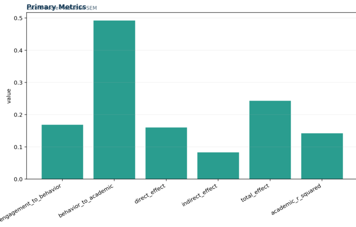
Structural Equation Modeling: The model has excellent global fit, strong Academic Achievement measurement, and moderate latent structural explanation….

Free Statistical Analysis Online Calculators, Guides and Ethical Support
Resources
Practical guides for SPSS, R, Python, Excel, Power BI, statistical tests, calculators, dashboards and interpretation.
Structural Equation Modeling: The model has excellent global fit, strong Academic Achievement measurement, and moderate latent structural explanation….
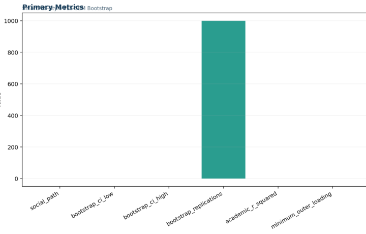
SEM in SmartPLS: The SmartPLS-style results show positive Educational Advantage and negative Social-Alcohol Exposure paths, modest R-squared, and positive…
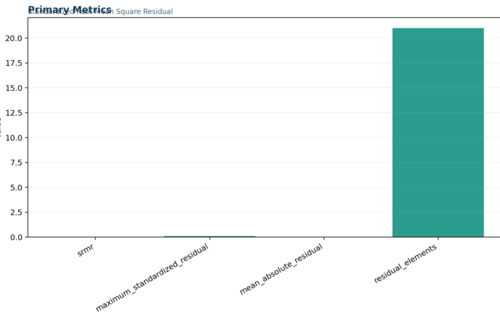
SRMR: SRMR = 0.035876 indicates a small average standardized residual for the covariance model. The residual matrix still needs inspection to locate any…

Structural Model: Educational Advantage is positively associated and Social-Alcohol Exposure negatively associated with latent Academic Achievement….
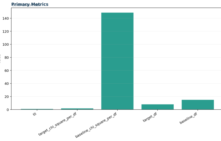
TLI: TLI = 0.996735 indicates excellent incremental fit after accounting for target-model complexity. The value remains conditional on a correctly specified…
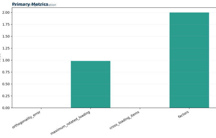
Varimax Rotation: The varimax solution produces clear dominant loadings for the grade, alcohol, and parental-education groups. TravelAccess remains weak…
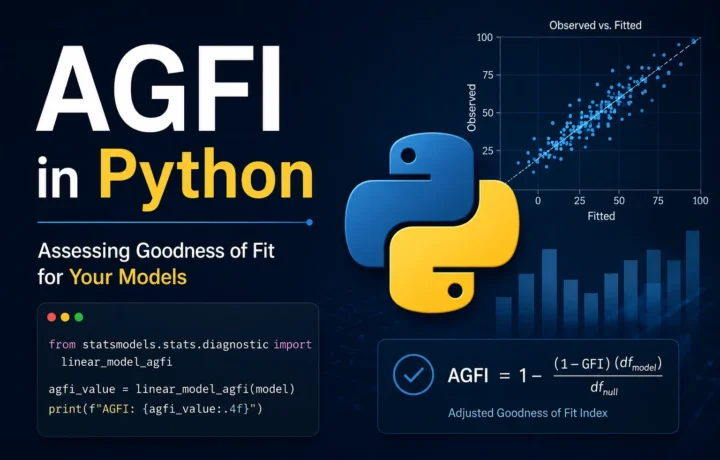
Python structural equation modeling and CFA fit Adjusted Goodness of Fit Index in Python: Formula, Worked CFA, Interpretation and Verified Results The Adjusted Goodness of Fit…
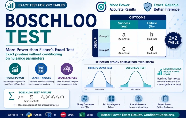
Unconditional exact inference for two independent proportions Boschloo Test: Formula, Statistic, Calculator, Python, R, SPSS and Excel Guide Boschloo Test, commonly written as Boschloo’s Test, is…
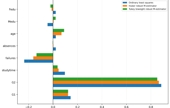
A verified 649-case guide to Huber M-estimation, Tukey sensitivity, robust weights, low-weight case review and separate Python, R, SPSS and Excel outputs.
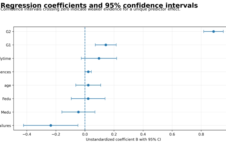
A verified 649-case regression p-value guide covering overall and term tests, exact coefficients, effect sizes, multiplicity, confidence intervals, and Python, R, SPSS, and Excel evidence.