Descriptive Statistics, IQR and Outlier Checking
Box Plot Interpretation is the process of reading the median, quartiles, interquartile range, whiskers and outlier points from a box-and-whisker plot. This complete worked example uses the student-por.csv dataset and explains the G3 final grade box plot with verified SPSS output, R charts, Python charts and Excel formulas. You will learn how to read Q1, median, Q3, IQR, lower fence, upper fence, whiskers, outlier candidates and grouped box plots by school, sex, study time, past failures and absences.
Google AdSense top placement reserved here
Table of Contents
- Quick Answer: Box Plot Interpretation Result
- What Is Box Plot Interpretation?
- Box Plot Parts: Median, Q1, Q3, IQR, Whiskers and Outliers
- Box Plot Outlier Formula
- Dataset and Corrected SPSS Output Used
- Verified Results in SPSS, R and Python
- Box Plot Charts and Interpretation
- R Validation Charts for Box Plot Interpretation
- How to Run Box Plot Interpretation in SPSS, R, Python and Excel
- How to Report Box Plot Interpretation Results
- Related Data Analysis Guides
- When Should You Use Box Plots?
- Common Mistakes
- Download SPSS Output and Verification Files
- External References
- FAQs About Box Plot Interpretation
Quick Answer: Box Plot Interpretation Result
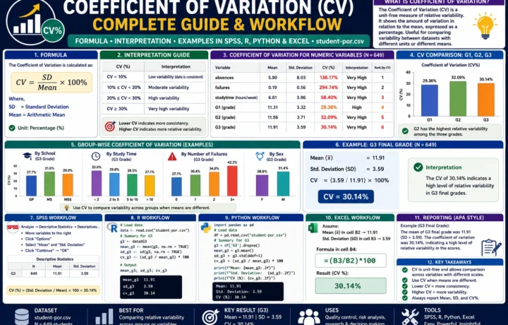
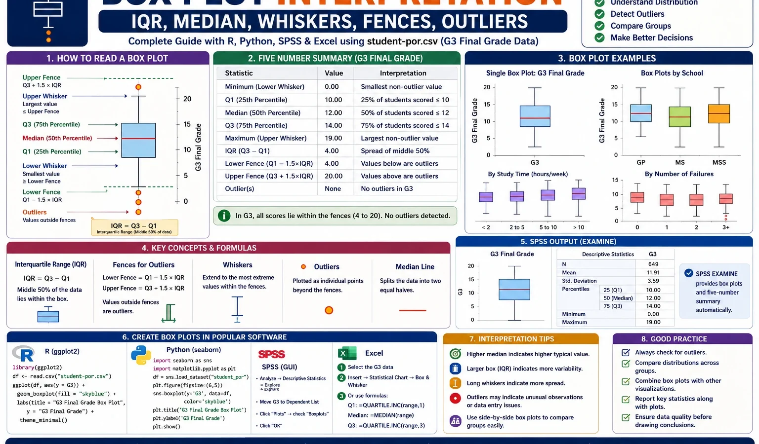
A Box Plot Interpretation was completed for the G3 final grade variable from the student-por.csv dataset. The corrected SPSS output confirms 649 valid cases and no missing values in the box-plot workflow. For G3 final grade, Q1 = 10, median = 12, Q3 = 14, and IQR = 4. Using the standard 1.5 × IQR rule, the lower fence = 4 and the upper fence = 20. The analysis found 16 box-plot outlier candidates, equal to about 2.47% of the 649 cases.
Final report sentence: The box plot for G3 final grade showed that the middle 50% of scores were between 10 and 14, with a median of 12 and an interquartile range of 4. The lower fence was 4 and the upper fence was 20. Sixteen observations, or approximately 2.47% of the sample, were identified as box-plot outlier candidates. These cases should be inspected carefully, not automatically deleted.
Important reporting note: A box-plot outlier means the value is unusual according to the 1.5 × IQR rule. It does not automatically mean the value is wrong. In educational data, very low final grades such as 0 or 1 may be real cases and should only be removed if a clear data-entry error or justified exclusion rule is found.
What Is Box Plot Interpretation?
Box Plot Interpretation means reading the story of a numeric variable from a box-and-whisker plot. A box plot does not show every data point in detail, but it gives a compact summary of the center, spread, shape and outlier pattern of a distribution.
A box plot is especially useful when you want to compare several distributions at the same time. For example, in this article, G3 final grade is shown as a single box plot, then compared across school, sex, study time and past failures. The same idea is also applied to absences, where the box plot clearly reveals a right-skewed attendance pattern with high-side outliers.
Unlike a histogram, a box plot focuses on the five-number summary: minimum non-outlier value, Q1, median, Q3 and maximum non-outlier value. Unlike a mean-and-standard-deviation table, it shows whether the distribution is centered, stretched, skewed or affected by unusual values. This is why box plots are widely used in descriptive statistics, exploratory data analysis, SPSS output, R reports, Python dashboards and Excel summaries.
Practical note: A box plot is descriptive, not a hypothesis test. It helps you see patterns. If your research question requires a formal group comparison, use the box plot together with a suitable statistical test.
If you are building a full assumption-checking workflow, use this post with related Salar Cafe resources such as the Q-Q Plot Normality Check, Kolmogorov-Smirnov Test, DAgostino Pearson Test, Cramer von Mises Test, Brown-Forsythe Test, Cochran C Test, Hartley F Max Test, Goldfeld-Quandt Test and Influence Diagnostics.
Box Plot Parts: Median, Q1, Q3, IQR, Whiskers and Outliers
A box plot can look simple, but each part has a statistical meaning. The center line inside the box is the median. The lower edge of the box is Q1, the upper edge is Q3, and the height of the box is the interquartile range. The whiskers extend to the lowest and highest non-outlier values, while points beyond the whiskers are usually marked as outlier candidates.
| Box plot part | Meaning | G3 final grade result | How to interpret it |
|---|---|---|---|
| Q1 | First quartile | 10 | About 25% of G3 scores are at or below 10. |
| Median | Middle value | 12 | Half of the G3 scores are below 12 and half are above 12. |
| Q3 | Third quartile | 14 | About 75% of G3 scores are at or below 14. |
| IQR | Q3 – Q1 | 4 | The middle 50% of G3 scores span 4 grade points. |
| Lower fence | Q1 – 1.5 × IQR | 4 | Values below 4 are low-end outlier candidates. |
| Upper fence | Q3 + 1.5 × IQR | 20 | Values above 20 would be high-end outlier candidates. |
| Lower whisker | Lowest non-outlier value | 5 | The lowest G3 value inside the accepted whisker range is 5. |
| Upper whisker | Highest non-outlier value | 19 | The highest observed G3 value is 19 and is still inside the upper fence. |
| Outlier points | Values outside fences | 16 cases | These are unusually low G3 scores according to the box-plot rule. |
The most important point is that the box itself does not represent the full range of the data. The box only represents the middle 50% of the data. In the G3 example, the box runs from 10 to 14. That means most students are concentrated around the middle grade range, even though some students have very low final grades.
Box Plot Outlier Formula
The most common box-plot outlier rule uses the interquartile range. The rule identifies values that are unusually far below Q1 or unusually far above Q3.
IQR = Q3 - Q1

Lower fence = Q1 - 1.5 × IQR
Upper fence = Q3 + 1.5 × IQR
For the G3 final-grade example:
Q1 = 10
Median = 12
Q3 = 14

IQR = 14 - 10 = 4

Lower fence = 10 - 1.5 × 4 = 4
Upper fence = 14 + 1.5 × 4 = 20
Therefore, any G3 value below 4 is a box-plot outlier candidate. Since the G3 variable has a maximum observed value of 19, there are no high-end outlier candidates above the upper fence of 20. The outliers in this example are low-end cases.
Plain-language meaning: The box plot is telling us that a G3 score below 4 is unusually low compared with the middle 50% of the class. It is not saying that the score is impossible or wrong.
Google AdSense middle placement reserved here
Dataset and Corrected SPSS Output Used
This worked example uses the student-por.csv student performance dataset and the existing cleaned file spss_ready_data.csv. The main variable is G3 final grade. Supporting variables include G1, G2, school, sex, studytime, failures and absences.
Important workflow rule: For this topic, the cleaned data file already existed in the folder, so the analysis uses the existing spss_ready_data.csv. For future SPSS syntax workflows, when a clean file is not already available, create a clean dataset using Python first and then use that clean file in SPSS.
| Item | Verified value | Explanation |
|---|---|---|
| Topic | Box Plot Interpretation | Descriptive statistics and visual interpretation topic. |
| Input cleaned file | spss_ready_data.csv | Existing cleaned dataset used for SPSS, R and Python. |
| Correct output folder | D:\DATA ANALYSIS\A Basic Descriptive Statistics Guides\Box Plot Interpretation | Output folder created inside the Basic Descriptive Statistics Guides folder. |
| Main variable | G3 | Final grade used for the main box-plot example. |
| Comparison variables | G1, G2, school, sex, studytime, failures, absences | Used to explain side-by-side and grouped box plots. |
| Sample size | 649 | Valid cases included in the corrected box-plot workflow. |
| Corrected SPSS output | Box-Plot-Interpretation-SPSS-output-CORRECTED.pdf | Final corrected PDF used for SPSS verification. |
External dataset source: UCI Machine Learning Repository: Student Performance dataset.
Verified Results in SPSS, R and Python
The Box Plot Interpretation workflow was reproduced in SPSS, R and Python. SPSS verified the cleaned import, missing-value check, descriptives, grouped box plots and G3 outlier calculation. Python and R generated the visual chart set used in this article.
SPSS Import and Missing-Data Check
The corrected SPSS output confirms that the dataset was imported correctly and that all main box-plot variables had complete values. The corrected syntax also removed earlier SPSS errors caused by mixed string/numeric COUNT commands, invalid percentile placement and unsupported aggregate percentile functions.
| Check | SPSS result | Meaning |
|---|---|---|
| Complete box-plot cases | 649 | All cases were complete for the selected box-plot workflow. |
| Missing numeric values | 0 | No missing values for G1, G2, G3, absences, studytime or failures. |
| Missing string values | 0 | No missing values for school or sex grouping variables. |
| School and sex grouping | Converted into numeric grouping variables | This avoids SPSS EXAMINE warnings with string grouping variables. |
Main Descriptive Statistics for G1, G2, G3 and Absences
The corrected SPSS output provides the descriptive foundation for the box plots. G3 has a slightly higher mean and median than G1 and G2, while absences has a very different shape because it is strongly right-skewed.
| Variable | N | Mean | Median | SD | Minimum | Maximum | Q1 | Q3 | IQR | Skewness | Kurtosis |
|---|---|---|---|---|---|---|---|---|---|---|---|
| G1 first period grade | 649 | 11.3991 | 11 | 2.74527 | 0 | 19 | 10 | 13 | 3 | -0.003 | 0.037 |
| G2 second period grade | 649 | 11.5701 | 11 | 2.91364 | 0 | 19 | 10 | 13 | 3 | -0.360 | 1.662 |
| G3 final grade | 649 | 11.9060 | 12 | 3.23066 | 0 | 19 | 10 | 14 | 4 | -0.913 | 2.712 |
| Absences | 649 | 3.6595 | 2 | 4.64076 | 0 | 32 | 0 | 6 | 6 | 2.021 | 5.781 |
Main G3 Box Plot Metrics
The most important box plot in this article is the G3 final-grade box plot. It provides a clear example of how to interpret quartiles, whiskers and outlier candidates.
| Metric | Value | Interpretation |
|---|---|---|
| N | 649 | There are 649 valid final-grade observations. |
| Q1 | 10 | One quarter of the students scored 10 or below. |
| Median | 12 | The middle final grade is 12. |
| Q3 | 14 | Three quarters of the students scored 14 or below. |
| IQR | 4 | The central 50% of final grades span 4 points. |
| Lower fence | 4 | Scores below 4 are low-end outlier candidates. |
| Upper fence | 20 | Scores above 20 would be high-end outlier candidates. |
| Outlier count | 16 | Sixteen G3 cases are box-plot outlier candidates. |
| Outlier percentage | 2.47% | Only a small part of the dataset is flagged as unusual. |
Grouped Box Plot Interpretation Summary
Grouped box plots help compare the distribution of G3 across categories. In this workflow, the main grouped box plots compare G3 by school, sex, study time and past failures.
| Grouped box plot | Main descriptive pattern | Interpretation |
|---|---|---|
| G3 by school | GP has a higher median and more compact distribution than MS. | The school box plot shows a visible difference in center and spread between the two school groups. |
| G3 by sex | Female students have a slightly higher center than male students. | The boxes overlap, so this should be interpreted descriptively unless followed by a formal test. |
| G3 by study time | Higher study-time groups generally show higher final-grade centers. | The box plots suggest that students who study more tend to have stronger G3 distributions. |
| G3 by failures | Students with no past failures show the highest grade distribution. | The distribution shifts downward as past failures increase. |
| Absences by school | Absences are right-skewed and include high-side outliers. | The absence box plots show that attendance data can behave very differently from grade data. |
Box Plot Charts and Interpretation
1. Box Plot Interpretation: G3 Final Grade

This chart is the main example for Box Plot Interpretation. The box begins at Q1 = 10 and ends at Q3 = 14. The thick line inside the box is the median, which is 12. The diamond marker shows the mean. The lower whisker reaches the lowest non-outlier value, while the points below the whisker represent low-end outlier candidates. These values should be inspected because they may be real low final grades rather than mistakes.
2. Box Plot Comparison for G1, G2 and G3

This chart compares G1, G2 and G3. G1 and G2 both have a median of 11, while G3 has a median of 12. G3 also has a wider IQR, which means the central 50% of final grades is more spread out than the central 50% of G1 and G2 grades. Side-by-side box plots are useful because they allow the reader to compare center, spread and unusual values without reading a long frequency table.
3. G3 Box Plot by School

The school box plot shows a clear descriptive difference. The GP group has a higher center, while the MS group has a lower center and wider spread. This does not prove that school causes the difference, but it does show that school groups have different G3 distribution shapes in this dataset. If this were part of a research report, the next step might be a t test, Mann-Whitney test or regression model depending on the research design.
4. G3 Box Plot by Sex

This box plot compares the G3 distribution by sex. The female group has a slightly higher center than the male group, but the boxes overlap. This is a good example of why box plots are descriptive. They help the reader see a pattern, but they do not replace a formal test when the goal is statistical inference.
5. G3 Box Plot by Study Time

This chart compares G3 across study-time groups. The lowest study-time group has the lowest center, while the 5-10 hours and more than 10 hours groups show stronger grade distributions. The chart also shows that the groups are not identical in spread. This is useful for descriptive reporting because it communicates both the average pattern and the variability pattern.
6. G3 Box Plot by Past Failures

This chart gives one of the strongest descriptive patterns in the article. Students with no past failures have the highest grade distribution. Students with one, two or three past failures have lower centers. The box plot shows that past failure history is associated with a downward shift in the distribution of final grades.
7. Box Plot of Student Absences

The absences box plot is different from the grade box plots. The median is low, the lower part of the distribution is compressed, and several high-side outliers appear. This pattern is typical for count-like variables where many cases have low values and a few cases have very high values. The absences box plot also explains why transformation or robust analysis may sometimes be needed for right-skewed variables.
8. Absences Box Plot by School

This grouped box plot compares absence patterns across schools. It shows that attendance variables can have different spread and outlier behavior across groups. The interpretation is not only about the median; the long whiskers and high-side points are also part of the story.
9. How to Read a Box Plot: G3 Example

This annotated chart is the easiest chart for learning how to read a box plot. It labels the lower fence, low whisker, Q1, median, Q3, high whisker and upper fence. It also gives the sample size, IQR and outlier count. This chart should be used as the main visual reference for students who need to understand the box plot structure quickly.
R Validation Charts for Box Plot Interpretation
The R workflow produced matching validation charts. These R charts are useful because they confirm that the same box-plot interpretation appears outside Python and SPSS.


How to Run Box Plot Interpretation in SPSS, R, Python and Excel
Box Plot Interpretation in Python
Python can calculate quartiles, fences and outlier counts and then generate publication-ready box plots. This code uses the existing cleaned dataset file and creates output folders inside the correct topic folder.
import os
import numpy as np
import pandas as pd
import matplotlib.pyplot as plt

base_dir = r"D:\DATA ANALYSIS\A Basic Descriptive Statistics Guides"
topic_dir = os.path.join(base_dir, "Box Plot Interpretation")
python_dir = os.path.join(topic_dir, "Python")
os.makedirs(python_dir, exist_ok=True)

input_csv = os.path.join(base_dir, "spss_ready_data.csv")
df = pd.read_csv(input_csv)

required = ["G1", "G2", "G3", "absences", "school", "sex", "studytime", "failures"]
missing = [c for c in required if c not in df.columns]
if missing:
    raise ValueError(f"Missing required columns: {missing}")

for col in ["G1", "G2", "G3", "absences", "studytime", "failures"]:
    df[col] = pd.to_numeric(df[col], errors="coerce")

df["case_id"] = np.arange(1, len(df) + 1)

g3 = df["G3"].dropna()
q1 = g3.quantile(0.25)
median = g3.quantile(0.50)
q3 = g3.quantile(0.75)
iqr = q3 - q1
lower_fence = q1 - 1.5 * iqr
upper_fence = q3 + 1.5 * iqr
outlier_mask = (df["G3"] < lower_fence) | (df["G3"] > upper_fence)

summary = {
    "n": int(g3.count()),
    "q1": q1,
    "median": median,
    "q3": q3,
    "iqr": iqr,
    "lower_fence": lower_fence,
    "upper_fence": upper_fence,
    "outlier_count": int(outlier_mask.sum()),
    "outlier_percent": float(outlier_mask.mean() * 100)
}

print(summary)

pd.DataFrame([summary]).to_csv(
    os.path.join(python_dir, "box_plot_g3_summary.csv"),
    index=False
)

plt.figure(figsize=(12, 7))
plt.boxplot(g3, labels=["G3 final grade"], showmeans=True)
plt.title("Box Plot Interpretation: G3 Final Grade")
plt.ylabel("Final grade")
plt.grid(axis="y", alpha=0.25)
plt.tight_layout()
plt.savefig(os.path.join(python_dir, "chart_01_python_box_plot_g3_final_grade.png"), dpi=300)
plt.close()
Box Plot Interpretation in R
R is excellent for side-by-side box plots and grouped box plots. The workflow below reads the same cleaned CSV file and saves R output inside the correct topic folder.
library(tidyverse)

base_dir <- "D:/DATA ANALYSIS/A Basic Descriptive Statistics Guides"
topic_dir <- file.path(base_dir, "Box Plot Interpretation")
r_dir <- file.path(topic_dir, "R")
dir.create(r_dir, showWarnings = FALSE, recursive = TRUE)

data_file <- file.path(base_dir, "spss_ready_data.csv")
df <- read.csv(data_file, stringsAsFactors = FALSE)

df <- df %>%
  mutate(
    case_id = row_number(),
    G1 = as.numeric(G1),
    G2 = as.numeric(G2),
    G3 = as.numeric(G3),
    absences = as.numeric(absences),
    studytime = as.factor(studytime),
    failures = as.factor(failures),
    school = as.factor(school),
    sex = as.factor(sex)
  )

g3 <- df$G3

q1 <- quantile(g3, 0.25, na.rm = TRUE)
median_g3 <- median(g3, na.rm = TRUE)
q3 <- quantile(g3, 0.75, na.rm = TRUE)
iqr <- IQR(g3, na.rm = TRUE)
lower_fence <- q1 - 1.5 * iqr
upper_fence <- q3 + 1.5 * iqr
outlier_count <- sum(g3 < lower_fence | g3 > upper_fence, na.rm = TRUE)

summary_table <- tibble(
  n = sum(!is.na(g3)),
  q1 = q1,
  median = median_g3,
  q3 = q3,
  iqr = iqr,
  lower_fence = lower_fence,
  upper_fence = upper_fence,
  outlier_count = outlier_count,
  outlier_percent = outlier_count / sum(!is.na(g3)) * 100
)

write.csv(summary_table, file.path(r_dir, "box_plot_g3_summary.csv"), row.names = FALSE)

p1 <- ggplot(df, aes(x = "G3 final grade", y = G3)) +
  geom_boxplot(outlier.shape = 16) +
  stat_summary(fun = mean, geom = "point", shape = 23, size = 3, fill = "white") +
  labs(
    title = "Box Plot Interpretation: G3 Final Grade",
    subtitle = "Box shows Q1, median, Q3, IQR, whiskers and outlier cases",
    x = "",
    y = "Final grade"
  ) +
  theme_minimal(base_size = 14)

ggsave(file.path(r_dir, "chart_01_r_box_plot_g3_final_grade.png"), p1, width = 12, height = 7, dpi = 300)
Box Plot Interpretation in SPSS
The corrected SPSS syntax uses the existing cleaned dataset and exports the corrected SPSS output PDF. The main correction is that school and sex are converted into numeric grouping variables before EXAMINE, and the G3 box-plot fences are added using verified values.
* ============================================================.
* Box Plot Interpretation - Corrected SPSS Syntax.
* Existing cleaned input file:
* D:\DATA ANALYSIS\A Basic Descriptive Statistics Guides\spss_ready_data.csv
* Correct output folder:
* D:\DATA ANALYSIS\A Basic Descriptive Statistics Guides\Box Plot Interpretation\SPSS
* ============================================================.

SET UNICODE=ON.
SET DECIMAL=DOT.
SET PRINTBACK=ON.
SET TNUMBERS=VALUES.
SET TVARS=LABELS.

HOST COMMAND=['cmd /c if not exist "D:\DATA ANALYSIS\A Basic Descriptive Statistics Guides\Box Plot Interpretation" mkdir "D:\DATA ANALYSIS\A Basic Descriptive Statistics Guides\Box Plot Interpretation"'].
HOST COMMAND=['cmd /c if not exist "D:\DATA ANALYSIS\A Basic Descriptive Statistics Guides\Box Plot Interpretation\SPSS" mkdir "D:\DATA ANALYSIS\A Basic Descriptive Statistics Guides\Box Plot Interpretation\SPSS"'].

GET DATA
 /TYPE=TXT
 /FILE="D:\DATA ANALYSIS\A Basic Descriptive Statistics Guides\spss_ready_data.csv"
 /ENCODING='UTF8'
 /DELCASE=LINE
 /DELIMITERS=","
 /QUALIFIER='"'
 /ARRANGEMENT=DELIMITED
 /FIRSTCASE=2
 /IMPORTCASE=ALL
 /VARIABLES=
 school A20
 sex A20
 age F8.2
 address A20
 famsize A20
 Pstatus A20
 Medu F8.2
 Fedu F8.2
 Mjob A30
 Fjob A30
 reason A30
 guardian A30
 traveltime F8.2
 studytime F8.2
 failures F8.2
 schoolsup A20
 famsup A20
 paid A20
 activities A20
 nursery A20
 higher A20
 internet A20
 romantic A20
 famrel F8.2
 freetime F8.2
 goout F8.2
 Dalc F8.2
 Walc F8.2
 health F8.2
 absences F8.2
 G1 F8.2
 G2 F8.2
 G3 F8.2.
CACHE.
EXECUTE.

DATASET NAME BoxPlotInterpretationClean WINDOW=FRONT.

COMPUTE case_id = $CASENUM.
FORMATS case_id (F8.0).
EXECUTE.

VARIABLE LABELS
 case_id "Case ID"
 school "School"
 sex "Sex"
 age "Student age"
 studytime "Weekly study time category"
 failures "Number of past class failures"
 absences "Number of school absences"
 G1 "First period grade"
 G2 "Second period grade"
 G3 "Final grade".

VALUE LABELS studytime
 1 "Less than 2 hours"
 2 "2 to 5 hours"
 3 "5 to 10 hours"
 4 "More than 10 hours".

VALUE LABELS failures
 0 "0 failures"
 1 "1 failure"
 2 "2 failures"
 3 "3 failures".
EXECUTE.

NUMERIC school_group sex_group (F1.0).

DO IF (RTRIM(school) = "GP").
 COMPUTE school_group = 1.
ELSE IF (RTRIM(school) = "MS").
 COMPUTE school_group = 2.
END IF.

DO IF (RTRIM(sex) = "F").
 COMPUTE sex_group = 1.
ELSE IF (RTRIM(sex) = "M").
 COMPUTE sex_group = 2.
END IF.

VALUE LABELS school_group
 1 "GP"
 2 "MS".

VALUE LABELS sex_group
 1 "Female"
 2 "Male".
EXECUTE.

COMPUTE numeric_missing_count = SUM(
 MISSING(G1),
 MISSING(G2),
 MISSING(G3),
 MISSING(absences),
 MISSING(studytime),
 MISSING(failures)
).

COMPUTE string_missing_count = SUM(
 MISSING(school),
 MISSING(sex)
).

COMPUTE complete_boxplot_case = (numeric_missing_count = 0 AND string_missing_count = 0).
EXECUTE.

FREQUENCIES VARIABLES=complete_boxplot_case numeric_missing_count string_missing_count
 /ORDER=ANALYSIS.

DESCRIPTIVES VARIABLES=G1 G2 G3 absences age studytime failures Medu Fedu
 /STATISTICS=MEAN STDDEV MIN MAX.

FREQUENCIES VARIABLES=G1 G2 G3 absences
 /STATISTICS=MEAN MEDIAN STDDEV MINIMUM MAXIMUM SKEWNESS SESKEW KURTOSIS SEKURT
 /PERCENTILES=25 50 75
 /ORDER=ANALYSIS.

EXAMINE VARIABLES=G1 G2 G3 absences
 /PLOT BOXPLOT STEMLEAF
 /COMPARE GROUPS
 /STATISTICS DESCRIPTIVES EXTREME
 /CINTERVAL 95
 /MISSING LISTWISE
 /NOTOTAL.

EXAMINE VARIABLES=G3 BY school_group
 /PLOT BOXPLOT
 /COMPARE GROUPS
 /STATISTICS DESCRIPTIVES EXTREME
 /CINTERVAL 95
 /MISSING LISTWISE
 /NOTOTAL.

EXAMINE VARIABLES=G3 BY sex_group
 /PLOT BOXPLOT
 /COMPARE GROUPS
 /STATISTICS DESCRIPTIVES EXTREME
 /CINTERVAL 95
 /MISSING LISTWISE
 /NOTOTAL.

EXAMINE VARIABLES=G3 BY studytime
 /PLOT BOXPLOT
 /COMPARE GROUPS
 /STATISTICS DESCRIPTIVES EXTREME
 /CINTERVAL 95
 /MISSING LISTWISE
 /NOTOTAL.

EXAMINE VARIABLES=G3 BY failures
 /PLOT BOXPLOT
 /COMPARE GROUPS
 /STATISTICS DESCRIPTIVES EXTREME
 /CINTERVAL 95
 /MISSING LISTWISE
 /NOTOTAL.

EXAMINE VARIABLES=absences BY school_group
 /PLOT BOXPLOT
 /COMPARE GROUPS
 /STATISTICS DESCRIPTIVES EXTREME
 /CINTERVAL 95
 /MISSING LISTWISE
 /NOTOTAL.

COMPUTE g3_q1 = 10.
COMPUTE g3_median = 12.
COMPUTE g3_q3 = 14.
COMPUTE g3_iqr = g3_q3 - g3_q1.
COMPUTE g3_lower_fence = g3_q1 - (1.5 * g3_iqr).
COMPUTE g3_upper_fence = g3_q3 + (1.5 * g3_iqr).
COMPUTE g3_boxplot_outlier = (G3 < g3_lower_fence OR G3 > g3_upper_fence).
EXECUTE.

FREQUENCIES VARIABLES=g3_boxplot_outlier
 /ORDER=ANALYSIS.

DESCRIPTIVES VARIABLES=g3_q1 g3_median g3_q3 g3_iqr g3_lower_fence g3_upper_fence
 /STATISTICS=MEAN MIN MAX.

OUTPUT EXPORT
 /CONTENTS EXPORT=VISIBLE
 /PDF DOCUMENTFILE="D:\DATA ANALYSIS\A Basic Descriptive Statistics Guides\Box Plot Interpretation\SPSS\Box-Plot-Interpretation-SPSS-output-CORRECTED.pdf".
Box Plot Interpretation in Excel
Excel can create a box-and-whisker chart and calculate the same interpretation values manually. For a simple classroom or report workflow, Excel is enough for Q1, median, Q3, IQR and fences. For detailed output, SPSS, R or Python is better.
| Excel task | Formula or step | Explanation |
|---|---|---|
| Q1 | =QUARTILE.INC(G3_range,1) |
Calculates the first quartile. |
| Median | =MEDIAN(G3_range) |
Calculates the middle value. |
| Q3 | =QUARTILE.INC(G3_range,3) |
Calculates the third quartile. |
| IQR | =Q3-Q1 |
Calculates the middle 50% spread. |
| Lower fence | =Q1-1.5*IQR |
Calculates the low-end outlier boundary. |
| Upper fence | =Q3+1.5*IQR |
Calculates the high-end outlier boundary. |
| Outlier flag | =IF(OR(A2<Lower_Fence,A2>Upper_Fence),"Outlier","Not outlier") |
Flags values outside the box-plot fences. |
| Create chart | Insert > Statistic Chart > Box and Whisker | Creates a built-in Excel box plot. |
Example Excel formulas:

Q1:
=QUARTILE.INC(B2:B650,1)

Median:
=MEDIAN(B2:B650)

Q3:
=QUARTILE.INC(B2:B650,3)

IQR:
=Q3-Q1

Lower fence:
=Q1-1.5*IQR

Upper fence:
=Q3+1.5*IQR

Outlier flag:
=IF(OR(B2<Lower_Fence,B2>Upper_Fence),"Outlier","Not outlier")
How to Report Box Plot Interpretation Results
A strong box plot report should not simply say that a box plot was created. It should mention the median, quartiles, IQR, whiskers, fences and outlier candidates. If groups are compared, it should describe which group has the higher center, wider spread or more visible outliers.
APA-style report: A box plot was used to summarize the distribution of G3 final grades. The median G3 score was 12, with the middle 50% of scores falling between Q1 = 10 and Q3 = 14. The interquartile range was 4. Using the 1.5 × IQR rule, the lower fence was 4 and the upper fence was 20. Sixteen observations, or approximately 2.47% of the sample, were identified as box-plot outlier candidates. These cases were retained for inspection rather than automatically removed.
Plain-language report: Most students scored between 10 and 14 on the final grade variable, and the typical final grade was around 12. A small number of students had unusually low scores. These low values should be checked, but they should not be deleted unless there is a clear reason.
Good reporting practice: If you remove outliers, report why they were removed. If you keep them, report that they were inspected and retained because they appeared to be valid observations.
When Should You Use Box Plots?
Use box plots when you need a quick visual summary of a numeric variable or when you want to compare distributions across groups. Box plots are especially helpful when the dataset includes outliers, skewness, unequal spread or multiple categories.
| Situation | Use a box plot? | Reason |
|---|---|---|
| You need to show median and IQR | Yes | A box plot is built around quartiles and the interquartile range. |
| You need to detect possible outliers | Yes | Box plots visually flag values outside the whisker range. |
| You need to compare groups | Yes | Side-by-side box plots compare center, spread and outlier patterns. |
| You need to show exact frequencies | No, use a frequency table | A box plot summarizes the distribution but does not show every count. |
| You need formal hypothesis testing | Use as support | A box plot supports interpretation but does not replace a statistical test. |
Common Mistakes
1. Thinking a box-plot outlier is always wrong
A box-plot outlier is only unusual according to the 1.5 × IQR rule. It may be a real observation. In this example, low G3 scores are unusual but may still be valid student grades.
2. Ignoring the median
The median is one of the most important parts of a box plot. It tells where the middle of the distribution is located. In the G3 example, the median is 12.
3. Reading the box as the full range
The box is not the full range. It represents the middle 50% of the data. Whiskers and outlier points show values outside that middle range.
4. Comparing means only
Many charts focus on means, but box plots focus on medians and quartiles. The mean marker can be helpful, but the main interpretation should come from the median, IQR and whiskers.
5. Forgetting group sample sizes
Grouped box plots can look very different when sample sizes are unequal. A small group may have a less stable box shape than a larger group.
6. Using box plots as a replacement for formal tests
A box plot is a descriptive graph. It can suggest group differences, but it does not test whether those differences are statistically significant.
Download SPSS Output and Verification Files
The corrected SPSS output PDF verifies the clean data import, missing-value check, descriptive statistics, main box plots, grouped box plots, G3 fences and outlier count.
External References for Box Plot Interpretation and Data Analysis
This post uses verified SPSS, R and Python outputs together with external statistical references and software documentation. These resources help readers verify the dataset source, SPSS workflow, R workflow and Python visualization tools used in the box plot interpretation process.
FAQs About Box Plot Interpretation
What does a box plot show?
A box plot shows the median, first quartile, third quartile, interquartile range, whiskers and possible outliers of a numeric variable.
What is the median in a box plot?
The median is the line inside the box. It shows the middle value of the distribution. In this G3 example, the median is 12.
What is Q1 in a box plot?
Q1 is the first quartile. It marks the value below which about 25% of the data fall. In this G3 example, Q1 is 10.
What is Q3 in a box plot?
Q3 is the third quartile. It marks the value below which about 75% of the data fall. In this G3 example, Q3 is 14.
What is IQR in box plot interpretation?
IQR means interquartile range. It is calculated as Q3 - Q1. In the G3 example, IQR = 14 - 10 = 4.
How are box plot outliers calculated?
The common rule is to flag values below Q1 - 1.5 × IQR or above Q3 + 1.5 × IQR as box-plot outlier candidates.
What were the G3 box plot results in this example?
The G3 box plot had n = 649, Q1 = 10, median = 12, Q3 = 14, IQR = 4, lower fence = 4, upper fence = 20 and 16 outlier candidates.
Should I delete box plot outliers?
No. Outliers should be inspected first. They should only be removed if there is a clear data-entry error or a justified analysis decision.
Can Box Plot Interpretation be done in SPSS?
Yes. SPSS can create box plots through Explore and the EXAMINE command. The corrected syntax in this article uses EXAMINE for main and grouped box plots.
Can Box Plot Interpretation be done in R?
Yes. R can create box plots using base R or ggplot2. It is especially useful for grouped box plots and publication-ready visualizations.
Can Box Plot Interpretation be done in Python?
Yes. Python can calculate Q1, median, Q3, IQR, fences and outlier counts and can create box plots using matplotlib or other visualization tools.
Can Box Plot Interpretation be done in Excel?
Yes. Excel has a built-in Box and Whisker chart. You can also calculate Q1, median, Q3, IQR and outlier fences manually with formulas.
Is a box plot a hypothesis test?
No. A box plot is a descriptive visualization. It helps show patterns, but formal hypothesis testing requires a statistical test.
Why are box plots useful for grouped data?
Grouped box plots show whether different categories have different centers, spreads and outlier patterns. This makes them useful for comparing school, sex, study time and failure groups.
Google AdSense bottom placement reserved here