

Clinical Trial Data Analysis Using R: Complete SEO-Based Case Study
Clinical Trial Data Analysis Using R is a practical healthcare analytics project that teaches how to clean, explore, summarize and visualize real-world clinical trial data. This post uses a dataset of 13,748 medical trials and keeps the workflow suitable for beginners, students, healthcare researchers, data analysts, biostatistics learners and pharmaceutical data science portfolios.
This SEO-structured version preserves the complete original case study, including all tables, figures, links, code snippets, dataset values, statistical summaries and final findings. The structure has been improved for search engines by adding a clear focus keyword, metadata, stronger headings, an optimized introduction, source context, FAQ schema and article schema while keeping the original tutorial content intact.
Focus Keyword: Clinical Trial Data Analysis Using R
Best For: R programming learners, healthcare analytics students, clinical research analysts, biostatistics beginners, medical data science portfolios and data visualization practice.
Main Workflow: R installation, RStudio setup, package installation, CSV import, data inspection, cleaning, missing-value handling, phase analysis, status analysis, enrollment analysis, sponsor analysis, condition analysis, yearly trends, monthly trends, visualization and final insights.
Source and Dataset Context: This article uses a public Kaggle clinical trials dataset and demonstrates a complete R-based exploratory data analysis workflow. It is an educational analytics project and does not compare drug effectiveness, treatment safety outcomes or patient recovery results.
Important SEO Note: The original post content below has been retained. Internal H1 headings inside the article body were converted to H2 level for cleaner WordPress SEO structure because the post title should normally remain the only H1 on a WordPress page.
A Real-World Case Study on 13,748 Medical Trials
Kaggle Clinical Trials Dataset
Clinical trial data analysis using R is one of the most practical applications of statistics, healthcare analytics, and data science. Instead of using toy datasets, this case study analyzes a real-world dataset containing more than 13,000 clinical trials from pharmaceutical and healthcare research.
In this guide, you will learn how to use R for:
- Clinical trial data cleaning
- Exploratory healthcare analytics
- Statistical summaries
- Trend analysis
- Medical data visualization
- Research reporting
- Real-world healthcare insights
Unlike generic tutorials, this article follows a complete analytical workflow used in actual healthcare and biostatistics environments.
Introduction to Clinical Trial Analytics
Clinical trials are the foundation of modern medical research. Pharmaceutical companies, hospitals, universities, and healthcare organizations conduct trials to test the following:
- Drug effectiveness
- Treatment safety
- Disease outcomes
- Medical interventions
- Patient recovery patterns
The global clinical research industry generates enormous datasets every year. These datasets contain structured information about the following: (TABLE 0)
| Clinical Variable | Example |
|---|---|
| Trial Phase | Phases 1, 2, 3, 4 |
| Enrollment Size | Number of Patients |
| Sponsor | Pfizer, Novartis |
| Disease Condition | Diabetes. Cancer |
| Status | Recurring, Completed |
| Timeline | Start year and month |
Analyzing this information manually is impossible. This is where R becomes valuable.
Types of Clinical Trial Data
Understanding data types is essential before analysis.
Common Variables in Clinical Trials
| Variable Type | Example |
|---|---|
| Continuous | Blood pressure |
| Binary | Survived / Did not survive |
| Categorical | Treatment group |
| Ordinal | Pain severity score |
| Time-to-Event | Survival duration |
About the Dataset
This case study uses a public healthcare dataset from Kaggle containing more than 13,748 clinical trial records. (TABLE 2)
Dataset Columns
| Column Name | Description |
|---|---|
| NCT | Unique Clinical |
| Sponsor | Organization conducting Study |
| Title | Trial Title |
| Summary | Trial Description |
| Start_Year | Year study Began |
| Start_Month | Month study began |
| Phase | Clinical Trial Phase |
| Enrollment | Number of Participants |
| Status | Current Trial Status |
| Condition | Disease or medical condition |
Why Is This Dataset Valuable?
Unlike beginner datasets, this dataset reflects real-world healthcare complexity:
- Missing values
- Inconsistent categories
- Large text fields
- Multiple medical conditions
- Uneven enrollment distributions
These characteristics make it ideal for learning practical healthcare analytics.
Why Use R for Medical Data Analysis?
R is one of the most widely used tools in:
- Biostatistics
- Epidemiology
- Public health
- Clinical research
- Pharmaceutical analytics
Advantages of R in Healthcare
| Feature | Benefit |
|---|---|
| Open Source | No licensing Cost |
| Statistical Power | Advanced Medical Analysis |
| Visualization | Publication-quality Charts |
| Reproducibility | Research Transparency |
| Community Support | Thousands of Packages |
| Automation | Faster Analysis Pipelines |
Major healthcare organizations use R alongside SAS and Python. (TABLE 3)
Install R Programming Language
Go to the official CRAN website:
Installation Steps
- Open the CRAN website
- Click Download R for Windows
- Click base
- Click Download R for Windows
- Run the installer
- Keep default settings during installation
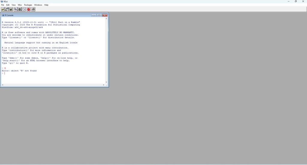
After installation: Open R and You should see the R Console window. (FIGURE 1)
Install RStudio
While R is the programming engine, RStudio provides a modern workspace for coding and analysis.
RStudio makes it easier to:
- Write scripts
- Import datasets
- View tables
- Create charts
- Manage projects
- Export reports
Download from the official website:
Installation Steps
Open RStudio after installation
Download RStudio Desktop
Run the installer
Keep default installation settings
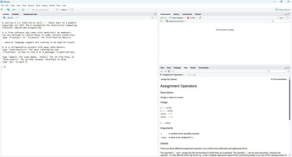
When RStudio opens, you will see four main panels. (FIGURE 2)
| Panel | Purpose |
|---|---|
| Script Editor | Write R Code |
| Console | Execute Commands |
| Environment | View Variables |
| Files/Plots | View Charts and Files |
Create an RStudio project
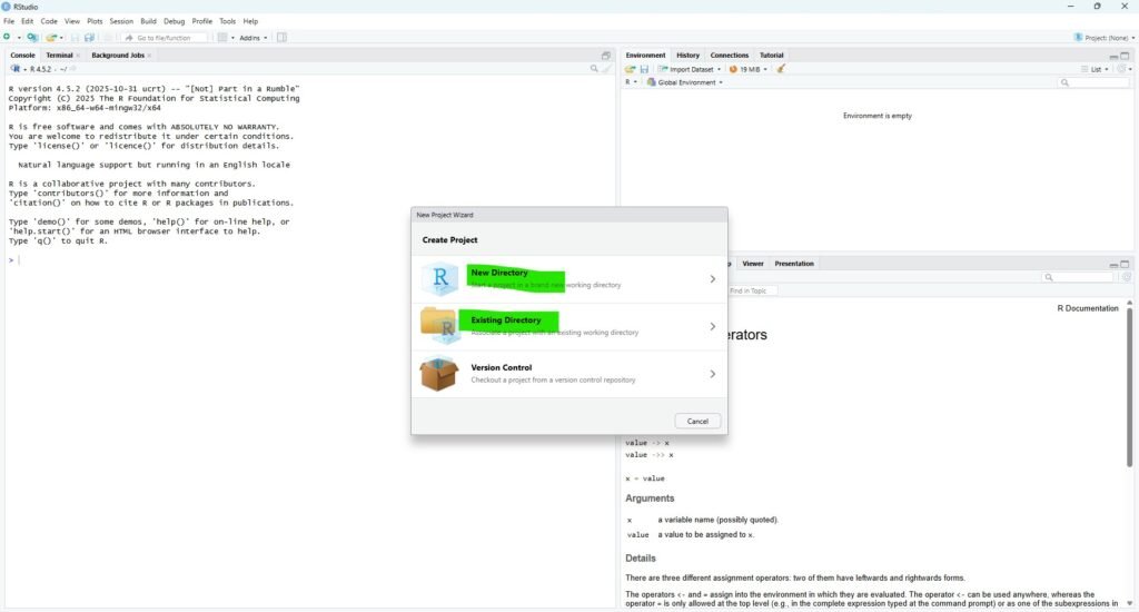
Open RStudio File → New Project
Existing Directory/Create New Directory
Browse to:
F:\CLINICAL_DATA  (FOLDER FOR THE PROJECT OR CREARTE NEW)
Create Project
Now all files, scripts, and outputs will remain organized in one workspace. (FIGURE 3)
Create Your First R Script
Inside RStudio:
Click: File>New File> R Script
Save the script as: clinical_trial_analysis.R (FIGURE 4)
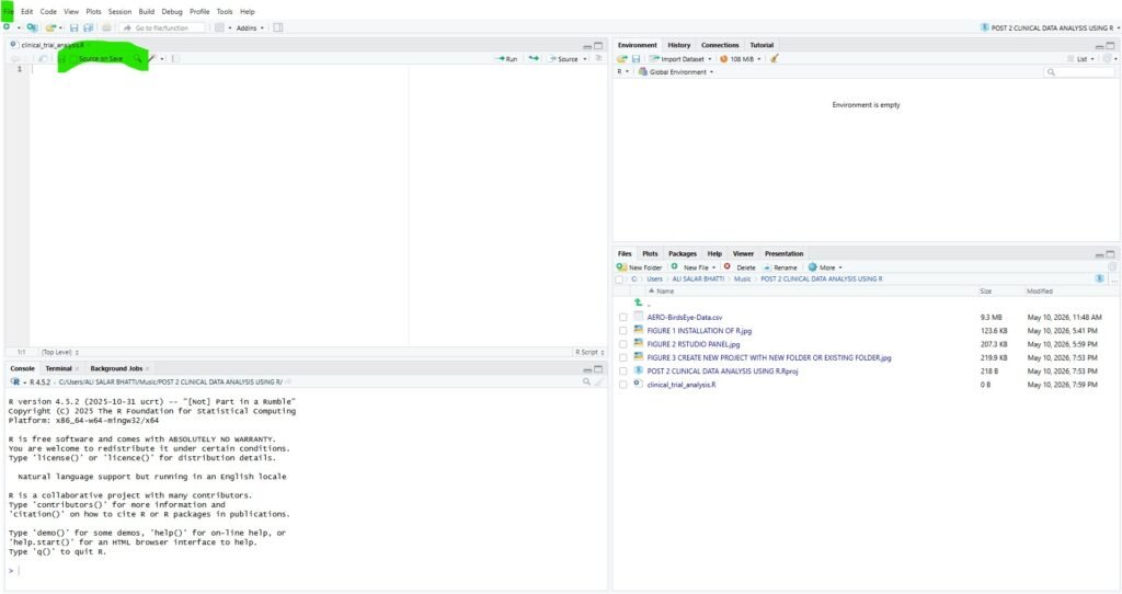
This script will contain all analysis code used in this case study.
A clean project structure improves workflow efficiency.
F:\CLINICAL_DATA/
│
├── AERO-BirdsEye-Data.csv
├── clinical_trial_analysis.R
├── plots/
├── outputs/
└── reports/
Common Beginner Mistakes During Installation
| MISTAKE | SOLUTION |
|---|---|
| Installing RStudio before R | Install R first |
| Spaces in file paths causing issues | Use quotes around paths |
| Forgetting to save scripts | Save frequently |
| Mixing datasets and scripts | Use folders |
Install Core Packages
In clinical_trial_analysis.R copy and paste the following code to install packages.
| Task | Example Package |
|---|---|
| Data cleaning | dplyr |
| Visualization | ggplot2 |
| Data Importing | readr |
| Healthcare analytics | survival |
| Interactive charts | plotly |
| install.packages(c( “tidyverse”, “ggplot2”, “dplyr”, “readr”, “janitor”, “stringr”, “lubridate”, “plotly” )) |
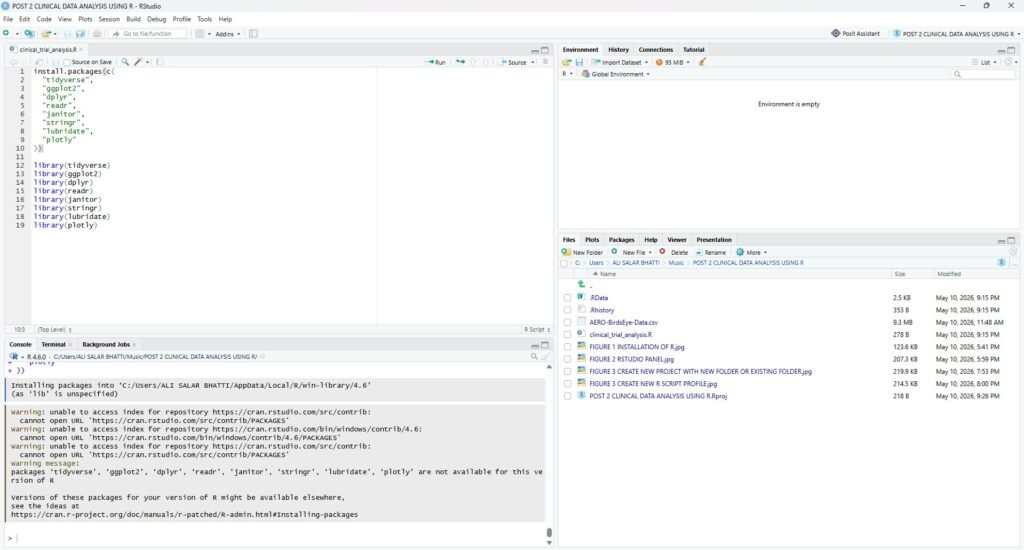
After installation, packages must be loaded into the session. Add this code below the installation section. (FIGURE 5)
| library(tidyverse) library(ggplot2) library(dplyr) library(readr) library(janitor) library(stringr) library(lubridate) library(plotly) |
Understanding Each Package
tidyverse
Tidyverse is a collection of modern R packages for data science.
It simplifies:
- Data cleaning
- Filtering
- Transformation
- Visualization
Why It Matters
Most professional R workflows now rely on the tidyverse ecosystem.
ggplot2
ggplot2 is one of the most powerful visualization libraries in data science.
We will use it to create:
- Trial phase charts
- Enrollment distributions
- Sponsor visualizations
- Clinical research trend graphs
dplyr
dplyr is used for:
- Filtering data
- Grouping observations
- Creating summaries
- Data transformation
Example tasks:
- Counting trial phases
- Finding top sponsors
- Grouping disease conditions
readr
readr helps import datasets quickly and efficiently.
We will use it to load the clinical trial CSV file.
janitor
janitor helps clean messy column names and improve dataset consistency.
Healthcare datasets often contain inconsistent formatting, making this package extremely useful.
stringr
stringr simplifies text cleaning and manipulation.
We will use it for:
- Cleaning sponsor names
- Standardizing condition labels
- Formatting text variables
lubridate
lubridate simplifies working with dates and time variables.
Useful for:
- Start year analysis
- Timeline visualization
- Trend analysis
plotly
plotly allows interactive charts.
This can improve blog engagement if you later embed visualizations online.
Importing Clinical Trial Data
Clinical datasets are commonly stored in CSV, Excel, or SAS formats.
Import CSV File
trial_data <- read.csv(“AERO-BirdsEye-Data.csv”)
Import Excel File
library(readxl)
trial_data <- read_excel(“AERO-BirdsEye-Data.csv”)
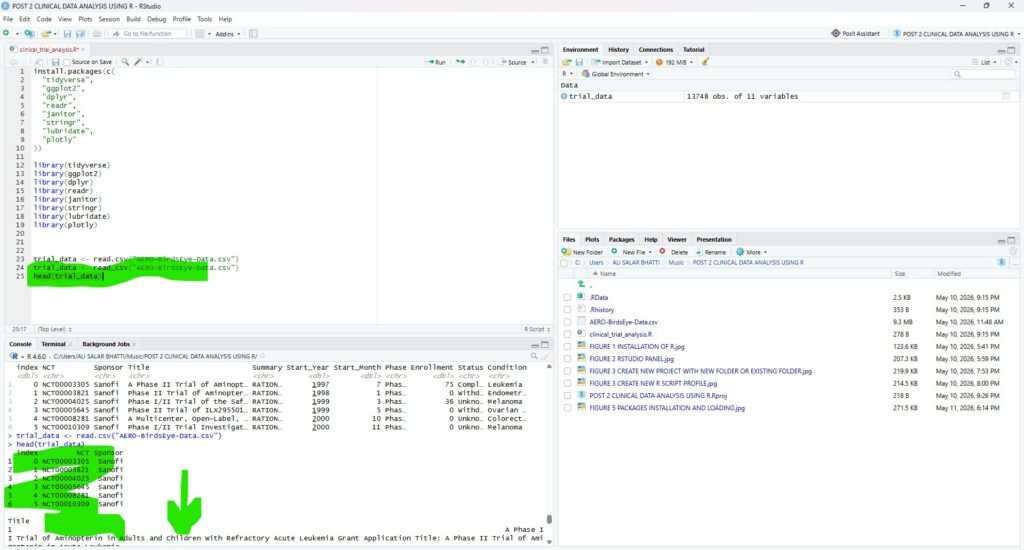
View Dataset Structure
head(trial_data)
It displays first rows. (FIGURE 06)
Check Dataset Dimensions
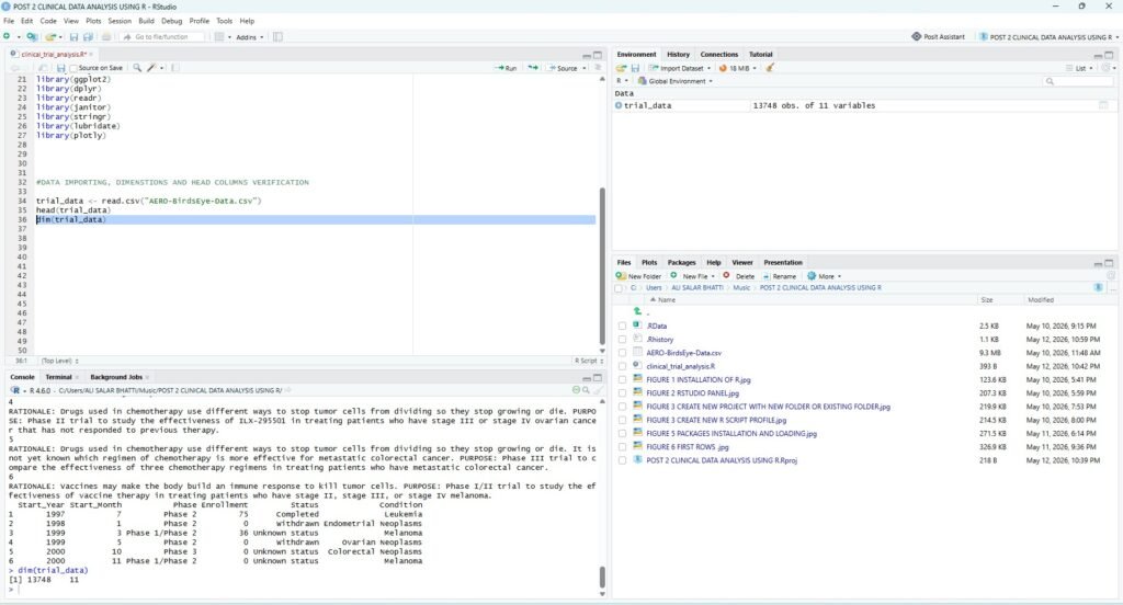
Understanding dataset size is essential before analysis.
dim(trial_data)Expected output:
13748 11Meaning:
| Value | Meaning |
|---|---|
| 13,748 | Rows |
| 11 | Columns |
View Column Names
Column names help identify variables available for analysis.
colnames(trial_data)Expected variables:
| Column Name | Purpose |
|---|---|
| NCT | Trial identifier |
| Sponsor | Organization |
| Title | Study title |
| Summary | Study description |
| Start_Year | Trial year |
| Start_Month | Trial month |
| Phase | Trial phase |
| Enrollment | Number of patients |
| Status | Current state |
| Condition | Medical condition |
Understand Dataset Structure
Use str() to inspect variable types.
str(trial_data)This shows:
- Numeric variables
- Character variables
- Missing values
- Data structure
| str(trial_data) ‘data.frame’: 13748 obs. of 11 variables: $ index : int 0 1 2 3 4 5 6 7 8 9 … $ NCT : chr “NCT00003305” “NCT00003821” “NCT00004025” “NCT00005645” … $ Sponsor : chr “Sanofi” “Sanofi” “Sanofi” “Sanofi” … $ Title : chr “A Phase II Trial of Aminopterin in Adults and Children With Refractory Acute Leukemia Grant Application Title: “| __truncated__ “Phase II Trial of Aminopterin in Patients With Persistent or Recurrent Endometrial Carcinoma” “Phase I/II Trial of the Safety, Immunogenicity, and Efficacy of Autologous Dendritic Cells Transduced With Aden”| __truncated__ “Phase II Trial of ILX295501 Administered Orally Once Weekly x 3 Repeated Every 6 Weeks in Patients With Stage I”| __truncated__ … $ Summary : chr “RATIONALE: Drugs used in chemotherapy use different ways to stop cancer cells from dividing so they stop growin”| __truncated__ “RATIONALE: Drugs used in chemotherapy use different ways to stop tumor cells from dividing so they stop growing”| __truncated__ “RATIONALE: Vaccines made from a person’s white blood cells combined with melanoma antigens may make the body bu”| __truncated__ “RATIONALE: Drugs used in chemotherapy use different ways to stop tumor cells from dividing so they stop growing”| __truncated__ … $ Start_Year : int 1997 1998 1999 1999 2000 2000 2000 2000 2001 2001 … $ Start_Month: int 7 1 3 5 10 11 12 7 4 5 … $ Phase : chr “Phase 2” “Phase 2” “Phase 1/Phase 2” “Phase 2” … $ Enrollment : int 75 0 36 0 0 0 0 0 3222 8 … $ Status : chr “Completed” “Withdrawn” “Unknown status” “Withdrawn” … $ Condition : chr “Leukemia” “Endometrial Neoplasms” “Melanoma” “Ovarian Neoplasms” … > |
Why Structure Inspection Is Important
Clinical datasets often import incorrectly.
Common Problems
| Problem | Example |
|---|---|
| Numbers imported as text | Enrollment column |
| Missing values misread | Empty cells |
| Dates stored incorrectly | Start year/month |
| Mixed categories | Status labels |
Inspecting structure early prevents future statistical errors.
Generate a Statistical Summary
Now generate summary statistics.
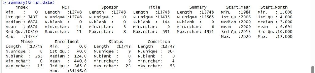
summary(trial_data)This provides:
- Minimum values
- Maximum values
- Mean
- Median
- Missing values
Key Findings from the Statistical Summary
The statistical summary gives several useful insights before cleaning the dataset.
The Dataset Contains 13,748 Clinical Trial Records
The summary output confirms that most columns contain 13,748 entries, which means the dataset is large enough for meaningful exploratory data analysis.
This is important because a larger dataset allows us to study patterns in:
- Trial phases
- Enrollment size
- Medical conditions
- Sponsor activity
- Trial status
- Research trends over time
For a real-world clinical trial case study, 13,748 records provide a strong foundation for analysis.
Start Year Ranges from 1984 to 2020
The Start_Year column shows the following range:
| Statistic | Value |
|---|---|
| Minimum Year | 1984 |
| 1st Quartile | 2006 |
| Median Year | 2009 |
| Mean Year | 2009 |
| 3rd Quartile | 2013 |
| Maximum Year | 2020 |
This tells us that the dataset covers clinical trials from 1984 to 2020.
However, most trials appear to be concentrated after 2006 because the first quartile is 2006. The median year is 2009, which means half of the trials started before 2009 and half started after 2009.
This is useful for our later time-trend analysis, where we can examine how clinical trial activity changed across different years.
Start Month Looks Properly Distributed
The Start_Month column ranges from 1 to 12, which means the month variable appears to be correctly formatted.
| Statistic | Value |
|---|---|
| Minimum Month | 1 |
| Median Month | 7 |
| Mean Month | 6.691 |
| Maximum Month | 12 |
This confirms that the dataset uses standard month numbers, where:
| Month Number | Meaning |
|---|---|
| 1 | January |
| 6 | June |
| 12 | December |
The median start month is 7, meaning July is around the center of the distribution. This column can later be used to analyze whether clinical trials are more commonly started in certain months.
Enrollment Has a Very Wide Range
The Enrollment column is one of the most important variables in this dataset because it tells us how many participants were included in each clinical trial.
The summary shows:
| Statistic | Enrollment |
|---|---|
| Minimum | 0 |
| 1st Quartile | 40 |
| Median | 124 |
| Mean | 440.8 |
| 3rd Quartile | 365 |
| Maximum | 84,496 |
This is one of the most important findings so far.
The median enrollment is 124, but the mean enrollment is 440.8. This difference shows that the enrollment data is likely right-skewed.
In simple terms, most trials have a relatively small number of participants, but a few very large trials increase the average.
This is common in clinical research. Some early-phase studies may include only a small number of patients, while large Phase 3 or Phase 4 trials can include thousands of participants.
The maximum enrollment value of 84,496 is extremely high and should be inspected later as a possible outlier or large-scale observational study.
Phase Column Has 8 Unique Categories
The Phase column has:
| Metric | Value |
|---|---|
| Total Records | 13,748 |
| Unique Values | 8 |
| Blank Values | 253 |
The presence of 8 unique phase categories means that this dataset may include values such as:
- Phase 1
- Phase 2
- Phase 3
- Phase 4
- Phase 1/Phase 2
- Phase 2/Phase 3
- Not Applicable
- Blank or missing values
There are also 253 blank phase values, which means this column will need cleaning before analysis.
This matters because clinical trial phase is a key variable for understanding the purpose and maturity of each study.
Status Column Has 9 Unique Categories
The Status column contains 9 unique values.
This means the dataset likely includes trial statuses such as:
- Completed
- Recruiting
- Terminated
- Withdrawn
- Active
- Suspended
- Unknown
This is useful because status analysis can help us understand how many trials were successfully completed and how many were stopped or withdrawn.
Later in this case study, we will create a frequency table and bar chart to show the distribution of clinical trial statuses.
Condition Column Has 867 Unique Medical Conditions
The Condition column contains 867 unique values.
This is a strong signal that the dataset covers a wide range of diseases and healthcare research areas.
The summary shows:
| Metric | Value |
|---|---|
| Total Records | 13,748 |
| Unique Conditions | 867 |
| Minimum Character Length | 4 |
| Maximum Character Length | 58 |
This column will be especially useful for finding the most commonly studied medical conditions.
Later, we can use this variable to answer questions such as:
- Which diseases appear most often in this clinical trial dataset?
- Are cancer-related trials common?
- How many trials focus on diabetes, asthma, hypertension, or cardiovascular disease?
- Which medical conditions attract the most research attention?
This section will give the post strong SEO value because people often search for real-world healthcare analytics examples using R.
Text Columns Need Further Inspection
The Title and Summary columns are text-based variables.
The summary shows that:
| Column | Maximum Character Length |
|---|---|
| Title | 591 |
| Summary | 4951 |
This means some clinical trial summaries are very detailed. These text columns may be useful for advanced analysis later, such as:
- Keyword extraction
- Text mining
- Natural language processing
- Identifying treatment areas
- Classifying trials by topic
For this beginner-friendly case study, we will mainly use structured columns such as phase, status, enrollment, year, sponsor, and condition.
What This Summary Tells Us Before Data Cleaning
The statistical summary gives us a clear understanding of the dataset before deeper analysis.
Main Observations
| Observation | Meaning |
|---|---|
| Dataset has 13,748 records | Good size for real-world analysis |
| Trials range from 1984 to 2020 | Useful for time-trend analysis |
| Enrollment is highly skewed | Outlier analysis is needed |
| Phase has blank values | Data cleaning is required |
| Condition has 867 unique values | Strong disease-level analysis possible |
| Status has 9 categories | Trial completion analysis is possible |
| Text columns are large | Future NLP analysis is possible |
Why This Step Matters in Clinical Trial Data Analysis Using R
Before creating charts or running statistical models, we need to understand the raw dataset.
This step helps prevent common mistakes such as:
- Analyzing missing values incorrectly
- Treating text as numeric data
- Ignoring outliers
- Misinterpreting categorical variables
- Creating misleading charts
In healthcare analytics, small data quality issues can lead to incorrect conclusions. That is why every clinical trial data analysis project should begin with a proper summary and interpretation.
Cleaning the Clinical Trial Dataset in R
After checking the statistical summary, the next step is data cleaning. In real-world clinical trial data analysis using R, raw datasets are rarely ready for analysis. They often contain blank values, inconsistent column names, repeated records, irregular text formatting, and unusual numeric values.
Before creating charts or drawing conclusions, we need to prepare a clean version of the dataset.
In this step, we will:
- Clean column names
- Remove duplicate records
- Convert blank values into missing values
- Standardize text columns
- Check the structure of the cleaned dataset
This process helps make the analysis more reliable and easier to reproduce.
Why Data Cleaning Matters in Clinical Trial Analysis
Clinical trial datasets contain information about medical studies, sponsors, enrollment, conditions, and trial phases. If the dataset is not cleaned properly, the final results may be misleading.
For example:
| Data Issue | Why It Matters |
|---|---|
| Blank phase values | Phase analysis becomes inaccurate |
| Duplicate records | Trial counts become inflated |
| Inconsistent sponsor names | Sponsor ranking becomes unreliable |
| Enrollment outliers | Average enrollment becomes misleading |
| Text formatting issues | Grouping and filtering become harder |
In healthcare analytics, clean data is especially important because research decisions may depend on the results.
Create a Backup Copy of the Original Dataset
Before cleaning, it is best practice to keep the original dataset unchanged.
Run this command:
trial_raw <- trial_dataThis creates a backup called trial_raw.
Now, if we make any mistake during cleaning, the original imported dataset is still available.
Clean Column Names
Dataset may have column names with spaces, capital letters, or special characters. These can make R code harder to write.
We will use the clean_names() function from the janitor package.
trial_clean <- trial_data %>%
  clean_names()
This will convert column names into a cleaner format.
For example:
| Original Column | Cleaned Column |
|---|---|
| Start_Year | start_year |
| Start_Month | start_month |
| Enrollment | enrollment |
| Condition | condition |
| Sponsor | sponsor |
Clean column names are easier to use in R code and reduce errors during analysis.
Check the New Column Names
Run this command:
names(trial_clean)You should now see lowercase column names such as:
"[1] "index"       "nct"         "sponsor"     "title"       "summary"     "start_year"  "start_month" "phase"
 [9] "enrollment"  "status"      "condition"
This confirms that the column names are ready for analysis.
Convert Blank Values into NA
In many CSV files, missing values are stored as blank cells instead of proper NA values. R may not always detect these automatically.
To fix this, run:
trial_clean <- trial_clean %>%
  mutate(across(where(is.character), ~na_if(.x, "")))
This command checks all text columns and converts blank values into NA.
That makes missing value analysis more accurate in the next step.
Remove Duplicate Records
Duplicate records can inflate trial counts and distort analysis.
Run:
trial_clean <- trial_clean %>%
  distinct()
This keeps only unique rows in the dataset.
Standardize text columns.
Text values should be consistent before grouping and counting.
Run:
trial_clean <- trial_clean %>%
  mutate(
    sponsor = str_squish(str_to_title(sponsor)),
    phase = str_squish(phase),
    status = str_squish(status),
    condition = str_squish(condition)
  )
This code does four useful things:
| Cleaning Function | Purpose |
|---|---|
str_squish() | Removes extra spaces |
str_to_title() | Standardizes sponsor capitalization |
mutate() | Updates selected columns |
condition = str_squish(condition) | Cleans condition text |
This is especially useful for sponsor analysis. For example, it helps avoid treating similar sponsor names as different categories because of spacing or capitalization.
Comparing Raw Data and Cleaned Data Before Analysis
Before moving into charts and deeper clinical trial data analysis using R, it is important to understand the difference between the raw dataset and the cleaned dataset.
In the previous step, we cleaned the imported dataset and created a new object called
trial_cleanFrom this point forward, we should use trial_clean for all analysis instead of the original trial_data.
The raw dataset is useful for initial inspection, but the cleaned dataset is better for final analysis, visualization, and interpretation.
What Is Raw Data?
Raw data is the dataset exactly as it was imported from the CSV file.
It has not yet been cleaned, standardized, or prepared for analysis.
In this case study, the raw clinical trial dataset contained:
| Feature | Raw Data Observation |
|---|---|
| Total records | 13,748 |
| Start year range | 1984 to 2020 |
| Start month range | 1 to 12 |
| Enrollment range | 0 to 84,496 |
| Phase categories | 8 unique values |
| Blank phase values | 253 |
| Status categories | 9 unique values |
| Condition categories | 867 unique values |
This tells us that the dataset is large and useful for healthcare analytics, but it also contains data quality issues that should be handled before analysis.
What Is Cleaned Data?
Cleaned data is the processed version of the raw dataset.
In this project, cleaning included:
- Standardizing column names
- Converting blank values into proper
NAvalues - Removing duplicate rows
- Cleaning extra spaces from text columns
- Creating analysis-ready variables
The cleaned dataset is stored as:
trial_cleanThis is the version we will use for the rest of the case study.
Raw Data vs Cleaned Data
| Feature | Raw Data | Cleaned Data |
|---|---|---|
| Object name in R | trial_data | trial_clean |
| Source | Directly imported CSV file | Processed version of raw data |
| Column names | Mixed capitalization | Standardized lowercase names |
| Blank values | May appear as empty cells | Converted into NA |
| Duplicate rows | May still be present | Checked and removed |
| Text formatting | May contain extra spaces | Cleaned using string functions |
| Best use | Initial inspection | Final analysis and visualization |
The raw dataset helps us understand the original file.
The cleaned dataset helps us produce reliable analysis.
Why We Should Not Analyze Raw Data Directly
If we analyze the raw dataset without cleaning it, the results may be inaccurate.
| Raw Data Problem | Possible Effect |
|---|---|
| Blank phase values | Phase counts become unclear |
| Duplicate rows | Trial totals may become inflated |
| Extra spaces in sponsor names | Same sponsor may appear as different sponsors |
| Enrollment value of 0 | Mean enrollment may become misleading |
| Inconsistent text formatting | Grouping and filtering become inaccurate |
In clinical trial data analysis using R, cleaning is not optional. It is a necessary step before creating final tables, charts, or conclusions.
Interpreting the Cleaned Clinical Trial Dataset Summary
After cleaning the dataset, we again used the summary() function to check whether the data was ready for analysis.
summary(trial_clean)This step is important because data cleaning should not be done blindly. After cleaning, we need to verify what changed, what remained the same, and whether the dataset is suitable for clinical trial data analysis using R.
The cleaned dataset still contains 13,748 records, which means no complete rows were removed during the cleaning process. However, the summary shows important improvements in how missing and blank values are represented.
Cleaned Dataset Overview
The cleaned dataset includes the same core clinical trial variables:
| Variable | Description |
|---|---|
index | Row index from the original dataset |
nct | Clinical trial identification number |
sponsor | Organization responsible for the trial |
title | Clinical trial title |
summary | Description of the trial |
start_year | Year the clinical trial started |
start_month | Month the clinical trial started |
phase | Clinical trial phase |
enrollment | Number of participants |
status | Trial status |
condition | Medical condition studied |
The biggest visible change is that column names are now cleaner and easier to use in R. For example, Start_Year became start_year, and Start_Month became start_month.
This makes the code easier to write and reduces the chance of errors.
Raw Data vs Cleaned Data: What Changed?
| Feature | Raw Dataset: trial_data | Cleaned Dataset: trial_clean | What Changed |
|---|---|---|---|
| Total rows | 13,748 | 13,748 | Same number of records |
| Column names | Mixed capitalization | Lowercase clean names | Improved for coding |
| Title blank values | 144 blanks | 144 NA values | Blanks converted to missing values |
| Phase blank values | 253 blanks | 263 NA values | Missing phases now detected properly |
| Summary blanks | 0 blanks | 0 blanks | No major change |
| Sponsor unique values | 10 | 10 | Same sponsor groups |
| Status unique values | 9 | 9 | Same status groups |
| Condition unique values | 867 | 867 | Same disease categories |
| Enrollment range | 0 to 84,496 | 0 to 84,496 | Same numeric range |
The most important improvement is that blank values are now treated as real missing values using NA.
This is important because R handles NA values properly in summaries, charts, filters, and statistical analysis.
Start Year Remains Valid
The start_year column still ranges from 1984 to 2020.
| Statistic | Value |
|---|---|
| Minimum | 1984 |
| 1st Quartile | 2006 |
| Median | 2009 |
| Mean | 2009 |
| 3rd Quartile | 2013 |
| Maximum | 2020 |
This confirms that cleaning did not change the historical coverage of the dataset.
The dataset still gives us a useful timeline of clinical trial activity over several decades. Later, we will use this column to create a trend chart showing how clinical trial activity changed by year.
Enrollment Still Shows Strong Skewness
The enrollment column remains unchanged after cleaning.
| Statistic | Value |
|---|---|
| Minimum | 0 |
| 1st Quartile | 40 |
| Median | 124 |
| Mean | 440.8 |
| 3rd Quartile | 365 |
| Maximum | 84,496 |
This tells us that the enrollment distribution is highly uneven.
The median enrollment is 124, but the mean is 440.8. This difference shows that a small number of very large clinical studies are pulling the average upward.
This is common in real-world clinical trial datasets because some studies enroll only a few dozen participants, while others include thousands.
Phase Has Missing Values After Cleaning
The cleaned summary shows that the phase column has 263 missing values.
| Metric | Value |
|---|---|
| Unique phase values | 7 |
| Missing phase values | 263 |
This means the dataset contains multiple clinical trial phase categories, but some records do not include phase information.
This can happen when studies are observational, device-related, non-drug studies, or not assigned to a traditional clinical phase.
For this case study, the best approach is not to delete these records. Instead, we will label missing phase values as Not Available
Checking Missing Values in the Cleaned Dataset
After cleaning the dataset and converting blank values into proper NA values, the next step is to check missing values by column.
Missing value analysis is important in clinical trial data analysis using R because missing data can affect charts, frequency tables, statistical summaries, and final conclusions.
We used:
colSums(is.na(trial_clean))The output was:
| Column | Missing Values |
|---|---|
index | 0 |
nct | 0 |
sponsor | 0 |
title | 144 |
summary | 0 |
start_year | 0 |
start_month | 0 |
phase | 263 |
enrollment | 0 |
status | 0 |
condition | 0 |
This is a useful result because most important analytical columns do not have missing values.
What These Missing Values Mean
The cleaned dataset contains missing values in only two columns:
titlephase
All other columns are complete.
This means the dataset is in good condition for analysis because the main variables needed for clinical trial trend analysis are available.
Title Has 144 Missing Values
The title column has 144 missing values.
| Column | Missing Values | Impact |
|---|---|---|
title | 144 | Low impact for this analysis |
This is not a major issue for our current case study because we are not using the title column for statistical analysis.
The title column is mainly useful for:
- Text mining
- Keyword extraction
- Searching individual studies
- Natural language processing
- Identifying study themes
Since our current analysis focuses on structured variables such as phase, enrollment, status, sponsor, year, and condition, missing titles will not affect most of our results.
Phase Has 263 Missing Values
The phase column has 263 missing values.
| Column | Missing Values | Impact |
|---|---|---|
phase | 263 | Important for phase analysis |
This is more important than missing titles because clinical trial phase is one of the key variables in this case study.
If phase values are missing, the phase distribution chart may be incomplete unless we handle those missing values properly.
Why We Should Not Use na.omit() Here
A beginner might remove all missing values using:
na.omit(trial_clean)But that is not the best choice here.
If we remove every row with a missing title or missing phase, we may lose useful clinical trial records that still contain valid sponsor, year, enrollment, status, and condition information.
In healthcare analytics, removing data without a clear reason can reduce accuracy and weaken the analysis.
A better approach is to handle missing phase values transparently.
Creating a Clean Clinical Trial Phase Variable
Because the phase column had missing values, we created a new variable called phase_clean.
This column keeps existing phase values but replaces missing values with:
Not AvailableWe used:
trial_clean <- trial_clean %>%
  mutate(
    phase_clean = ifelse(is.na(phase), "Not Available", phase)
  )
Then we checked the distribution:
table(trial_clean$phase_clean)The output was:
| Clinical Trial Phase | Number of Trials |
|---|---|
| Early Phase 1 | 10 |
| Not Available | 263 |
| Phase 1 | 2,516 |
| Phase 1/Phase 2 | 322 |
| Phase 2 | 3,596 |
| Phase 2/Phase 3 | 139 |
| Phase 3 | 4,887 |
| Phase 4 | 2,015 |
Why We Created phase_clean
The original phase column had missing values. If we used it directly in charts, R might silently exclude missing values or show them unclearly.
By creating phase_clean, we make the analysis easier to understand.
| Original Issue | Cleaning Solution |
|---|---|
| Missing phase values | Replaced with Not Available |
| Harder chart interpretation | Clear category for missing data |
| Possible row loss | All records preserved |
| Less transparent analysis | Missing data shown openly |
From this point forward, phase-based analysis should use:
phase_cleaninstead of:
phase
Creating a Clean Phase Distribution Table in R
After creating the phase_clean variable, we converted the phase counts into a structured table.
We used:
phase_table <- trial_clean %>%
  count(phase_clean) %>%
  arrange(desc(n))

phase_table
The result was:
| Rank | Clinical Trial Phase | Number of Trials |
|---|---|---|
| 1 | Phase 3 | 4,887 |
| 2 | Phase 2 | 3,596 |
| 3 | Phase 1 | 2,516 |
| 4 | Phase 4 | 2,015 |
| 5 | Phase 1/Phase 2 | 322 |
| 6 | Not Available | 263 |
| 7 | Phase 2/Phase 3 | 139 |
| 8 | Early Phase 1 | 10 |
This table gives a clearer view of clinical trial phase distribution.
Phase 3 Has the Highest Number of Trials
The most common category is Phase 3, with 4,887 trials.
Phase 3 trials are usually larger and more advanced studies designed to confirm whether a treatment works in a broader patient population.
A high number of Phase 3 trials suggests that the dataset includes many late-stage clinical studies.
Phase 2 Is the Second-Largest Category
The second-largest category is Phase 2, with 3,596 trials.
Together, Phase 2 and Phase 3 make up a major portion of the dataset:
| Combined Category | Number of Trials |
|---|---|
| Phase 2 + Phase 3 | 8,483 |
This shows that most studies in this dataset are concentrated in mid-stage and late-stage clinical research.
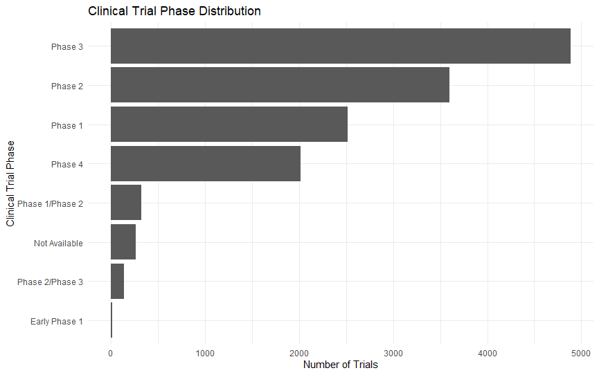
Visualizing the Clinical Trial Phase Distribution
After creating the phase distribution table, we visualized the results using a bar chart.
ggplot(phase_table, aes(x = reorder(phase_clean, n), y = n)) +
  geom_col() +
  coord_flip() +
  labs(
    title = "Clinical Trial Phase Distribution",
    x = "Clinical Trial Phase",
    y = "Number of Trials"
  ) +
  theme_minimal()
This chart gives a clearer visual understanding of the distribution of clinical trial phases in the dataset.
What the Bar Chart Shows
The chart confirms the same pattern we observed in the table.
Phase 3 has the longest bar, followed by Phase 2, Phase 1, and Phase 4.
This shows that the dataset is not evenly distributed across phases. Instead, it is concentrated mainly in:
- Phase 3
- Phase 2
- Phase 1
- Phase 4
The chart also shows that missing phase information is limited because the Not Available category is relatively small.
Calculating the Percentage Share of Each Clinical Trial Phase
Counts are useful, but percentages make the results easier to compare.
We used:
phase_table <- phase_table %>%
  mutate(percentage = round((n / sum(n)) * 100, 2))

phase_table
The result was:
| Rank | Clinical Trial Phase | Number of Trials | Percentage |
|---|---|---|---|
| 1 | Phase 3 | 4,887 | 35.55% |
| 2 | Phase 2 | 3,596 | 26.16% |
| 3 | Phase 1 | 2,516 | 18.30% |
| 4 | Phase 4 | 2,015 | 14.66% |
| 5 | Phase 1/Phase 2 | 322 | 2.34% |
| 6 | Not Available | 263 | 1.91% |
| 7 | Phase 2/Phase 3 | 139 | 1.01% |
| 8 | Early Phase 1 | 10 | 0.07% |
Phase 2 and Phase 3 Make Up Most of the Dataset
The two largest categories are:
| Phase | Percentage |
|---|---|
| Phase 3 | 35.55% |
| Phase 2 | 26.16% |
| Combined | 61.71% |
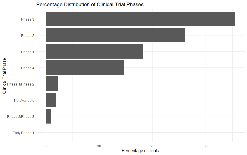
Together, Phase 2 and Phase 3 represent 61.71% of the dataset.
This means nearly two-thirds of all records are concentrated in mid-stage and late-stage clinical research.
Interpreting the Percentage Distribution of Clinical Trial Phases
We also created a percentage-based bar chart.
ggplot(phase_table, aes(x = reorder(phase_clean, percentage), y = percentage)) +
  geom_col() +
  coord_flip() +
  labs(
    title = "Percentage Distribution of Clinical Trial Phases",
    x = "Clinical Trial Phase",
    y = "Percentage of Trials"
  ) +
  theme_minimal()
The chart makes one conclusion very clear: this clinical trial dataset is heavily concentrated in Phase 2 and Phase 3 studies.
Key Insights from Phase Analysis
| Finding | Interpretation |
|---|---|
| Phase 3 is 35.55% | Largest clinical trial category |
| Phase 2 is 26.16% | Strong focus on efficacy testing |
| Phase 2 + Phase 3 = 61.71% | Dataset is dominated by mid-to-late stage trials |
| Phase 1 is 18.30% | Early-stage safety trials are well represented |
| Phase 4 is 14.66% | Post-market research is also meaningful |
| Not Available is 1.91% | Missing phase data is limited |
| Early Phase 1 is 0.07% | Very early studies are rare |
Analyzing Clinical Trial Status Distribution in R
After analyzing clinical trial phases, the next step is to examine the status of each clinical trial.
The status column tells us whether a clinical trial was completed, terminated, withdrawn, suspended, recruiting, or still active.
We used:
status_table <- trial_clean %>%
  count(status) %>%
  arrange(desc(n))

status_table
The result was:
| Rank | Clinical Trial Status | Number of Trials |
|---|---|---|
| 1 | Completed | 10,568 |
| 2 | Terminated | 1,285 |
| 3 | Recruiting | 800 |
| 4 | Active, not recruiting | 646 |
| 5 | Withdrawn | 291 |
| 6 | Not yet recruiting | 108 |
| 7 | Unknown status | 19 |
| 8 | Suspended | 16 |
| 9 | Enrolling by invitation | 15 |
Most Trials Were Completed
The largest category is Completed, with 10,568 trials.
This shows that the majority of clinical trials in this dataset reached completion.
Completed studies are especially useful for historical analysis because they are more likely to have full enrollment information and final trial records.
Terminated Trials Are the Second-Largest Category
The second-largest category is Terminated, with 1,285 trials.
A terminated trial is a study that started but ended earlier than planned.
This may happen for several reasons, such as:
- Safety concerns
- Low recruitment
- Lack of effectiveness
- Funding issues
- Administrative decisions
- Sponsor strategy changes
This is an important insight because terminated trials can reveal challenges in clinical research.
Calculating the Percentage Distribution of Clinical Trial Status
We calculated the percentage share of each status.
status_table <- status_table %>%
  mutate(percentage = round((n / sum(n)) * 100, 2))

status_table
The result was:
| Rank | Clinical Trial Status | Number of Trials | Percentage |
|---|---|---|---|
| 1 | Completed | 10,568 | 76.87% |
| 2 | Terminated | 1,285 | 9.35% |
| 3 | Recruiting | 800 | 5.82% |
| 4 | Active, not recruiting | 646 | 4.70% |
| 5 | Withdrawn | 291 | 2.12% |
| 6 | Not yet recruiting | 108 | 0.79% |
| 7 | Unknown status | 19 | 0.14% |
| 8 | Suspended | 16 | 0.12% |
| 9 | Enrolling by invitation | 15 | 0.11% |
What the Status Percentage Table Shows
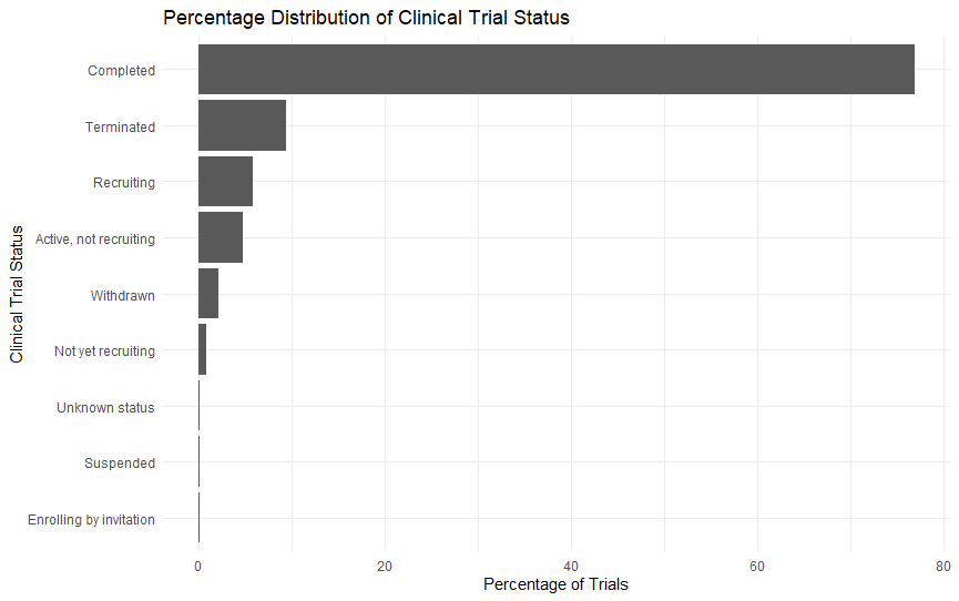
The most important result is:
76.87% of trials were completed.
This means more than three out of every four records in the dataset belong to completed clinical trials.
Terminated trials represent 9.35%, which means nearly one in ten trials ended earlier than planned.
Recruiting and active trials together represent 10.52%, showing that some studies were still ongoing at the time the dataset was collected.
Visualizing the Percentage Distribution of Clinical Trial Status
We created a bar chart for clinical trial status.
ggplot(status_table, aes(x = reorder(status, percentage), y = percentage)) +
  geom_col() +
  coord_flip() +
  labs(
    title = "Percentage Distribution of Clinical Trial Status",
    x = "Clinical Trial Status",
    y = "Percentage of Trials"
  ) +
  theme_minimal()
The chart shows that Completed trials dominate the dataset, while all other status categories are much smaller.
Main Insights from Trial Status Analysis
| Finding | Interpretation |
|---|---|
| Completed trials = 76.87% | Most studies reached completion |
| Terminated trials = 9.35% | A meaningful number ended early |
| Recruiting + active trials = 10.52% | Some studies were ongoing |
| Withdrawn trials = 2.12% | A small number stopped before enrollment |
| Unknown status = 0.14% | Status data is mostly complete |
| Suspended trials = 0.12% | Temporary pauses are rare |
Analyzing Clinical Trial Enrollment Summary in R
After analyzing trial phases and trial status, the next step is to examine the enrollment variable.
Enrollment tells us how many participants were included in each clinical trial.
We used:
summary(trial_clean$enrollment)Then we created a structured summary:
enrollment_summary <- trial_clean %>%
  summarise(
    total_trials = n(),
    min_enrollment = min(enrollment, na.rm = TRUE),
    q1_enrollment = quantile(enrollment, 0.25, na.rm = TRUE),
    median_enrollment = median(enrollment, na.rm = TRUE),
    mean_enrollment = round(mean(enrollment, na.rm = TRUE), 2),
    q3_enrollment = quantile(enrollment, 0.75, na.rm = TRUE),
    max_enrollment = max(enrollment, na.rm = TRUE)
  )

enrollment_summary
The result was:
| Total Trials | Minimum Enrollment | 1st Quartile | Median | Mean | 3rd Quartile | Maximum Enrollment |
|---|---|---|---|---|---|---|
| 13,748 | 0 | 40 | 124 | 440.78 | 365 | 84,496 |
What the Enrollment Summary Shows
The enrollment summary shows that clinical trial size varies dramatically.
The median enrollment is 124, while the mean enrollment is 440.78.
This difference means enrollment is right-skewed. Most trials are relatively small, but a few very large studies increase the average.
The maximum enrollment value is 84,496, which is much larger than the median.
Why Median Is Better Than Mean Here
In skewed healthcare datasets, the median often gives a better picture of the typical case.
If we only reported the mean enrollment of 440.78, readers might assume most trials are around 441 participants.
But the median of 124 tells a different story.
It shows that a more typical clinical trial in this dataset has around 124 participants, while the mean is inflated by very large studies.
Visualizing the Distribution of Clinical Trial Enrollment
We created a histogram to understand how enrollment is distributed.
ggplot(trial_clean, aes(x = enrollment)) +
  geom_histogram(bins = 50) +
  labs(
    title = "Distribution of Clinical Trial Enrollment",
    x = "Number of Participants Enrolled",
    y = "Number of Trials"
  ) +
  theme_minimal()
The histogram shows that most trials are concentrated near the lower end of the enrollment range, while a few very large studies stretch the x-axis.
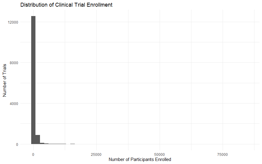
This confirms that clinical trial enrollment is highly right-skewed.
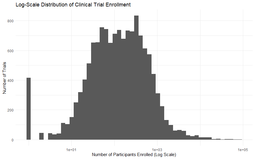
Interpreting the Log-Scale Distribution of Clinical Trial Enrollment
Because the enrollment distribution was extremely skewed, we created a log-scale histogram.
ggplot(trial_clean, aes(x = enrollment + 1)) +
  geom_histogram(bins = 50) +
  scale_x_log10() +
  labs(
    title = "Log-Scale Distribution of Clinical Trial Enrollment",
    x = "Number of Participants Enrolled (Log Scale)",
    y = "Number of Trials"
  ) +
  theme_minimal()
We used:
enrollment + 1because log-scale charts cannot handle zero values.
Why We Used a Log Scale
A normal histogram was useful, but it was difficult to interpret because enrollment ranged from 0 to 84,496 participants.
A log scale helps by compressing very large values while spreading out smaller values.
| Normal Scale | Log Scale |
|---|---|
| Shows the full raw range | Makes skewed data easier to read |
| Outliers dominate the chart | Outliers are compressed |
| Smaller trials are hard to see | Small and medium trials become visible |
| Useful first view | Better for interpretation |
The log-scale chart shows that most trials are small to medium-sized, while very large studies are rare.
Identifying the Largest Clinical Trials by Enrollment
To understand which studies created the long right tail, we identified the top 10 trials by enrollment.
top_enrollment_trials <- trial_clean %>%
  arrange(desc(enrollment)) %>%
  select(nct, sponsor, title, phase_clean, status, condition, enrollment) %>%
  head(10)

top_enrollment_trials
The result was:
| Rank | NCT ID | Sponsor | Phase | Status | Condition | Enrollment |
|---|---|---|---|---|---|---|
| 1 | NCT00744263 | Pfizer | Phase 4 | Completed | Pneumonia, Pneumococcal | 84,496 |
| 2 | NCT00090233 | Merck | Phase 3 | Completed | Rotavirus Infections | 69,274 |
| 3 | NCT00140673 | GSK | Phase 3 | Completed | Rotavirus Infections | 63,227 |
| 4 | NCT02251704 | GSK | Not Available | Recruiting | Malaria | 56,000 |
| 5 | NCT02374450 | GSK | Not Available | Recruiting | Malaria | 52,192 |
| 6 | NCT00344513 | GSK | Phase 4 | Completed | Heart Failure | 50,000 |
| 7 | NCT00709891 | Roche | Not Available | Completed | Papilloma | 47,208 |
| 8 | NCT00753272 | GSK | Phase 3 | Completed | Influenza, Human | 43,695 |
| 9 | NCT00861380 | GSK | Phase 3 | Completed | Streptococcal Infections | 41,188 |
| 10 | NCT01427309 | Sanofi | Phase 4 | Completed | Influenza, Human | 31,989 |
What These Large Trials Reveal
The largest enrollment values are mostly connected to:
- Vaccines
- Infectious diseases
- Public health studies
- Infant and elderly populations
- Screening programs
- Post-marketing or late-stage research
This explains why the enrollment distribution is skewed. A few very large studies have a strong effect on the mean.
Analyzing Clinical Trial Enrollment by Phase
Next, we analyzed whether some clinical trial phases usually enroll more participants than others.
enrollment_by_phase <- trial_clean %>%
  group_by(phase_clean) %>%
  summarise(
    trials = n(),
    median_enrollment = median(enrollment, na.rm = TRUE),
    mean_enrollment = round(mean(enrollment, na.rm = TRUE), 2),
    max_enrollment = max(enrollment, na.rm = TRUE)
  ) %>%
  arrange(desc(median_enrollment))

enrollment_by_phase
The result was:
| Clinical Trial Phase | Trials | Median Enrollment | Mean Enrollment | Maximum Enrollment |
|---|---|---|---|---|
| Phase 3 | 4,887 | 351 | 796 | 69,274 |
| Phase 2/Phase 3 | 139 | 249 | 566 | 8,031 |
| Phase 4 | 2,015 | 159 | 518 | 84,496 |
| Not Available | 263 | 100 | 909 | 56,000 |
| Phase 2 | 3,596 | 90.5 | 180 | 4,002 |
| Phase 1/Phase 2 | 322 | 60 | 99.9 | 1,365 |
| Early Phase 1 | 10 | 32 | 58.2 | 328 |
| Phase 1 | 2,516 | 32 | 51.1 | 1,260 |
What This Table Shows
The table shows that later-stage trials generally have larger enrollment sizes than early-stage trials.
Phase 3 has the highest median enrollment at 351 participants.
Phase 1 and Early Phase 1 have the lowest median enrollment at 32 participants.
This matches clinical research logic: early-stage studies are usually smaller, while late-stage studies are usually larger.
Visualizing Median Enrollment by Clinical Trial Phase
We created a bar chart for median enrollment by phase.
ggplot(enrollment_by_phase, aes(x = reorder(phase_clean, median_enrollment), y = median_enrollment)) +
  geom_col() +
  coord_flip() +
  labs(
    title = "Median Enrollment by Clinical Trial Phase",
    x = "Clinical Trial Phase",
    y = "Median Enrollment"
  ) +
  theme_minimal()
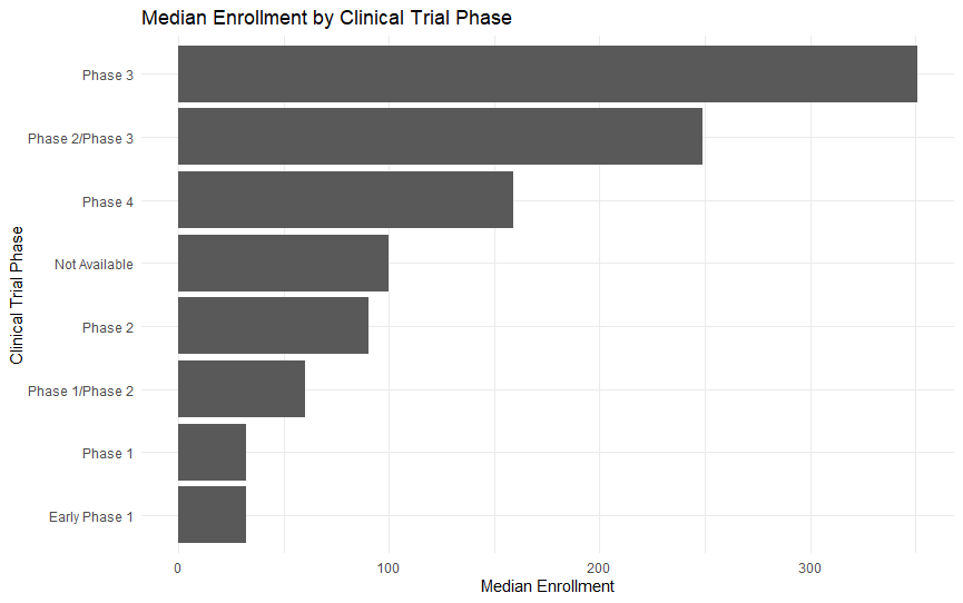
The chart clearly shows that Phase 3 has the highest typical enrollment, while Phase 1 and Early Phase 1 have the lowest.
Main Insights from Enrollment by Phase
| Finding | Interpretation |
|---|---|
| Phase 3 has the highest median enrollment | Late-stage trials are typically larger |
| Phase 1 has the lowest median enrollment | Early safety trials are usually small |
| Phase 2 is smaller than Phase 3 | Enrollment increases as studies advance |
| Phase 4 has the highest maximum enrollment | Post-market studies can be very large |
| Not Available has a high mean | Missing phase records include some large studies |
| Median is better than mean | Enrollment is skewed by large outliers |
Analyzing the Top Clinical Trial Sponsors
After phase, status, and enrollment analysis, we examined the sponsor column.
sponsor_table <- trial_clean %>%
  count(sponsor) %>%
  arrange(desc(n)) %>%
  head(10)

sponsor_table
The result was:
| Rank | Sponsor | Number of Trials |
|---|---|---|
| 1 | GSK | 2,473 |
| 2 | Novartis | 2,320 |
| 3 | Pfizer | 1,970 |
| 4 | Merck | 1,770 |
| 5 | Sanofi | 1,524 |
| 6 | JNJ | 1,143 |
| 7 | Roche | 1,095 |
| 8 | Bayer | 619 |
| 9 | AbbVie | 417 |
| 10 | Gilead | 417 |
What the Sponsor Table Shows
The sponsor table shows that a small group of large pharmaceutical companies account for a major share of clinical trial activity in this dataset.
GSK has the highest number of trials, followed by Novartis, Pfizer, Merck, and Sanofi.
This means trial sponsorship is highly concentrated among major pharmaceutical companies.
Calculating Sponsor Percentage Share
Next, we calculated what percentage of all trials each top sponsor represented.
sponsor_table <- trial_clean %>%
  count(sponsor) %>%
  arrange(desc(n)) %>%
  mutate(percentage = round((n / sum(n)) * 100, 2)) %>%
  head(10)

sponsor_table
The result was:
| Rank | Sponsor | Number of Trials | Percentage |
|---|---|---|---|
| 1 | GSK | 2,473 | 17.99% |
| 2 | Novartis | 2,320 | 16.88% |
| 3 | Pfizer | 1,970 | 14.33% |
| 4 | Merck | 1,770 | 12.87% |
| 5 | Sanofi | 1,524 | 11.09% |
| 6 | JNJ | 1,143 | 8.31% |
| 7 | Roche | 1,095 | 7.96% |
| 8 | Bayer | 619 | 4.50% |
| 9 | AbbVie | 417 | 3.03% |
| 10 | Gilead | 417 | 3.03% |
Top Sponsors Are Highly Concentrated
The top three sponsors are:
| Sponsor | Percentage |
|---|---|
| GSK | 17.99% |
| Novartis | 16.88% |
| Pfizer | 14.33% |
Together, these three companies account for 49.20% of all trials.
The top five sponsors account for 73.16%.
This means clinical trial activity in this dataset is highly sponsor-concentrated.
Visualizing Top Clinical Trial Sponsors by Percentage Share
We created a sponsor percentage bar chart.
ggplot(sponsor_table, aes(x = reorder(sponsor, percentage), y = percentage)) +
  geom_col() +
  coord_flip() +
  labs(
    title = "Top Clinical Trial Sponsors by Percentage Share",
    x = "Sponsor",
    y = "Percentage of Trials"
  ) +
  theme_minimal()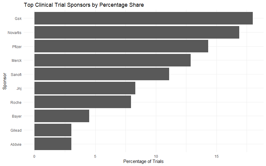
The chart clearly shows that GSK, Novartis, Pfizer, Merck, and Sanofi dominate the dataset.
Analyzing the Top Medical Conditions in the Dataset
Next, we analyzed the condition column.
condition_table <- trial_clean %>%
  count(condition) %>%
  arrange(desc(n)) %>%
  head(10)

condition_table
The result was:
| Rank | Medical Condition | Number of Trials |
|---|---|---|
| 1 | Diabetes Mellitus, Type 2 | 536 |
| 2 | Breast Neoplasms | 388 |
| 3 | Pulmonary Disease, Chronic Obstructive | 339 |
| 4 | Hypertension | 338 |
| 5 | Asthma | 334 |
| 6 | Arthritis, Rheumatoid | 333 |
| 7 | Influenza, Human | 324 |
| 8 | Schizophrenia | 292 |
| 9 | Diabetes Mellitus | 270 |
| 10 | Alzheimer Disease | 218 |
What the Condition Table Shows
The most common condition is Diabetes Mellitus, Type 2, with 536 trials.
Other common conditions include breast neoplasms, COPD, hypertension, asthma, rheumatoid arthritis, influenza, schizophrenia, diabetes mellitus, and Alzheimer disease.
This shows that the dataset covers many different disease areas.
Calculating Percentage Share of Top Medical Conditions
We calculated the percentage share of each top condition.
condition_table <- trial_clean %>%
  count(condition) %>%
  arrange(desc(n)) %>%
  mutate(percentage = round((n / sum(n)) * 100, 2)) %>%
  head(10)

condition_table
The result was:
| Rank | Medical Condition | Number of Trials | Percentage |
|---|---|---|---|
| 1 | Diabetes Mellitus, Type 2 | 536 | 3.90% |
| 2 | Breast Neoplasms | 388 | 2.82% |
| 3 | Pulmonary Disease, Chronic Obstructive | 339 | 2.47% |
| 4 | Hypertension | 338 | 2.46% |
| 5 | Asthma | 334 | 2.43% |
| 6 | Arthritis, Rheumatoid | 333 | 2.42% |
| 7 | Influenza, Human | 324 | 2.36% |
| 8 | Schizophrenia | 292 | 2.12% |
| 9 | Diabetes Mellitus | 270 | 1.96% |
| 10 | Alzheimer Disease | 218 | 1.59% |
Dataset Is Medically Diverse
The top condition, Type 2 Diabetes, accounts for only 3.90% of all records.
This means no single medical condition dominates the dataset.
The dataset is sponsor-concentrated but medically diverse.
Visualizing the Top Medical Conditions
We created a bar chart for the top medical conditions.
ggplot(condition_table, aes(x = reorder(condition, percentage), y = percentage)) +
  geom_col() +
  coord_flip() +
  labs(
    title = "Top Medical Conditions in Clinical Trial Dataset",
    x = "Medical Condition",
    y = "Percentage of Trials"
  ) +
  theme_minimal()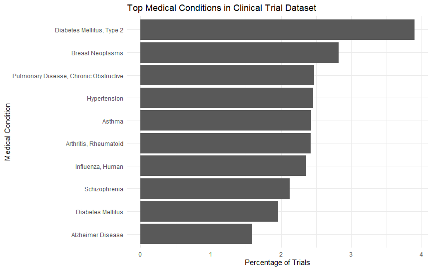
The chart confirms that Type 2 Diabetes is the most frequent condition, but the dataset is spread across many disease areas.
Analyzing Clinical Trials by Start Year
Next, we analyzed the start_year column.
year_table <- trial_clean %>%
  count(start_year) %>%
  arrange(start_year)

year_table
The yearly table showed that trial records were very low before 2000, increased sharply in the early 2000s, peaked around 2006–2008, and then declined later.
The peak year was 2007, with 1,115 trials.
Main Insights from Yearly Trial Analysis
| Finding | Interpretation |
|---|---|
| Earliest year is 1984 | Dataset includes historical records |
| Trial counts are low before 2000 | Earlier years are less represented |
| Counts rise sharply after 2000 | Dataset activity increases strongly |
| Peak occurs in 2007 | Highest trial count is 1,115 |
| 2006–2008 are strongest years | Main concentration of trial starts |
| 2019–2020 are very low | Likely incomplete dataset coverage |
| Later years need caution | Avoid overclaiming from incomplete data |
The main conclusion is that this dataset is heavily concentrated in the 2000s, especially around 2006 to 2008.
Visualizing Clinical Trials by Start Year
We created a line chart.
ggplot(year_table, aes(x = start_year, y = n)) +
  geom_line() +
  geom_point() +
  labs(
    title = "Clinical Trials by Start Year",
    x = "Start Year",
    y = "Number of Trials"
  ) +
  theme_minimal()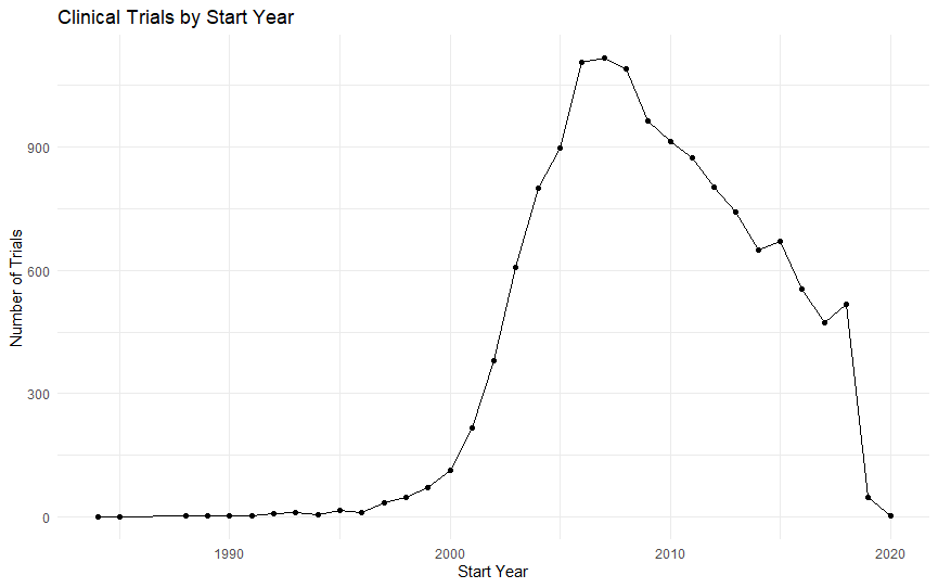
The chart shows:
- Very few records before 2000
- Rapid growth after 2000
- Peak around 2006–2008
- Decline after 2008
- Very low counts in 2019 and 2020
The drop in 2019 and 2020 should be interpreted carefully because it may reflect incomplete dataset coverage.
Analyzing Clinical Trials by Start Month
Next, we analyzed trial starts by month.
month_table <- trial_clean %>%
  count(start_month) %>%
  arrange(start_month)

month_table
The result was:
| Month Number | Number of Trials |
|---|---|
| 1 | 1,118 |
| 2 | 1,018 |
| 3 | 1,153 |
| 4 | 1,053 |
| 5 | 1,090 |
| 6 | 1,185 |
| 7 | 1,080 |
| 8 | 1,013 |
| 9 | 1,217 |
| 10 | 1,302 |
| 11 | 1,260 |
| 12 | 1,259 |
What the Monthly Table Shows
Clinical trial starts are fairly spread across all 12 months.
October has the highest number of trial starts, with 1,302 trials.
August has the lowest number, with 1,013 trials.
The difference between the highest and lowest month is 289 trials, which shows moderate variation but not extreme seasonality.
Converting Start Month Numbers into Month Names
Month numbers are not as reader-friendly as month names, so we converted them.
month_table <- month_table %>%
  mutate(
    month_name = month.abb[start_month],
    month_name = factor(month_name, levels = month.abb)
  )

month_table
The updated table was:
| Month Number | Number of Trials | Month Name |
|---|---|---|
| 1 | 1,118 | Jan |
| 2 | 1,018 | Feb |
| 3 | 1,153 | Mar |
| 4 | 1,053 | Apr |
| 5 | 1,090 | May |
| 6 | 1,185 | Jun |
| 7 | 1,080 | Jul |
| 8 | 1,013 | Aug |
| 9 | 1,217 | Sep |
| 10 | 1,302 | Oct |
| 11 | 1,260 | Nov |
| 12 | 1,259 | Dec |
Using factor() keeps the months in correct calendar order.
Visualizing Clinical Trials by Start Month
We created a monthly bar chart.
ggplot(month_table, aes(x = month_name, y = n)) +
  geom_col() +
  labs(
    title = "Clinical Trials by Start Month",
    x = "Start Month",
    y = "Number of Trials"
  ) +
  theme_minimal()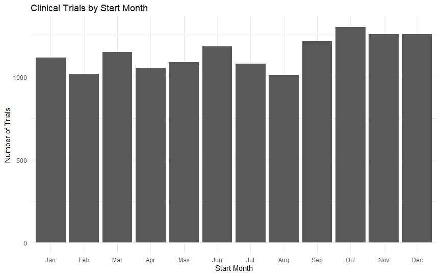
The chart confirms that trial starts are distributed across all months, with a slight increase in the final quarter.
Calculating Monthly Percentage Share
We calculated monthly percentages.
month_table <- month_table %>%
  mutate(percentage = round((n / sum(n)) * 100, 2))

month_table
The result was:
| Month | Number of Trials | Percentage |
|---|---|---|
| Jan | 1,118 | 8.13% |
| Feb | 1,018 | 7.40% |
| Mar | 1,153 | 8.39% |
| Apr | 1,053 | 7.66% |
| May | 1,090 | 7.93% |
| Jun | 1,185 | 8.62% |
| Jul | 1,080 | 7.86% |
| Aug | 1,013 | 7.37% |
| Sep | 1,217 | 8.85% |
| Oct | 1,302 | 9.47% |
| Nov | 1,260 | 9.16% |
| Dec | 1,259 | 9.16% |
Monthly Pattern
Each month contributes between 7.37% and 9.47% of all trials.
October has the highest share at 9.47%.
August has the lowest share at 7.37%.
The final quarter appears slightly higher, but the dataset does not show an extreme seasonal pattern.
Analyzing Clinical Trial Status by Phase
After analyzing phase and status separately, we compared them together.
status_by_phase <- trial_clean %>%
  count(phase_clean, status) %>%
  arrange(phase_clean, desc(n))

status_by_phase
This counts how many trials fall into each combination of clinical trial phase and trial status.
Why Status by Phase Analysis Matters
Phase tells us where a trial sits in the clinical research pipeline.
Status tells us what happened to the trial.
Together, they help us understand:
- Which phases have the most completed trials
- Which phases have more terminated studies
- Which phases have more recruiting or active studies
- Whether missing phase records still contain useful status information
Calculating Trial Status Percentage Within Each Phase
Raw counts can be misleading when phase groups have different sizes, so we calculated percentages within each phase.
status_by_phase_percent <- trial_clean %>%
  count(phase_clean, status) %>%
  group_by(phase_clean) %>%
  mutate(percentage = round((n / sum(n)) * 100, 2)) %>%
  arrange(phase_clean, desc(percentage))

print(status_by_phase_percent, n = Inf)
Completed Trials by Phase
| Clinical Trial Phase | Completed Trials | Completion Percentage |
|---|---|---|
| Early Phase 1 | 10 | 100.00% |
| Not Available | 218 | 82.90% |
| Phase 4 | 1,659 | 82.30% |
| Phase 1 | 1,977 | 78.60% |
| Phase 3 | 3,795 | 77.70% |
| Phase 2 | 2,646 | 73.60% |
| Phase 2/Phase 3 | 89 | 64.00% |
| Phase 1/Phase 2 | 174 | 54.00% |
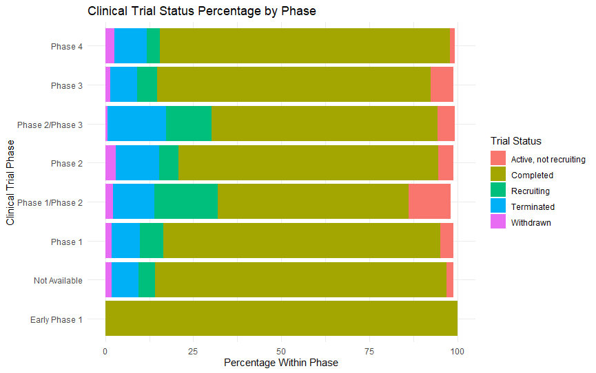
The main finding is that Completed is the largest status category in every phase.
Terminated Trials by Phase
| Clinical Trial Phase | Terminated Trials | Termination Percentage |
|---|---|---|
| Phase 2/Phase 3 | 23 | 16.60% |
| Phase 2 | 449 | 12.50% |
| Phase 1/Phase 2 | 38 | 11.80% |
| Phase 4 | 183 | 9.08% |
| Phase 1 | 203 | 8.07% |
| Not Available | 20 | 7.60% |
| Phase 3 | 369 | 7.55% |
The highest termination percentage appears in Phase 2/Phase 3, followed by Phase 2.
This suggests that mid-stage and transition-stage trials may have relatively higher termination shares in this dataset.
Visualizing Clinical Trial Status Percentage by Phase
We created a stacked bar chart using the five main statuses:
status_by_phase_main <- status_by_phase_percent %>%
  filter(status %in% c(
    "Completed",
    "Terminated",
    "Recruiting",
    "Active, not recruiting",
    "Withdrawn"
  ))

ggplot(status_by_phase_main, aes(x = phase_clean, y = percentage, fill = status)) +
  geom_col() +
  coord_flip() +
  labs(
    title = "Clinical Trial Status Percentage by Phase",
    x = "Clinical Trial Phase",
    y = "Percentage Within Phase",
    fill = "Trial Status"
  ) +
  theme_minimal()
Main Insights from Status-by-Phase Analysis
| Finding | Interpretation |
|---|---|
| Completed is the top status in every phase | Most trials reached completion |
| Phase 4 completion is 82.30% | Post-market trials have a high completion share |
| Phase 3 completion is 77.70% | Late-stage trials are strongly represented and often completed |
| Phase 2 termination is 12.50% | Mid-stage trials show meaningful early stopping |
| Phase 2/Phase 3 termination is 16.60% | Transition-stage trials have the highest termination share |
| Phase 1/Phase 2 recruiting is 18.00% | Hybrid early-stage studies include many ongoing trials |
| Withdrawn percentages are low | Few trials stop before enrollment |
This chart gives one of the most advanced insights in the article because it connects two important clinical trial variables: phase and status.
Analyzing Sponsor Activity by Clinical Trial Phase
Next, we examined how the top sponsors are distributed across clinical trial phases.
sponsor_phase_table <- trial_clean %>%
  filter(sponsor %in% sponsor_table$sponsor) %>%
  count(sponsor, phase_clean) %>%
  arrange(sponsor, desc(n))

sponsor_phase_table
Largest Phase Category for Each Sponsor
| Sponsor | Largest Phase Category | Number of Trials |
|---|---|---|
| GSK | Phase 1 | 723 |
| Novartis | Phase 3 | 829 |
| Pfizer | Phase 3 | 654 |
| Merck | Phase 3 | 760 |
| Sanofi | Phase 3 | 565 |
| JNJ | Phase 3 | 451 |
| Roche | Phase 3 | 394 |
| Bayer | Phase 3 | 219 |
| AbbVie | Phase 3 | 174 |
| Gilead | Phase 2 | 152 |
This table shows that Phase 3 is the leading phase for most top sponsors.
Key Sponsor-by-Phase Insights
| Finding | Interpretation |
|---|---|
| Phase 3 dominates most sponsors | Late-stage trials are central to the dataset |
| Novartis has the most Phase 3 trials | Strong late-stage sponsor presence |
| GSK has the most Phase 1 trials | Broad early-stage representation |
| Pfizer and Merck have high Phase 3 counts | Major late-stage research activity |
| Gilead leads slightly in Phase 2 | More mid-stage focus in this dataset |
| Phase 4 appears across major sponsors | Post-market research is well represented |
Visualizing Top Sponsors by Clinical Trial Phase
We created a heatmap.
ggplot(sponsor_phase_table, aes(x = phase_clean, y = sponsor, fill = n)) +
  geom_tile() +
  labs(
    title = "Top Sponsors by Clinical Trial Phase",
    x = "Clinical Trial Phase",
    y = "Sponsor",
    fill = "Number of Trials"
  ) +
  theme_minimal() +
  theme(
    axis.text.x = element_text(angle = 45, hjust = 1)
  )
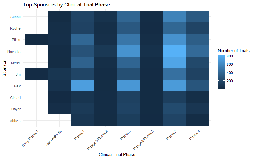
A heatmap is useful because it compares two categorical variables at the same time:
| Variable | Meaning |
|---|---|
| Sponsor | Company responsible for the clinical trial |
| Clinical trial phase | Stage of the trial |
| Fill intensity | Number of trials |
The heatmap confirms that most top sponsors are heavily represented in Phase 2 and Phase 3 trials.
Analyzing Completed Clinical Trials by Sponsor
Next, we analyzed which sponsors had the highest number and percentage of completed trials.
completed_by_sponsor <- trial_clean %>%
  filter(sponsor %in% sponsor_table$sponsor) %>%
  count(sponsor, status) %>%
  group_by(sponsor) %>%
  mutate(percentage = round((n / sum(n)) * 100, 2)) %>%
  filter(status == "Completed") %>%
  arrange(desc(n))

completed_by_sponsor
The result was:
| Rank | Sponsor | Status | Completed Trials | Completion Percentage |
|---|---|---|---|---|
| 1 | GSK | Completed | 2,116 | 85.60% |
| 2 | Novartis | Completed | 1,742 | 75.10% |
| 3 | Pfizer | Completed | 1,473 | 74.80% |
| 4 | Merck | Completed | 1,360 | 76.80% |
| 5 | Sanofi | Completed | 1,232 | 80.80% |
| 6 | JNJ | Completed | 868 | 75.90% |
| 7 | Roche | Completed | 772 | 70.50% |
| 8 | Bayer | Completed | 470 | 75.90% |
| 9 | Gilead | Completed | 288 | 69.10% |
| 10 | AbbVie | Completed | 247 | 59.20% |
What the Completion Table Shows
GSK has the highest number of completed trials, with 2,116 completed studies.
GSK also has the highest completion percentage among the top sponsors, at 85.60%.
Sanofi also has a strong completion percentage of 80.80%.
AbbVie has the lowest completion percentage among the top 10 sponsors, at 59.20%.
This should be interpreted carefully because lower completion percentage may reflect more active, recruiting, or recently started trials rather than poor performance.
Step Visualizing Clinical Trial Completion Percentage by Sponsor
We created a completion percentage chart.
ggplot(completed_by_sponsor, aes(x = reorder(sponsor, percentage), y = percentage)) +
  geom_col() +
  coord_flip() +
  labs(
    title = "Clinical Trial Completion Percentage by Sponsor",
    x = "Sponsor",
    y = "Completion Percentage"
  ) +
  theme_minimal()
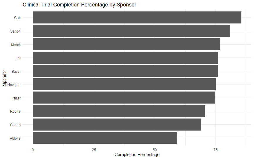
Main Insights from Sponsor Completion Chart
| Finding | Interpretation |
|---|---|
| GSK has the highest completion percentage | Strongest completion share among top sponsors |
| Sanofi is second highest | Strong completion profile |
| Most sponsors fall between 69% and 77% | Similar completion patterns among major sponsors |
| AbbVie has the lowest completion percentage | More non-completed or active trials in this dataset |
| Completion percentage adds context beyond trial count | Count alone does not show sponsor outcome profile |
Final Key Findings from the Clinical Trial Data Analysis
After completing the major analysis steps, we created a final summary table.
key_findings <- tibble(
  metric = c(
    "Total clinical trial records",
    "Most common phase",
    "Most common status",
    "Median enrollment",
    "Highest enrollment",
    "Top sponsor",
    "Top medical condition",
    "Peak start year",
    "Most common start month"
  ),
  finding = c(
    nrow(trial_clean),
    phase_table$phase_clean[1],
    status_table$status[1],
    median(trial_clean$enrollment),
    max(trial_clean$enrollment),
    sponsor_table$sponsor[1],
    condition_table$condition[1],
    year_table$start_year[which.max(year_table$n)],
    as.character(month_table$month_name[which.max(month_table$n)])
  )
)

key_findings
The result was:
| Metric | Finding |
|---|---|
| Total clinical trial records | 13,748 |
| Most common phase | Phase 3 |
| Most common status | Completed |
| Median enrollment | 124 |
| Highest enrollment | 84,496 |
| Top sponsor | GSK |
| Top medical condition | Diabetes Mellitus, Type 2 |
| Peak start year | 2007 |
| Most common start month | Oct |
Final Analysis Summary
This case study showed how R can be used to perform a complete exploratory analysis of a real-world clinical trial dataset.
Using R, we were able to:
- Clean the dataset
- Handle missing phase values
- Analyze clinical trial phases
- Analyze trial status
- Study enrollment distribution
- Compare sponsors
- Identify top medical conditions
- Explore yearly and monthly trends
- Compare trial status across phases
- Summarize the most important findings
The strongest findings were:
| Area | Main Finding |
|---|---|
| Phase | Phase 3 trials were most common |
| Status | Completed trials dominated |
| Enrollment | Median enrollment was 124 |
| Sponsor | GSK was the top sponsor |
| Condition | Type 2 diabetes was the top condition |
| Time | Peak start year was 2007 |
| Month | October had the most starts |
Conclusion: What We Learned from Clinical Trial Data Analysis Using R
This clinical trial data analysis using R case study showed how a real-world healthcare dataset can be cleaned, explored, visualized, and interpreted using modern R tools.
The purpose of this analysis was not to compare medicines, judge treatment effectiveness, or decide which clinical trial produced better patient outcomes. Instead, this project focused on understanding the structure and patterns inside the clinical trial dataset.
In simple terms, this analysis answered questions such as:
- What types of clinical trials are present in the dataset?
- Which clinical trial phases appear most often?
- What is the most common trial status?
- How large are the trials based on enrollment?
- Which sponsors appear most frequently?
- Which medical conditions are studied most often?
- When were most trials started?
- How are trial phases, sponsors, and statuses related?
This makes the project an example of exploratory clinical trial data analysis, not clinical medical evaluation.
Conclusion from the R Data Analysis Workflow
From a data analysis perspective, this case study demonstrated a complete beginner-to-intermediate workflow in R.
We started by importing the dataset into RStudio and checking its structure using commands such as:
summary(trial_data)
str(trial_data)
dim(trial_data)
After inspecting the raw data, we cleaned the dataset by standardizing column names, converting blank values into proper missing values, removing duplicate records, and creating new analysis-ready variables such as phase_clean.
This step was important because real-world datasets are rarely clean when they are first imported. The raw dataset contained missing values in important fields such as phase and title.
Instead of deleting useful records, we handled missing phase values transparently by labeling them as Not Available.
Using packages such as dplyr, ggplot2, janitor, and stringr, we created tables, percentages, summaries, bar charts, histograms, line charts, and heatmaps.
These tools allowed us to move from raw CSV data to meaningful insights.
How R Helped in This Analysis
| Task | How R Helped |
|---|---|
| Data importing | Loaded the CSV dataset into RStudio |
| Data cleaning | Standardized columns and handled missing values |
| Descriptive analysis | Created summaries, counts, and percentages |
| Visualization | Produced charts for phase, status, enrollment, sponsors, and trends |
| Grouped analysis | Compared enrollment, status, and sponsors by phase |
| Reporting | Created structured tables suitable for a blog post or report |
The analysis also showed why it is important to interpret data carefully.
For example, the enrollment column had a median of 124 but a mean of 440.78, showing that a few very large trials pulled the average upward.
Without comparing mean and median, the typical trial size could easily be misunderstood.
So, from a data analysis point of view, this project demonstrated how R can turn a large clinical trial dataset into a clear analytical story.
Conclusion from the Dataset Findings
From the dataset itself, several important patterns were found.
The dataset contained 13,748 clinical trial records, making it large enough for meaningful exploratory analysis.
The most common clinical trial phase was Phase 3, which represented the largest share of trial records. This showed that the dataset was strongly concentrated in late-stage clinical trial activity.
The most common trial status was Completed, with 76.87% of trials marked as completed. This means most records in the dataset represented trials that had reached completion, rather than trials that were still recruiting, suspended, withdrawn, or unknown.
The enrollment analysis showed that most clinical trials were small to medium-sized, while a few very large studies created extreme outliers.
The median enrollment was 124 participants, while the highest enrollment was 84,496 participants. This confirmed that trial enrollment was highly right-skewed.
The sponsor analysis showed that trial activity was highly concentrated among major pharmaceutical companies. GSK was the top sponsor, followed by Novartis, Pfizer, Merck, Sanofi, JNJ, Roche, Bayer, AbbVie, and Gilead.
The condition analysis showed a different pattern. Unlike sponsor activity, medical conditions were more diverse. The most common condition was Diabetes Mellitus, Type 2, but it represented only 3.90% of all records.
The time-based analysis showed that most trial records were concentrated in the 2000s, with the highest number of trial starts in 2007. The monthly analysis showed that trial starts were fairly balanced across the year, with October having the highest number of starts.
Important Limitation of This Analysis
This analysis should not be interpreted as medical evidence about which treatment works better, which drug is safer, or which trial improved patient outcomes.
The dataset used in this case study contains information about trial records, such as sponsor, phase, status, enrollment, start year, and condition.
It does not provide enough information to compare patient recovery, treatment effectiveness, survival outcomes, adverse events, or clinical success.
Therefore, this post should be understood as a study of clinical trial activity and structure, not a study of medical results.
| We Analyzed | We Did Not Analyze |
|---|---|
| What trials were recorded | Which treatment worked best |
| Who sponsored the trials | Which medicine cured patients |
| When trials started | Patient recovery outcomes |
| Trial phase distribution | Drug safety or efficacy |
| Trial status distribution | Clinical superiority |
| Enrollment patterns | Individual patient health results |
| Medical condition frequency | Treatment success rates |
This distinction is important because clinical trial data analysis can have different goals.
In this post, the goal was to understand the dataset and describe patterns in clinical trial activity.
Frequently Asked Questions About Clinical Trial Data Analysis Using R
What is clinical trial data analysis using R?
Clinical trial data analysis using R is the process of using the R programming language to clean, explore, summarize, and visualize clinical trial datasets.
In this case study, we used R to analyze trial phase, status, enrollment, sponsors, medical conditions, start year, and start month.
This analysis focused on understanding the structure of clinical trial records, not on judging whether one treatment or medicine is better than another.
What dataset was used in this clinical trial case study?
This case study used a clinical trial dataset containing 13,748 records.
The dataset included infor[Truncated]

